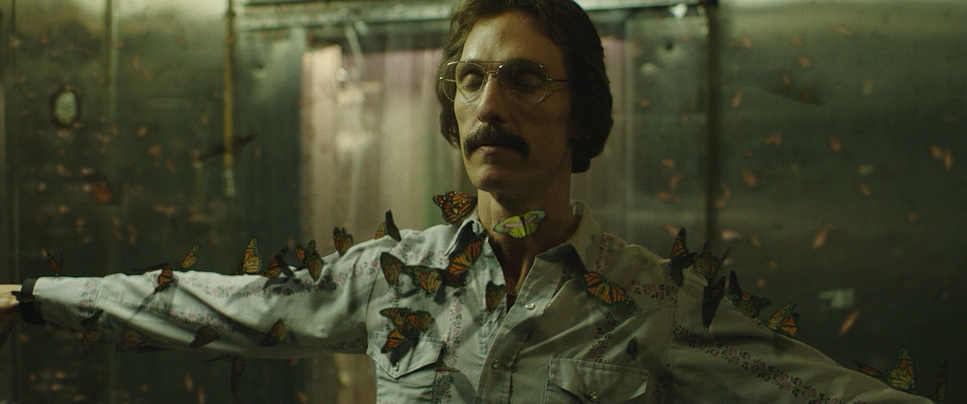
Dallas Buyers Club (2013) is a reminder that sometimes, the most effective image is the one that breaks those rules. It is a film that doesn’t just display technical craft; it physically embodies the struggle of its protagonist. While the conversation around this film usually centers on the physical transformations of Matthew McConaughey and Jared Leto, the visual language crafted by director Jean-Marc Vallée and cinematographer Yves Bélanger deserves equal credit. It is a look that feels less like a movie and more like a fever dream sweaty, desperate, and urgent.
This wasn’t a glossy Hollywood production, and that’s precisely why it works. It is a raw, visceral experience of Ron Woodroof’s fight against the FDA and his own mortality in 1980s Texas. As someone who manipulates images for a living, I find the choices here fascinating not because they are “beautiful” in the traditional sense, but because they are fiercely functional. Every grain of noise and every flared highlight serves the story.
About the Cinematographer: Yves Bélanger

Yves Bélanger is not a cinematographer who hides behind massive lighting trucks. A frequent collaborator with Vallée, Bélanger is known for a radical approach to “subtracting” equipment rather than adding it. His philosophy for Dallas Buyers Club was simple but risky: he wanted to shoot the entire film without artificial movie lights.
This approach required a cinematographer who could think on his feet, reacting to the environment rather than controlling it. Bélanger treated the actors less like subjects on a set and more like wildlife he was documenting. It’s a testament to his eye that the film doesn’t look like amateur home video; instead, the lack of lighting gear allowed for a 360-degree freedom of movement that grounded the audience firmly in Ron’s harsh, unpolished reality.
Inspiration Behind the Cinematography
The visual reference point for Dallas Buyers Club wasn’t other cinema; it was reality. The goal was to transport the audience directly into 1985 into filthy apartments, sterile hospital corridors, and grimy rodeo arenas. The team leaned heavily into a “documentary” aesthetic.
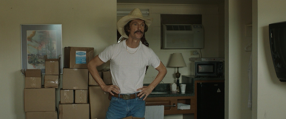
The inspiration was clearly to strip away the barrier between the lens and the actor. In many ways, the film mimics the style of cinéma vérité. By avoiding stylized lighting or composed “beauty shots,” the cinematography forces us to confront the deteriorating physical states of the characters. When you see McConaughey’s skeletal frame in the hard daylight, it hits harder because the light hasn’t been softened to flatter him. It’s a brave choice to let the image be “ugly” or harsh because that harshness is the truth of the narrative.
Camera Movements
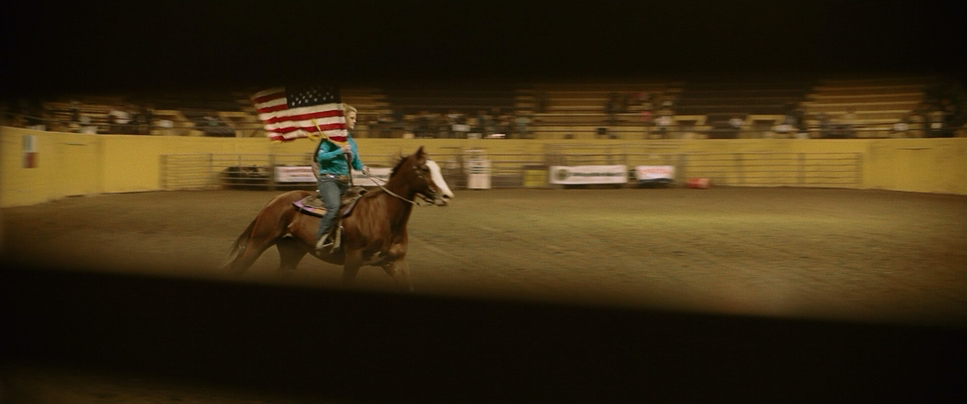
The handheld camera is the visual heartbeat of this film. Critics often debate the overuse of “shaky cam,” but here, the instability is narrative, not stylistic. The camera operates as an unseen observer, breathing alongside Ron, reacting to his coughing fits and his frantic hustling.
Because they weren’t waiting on lighting setups, the camera was always rolling. This immediacy creates a sense of anxiety. When Ron is dealing with the ringing in his ears or the shock of his diagnosis, the camera jitters, mirroring his physiological panic. It’s a subjective experience. We aren’t watching Ron from a safe distance; we are trapped in the room with him. The movement is reactive when Ron moves, the operator moves. It feels unchoreographed because, largely, it was.
Compositional Choices
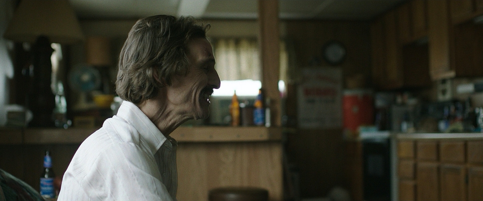
Bélanger’s framing reinforces the themes of isolation and entrapment. The film presents a 2.39:1 widescreen image, but it rarely feels “epic.” Instead, the wide frame is often used to isolate characters in negative space. We often see Ron framed in “clean singles,” emphasizing his loneliness.
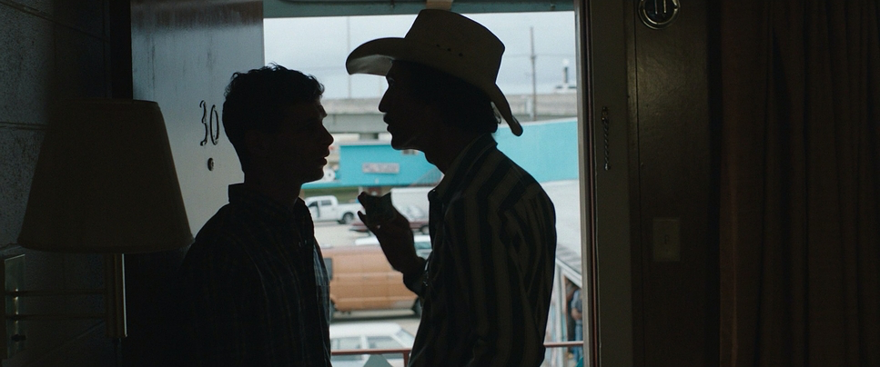
Interestingly, the composition often breaks the rules of headroom and looking room. Characters are sometimes pushed to the far edge of the frame, or the focus racks to something in the extreme foreground, creating a sense of claustrophobia even in open spaces. In the car scenes like the one around the 38-minute mark the framing is tight, intimate, and unflinching. The composition values emotional proximity over geometric perfection. It forces the audience to inhabit the scene, making us feel the confinement of Ron’s situation.
Lighting Style
The lighting in Dallas Buyers Club is the most radical element of its production. Bélanger famously used almost zero film lights. The entire movie was lit using practicals (lamps visible in the scene) and available daylight.
This resulted in a lighting style that is hard, directional, and often mixed in color temperature. In the hospital scenes, the team embraced the sickly green spike of real fluorescent tubes rather than correcting it. In the motel rooms and trailers, the light often falls off rapidly into crushed, noisy shadows because there is no “fill light” lifting the darkness. At times, we see harsh side-lighting or edge-lighting from a window that overexposes part of an actor’s face while burying the rest in shadow. As a colorist, I can see that they didn’t try to save the highlights or lift the shadows artificially; they let the contrast be heavy and natural. It’s honest lighting it reveals every wrinkle, every lesion, and every drop of sweat.
Lensing and Blocking
Contrary to some misconceptions about “gritty” films being shot on lower-end gear, Dallas Buyers Club was shot on the ARRI ALEXA, the industry gold standard. However, the choice of glass was specific: Zeiss Ultra Speed lenses. These are spherical lenses, not anamorphic, which open up to a very fast f/1.3 aperture.
This combination was crucial. The Alexa’s dynamic range and the Zeiss lenses’ speed allowed Bélanger to shoot in extremely low light without adding grain that would distract from the performance. They shot open gate and cropped to 2.39:1 to get that cinematic widescreen feel without the optical distortions of anamorphic glass.
In terms of blocking, the freedom from lighting stands meant the actors could go anywhere. Vallée and Bélanger employed a fluid, improvisational blocking style. If an actor wanted to walk to a dark corner of the room, the camera just followed. This dynamic interplay between the operator and the talent creates a “dance” that feels alive. The shallow depth of field from the wide-open lenses keeps our attention strictly on the eyes of the performer, blurring out the chaotic world around them.
Color Grading Approach
As a colorist, this is where I really get to sink my teeth into the film’s visual language. The grade on Dallas Buyers Club is distinctively muddy and “un-Hollywood.” It eschews clean white balances for a palette that feels stained and aged.
The hue separation is minimal. We don’t see the typical “teal and orange” contrast where skin tones pop against a cool background. Instead, the skin tones often sit in a sickly yellow-green pocket, blending into the motel walls and rodeo dust. This monochromatic wash often leaning into distinct greens and sodium-vapor oranges enhances the feeling of sickness.
The contrast shaping is aggressive. The blacks are often crushed, likely a result of the available-light shooting conditions, but this adds weight to the image. The highlight roll-off of the Alexa is utilized perfectly; even when a window is completely blown out white, it blooms organically rather than clipping digitally. The grade feels like a form of “print emulation,” adding a texture that removes the digital sharpness of the sensor. It’s a grade that refuses to make the actors look healthy. It supports the narrative by ensuring the environment looks just as toxic as the virus in Ron’s blood.
Technical Aspects & Tools
| Dallas Buyers Club – Technical Specs | |
|---|---|
| Genre | Drama, History, Political, Documentary, Docudrama |
| Director | Jean-Marc Vallée |
| Cinematographer | Yves Bélanger |
| Production Designer | John Paino |
| Costume Designer | Kurt and Bart |
| Editor | Martin Pensa, Jean-Marc Vallée |
| Time Period | 1980s |
| Color | Green |
| Aspect Ratio | 2.39 – Spherical |
| Format | Digital |
| Lighting | Hard light, Side light, Edge light |
| Lighting Type | Daylight |
| Story Location | United States > Texas |
| Filming Location | Louisiana > New Orleans |
| Camera | ARRI ALEXA Classic / Plus |
| Lens | Panavision Ultra Speed Zeiss |
| Film Stock / Resolution | 2K |
The decision to shoot digital with the ARRI ALEXA was unconventional for a period piece in 2013, where 16mm or 35mm film might have been the expected choice for a “gritty 80s” look. However, film stock requires light, and this production had none to spare.
The Alexa’s high native ISO (likely pushed to 1600 or higher in post) and the Zeiss Ultra Speeds were the only way to capture scenes lit by a single lighter flame or a dim dashboard bulb. This technical package wasn’t about achieving the highest resolution; it was about latitude and sensitivity. By shooting digital but grading for a filmic, textured look, they got the best of both worlds: the flexibility of modern capture with the aesthetic of vintage cinema. The minimal grip equipment often just a handheld rig allowed the production to move at a blistering pace, completing the shoot in just 25 days.
- Also read: DEAR ZACHARY: A LETTER TO A SON ABOUT HIS FATHER (2008) – CINEMATOGRAPHY ANALYSIS
- Also read: SEARCHING FOR SUGAR MAN (2012) – CINEMATOGRAPHY ANALYSIS
Browse Our Cinematography Analysis Glossary
Explore directors, cinematographers, cameras, lenses, lighting styles, genres, and the visual techniques that shape iconic films.
Explore Glossary →