Some projects are technically brilliant but emotionally cold, others are raw and messy yet hit you right in the gut. Then there are films like Kurt Kuenne’s Dear Zachary: A Letter to a Son About His Father (2008). This isn’t just a documentary; it’s a living, breathing testament to grief and outrage, captured through a lens that feels less like a tool and more like an extension of the director’s own heart.
When I first watched Dear Zachary: A Letter to a Son About His Father, I wasn’t analyzing the bit rate or the lighting ratios. I was just bearing witness. From a craft perspective, however, it is a masterclass in how visual storytelling even when born of necessity and profound anguish can achieve monumental impact. Kuenne built this film piece by painstaking piece, a “memory album” that morphed into a public scream for justice. Let’s dig into the cinematography of this film, not as a technical exercise, but as an emotional language.
About the Cinematographer

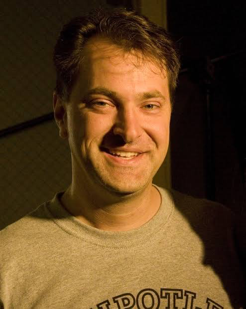
Usually, I’d be breaking down the work of a dedicated Director of Photography. Dear Zachary: A Letter to a Son About His Father is a unique beast because Kurt Kuenne is the cinematographer. This fundamentally alters the visual fabric. This wasn’t a professional DP meticulously planning shots with storyboards and gear lists. This was a friend, a collaborator from childhood, picking up a camera with an intensely personal mission.
He started shooting this project within 24 hours of hearing about Andrew’s death. That context is everything. Kuenne wasn’t just capturing images; he was preserving a legacy and processing his own grief. His role was defined by intimacy. He utilized a blend of existing personal footage and newly shot interviews, all under his own lens. It gives the film a raw, unfiltered verité quality. It’s a style born of emotional necessity, not aesthetic dogma. He is the eyes through which we experience this story, and those eyes are bloodshot.
Inspiration Behind the Cinematography

The visual approach is inextricably linked to Kuenne’s evolving purpose. Initially, this was a time capsule for a child who would never know his father. Kuenne spent the summer of 2003 traveling the globe, gathering interviews. The visual language at this stage prioritized warmth and authenticity. Think soft, natural light and unguarded expressions a sense of shared remembrance.
But the narrative “metamorphicized,” as one reviewer noted. After Zachary’s own tragic death, Kuenne realized he had to finish it “for them and for myself.” The critical turning point came when he discovered the extent of the injustice surrounding the case. The project shifted from a personal memorial to a call for change, and the visuals had to follow suit.
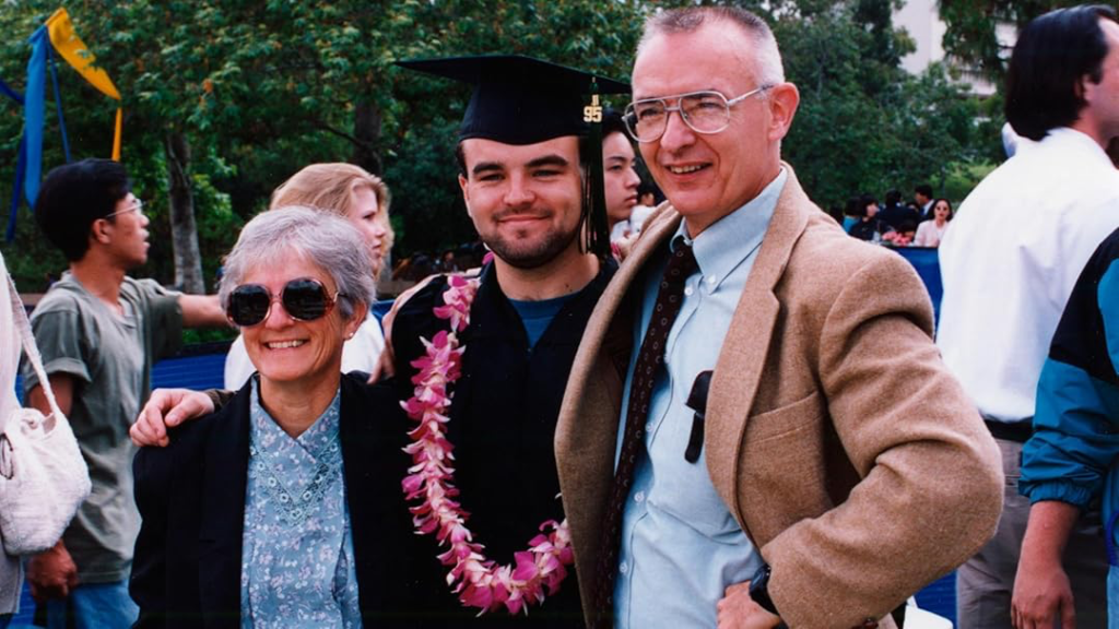
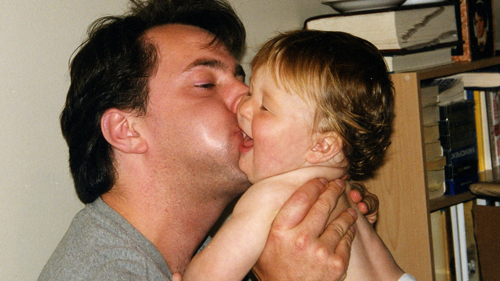
The style draws from two wells: the tender, almost nostalgic aesthetic of home videos, and a starker, colder presentation of facts as the film takes on its activist mantle. The 300 hours of footage Kuenne cataloged weren’t just volume; they were the raw data of a political journey.
Camera Movements

Because this is deeply personal and improvisational, the camera work is functional rather than overtly cinematic. You won’t see elaborate crane shots or choreographed dolly moves. Kuenne employs a language that feels immediate.
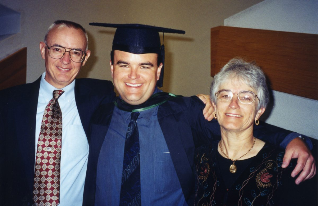
Much of the film, particularly the interviews, relies on static shots or imperceptible pans. This stillness grounds us. When Andrew’s parents, Kate and David Bagby, recount their ordeal, the camera remains steadfast a silent listener. It elevates their testimony, giving their resilience an unshakeable weight.
On the flip side, you have the handheld footage in the archival clips. This handheld aesthetic lends a raw texture to the past. It feels like memory itself fluid, imperfect, full of life. Even in later interviews, especially during emotionally charged moments, you can feel the camera breathe. It oscillates between a steady, observational stance and a more intimate, participant-observer style. The lack of stylized movement keeps the focus squarely on the human toll, avoiding any visual distractions that might dilute the impact.
Compositional Choices

Kuenne keeps the framing tight. He frequently utilizes medium close-ups and close-ups during interviews to eliminate background noise and pull us into the personal space of the subjects. It creates an effect of intense connection, as if we are sitting across from them in their living room.
He does employ wider shots, but usually only to establish a sense of place the Canadian landscapes or the Bagbys’ home anchoring the story geographically.
The most striking compositional work happens in the film’s “nightmare” sequences. Here, Kuenne abandons the measured pace for quick edits, jarring juxtapositions, and fragmented imagery. The composition becomes frenetic and claustrophobic. It’s a deliberate departure designed to plunge the viewer into visceral horror. This isn’t about elegant framing; it’s about conveying psychological terror through a barrage of visual information extreme close-ups of documents, rapid cuts of locations, and a sense of impending doom. It feels like a visual assault.
Lighting Style
The lighting is overwhelmingly naturalistic. Kuenne wasn’t working with a grip truck or a lighting crew; he was working with speed. This means we see a lot of available light soft window light or ambient room practicals.
This lack of artifice makes the interviews feel unvarnished. There is no studio-perfect hair light. When Kate and David Bagby appear, their faces are lit softly, enhancing their vulnerability. Kate Bagby actually comments in the film, “the less light you put on my face, the better the picture will look.” While self-deprecating, Kuenne honors this. He lets the natural light mold their expressions, showcasing the lines of their grief without theatricality.
Even in the darker parts of the film, there are no dramatic chiaroscuro effects to heighten suspense artificially. The dread comes from the content, not the lighting ratios. This commitment to un-glamorized illumination amplifies the emotional honesty.
Lensing and Blocking
In a doc like this, “blocking” isn’t about arranging actors; it’s about how subjects naturally occupy the frame. Kuenne’s choices lean towards the organic.
He frequently uses normal to slightly wide focal lengths for the interviews. A normal lens (around 50mm) creates a perspective closest to human vision. Wider lenses (around 35mm) include the environment without distracting from the speaker. This combo creates presence. We are there with them.
For the archival footage, the lensing is dictated by the consumer cameras of the era often wider, deep-focus perspectives that reinforce the “home video” aesthetic.
As for the staging, Kuenne positions his subjects in familiar, comfortable settings. They are often seated, facing the camera directly or slightly off-axis. There is no complex choreography. The camera acts as a stable observer. This approach ensures the subjects feel relatable within their own spaces. It’s not about visual flair; it’s about truthful capture.
Color Grading Approach
This is where I spent the most time analyzing the image. As a colorist, the grade in Dear Zachary: A Letter to a Son About His Father is fascinating because it abandons high-end polish for raw emotional cohesion. The footage spans decades and formats, from grainy VHS to digital video. The grade’s job is to stitch this tapestry together.
In the early sections dedicated to Andrew’s life, the grade maintains warmth and a nostalgic, faded quality. There is a gentle lift in the mid-tones and a softening of the highlights mimicking the bloom of old memories. The colors aren’t oversaturated; they rely on good hue separation to keep skin tones looking healthy, even if the overall palette is subdued.
As the tragedy deepens, the color shifts aggressively. We move toward a cooler, desaturated palette. The warmth recedes, replaced by a subtle blue or green push in the shadows. The contrast shaping changes here, too. The blacks get crushed likely to hide the noise floor of the consumer cameras, but emotionally it feels like the air is being sucked out of the room. The highlights lose that nostalgic bloom and become hard and clinical.
Crucially, the grade unifies the diverse footage. It manages the highlight roll-off from older, lower dynamic range cameras to maintain authenticity, while blending newer footage to match. The grade is a silent storyteller, guiding our perception of warmth, coldness, and the gravitas of the narrative.
Technical Aspects & Tools
Dear Zachary: A Letter to a Son About His Father is a testament to resourcefulness. Kuenne was a one-man band, and the toolset reflects that.
For the archival footage, we are looking at consumer-grade camcorders from the 80s and 90sVHS, Hi8, or MiniDV. The aesthetic of these formats the interlacing artifacts, the blown highlights, the chromatic noise becomes a deliberate part of the film’s texture.
For the interviews, Kuenne likely used the prosumer workhorses of the early 2000s, like the Sony VX2000 or Panasonic DVX100. You can tell by the depth of field and the specific way the sensors handle low light. These cameras were portable and easy to use, perfect for a filmmaker traveling alone.
But the real technical prowess shines in the editing and sound design. The “nightmare” sequence is a masterclass in manipulation. Rapid-fire cuts, disorienting soundscapes, and distorted voices simulate psychological distress. It demonstrates that technical limitations don’t prevent impact; in fact, creative post-production can weaponize those limitations to create a harrowing experience.
- Also read: SEARCHING FOR SUGAR MAN (2012) – CINEMATOGRAPHY ANALYSIS
- Also read: INSIDE JOB (2010) – CINEMATOGRAPHY ANALYSIS
Browse Our Cinematography Analysis Glossary
Explore directors, cinematographers, cameras, lenses, lighting styles, genres, and the visual techniques that shape iconic films.
Explore Glossary →