Jim Sheridan’s In the Name of the Father (1993) drama isn’t just a brutal recounting of the Guildford Four scandal; it’s a blueprint for how cinematography and color can do the heavy lifting in storytelling. We all know the stories about Daniel Day-Lewis how he lost 50 pounds and spent days in a jail cell to prep but honestly, it’s the visual language that sells the claustrophobia.
It’s one of those films that, even decades later, feels immediate. Every frame looks painstakingly considered, not to be “pretty,” but to be true. It’s a gut punch of a movie, and that impact comes from its refusal to polish a very dark period in history.
About the Cinematographer
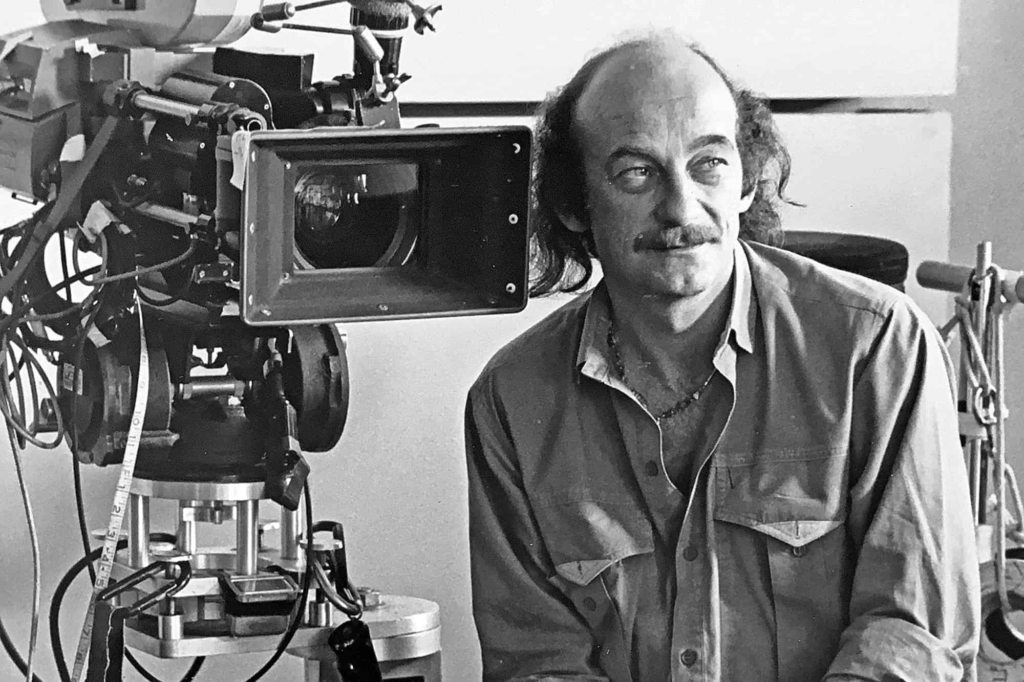
Peter Biziou is a legend I’ve always admired. Before tackling this, he’d already won an Oscar for Mississippi Burning. If you look at his resume, he was the perfect hire for this. Both films deal with systemic injustice and racial or political tension, and Biziou has this specific way of lighting that leans into gritty realism without making it look like a mistake. He doesn’t do flashy, “look at me” camera moves. Instead, he focuses on a kind of observational intimacy. He lets the performances breathe. It’s a philosophy I try to steal for my own work: finding the truth in the light, or often, the lack of it.
Inspiration Behind the Cinematography
To me, the look of In the Name of the Father feels ripped straight from 1970s photojournalism. The setting “The Troubles” in Northern Ireland demanded a documentary feel. You can’t shoot 70s Belfast or an economic slump in London with glossy, Hollywood lighting. It would feel like a lie.
I suspect Biziou and Sheridan spent a lot of time looking at news photographs and conflict photography from guys like Don McCullin. They stripped away the cinematic artifice. The opening sequence in Belfast is a prime example: British security forces mistake Gerry for a sniper, sparking a massive riot. It’s chaotic, messy, and terrifying. I recently watched a breakdown by a former Belfast resident who lived through this era, and he noted that the depiction of the “snatch squads” was terrifyingly accurate. The film captures that grime and fear because it treats the camera like a war correspondent, not a movie prop.
Camera Movements
The camera work here is all about restraint. You won’t find sweeping crane shots or indulgent dolly moves just for the sake of it. Biziou uses a specific palette of movements that put us right in Gerry Conlon’s headspace.
In those early Belfast scenes, the camera is handheld, shaky, and reactive. It has that vérité energy. It breathes and shakes, mirroring the instability of Gerry’s life. It feels like the operator is just trying to keep up with the riot, which grounds the action in reality.
But once the handcuffs go on, the visual language slams the brakes. The camera becomes deliberate, static, and heavy. We get slow, methodical tracking shots down narrow prison corridors. The stillness creates this unbearable sense of confinement. When the camera does move, it’s usually a slow push-in during key emotional beats like the quiet moments between Gerry and his father, Giuseppe. These subtle moves draw us into their internal world without screaming “dramatic moment.” It’s a dance between the chaos of the streets and the deadening control of the prison.
Compositional Choices
Biziou’s framing is deceptively simple but incredibly smart. He uses the 1.85:1 aspect ratio to trap his characters. The film is full of negative space and aggressive leading lines that scream “oppression.”
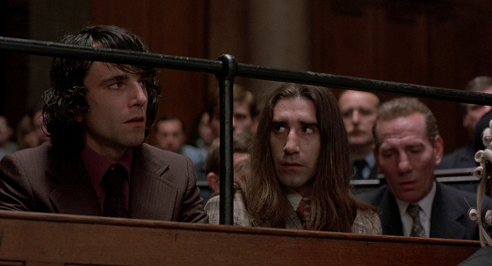
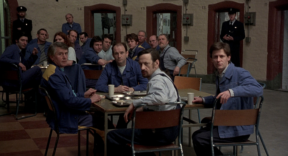
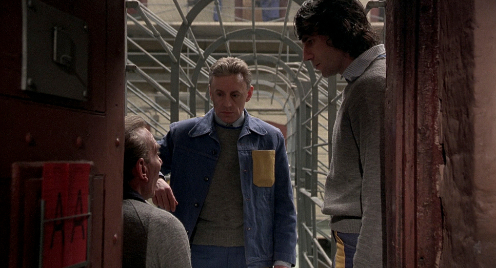
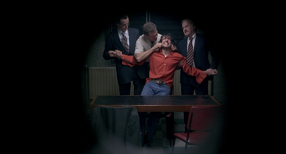
In the prison, notice how often characters are framed by bars, grates, or the hard geometry of the cell blocks. It’s a visual cage. Windows are rarely clear; they’re dirty, high up, or obscured, reminding us how far away the real world is. Biziou saves his close-ups for the moments that really hurt, like the interrogation scenes where Day-Lewis is being broken down. The frame gets tight, forcing you to look at the damage.
I love the mid-shots used for Gerry and Giuseppe. Biziou often frames them slightly off-center, crowding them together in their tiny cell. As Giuseppe gets sicker, the framing seems to get even tighter, suffocating them. The deep focus in the wider shots creates a stark contrast you see these two small men against an endless, repetitive row of cells. It makes them look insignificant against the system, which is exactly the point.
Lighting Style
The lighting is almost a character in itself. Biziou champions motivated lighting here meaning every light source feels like it’s coming from a practical lamp, a window, or a streetlamp.
In Belfast, the light is harsh, diffused, and overcast. It feels like a permanent gray day. But inside the prison, Biziou isn’t afraid of the dark. The interiors are dramatically underexposed. He uses single, harsh sources bare bulbs or fluorescent strips to create deep shadows. In modern HDR workflows, we’re often obsessed with retaining shadow detail, but Biziou lets the blacks get crushed. It feels heavy.
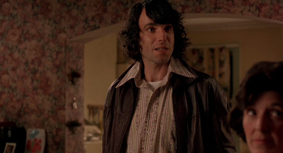
Even the “warm” moments between father and son aren’t exactly cozy; they’re just slightly less hostile than the corridors. The light sculpts their faces, highlighting their gauntness. It’s high-contrast, often leaving half a face in total shadow, which is a great visual metaphor for the moral murkiness of the legal system. It’s not flattering lighting; it’s honest lighting.
Lensing and Blocking
Technically, the film sticks to a very natural focal range likely between 28mm and 50mm on 35mm film. This avoids the distortion of super-wide lenses or the flattening effect of long telephoto lenses. It mimics the human field of view.
The wider lenses in the prison yard emphasize the scale of the walls, while the 50mm range handles the intimate dialogue. It puts the viewer in the room, rather than observing from a distance.
Blocking becomes crucial because of this lens choice. In a small cell, where do you put the actors? Initially, Gerry and Giuseppe are physically distanced in the frame, reflecting their strained relationship. As they bond, the blocking brings them physically closer. In the interrogation rooms, Gerry is often seated low, dwarfed by standing officers, or separated by tables. When he finally starts fighting back legally, his blocking shifts he stands up, he takes up more frame, he asserts himself. It’s subtle, but your brain picks up on the power shift.
Color Grading Approach
As a colorist, this is the stuff I geek out on. The grade or rather, the photochemical timing, given this was 1993 is a lesson in density.
The palette is aggressively desaturated. It’s almost sepia-toned, but cooler. We’re talking dull greens, grays, and browns the colors of institutional decay. It’s not black and white, but it barely remembers what color looks like. This lack of saturation reflects the draining of life and hope.
The contrast curve is fascinating. The blacks are thick and rich (likely printed down), while the highlights have that gentle film roll-off. There’s no “digital clip” here. Even the brights feel a bit tired, like the light can’t quite cut through the gloom. Hue separation is minimal; skin tones often blend into the muddy background walls.
If I were grading a remaster of this today, I’d fight to keep that “dirty” look. I’d preserve the film grain structure and avoid cleaning it up too much. The texture is part of the story. It’s an “anti-beauty” grade, which paradoxically makes it perfect.
Technical Aspects & Tools
In the Name of the Father – Technical Specs
| Genre | Drama |
|---|---|
| Director | Jim Sheridan |
| Cinematographer | Peter Biziou |
| Production Designer | Caroline Amies |
| Costume Designer | Joan Bergin |
| Editor | Gerry Hambling |
| Time Period | 1970s |
| Aspect Ratio | 1.85 – Spherical |
| Format | Film – 35mm |
| Lighting Type | Daylight, Overcast |
| Story Location | … Europe > United Kingdom |
| Filming Location | … Dublin > Kilmainham Jail, Dublin, County Dublin, Ireland |
| Camera | JDC Camera |
| Lens | JDC |
Since we are talking 1993, this is pure analog filmmaking. They used JDC cameras (modified crystal-sync cameras popular in the UK then) and 35mm film. Biziou likely used tungsten-balanced stock for the interiors, maybe pushing the ISO to get that grain and exposure in the dim cells.
The lighting package would have been old-school HMIs for the window light, tungsten fresnels for the interiors, lots of flags to shape the shadows. This wasn’t done with LED panels and an iPad. The “grade” was baked in at the lab through chemical processes and printer lights.
And while it’s not strictly cinematography, the sound design does a lot of work filling in the visual gaps the clanging doors and muffled shouts make the prison feel enormous even when the camera is tight on a face.
- Also read: LA HAINE (1995) – CINEMATOGRAPHY ANALYSIS
- Also read: WILD TALES (2014) – CINEMATOGRAPHY ANALYSIS
Browse Our Cinematography Analysis Glossary
Explore directors, cinematographers, cameras, lenses, lighting styles, genres, and the visual techniques that shape iconic films.
Explore Glossary →