It’s easy to get lost in the technical weeds, but every so often, a film comes along that reminds me why I fell in love with this craft in the first place. The Iron Giant (1999) is one of those films.
It’s easy to dismiss animated features as “just cartoons,” but Brad Bird’s 1999 debut is a serious piece of filmmaking. It’s a lesson in visual storytelling that rivals any live-action drama. For me, it’s not just a nice movie; it’s a case study in how visual decisions lighting ratios, color temperature, and lens choice can manipulate an audience just as effectively as dialogue. From its period-accurate aesthetic to the seamless blend of hand-drawn and CGI assets, every choice guides us through a story of fear, friendship, and the choice to be who you want to be.
About the Director as Cinematographer

In animation, “cinematography” is a bit of a misnomer because you don’t have a physical set. However, the role is just as critical. While Brad Bird directed, we have to give credit to the layout supervisor (effectively the cinematographer), Steven Wilzbach. Together, they treated this not like a cartoon, but like a high-budget 1950s live-action feature.
Bird’s vision was personal, stemming from a tragedy involving gun violence, which birthed the core concept: “What if a gun had a soul?” This emotional core drove the visual language. Notice how the Giant shifts from an imposing, jagged silhouette to a soft, rounded protector. Bird was obsessive about the “acting” of the animation; he famously acted out scenes himself. This top-down control means the visual grammar is incredibly cohesive. They didn’t just animate a script; they built a visual world where the camera “feels” weight and momentum, elevating it way above standard Saturday morning fare.
Inspiration Behind the Cinematography
The visual inspiration here is overtly nostalgic, but it’s specific. It’s not just “old school”; it’s a deliberate nod to the CinemaScope era of the 1950s. The team studied the widescreen compositions of the time to capture that broad, epic feel.
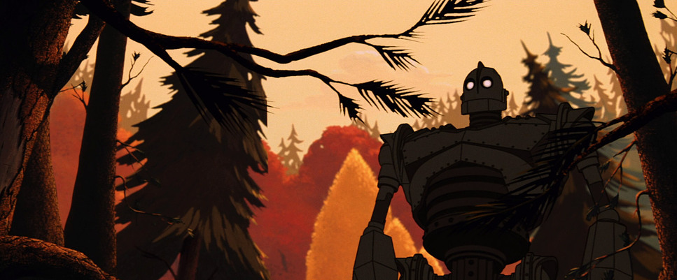
Contrary to the “dark and gritty” trend we see in modern reboots, this film leans heavily into Norman Rockwell’s Americana. It’s idyllic on the surface diners, white picket fences, vast forests but undercut with the paranoia of the Cold War. From the opening shot of Sputnik, the visual language links the alien arrival with the very real fear of nuclear annihilation. It creates a powerful juxtaposition: the warmth of the setting versus the cold, metallic threat of the unknown. It’s a foundational choice that grounds a fantastical robot in a reality that feels historically tangible.
Camera Movements
In animation, usually, the “camera” is perfect. It glides effortlessly. But in The Iron Giant, the camera has mass. It has inertia. The team worked hard to replicate the imperfections of physical gear.
We see tracking shots following Hogarth on his bike that feel like they are mounted on a physical dolly there’s a slight delay in the pan, a bit of overshooting when he stops. It puts us right there in the woods with him. When the Giant moves, the camera creates a sense of scale by using slower, heavy movements, like a crane shot trying to keep up with a skyscraper.
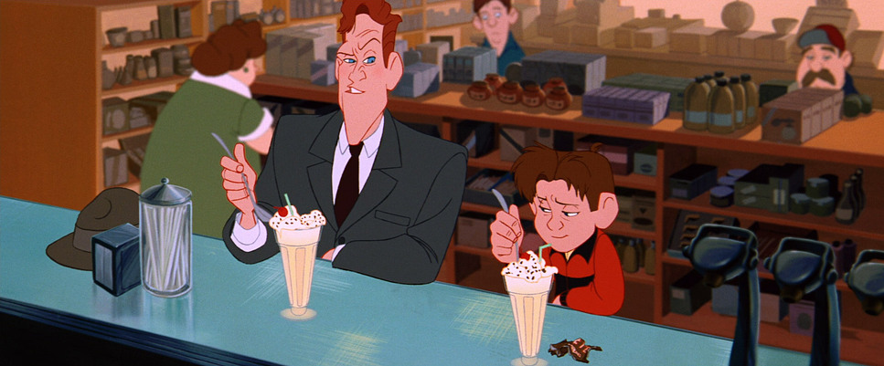
But my favorite detail is the handheld work. Look at the scene where Hogarth drinks the espresso. The camera starts to jitter and shake, mirroring his caffeine-induced mania. Or in the chaotic climax, the framing gets messy and reactive, as if a combat cameraman is trying to survive the action. These “mistakes” are what make the animation feel alive.
Compositional Choices
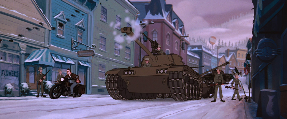
The composition here is architectural. Because they shot this in a 2.39:1 anamorphic aspect ratio, they had a massive horizontal canvas to fill, and they used it brilliantly to establish power dynamics.
The Giant’s size is emphasized by negative space. They often frame Hogarth in the bottom corner of a wide shot, with the Giant taking up the rest, or looming out of frame. It makes Hogarth look tiny, which paradoxically makes his courage look bigger.
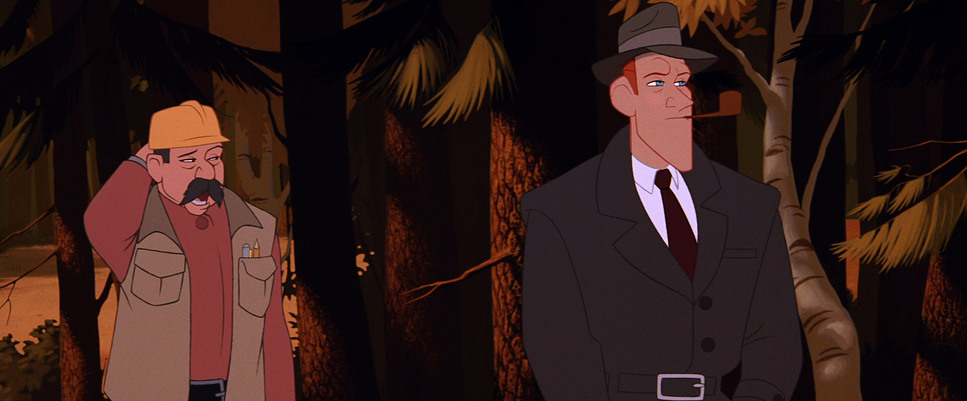
They also play with the “Rule of Thirds” in interesting ways. In moments of peace, the framing is balanced and symmetrical. But when Kent Mansley (the government agent) enters the frame, the composition often becomes claustrophobic. He’s frequently framed through windows, car windshields, or in tight corridors, visually reinforcing his narrow-minded xenophobia. Meanwhile, Hogarth and the Giant are given the open sky. It’s a subtle cue, but it tells your brain who to trust before they even speak.
Lighting Style
As a colorist, lighting is usually where I spot the difference between cheap and expensive production. The Iron Giant is lit like a drama. The lighting isn’t flat; it’s motivated and directional.
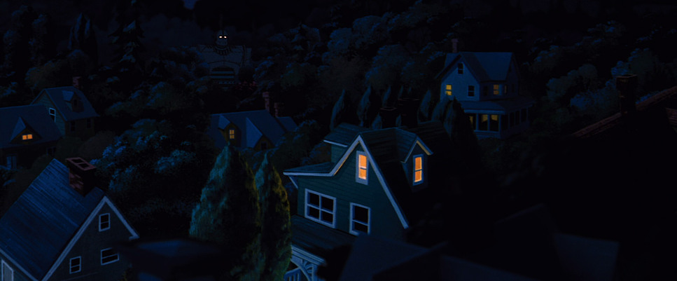
They use practical sources beautifully the warm glow of a flashlight under a blanket, the harsh beam of a car headlight cutting through the fog, or the dappled sunlight filtering through the autumn leaves. It gives the woods a sacred, almost cathedral-like vibe during the bonding scenes.
The contrast ratios are also pushed. They aren’t afraid of the dark. When the Giant’s “defense mode” kicks in, we switch to high-contrast, low-key lighting. The friendly robot disappears into shadow, and all we see are the glowing eyes and the silhouette of a weapon. It’s classic Chiaroscuro. They treat light as an emotional tool: soft and wrapping for safety, hard and rim-lit for danger.
Lensing and Blocking
Even though there are no glass lenses involved, the layout team simulated specific focal lengths to drive the story.
They use wide-angle distortion to sell the Giant’s scale. When the Giant leans down to Hogarth, the perspective distorts slightly, making the robot feel massive and distinct from the background. Conversely, for the emotional beats, they simulate telephoto lenses. The background compresses, the depth of field becomes shallow (blurring the forest behind them), and we are forced to focus solely on the connection between the boy and the machine.
The blocking where characters stand is just as precise. Initially, there is physical distance between the two leads. As the film progresses, the blocking tightens. By the end, they effectively share the same visual space. Mansley, however, is almost always blocked aggressively; he moves in straight lines and invades personal space, visually disrupting the harmony of the scene.
Color Grading Approach
Here is where I geek out. A lot of people misremember this film as having a “muted” palette. I disagree. If you look at the scopes, this film is rich, warm, and highly saturated specifically in the red and orange vectors.
It evokes the look of 1950s Kodak Ektachrome film stock. The reds of the barn, the rust on the Giant (before he repairs himself), and the vibrant oranges of the Maine autumn foliage are punchy. It’s not digital neon; it’s analog warmth. It feels like a Rockwell painting come to life.
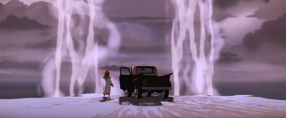
We see a classic warm/cool separation. The “safe” world of Hogarth is bathed in gold, amber, and earth tones. The “threat” (the military, the ocean at night, space) is rendered in steely blues, cyans, and cold greys. As a colorist, I love the highlight roll-off they emulated. It’s not a harsh digital clip; the whites bloom slightly (halation), mimicking how vintage lenses react to bright light. It creates a nostalgic haze that softens the image, making the CGI Giant sit naturally inside the hand-drawn world.
Technical Aspects & Tools
| Genre | Adventure, Animation, Family, Fantasy, Science Fiction |
|---|---|
| Director | Brad Bird |
| Cinematographer | Steven Wilzbach |
| Editor | Darren T. Holmes |
| Time Period | 1950s |
| Color | Warm, Saturated, Red, Orange |
| Aspect Ratio | 2.39 – Anamorphic |
| Format | Animation |
The technical execution was revolutionary for 1999. The film blends traditional 2D hand-drawn characters with a 3D CGI Giant. The challenge was making sure the robot didn’t look like a shiny plastic toy dropped into a 2D painting.
To solve this, they wrote software to “wobble” the lines of the CGI model, introducing microscopic imperfections so it matched the hand-drawn line work of the other characters. This “Toon Shading” technique was groundbreaking.
And we have to talk about the effects. The visual effects animator Michel Gagné (not “Donnier” as some AI bots might tell you) brought an incredible energy to the film. His design for the energy blasts and explosions wasn’t realistic fire; it was stylized, bubbling, kinetic art that fit perfectly with the retro-futuristic aesthetic. It bridged the gap between the CGI and the painted backgrounds seamlessly.
- Also read: THE GREEN MILE FILM STILLS
- Also read: MEMORIES OF MURDER (2003) – CINEMATOGRAPHY ANALYSIS
Browse Our Cinematography Analysis Glossary
Explore directors, cinematographers, cameras, lenses, lighting styles, genres, and the visual techniques that shape iconic films.
Explore Glossary →