Akira Kurosawa’s High and Low might look like a standard police procedural on the surface, but if you shut off the dialogue and just watch the light, it reveals itself as a masterclass in visual psychology.
While everyone talks about Kurosawa’s samurai epics, High and Low is the film that actually changed how I look at the camera: not just as a recorder of events, but as an active participant in the moral decay of its characters. For me, this film isn’t just a classic; it is a textbook on how precise visual choices can elevate a story beyond a simple crime thriller into a study of the human condition.
About the Cinematographer
Cinematography in a Kurosawa film is never just about one technician; it’s a collective vision with the director acting as the ultimate maestro. For High and Low, Kurosawa collaborated with two legends: Takao Saitō and Asakazu Nakai.
Saitō, a long-time collaborator, famously said, “Fundamentally, the camera is not a player, it is there to record all that ought to be recorded and nothing more.” But looking at the final image, I don’t interpret this as a call for simplicity. It’s a philosophy of discipline. Their work implies a deep respect for the story, avoiding flashy camera moves in favor of a clear, purposeful gaze. It’s an approach that creates a visual style that feels both timeless and startlingly modern technical excellence used solely to support the narrative weight.
Inspiration Behind the Cinematography
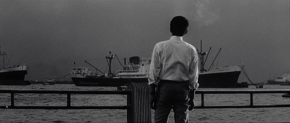
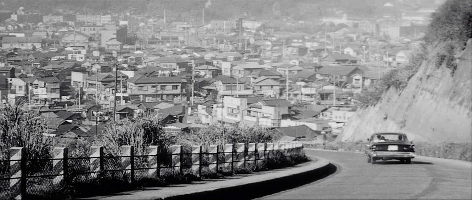
The visual backbone of High and Low rests on the stark division implied by its Japanese title: Heaven and Hell. There is a clear duality here the rich man on the hill (Gondo) and the criminal sweating in the heat below. It’s a concept Kurosawa adapted from Ed McBain’s King’s Ransom, but he used it to dissect the social and economic friction of 1960s Japan.
Visually, I see a blend of American film noir’s chiaroscuro and the psychological depth of German Expressionism. The opening scenes, confined to Gondo’s air-conditioned, luxurious apartment, establish a claustrophobic tension a gilded cage. This contrasts violently with the later sequences in the city’s underbelly, a world that feels sweltering and chaotic, almost like a Bosch painting come to life. The journey from “high” to “low” isn’t just a location change; it’s a shift in texture, lighting, and atmosphere designed to externalize the internal conflict between Gondo’s moral struggle and the kidnapper’s envy.
Camera Movements
Despite Saitō’s claim that the camera “is not a player,” the camera in High and Low feels incredibly alive. In the apartment sequences, the camera is restless, often frenzied. It doesn’t just sit there; it paces. It feels like an extension of Gondo’s own anxious mind. Kurosawa employs long takes here not to show off, but to let the tension rot in the room, forcing us to sit in the discomfort alongside the characters.
Watch the early moments in the living room: the camera performs slow, deliberate dollies and subtle re-frames that almost imperceptibly shift our focus. It highlights unspoken tensions without cutting. However, when the film transitions to the police procedural aspect, the movement shifts gears entirely. It becomes utilitarian, almost documentary-like. We are pulled through crowded streets and tight alleyways, replicating the relentless, methodical nature of the hunt. These aren’t random choices; they are distinct visual languages for two different worlds the psychological torture of the victim and the collective action of the law.
Compositional Choices
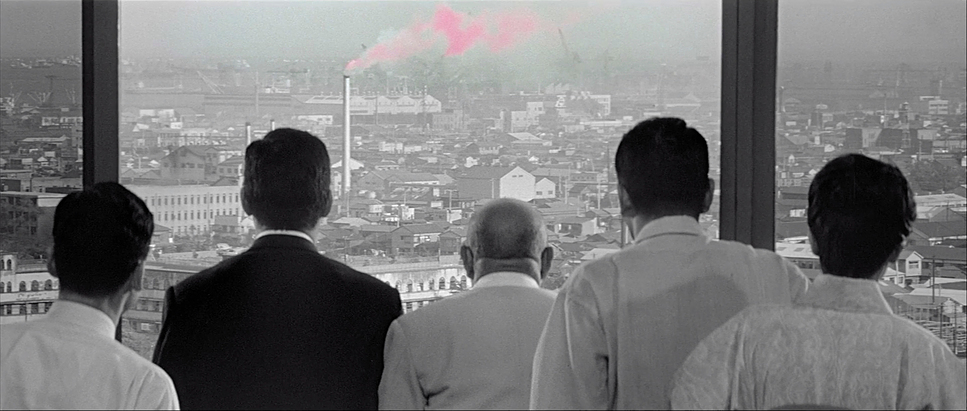
Kurosawa’s use of the TohoScope widescreen aspect ratio (2.35:1) is, frankly, some of the best anamorphic work in cinema history. He doesn’t just fill the frame; he sculpts it. The wide canvas allows for incredibly intricate blocking, especially in those drawn-out scenes within the apartment.
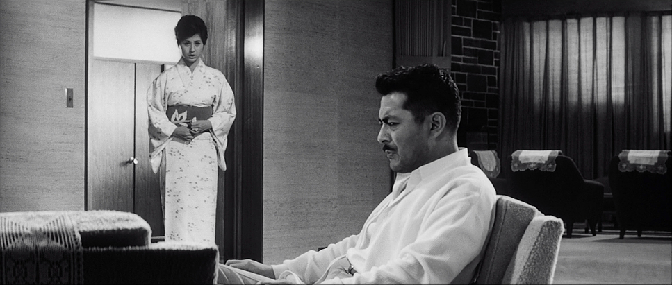
He stages multiple actors in deep focus, using foreground elements and spatial relationships to map out power dynamics without a single line of dialogue. Consider the meeting with the corporate executives: Gondo is often framed slightly apart, or pushed to a different depth plane, visually cementing his isolation before he even speaks a word of opposition. The widescreen format pulls our eyes from foreground action to background reactions, creating a layered quality where every square inch of the negative is working for the story. It teaches us that negative space and the balance of bodies are just as important as the actors’ faces.
Lighting Style
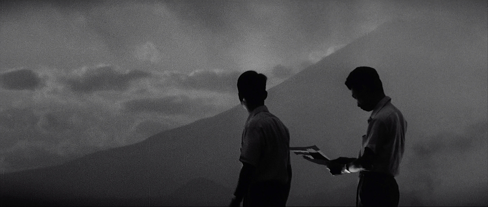
The lighting in High and Low is a lesson in motivation. It draws from noir conventions but feels evolved. The visual shift from the “high” to the “low” is defined by luminance. In Gondo’s apartment, the lighting is broad, bright, and clinical reflective of his financial power but also the harsh, exposing nature of his dilemma. Yet, even here, shadows begin to creep in as his moral certainty fractures.
Once we descend into the city’s “inferno,” the lighting turns gritty. Streetlights slash through the darkness, creating high-contrast pockets of deep shadow. The sequences in the drug alley are particularly striking; the lighting stops trying to reveal and starts trying to conceal. It’s a world where visibility is limited, forcing police to cut through the murky atmosphere with flashlights. This isn’t just aesthetic; it’s atmospheric storytelling. The “low” is a place where morality is compromised, and the lighting or lack thereof reflects that perfectly.
Lensing and Blocking
While we don’t have the exact camera logs, the visual evidence suggests a thoughtful interplay of focal lengths. Kurosawa seems to favor wider glass for establishing the geometry of the apartment, allowing for that incredible deep-focus blocking.
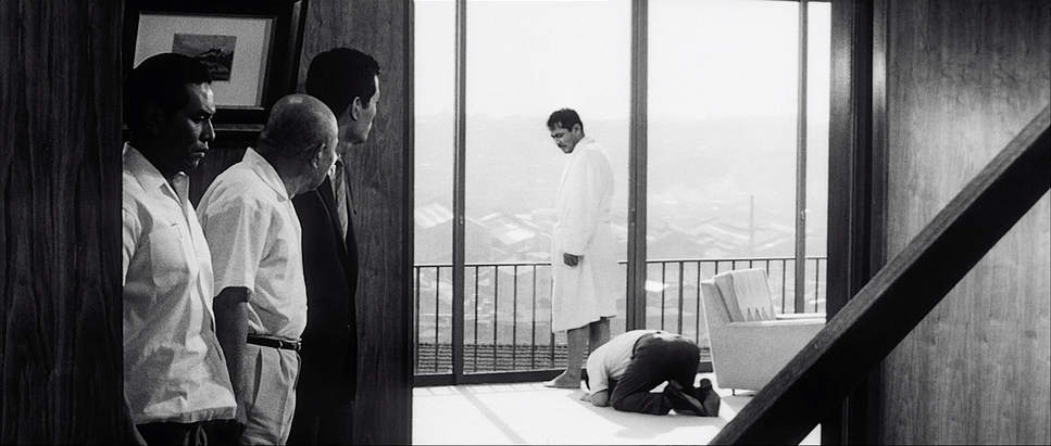
The staging is astonishing. Every movement of the characters feels designed. Mifune and the other actors are constantly shifting, creating dynamic compositions within single, prolonged takes. It’s a subtle ballet where spatial relationships communicate tension Gondo moving to the window to look down at the city effectively isolates him from the police officers confined to the center of the room. This meticulous blocking ensures that even in a dialogue-heavy film, the visual engagement never drops. It plays out like a perfectly choreographed stage play, but with the control that only cinema allows.
Color Grading Approach
As a colorist, I find the concept of “grading” in a black-and-white film fascinating. We aren’t dealing with hue, but we are absolutely shaping the tonal palette, the contrast curve, and the texture.
When I look at High and Low, I see a deliberate manipulation of dynamic range. The bright whites of Gondo’s apartment represent the “Heaven” they are clean, perhaps even sterile. This is balanced against the “Hell” below, where the contrast becomes aggressive. In the lower depths, the blacks are crushed harder, and the highlights feel harsher, creating a visceral, gritty texture.
This is “tonal sculpting” at its finest. The film stock’s natural grain structure (likely a slower ASA stock for the interiors to keep it clean, and perhaps pushed in development for the night exteriors) adds a tactile quality you just can’t get digitally. The highlight roll-off in the bright windows feels organic, while the shadows in the slums retain just enough detail to feel dangerous rather than empty. It’s a reminder that even without color, you can paint with density and exposure to convey maximum emotional weight.
Technical Aspects & Tools
High and Low (1963) — Technical Specifications
| Genre | Crime, Drama, Mystery, Thriller, Courtroom Drama, Film Noir, Police |
|---|---|
| Director | Akira Kurosawa |
| Cinematographer | Asakazu Nakai, Takao Saitō |
| Production Designer | Yoshirô Muraki |
| Costume Designer | Miyuki Suzuki |
| Editor | Akira Kurosawa |
| Time Period | 1960s |
| Color | Desaturated, Black and White |
| Aspect Ratio | 2.35 – Anamorphic |
| Format | Film – 35mm |
| Lighting | Hard light, Top light |
| Lighting Type | Artificial light, Tungsten |
| Story Location | Japan > Yokohama |
| Filming Location | Japan > Yokohama |
Shot in TohoScope, Kurosawa fully embraced the anamorphic format. While the specific gear isn’t documented in detail, the stability and fidelity suggest robust 35mm cameras, likely Mitchell or Arriflex models standard for that era.
The choice of black and white stock was almost certainly an artistic decision as much as a technical one. Different stocks resolve contrast differently, and Kurosawa clearly chose an emulsion that could handle the wide dynamic range required to bridge the two worlds of the film. The discipline required to achieve this level of focus and exposure precision without modern monitoring or digital playback speaks volumes about the skill of the crew.
- Also read: JUDGMENT AT NUREMBERG (1961) – CINEMATOGRAPHY ANALYSIS
- Also read: COME AND SEE (1985) – CINEMATOGRAPHY ANALYSIS
Browse Our Cinematography Analysis Glossary
Explore directors, cinematographers, cameras, lenses, lighting styles, genres, and the visual techniques that shape iconic films.
Explore Glossary →