It’s strange how a film can win Best Picture, rake in a fortune, and still feel somewhat underrated in cinematic discussions. The Sting suffers from the unique problem of being sandwiched historically between the two Godfatherfilms, which often dominate the conversation about 70s cinema. But dismissing it as merely “light entertainment” misses the point. For me, looking at this through the lens of a colorist and filmmaker, The Sting is a masterclass in visual discipline. It demonstrates how choices from the glass on the front of the camera to the dyes in the wardrobe can craft a cohesive world. The film radiates “cool,” but that cool isn’t accidental; it’s engineered by incredibly thoughtful cinematography.
About the Cinematographer
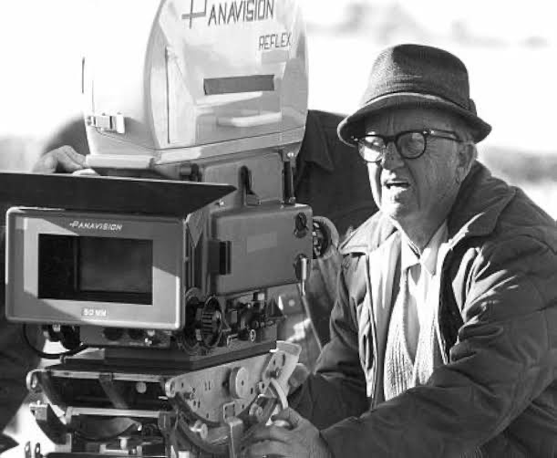
The architect of this look was the legendary Robert Surtees. By the time he shot The Sting, Surtees was already a titan who bridged the Golden Age and New Hollywood. He was a multi-Oscar winner known for his versatility, having lensed everything from the gritty noir of The Bad and the Beautiful to the sweeping 65mm epic Ben-Hur.
He brought a tremendous depth of experience to this project, but what makes his work here special is his restraint. His style wasn’t about flashy theatrics; it was about serving the story with precision. He had a knack for making complex setups feel effortlessly natural a necessity for a film relying on intricate cons and the charisma of Paul Newman and Robert Redford. Working with director George Roy Hill, Surtees orchestrated a visual symphony that is understated, classic, and technically flawless.
Inspiration Behind the Cinematography
George Roy Hill wasn’t just making a film set in the 1930s; he was striving to evoke the spirit of 1930s cinema. This distinction informed every visual decision. You see it immediately in the opening frames, where Hill utilized the vintage Universal logo to announce the nostalgic tone before a single scene played out.
This went deeper than retro aesthetics; it was about narrative immersion. Hill researched Old Hollywood gangster films of the era and noticed a distinct minimalism specifically, that scenes weren’t cluttered with unnecessary extras. He brought that approach to The Sting, creating a focused, almost theatrical atmosphere where the main players command the frame.
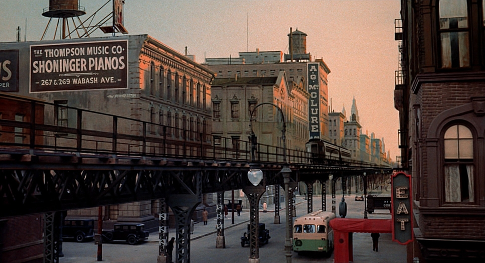
Crucially, Hill, Surtees, and art director Henry Bumstead devised a strict color scheme of muted browns and maroons. This was a deliberate move away from the vibrant, primary-heavy palette common in the early 70s. It grounds the film in a subdued, vintage reality. It tells you immediately that you are entering a specific, carefully constructed past. This wasn’t an accident of the film stock; it was a conscious, collaborative decision to shape the audience’s perception from frame one.
Camera Movements
If you watch The Sting expecting aggressive, show-stopping camera moves, you’ll be disappointed. But that stillness is part of its brilliance. The camera acts as a silent partner in the con subtly guiding your eye, directing your attention, and occasionally misdirecting it. The film is structured like a con on the audience, and the camera often aids this by lingering on the wrong person or cutting just before a sleight of hand creates a plot twist.
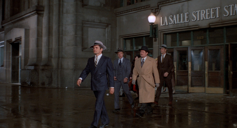
The movement is defined by smooth, purposeful dollies and elegant pans, likely achieved using the heavy, studio-standard Mitchell BNCR camera. These moves are motivated by character action or the need to reveal information, rather than drawing attention to the cinematography itself. In the “big con” sequences, the camera plays a vital role in establishing the geography of the grift, tracking characters through complex spaces like the betting parlor to ensure the audience can follow the moving pieces of the scam.
When the camera does push in, it’s gentle emphasizing a moment of doubt or realization on a character’s face. It mirrors the classic Hollywood style of the 30s, lending an air of timeless sophistication to the storytelling.
Compositional Choices

Surtees’ compositions favor balanced, meticulously organized frames. This attention to geometry is vital in a film where every glance and shift in posture holds narrative weight.
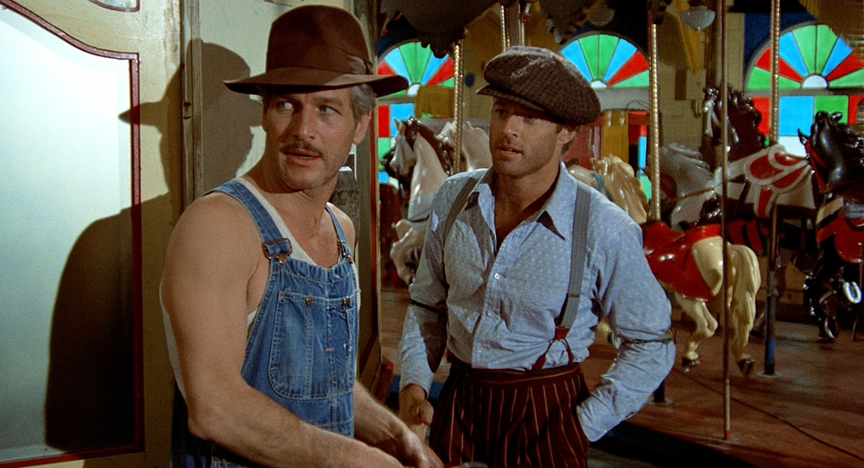
Characters are often framed within architectural elements doorways, windows, or the structured lines of a train car—creating natural depth and anchoring them in the environment. This grounds the sprawling narrative, making the world feel tangible. The framing also subtly reinforces the dynamic between the leads: Newman, the seasoned pro, is often composed in a way that dominates the space, while Redford, the rookie, is positioned as reactive. Surtees sells this mentorship dynamic purely through blocking and lens choice, bridging the relatively small real-life age gap between the actors.
While some might describe the visuals as “dull” compared to the experimentalism of the 70s, I argue this is a deliberate classicism. It prioritizes clarity and elegance over flash. It allows the performances and the intricate plot to take center stage, which is exactly what a procedural about elaborate cons requires.
Lighting Style
The lighting scheme is a fascinating hybrid, blending period authenticity with modern technique. Surtees and Hill devised a look that combined the hard-light theatricality of the 1930s with the softer, more naturalistic approach of the 1970s.
Surtees understood that 1930s lighting relied on strong key lights and a heightened sense of drama, but he softened it for the color negative, preventing it from looking like a stage play. There is a beautiful use of motivated light throughout; illumination streams through windows or spills from practical lamps, giving every shot a sense of place.
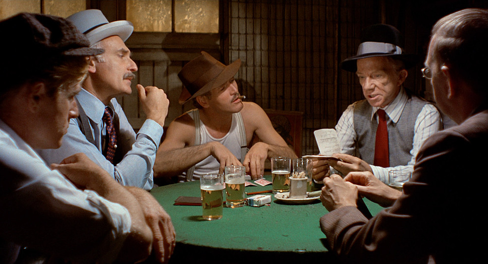
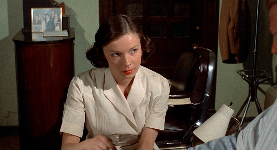
The contrast shaping is superb. It’s not a full-blown noir, but the darker, conspiratorial scenes echo that era’s approach. Shadows are used strategically to add mystery without obscuring the performances. Faces are sculpted to emphasize the sharp features of the leads and the menacing presence of Robert Shaw’s Doyle Lonigan. The poker scenes are a highlight, where the interplay of light and shadow adds to the tension and the illicit feel of the room. It’s a sophisticated balance bright enough to be inviting, but moody enough to convey the risk.
Lensing and Blocking
To achieve that specific period look, Surtees didn’t rely on modern, clinical glass. He utilized Bausch and Lomb Super Baltar lenses. These vintage primes are famous for their distinct personality they aren’t overly sharp, and they render skin tones with a creamy, flattering quality that fits the romanticized version of the 30s perfectly. You don’t see exaggerated distortion from ultra-wides; instead, we get a natural field of view (likely 35mm, 50mm, and 75mm focal lengths) that lets the production design breathe.
Blocking is where the film truly excels. For a story about a multi-layered deception, the placement of characters is paramount. The “big con” is elaborate and convoluted, and the blocking helps the audience decode the many moving parts. Hill and Surtees choreographed movement to control information flow, positioning characters to reveal or conceal elements of the scam as needed.
Consider the physical presence of Robert Shaw. His character’s limp actualized by a real-life racquetball injury Shaw sustained before filming was incorporated into the blocking. Hill felt it added a gritty texture to the character, and the way Shaw is blocked to navigate the space emphasizes his menace without needing excessive dialogue.
Color Grading Approach
From a colorist’s perspective, The Sting is a study in tonal discipline. The mandate for “muted browns and maroons” serves as the visual cornerstone. This isn’t just about art direction; it’s about how the film stock was exposed and processed to support that palette.
This choice rejects the vibrant, saturated “pop” that was emerging in 70s cinema. The browns evoke the worn textures of suits and wood-paneled offices, while the maroons provide richness without breaking the period illusion. The dynamic range is managed organically highlights roll off gently, retaining detail without clipping, and shadows are deep but rich, avoiding the crushed digital black we often see today.
This “print-film sensibility” creates a cohesive image where colors bleed subtly into one another. The hue separation is gentle; skin tones are rendered with a warmth that separates them from the cooler or neutral backgrounds, ensuring the characters remain the focal point. If I were grading this today, the challenge would be resisting the urge to push contrast. The magic is in the mid-tones and that soft, painterly fall-off that makes the world feel lived-in rather than manufactured.
Technical Aspects & Tools
| The Sting – Technical Specifications | |
|---|---|
| Genre | Comedy, Crime, Gangster, Heist, Drama, Gambling |
| Director | George Roy Hill |
| Cinematographer | Robert Surtees |
| Production Designer | Henry Bumstead |
| Costume Designer | Edith Head |
| Editor | William Reynolds |
| Time Period | 1930s |
| Aspect Ratio | 1.85 – Spherical |
| Format | Film – 35mm |
| Lighting | Hard light |
| Lighting Type | Daylight |
| Story Location | … Illinois > Joliet |
| Filming Location | … North America > USA |
| Camera | Mitchell BNCR |
| Lens | Bausch and Lomb – Super Baltar |
Beyond the artistry, the technical execution reveals a commitment to perfection. Shooting on 35mm film (likely an Eastman 5254 stock given the year), the grain structure contributes significantly to the nostalgic feel.
The production went to great lengths for authenticity. The “classic train station” was built from scratch on the Universal backlot, dressed with vintage luggage and rusted beams to fool the eye. Hill’s dedication was absolute; he famously scrapped an entire week’s worth of footage because he felt he could do it better, demanding a reshoot to get the tone exactly right.
Even minor details were technical feats. For the close-ups of Paul Newman’s card manipulation, they brought in legendary sleight-of-hand expert John Skarn as a hand double. This ensures that even in extreme close-up, the mechanics of the con hold up to scrutiny. It’s a testament to a production where every department from camera to props was aligned in creating a seamless illusion.
- Also read: GONE WITH THE WIND (1939) – CINEMATOGRAPHY ANALYSIS
- Also read: DOWNFALL (2004) – CINEMATOGRAPHY ANALYSIS
Browse Our Cinematography Analysis Glossary
Explore directors, cinematographers, cameras, lenses, lighting styles, genres, and the visual techniques that shape iconic films.
Explore Glossary →