Watching Gone with the Wind on a calibrated monitor isn’t just a movie night; it’s a reality check. We get so caught up in what digital tools can do that we forget what was achieved photochemically in 1939. This isn’t just “content”; it’s a masterclass in visual engineering.
Gone with the Wind is an absolute beast of a film. It’s four hours of spectacle that commands the screen with an ambition we rarely see today without a green screen. Watching the high-def Blu-ray transfer, the density of the image is what hits you first it pushes the boundaries of what was technically possible at the time.
And you can’t talk about this production without acknowledging the sheer workload of the director, Victor Fleming. The guy helmed this and The Wizard of Oz in the same year. As one reviewer perfectly put it: “Jesus Christ, two of the biggest iconic films of all time in the same year directed by the same guy, that dude was set for life.” That level of output in the Golden Age isn’t just impressive; it’s practically superhuman.
About the Cinematographer
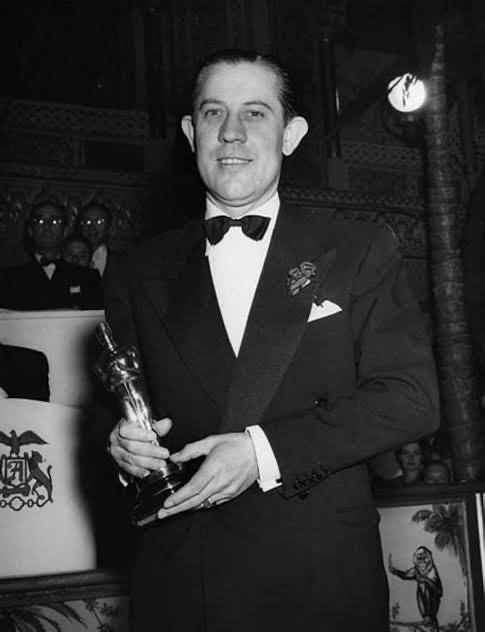
The look of Gone with the Wind came from a heavy-hitter collaboration. Ernest Haller was the visual architect, a Warner Bros. veteran who knew how to light a face to make it iconic. But the secret weapon was Ray Rennahan, the Technicolor expert.
You have to remember, Technicolor wasn’t just a camera; it was a science experiment. It was a massive, three-strip process that required specific light levels and color temperatures just to register an image. Rennahan was there to ensure the physics worked, while Haller focused on the drama. Their collaboration resulted in a visual language that feels like a painting in motion technically rigid but artistically fluid.
Inspiration Behind the Cinematography
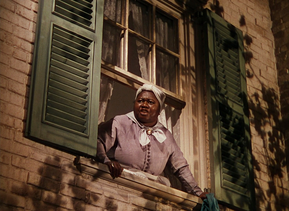
Visually, the film is pure propaganda for the “Lost Cause.” The lighting isn’t subtle about it; it’s designed to mythologize the American South. The opening scenes at Tara are bathed in this golden, ethereal light that screams “paradise.” It frames the plantation as something worth dying for.
There’s a specific moment the “raid” where the men ride out for retribution that highlights this perfectly. In the novel, it’s clearly the Klan. On screen, the cinematography sanitizes it. By stripping away the hoods and framing the men as gallant silhouettes riding into the darkness, the visual language manipulates the audience into rooting for them. It’s a powerful, albeit dangerous, example of how framing and lighting can rewrite history. The technical achievement is undeniable, but we have to acknowledge that these beautiful images were doing some heavy ideological lifting.
Camera Movements
For a film from the late 30s, the camera is surprisingly mobile, but it’s the purpose of the movement that matters. It’s not moving just to move; it’s shifting the narrative scope.
The standout moment is, of course, the crane shot at the train depot. It starts intimate tight on Scarlett and then pulls back. And keeps pulling back. It cranes up to reveal hundreds of wounded soldiers (and no, that’s not a multiplier plugin; the studio literally paid for every single one of those bodies).
Visually, this move does something brilliant: it forcibly shifts the perspective from Scarlett’s selfish internal monologue to the objective horror of the war. It uses the Z-axis to dwarf the protagonist against the scale of the tragedy. It’s a depth cue that hits you in the gut.
Compositional Choices
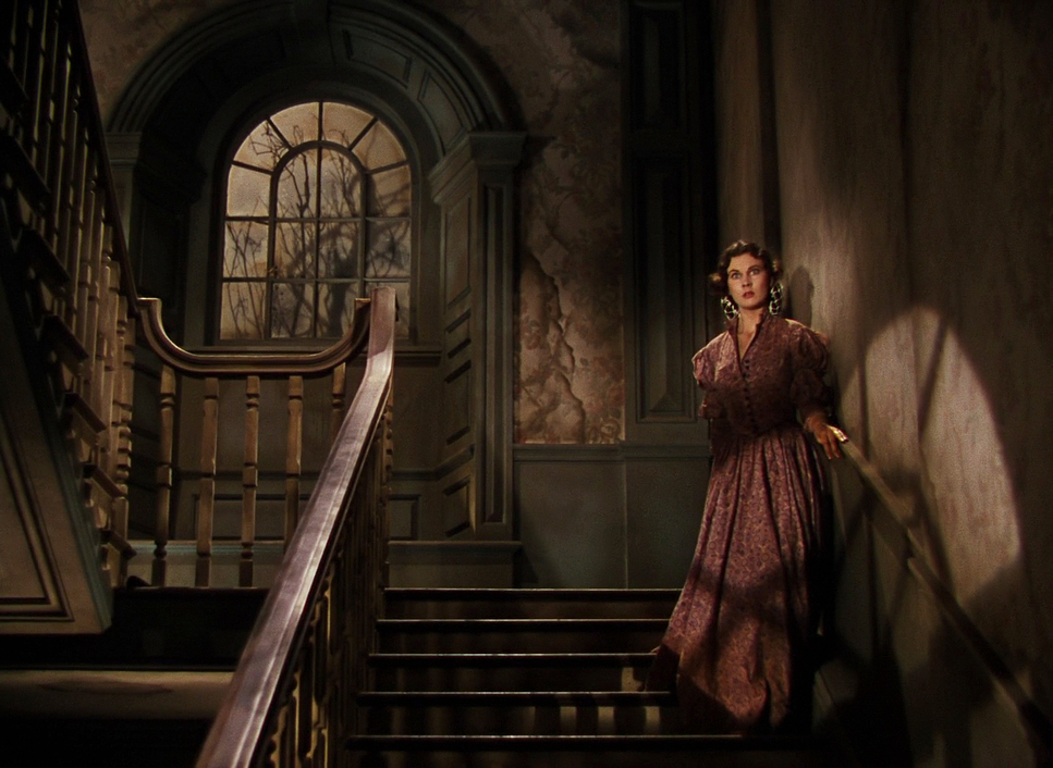
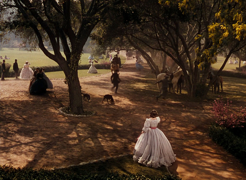
Haller and Fleming leaned hard into classical composition here. We’re talking deep staging and strong foreground-background separation. They pack the frame with information. The wide shots of Tara establish the land as a character itselfvast, resilient, and idealized.
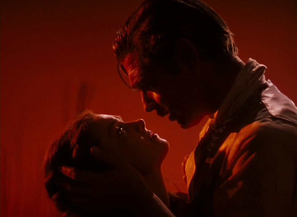
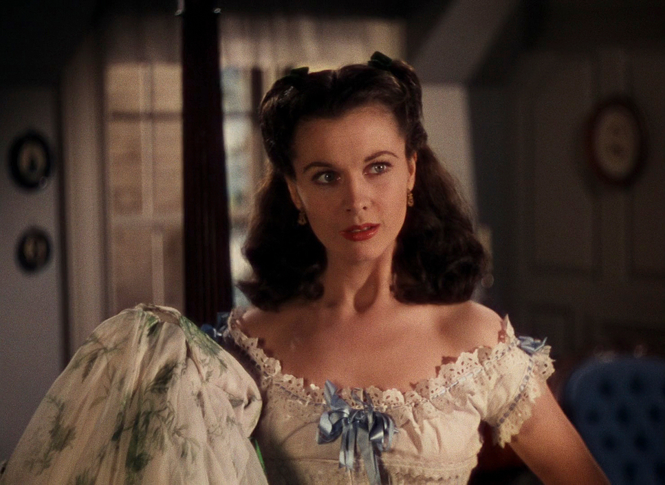
But look at the close-ups. When the camera pushes in on Vivien Leigh or Clark Gable, the background doesn’t just disappear into bokeh; it remains a presence. They also utilized s ilhouettes extensively figures cut against blazing sunsets. It’s a graphic, almost comic-book style choice that turns the characters into icons instantly. These aren’t accidental framings; every element is placed to guide your eye through the hierarchy of the scene.
Lighting Style
Lighting for three-strip Technicolor was brutal. The film speed (ASA) was incredibly slow, meaning you needed an immense amount of light just to get an exposure. This usually forces a flat, high-key look.
But Haller fought against that. He managed to sculpt contrast despite the technical limitations. Look at the burning of Atlanta the flickering light on the faces creates a dynamic, chaotic energy that modern LED panels struggle to replicate.
There’s also a distinct shift in the lighting strategy. The first half is vibrant and high-key. After the intermission, the light gets harder. The shadows get crushed. The “halo” backlighting on Scarlett remains, keeping her the star, but the world around her becomes visually hostile. It’s a great example of lighting the subtext, not just the set.
Lensing and Blocking
They stuck mostly to standard spherical lenses, keeping distortion low and the field of view natural. But the real magic is in the blocking.
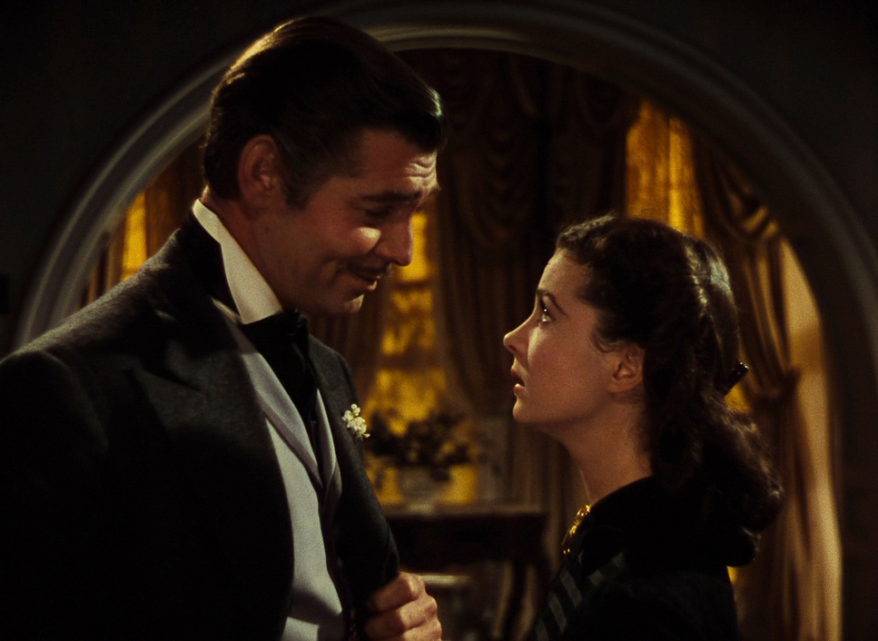
Today, we rely heavily on editing to change the focus of a scene. In GWTW, they used deep focus and actor movement. Watch Clark Gable. He commands the space, physically dominating the frame, often placed centrally or in the foreground to assert power. The choreography between him and Leigh is precise—their physical distance in the frame constantly mirrors their emotional distance. It’s a lost art: letting the actors move through the frame rather than cutting around them.
Color Grading Approach
As a colorist, this is where I geek out. This wasn’t “grading” as we know it no Lift/Gamma/Gain wheels here. This was photochemical timing. The Technicolor process involved three separate black-and-white negatives (one for Red, Green, and Blue records) that were dyed and laminated together.
The result is a hue separation that is absolutely razor-sharp. The primaries the reds of the costumes, the greens of the lawn pop with a hyper-real intensity that digital sensors still struggle to match without breaking. The highlight roll-off is gentle and creamy, avoiding that harsh digital clipping, while the shadows hold a rich density without looking muddy.
The palette evolution is textbook color storytelling. The film starts with warm, inviting analogies. As the war hits, we shift into cooler, desaturated blues and grays, or the violent oranges of fire. This tonal sculpting was baked into the print. Viewing it on a proper Blu-ray transfer is the only way to really appreciate the dye-transfer aesthetic. It’s distinct, thick, and incredibly robust.
Technical Aspects & Tools
| Genre | Drama, Romance, War |
|---|---|
| Director | Victor Fleming |
| Cinematographer | Ernest Haller, Lee Garmes |
| Production Designer | William Cameron Menzies |
| Costume Designer | Walter Plunkett, Elmer Ellsworth, Eugene Joseff |
| Editor | James E. Newcom |
| Time Period | 1800s |
| Color | Warm, Saturated |
| Aspect Ratio | 1.37 – Spherical |
| Format | Film – 35mm |
| Lighting | Edge light |
| Lighting Type | Daylight |
| Story Location | … Georgia > Atlanta |
| Filming Location | … Culver City > Selznick International Studios – 9336 Washington Blvd |
| Camera | Mitchell |
| Lens | Bausch and Lomb |
The technical specs of this production are staggering. The “burning of Atlanta” wasn’t VFX; they literally burned down old studio sets. The pyrotechnics were practical, massive, and dangerous.
Then there are the matte paintings. These were the original set extensions. They blended hand-painted glass elements with live-action footage so seamlessly that, even today, it’s hard to tell where the set ends and the painting begins. It reminds you that “technical masterpieces” aren’t defined by computers, but by ingenuity. They used heavy, blimped cameras and massive arc lights to create a world that felt completely immersive.
- Also read: DOWNFALL (2004) – CINEMATOGRAPHY ANALYSIS
- Also read: MY NEIGHBOR TOTORO (1988) – CINEMATOGRAPHY ANALYSIS
Browse Our Cinematography Analysis Glossary
Explore directors, cinematographers, cameras, lenses, lighting styles, genres, and the visual techniques that shape iconic films.
Explore Glossary →