I re-watched Oliver Hirschbiegel’s Downfall (2004) recently. Most people know this film for the memes the infinite parodies of Bruno Ganz’s shaking hand and screaming fits. But looking at it again through the eyes of a colorist and filmmaker, the craft is terrifyingly disciplined. It doesn’t use cinematography to make war look “epic” or “tragic” in the Hollywood sense. It uses visual language to make you feel physically sick.
As someone who spends days staring at nodes in DaVinci Resolve, I’m usually obsessing over perfect skin tones and separation. Downfall does the exact opposite. It creates a visual autopsy of a regime. It’s ugly, it’s green, and it’s a masterclass in restraint.
About the Cinematographer
The DP, Rainer Klausmann, isn’t interested in showing off here. You don’t see the “look at me” tracking shots you might find in a modern war film like 1917. Klausmann’s approach is almost invisible, which is the hardest thing to pull off.
He treats the subject matter like a journalist documenting a disaster zone. He understands that if you make the lighting too dramatic or the camera moves too smooth, you give the audience an emotional “out” you remind them it’s a movie. Klausmann refuses to do that. He traps you in the room.
Inspiration Behind the Cinematography
The visual reference here is clearly newsreel footage, but elevated. The filmmakers had to walk a tightrope: depict Hitler without making him a caricature, but also without accidentally romanticizing him.
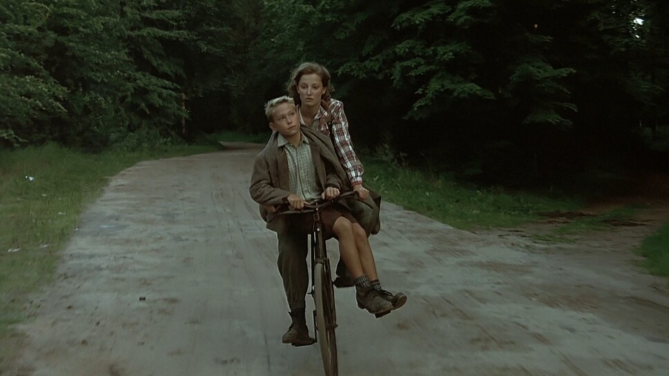
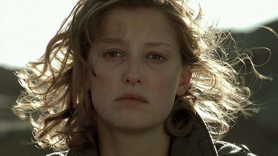
The solution was a documentary aesthetic. The camera becomes a third person in the room perhaps standing in for Trudl Junge, the secretary whose perspective anchors the story. There is a distinct shift in the visual language between the opening scene in 1942 and the bunker in 1945. The 1942 sequence feels cleaner, more composed. By 1945, the image has degraded just like the ideology. It’s grittier, darker, and harder to look at.
Camera Movements
A lot of films use handheld camera work to create fake energy. You know the look shaky cam during a conversation to make it feel “intense.” In Downfall, the handheld work actually makes sense.
It’s reactive. The camera breathes with the actors. When the Russian artillery shells hit above ground, the camera doesn’t just shake; it jars. In the bunker scenes, the movement is subtle, mimicking the natural micro-movements of a human observer trying to keep steady. When Hitler goes into his rants, the camera doesn’t swoop in; it holds tight on his face, swaying slightly, which creates this incredible tension. It feels like the operator is too scared to move.
Compositional Choices
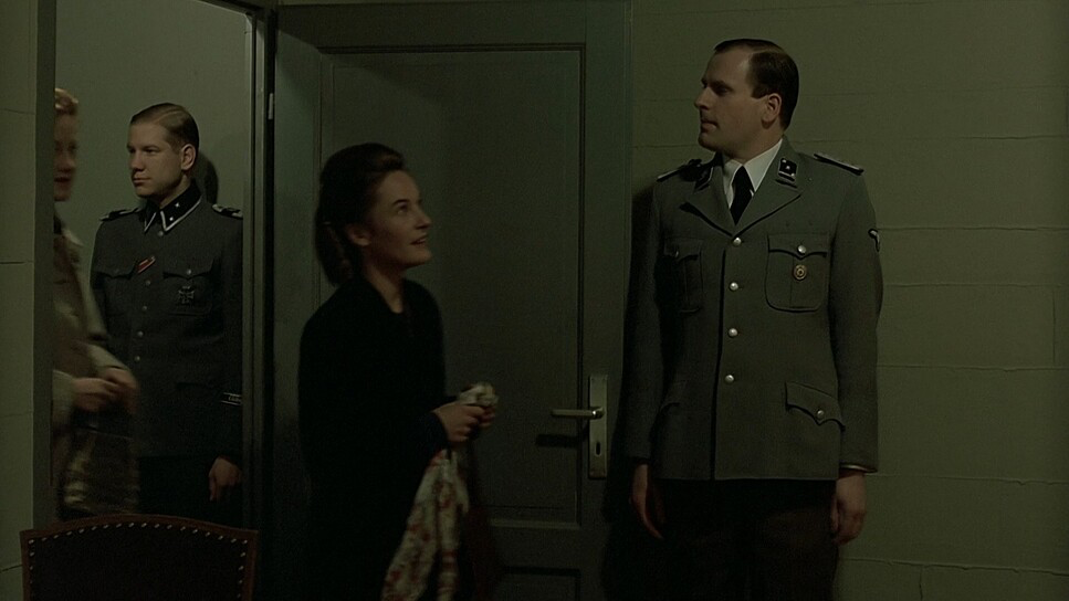
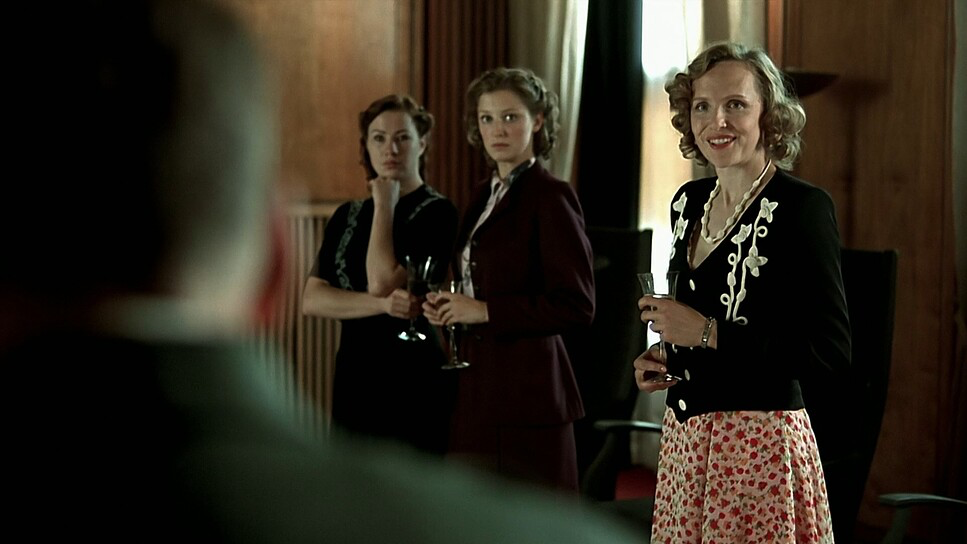
The framing is pure claustrophobia. The bunker has low ceilings, and Klausmann emphasizes this by frequently “short-siding” the characters placing them on the edge of the frame with no “look room” to suggest they have nowhere to go.
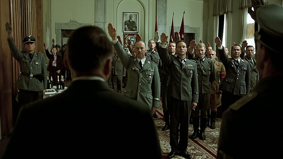
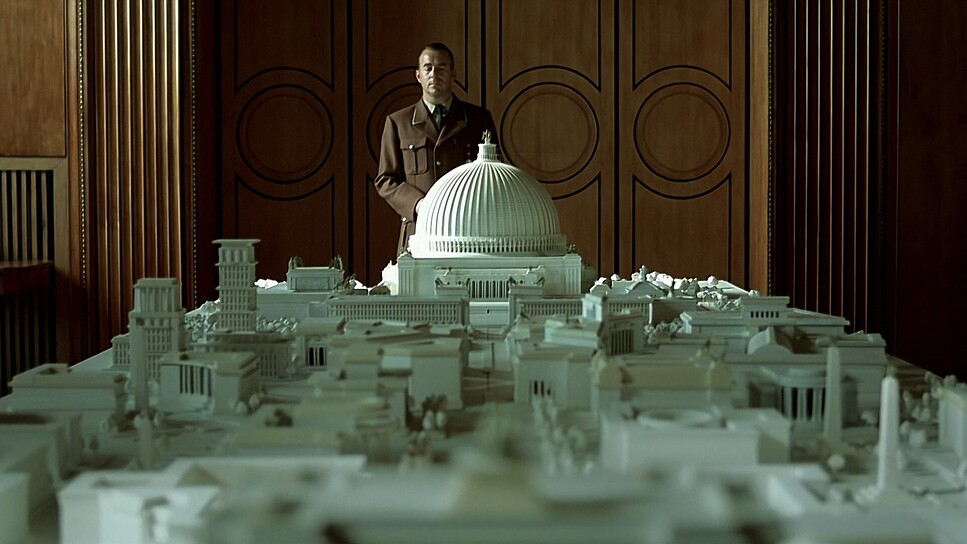
There is a great use of depth cues in the blocking. You’ll often see out-of-focus figures crossing the foreground or huddled in the deep background. It sells the idea that this isn’t just a command center; it’s a tomb packed with people. Hitler is often framed centrally, but as the film progresses, that center framing stops making him look powerful and starts making him look isolated. He becomes a small figure swallowed by the concrete walls.
Lighting Style
This is where the film really shines (or rather, doesn’t). The lighting is harsh and source-heavy. Klausmann leans into the “ugly” frequencies of artificial light.
In the bunker, the practicals—those bare bulbs and fluorescent tubes are doing the heavy lifting. We aren’t seeing perfectly diffused softboxes. We are seeing hard shadows and pockets of pure black. The exterior shots of ruined Berlin switch to a cold, flat daylight that feels dead. There is no golden hour here. It’s strictly motivated lighting, and it respects the continuity of the environment over the beauty of the actors.
Lensing and Blocking
Technically, this was shot on Arricams (LT and ST) using Zeiss Ultra Prime lenses. The Ultra Primes are incredibly sharp, high-contrast lenses. They don’t have the vintage “swirl” of older glass, which fits the clinical, unromantic tone of the film.
However, the choice of lens focal length is key. They use wider focal lengths to exaggerate the tightness of the hallways. When you shoot a close-up on a wider lens (like a 24mm or 32mm) rather than a telephoto (85mm), you force the audience into the actor’s personal space. You feel the spit and the sweat. The blocking reinforces this hierarchy everyone orbits Hitler initially, but by the end, the blocking becomes chaotic, with characters drifting through the frame like ghosts.
Color Grading Approach
If I were building the node tree for Downfall today, I wouldn’t be reaching for a “Teal and Orange” LUT. The grade here is fascinatingly sickly.
It looks like a Bleach Bypass emulation. The saturation is pulled way back, particularly in the warm tones. The skin tones aren’t the healthy pink/peach we usually aim for; they are pushed toward a sallow yellow-green. It creates a physiological reaction in the viewer the characters look unhealthy, exhausted, and dying.
The contrast curve is aggressive. The blacks aren’t lifted or milky; they are dense. The highlights on the sweating foreheads are allowed to blow out slightly, which feels very organic to the film stock. It’s a mono-tonal palette dominated by concrete greys, field greys of the uniforms, and that sickly fluorescent green. It’s a grade designed to drain the life out of the image.
Technical Aspects & Tools
Downfall (2004)
Technical Specifications • 35mm Film • Arricam LT/ST| Genre | War, Drama, History, Military, World War II, Biopic, Political, Epic, Docudrama, Science-Fiction |
|---|---|
| Director | Oliver Hirschbiegel |
| Cinematographer | Rainer Klausmann |
| Production Designer | Bernd Lepel |
| Costume Designer | Claudia Bobsin |
| Editor | Hans Funck |
| Colorist | Traudl Nicholson |
| Time Period | 1940s |
| Color | Cool |
| Aspect Ratio | 1.78 – Spherical |
| Format | Film – 35mm |
| Lighting | Hard light |
| Lighting Type | Artificial light |
| Story Location | Germany > Berlin |
| Filming Location | Europe > Germany |
| Camera | Arricam LT, Arricam ST |
| Lens | Zeiss Ultra Prime |
| Film Stock / Resolution | 5218/7218 Vision 2 500T, 5246/7246 Vision 250D |
The metadata confirms this was shot on 35mm film, specifically Kodak Vision 2 500T (5218) for the interiors. This is a crucial detail.
500T is a high-speed tungsten stock. It has a very distinct grain structure. In the low-light environment of the bunker, that grain becomes very prominent. It adds a “texture” to the air, almost like dust or smoke. If they had shot this on a modern digital sensor like an Alexa, it might have looked too clean in the shadows. The chemical grain of the 5218 stock acts like a veil, making the image feel gritty and lived-in. The exterior daylights were likely the Vision 2 250D, providing that stark, cold contrast to the tungsten interiors.
- Also read: MY NEIGHBOR TOTORO (1988) – CINEMATOGRAPHY ANALYSIS
- Also read: UNFORGIVEN (1992) – CINEMATOGRAPHY ANALYSIS
Browse Our Cinematography Analysis Glossary
Explore directors, cinematographers, cameras, lenses, lighting styles, genres, and the visual techniques that shape iconic films.
Explore Glossary →