When I watch something like My Neighbor Totoro, and I’m humbled. At first glance, it seems deceptively simple a kids’ movie about a big fuzzy spirit. But if you look closer, the visual storytelling is profoundly sophisticated. It manages to imprint itself on your memory not through explosions or high-stakes drama, but through mood and atmosphere. It’s a masterclass in visual poetry, and despite being Studio Ghibli’s third film, it remains an inexhaustible well of insight into how an image is crafted.
About the Cinematographer
In the traditional sense, 2D animation doesn’t have a cinematographer lighting a set, but it absolutely has a Director of Photography. For My Neighbor Totoro, that role belongs to Hisao Shirai. While the creative direction and layouts flowed from Hayao Miyazaki, Shirai was the technical architect responsible for capturing those images. He managed the camera stand and the complex multiplane shots that give the forest its incredible depth.
Miyazaki’s personal history heavily influenced the visual philosophy the story mirrors his own mother’s struggle with spinal tuberculosis but it was Shirai who executed the technical “filming” of these layers. His work on the optical effects (like the soft glows and lighting transitions) is what bridges the gap between static painted backgrounds and living, breathing cinema. It was a partnership: Miyazaki provided the “eye” and the emotional anchor, while Shirai ensured the camera observed these moments with the necessary naturalism and grace.
Inspiration Behind the Cinematography
The look of Totoro is driven by a desire to depict a specific era pre-industrial Tokyo in the mid-50s as a time when humans lived in rhythm with nature. You see it in the lack of TVs and the manual labor of rice planting. The visuals aren’t trying to sell you a fantasy world; they are trying to ground you in a “simpler time.”
Consequently, the cinematography avoids grand, sweeping statements. It prefers the quiet majesty of everyday life. It’s about feeling the presence of forest spirits without necessarily seeing them right away. We get these lingering establishing shots of ancient trees and dark, quiet shrines that create a “spiritual omnipresence.” The camera takes a step back, allowing the environment to breathe. Unlike modern films that often rush to show you the “magic,” Totoro reveals the magic inherent in a dusty staircase or a growing garden.
Camera Movements
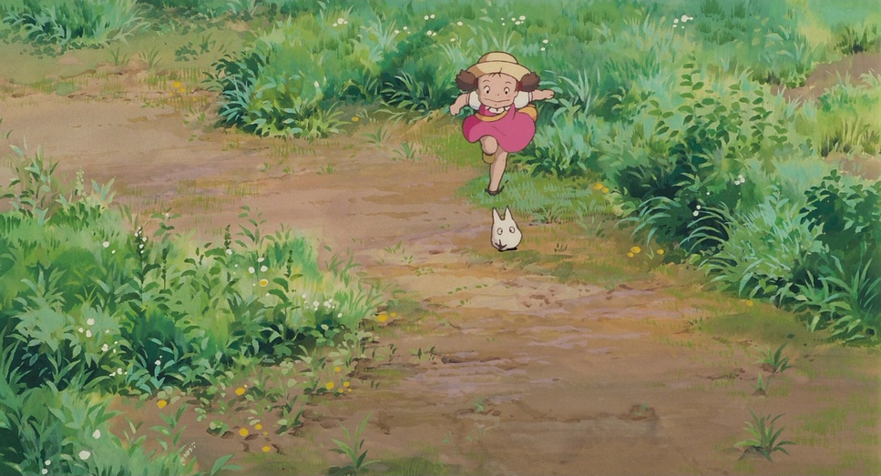
If I were shooting this today, I’d be tempted to use a gimbal or a drone, but Totoro resists that urge. The “camera” movements are characterized by restraint. There are no frantic whip pans. Instead, we see gentle pans following May as she explores, or smooth tracking shots carrying us alongside Satsuki. It emulates a curious, attentive gaze like a parent watching their kids play from the porch.
Take the scene where May falls through the camphor tree. It’s a fluid, vertical tracking shot, reminiscent of Alice in Wonderland, but it doesn’t over-dramatize the fall. It invites us into May’s subjective experience her disorientation and sudden wonder. Similarly, during the iconic rain sequence, the camera holds steady. It lets the rain become a character. When Totoro arrives, he doesn’t crash in; he just sort of materializes out of the downpour. Even the Catbus scenes, which are dynamic, maintain a grounded sensibility. The unhurried movement fosters a sense of calm, forcing the audience to slow down and soak in the details just like the children do.
Compositional Choices
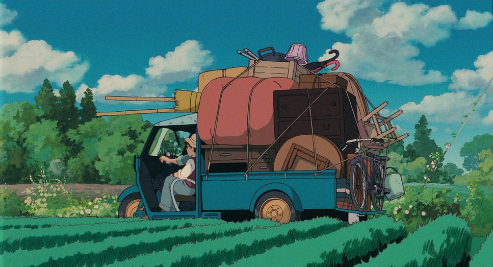
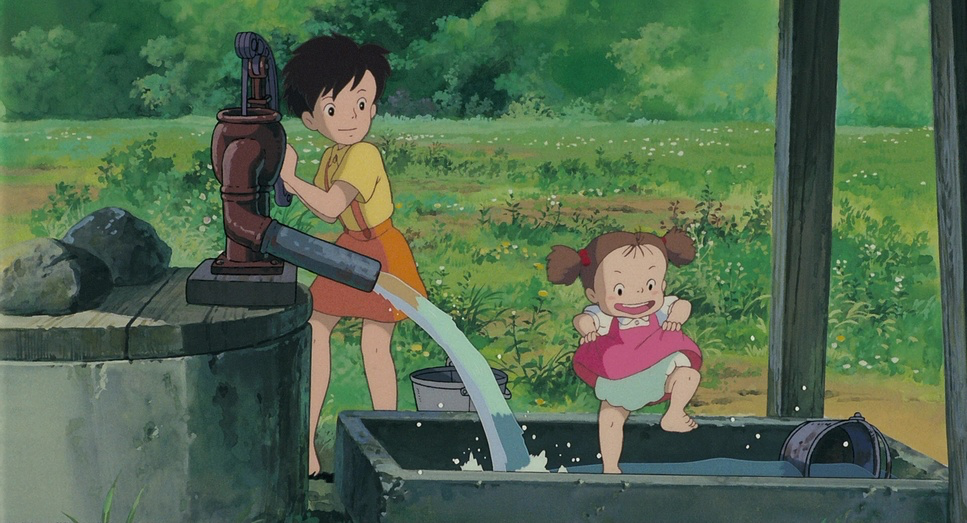
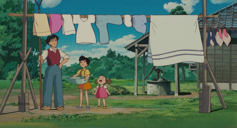
The composition here borrows heavily from traditional landscape painting. We see a lot of deep staging using foreground elements like trees or the architecture of the old house to create legitimate depth. The wide shots establish the family’s smallness against the grandeur of the countryside, reinforcing that theme of humanity living within nature, not dominating it.
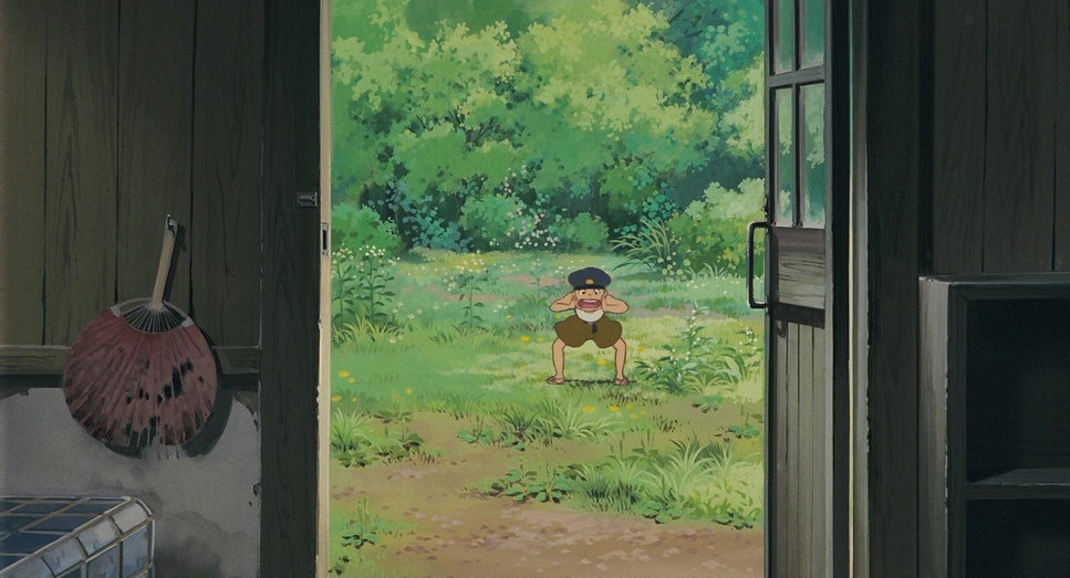
What I love most is the perspective. Many shots are framed from a lower angle, putting us effectively at the eye level of a four-year-old. This isn’t just a gimmick; it completely changes how we perceive the world. A dark hallway becomes an abyss; a camphor tree becomes a mountain. When the girls explore their new house, the “camera” peeks around corners, sharing their trepidation. The frames are rarely cluttered, allowing individual elements a swaying branch, a running child to hold our attention. It breathes.
Lighting Style
While we categorize lighting as “hard” or “soft” in live action, in animation, it’s about color selection and shading. Totoro eschews high-contrast, dramatic lighting for something far more diffused and naturalistic. Daylight filters through the canopy (the Japanese concept of komorebi), creating dappled patterns that feel incredibly real.
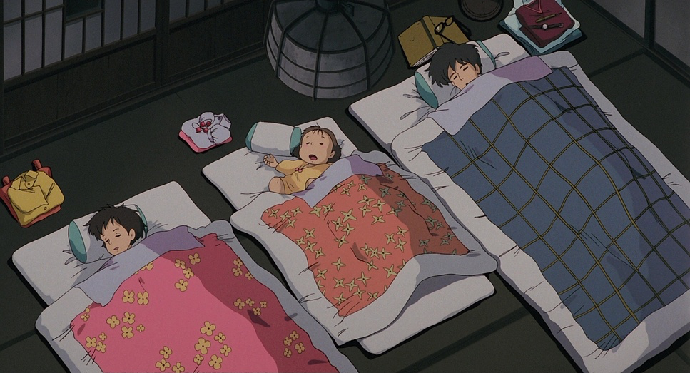
Even interior scenes rely on ambient light spilling from windows or the soft glow of lanterns. There’s a notable absence of harsh, directional rim lights that you see in modern 3D animation. The color temperature shifts organically cool tones for the shade, warm golden hues for sunset. As a colorist, I always look at highlight roll-off, and Totoro handles this beautifully. The highlights bloom softly, mimicking how light disperses in a vintage lens. The shadows retain detail, preventing the “scary” scenes from feeling too ominous. It keeps the tone optimistic, even when the characters are anxious.
Lensing and Blocking
Hisao Shirai’s aesthetic implies a very specific choice of focal lengths. The establishing shots feel widem aybe a 28mm or 35mm equivalent which makes the natural settings feel vast and encompassing. But when we get close to Satsuki and May, the distortion vanishes, keeping the intimacy genuine without feeling “fisheye.”
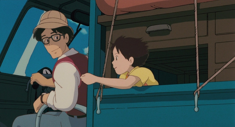
The blocking (where characters are placed) is deliberate. The family is almost always framed together, reinforcing their unity. The bathtub scene, where the father and daughters laugh away their fear of the soot sprites, frames them as a tight, cohesive unit. I know Western distributors initially struggled with the nudity in that scene, but visually, it’s a powerful statement of safety and family bond. The way Satsuki often physically carries May underscores her role as the protector. It’s visual storytelling at its finest: showing the relationship dynamics without a single line of dialogue.
Color Grading Approach
Okay, technically this film wasn’t “graded” in the modern sense it was ink and paint on cel. But if I were trying to emulate this look in Resolve today, I’d be looking at print film emulation. The palette is bright but cool, avoiding the hyper-saturated “digital pop” we see so often now. It has a beautiful mid-range density no crushed blacks, no clipped whites.
The tonal sculpting gives it a soft, watercolor feel. The greens of the forest are separated with incredible precision, distinguishing between deep moss, fresh grass, and ancient pine. The blues and earth tones are rendered with a gentle hand. It reminds me of beautifully exposed celluloid. This “soft contrast” approach is crucial; if the blacks were crushed, the scene where May gets lost would feel like a horror movie. instead, the open shadows keep it feeling like an adventure, albeit a scary one. It feels like a memory slightly desaturated, yet emotionally vivid.
Technical Aspects & Tools
My Neighbor Totoro: Technical Specifications
| Genre | Animation, Family, Fantasy, Magical Realism, Traditional Animation, Nature, Drama, Anime |
|---|---|
| Director | Hayao Miyazaki |
| Cinematographer | Hisao Shirai |
| Production Designer | Kazuo Oga |
| Editor | Takeshi Seyama |
| Colorist | Chris DeLaGuardia |
| Time Period | 1950s |
| Color Palette | Yellow, Cyan, Blue |
| Aspect Ratio | 1.85 |
| Format | Animation |
| Lighting | Hard light, Side light |
| Lighting Type | Daylight, Sunny |
| Story Location | Asia > Japan |
We are looking at hand-drawn cel animation from 1988. No 3D renders, no AI interpolation. The “special effects”—like the glow of the trees or the Catbus eyeswere achieved through optical printing and multiplane cameras. This manual labor gives the image a texture that is hard to fake digitally.
There’s a perception that the film lacks “creative designs” compared to more fantasy-heavy anime, but that restraint is the point. The technical skill lies in making the familiar feel magical. The absence of modern visual noise allows the artistry of the background paintings to shine. The optical effects have an organic softness that blends perfectly with the line art. It’s a reminder that we don’t need the newest plugin or the sharpest sensor to tell a story; we just need intention.
- Also read: UNFORGIVEN (1992) – CINEMATOGRAPHY ANALYSIS
- Also read: PLATOON (1986) – CINEMATOGRAPHY ANALYSIS
Browse Our Cinematography Analysis Glossary
Explore directors, cinematographers, cameras, lenses, lighting styles, genres, and the visual techniques that shape iconic films.
Explore Glossary →