I’m Salik, and if you follow my work at Color Culture, you know I usually obsess over the technical side of the image. But today I want to look at a film that uses its technical limitations to tell the story. We’re talking about Clint Eastwood’s 1992 revisionist western, Unforgiven.
The Western genre is usually painted in broad strokes John Ford’s monuments or Sergio Leone’s sweating close-ups. But Unforgiven is different. It doesn’t just embrace the tropes; it lets them rot on screen. It strips away the golden-hour romance to reveal something much uglier and more honest. As a filmmaker, watching this movie is a lesson in restraint. It forces you to look at violence not as an action set-piece, but as a clumsy, messy reality. The cinematography reflects that brutality perfectly.
About the Cinematographer
The look of Unforgiven belongs to Jack N. Green. While he might not have the household name recognition of a Deakins or Lubezki, his work with Eastwood is the definition of “professional efficiency.” He shot a massive run of Eastwood’s films, including Heartbreak Ridge and The Bridges of Madison County.
Green’s approach here is anti-ego. There are no “look at me” shots. Eastwood is famous for doing very few takes, which meant Green had to light fast and commit to his exposure. He trusted the shadows. In an era where DPs were starting to get flashier, Green stuck to a minimalist philosophy: light the space, let the actors live in it, and don’t be afraid of the dark.
Inspiration Behind the Cinematography
Visually, Unforgiven is a rejection of the “Hollywood West.” You won’t find the pristine, high-saturation technicolor of the 50s here. Green and Eastwood presented a world that feels cold and worn out.
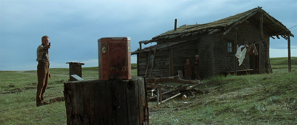
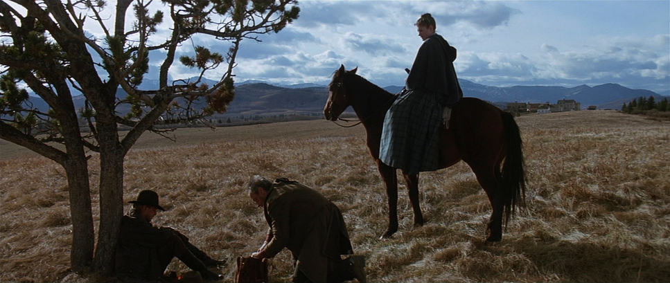
The inspiration clearly comes from the harsh reality of the location itself Alberta, Canada, doubling for Wyoming. It’s not the warm desert; it’s the windy plains. The film leans into the isolation of that landscape. When we see William Munny failing to mount his horse, he isn’t framed as a silhouette against a heroic sunset; he’s just a frail figure struggling in flat, unforgiving light. The visual language constantly reminds you that the “legend” is a lie. It’s a grim, muddy reality, and the camera never tries to pretty it up.
Camera Movements
If you watch closely, you’ll notice how still the camera is. Modern westerns often rely on Steadicam or dynamic crane moves to keep the audience engaged. Unforgiven does the opposite. It observes.
Take the attack on the young cowboy in the canyon. The camera doesn’t shake or chase the action to create artificial energy. It sits there. It forces you to watch the young man bleeding out, crying because he’s scared to death. It’s uncomfortable precisely because the camera refuses to look away or cut quickly.
When the camera does move, it’s usually a slow, motivating creep. A subtle dolly-in on a face to catch a reaction, or a slow pan to reveal the emptiness of a room. It’s functional. It mirrors the pacing of an aging gunfighter deliberate, heavy, and tired.
Compositional Choices
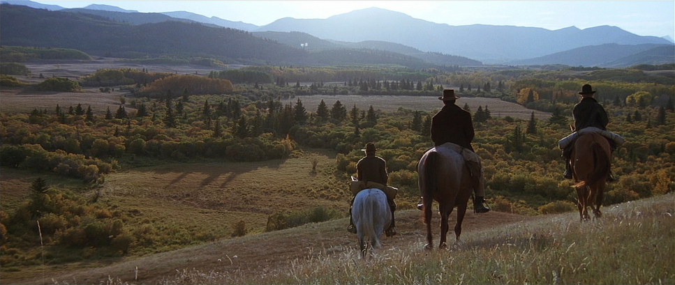
Green makes excellent use of the anamorphic frame here. He frequently isolates characters in wide master shots, using the 2.39:1 aspect ratio to emphasize just how small these men are against the massive, indifferent landscape.
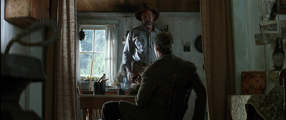
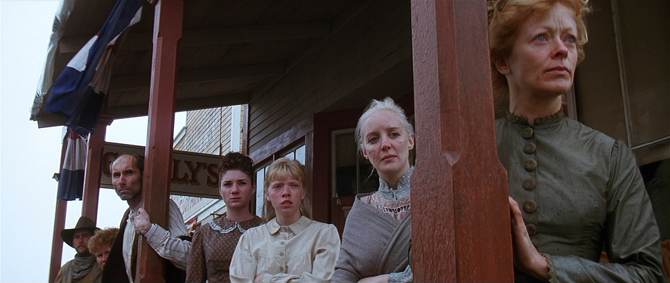
This creates a sense of agoraphobia outside, which contrasts sharply with the claustrophobia inside. When the story moves into the saloon or the sheriff’s office, the framing tightens up. Characters are often obstructed by door frames, bars, or shadows. It feels oppressive. Green also isn’t afraid of negative space. He often frames Eastwood or Freeman with a lot of empty air around them, visually reinforcing their isolation. It’s a somber, mature way of composing that avoids the “comic book” framing of the Spaghetti Westerns.
Lighting Style
This is where the film really shines for me. The lighting is almost strictly motivated and incredibly source-heavy.
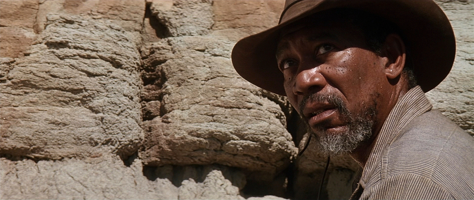
Outdoors, Green deals with high-contrast, harsh sunlight that digs deep shadows into the actors’ eyes no fill cards trying to save the faces. But the interior work is what defines the mood. The saloon scenes are lit to look like they are actually illuminated by oil lamps and candles. This means the fall-off is rapid.
The lighting creates a “pool of light” effect where characters step in and out of visibility. It’s high-contrast, confident chiaroscuro. In the final shootout, the darkness isn’t a mistake; it’s a narrative tool. Munny appears out of the blackness like a ghost. If this were lit “properly” for television, with rim lights separating everyone from the background, the scene would lose all its terror.
Lensing and Blocking
Shot on Panavision C-Series (or potentially E-Series) anamorphics, the lensing has that distinct vertical bokeh and gentle distortion that you can only get from glass of that era. Green favors the wider end of the spectrum for landscapes but jumps to longer focal lengths for dialogue to compress the space slightly.
The blocking is theatrical in the best way. Eastwood (the director) understands the power of standing still. Characters are often arranged in triangles or deep staging, meaning one person is close to the lens while others are deep in the background. Because they aren’t cutting every 2 seconds, the blocking has to carry the scene. It allows the actors to perform with their whole bodies, not just their faces. You can feel the physical toll of the lifestyle just by how Munny slouches in the frame.
Color Grading Approach
I need to make a distinction here: In 1992, there was no “Digital Colorist” sitting at a Resolve panel. This film was timed photochemically. Phil Downey, listed as the Color Timer, would have been working with printer lights Red, Green, and Blue points at the lab.
That makes the look of this film even more impressive. You couldn’t just draw a power window around a face to brighten it up. The “muddy” palette the browns, the desaturated greens, the crushed blacks had to be baked in via the lighting and the film stock development.
The palette is aggressively earthy. It’s a wash of tobacco browns, greys, and deep blacks. The blood is one of the few things that registers as a true, saturated primary color, which makes it pop violently on screen. If I were grading this today, I’d be fighting the urge to “fix” the skin tones. In Unforgiven, the skin tones are often ruddy or shadowed, blending into the wooden walls behind them. It’s a “print film” look that feels organic and aged, rather than the clean, teal-and-orange separation we see in modern digital westerns.
Technical Aspects & Tools
Unforgiven (1992) — Technical Specs
| Genre | Western |
|---|---|
| Director | Clint Eastwood |
| Cinematographer | Jack N. Green |
| Production Designer | Henry Bumstead |
| Costume Designer | Glenn Kaplan |
| Editor | Joel Cox |
| Colorist | Phil Downey |
| Time Period | 1800s |
| Color | Blue |
| Aspect Ratio | 2.35 – Anamorphic |
| Original Aspect Ratio | 2.39 |
| Format | Film – 35mm |
| Lighting Type | Daylight |
| Story Location | … Wyoming > Big Whiskey |
| Filming Location | … Alberta > Calgary |
| Camera | Panavision Cameras |
| Lens | Panavision Lenses |
The film was shot on 35mm, likely using Kodak 5296 (500T) for those dark interiors to dig out whatever exposure they could. The grain structure is present and heavy, adding a grit that digital sensors still struggle to emulate perfectly.
Technically, this is Anamorphic Widescreen. While often colloquially called “2.35,” by the 90s the standard was strictly 2.39:1. That wide canvas is essential for the Western, but Green uses it to show emptiness rather than grandeur. The equipment package was standard Panavision robust, heavy cameras that didn’t allow for the frantic handheld work we see today. The stability of the gear contributed to the stability of the image.
- Also read: PLATOON (1986) – CINEMATOGRAPHY ANALYSIS
- Also read: ROOM (2015) – CINEMATOGRAPHY ANALYSIS
Browse Our Cinematography Analysis Glossary
Explore directors, cinematographers, cameras, lenses, lighting styles, genres, and the visual techniques that shape iconic films.
Explore Glossary →