Looking at the cinematography of Tate Taylor’s The Help (2011). While the film has faced valid criticism regarding its narrative perspective, visually, it remains a textbook example of how high-gloss, classical Hollywood craftsmanship handles a period drama.
The film is set in 1960s Mississippi, a setting that requires a careful balance. It needs to look historically accurate without feeling like a museum piece. The challenge for visual storytellers here is specific: how do you render the “perfect” surface of Southern high society while hinting at the rot underneath? It’s not about just making it look “pretty”; it’s about using visual polish as a narrative device.
About the Cinematographer
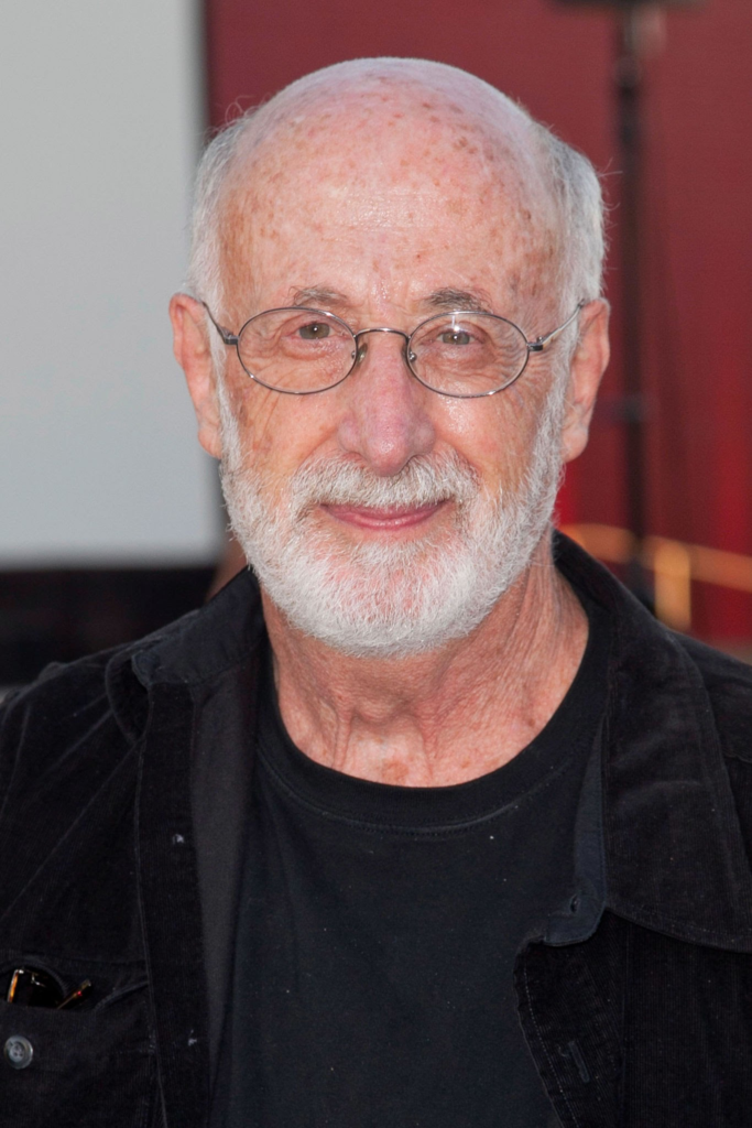
The Director of Photography for The Help was Stephen Goldblatt, ASC, BSC. Goldblatt is a heavyweight who understands that cinematography shouldn’t always scream for attention. His work ranges from the stylized visuals of Batman Forever to the intimate drama of Angels in America. He is a master of “invisible” lighting creating environments that feel natural but are meticulously controlled.
For The Help, Goldblatt’s approach was grounded in classical elegance. He didn’t try to reinvent the wheel with shaky cams or experimental filters. Instead, he built a credible, solid world that allowed the performances to take center stage. His lighting and composition choices here are deliberate, designed to establish the rigid social structures of Jackson, Mississippi, before the script even says a word.
Inspiration Behind the Cinematography
Stylistically, the film walks a fine line between realism and nostalgia. The visual reference point feels like a blend of mid-century Life magazine spreads and the technicolor vibrancy of 60s melodramas. Goldblatt and director Tate Taylor clearly aimed for a “Kodachrome” look lush, saturated, and inviting on the surface.
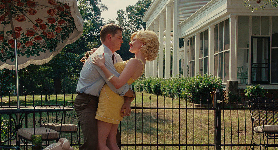
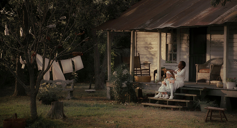
This aesthetic serves a narrative purpose. The world of the white employers is presented with a sun-drenched, golden-hour gloss. It’s warm and vibrant, suggesting an idyllic life. This visual beauty acts as a mask, contrasting sharply with the ugly racial politics driving the plot. The opulent, brightly lit interiors of the white homes juxtapose the more modest environments of the maids, Aibileen and Minny. However, Goldblatt avoids making the maids’ homes look “gritty” or miserable. Instead, he shifts the visual language to something warmer and more intimate, using the lighting to suggest community and safety rather than just poverty.
Camera Movements
Goldblatt’s camera work here is disciplined. You won’t find unmotivated movement. The camera serves to ground the audience in the scene rather than distract them with technique.
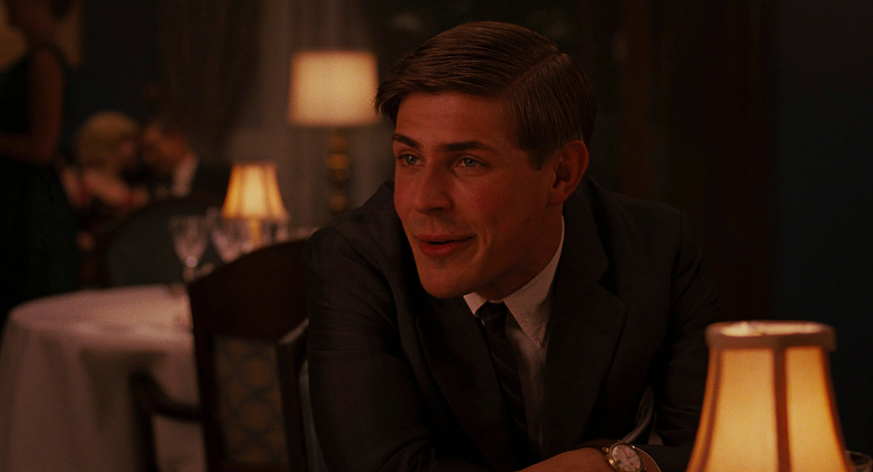
In the scenes involving the white social circles bridge clubs and luncheons Goldblatt frequently utilizes smooth, controlled dolly shots. The camera glides through these spaces, mirroring the performative perfection of the characters. It feels orderly and rigid, much like the social rules these women enforce.
Conversely, when the narrative shifts to the maids, the camera settles down. During intimate conversations—like the kitchen scenes between Skeeter and Aibileen the camera is often static or employs a very slow, subtle push-in. This lack of movement emphasizes the weight of what is being said. It forces the viewer to focus entirely on the performance. When the camera does move in these moments, it’s observational, acting as a witness to the “secret” stories being told.
Compositional Choices
The framing in The Help is heavily reliant on power dynamics. Goldblatt uses blocking and the 1.85:1 aspect ratio to physically separate characters within the frame.
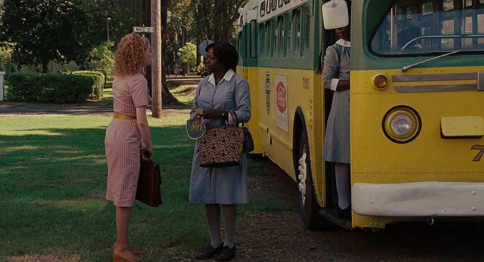
A key element here is the use of depth and blocking. When the maids are working in white households, they are frequently pushed to the background or the edges of the frame, visually reinforcing their marginalization. They are present, but rarely the “subject” until the story demands it.
Goldblatt also uses camera angles to dictate authority. Hilly Holbrook is often framed slightly from below (low angle), making her loom over others, reinforcing her role as the antagonist. In contrast, the group scenes with the maids are framed tighter, often with medium-wide lenses that bring the characters physically closer together. This visual compression creates a sense of solidarity and shared risk. The composition tells us who holds the power in the room before a line is delivered.
Lighting Style
The lighting is where Goldblatt’s experience really shows. He employs a soft, motivated lighting style, relying heavily on large diffusion to simulate natural daylight streaming through the ample windows of the Southern locations.
For the white households, the lighting is high-key. It’s bright, with plenty of fill light that minimizes shadows. This creates that “glossy” magazine look there are no dark corners for secrets to hide, which makes the hypocrisy feel more stark.
However, the real technical achievement is in how he lights the diverse cast. Lighting Viola Davis and Octavia Spencer in the same frame as Bryce Dallas Howard requires a keen understanding of skin tones. Goldblatt ensures the Black characters are lit with care using soft, large sources that wrap around the face to create specular highlights on the skin, ensuring they are never underexposed or muddy. In the maids’ homes, the light is warmer and directional, often motivated by practical lamps, creating a mood that is less “perfect” but significantly more inviting.
Lensing and Blocking
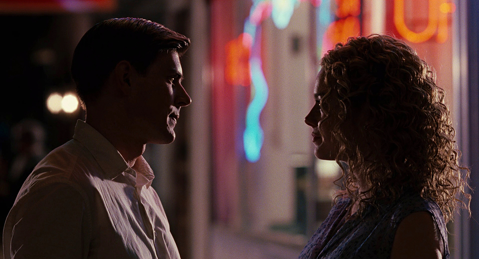
The film was shot primarily on spherical lenses, likely in the 35mm to 50mm range for dialogue scenes. This focal length mimics the human field of view, avoiding the distortion of wide angles or the detachment of long telephoto lenses. It feels immediate and personal.
The blocking where actors are placed is integral to the storytelling. Early in the film, the blocking is rigid. Maids stand; employers sit. Maids are by the door; employers are at the head of the table. As the “sisterhood” forms between Skeeter and the maids, this blocking relaxes. They sit at the same tables; they share the same focal plane.
Goldblatt creates clean singles for the dramatic moments, isolating characters to emphasize their internal struggles. The background is usually soft but distinct enough to establish location a classic technique to keep the focus strictly on the actor’s eyes.
Color Grading Approach
As a colorist, this is the part of the production I appreciate most. The color grade, executed by Jim Passon, is instrumental in selling the period setting.
The overall palette is unmistakably warm, with a distinct magenta push in the highlights. This mimics the characteristics of film stocks from the 1960s. It’s not a neutral, digital white; it has a creamy, vintage texture. The saturation is pushed slightly, particularly in the costumes and production design the greens of the lawns and the pastels of the dresses pop, reinforcing the “technicolor dream” facade.
Passon’s work on the skin tones is excellent. He maintains good separation between the warm skin tones and the set design. In the shadows, he avoids crushing the blacks. There is a nice roll-off in the low end, keeping detail in the maids’ uniforms and the darker interiors without introducing digital noise. The contrast curves are gentle—this isn’t a high-contrast action movie. It’s a drama where the mid-tones carry the weight, and the grade respects that by keeping the image open and legible.
Technical Aspects & Tools
| The Help (2011) – Technical Specifications | |
|---|---|
| Genre | Drama |
| Director | Tate Taylor |
| Cinematographer | Stephen Goldblatt |
| Production Designer | Mark Ricker |
| Costume Designer | Sharen Davis |
| Editor | Hughes Winborne |
| Colorist | Jim Passon |
| Time Period | 1960s |
| Color Palette | Warm, Magenta |
| Aspect Ratio | 1.85 |
| Format | Film – 35mm |
| Lighting | Soft light, Backlight |
| Lighting Type | Daylight, Sunny |
| Story Location | Mississippi > Jackson |
| Filming Location | Mississippi > Greenwood |
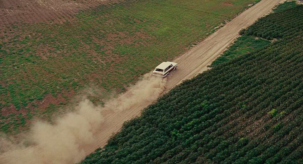
Contrary to the digital standard of today, The Help was shot on 35mm film. This choice is evident in the organic grain structure and the way the image handles highlights. Film has a natural compression in the highlights that digital sensors often struggle to emulate, and you can see that here in the sun-drenched exteriors the sky doesn’t clip into a flat white; it retains texture.
The film uses a 1.85:1 aspect ratio. This is a “taller” widescreen format compared to the cinematic 2.39:1 scope. This was the right choice for a character-driven drama; it allows for close-ups that feel intimate without too much empty negative space on the sides. It grounds the film in a more realistic visual language. The technical specs film acquisition, spherical lenses, and a photochemical-inspired grade all work together to subconsciously transport the viewer back to 1963.
- Also read: WARRIOR (2011) – CINEMATOGRAPHY ANALYSIS
- Also read: SPOTLIGHT (2015) – CINEMATOGRAPHY ANALYSIS
Browse Our Cinematography Analysis Glossary
Explore directors, cinematographers, cameras, lenses, lighting styles, genres, and the visual techniques that shape iconic films.
Explore Glossary →