I want to dig deep into a film that stands as a quiet giant in the landscape of modern cinema: Warrior (2011). It’s a film that resonates on so many levels not just for its visceral action, but for the profound emotional current that runs through its core. I remember watching this expecting a standard fight movie and walking away absolutely floored. It reminds me of the raw power of 70s cinema verité films like Raging Bull or Fat City where the bruised knuckles are just a metaphor for bruised souls.
What makes Warrior so impactful isn’t just Tom Hardy’s traps or Joel Edgerton’s quiet intensity; it’s the meticulous craft behind the lens. As filmmakers, we often talk about the “heart” of a story, and Warrior beats with a rhythm that is both brutal and deeply human. It’s a masterpiece of texture and shadow. So, let’s peel back the layers and explore the cinematography that made this film a lasting experience for so many of us.
About the Cinematographer
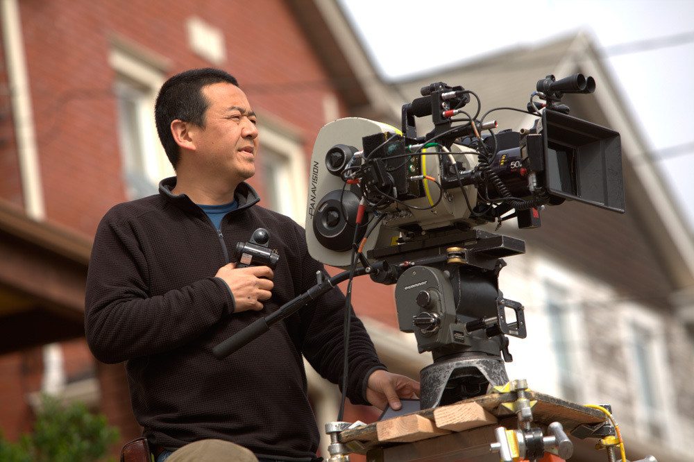
The eye behind Warrior was Masanobu Takayanagi. While many know him for his later, polished work on films like Spotlight or Hostiles, his work here is a masterclass in controlled chaos. Takayanagi has a unique ability to ground high-stakes narratives in a tangible, almost suffocating reality. He understands that in a film like this, the camera isn’t just recording choreography; it’s translating pain.
Working with director Gavin O’Connor, Takayanagi created a visual language that feels immediate and unpolished. He avoided the glossy, high-key look often associated with sports movies of that era, opting instead for a gritty authenticity. His work here is about immersion drawing you into the claustrophobia of the Conlon family dynamic. It’s the kind of cinematography that, as a colorist, I deeply respect because it starts with a strong negative. The choices in exposure and composition gave the post-team a rich, dense image to sculpt, rather than something they had to “fix.”
Inspiration Behind the Cinematography
The core inspiration for Warrior‘s look stems from a commitment to unflinching realism. The mandate was clear: the film needed to feel “brutal” in the cage and “fractured” in the home. This wasn’t about stylized combat; it was about a primal fight for survival.
Takayanagi and O’Connor adopted a visual approach that acts as an invisible participant. The camera breathes alongside the characters. In the domestic scenes, it mirrors the quiet desperation of Brendan’s financial struggles and the haunting silence of Paddy’s sobriety. In the ring, it mimics the adrenaline of Tommy’s rage. The visual design serves the psychological barriers each brother faces; the goal wasn’t just to capture a knockout, but to translate the internal battle onto the screen. It is a perfect example of form following function.
Camera Movements
When you watch Warrior, the camera movement signals that you are in a subjective experience. There is a distinct preference for handheld work, but it’s not the lazy “shaky cam” we often see. Because they were shooting on Panavision Panaflex cameras substantial, heavy 35mm bodies the handheld movement has weight to it. It doesn’t jitter; it sways and breathes.
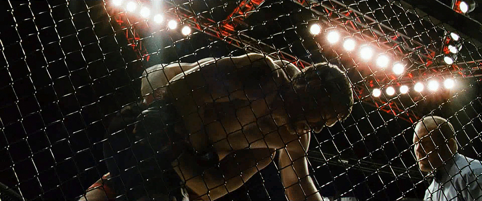
During the fights, the operator is in the mix, ducking and weaving. This dynamic approach complements the violent nature of the MMA choreography. However, Takayanagi masterfully punctuates these chaotic moments with static, locked-off shots. Think of the wide shots of the empty gym or the stark framing of the hotel rooms. This interplay between the fluid, reactive movement of the fights and the paralyzed stillness of the emotional scenes creates a rhythm that keeps the audience off-balance, much like the fighters themselves.
Compositional Choices
The compositional choices in Warrior reinforce the themes of isolation. Takayanagi frequently utilizes the 2.39:1 aspect ratio to separate characters even when they share a frame. We see a lot of “clean singles” and “left-heavy” composition, often leaving a vast amount of negative space behind a character to emphasize their loneliness.
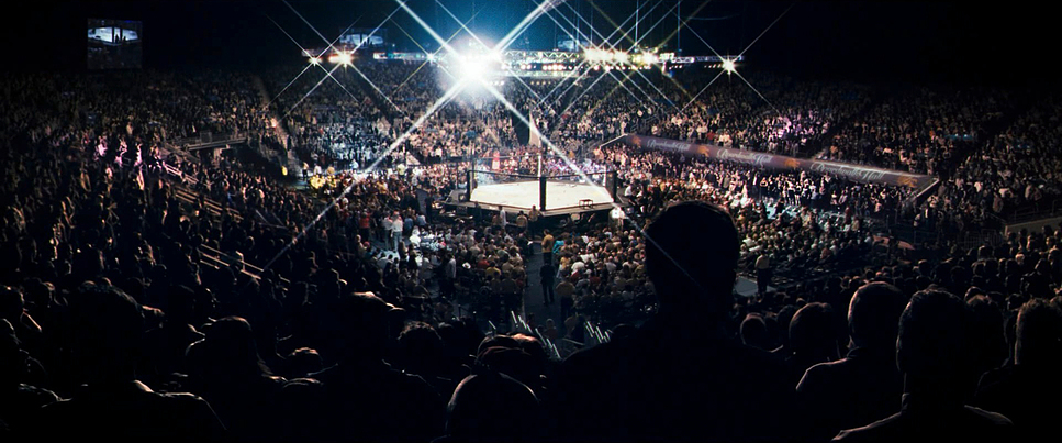
Close-ups are used aggressively. These aren’t just beauty shots; they are often shot with long lenses, compressing the background to trap the character in their own headspace. We see every wince and bead of sweat on Tom Hardy’s face, creating an intimacy that feels almost intrusive. Conversely, the wide shots emphasize scale the vastness of the Atlantic City arena dwarfs the brothers, reminding us how small they are against the machine they are fighting. The blocking is equally deliberate; notice how rarely the brothers make eye contact, often framed looking past one another, visually communicating their broken history without a word of dialogue.
Lighting Style

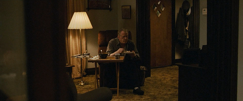
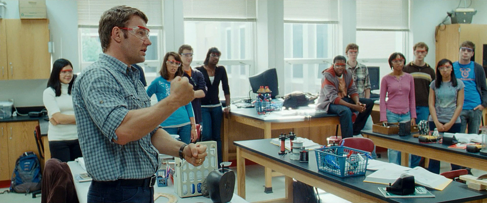
The lighting in Warrior is a textbook example of motivated naturalism, executed with high contrast. Takayanagi avoids “movie lighting” in favor of sources that feel organic to the environment. In the Conlon homes, the lighting is top-down, often utilizing practicals or simulated sodium-vapor streetlights pushing through windows. This creates deep, crushed shadows and hot highlights a technique known as “chiaroscuro.”
In the arena, the lighting shifts to high-intensity overhead grids. This creates a severe “top light” effect, carving out the muscles of the fighters and hiding their eyes in shadow, making them look more like gladiators than men. The use of edge light is prominent here, separating the fighters from the dark crowds. It’s a lighting scheme that doesn’t just illuminate; it textures. It emphasizes the sweat, the blood, and the exhaustion.
Lensing and Blocking
My approach to analyzing the optics here centers on the glass. The production utilized Panavision Primo Primes and Ultra Speed MKIIs. These are legendary lenses. The Ultra Speeds, in particular, open up to T1.9 or wider, allowing Takayanagi to shoot in low-light situations with a very shallow depth of field.
This choice of fast glass is crucial. It means that when we are in a close-up, the background dissolves into a soft bokeh, isolating the actor. You’ll notice a lot of long-lens work (likely 85mm or 100mm) during the fights and emotional beats. This telephoto compression flattens the space, making the hits look harder and the emotional distance feel shorter.
Blocking-wise, the actors are often positioned in opposition. In the scene on the porch between Tommy and Paddy, the physical distance is palpable. Takayanagi captures this with a low angle, giving the characters a statuesque, almost mythic quality, while the blocking keeps them in separate emotional worlds even when they are inches apart.
Color Grading Approach
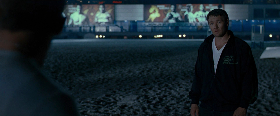
Alright, let’s talk color, because this is where the film’s “look” really comes together. The film was graded by colorist David Cole, and the work is subtle but heavy. The palette is distinctly desaturated, leaning into cool cyans and earthy browns. This isn’t the teal-and-orange of a blockbuster; it’s the dirty green of fluorescent gym lights and the rust of a dying industrial town.
The film was shot on 35mm, and the grade respects that. The focus was clearly on density. The blacks are rich and heavy, sitting low on the waveform, while the highlights in the arena are allowed to blow out slightly, mimicking the blinding nature of stadium lights. There is a specific quality to the skin tones they aren’t healthy or glowing. They are often skewed slightly green or cool, reflecting the harsh environments these men live in.
If I were grading this, I’d be looking at how the film stocks handled the mixed lighting. The “Expression” 500T stock used has a lower contrast and saturation by design, which gives the shadows a milky, lifted feel in the darker scenes, while the standard Vision3 500T provides that tight grain structure we see in the sharper sequences. The grade enhances this by not fighting the natural fall-off of the film, but embracing the grit.
Technical Aspects & Tools
Warrior – Technical Specs
| Genre | Drama, Action, Sports, Family, Fatherhood, Marriage |
|---|---|
| Director | Gavin O’Connor |
| Cinematographer | Masanobu Takayanagi |
| Production Designer | Dan Leigh |
| Costume Designer | Abigail Murray |
| Editor | Sean Albertson, Matt Chesse, John Gilroy, Aaron Marshall |
| Colorist | David Cole |
| Time Period | 2010s |
| Aspect Ratio | 2.39 – 3 perf |
| Format | Film – 35mm |
| Lighting | High contrast, Backlight, Edge light |
| Lighting Type | Artificial light, Practical light |
| Story Location | … Pennsylvania > Pittsburgh |
| Filming Location | … Pennsylvania > Pittsburgh |
| Camera | Panavision Panaflex |
| Lens | Panavision Primo Primes, Panavision Ultra Speed MKII, Zeiss Super Speed MKII |
| Film Stock / Resolution | 5219/7219 Vision 3 500T, 5229/7229 Vision 2 500T Expression, 5260 Vision 2 500T, 8592/8692 Reala 500D |
For the gear heads, Warrior is a testament to the power of celluloid. It was shot on 35mm film (3-perf) using Panavision Panaflex cameras. In an era where the Arri Alexa was beginning to dominate, shooting film was a deliberate choice for texture.
The film stocks chosen are fascinating. Takayanagi used a mixture of Kodak Vision3 500T (5219) for the main work, but also utilized Vision2 500T Expression (5229). The “Expression” stock is famous for its lower contrast and softer palette, perfect for the flashback-like quality of the family drama. For the few daylight exteriors, they used Reala 500D (8592), a Fuji stock known for its unique color rendition, distinct from the Kodak look.
The lenses were a mix of Panavision Primo Primes, Panavision Ultra Speed MKII, and Zeiss Super Speed MKII. These vintage high-speed lenses have character they flare, they have subtle aberrations, and they take the “digital edge” off the image before it even hits the sensor (or in this case, the negative).
- Also read: SPOTLIGHT (2015) – CINEMATOGRAPHY ANALYSIS
- Also read: RUSH (2013) – CINEMATOGRAPHY ANALYSIS
Browse Our Cinematography Analysis Glossary
Explore directors, cinematographers, cameras, lenses, lighting styles, genres, and the visual techniques that shape iconic films.
Explore Glossary →