When I first watched Martin McDonagh’s Three Billboards Outside Ebbing, Missouri, I was struck by the discipline of the image. With performances this volatile Frances McDormand, Woody Harrelson, and Sam Rockwell are all operating at peak intensity it would have been easy for the camera to try and match that chaos. But cinematography by Ben Davis, BSC, does the opposite. It is calm, composed, and deliberate.
This film is a study in restraint. It doesn’t scream for attention; instead, it uses specific lighting ratios, anamorphic framing, and a carefully controlled palette to ground a story that teeters on the edge of the absurd. For us as filmmakers and colorists, dissecting Three Billboards Outside Ebbing, Missouri, offers a look at how to photograph “deep dark territory” without losing the comedic undertone.
About the Cinematographer

Ben Davis, BSC, is an interesting choice for this material. You likely know him from massive MCU projects like Guardians of the Galaxy or Doctor Strange. Going from VFX-heavy blockbusters to a character-driven drama in rural America requires a significant gear shift.
Davis previously worked with McDonagh on Seven Psychopaths, and that shorthand is visible here. He understands that McDonagh’s script is dense with dialogue and heavy on blocking. Davis isn’t trying to impose a “signature style” here; he is stepping back to create a container for the actors. The result is a visual language that feels almost like a documentary of a town that time forgot, balancing cinematic grandeur with a gritty, localized reality.
Inspiration Behind the Cinematography
The visual identity of Three Billboards Outside Ebbing, Missouri is tied to the concept of the “Neo-Western.” Ebbing, Missouri, isn’t presented as a modern American town; it feels suspended in the past. There is a “Southern American gothic” inflection at play a sense of stagnation and simmering violence that usually belongs in a Clint Eastwood film.
The town feels forgotten, and the landscapes carry the weight of that neglect. By framing Ebbing with a slightly retro feel, Davis evokes the classic American western, where themes of outlaw justice and moral ambiguity are right at home. The billboards themselves act as the inciting incident in this landscape massive, red scars on a green, pastoral hill.
There are also specific cinematic nods. Mark Kermode pointed out the reference to “Drinkwater Road,” a nod to Psycho. It’s a subtle detail, but it places the film in a lineage of stories where isolation breeds psychological breaks. The goal was to build a world that feels lived-in and flawed, rather than a polished movie set.
Camera Movements
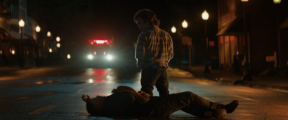
“Unintrusive” is the operational word for the camera movement. Davis largely avoids the dolly or the steadicam unless the blocking demands it. The camera is often static, forcing the audience to sit with the tension rather than relieving it with movement.
However, the film breaks this rule for one specific, devastating sequence: Dixon’s assault on the advertising agency. This is the technical standout of the film a continuous “one-r” (long take) that follows Dixon from the street, up the stairs, through the violence, and back out the window.
Technically, this shot is brilliant because it refuses to cut away. It forces the viewer to witness the cause and effect of Dixon’s rage in real-time. It transforms the film from an observational drama into a visceral experience. By saving this kind of complex, kinetic camera movement for a single key moment, Davis maximizes its impact. If the whole film had been handheld and shaky, this scene would have just been noise. Because the rest of the film is so still, this scene feels like an explosion.
Compositional Choices
Composition is where the film’s emotional logic lives. The film was shot Anamorphic (2.39:1), and Davis utilizes the width of the frame to isolate characters.
Mildred is frequently center-framed. In a standard drama, you might use the rule of thirds, but placing her dead center makes her an immovable object. She blocks the view. She dominates the space. Contrast this with the billboards themselves: massive, horizontal structures that cut across the horizon line.
There is a scene where Mildred drives past the billboards and stops. She doesn’t speak; she just chews her thumbnail. The framing here allows the negative space of the lonely road to weigh down on her, while the depth cues keep the billboards looming in the background. As a filmmaker, I appreciate how the blocking and the lens choice do the heavy lifting. You feel her resolve not because of a line of dialogue, but because of how small she looks against the landscape, yet how dominant she remains in the frame.
Lighting Style
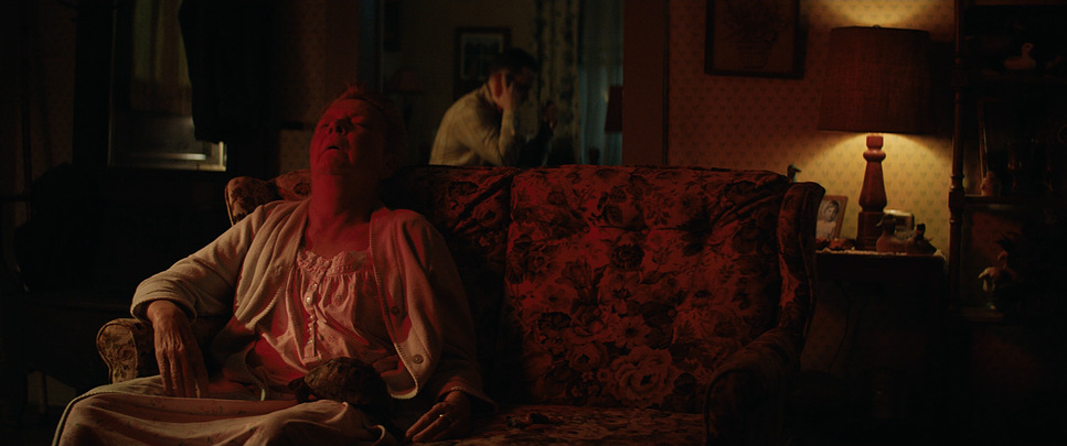
The lighting feels naturalistic, but it’s doing a lot of subtle work to support the tone. Davis relies heavily on what feels like available light overcast skies for the exteriors and practical sources for the interiors.
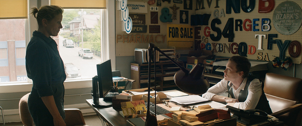
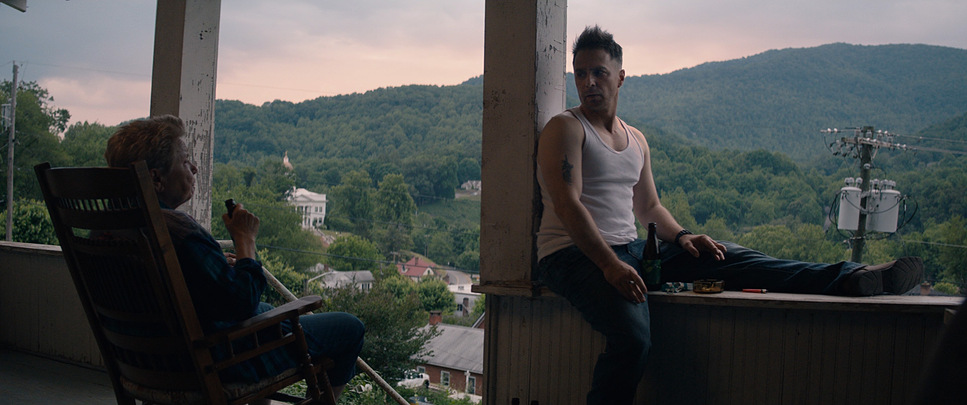
The police station is a great example of this “ugly” realism. It’s lit with cool, dim tones that feel institutional and claustrophobic. It reflects the moral decay of the department. Contrast that with the exteriors, which often feature the soft, flat light of an overcast day, or the distinct warmth of the “golden hour” in scenes involving Chief Willoughby.
The interplay of light and shadow is crucial for Sam Rockwell’s character, Dixon. Early in the film, he is often lit unflatteringly, falling into shadow. As his arc pivots toward redemption, the quality of light on his face softens. It’s a classic lighting cue, but executed so subtly that it registers subconsciously.
Lensing and Blocking
This is where the technical choices really define the film’s look. Contrary to the cleaner look of modern spherical glass, Davis shot Three Billboards using Panavision C-Series Anamorphic lenses.
This was a critical decision. The C-Series are vintage lenses known for their unique character they aren’t clinically sharp. They have barrel distortion, fall-off at the edges, and that distinct anamorphic bokeh. This optical “imperfection” matches the town of Ebbing perfectly. If this had been shot on clean, modern Zeiss Master Primes, the town would have felt too present, too “now.” The C-Series glass gives it that warped, vintage texture, slightly distancing the viewer from reality.
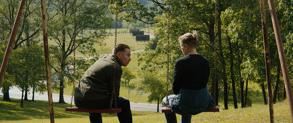
The blocking maximizes the anamorphic format. In confrontation scenes, characters are often spaced wide apart, utilizing the full width of the 2.39 aspect ratio to visualize the emotional distance between them.
Color Grading Approach
For the color grade, credited to Adam Glasman, the approach was clearly about separation and texture. As a colorist, I respect that they didn’t go for a heavy “look” or a teal-and-orange blockbuster overlay.
The palette is earthy and grounded. The greens of the Missouri landscape are slightly desaturated and pushed toward cooler, mossy tones. This allows the red of the billboards to scream. That specific red is the visual anchor of the film it is punched up in saturation and luminance to ensure it draws the eye immediately. It’s a visual representation of Mildred’s anger: a bright, bloody wound in a dull, grey town.
The contrast curve appears to be a film-emulation approach (likely a LUT based on Kodak stock). The blacks are dense but retain detail (important for those “dark territory” scenes), and the highlight roll-off is smooth, avoiding the harsh clipping you sometimes see in digital capture. It feels organic, supporting the decision to use vintage glass.
Technical Aspects & Tools
Three Billboards Outside Ebbing, Missouri: Technical Specifications
| Genre | Crime, Drama |
|---|---|
| Director | Martin McDonagh |
| Cinematographer | Ben Davis |
| Production Designer | Inbal Weinberg |
| Costume Designer | Melissa Toth |
| Editor | Jon Gregory |
| Colorist | Adam Glasman |
| Time Period | 2010s |
| Aspect Ratio | 2.39 – Anamorphic |
| Format | Digital |
| Camera | ARRI ALEXA XT / XTplus |
| Lens | Panavision C series |
| Film Stock / Resolution | 2.8K / 2.8K ArriRaw |
To achieve this specific aesthetic, the production utilized the ARRI ALEXA XT Plus. The Alexa sensor is industry-standard for a reason its dynamic range and color science are the closest digital equivalent to celluloid film.
Pairing the Alexa XT with Panavision C-Series lenses is a deliberate juxtaposition. You get the reliability and workflow of a modern digital sensor, but the optical texture of 40-year-old glass. The camera was likely rated at 800 ISO to maximize dynamic range, preserving the details in the shadows during the police station scenes while holding the sky detail in the exteriors.
From a DIT and post-production perspective, the workflow would focus on matching the different anamorphic focal lengths (which can vary in color and contrast) and ensuring that the skin tones remained natural despite the stylized environment.
- Also read: LOCK, STOCK AND TWO SMOKING BARRELS (1998) – CINEMATOGRAPHY ANALYSIS
- Also read: HACKSAW RIDGE (2016) – CINEMATOGRAPHY ANALYSIS
Browse Our Cinematography Analysis Glossary
Explore directors, cinematographers, cameras, lenses, lighting styles, genres, and the visual techniques that shape iconic films.
Explore Glossary →