Few films kick open the door to a new decade like Guy Ritchie’s 1998 debut, Lock, Stock and Two Smoking Barrels.Looking back at a film like this isn’t just nostalgia; it’s a reminder of what raw, unbridled vision looks like when it hits the screen.
This isn’t just a cult classic; it’s a blueprint. Lock, Stock perfectly encapsulates a moment not just in cinema, but in British culture. It introduced the world to Ritchie’s signature style: the fast-talking ensemble cast, the intertwining storylines, and that distinct “lad” swagger. It also launched the careers of Jason Statham and Vinnie Jones. But for me, dissecting its cinematography is about understanding how the visual language amplifies that unique voice. It’s a masterclass in making a low-budget 16mm production look like a million quid, and that is always worth a closer look.
About the Cinematographer
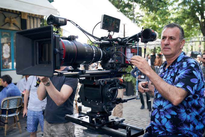
When you talk about the visual identity of Lock, Stock, you’re talking about the partnership between Guy Ritchie and cinematographer Tim Maurice-Jones. Unlike the polished, high-gloss commercials of the era, Maurice-Jones brought a grittier, more kinetic approach that was absolutely crucial for this film. For a director’s debut feature especially one so visually distinctive and narratively complex having a DP who can translate a chaotic vision into tangible frames is invaluable.
It’s interesting to consider that for a debut feature, there’s often a fearlessness that comes from not having a pre-established “house style” to adhere to. Maurice-Jones and Ritchie weren’t trying to fit into a mold; they were breaking it. You see that bold experimentation in the willingness to push the boundaries of framing and movement. There’s an energy in Lock, Stock that feels incredibly raw and immediate, and a significant portion of that credit goes to Maurice-Jones’s ability to capture Ritchie’s frenetic storytelling with an equally energetic camera.
Inspiration Behind the Cinematography
The most obvious comparison often made is to Quentin Tarantino. By 1998, Tarantino had already established a style with hip gangsters riffing through tightly woven crime stories featuring punchy dialogue and non-traditional structures. Lock, Stock certainly leans into that zeitgeist an ensemble of small-time criminals caught in a web of underworld intrigue.
However, to simply label it a Tarantino knock-off misses the point entirely. Ritchie and Maurice-Jones took that spirit and infused it with a distinctly British, “Cockney” flavor. The inspiration wasn’t just stylistic mimicry; it was about evolving a genre through a unique cultural lens. The visual dynamism, the abruptly frozen frames, the speed ramping these weren’t just flourishes; they were integral to mimicking the breathless, chaotic lives of these characters. It’s almost as if the camera itself is a character, constantly scrambling to keep up, peering into the hidden corners of London’s underworld. This aesthetic makes the style feel like a natural, organic fit rather than a forced imitation. It’s the visual equivalent of a quick jab followed by a theatrical flourish—rough, but undeniably stylish.
Camera Movements
If there’s one defining characteristic of Lock, Stock‘s cinematography, it’s the sheer kinetic energy of its camera movements. This isn’t a film that sits still; it’s constantly on the move, reflecting the frantic scramble of the plot. We’re talking about a symphony of whip pans, quick tilts, and aggressive push-ins that mirror the pace of Ritchie’s dialogue. The camera rarely lingers, preferring to dart from one character to another, or from one piece of incriminating evidence to the next.
Much of this is handheld work, facilitated by the lighter weight of the 16mm cameras used during production. The slight imperfections, the subtle waver, the way the camera seems to breathe with the characters it all adds to a gritty realism. It grounds us firmly in the low-level criminal world, making the audience feel like an embedded observer rather than a passive viewer. When the camera does stabilize, it’s usually for a deliberate, tension-building moment, like tracking through a crowded pub. But even then, there’s an underlying urgency to it. This constant motion serves as a powerful depth cue, not just showing us the space, but making us feel the pressure and claustrophobia of the characters’ predicament.
Compositional Choices
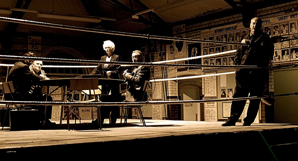
The compositional choices in Lock, Stock are a masterclass in controlled chaos. While not overtly flashy in a symmetrical sense, there’s an intelligent use of the frame to convey character dynamics. Often, we find characters framed slightly off-center, or in dynamic arrangements, reflecting their precarious position in the underworld.
I see a lot of deep focus in certain scenes, keeping multiple characters or elements in the background sharp, which subtly underscores the interconnectedness of their various schemes. It forces the viewer to actively scan the frame. Other times, Maurice-Jones employs tighter close-ups, often with longer lenses to compress the background, isolating a character in their agitated state or emphasizing a crucial piece of dialogue. The use of negative space is often minimal, particularly in interiors, making the environments feel cluttered and oppressive. It’s a composition style that actively invites you into their world, demanding your attention and participation.
Lighting Style
The lighting in Lock, Stock is as unpretentious and hard-hitting as its characters. This isn’t a film about glossy, studio-perfect lighting; it’s about gritty realism. The overall aesthetic leans towards a more naturalistic, often available-light approach, particularly in the dingy pubs and back alleys that form the backdrop of this story.
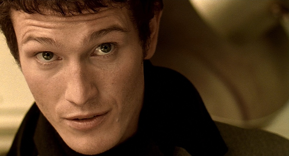
We see a lot of motivated lighting, drawing heavily from practicals within the scene bare bulbs, neon signs, and windows allowing in London’s flat daylight. This enhances the authenticity. Shadows are frequently deep and contrasty, especially in interiors, which helps to sculpt faces and create a sense of foreboding. There’s often a deliberate lack of fill light, allowing faces to fall into shadow, adding to their enigmatic or menacing presence. For instance, in scenes with Hatchet Harry, the lighting often plays with chiaroscuro, emphasizing his formidable presence. I often imagine Maurice-Jones and Ritchie embracing the limitations of their budget, turning them into stylistic advantages, letting the shadows do the heavy lifting to convey mood and tension.
Lensing and Blocking
The lens choices and blocking are crucial for managing this ensemble cast and maintaining that trademark pace. While the film uses a variety of focal lengths, the blocking is where the real magic happens. Ritchie and Maurice-Jones are masters of dynamic staging. Characters aren’t just standing around; they’re constantly moving, interacting, and filling the frame in deliberate ways.
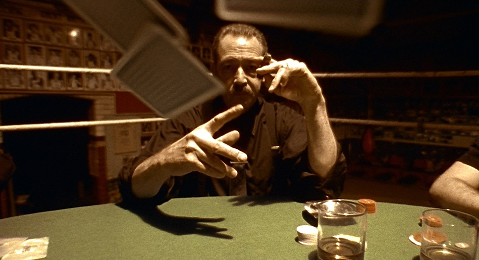
In scenes with multiple characters exchanging rapid-fire dialogue, the blocking ensures that each individual gets their moment. This isn’t always about neat, theatrical blocking; sometimes it’s intentionally messy, reflecting the chaotic nature of their lives. Consider the poker game scene the camera, the blocking, the close-ups everything is designed to ratchet up the tension. There’s a constant dance between characters entering and exiting the frame, often from unexpected directions, which keeps the visual energy high. This is particularly effective given the multiple intersecting plots, ensuring the viewer always understands who is where and how they relate to the developing chaos.
Color Grading Approach
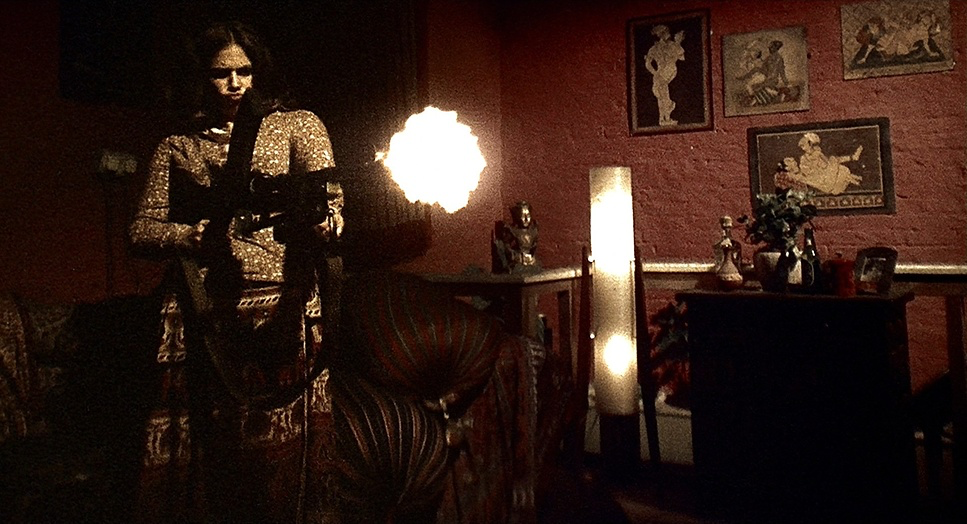
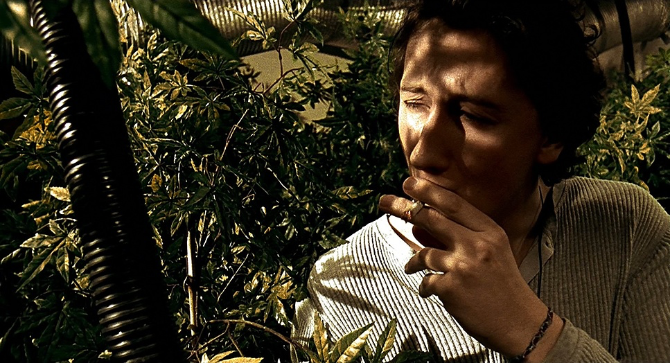
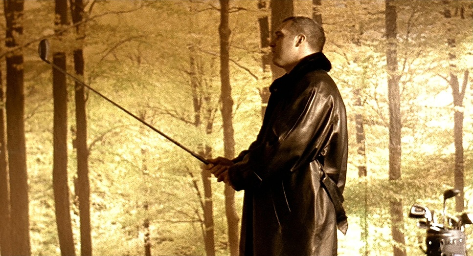
Ah, now we’re talking my language. The color grading in Lock, Stock is iconic. It is a fantastic example of how an intentional palette can deeply embed a film in its genre. Unlike the “cool” or “blue” tones often associated with modern crime thrillers, Lock, Stock leans heavily into a warm, saturated, almost sepia-toned aesthetic.
I’d describe the overall palette as “dirty gold,” with a notable emphasis on yellows, browns, and warm greens. It gives the image a tobacco-stained feel, evoking the grit of East London pubs and the grime of the criminal underworld. Skin tones are rendered with warmth, blending them into the environment rather than popping them out, which creates a cohesive, murky atmosphere.
The contrast shaping is robust. The blacks are crushed just enough to hide the grain of the 16mm stock, while the highlights often have that soft, creamy roll-off you only get from film. My intuition as a colorist tells me this look wasn’t just achieved in post; it was likely a combination of the specific Fuji film stocks (which often lean greener/warmer than Kodak) and a dedicated timing process at the lab to bake that warmth into the print. It’s a bold, stylized grade that makes the film feel sweaty, tense, and lived-in.
Technical Aspects & Tools
Lock, Stock and Two Smoking Barrels – Technical Specs
| Genre | Comedy, Crime, Heist, Dark Comedy, Biopic, Gangster, Thriller, Gambling |
| Director | Guy Ritchie |
| Cinematographer | Tim Maurice-Jones |
| Production Designer | Iain Andrews, Eve Mavrakis |
| Costume Designer | Stephanie Collie |
| Editor | Niven Howie |
| Colorist | Martin McGlone |
| Time Period | 1990s |
| Color | Warm, Saturated |
| Aspect Ratio | 1.85 – Spherical |
| Format | Film – 16mm |
| Lighting | Soft light |
| Lighting Type | Daylight |
| Story Location | England > London |
| Filming Location | England > London |
| Camera | Arriflex 16 SR2 |
| Film Stock / Resolution | 72161 Fuji FG 80D/64T 16mm |
We need to address the format because it defines the entire look of the film. Lock, Stock was shot on 16mm film(specifically Super 16mm using cameras like the Arriflex 16 SR2). It was then blown up to 35mm for theatrical release.
This choice is critical. 16mm has a much more pronounced grain structure than 35mm, giving the image that textured, “alive” quality. It feels scrappy and punk-rock, matching the low-budget nature of the production perfectly. The dynamic range of the film stock specifically the Fuji FG 80D/64T stocks mentioned in technical specs would have handled the mixed lighting conditions of London locations with a distinctive character.
Beyond the shooting, the editing techniques are inextricably linked to the camera work. The abrupt freeze frames, slow motion, and speed ramping required careful planning on set with the camera department. Speed ramping, in particular, involves changing frame rates on the fly, a mechanical process on a film camera. This fusion of raw 16mm aesthetics with bold, technical camera manipulation is what cemented Lock, Stock‘s place as a seminal piece of late 90s cinema.
- Also read: HACKSAW RIDGE (2016) – CINEMATOGRAPHY ANALYSIS
- Also read: ROCKY (1976) – CINEMATOGRAPHY ANALYSIS
Browse Our Cinematography Analysis Glossary
Explore directors, cinematographers, cameras, lenses, lighting styles, genres, and the visual techniques that shape iconic films.
Explore Glossary →