As a filmmaker and colorist, I spend a lot of time analyzing how images are built. It’s a craft that marries intuition with technical precision, often under immense pressure. When I think about films that truly embody this, Rocky (1976)invariably comes to mind. It’s more than just an iconic sports drama; it’s a blueprint for how raw, honest visual storytelling can elevate a low-budget production into a cultural landmark.
Everyone knows the Rocky narrative Stallone’s stubborn belief in his script and the shoestring budget. But the real magic lies in the image pipeline the way the film looks. It carries the emotional weight of a character who, despite his humble beginnings, dared to dream. It’s a reminder that impactful cinema isn’t about clean, commercial gloss; it’s about understanding the soul of the story and translating it through the lens.
About the Cinematographer
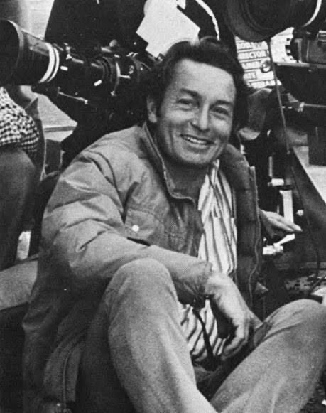
The pragmatist behind the lens was James Crabe, ASC. His work here is often overshadowed by the larger-than-life performances, but it is a study in working with constraint. Crabe came from a background that included television, which meant he knew how to move fast. He wasn’t known for a flamboyant, signature style, but rather for a grounded realism that served the script.
On a production like Rocky, where the budget was slashed to just over $1 million, the cinematographer has to be an architect of efficiency. Every setup has to count. Crabe’s experience allowed him to maximize impact with minimal resources a skill I appreciate in my own grading suite when we have to fix “fix it in post” moments. He relied on available light, clever blocking, and camera choices that felt naturalistic rather than performative. It’s a mindset that strips away the superfluous to focus on the narrative, a discipline many modern productions could learn from.
Inspiration Behind the Cinematography
The visual DNA of Rocky is rooted in the struggle of the underdog. The filmmakers weren’t aiming for perfection; they were aiming for truth. As a colorist, I often talk to clients about how an image needs to feel authentic, and Rocky nails this.
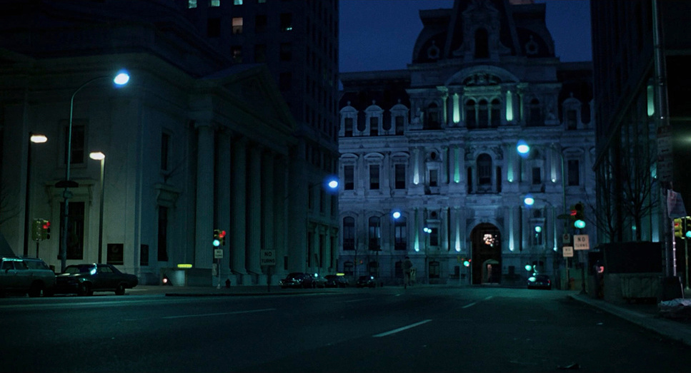
The film captures a “real everyday life” aesthetic. Characters aren’t lit to look like models; they look like people trying to survive. The visual inspiration clearly came from a desire to create a world that felt lived-in a Philadelphia that was gritty and unvarnished. It’s not about making Rocky look heroic through stylized backlights, but about grounding him in a reality where heroism is found in persistence. The cinematography acts as a mirror, reflecting his internal world without artifice.
Camera Movements
When analyzing the movement in Rocky, the economy of the camera stands out. There are very few “Hollywood” crane shots. Instead, the camera acts as an empathetic observer, tethered to Rocky’s experience. The handheld work, particularly in the earlier scenes of Rocky navigating his neighborhood, places us directly into his often-claustrophobic world. It gives the film an almost documentary-like immediacy.
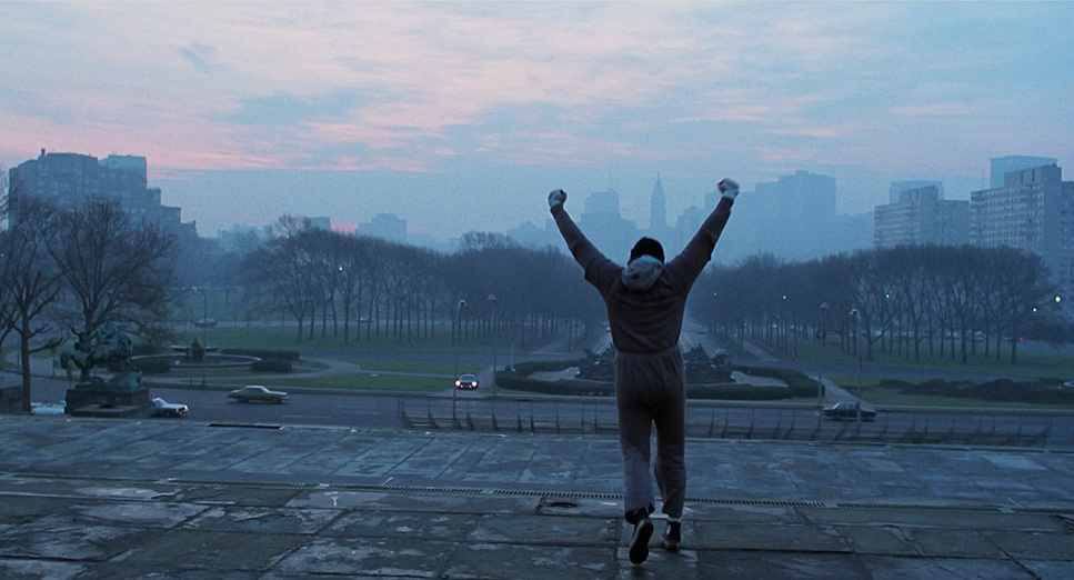
Then, of course, there is the Steadicam. It’s impossible to discuss this film without mentioning Garrett Brown, whose invention was pivotal here. The training montage, specifically the run up the museum steps, utilizes this (then-revolutionary) tool not just for smoothness, but to capture the spirit of the moment. The camera tracks, follows, and widens to reveal the scale of the city, underscoring Rocky’s determination. It’s dynamic, but it feels earned, born from character momentum rather than stylistic flourish.
Compositional Choices
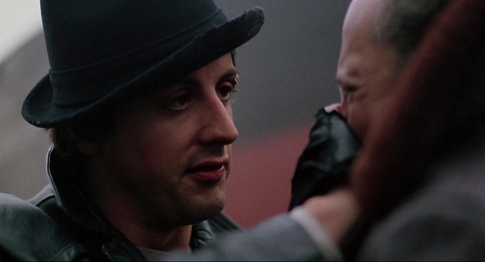
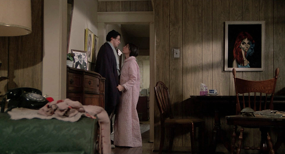
Crabe’s framing is a lesson in visual psychology. In the first act, we find Rocky framed within restrictive spaces doorways, dimly lit apartments, and the tight corners of the gym. These compositions emphasize his isolation and the limited scope of his life. He is a small figure within a larger, imposing environment.
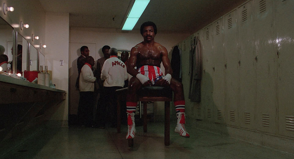
The framing of Adrian is equally telling. Initially, she is obscured, hidden behind counters or in shadows, her “mousey” nature reflected in the negative space. As their relationship deepens, the compositions open up. We see more frequent two-shots, favoring a balanced framing that speaks to their connection. Even the boxing scenes, for all their chaos, employ compositions that isolate the fighters, underscoring the solitary nature of their struggle while connecting them in a visceral dance.
Lighting Style
The lighting in Rocky is distinctly 70s: naturalistic, top-lit, and high-contrast. Crabe largely eschewed elaborate setups, harnessing practical sources and available ambient light.
Many scenes, particularly in the apartment or the gym, rely on single-source lighting. This creates a strong fall-off, allowing shadows to carve out the space and deepen the mood. When Rocky is on the streets at night, the existing streetlights and storefront glows provide the key illumination. This motivated lighting lends immense credibility to the world; it doesn’t feel like a set. Even the skin tones which lean warmer in the interiors speak to this naturalism. There’s no attempt to cosmetically soften the image; it’s about portraying the reality of the environment.
Lensing and Blocking
Given the low light conditions and the need for speed, the lens package likely relied on fast glass, such as Zeiss Super Speeds or Angenieux zooms, which were workhorses of that era. These lenses have a specific optical character they aren’t clinically sharp like modern optics, but they offer a beautiful texture. We see a deliberate mix of wider focal lengths for establishing context and tighter, normal-to-short telephoto lenses for character intimacy.
The blocking is masterful in its simplicity. Take the scene between Rocky and Mickey when the trainer first offers to help. The camera holds on a medium shot, but the physical positioning of the actors the distance between them speaks volumes about their history. Later, in the ring, the blocking is relentless. The camera is often right in the thick of the fight, mimicking a spectator’s view. This kind of blocking, where the actors’ movements dictate the camera’s path rather than the other way around, keeps the pacing organic and allows the scenes to breathe.
Color Grading Approach
As a colorist, this is where I really nerd out. When I look at the 4K remaster of Rocky, I’m seeing a film that was clearly designed for a specific photometric workflow.
My approach to grading a film like this today would be to build a pipeline around a vintage Print Film Emulation (PFE). We are looking for that specific 70s density rich, subtractive color mixing where the blacks are crushed just enough to feel “appropriately dark” without losing all texture. The magic is in the toe of the curve (the shadow roll-off) and the way the highlights desaturate as they clip.
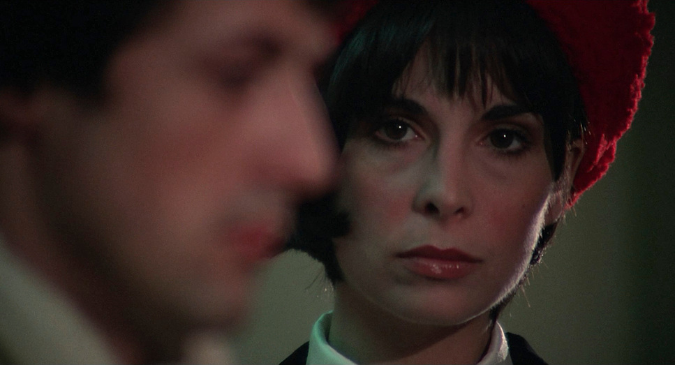
The “muted dull setting” of Philadelphia is a character in itself. The grade embraces this grime, but with intentional hue separation. The reds Adrian’s hat, the boxing trunks need to pop. This is about density, not just saturation. We want those reds to feel heavy and significant against the cooler, greener mercury-vapor tones of the city streets. Rocky’s complexion is often kept slightly more neutral, separating him from the warmer, more chaotic environments around him. It’s about finding the balance between fidelity and artistic intent, ensuring the image retains that “thick” filmic feel.
Technical Aspects & Tools
Rocky (1976) – Technical Specifications
| Genre | Drama, Action, Sports |
|---|---|
| Director | John G. Avildsen |
| Cinematographer | James Crabe, Garrett Brown |
| Production Designer | William J. Cassidy |
| Costume Designer | Robert Cambel |
| Editor | Scott Conrad, Richard Halsey |
| Time Period | 1970s |
| Color | Warm, Desaturated |
| Aspect Ratio | 1.85 – Spherical |
| Format | Film – 35mm |
| Lighting | Hard light, Top light |
| Lighting Type | Artificial light |
| Story Location | … Pennsylvania > Philadelphia |
| Filming Location | … Pennsylvania > Philadelphia |
| Camera | Panavision Panaflex |
| Lens | Zeiss Super Speed, Angenieux |
| Film Stock / Resolution | 5247/7247 Vision 125T |
From a technical standpoint, the film’s aesthetic is defined by its format. Rocky was shot on 35mm film, specifically Kodak 5247. This stock was the industry standard of the 70s, known for its iconic grain structure and how it handled pushed processing which Crabe likely did to get exposure in those dark Philadelphia locations. The 4K remaster preserves this medium-to-heavy grain, which is critical; scrubbing it away would destroy the film’s texture.
The aspect ratio is 1.85:1 (Spherical). Unlike the anamorphic 2.39:1 formats popular for epics at the time, the 1.85 ratio feels taller and more personal, focusing our attention on the characters rather than the landscape. The camera package would have included the Panavision Panaflex, which was relatively new at the time and quiet enough for sync-sound on location. Every technical choice, from the high-speed film stock to the spherical lenses, reinforced the grounded, human-scale narrative.
- Also read: MILLION DOLLAR BABY (2004) – CINEMATOGRAPHY ANALYSIS
- Also read: TRAINSPOTTING (1996) – CINEMATOGRAPHY ANALYSIS
Browse Our Cinematography Analysis Glossary
Explore directors, cinematographers, cameras, lenses, lighting styles, genres, and the visual techniques that shape iconic films.
Explore Glossary →