Gran Torino isn’t really a film about a car; it’s a film centered entirely around race and territory. It’s a raw look at Walt Kowalski, an aging, bigoted Korean War vet who finds an unexpected path to redemption through his Hmong neighbors. Eastwood, directing himself, crafts a narrative about a damaged man finding purpose in the next generation. It’s a classic redemption arc, sure, but the execution elevates it specifically the visual storytelling. From Walt’s isolation in his decaying house to his eventual sacrifice, the cinematography works to paint a portrait of a community in flux. I want to break down exactly how they built these images, how the look evolves, and what the technical choices tell us about the character’s headspace.
About the Cinematographer
The DP on Gran Torino was Tom Stern, Eastwood’s go-to collaborator. If you’ve seen Million Dollar Baby or Mystic River, you know Stern’s look: deep shadows, high contrast, and zero wasted movement. Their partnership is famous for its speed and pragmatism. Stern isn’t about setting up 50 lights for a beauty shot; he’s about lighting the environment and letting the actors live in it. It’s an “uncluttered” vision. This stripped-down aesthetic fits Eastwood’s directing style perfectly. It feels honest, almost like a documentary at times, which is crucial when you’re dealing with sensitive subjects like prejudice and gang violence. They aren’t trying to make it look “cinematic” in the blockbuster sense; they are trying to make it feel real.
Inspiration Behind the Cinematography
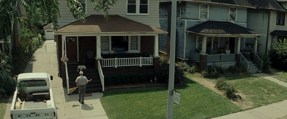
The visual approach stems directly from Walt’s internal state. We start with a bitter, isolated man living in a “working class neighborhood in Detroit” that he barely recognizes anymore. The cinematography reflects this decay. It’s not just a backdrop; the house is practically an extension of Walt’s own stubbornness.
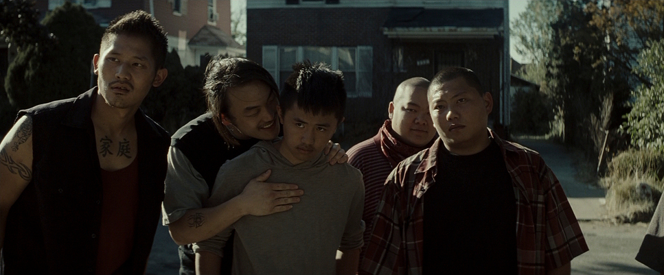
Visually, this translates to a desaturated palette dominated by the grays, browns, and rusted tones of an aging Rust Belt city. The framing emphasizes Walt’s self-imposed “fortress of solitude.” We often see him framed by doorframes or porch railings, cutting him off from the world outside. The goal is to show his resistance to change. As the story progresses and Walt connects with the Hmong community next door, the visual language shifts. The framing opens up, incorporating more shared space, and the lighting introduces warmer, tungsten tones when he’s with Sue and Tao. The camera mirrors Walt’s gazein itially narrow and prejudiced, then slowly widening to accept the world around him.
Camera Movements
In Gran Torino, the camera hardly moves. There are no sweeping crane shots or shaky handheld runs here. The camera is mostly static, locked off on a tripod. This stillness grounds the film in reality. It forces us to sit with the characters in their discomfort. It feels less like a movie and more like we are eavesdropping on a neighbor.
When the camera does move, it’s strictly motivated. You might see a slow, subtle push-in during a moment of introspection for Walt, but it’s barely perceptible. Pans are smooth and functional, just following a character crossing the room. This lack of movement mirrors Walt’s rigidity he’s a man stuck in his ways. It’s only as he softens that the camera language loosens up slightly, perhaps tracking more fluidly with the Hmong family to show their chaotic, vibrant life. The absence of showy camera work ensures our focus remains on the performance. It’s a lesson in restraint: sometimes the best move is not to move at all.
Compositional Choices
Composition here is all about isolation versus connection. Early in the film, Walt is constantly framed alone. Look at the scenes on his porch: he’s often positioned off-center, with the negative space around him emphasizing his loneliness. He is frequently framed behind physical barriers the railing of his porch, the mesh of a screen door, or the bars of his fence. He is a prisoner in his own home.
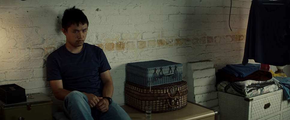
As his relationship with Tao and Sue develops, the composition changes. Initially, when he enters their house, he’s framed on the edge of the shot, an outsider looking in. But as he integrates, the lens brings him into the fold. We start seeing “two-shots” where he shares the frame equally with Tao, or wider shots where he’s surrounded by the family. The depth of field plays a role here too. In the beginning, shallow focus isolates him; later, deep focus allows us to see him and the neighborhood clearly in the same shot, suggesting he’s finally acknowledging his surroundings.
Lighting Style
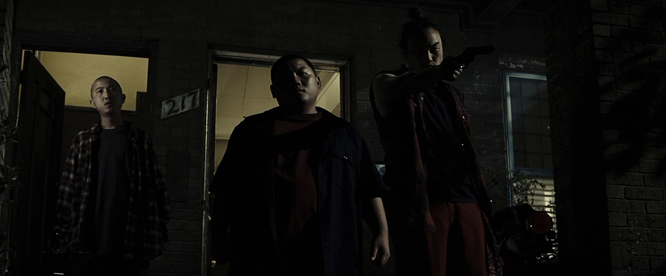
Tom Stern’s lighting is classic naturalism, but with that signature Eastwood darkness. It’s heavily motivated, meaning the light always looks like it’s coming from a real source a window, a table lamp, or a streetlamp. There’s no “Hollywood gloss” here.
For Walt’s early scenes, the lighting is harsh. We see high contrast ratios, with deep, crushed blacks and observational key lighting that doesn’t try to make Eastwood look younger. The shadows are heavy, literally obscuring parts of his face, extending that internal gloom into the room. It makes him look haunted. However, when Walt is inside the Hmong home, the lighting warms up. Stern likely gelled the lights or dimmed practicals to create a softer, yellow-orange tungsten glow. It’s a subtle shift, but it tells the audience that this place is safe. Since they shot on film, the highlight roll-off in the windows is smooth no harsh digital clippingwhich keeps even the bright exteriors feeling organic.
Lensing and Blocking
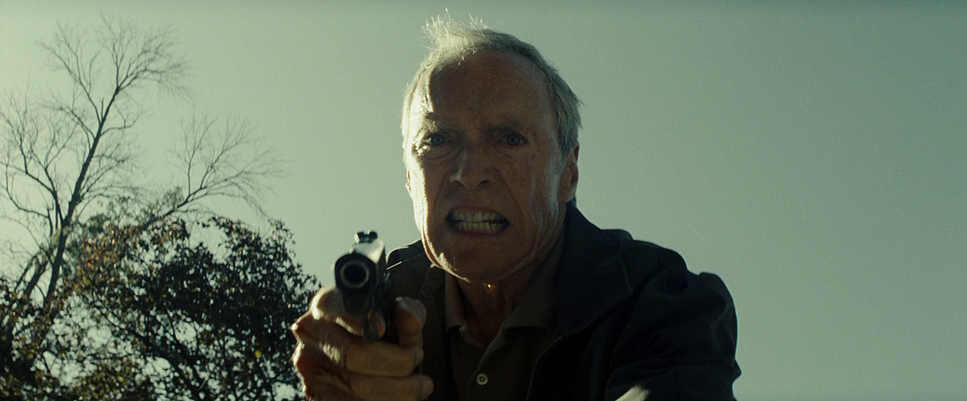
The production leaned on anamorphic glass, specifically Panavision C-Series and E-Series lenses. They tended to stay on the wider end of the focal lengths rather than using long telephoto lenses to compress the background. This is vital because we need to see the environment. We need to see the peeling paint on the houses and the overgrown lawns. Wide lenses keep Walt connected to that specific Detroit geography.
The blocking is just as deliberate. Walt is frequently blocked to create distance. Even when he’s talking to Father Janovich, he’s usually busy working on something, turning his back, or standing behind a barrier. His body language is closed off, often leaning forward aggressively. The Gran Torino itself acts as a blocking toolinitially, it’s a barrier that separates him from the gang and his neighbors. Later, it becomes a bridge; scenes of him and Tao leaning over the engine block physically bring them together in a shared activity. It’s simple, effective staging that shows the power dynamic shifting without a word of dialogue.
Color Grading Approach
As a colorist, this is where I really nerd out. The grade on Gran Torino isn’t trying to be trendy; it’s trying to look like a traditional film print. Since they shot on 35mm, the footage already had a great starting point, but the DI (Digital Intermediate) took it further.
The primary goal was clearly contrast shaping. To sell the grit of the story, the grade leans into a cooler, desaturated look for the exterior Detroit scenes greens are muted, skies are often a pale cyan or gray rather than a vibrant blue. It feels cold. The blacks are dense, sometimes crushed to the point where detail is lost, which fits the noir-ish elements of the story.
However, the grade separates the two worlds. Walt’s house is cool and dark. The Hmong house has a warmer white point, bringing out skin tones and making the reds and oranges pop slightly more. It’s not a dramatic “teal and orange” look, but a subtle temperature shift. The highlight roll-off is kept very soft typical of the Kodak Vision3 stock which prevents the image from feeling sharp or digital. It’s a textured, chemical look that suits the “old school” nature of the protagonist.
Technical Aspects & Tools
Gran Torino – Technical Specs
| Genre | Drama |
|---|---|
| Director | Clint Eastwood |
| Cinematographer | Tom Stern |
| Production Designer | James J. Murakami |
| Costume Designer | Deborah Hopper |
| Editor | Joel Cox, Gary D. Roach |
| Colorist | Tony Dustin |
| Time Period | 2000s |
| Aspect Ratio | 2.39 – Anamorphic |
| Format | Film – 35mm |
| Lighting | Soft light, Top light |
| Lighting Type | Daylight, Artificial light, Tungsten |
| Story Location | … Michigan > Detroit |
| Filming Location | … Michigan > Detroit |
| Camera | Panavision Millennium / Millenium XL / XL2 |
| Lens | Panavision E series, Panavision C series, Panavision 70-200mm (ATZ), Panavision 40-80 (Bailey zoom – AWZ2), Panavision 70-200mm (ATZ) |
Gran Torino was shot on 35mm film, which gives it that grain structure and texture you just can’t perfectly fake with digital. They used Panavision cameras likely the Millennium XL paired with Panavision C-Series and E-Series anamorphic lenses. These older lenses have distinct characteristics: they aren’t clinically sharp, and they have unique flares and focus fall-off that add character to the image.
For the film stock, they almost certainly used Kodak Vision3 500T (5219) for the interiors and night scenes. That stock loves shadow detail and handles mixed lighting situations well, which is perfect for the dimly lit interior of Walt’s house. For exteriors, they likely used a slower daylight stock like 250D to keep the grain tighter. The 2.39:1 anamorphic aspect ratio is also a key choice it gives the film a cinematic weight and allows for those wider compositions where Walt is isolated against the horizontal lines of his porch and street. Eastwood and Stern work fast few takes, simple setups and using these reliable workhorse cameras allowed them to focus on the acting rather than the tech.
- Also read: BLADE RUNNER (1982) – CINEMATOGRAPHY ANALYSIS
- Also read: INSIDE OUT (2015) – CINEMATOGRAPHY ANALYSIS
Browse Our Cinematography Analysis Glossary
Explore directors, cinematographers, cameras, lenses, lighting styles, genres, and the visual techniques that shape iconic films.
Explore Glossary →