We often talk about films that are “influential,” but Blade Runner is in a league of its own. It is a sublime fusion of stunning cyberpunk visuals and classic film noir tropes. It explores deep ideas about the nature of consciousness and the value of life, but it does so through a visual language where the very air feels heavy with meaning. Every splash of neon and every drip of rain is meticulously placed. So, let’s dive into the visual language of Blade Runner and truly appreciate the genius behind it.
About the Cinematographer
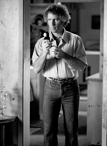
The visual architect behind Blade Runner‘s iconic look was the brilliant Jordan Cronenweth, ASC. His work on this film cemented his legacy as one of the most innovative cinematographers of his time. Cronenweth was a master of practical lighting and had a fearless willingness to push the boundaries of underexposure. He had an incredible ability to imbue mundane spaces with a dreamlike, almost painterly quality.
Cronenweth had a unique way of seeing light he wasn’t just illuminating a scene; he was sculpting with it. Tragically, he was battling Parkinson’s disease during production, which adds a layer of heroic dedication to the final result. Despite the physical challenges, he created a visual lexicon that has been imitated countless times but never truly replicated. His partnership with Ridley Scott was one of those rare, alchemical collaborations where director and DP were perfectly attuned, resulting in something truly transcendent.
Inspiration Behind the Cinematography
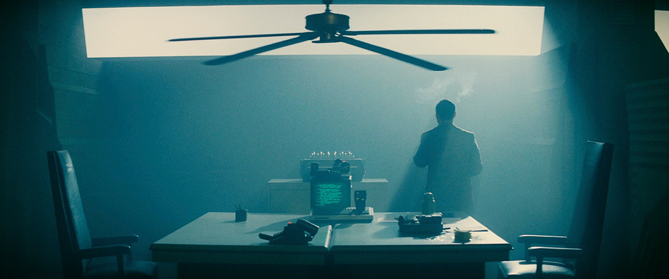
Blade Runner‘s visual identity works because it mashes up two seemingly contradictory styles into something cohesive. The primary foundation is undeniably film noir. Deckard is your archetype of the classic noir detective: smart, resourceful, but deeply cynical and world-weary. This character archetype dictates the lighting schema.
We see the “rain-soaked city in permanent darkness,” the low-key lighting, and the moral ambiguity reflected in the lack of clear, broad sources. But layered over this noir foundation is a dazzling, oppressive cyberpunk world. It’s a vision of Los Angeles defined by gigantic skyscrapers, flying cars, and neon-lit streets. The contrast is the key: old-world grime meeting futuristic glow.
Visually, the film owes a massive debt to Syd Mead, whose concept art established the industrial, functional aesthetic of the vehicles and architecture. But beyond the sci-fi, I see strong echoes of painters like Edward Hopper in the framing isolated figures set against grand, anonymous urban backdrops, emphasizing loneliness. The result is a “retro-fitted” world where bright neon lights are patched over decaying old buildings a perfect visual metaphor for the film’s core themes of artificiality masking organic decay.
Camera Movements
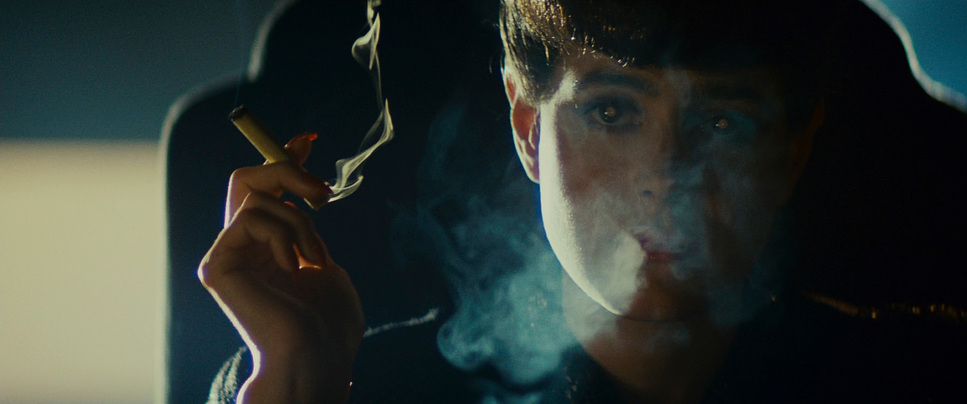
The camera in Blade Runner is rarely frantic. Unlike modern sci-fi which often relies on handheld chaos to sell realism, Cronenweth acts as a deliberate observer. This is a constructed reality, and the camera movements reflect that precision.
We open with that iconic shot of the industrial gas flares reflecting in the human eye a static, meditative close-up that sets a tone of introspection. From there, the film relies heavily on slow, deliberate tracking shots. When we follow Deckard through crowded streets, the camera glides. These movements are about immersion, allowing us to absorb the incredible density of the production design. The camera isn’t just moving from A to B; it’s pushing through layers of atmosphere, smoke, and light.
Crane shots are frequently deployed to establish the sheer scale of this dystopian Los Angeles. They make the human figures even Deckard feel insignificant within the sprawling, oppressive cityscape.
However, the film shifts gears masterfully with the use of Steadicam, particularly during the climax. The final cat-and-mouse chase through the derelict Bradbury Building uses the Steadicam to add a visceral, subjective tension. It places us squarely in Deckard’s desperate flight and Roy’s predatory pursuit, ratcheting up the claustrophobia in a way static shots never could.
Compositional Choices
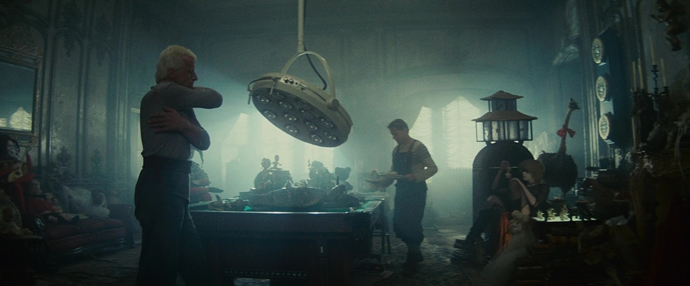
If Blade Runner were a painting, it would be a canvas where not a single inch is wasted. The compositional choices are dense, layered, and constantly feeding us information.
Depth cues are paramount here. Cronenweth rarely gives us a flat frame. He constantly uses foreground elements rain-streaked windows, steam vents, passing crowds to create layers that draw the eye deep into the background. The ever-present smoke and rain act as natural atmospheric haze, enhancing the illusion of distance and making the light feel tangible.
Framing creates a sense of entrapment. Despite the gargantuan scale of the city, characters are frequently framed tight within doorways, pillars, or the geometric patterns of the buildings. This emphasizes the verticality of the world the towering skyscrapers and the endless rain weigh down on the characters.
I also appreciate the use of silhouette. It’s a classic noir trope perfectly adapted for sci-fi, using strong backlighting to obscure faces and heighten mystery. In a world where you can’t tell human from replicant, the compositions constantly reinforce that ambiguity by hiding the characters in shadow.
Lighting Style
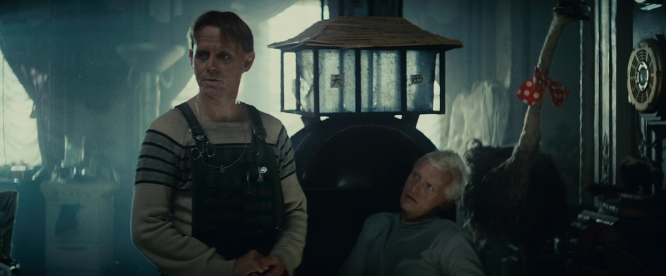
This is where Blade Runner truly innovated. Cronenweth’s approach was a masterclass in motivated lighting infused with a high-contrast aesthetic. In a movie that is almost perpetually dark and raining, the light sources become characters themselves.
Every neon sign, monitor glow, and street lamp feels like a practical, on-set fixture. This lends an incredible authenticity to the fantastical world. The neon glow paints the wet streets and faces with saturated blues, reds, and greens colors that often signify emotional states or the artificiality of the replicants.
Critically, Cronenweth embraced deep shadows. There is very little “safe” fill light. He lets the shadows swallow detail, forcing the viewer to lean in. This high contrast actively participates in the storytelling.
But the secret sauce is the use of smoke and haze. It’s not just for mood; it’s functional. The smoke catches the hard light from the practicals, creating those glorious light shafts that cut through the darkness. It creates volume. When you see a character backlit by a wall of vapor, you’re seeing light itself become the subject.
Lensing and Blocking
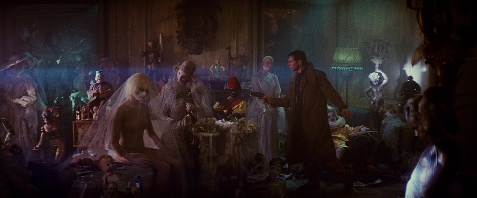
Cronenweth primarily used anamorphic lenses, which are inherently cinematic. They give us that wide, expansive aspect ratio (2.39:1), but also the characteristic oval bokeh and horizontal lens flares that define the film’s aesthetic. These optical characteristics contribute to the dreamlike quality, making the world feel slightly stretched and grander than life.
There is a sophisticated interplay of wide and long lenses. Wide lenses emphasize the architectural scale, dwarfing Deckard inside the Tyrell Corporation. Conversely, long lenses are deployed for intimate moments, compressing space and isolating characters to enhance their vulnerability.
Blocking the positioning of actors in the frame is incredibly precise. Because the depth of field is often shallow (due to low light levels), the actors have to hit their marks perfectly. Watch the scene where Rachel sits at Deckard’s piano; the way she unpins her hair and interacts with the space is choreographed to reveal her internal exploration of humanity, all within a strictly composed frame.
Color Grading Approach
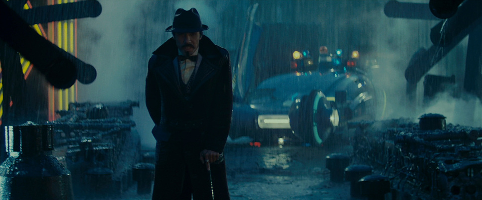
Ah, the color. As a colorist, this is where Blade Runner sings. It is crucial to remember that this film predates Digital Intermediates. The “look” was achieved photochemically through lighting choices on set, film stock selection, and printer lights in the lab during the answer print process.
The palette is incredibly rich. We see masterful hue separation, where the vibrant neon creates distinct visual anchors against a backdrop of desaturated grays and browns. It avoids being garish because the colors feel motivated by the grime and decay.
The tonal sculpting is aggressive. The blacks are inky but retain texture, and the highlights roll off beautifully. This is the advantage of film origination the specular highlights from wet surfaces and neon transition smoothly into the mid-tones without the harsh clipping we sometimes see in digital.
A perfect example of color as storytelling is the “sunset” scene at the Tyrell Corporation. It’s a stark contrast to the dominant cool, cyan-heavy palette of the streets. The warm, golden hues signal a shift in power and atmosphere. It demonstrates that color isn’t just a static overlay; it’s responsive to the narrative.
Technical Aspects & Tools
| Blade Runner (1982) | Technical Specifications | |
|---|---|
| Genre | Artificial Intelligence, Cyberpunk, Drama, Hard Sci-Fi, Psychedelic, Satire, Science Fiction, Technology, Thriller, Political, Dystopian, Neo-Noir, Crime |
| Director | Ridley Scott |
| Cinematographer | Jordan Cronenweth |
| Production Designer | Lawrence G. Paull |
| Costume Designer | Michael Kaplan, Charles Knode |
| Editor | Marsha Nakashima |
| Colorist | Jill Bogdanowicz, Tom Burton, Karen Krause, Joshua Pines, Thomas R. Polizzi, James Warren |
| Time Period | Future |
| Color Palette | Cool, Desaturated, Cyan, Blue |
| Aspect Ratio | 2.39 – Anamorphic |
| Format | Film – 35mm – Flashing |
| Lighting | Hard light |
| Lighting Type | Artificial light, Practical light, Mixed light |
| Story Location | … California > Los Angeles |
| Filming Location | … California > Los Angeles |
| Camera | Mitchell FC 65 |
| Lens | Panavision C series |
| Film Stock / Resolution | Eastman 100T 5247 |
For a film made in 1982, the technical execution was groundbreaking, relying on a blend of analog ingenuity and optical chemistry.
The film was shot on 35mm film stock, specifically Eastman 100T 5247. The resulting grain structure adds a tactile, lived-in texture that digital noise reduction often strips away. That grain is part of the world it feels gritty.
Panavision cameras and anamorphic lenses were the workhorses, but the unsung heroes were the practical lights. The set design integrated thousands of neon and fluorescent tubes, allowing Cronenweth to light 360-degree environments.
And we cannot forget the environmental effects. The production ran rain machines and smoke/haze machinesconstantly. These transformed mere light bulbs into glowing beacons. Finally, the world-building relied on miniatures and matte paintings. The sprawling cityscapes were meticulously crafted physical models, integrated via motion-control cameras. This analog approach gives the visual effects a weight and presence that CGI often lacks.
- Also read: INSIDE OUT (2015) – CINEMATOGRAPHY ANALYSIS
- Also read: THE BIG LEBOWSKI (1998) – CINEMATOGRAPHY ANALYSIS
Browse Our Cinematography Analysis Glossary
Explore directors, cinematographers, cameras, lenses, lighting styles, genres, and the visual techniques that shape iconic films.
Explore Glossary →