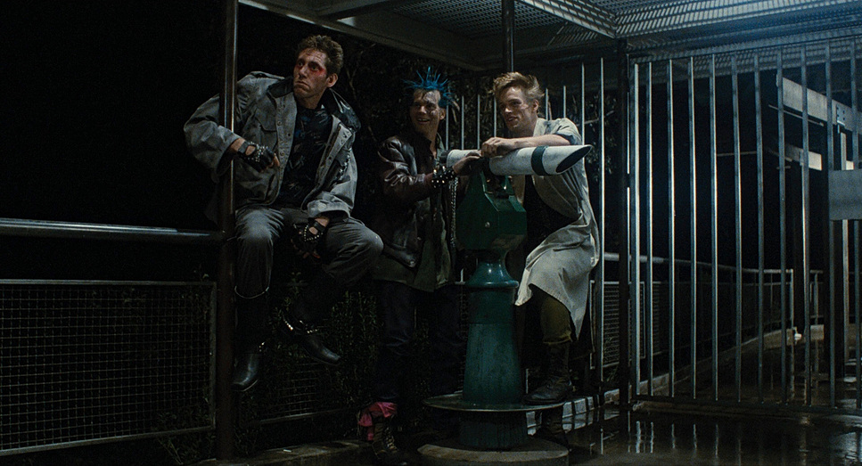
When you dive into James Cameron’s 1984 original, you aren’t just watching an action movie; you’re watching a masterclass in doing more with less. For me, this is a foundational text. It’s a totally different beast than its sequel, T2, which is a polished, high-gloss blockbuster. The first Terminator? It’s a sci-fi horror film, pure and simple, and the cinematography is the reason that horror lands.
About the Cinematographer
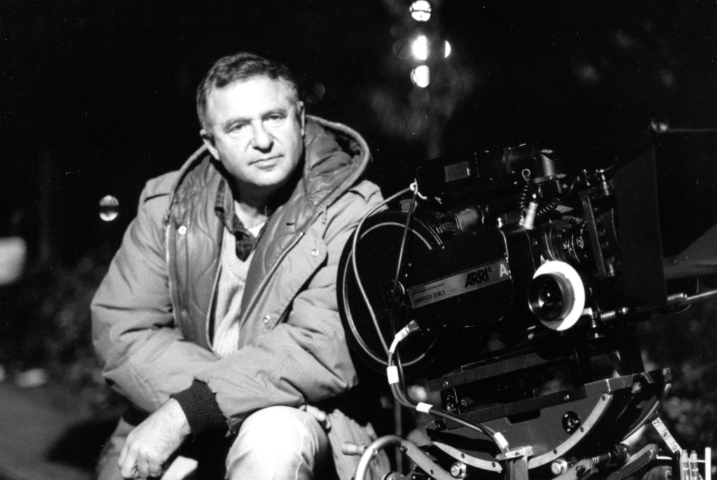
The visual architect here was Adam Greenberg. His career is massive, spanning decades, but his work on Cameron’s breakthrough set a specific, gritty tone that defined an era. It’s a fascinating collaboration because Cameron wasn’t just a “script guy” he came from visual effects and production design under Roger Corman. He was painting matte shots for Escape from New York, so he understood how to cheat the eye and craft convincing visuals on a shoestring budget. This partnership with Greenberg was the perfect storm. Cameron knew what he needed the audience to feel, and Greenberg knew how to translate that into tangible light and shadow. It proves that when a director has high visual literacy, the cinematographer can stop explaining and start elevating.
Inspiration Behind the Cinematography
It all started with a fever dream literally. Cameron famously envisioned a chrome skeleton rising from the fire, and that singular, primal image anchors the entire film. The cinematography leans heavily into that horror designation. You feel the constant dread, that sense of impending doom Kyle Reese describes. The visual language isn’t about hope or heroism; it’s about the terror of survival.
The look is defined by smoke, shadows, and that iconic cold blue light. It’s a signature that screams “80s grit” in the best way possible. It embraces its B-movie roots but executes them with A-list confidence. The inspiration wasn’t just to show a robot; it was to convey the feeling of being hunted. This meant a strategy prioritizing silhouettes and darkness, making the Terminator feel like an inescapable presence rather than just a bodybuilder in a leather jacket.
Camera Movements
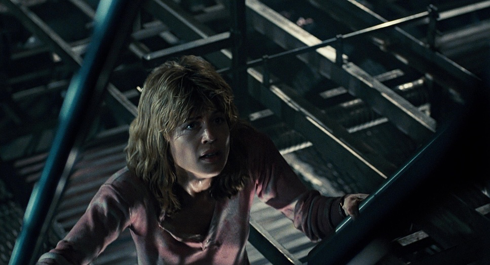
The camera work in The Terminator is inextricably linked to the genre. It shoots like a slasher film. For much of the runtime, Sarah Connor and Kyle Reese are on the defensive, and the camera mirrors that urgency. During the chase sequences, it’s frantic a mix of handheld that puts us in their worn-out shoes, and fluid tracking shots that emphasize just how fast they have to move to stay alive.
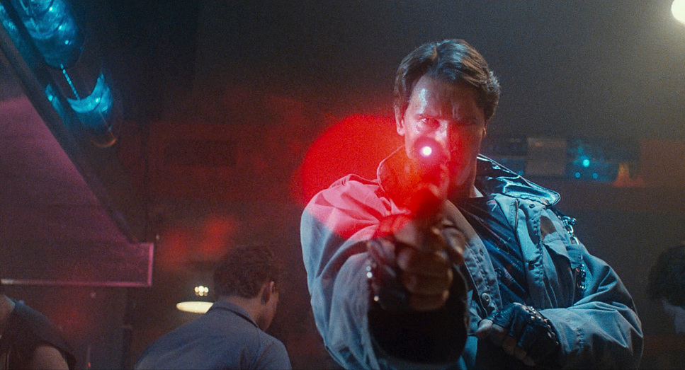
Then you look at the Terminator. When he is on screen, the camera changes completely. It becomes steady, almost clinical. It doesn’t whip around him; it observes him. Look at the police station assault: the camera work is cold and methodical as he eliminates obstacles. This contrast is brilliant. It reinforces the power dynamic without a single line of dialogue: frantic energy for the vulnerable humans; calm, unstoppable momentum for the machine. Even when he’s driving, the camera scans with him, mimicking a machine’s sensory input.
Compositional Choices
Composition here is all about power dynamics. Early on, Sarah Connor is framed to feel small. She is frequently dwarfed by the Los Angeles environment or the crowds, visually establishing her vulnerability before the threat even reveals itself. It’s a subtle depth cue that forces the audience to worry about her immediately.
Conversely, the Terminator is composed to feel immense. He fills the frame, his shoulders crowding the edges, or he’s placed in the background as a looming threat that won’t go away. Cameron and Greenberg were also smart about what they didn’t show. We don’t see the full robotic workings until the end. This sparing use of revealing compositions makes the glimpses we do get the peeled-out eye, the exposed tendons feel like a genuine shock rather than a special effect. Even the future war scenes, which were largely miniatures, use foreground elements to cheat the scale, suggesting a massive, bleak world beyond the edges of the lens.
Lighting Style
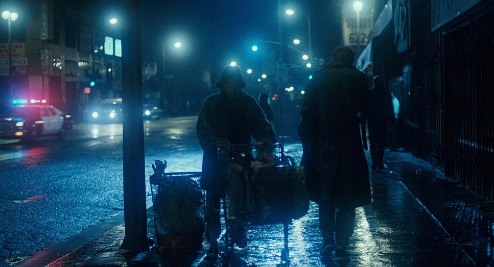
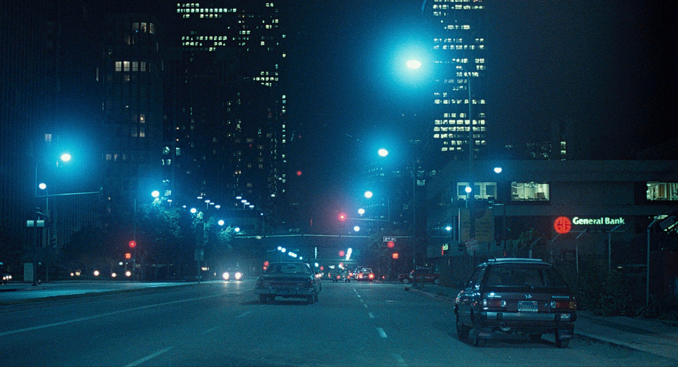
From a colorist’s perspective, this is where the movie really flexes its muscles. The lighting style is the backbone of the film’s aesthetic. It relies on heavy contrast deep, inky blacks and stark, hard sources. This isn’t just for looks; it’s narrative. The shadows are a character, providing the only refuge for Reese and Sarah.
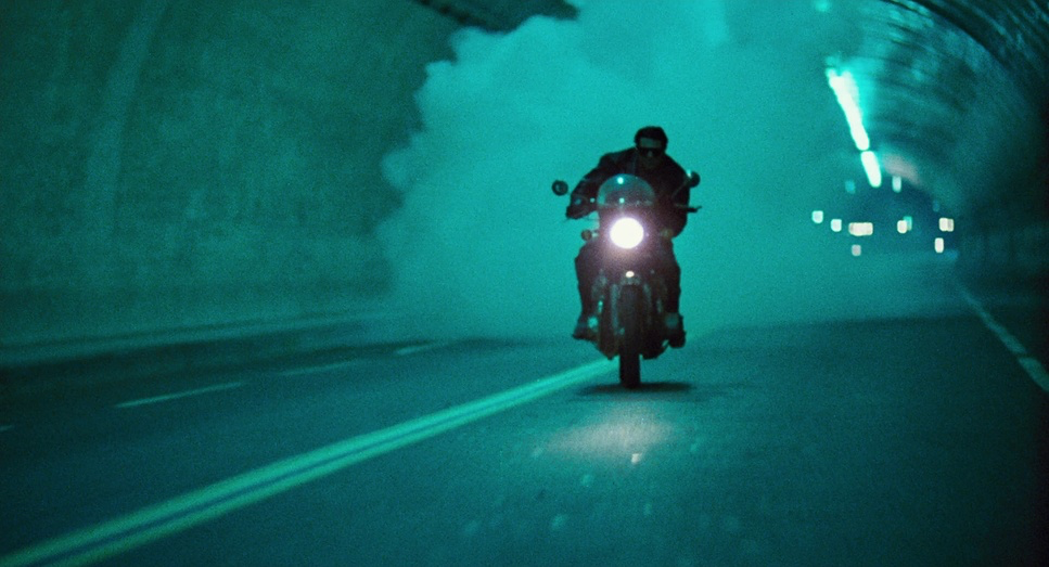
That “cold blue” look is legendary. The night scenes are bathed in saturated blues and cyans, motivated by “moonlight” or the harsh glow of streetlamps. It immediately evokes a hostile, industrial atmosphere. It highlights metallic surfaces (foreshadowing the endoskeleton) and emphasizes the Terminator’s lack of warmth. When we do see warm sources a lamp in the motel, the fire in the factory they pop aggressively against that cool base. It creates a visual tension that keeps the eye moving and the brain alert. It’s not “pretty” light; it’s effective light.
Lensing and Blocking
The lens choices lean into the grit. We see wider lenses establishing the isolation of the future war or the emptiness of the LA streets. But during the action, the lensing gets aggressive, often using wider angles up close to exaggerate the Terminator’s size or the chaos of the gunfights.
The blocking is even more telling. Kyle and Sarah are almost always retreating. Their movement is defined by evasion ducking, running, hiding. They are reactive. The Terminator, however, is a masterclass in linear blocking. He doesn’t dodge. He walks through walls, over bodies, and straight toward the lens. The camera tracks him at a slow, deliberate pace, contrasting with the frantic, reactive movement of the heroes. It’s the visual equivalent of a tank boss fight: one side has agility, the other has armor, and the blocking makes sure you feel that weight.
Color Grading Approach
This is where I get to geek out. The grade on The Terminator defines the “tech-noir” aesthetic. When people ask for that “80s look,” this is usually what they mean.
The palette is utilitarian and desaturated, particularly in the mid-tones, but the cool tones are pushed hard. The blues and cyans are dense, giving the night scenes a suffocating quality. Contrast shaping is paramount here. The blacks are often crushed, likely a necessity of the film stock and lighting package at the time, but it adds a density to the image that modern digital cameras struggle to replicate. It feels thick. There’s a tangible sense of print-film sensibilities the highlights roll off with a soft, organic quality, even when the lights are harsh.
Hue separation isn’t about making a rainbow; it’s about accents. The dominant cool tones are occasionally punctuated by the red glow of the Terminator’s eyes or an explosion. These moments work because the rest of the film is so controlled. It’s also worth noting the “remaster problem.” Modern releases often clean up the grain and balance the contrast too perfectly, losing that authentic 80s print character. The film’s low budget meant embracing noise and grit, and that texture is part of why it works.
Technical Aspects & Tools
The Terminator – Technical Specs
| Genre | Action, Cyberpunk, Science Fiction, Thriller, Time Travel, Technology, Artificial Intelligence, Dystopian |
|---|---|
| Director | James Cameron |
| Cinematographer | Adam Greenberg |
| Production Designer | George Costello |
| Costume Designer | Hilary Wright |
| Editor | Mark Goldblatt |
| Colorist | Peter Silverman |
| Time Period | 1980s |
| Color | Desaturated, Cyan |
| Aspect Ratio | 1.85 |
| Lighting | Side light |
| Lighting Type | Daylight |
| Story Location | California > Los Angeles |
| Filming Location | California > Los Angeles |
| Camera | Arriflex 35 III |
| Lens | Zeiss Super Speed |
| Film Stock / Resolution | 5293/7293 EXR 200T |
The technical achievements are staggering when you consider the budget was just over $6 million. In today’s terms, that is virtually nothing for a sci-fi action film. This constraint forced invention. Stan Winston truly brought the nightmare to life, blending techniques that, frankly, shouldn’t have worked together as well as they did.
They used full-scale puppets for static shots, animatronics for the close-ups (like the eye surgery), and stop-motion for the full-body walking shots. People love to knock the stop-motion now, saying it looks “dated” compared to T2, but I’d argue the jerky, unnatural movement actually makes the machine scarier. It puts the Terminator right in the uncanny valley it moves like something that shouldn’t be alive.
The future war scenes are another triumph of “camera logic” over budget. They used foreground miniatures mixed with forced perspective to create a sense of scale that CGI often fails to achieve. It proves that vision and execution matter more than a blank check.
- Also read: HARRY POTTER AND THE DEATHLY HALLOWS: PART 2 (2011) – CINEMATOGRAPHY ANALYSIS
- Also read: MAD MAX: FURY ROAD (2015) – CINEMATOGRAPHY ANALYSIS
Browse Our Cinematography Analysis Glossary
Explore directors, cinematographers, cameras, lenses, lighting styles, genres, and the visual techniques that shape iconic films.
Explore Glossary →