It’s a film that dances on the line between glamorous fantasy and grounded reality, much like its protagonist, Frank Abagnale Jr. You know, the guy who, before he could legally buy a beer, was living out multiple professional fantasies: pilot, doctor, lawyer, professor all while writing fraudulent checks that would make your head spin.
The narrative itself is a lesson in “fake it ’til you make it,” driven by sheer audacity and an understanding of human psychology. And the visuals? They perfectly encapsulate this theme, creating a world that feels both aspirational and inherently fragile. My goal here isn’t just to gush about a great movie, but to dig into the actual craft, dissecting the visual choices that made Catch Me If You Can such a captivating watch.
About the Cinematographer

You can’t talk about Catch Me If You Can without talking about Janusz Kaminski. He’s Steven Spielberg’s long-time collaborator, and honestly, the man’s a legend. He has a distinct aesthetic that’s immediately recognizable, often characterized by strong, directional light, a somewhat desaturated palette, and a certain painterly quality that makes his images feel both classic and strikingly modern. With Spielberg, he’s created some of the most iconic images in cinema history, from the stark realism of Schindler’s List to the fantastical glow of E.T.
For Catch Me If You Can, Kaminski brought his signature blend of artistry and technical precision, shaping a visual language that felt perfectly attuned to the film’s 1960s and 70s setting. His work here is never just about making pretty pictures; it’s about serving the story, elevating the emotional stakes, and grounding the fantastical elements in a believable visual reality. Or, in Frank’s case, a believable unreality.
Inspiration Behind the Cinematography
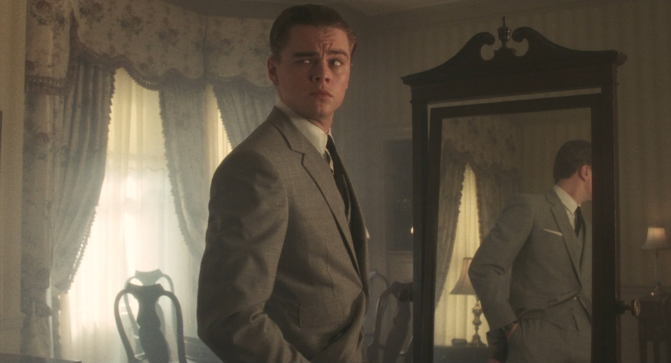
The core inspiration for the look clearly stems from the duality of Frank Abagnale Jr.’s life: the glamorous facade versus the lonely reality. The film evokes the aspirational quality of the era the allure of travel, wealth, and status while simultaneously hinting at the precariousness of Frank’s existence. Frank’s father teaches him early on that “appearance is everything.” This becomes the film’s visual mantra.
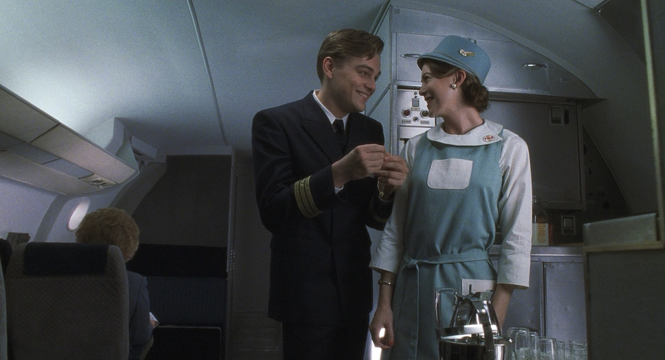
We see this played out as young Frank first impersonates a substitute teacher in his prep school uniform. He looks the part, acts the part, and immediately commands authority. The film visually underscores how a uniform, a confident posture, and a certain kind of framing can transform perception. When Frank spots that pilot surrounded by stewardesses, the uniform becomes a visual symbol of the status he craves. The cinematography leans into this, presenting these moments with a certain glow, a sense of envy and desire in Frank’s eyes, making the uniform itself a character in the story.
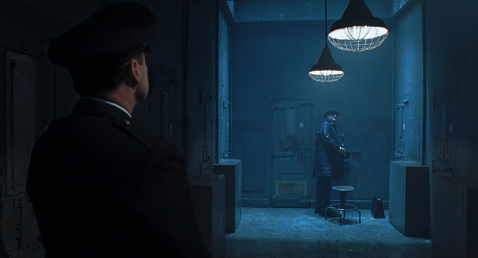
The “cat and mouse game” between Frank and FBI agent Carl Hanratty also shapes the visual strategy. The cinematography contrasts Frank’s brightly lit, expansive, often public spaces (airports, glamorous hotels) with Hanratty’s more confined, office-bound, and somewhat grittier world. This visual juxtaposition heightens the sense of Frank’s freedom and Hanratty’s relentless, often frustrating, pursuit. It’s about creating two distinct visual languages that eventually converge.
Camera Movements
Kaminski’s camera work here is elegant and motivated. It’s rarely static, constantly flowing, guiding our eyes and building rhythm, much like a confident con artist leading his mark. You’ll notice a prevalence of smooth, deliberate tracking shots and dolly moves, especially when Frank is on the move, asserting his authority, or slipping through crowds. These movements often have a grace that reflects Frank’s own smooth maneuvers, giving him an almost balletic quality as he navigates his fabricated life.
Consider the airport sequences, a recurring motif. The camera glides alongside Frank as he strides confidently through terminals, often with a slight push-in to emphasize his unwavering self-assurance. These wide-angle tracking shots immerse us in the bustling environments while keeping Frank central, often leading the frame. Even when he’s escaping capture at the Miami airport, masquerading as a recruiter with a bevy of stewardesses, the camera maintains a confident, unbroken flow, matching his audacious stride. It’s not shaky handheld; it’s a controlled, purposeful movement that implies Frank is in charge, even when he’s hiding in plain sight.
Conversely, for Hanratty, the movements can feel a bit more grounded, sometimes even a touch more observational, reflecting his detective’s methodical approach. There might be subtle push-ins on documents or close-ups of his furrowed brow, but his world, visually, is less about fluid grace and more about determined analysis.
Compositional Choices
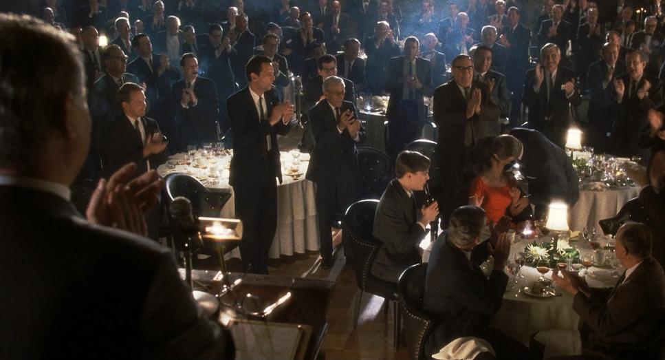
Composition in Catch Me If You Can is incredibly precise, yet it never feels overtly staged. Kaminski often uses wide shots to establish Frank’s environment, emphasizing the grand scale of his cons the vastness of the Pan Am terminals, the spacious hospital corridors, the opulent homes. Within these wide frames, Frank is often positioned centrally or using leading lines to draw our attention to him, even amidst bustling backgrounds. This creates strong depth cues, giving the audience a clear sense of place and Frank’s relationship to it.
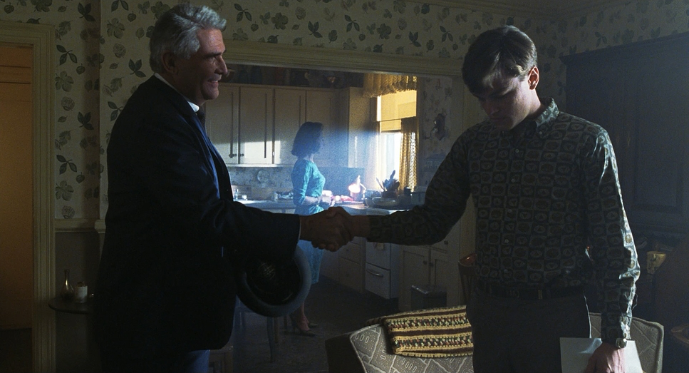
But the real genius comes in how composition reflects Frank’s internal state. Many times, he’s framed in wide shots, alone amidst a crowd or in a grand space, subtly emphasizing his isolation despite his social chameleon act. Think of him in that cramped apartment in Queens after his family downsizes a visual echo of his diminished status. Contrast that with his confident swagger in a pilot’s uniform, often framed against powerful architectural lines or the dynamic energy of an airport.
There’s a recurring visual motif where Frank is slightly off-center, or framed by doorways and windows, creating a sense of him being observed, or perhaps observing others. It’s a subtle way to remind us of his constant performance. This framing choice is particularly effective in scenes where he’s trying to learn new skills, soaking it all in before embodying his next role.
Lighting Style
Kaminski’s lighting is, for me, where a lot of the magic happens. It’s a perfect example of motivated lighting making every source feel natural to the scene, yet undeniably artful. He uses a lot of strong backlighting, often creating a glowing aura around characters, especially Frank. This adds to the film’s slightly romantic quality, elevating Frank’s story into almost mythic territory.
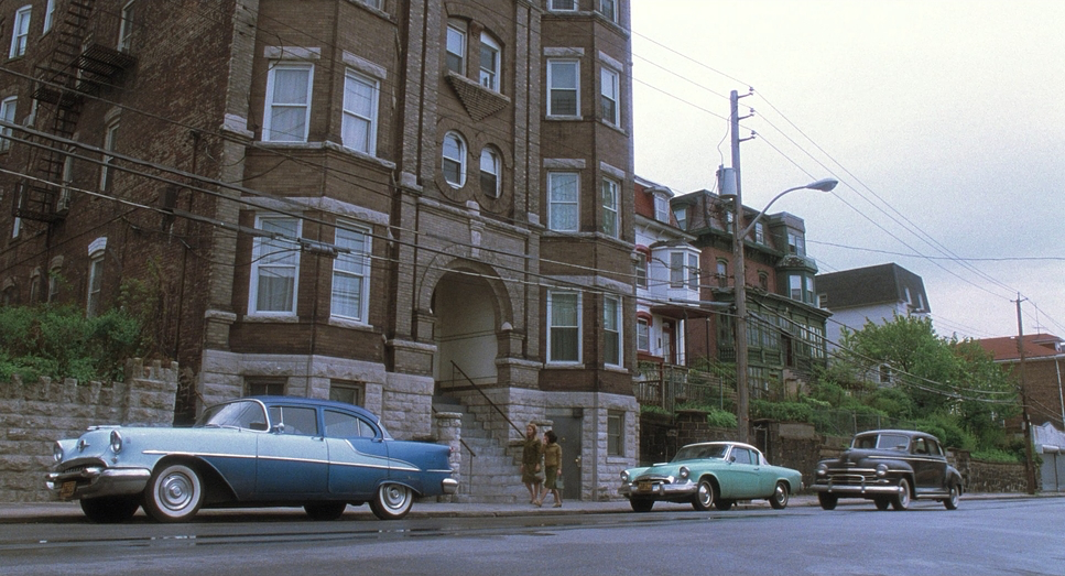
The period setting is beautifully evoked through choices in color temperature. Interiors often have a warm, inviting glow, typical of incandescent lighting. Practical lights lamps, overhead fixtures, streetlights are almost always visible in the frame, serving as tangible light sources. But Kaminski takes these real-world sources and shapes them with a painter’s eye, often using sharp, directional key lights to sculpt faces and create dramatic shadows, giving scenes a slightly high-contrast, graphic feel.
There’s a clear distinction between the lighting for Frank’s glamorous moments and his more vulnerable situations. When he’s flying high, the lighting tends to be brighter, more expansive, perhaps with a touch of lens flare. When he’s cornered, or in the French prison sequences, the lighting becomes harsher and lower-key. The shift in dynamic range from the broad, almost theatrical highlights of his freedom to the deep, crushing shadows of incarceration is a deliberate narrative choice.
Lensing and Blocking
The lens choices and blocking are meticulously crafted to convey Frank’s story. Kaminski favored Panavision Primo Classic spherical primes for this shoot. This choice keeps the lines cleaner and the field of view wide without the anamorphic squeeze, allowing the environment to stay in play. It creates a sense of spatial awareness that’s crucial for a story about a con artist who’s always aware of his escape routes. It also allows for more dynamic blocking, where actors can move deeper into the frame, creating a sense of real-world depth rather than a flat, theatrical plane.
Consider the scenes where Frank is impersonating various professionals. His blocking is often confident and expansive. As a pilot, he might occupy a lot of space in the frame, using his body language to project authority. As a doctor, his movements might be slightly more constrained, but still authoritative, perhaps framed against medical equipment or hospital staff.
The film also makes excellent use of rack focus and shallow depth of field. This draws our eye precisely where it needs to be, blurring out distractions and focusing on the crucial detail a check, a badge, a fleeting expression. For example, during his pilot con, Frank uses labels removed from model planes to make his counterfeits look real. The lens behavior often racks focus from his confident face to these meticulously crafted fake IDs, quickly establishing his ingenuity and audacity.
Color Grading Approach
From a colorist’s perspective, the grading in Catch Me If You Can is simply exquisite. It masterfully balances period authenticity with a modern cinematic sensibility. The overall palette is often slightly desaturated, particularly in the mid-tones, which gives the film a timeless, almost nostalgic quality without feeling overtly sepia-toned. It leans into cooler blues and greens for Hanratty’s FBI world, conveying a sense of grounded realism and institutional rigor. Conversely, Frank’s world often has warmer, golden hues, especially in the more glamorous locations, evoking a sense of aspiration and luxury.
There’s a beautiful handling of contrast shaping. The blacks are rich and deep, never crushed, retaining detail even in the shadows. The highlights, especially those backlights Kaminski loves, have a gentle, natural roll-off. This print-film sensibility gives the image an organic, photochemical texture.
The hue separation is also key. Even within a controlled palette, specific colors pop when needed: the vibrant red of a stewardess’s uniform, the crisp white of a pilot’s shirt, the rich greens of money. These strategic color choices serve as visual anchors. My job in the grade would be to ensure these intentional hue shifts are perfectly balanced, that the tonal sculpting supports the emotional arc, and that the film’s visual identity remains cohesive. It’s about making the color feel right not just technically accurate, but emotionally true.
Technical Aspects & Tools
Catch Me If You Can – Technical Specifications
| Genre | Adventure, Crime, Drama, FBI, Outlaw, History, Biopic, Detective, Thriller, Heist, Docudrama, True Crime |
| Director | Steven Spielberg |
| Cinematographer | Janusz Kamiński |
| Production Designer | Jeannine Oppewall |
| Costume Designer | Mary Zophres |
| Editor | Michael Kahn |
| Colorist | Dale E. Grahn |
| Time Period | 1960s |
| Color | Cool, Saturated, Blue |
| Aspect Ratio | 1.85 – Spherical |
| Format | Film – 35mm |
| Camera | Panavision Millennium / Millenium XL / XL2 |
| Lens | Panavision Primo Classic |
| Film Stock / Resolution | 2383/3383 Vision, 5277/7277 Vision 320T |
To achieve this specific look, Kaminski and his team relied on a toolkit that prioritized organic texture over clinical sharpness. The film was shot on 35mm film, primarily using the Panavision Millennium and Millennium XLcameras.
Crucially, the film stocks used were Kodak Vision 320T (5277) and Vision 500T (5279). These older Vision stocks are distinct from the modern Vision3 line we use today; they had a slightly different grain structure and color rendition that contributed heavily to the movie’s specific period feel. The 5277 stock, in particular, was known for being lower contrast with a softer palette, which likely helped in achieving that nostalgic, pastel-influenced 60s look before the grade added the crunch back in.
- Also read: V FOR VENDETTA (2005) – CINEMATOGRAPHY ANALYSIS
- Also read: PIRATES OF THE CARIBBEAN: THE CURSE OF THE BLACK PEARL – CINEMATOGRAPHY ANALYSIS
Browse Our Cinematography Analysis Glossary
Explore directors, cinematographers, cameras, lenses, lighting styles, genres, and the visual techniques that shape iconic films.
Explore Glossary →