t’s always a privilege to sit down and dissect a film like To Kill a Mockingbird. For anyone in the visual storytelling world—whether you’re behind the camera, in the edit suite, or in my chair as a colorist at Color Culture—this 1962 classic by Robert Mulligan is more than just a powerful narrative. It is a masterclass in how visual language can elevate a story from great to unforgettable. Based on Harper Lee’s Pulitzer Prize-winning novel, it’s a story I revisit not just for its enduring themes of justice and lost innocence, but for the deceptively simple, profoundly effective cinematography that underpins every beat.
The film’s strength lies in its ability to immerse us in the fictional town of Maycomb, Alabama, primarily through the eyes of young Scout Finch. This perspective transforms the world into a place that feels physically larger and often darker as innocence gives way to the harsh realities of racism. My goal here is to pull back the curtain on how the visual decisions made by the filmmakers crafted that world and guided our emotional journey through it.
About the Cinematographer
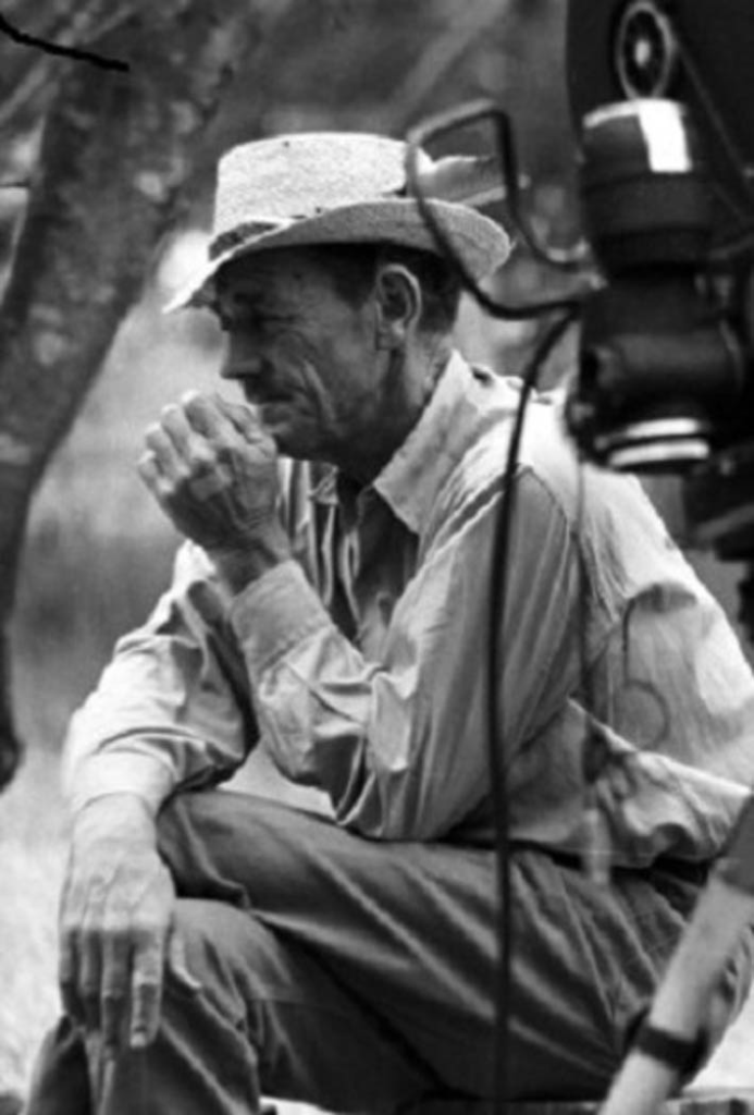
The man behind the lens for To Kill a Mockingbird was Russell Harlan, a highly respected cinematographer whose career spanned decades. He earned an Academy Award nomination for his work on this film, and it’s easy to see why. Harlan wasn’t known for flamboyant camera work; rather, his genius lay in his quiet, meticulous approach to black and white photography. He had a knack for naturalism, creating images that felt inherently authentic to the setting and the emotional truth of the scene.
Working in black and white during that era, a cinematographer like Harlan was an artisan of light and shadow. He used contrast, texture, and tonal values to define form and mood. He understood that in the absence of color, every shade of gray had to carry weight; every highlight and shadow had to be purposeful. His style was always in service of the narrative—he was a true collaborator in bringing stories to life with a deep respect for the script.
Inspiration Behind the Cinematography
For To Kill a Mockingbird, the primary inspiration for the cinematography stemmed directly from the heart of the source material: the child’s perspective and the oppressive atmosphere of the Deep South in the 1930s. The film captures the sense of a small, sleepy town, but one where latent tensions simmer just beneath the surface. The visuals subtly transition from a nostalgic, sun-dappled portrayal of childhood curiosity to a stark, often claustrophobic depiction of injustice.
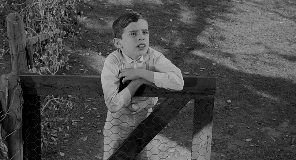
The idea of seeing the world through Scout’s innocent eyes fundamentally influenced the visual grammar. It wasn’t about flashy wide-angle shots or dizzying movements; it was about grounding the viewer in her experience. The specific time setting and location are pivotal, lending an air of historical authenticity that the visuals had to reinforce. Maycomb is as much a character as Atticus or Scout, and Harlan’s lens establishes its character—a place of quiet dignity and deep-seated prejudice. There’s an unvarnished quality to the images, almost like faded photographs from an old family album, perfectly encapsulating a time that is both intimately familiar and tragically distant.
Camera Movements
In To Kill a Mockingbird, camera movements are generally restrained, purposeful, and observational. This isn’t a film that calls attention to its mechanics, and that is precisely its strength. We don’t see many elaborate crane shots or aggressive handheld work. Instead, the movements are functional, guiding our gaze rather than dictating it.
Consider the scenes within the Finch household: we often find the camera moving with a gentle dolly, following Scout and Jem as they navigate their home, perhaps panning slowly to reveal Atticus reading in his study. These movements create a sense of intimacy and presence. In the courtroom, however, the movements become more constrained, often static, emphasizing the weight and formality of the proceedings. When the camera does move, it’s usually to shift perspective—perhaps from Atticus to the jury—or to focus intently on a witness’s face to amplify the emotional impact. The legendary seven-minute monologue by Gregory Peck, captured in a single take, is a testament to this controlled approach. The camera holds, unwavering, acting as a direct conduit for the emotion. It is a masterful demonstration of knowing when not to move the camera.
Compositional Choices
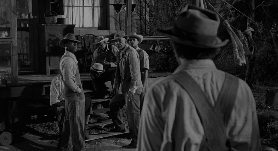
Composition in To Kill a Mockingbird is a lesson in using the frame to convey power dynamics. Given the child’s perspective, we often encounter compositions that place adults in positions of authority or mystery. Low-angle shots of Atticus, especially during the trial, enhance his noble stature and unwavering resolve, reinforcing the idea that he is a pillar of moral strength—almost larger than life to his children. Conversely, when Bob Ewell or other antagonists are framed, there is often a sense of intrusion, achieved through slightly askew angles or tight, uncomfortable close-ups.
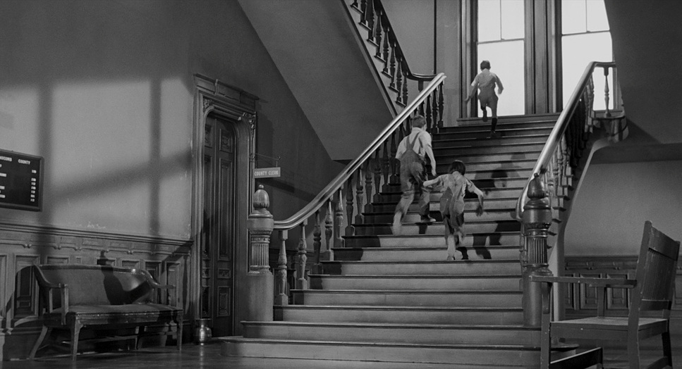
The use of deep focus is prevalent, allowing the audience to take in multiple layers of information within a single frame, particularly in the bustling courtroom scenes. We can see the faces of the jury, the reactions of the spectators, and the central figures all within the same shot, mimicking the way Scout observes her environment. Negative space is also used effectively to highlight isolation or vulnerability, especially in scenes involving the children alone or when characters like Boo Radley are introduced. These choices anchor the narrative visually, proving that simple composition often carries the most profound meaning.
Lighting Style
In black and white cinematography, lighting isn’t just about illumination; it’s about sculpting. Russell Harlan’s lighting here is a beautiful blend of motivated naturalism and dramatic expression. For the daytime scenes in Maycomb, the lighting feels sun-drenched, utilizing hard sunlight filtered through windows or trees to create dappled patterns and strong contrasts characteristic of the Southern heat. This approach grounds the film in reality, making the heat of Maycomb feel tangible.
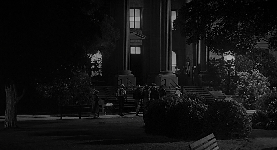
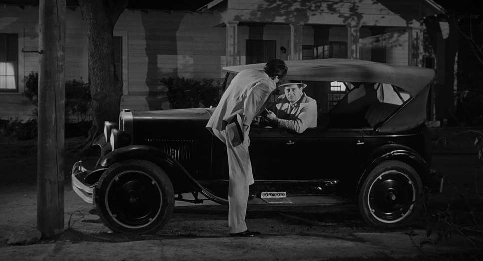
However, as the narrative darkens, so does the lighting. Interior scenes, especially those dealing with the trial, employ lower-key lighting with stark shadows to create a somber mood. While the night scenes are generally beautifully rendered in modern transfers, there are moments where the darkness becomes absolute—such as the garage interior, which can appear as an endless pit of shadow. This use of heavy shadow is a powerful compositional element, suggesting the unknown or the morally ambiguous. Motivated light sources like lamps and windows add texture to the monochromatic palette, while the chiaroscuro effect in many scenes evokes a sense of impending conflict.
Lensing and Blocking
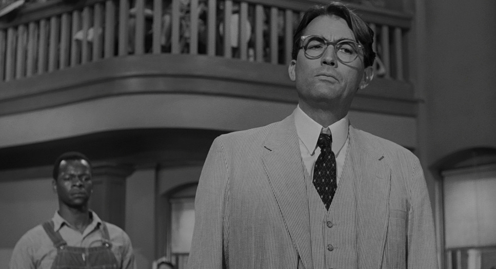
Lensing choices in To Kill a Mockingbird lean towards a naturalistic portrayal, primarily utilizing standard and medium focal lengths that approximate human vision. This helps maintain the observational quality of the narrative. Wide shots are used for establishing the town or creating a sense of isolation, while tighter lenses are reserved for moments of emotional intensity. The subtle detail of Tom Robinson’s deformed left arm is handled not through a flashy lens choice, but through Atticus’s blocking and interaction—throwing a glass for Tom to catch with his right hand. It is a clever cinematic adaptation of a book detail.
Blocking—the staging of actors—is meticulously executed to convey relationships. Atticus often stands firm and centered, a visual anchor. The children are frequently placed together, signifying their bond. In the courtroom, the physical separation between the defense, prosecution, jury, and spectators underscores the societal divisions. Characters like Bob Ewell are often blocked to appear confrontational, physically invading the space of others to solidify his role as the antagonist. This careful choreography speaks volumes without a single word.
Color Grading Approach
As a colorist, approaching a black and white film like To Kill a Mockingbird means focusing intensely on tonal values and grayscale rendering. “Color grading” here becomes a symphony of luminance. Modern 4K reviews note that the grayscale looks appropriate and whites are stable, which tells me the restoration team did their job well.
The original film, likely shot on classic Kodak B&W negative, has an inherent dynamic range and grain structure. For a 4K restoration, the task is to honor that look while optimizing it for modern displays. This involves meticulous tonal sculpting: ensuring deep, rich blacks that hold detail where intended, and clean whites that don’t clip. The film grain, described in technical reviews as “lighter in density,” suggests a respectful transfer that preserves the organic texture of the film stock rather than scrubbing it away with Digital Noise Reduction (DNR).
My approach would be to ensure excellent separation between different shades of gray. This “hue separation” is really about luminance separation—making sure a grey jacket doesn’t bleed into a grey wall. I’d look at how contrast shapes the dramatic arc: perhaps a slightly softer, more nostalgic contrast for the opening scenes, giving way to harder, more unforgiving contrast during the trial. The “highlight roll-off” is critical here; we aim for a classic print-film sensibility where bright areas transition smoothly to white, rather than the harsh clip often seen in digital formats.
Technical Aspects & Tools
To Kill a Mockingbird (1962) – Technical Specifications
| Genre | Crime, Drama, Mystery |
| Director | Robert Mulligan |
| Cinematographer | Russell Harlan |
| Production Designer | Henry Bumstead |
| Costume Designer | Rosemary Odell, Seth Banks |
| Editor | Aaron Stell |
| Time Period | 1930s |
| Color | Desaturated, Black and White |
| Aspect Ratio | 1.85 – Spherical |
| Format | Film – 35mm |
| Lighting | Hard light |
| Story Location | … Alabama > Maycomb |
The 4K UHD release provides fantastic insights into the technical backbone of this film. The “native 4K resolution” scan means we’re seeing an unprecedented level of detail from the original 35mm negative. The film is presented in a 1.85:1 aspect ratio, the standard spherical widescreen format for 1962. This ratio strikes a perfect balance—wide enough to capture the breadth of the Southern landscape, yet tall enough to maintain intimate framing for the characters.
The restoration process aimed for an appreciable upgrade rather than a total revision, which speaks to the quality of Harlan’s original work. The lack of heavy-handed DNR is music to a film lover’s ears; it preserves the filmic identity. Even with the best restorations, a film of this vintage will carry minor artifacts, like the occasional white speck seen during the scene where Jem and Scout are attacked in the woods. These fleeting imperfections are part of its history. The HDR10 grading allows for a wider dynamic range, enhancing the depth of Harlan’s light and shadow play, making the blacks richer and the whites more impactful without losing the “toe” and “shoulder” detail that gives film its character.
- Also Read: ONCE UPON A TIME IN AMERICA (1984) – CINEMATOGRAPHY ANALYSIS
- Also Read: PRINCESS MONONOKE (1997) – CINEMATOGRAPHY ANALYSIS
Browse Our Cinematography Analysis Glossary
Explore directors, cinematographers, cameras, lenses, lighting styles, genres, and the visual techniques that shape iconic films.
Explore Glossary →