When I think of films that balance artistry with thematic depth, Howl’s Moving Castle is a benchmark. It’s a constant source of inspiration, not just for its narrative, but for its audacity in visual storytelling. From the lumbering, ramshackle castle to the subtle shifts in light that underscore the emotional arcs, every frame feels deliberate. It creates a classic Ghibli paradox: a fantastical tale grounded in deeply human experiences war, identity, loneliness, and the chaotic beauty of found family. As someone who lives and breathes image-making, understanding how a film achieves such emotional resonance through its visual design is the ultimate goal. With Howl’s, the deeper I look, the more layers I uncover.
About the Cinematographer

While Hayao Miyazaki is the guiding force, we must acknowledge the Director of Photography, Atsushi Okui. In the realm of animation, the cinematographer’s role is unique. It isn’t about operating a physical camera; it’s about overseeing the entire visual execution: supervising the layout, backgrounds, and the digital photography (a hybrid process in this era of Ghibli).
Okui’s job was to ensure the final composite aligned with the director’s emotional intent. He worked in lockstep with the art director and Miyazaki to translate specific lens characteristics and lighting moods from storyboards into final animated frames. It’s a collaborative effort, but Miyazaki’s artistic fingerprints are strong he acts as the de facto lead visual architect, possessing a clear internal sense of how light should fall and how a visual reveal should be paced.
Inspiration Behind the Cinematography
Miyazaki’s deep-seated pacifism, forged by a childhood marked by WWII evacuations, informed the very fabric of Howl’s Moving Castle. The war isn’t merely a backdrop here; it is a suffocating presence that dictates the film’s visual contrast. Produced shortly after Miyazaki boycotted the Academy Awards due to the invasion of Iraq, this film stands as his most direct anti-war statement.
The cinematography reflects this by juxtaposing idyllic landscapes with the devastating imagery of conflict. We see vast, serene flower fields painted with soft, naturalistic light, symbolizing a peace that is perpetually under threat. Then, the skies are choked with smoke and filled with insect-like war machines, while cities burn with an orange glow reminiscent of historical fire-bombings. The visual language makes Miyazaki’s disdain for conflict clear, portraying war as a grotesque, mechanical monster. The natural world becomes a visual sanctuary, a place of escape from the destruction of human conflict. This dichotomy is not just a stylistic choice; it’s a narrative plea for preservation.
Camera Movements
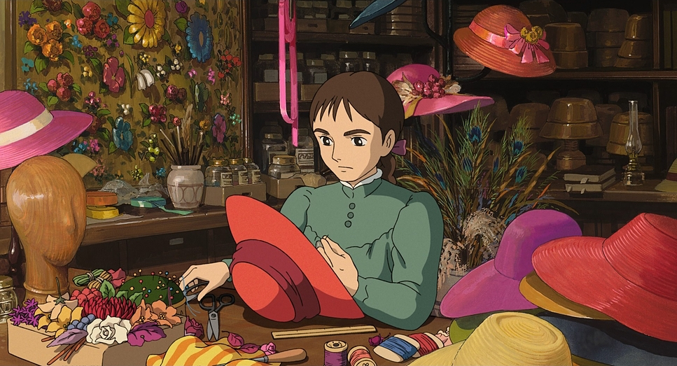
The camera movements in Howl’s Moving Castle articulate character psychology rather than just showing action. In Sophie’s early scenes, the camera feels constrained, mirroring her suffocating existence in the hat shop. Shots are static or employ gentle, resigned pans that keep her within tight frames, emphasizing her feeling of being trapped in a life she doesn’t love.
When Howl enters, the camera literalizes her emotional liberation. The sequence where he sweeps her into the sky is a masterclass in dynamic movement. The “camera” soars with them, using sweeping crane moves and fluid tracking to convey exhilaration. It is the visual representation of being swept away.
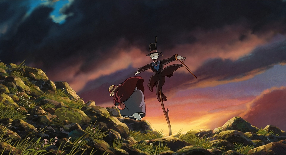
The castle itself dictates a unique form of movement. Its shambolic, organic quality rotating disparate layers on mechanical legs—inspires tracking shots that emphasize its monstrous yet endearing gait. The camera often follows its lumbering progress, giving it weight and agency. Inside, quick pans and tilts follow Calcifer’s flames or the shifting mechanisms, contributing to an atmosphere that feels toxic yet oddly comfortable. The movements always serve to immerse us in the subjective experience or emphasize the scale of this world.
Compositional Choices
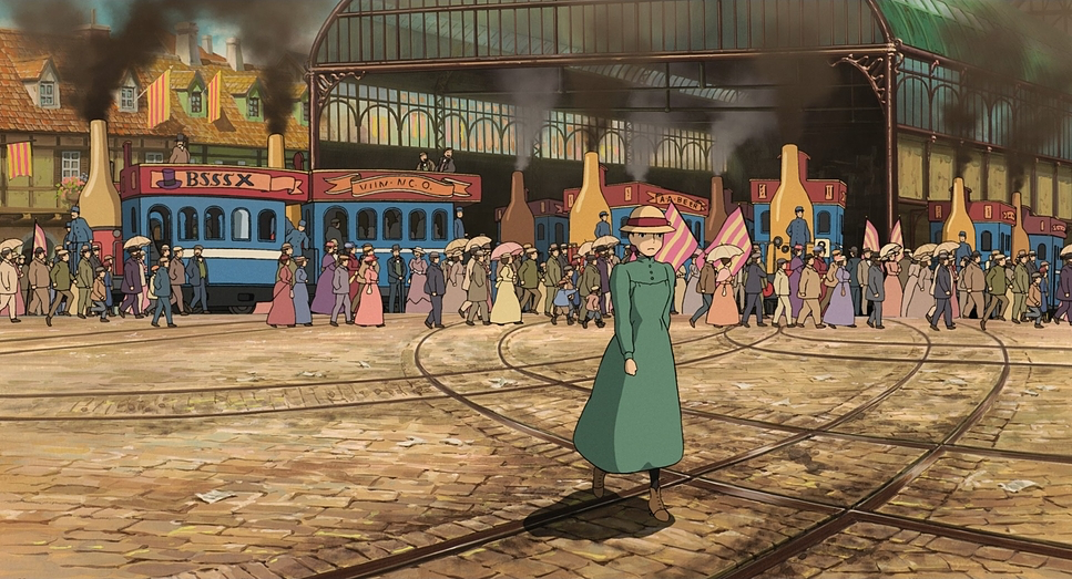
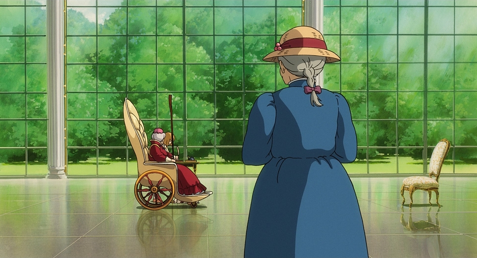
Miyazaki’s compositions are deeply tied to the characters’ emotional states. Early on, Sophie is framed restrictively, almost swallowed by her environment to reinforce her timid nature. The hat shop features low ceilings and tight angles, emphasizing her confinement. This creates a powerful visual depth cue for her internal state.
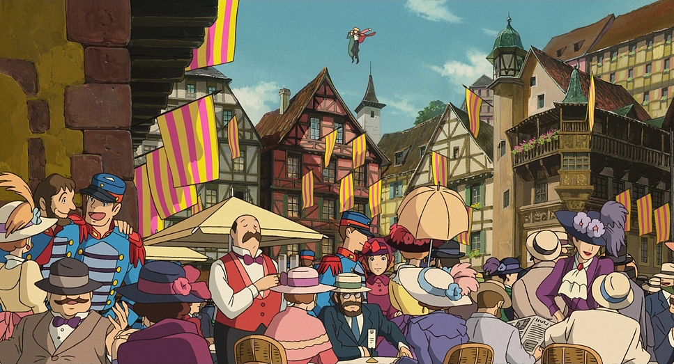
In contrast, when Sophie ventures out with Howl, the compositions open up. Vast landscapes dominate the screen rolling hills and shimmering lakes. These wide shots use the rule of thirds expertly, placing tiny human figures against breathtaking horizons to highlight both their vulnerability and the possibilities of their journey.
The castle is a compositional marvel, often framed in silhouette against dramatic skies or in close-ups that reveal its accumulation of parts. It is treated as a character; compositions emphasize its imposing presence. When the castle transforms, the camera uses eye-level shots to draw us into its peculiar logic. During war sequences, compositions become tighter and more chaotic, often using a telephoto effect to compress space. This makes the aerial battles feel claustrophobic despite taking place in the open sky.
Lighting Style
The lighting here is a lesson in motivated illumination. Miyazaki uses light to define mood, differentiate between the mundane and the magical, and separate peace from war.
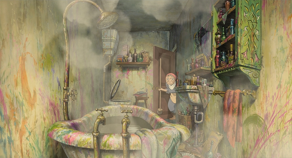
Domestic scenes within the castle employ a soft, diffused lighting style. This creates a warm, inviting glow, making even the clutter feel comfortable. Calcifer’s flame acts as a literal light source for the interior; the animators rendered his flickering glow with incredible detail, casting dynamic shadows that dance across the environment. This is narrative lighting: Calcifer is the heart of the castle, and his light is its lifeblood.
Contrast this with the war scenes, where lighting becomes harsh and dramatic. Firebombed cities are lit by the apocalyptic orange of explosions, casting long, menacing shadows. War machines are silhouetted against blood-red or smoky grey skies, their metallic surfaces reflecting light with a cold gleam. Even Madame Suliman’s palace is lit with cooler, austere tones, reflecting control rather than the warmth found in Howl’s chaotic home.
Lensing and Blocking
In animation, “lensing” refers to how perspective is rendered to mimic focal length. Howl’s Moving Castle employs implied wide-angle lenses for landscapes to create vastness. These wider focal lengths also lend a charming, slightly exaggerated perspective to the castle interiors often feeling cavernous and chaotic, almost like a fisheye distortion that reinforces Sophie’s initial overwhelm.
Conversely, implied long lenses (telephoto effects) are used for intimacy or to emphasize isolation. During dramatic conversations, characters are slightly flattened against the background to draw focus to their expressions. The war scenes use this compression to make aerial dogfights feel intense and crowded.
Blocking—the arrangement of characters is meticulously choreographed. Sophie’s initial meekness is expressed by her retreating or being positioned passively. As she gains confidence, her blocking becomes assertive; she physically steps into spaces and takes charge. When she cleans Howl’s room, her dominant blocking signifies her newfound strength. Howl’s flamboyance is also reflected in his blocking: grand gestures and central positioning, until his vulnerability is revealed and he shrinks into the shadows.
Color Grading Approach
As a colorist, this is where the film truly shines. The color design is sophisticated, acting as a crucial emotional guide. Ghibli films have a distinct “print-film sensibility” a richness that speaks to a meticulous approach to color.
Contrast Shaping: The film’s use of contrast is dynamic. Peaceful scenes feature a gentler contrast curve, allowing for detail in highlights and shadows to create naturalism. During the war, the contrast is punched up. Deeper blacks and brighter highlights create a less forgiving visual, enhancing the chaos. It makes us feel the difference between sanctuary and conflict.
Hue Separation: The deliberate separation of hues is a hallmark. Sophie’s initial attire is muted, blending into the background. As she gains confidence, her clothing features vibrant blues and greens. Howl is a riot of color, while Calcifer is a brilliant flame of oranges and reds, always separated beautifully from the grays of the castle. The natural greens of the landscapes are pristine, beautifully separated from the desaturated, smoky grays of the war zones.
Tonal Sculpting: The tonality shifts with the narrative. Early scenes are desaturated and melancholic. When flight is introduced, tones become vibrant. During the bombing sequences, the film adopts a desaturated, almost monochromatic palette (grays, browns, fiery oranges), visually reinforcing the despair Miyazaki aims to portray.
Highlight Roll-Off: This is a subtle but vital technical detail. In digital grading, we often struggle to keep bright skies from “clipping” into harsh white. In this film, the highlight roll-off is exquisite. The way bright skies and reflections are rendered gently rolling off while retaining texture gives the film an organic, painterly quality. It avoids the harshness of digital production and perfectly emulates natural light behavior.
Technical Aspects & Tools
Howl’s Moving Castle — Technical Specs
| Genre | Adventure, Animation, Book Adaptation, Fantasy |
| Director | Hayao Miyazaki |
| Cinematographer | Atsushi Okui |
| Editor | Takeshi Seyama |
| Colorist | Hiroaki Hirabayashi, Chris DeLaGuardia |
| Time Period | 1800s |
| Color Palette | Cool, Yellow, Cyan, Blue |
| Aspect Ratio | 1.85 |
| Format | Animation |
| Lighting Type | Daylight |
| Story Location | Earth > Europe |
| Film Stock / Resolution | 2K |
Howl’s Moving Castle represents a significant point in Ghibli’s evolution, integrating digital techniques with hand-drawn charm. The castle itself is a prime example of this hybrid approach. Its complex, kinetic movement—the rotating, disparate layers would have been nearly impossible with traditional cel animation alone. CGI was employed to render the base structure, giving it that distinct mechanical quality.
However, Ghibli’s genius was in the texture mapping. The CGI was carefully overlaid with hand-drawn textures, ensuring the castle didn’t look like a 3D object dropped into a 2D world. It feels entirely of a piece with the hand-painted backgrounds. They weren’t chasing hyper-realism; they were using technology to augment their artistic capabilities.
- Also read: THE THING (1982) – CINEMATOGRAPHY ANALYSIS
- Also read: MONTY PYTHON AND THE HOLY GRAIL (1975) – CINEMATOGRAPHY ANALYSIS
Browse Our Cinematography Analysis Glossary
Explore directors, cinematographers, cameras, lenses, lighting styles, genres, and the visual techniques that shape iconic films.
Explore Glossary →