I watch movies differently than most people. I’m usually staring at the scopes or analyzing the highlight roll-off. But Denis Villeneuve’s Prisoners is one of those rare films that forces you to stop analyzing and just feel the weight of it. It’s an exhausting watch—honestly, it drains you. There’s a YouTube review by Chris Stuckmann where he mentions how the film keeps your heart rate up the entire time, and he’s not wrong. But beyond the plot, this film is a textbook example of cinematography done right. It opens with the line “Everything matters,” and visually, Roger Deakins made sure that was actually true.
About the Cinematographer
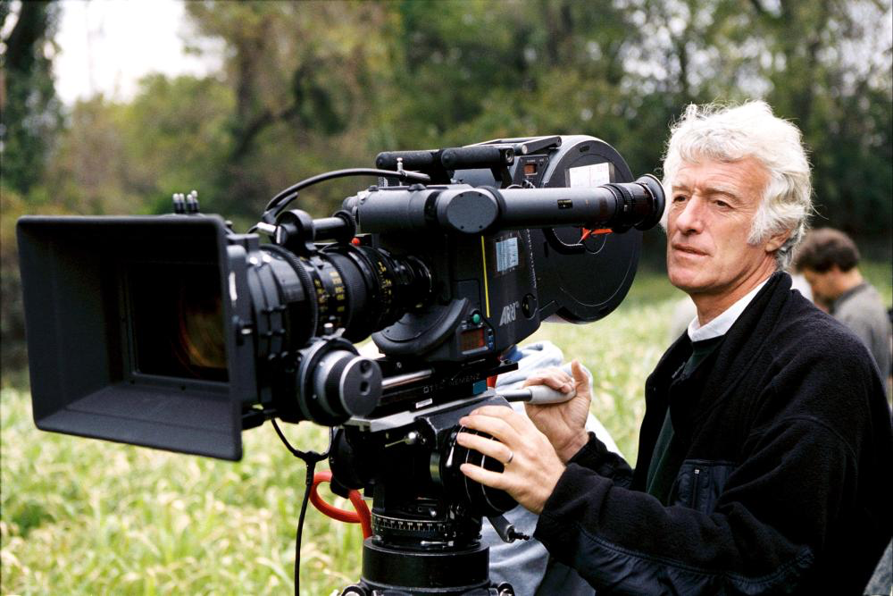
Roger Deakins doesn’t need much of an introduction. In my opinion—and I think most of the industry agrees—he is the best DP working today. Stuckmann calls him his favorite cinematographer, and it’s easy to see why. What sets Deakins apart isn’t flashy distinctiveness; it’s his consistency. He has this ability to make a scene look completely natural, yet somehow better than reality. He doesn’t just blast light into a room; he shapes it to create volume and texture. His work with Villeneuve, from Sicario to Blade Runner 2049, shows that he isn’t interested in showing off with the camera. He’s interested in visual psychology. He wants the image to disappear into the story.
Inspiration Behind the Cinematography
The story is bleak—kidnapped kids and a father losing his moral compass. The look of the film had to match that. The inspiration clearly comes from the setting itself: a wet, freezing Pennsylvania winter. The overcast weather acts like a giant soft-box, but a gloomy one. It’s not just a backdrop; the weather creates this constant pressure on the characters.
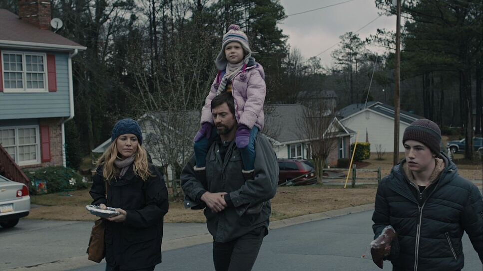
Visually, it feels like a mix of Nordic Noir and a 70s American thriller. The goal was obviously to make the characters feel trapped. You see it in the way the environments overpower the people—whether it’s Alex Jones, trapped in his own mind, or Keller Dover (Hugh Jackman), who eventually ends up literally trapped in a hole. The cinematography creates a sense of suffocation. It mirrors that erosion of hope where everything feels grey, damp, and heavy.
Camera Movements
The pacing of the camera in Prisoners is incredibly deliberate. It’s slow. Deakins isn’t afraid to just hold a shot and let the actors work. In an era where thrillers often rely on shaky handheld footage to create “energy,” this film goes the opposite direction. It’s unsettlingly quiet.
When the camera does move, it’s usually a slow, creeping dolly push or a very stable Steadicam shot. I like to think of the movement as “heavy”—it adds weight to the scene. For example, during the intense interrogation scenes, the camera doesn’t shake around to show chaos. Instead, it might do a slow, subtle push-in on a character’s face. It forces you to look at them. It’s a confident choice. Using a shaky cam is often a crutch to hide a lack of tension in the performance; holding the camera still requires you to trust your actors completely.
Compositional Choices
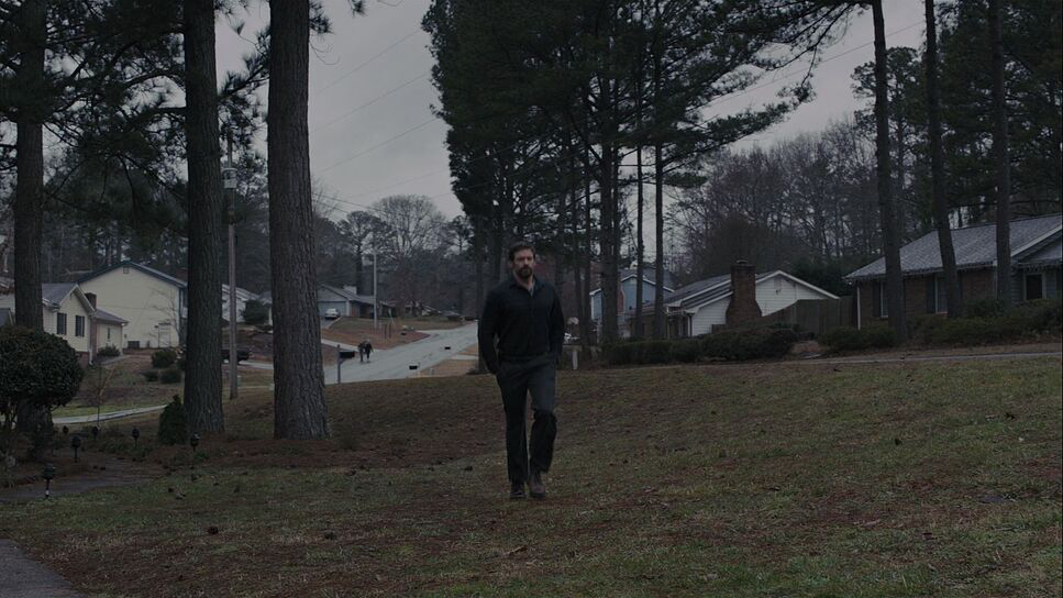
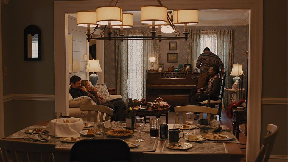
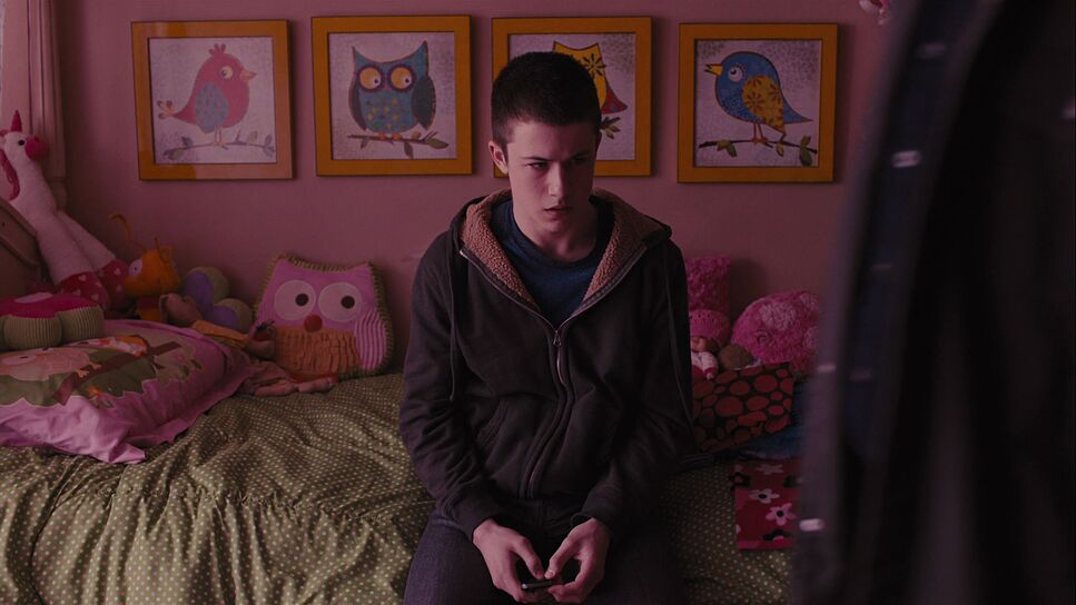
Deakins’ framing here is strict. He uses a lot of “frames within frames”—shooting through doorways, windows, and hallways to physically box the characters in. It reinforces that theme of entrapment without needing a line of dialogue to explain it. Even when they are outside, the characters are often pushed to the bottom of the frame, dominated by the massive, leafless trees and grey sky above them.
He also uses negative space to make the characters feel isolated. The framing is often slightly off-center, which subconsciously makes the viewer feel like something is wrong. Villeneuve knows exactly when to use a wide shot to show the hopelessness of the search, and when to get tight. The architecture of the house, with its dark corners and hidden spaces, becomes a part of that composition. It’s claustrophobic, even when the room is large.
Lighting Style
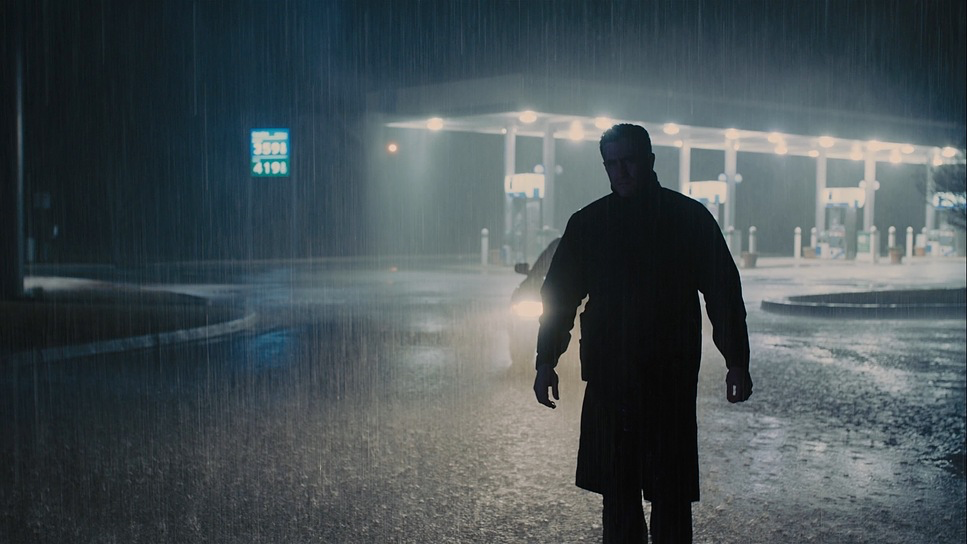
This is where Deakins really separates himself from the pack. The lighting is entirely motivated. If there’s a lamp in the room, that’s where the light feels like it’s coming from. The exterior scenes are almost all shot under overcast skies. This provides a soft, low-contrast light that looks great on skin tones but sucks the happiness out of the location. There is barely any hard sunlight in this movie.
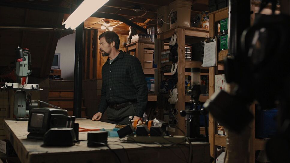
Interiors are where it gets technical. He relies heavily on practicals—bare bulbs, table lamps, fluorescent tubes. This creates pockets of light and lets the rest of the room fall off into darkness. In the interrogation scenes, the contrast is high, but it’s not “lit” like a movie set; it looks like a basement. He’s not afraid of darkness. A lot of DPs are terrified of letting an actor’s face fall into shadow, but Deakins embraces the silhouette. It forces the audience to lean in and pay attention because we aren’t being spoon-fed every visual detail.
Lensing and Blocking
For lenses, Deakins used Arri/Zeiss Master Primes. These are incredibly sharp, clean lenses. They don’t have the vintage distortion or flaring that is trendy right now, and for this film, that cleanness was necessary. It creates a window into this gritty world without putting a “filter” between the audience and the story. He mostly stuck to prime lenses, likely in the 32mm to 50mm range, which mimics the human field of view.
The blocking—where the actors stand—is also very precise. In the bathroom torture scene, look at how Hugh Jackman towers over Paul Dano. The camera angle and the physical positioning tell you exactly who has the power in that moment. It’s not accidental. Deakins places the camera to emphasize the power dynamics, making the viewer feel the intimidation or the vulnerability of the characters.
Color Grading Approach
As a colorist, this is the part I obsess over. The grade on Prisoners is a masterclass in density. It’s not just “desaturated”—anyone can just lower the saturation knob. This looks like a specific Print Film Emulation (PFE) where the color has been subtracted. The palette is dominated by cool blues, cyans, and greys.
But here’s the key: the shadows aren’t crushed to absolute black. There’s detail in the shadows, but they are dense and heavy. The highlights have a very soft roll-off; nothing clips harshly. When you do see color, like the amber of a street lamp or the red of the blood, it pops because the rest of the image is so muted. It’s a subtractive color process. It feels like they pulled the warmth out of the midtones to make the world feel cold. The only “pure” color seems to be the red whistle at the end—a deliberate visual cue for hope in a sea of grey.
Technical Aspects & Tools
Prisoners (2013) – Technical Specifications
| Genre | Crime, Drama, Thriller, FBI, Psychological Horror, Horror, Detective, Serial Killer, Neo-Noir, CIA / FBI, FBI / CIA |
|---|---|
| Director | Denis Villeneuve |
| Cinematographer | Roger Deakins |
| Production Designer | Patrice Vermette |
| Costume Designer | Renée April |
| Editor | Joel Cox, Gary D. Roach |
| Colorist | Mitch Paulson |
| Time Period | 2010s |
| Aspect Ratio | 1.78 – Spherical |
| Format | Digital |
| Lighting | Soft light |
| Lighting Type | Daylight |
| Story Location | United States > Pennsylvania |
| Filming Location | Georgia > Conyers |
| Camera | ARRI ALEXA 4:3 / plus |
| Lens | Zeiss Master Primes |
| Film Stock / Resolution | 2.8K / 2.8K ArriRaw |
They shot this on the Arri Alexa (likely the Alexa M and Studio models). At the time, this was the benchmark for digital cinema, and honestly, it still is. The Alexa’s dynamic range was crucial here because Deakins was shooting in such low-light conditions. He needed a sensor that could see into the shadows without introducing a ton of digital noise.
Pairing the Alexa with Master Primes meant the image was technically perfect—sharp, no chromatic aberration, no breathing during focus pulls. This combination allowed the image to be “invisible.” The gear didn’t call attention to itself. It just captured the incredibly complex lighting ratios Deakins was setting up. It’s a reminder that you don’t always need the newest 8K or 12K camera; you need a sensor with good latitude and glass that you can trust.
- Also read: SNATCH (2000) – CINEMATOGRAPHY ANALYSIS
- Also read: SPIDER-MAN: NO WAY HOME (2021) – CINEMATOGRAPHY ANALYSIS
Browse Our Cinematography Analysis Glossary
Explore directors, cinematographers, cameras, lenses, lighting styles, genres, and the visual techniques that shape iconic films.
Explore Glossary →