There are a handful of films that live rent-free in my head. Braveheart (1995) is one of them. I spend most of my waking hours staring at screens, tweaking curves, and obsessing over color spaces at my grading service, Color Culture. It takes a lot to make me stop analyzing the signal and just feel the image. But Braveheart still does that. It digs its claws into your gut and doesn’t let go.
We can debate the history all day—we know it’s a “fairy tale inspired by true events.” But visual language has its own truth, and what Mel Gibson and his team achieved here wasn’t a documentary; it was a visceral, emotional assault. As someone who lives in the details of the image, I see this film not just as an epic, but as a blueprint for how cinematography drives narrative.
About the Cinematographer
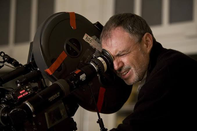
The man behind the lens was John Toll, ASC. By ’95, Toll was already a heavyweight, but Braveheart earned him his first Academy Award and solidified his legacy. What strikes me about Toll’s work isn’t just the pretty sunsets; it’s the muscle.
He has this remarkable ability to balance the macro and the micro. He isn’t just shooting landscapes; he’s contextualizing the people within them. His collaboration with Gibson—a director who thinks in very bold, kinetic terms—resulted in imagery that feels gritty and grounded. Toll understood that for this story, the camera couldn’t be a passive observer. It had to be down in the mud.
Inspiration Behind the Cinematography
The visual philosophy here seems to be “beauty meets brutality.” The inspiration clearly came from the untamed texture of the locations (shot largely in Ireland and Scotland) juxtaposed against the mechanical violence of medieval warfare.
Toll wasn’t chasing a clean image. He was chasing an emotional one. From the sweeping vistas that establish the land as a character, to the claustrophobic tight shots in the heat of battle, every frame is designed to manipulate the viewer’s pulse. As a colorist, I often talk about “sculpting” an image to guide the eye, and Toll laid the perfect foundation for that. He captured the wet, cold atmosphere of the Highlands in a way that makes you want to pull a blanket closer. It’s atmospheric, not just aesthetic.
Camera Movements
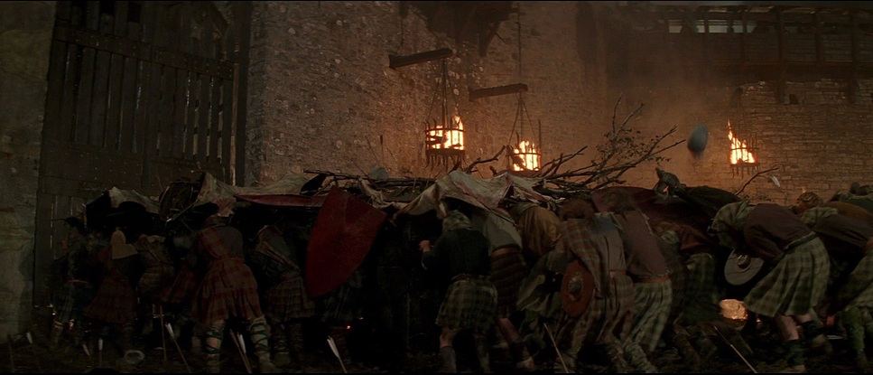
The camera work in Braveheart is a study in contrast. On one hand, you have the massive, stable crane and helicopter shots. These are essential for scale—showing the chess board, the formations, the impossible odds.
But then, the shutter angle feels like it tightens, and we drop into the handheld chaos. This is where the film really shines. The operator is right there in the “bone-crunching chaos,” tracking Wallace through the mud. It’s disorienting, yes, but it’s motivated disorientation. It mirrors the panic of a mêlée. The camera isn’t shaking to hide bad choreography; it’s shaking because the world is shaking. This interplay—switching from the objective “God’s eye” view to the subjective “soldier’s eye” view—is why the action sequences still hold up against modern CGI fests.
Compositional Choices
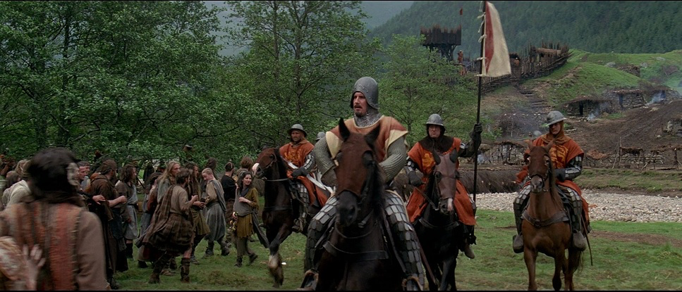
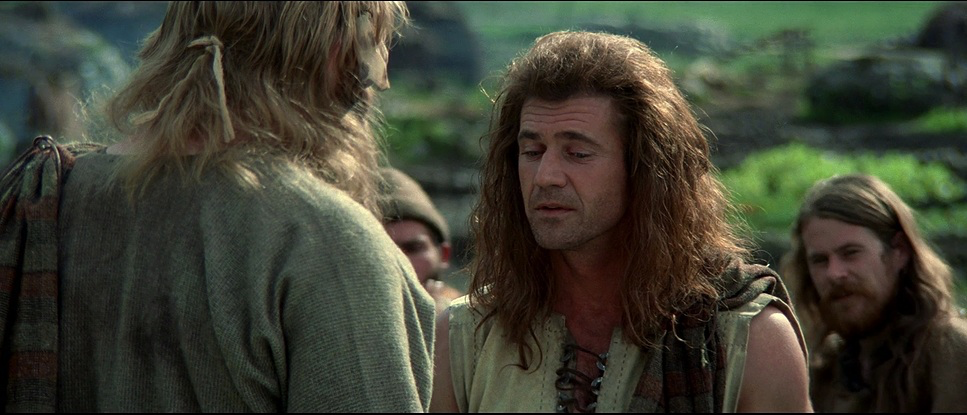
Toll’s framing is deceptively simple but incredibly effective. He leans on the anamorphic 2.35:1 aspect ratio to create vast negative space in the landscapes, often using the rule of thirds to place the horizon low, letting those dramatic Irish skies dominate the frame.
But look closer at the blocking. When Wallace speaks, he is often centered—a classic hero shot—but the depth cues are what sell it. Toll packs the foreground with soldiers, spears, and texture. It creates a dense, layered image that feels three-dimensional. Even in the close-ups, the use of telephoto compression brings the background elements right up against the characters, isolating their emotions while keeping the context of the army literally pressing in on them. It’s composed chaos.
Lighting Style
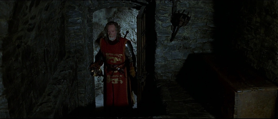
This film is a masterclass in utilizing natural and motivated light. Shot largely outdoors in overcast conditions, Toll embraced the soft, diffuse skylight. It creates a “wrapping” effect on the faces that looks incredibly organic—no hard key lights screaming “this is a movie set.”
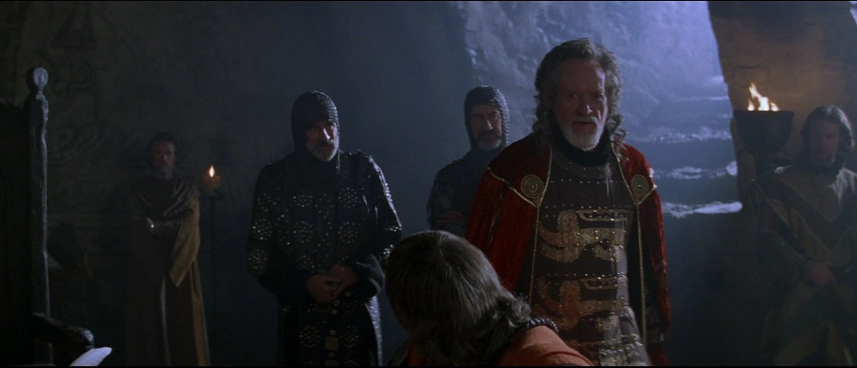
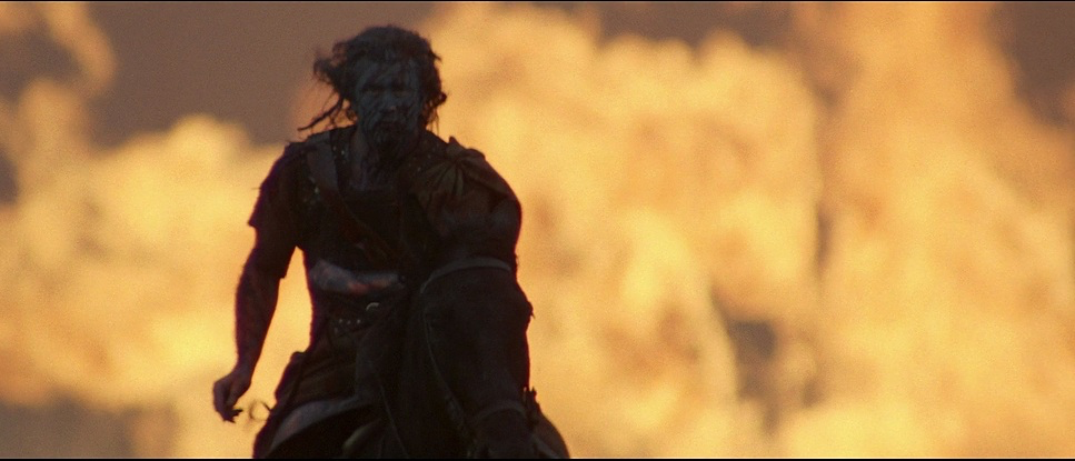
However, when they needed drama, they pushed the contrast. The interior scenes, specifically inside the castles or huts, rely on practicals—firelight and torches. This creates that warm, flickering fall-off that digital sensors still struggle to emulate perfectly. I love the use of silhouettes and backlighting during the tragedy scenes; it evokes that “eerie doom” feeling without needing dialogue. As a colorist, I appreciate that he protected his highlights. The roll-off on the film stock is creamy and soft, even when shooting against a bright gray sky.
Lensing and Blocking
Technically, this is where the “look” of Braveheart is defined. Toll utilized Panavision cameras paired with Panavision C and E Series anamorphic lenses.
The choice of anamorphics is crucial. You get those characteristic horizontal flares and that specific oval bokeh, but more importantly, you get a unique barrel distortion that makes the world feel slightly curved and encompassing. He used wide focal lengths to exaggerate the distance between armies, making the charge feel longer and more terrifying. Then, he’d snap to long telephoto lenses to pick faces out of the crowd.
The blocking of thousands of extras is a logistical nightmare, but visually, it’s organized like a ballet. They didn’t just fill the frame; they layered it. The movement of the background actors is always orchestrated to lead your eye toward the hero action.
Color Grading Approach
From my perspective running Color Culture, the grade on Braveheart is the definition of “rich density.” This was a photo-chemical finish (timed by Terry Haggar), and it carries that specific weight you only get from print emulation.
It’s not the teal-and-orange hyper-separation we see today. The palette is earthy and subtractive. The greens of the landscape are deep and mossy, not vibrant and neon. The skin tones have a beautiful ruddy quality—they look like people who live outdoors in the cold. There is a distinct separation in the shadows (the “toe” of the curve) where the blacks are crushed just enough to add weight but still retain texture in the mud and armor.
The “doom” scenes lean into cool, steel blues, while the intimate moments are bathed in the warmth of firelight (likely 3200K tungsten balanced). It’s a naturalistic grade that respects the location. It doesn’t scream “look at me,” it just feels real.
Technical Aspects & Tools
| Genre | Action, Drama, History, War, Military, Pre-Industrial Wars, Medieval Wars, Adventure, Epic, Revenge |
|---|---|
| Director | Mel Gibson |
| Cinematographer | John Toll, Eddie Collins, Raymond Stella |
| Production Designer | Thomas E. Sanders |
| Costume Designer | Charles Knode |
| Editor | Steven Rosenblum |
| Colorist | Terry Haggar |
| Time Period | Medieval: 500-1400 |
| Aspect Ratio | 2.35 – Anamorphic |
| Format | Film – 35mm |
| Lighting | Hard light, High contrast, Silhouette, Backlight |
| Lighting Type | Practical light, Firelight |
| Story Location | … United Kingdom > Scotland |
| Filming Location | … Scotland > Glen Nevis |
| Camera | Panavision Panaflex, Panavision Platinum |
| Lens | Panavision C series, Panavision E series |
| Film Stock / Resolution | 5248/7248 EXR 100T, 5293/7293 EXR 200T, 5298/7298 EXR 500T |
We have to talk about the stock. Braveheart was shot on 35mm using Kodak EXR 5298 (500T) for the low light and night scenes, and likely EXR 5248 or 5293 for the day exteriors.
That EXR 500T stock is legendary for its grain structure. It has a grit to it that digital noise reduction often tries to scrub away today. That grain is part of the texture of the film; it makes the mud feel dirtier and the air feel thicker. The dynamic range of these stocks allowed Toll to hold detail in the bright overcast skies while digging into the dark shadows of the forests. As a colorist, working with a scan of a negative like this is a dream because the information is there—it just needs to be shaped.
- Also Read: ETERNAL SUNSHINE OF THE SPOTLESS MIND- CINEMATOGRAPHY ANALYSIS
- Also Read: STAR WARS: RETURN OF THE JEDI (1983) – CINEMATOGRAPHY ANALYSIS
Browse Our Cinematography Analysis Glossary
Explore directors, cinematographers, cameras, lenses, lighting styles, genres, and the visual techniques that shape iconic films.
Explore Glossary →