Let’s be honest about Return of the Jedi. It’s the messy sibling of the Original Trilogy. As a filmmaker and the lead colorist at Color Culture, I spend my days staring at waveforms and dissecting images, and Jedi (1983) is a frustrating, fascinating case study. We all know the criticisms—the tonal whiplash of the Ewoks, the rehashed Death Star plot—but if you strip away the narrative baggage and look strictly at the visual data, the film is actually a technical marvel. It’s the final, massive brushstroke on a canvas that defined a generation, and the craftsmanship holding it together deserves a closer look, even if we have to squint past a few teddy bears to see it.
About the Cinematographer
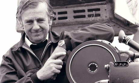
The visual torch passed from Peter Suschitzky’s moody, noir-inspired work on Empire to Alan Hume for the finale. Hume was a different kind of operator—a British veteran known for his speed and robust, classical approach (he had just shot For Your Eyes Only). He didn’t try to replicate the high-contrast gloom of Empire. Instead, he brought a pragmatic, naturalistic style that was crucial for a production this technically heavy. Hume wasn’t chasing flashy, self-aware cinematography; his job was to ground the fantastical. When you have a puppet gangster and a green muppet carrying the emotional weight of a scene, the lighting has to be absolutely convincing. Hume’s work is less stylized than his predecessors, but it’s incredibly disciplined.
Inspiration Behind the Cinematography
The visual DNA of Star Wars has always been a collision of genres—John Ford westerns meeting Kurosawa’s samurai epics—but Jedi leans harder into the “fantasy” aspect of the space opera. The inspiration here seems to be texture. Because the film relied so heavily on practical creatures (from the Rancor to the Sarlacc), the cinematography had to emphasize tangibility. Hume lit these scenes to reveal the “slime and grit,” ensuring the creatures didn’t look like rubber suits in a dark room. There’s a specific “mythic weight” they were aiming for, particularly in the Emperor’s throne room. It feels less like a sci-fi corridor and more like a theatrical stage for a morality play, stripping away the distraction of the background to focus purely on the faces of the three combatants.
Camera Movements
The camera in Jedi is remarkably restrained compared to modern blockbusters. It acts as an observer, rarely drawing attention to itself—until the action starts. The speeder bike chase on Endor remains the standout example of subjective camera movement.
Garrett Brown (the inventor of the Steadicam) walked through the forest shooting at roughly 0.75 frames per second—walking slowly so that when played back at 24fps, it would look like terrifying speed. This wasn’t just “cool footage”; it was a logistical masterclass in solving a problem: How do you make a speeder bike feel fast in a stationary forest? The result is a visceral, dizzying point-of-view that plunges the audience into the danger. Conversely, in the space battles, the camera adopts a documentary style, tracking fighters with a chaotic, handheld energy that mimics WWII dogfight footage. It’s that friction between the smooth, manufactured motion of the ships and the frantic energy of the camera that sells the reality.
Compositional Choices
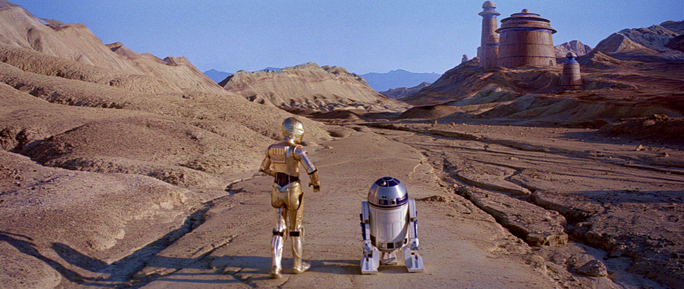
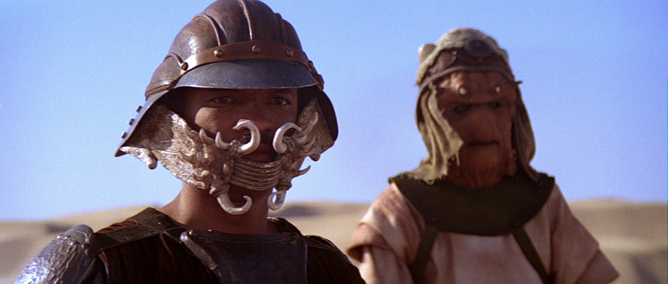
Working in the 2.35:1 anamorphic format, Hume had to manage a massive amount of visual information. The common critique that Jedi feels “cluttered” isn’t just a script issue; it’s a compositional reality. The frame is often packed—Jabba’s palace is a riot of creatures, smoke, and debris. Hume used this density to convey the chaotic, grimy underworld, contrasting it sharply with the sterile, geometric emptiness of the Death Star.
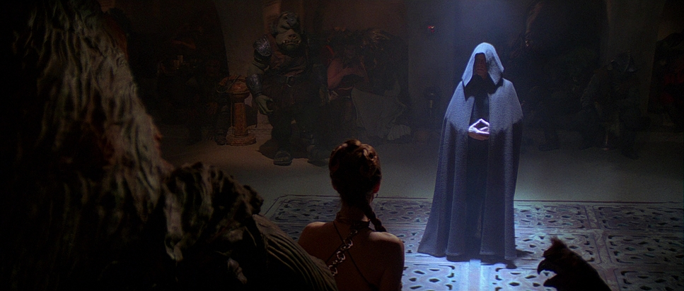
The framing in the final duel is where the composition really shines. Notice the hierarchy: Palpatine is almost always centered and seated, a static force of evil. Vader is often framed slightly lower or behind him, visually reinforcing his servitude. Luke is frequently isolated in negative space, emphasizing his loneliness. It’s simple, theatrical blocking, but it does the heavy lifting for the story without a word being spoken.
Lighting Style
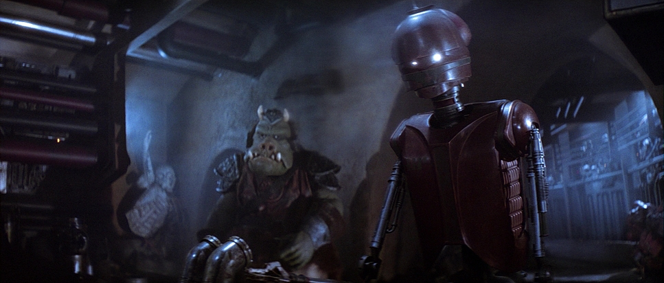
The lighting strategy in Jedi is strictly motivated but highly dramatic. Jabba’s Palace is a lesson in low-key lighting; Hume utilizes pools of light from “practical” sources to hide the seams of the creature effects while accentuating their textures. It’s muddy, warm, and oppressive.
Contrast that with the Emperor’s Throne Room. This is my favorite lighting setup in the film. It’s harsh, high-contrast, and predominantly top-lit. This isn’t the soft, flattering light of a hero; it creates deep sockets in the eyes and accentuates the craggy, ancient texture of the Emperor’s prosthetics. The cool, blue-cyan ambience of the Death Star interior creates a sense of cold steel and space, which is then violently interrupted by the warm, sickly yellow practicals illuminating the Emperor’s face. It’s a classic “warm/cool” separation, but executed with an intensity that mirrors the internal conflict of the characters.
Lensing and Blocking
Here is where many people get the tech wrong. While Empire was famous for its use of Panavision C-Series lenses, Return of the Jedi switched gears. The production utilized Arriflex BL3 cameras paired with Cooke Xtal Express (JDC) anamorphic lenses.
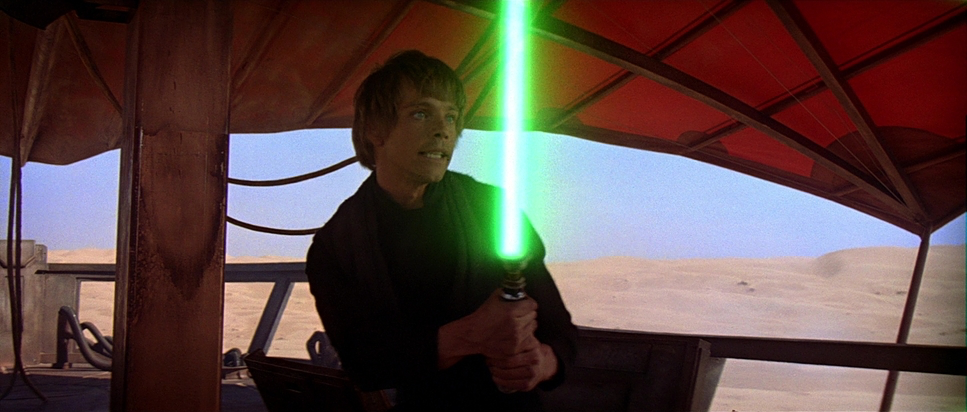
Why does this matter? Because Cookes render images differently than Panavision glass. They have the famous “Cooke Look”—a certain warmth and sharpness that is gentle on skin tones but still resolves high detail. You can see it in the way the lenses flare; the anamorphic streaks are distinct, and the fall-off in sharpness at the edges of the 2.35 frame gives the film a slight vintage, painterly quality that modern digital sensors struggle to replicate. The blocking takes advantage of this anamorphic width, spreading characters across the frame to create physical and emotional distance, then collapsing that distance with tight telephoto close-ups during moments of intimacy or realization.
Color Grading Approach
From a colorist’s perspective, this film is a fascinating artifacts of the photochemical era. Shot on Eastman 5293/7293 (EXR 200T) stock, the image has a specific density that we constantly try to emulate in DaVinci Resolve today.
The “grade” wasn’t done digitally; it was done with printer lights at the lab. The separation of hues is critical here. Tatooine is pushed into dusty oranges and yellows, feeling properly sun-baked. Endor is lush with organic greens and browns. But the Death Star is where the color science really hits: it’s a cool, desaturated blue palette.
What stands out to me is the highlight handling. Film stock like 5293 has a “shoulder” in the highlights that rolls off gently. When you see a lightsaber clash or an explosion, it doesn’t clip to a digital white; it retains a soft, blooming core. The shadows in the Emperor’s lair are crushed just enough to feel dangerous, but the toe of the film curve keeps details in Vader’s black armor visible. It’s a robust, grounded palette—no teal and orange LUTs here, just pure chemical color timing that separates the worlds perfectly.
Technical Aspects & Tools
Return of the Jedi
Technical Specifications
| Genre | Action, Adventure, Science Fiction, Space, Epic |
| Director | Richard Marquand |
| Cinematographer | Alan Hume |
| Production Designer | Norman Reynolds |
| Costume Designer | Mary Selway |
| Editor | Sean Barton, Duwayne Dunham |
| Colorist | Mark Nakamine |
| Time Period | Future |
| Color | Cool, Desaturated, Blue |
| Aspect Ratio | 2.35 – Spherical |
| Format | Film – 35mm |
| Lighting | High contrast, Top light |
| Lighting Type | Artificial light |
| Story Location | Death Star |
| Filming Location | Hertfordshire > Elstree Studios |
| Camera | Arriflex BL3, Arri 2c (IIc) |
| Lens | Cooke Xtal Express, Cooke Varotel Zoom lenses, Cooke Varotal Lenses |
| Film Stock / Resolution | 5293/7293 EXR 200T |
The technical leap in Jedi was massive. The reliance on optical compositing was at its peak. Every TIE fighter swarm and space battle required multiple passes on the optical printer. This process inherently builds up grain and contrast, which meant the original negatives had to be impeccably exposed to survive the generational loss.
The team used the Arriflex BL3 as the workhorse camera—a quieter, more compact body than previous generations, which allowed for slightly more agility on the complex sets. The visual effects work by ILM was groundbreaking, particularly the matte paintings which expanded the scope of the hangar bays and forests. We often take for granted how hard it is to match the lighting of a live-action plate to a matte painting, but the integration here is nearly seamless, thanks largely to the dynamic range of the 35mm stock and the precision of the lighting team.
- Also Read: AMERICAN BEAUTY (1999) – CINEMATOGRAPHY ANALYSIS
- Also Read: CINEMA PARADISO (1988) – CINEMATOGRAPHY ANALYSIS
Browse Our Cinematography Analysis Glossary
Explore directors, cinematographers, cameras, lenses, lighting styles, genres, and the visual techniques that shape iconic films.
Explore Glossary →