As an enthusiast filmmaker and a full-time colorist running Color Culture, I spend my days staring at calibrated monitors, dissecting images pixel by pixel. We often talk about “craft” in this industry, but rarely do we see a film where the technique is so perfectly synchronized with the narrative as it is in Christopher Nolan’s The Prestige (2006).
This isn’t just a movie about magicians; it’s a visual sleight of hand. While many dissect the script, I want to look at the image itself. I’ve watched this film countless times—not just for the story, but to study how the visual language hides secrets in plain sight. Let’s break down the visual wizardry of this cinematic gem.
From the opening shot of the top hats scattered in the woods, The Prestige establishes a very specific texture. It demands that you look closely. Nolan, a director known for cerebral puzzles, found his perfect visual counterpart in cinematographer Wally Pfister. Together, they didn’t just film a period piece; they built a tactile, dirty, atmospheric world that feels heavy with obsession.
For me, the genius here is how the cinematography acts as a misdirection. The camera shows you exactly what you need to see, but the lighting and composition force you to look elsewhere. It’s a masterclass in visual psychology. Every hue in the grade and every shadow in the frame contributes to the themes of duality and sacrifice. It’s a visual puzzle box, and as someone who works in post-production, I find new details in the shadows every time I watch it.
About the Cinematographer: Wally Pfister

You can’t talk about the look of early Nolan films without talking about Wally Pfister. Before Hoyte van Hoytema took over the lens for Interstellar and Oppenheimer, Pfister defined the gritty, grounded realism of the Nolanverse. Their collaboration spanned from Memento to The Dark Knight Rises, and The Prestige represents the peak of their “analog” era.
Pfister isn’t a DP who chases pretty, cosmetic flares. His work is muscular and grounded. He favors a naturalistic approach that feels motivated by the environment rather than a studio grid. For this film, he had to render Victorian London not as a polished set, but as a place of soot, fog, and industrial grime. He understands how to use darkness effectively—letting characters fall completely into shadow rather than keeping them perfectly lit for vanity. It’s that willingness to obscure the actor that makes his work here so psychologically effective.
Inspiration for the Cinematography
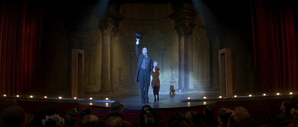
The visual language of The Prestige feels like a collision between the old world and the new—much like the rivalry between the two protagonists. Nolan and Pfister were clearly inspired by the heavy atmosphere of the Victorian era, but they avoided the stiff “costume drama” look. They wanted it to feel dangerous.
Visually, the film leans into the aesthetic of the Industrial Revolution. There is a Dutch Masters quality to the interiors—faces carved out of darkness by single sources of light—but it’s dirtier. The inspiration seems to come from the friction between the warm, flickering gaslight of the theatres and the cold, terrifying electric blue of Tesla’s alternating current. It’s a deliberate clash of textures: the wood and velvet of the magician’s stage versus the steel and sparks of the scientist’s lab.
Camera Movements
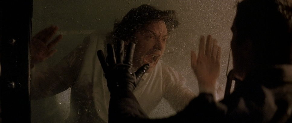
In The Prestige, the camera is rarely static, but it’s never showy. Pfister’s movement is always subjective—it puts you in the mindset of the character.
There is a distinct difference in how the camera handles the “performance” versus the “reality.” When we are backstage in the labyrinthine corridors of the theatres, we get these smooth, deliberate tracking shots. They glide through the cluttered workshops, mimicking the meticulous nature of the magicians preparing their illusions. It feels controlled, rehearsed.
Contrast that with the moments of discovery or violence. Pfister utilizes a looser, handheld energy (or very subtle Steadicam) that feels reactive. Think of the scene where Angier travels to Colorado Springs to meet Tesla; the camera floats with a sense of unease and wonder. Or consider the handheld work during the heated arguments between Borden and Sarah—it’s jagged and uncomfortable. The camera isn’t just recording the scene; it’s mimicking the instability of their lives. It pushes in slowly when a character is realizing a horrifying truth, and pulls back to leave them isolated in their obsession.
Compositions
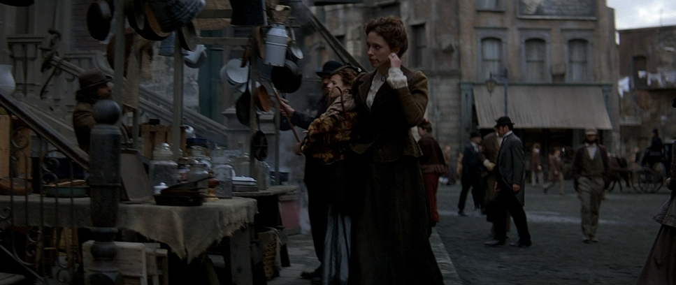
The framing in this film is incredibly disciplined. As a colorist, I often look at how a DP protects the “neg” (negative space), and Pfister uses composition to trap his characters.
A major motif here is “frames within frames.” You’ll notice characters constantly shot through doorways, behind bars (like the bird cages), between stage curtains, or reflected in mirrors. It creates a voyeuristic feeling, as if we are spying on them—which mirrors exactly what Borden and Angier are doing to one another.
The composition also plays with the concept of the “double.” We see frequent symmetry in the blocking, but it’s often broken or off-balance. Pfister uses anamorphic lenses to isolate characters in the center of the frame, compressing the background so the world feels like it’s closing in on them. There is also a brilliant use of deep focus in the workshop scenes; you can see the clutter of tools in the foreground and the magician in the background, visually connecting the man to his method.
Lighting Style
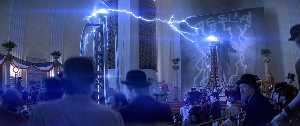
The lighting is where the mood of The Prestige truly lives. This is a low-key film, meaning the contrast ratio is high and the shadows are deep.
Pfister relies heavily on motivated practicals—oil lamps, candles, and gas fixtures. He isn’t afraid to let a lamp “blow out” (clip to white) in the background while the character in the foreground is significantly underexposed. This creates a realistic, gritty fall-off of light. In the workshop scenes, we often see shafts of light cutting through smoke or dust, which adds volume to the air and separates the actor from the background without making it look like a sitcom.
The stage scenes are particularly interesting. They utilize hard spotlights that cut through the darkness, isolating the magician. It’s theatrical, but it also feels lonely. The lighting tells us that when they are on stage, they are gods; when they step off into the shadows, they are just desperate men.
Lensing and Blocking
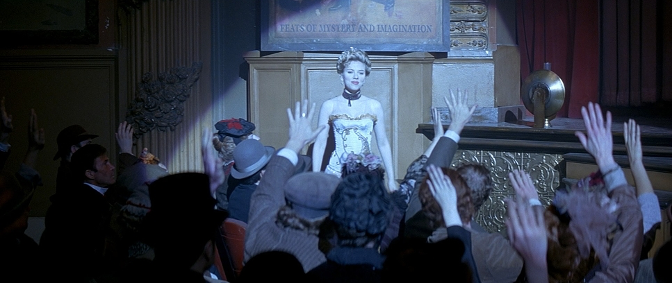
Technically, the choice of anamorphic lenses (likely Panavision C-series or E-series) is crucial here. Anamorphic glass gives you that cinematic widescreen aspect ratio, but it also introduces specific optical characteristics—elliptical bokeh and a shallower depth of field that separates the subject from the chaotic background.
The blocking—where the actors stand and move—is like a chess match. Notice how often Borden and Angier are blocked with their backs to the camera, or partially obscured by an object. It’s a visual representation of their secrets. They are rarely “open” to the audience.
Furthermore, the blocking emphasizes distance. In the scenes where they attend each other’s shows, they are placed in the crowd or in disguise, framed to look small against the massive scale of the theatre. It reinforces the idea that they are always watching, always obsessing, from a distance.
Color Grading
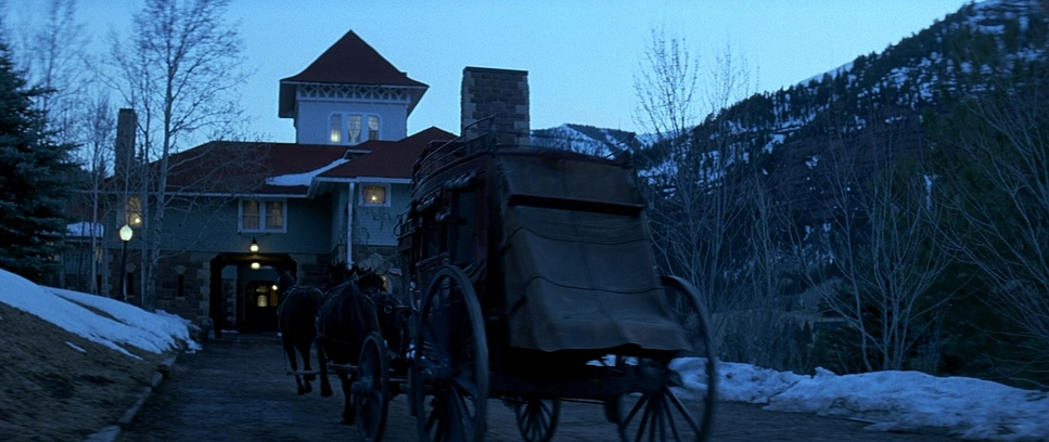
This is my wheelhouse. From a colorist’s perspective, The Prestige has a very specific “film print” aesthetic that predates the modern obsession with heavy digital LUTs.
The palette is essentially a “bleach bypass” look, though likely achieved through a combination of production design and photochemical timing (and early DI work). The film is desaturated, but selectively. The greens and blues of London are pulled down to a steely, greyish cyan—cold and uninviting. This matches the emotional temperature of the rivalry.
However, the skin tones remain dense and natural, anchoring the characters in reality. There is a distinct separation between the “warmth” of the magic shows (rich ambers, deep reds of the curtains, golden tungsten light) and the “coldness” of their real lives (desaturated daylight, cold stone, grey skies).
In my work at Color Culture, when a client asks for a “period thriller” look, this is the reference point. It’s not about slapping a sepia filter on it. It’s about crushing the blacks to hide information and rolling off the highlights so they feel creamy rather than digital and sharp. The grade here supports the narrative: the magic is warm and inviting; the reality is cold and hard.
Technical Aspects
| Genre | Book Adaptation, Drama, Mystery, Psychological, Revenge, Thriller, Psychological Horror, Murder Mystery, Costume Drama, Low Fantasy, Fantasy, Costume |
| Director | Christopher Nolan |
| Cinematographer | Wally Pfister |
| Production Designer | Nathan Crowley |
| Costume Designer | Joan Bergin |
| Editor | Lee Smith |
| Colorist | David Orr |
| Time Period | 1800s |
| Aspect Ratio | 2.35 – Anamorphic |
| Format | Film – 35mm |
| Lighting | Backlight |
| Lighting Type | Daylight |
| Story Location | England > London |
| Filming Location | California > Los Angeles |
| Camera | Panavision Millennium / Millenium XL / XL2 |
| Lens | Panavision C series, Panavision E series |
| Film Stock / Resolution | 5205/7205 Vision 2 250D, 5218/7218 Vision 2 500T |
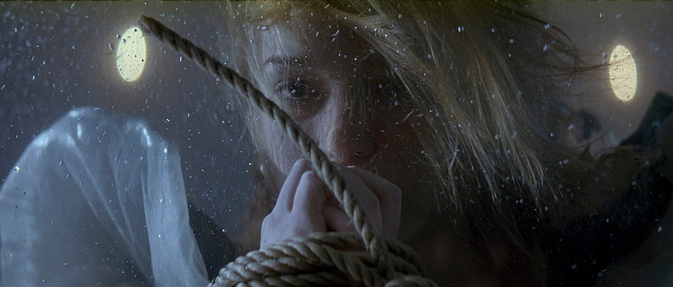
The technical backbone of this film is 35mm celluloid. You can feel the grain structure. It gives the image a texture that digital cameras in 2006 simply couldn’t replicate (and arguably still struggle to mimic perfectly today).
Shooting on 35mm with anamorphic lenses gives the image an organic softness. It’s sharp, but not clinically sharp. This texture helps sell the period setting—if the image were too clean, the costumes and sets might look like a cosplay. The grain acts as a binding agent, gluing the visual elements together.
- Also read: LIFE IS BEAUTIFUL (1997) – CINEMATOGRAPHY ANALYSIS
- Also read: TERMINATOR 2: JUDGMENT DAY (1991) – CINEMATOGRAPHY ANALYSIS
Browse Our Cinematography Analysis Glossary
Explore directors, cinematographers, cameras, lenses, lighting styles, genres, and the visual techniques that shape iconic films.
Explore Glossary →