I usually spend my days at Color Culture staring at DaVinci Resolve scopes, obsessing over skin tone lines, and arguing that “teal and orange” isn’t a personality trait. But Robert Eggers’ Nosferatu forced me out of the grading suite. It’s a dense, visually suffocating masterpiece that treats the camera as a participant rather than just a recording device.
While general audiences might focus on the scares, I found myself fixated on the texture of the grain, the highlight roll-off, and the sheer intentionality behind the shadows. Visually, this is arguably the most significant horror film of the last decade. It creates an atmosphere so thick you can practically taste the silver halide. Let’s dissect why this movie works so well from a technical perspective.
About the Cinematographer
If you follow Robert Eggers, you know his visual language is inseparable from Jarin Blaschke. They are effectively the Deakins and Villeneuve of gothic horror, with a 17-year collaboration defined by a perfectionism that borders on masochism.
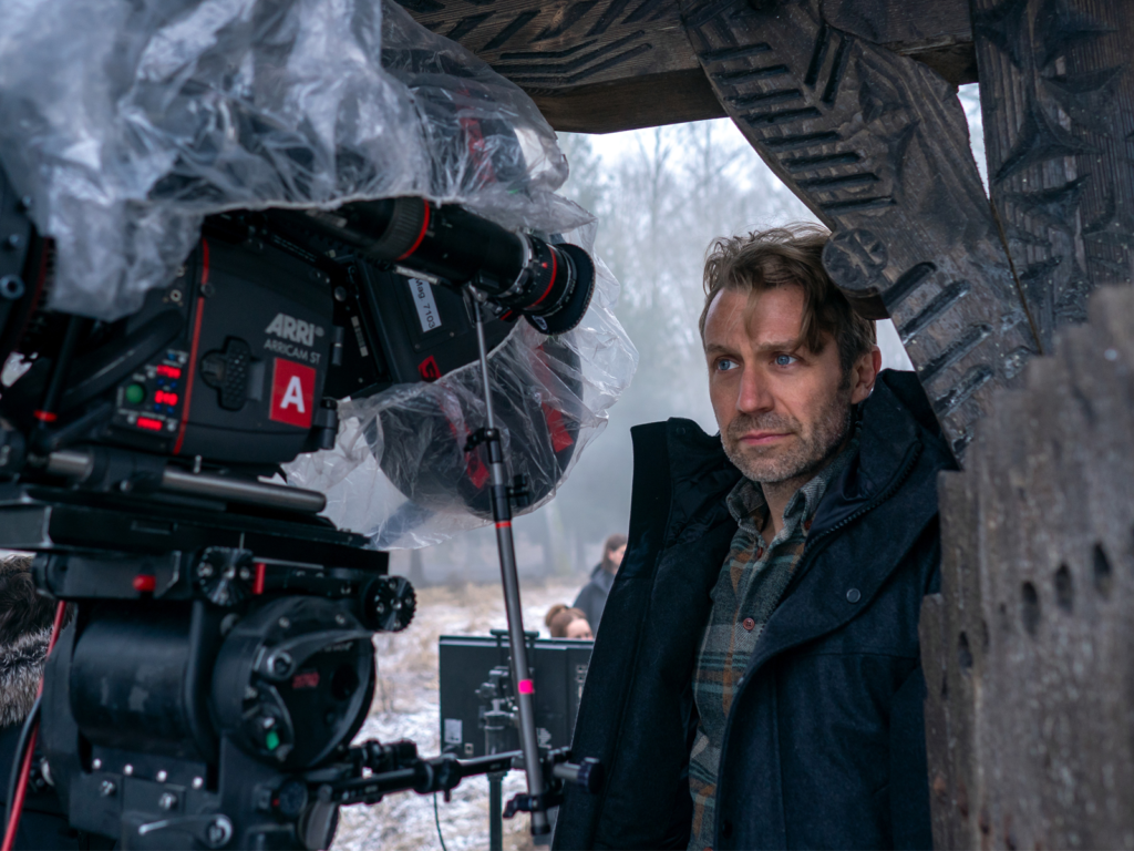
Blaschke isn’t just pointing a camera; he is an academic of light. He shot The Witch, The Northman, and The Lighthouse(where he famously used a custom cyan filter on panchromatic black-and-white stock to simulate an orthochromatic look). For Nosferatu, Blaschke returned to 35mm, pushing the boundaries of what modern lenses and film stocks can technically achieve. He describes the role of a cinematographer as a “sacrifice,” constantly trying to break the medium to find something new. His approach here was to create a visual language authentic to the era—not just a modern interpretation of 1838, but a visual texture that feels born from it.
Inspiration for the Cinematography
Since Nosferatu is a remake of the 1922 classic, the instinct is to expect heavy German Expressionism—sharp angles and high-contrast, stylized shadows. However, Blaschke explicitly pivoted away from that. He noted that this is not an expressionist film; it is a Romantic one.
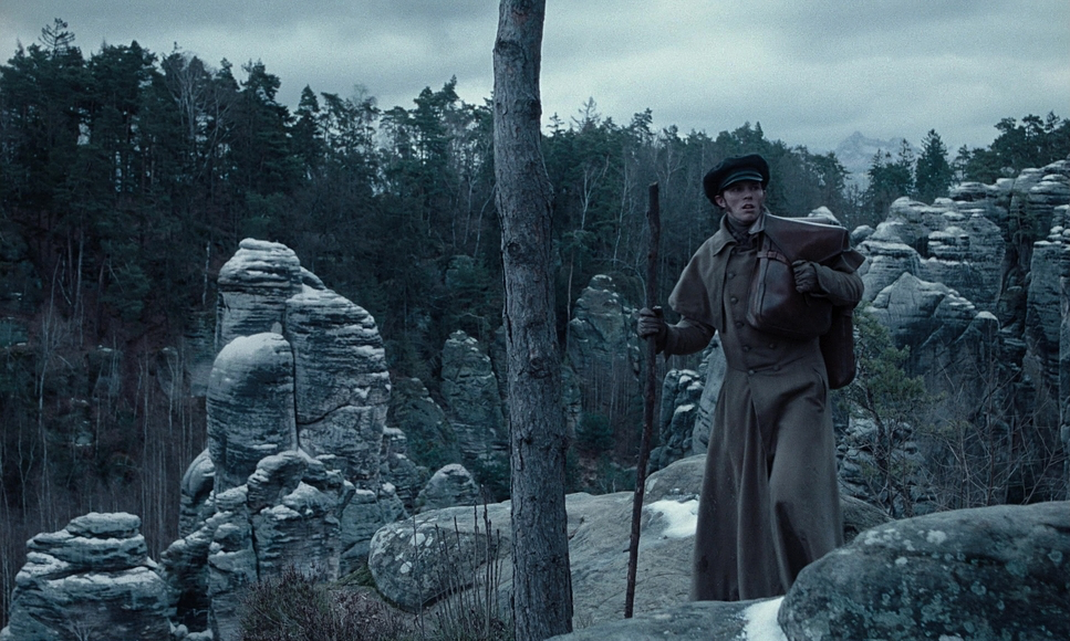
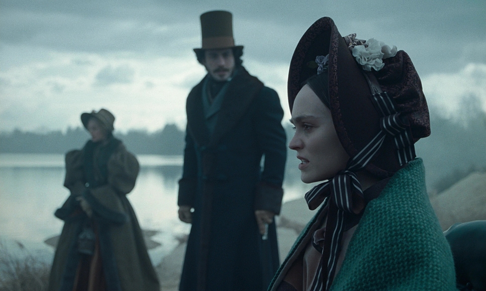
The mandate wasn’t to recreate a “1922 view of 1838,” but an “1838 view of 1838.” To understand the look, you have to look at the paintings of the Romantic era, specifically Caspar David Friedrich. We’re seeing moody, sublime landscapes where nature is overwhelming and humanity is small. This context is crucial because it explains why the film feels lush and melancholy rather than just “scary.” It captures a Gothic tale of obsession, where the cinematography reflects a romantic, sickly infatuation rather than simple shock value.
Camera Movements used
You won’t find handheld “shaky cam” masking bad blocking here. The movement in Nosferatu is deliberate, heavy, and unsettling. Blaschke and Eggers utilize long, static takes, but when the camera moves, it feels like an unseen presence leading the character.
Blaschke describes a philosophy of “withholding information.” The camera often leads Thomas Hutter down a hall, panning away from him to the door he is approaching, effectively holding on the destination before he arrives. It creates a delicious frustration—starving the audience of information to force engagement.
Technically, this relies heavily on what Bruce Block calls “relative movement.” Unlike a zoom, which flattens space, the physical movement of the dolly shifts the foreground faster than the background, creating a hyper-immersive, three-dimensional world. We see pans that sweep 270 degrees, moving through fly-away walls to transition from a close-up to a wide shot in a single, fluid motion.
Compositions
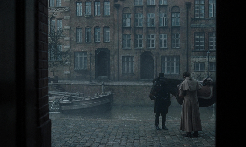
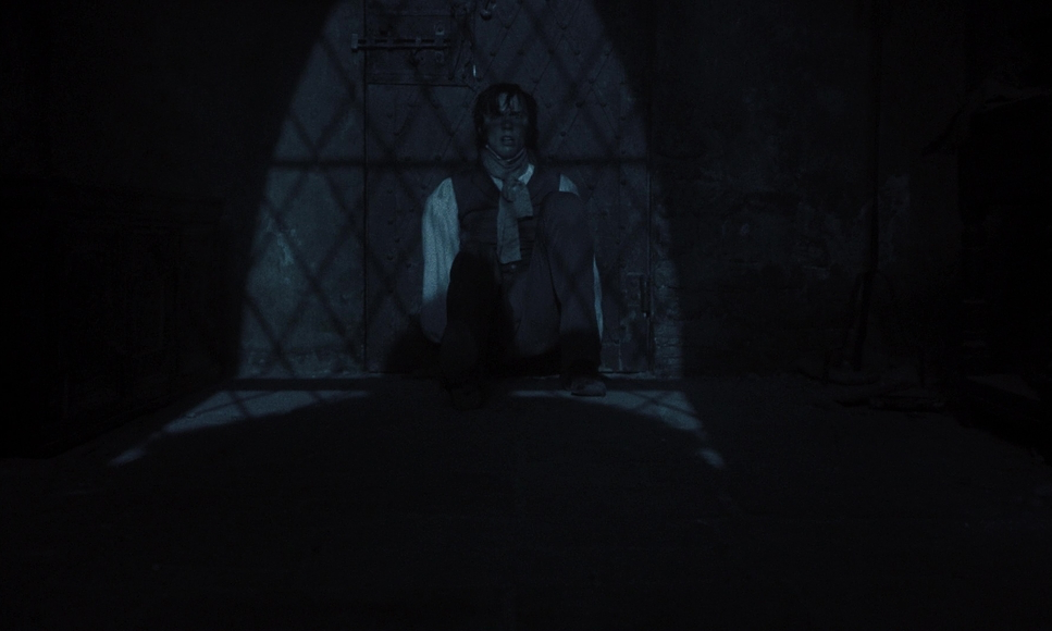
Compositionally, Nosferatu is a masterclass in oppressive symmetry. While symmetry can sometimes feel static, here it leans into the discomfort suitable for the genre. Shot in a 1.66:1 aspect ratio, the taller, boxier frame allows for compositions that resemble portraiture, emphasizing the verticality of the castle and the isolation of the characters.
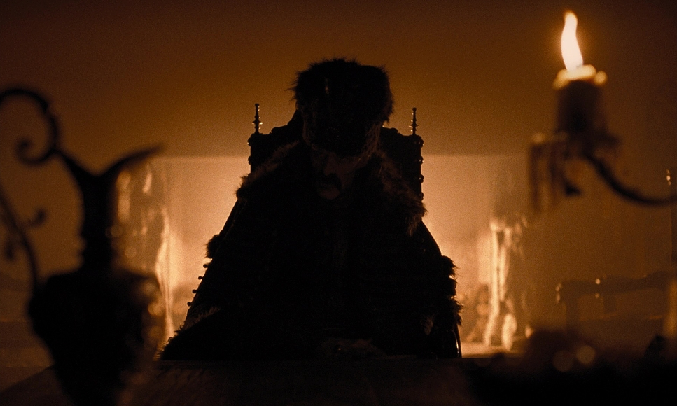
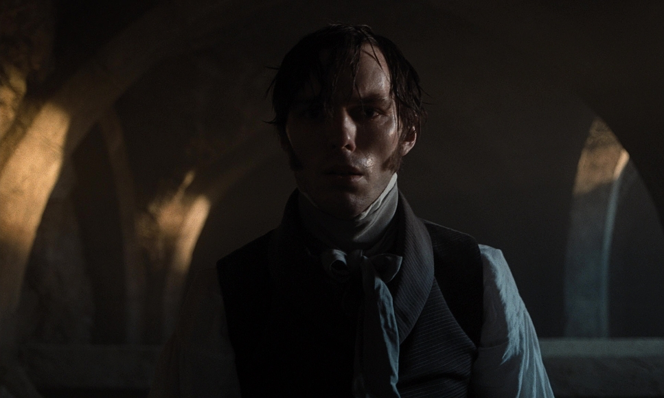
The film makes aggressive use of “Surface Division”—a concept from The Visual Story. Doorways, windows, and curtains frequently slice the frame, trapping characters within the image. There are shots where the camera pans, forcing you to crane your neck to see around a corner. This isn’t just aesthetic; it’s a power dynamic. Count Orlok is often framed in the shadows or blurred in the deep background, visually establishing him as a “presence” rather than a man. By denying us a clear look, the composition forces us to lean in, making us complicit in the horror.
Lighting Style
As a colorist, I can tell you that you can’t grade a bad lighting setup into a good one. Blaschke’s strategy here is “motivated naturalism” on steroids. Day interiors are primarily window-lit; night interiors are almost exclusively lit by flame. And I don’t mean electric bulbs on a dimmer—I mean real fire.
For moonlight, Blaschke refused to fake it. He used mirrors to reflect light into studio environments to maintain the physics of light sources at infinity. If a lamp is close, shadows splay; if it’s the moon, shadows must be parallel. He effectively creates what Block defines as “Non-Coincidence of Tone,” where the subject is obscured by shadow to generate suspense. The film is incredibly dark—testing the dynamic range of projection—but there is always a rim light or a highlight carving out the necessary separation.
Lensing and Blocking
We have to talk about the glass. You simply don’t get this texture with standard primes. Blaschke worked with Panavision to build custom lenses, specifically exploring “Heliar” and “Petzval” designs. These lenses create a specific swirl or “bloom” in the highlights and a sharp fall-off toward the edges, driving the viewer’s eye relentlessly to the center of the frame.
The blocking works in tandem with this glass. Because they committed to real candlelight, they were shooting wide open on high-speed lenses, resulting in a razor-thin depth of field. To keep things in focus, the actors are essentially handcuffed to their marks. Eggers creates depth by staging actors along the Z-axis, placing objects in the foreground to exaggerate the distance to the background. This emphasizes the isolation of characters like Ellen Hutter (Lily-Rose Depp), who is often visually separated from others by that shallow focus, reinforcing her parasitic connection to Orlok.
Color Grading
This is where I geek out. Nosferatu is a color film, but the night scenes feel biologically monochromatic. This isn’t a simple desaturation LUT. Blaschke employed a technique he developed on The Lighthouse and refined on The Northman: the “Scotopic” filter.
Here’s the science: In low light, human eyes switch from cones (color) to rods (monochromatic/blue-sensitive). This is scotopic vision. We effectively stop seeing red wavelengths. To mimic this on Kodak 5219 stock, Blaschke used a custom glass filter that cuts red light, blinding the film to those wavelengths. This creates a silvery, cyan-heavy image where skin tones lose their warmth and blood renders as black. It utilizes “Affinity of Color” to reduce visual intensity, plunging us into a world that feels biologically correct to how we see in the dark—ghostly and colorless.
Technical aspects
Nosferatu (2024)
35mm Film | 1.66:1 Spherical | Arricam ST
| Genre | Drama, Fantasy, Horror, Monster |
| Director | Robert Eggers |
| Cinematographer | Jarin Blaschke |
| Production Designer | Craig Lathrop |
| Costume Designer | Linda Muir |
| Editor | Louise Ford |
| Colorist | Edo Brizio |
| Time Period | 1800s |
| Color | Cool, Desaturated, White |
| Aspect Ratio | 1.66 – Spherical |
| Format | Film – 35mm |
| Lighting | Soft light, Low contrast, Backlight, Edge light |
| Lighting Type | Daylight |
| Story Location | Europe > Germany |
| Filming Location | Czech Republic > Prague |
| Camera | Arricam ST |
| Lens | Pathe Lenses, Bausch and Lomb – Original Baltar |
Finally, the tactile nature of this production is undeniable. In an era of green screens, Nosferatu was shot on 35mm film, and you can feel it in the grain structure and the “sprocket bob” in the titles. It grounds the film in a reality that digital sensors often struggle to replicate without heavy emulation.
The effects are largely practical. We are talking about 5,000 live rats on set. The fire sequences? Mostly real fire, which reportedly terrified Willem Dafoe. Even the “invisible” VFX are fascinating—there is a scene where a shadow moves across a curtain that looks practical but was actually a VFX addition because the physical lighting couldn’t achieve the specific shadow throw without ruining the exposure.
This film creates what Bruce Block describes as “Ambiguous Space”—using shadows and mirrors to confuse the viewer’s sense of size and location. It’s a technical marvel that fuses 19th-century aesthetics with 21st-century precision.
- Also Read: CINEMATOGRAPHY ANALYSIS OF THE LORD OF THE RINGS: THE FELLOWSHIP OF THE RING
- Also Read: FRANKENSTEIN: A CINEMATOGRAPHY ANALYSIS
Browse Our Cinematography Analysis Glossary
Explore directors, cinematographers, cameras, lenses, lighting styles, genres, and the visual techniques that shape iconic films.
Explore Glossary →