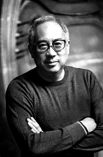
Hello, I’m Salik Waquas, a filmmaker and full-time colorist. Owning and operating my post-production color grading suite has allowed me to merge my passion for storytelling with technical precision. Through my journey, I’ve developed an obsession with the nuances of visual storytelling and its transformative power on audiences. Writing about the one of my favorite film directed by Zack Snyder’s Batman v Superman: Dawn of Justice is my way of sharing my appreciation for this art form and diving deeper into its intricacies.
Cinematography Analysis Of Batman v Superman: Dawn of Justice
About the Cinematographer
Larry Fong’s work in Batman v Superman: Dawn of Justice is a testament to his mastery of visual storytelling. Collaborating with Zack Snyder on several iconic films like 300 and Watchmen, Fong has carved a niche for creating evocative, high-concept visuals that are equally grounded in emotion. His ability to meld operatic visuals with raw human vulnerability shines in this film, a work that visually encapsulates the tension between hope and despair, divinity and humanity.
As a colorist, I find Fong’s approach inspiring. His dedication to creating frames that resonate emotionally and thematically reminds me of why I entered this field. His art direction aligns with Snyder’s love for visual symbolism, making their partnership a perfect match for a film as ambitious as Batman v Superman.
Inspiration for the Cinematography
The visual language of Batman v Superman draws heavily from the pages of Frank Miller’s The Dark Knight Returns, blending the graphic novel’s gritty tone with Snyder and Fong’s appreciation for classical art. Watching the film, I can feel the influence of chiaroscuro lighting and bold, painterly compositions reminiscent of Caravaggio.
I believe what sets this film apart is how it frames its characters with mythological grandeur. The frequent use of slow motion, exaggerated framing, and deliberate composition turns every frame into a canvas rich with narrative. For example, Superman is consistently depicted in poses that evoke Renaissance depictions of messianic figures, highlighting his godlike status.
Camera Movements That Amplify Emotion
The camera movements in this film are masterful, emphasizing the internal struggles of its characters. I particularly appreciate how the Metropolis destruction sequence is captured through Bruce Wayne’s perspective. The handheld, chaotic shots throw us into the turmoil, aligning us with Bruce’s fear and helplessness.
In stark contrast, Superman’s scenes are often smooth and sweeping, underlining his otherworldly nature. I can’t help but admire the “Knightmare” sequence, where frantic, unstable camera movements echo Bruce’s paranoia. The deliberate tension between these perspectives—grounded and divine—reinforces the film’s narrative of ideological clash.
Compositions: A Story in Every Frame
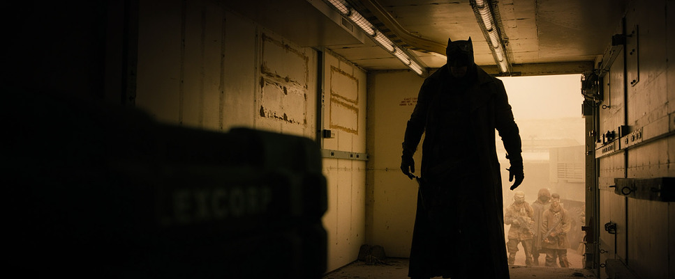
Composition is where Fong’s artistry truly shines. I’ve studied the film frame by frame and am constantly in awe of how the power dynamics are embedded visually. Superman often dominates the frame through low angles, while Batman lurks in shadowy corners, his menace palpable.
There’s a scene where Lex Luthor is deliberately placed off-center—a subtle but effective way to reflect his chaotic mind. The recurring motifs, like horses symbolizing the Four Horsemen, serve as visual metaphors for the apocalypse and redemption. As someone who crafts visuals daily, these compositional choices resonate deeply with me. They remind me of the importance of storytelling through subtle visual cues.
Lighting: Setting the Tone
Lighting in Batman v Superman is a masterclass in mood setting. As a colorist, I find myself constantly revisiting the Capitol bombing scene. The warm hues that dissolve into cold, harsh tones mirror the destruction of hope and trust in a single moment. It’s visual poetry.
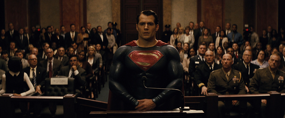
Fong’s use of high-contrast lighting, especially in Batman’s scenes, creates stark silhouettes that emphasize his fear-driven worldview. Superman, on the other hand, basks in softer light, a visual nod to his role as a symbol of hope. The juxtaposition of these lighting styles encapsulates the film’s thematic duality.
Lensing and Blocking: Elevating Narrative
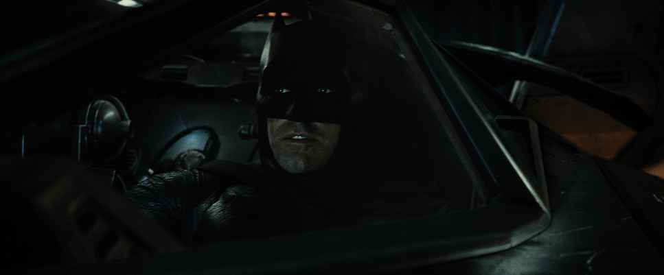
The lensing choices in Batman v Superman are as purposeful as its narrative. The use of wide-angle lenses to amplify Superman’s grandiosity contrasts beautifully with the shallow depth of field in Batman’s scenes, drawing us into his more personal struggles. It’s this kind of deliberate lensing that I strive to emulate in my own color grading work.
Blocking, too, deserves special mention. Bruce and Clark are often framed at opposing ends during their confrontations, visually reinforcing their ideological chasm. The climactic fight scene, with its intricate spatial dynamics, is an example of how blocking can heighten emotional stakes. These are the kinds of visual tools that excite me as a colorist—they offer endless opportunities for storytelling through framing.
Color Grading: Symbolism Through Palette
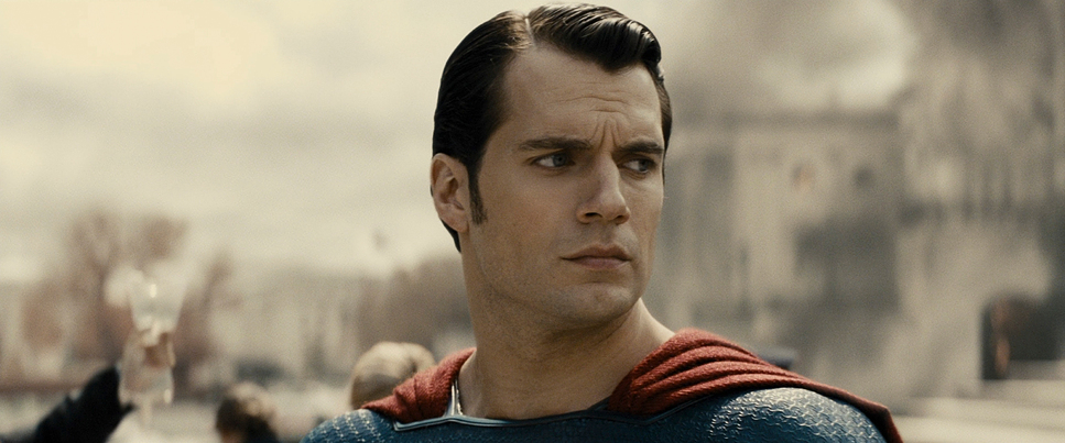
The desaturated tones of Batman v Superman immediately caught my attention. As someone who spends hours perfecting the subtleties of color grading, I can’t help but marvel at how this film uses color to convey emotion. Superman’s vibrant red and blue costume often feels like the only beacon of hope against the muted grays and blacks of Gotham, a deliberate choice that underscores his symbolic role.
The Knightmare sequence, drenched in oppressive oranges, perfectly evokes a dystopian wasteland. Similarly, the cold blues of the Batcave amplify Bruce’s isolation. These color choices aren’t just aesthetic; they are deeply tied to the story, adding layers of meaning to every scene.
Technical Aspects: A Blend of Analog and Digital
| Genre | Action, Adventure, Fantasy, Superhero |
| Director | Zack Snyder |
| Cinematographer | Larry Fong |
| Production Designer | Patrick Tatopoulos |
| Costume Designer | Michael Wilkinson |
| Editor | David Brenner |
| Colorist | Stefan Sonnenfeld |
| Time Period | 2010s |
| Color | Cool, Desaturated, Blue |
| Aspect Ratio | 2.39 – Spherical |
| Format | Film – 35mm |
| Lighting | Soft light, Low contrast |
| Lighting Type | Daylight, Overcast |
| Story Location | United States of America > Gotham City |
| Filming Location | Michigan > Detroit |
| Camera | Arri 435 / 435ES, ARRI ALEXA XT / XTplus, Arriflex 416 |
| Lens | Panavision 40-80 (Bailey zoom – AWZ2), Panavision 70-200mm (ATZ), Panavision C series, Panavision E series, Panavision Primo 70 Primes, Panavision System 65 Lenses, Zeiss Lenses |
Fong and Snyder’s decision to shoot Batman v Superman on a mix of 35mm film and digital formats creates a textural richness that’s rare in modern blockbusters. The IMAX sequences, in particular, are breathtaking. Watching those scenes feels immersive in a way that only large-format filmmaking can achieve.
The visual effects, while extensive, blend seamlessly with the practical elements. As someone who understands the challenges of integrating VFX with real-world lighting and color grading, I admire how this film achieves a balance between spectacle and authenticity.
- Also Read: CINEMATOGRAPHY ANALYSIS OF IT (IN DEPTH)
- Also Read: CINEMATOGRAPHY ANALYSIS OF LATE SPRING (IN DEPTH)
Browse Our Cinematography Analysis Glossary
Explore directors, cinematographers, cameras, lenses, lighting styles, genres, and the visual techniques that shape iconic films.
Explore Glossary →