I’m Salik Waquas, a filmmaker and full-time film colorist with an enduring passion for cinematic storytelling. I own Color Culture, a post-production color grading suite dedicated to enhancing visual narratives. As someone who views films through the dual lenses of a filmmaker and a colorist, I’ve always been captivated by the artistry of Fight Club directed by David Fincher. Its cinematography is a benchmark of visual storytelling, an intricate balance of technical brilliance and thematic depth. Analyzing it feels like peeling back layers of a masterpiece to understand what makes it timeless.
Cinematography Analysis Of Fight Club
About the Cinematographer
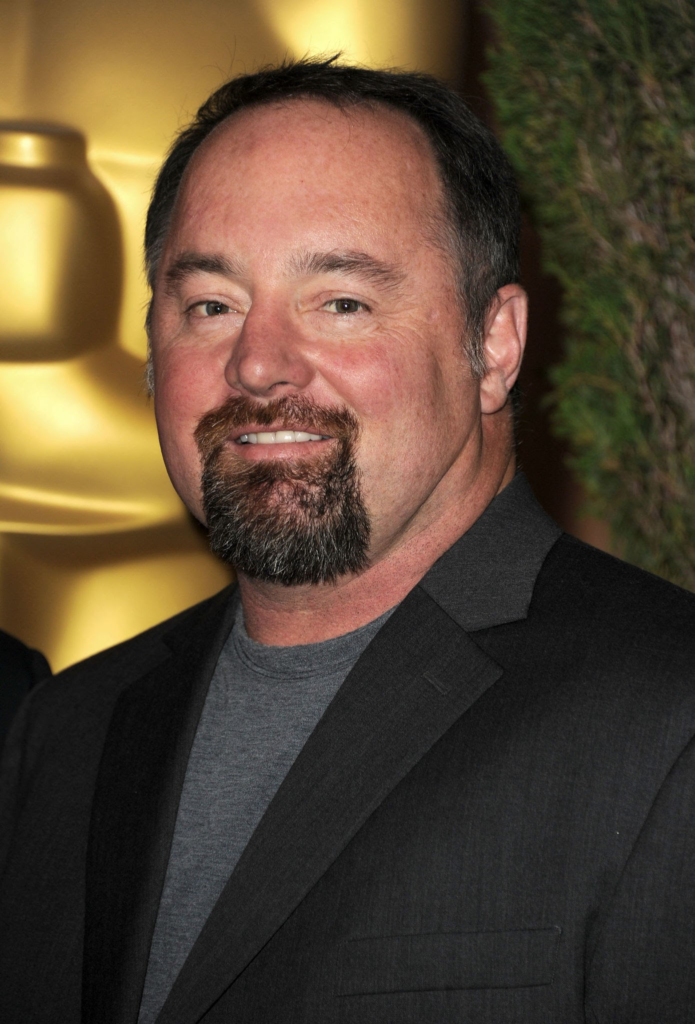
The cinematographer behind Fight Club is Jeff Cronenweth, ASC, a name synonymous with visually striking and emotionally resonant imagery. His lineage in cinematography is significant—his father, Jordan Cronenweth, is celebrated for his work on Blade Runner. Jeff stepped into Fight Club after Andrzej Sekuła left the project, but his impact was profound, creating visuals that cemented his reputation in cinematic history.
Cronenweth’s approach to the film blends gritty realism with surreal stylization, perfectly complementing David Fincher’s meticulous storytelling. Their collaboration is a symbiosis of precision and creative freedom, resulting in a film that looks as chaotic and unhinged as its themes suggest, yet feels cohesively deliberate. Cronenweth transformed Fincher’s vision into a visual language that mirrors the protagonist’s internal battles, rebellion, and search for identity.
Inspiration for the Cinematography of Fight Club
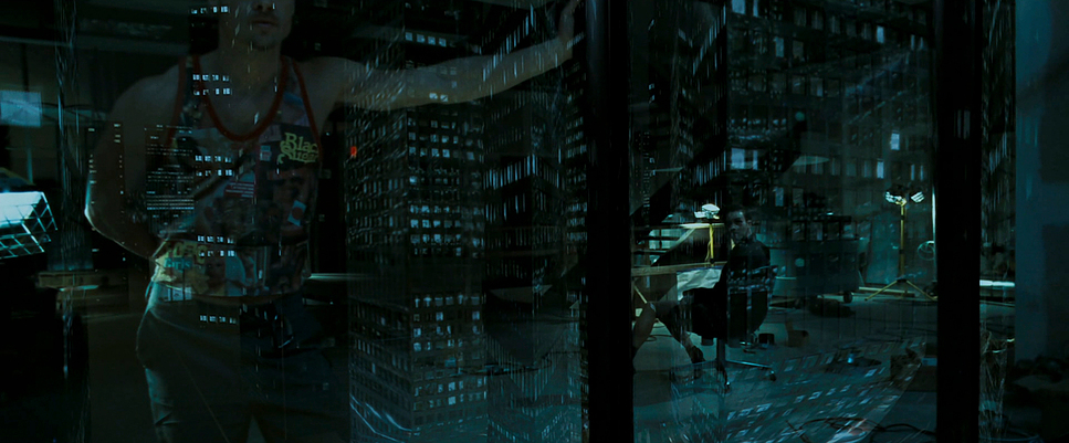
Cronenweth and Fincher pulled inspiration from diverse sources to shape the visual language of Fight Club. The minimalist yet dramatic advertising campaigns of the 1990s heavily influenced the film’s aesthetic. These campaigns, with their stark contrasts and rich monochromatic imagery, provided a counterpoint to the artificiality of consumer culture, echoing the film’s critique.
The gritty realism of photojournalism also played a role, grounding the chaotic world of underground fight clubs in a raw, immediate visual style. Films like Taxi Driver and Se7en informed the urban decay aesthetics, while Fincher’s Hitchcockian philosophy of pre-visualization ensured every frame served a purpose. Together, they built a world where the sterile environments of consumerism clash with the gritty, primal settings of rebellion.
Camera Movements Used in Fight Club
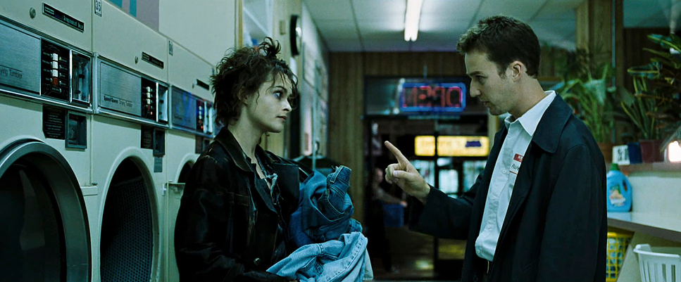
Camera movements in Fight Club are as deliberate as its narrative beats. Fincher and Cronenweth use dynamic, innovative techniques to reflect the protagonist’s unraveling psyche and immerse viewers in the story. One iconic sequence is the IKEA catalog scene, where the camera glides seamlessly through the narrator’s apartment, presenting his consumerist entrapment in a surreal, dreamlike manner. This movement feels almost otherworldly, mimicking the narrator’s detachment from reality.
Conversely, the fight scenes embrace handheld, shaky camera movements that capture their raw intensity. This choice plunges the audience into the visceral chaos of physical combat, mirroring the primal liberation the characters seek. The car crash scene is another standout example of immersive cinematography, combining gimbal-mounted cameras, practical effects, and CGI to disorient and overwhelm viewers, replicating the violent unpredictability of the crash itself.
Compositions in Fight Club
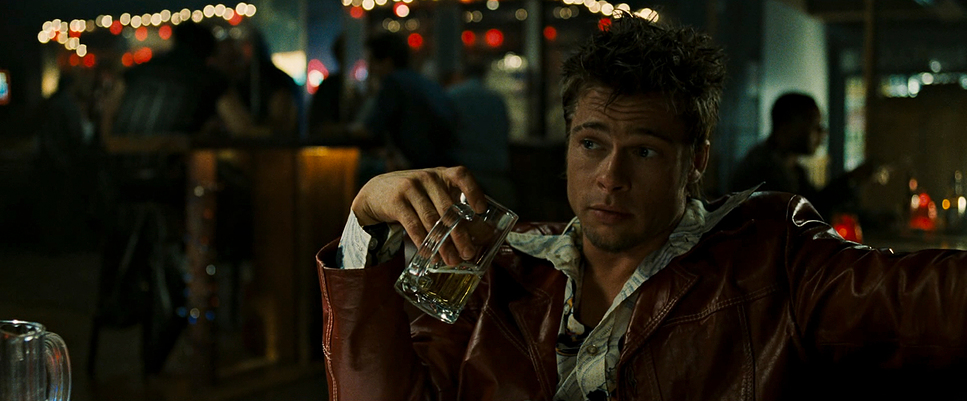
The film’s compositions are masterfully designed to convey duality and disconnection. The narrator’s isolation is frequently emphasized through tight close-ups and shallow depth-of-field shots, while Tyler Durden’s dominance is often framed with expansive, commanding compositions. This contrast reinforces their psychological struggle, foreshadowing the revelation of their shared identity.
Cronenweth also plays with symmetry and asymmetry to embody the film’s themes of chaos and control. In fight scenes, the brutal, chaotic action is often centered within symmetrical frames, giving the violence an almost ritualistic aesthetic. This interplay between order and chaos captures the essence of the Fight Club itself—structured anarchy.
Lighting Style of Fight Club

Lighting is one of the film’s most evocative tools. Cronenweth employs a predominantly low-key lighting style, characterized by deep shadows and stark contrasts. This approach evokes a sense of noir, emphasizing the film’s moral ambiguity and the protagonist’s fractured psyche.
Nighttime scenes dominate the film, bathed in muted, cool tones that evoke introspection and melancholy. The fight club sequences feature harsh overhead lighting, throwing deep shadows across the fighters’ faces and bodies to accentuate the raw brutality. In stark contrast, the sterile environments of office spaces and convenience stores are overlit, creating an oppressive artificiality that reflects the soulless monotony of consumer-driven existence.
One of my favorite techniques in the film is the interplay of warm and cool lighting. Warm tones are often associated with Tyler Durden, symbolizing his vitality and charisma, while cooler tones are reserved for the narrator, reflecting his detachment and ennui.
Lensing and Blocking in Fight Club

Cronenweth’s choice of lenses is integral to the film’s psychological depth. Wide-angle lenses frequently distort perspective, especially during scenes where the narrator’s grip on reality falters. This subtle distortion creates a sense of unease, making the audience feel as unsettled as the protagonist.
Blocking also plays a crucial role in visual storytelling. Tyler is often positioned in dominant or central positions within the frame, while the narrator is relegated to the background or edges. This spatial hierarchy visually reinforces their power dynamic and Tyler’s influence over the narrator. A brilliant example of this is the fight scene between the narrator and his boss, where tight framing and distorted perspectives heighten the tension and claustrophobia.
Color of Fight Club
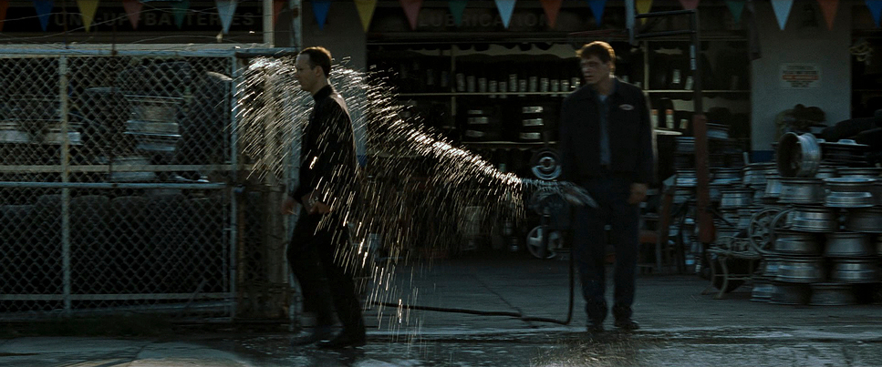
The color palette of Fight Club is one of its most defining characteristics. Desaturated blues, greens, and grays dominate the film, creating a grim, industrial aesthetic. These tones mirror the protagonist’s dissatisfaction with modern life and his descent into chaos. The occasional bursts of vibrant color—like the red of the soap—act as symbolic accents, representing rebellion and vitality amidst the dreariness.
The deliberate manipulation of saturation further underscores the film’s critique of consumer culture. The IKEA catalog scenes, for instance, are slightly oversaturated, emphasizing the artificial allure of materialism. Meanwhile, the final explosion sequence employs fiery reds and oranges, symbolizing destruction and renewal, themes central to the narrative.
Technical Aspects of Fight Club
| Genre | Action, Comedy, Satire, Crime, Gangster, Mafia, Drama, Horror, Psychological Horror, Thriller, Mental Health |
| Director | David Fincher |
| Cinematographer | Jeff Cronenweth |
| Production Designer | Alex McDowell |
| Costume Designer | Michael Kaplan |
| Editor | James Haygood |
| Colorist | Stephen Nakamura |
| Time Period | 1990s |
| Color | Cool, Desaturated, Blue |
| Aspect Ratio | 2.39 – Spherical, Super 35 |
| Format | Film – 35mm |
| Lighting | Soft light, Low contrast |
| Lighting Type | Artificial light |
| VFX | CGI |
| Story Location | North America > United States of America |
| Filming Location | California > Los Angeles |
| Camera | Arriflex 35 III, Panavision Panastar, Panavision Platinum |
| Lens | Panavision Primo Primes |
| Film Stock / Resolution | 5246/7246 Vision 250D, 5248/7248 EXR 100T, 5279/7279 Vision 500T |
From a technical standpoint, Fight Club is groundbreaking. Shot primarily on Arriflex cameras paired with Zeiss Super Speed lenses, the film achieves its gritty, high-contrast aesthetic with sharp precision. These lenses were crucial for handling the low-light environments Cronenweth favored.
Digital post-production played a significant role in refining the film’s look. Fincher’s early adoption of digital intermediates allowed Cronenweth to fine-tune the color grading, ensuring a cohesive aesthetic. Subtle CGI enhancements—such as the IKEA catalog scene and Tyler’s subliminal flashes—were seamlessly integrated to push the boundaries of visual storytelling without detracting from the film’s grounded aesthetic.
Final Thoughts
As a colorist and filmmaker, Fight Club is a source of endless inspiration for me. Jeff Cronenweth’s work is a masterclass in blending technical innovation with artistic expression. Every frame, every lighting choice, and every camera movement serves the story, reflecting the characters’ emotional and psychological depths.
Cronenweth’s ability to capture Fincher’s vision elevates Fight Club from a compelling narrative to a visual masterpiece. Its cinematography doesn’t just complement the story; it amplifies and deepens it, making it a film that continues to resonate both visually and thematically. For me, Fight Club isn’t just a movie—it’s a textbook on how to tell stories with a camera.
- Also Read: CINEMATOGRAPHY ANALYSIS OF FARGO (IN DEPTH)
- Also Read: CINEMATOGRAPHY ANALYSIS OF EVERYTHING EVERYWHERE ALL AT ONCE
Browse Our Cinematography Analysis Glossary
Explore directors, cinematographers, cameras, lenses, lighting styles, genres, and the visual techniques that shape iconic films.
Explore Glossary →