My name is Salik Waquas, and I am a filmmaker and a full-time film colorist. Through my work and passion for visual storytelling, I’ve developed a deep appreciation for the craft of cinematography and its power to shape narratives. Running my color grading suite, Color Culture, has given me countless opportunities to study and enhance the visual language of films. One of the films I’ve always admired, both as an artist and as a viewer, is Fargo (1996). Roger Deakins’ cinematography in this Coen Brothers classic is a masterclass in restraint, subtlety, and storytelling through visuals. In this article, I’ll share my personal analysis of Fargo’s cinematography, exploring its various elements and how they serve to elevate the film’s narrative.
Cinematography Analysis Of Fargo
About the Cinematographer
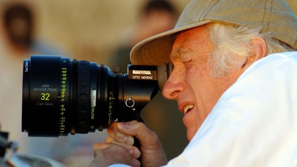
Roger Deakins, the legendary cinematographer behind Fargo, is known for his ability to blend technical mastery with artistic subtlety. His collaboration with the Coen Brothers has produced some of the most visually striking films of the modern era. With Fargo, Deakins approached the bleak, snowy landscape of Minnesota with an eye for simplicity and realism. His minimalist yet evocative style captures not just the physical desolation of the setting but also the moral ambiguity of the characters. As a filmmaker, I’ve always admired Deakins’ ability to use visuals not to overpower a story but to subtly enhance it, creating frames that linger in the viewer’s mind long after the film ends.
Inspiration for the Cinematography of Fargo
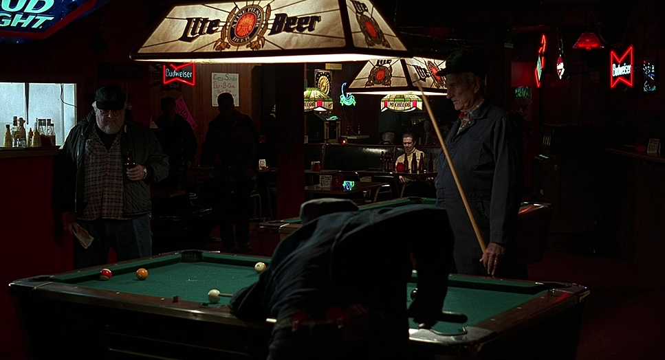
The visual aesthetic of Fargo is rooted in its stark and minimalist approach. Deakins and the Coen Brothers were inspired by the barren, snow-covered Midwest, a landscape that mirrors the cold detachment and moral complexity of the film’s characters. The film’s use of monochromatic white expanses reflects the indifference of nature to human folly. This minimalist approach keeps the focus on the characters and their actions while grounding the surreal events in a tangible reality.
I’ve often drawn inspiration from this approach in my work, particularly the idea of letting the environment play an active role in storytelling. The barren snowfields of Fargo aren’t just a backdrop—they are a character, an extension of the film’s themes of isolation and futility.
Camera Movements Used in Fargo

Deakins’ camera work in Fargo is deliberately restrained, emphasizing stillness and simplicity. The lack of dynamic camera movements reflects the frozen, unchanging nature of the snowy landscape. When the camera does move, it does so with purpose—tracking shots that follow characters, slow zooms that heighten tension, and subtle pans that draw the viewer into the narrative.
One scene that stands out to me is when Jerry Lundegaard scrapes ice off his windshield. The tight, cramped framing contrasts sharply with the wide, open landscapes seen elsewhere, visually reflecting Jerry’s inner turmoil against the vast indifference of the world. As a filmmaker, I find this approach incredibly effective—it’s a reminder that camera movement should always serve the story, not distract from it.
Compositions in Fargo
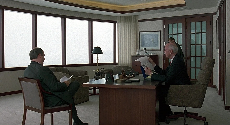
The compositions in Fargo are a masterclass in using negative space and balance to reflect characters’ emotional states. Deakins often frames characters in the lower third of the screen, dwarfed by vast, empty expanses of snow. This visual isolation mirrors their existential struggles, emphasizing their smallness and insignificance in the grander scheme of things.
For me, one of the most striking aspects of the compositions is the use of symmetry to underscore emotional connections. Marge Gunderson and her husband, Norm, are often framed together in two-shots, symbolizing their harmonious relationship. In contrast, Jerry is frequently framed alone or with others at a distance, reflecting his growing alienation. This careful use of framing and composition is something I strive to emulate in my own work—it’s proof that subtle visual cues can speak volumes about character dynamics.
Lighting Style of Fargo

The naturalistic lighting in Fargo enhances its grounded narrative while maintaining its stark, bleak tone. The pervasive whiteness of the snow creates a high-key lighting effect, bathing the exteriors in a cold, sterile light. This contrast between the harsh daylight and the dark deeds of the characters heightens the absurdity of the narrative.
Interiors, however, are often lit with warm, dim lighting, creating a sense of comfort and intimacy—particularly in scenes featuring Marge and Norm. As a colorist, I admire the balance between these lighting styles. The warmth of the interiors serves as a visual reprieve from the cold, harsh exteriors, reinforcing the emotional core of the film. This interplay between light and shadow, while subtle, creates a powerful contrast that adds depth to the storytelling.
Lensing and Blocking of Fargo
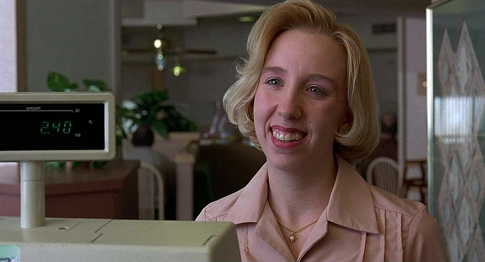
Deakins’ choice of lenses and meticulous blocking play a crucial role in Fargo’s visual storytelling. Wide-angle lenses are often used to capture the vastness of the snowy landscapes, emphasizing the characters’ isolation. Telephoto lenses, on the other hand, compress the depth of field, creating a sense of entrapment and detachment.
Blocking is equally precise, with characters positioned to reflect power dynamics and relationships. For instance, Jerry is often shown at a lower level or framed behind other characters, visually underscoring his inferiority and lack of control. In contrast, Marge’s framing reflects her strength and authority, with her often positioned in commanding stances. These subtle choices in lensing and blocking are a testament to Deakins’ mastery, and they inspire me to think critically about how such elements can enhance narrative themes.
Color Pallete of Fargo
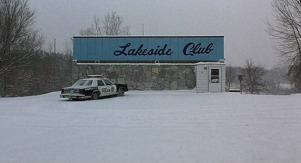
The color palette of Fargo is another aspect that stands out for its restrained yet effective approach. The film’s palette is dominated by whites, grays, and muted earth tones, reflecting the starkness of the environment and the bleakness of the story. The occasional use of warm hues—such as the soft yellow glow of a lamp or the deep red of blood on snow—creates striking contrasts that draw attention to key moments.
As a colorist, I find the interplay between warm and cool tones in Fargo particularly inspiring. The subtle shifts in color temperature between scenes create a visual rhythm that supports the film’s emotional beats. It’s a reminder of how color grading can serve as an invisible yet powerful storytelling tool.
Technical Aspects of Fargo
FARGO (1996) — Technical Specs
| Genre | Crime, Drama, Thriller, Murder Mystery, Mystery, Film Noir, Neo-Noir |
| Director | Joel Coen |
| Cinematographer | Roger Deakins |
| Production Designer | Rick Heinrichs |
| Costume Designer | Mary Zophres |
| Editor | Joel Coen |
| Time Period | 1980s |
| Aspect Ratio | 1.85 – Spherical |
| Format | Film – 35mm |
| Lighting | Backlight |
| Lighting Type | Artificial light, Tungsten |
| Story Location | Minnesota > Minneapolis |
| Filming Location | Minnesota > Minneapolis |
| Camera | Arriflex 35 BL4 |
| Lens | Zeiss Standard Primes |
| Film Stock / Resolution | 5293/7293 EXR 200T |
From a technical perspective, Fargo exemplifies the power of simplicity. Shot on 35mm film with Arriflex cameras and Zeiss lenses, the film captures a tactile, organic quality that enhances its realism. Deakins’ preference for natural light and practical setups ensures that the visuals remain grounded and authentic.
The editing by Roderick Jaynes (a pseudonym for the Coens) complements the cinematography perfectly, maintaining a seamless flow that lets the visuals speak for themselves. The sound design, with its ambient noises of wind and snow crunching underfoot, further immerses the viewer in the film’s world. These technical choices serve as a reminder that simplicity, when executed with precision, can be just as impactful as elaborate techniques.
Conclusion
For me, Fargo represents a benchmark in visual storytelling. Roger Deakins’ cinematography is a testament to the power of restraint and subtlety, proving that profound emotional and thematic depth can be achieved through simplicity. From its stark compositions to its nuanced color grading, every visual element of Fargo works in harmony to support the Coen Brothers’ vision.
As a filmmaker and colorist, I find endless inspiration in this film. It’s a reminder that every frame is an opportunity to tell a story, and that even the smallest visual choices can leave a lasting impact. Fargo is more than just a film—it’s a lesson in the art of crafting timeless cinema.
- Also Read: CINEMATOGRAPHY ANALYSIS OF EVERYTHING EVERYWHERE ALL AT ONCE
- Also Read: CINEMATOGRAPHY ANALYSIS OF EUPHORIA (IN DEPTH)
Browse Our Cinematography Analysis Glossary
Explore directors, cinematographers, cameras, lenses, lighting styles, genres, and the visual techniques that shape iconic films.
Explore Glossary →