Hello, I’m Salik Waquas, a filmmaker and colorist with a passion for visual storytelling. I own a post-production color grading suite where I immerse myself in the intricate art of shaping narratives through color and light. One film that has always resonated with me is Dead Poets Society, directed by Peter Weir, not just for its compelling story but for its masterful cinematography. I’d like to share my analysis of the cinematographic elements that make this film a timeless masterpiece.
About the Cinematographer

The visual brilliance of Dead Poets Society is the work of John Seale, an Academy Award-winning Australian cinematographer renowned for his versatility and keen eye for detail. Seale’s ability to blend technical precision with emotional sensitivity results in visuals that are both evocative and meaningful. His collaboration with director Peter Weir brought to life a visual narrative that complements the film’s themes of individuality and conformity. Seale’s approach in this film stands out as an evocative blend of realism and romanticism, making every frame resonate with the underlying message.
Inspiration for the Cinematography of Dead Poets Society
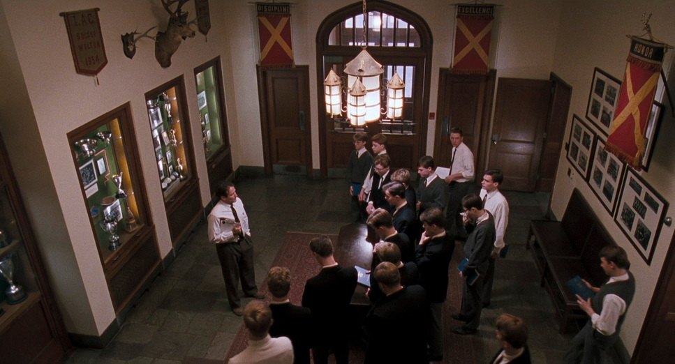
The cinematography draws heavily on the central themes of tradition versus individuality. Seale aimed to reflect the rigidity of Welton Academy—a conservative institution in the 1950s—through structured compositions and muted color palettes. The austere atmosphere of the school is juxtaposed with the liberating essence of poetry and dreams. Lighting choices vary between the cold, shadowy interiors of the school and the warm, natural glow of outdoor scenes, symbolizing the students’ internal struggles between suppression and freedom.
There’s also a thematic connection to Shakespeare’s A Midsummer Night’s Dream, evident in the film’s dreamlike visuals. Much like the play’s fantastical forest setting, Dead Poets Society explores metaphorical journeys into the unknown, where passions and dreams momentarily escape societal restrictions. This duality drives the visual storytelling, creating a poignant balance between realism and an ethereal sense of longing.
Camera Movements Used in Dead Poets Society
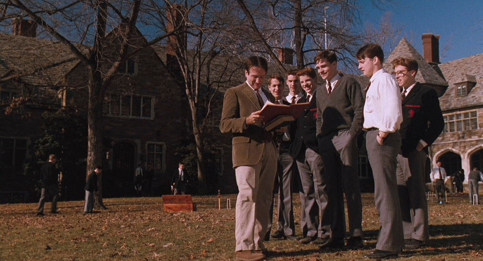
Seale employs a range of camera movements to enhance the storytelling. In the classroom scenes, the camera is deliberately restrained with static and symmetrical framing, emphasizing the strict and controlled environment of Welton Academy. These shots create a visual monotony that reflects the students’ repressed existence.
In contrast, dynamic camera movements come into play during moments of emotional liberation or rebellion. For instance, during the Dead Poets’ meetings in the cave, handheld and tracking shots are used, conveying a sense of intimacy and spontaneity. This shift mirrors the characters’ internal journeys towards self-expression. The climactic scene where the students stand on their desks employs slow, purposeful tilts, capturing the gravity and beauty of their collective act of defiance.
Compositions in Dead Poets Society
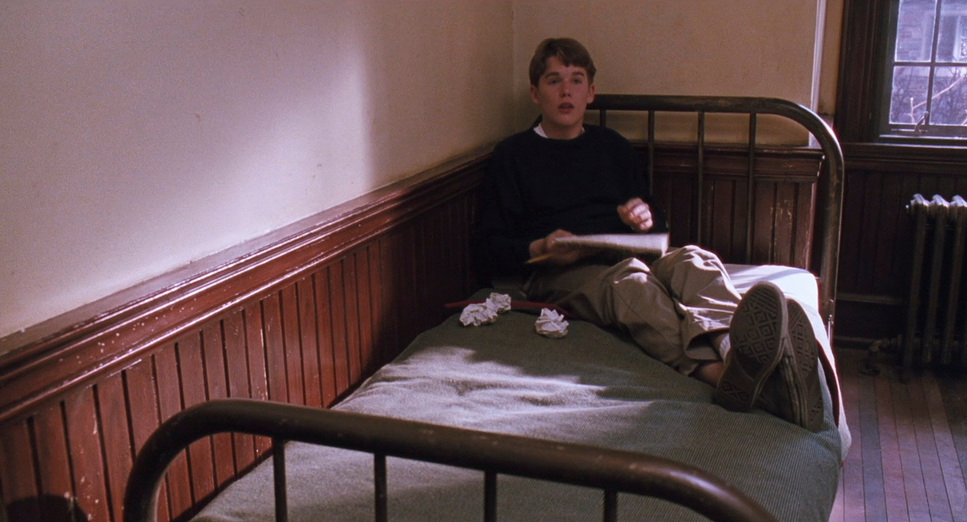
The film’s compositions are meticulously crafted to reflect the characters’ relationships and emotional states. Within the school, characters are frequently framed within rigid, symmetrical compositions that emphasize their entrapment. Neil’s interactions with his father often show him dwarfed by imposing walls or furniture, visually communicating his lack of agency.
Conversely, outdoor scenes feature more organic, asymmetrical compositions, reflecting the fluidity and freedom that poetry brings to the students. The use of framing devices like doorways and windows serves as frames within frames, symbolizing the emotional and ideological barriers the characters must overcome.
A standout composition occurs during Neil’s final moments. As he sits in his father’s study, the framing positions him forward-facing but emotionally distant, with his mother behind him. This setup symbolizes their irreconcilable disconnect, and the starkness of the composition mirrors Neil’s isolation and the inevitability of his tragic choice.
Lighting Style of Dead Poets Society
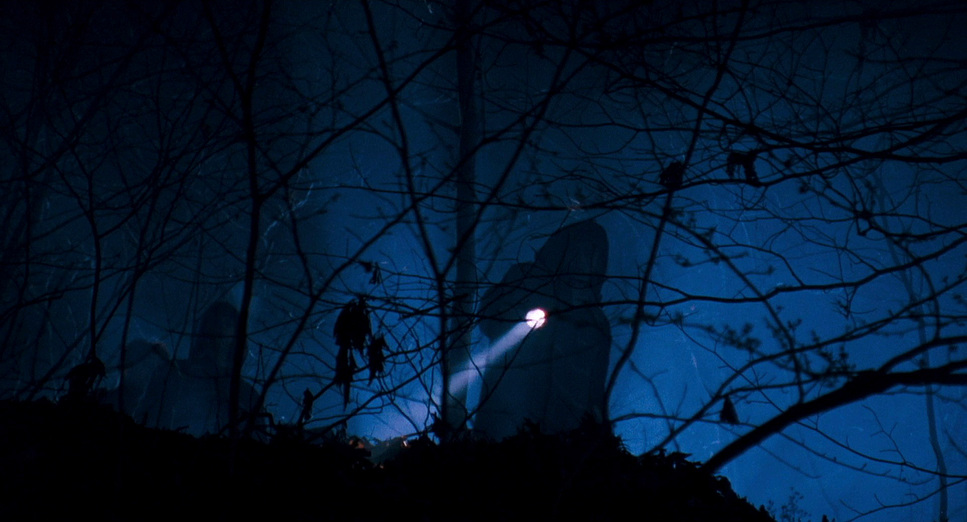
Lighting plays a crucial role in conveying the film’s emotional undertones. Classroom scenes are lit with cool, harsh lighting, reinforcing the oppressive atmosphere of the institution. The lighting creates deep shadows, suggesting the stifling conformity imposed upon the students.
In contrast, the Dead Poets’ meetings are bathed in warm, soft lighting, creating an intimate and inviting ambiance. This dichotomy underscores the thematic contrast between conformity and freedom. In Neil’s final scene, the lighting takes on symbolic weight. Standing by the window with snow falling outside, the cold, blue tones mirror his despair. The lighting shifts to emphasize his silhouette, reducing him to a shadow of his true self, reflecting the loss of hope.
Lensing and Blocking of Dead Poets Society
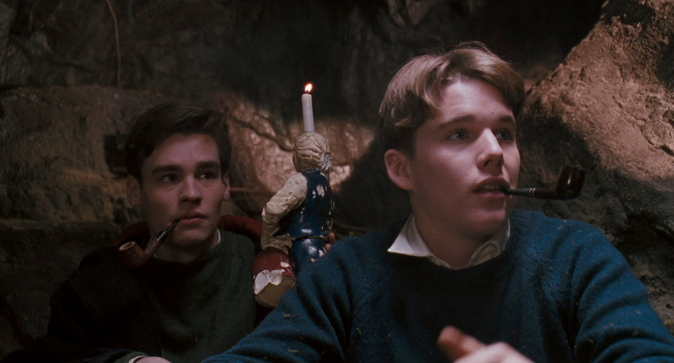
Seale’s choice of lenses and blocking techniques further enhances the visual narrative. Wide-angle lenses capture the grandeur and rigidity of Welton Academy, amplifying the imposing structures and their dominance over the students. In more intimate moments, such as the cave meetings, tighter lenses bring the audience closer to the characters, fostering a sense of connection and vulnerability.
Blocking—the positioning and movement of actors within the frame—is also significant. In the classroom, Mr. Keating frequently moves among the students, breaking the traditional hierarchy of teacher-student relationships. This dynamic blocking reflects his unconventional teaching methods and his encouragement of individuality. In contrast, scenes involving Neil and his father feature rigid, hierarchical blocking, with Neil often positioned lower or farther back in the frame, underscoring his subordinate role.
Color of Dead Poets Society
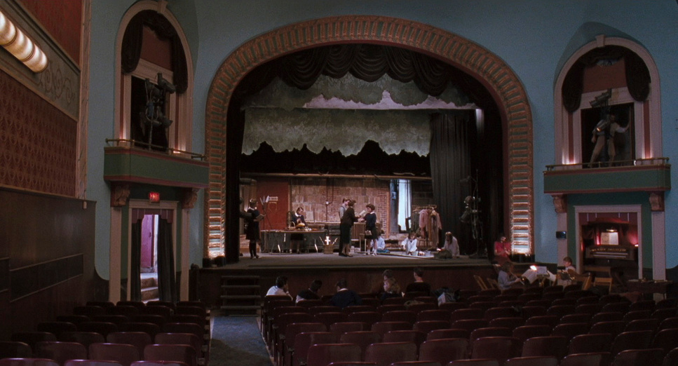
The film’s color palette is subdued yet purposeful, dominated by earthy tones like grays, browns, and dark greens that reflect the conservative setting. These muted colors convey a sense of tradition and conformity within the academy’s walls.
However, bursts of color are strategically used to signify moments of passion and rebellion. Outdoor scenes feature more vibrant, natural colors, symbolizing freedom and self-expression. The use of red is particularly striking; it often symbolizes passion and defiance. For instance, the book of poetry that inspires the students features a bold red cover, acting as a visual beacon of rebellion and individuality.
Technical Aspects of Dead Poets Society
| Genre | Drama, Coming-of-Age, High School |
| Director | Peter Weir |
| Cinematographer | John Seale |
| Production Designer | Wendy Stites |
| Costume Designer | Nancy Konrardy |
| Editor | William M. Anderson |
| Time Period | 1950s |
| Color | Warm, Desaturated |
| Aspect Ratio | 1.85 – Spherical |
| Format | Film – 35mm |
| Lighting | Soft light, Low contrast |
| Lighting Type | Artificial light |
| Story Location | United States of America > New England |
| Filming Location | Middletown > 350 Noxontown Road |
| Camera | Panavision Panaflex |
| Lens | Panavision Primo Primes |
From a technical perspective, Seale’s work is a masterclass in subtle yet effective cinematography. The film was shot on 35mm film, which lends a timeless, organic quality to its visuals. The choice of film stock enhances the subdued color palette and allows for rich contrasts, particularly in the interplay of light and shadow.
The use of practical lighting—incorporating natural light sources like candles and windows—creates a sense of authenticity and intimacy. This approach is evident in the cave scenes, where the flickering candlelight underscores the students’ vulnerability and passion.
Sound design also plays a subtle but significant role in enhancing the visuals. Moments of silence or the soft rustle of leaves often accompany key scenes, allowing the visuals to speak for themselves. The sparing use of music amplifies the emotional weight of the story, particularly in Neil’s tragic arc.
Conclusion
In Dead Poets Society, John Seale’s cinematography does more than capture the narrative; it becomes an integral part of the storytelling. Through thoughtful use of lighting, composition, and camera movement, the film immerses the audience in the emotional world of the characters. The visual elements amplify the film’s exploration of dreams, individuality, and the cost of conformity.
As a filmmaker and colorist, I find Seale’s work in this film to be a profound reminder of the power of visual storytelling. Studying these elements offers valuable insights into how deliberate cinematographic choices can profoundly influence narrative and emotional impact. It is a testament to the idea that every frame, every shadow, and every beam of light can carry the weight of a story.
Thank you for joining me in this exploration of Dead Poets Society. It’s films like these that inspire me to continue pushing the boundaries of visual storytelling in my own work.
- Also Read: CINEMATOGRAPHY ANALYSIS OF CITY OF GOD (IN DEPTH)
- Also Read: CINEMATOGRAPHY ANALYSIS OF KNIVES OUT (IN DEPTH)
Browse Our Cinematography Analysis Glossary
Explore directors, cinematographers, cameras, lenses, lighting styles, genres, and the visual techniques that shape iconic films.
Explore Glossary →