As a filmmaker and colorist, I’ve always been captivated by the visual language of cinema—how it transforms storytelling into something visceral, something unforgettable. Few films have left as indelible a mark on me as Stanley Kubrick’s A Clockwork Orange. From its provocative themes to its audacious visual style, this 1971 classic is a masterclass in the power of cinematography. Through this article, I want to share my thoughts on the film’s extraordinary visuals and explore the techniques that John Alcott, the cinematographer, used to create its iconic aesthetic.
Cinematography Analysis Of A Clockwork Orange
About the Cinematographer
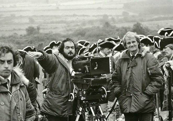
John Alcott’s work in A Clockwork Orange is nothing short of genius. A frequent collaborator of Kubrick’s, Alcott was the perfect partner to bring Kubrick’s demanding vision to life. What sets Alcott apart is his ability to innovate within constraints. Unlike their previous collaboration, 2001: A Space Odyssey, which had the luxury of a $12 million budget, A Clockwork Orange was created with just $2 million. Despite this stark difference, Alcott’s work doesn’t feel limited; instead, it thrives on efficiency and creativity.
His approach to lighting, framing, and composition turned these limitations into strengths. By utilizing practical lighting and custom lenses, Alcott crafted a raw, immersive aesthetic that remains groundbreaking to this day. It’s rare to find a cinematographer who so seamlessly blends technical mastery with artistic intent, and Alcott’s work here continues to inspire me in my own projects.
Inspiration for the Cinematography
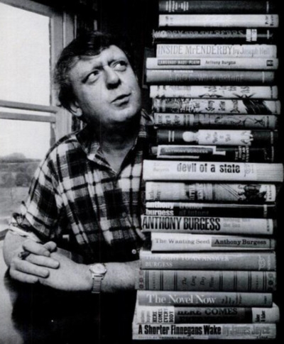
Kubrick’s visual vision for A Clockwork Orange was deeply rooted in Anthony Burgess’s novel. The book’s blend of dystopian satire and dark humor served as the foundation for the film’s striking aesthetic. Kubrick and Alcott sought to create a visual language that mirrored Alex’s distorted worldview—both starkly realistic and dreamlike in its exaggeration.
Kubrick’s decision to use a 1.66:1 aspect ratio over a widescreen format was significant. This choice wasn’t merely technical (to ensure compatibility with television broadcasts) but artistic. The slightly taller frame allowed Kubrick to pack in vertical detail, enhancing the unsettling environments while maintaining a sense of intimacy with the characters.
Their work also drew inspiration from contemporary art, particularly the distorted, grotesque compositions of painters like Francis Bacon. This influence is apparent in the film’s surreal imagery, bold color contrasts, and avant-garde framing. It’s as though the cinematography bridges the gap between reality and nightmare, perfectly capturing the film’s dystopian tone.
Camera Movements in A Clockwork Orange
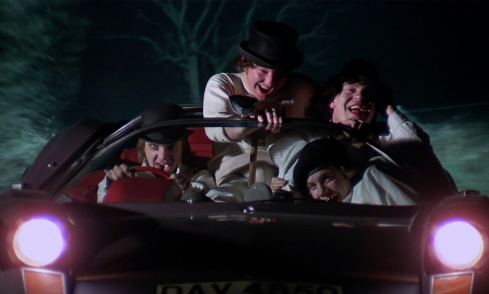
Kubrick’s use of camera movements is one of the film’s most compelling elements. Every motion is deliberate, amplifying the story’s themes and the characters’ psychological states. For instance:
- Handheld Shots: Some of the film’s most chaotic moments are shot handheld, and these sequences carry an electrifying immediacy. Kubrick himself operated the handheld camera for pivotal scenes, including the brutal fight with Billy Boy’s gang and the infamous encounter with the cat lady. These shaky, raw visuals place the audience directly in the fray, making the violence more visceral.
- Slow Motion: One of the most memorable scenes in the film is Alex’s fight with his droogs at the marina, shot in slow motion. The balletic grace of their movements, paired with the operatic music, creates a surreal juxtaposition. This technique highlights the beauty and absurdity of violence, forcing the audience to confront their reactions to these moments.
- Fast Motion: In stark contrast, the William Tell overture scene uses fast motion to heighten the absurdity of Alex’s debauchery. This comically exaggerated speed mocks the use of slow motion in other films to glorify similar acts.
- Long Zooms: A technical innovation worth mentioning is the customized 20-to-1 zoom lens used by Kubrick. These long zoom shots give the film a voyeuristic quality, as though the audience is spying on Alex’s world from a distance. This sense of detachment mirrors the societal alienation that pervades the film.
These movements aren’t just technically impressive—they’re emotionally resonant. They align the audience with Alex’s perspective, immersing us in his chaotic reality while maintaining a critical distance.
Compositions in A Clockwork Orange
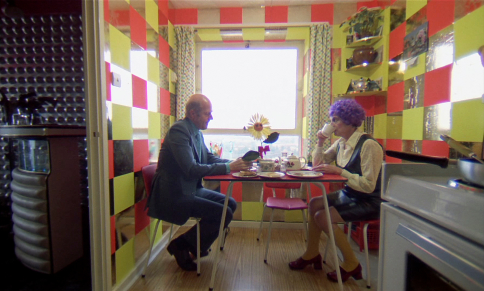
Kubrick’s compositions are perhaps the most instantly recognizable aspect of A Clockwork Orange. His meticulous use of symmetry, central framing, and one-point perspective creates an eerie sense of order within the film’s chaotic world. This compositional style is most evident in the Korova Milk Bar. The symmetrical arrangement of the space, with its unsettling white sculptures and stark lighting, is both visually arresting and thematically resonant. It reflects the artificial, dystopian society that the characters inhabit.
Wide-angle lenses play a crucial role in creating these compositions. They distort the image, particularly in confined spaces, amplifying the unease and discomfort of the film’s setting. For example, in the record store scene, the use of a 9.8mm lens captures both the cramped environment and the detailed set design, drawing the viewer into Alex’s world.
Kubrick’s approach to composition often aligns with the film’s themes. Characters are framed to highlight their emotional isolation or moral detachment. The blocking, too, reinforces these dynamics—whether it’s Alex positioned as the dominant figure among his droogs or the rigid, dehumanizing arrangements of prisoners during the correctional facility scenes. Each frame feels intentional, serving the dual purpose of storytelling and visual artistry.
Lighting Style
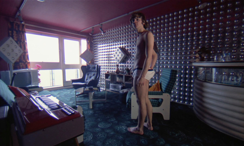
Lighting in A Clockwork Orange is a study in innovation. Alcott’s use of practical lighting was revolutionary for its time, and it remains a source of inspiration for me as a colorist. By relying on visible light sources—unshaded bulbs, spherical fixtures, and even neon signs—Alcott created a naturalistic yet stylized look. This approach not only added authenticity but also kept the production efficient.
What fascinates me most is how the lighting evolves throughout the film:
- The First Act: Bright, high-key lighting and saturated colors dominate Alex’s world, symbolizing his freedom and hedonism.
- The Prison Sequences: Flat, clinical lighting with cool tones underscores the oppressive environment.
- The Final Act: Subdued, desaturated lighting mirrors Alex’s vulnerability and moral reckoning.
One particularly striking example is the lighting used during the droogs’ assault on the homeless man. The scene’s harsh, directional lighting mimics streetlamps, adding a gritty realism that makes the violence feel disturbingly close to home. Alcott’s ability to adapt the lighting style to each act’s emotional tone is a masterclass in storytelling through visuals.
Lensing and Blocking
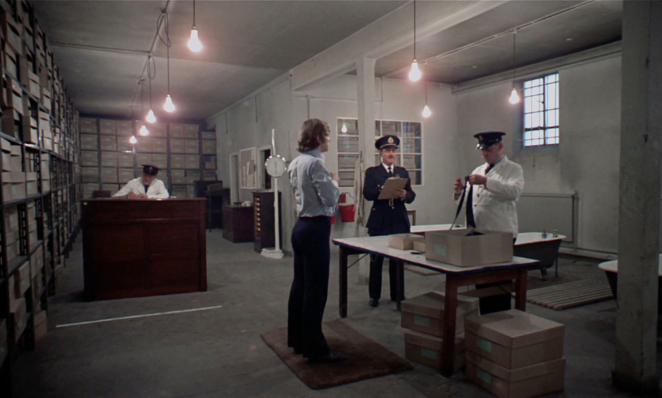
Kubrick’s lens choices and blocking decisions are equally integral to the film’s impact. The use of wide-angle lenses, such as the 9.8mm, allows for expansive framing that captures intricate details while distorting the image for dramatic effect. These lenses also enable deep focus, keeping every element of the frame sharp and engaging.
Blocking is another area where Kubrick’s genius shines. The precise positioning of characters within the frame conveys power dynamics and emotional tension. In the Korova Milk Bar, Alex’s commanding central position establishes his dominance. Meanwhile, the rigid blocking in the prison sequences emphasizes the dehumanization of the characters, reducing them to cogs in a machine.
The handheld blocking during the cat lady’s confrontation is especially noteworthy. The dynamic, unpredictable movements heighten the scene’s intensity, making the audience feel the chaos and unpredictability of the moment.
Color
| Genre | Drama, Psychedelic, Science Fiction |
| Director | Stanley Kubrick |
| Cinematographer | John Alcott |
| Production Designer | John Barry |
| Costume Designer | Milena Canonero |
| Editor | Bill Butler |
| Time Period | Future |
| Color | Blue |
| Aspect Ratio | 1.66 – Spherical |
| Format | Film – 35mm |
| Lighting | Hard light, Low contrast, Top light |
| Lighting Type | Artificial light |
| Story Location | United Kingdom > England |
| Filming Location | United Kingdom > England |
| Camera | Mitchell BNC, Newman Sinclair Autokine 35mm, Arriflex 35 IIC |
| Lens | Angenieux Optimo Zooms |
| Film Stock / Resolution | 5254/7254 100T |
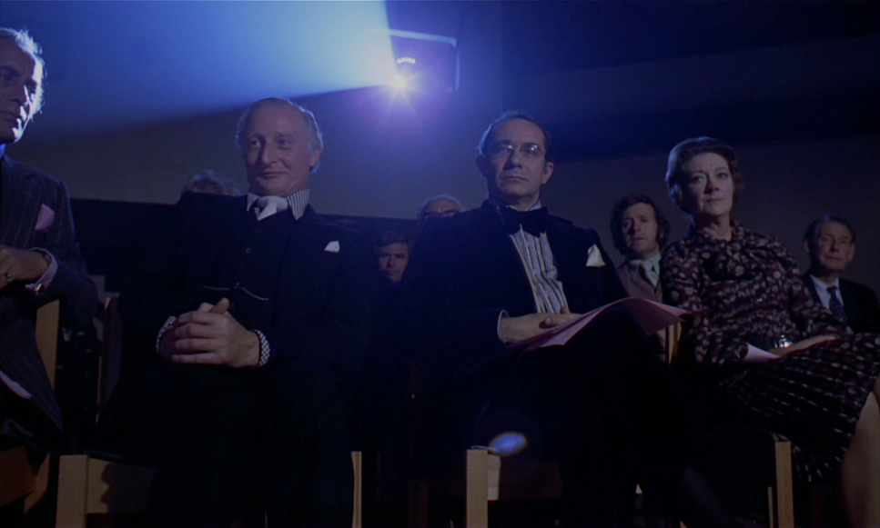
Color in A Clockwork Orange is one of the film’s most striking and symbolic elements. Kubrick and Alcott used a deliberately bold palette to contrast the film’s unsettling themes. Each act’s color scheme reflects Alex’s journey:
- First Act: Vibrant, saturated colors highlight Alex’s hedonistic lifestyle and distorted reality.
- Second Act: Muted, cool tones dominate the prison sequences, symbolizing control and oppression.
- Final Act: Desaturated grays and washed-out colors underscore Alex’s loss of agency and the bleakness of his reformation.
The Korova Milk Bar, with its stark white interiors and red accents, is a prime example of how color sets the tone. The contrast between the sterile white and the grotesque sculptures creates a sense of unease, perfectly aligning with the film’s themes.
One of the most fascinating aspects for me as a colorist is how Kubrick uses color to create dissonance. The bold hues make the visuals almost seductive, forcing the audience to grapple with the disturbing actions depicted. This deliberate tension between beauty and horror is a hallmark of Kubrick’s style.
Conclusion
As a filmmaker and colorist, I am endlessly inspired by the cinematography of A Clockwork Orange. Kubrick and Alcott’s collaboration is a testament to the power of visual storytelling. Every element—from the lighting and lensing to the compositions and color palettes—works in harmony to immerse the audience in Alex’s twisted world.
What resonates most with me is how the film balances technical innovation with thematic depth. Even with a modest budget, Kubrick and Alcott created a timeless work of art that continues to influence filmmakers today. For anyone passionate about cinema, A Clockwork Orange is not just a film to watch but a visual feast to study, admire, and learn from.
- Also Read: CINEMATOGRAPHY ANALYSIS OF AMÉLIE (IN DEPTH)
- Also Read: CINEMATOGRAPHY ANALYSIS OF 1917 (IN DEPTH)
Browse Our Cinematography Analysis Glossary
Explore directors, cinematographers, cameras, lenses, lighting styles, genres, and the visual techniques that shape iconic films.
Explore Glossary →