I’m Salik Waquas, a film colorist and filmmaker who owns a post-production color grading suite. My journey from being a mechanical engineer to a full-time colorist has shaped the way I view films—not just as stories but as technical and artistic marvels. One film that has profoundly impacted me is 1917.
Roger Deakins’ cinematography in 1917 represents a groundbreaking achievement, blending technical ingenuity with artistic brilliance. The film’s innovative one-shot style immerses the viewer into a visceral World War I narrative, offering an unforgettable cinematic experience. This is my in-depth analysis of the cinematographic choices that make 1917 an iconic masterpiece.
CINEMATOGRAPHY ANALYSIS OF 1917
About the Cinematographer
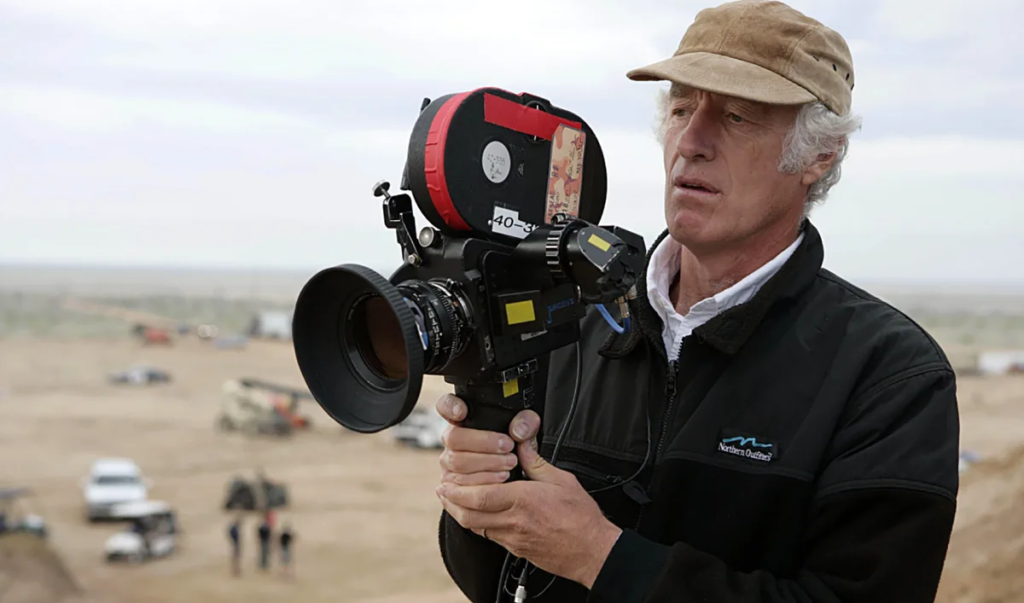
Roger Deakins is a name that needs no introduction in the world of cinematography. With films like Blade Runner 2049, No Country for Old Men, and The Shawshank Redemption, Deakins has continuously redefined what is possible in visual storytelling.
In 1917, his collaboration with director Sam Mendes pushed boundaries by crafting a one-shot war epic. What amazes me most about Deakins’ work here is his ability to make the camera a character in the film—an active participant in the journey of two soldiers rather than a passive observer. Watching 1917 feels less like watching a movie and more like living through the events with the protagonists.
Inspiration for the Cinematography of 1917
The one-shot format in 1917 wasn’t just a stylistic choice; it was inspired by director Sam Mendes’ grandfather’s war stories. Mendes wanted to capture the immediacy of a real-time experience, and Deakins brought this vision to life with masterful cinematography.
From my research and observations, the approach echoes the work of films like Birdman and Russian Ark, which also experimented with the continuous shot. However, 1917 stands apart in its ability to weave this technique into the narrative. The absence of traditional cuts heightens the tension and urgency, making the audience feel like they’re in the trenches alongside the soldiers.
Camera Movements in 1917
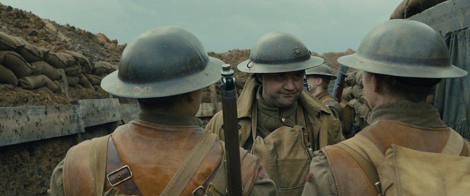
The seamless camera movement in 1917 is arguably its most striking feature. The camera fluidly follows the protagonists across war-torn landscapes, often transitioning between Steadicams, wire rigs, and cranes to maintain the illusion of a continuous shot.
What stands out to me is how the movement feels organic and story-driven. For example, in the opening sequence, the camera pulls back from a peaceful meadow into the chaos of a trench. This transition mirrors the protagonists’ shift from calm to urgency. In one of the film’s most iconic scenes—the nighttime run through a burning town—the camera’s dynamic movements amplify the protagonist’s desperation.
From a filmmaker’s perspective, the planning and execution of these movements are nothing short of awe-inspiring. Every rig change and movement was rehearsed to perfection, ensuring fluidity and narrative cohesion.
Compositions in 1917
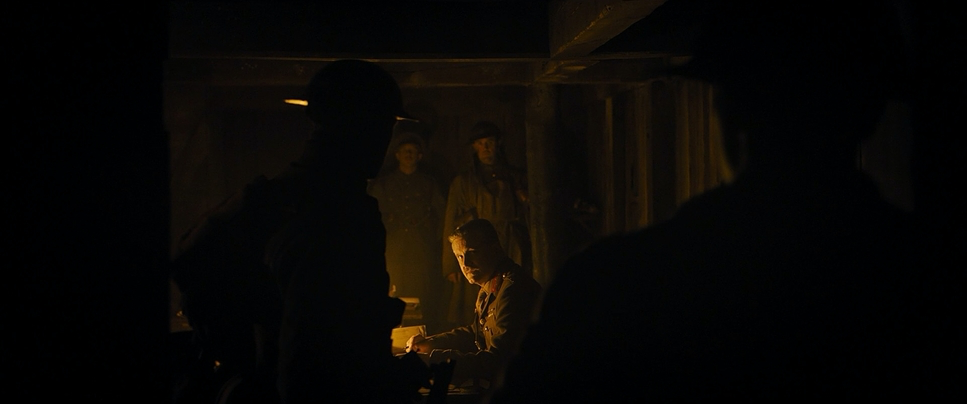
Despite the absence of cuts, Deakins ensures that every frame in 1917 is visually captivating. The compositions are meticulous, with blocking and choreography replacing traditional editing to guide the viewer’s focus.
One of my favorite examples is the scene where the general briefs the protagonists on their mission. The camera begins behind the soldiers, emphasizing their subordination, and then subtly shifts to capture their reaction, ensuring the emotional weight of the moment is preserved.
Deakins also uses depth and leading lines masterfully. Trenches and pathways serve as visual guides, directing attention while creating a sense of movement and progression. This technique ensures that even static moments retain a sense of tension and forward momentum.
Lighting Style in 1917
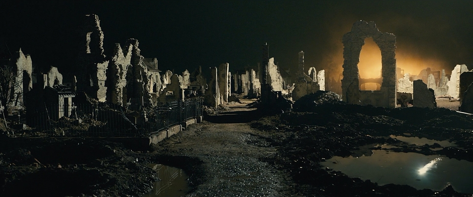
Lighting in 1917 plays a critical role in setting the film’s tone. Deakins leans heavily on naturalistic and motivated lighting, using sources like flares, fire, and moonlight to enhance realism.
The nighttime sequence in the bombed-out town is, in my opinion, a masterclass in lighting. Real flares were choreographed to create dynamic and eerie lighting that shifts shadows and highlights, amplifying the tension. Similarly, in quieter moments, such as when the soldiers take shelter, the interplay of soft light and shadows creates a fleeting sense of respite.
As a colorist, I deeply admire how Deakins uses lighting to complement the narrative. It’s not just about illuminating the scene; it’s about evoking emotion and enhancing the story.
Lensing and Blocking in 1917
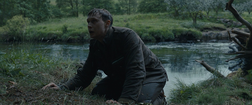
Deakins’ choice of lensing and blocking in 1917 is integral to its immersive aesthetic. A 40mm lens was predominantly used, offering a perspective that mimics human vision and keeps the audience intimately connected to the characters.
Blocking replaces editing in 1917. Characters and camera movements are choreographed with precision, ensuring that transitions feel natural. For example, when a protagonist moves ahead of the camera to reveal a new setting, it feels seamless and purposeful. This synchronization required extensive rehearsal and set design tailored to the camera’s trajectory.
For me, this aspect of 1917 serves as a reminder that great cinematography is as much about collaboration as it is about technical skill.
Color Palette of 1917
1917 — Technical Specifications
| Genre | Action, Drama, History, Survival, War, World War I |
| Director | Sam Mendes |
| Cinematographer | Roger Deakins |
| Production Designer | Dennis Gassner |
| Costume Designer | Jacqueline Durran |
| Editor | Lee Smith |
| Colorist | Greg Fisher |
| Time Period | 1910s |
| Color | Warm, Saturated, Yellow |
| Aspect Ratio | 2.39 – Spherical |
| Format | Digital |
| Lighting | Hard light, High contrast, Silhouette, Backlight |
| Lighting Type | Firelight, Tungsten |
| Story Location | … Ecoust > Northern France |
| Filming Location | … London > Shepperton Studios |
| Camera | ARRI ALEXA Mini |
| Film Stock / Resolution | ARRIRAW (4.5K) |
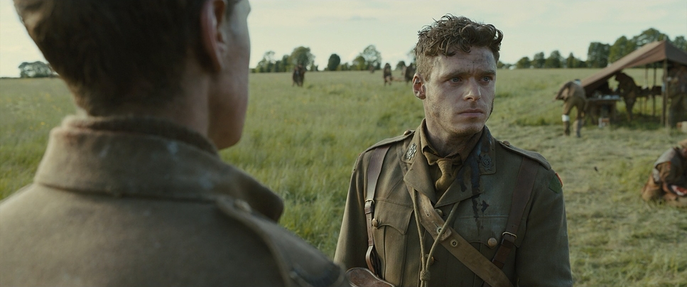
The muted, earthy tones of 1917 reflect the grim realities of war while adding a layer of emotional depth. Dominated by greens, browns, and grays, the color palette creates an oppressive atmosphere that mirrors the soldiers’ dire circumstances.
However, moments of heightened emotion are often marked by dramatic shifts in color. The fiery glow of the burning town contrasts starkly with the desaturated tones of the trenches, creating a haunting visual juxtaposition. Similarly, the lush greens of the meadow at the film’s beginning and end serve as symbols of hope and renewal.
As someone who works with color grading, I find 1917 a perfect example of how restraint in color can amplify a film’s authenticity and emotional impact.
Conclusion
Roger Deakins’ cinematography in 1917 is a masterclass in visual storytelling. Every aspect—camera movement, composition, lighting, lensing, and color—was meticulously crafted to immerse the audience in the protagonists’ perilous journey.
As a filmmaker and colorist, I’m profoundly inspired by how 1917 combines technical innovation with artistic vision. It’s not just a film; it’s an experience that redefines what cinema can achieve. For anyone passionate about filmmaking, 1917 is a must-watch and a testament to the power of visuals in storytelling.
- Also Read: CINEMATOGRAPHY ANALYSIS OF SCHINDLER’S LIST (IN DEPTH)
- Also Read: CINEMATOGRAPHY ANALYSIS OF SINGIN’ IN THE RAIN (IN DEPTH)
Browse Our Cinematography Analysis Glossary
Explore directors, cinematographers, cameras, lenses, lighting styles, genres, and the visual techniques that shape iconic films.
Explore Glossary →