My name is Salik Waquas, and I’m a film colorist with a deep appreciation for the artistry that goes into every frame of a cinematic masterpiece. As a colorist, I’m always drawn to films where visual storytelling is paramount, where every choice—be it lighting, lensing, or composition—serves a deeper narrative purpose. “City Lights” is one of those rare films that transcend its era, and its cinematography offers invaluable insights for anyone passionate about film. Here, I’ll dive into an analysis of the cinematographic elements of “City Lights” and explore how these choices contribute to its lasting impact.
Cinematography Analysis OF City Lights
About the Cinematographer

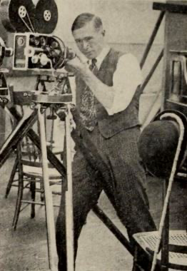
In City Lights, Charlie Chaplin wore multiple hats: he was not only the director and star but also deeply involved in the cinematographic choices. Although Roland Totheroh is credited as the cinematographer, Chaplin’s vision was integral to shaping the visual style. From a colorist’s perspective, I find the collaboration between Chaplin and Totheroh particularly inspiring. Chaplin’s influence in framing and lighting gave City Lights its unique aesthetic, with Totheroh’s skills helping to bring that vision to life. This partnership highlights how a director’s vision can be fully realized through close collaboration with a cinematographer, creating a cohesive world where each shot complements the storytelling without distracting from it.
Inspiration for the Cinematography of “City Lights”

As I analyzed City Lights, I was struck by how Chaplin and Totheroh drew from German Expressionism and early silent cinema, with their stark contrasts and exaggerated expressions. The film’s visual style often leans on geometric framing and the strategic use of light to convey mood, which is characteristic of Expressionist cinema. This stylistic choice enabled Chaplin to balance realism with a hint of fantasy, capturing heightened emotion without losing narrative depth.
From a colorist’s point of view, this approach is a reminder of how one can use contrasts and textures to evoke emotions subtly. It’s fascinating to see how Chaplin achieved such balance between reality and fantasy, creating an emotional resonance that colorists often strive to emulate in their work. His dedication to the silent film format, even as Hollywood transitioned to “talkies,” speaks to his belief in the power of visual storytelling—something that resonates with me as I explore visual storytelling through color grading.
Camera Movements Used in “City Lights”
Chaplin’s conservative approach to camera movement in City Lights is both striking and effective. Most shots remain anchored and static, allowing the audience to focus on the action and the actors. However, Chaplin uses subtle movements in crucial scenes, such as the delicate dolly-in during the flower-selling moments. This gentle motion draws us closer to the Tramp and the blind flower girl, enhancing the intimacy of their interactions.
As a colorist, I appreciate this restrained use of movement because it reflects a similar philosophy in color grading. Sometimes, the most impactful moments occur when you keep things simple, using only subtle adjustments to enhance an emotional effect. In Chaplin’s work, these rare instances of camera movement underscore key scenes without overwhelming them, serving as a reminder that restraint can be powerful in visual storytelling.
Compositions in “City Lights”
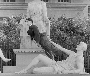
The compositions in City Lights feel meticulously crafted to balance humor, empathy, and storytelling. Chaplin often positions himself slightly off-center, using background elements to create asymmetry that conveys the Tramp’s vulnerability and outsider status. This visual asymmetry invites viewers to empathize with the Tramp while maintaining an awareness of the world around him.
From my colorist perspective, these compositions demonstrate how one can use visual techniques to create layers within a scene. Even in black and white, the use of textures, shadows, and exposure evokes a subtle “color palette.” This technique resembles what a modern colorist might do with layers in color grading—guiding the viewer’s eye to specific elements within a frame through nuanced contrast and shading. By utilizing background elements to frame his characters, Chaplin invites the audience to look beyond the characters and consider the socio-economic context, giving each frame emotional depth.
Lighting Style of “City Lights”

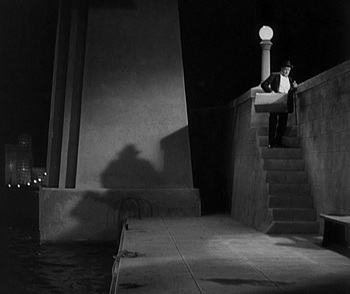
The lighting in City Lights stands out as one of its defining features, combining high-key and low-key lighting that mirrors the emotional tone of each scene. Chaplin’s meticulous attention to lighting in comedic scenes enhances his facial expressions and body language, while the more dramatic lighting in somber scenes underscores the story’s melancholic undertones.
For a colorist, this blend of light and shadow offers a masterclass in creating depth within a scene. Chaplin’s use of shadows to add texture to each frame parallels how a colorist might use contrast to highlight specific elements. In scenes where the Tramp feels isolated, high contrast lighting creates a separation from the background, emphasizing his loneliness. This careful interplay of light and shadow is a lesson in how visual contrast can evoke powerful emotions without a single word.
Lensing and Blocking of “City Lights”
Chaplin’s lensing and blocking choices in City Lights reveal his mastery of cinematic space. Favoring wider lenses, he captures the full breadth of each scene, giving his comedic gestures ample room to unfold. His blocking techniques emphasize the social dynamics within scenes, positioning the Tramp in ways that visually reinforce his lower social status in contrast to wealthier characters.
In my work as a colorist, I find this approach particularly valuable. Wide lenses allow both the characters and their surroundings to coexist within the same visual space, calling for a balanced approach to color grading that doesn’t overshadow any part of the frame. Chaplin’s meticulous blocking and lens choices remind me that maintaining a sense of spatial awareness, even in close-up scenes, can enhance storytelling by grounding characters in their environment.
Color of “City Lights” and Technical Aspects
Although City Lights was released in black and white, it’s fascinating for me, as a colorist, to think about how Chaplin’s use of contrast creates an inherent “color.” Each scene’s tonal contrast evokes different emotions: the high-contrast scenes convey stark emotions like sadness or loneliness, while softer tones in scenes with the flower girl suggest warmth and hope.
| Genre | Comedy, Drama, Romance |
| Director | Charlie Chaplin |
| Cinematographer | Gordon Pollock, Roland Totheroh |
| Production Designer | Henry Clive |
| Editor | Charlie Chaplin, Willard Nico |
| Color | Desaturated, Black and White |
| Aspect Ratio | 1.20 – Spherical |
| Format | Film – 35mm |
| Lighting | Soft light |
| Story Location | North America > United States |
| Filming Location | California > Los Angeles |

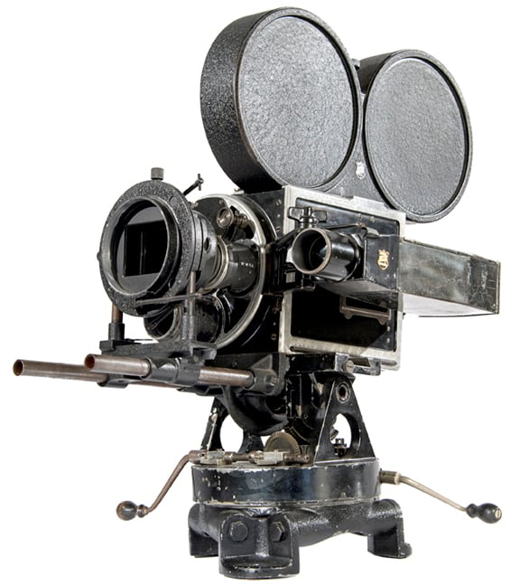
On the technical side, Chaplin used the Bell & Howell 2709 camera, a reliable choice among silent filmmakers for its precision. Likely shot with prime lenses, this choice provided the sharpness and consistency needed to bring out the visual nuances Chaplin desired. These technical details are essential when aiming for a “timeless” look in color grading today. The type of camera and lens affect how light interacts within the scene, influencing choices on contrast, grain, and texture. The vintage sharpness, combined with soft gradations between light and shadow, serves as a blueprint for colorists looking to emulate classic film aesthetics.
Conclusion
In City Lights, Chaplin’s collaboration with Totheroh resulted in a visually compelling film that marries technical precision with emotional depth. Each choice in camera movement, composition, lighting, lensing, and contrast creates a silent yet profound narrative that resonates across generations. As a colorist, I find immense inspiration in Chaplin’s approach to visual storytelling, as it exemplifies how carefully crafted visuals can convey powerful emotions without a single spoken word.
Through its timeless aesthetic, City Lights reminds us of the power of cinema to capture universal human experiences. It’s a masterclass in how every visual element, from light to shadow, contributes to a cohesive narrative. In an era increasingly dominated by sound, City Lights endures as a testament to the enduring artistry of silent film and the language of cinema itself.
- Also Read: CINEMATOGRAPHY ANALYSIS OF SUNSET BOULEVARD (IN DEPTH)
- Also Read: CINEMATOGRAPHY ANALYSIS OF THE GODFATHER PART II (IN- DEPTH)
Browse Our Cinematography Analysis Glossary
Explore directors, cinematographers, cameras, lenses, lighting styles, genres, and the visual techniques that shape iconic films.
Explore Glossary →