I am Salik Waquas, a film colorist with a deep passion for visual storytelling. Over the years, I’ve had the privilege of working on a variety of projects, ranging from mainstream commercials to feature films. My fascination with cinematography began with an appreciation for how the visual medium can evoke emotions, tell a story, and create an atmosphere that transcends mere images on a screen.
While I’ve worked extensively in color grading, my love for cinematography continues to influence my approach to each project. One film that left a significant mark on me is Breathless directed by Jean-Luc Godard’s in 1960, particularly the groundbreaking cinematography of Raoul Coutard. This article is my reflection on how Breathless has shaped my understanding of the craft and why Coutard’s work remains relevant to me today.
Breathless Cinematography Analysis In Depth
About the Cinematographer
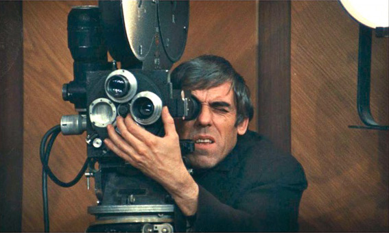
When I think about the cinematography of Breathless, I can’t help but admire Raoul Coutard, the mastermind behind the camera. His work in this film really pushed the boundaries of what cinematography could be, and it still influences filmmakers like me today. Coutard, much like Jean-Luc Godard, wasn’t afraid to break the rules of traditional filmmaking. He brought in his experience as a documentary filmmaker, and that background shaped the raw, real look of Breathless.
What I find inspiring is how Coutard didn’t let the lack of resources hinder his creativity. He shot the film with minimal equipment, making use of what he had, and managed to create something that still feels fresh decades later. As a colorist, I’m constantly reminded that sometimes, the most creative solutions come from working with limitations, and Coutard exemplified that with his approach to Breathless.
Inspiration for the Cinematography of Breathless
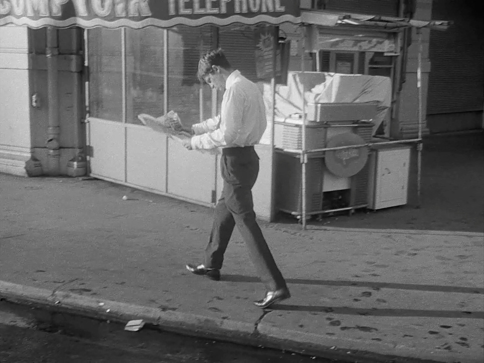
The cinematography in Breathless was heavily influenced by cinéma vérité and the direct cinema movement. This documentary style really spoke to Godard and Coutard, and they applied it to fiction in a way that hadn’t been done before. I think what stands out to me is how they took the documentary approach and infused it into a narrative film, giving Breathless an immediacy that feels intimate yet unpolished.
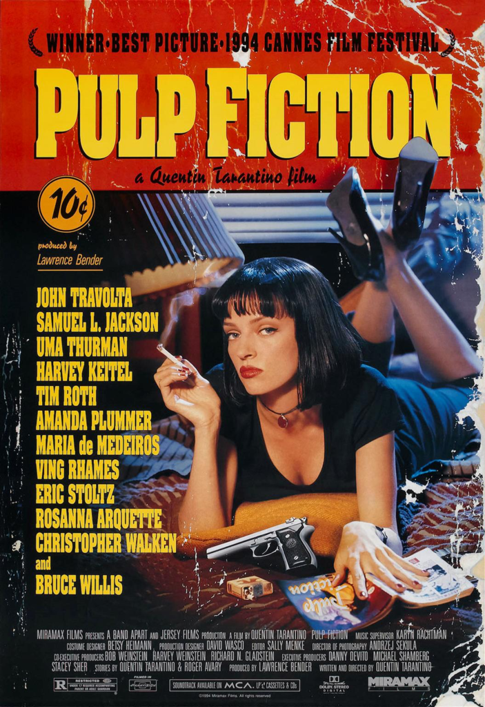
I see traces of this influence in many films that came after, like Pulp Fiction and My Own Private Idaho. These films, like Breathless, prioritize realism and spontaneity. As a filmmaker myself, I’m drawn to the idea of blending documentary techniques with fiction because it creates a unique sense of truth on screen. It’s not about being perfectly polished; it’s about capturing the raw essence of a moment.
Camera Movements Used in Breathless
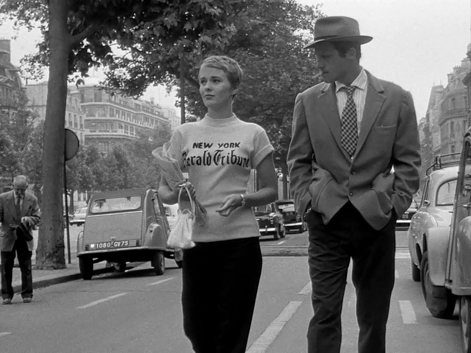
The camera movements in Breathless are what truly set it apart. The film is shot almost entirely handheld, giving it that rough, unpolished quality that breaks away from traditional cinema. For me, it’s that handheld style that brings an unparalleled sense of realism to the film. It makes the viewer feel like they’re part of the action, not just watching from a distance.
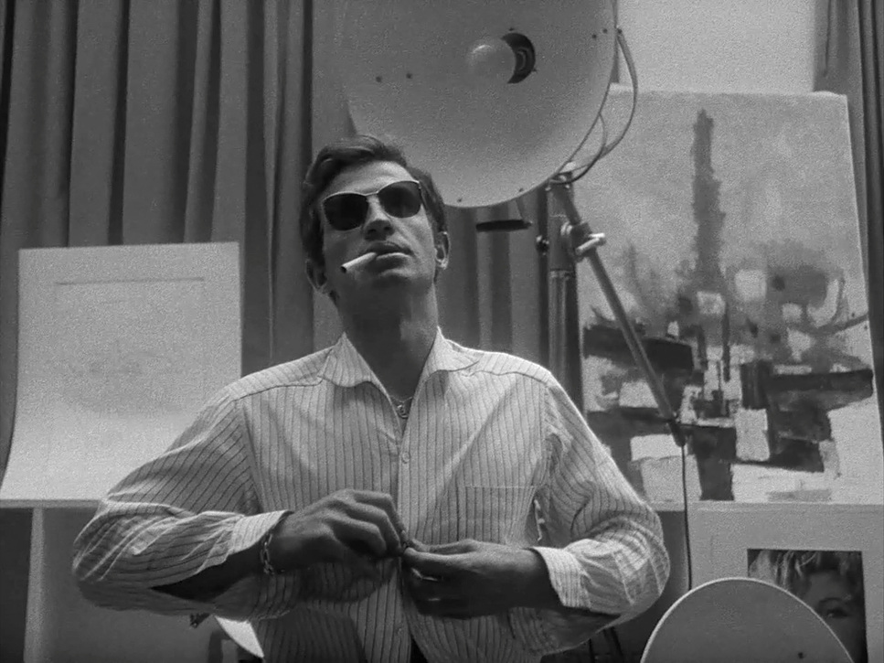
What I find fascinating is how the camera movements mirror the emotional tension of the characters. Michel, the main character, is always on edge, always in motion, and the handheld camera captures that restlessness perfectly. It’s like the camera is as unstable as Michel’s life, which is such a brilliant way to visually represent his inner turmoil.
Coutard and Godard even improvised dolly shots by having Coutard sit in a wheelchair and get pushed through the scene. I love that kind of resourcefulness because it reminds me that creativity often comes from thinking outside the box. It’s not about having the best gear; it’s about making the best use of what’s available to you.
Compositions in Breathless
The compositions in Breathless feel chaotic at times, but they’re also intentional in their own way. When I watch the film, I notice how the framing allows the characters to dominate the screen, often disregarding traditional compositional rules. This “loose” framing gives the film a feeling of spontaneity, but at the same time, it’s carefully crafted to reflect the characters’ emotional states.
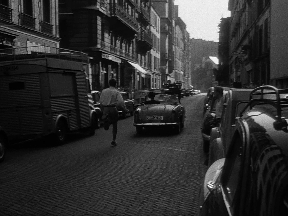
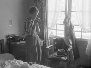
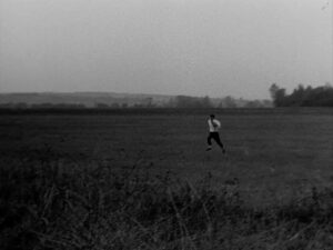
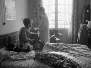
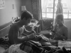
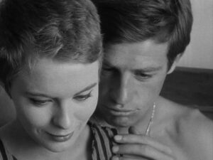
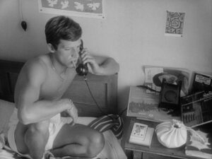
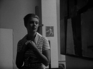
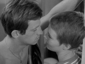
One thing that stands out to me is the use of space around the characters. There’s often a lot of negative space in the shots, which creates a sense of alienation. Michel and Patricia seem disconnected from the world around them, and the compositions visually reinforce that feeling. I also love the moments where the film gets claustrophobic, especially in Patricia’s apartment. The tight compositions in these scenes reflect the intimate yet suffocating nature of their relationship.
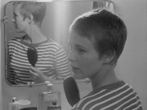
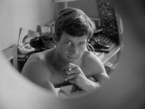
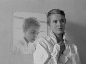
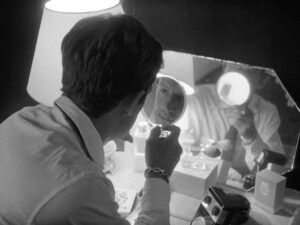
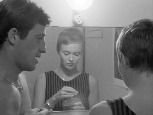
The use of mirrors in the film is another compositional element that caught my attention. Mirrors often double the characters, creating reflections that emphasize themes of identity and self-reflection.
Lighting Style of Breathless
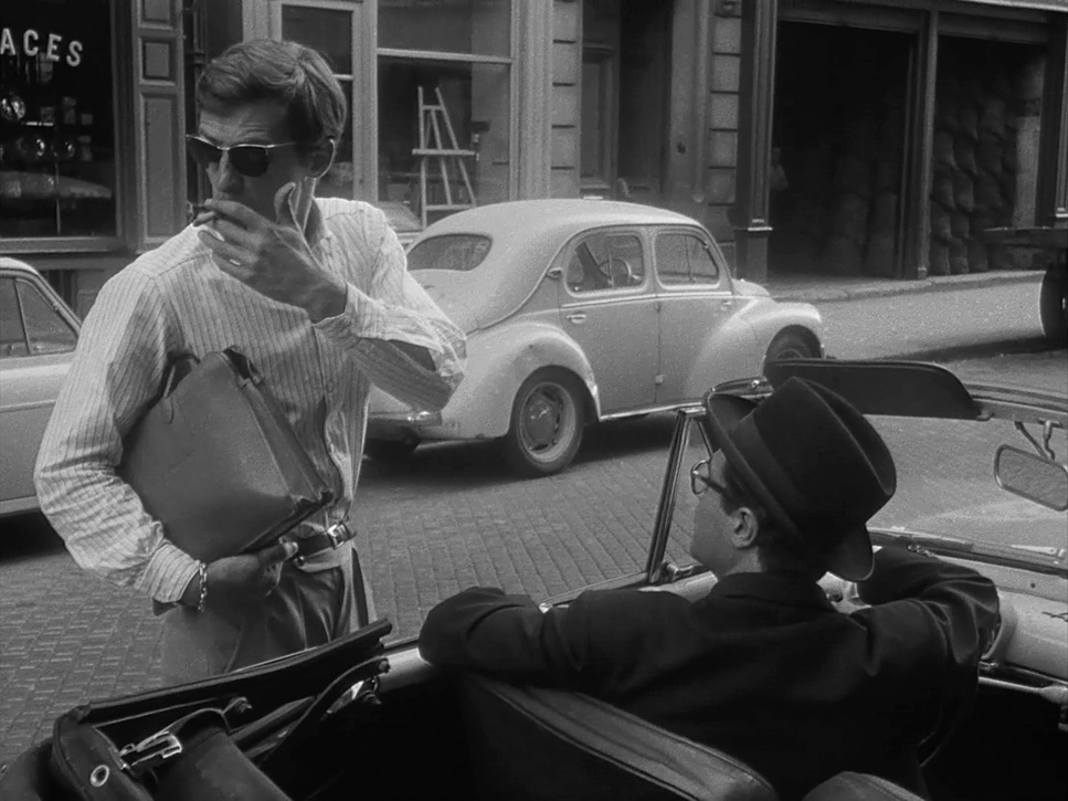
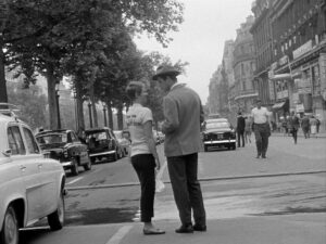
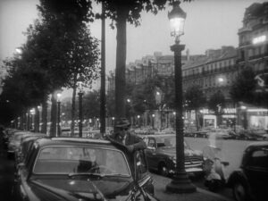
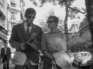
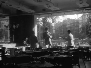
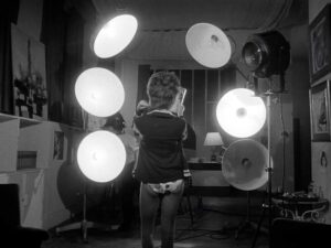
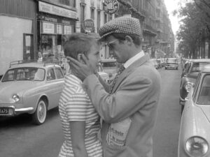
When it comes to the lighting in Breathless, I’m particularly impressed by how Coutard used only available light. This decision gives the film a naturalistic, almost documentary-like feel, which was a bold choice at the time. Most films were meticulously lit on soundstages, but Coutard embraced the imperfections of natural light, and it adds so much to the film’s raw aesthetic.
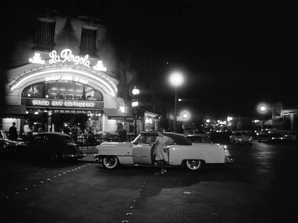
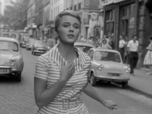
I find the harsh, unflattering light in the daytime scenes especially interesting because it contributes to the film’s gritty realism. It’s not about making the characters look good; it’s about capturing the truth of the moment. The nighttime scenes, on the other hand, have a soft, ambient glow that contrasts with the roughness of the daylight. As a colorist, I love working with this kind of natural lighting because it allows me to experiment with subtle grading while keeping the raw texture intact.
Lensing and Blocking of Breathless
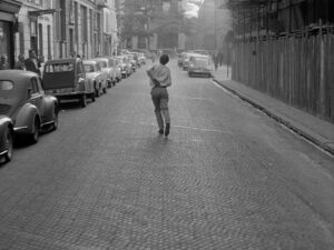
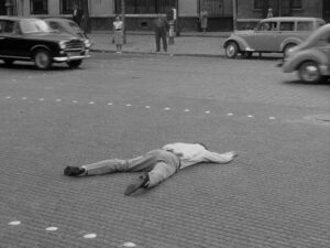
Coutard often used wide-angle lenses, which allowed him to capture more of the scene in one shot. This decision makes the cramped Parisian streets and apartments feel more expansive, but it also creates a slight distortion that adds to the film’s sense of unease.
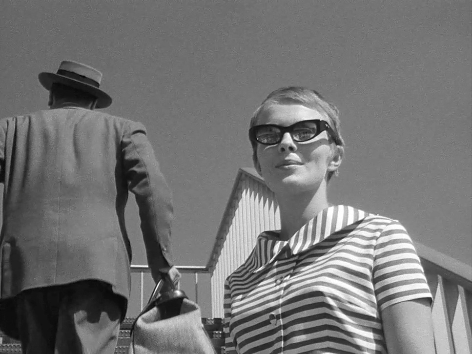
What really struck me about the blocking in Breathless is how loose and improvisational it feels. Godard didn’t confine the actors to specific marks or choreographed movements. Instead, he allowed them to move naturally within the space, and the camera simply followed. This lack of precision gives the film a sense of spontaneity that feels real, almost like the scenes are unfolding organically rather than being carefully staged.
As someone who works closely with directors and cinematographers, I appreciate how this free-flowing approach creates a dynamic energy in the film. It’s something I try to keep in mind when collaborating on my projects—sometimes letting go of rigid control can lead to more authentic and engaging results.
Color of Breathless
BREATHLESS (1960) | 35mm • 1.33:1 • B&W
| Genre | Crime, Drama |
| Director | Jean-Luc Godard |
| Cinematographer | Raoul Coutard |
| Editor | Cécile Decugis |
| Time Period | 1950s |
| Color | Desaturated, Black and White |
| Aspect Ratio | 1.33 – Spherical |
| Original Aspect Ratio | 1.37 |
| Format | Film – 35mm |
| Lighting | Soft light, Low contrast |
| Lighting Type | Daylight |
| Story Location | Bouches-du-Rhône > Marseille |
| Filming Location | Bouches-du-Rhône > Marseille |
| Camera | Arriflex |
Although Breathless is in black and white, the film still manages to use “color” in a metaphorical sense. The high contrast between the dark and light tones gives the film its striking visual identity. The shadows and highlights are used masterfully to convey mood, and this play of light and shadow is something I find incredibly effective as a visual storytelling tool.
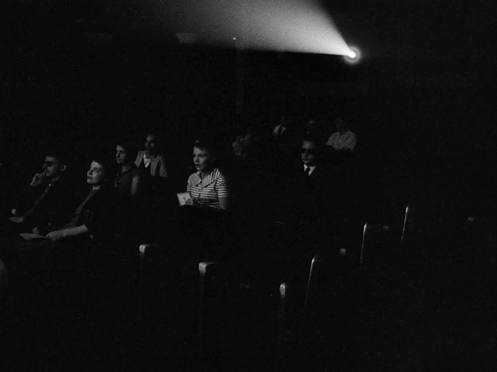
What fascinates me as a colorist is how the absence of color forces us to focus on other aspects of the image—texture, contrast, and composition. In Breathless, the black-and-white palette adds to the film’s raw, documentary-like feel. It strips away any distractions and puts the focus squarely on the characters and their emotions.
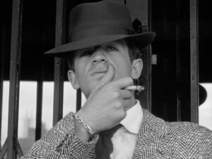
In many ways, the lack of color enhances the film’s connection to film noir, giving it that gritty, mysterious vibe. I find it interesting how this limitation—working in black and white—actually opens up new possibilities for visual storytelling. As a colorist, it’s a great reminder that even without vibrant colors, you can still create powerful, mood-driven images.
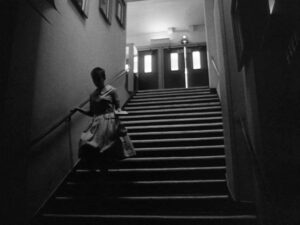
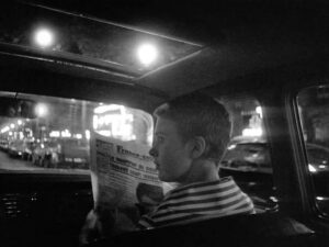
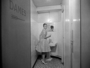
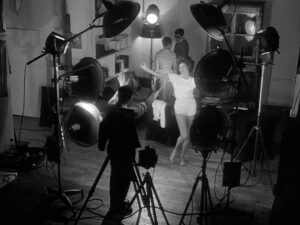
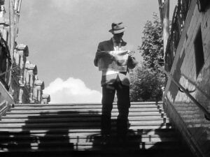
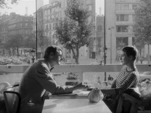
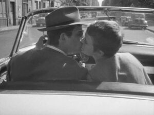
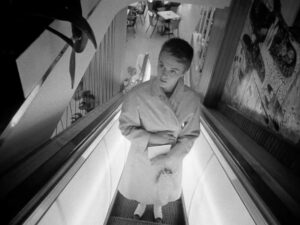
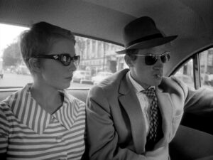
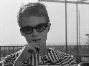
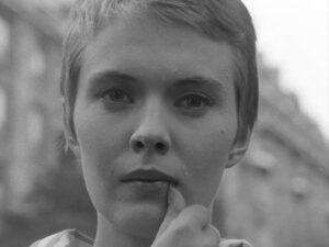
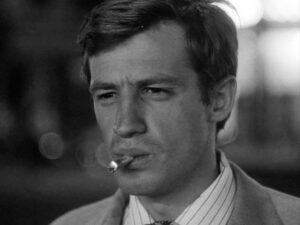
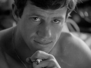
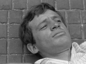
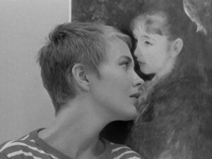
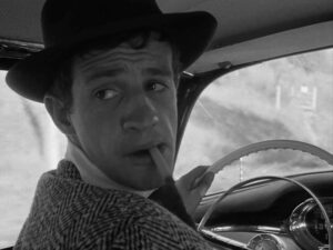
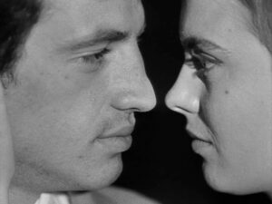
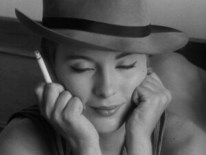
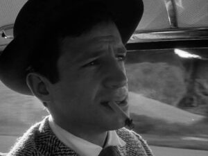
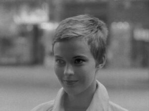
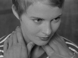
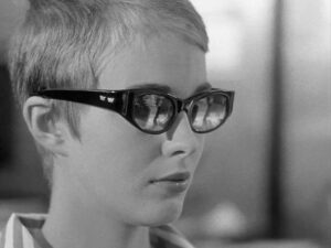
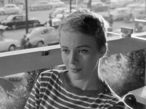
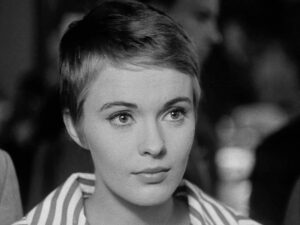
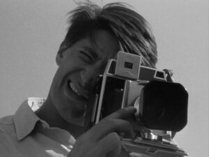
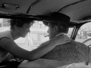
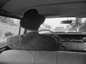
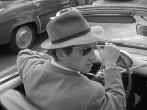
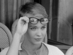
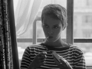
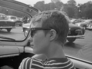
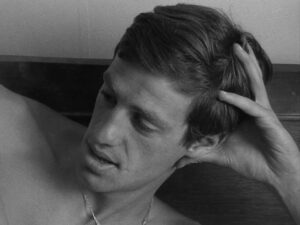
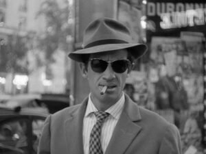
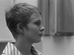
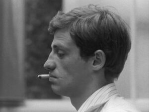
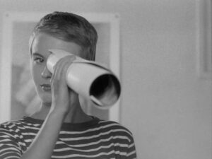
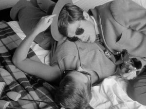
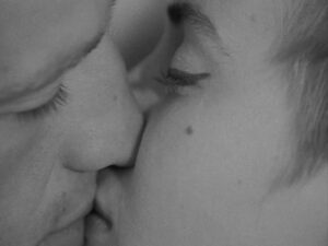
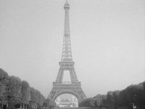
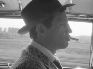
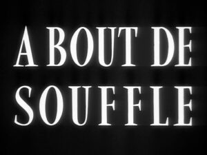
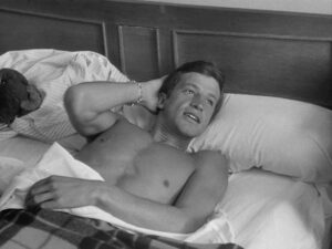
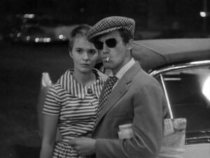
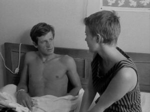
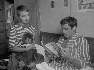
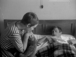
Breathless Film Stills
A curated reference archive of cinematography stills from Breathless. Study the lighting, color grading, and composition.

Conclusion
Breathless remains a cinematic masterpiece because it dares to challenge conventions, and Raoul Coutard’s cinematography plays a significant role in its success. The film’s handheld camera work, naturalistic lighting, unconventional compositions, and bold use of black and white create a visual experience that feels raw, immediate, and timeless. For me, analyzing Breathless is not just an academic exercise; it’s a source of inspiration for my own work as a colorist and filmmaker.
Also Read: CINEMATOGRAPHY ANALYSIS OF MOONRISE KINGDOM (IN DEPTH)
Also Read: CINEMATOGRAPHY ANALYSIS OF APOCALYPSE NOW (IN DEPTH)
Browse Our Cinematography Analysis Glossary
Explore directors, cinematographers, cameras, lenses, lighting styles, genres, and the visual techniques that shape iconic films.
Explore Glossary →