Hi, I’m Salik Waquas, a professional colorist, and I run a post-production color grading suite. Cinematography has always intrigued me, not only for its visual beauty but also for how it serves the narrative. In this article, I’ll share my analysis of Moonrise Kingdom‘s cinematography and break down how Robert Yeoman’s work elevates the film beyond its whimsical tone. As someone who loves Wes Anderson’s films, I enjoy exploring how meticulously crafted visuals can create emotional depth. This is my take on how Yeoman’s cinematography makes Moonrise Kingdom a storybook that resonates with the bittersweet experience of growing up.
About the Cinematographer
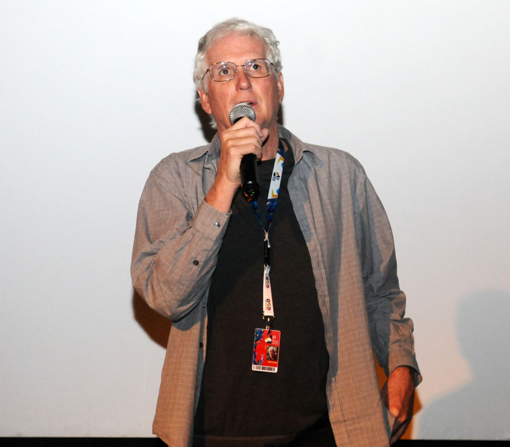
Robert Yeoman, ASC, is the creative genius behind the cinematography of Moonrise Kingdom. A longtime collaborator with Wes Anderson, Yeoman has brought Anderson’s distinctive style to life across films like The Grand Budapest Hotel and Fantastic Mr. Fox. His visuals are always playful yet rich with emotional meaning, creating intricate worlds that feel both magical and grounded. Yeoman’s role in shaping Anderson’s storytelling is paramount—he doesn’t merely compose beautiful frames; he ensures they serve the narrative and deepen our connection with the characters.
In Moonrise Kingdom, Yeoman crafts a visual journey that mirrors the emotional arc of its young protagonists, Sam and Suzy. His cinematography blends childlike whimsy with emotional depth, transforming the film into a visual fairy tale that explores innocence, freedom, and first love.
Inspiration for the Cinematography of Moonrise Kingdom
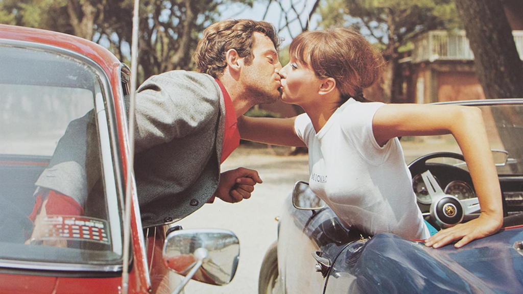
The film’s visual style draws heavily from children’s storybooks, evoking nostalgia with each frame. Yeoman and Anderson were also inspired by the French New Wave cinema—specifically the works of directors like François Truffaut and Jacques Tati. This influence is apparent in the playful use of framing and the deliberate awkwardness in character movements.
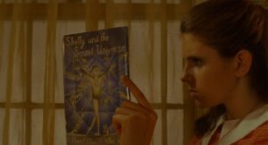
Throughout Moonrise Kingdom, every shot feels like a carefully arranged diorama, transporting the audience into a world seen through the eyes of children. The visuals remind me of Suzy’s beloved fantasy novels, reinforcing the sense that the characters are creating their own imaginary world. The playful yet structured design also echoes the charm of theater, with characters often facing the camera directly, blurring the line between cinema and performance.
Camera Movements Used in Moonrise Kingdom
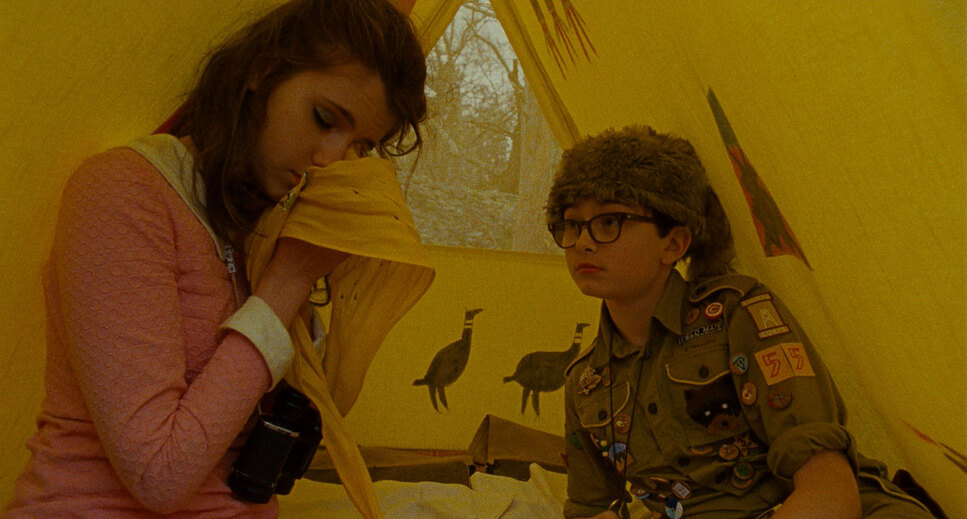
In Anderson’s films, every camera movement feels deliberate, and Moonrise Kingdom is no different. Yeoman employs smooth lateral tracking shots, whip pans, and symmetrical zooms that give the film a rhythmic flow. These movements contribute to the story’s lighthearted tone while maintaining visual precision.
The tracking shots are not just about following the characters; they immerse us in their environment. For example, scenes inside Suzy’s house or the Khaki Scouts’ camp reveal how these spaces shape the characters’ lives. When the children run away, the chaotic yet fluid camera movements mirror their emotional urgency, further drawing us into their journey.
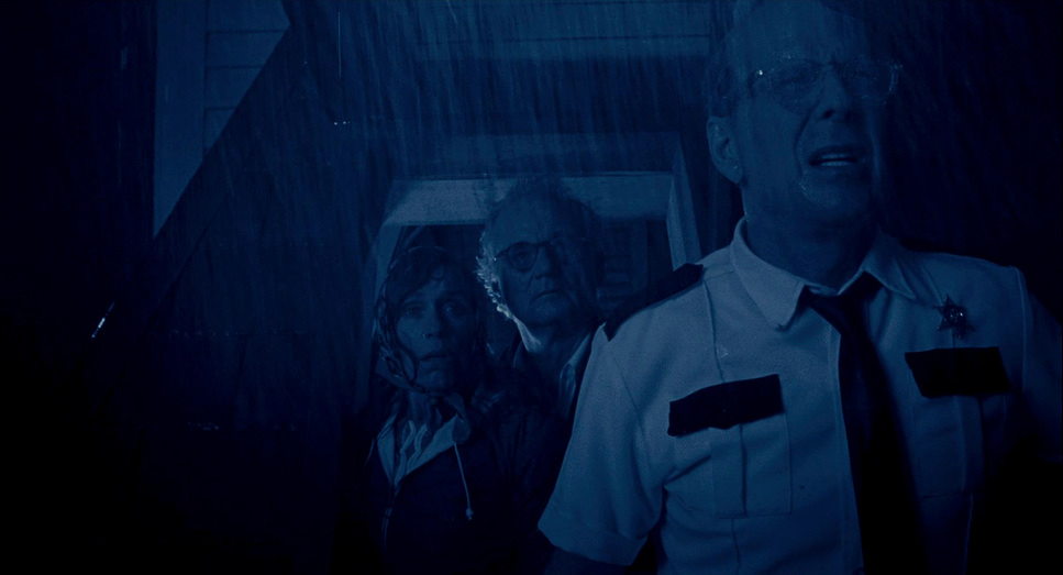
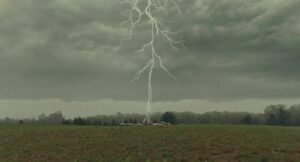
Whip pans—one of Anderson’s signature techniques—add both humor and momentum, especially during moments of tension. Even in scenes like the storm’s arrival, where the stakes are higher, the whimsical camera work maintains the film’s playful spirit.
Compositions in Moonrise Kingdom
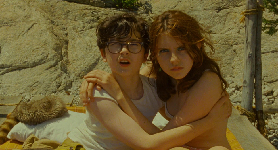
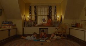
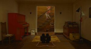
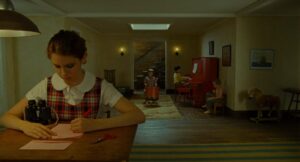
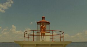
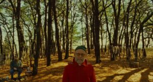
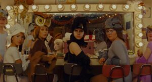
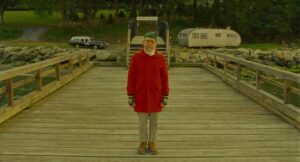
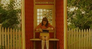
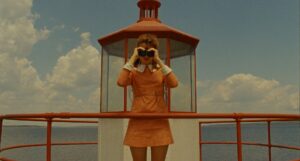
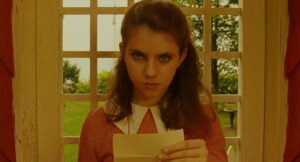
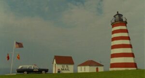
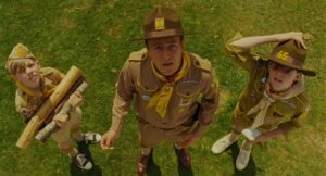
Anderson’s films are famous for their symmetry, and Moonrise Kingdom exemplifies this to perfection. Yeoman frames each shot with meticulous care, often placing characters and objects at the center of the frame. This compositional style creates a storybook feel, reinforcing the film’s whimsical tone.
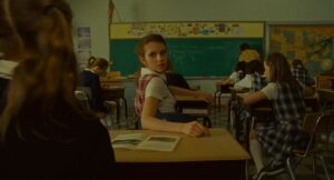
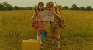
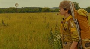
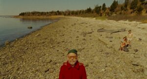
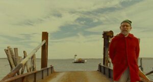
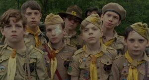
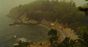
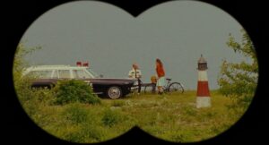
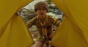
One of the things I admire most about the film is how the compositions convey narrative meaning. Sam and Suzy are often framed alone within vast landscapes, emphasizing their emotional and social isolation. In contrast, group shots highlight the constraints imposed by the adult world—whether it’s the rigid alignment of the Khaki Scouts or the strict order in Suzy’s family home. This visual storytelling enhances the film’s theme of longing for freedom, making the children’s escape feel even more poignant.
Lighting Style of Moonrise Kingdom
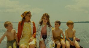
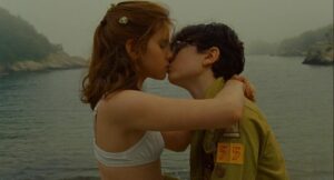
The lighting in Moonrise Kingdom plays a subtle but crucial role in shaping the film’s nostalgic tone. Yeoman often uses soft, diffused light to create a dreamlike quality, reminiscent of natural sunlight. If you notice, many scenes are shot during the “magic hour,” giving them a warm, golden glow that enhances the sense of innocence.
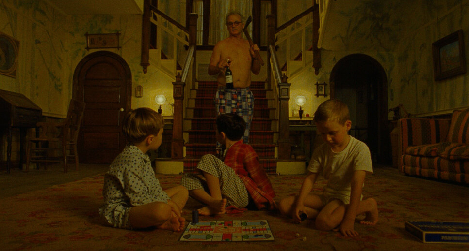
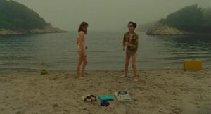
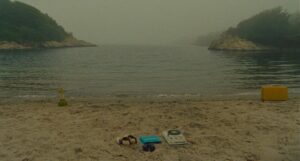
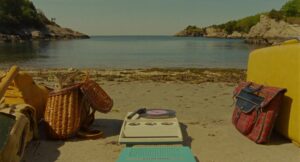
The lighting shifts with the emotional tone of the scenes. For instance, when the characters face conflict or uncertainty—such as during the storm—the lighting becomes cooler and more subdued. Conversely, scenes set on the beach, where Sam and Suzy experience brief moments of freedom, are bright and sunlit, reflecting their joy and liberation.
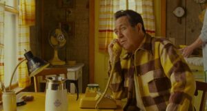
What I particularly appreciate is how the lighting differentiates between the children’s and adults’ worlds. The children’s scenes are bathed in warmth and softness, reinforcing their sense of adventure. In contrast, the adult scenes are lit more harshly, emphasizing emotional detachment and the weight of societal expectations.
Lensing and Blocking in Moonrise Kingdom
Wide-angle lenses play a significant role in defining the visual language of Moonrise Kingdom. The choice of these lenses creates a sense of openness, capturing not just the characters but their surroundings. The slight distortion that comes with wide-angle shots adds to the film’s playful aesthetic, reinforcing the idea that we are seeing the world through the eyes of children.
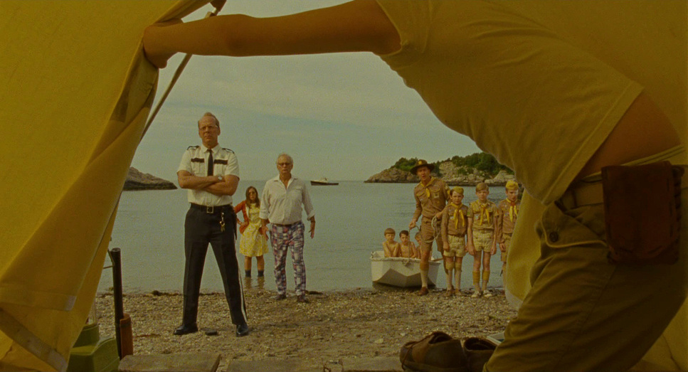
Blocking—the arrangement of actors within a scene—further enhances the storytelling. Sam and Suzy are often positioned close to each other, reflecting their emotional connection. In contrast, the scouts and adults are arranged more rigidly, emphasizing the constraints they place on the children. A great example of effective blocking is the scene inside the church, where the rigid alignment of Suzy’s family contrasts with Sam’s carefree presence, subtly highlighting their desire to break free from societal norms.
Color of Moonrise Kingdom
| Genre | Comedy, Drama, Romance, Survival, Coming-of-Age, Science-Fiction |
| Director | Wes Anderson |
| Cinematographer | Robert D. Yeoman |
| Production Designer | Adam Stockhausen |
| Costume Designer | Kasia Walicka-Maimone |
| Editor | Andrew Weisblum |
| Time Period | 1960s |
| Color | Warm, Desaturated |
| Aspect Ratio | 1.85 |
| Format | Film – 16mm |
| Lighting | Low contrast |
| Lighting Type | Artificial light, Practical light |
| Story Location | New England > New Panzance |
| Filming Location | Portsmouth > Prudence Island |
| Camera | Aaton Aminima |
| Lens | Zeiss Super Speed |
| Film Stock / Resolution | 5213/7213 Vision 3 200T |
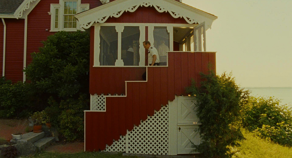
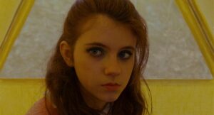
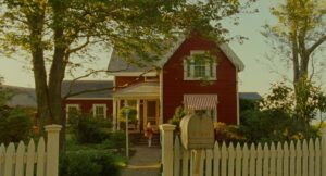
As a colorist, the film’s color palette stands out to me as one of its most carefully curated elements. Yeoman and Anderson use soft pastel tones—yellows, greens, pinks, and blues—that evoke the innocence and whimsy of childhood. Each location in the film has its own distinct palette: earthy tones dominate the Khaki Scouts’ camp, cool blues are used in Suzy’s home, and the beach scenes glow with warm, golden hues.
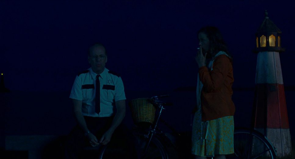
The film’s color leans towards a slightly desaturated look, adding a vintage feel that matches its 1960s setting. What I find fascinating is how the colors shift to reflect the characters’ emotions. When Sam and Suzy are happy, the colors are warm and vibrant. During moments of tension, the palette shifts to cooler, muted tones, subtly altering the mood.
The color also helps distinguish the children’s world from the adult world. The children’s scenes are filled with warm, inviting colors, while adult scenes are colder and more subdued, reinforcing the emotional distance between generations.
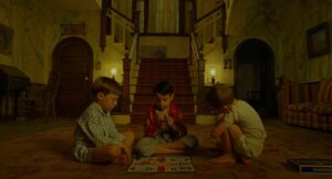
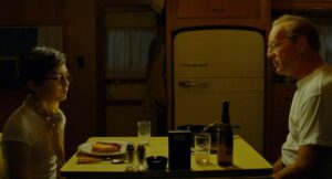
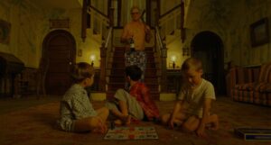
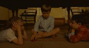
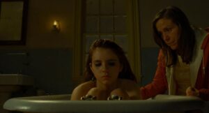
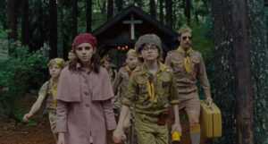
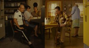
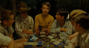
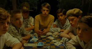
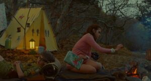
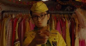
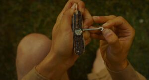
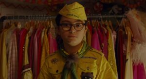
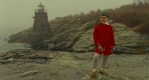
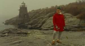
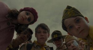
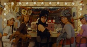
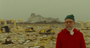
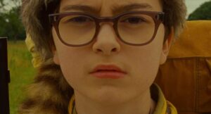
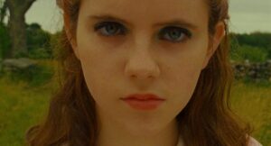
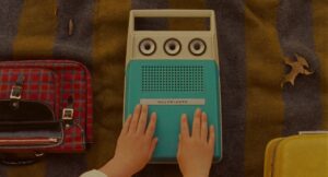
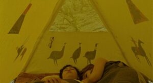
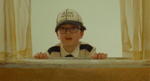
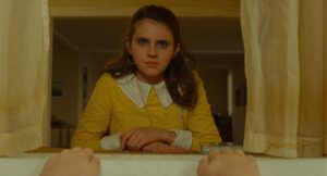
Moonrise Kingdom Film Stills
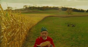
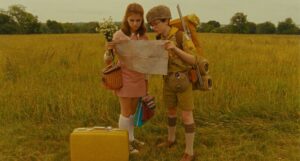
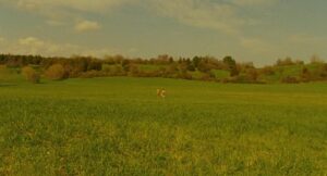
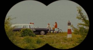
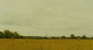
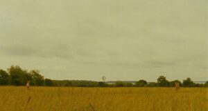
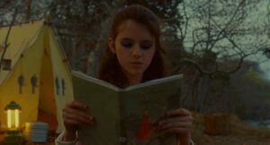
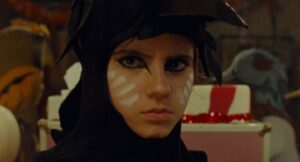
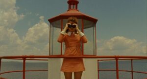
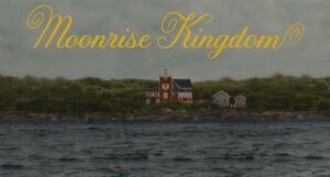
A curated reference archive of cinematography stills from Moonrise Kingdom. Study the lighting, color grading, and composition.







Final Thoughts
Moonrise Kingdom is a masterclass in visual storytelling. Robert Yeoman’s cinematography brings Wes Anderson’s whimsical world to life, crafting a film that feels like a storybook but resonates with emotional depth. Every element—from the camera movements to the lighting, compositions, and color —works harmoniously to create a visually stunning experience that supports the narrative. The cinematography perfectly captures the transition from childhood to adulthood, blending the innocence of youth with the complexities of growing up. The way the visuals mirror the characters’ emotions makes the story feel personal and universal at the same time.
- Also Read: CINEMATOGRAPHY ANALYSIS OF APOCALYPSE NOW (IN DEPTH)
- Also Read: BIRDMAN CINEMATOGRAPHY ANALYSIS (IN DEPTH)
Browse Our Cinematography Analysis Glossary
Explore directors, cinematographers, cameras, lenses, lighting styles, genres, and the visual techniques that shape iconic films.
Explore Glossary →