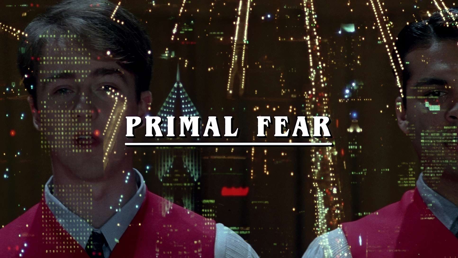
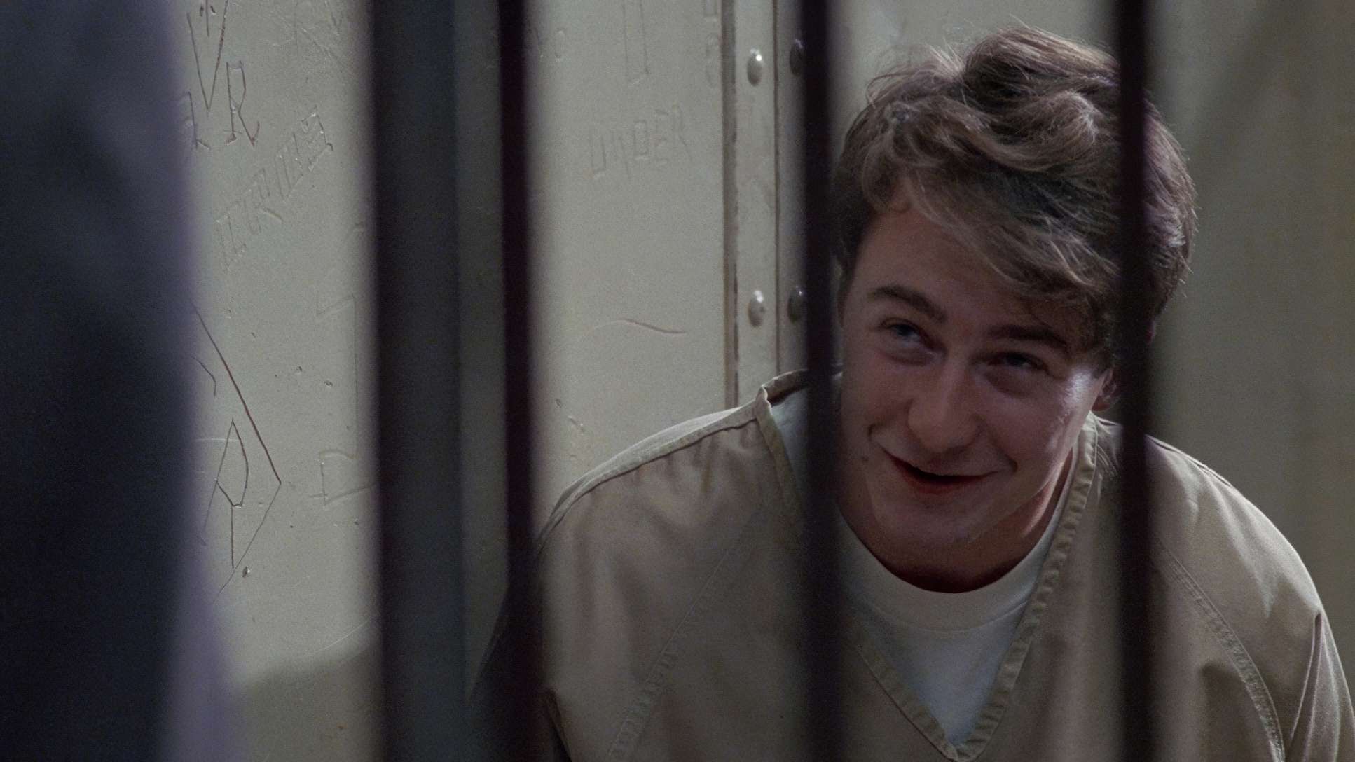
Gregory Hoblit’s Primal Fear (1996). Most people remember this for Edward Norton’s explosive debut which Siskel and Ebert rightfully raved about but for me, it’s all about the visual scaffolding.
As a colorist, I don’t just see a “slow-burn” courtroom drama; I see a blueprint of how to use light and glass to sell a lie. The film is a masterclass in moral ambiguity, using its cinematography to keep us off-balance until those two killer twists finally land.
About the Cinematographer
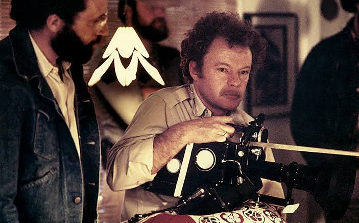
The man behind the lens was Michael Chapman. If that name doesn’t ring a bell, his resume should: Taxi Driver and Raging Bull. Chapman is a legend. He’s known for a gritty, expressive style, but in Primal Fear, he shows a different kind of mastery restraint. Working with 35mm film (specifically the 5298/7298 EXR 500T stock), Chapman didn’t go for the overt stylistic fireworks of his Scorsese days. Instead, he opted for a meticulous, quiet build. He understood that in a legal thriller, the camera shouldn’t shout; it should imply. It’s that veteran hand that knows exactly when to let a shadow do the talking.
Lighting Style: The Chiaroscuro of Chicago
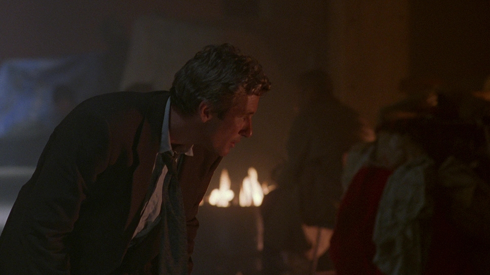
The lighting in Primal Fear is doing the heavy lifting for the film’s themes. Chapman leaned into a high-contrast, low-key style that feels moody as hell. We’re talking about deep, inky shadows and stark highlights that mirror the elusive nature of “truth” in the script.
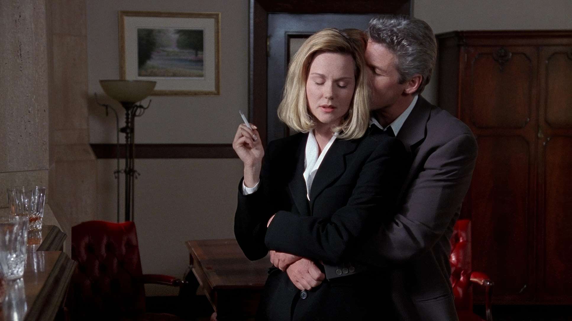
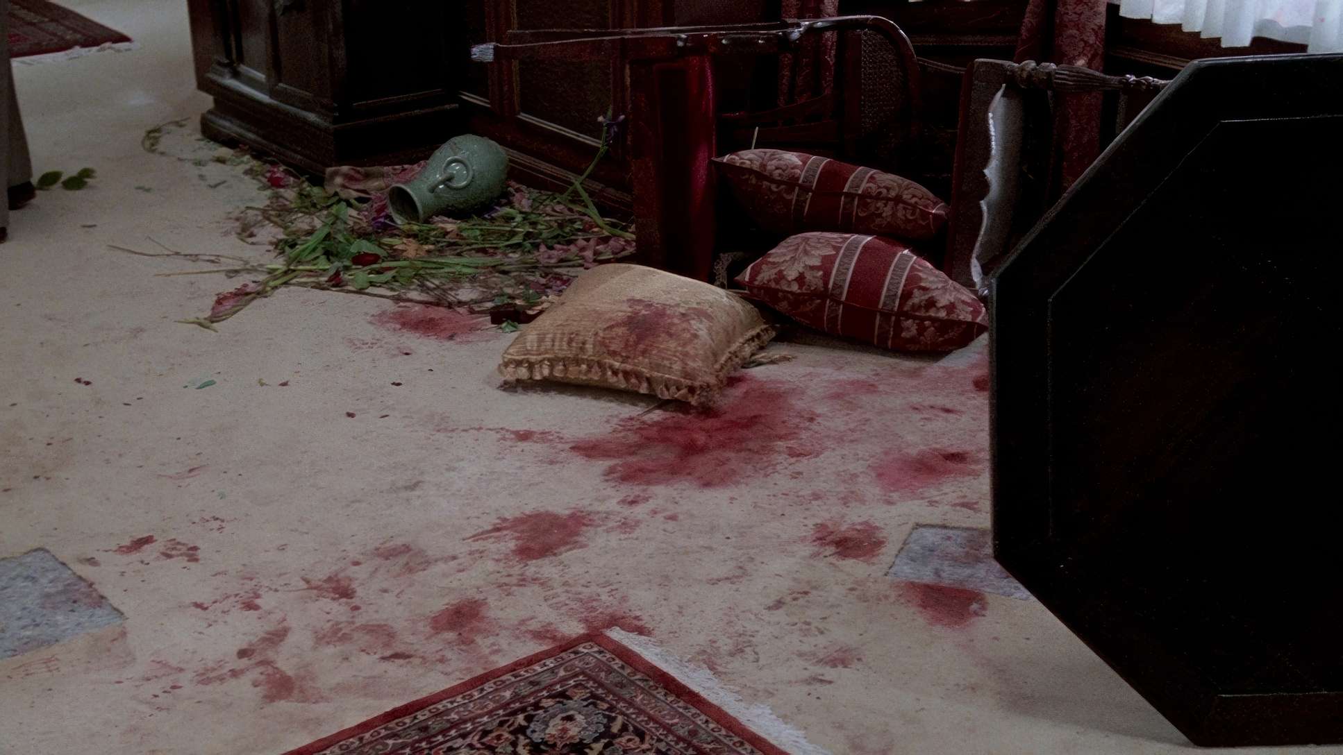
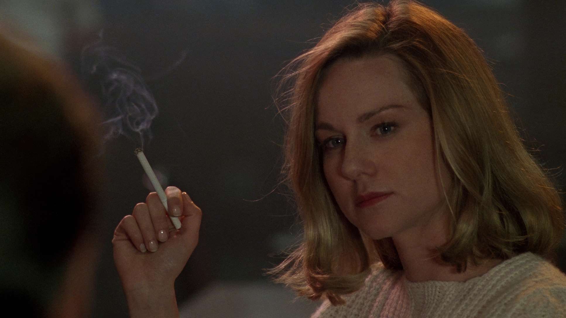
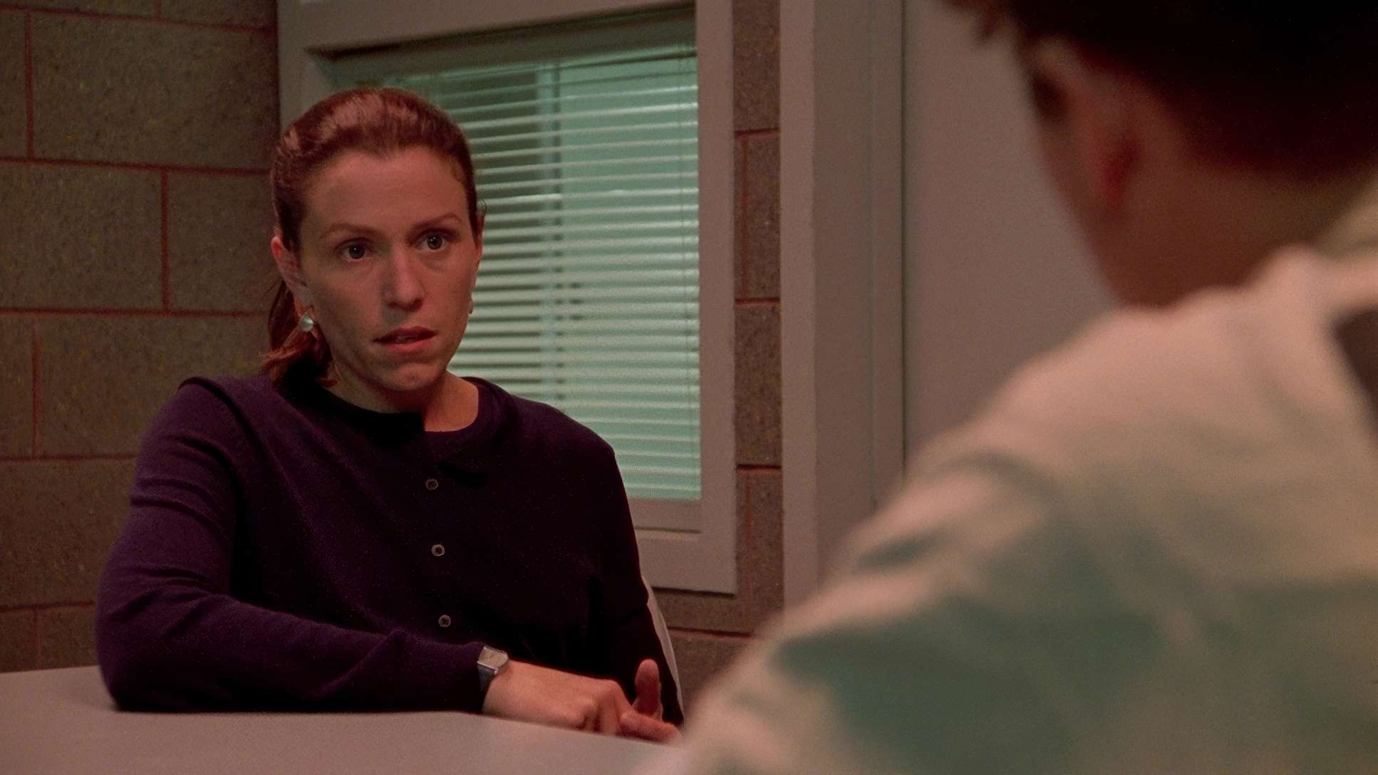
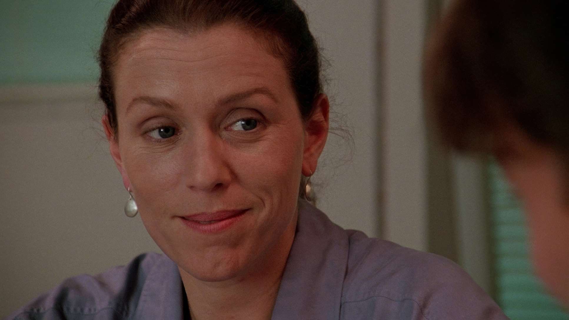
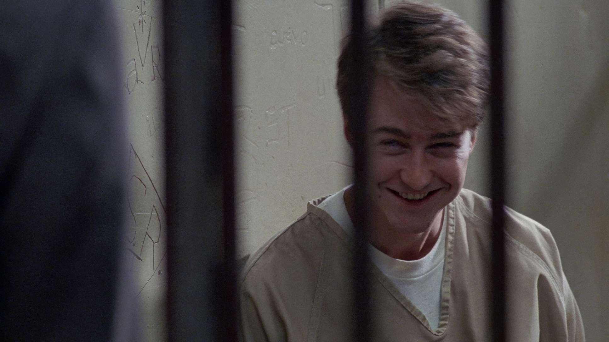
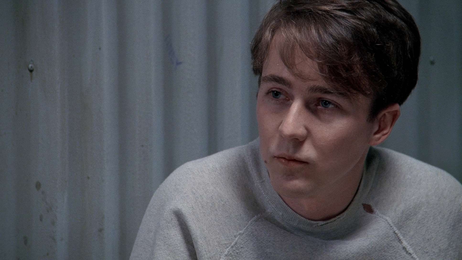
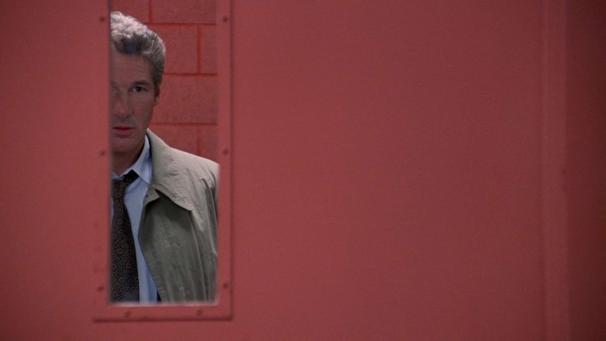
What’s interesting is the use of soft, artificial light in such a hard-boiled context. For example, the scenes in the Archbishop’s residence are steeped in this heavy chiaroscuro effect. It’s not just for aesthetics; it’s a narrative device. By cloaking faces in shadow, Chapman forces the audience to work to see the truth, much like Richard Gere’s character, Martin Vail, is struggling to find the facts. Using that EXR 500T stock allowed Chapman to really push those black levels, creating a sense of dread that stays with you long after the scene ends.
Color Grading: The Phil Hetos Legacy vs. The 4K Remaster
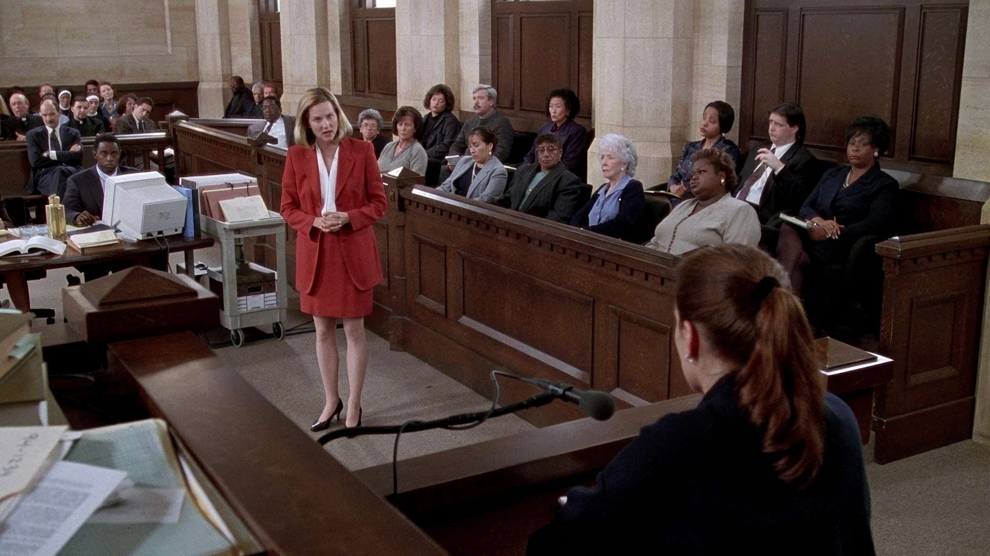
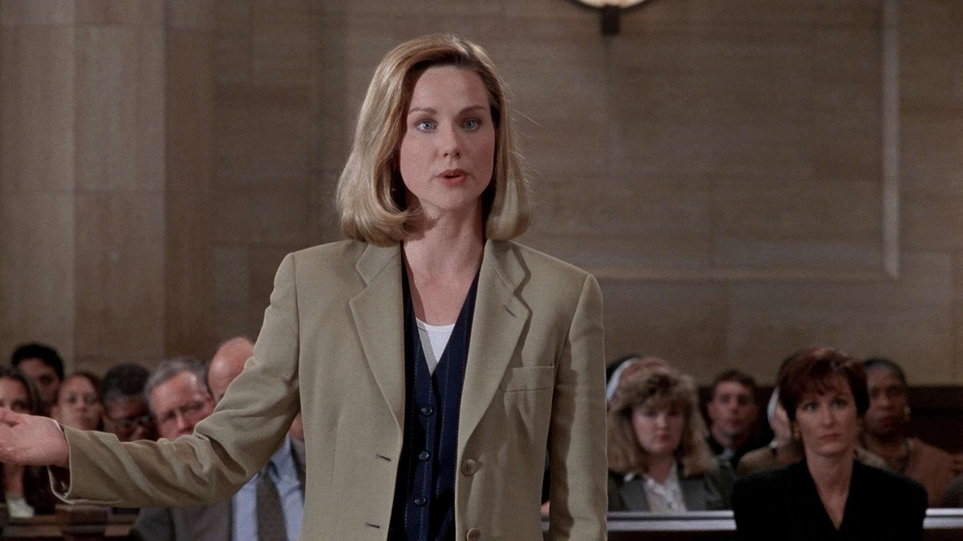
Now, let’s talk shop. This is where I feel most at home. The original look, timed by the legendary Phil Hetos, was built on that classic 90s photochemical sensibility rich blacks and natural highlight roll-off. The palette is inherently subdued, focusing on the cool, sterile blues of the Chicago courtrooms and the institutional grays of the prison.
I’ve been looking at the recent 4K UHD release with HDR10 and Dolby Vision, and as a colorist, it’s a bit of a mixed bag. On one hand, the “modest but bolder” colors look fuller, and the skin tones lean into a warm, healthy zone that makes the characters feel human. But then you hit the technical hurdles. Paramount’s bit-rates on this disc are a bit of a “Wild West” situation swinging from single digits to 100 Mbps. When the bit-rate bottoms out in those dark Chapman shadows, you can see the encoding struggle. It’s a reminder that even with the best HDR tools, we’re still at the mercy of the delivery pipeline.
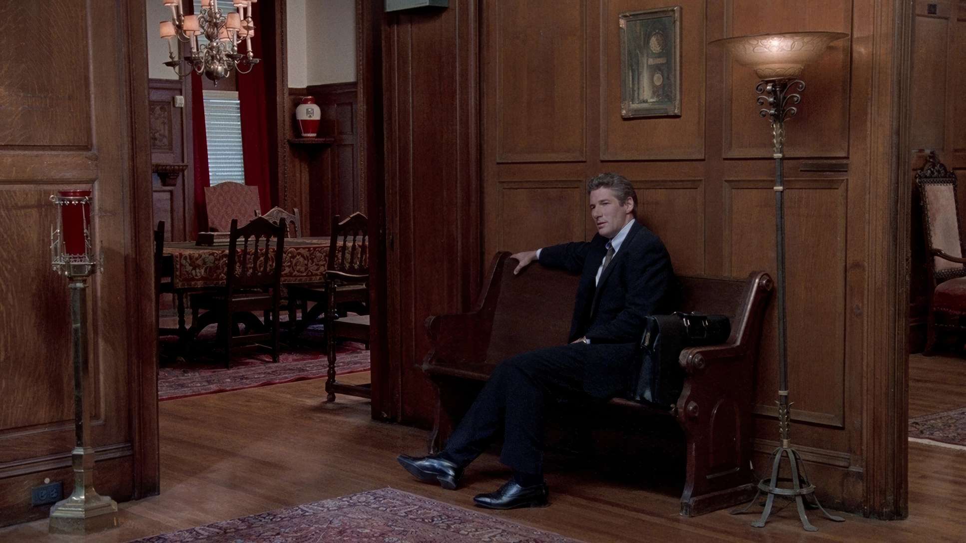
Compositional Choices
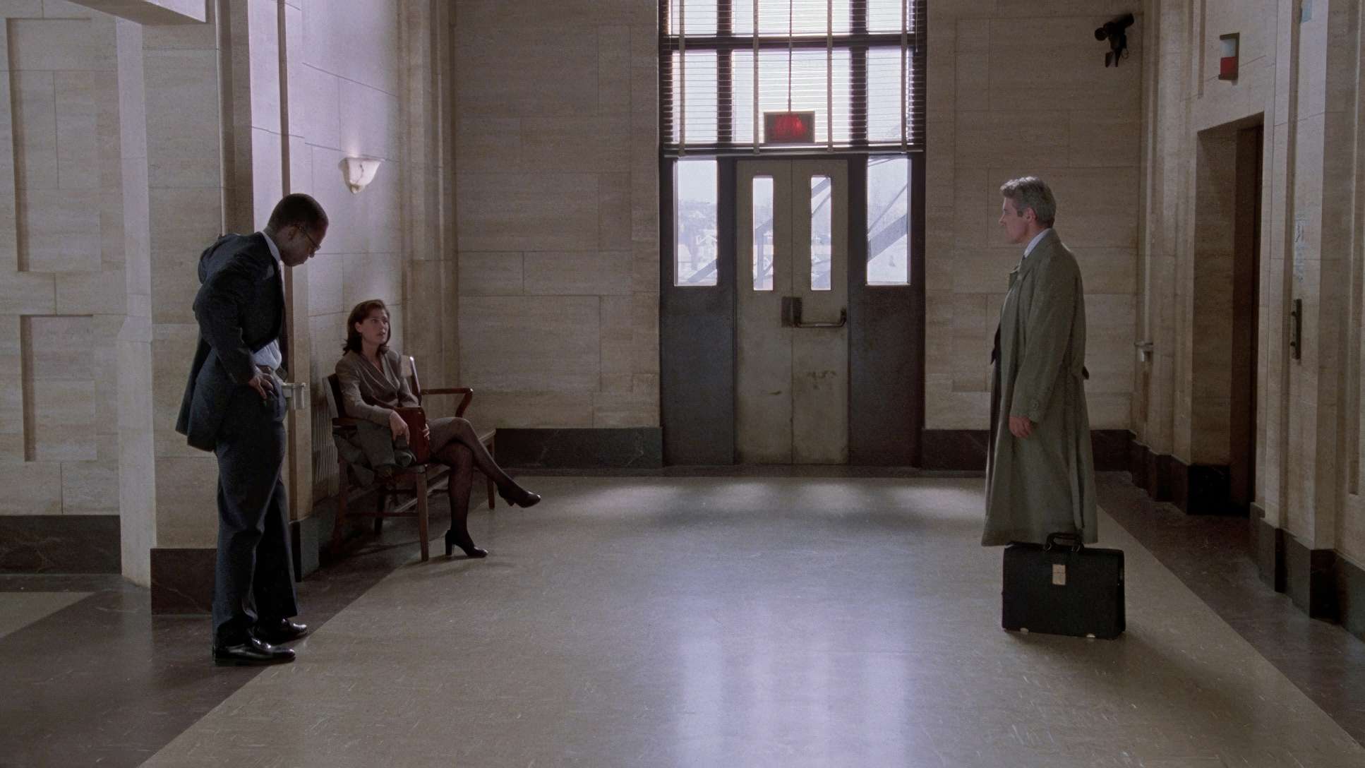
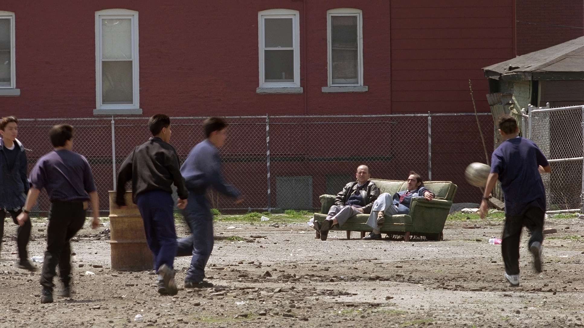
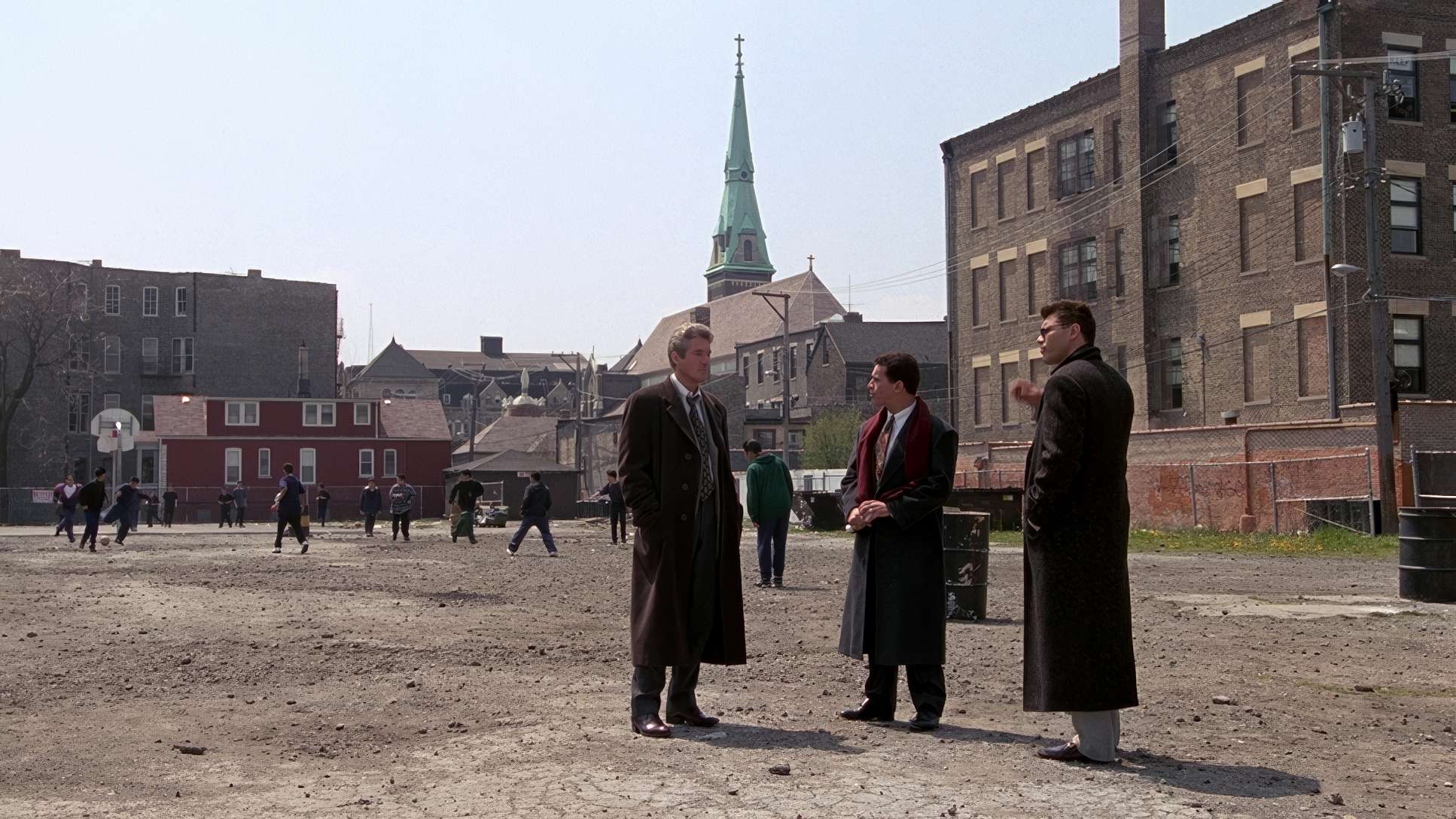
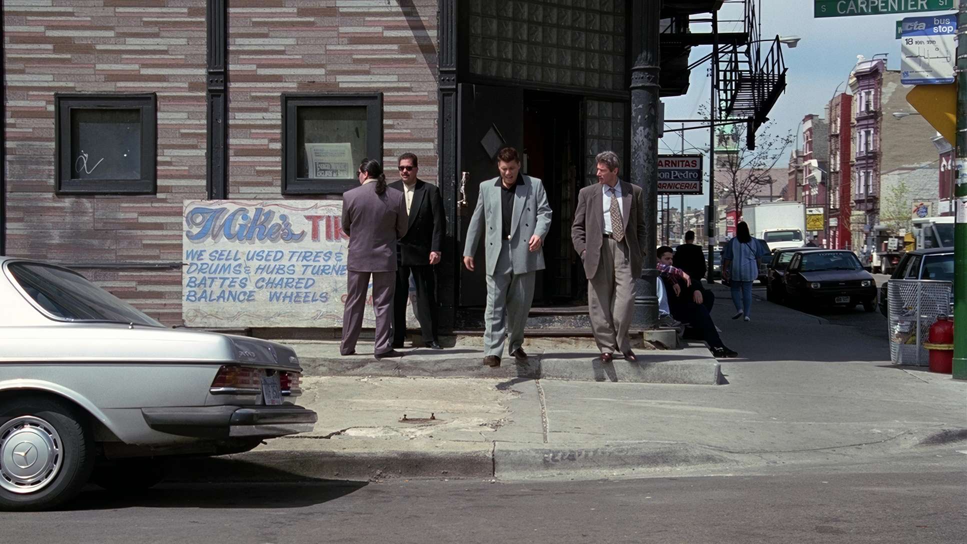
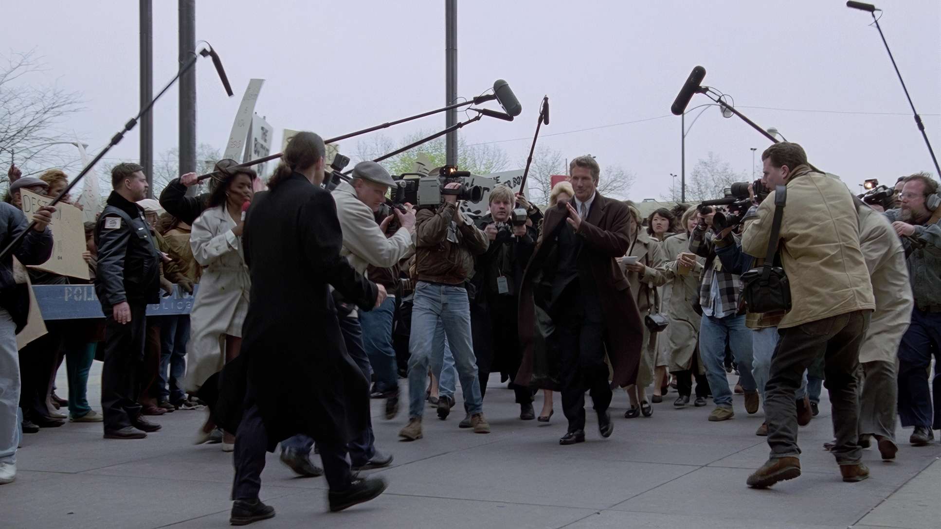
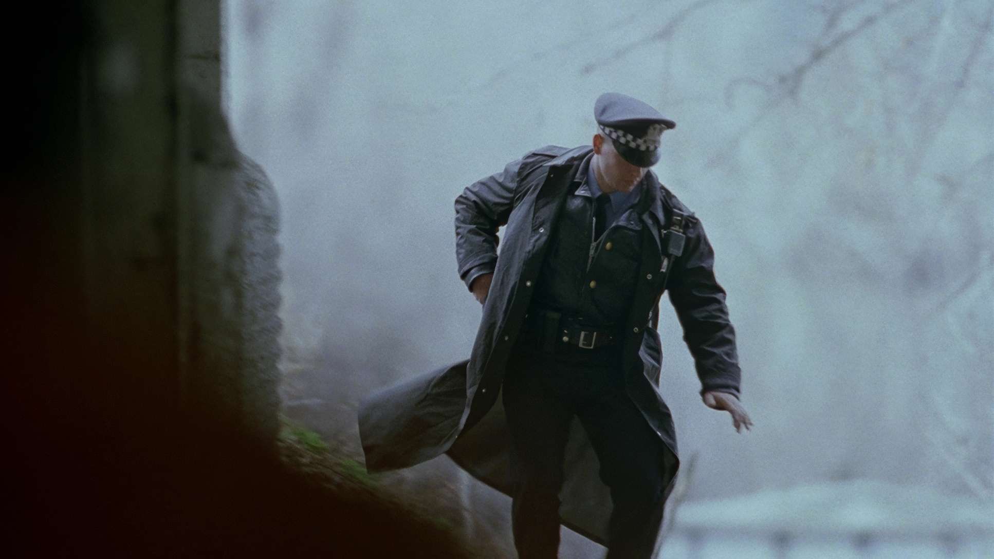
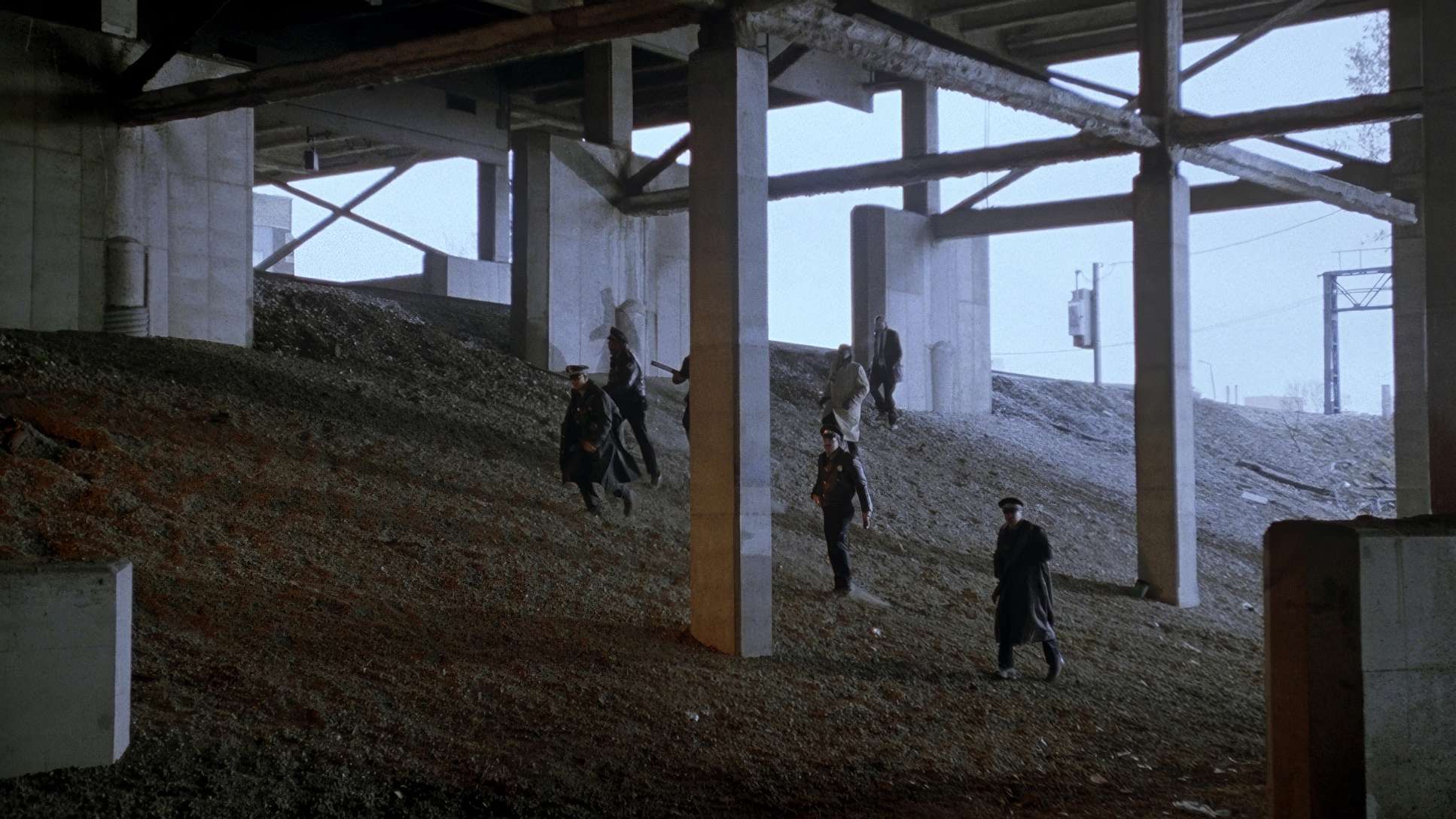
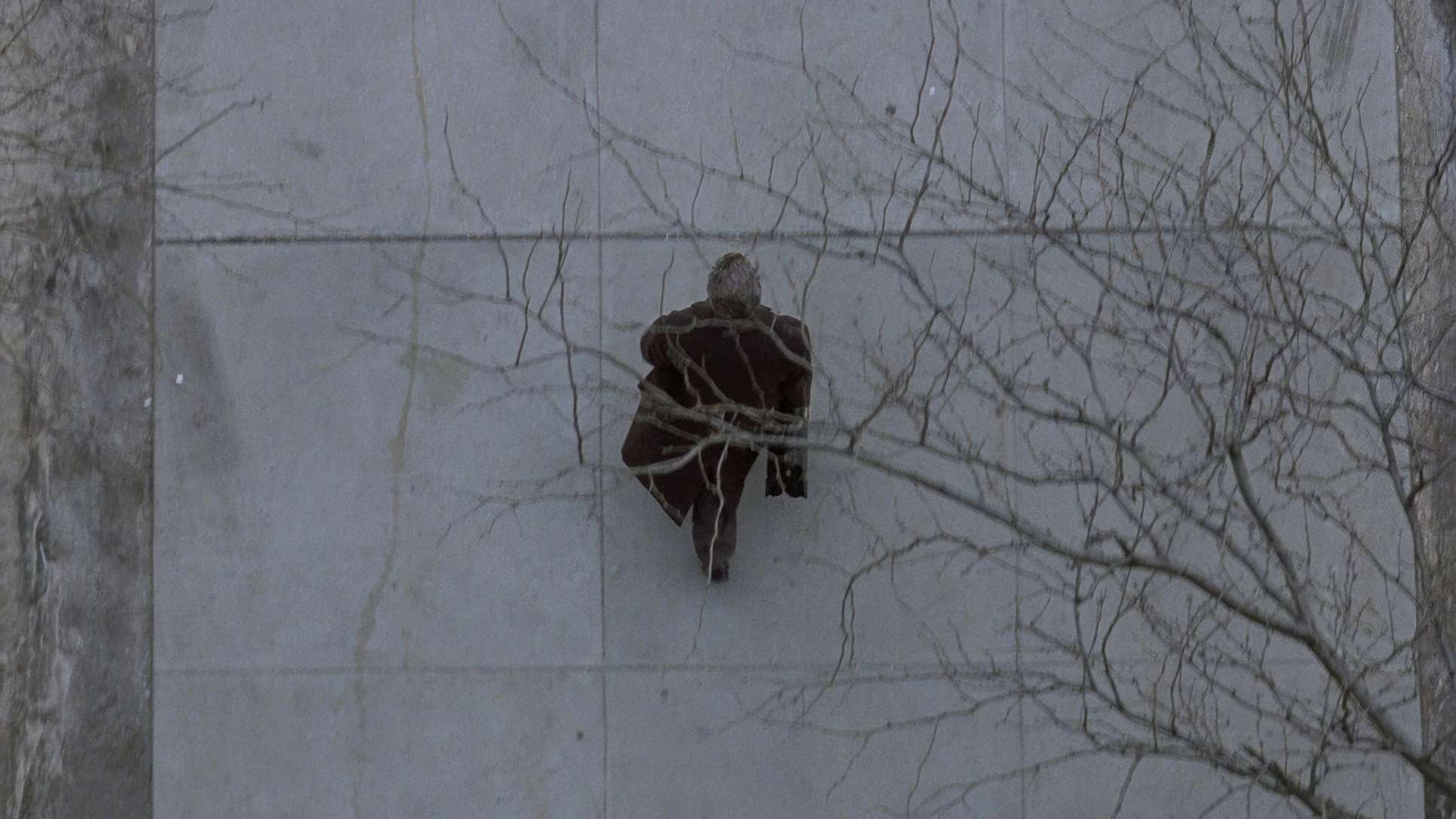
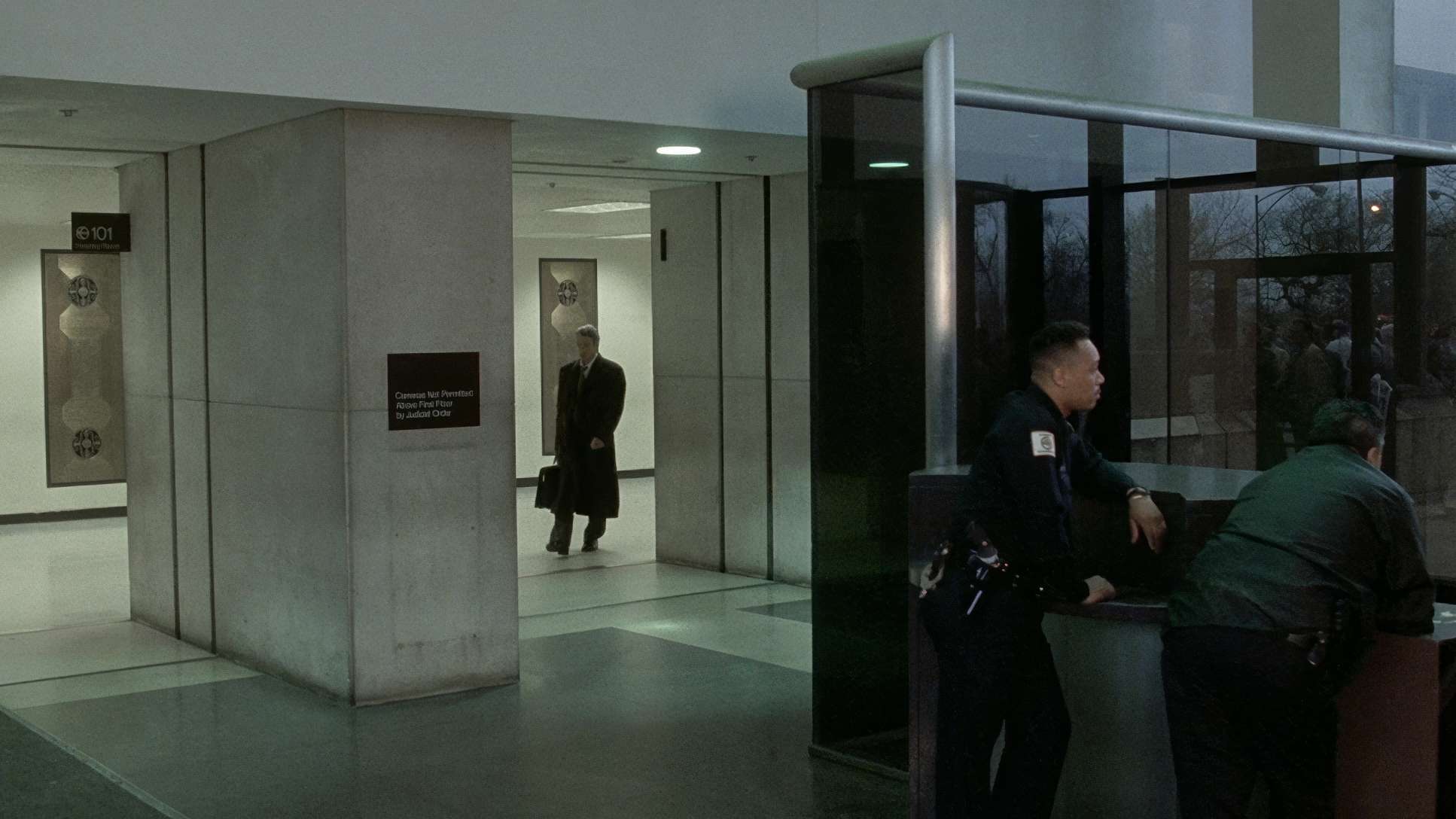
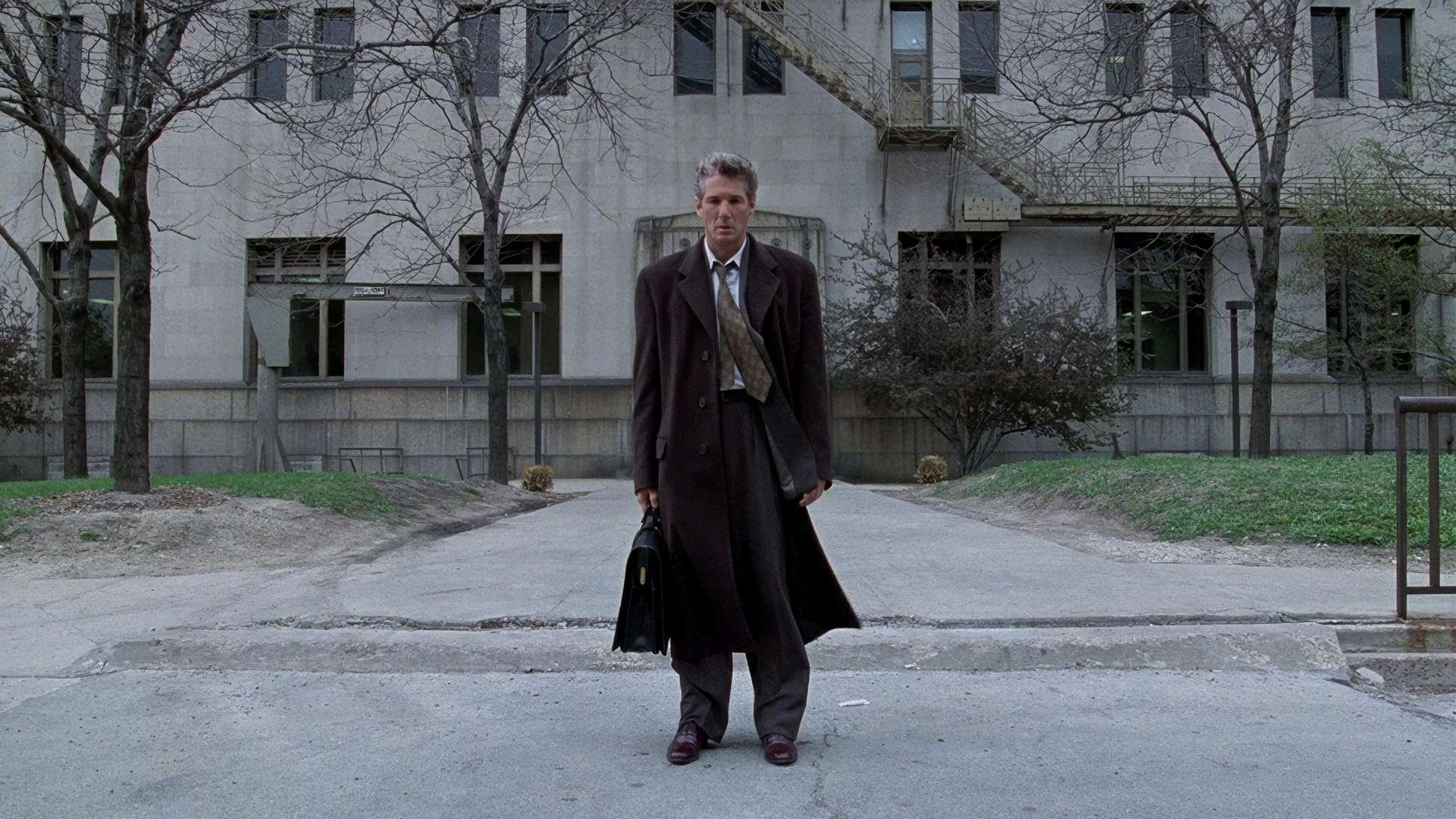
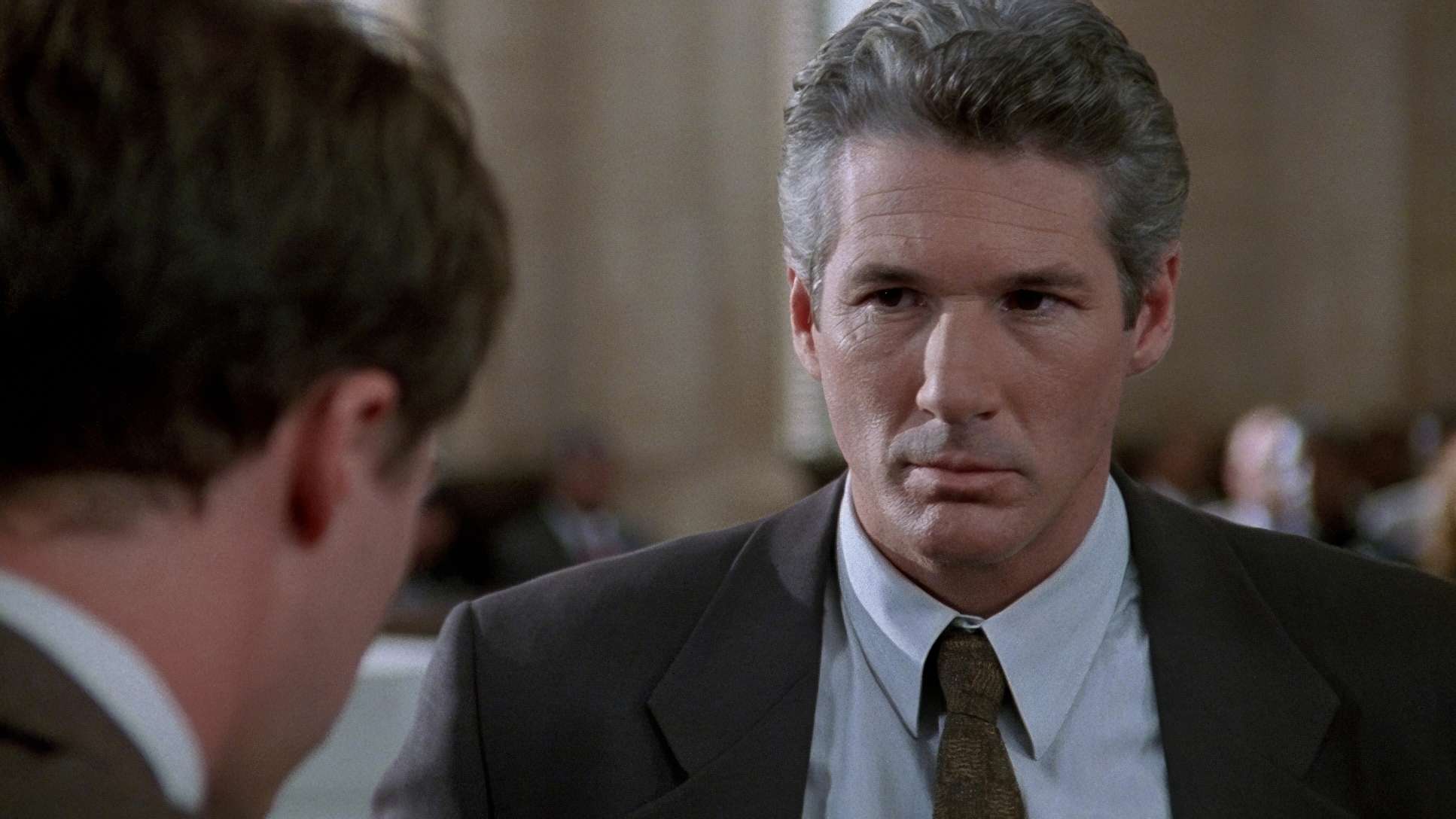
Chapman’s framing is a silent narrator. He loves using the grand, imposing architecture of the Chicago sets to dwarf the characters, emphasizing the weight of the legal system.
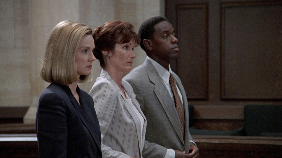
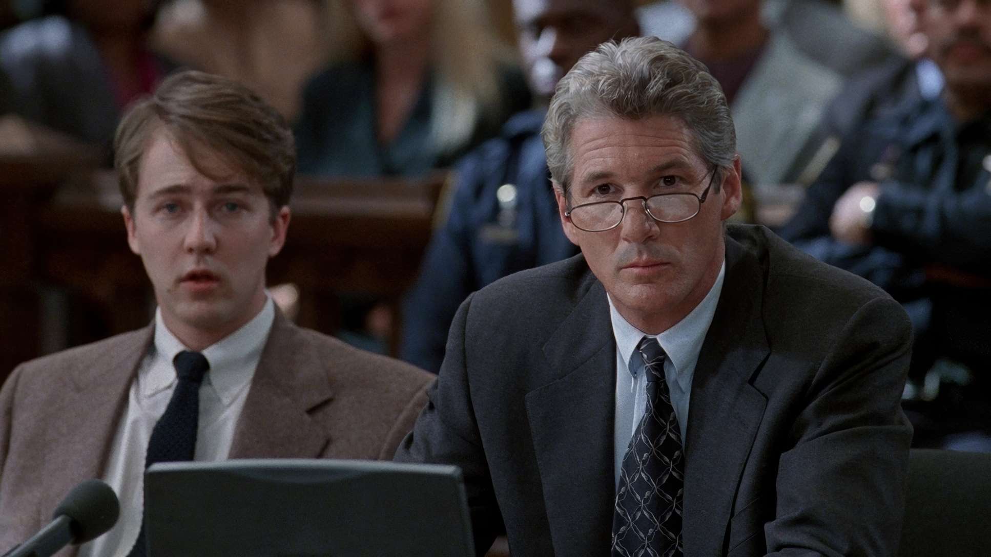
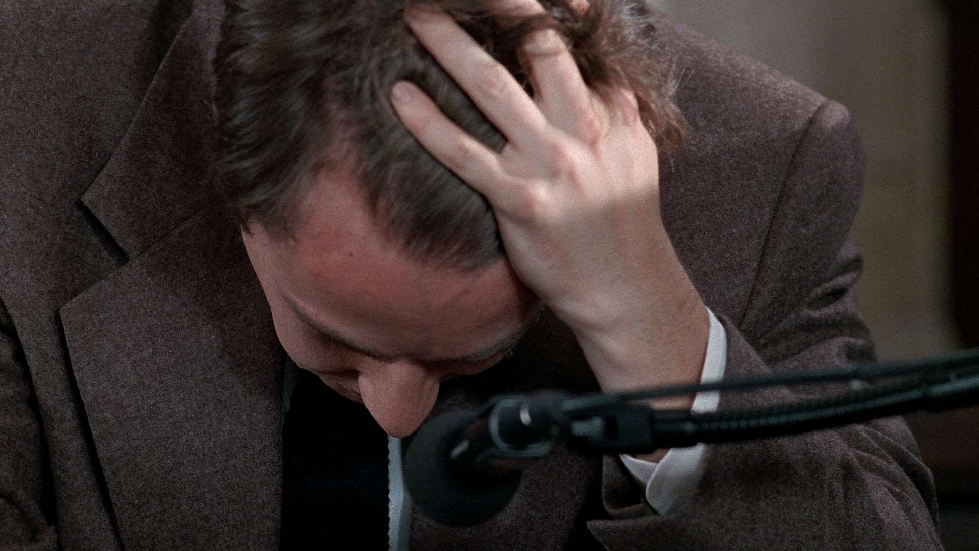
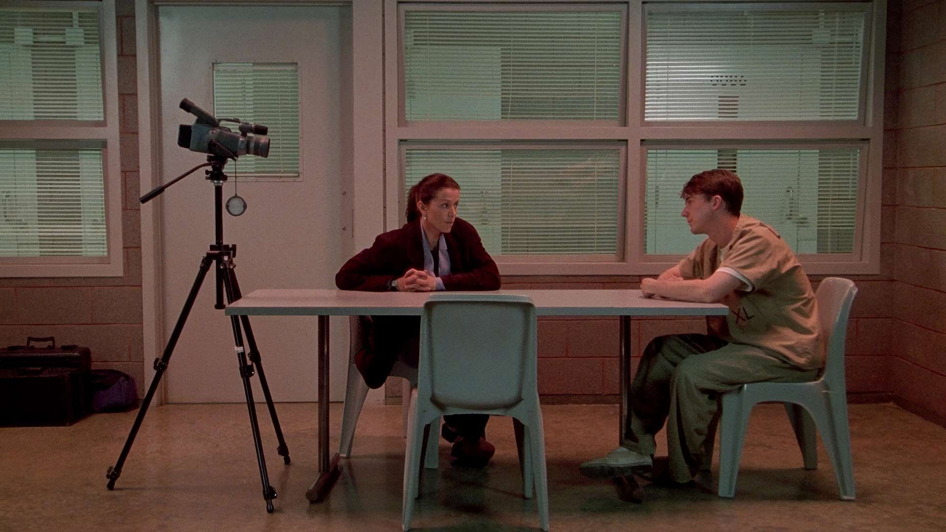
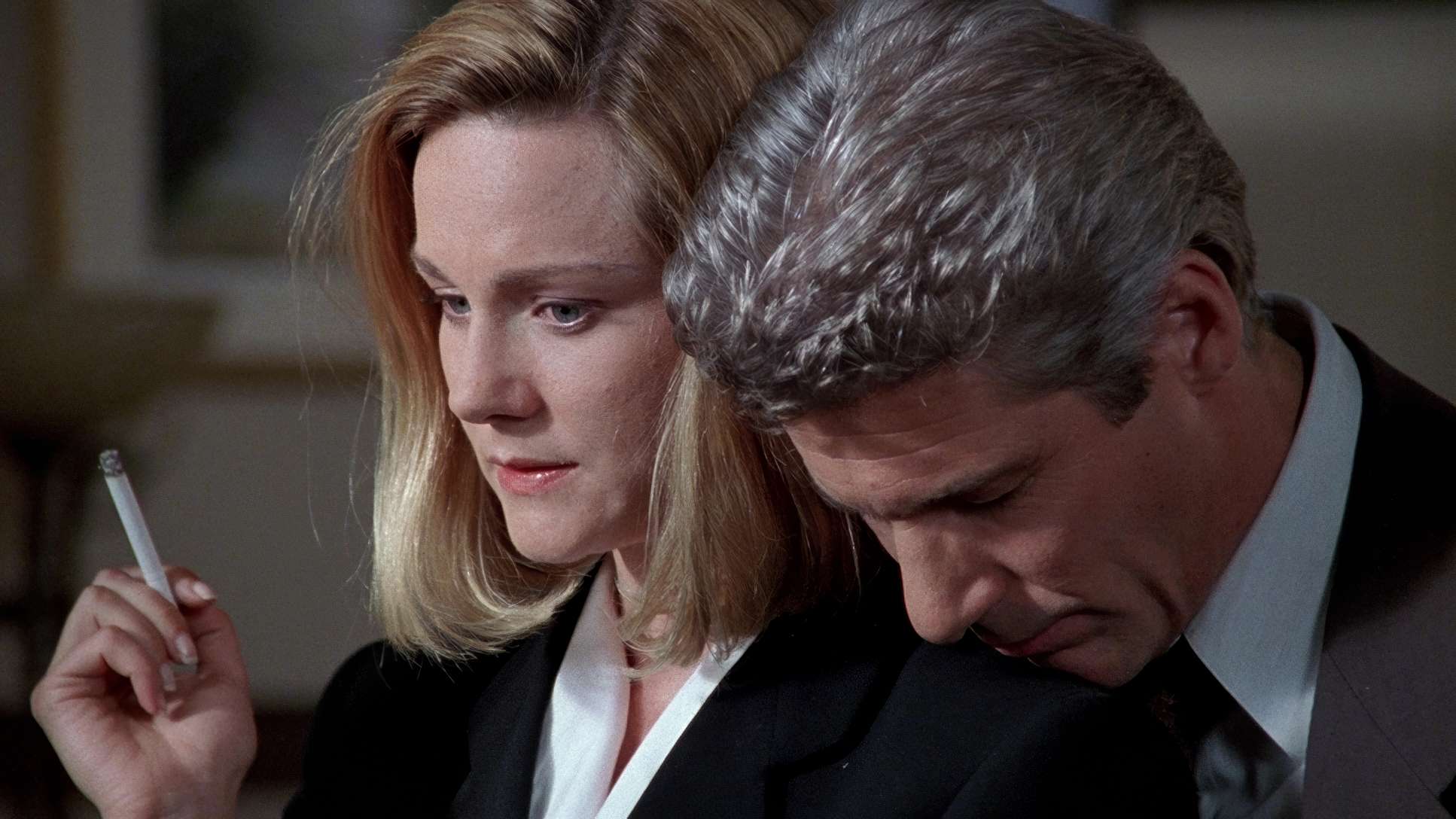
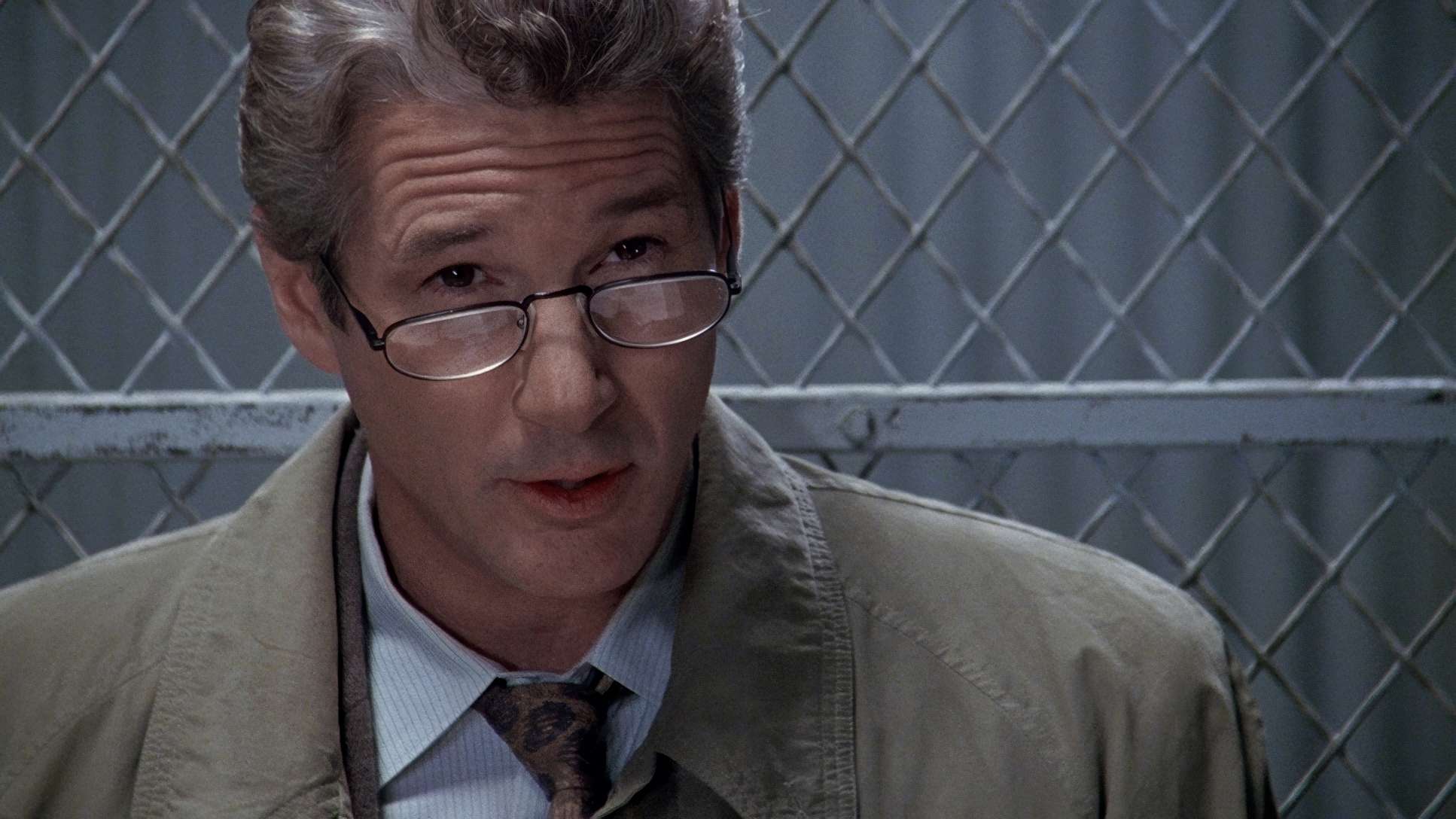
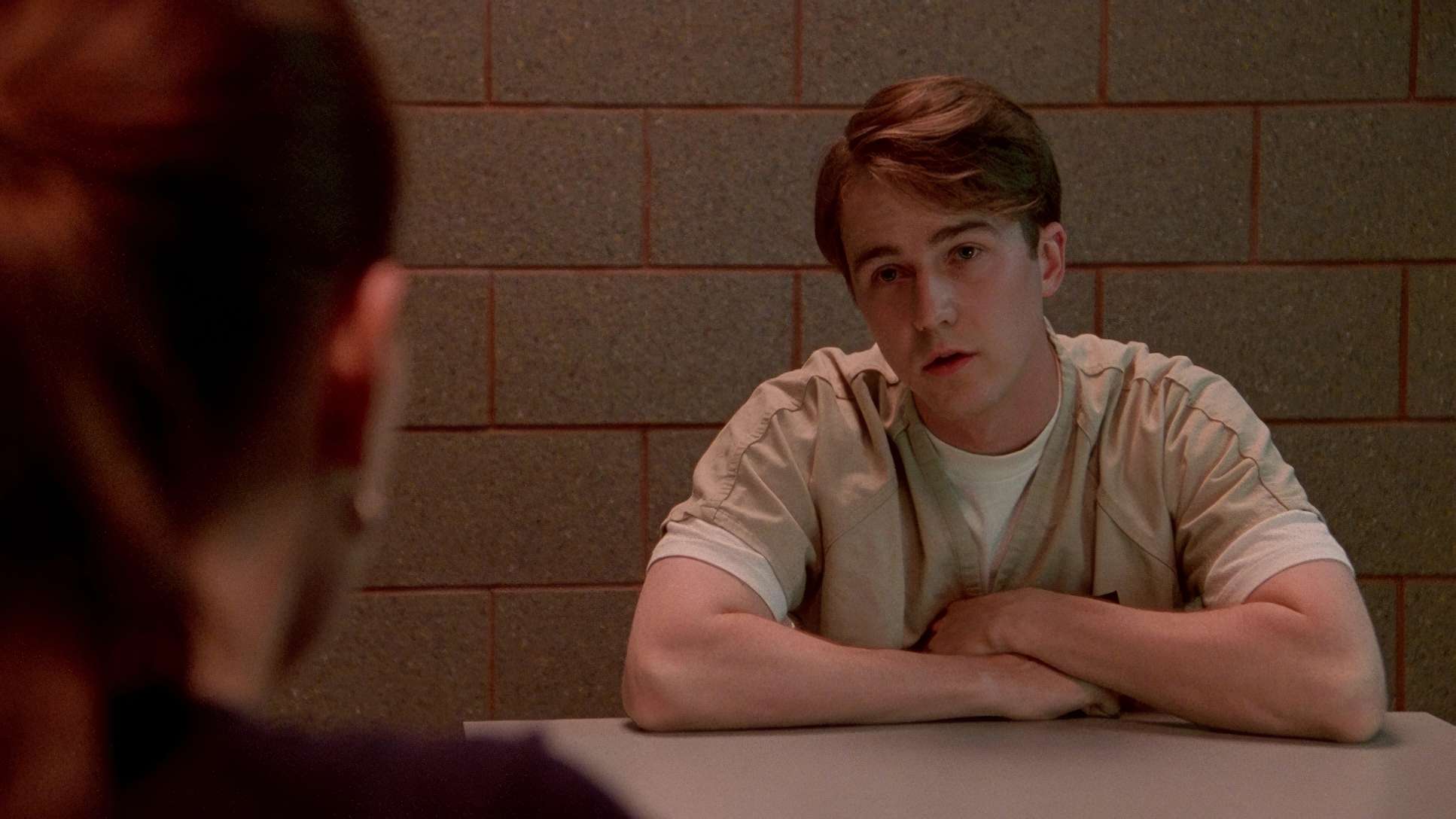
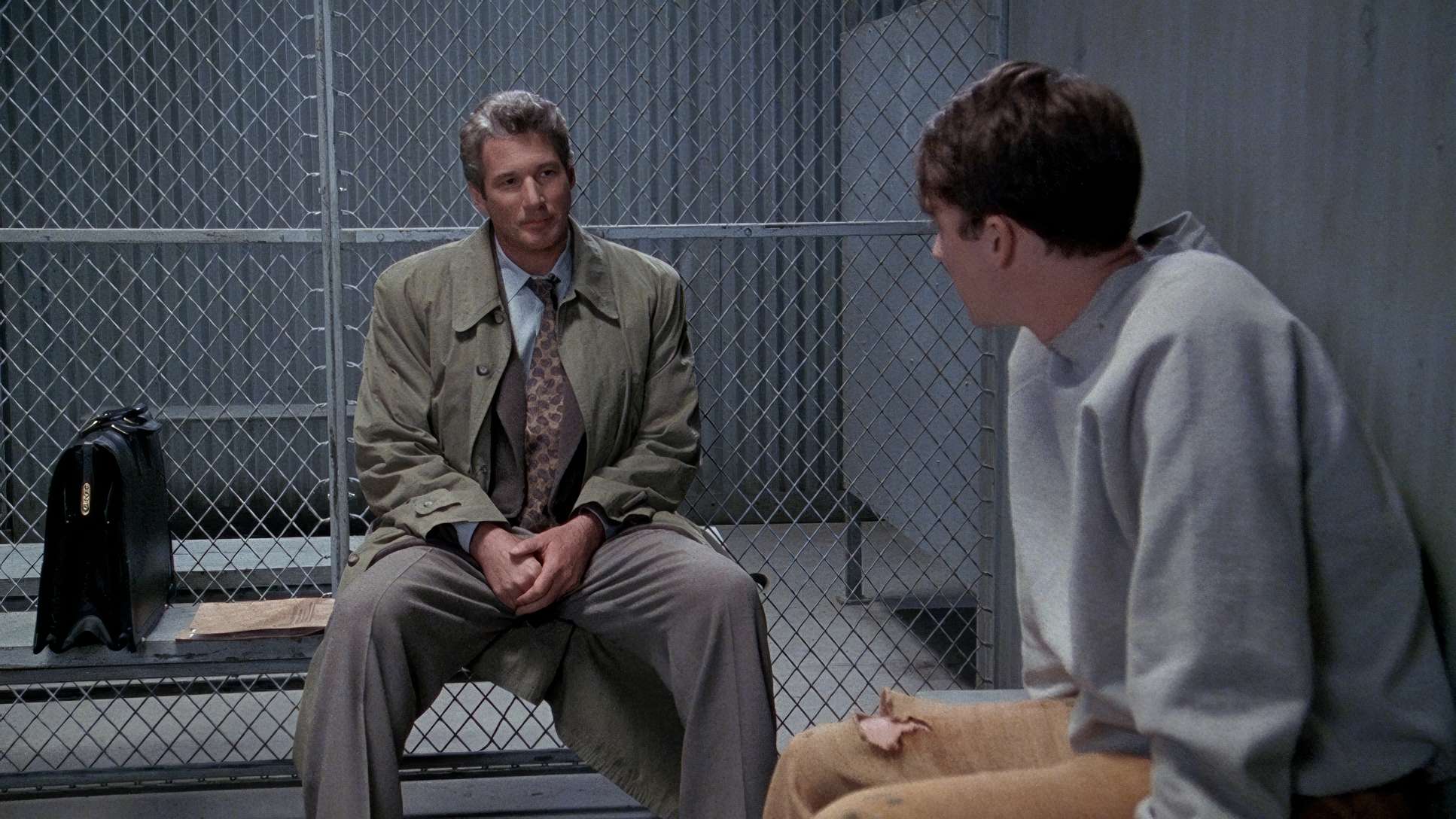
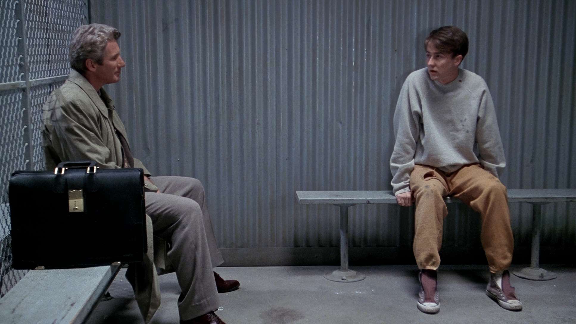
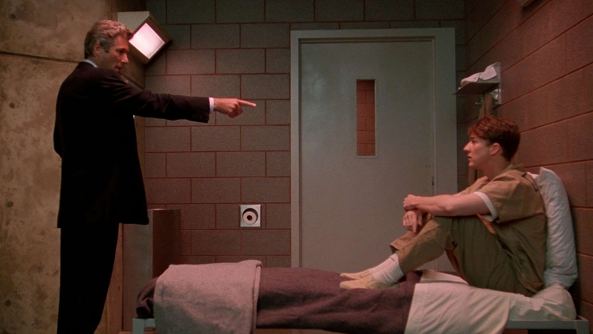
Take a look at the shot around the 00:05:24 mark. It’s a perfectly balanced two-shot a Medium Close Up on a long lens. This is Chapman 100%. By using a longer focal length, he compresses the space between the characters, creating an intimacy that feels almost claustrophobic. It’s a “specific look” that forces us to scrutinize every twitch of Aaron’s face. He uses negative space around Edward Norton to suggest the isolation of his psyche, while the “balanced” composition makes us feel like we’re seeing a fair fight, even when the visual language is subtly manipulating our sympathies.
Lensing and Blocking
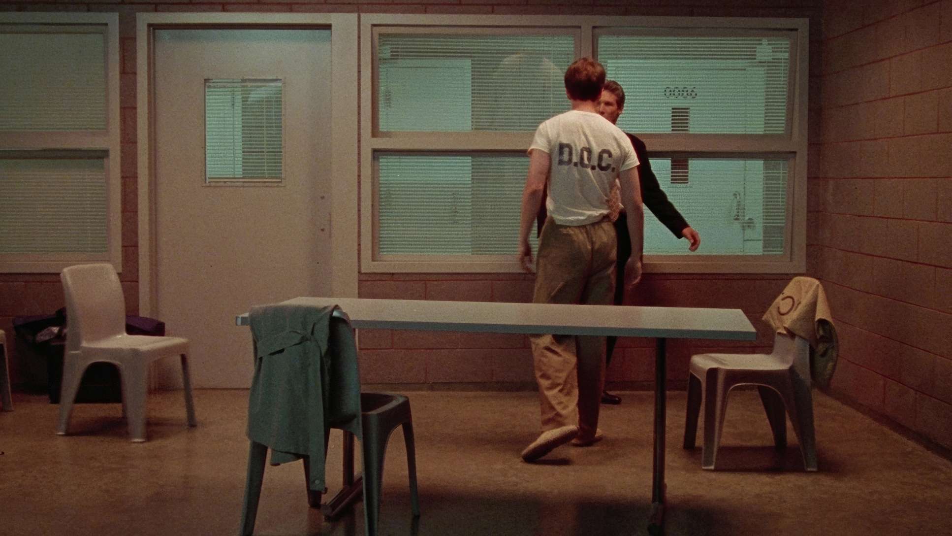
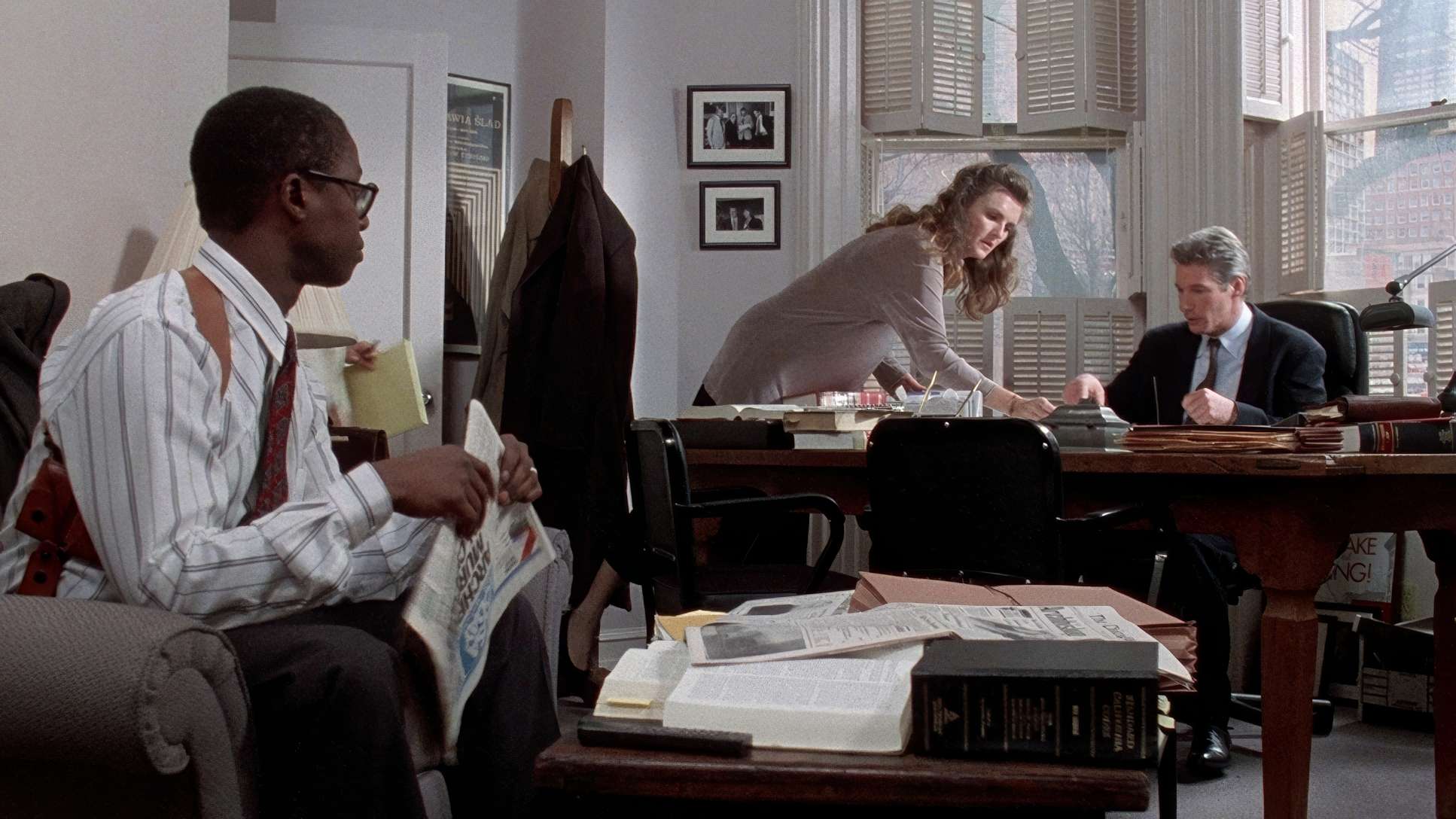
The glass choices here are fascinating. Chapman utilized Panavision Panaflex cameras with Panavision Ultra Speed MKII lenses. Those MKIIs have a beautiful, organic quality to them they’re sharp but not “digital sharp.” For most of the courtroom stuff, the lensing is conservative and “grounded,” giving us that boilerplate legal drama feel.
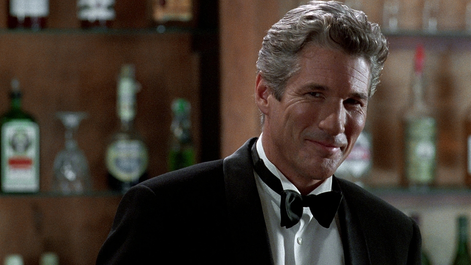
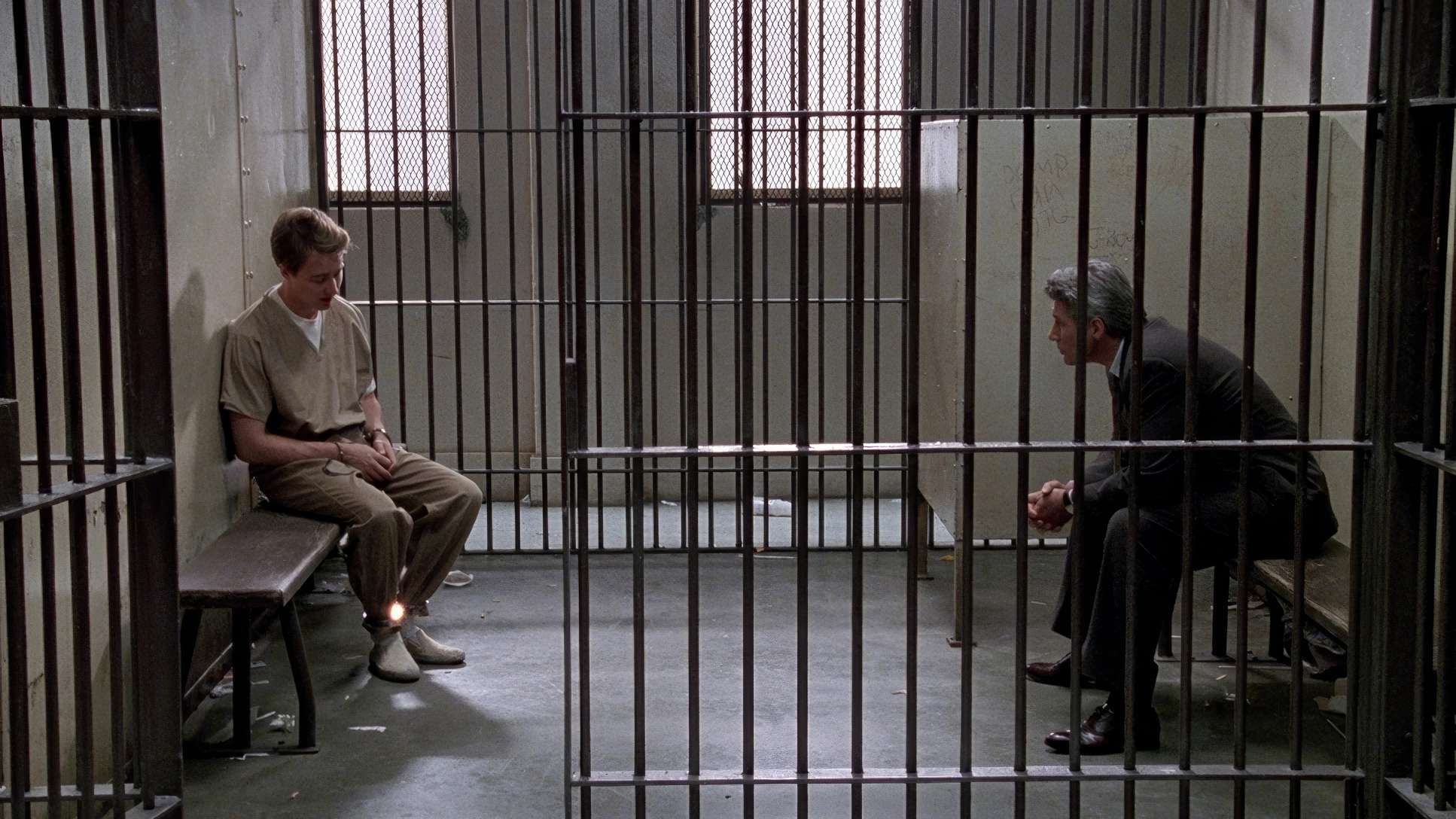
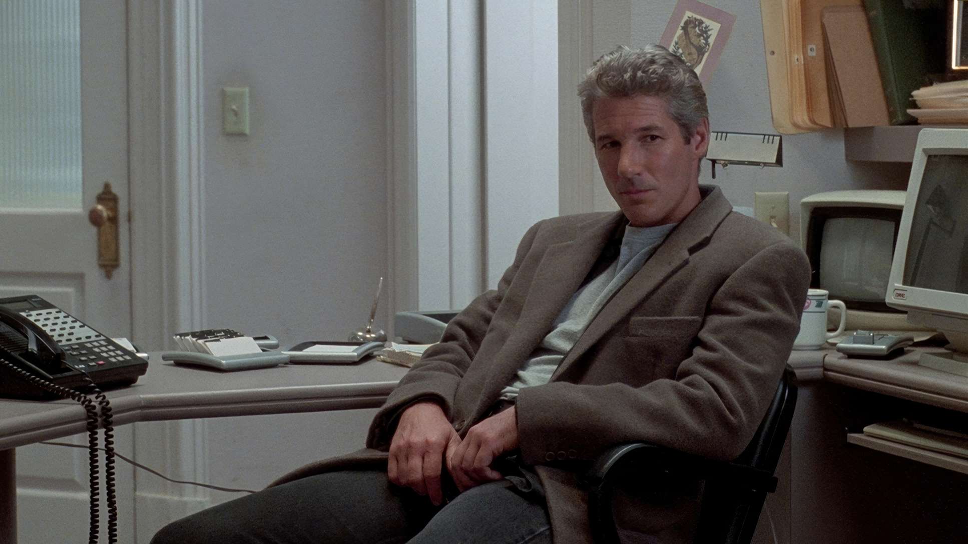
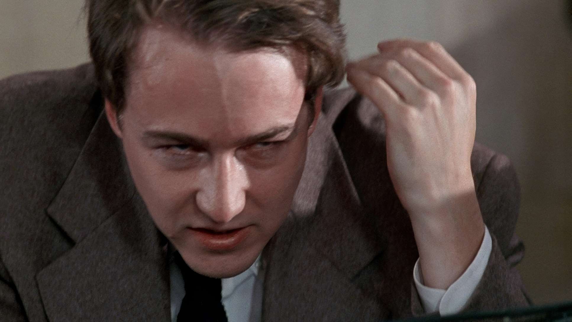
But when the focus shifts to Aaron, the blocking gets clever. Initially, Martin Vail dominates the frame—he’s the “egotistical attorney” in the spotlight. But as the story unfolds, the blocking subtly shifts. Aaron begins to take up more visual weight, and Vail finds himself pushed into the background. It’s a brilliant bit of foreshadowing for the moment Vail realizes he’s been taken for a fool. The blocking isn’t just about where people stand; it’s about who holds the power in the frame.
Camera Movements: Motivated Tension
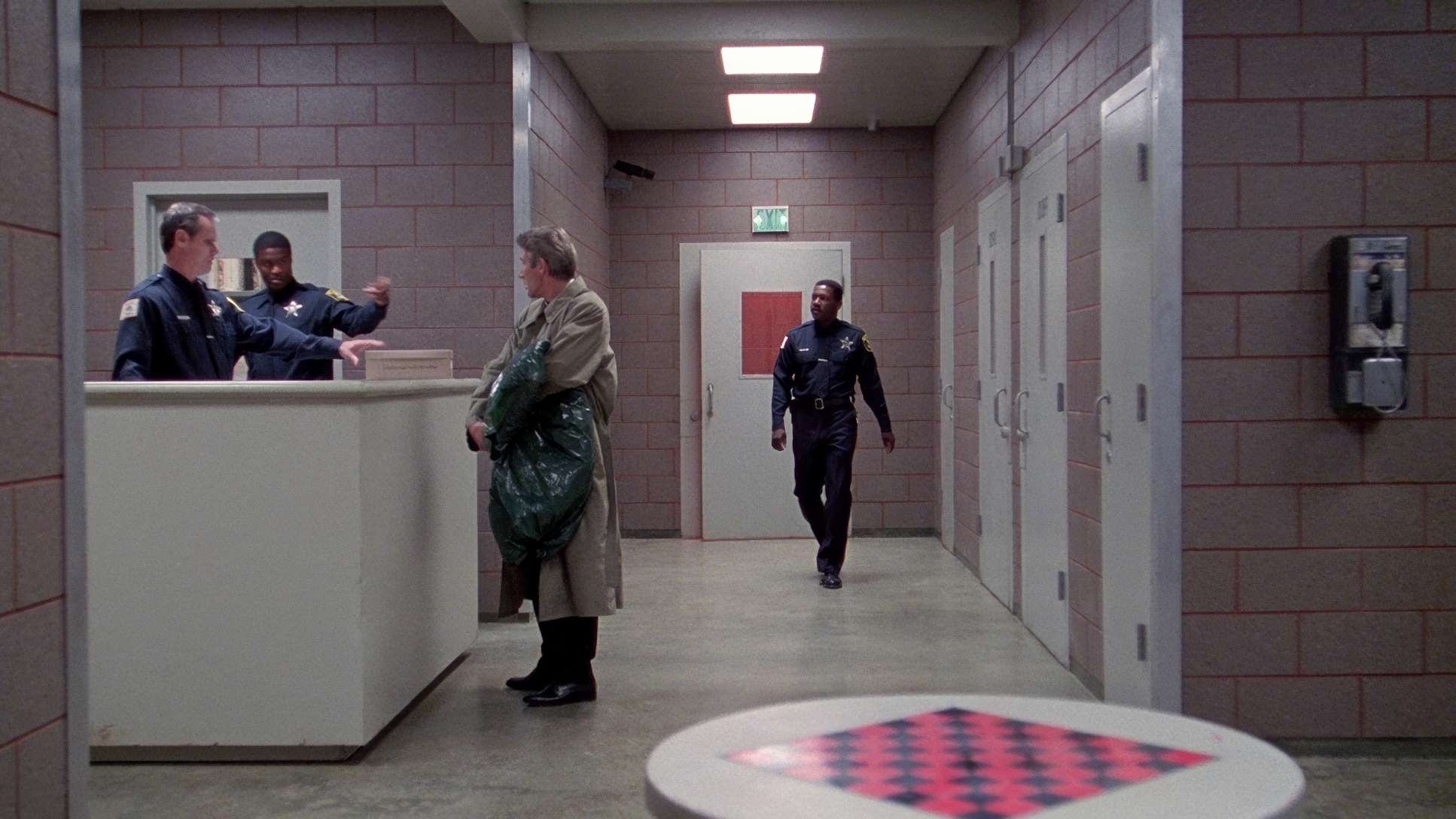
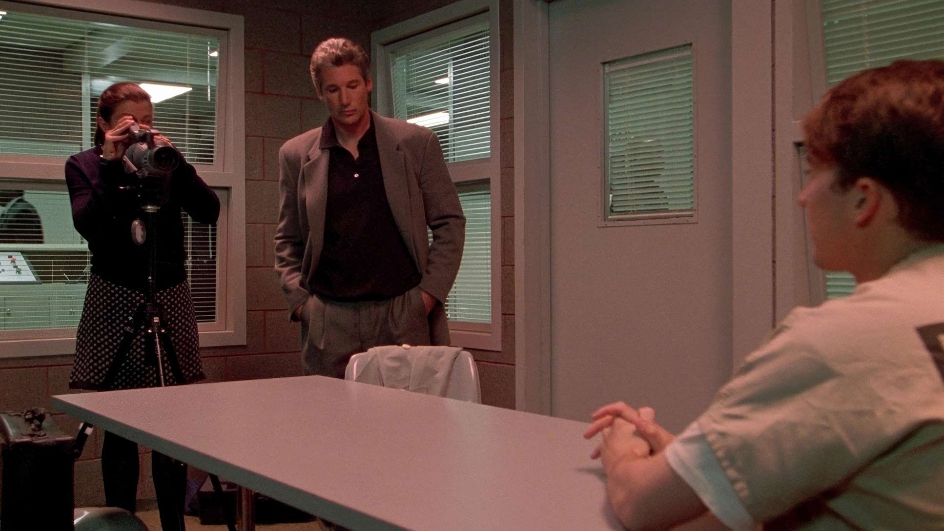
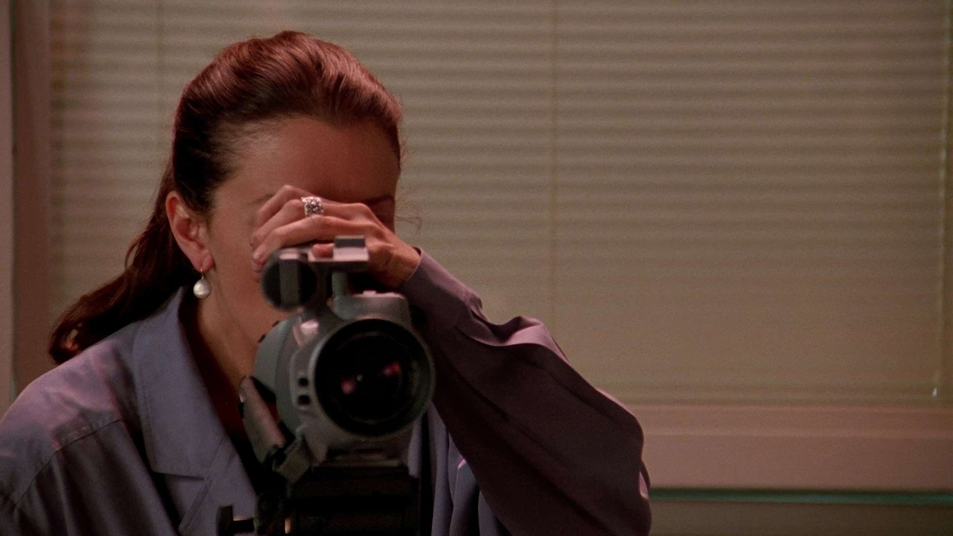
In Primal Fear, the camera doesn’t move unless it has a reason. This isn’t a kinetic action flick; it’s a drama that relies on “motivated” movement. In the courtroom, the camera is observational slow pans and tracking shots that mirror the ritual of the law.
However, outside the courtroom, Chapman uses those slow, creeping push-ins to ramp up the unease. He saves the handheld work for the genuine chaos, which makes those moments feel twice as impactful because the rest of the film is so composed. This classical approach creates a solid foundation, so when the tension finally snaps, the audience really feels it.
Inspiration Behind the Cinematography
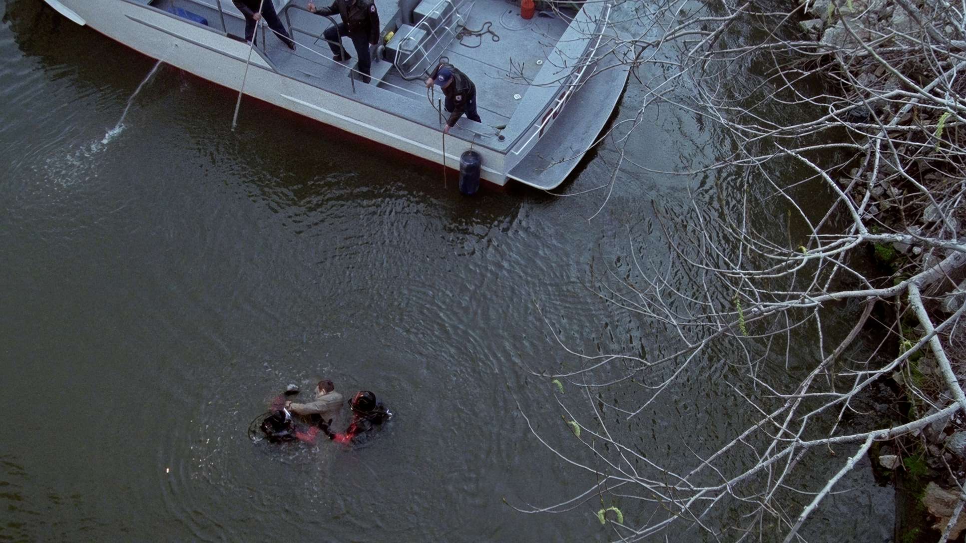
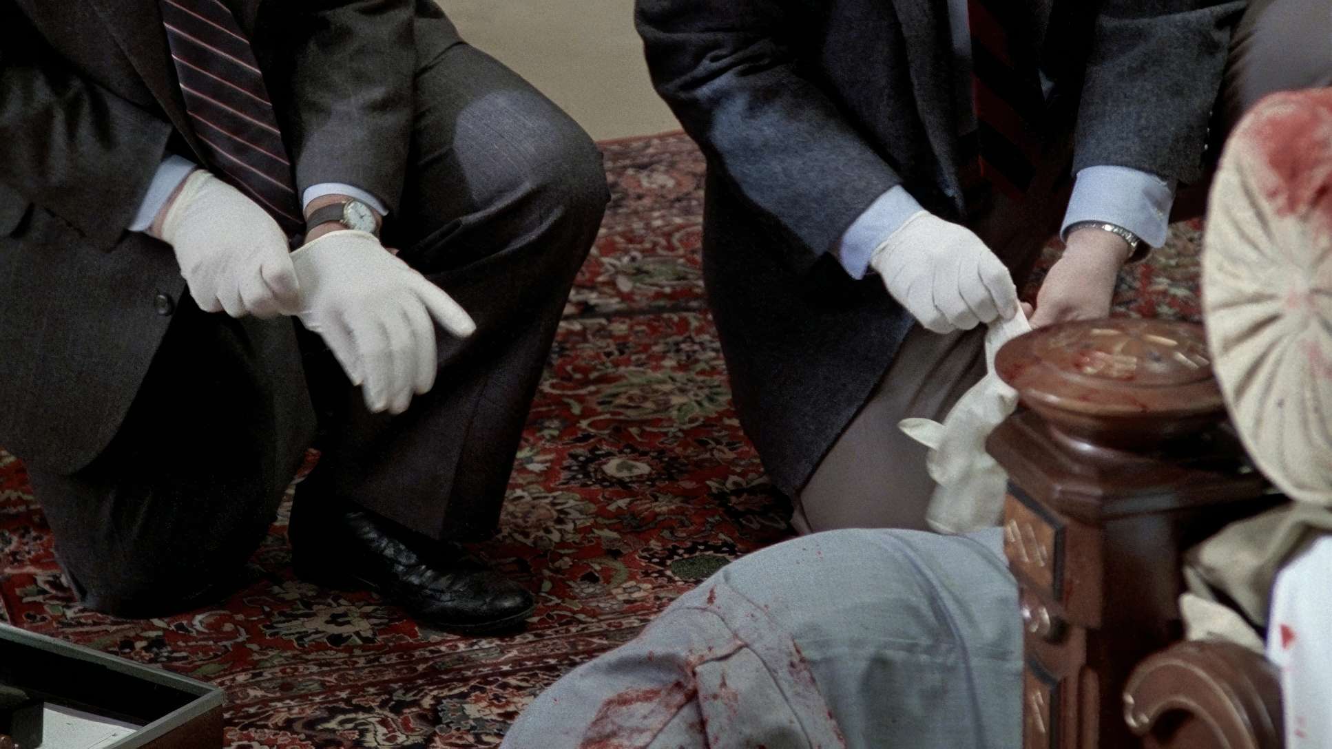
The core inspiration here is clearly the “corruption of innocence.” The film is a visual dance between the public performance of the courtroom and the dark, private corners where the real crime happened. From the very first scene where a figure is seen in the shadows kneeling over a body we know that obscured vision is the theme. The entire visual scheme is designed to suggest that what we see isn’t the whole truth. It’s a “visual scaffolding” that supports the psychological suspense, aligning perfectly with the idea of a “cunning disguise.”
Technical Aspects & Tools: The DNR Dilemma
Primal Fear (1996)
Technical Specifications & Production Credits
| Genre | Courtroom Drama, Crime, Drama, Mystery, Thriller, Legal, Detective |
| Director | Gregory Hoblit |
| Cinematographer | Michael Chapman |
| Production Designer | Jeannine Oppewall |
| Costume Designer | Betsy Cox |
| Editor | David Rosenbloom |
| Colorist | Phil Hetos |
| Time Period | 1990s |
| Aspect Ratio | 1.78 – Spherical |
| Format | Film – 35mm |
| Lighting | Soft light |
| Lighting Type | Artificial light |
| Story Location | Chicago, Illinois |
| Filming Location | Park Plaza Hotel – 607 S. Park View Street, Los Angeles |
| Camera | Panavision Panaflex |
| Lens | Panavision Ultra Speed MKII |
| Film Stock / Resolution | 5298/7298 EXR 500T |
Let’s get into the weeds of the 4K transfer. The aspect ratio is 1.78:1 (a slight crop from the theatrical 1.85:1), which works well for home screens. But the real talking point for us pros is the Digital Noise Reduction (DNR). It’s been applied at about a “10% strength.”
As a colorist, this is always a touchy subject. At 10%, you avoid the “waxy face” disaster, but you do lose some of that organic film grain that gives 35mm its soul. Grain isn’t noise; it’s texture. While the image is cleaner, I’d argue a bit of the film’s “grit” was sacrificed for “clarity.” It’s a recurring dilemma in our industry: how much do we “clean up” for modern eyes while still respecting the original 1996 intent?
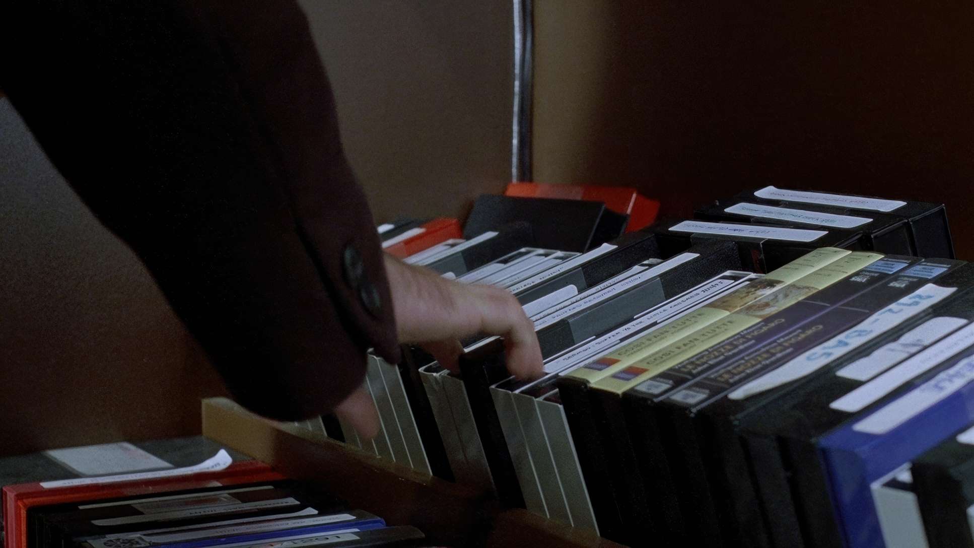
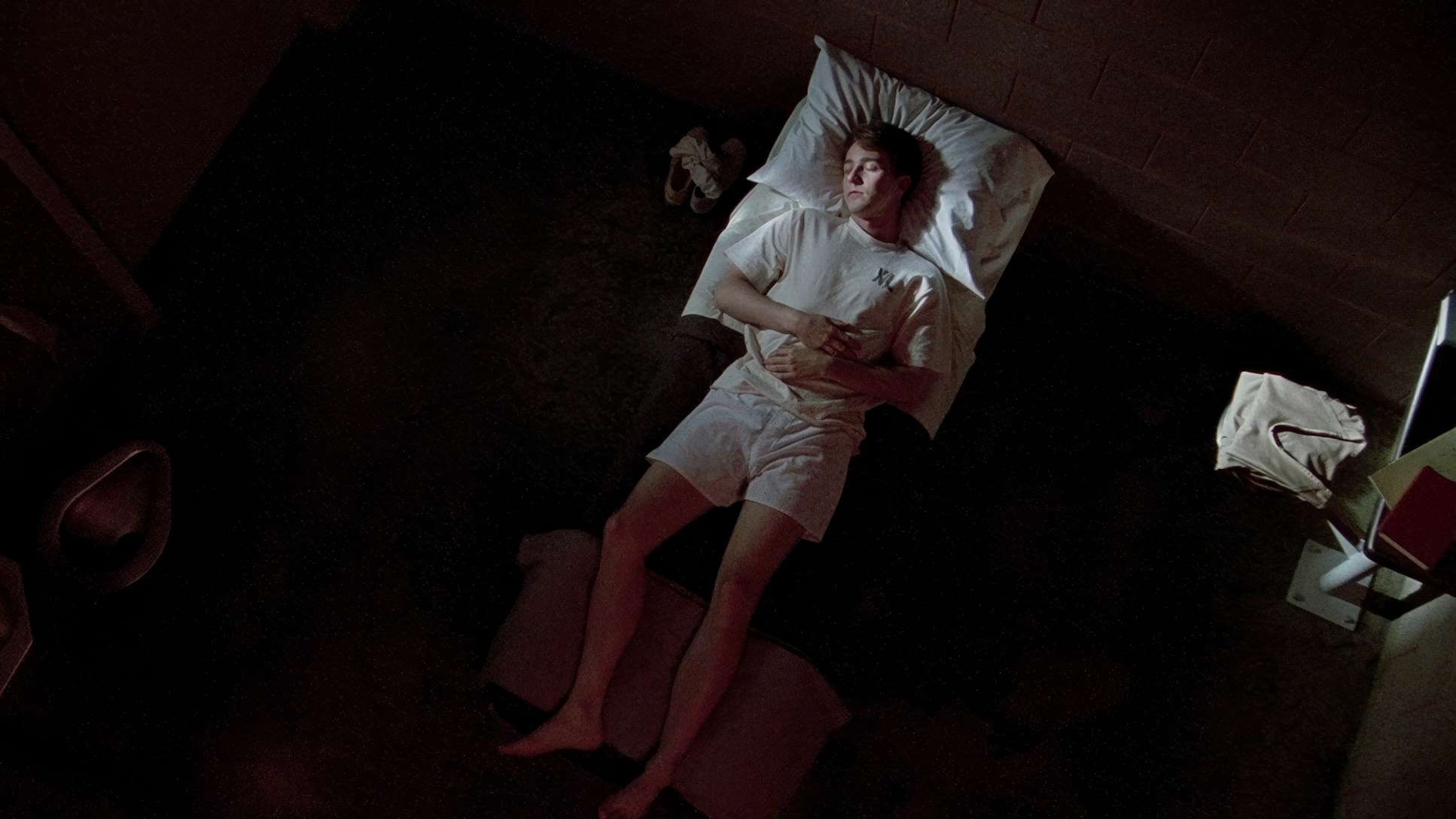
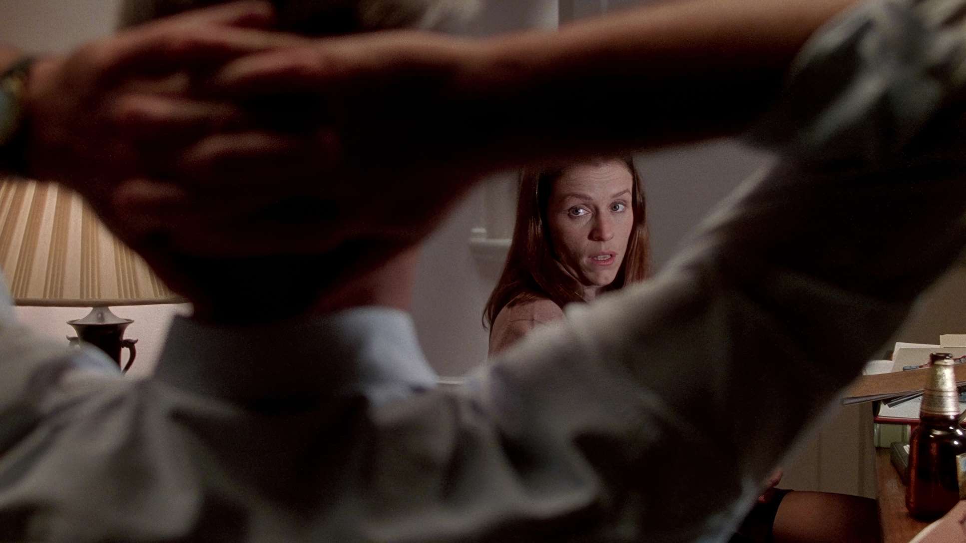
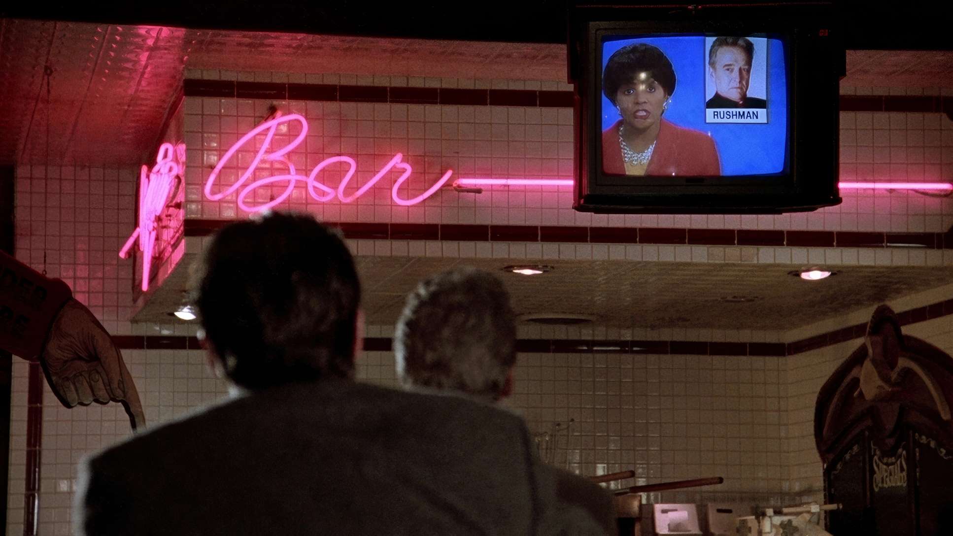
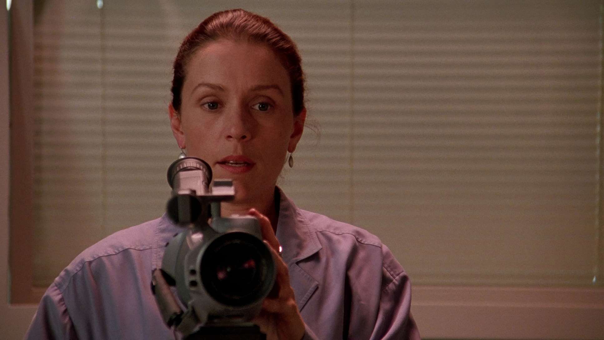
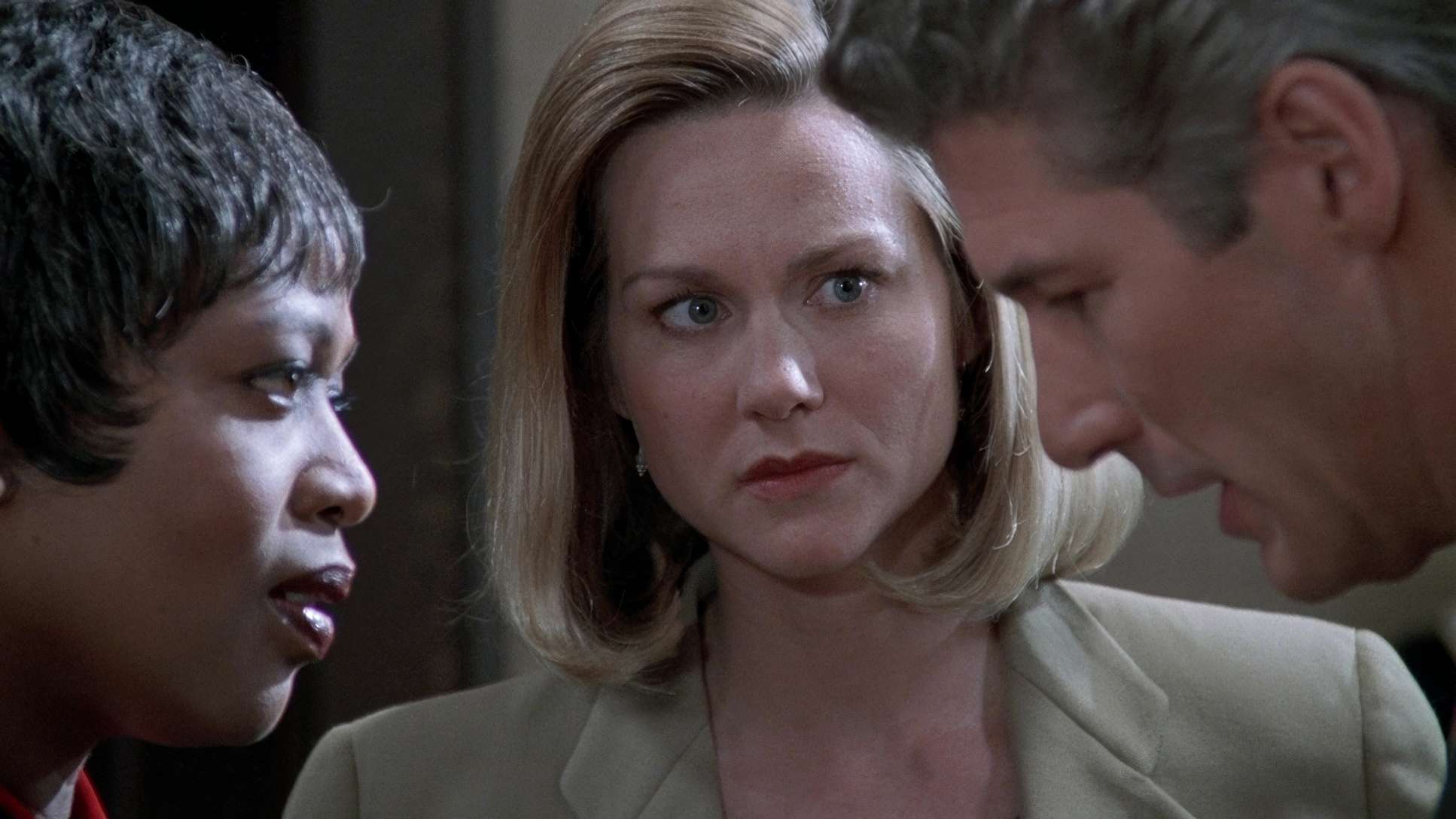
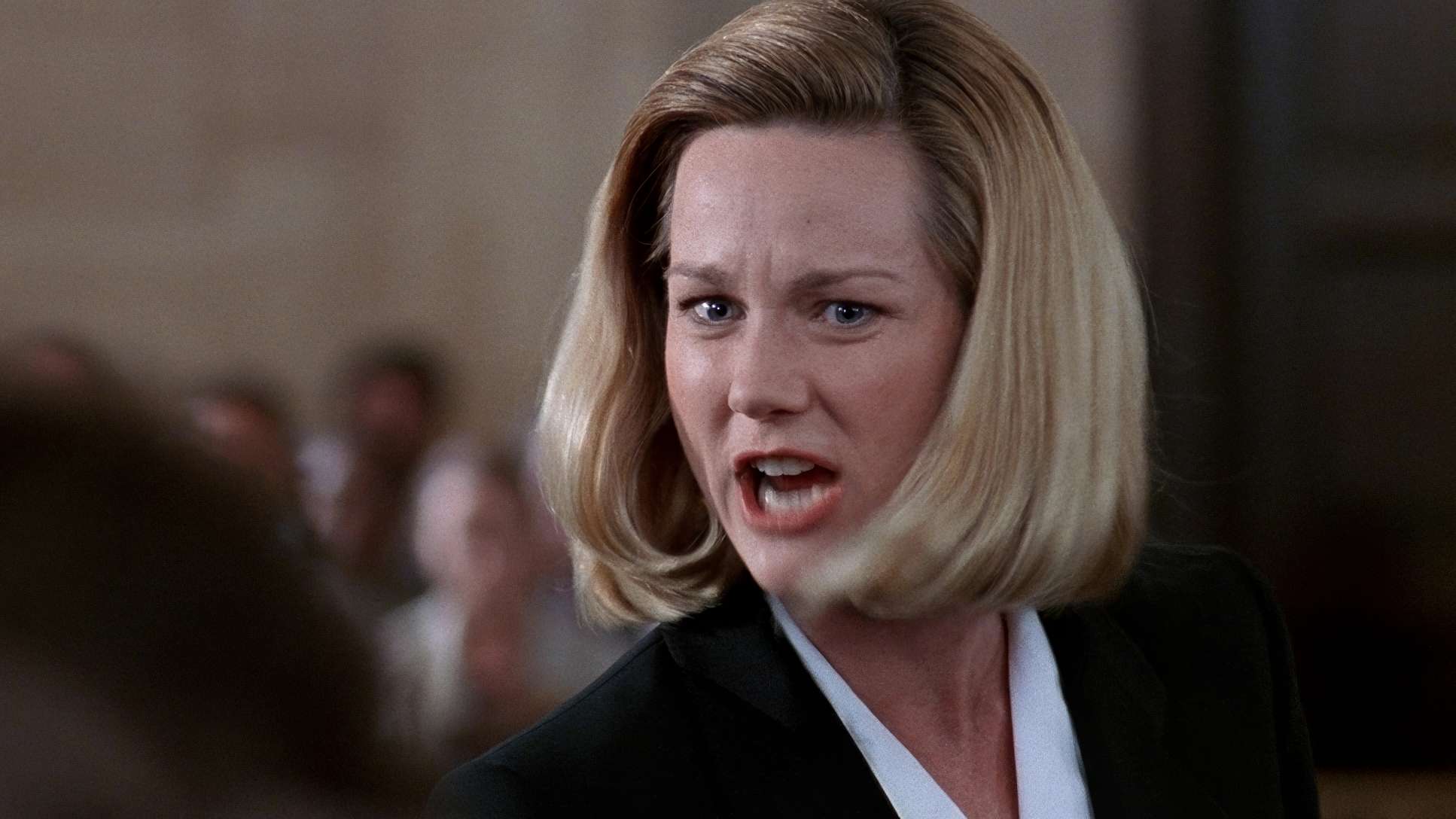
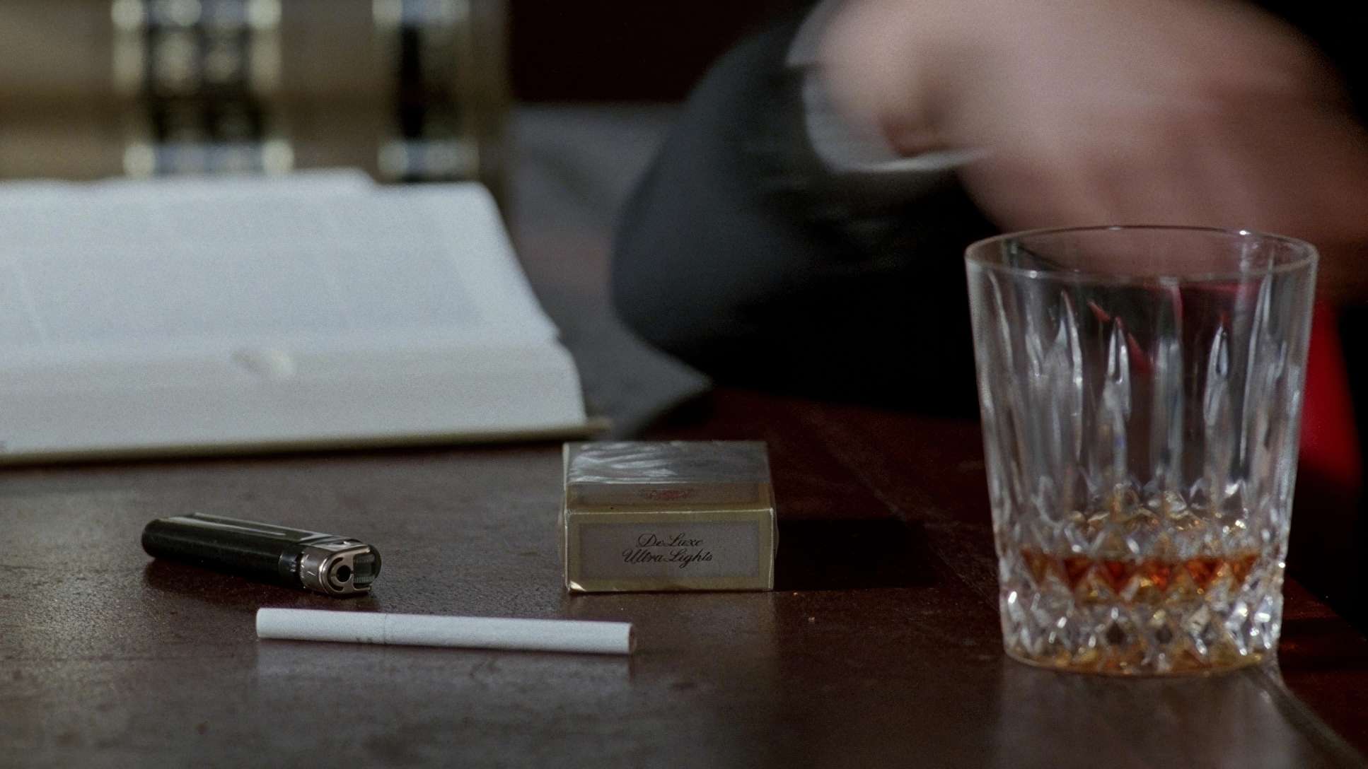
Primal Fear (1996) FilmStills
A curated reference archive of cinematography stills from PRIMAL FEAR (1996). Study the lighting, color grading, and composition.


- Also read: AIRPLANE! (1980) – CINEMATOGRAPHY ANALYSIS
- Also read: THE BANSHEES OF INISHERIN (2022) – CINEMATOGRAPHY ANALYSIS
Browse Our Cinematography Analysis Glossary
Explore directors, cinematographers, cameras, lenses, lighting styles, genres, and the visual techniques that shape iconic films.
Explore Glossary →