Airplane!, it’s more than just a comedy writing masterclass; it’s a brilliant, often-overlooked triumph of visual execution. This isn’t just a funny movie. It’s a cinematic sleight of hand. Its genius usually attributed to the rapid-fire gags and deadpan delivery is actually rooted in how it looks. As a colorist, I’m obsessed with how visual choices support narrative. With Airplane!, the narrative being spoofed was the earnest, grim disaster film. To make the joke work, that genre had to be upheld with absolute visual integrity. The film doesn’t just tell jokes; it presents them with a stone-cold straight face. That face was crafted by its cinematography.
About the Cinematographer
The ZAZ trio (David Zucker, Jim Abrahams, and Jerry Zucker) were the comedic architects, but they knew they couldn’t hire a “comedy” cameraman. They needed a seasoned craftsman to translate “serious absurdity” to the screen. They found that in Joseph F. Biroc, ASC.
Biroc wasn’t a gag man; he was a veteran of tension. He’d shot everything from the gritty noir Kiss Me Deadly to sweeping action epics. He understood how to light for impact, not for laughs. Initially, ZAZ wanted to shoot in black and white on an old propeller plane to mirror Zero Hour! exactly, but Paramount pushed for a modern color film. This “compromise” actually raised the stakes for Biroc. He had to figure out how to make a color film look as melodramatic as a 50s thriller, even when a blow-up doll is flying the plane. He provided the rock-solid visual foundation that allowed the chaos to unfurl without the camera ever “winking” at the audience.
Lighting Style

As a colorist, this is where I really start to peel back the layers. In Airplane!, the lighting is the ultimate “straight man.” It isn’t bright or flat like a typical sitcom; it’s genuinely dramatic, often verging on the melodramatic.
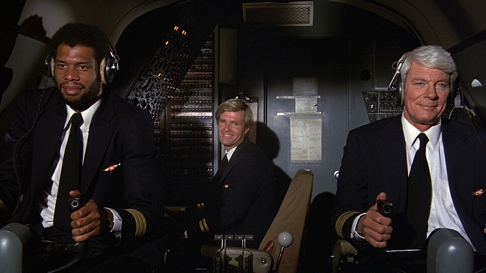
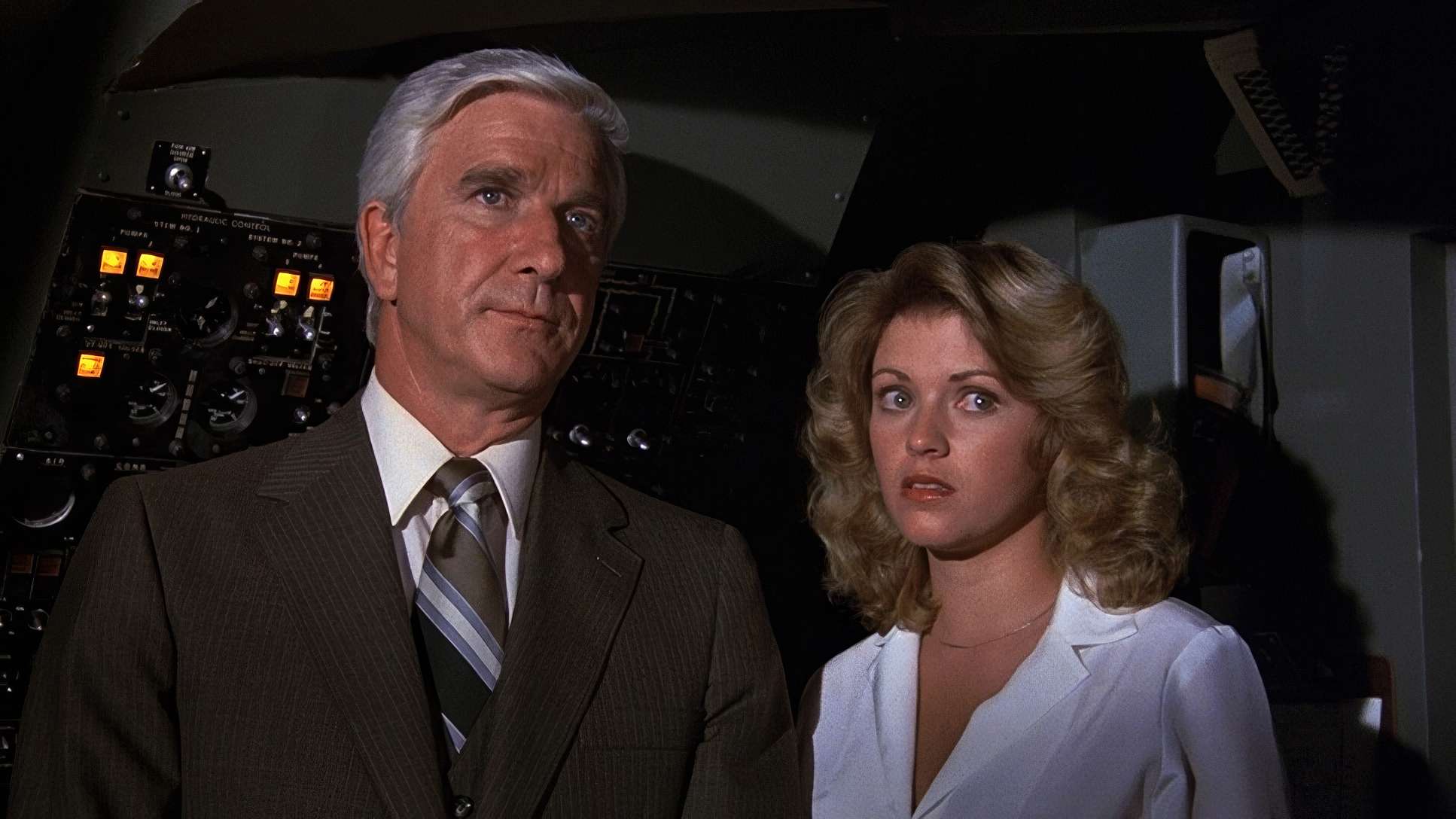
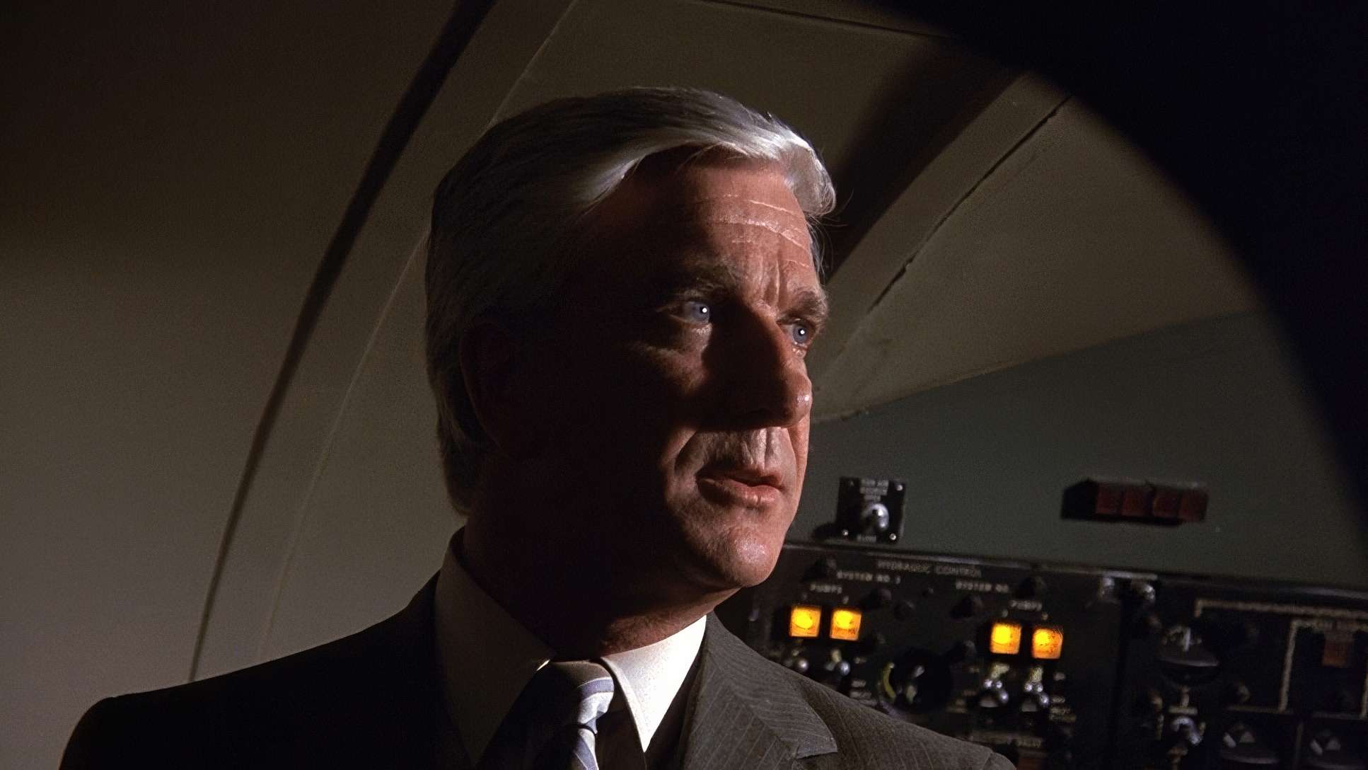
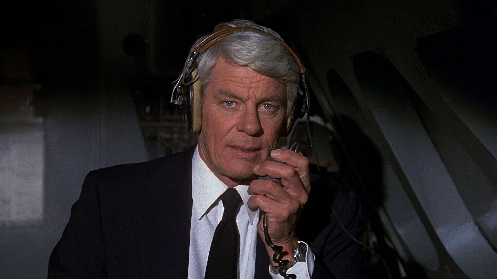
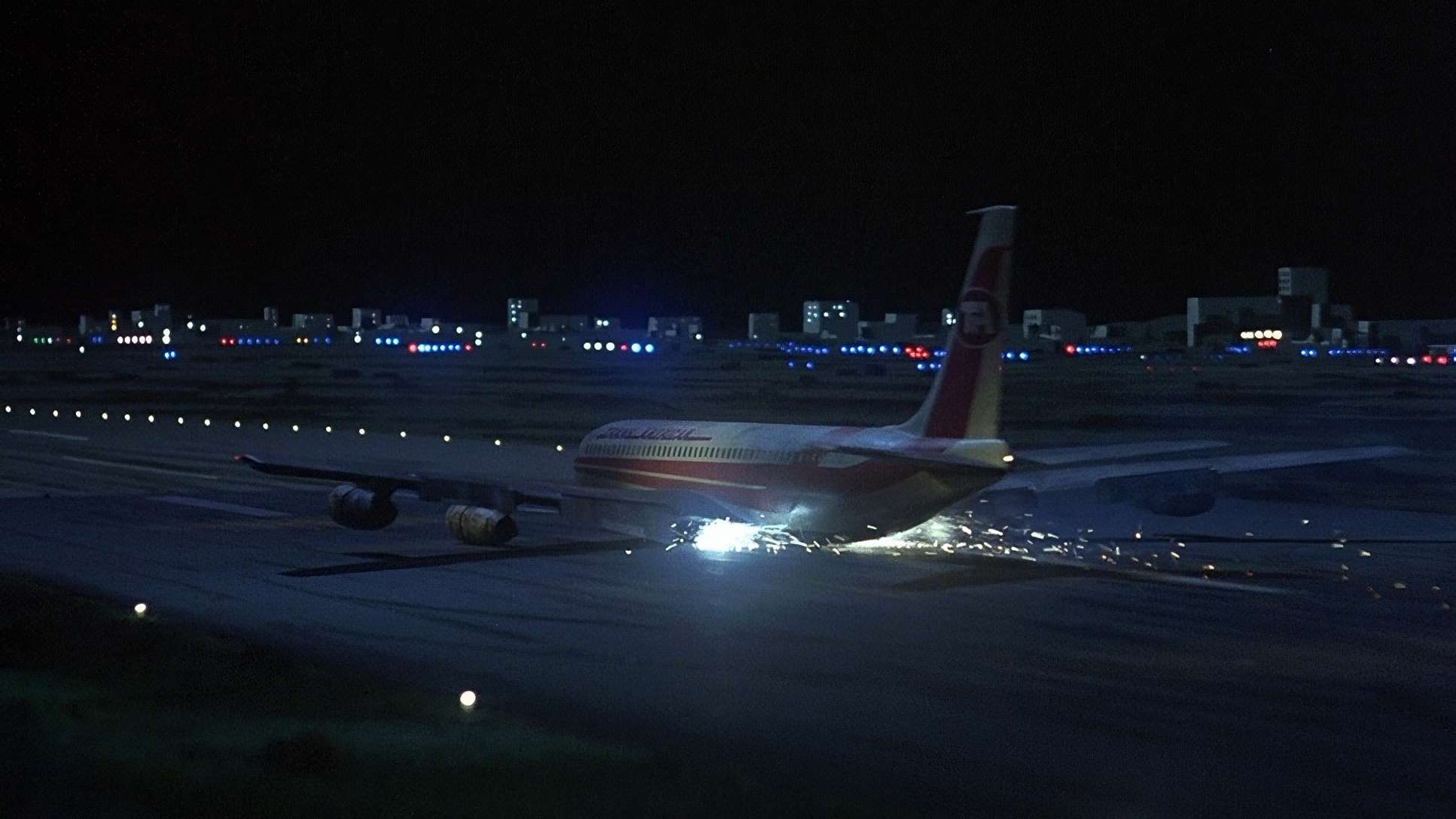
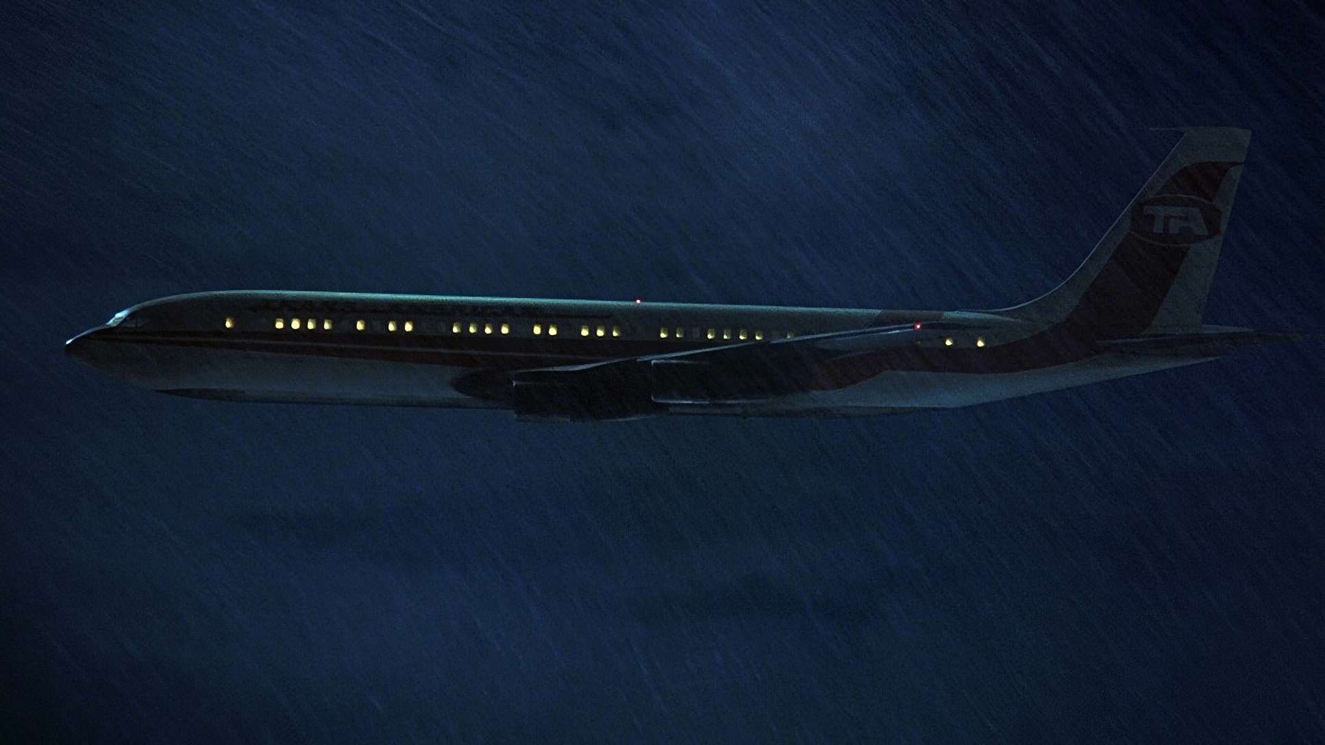
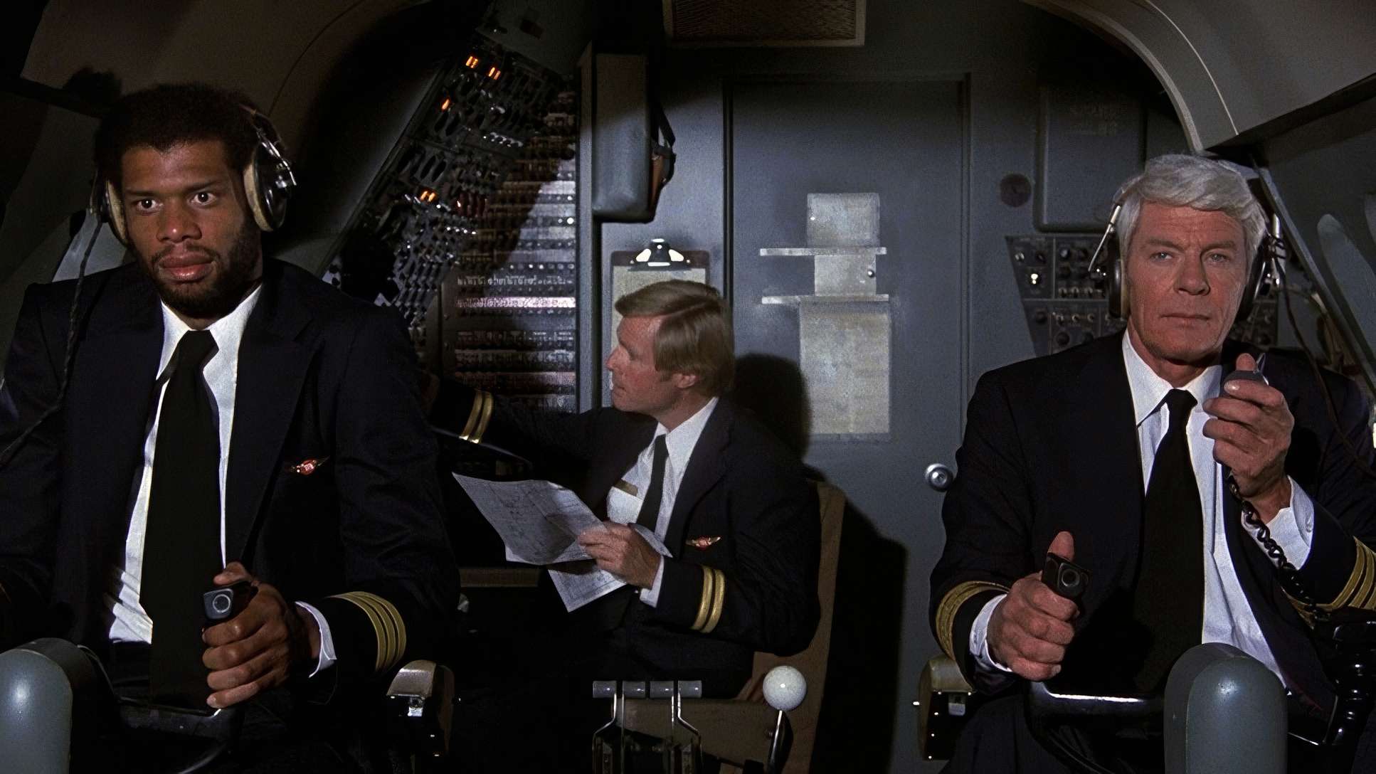
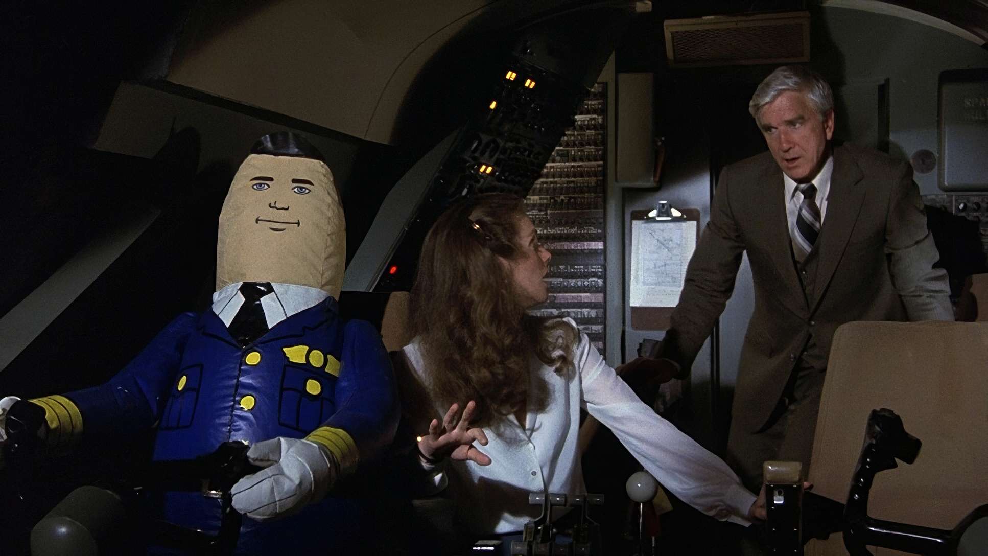
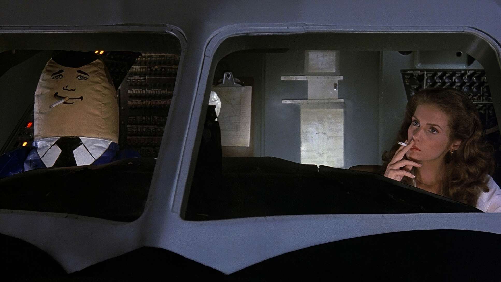
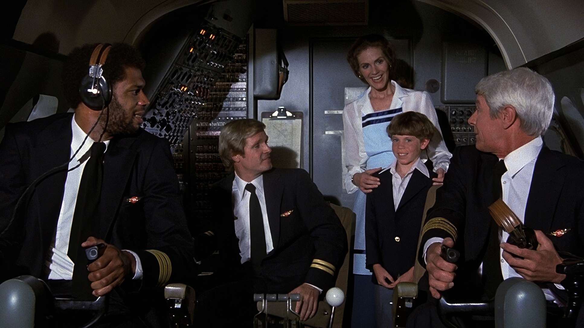
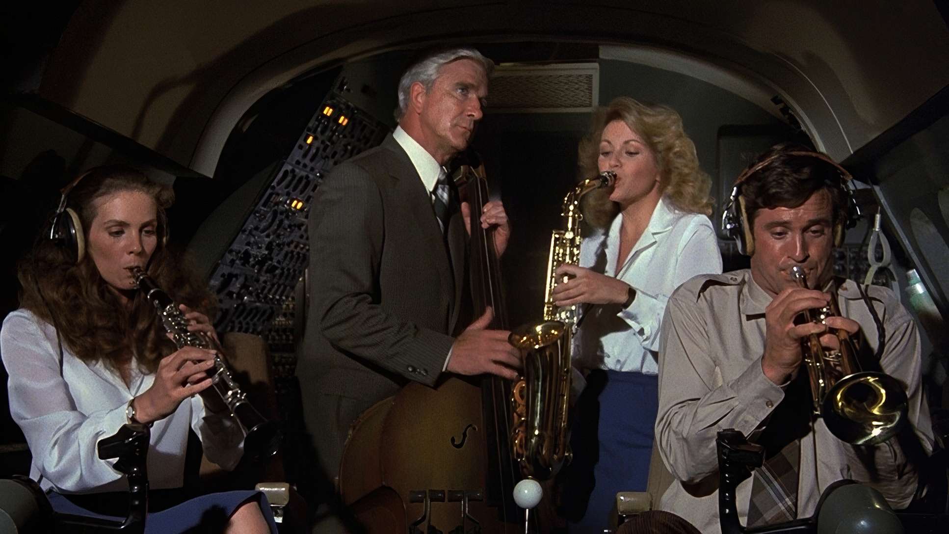
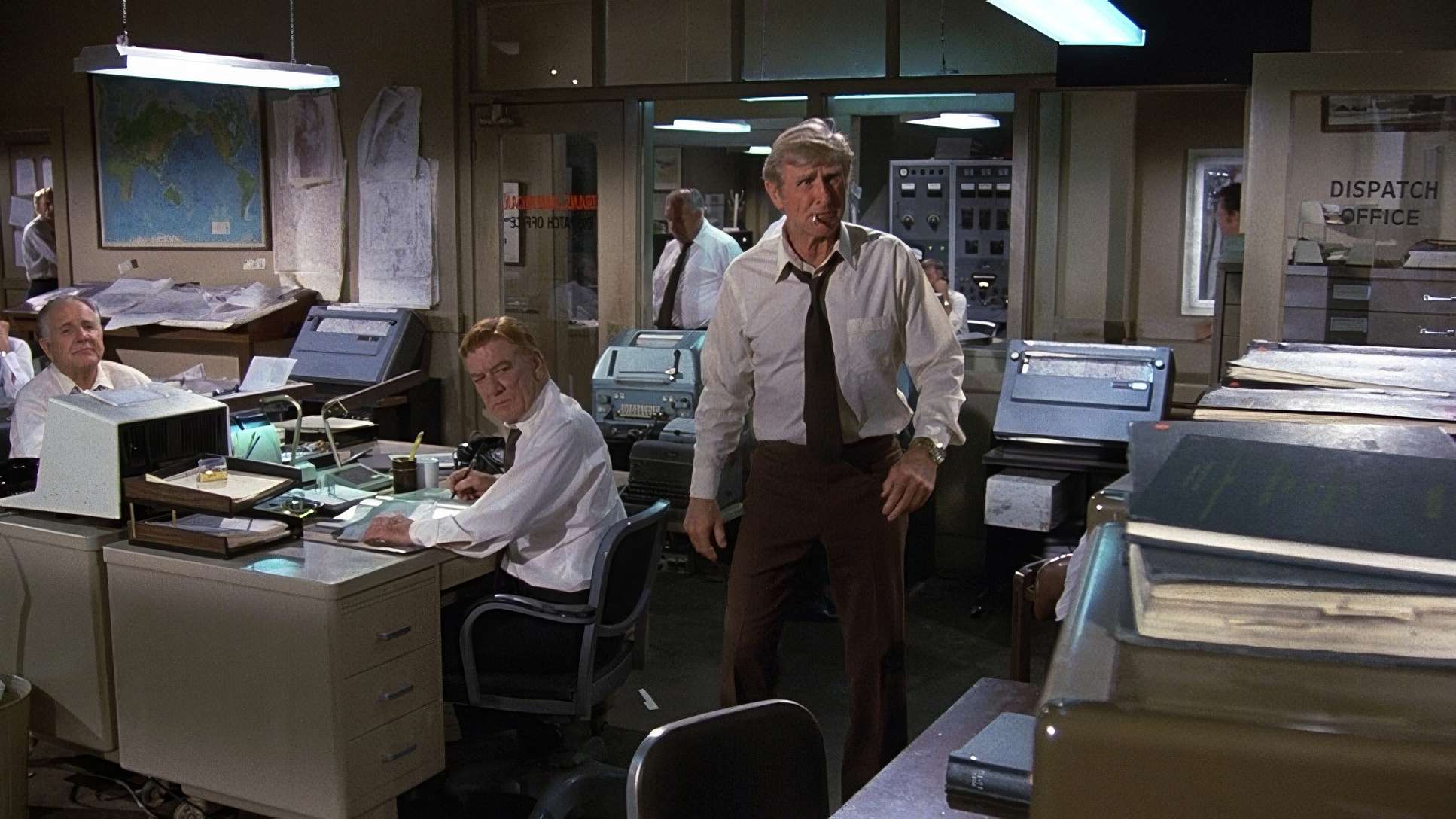
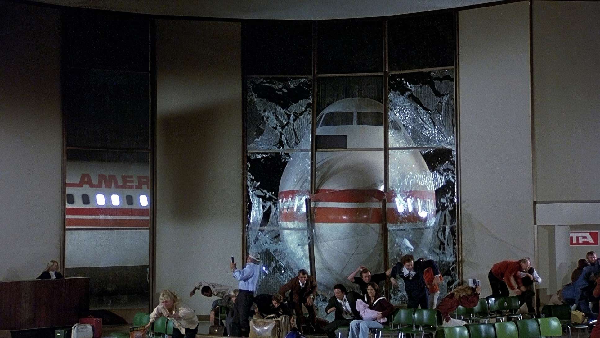
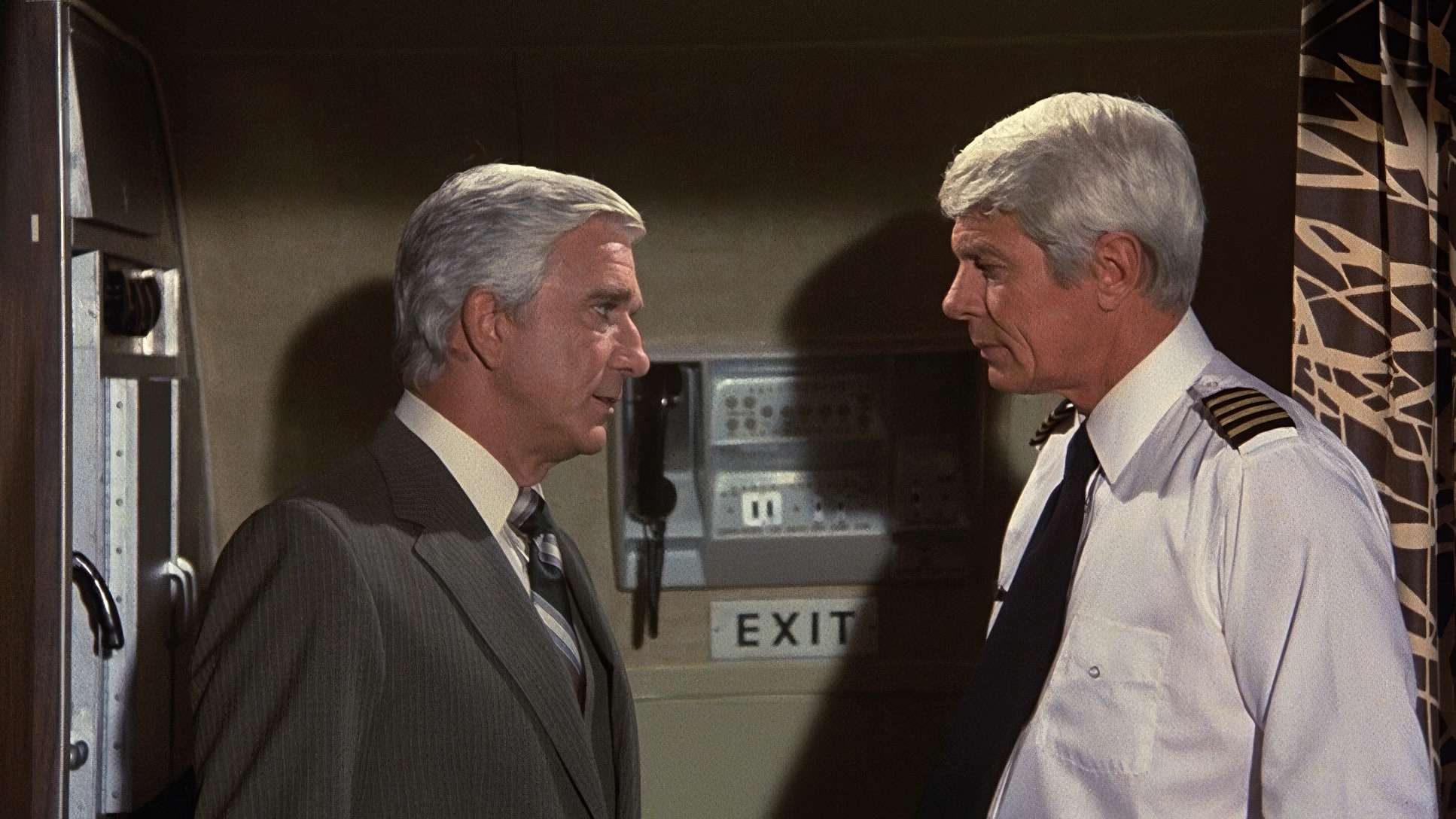
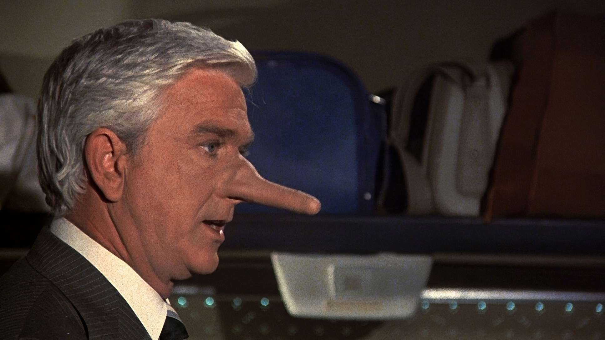
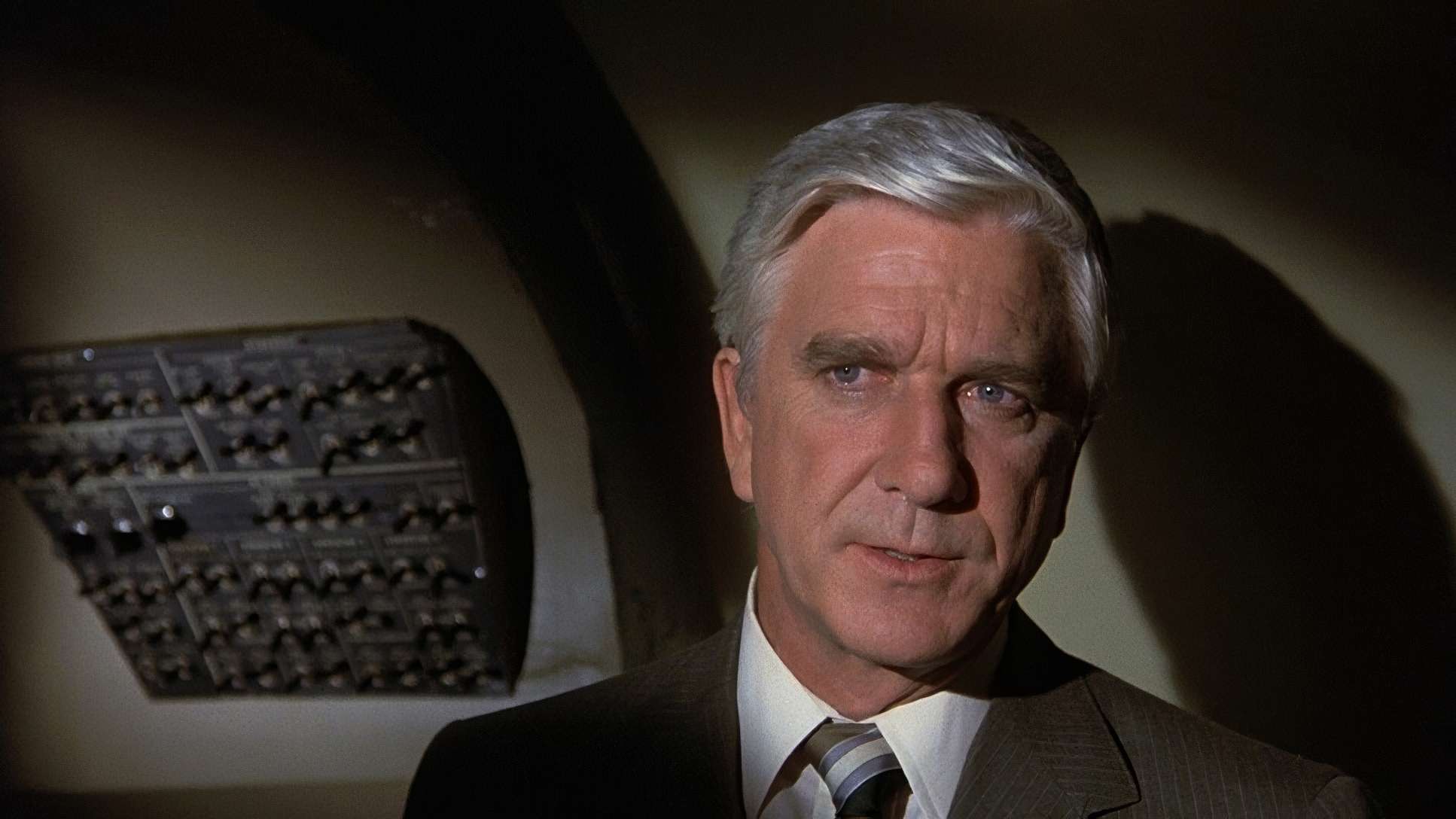
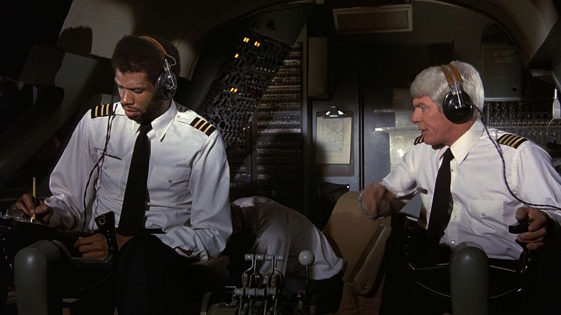
Biroc used motivated lighting throughout. Every source feels real, from the utilitarian fluorescents of the control tower to the harsh sun cutting through the cockpit windows. He didn’t shy away from high contrast. Look at the scenes with Leslie Nielsen or Robert Stack their faces are sculpted with hard light and deep shadows, emphasizing their grim determination. As a colorist, I love the density in these frames. By lighting the actors like they’re in a Melville thriller, the absurdity of their dialogue becomes ten times funnier. If the lighting had been “cheery,” the deadpan wouldn’t have landed. The serious lighting acts as a dramatic backdrop, making the jokes feel startlingly out of place.
Inspiration Behind the Cinematography
The DNA of this film is Zero Hour! (1957). It’s not just an inspiration; it’s a forensic reconstruction. If you watch them side-by-side, the shot-for-shot recreation of camera angles and character placements is uncanny.
ZAZ realized that humor lands harder if the audience feels they’re watching a tense drama right until the rug is pulled out. Biroc achieved this by leaning into the visual language of the 1950s. We see classic, centered framing that feels intentional and formal. He used low-angle shots to emphasize power and high-angles for vulnerability, just as you’d find in a serious thriller. The goal wasn’t “good” cinematography in the traditional sense, but “serious” cinematography. It’s an inverse form of storytelling: the visuals scream “danger” while the actions whisper “absurdity.”
Color Grading Approach
When I look at Airplane! through a colorist’s lens, I see a fascinating study in translation. Since ZAZ originally wanted Black and White, the color grade had to maintain that spirit of dramatic weight.
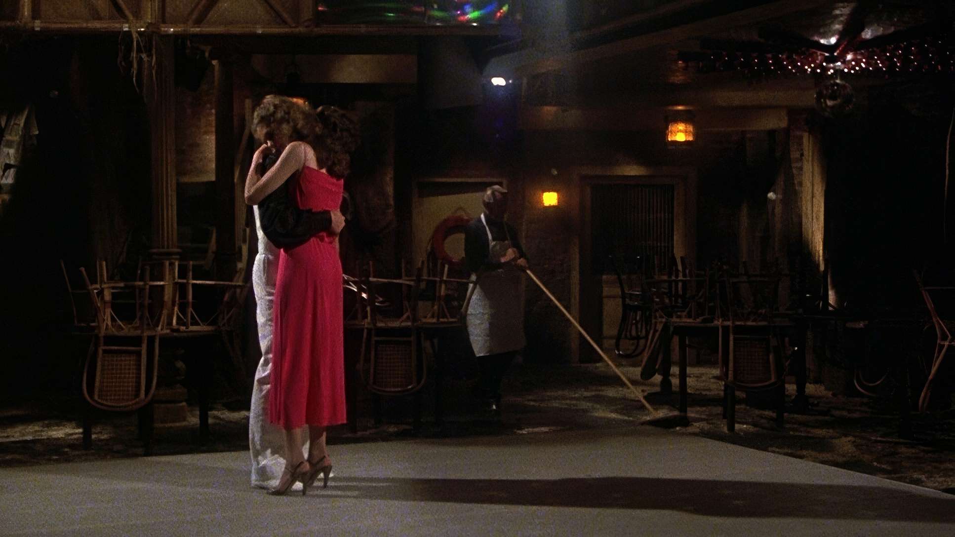
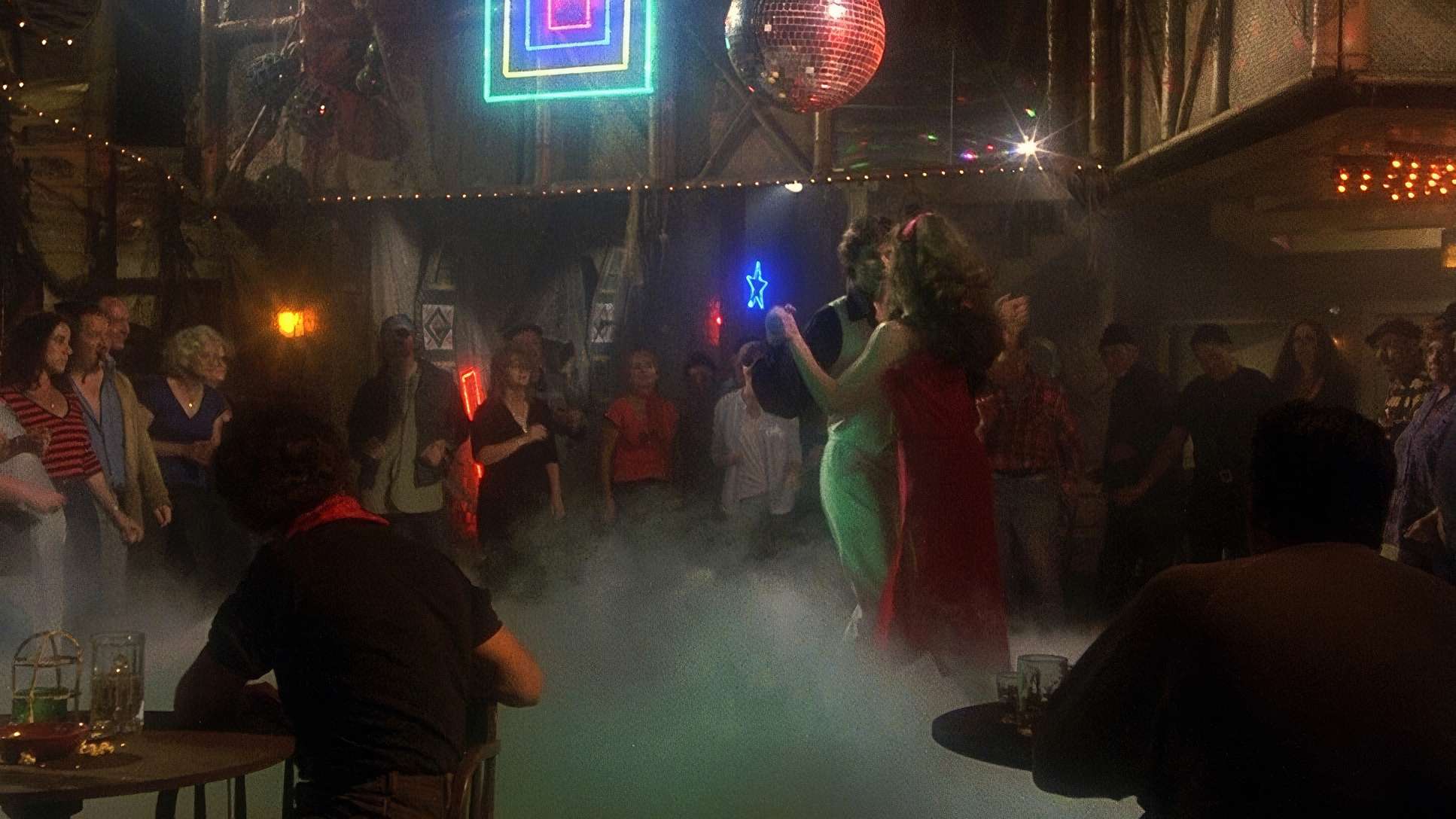
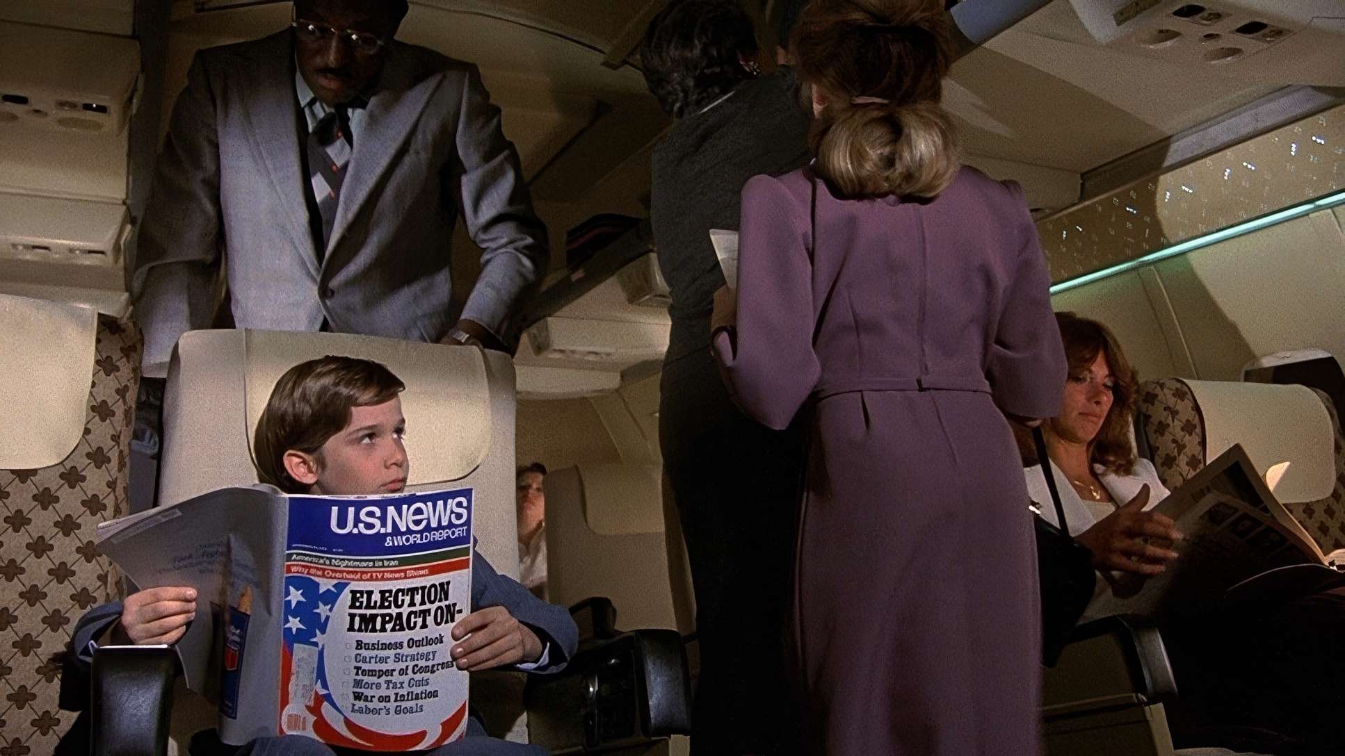
The film sports a naturalistic, slightly desaturated palette. We aren’t seeing the vibrant, popping saturation of a modern “studio comedy.” Instead, the browns, beiges, and cool blues of the aircraft interior are kept quite neutral. This grounds the film in a believable, almost clinical 1970s aesthetic. I’m particularly drawn to the highlight roll-off in this film. Shooting on 1980-era film stock meant the transition from bright skies to shadows was organic and soft nothing like the harsh digital clipping we see today. That gentle curve into the whites gives the film a dimensional, cinematic quality that makes the “serious” facade even more convincing. The colors never give away the joke.
Compositional Choices
Biroc’s compositions are a masterclass in genre homage. He used the classical, balanced framing typical of 70s disaster movies, avoiding any “flashy” stylistic flourishes that might betray the film’s intent.
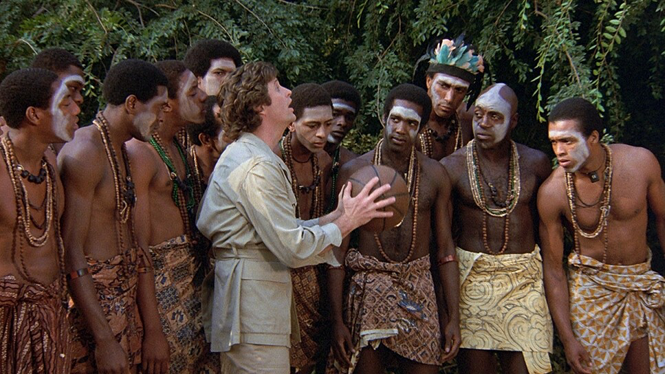
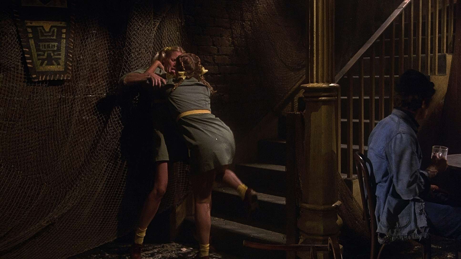
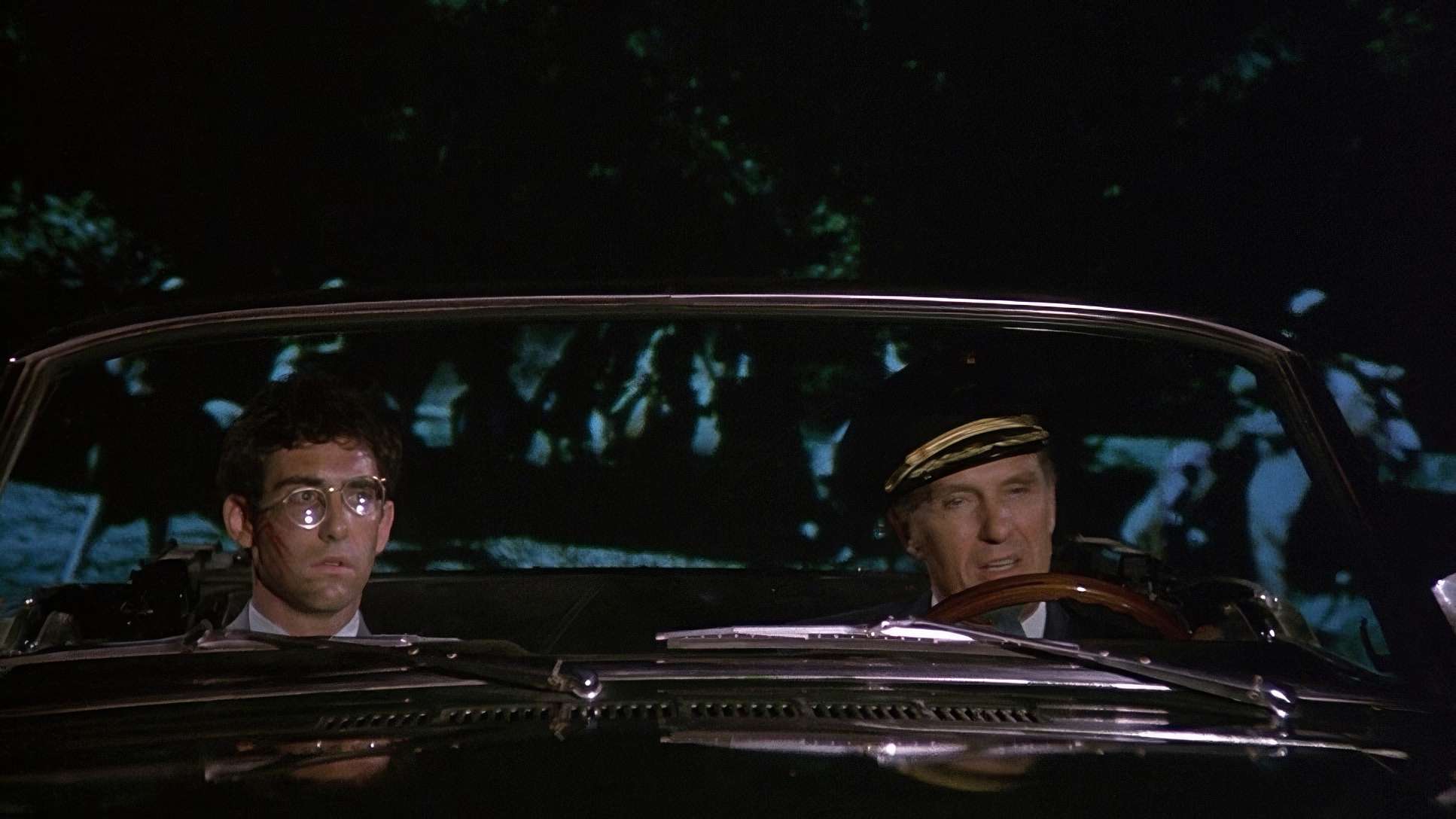
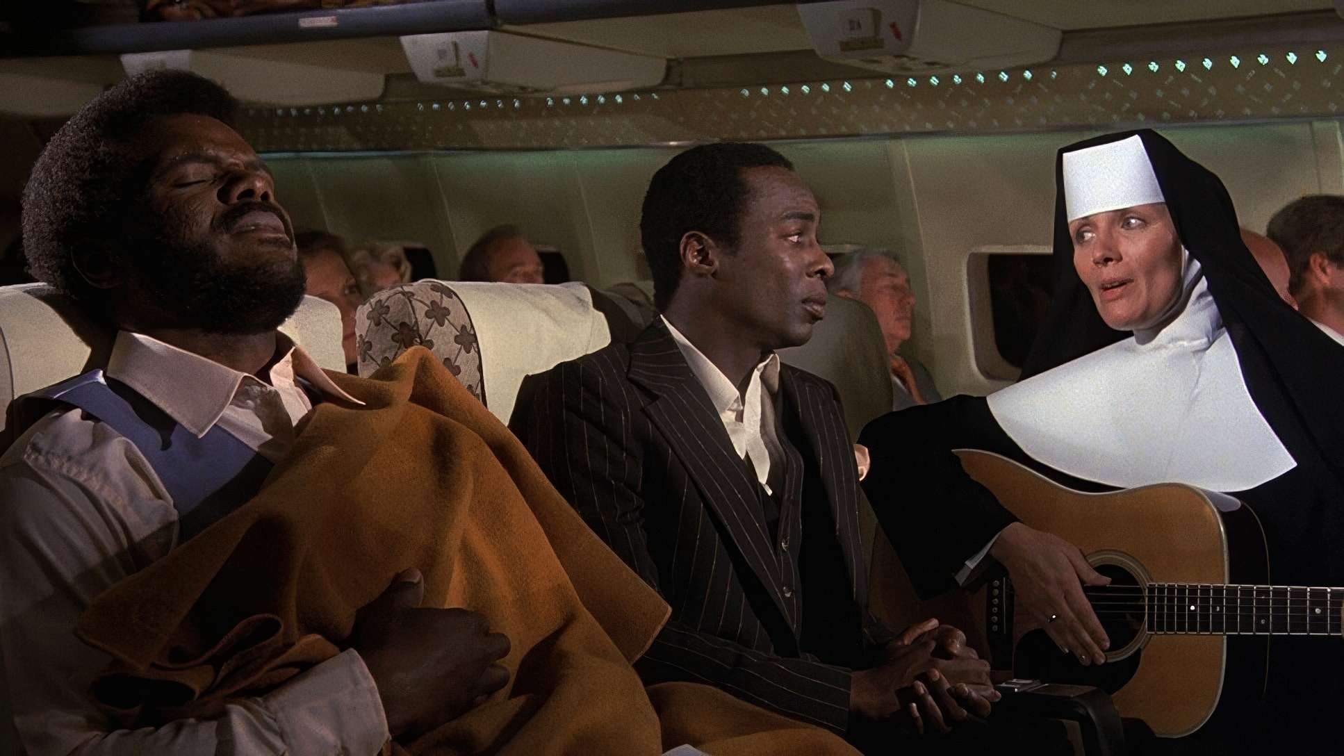
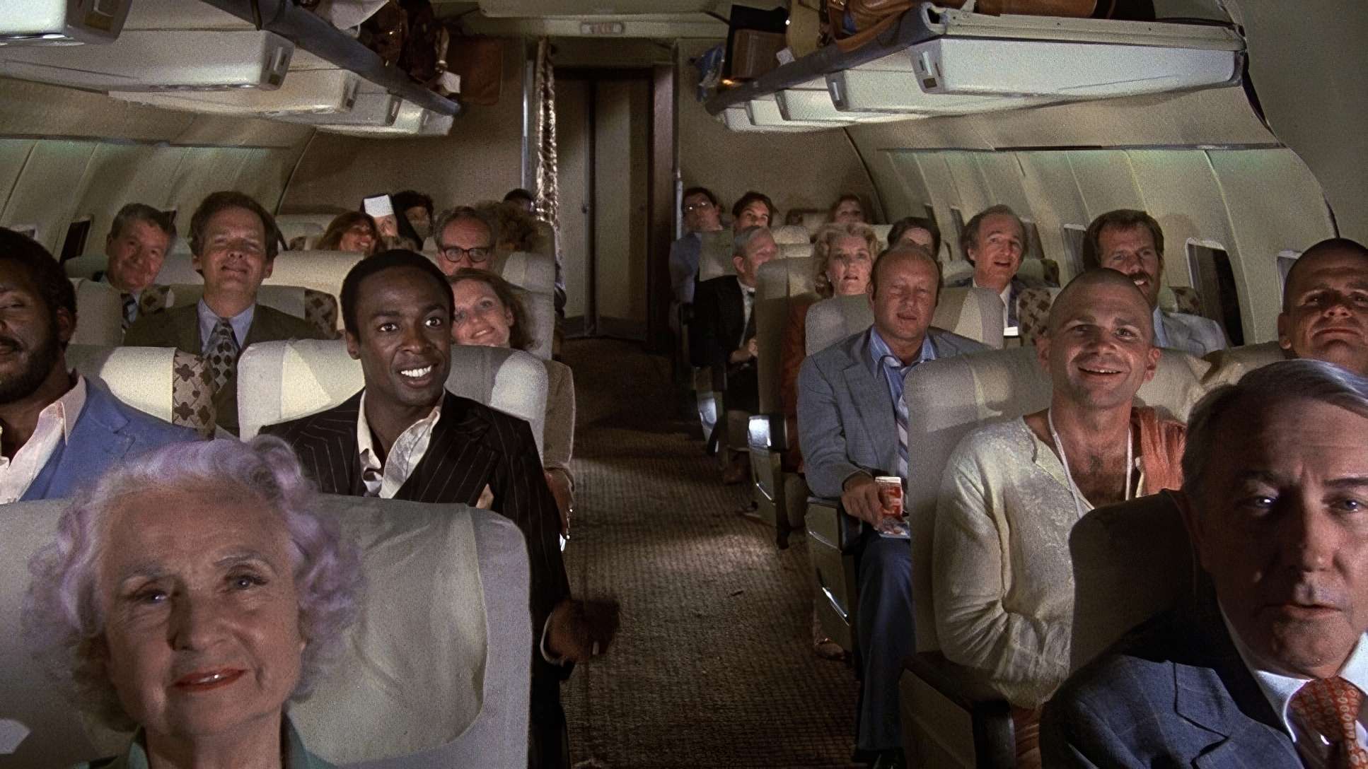
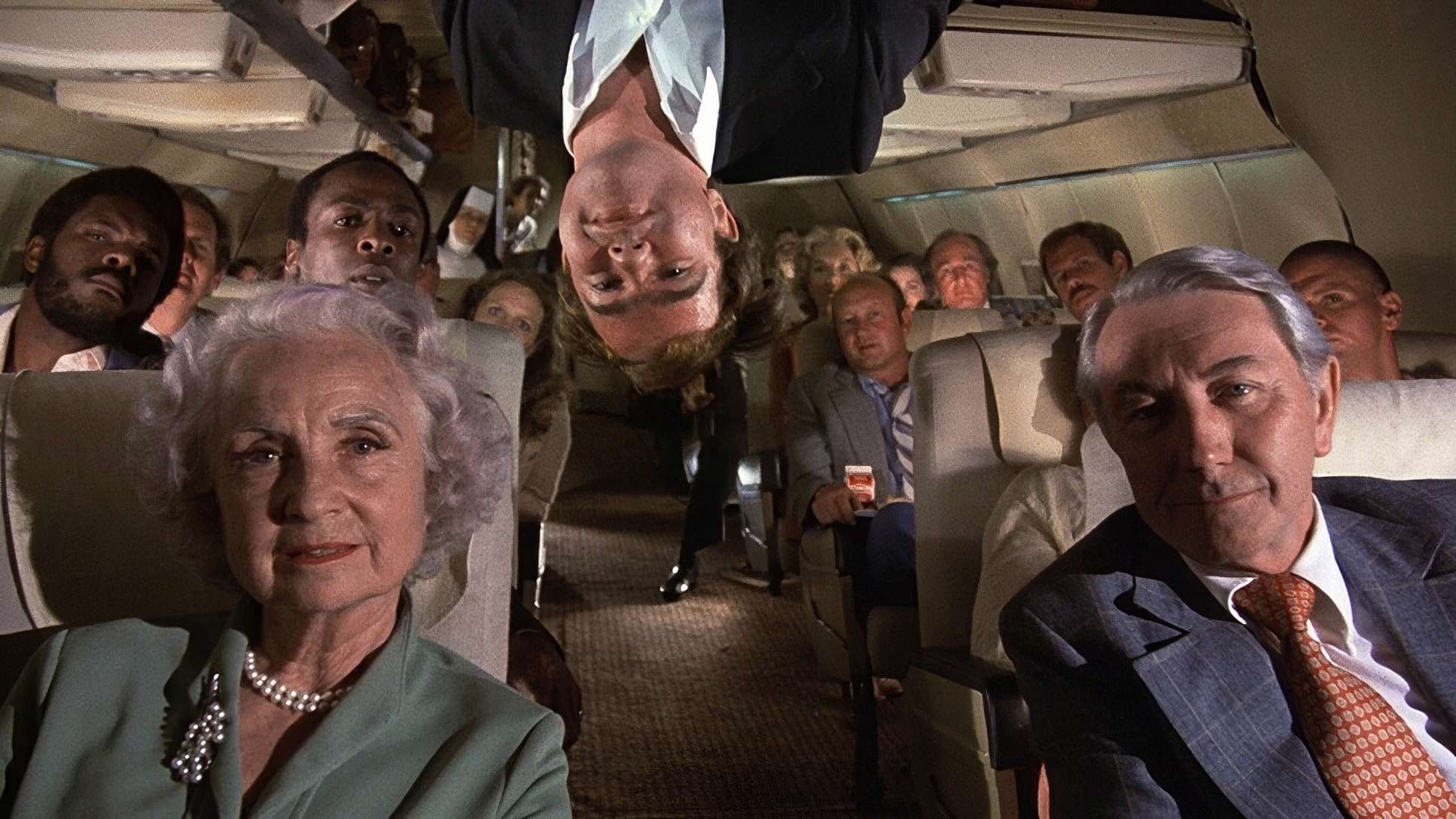
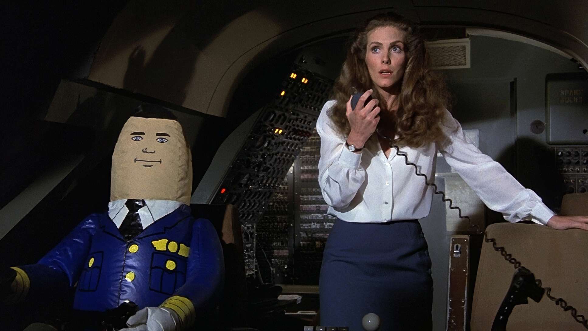
The depth cues are particularly impressive. Biroc layered the foreground, mid-ground, and background elements within the cramped cabin to create a sense of realism. This believable world makes the “I speak jive” sequence even more hilarious because the environment feels so grounded. There’s a formal symmetry to the shots that suggests order, even as the script descends into anarchy. Characters adhere to strict eyelines and headroom conventions; the camera never breaks the fourth wall. It invites us to take the scenario seriously, which is exactly why the punchlines hit with such force. It’s like dressing a clown in a tuxedo to deliver Shakespeare.
Camera Movements
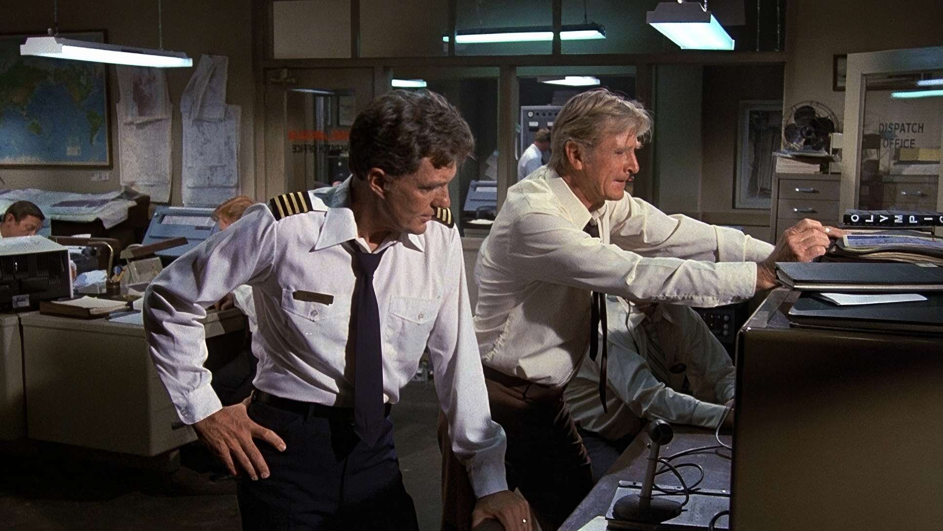
In Airplane!, the camera is an impartial observer. You won’t find any gratuitous swoops or frantic handheld work. The movements are judicious, methodical, and restrained.
Most shots are static, allowing the actors’ deadpan timing to breathe. When the camera does move, it’s usually a slow, deliberate pan perhaps following a character through the cockpit or a subtle dolly push-in during a moment of “tension.” For example, when the camera slowly dollies into a character’s face as they deliver an absurd line, the movement treats the moment with a gravitas it hasn’t earned. That’s the secret. The steady, composed frame allows the performances to shine. If the camera had been shaking or “funny,” it would have diluted the humor.
Lensing and Blocking
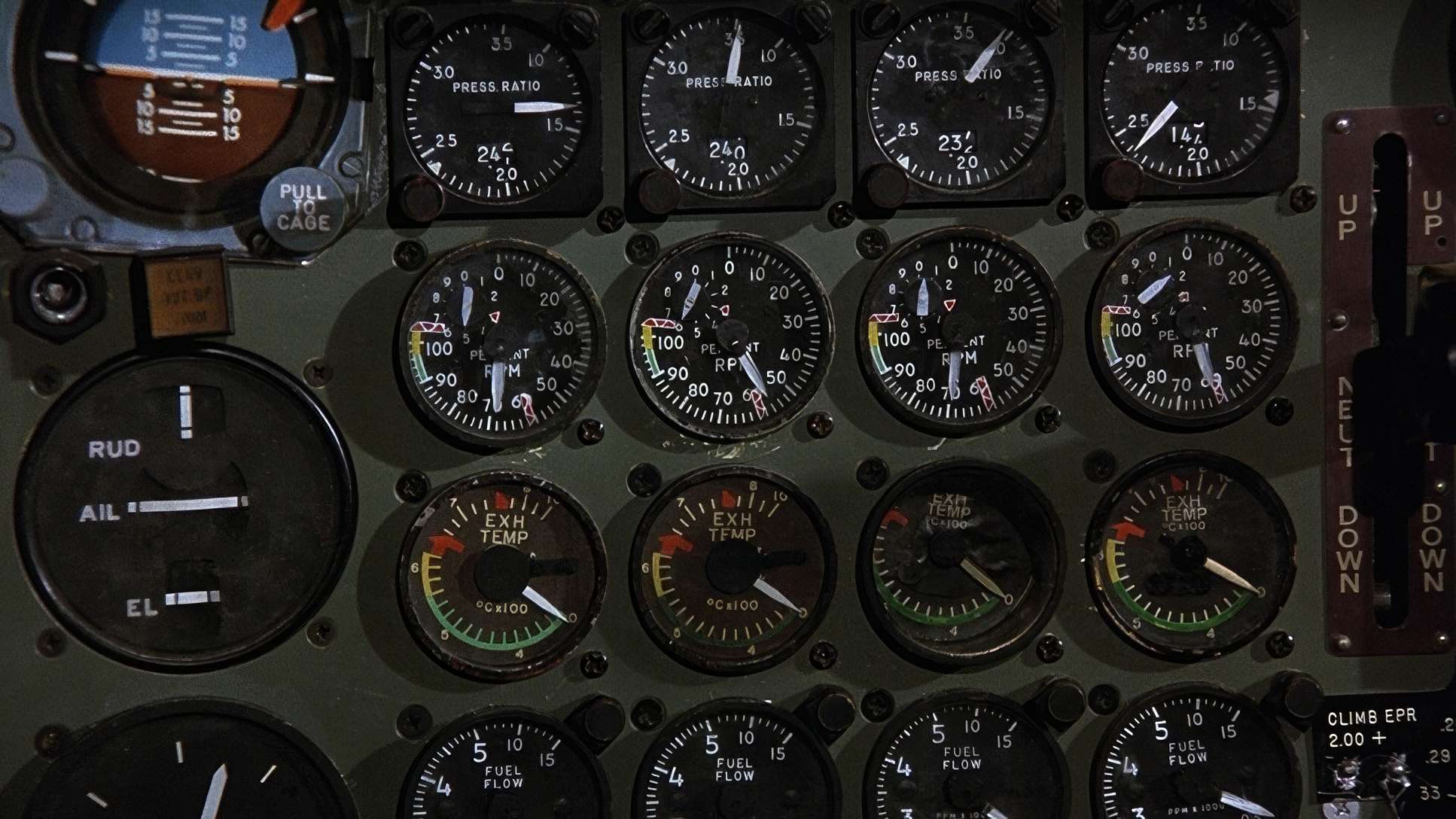
The lensing strategy was all about clarity and adherence to genre. Biroc opted for standard prime lenses, likely ranging from 35mm to 85mm. He avoided wide-angle distortions that might make the film feel “wacky.”
By sticking to classic focal lengths, the film maintains a natural perspective that mirrors Zero Hour! perfectly. The blocking is equally purposeful. Characters are positioned to convey urgency or exasperation, often in clean two-shots or over-the-shoulder setups. In the cabin, the blocking is so precise that sight gags like the religious zealots unfold naturally within the frame without the camera needing to “hunt” for them. The camera simply trusts the actors to carry the humor through their deadpan commitment.
Technical Aspects & Tools
AIRPLANE! (1980) – 35mm / 1.85:1 / Panavision
| Genre | Comedy, Parody, Slapstick |
| Director | Jerry Zucker, Jim Abrahams, David Zucker |
| Cinematographer | Joseph F. Biroc |
| Production Designer | Ward Preston |
| Costume Designer | Rosanna Norton |
| Editor | Patrick Kennedy |
| Time Period | 1970s |
| Color | Cool, Blue, White |
| Aspect Ratio | 1.85:1 – Spherical |
| Format | Film – 35mm |
| Lighting Type | Moonlight |
| Story Location | North America > USA |
| Filming Location | North America > USA |
| Camera | Panavision Panaflex |
| Lens | Panavision Lenses |
Shot in 1979 on a modest budget, the technical choices were firmly rooted in the era’s standard practices. It wasn’t about pushing boundaries; it was about using established tools to sell the illusion.
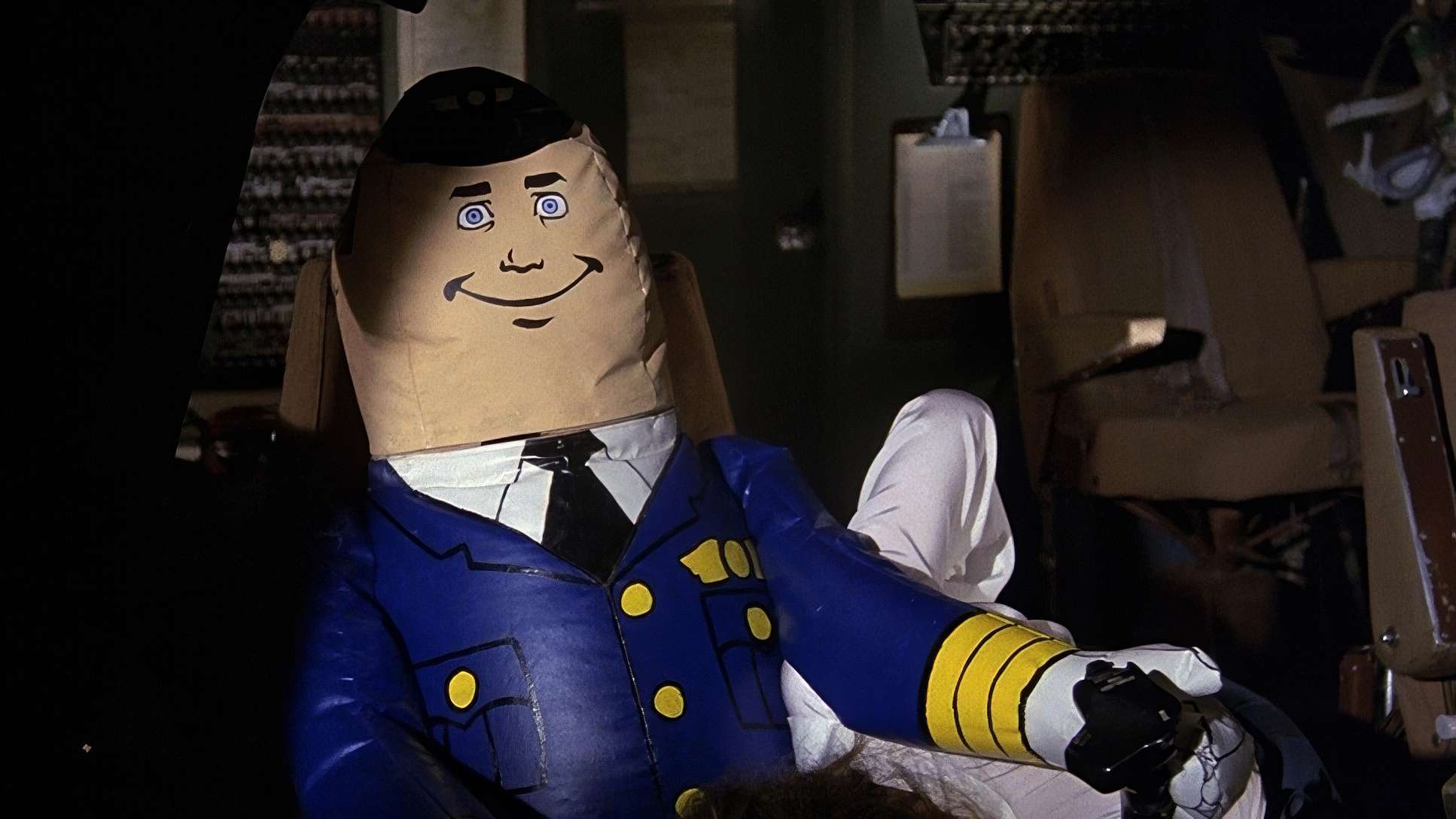
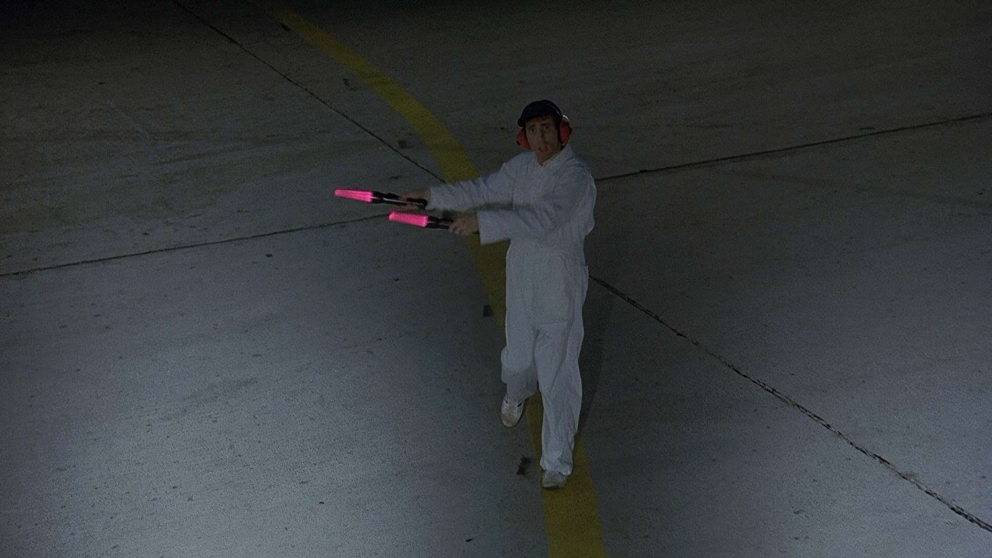
Airplane! was shot on 35mm film, likely using Kodak workhorses like Eastman 5247. This stock provided the fine grain and organic texture that screams “cinema.” They used Panavision Panaflex cameras the industry standard to ensure smooth, reliable operation for those controlled movements. Crucially, the film was framed for a 1.85:1 theatrical aspect ratio, keeping the visual information tight and focused. Even the special effects, which used a mix of miniatures and practical sets at LAX, were designed to blend in rather than stand out. Every tool was an accomplice in the comedic deception.
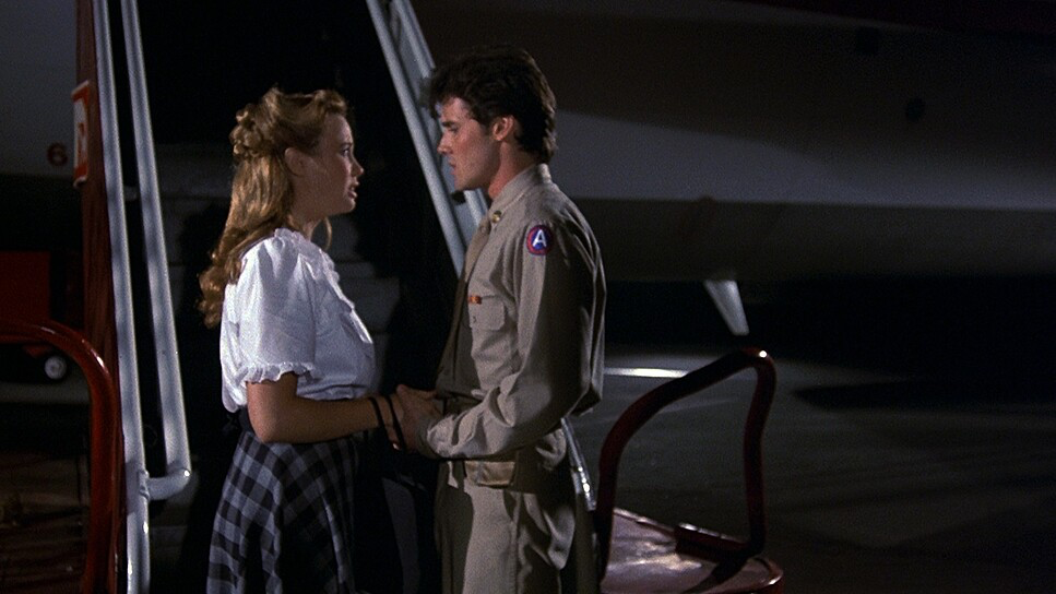
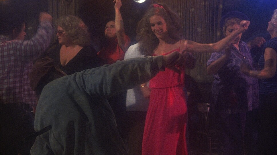
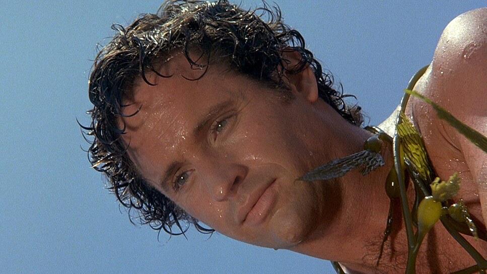
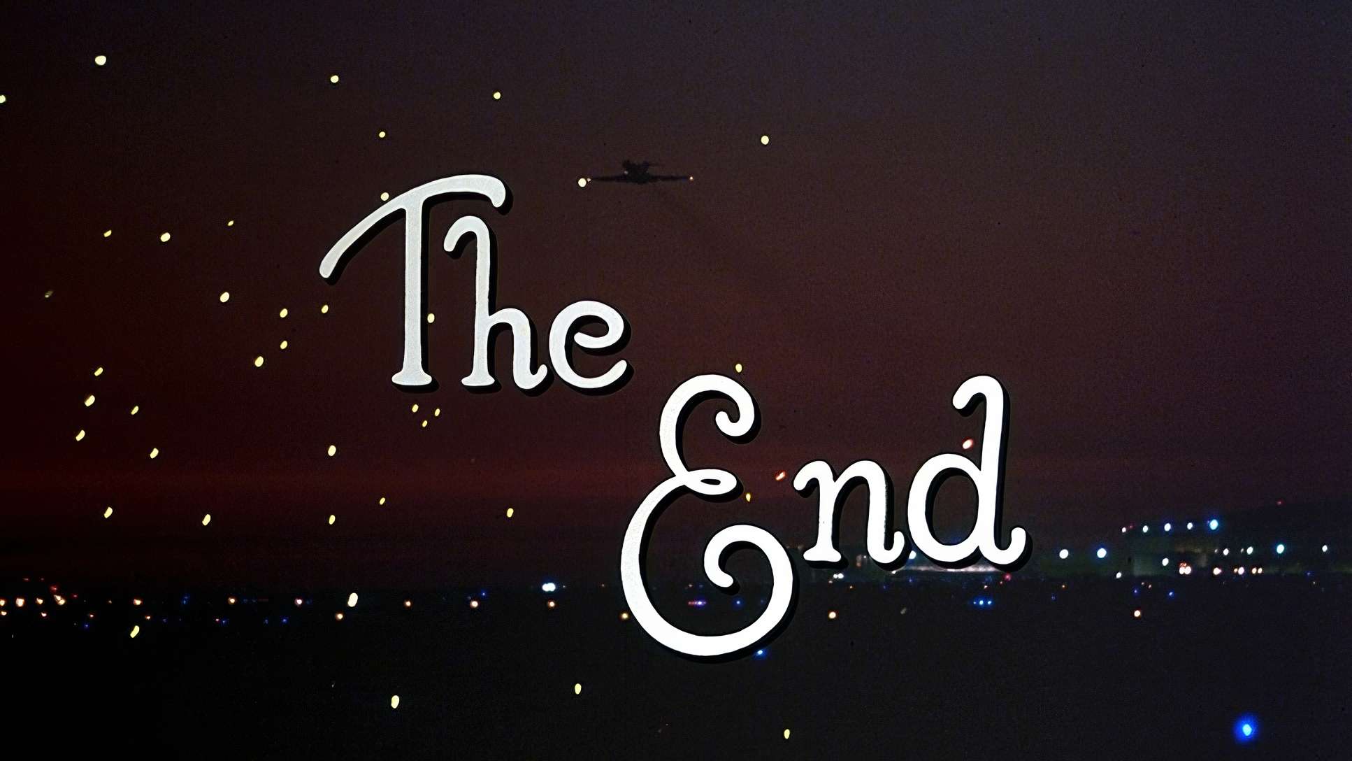
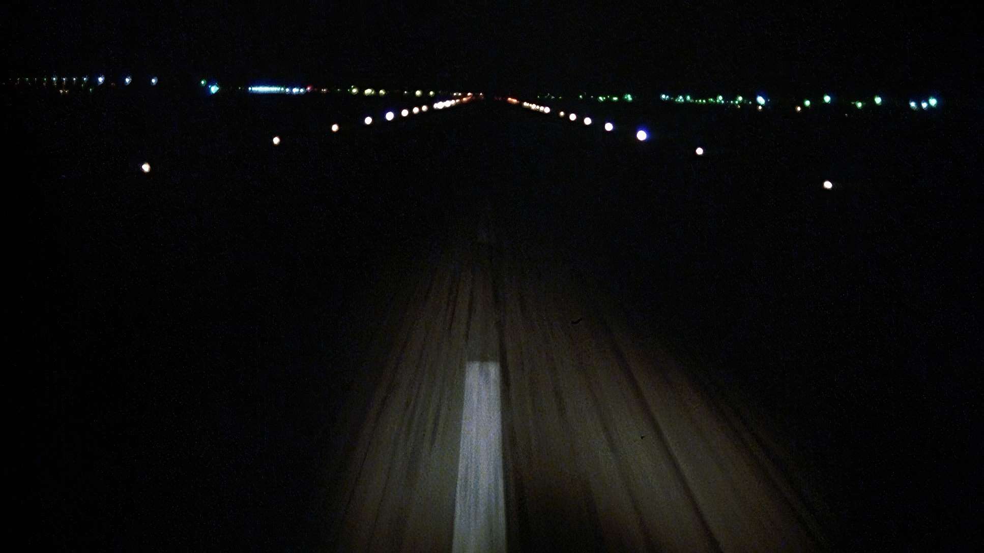
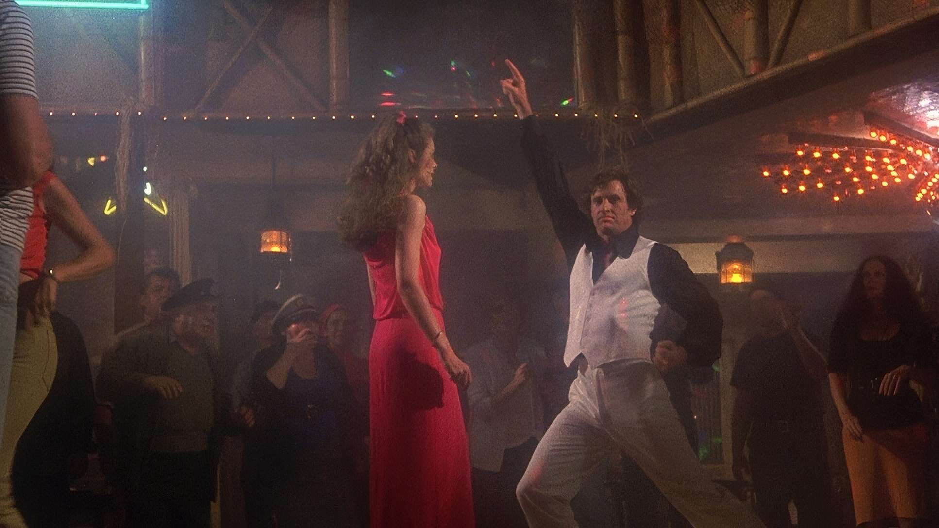
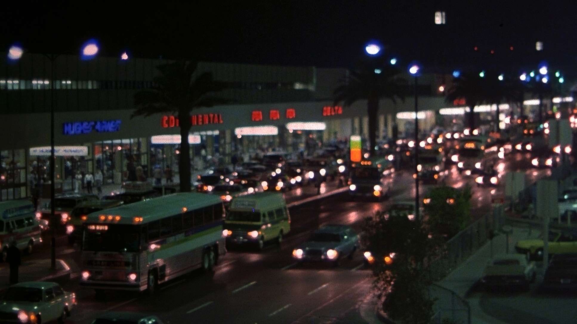
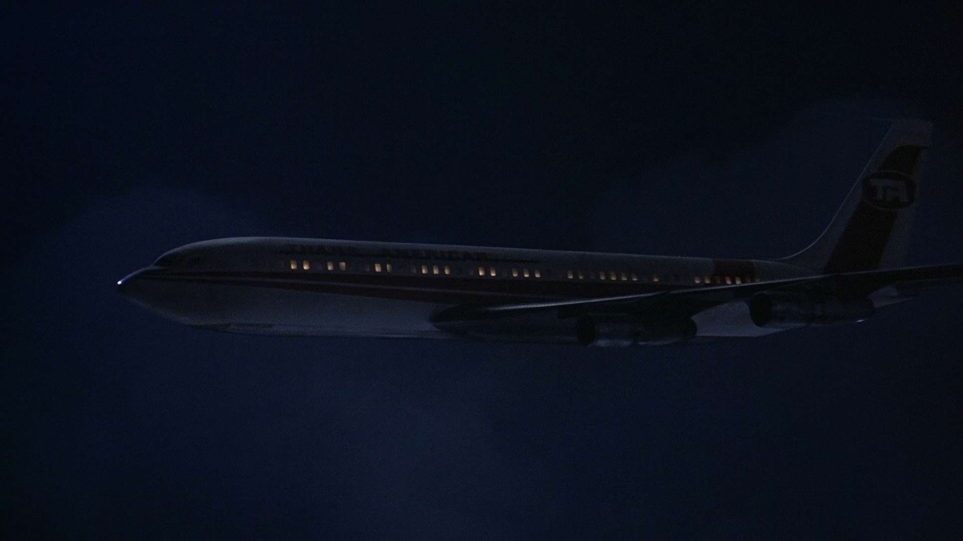
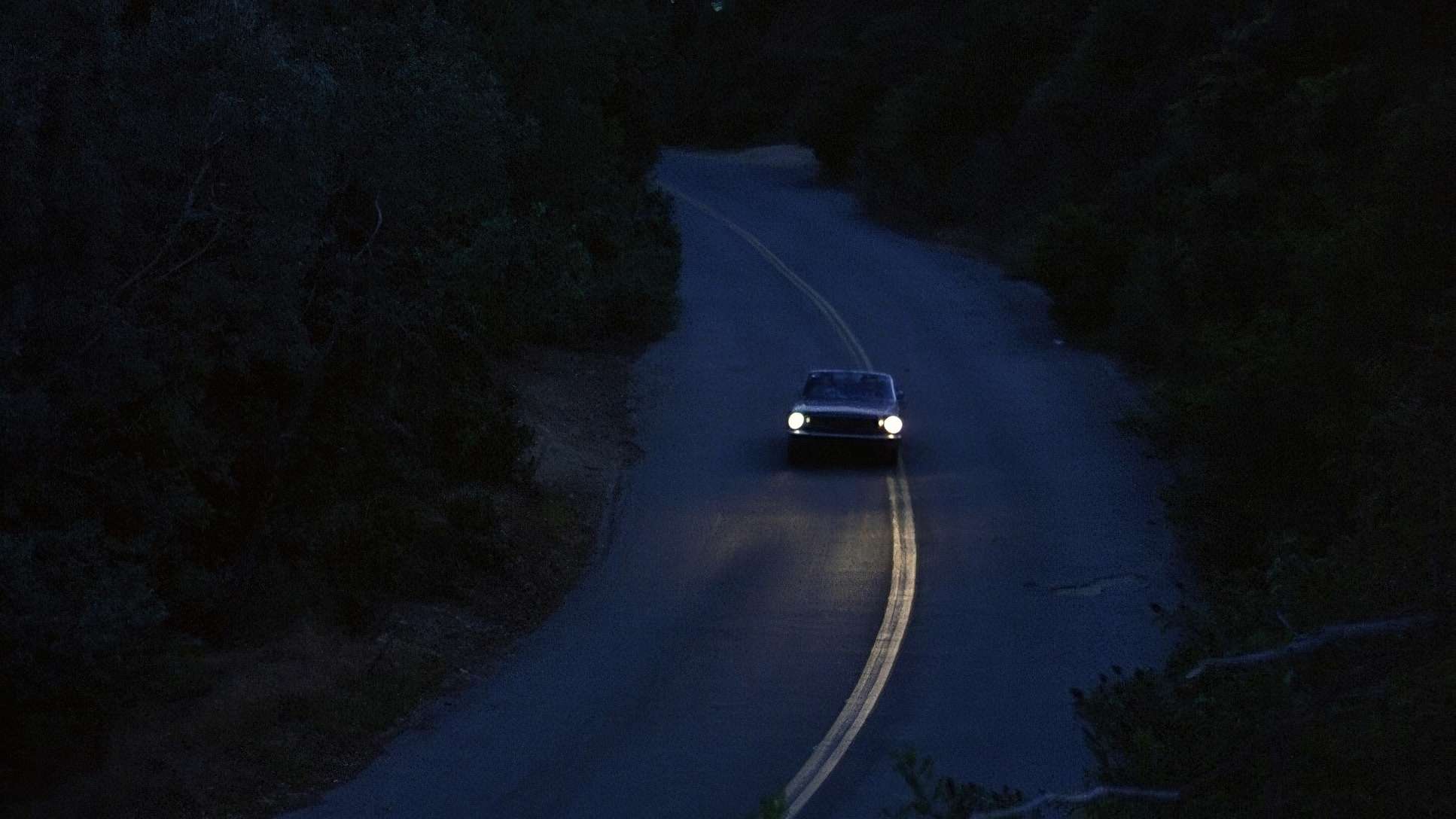
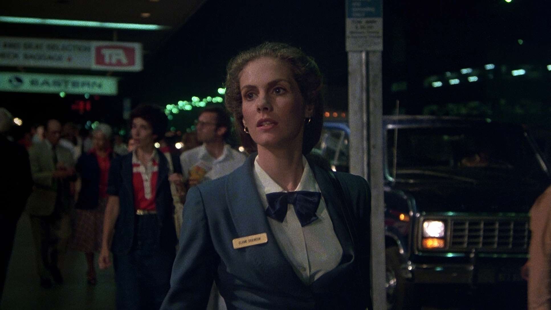
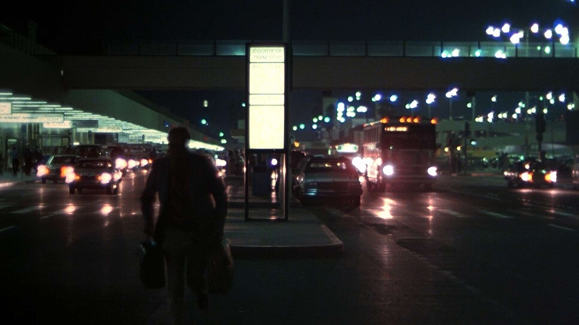
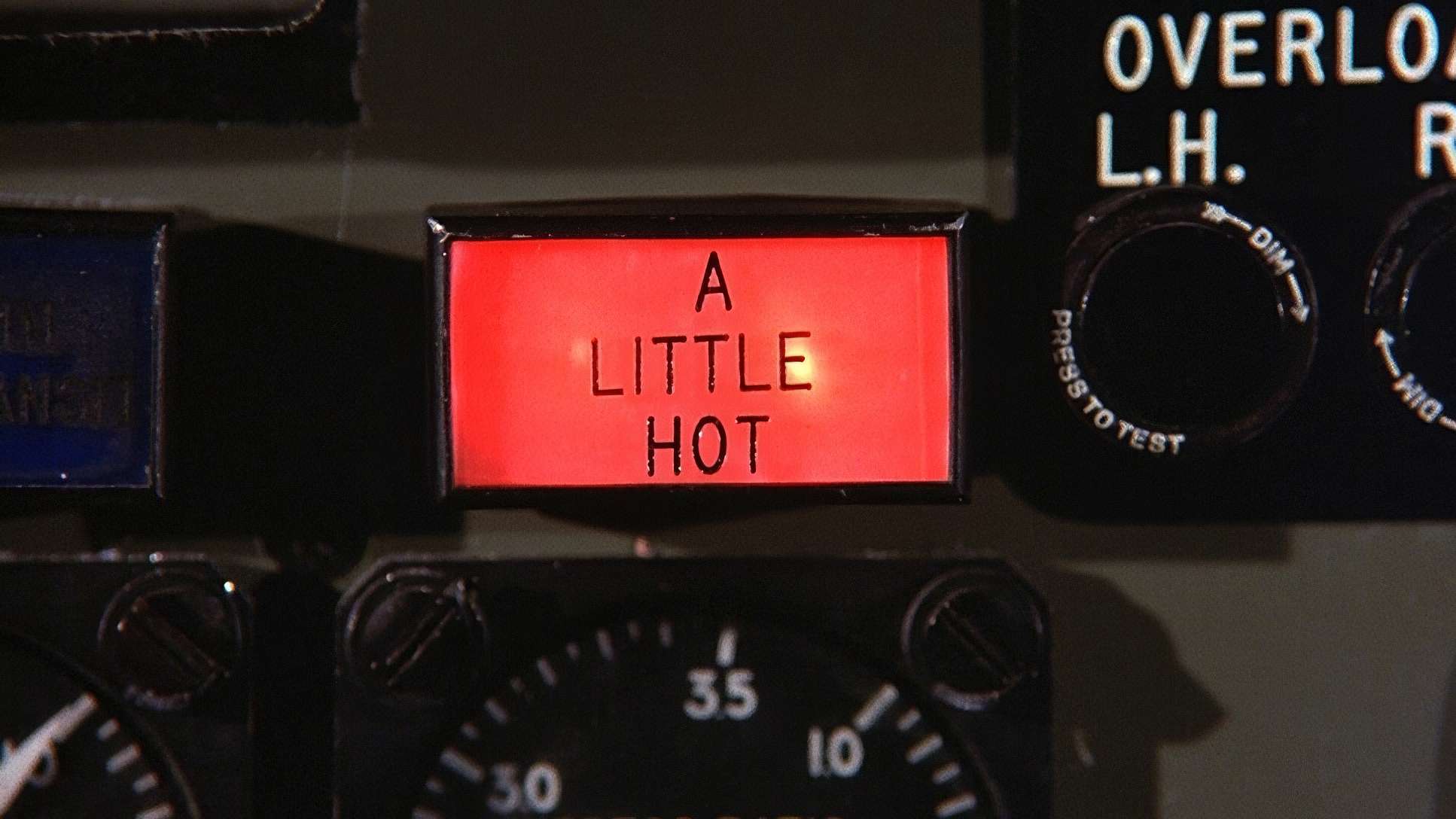
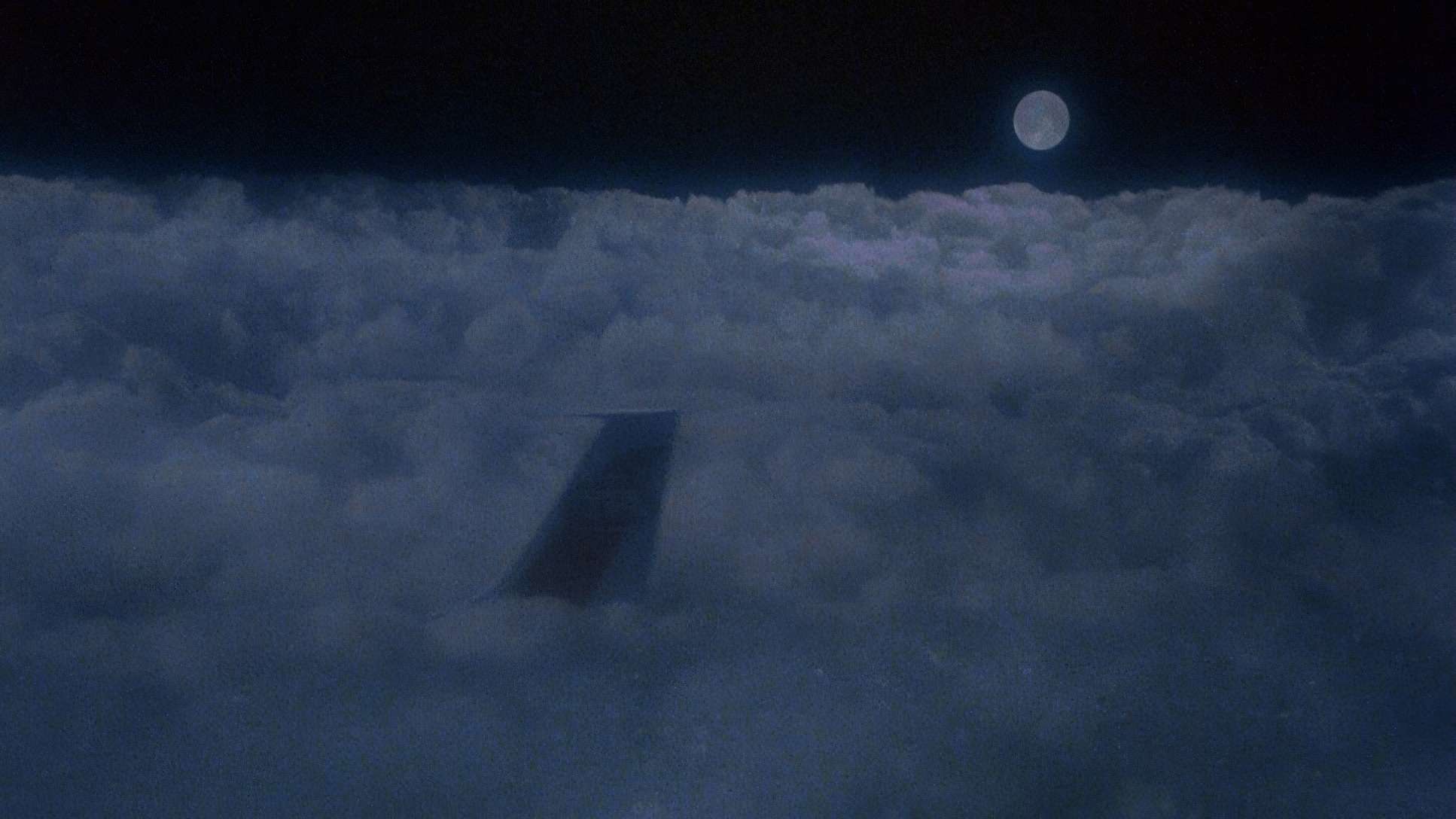
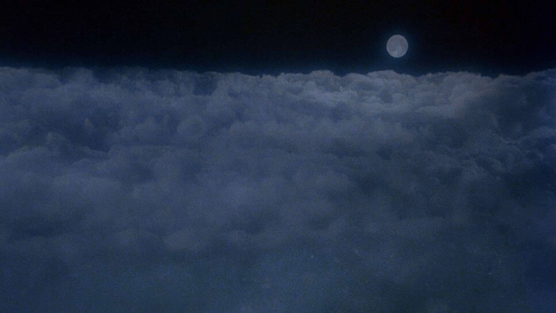
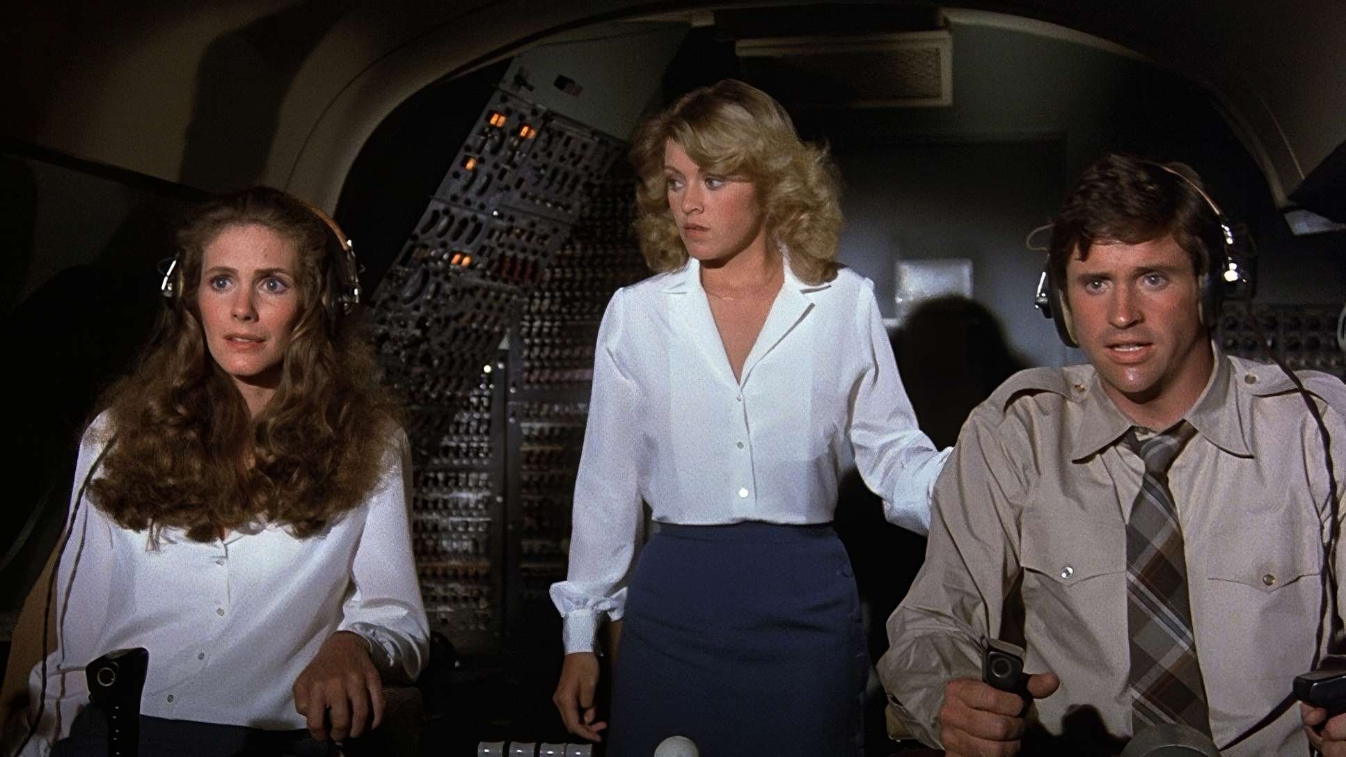
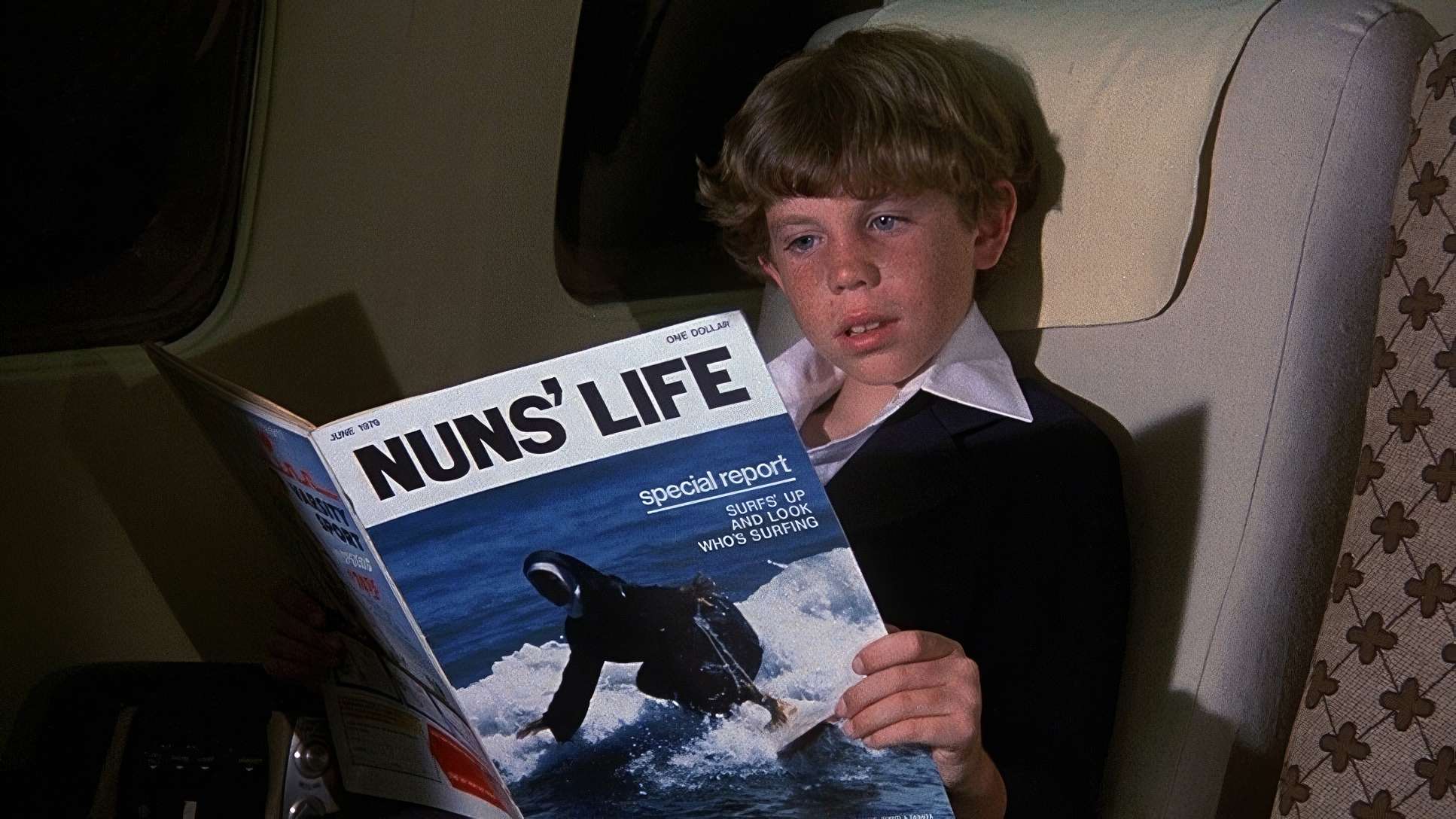
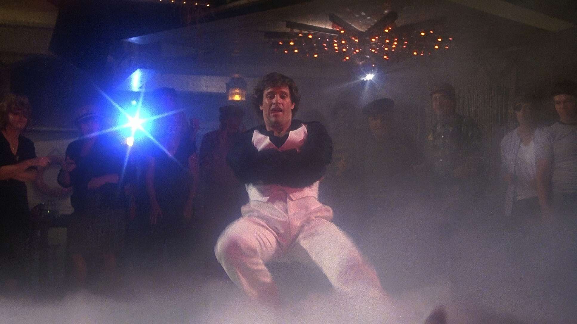
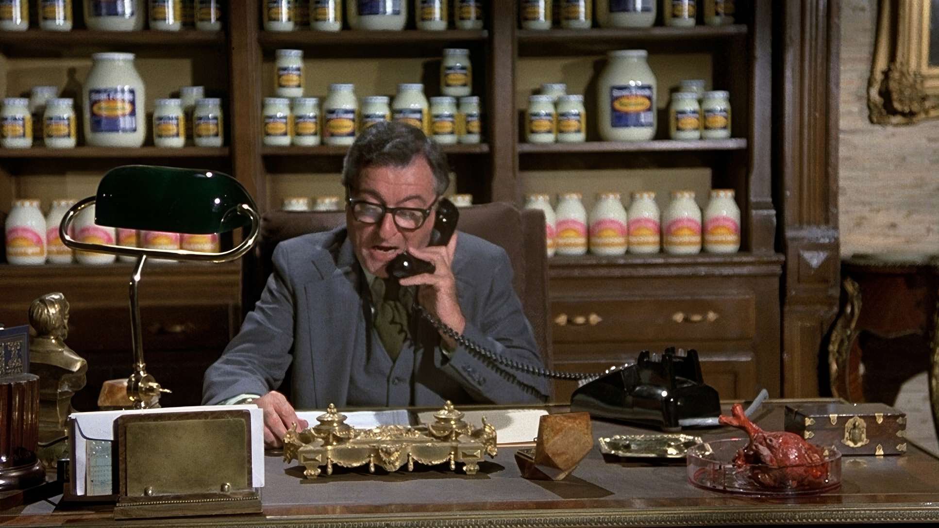
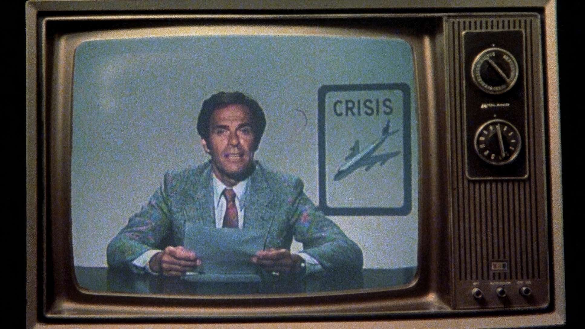
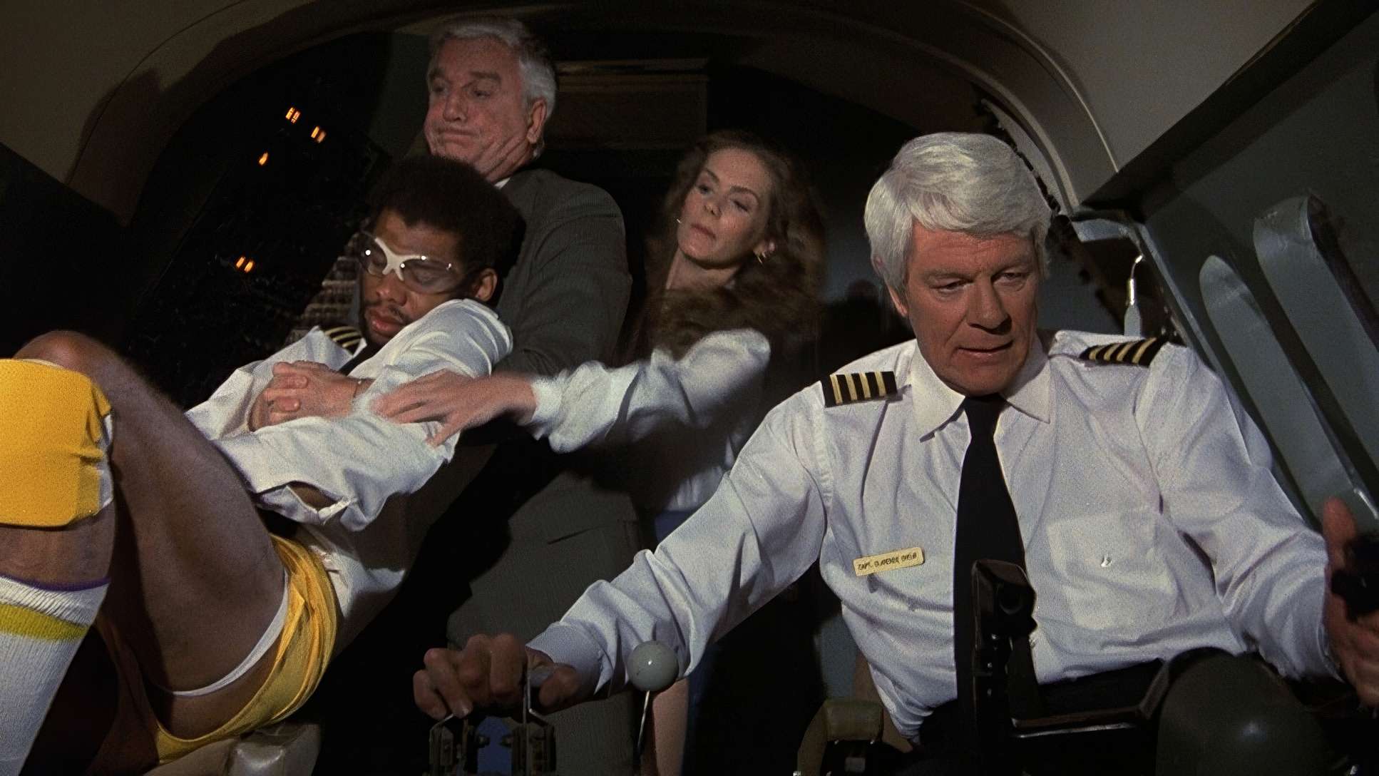
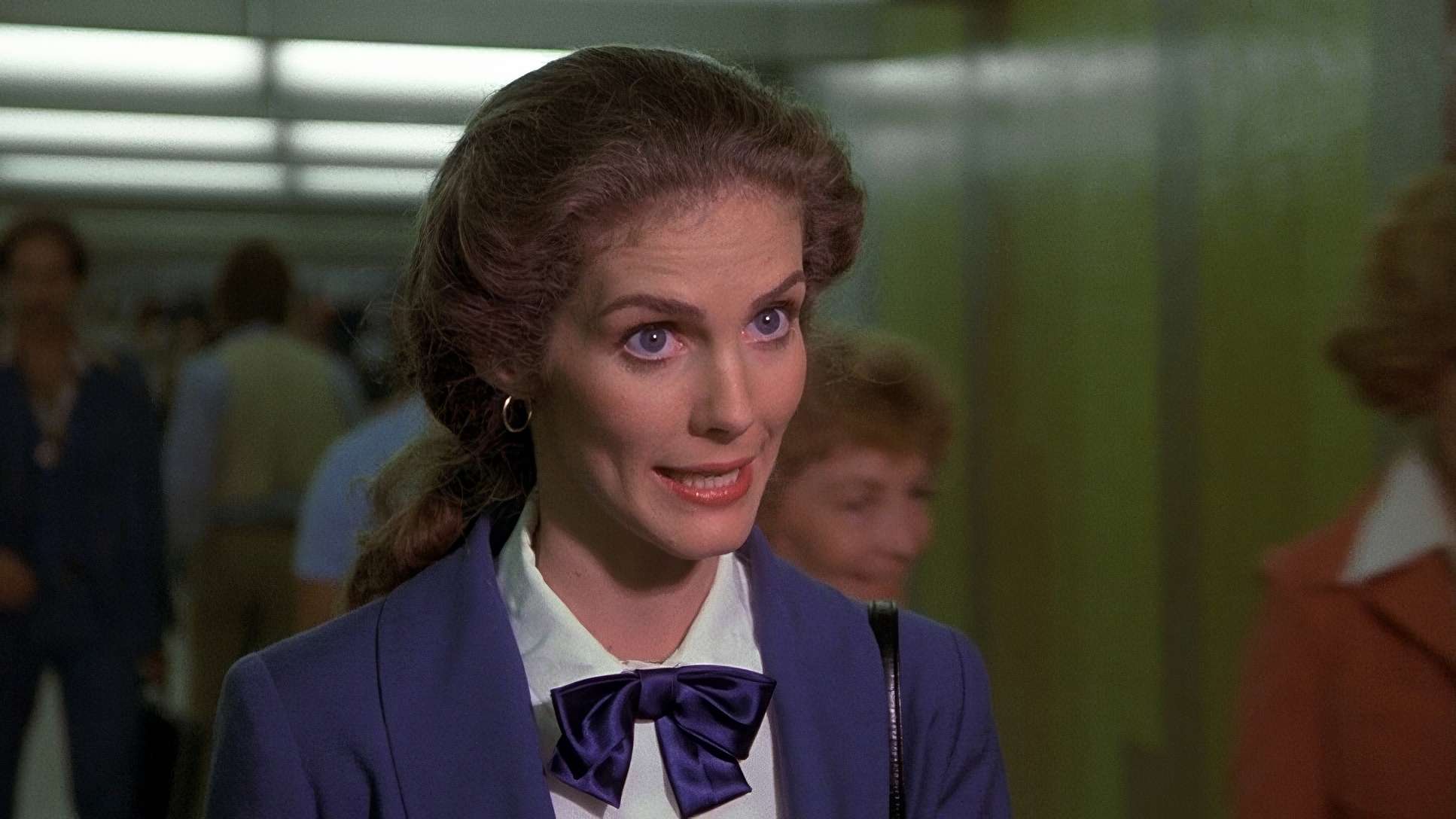
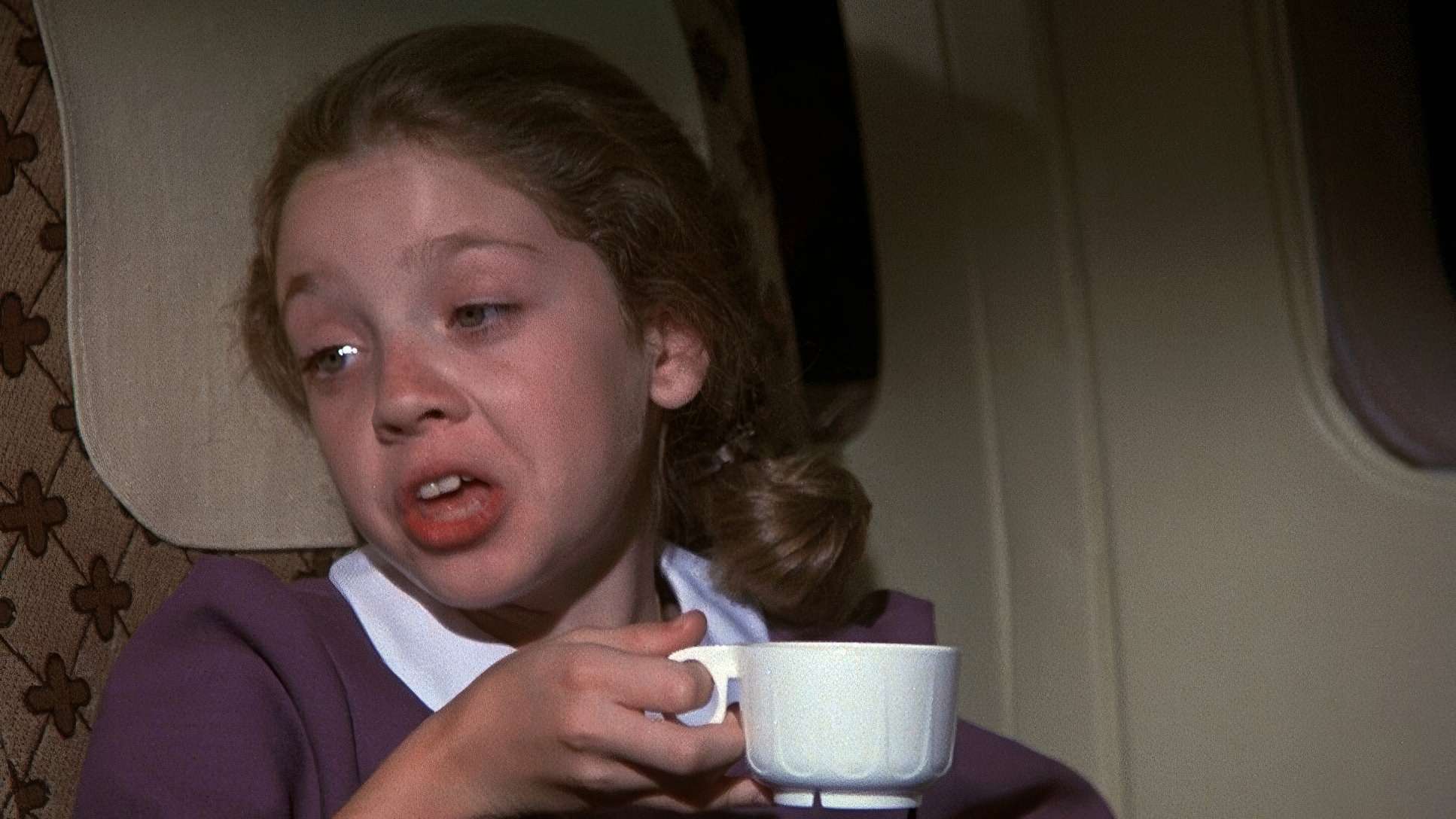
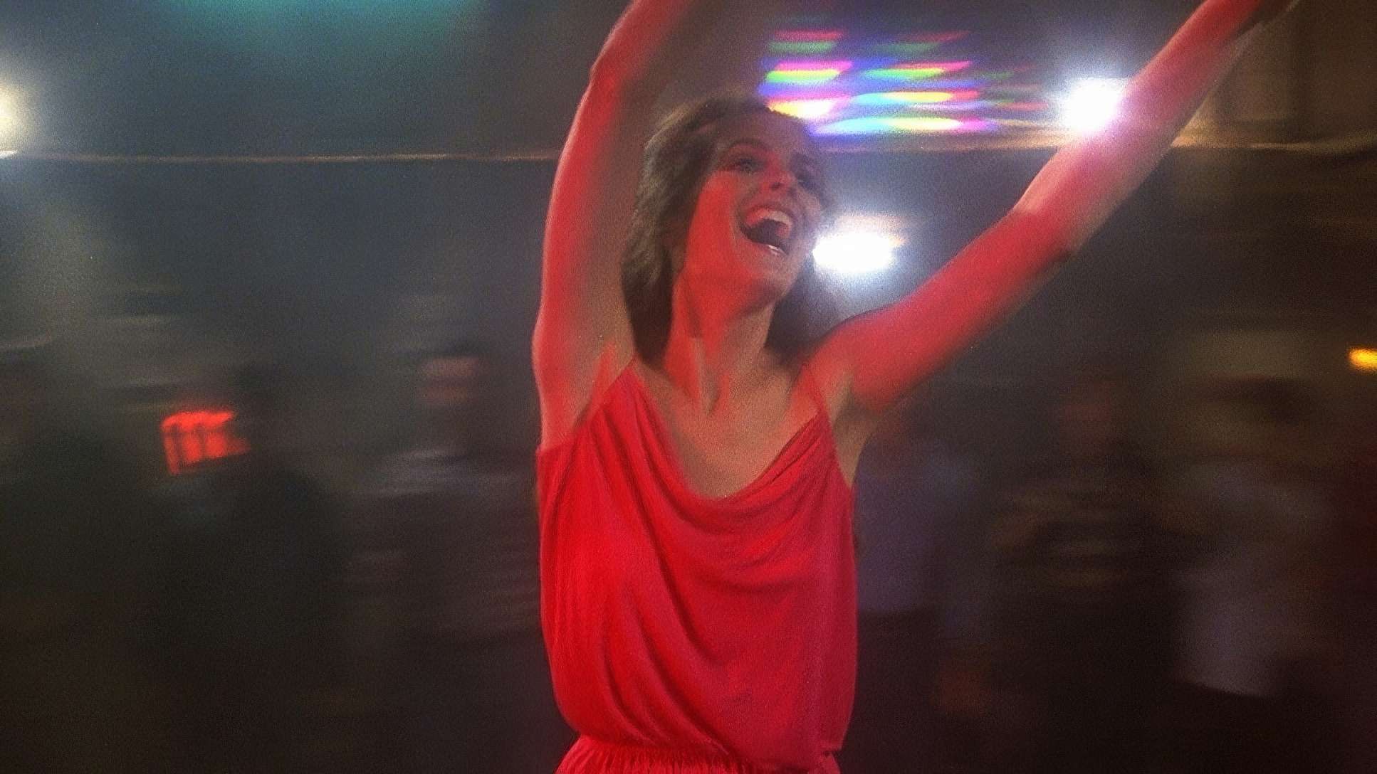
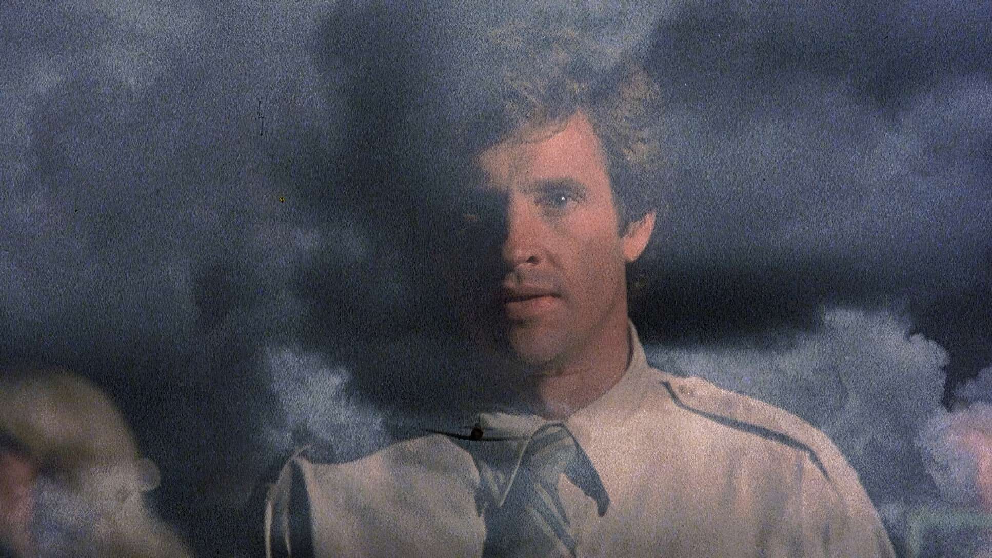
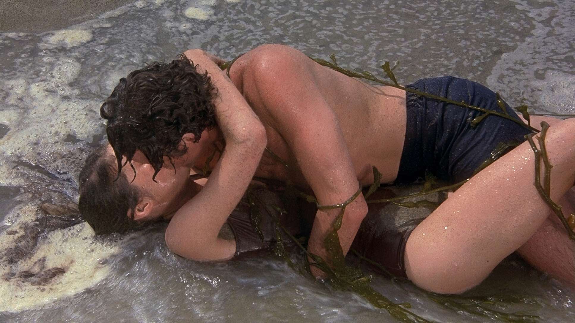
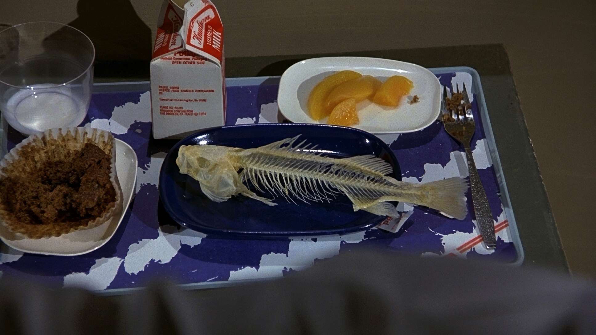
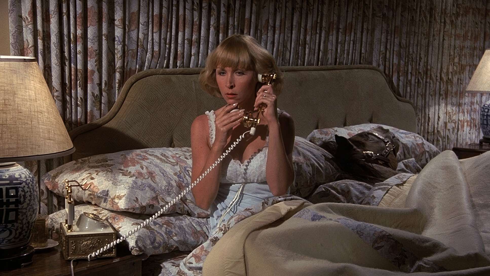
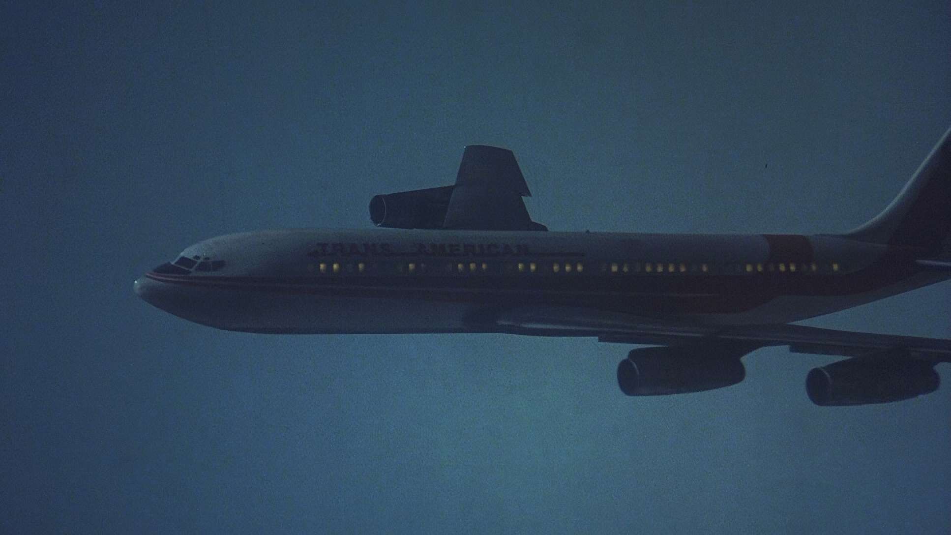
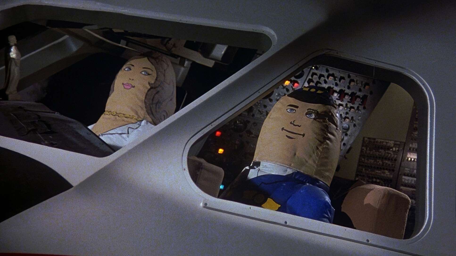
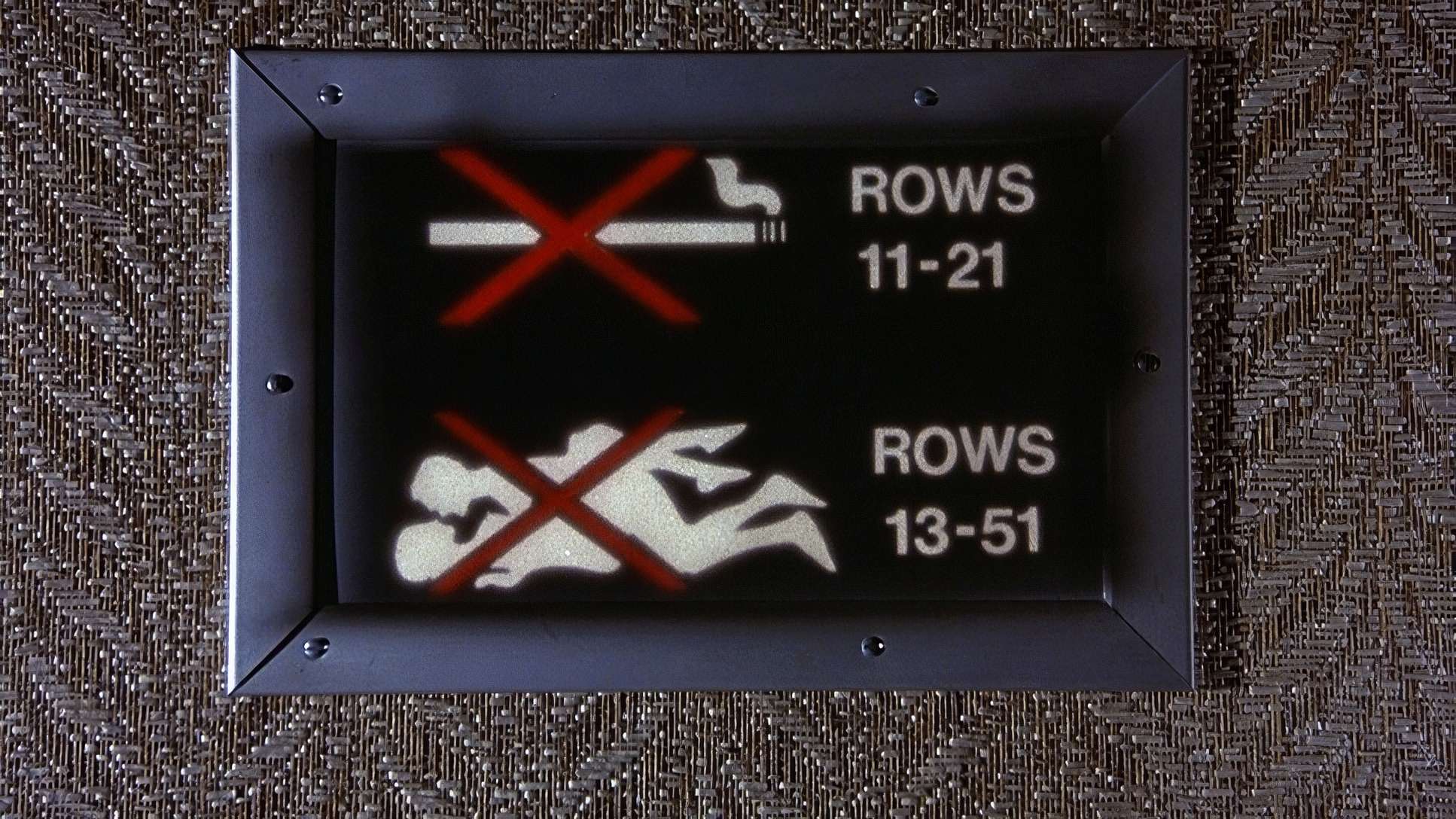
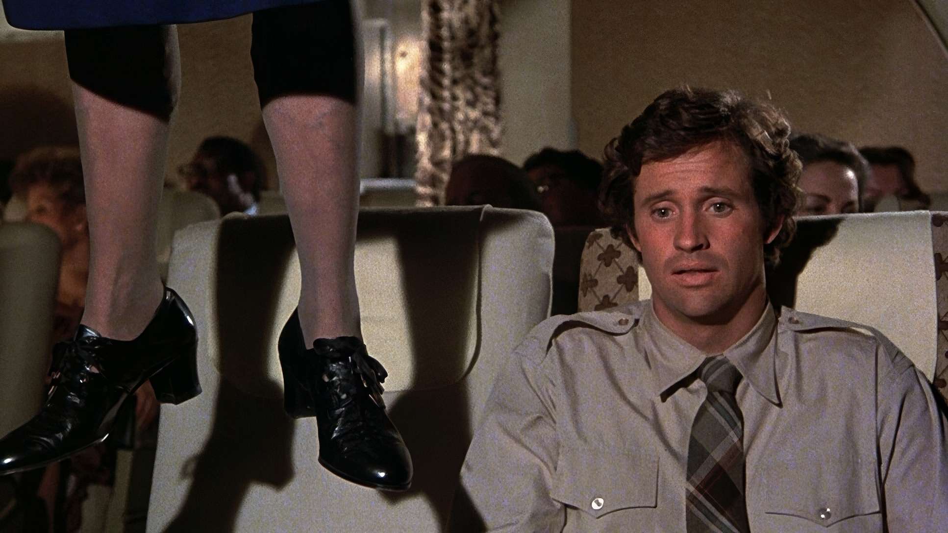
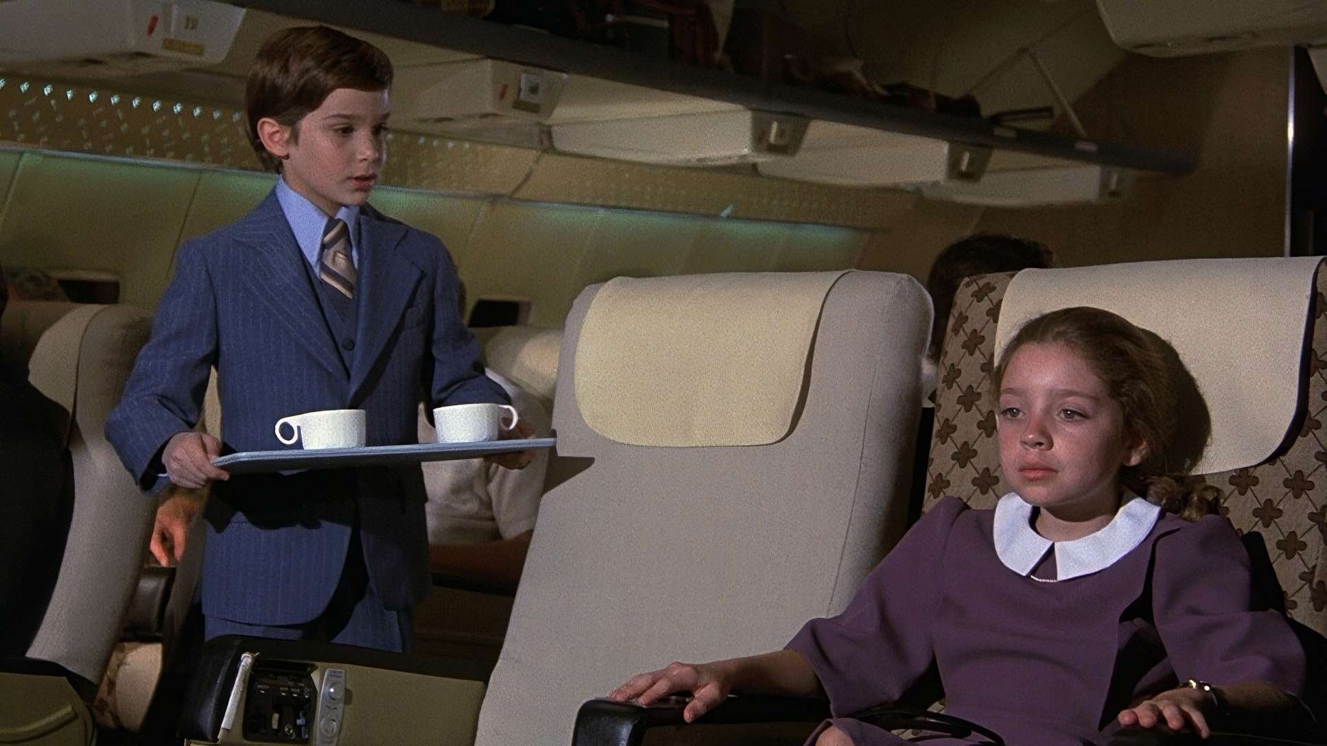
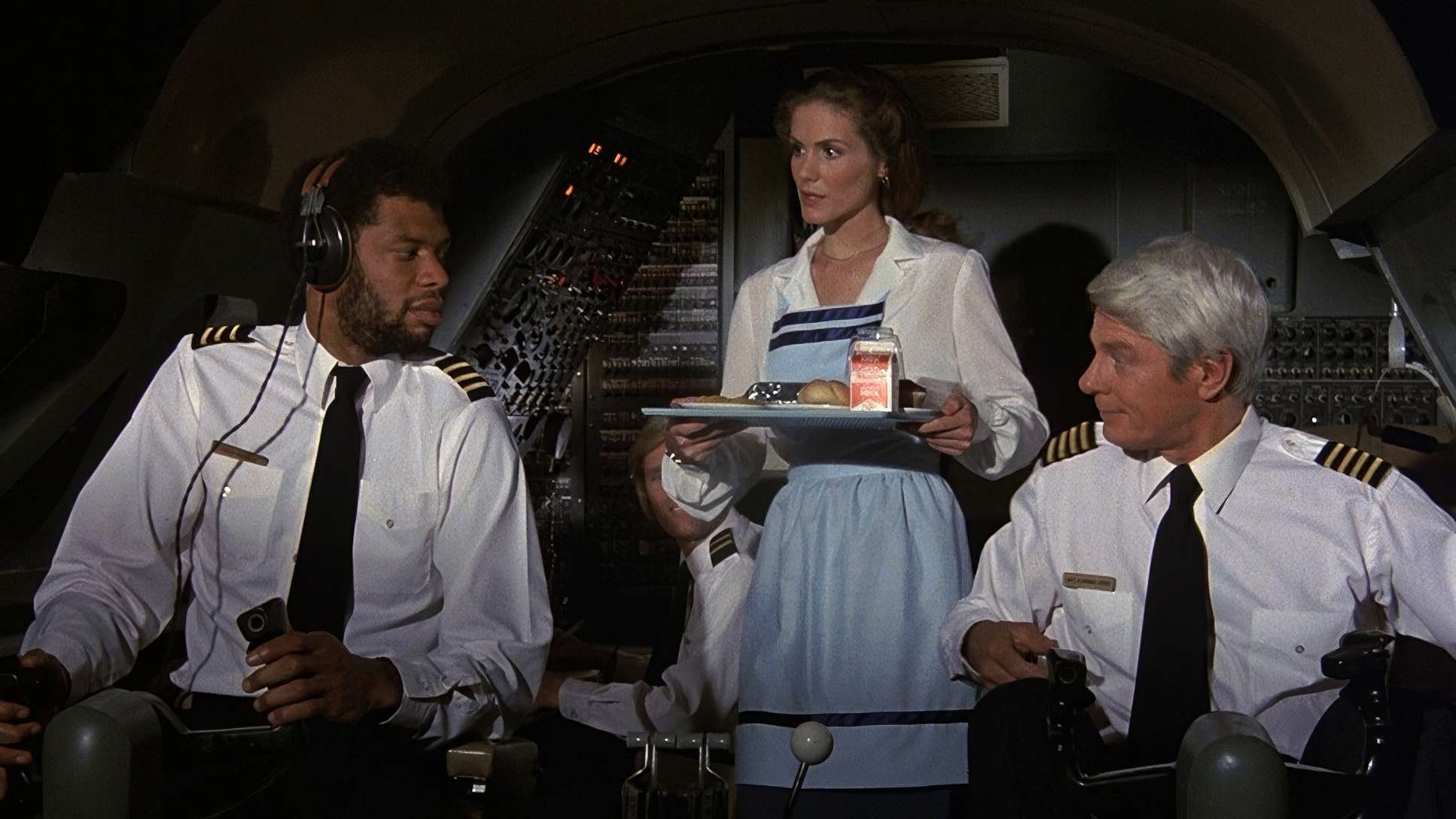
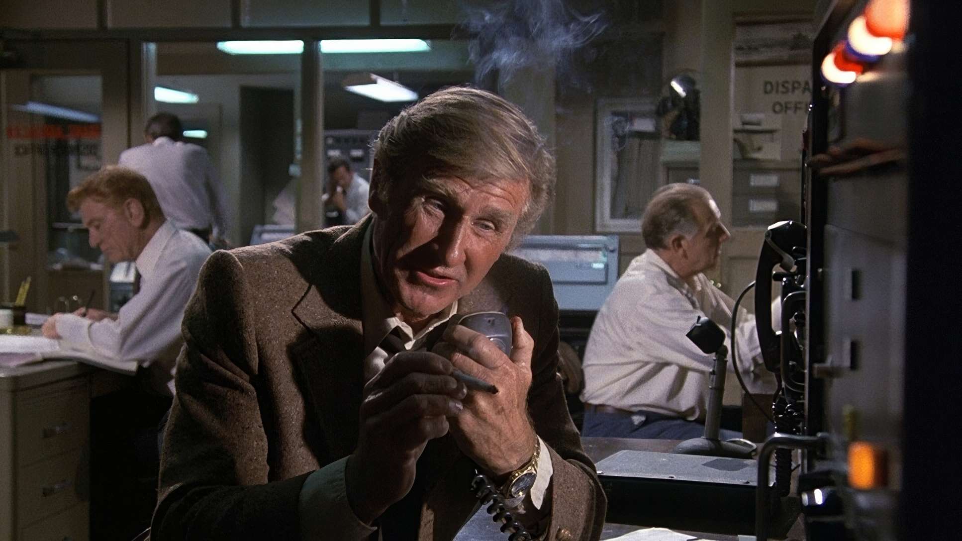
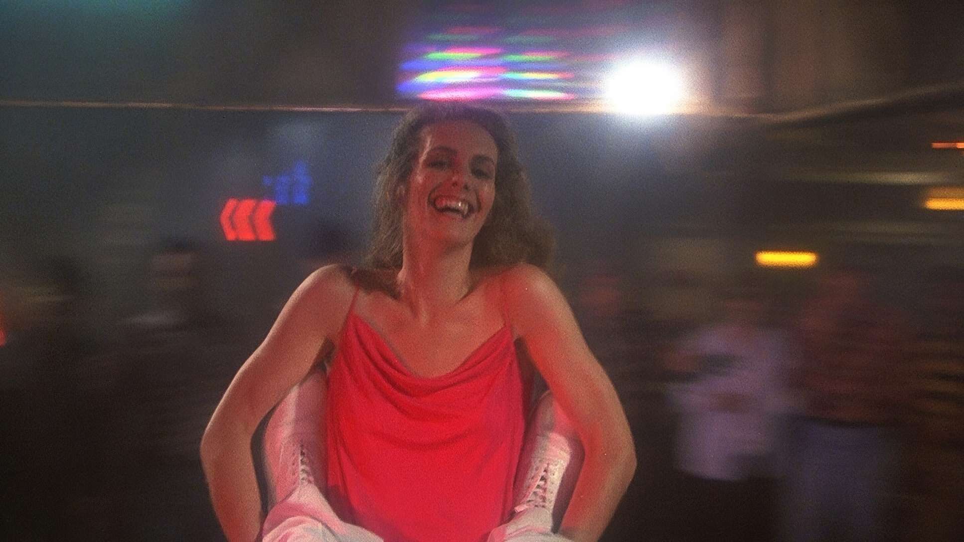
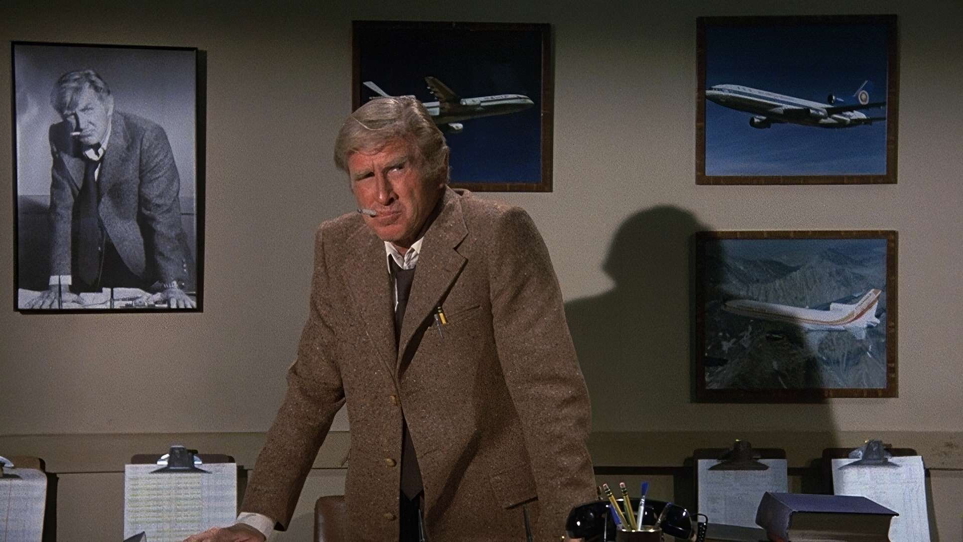
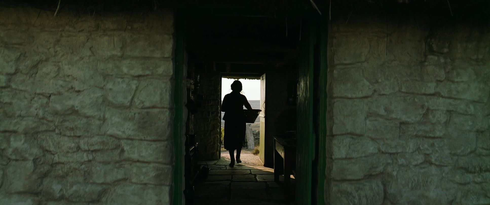
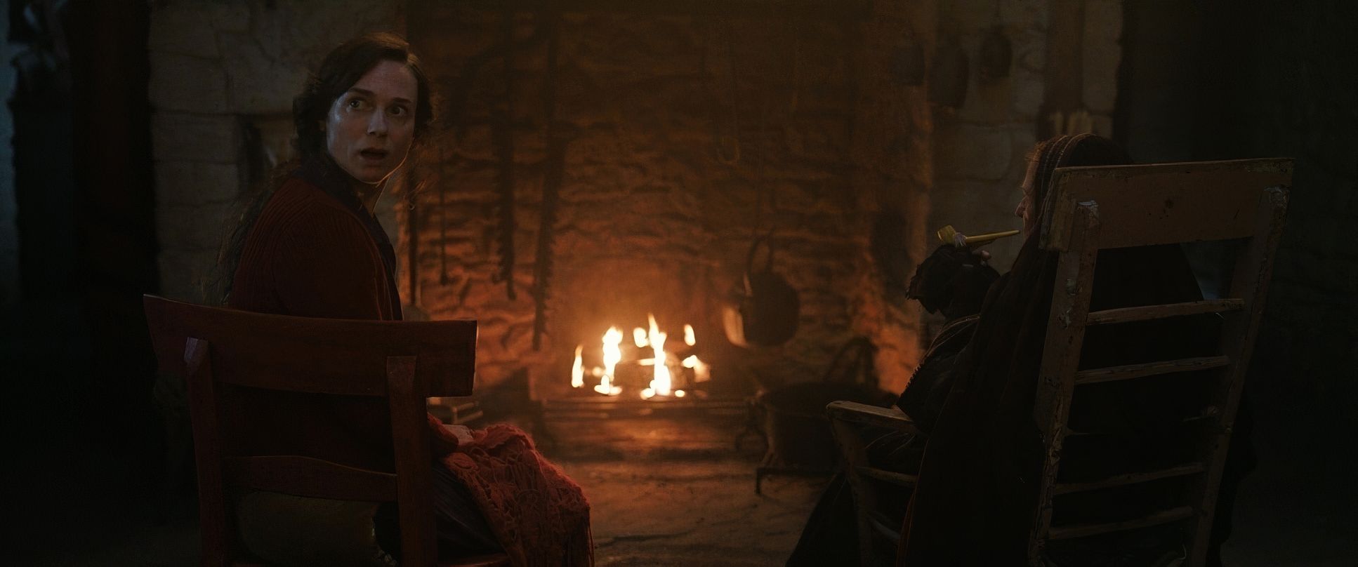
Airplane! (1980) Film Stills
A curated reference archive of cinematography stills from Airplane! (1980). Study the lighting, color grading, and composition.


- Also read: THE BANSHEES OF INISHERIN (2022) – CINEMATOGRAPHY ANALYSIS
- Also read: FIRST BLOOD (1982) – CINEMATOGRAPHY ANALYSIS
Browse Our Cinematography Analysis Glossary
Explore directors, cinematographers, cameras, lenses, lighting styles, genres, and the visual techniques that shape iconic films.
Explore Glossary →