On the surface, it’s easy to see why critics in 2006 dismissed it as just another “Tarantino rip-off” or a “quirky Guy Ritchie romp.” I’ve heard all the complaints: the plot is too convoluted, the characters are overly stylized, the set design is dizzying. But honestly? Those are the exact reasons it works. It’s a beautifully deceptive piece of visual storytelling a literal “Kansas City Shuffle” for the eyes. It doesn’t just ask for your attention; it demands it, rewarding you for every second you spend looking at the frame rather than just listening to the dialogue.
About the Cinematographer
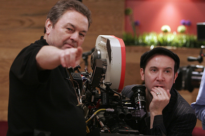
The man behind this visual maze is Peter Sova. If you know his work on Donnie Brasco or Diner, you know he has this incredible knack for building worlds that feel lived-in but distinct. In Slevin, he and McGuigan created an aesthetic that’s simultaneously sleek and disorienting. Sova’s work here isn’t about being “flashy” for the sake of it; it’s about meticulously laying traps. It’s the kind of cinematography that does all the heavy lifting in silence, planting the seeds for narrative twists that you won’t see coming until it’s too late.
Inspiration Behind the Cinematography

The “Kansas City Shuffle” isn’t just a plot point it’s the film’s entire visual DNA. As Good Cat famously explains: “They look right, you go left.” Sova takes that concept and runs with it. From the opening frames, the cinematography is designed to misdirect. It makes you comfortable in your genre assumptions just so it can pull the rug out from under you in the third act.
Those “dizzying” sets and “overly stylized” characters? They aren’t flaws. They’re deliberate choices. The film embraces a certain theatrical artifice that nudges us into a heightened reality. It’s a visual contract: You think you know what you’re watching, but I’m going to show you something else.
Compositional Choices
This is where the film becomes a goldmine for analysis. The frames are architectural symmetrical, precise, and packed with heavy patterns that are frankly mesmerizing.
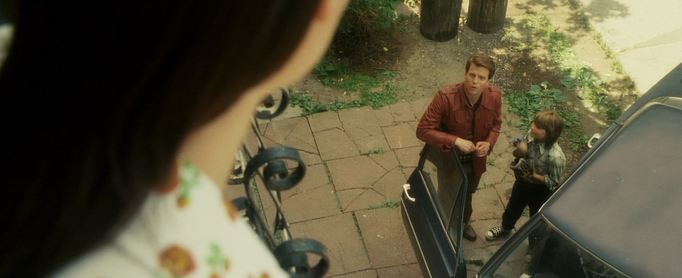
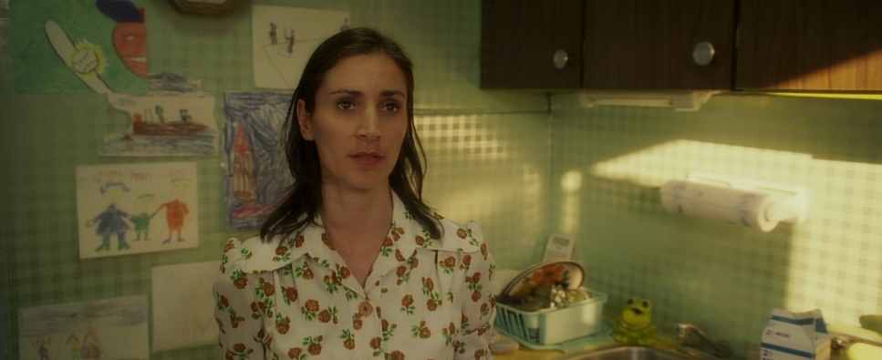
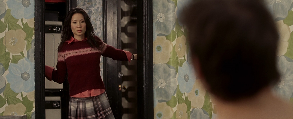
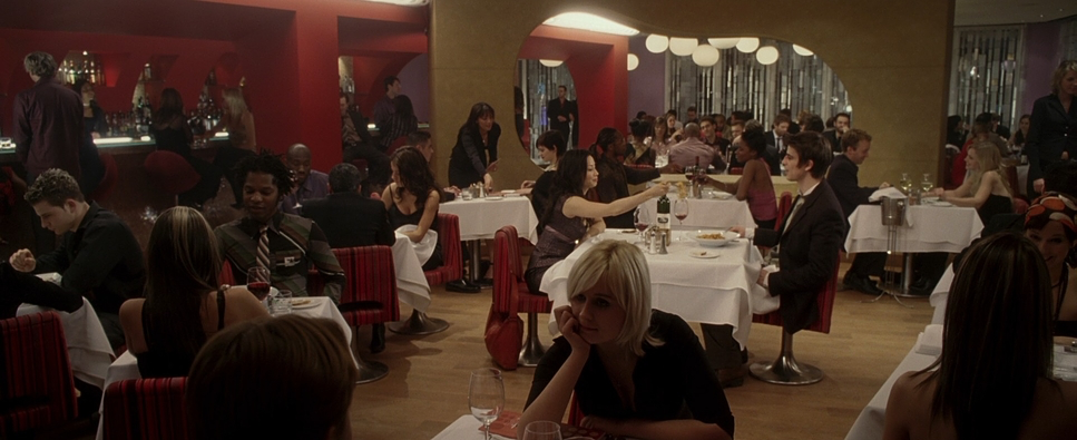
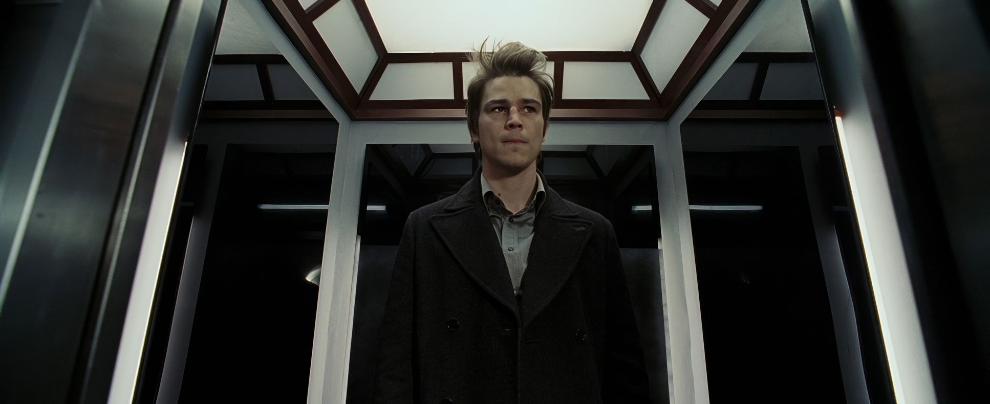
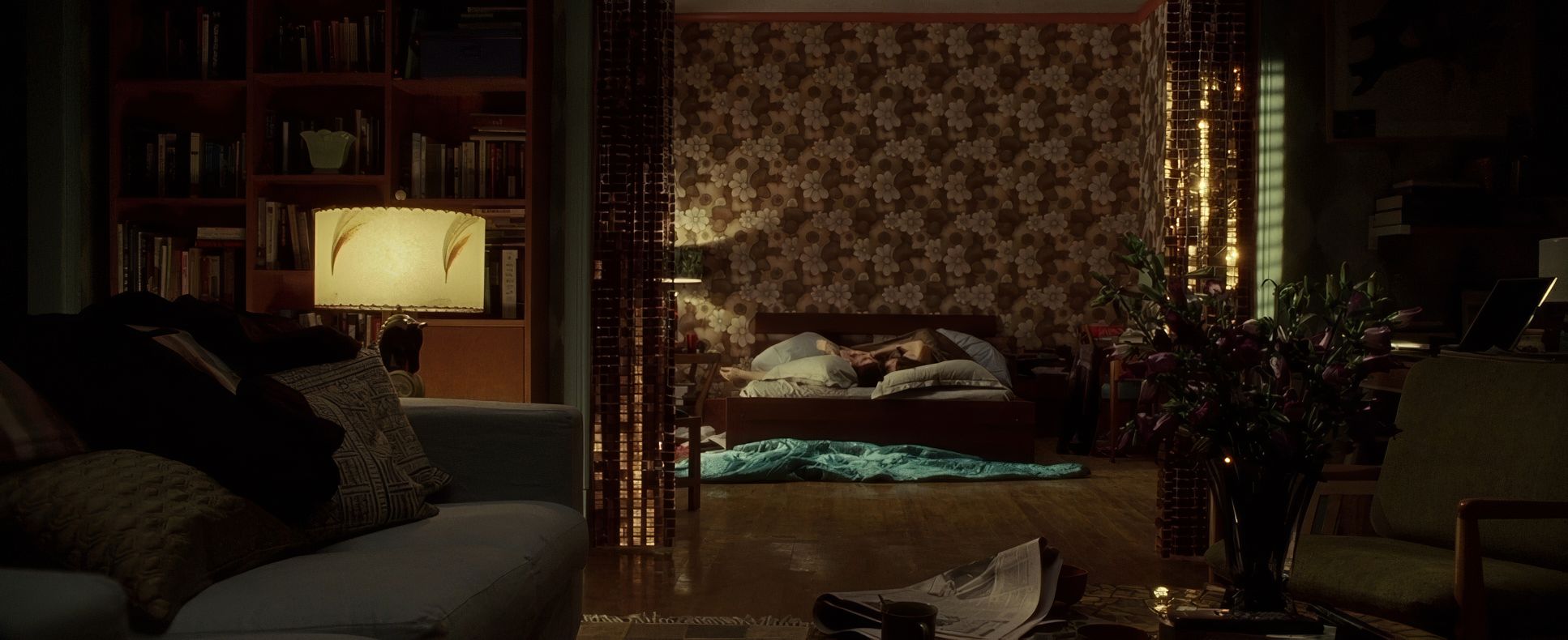
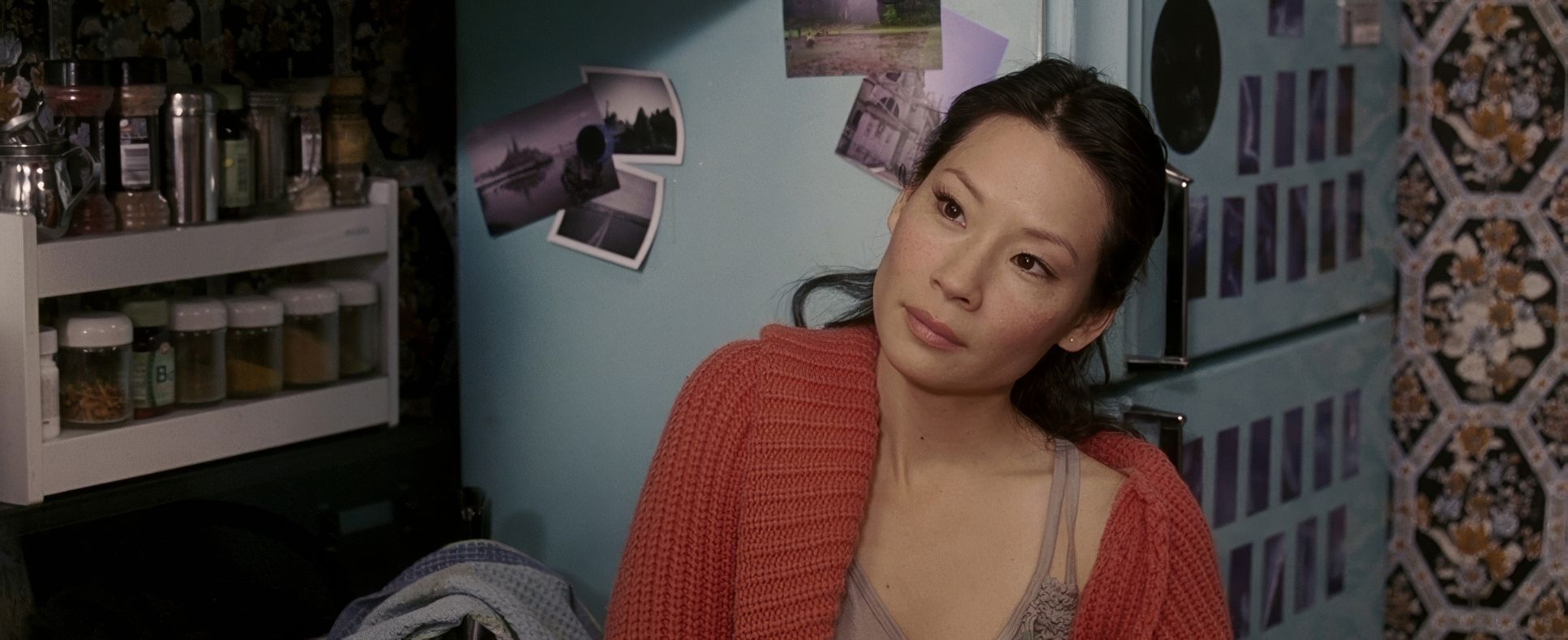
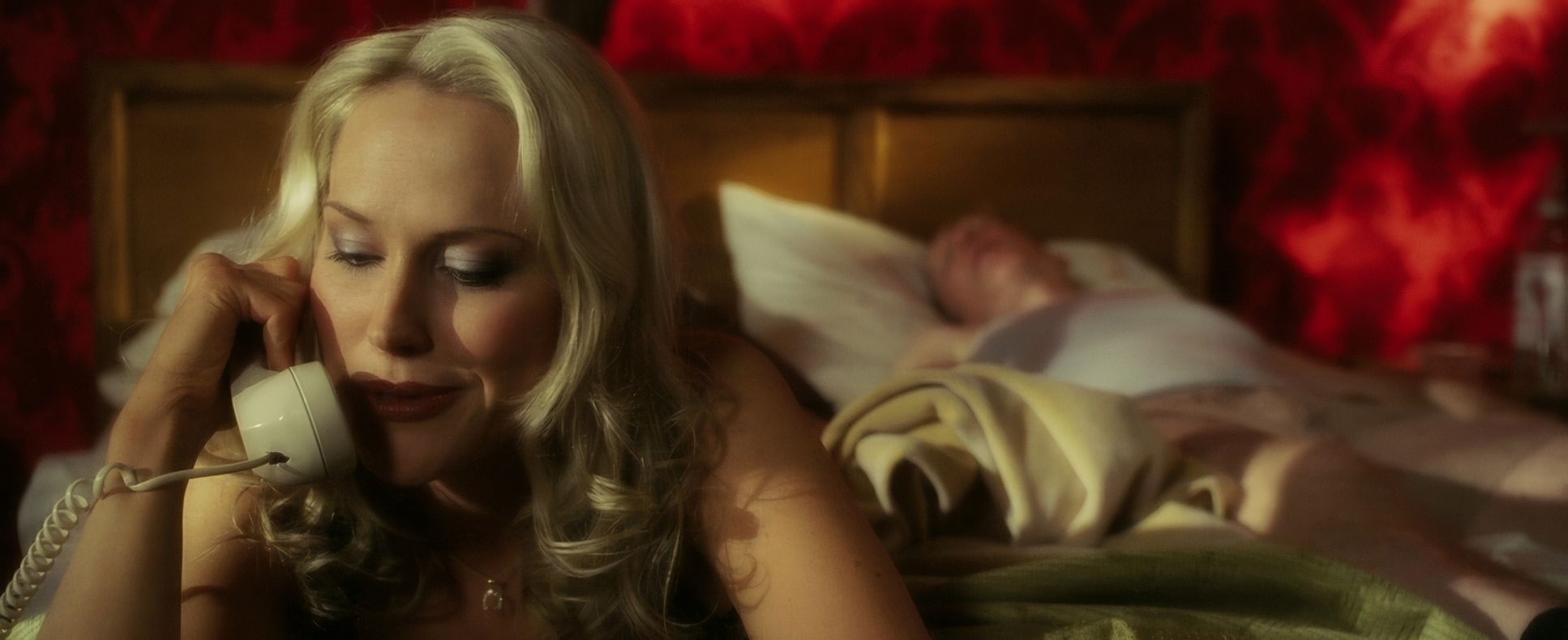
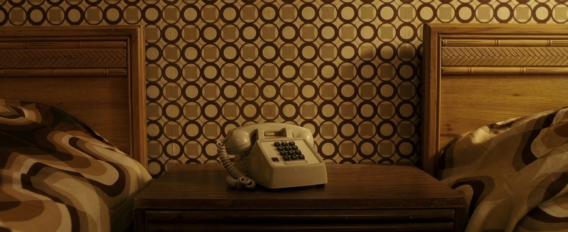
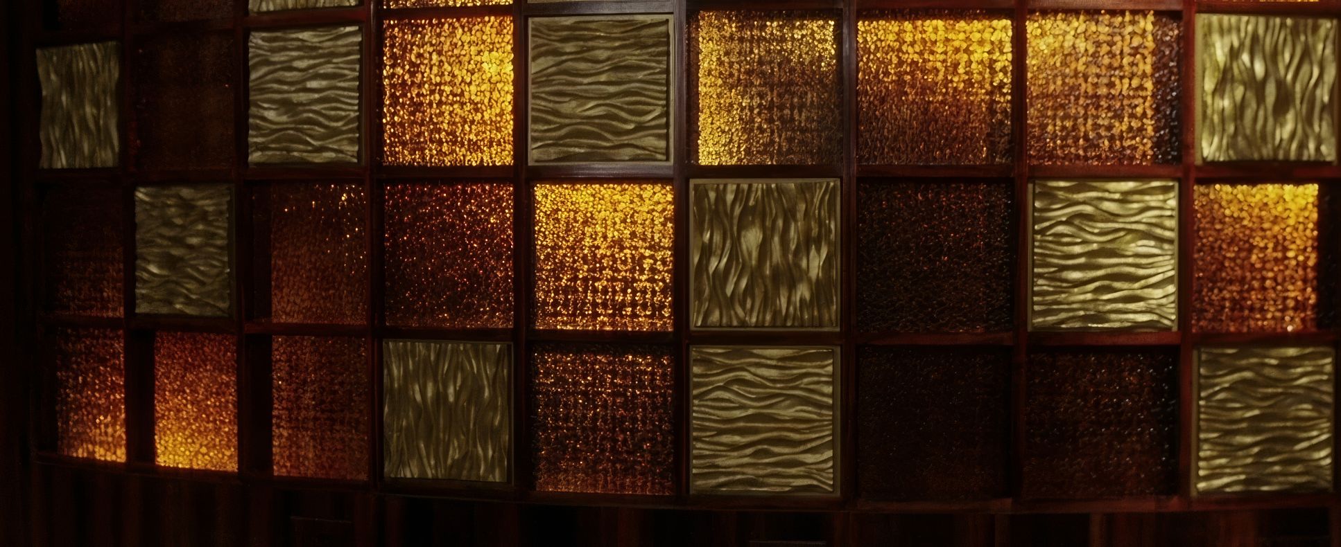
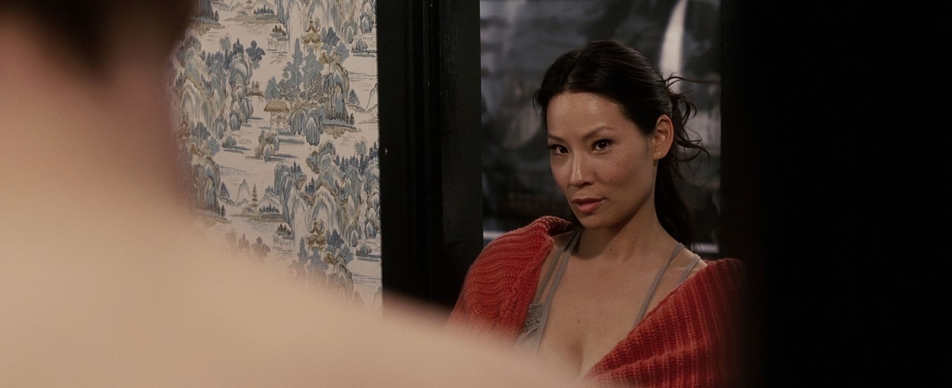
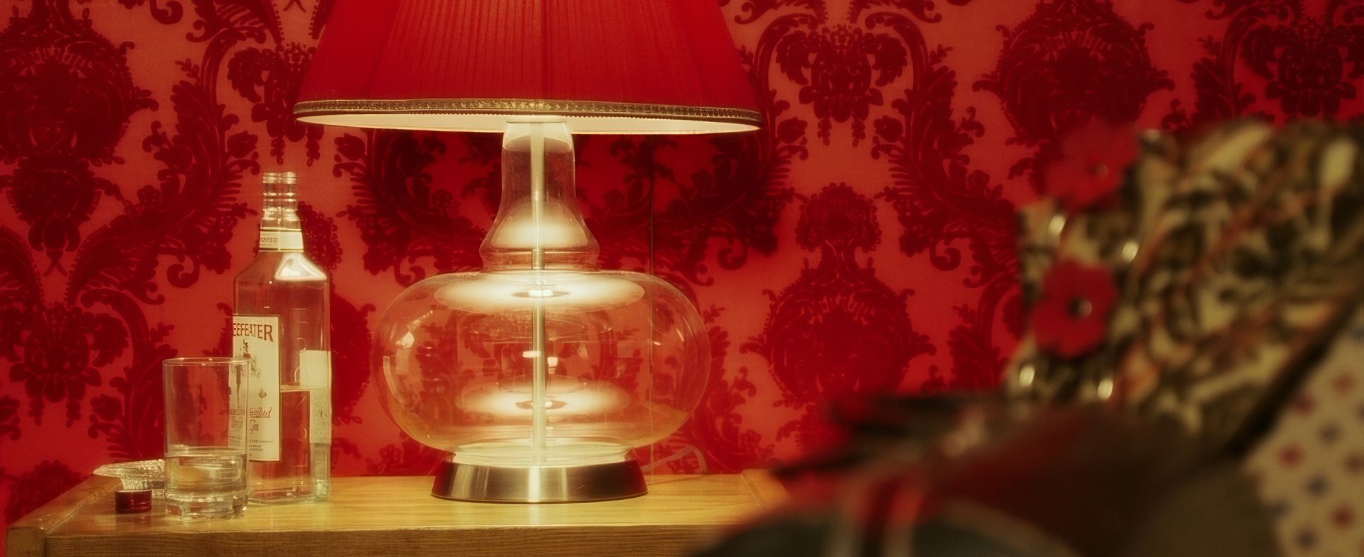
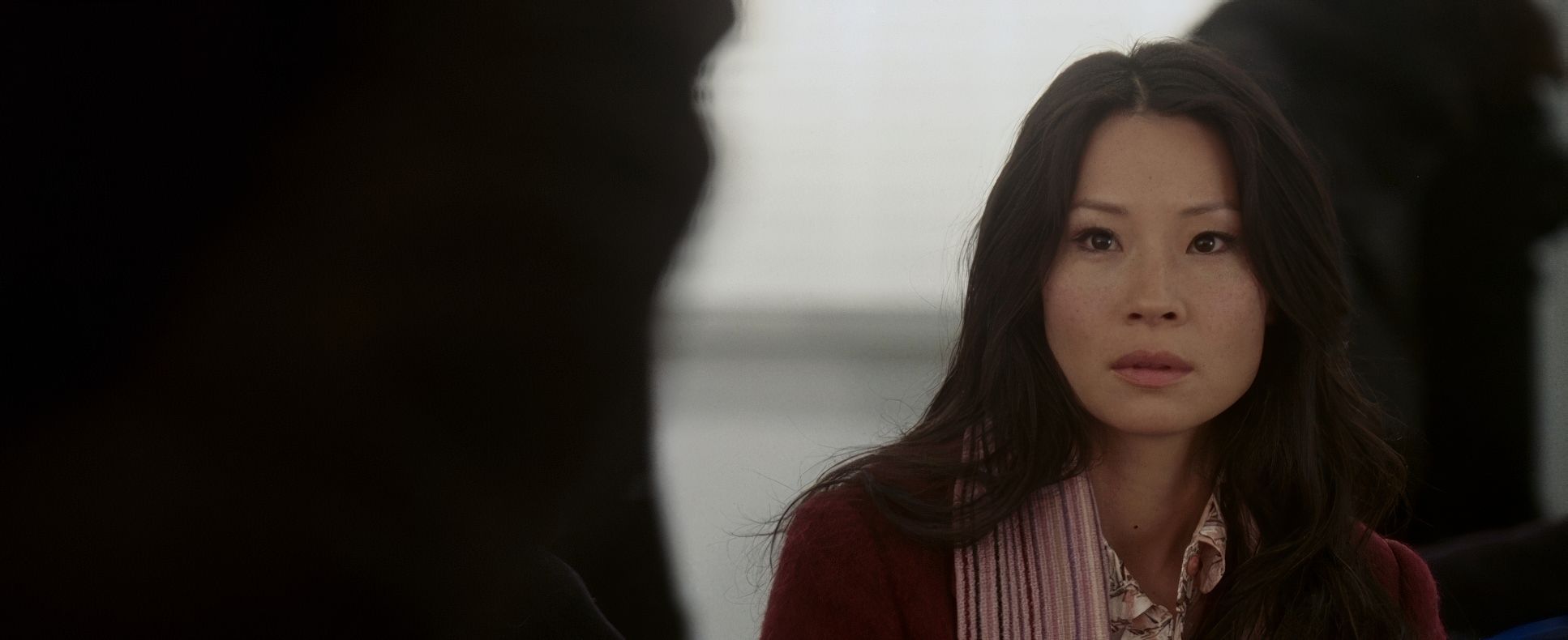
Look at the “wallpaper” palettes. You’ve got Slevin’s fake girlfriend’s apartment morphing from lines to waves to floral chaos, which then subtly connects to the floral designs in Nick Fisher’s and Lindsay’s spaces. These aren’t just cool production design choices; they’re depth cues. They identify characters and foreshadow fates before a single line of dialogue is spoken. Then you have the Boss’s domain all reddish-orange and strong lines juxtaposed against the Rabbi’s cool blue themes. Even the geometric chaos of the Boss’s black-and-white floor feels like it’s signaling their eventual downfall. It’s visual confinement at its best.
Color Grading Approach
As a colorist, this is where I get really excited. Michael Dobroski (the film’s colorist) didn’t just give this a “pass” he used color as a scalpel to separate truth from fiction.
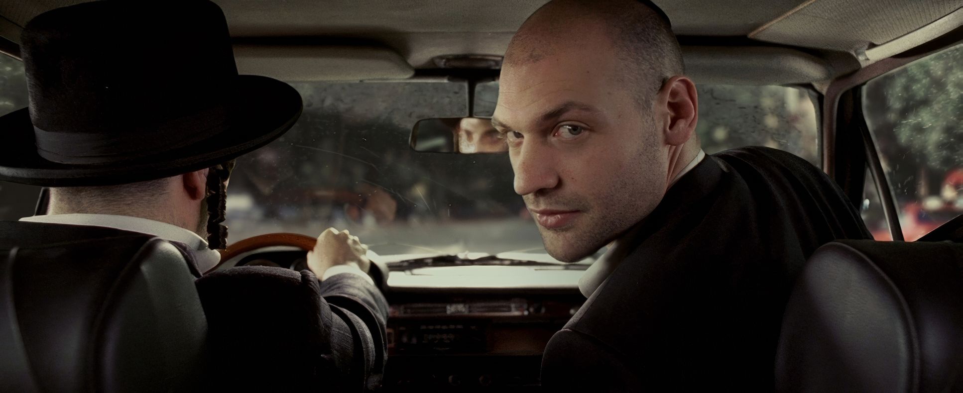
We’re seeing a masterclass in hue separation here. The Boss’s world is drenched in these oppressive, aggressive reds and oranges. Compare that to the Rabbi’s spaces, which lean into those calculated, clinical blues. It’s a classic strategy, but executed with such intent that it defines the characters’ personas.
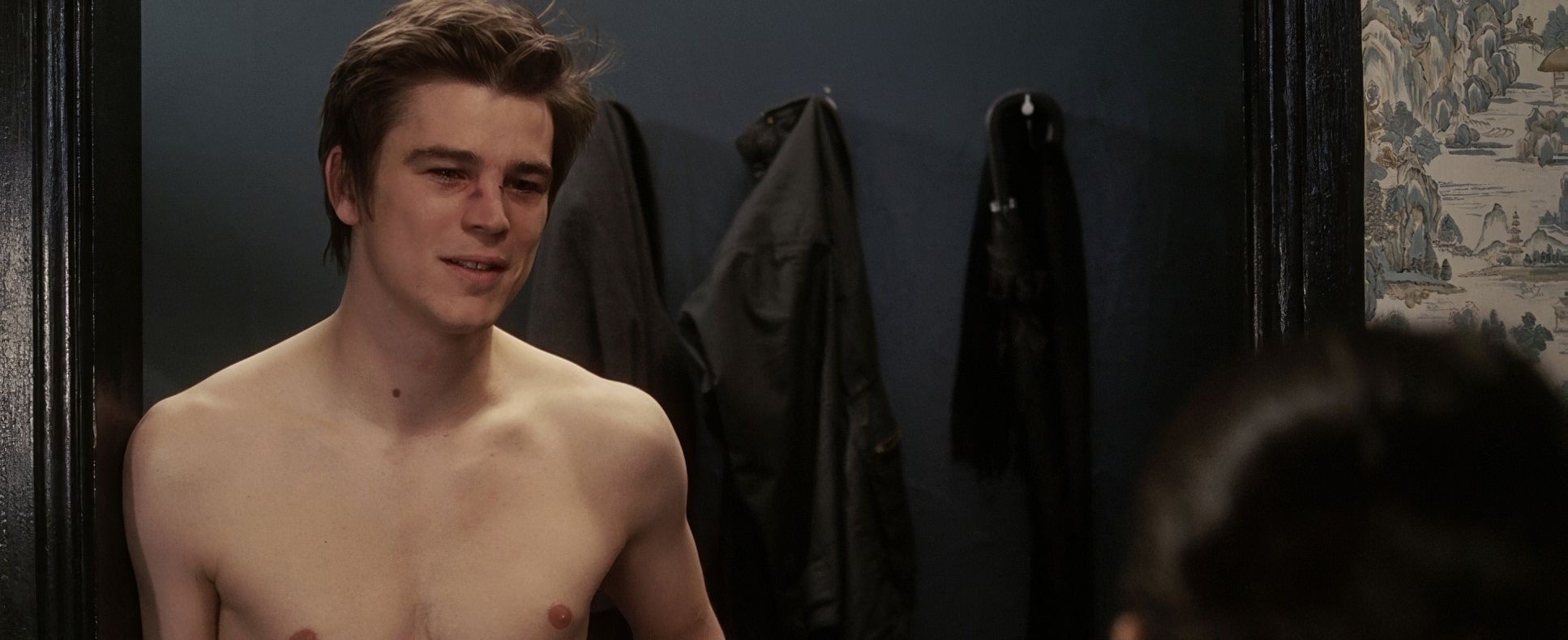
And then there are the flashbacks. Using black and white for Slevin’s fabricated backstory isn’t just a style choice; it’s a tonal signal that we’ve departed from the truth. Even the “overexposed” look of the unreliable memories that’s a dynamic range decision, pushing the highlights and crushing shadows to create something ethereal and untrustworthy. It’s got that beautiful 2006 print-film sensibility rich blacks and that pleasing highlight roll-off you only get from the era of Vision2 stocks.
Lighting Style
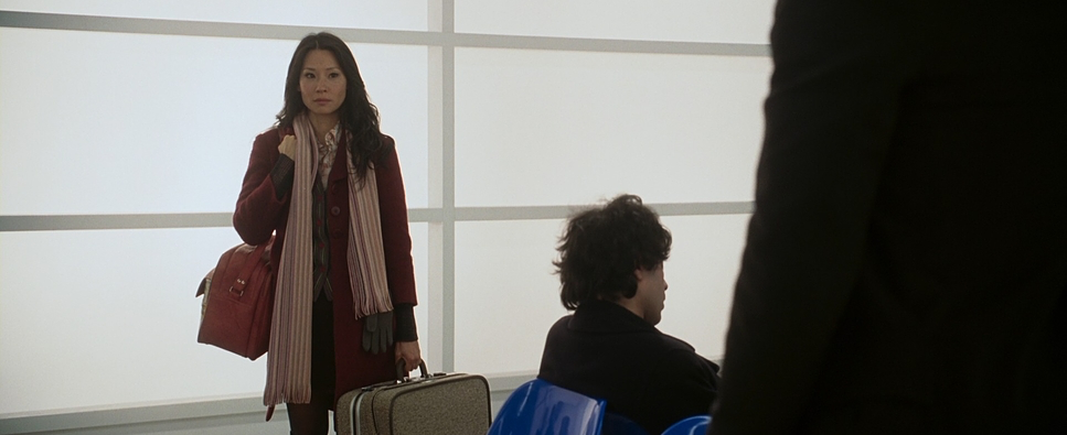
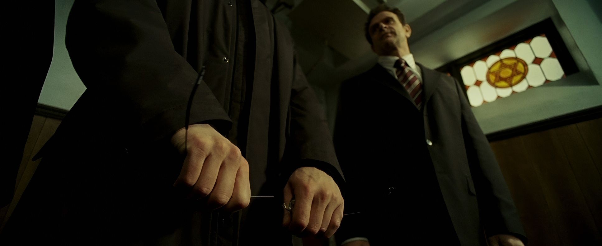
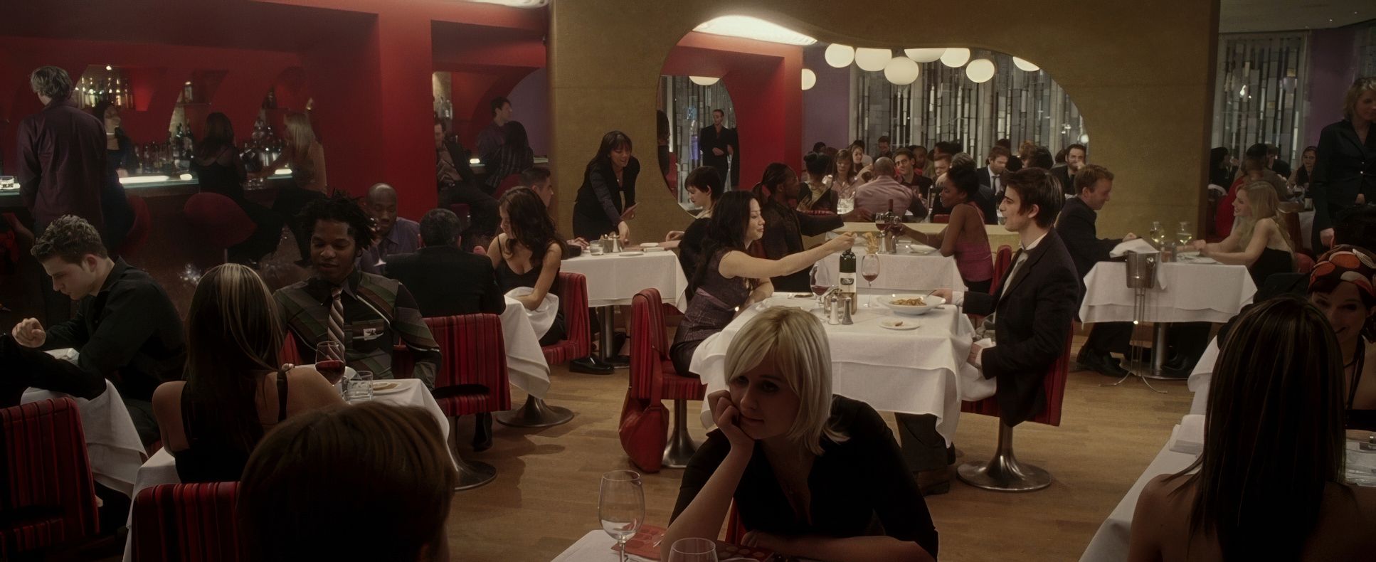
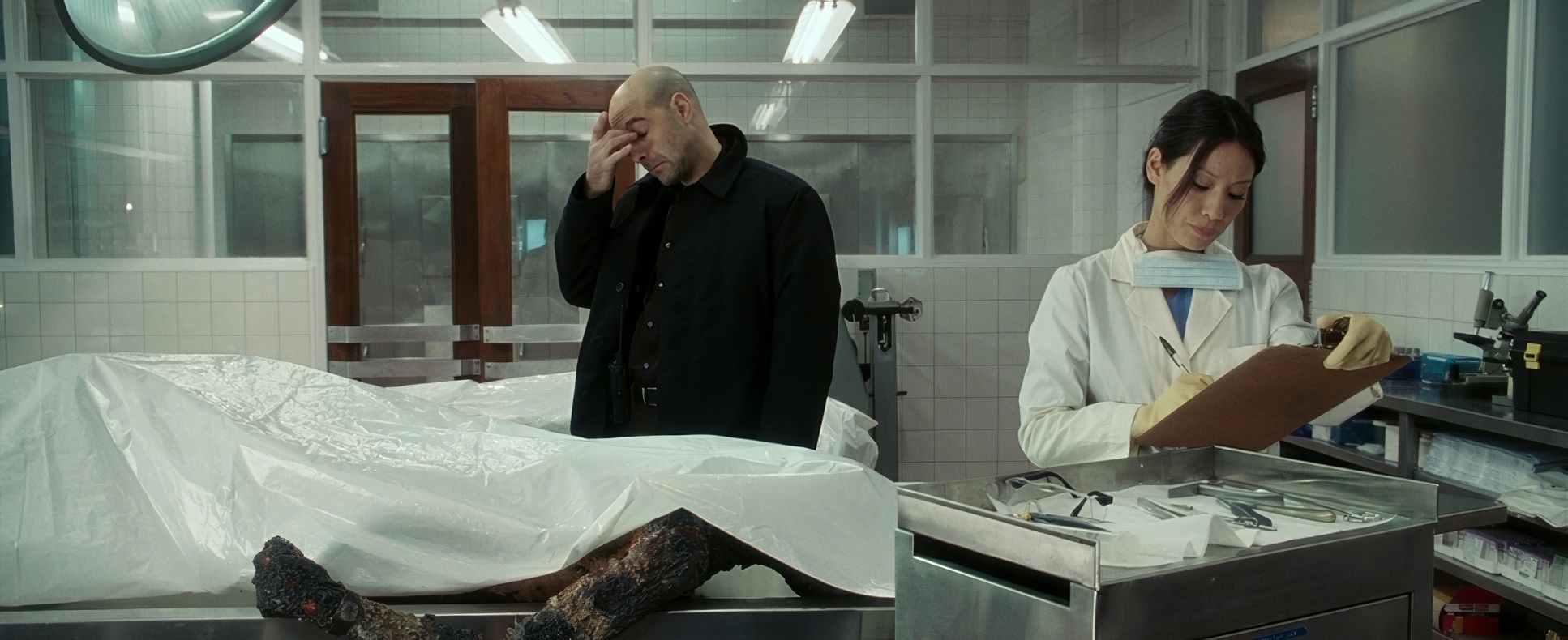
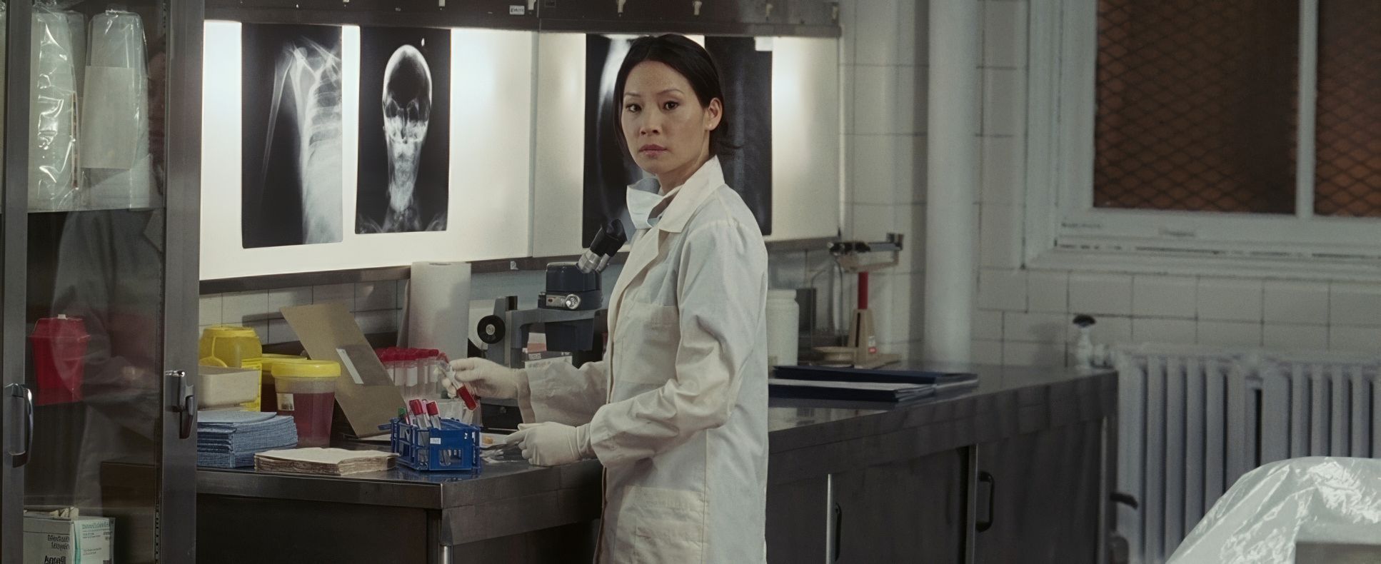
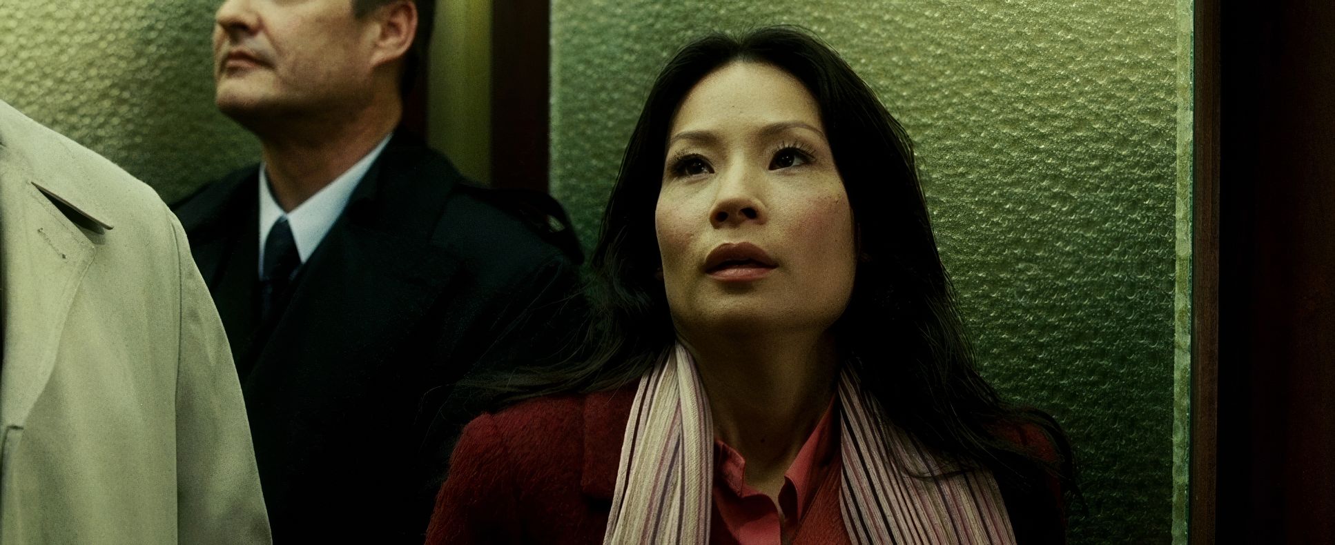
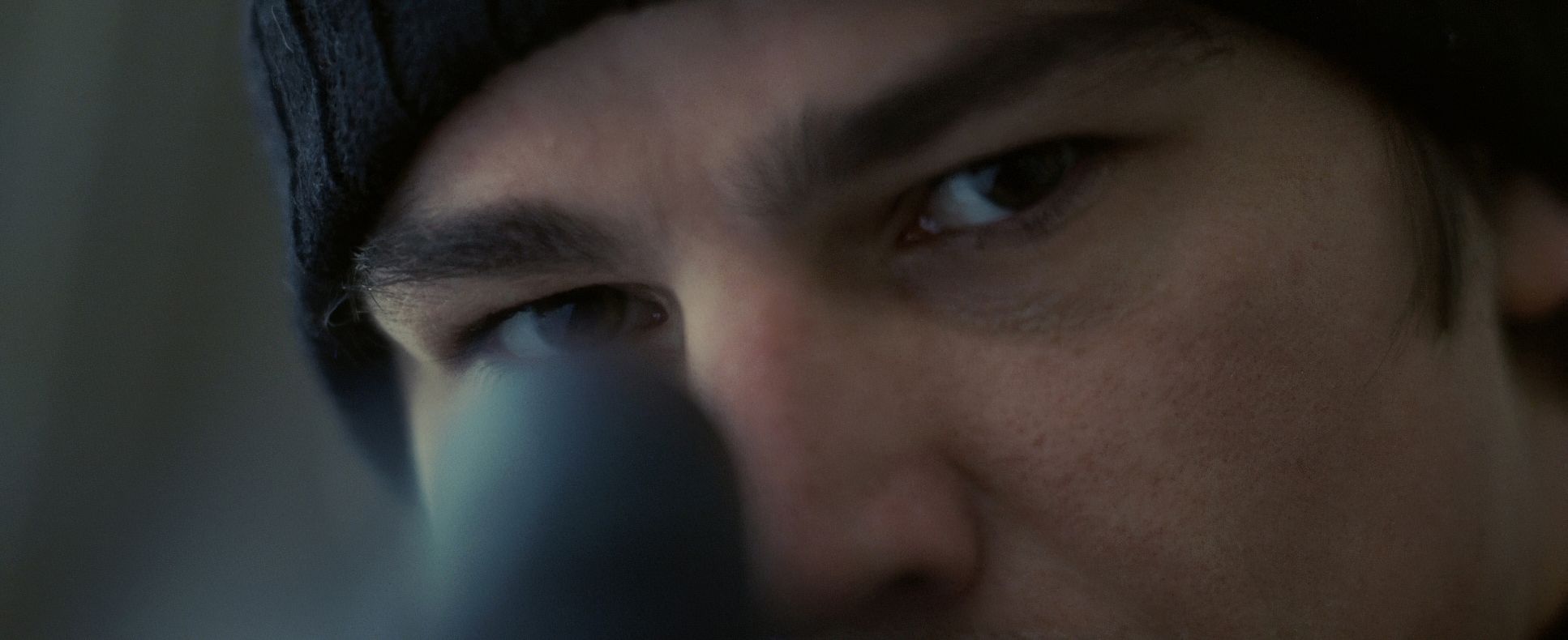
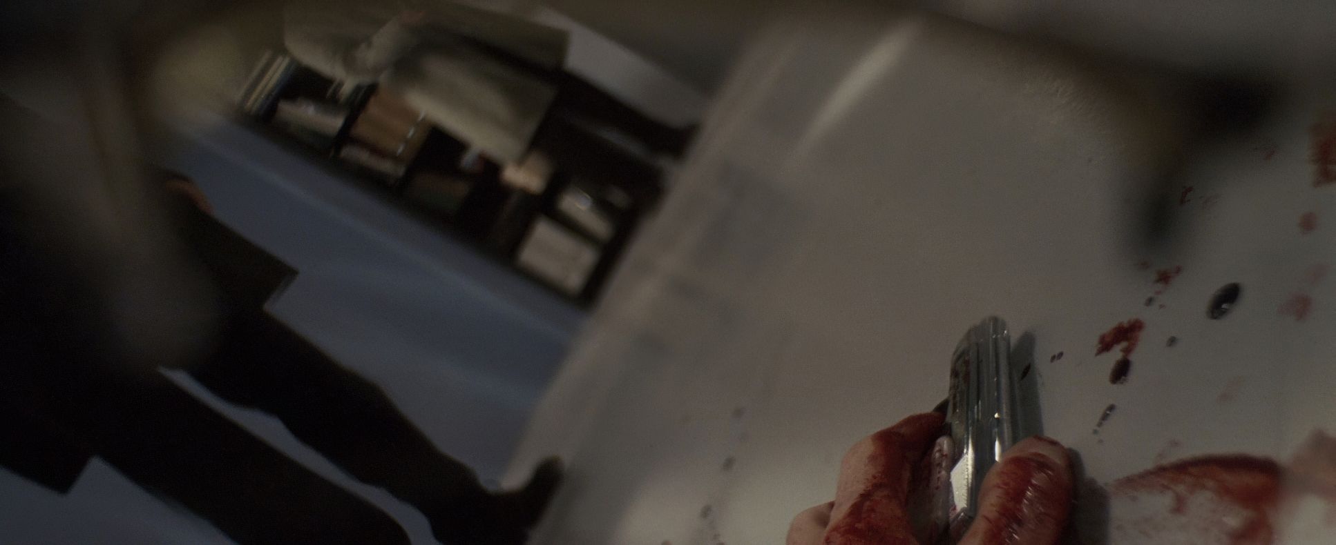
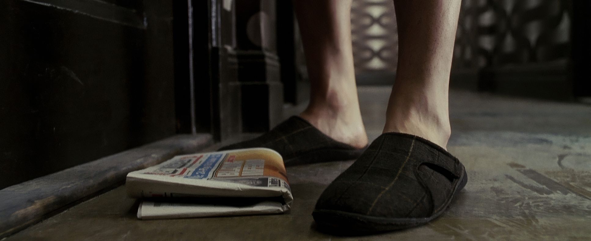
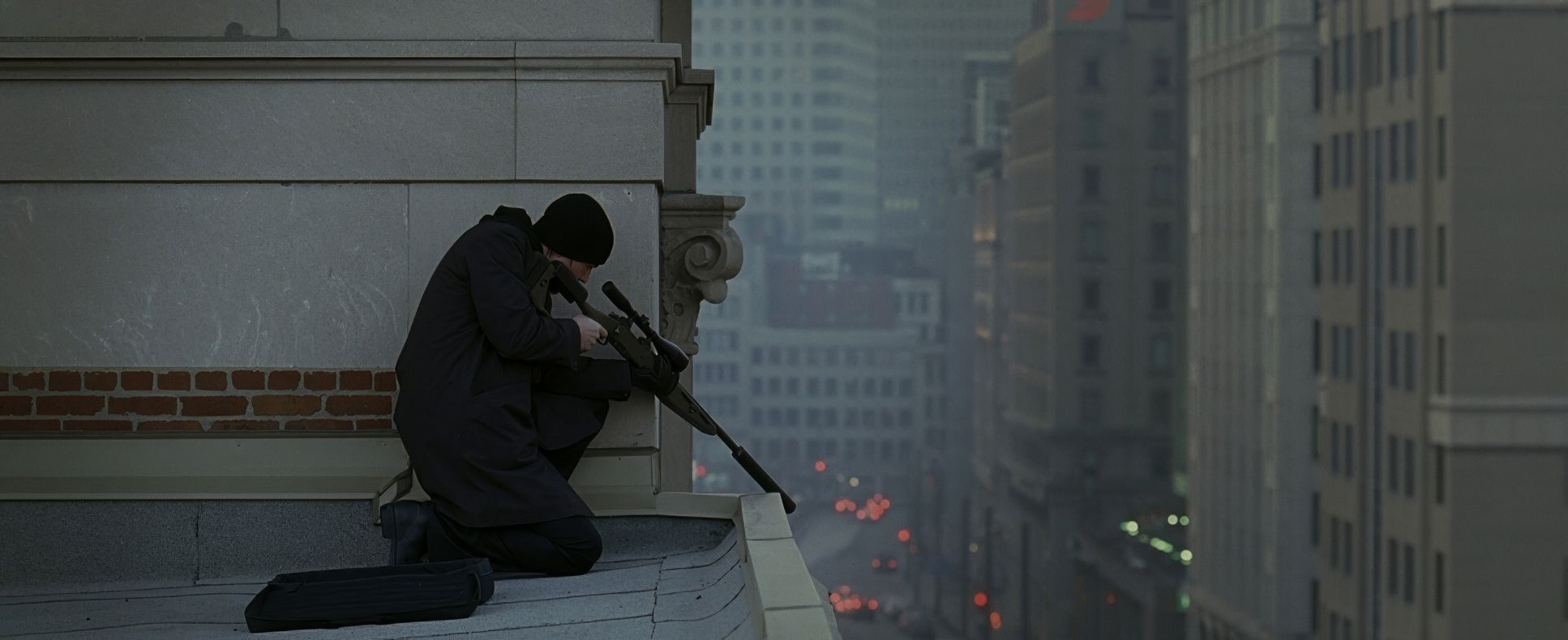
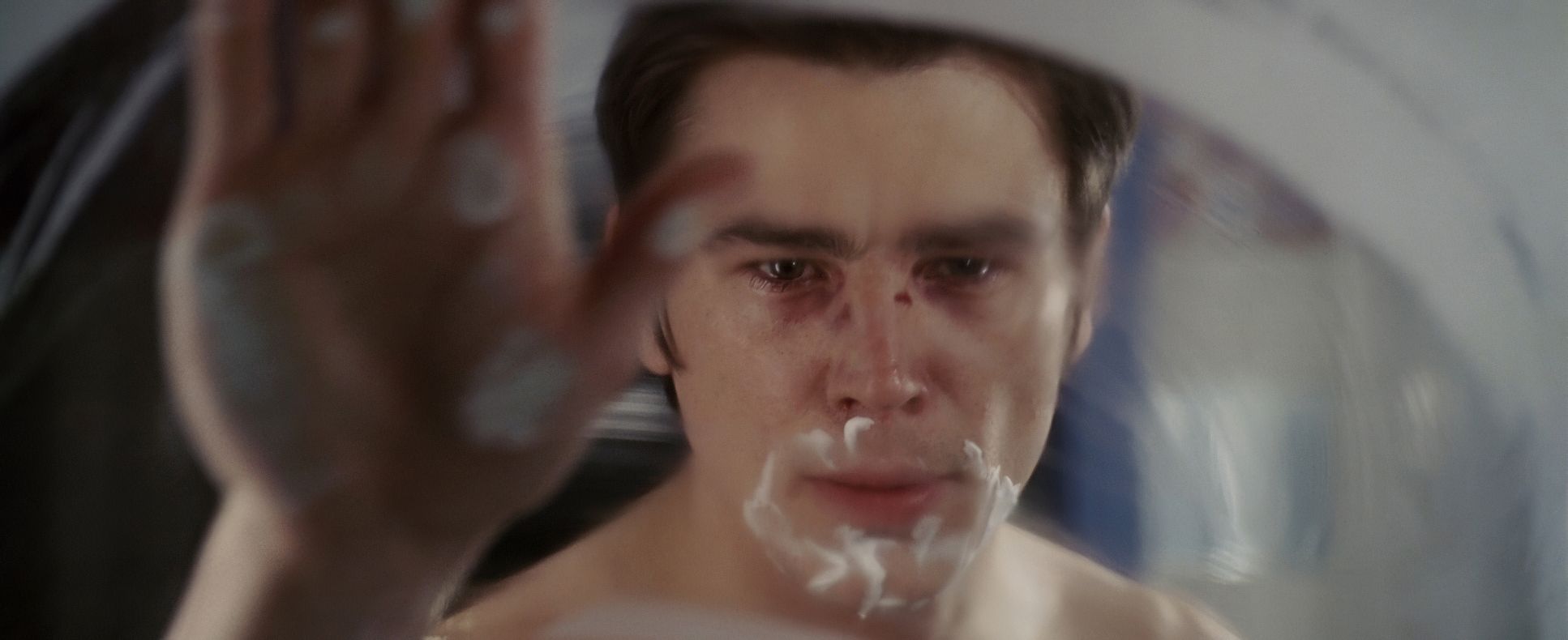
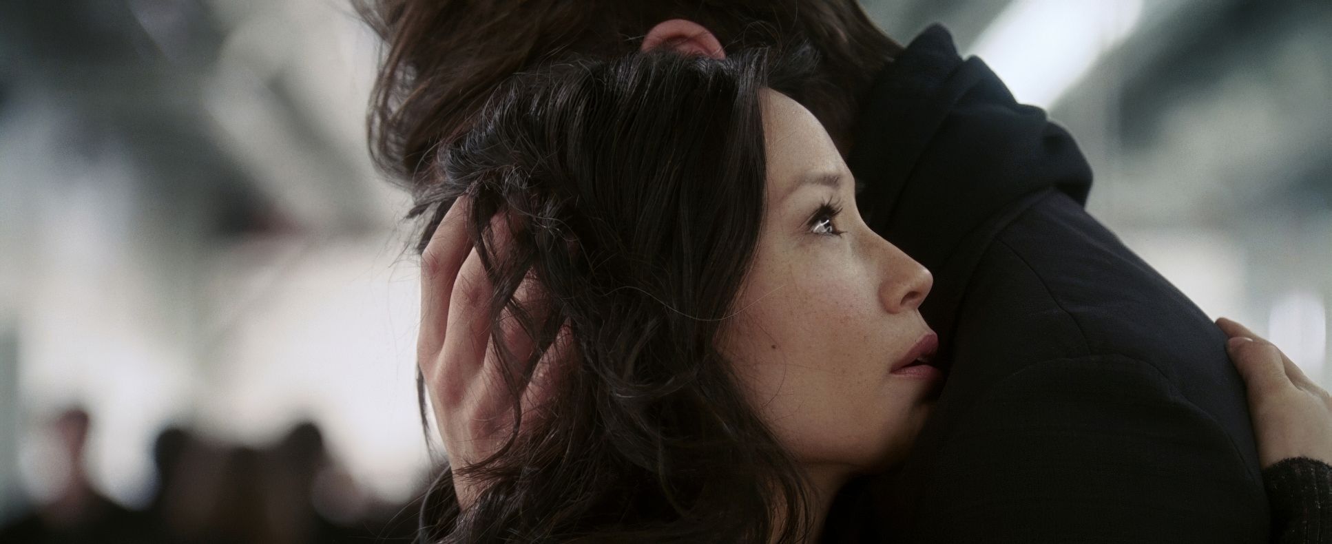
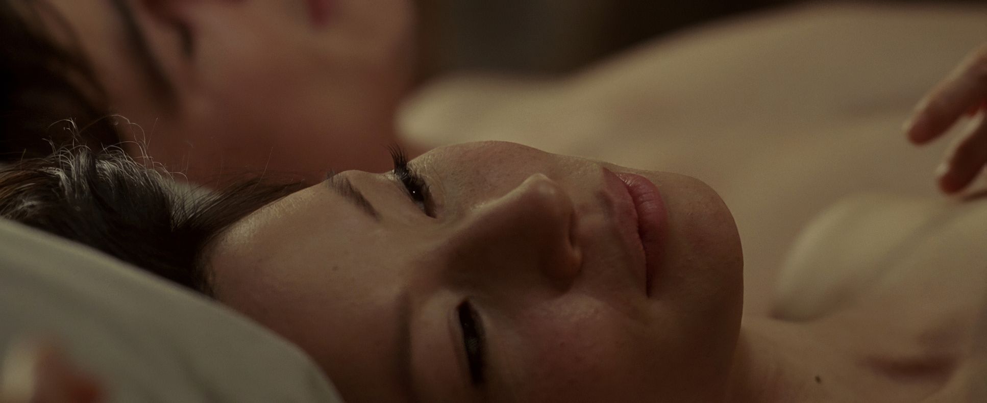
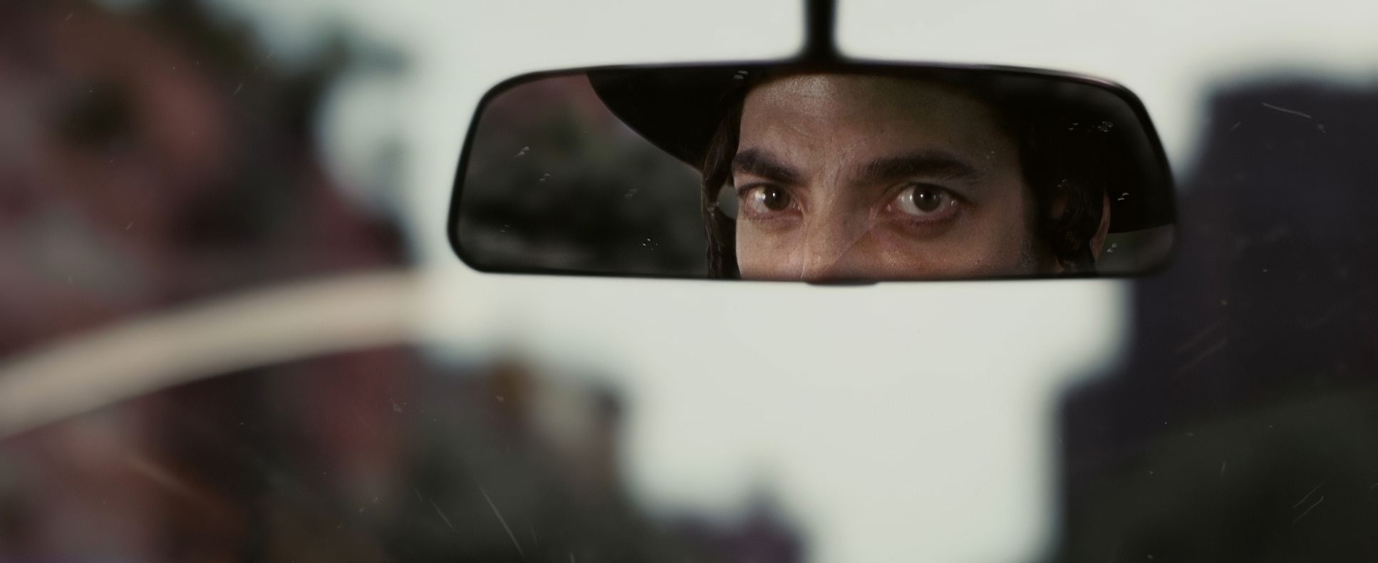
The lighting in Slevin is all about selective revelation. It’s a dance between high-contrast noir shadows and stark, clean light that exposes a character’s vulnerability (or their lies).
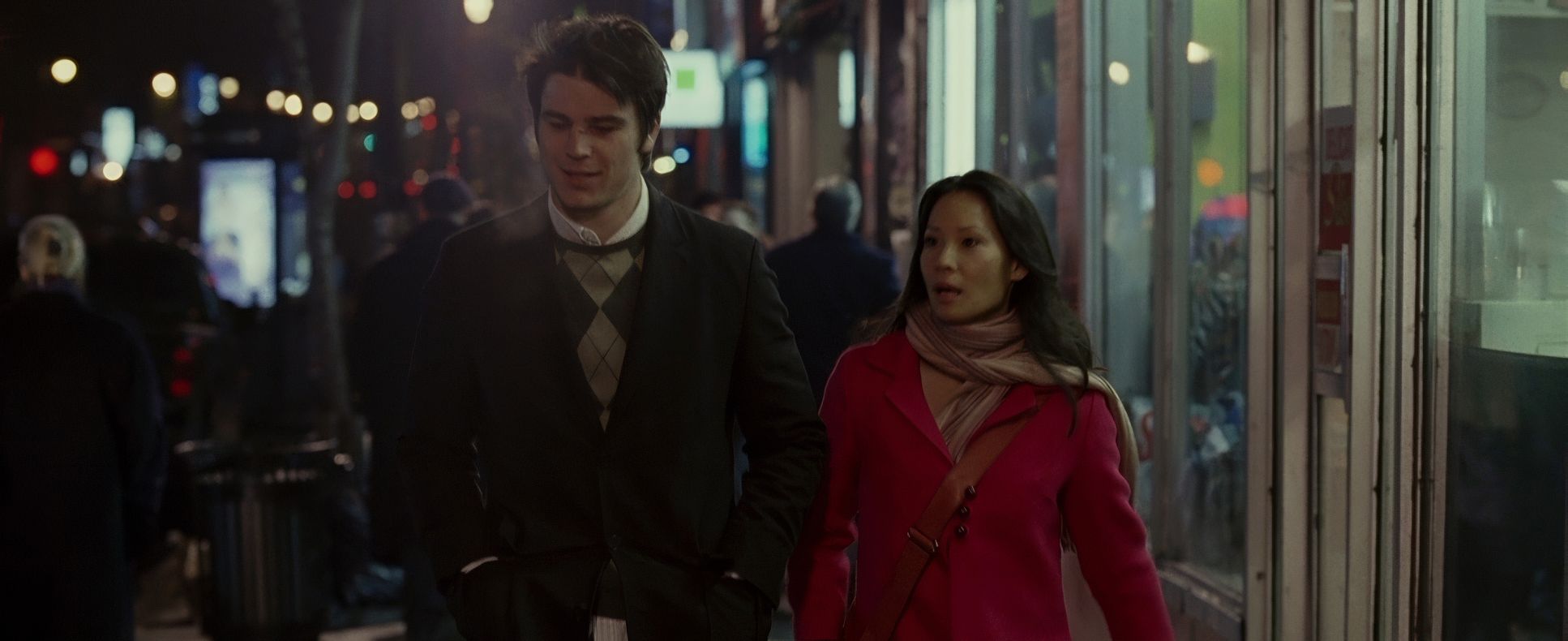
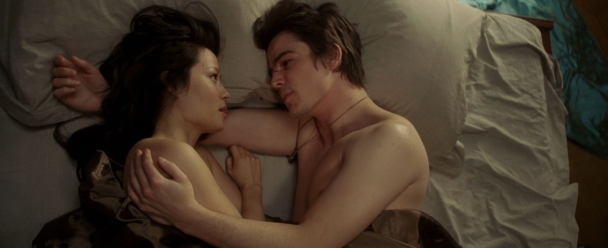
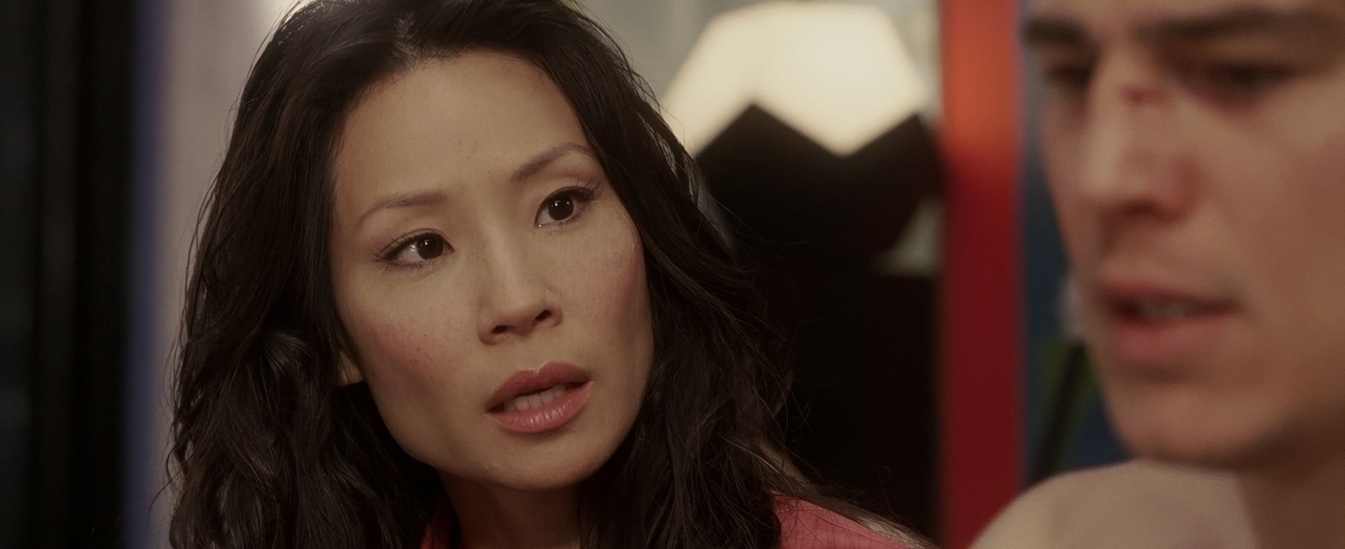
In the lairs of the Boss and the Rabbi, it’s moody and theatrical. You can see the motivated sources practical lamps casting long, dramatic shadows that make these men look larger than life. Then you flip to scenes with Lindsay and Slevin, where the light becomes softer, more naturalistic perhaps the only “authentic” thing in the whole movie. But Sova also uses light to disorient. The way he handles the overexposed flashbacks forces us to become detectives. We’re constantly questioning if what we’re seeing is “real” or just a trick of the light.
Camera Movements
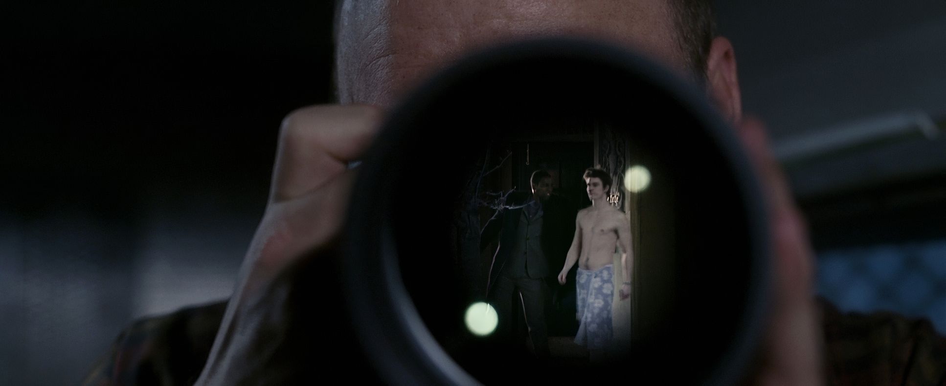
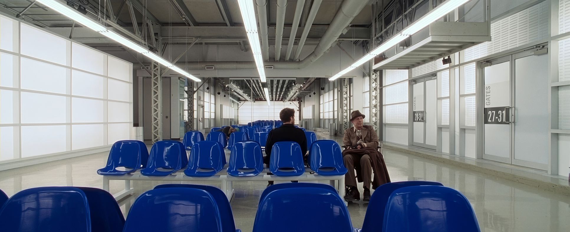
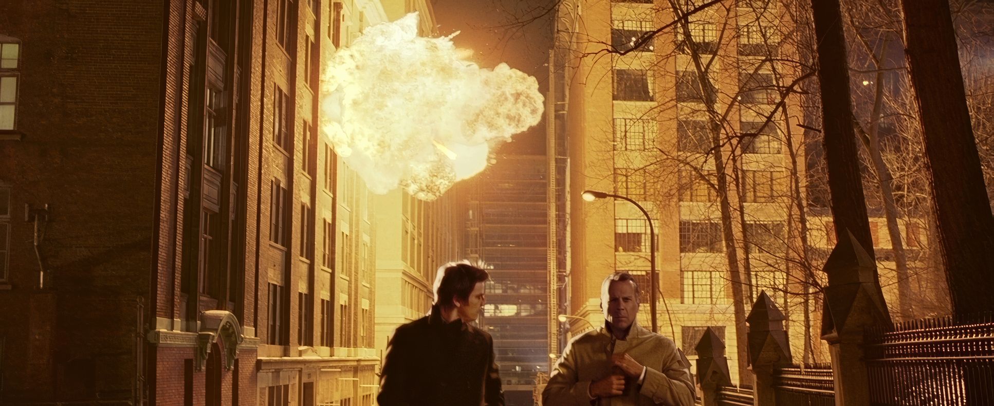
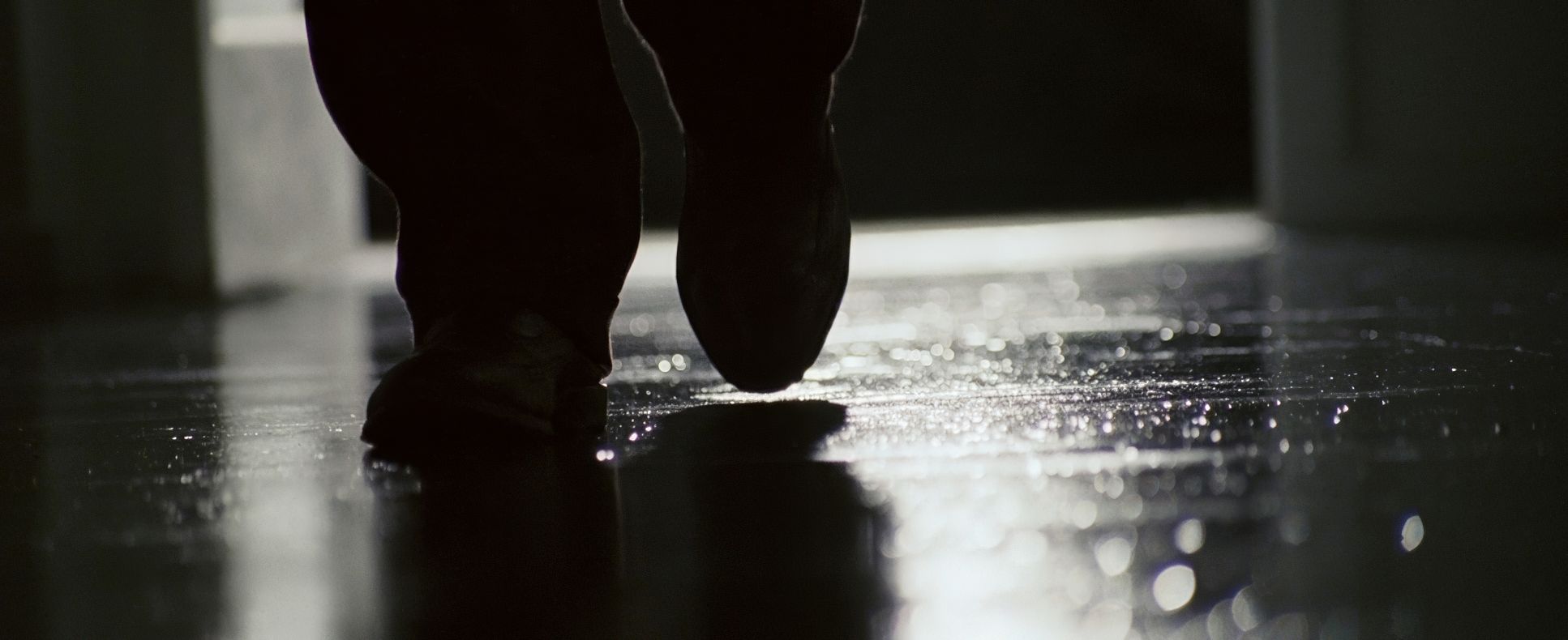
The camera is rarely static, but it’s never moving just for the sake of it. It’s a restless, silent observer. You’ll notice these fluid tracking shots through those complex, patterned environments it makes you feel like you’re being drawn deeper into a maze.
The rhythm is what gets me. During the fast-paced dialogue, Sova uses quick pans and snap zooms that keep up with the characters’ wit. But when it’s time to reveal a clue, the camera slows down. It becomes deliberate. It’s a rhythmic dance, constantly adjusting its tempo to control how much information we’re actually absorbing.
Lensing and Blocking
The choice of glass here is crucial. They shot this on Panavision Millenniums with Primo Primes, and you can feel that sharpness and control over depth. Sova often uses wider lenses for those big, patterned establishing shots, which makes the characters look tiny like they’re trapped in elaborate cages.
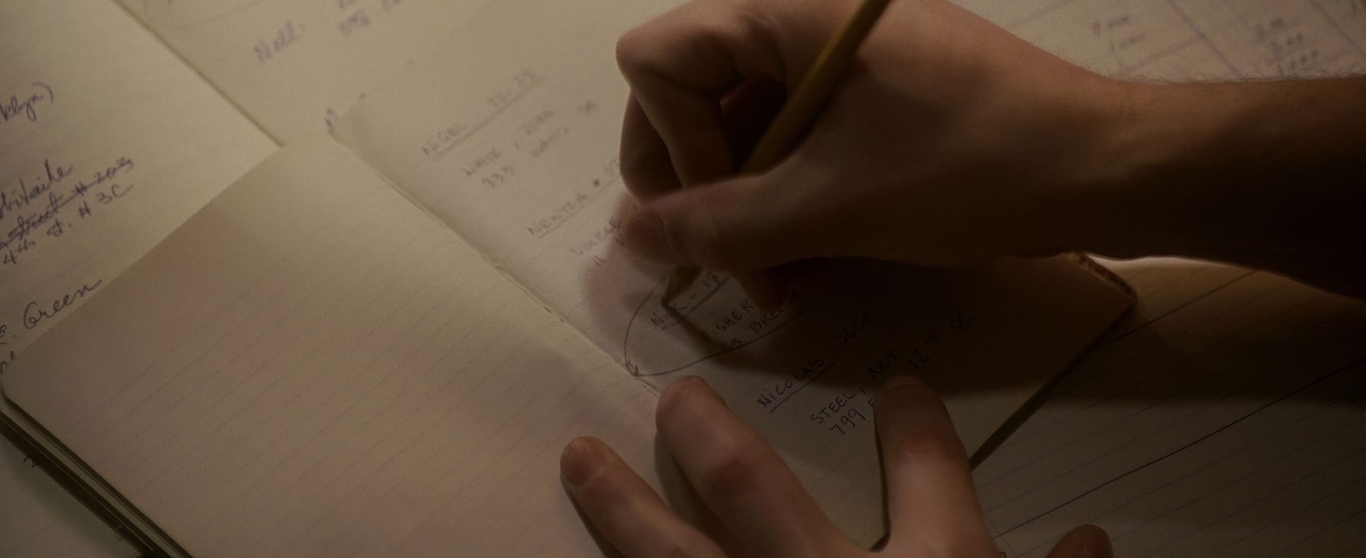
Then, when things get intimate, he moves to longer lenses to compress the depth and pull us into the performance. The blocking is just as meticulous. Characters are layered foreground, mid-ground, background allowing Sova to hide or highlight information at will. Think of the “rule of three” shots where Slevin is physically blocked between the two crime bosses. It’s not an accident; it’s a visual cue for his role as the pivot point in the con.
Technical Aspects & Tools
Lucky Number Slevin
Technical Specs: 35mm Film | 2.39:1 Anamorphic
| Genre | Crime, Drama, Mystery, Thriller, Film Noir, Gangster, Heist |
| Director | Paul McGuigan |
| Cinematographer | Peter Sova |
| Production Designer | François Séguin |
| Costume Designer | Odette Gadoury |
| Editor | Andrew Hulme |
| Colorist | Michael Dobroski |
| Time Period | 2000s |
| Color | Blue, White |
| Aspect Ratio | 2.39 – Anamorphic |
| Format | Film – 35mm |
| Lighting | Soft light, Side light |
| Lighting Type | Fluorescent |
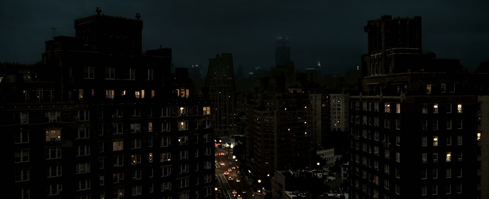
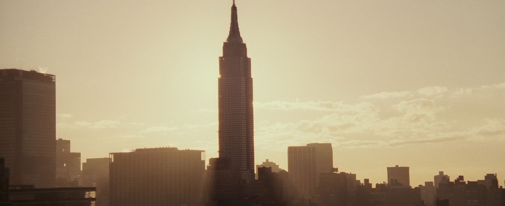
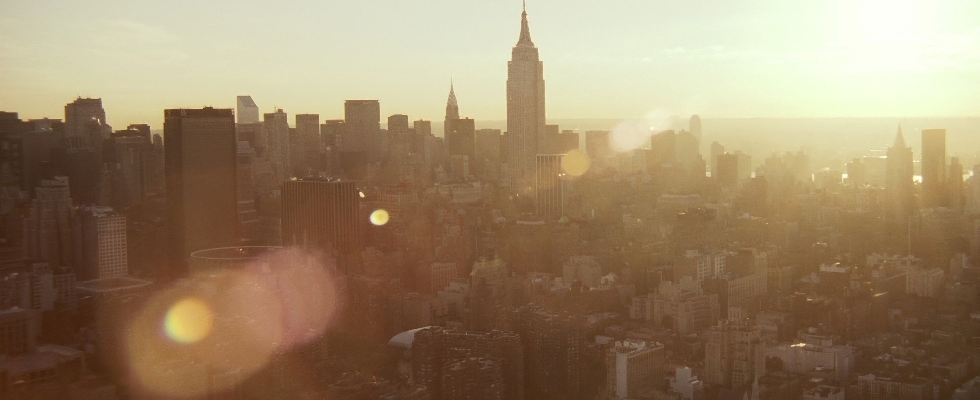
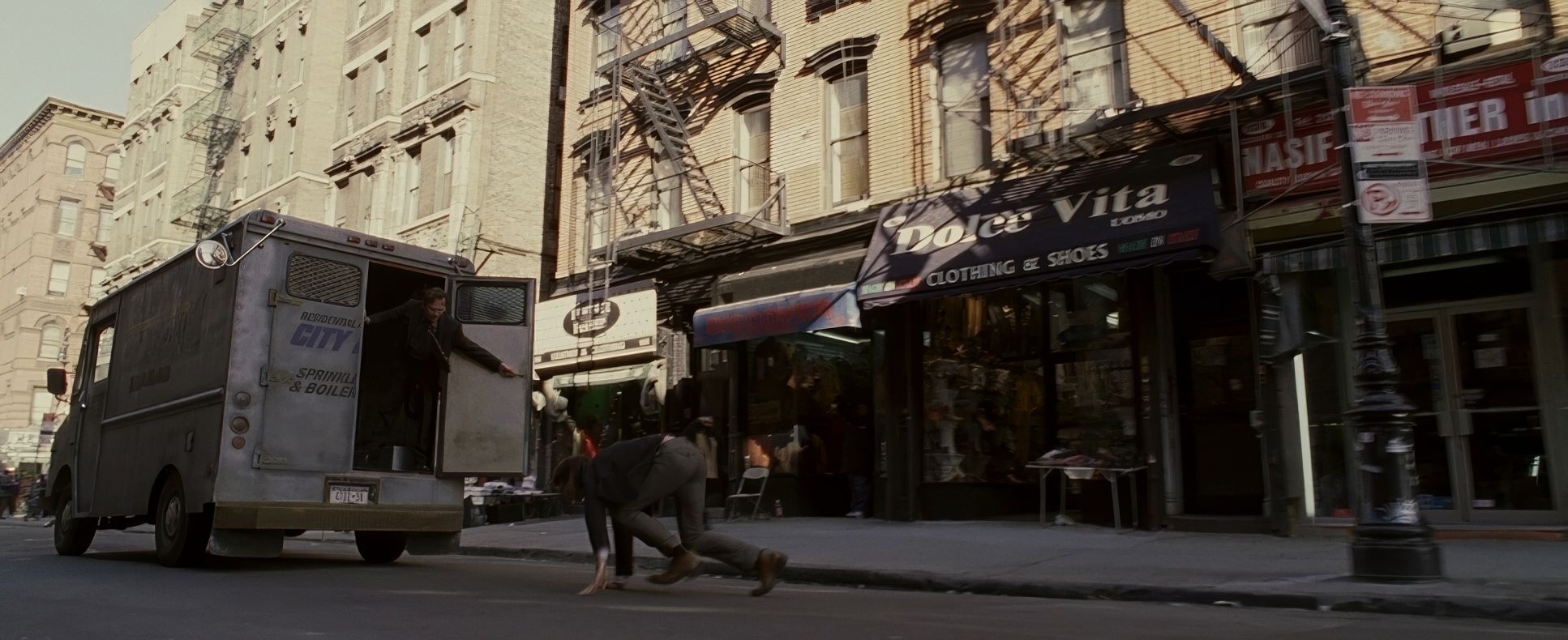
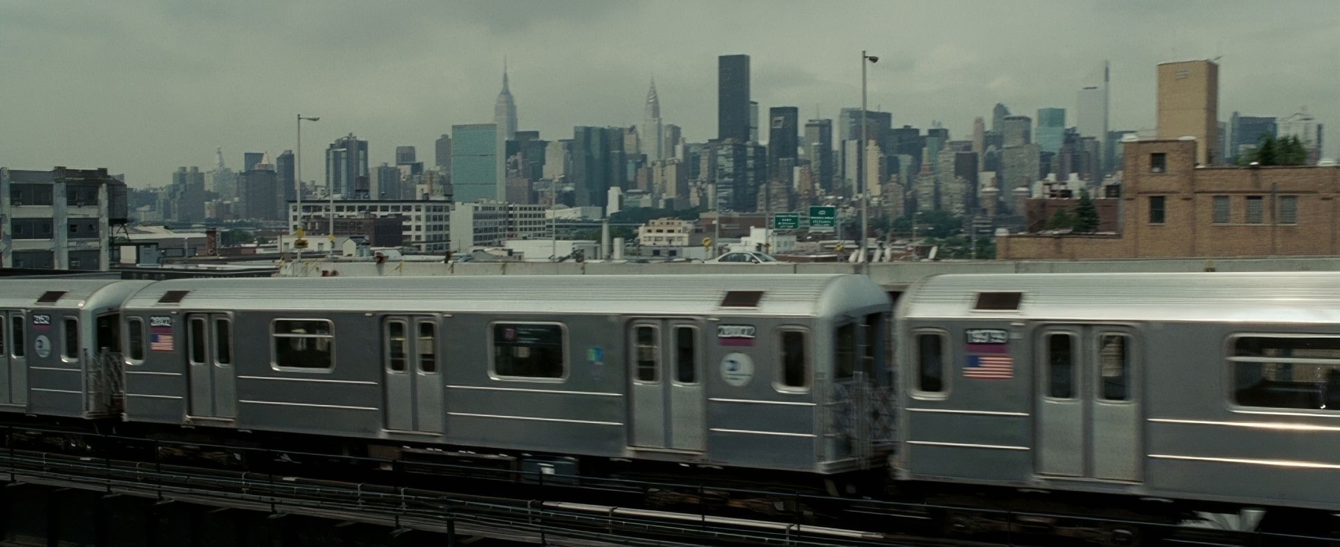
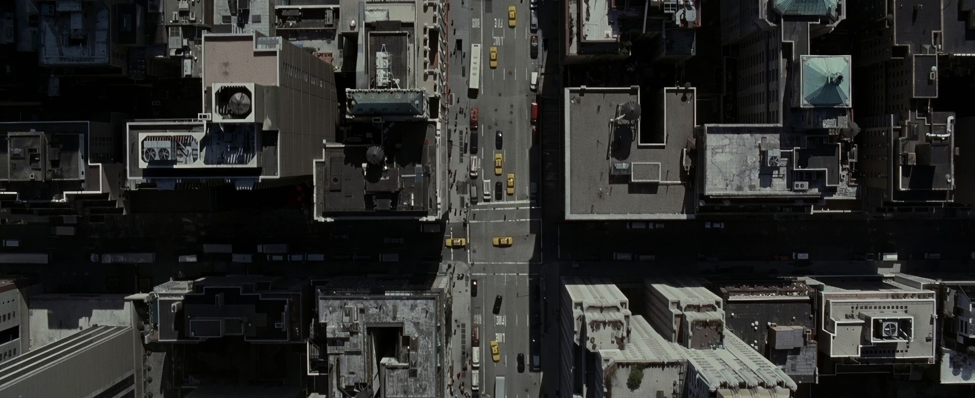
| Story Location | New York City, New York |
| Filming Location | Cité du Cinéma, Montreal |
| Camera | Panavision Millennium / Millenium XL / XL2 |
| Lens | Panavision Primo Primes |
| Film Stock / Resolution | 5217/7217 Vision 2 200T, 5218/7218 Vision 2 500T, 8552/8652 F-250T, 8562/8662 F-250D |
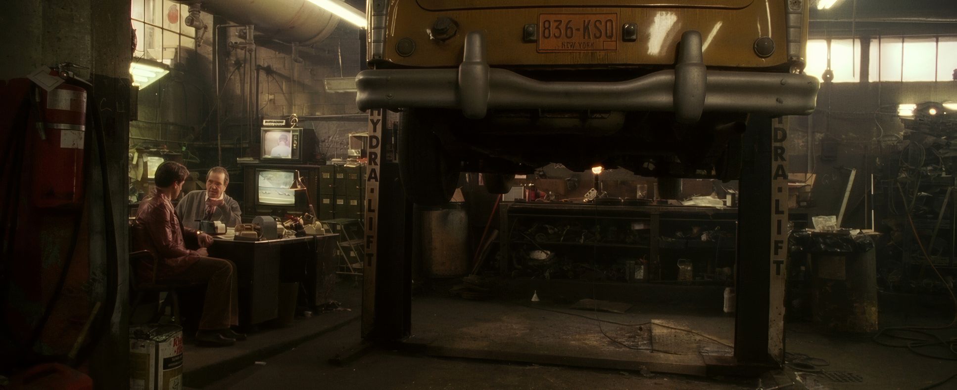
For the gearheads, Lucky Number Slevin is a 35mm beauty. They utilized a mix of Kodak Vision2 200T and 500T (5217/5218), which explains that incredible texture and the way those fluorescent lights in the train station scenes (shot in Montreal) have that specific “flicker” and color cast.
That “low framerate” effect in the flashbacks? That’s a deliberate manipulation of the shutter or in-camera cranking to create that staccato, dreamlike feeling. Every frame, every shift in color temperature, every choice of Panavision glass feels like it was part of a larger plan. It’s a testament to the collaboration between McGuigan and Sova.
Lucky Number Slevin (2006) Film Stills
A curated reference archive of cinematography stills from Lucky Number Slevin (2006). Study the lighting, color grading, and composition.


- Also read: MULAN (1998) – CINEMATOGRAPHY ANALYSIS
- Also read: GATTACA (1997) – CINEMATOGRAPHY ANALYSIS
Browse Our Cinematography Analysis Glossary
Explore directors, cinematographers, cameras, lenses, lighting styles, genres, and the visual techniques that shape iconic films.
Explore Glossary →