Mission: Impossible – Fallou isn’t just a film I enjoyed; it’s the masterclass I pull up as a reference when a client asks for “gritty realism that still looks like a hundred million dollars.”
Christopher McQuarrie and Rob Hardy didn’t just make an action movie; they built a visual DNA that feels meticulously planned. I mean, the general consensus is that this is one of the best action epics in recent memory, but for me, the magic is in how that raw physical intensity is captured. It’s a beautifully filmed beast that makes you feel every punch and every white-knuckle moment.
About the Cinematographer

The visual architect here is Rob Hardy, BSC. I’ve followed his work from the sterile, clinical precision of Ex Machinato the larger-than-life scale of Fallout. What I love about Hardy is his “invisible artistry.” He isn’t flashy for the sake of it. In Fallout, every lighting choice and camera movement feels deliberate, designed to immerse you deeper into Ethan Hunt’s impossible situation rather than screaming, “Look at this cool shot!”
His partnership with McQuarrie clearly built on the foundation of Rogue Nation, but they pushed the envelope further here. There’s a palpable trust between the director and DP that allowed for those complex, extended sequences where the camera becomes a character weaving through the chaos. Hardy’s approach perfectly complements the film’s commitment to practical stunts, ensuring Tom Cruise’s insanity is felt with visceral impact.
Color Grading Approach

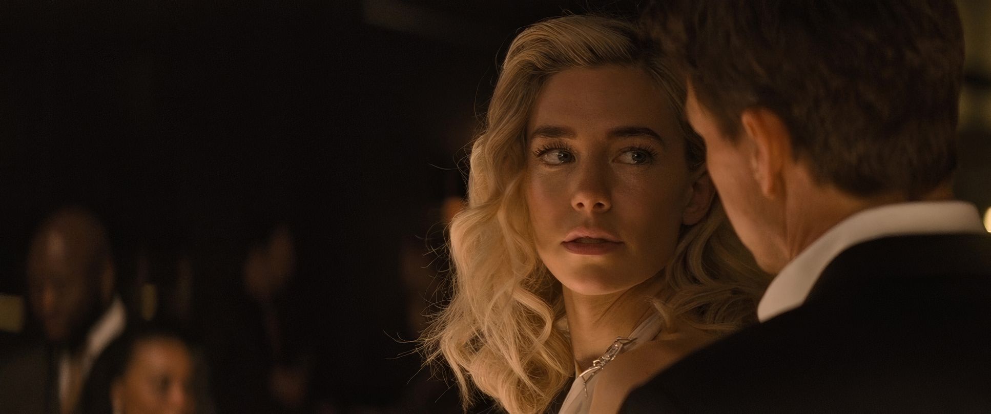
Since this is my bread and butter, I want to nerd out here for a second. The color grading on Fallout, handled by Jateen Patel, is a masterclass in tonal sculpting. As a colorist, I look at the highlights and shadows first. The contrast shaping here is impeccable the shadows are rich and deep, but they’re never “crushed” into a muddy mess. There’s detail in the “toe” of the curve that keeps the image feeling tactile and real.
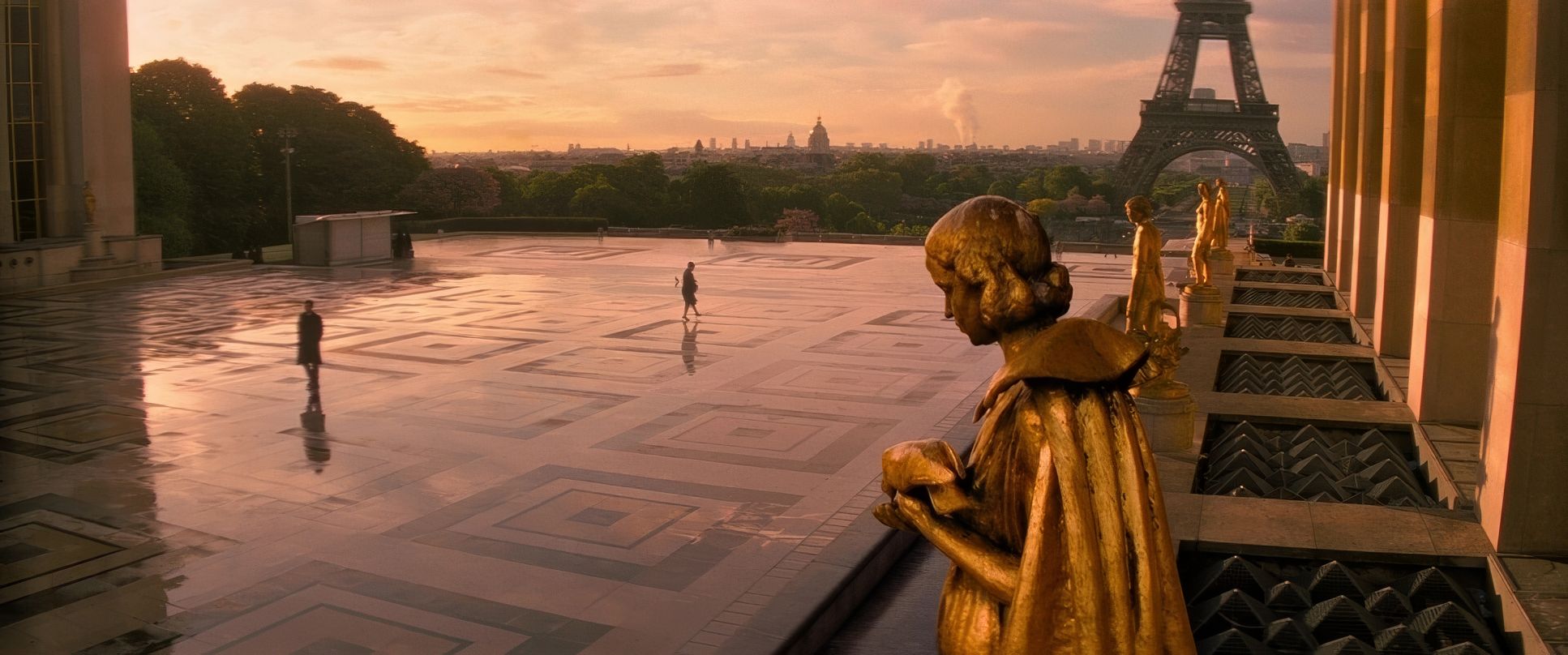
The palette leans towards a sophisticated, slightly desaturated cool tone, especially in the urban sequences. We’re seeing a lot of cyans and blues in the night exteriors, which underscores the high stakes. However, what really impresses me is the hue separation. Even in a cool-toned scene, the skin tones remain natural and “healthy.” That’s a tough balance to strike in the grade without looking “filtered.”
There’s also a clear print-film sensibility. Since they shot on a mix of Kodak Vision3 50D, 200T, and 500T, you get that organic texture that digital sensors still struggle to emulate perfectly. Patel’s grade respects that celluloid foundation, giving us beautiful highlight roll-off (where the brightest parts of the image fade softly rather than “clipping” into a digital white). It’s a grade that doesn’t just look pretty; it supports the gravity of the story.
Inspiration Behind the Cinematography

The core inspiration was clearly a rejection of the “shaky cam nonsense” that has plagued action cinema for two decades. The goal was to make other action movies look like “baby movies” by comparison and they mostly succeeded. They wanted authenticity and clarity.
The visual philosophy felt like: Let the action speak for itself, but elevate its language. It’s an “adult action film” in its execution. It demands your attention and respects your intelligence by trusting that well-crafted visuals will sustain tension better than cheap editing tricks. They wanted to make you hold your breath, not make you feel motion-sick.
Lighting Style
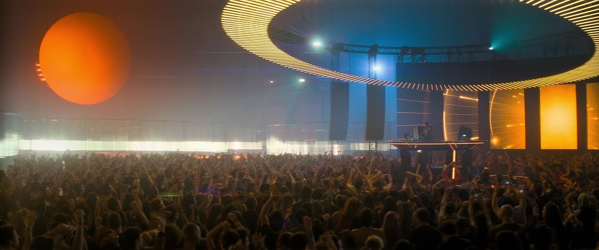
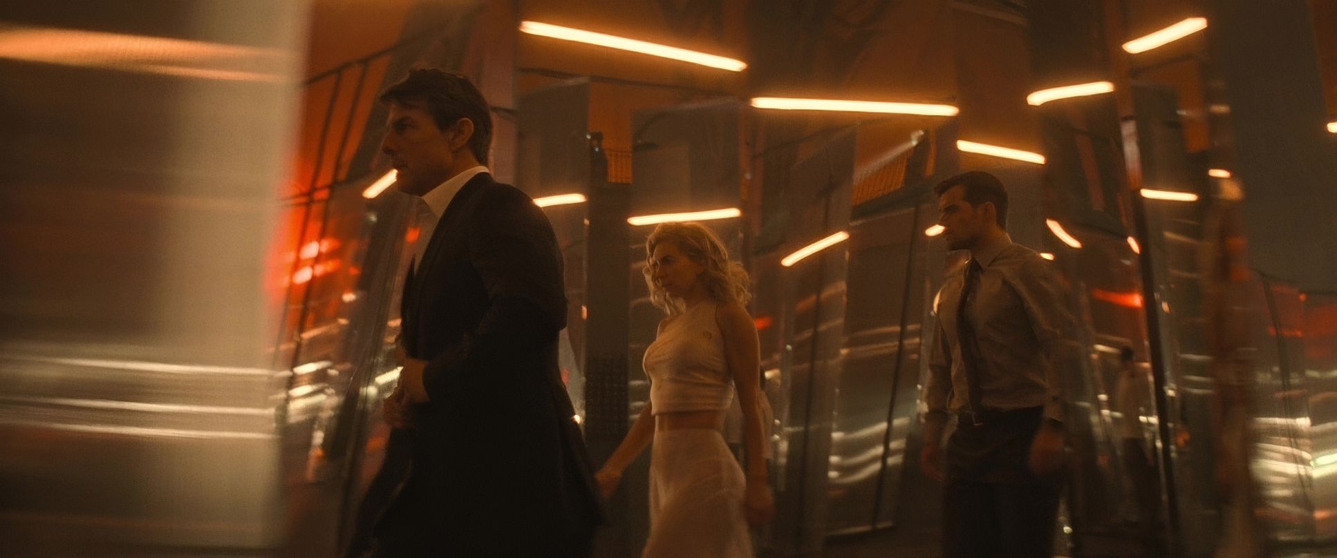
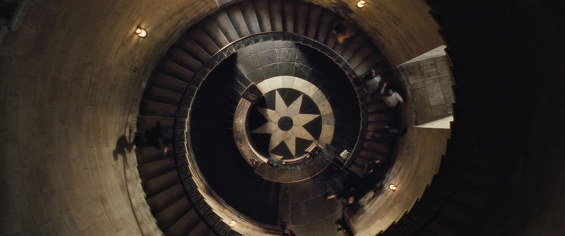
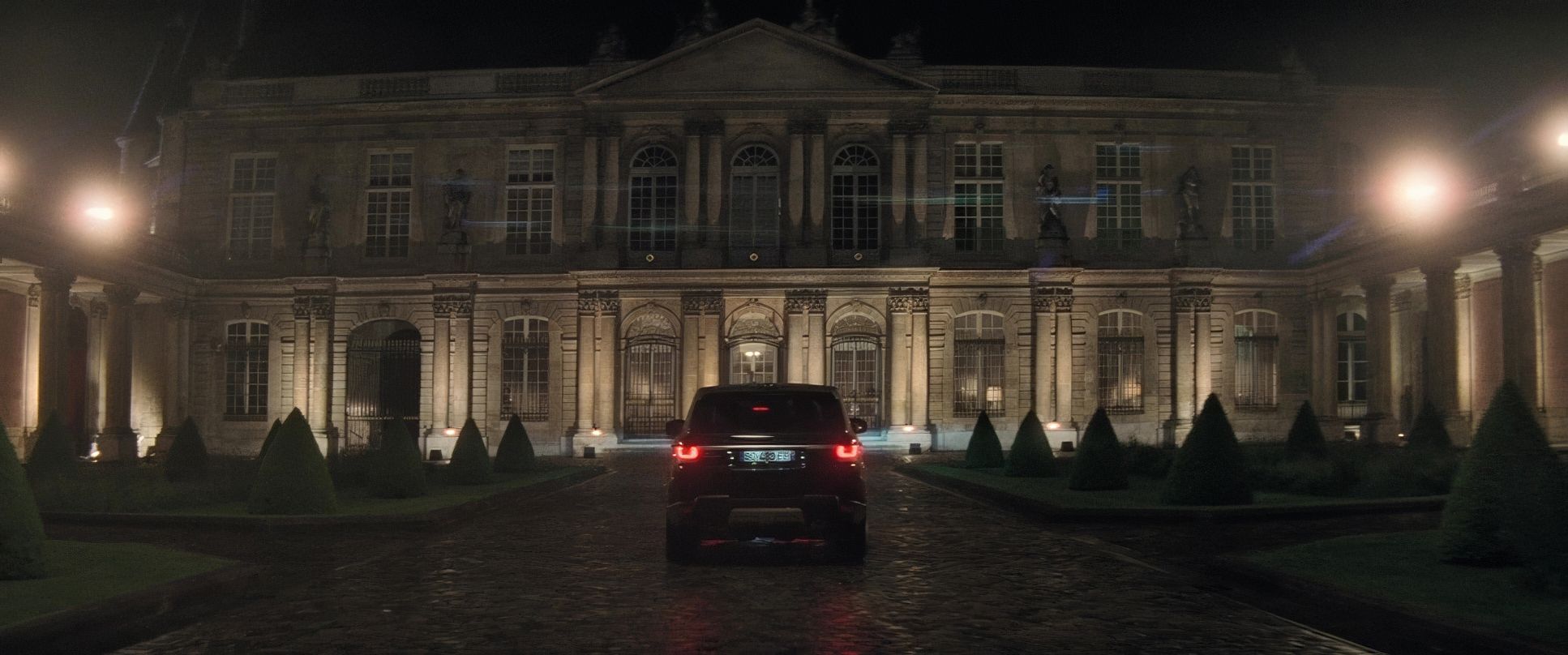
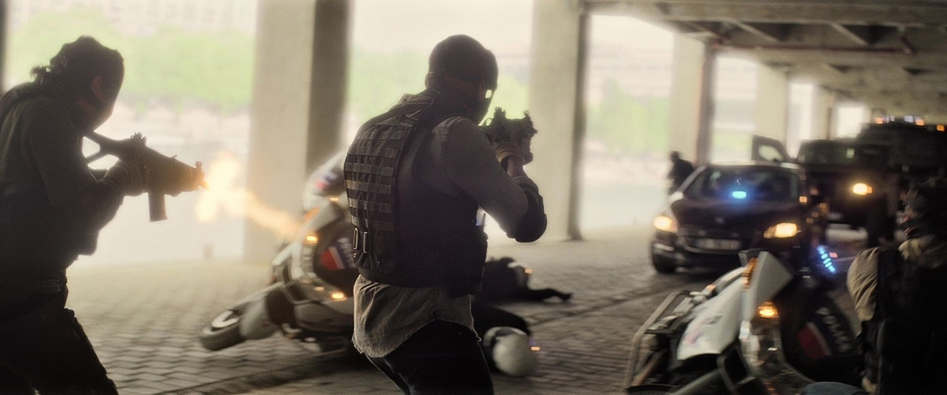
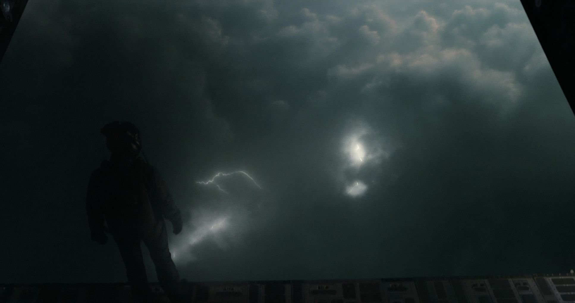
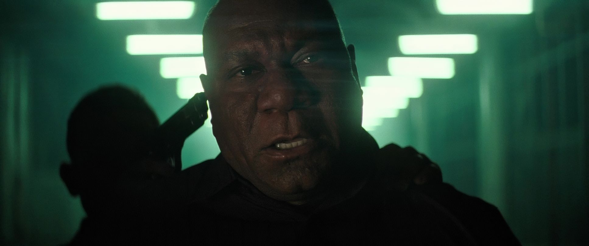
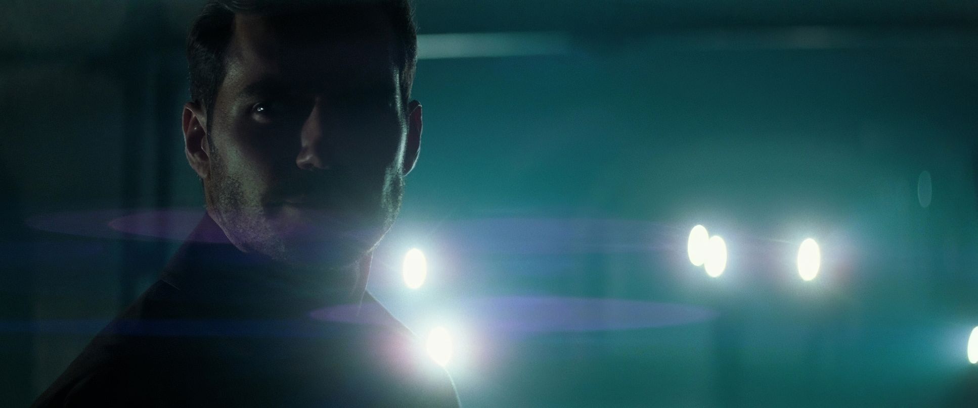
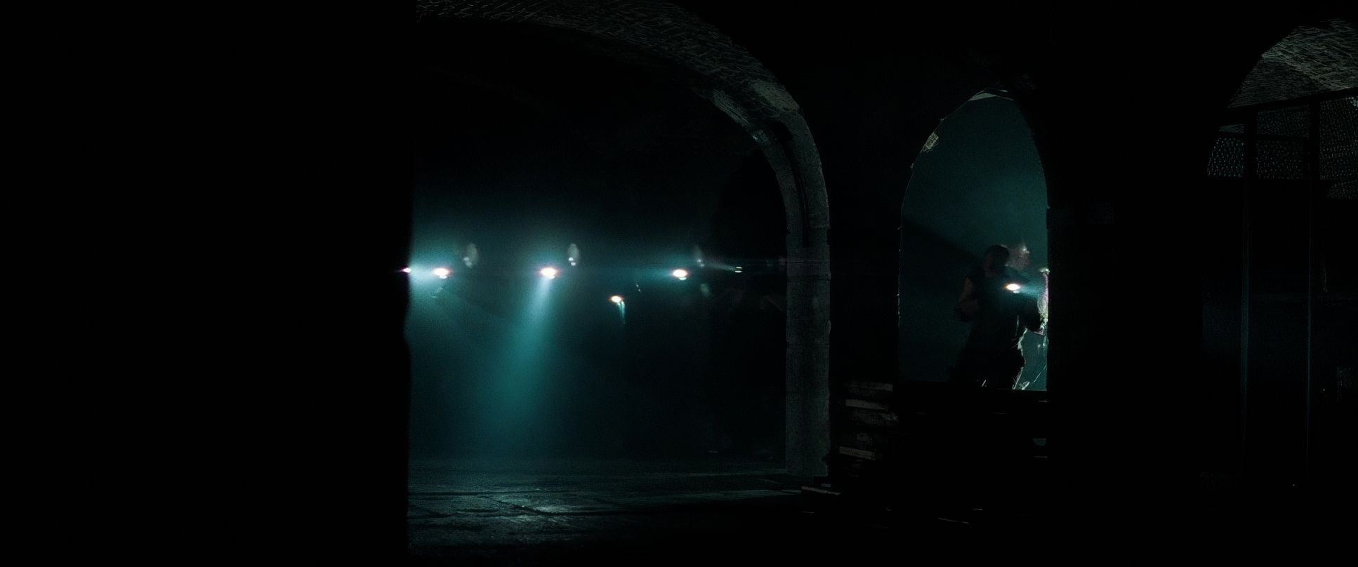
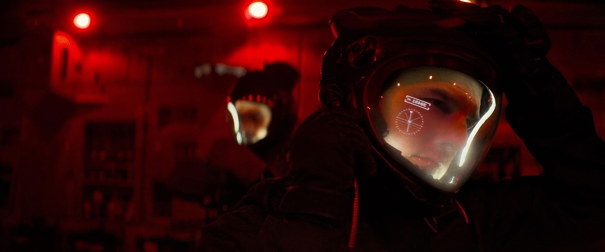
The lighting in Fallout is a masterclass in motivated lighting. It’s gritty and naturalistic, avoiding that “lit for a movie” look. Night scenes, in particular, are exceptional. Instead of flooding a street with artificial light, Hardy embraces deep shadows and uses practical sources streetlights, car headlights, or an interior lamp to provide primary illumination.
In the interior stealth sequences, the lighting shifts to reflect the emotional temperature. I love the use of side-lighting here; it sculpts the actors’ faces and emphasizes textures, making everything feel grounded. It’s never just “bright” or “dark” every pocket of light feels like it has a reason to be there.
Camera Movements

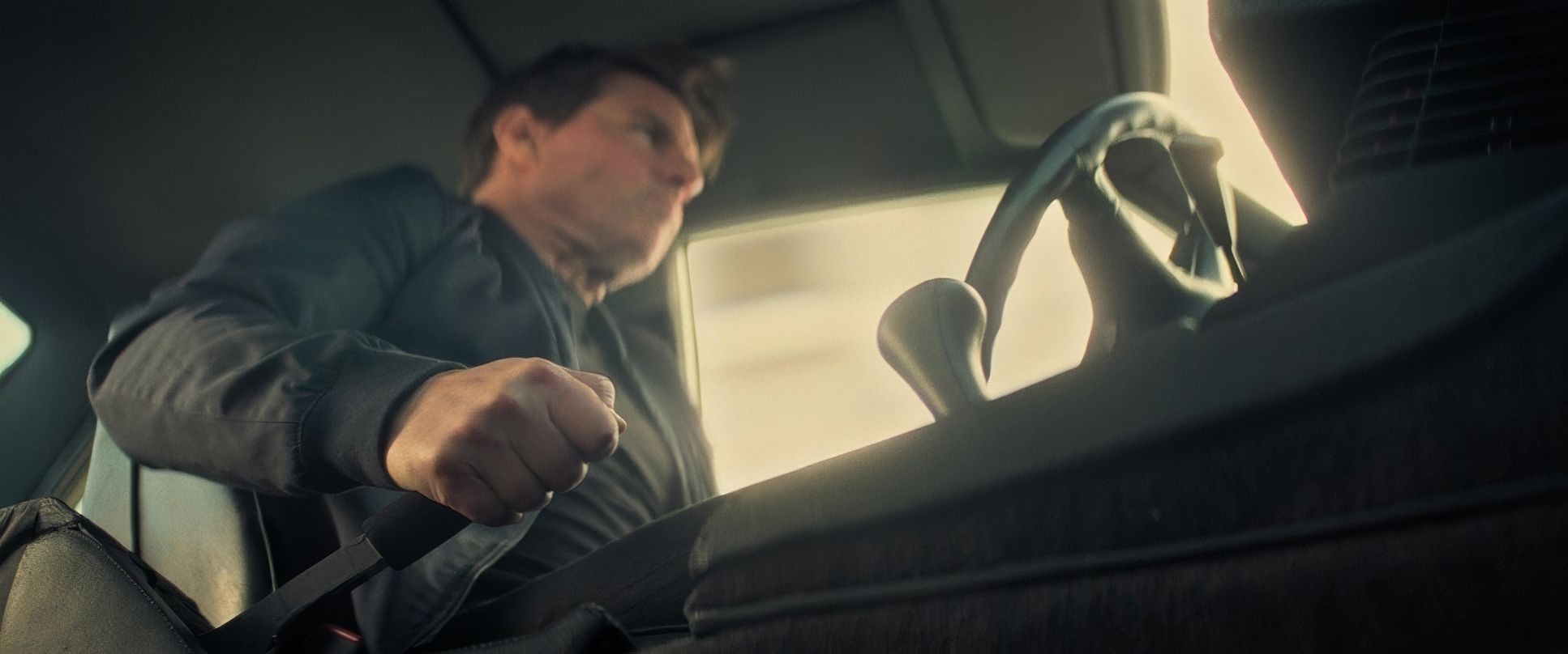
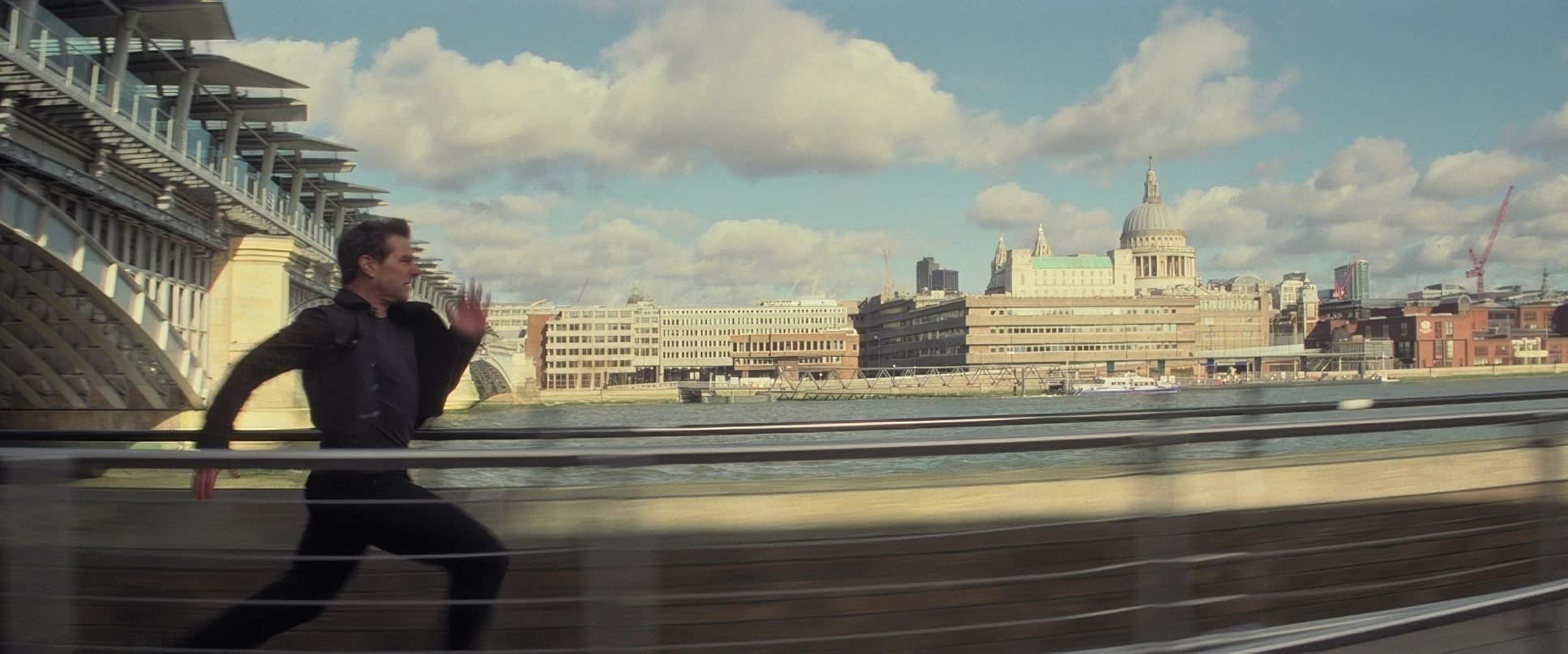
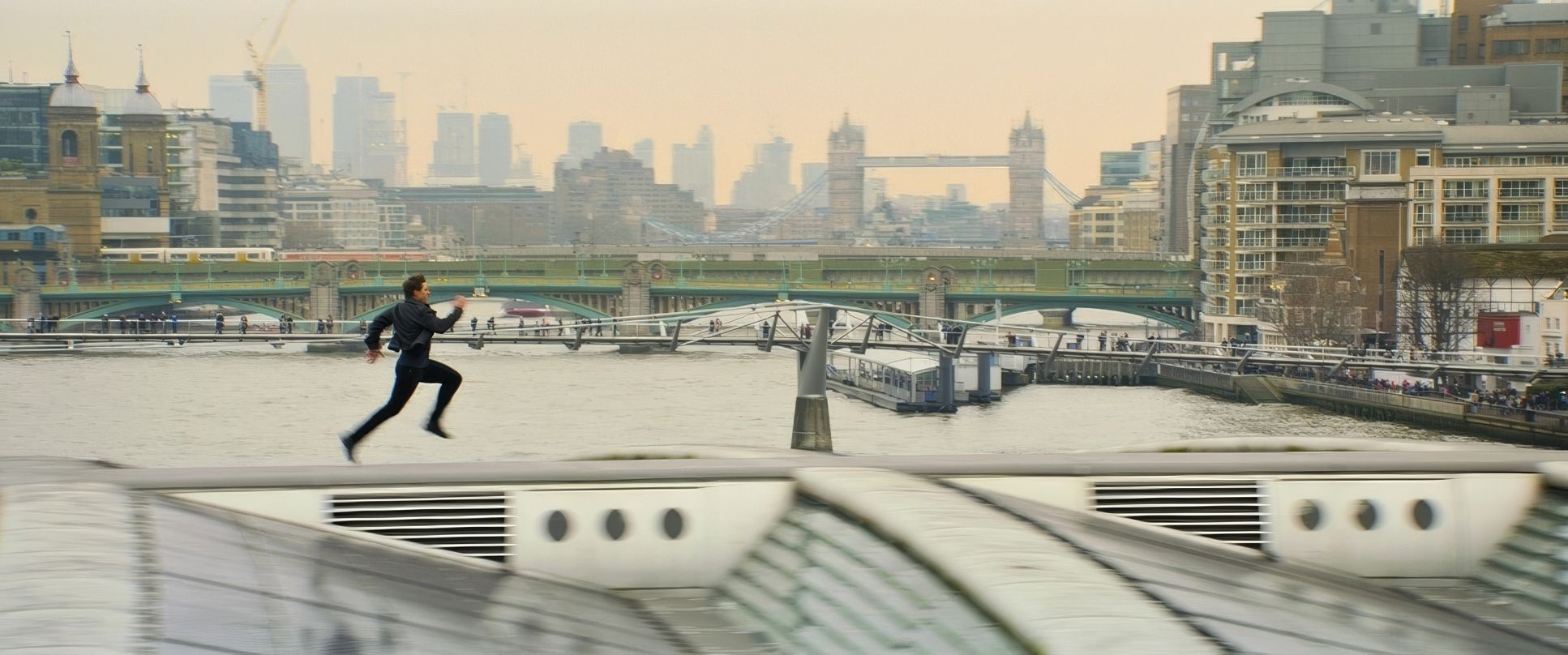
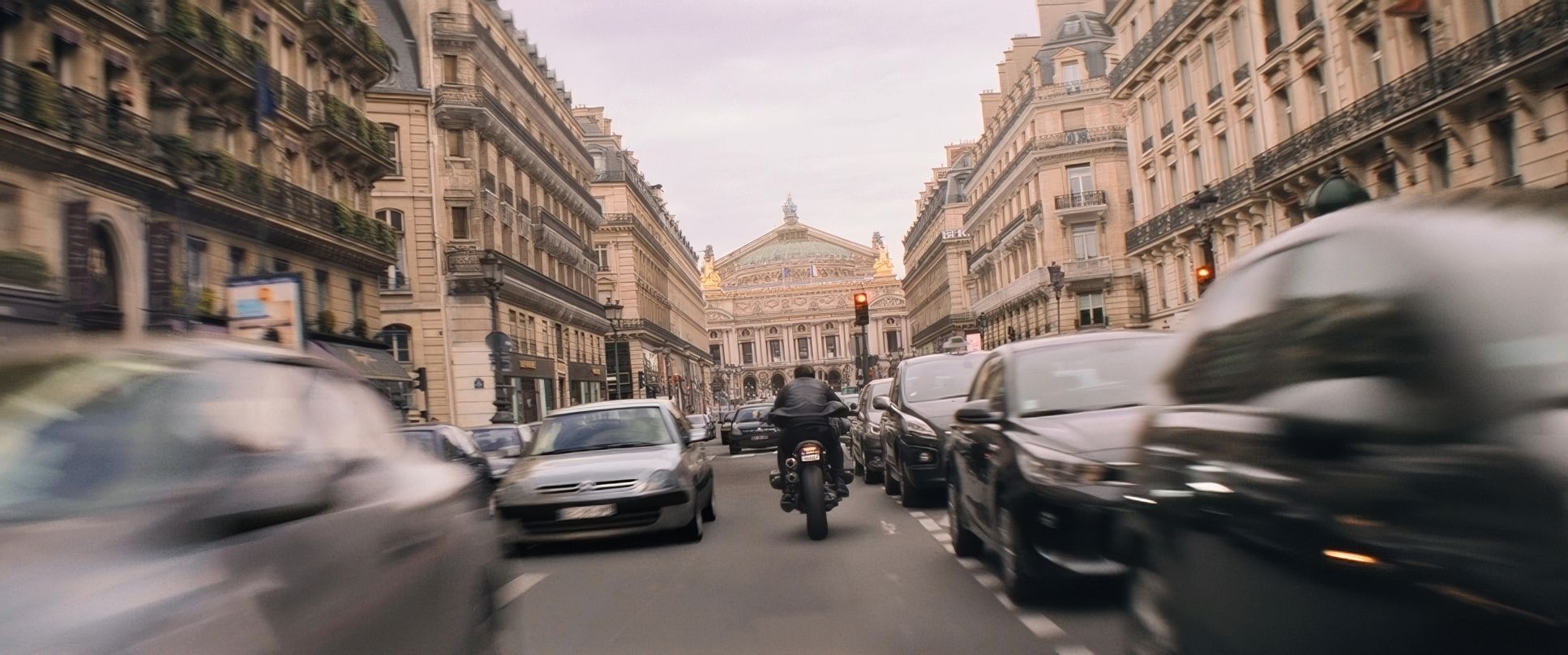
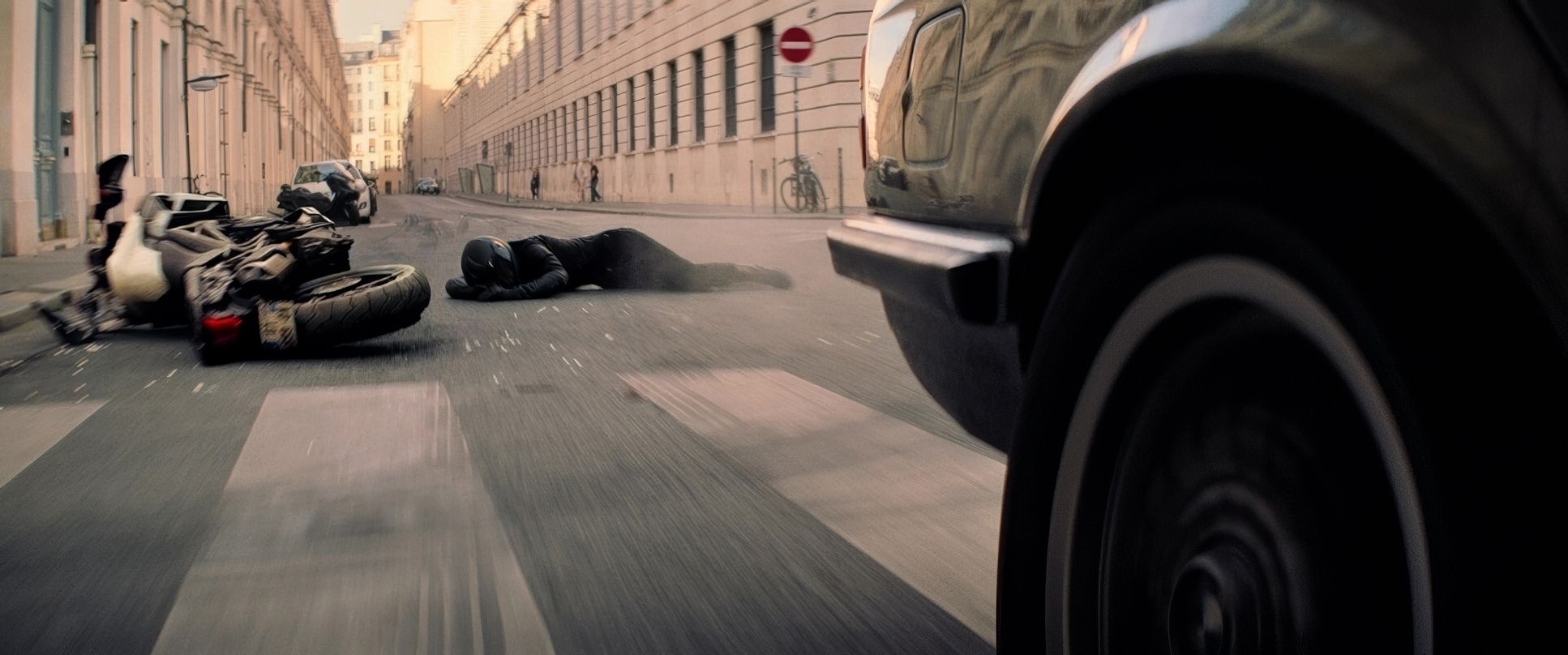
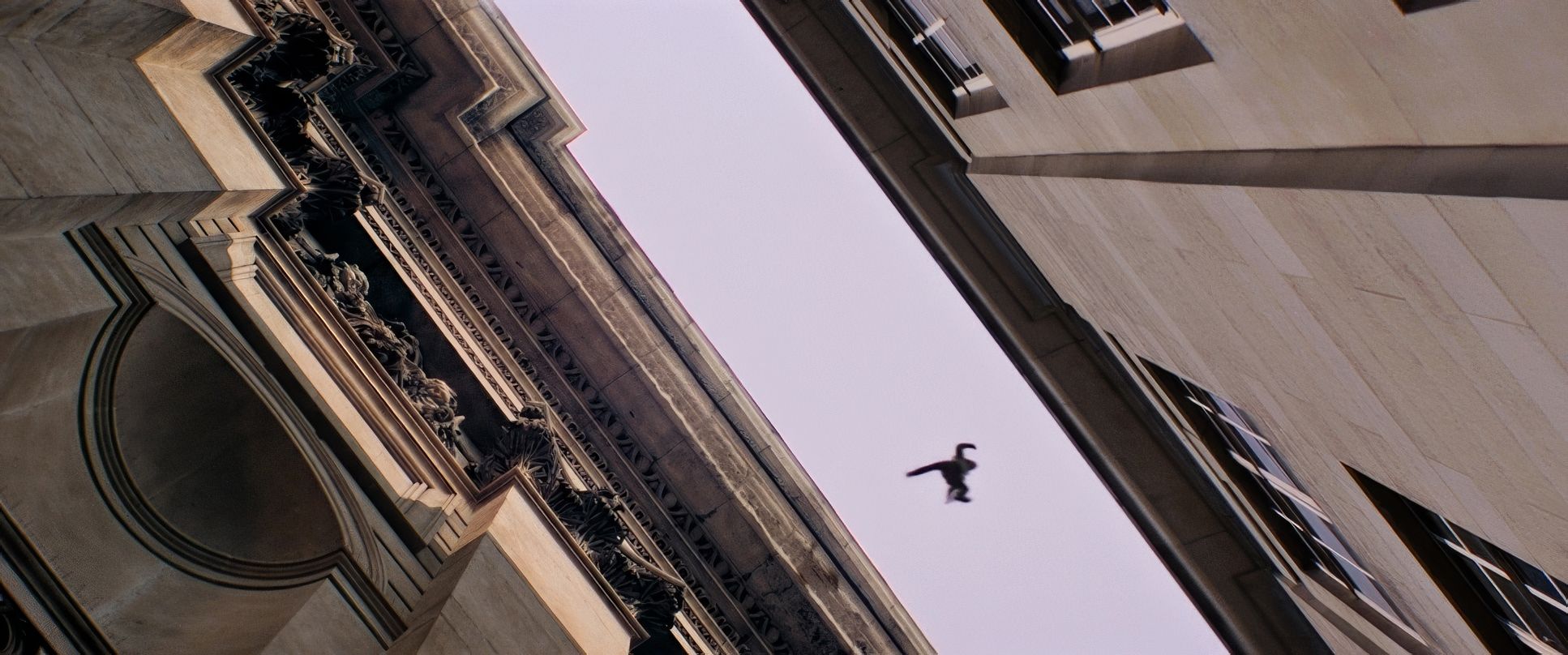
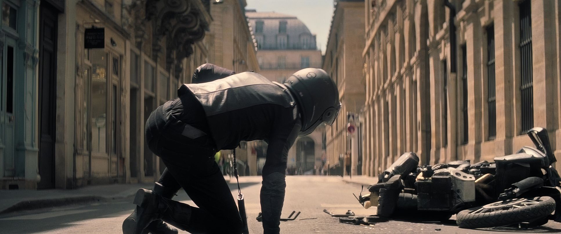
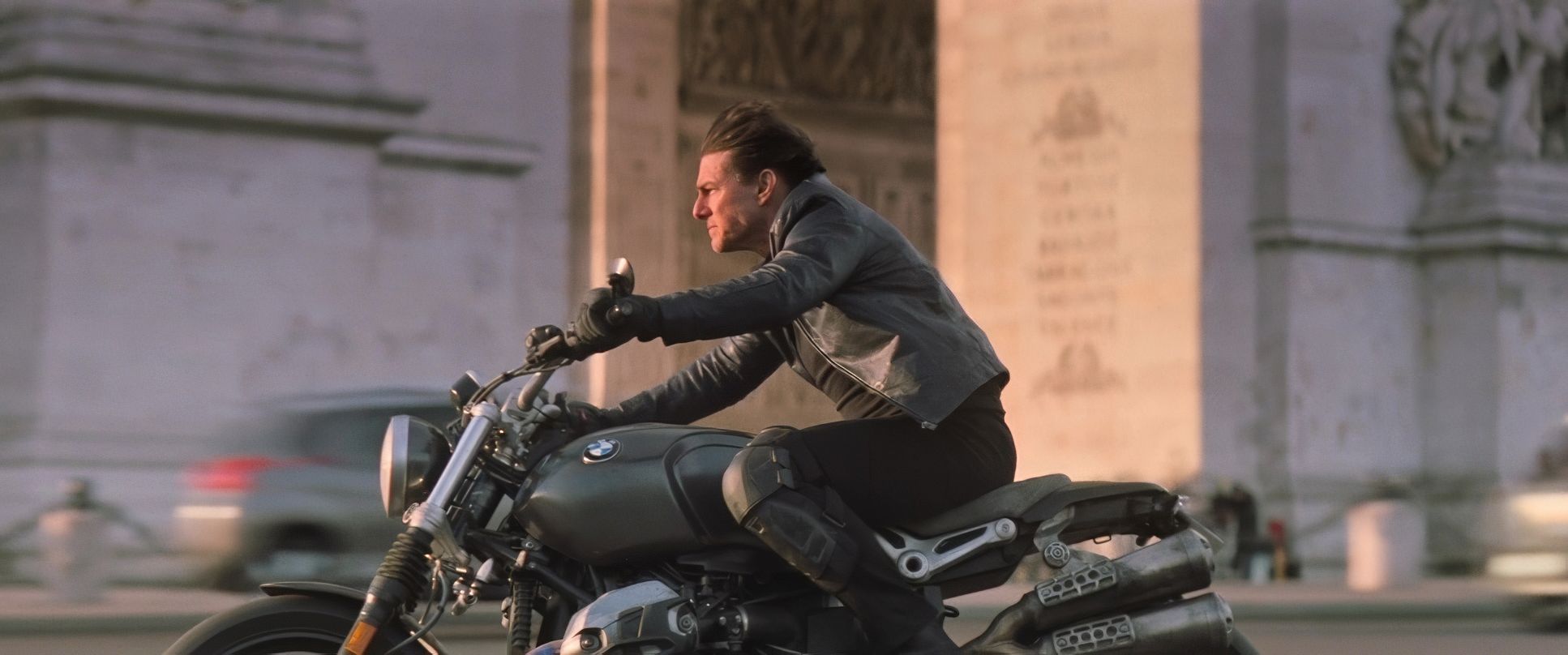
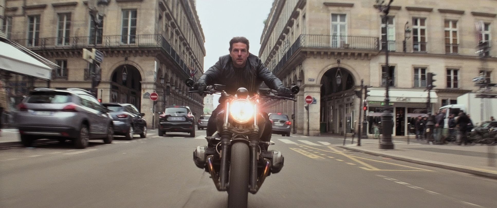
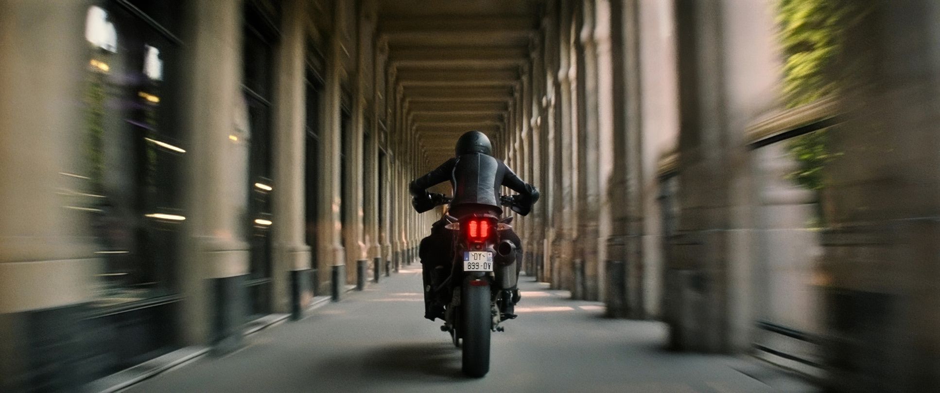
This is where the energy comes from. The camera work is a dynamic, relentless force. Whether it’s the foot chases or the motorcycling through Paris, we aren’t just watching Ethan Hunt; we are with him.
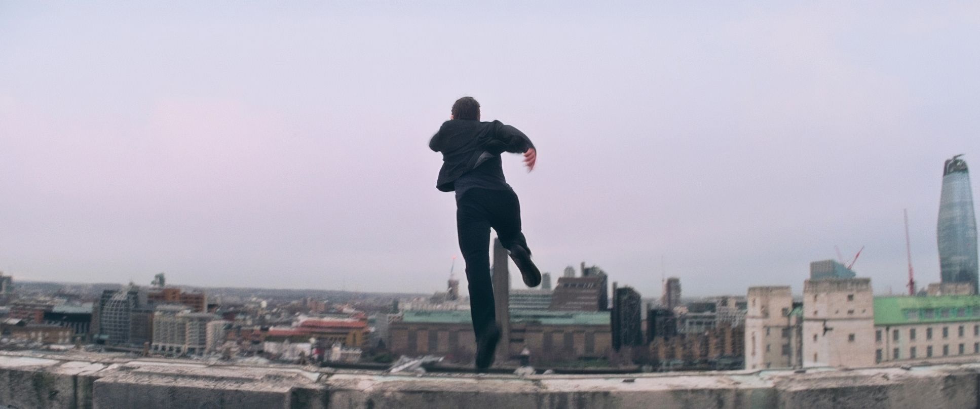
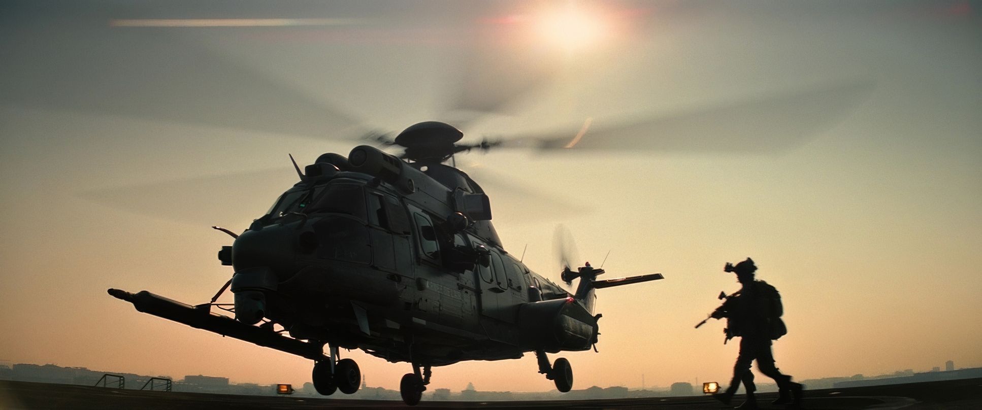
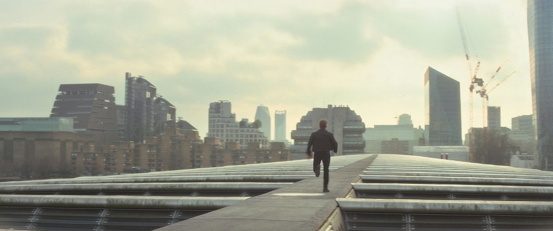
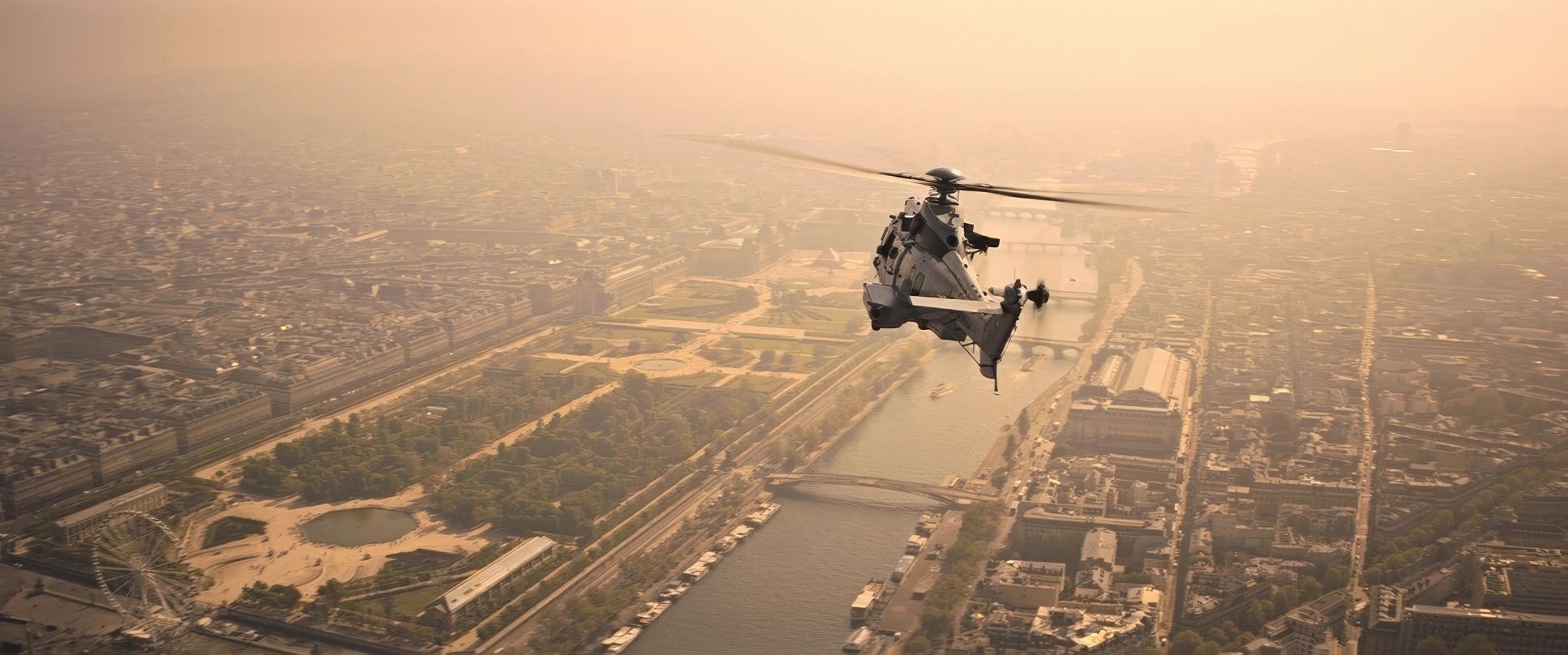
The camera uses relentless forward momentum, often employing Steadicam or dolly shots that maintain a close proximity to amplify the speed. There’s that specific shot where the camera spins around Cruise as he runs atop a building it’s a moment of heightened disorientation, yet it maintains total clarity. It’s a calculated escalation. Then you have the helicopter sequence, where the camera is practically another rotor blade. It’s unreal.
Compositional Choices

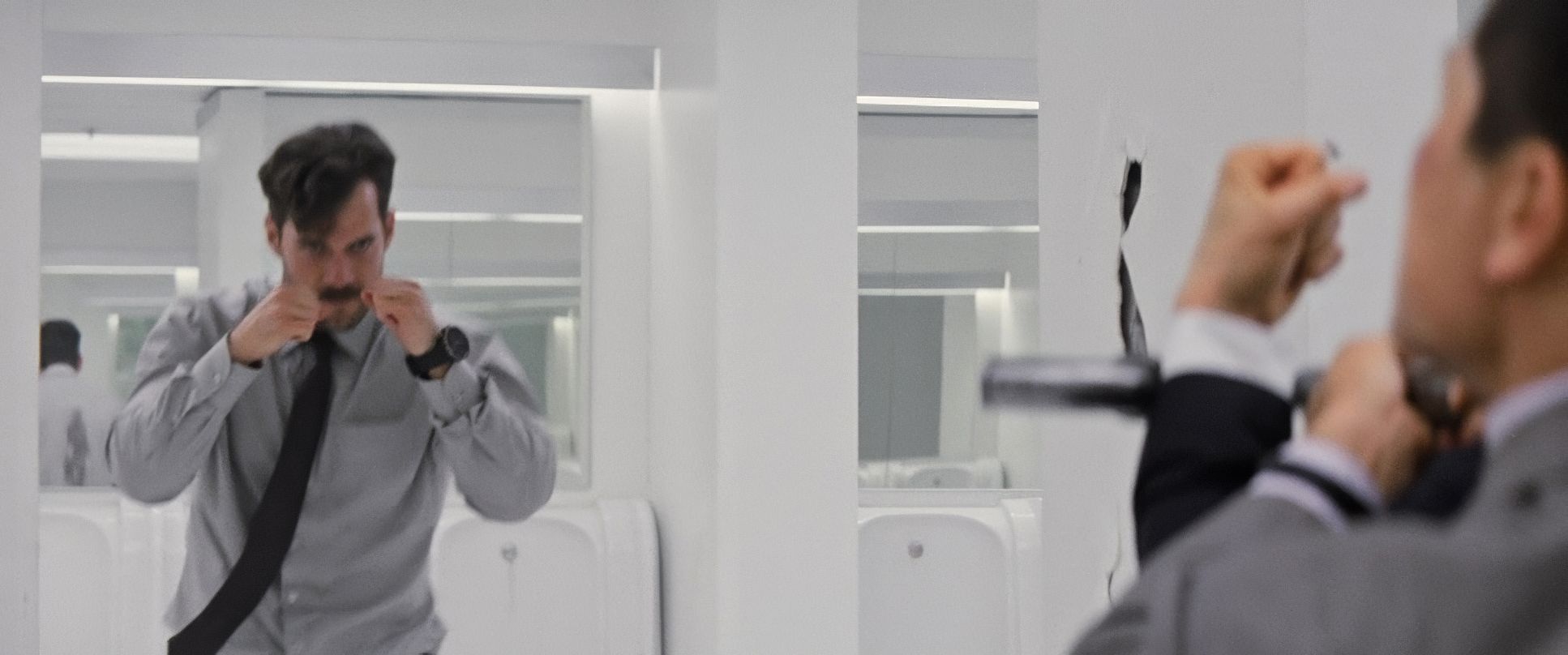
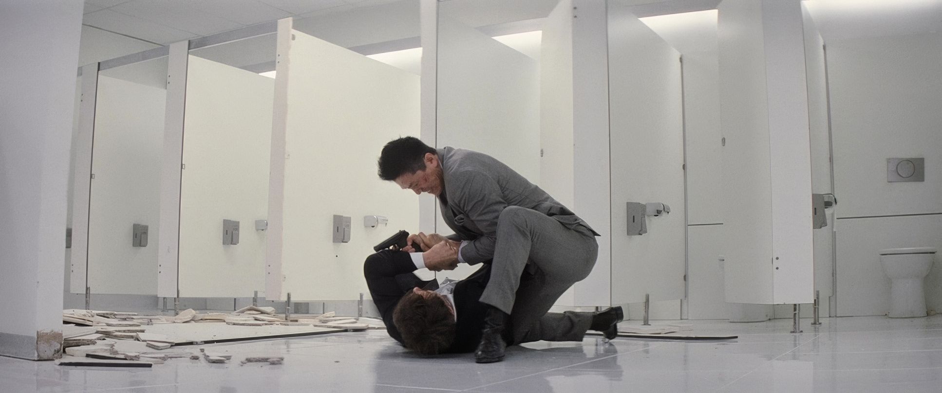
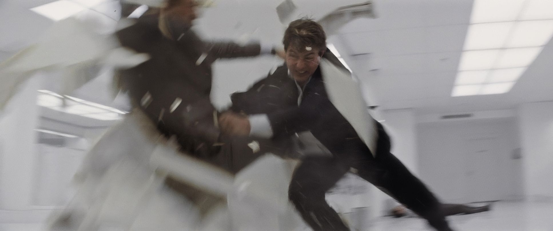
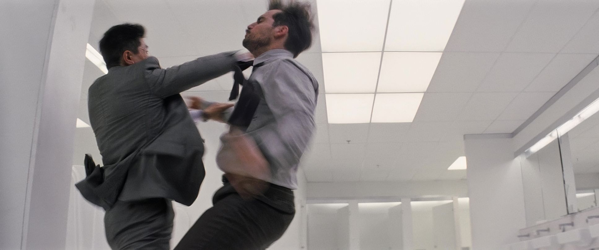
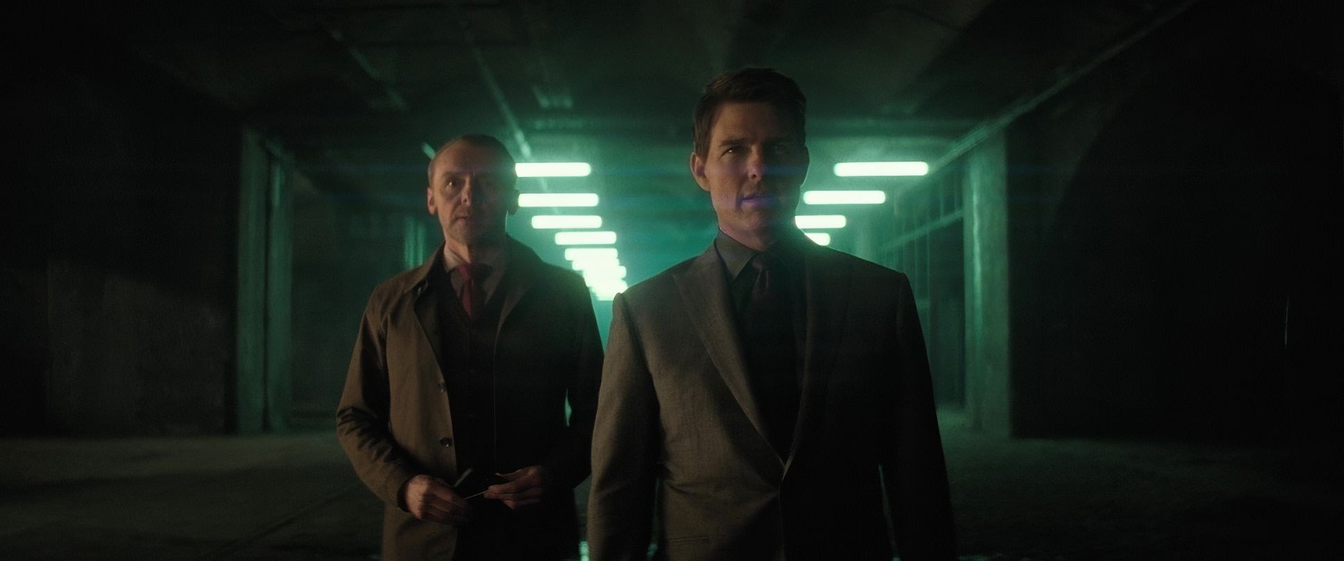
Hardy’s compositions consistently guide the eye without being overtly stylized. Take the iconic bathroom fight. It’s “beautifully filmed with these wide angles,” which is a gutsy move in a close-quarters fight. Most directors would hide the stunts with tight shots and 50 cuts per minute. By staying wide, they anchor you in the space. You see the full body movements and the force of each punch.
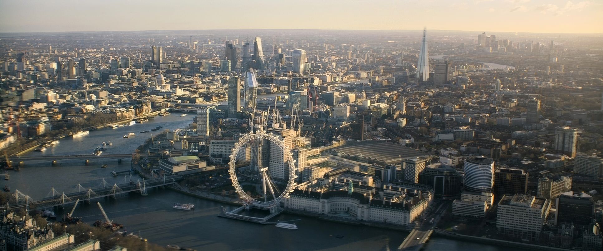
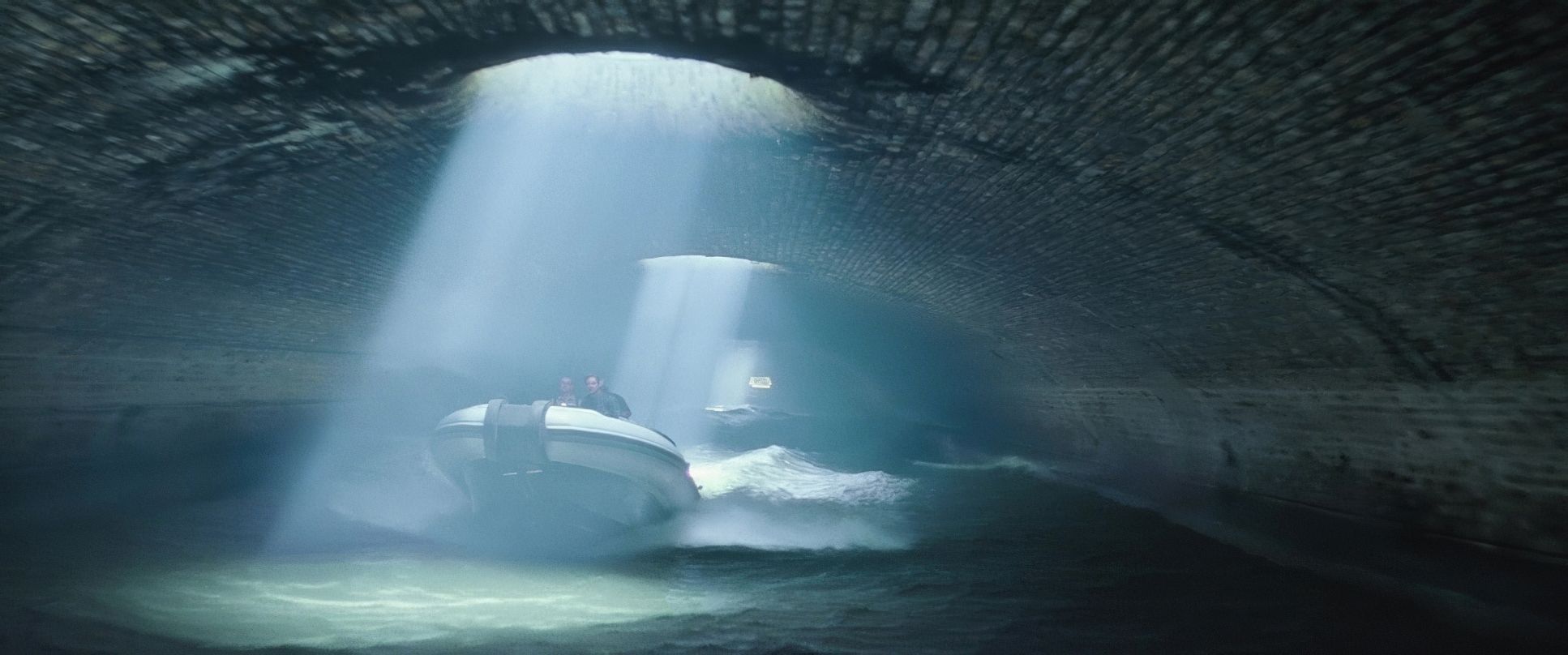
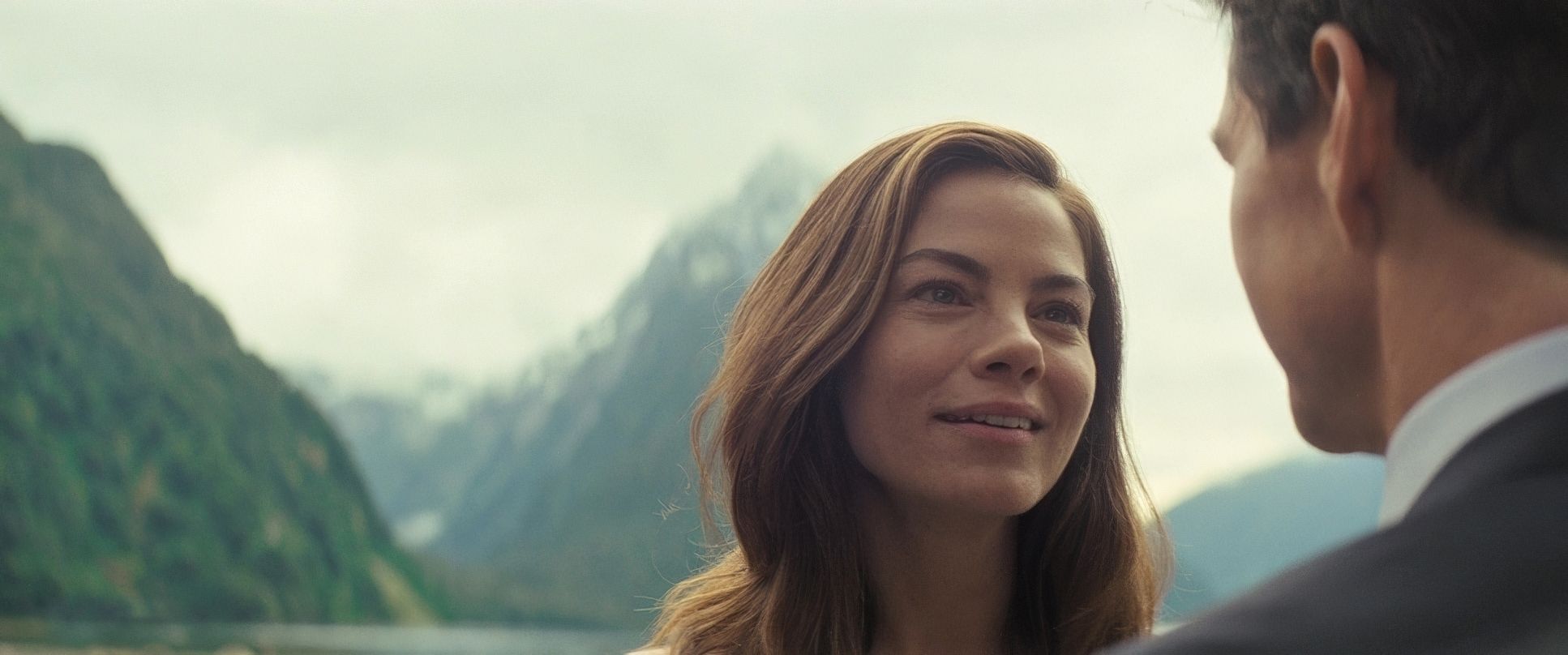
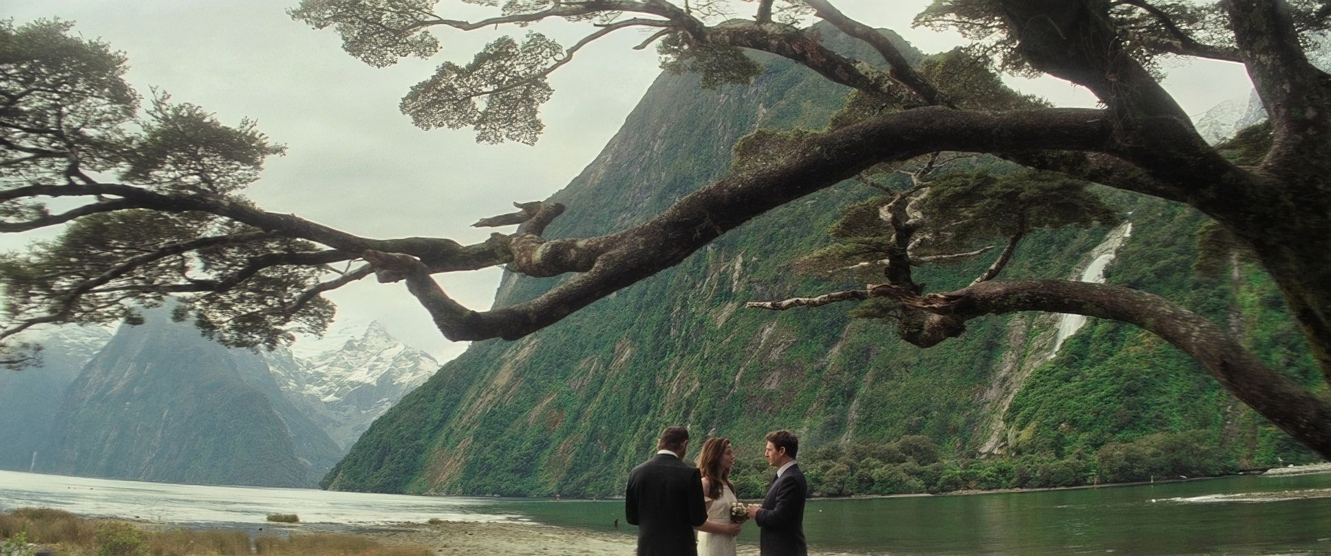
Beyond the action, Hardy uses strong depth cues foreground elements framing the characters to hint at hidden dangers. Whether it’s the vast landscapes of Milford Sound or a cramped safe house, the composition ensures you always know exactly where Ethan is in relation to the threat.
Lensing and Blocking

The choice of glass Panavision C-Series, E-Series, and Primo 70s directly impacts how we perceive the stunts. For the sprawling Paris motorcycle chase, they used lenses that captured a grand sense of scale without distorting the danger.
Conversely, for the intimate brutality of the bathroom fight, the “bravery” of using wider lenses meant the actors had to be perfect. The blocking is so tight that characters move in and out of focus, creating a palpable sense of a real-time struggle. If I have one minor “human” gripe, it’s that sometimes the shift to a long lens in the tighter dialogue scenes feels a bit standard compared to the daring wide-angle work elsewhere, but that’s just me being picky.
Technical Aspects & Tools
Mission: Impossible – Fallout | Technical Specifications
| Genre | Action, Adventure, CIA, Crime, Drama, Thriller, Heist, Spy, CIA / FBI, FBI / CIA, Science-Fiction |
| Director | Christopher McQuarrie |
| Cinematographer | Rob Hardy |
| Production Designer | Peter Wenham |
| Costume Designer | Jeffrey Kurland |
| Editor | Eddie Hamilton |
| Colorist | Jateen Patel |
| Time Period | 2010s |
| Color | Warm, Green |
| Aspect Ratio | 2.39 – Anamorphic |
| Format | Film – 35mm, Digital, Digital – Large Format |
| Lighting Type | Daylight, Sunny, Practical light |
| Filming Location | Milford Sound > Fiordland National Park |
| Camera | Panavision Millennium / Millenium XL / XL2 |
| Lens | Panavision Primo 70s, Angenieux Optimo Zooms, Panavision C series, Panavision E series |
| Film Stock / Resolution | 5203/7203 Vision 3 50D, 5213/7213 Vision 3 200T, 5219/7219 Vision 3 500T, Redcode RAW 6K, Redcode RAW 8k |
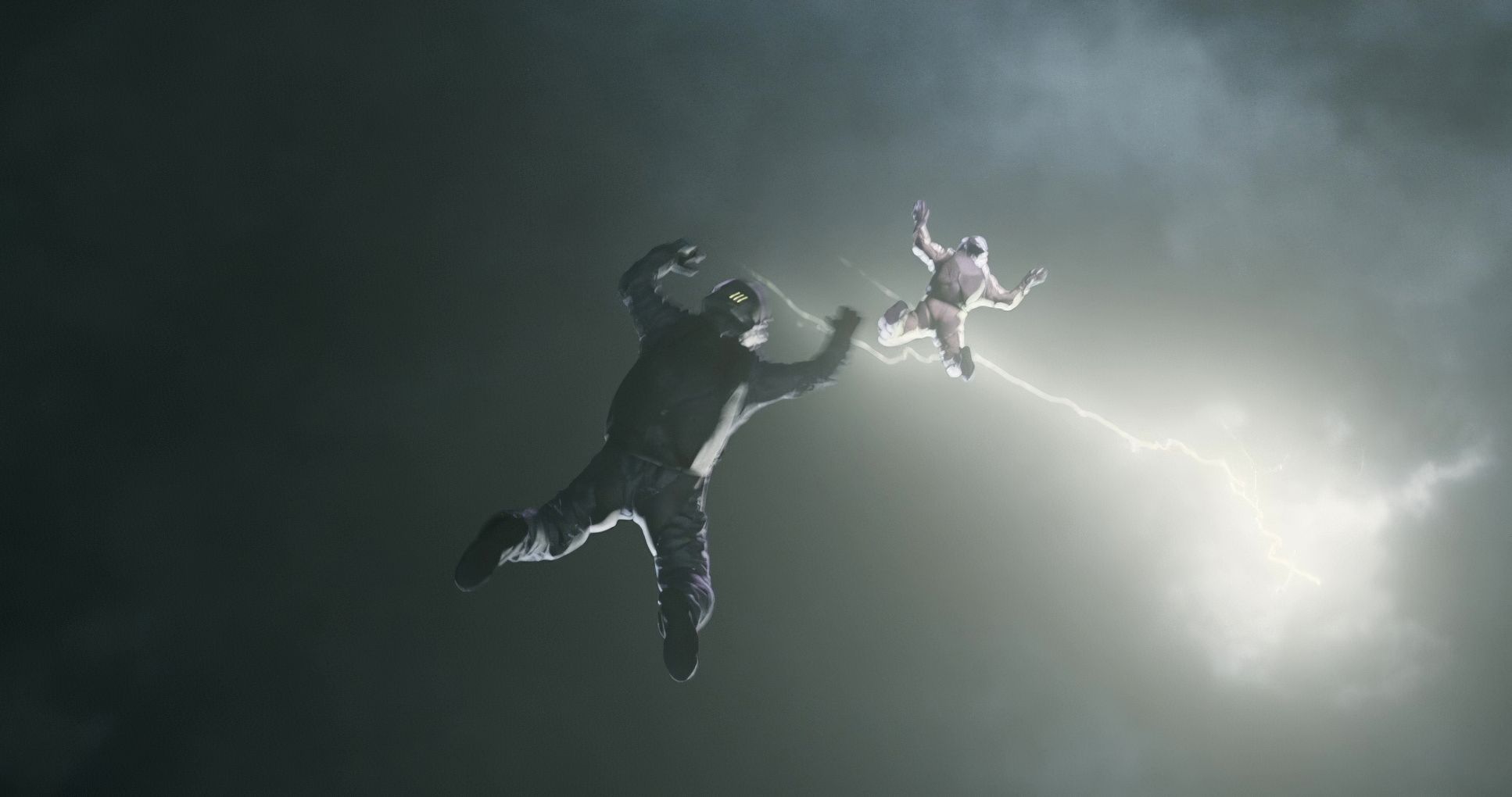
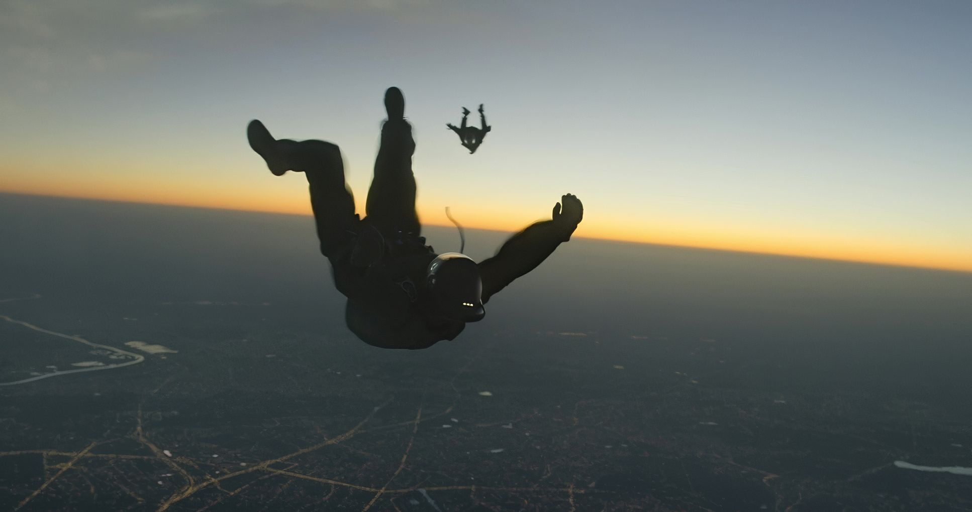
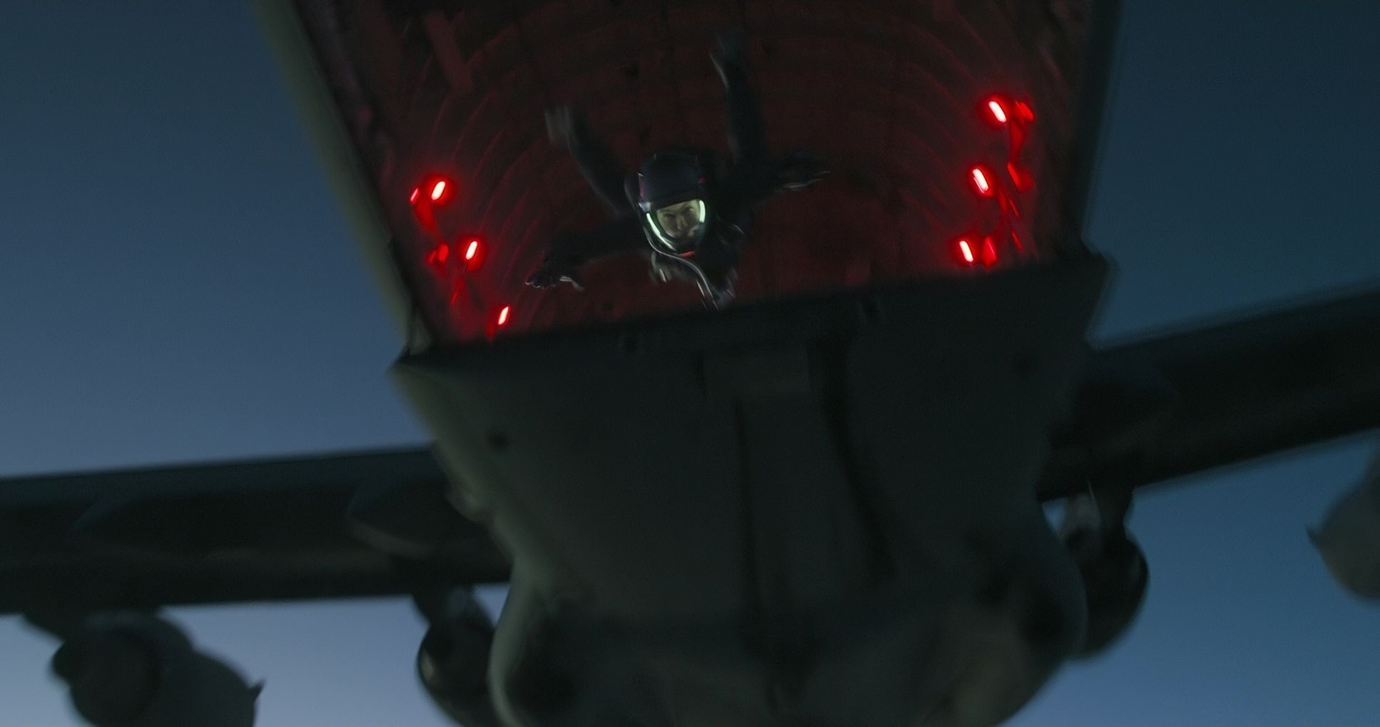
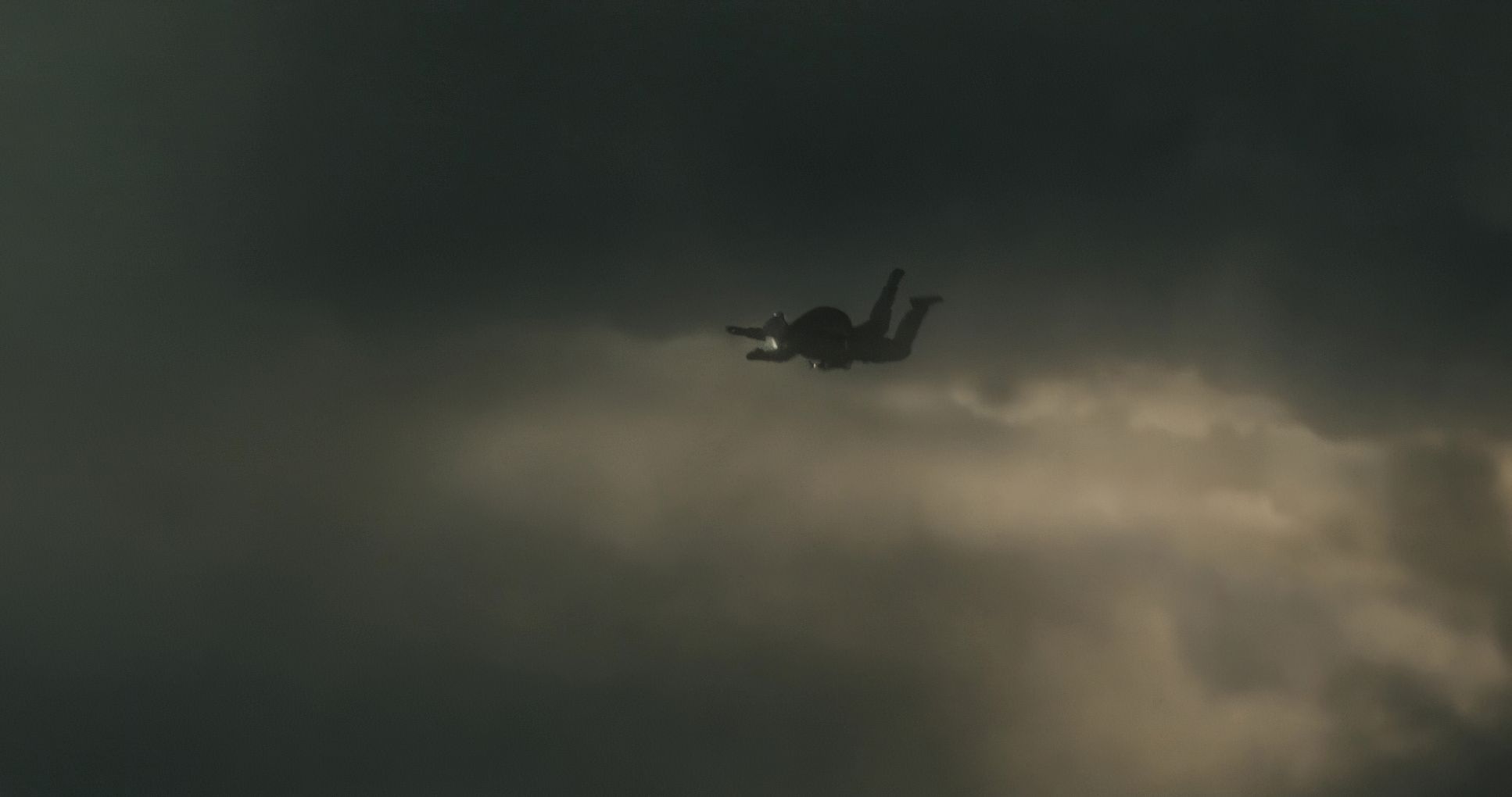
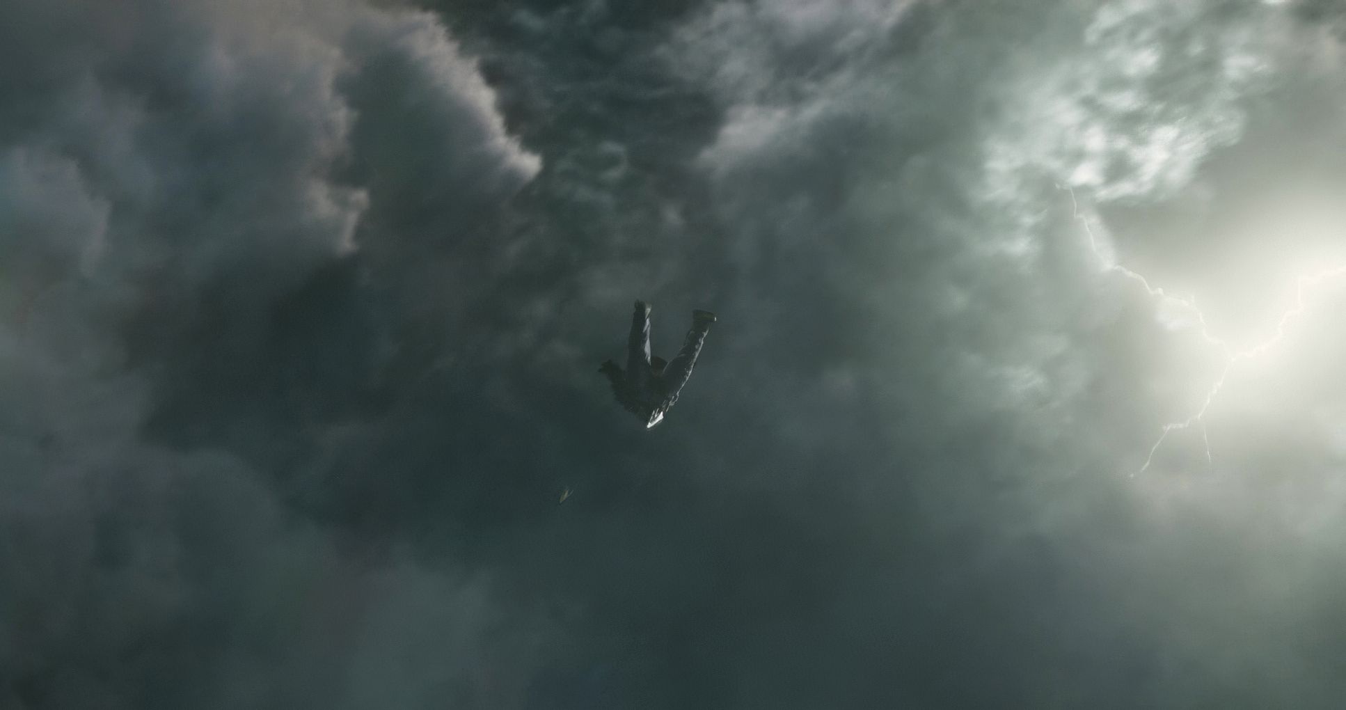
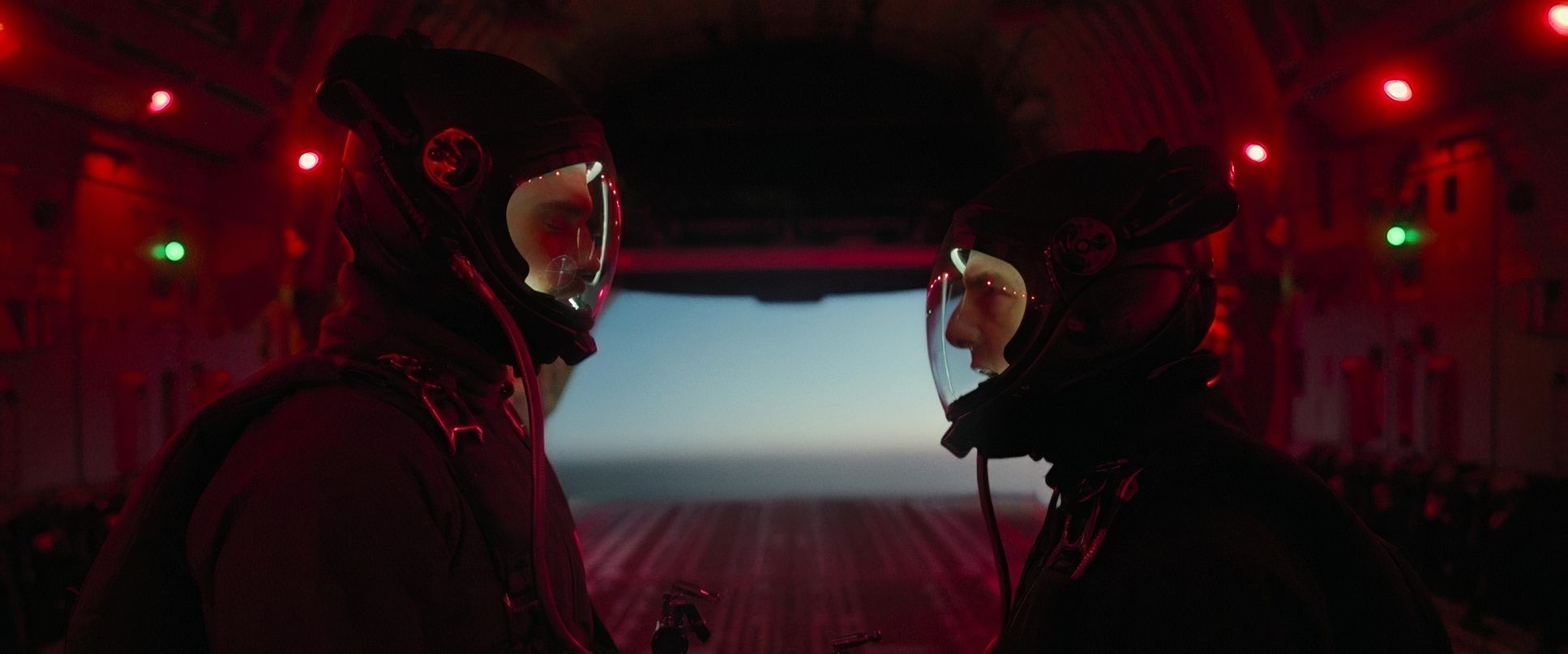
The technical backbone is fascinating because it’s a hybrid. While they shot primarily on 35mm film (Panavision Millennium XL2), they switched to Digital (Redcode RAW 8K) and Digital Large Format for those insane IMAX sequences like the HALO jump.
The recommendation to “See it in IMAX” isn’t just marketing. The expanded aspect ratio (shifting from 2.39:1 to the taller IMAX frame) literally gives you more image to digest. Personally, I find the jump between aspect ratios a bit jarring at times, but the sheer scale of the helicopter chase in IMAX is enough to make any filmmaker’s jaw drop. It’s a testament to the editor, Eddie Hamilton, that the film feels so cohesive despite switching between film stocks and digital formats.
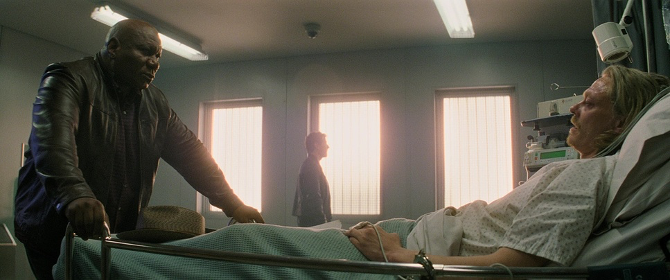
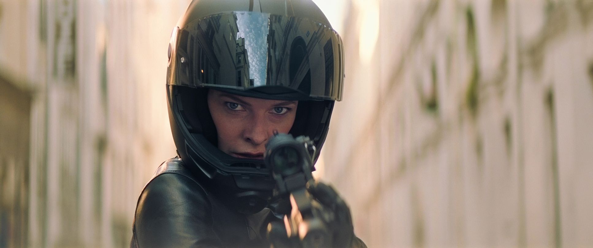
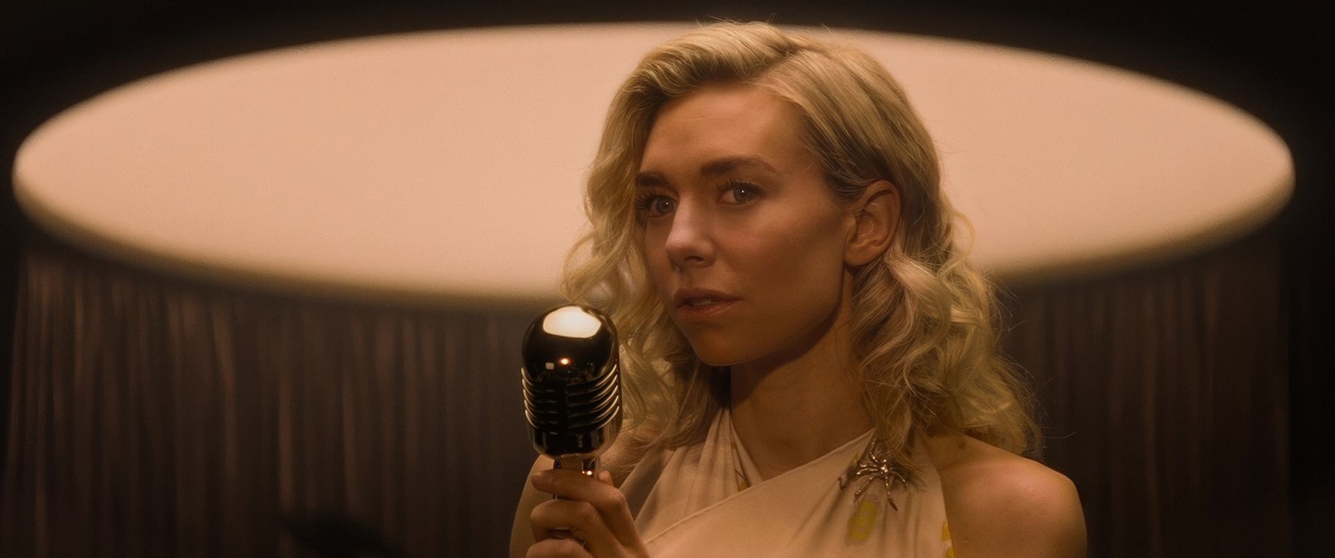
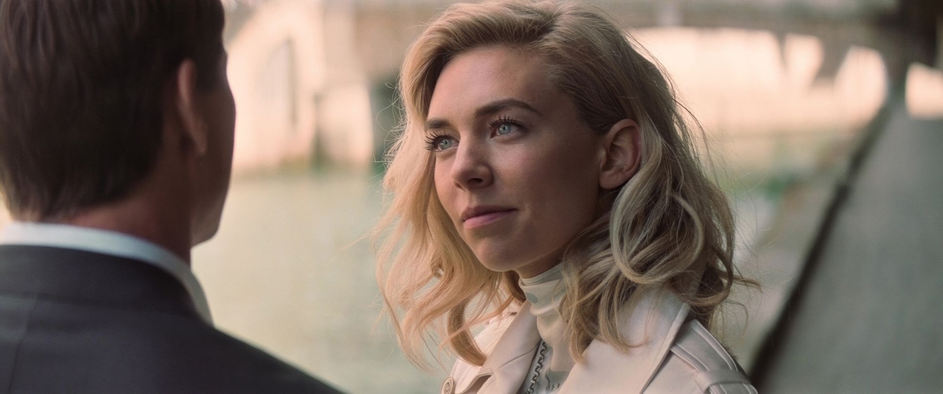
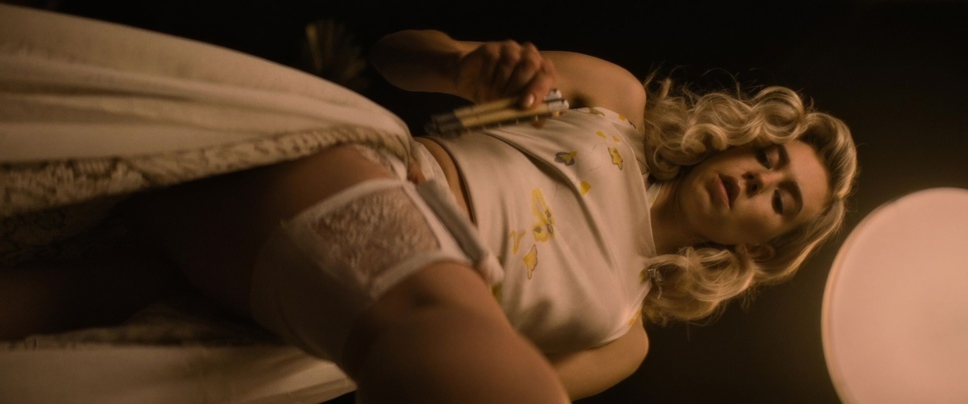
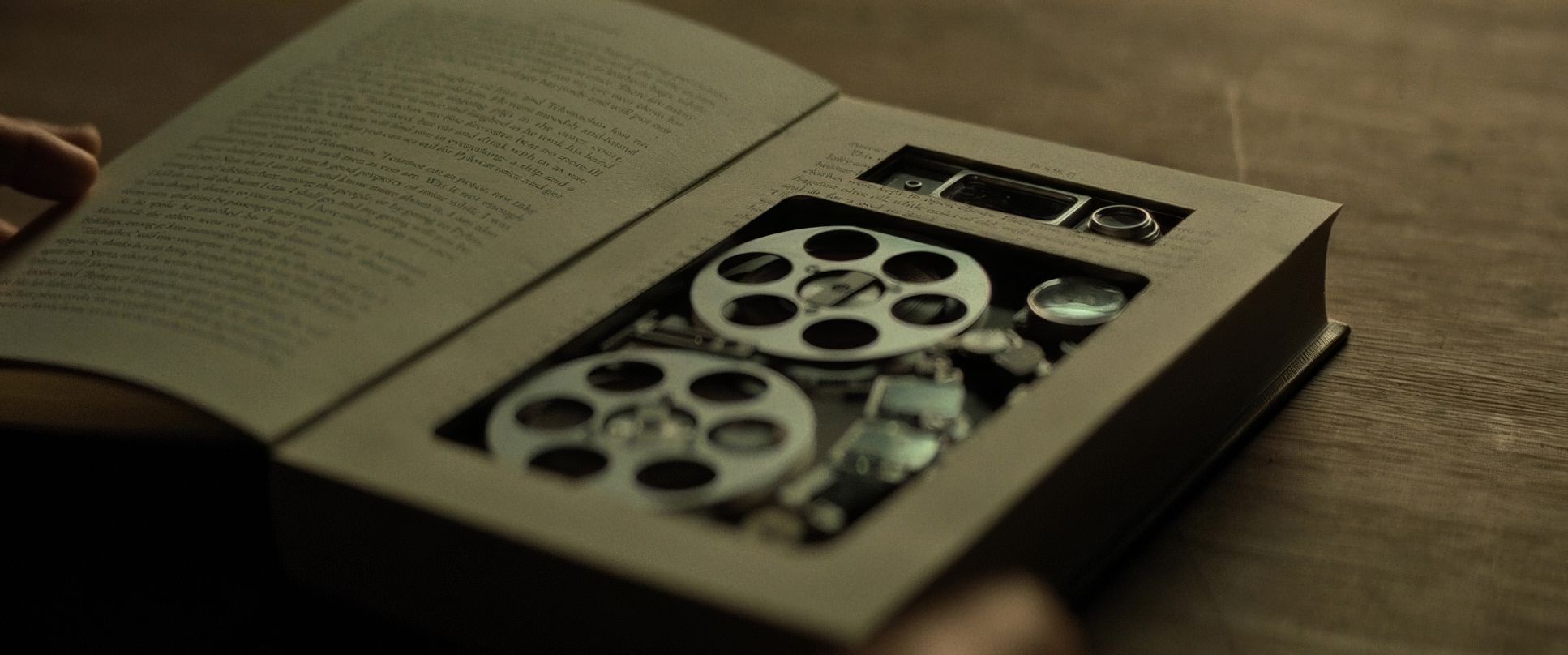
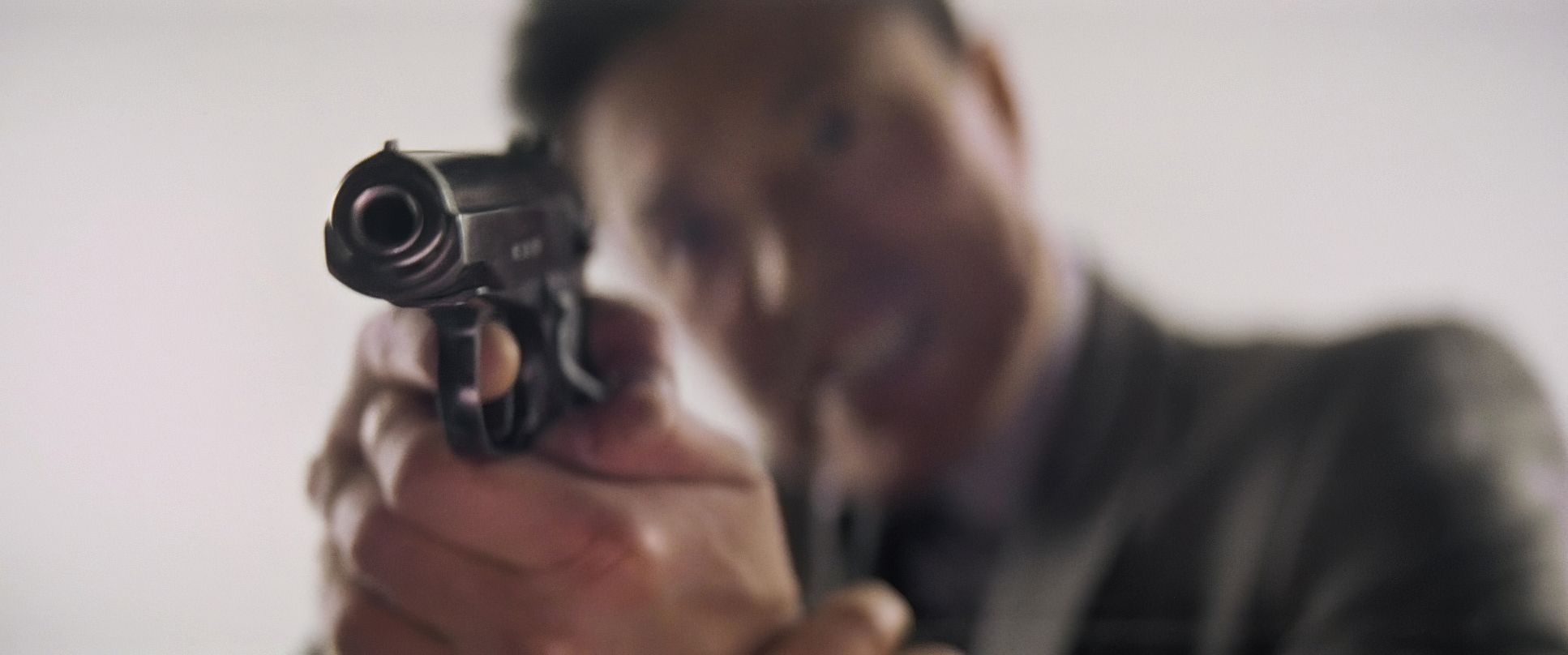
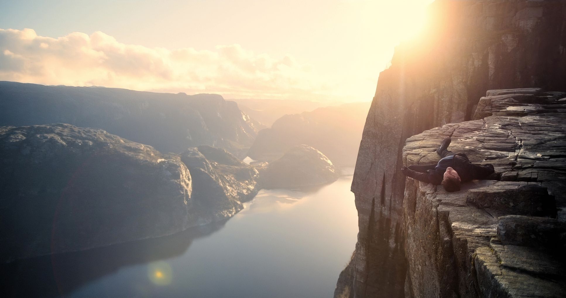
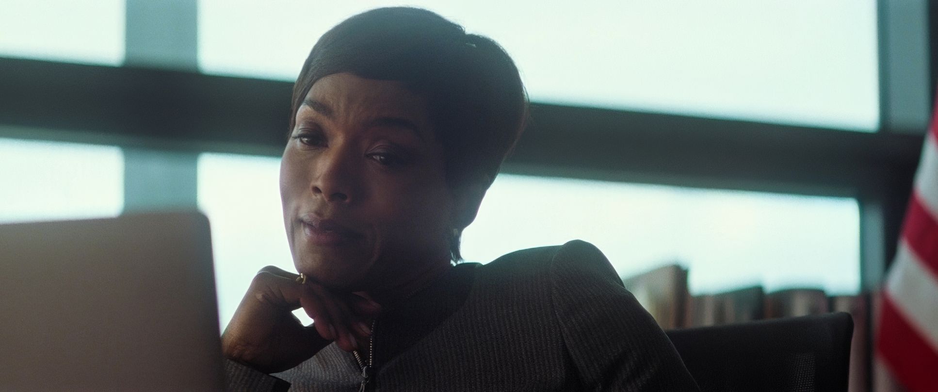
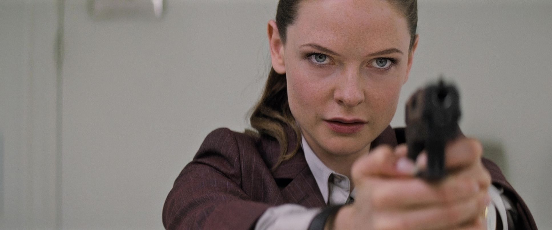
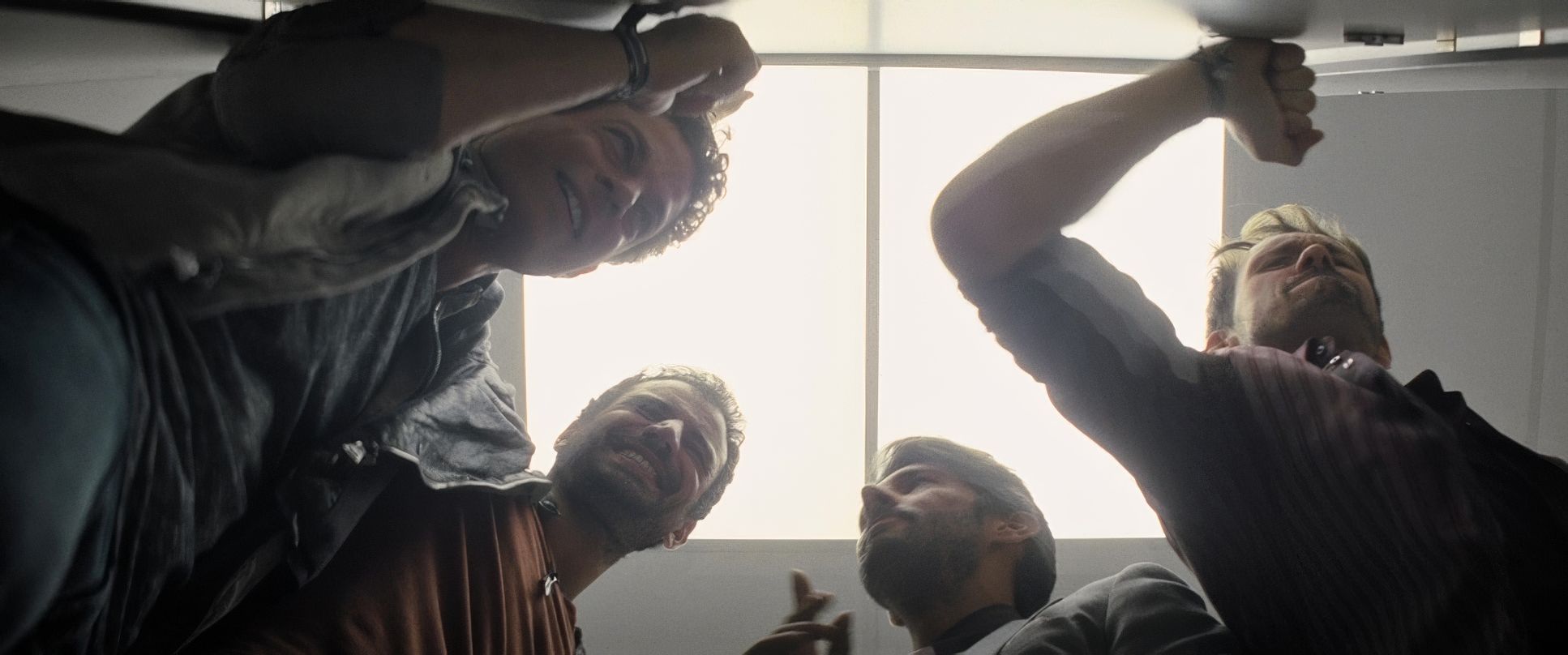
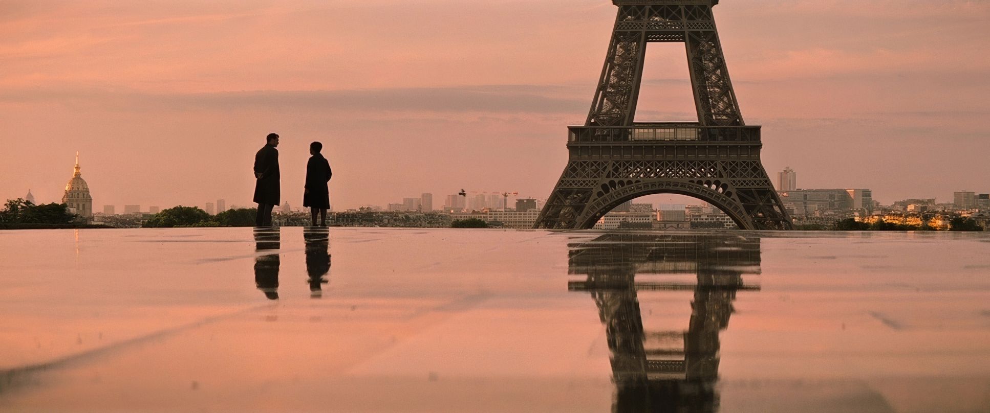
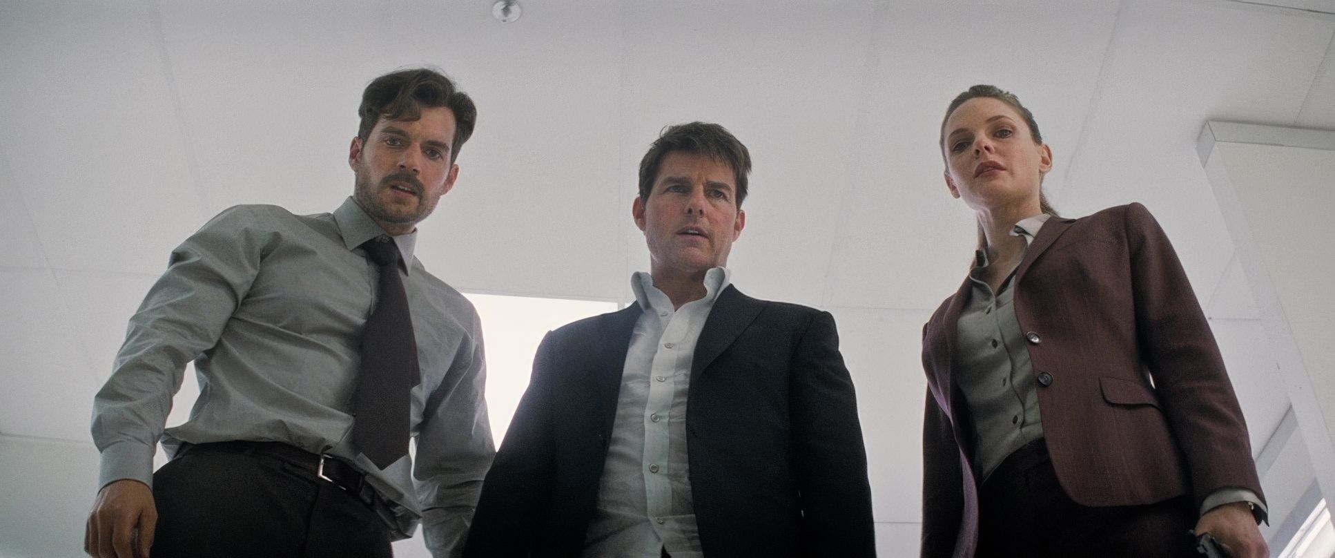
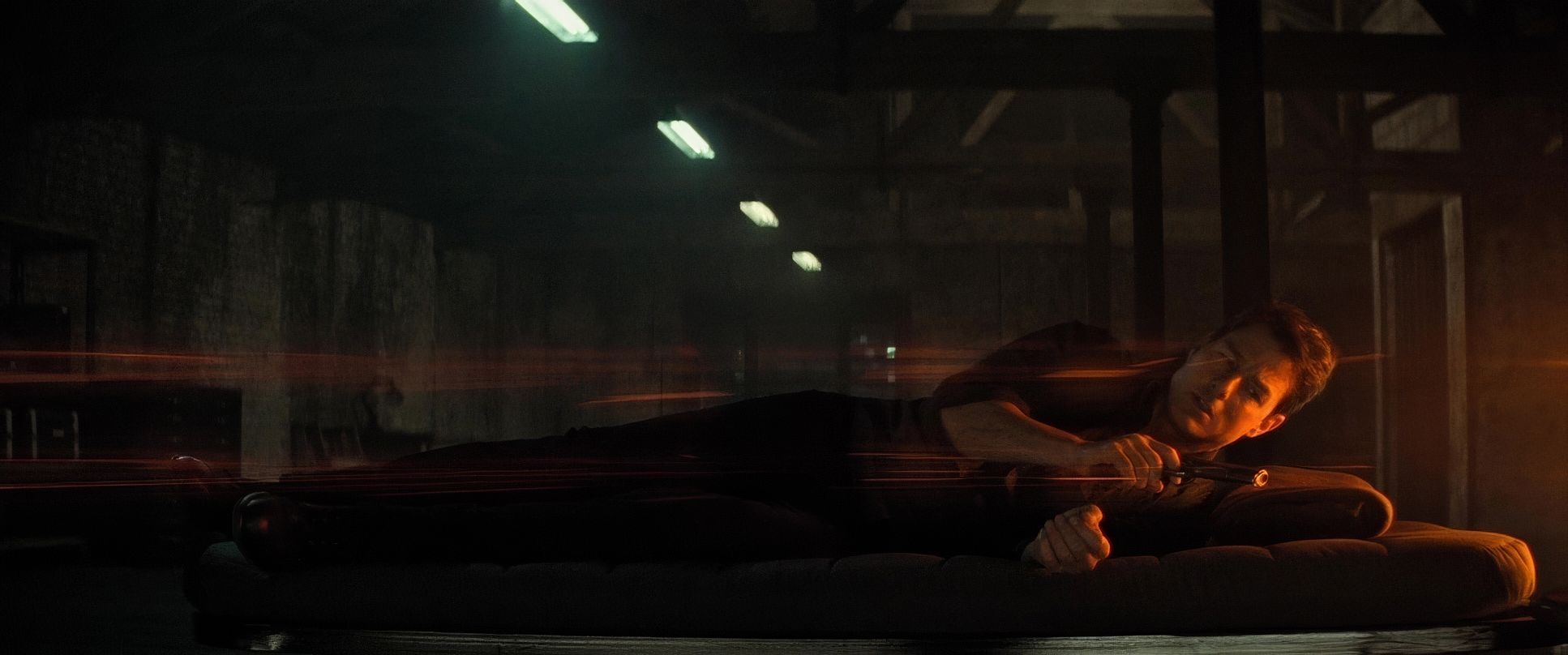
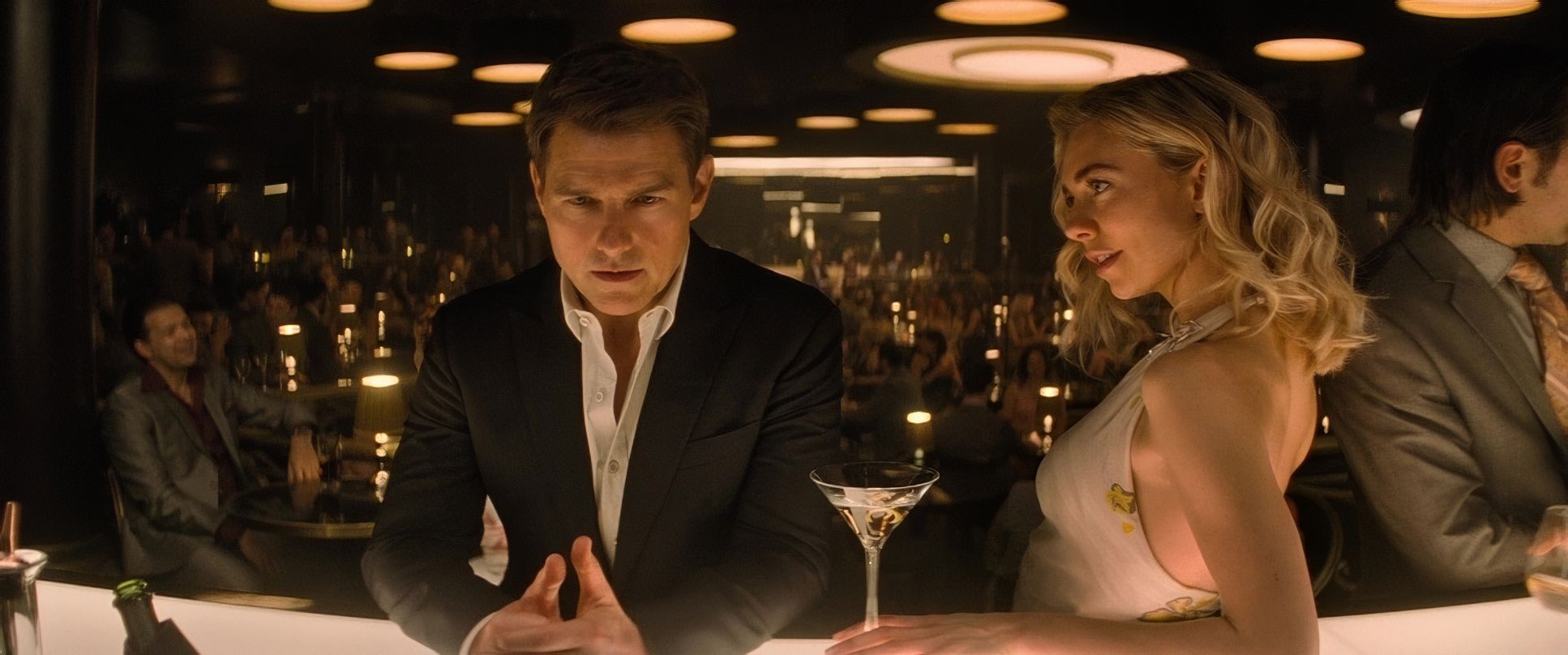
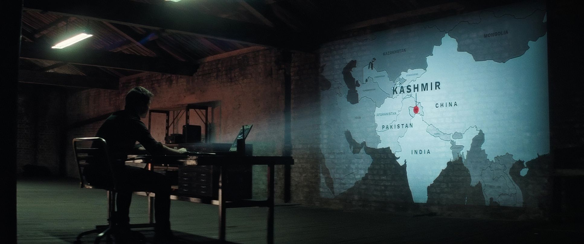
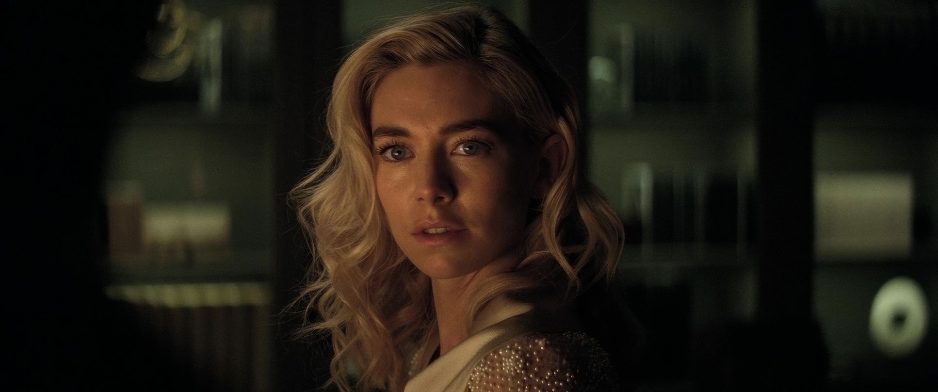
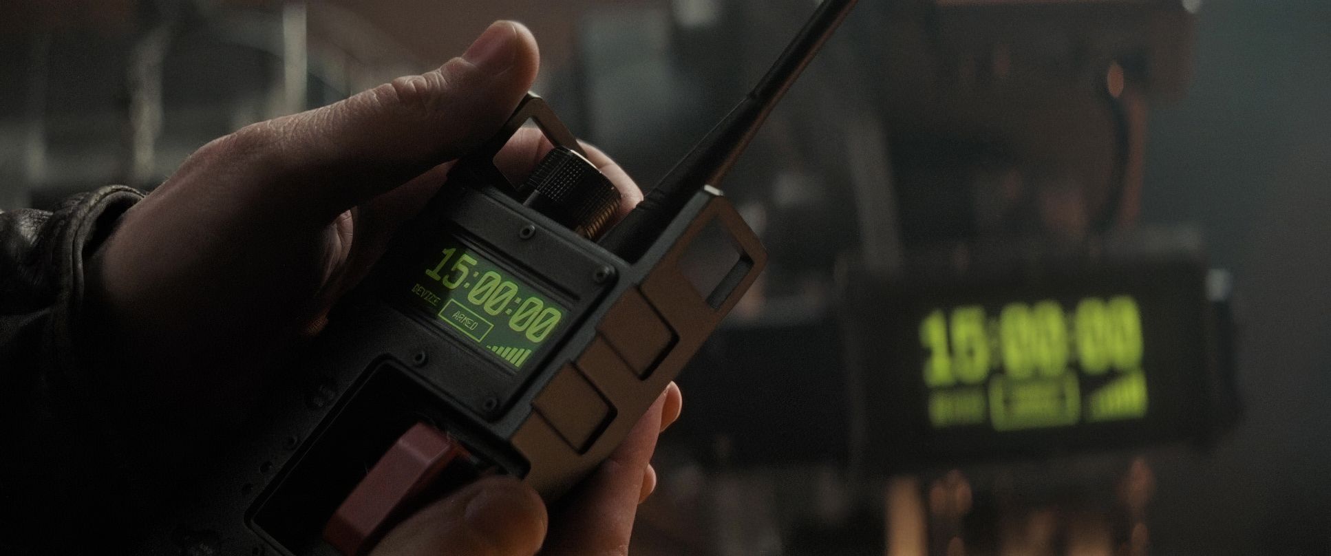
Mission: Impossible – Fallout (2018) Film Stills
A curated reference archive of cinematography stills from MISSION: IMPOSSIBLE – FALLOUT (2018). Study the lighting, color grading, and composition.


- Also read: BLACK HAWK DOWN (2001) – CINEMATOGRAPHY ANALYSIS
- Also read: CRASH (2004) – CINEMATOGRAPHY ANALYSIS
Browse Our Cinematography Analysis Glossary
Explore directors, cinematographers, cameras, lenses, lighting styles, genres, and the visual techniques that shape iconic films.
Explore Glossary →