Ridley Scott’s Black Hawk Down (2001) is right at the top of that list for me. I still remember the visceral punch of seeing it in the theater. It wasn’t just a “war movie” it was a relentless, 144-minute immersive experience. Even twenty years later, I find myself coming back to it as a benchmark for grit and controlled visual chaos.
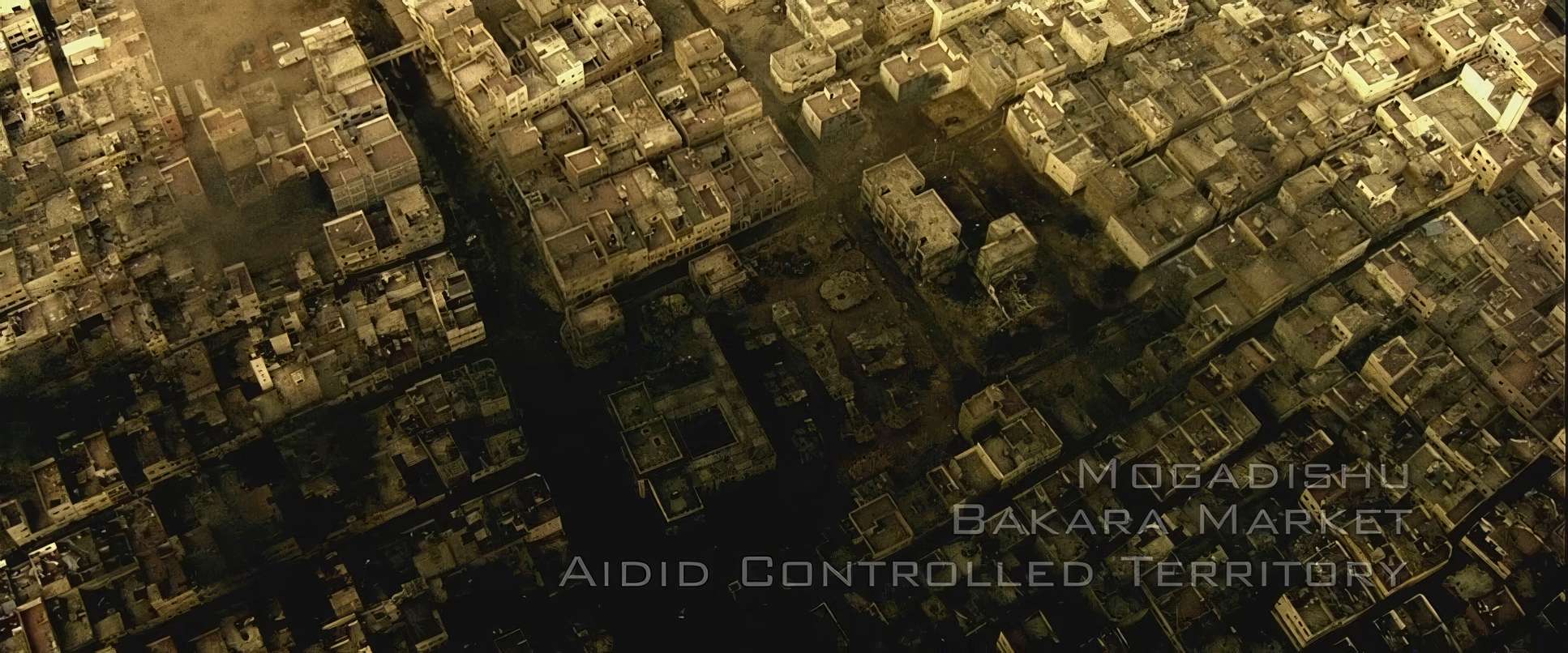
The film landed at a strange time, released just after 9/11 despite being shot before it. It captured a specific kind of modern urban warfare that felt terrifyingly current. There’s no romanticism here. It’s a brutal, desperate struggle for survival where the city itself is the antagonist.
About the Cinematographer
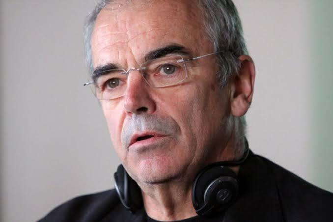
I’ve always thought Sławomir Idziak was a bold, almost wild choice for this film. If you look at his earlier work specifically his collaboration with Krzysztof Kieślowski on Three Colors: Blue his style was poetic, soft, and heavily stylized with colored filters. Bringing that expressionistic sensibility to a Ridley Scott war epic was a stroke of genius.
Idziak didn’t just “capture” reality; he interpreted it. He used smoke, heavy filtering, and unconventional lighting to create a psychological state. In Black Hawk Down, he paired his signature style with Ridley’s love for “visceral” textures. Together, they created a visual language that feels like you’ve been dropped right into the middle of Mogadishu, boots on the ground.
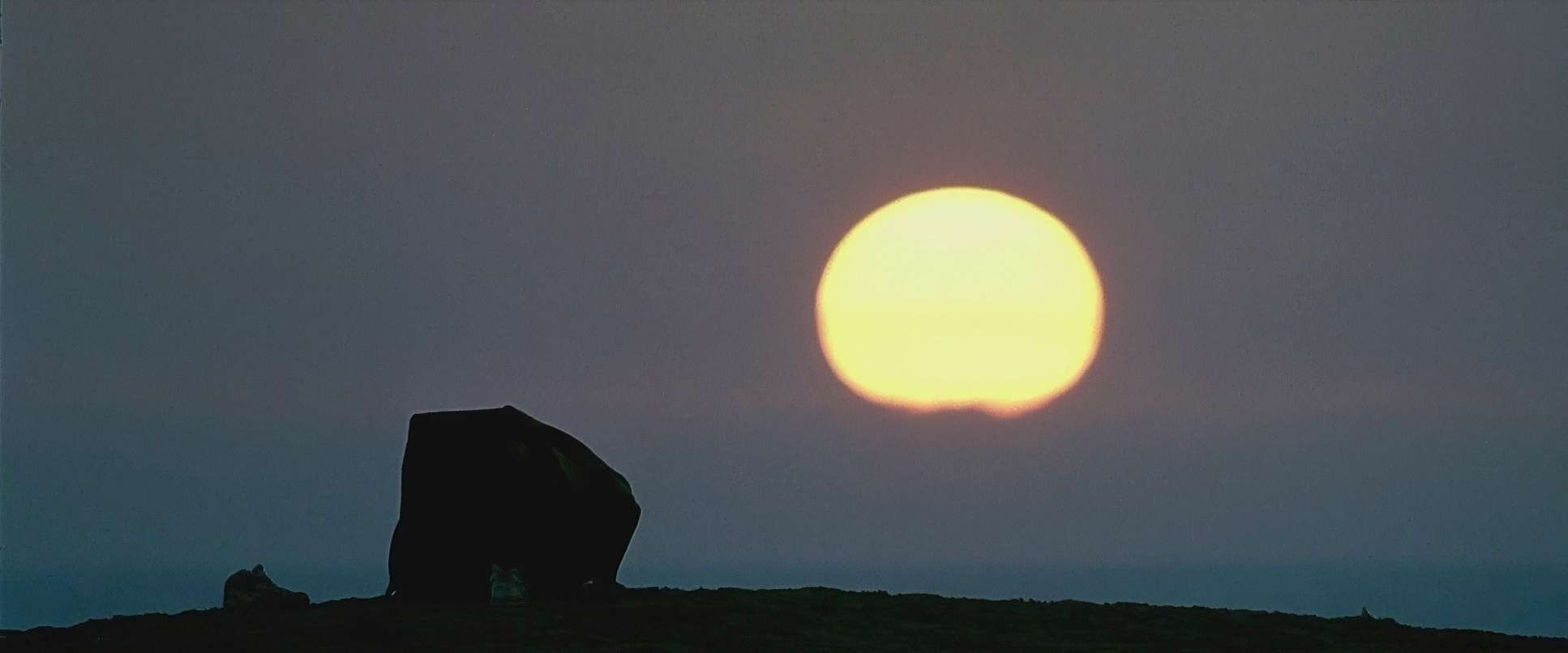
Lighting Style: The Brutal Sun
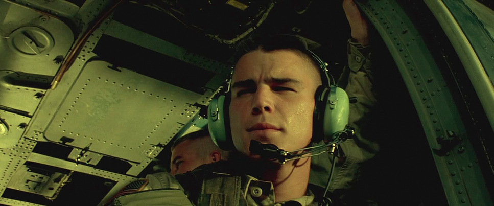
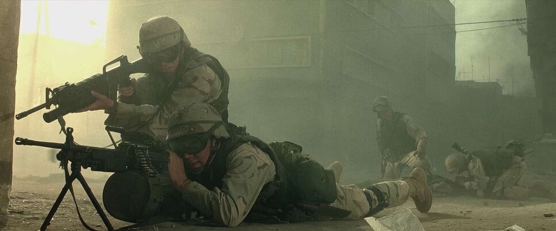
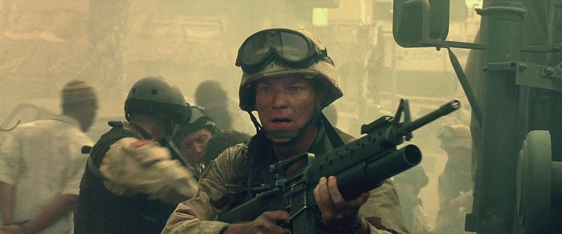
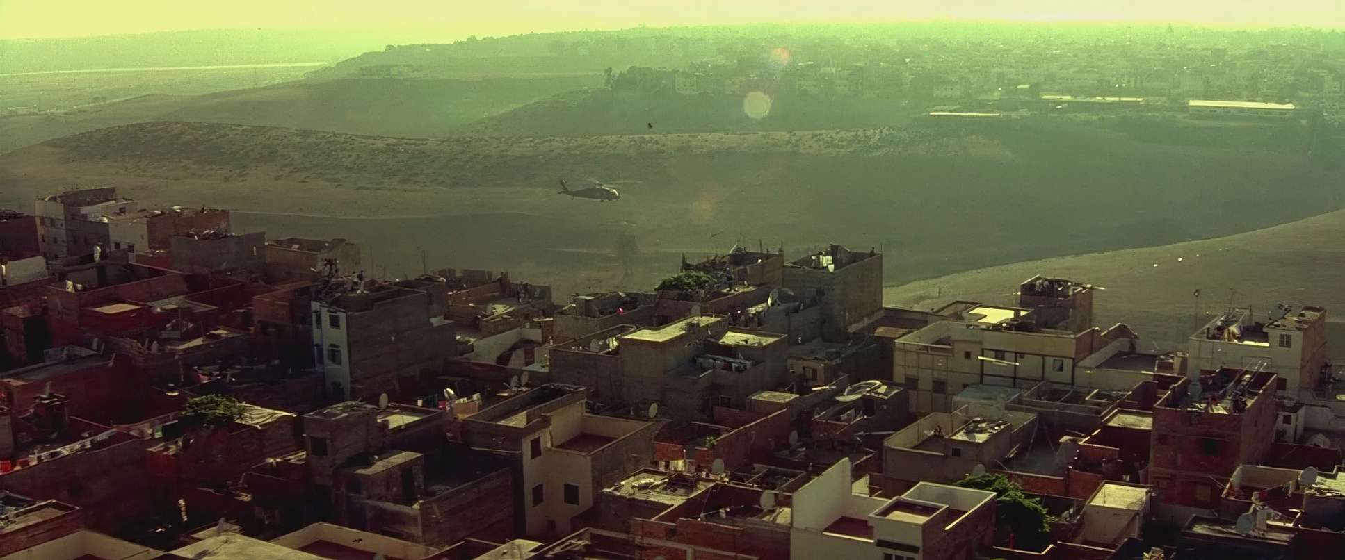
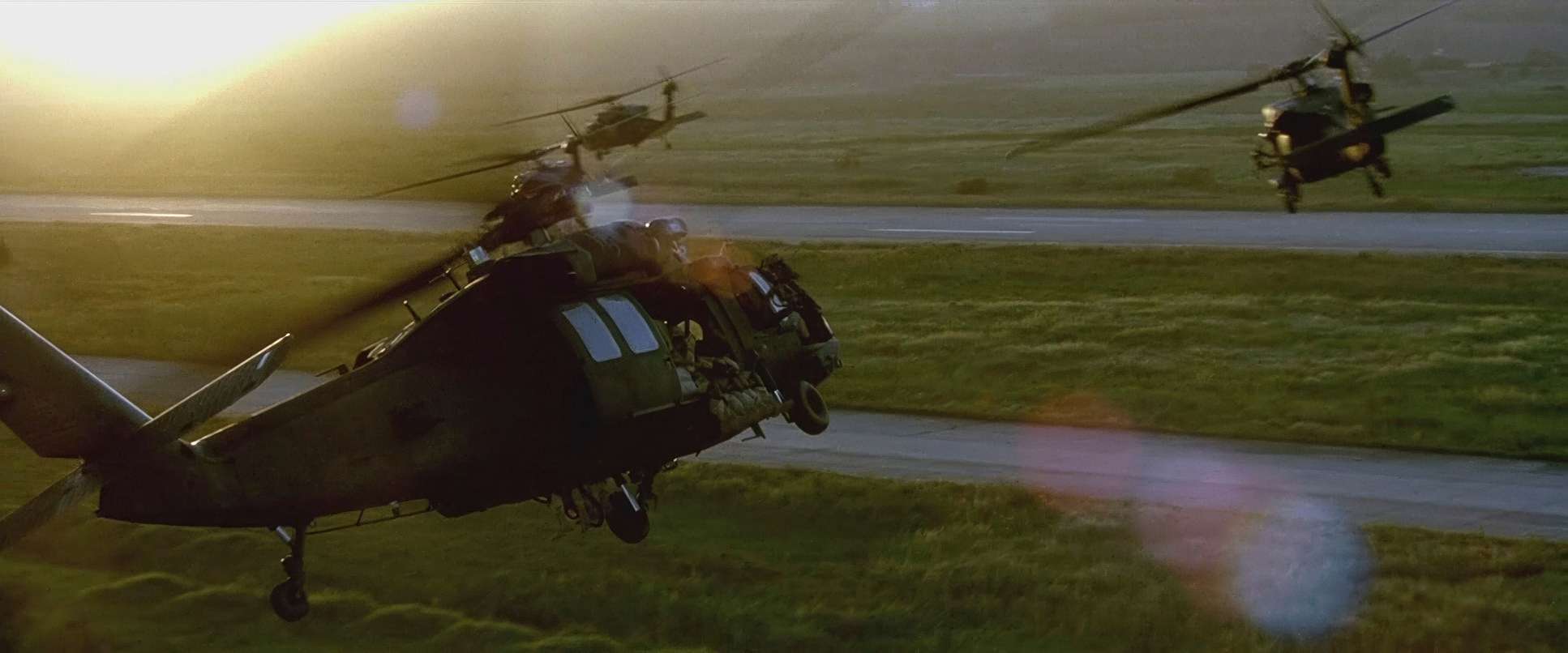
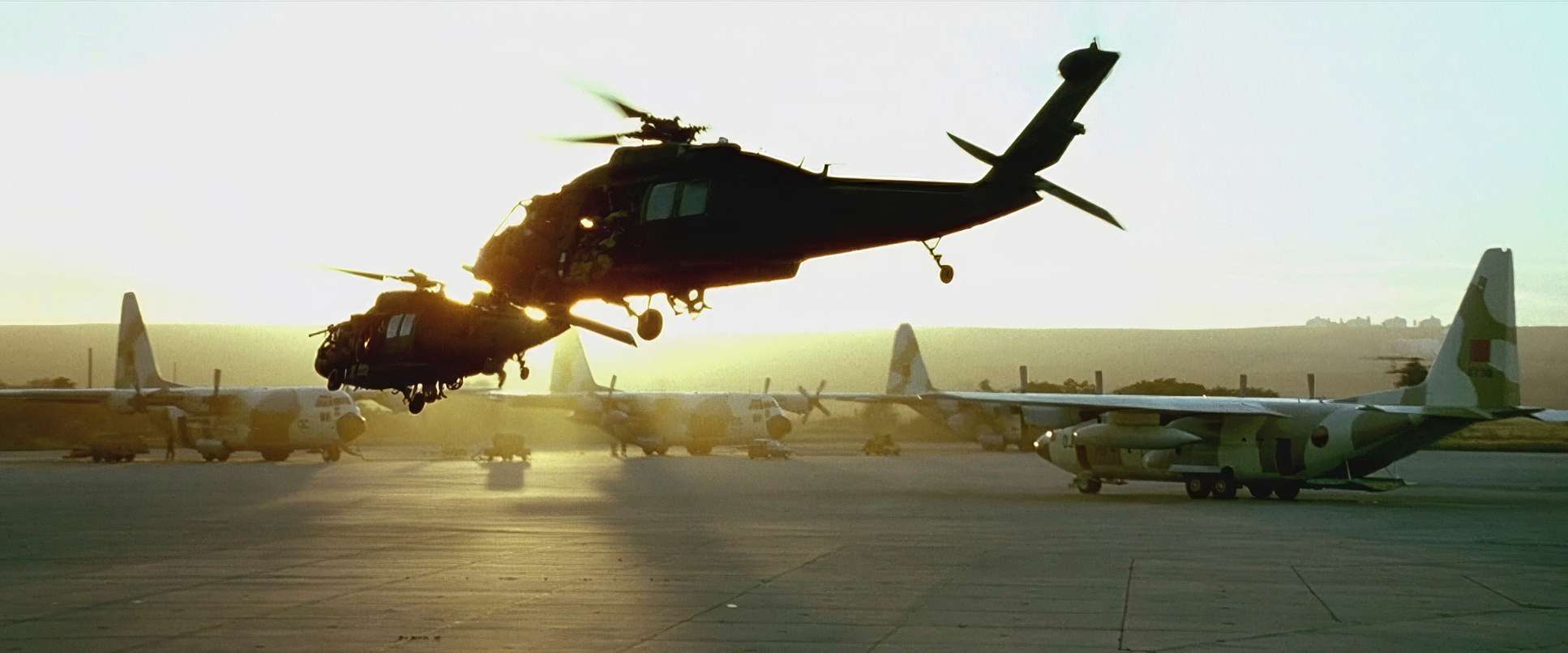
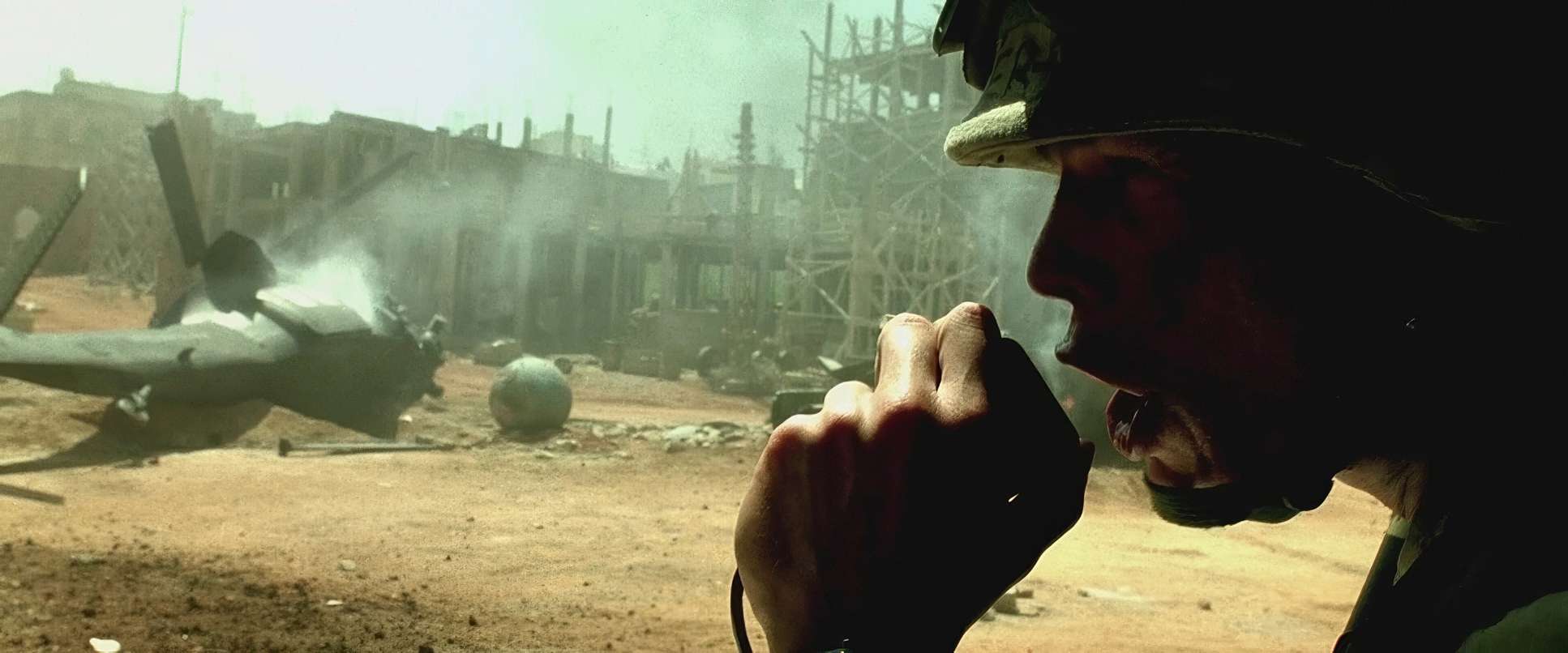
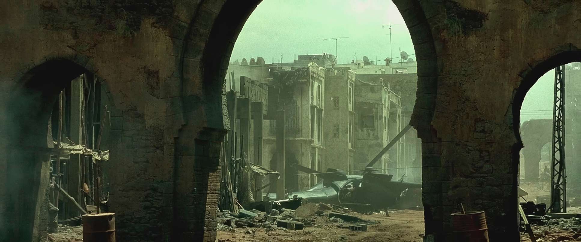
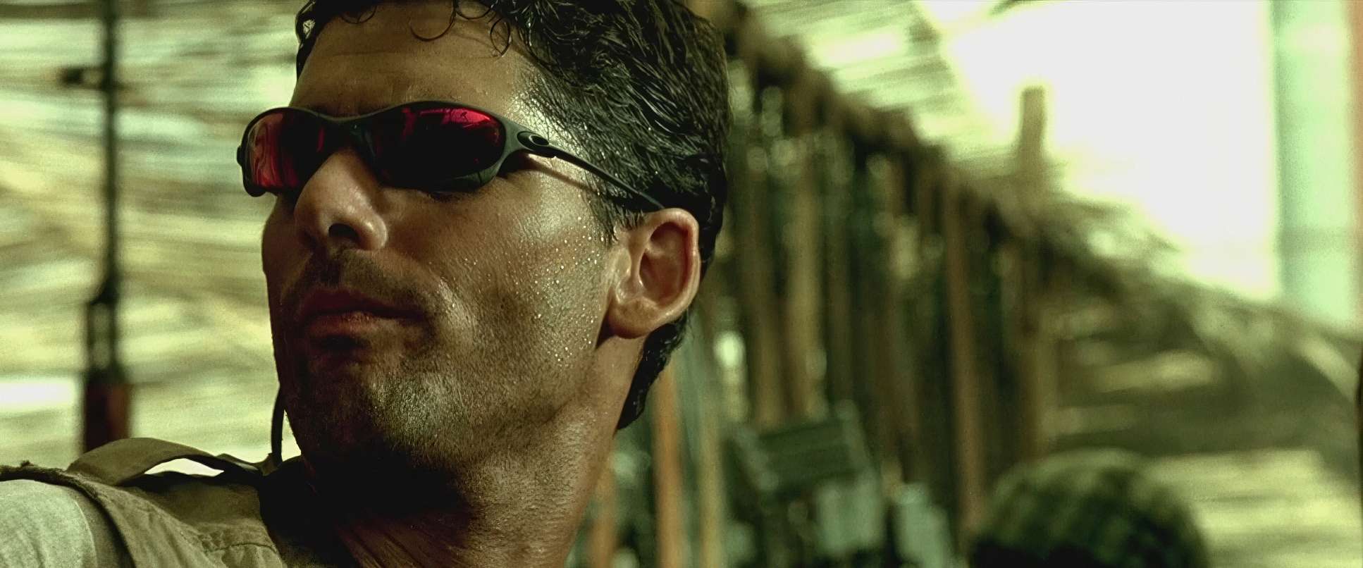
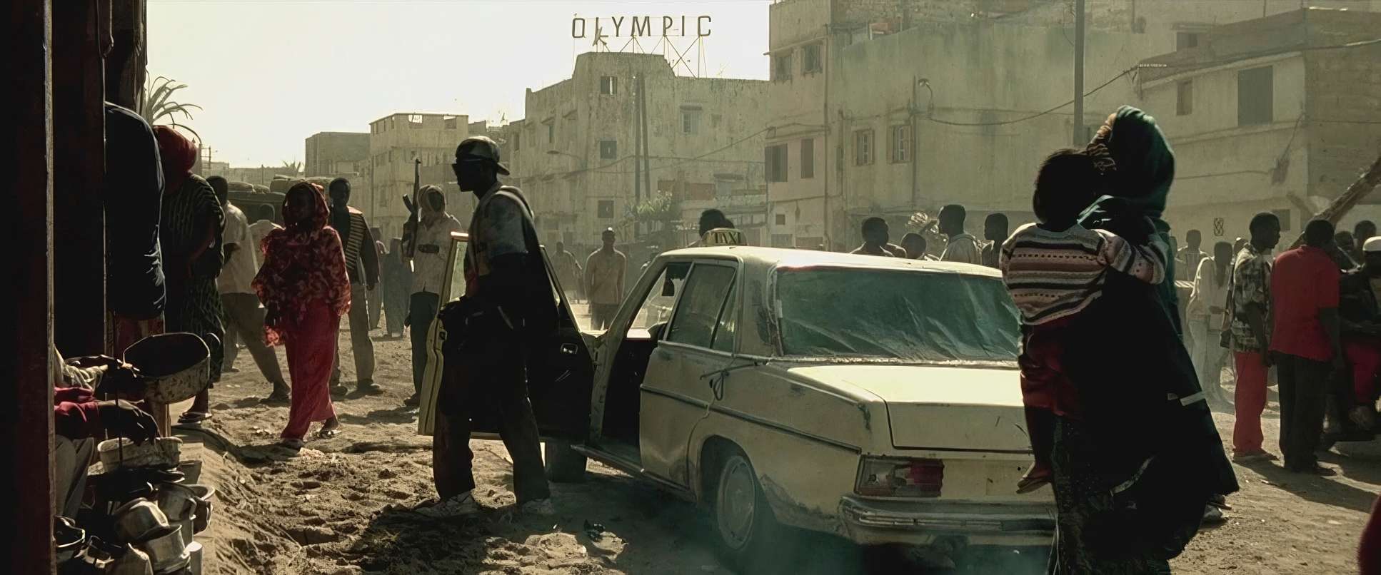
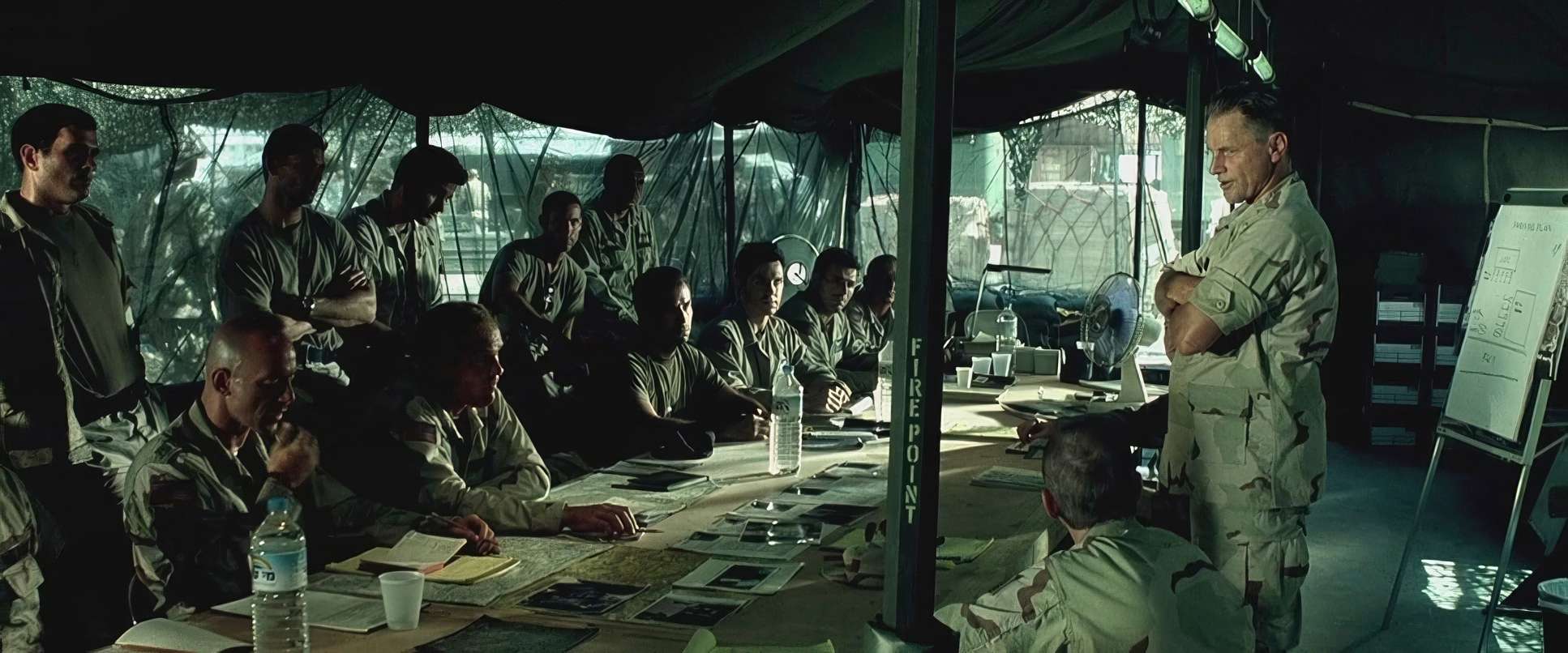
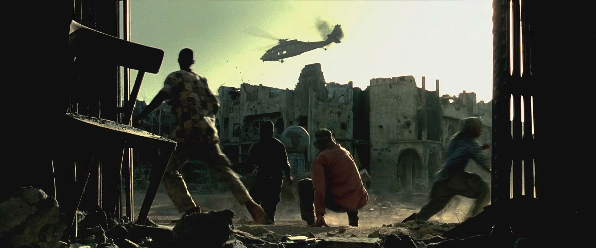
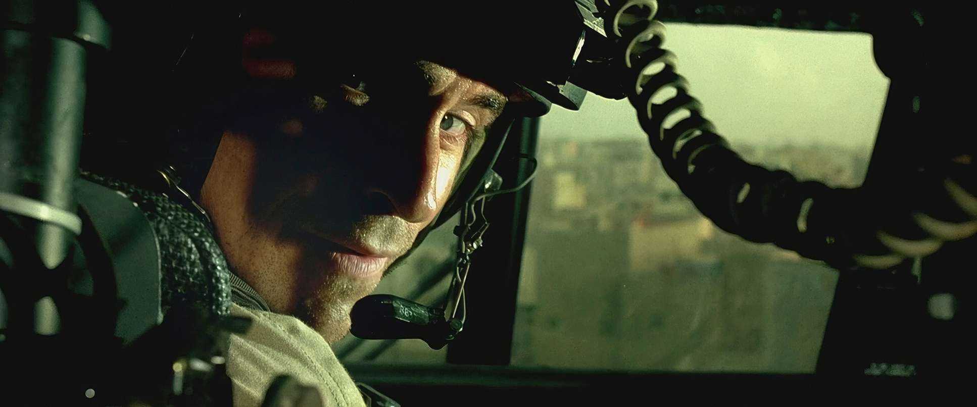
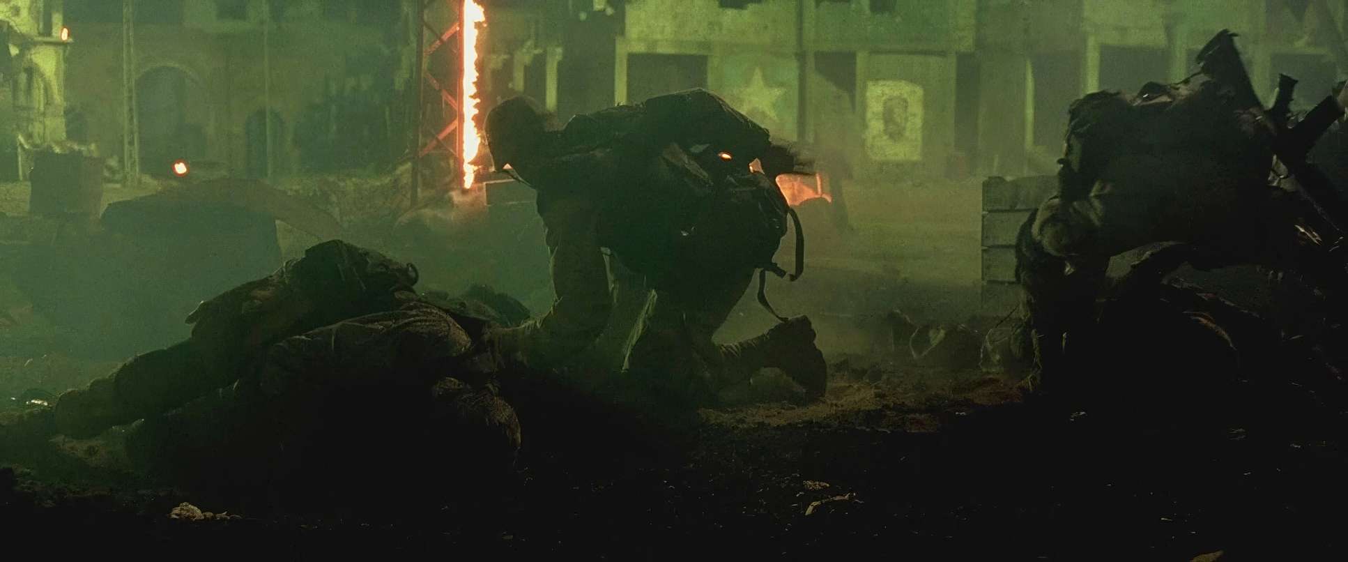
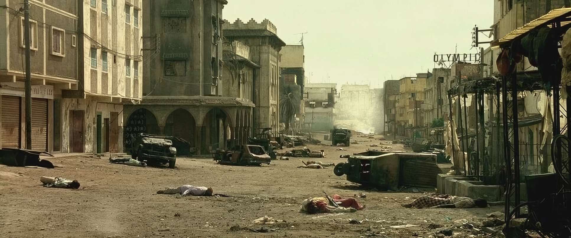
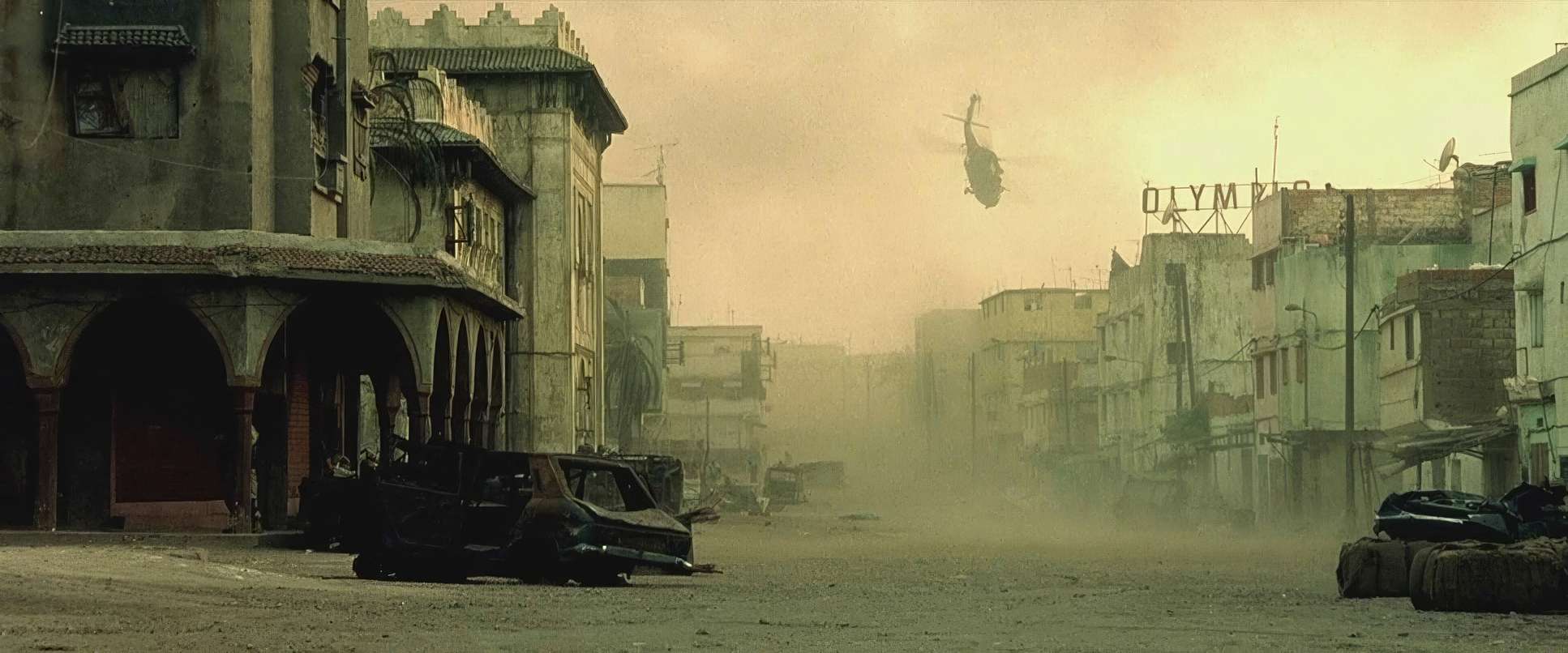
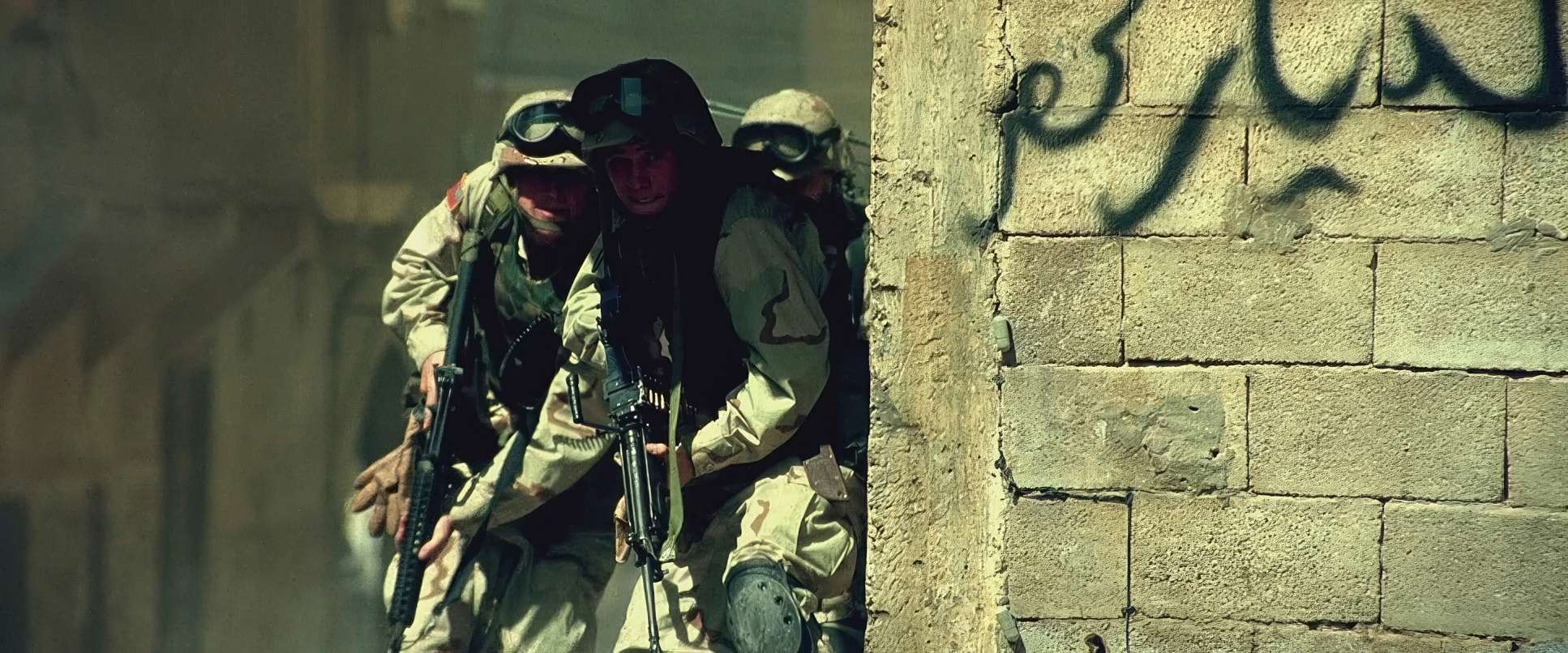
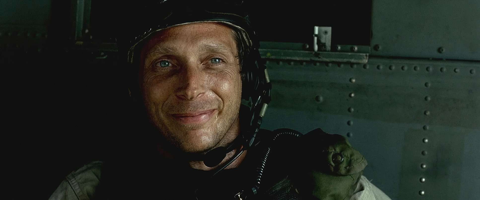
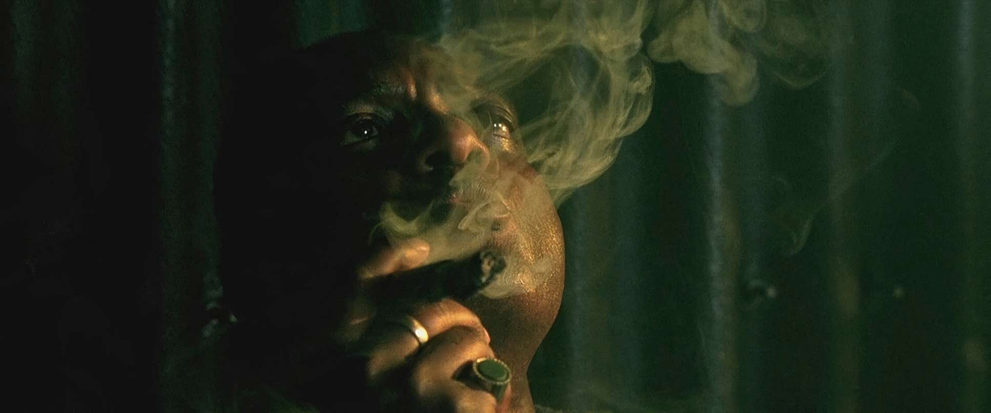
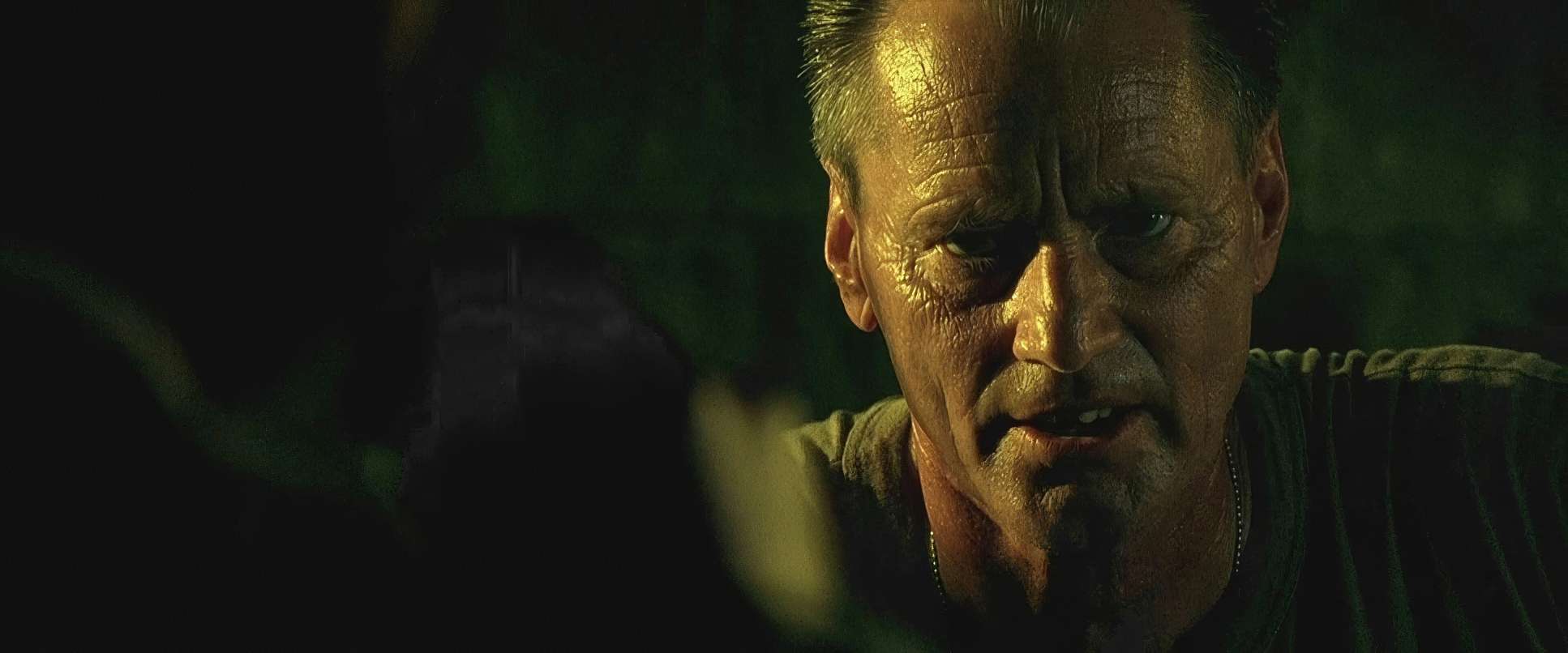
As a colorist, the lighting in this film is what fascinates me most. Idziak leaned into the harshness of the Moroccan sun rather than trying to fight it. Most DPs are terrified of “ugly” light, but here, the sun is a character.
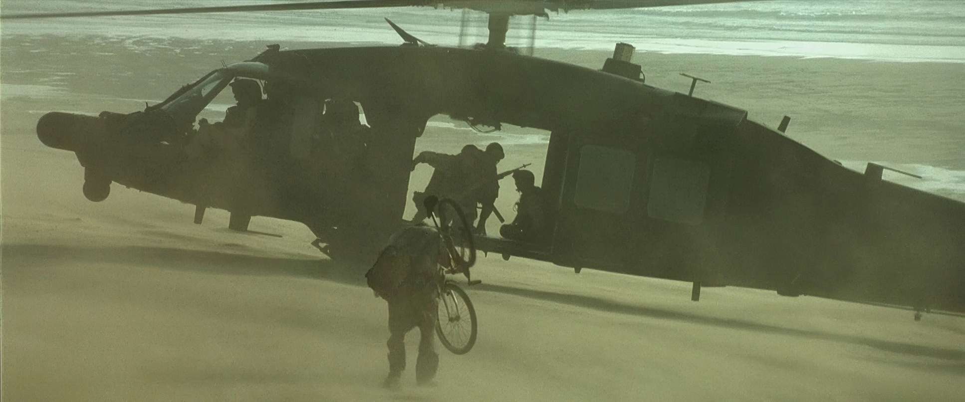
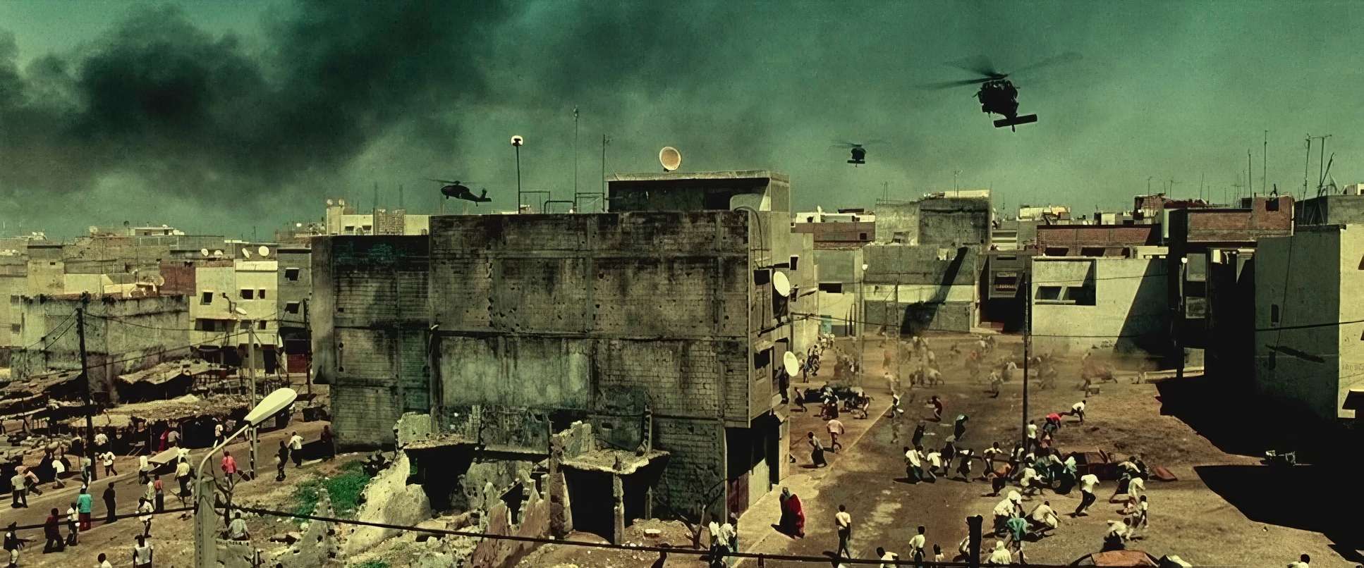
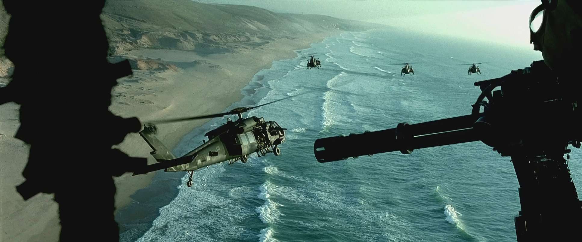
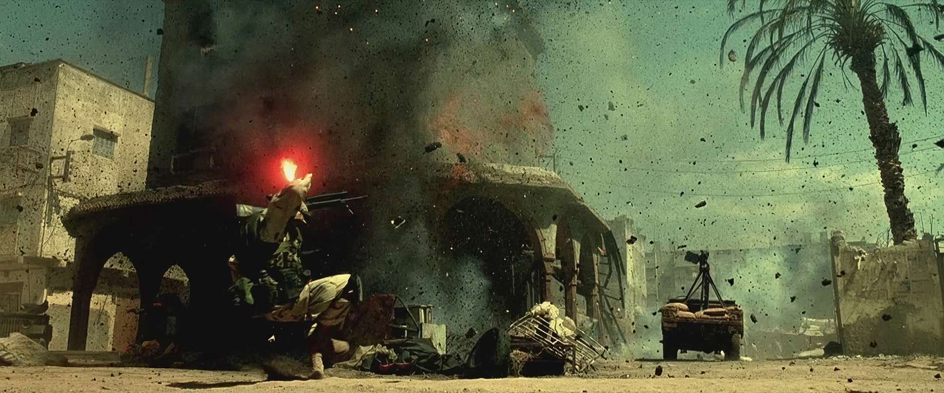
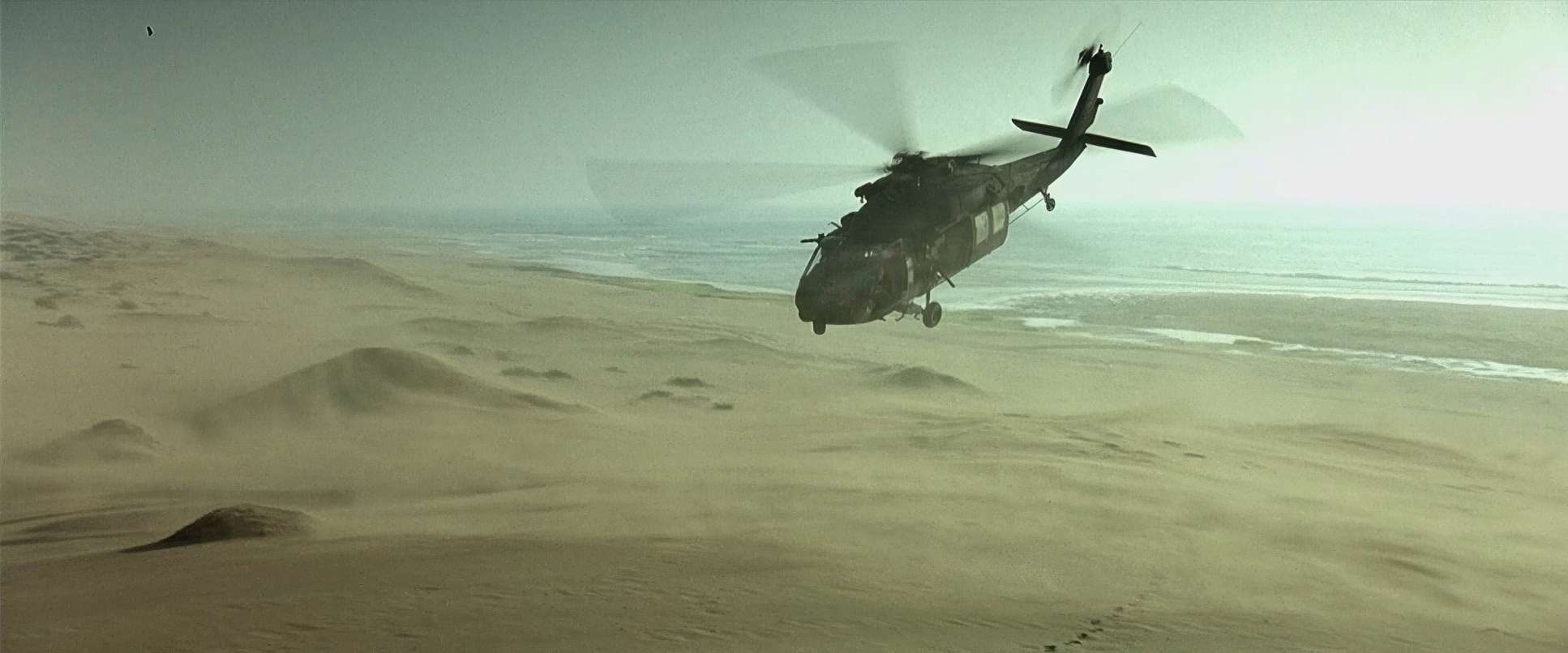
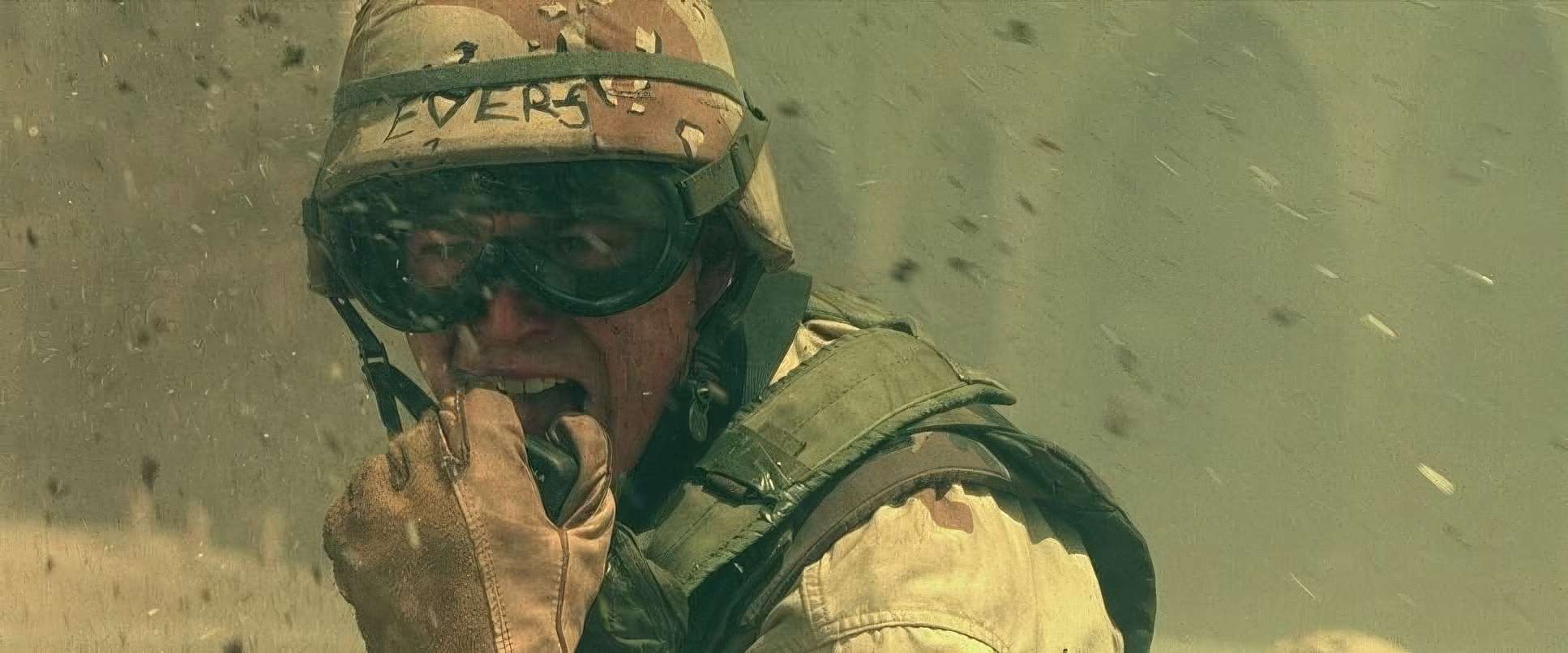
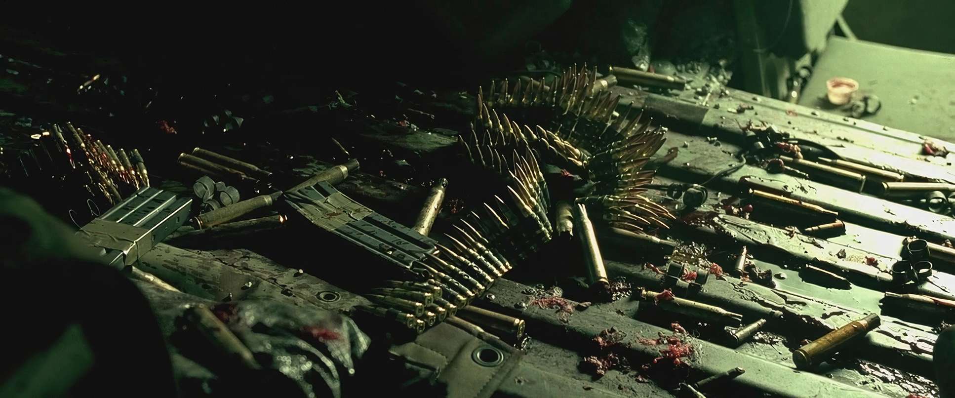
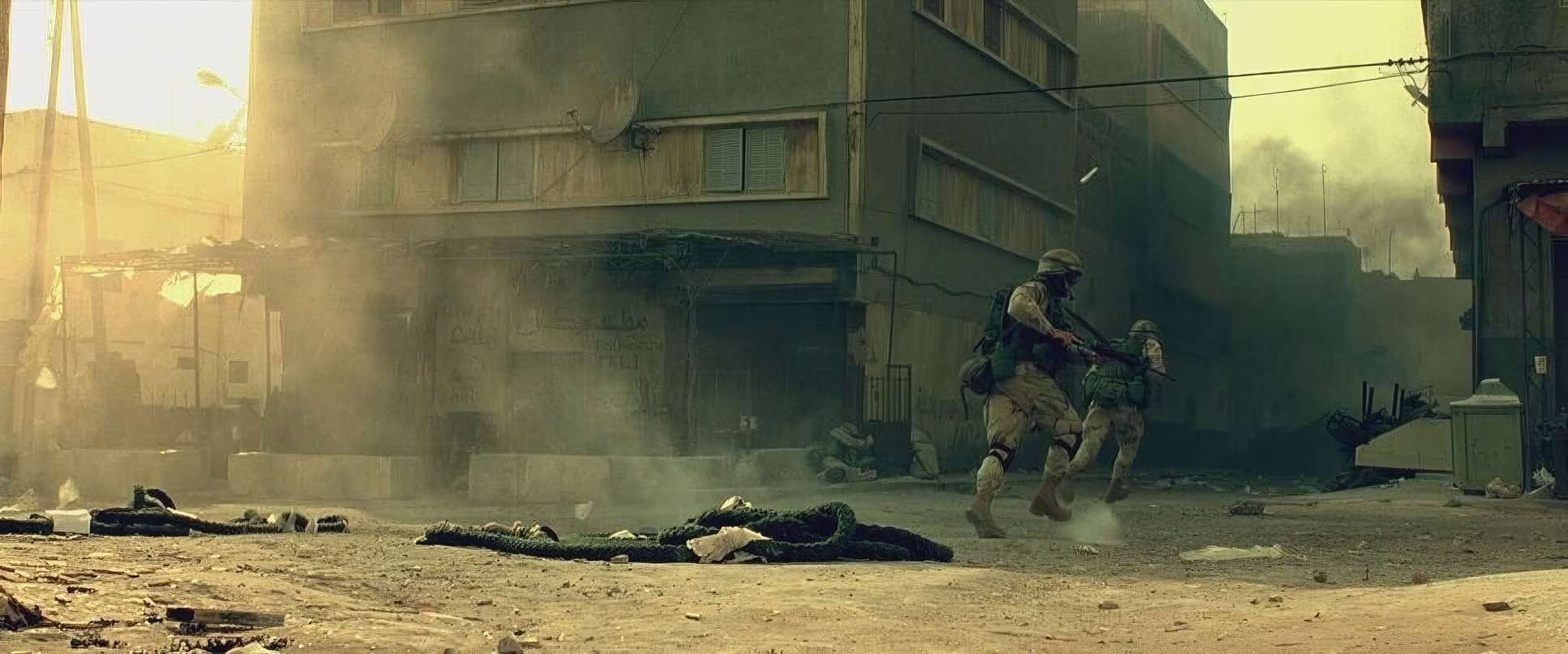
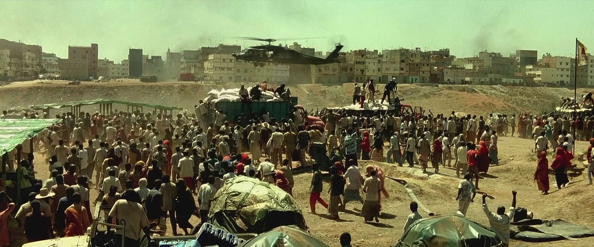
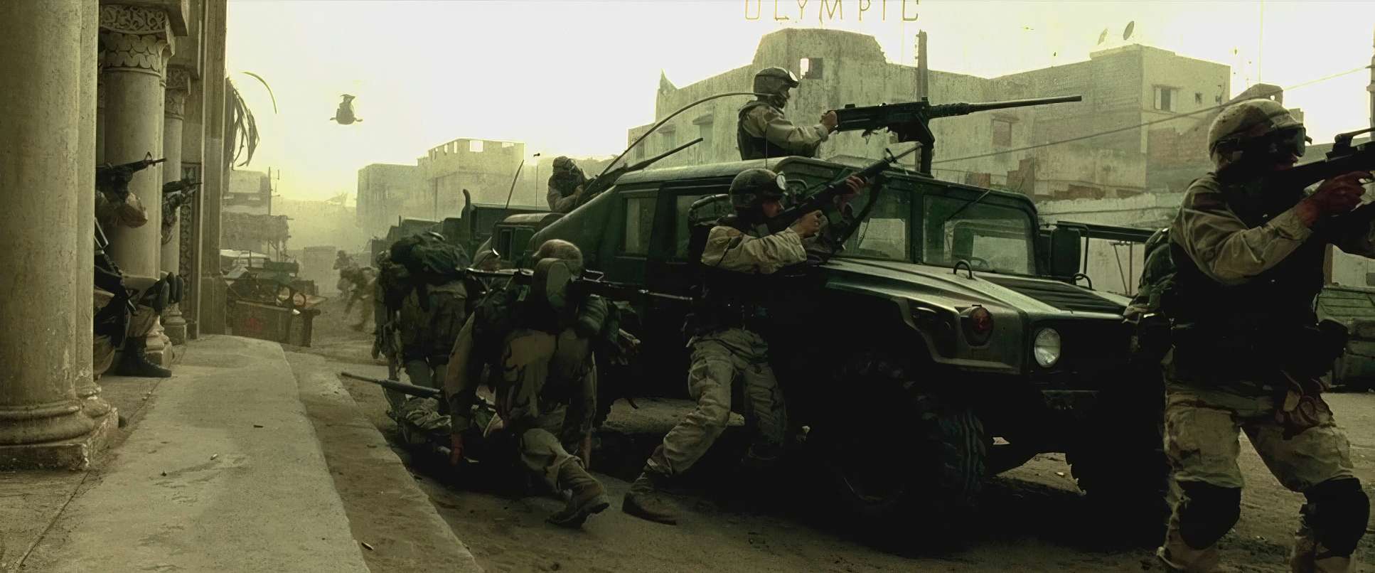
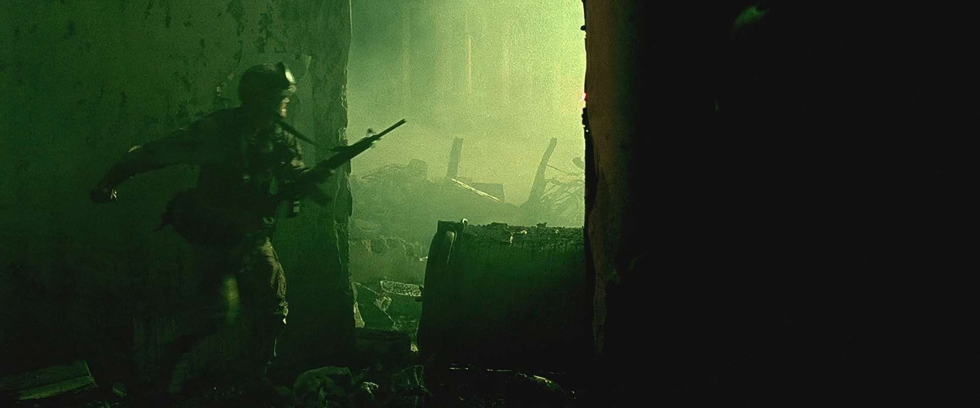
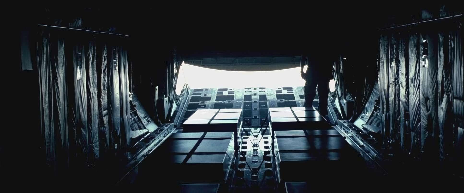
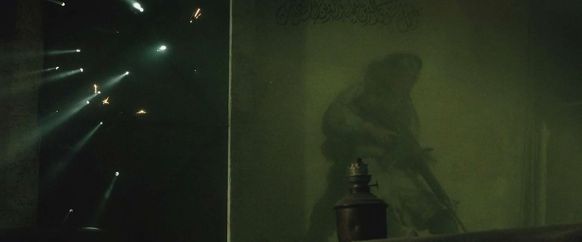
It’s a high-contrast, unforgiving look. He essentially abandoned the idea of “fill light.” You’ve got these scorching highlights and deep, heavy shadows where detail just falls off into the black. That’s a deliberate move. It makes the environment feel oppressive and hot. The dust kicked up by the Black Hawks diffuses that light, creating these massive shafts of white that add a thick, tactile texture to the air. It’s unglamorous and gritty, but it’s exactly why the film feels so honest.
Color Grading Approach: The Sonnenfeld Touch
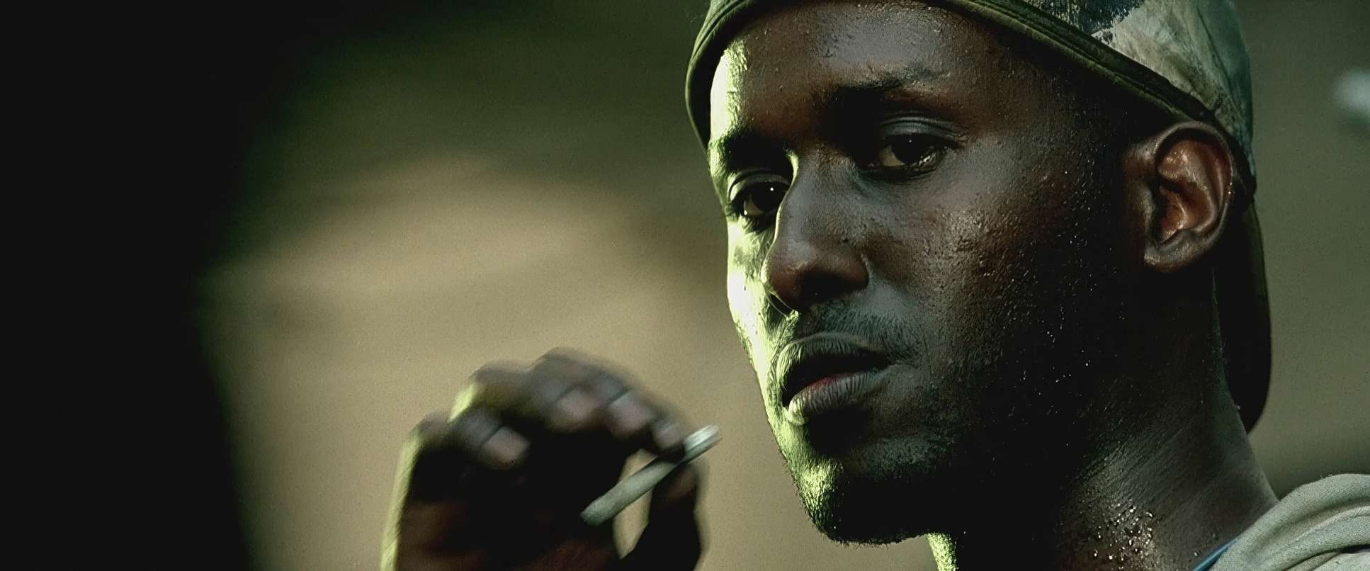
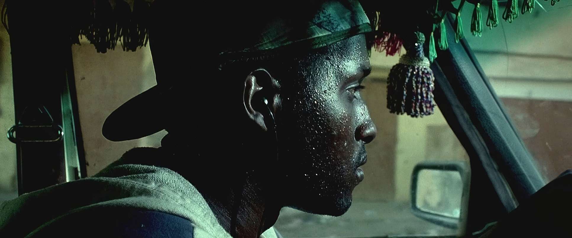
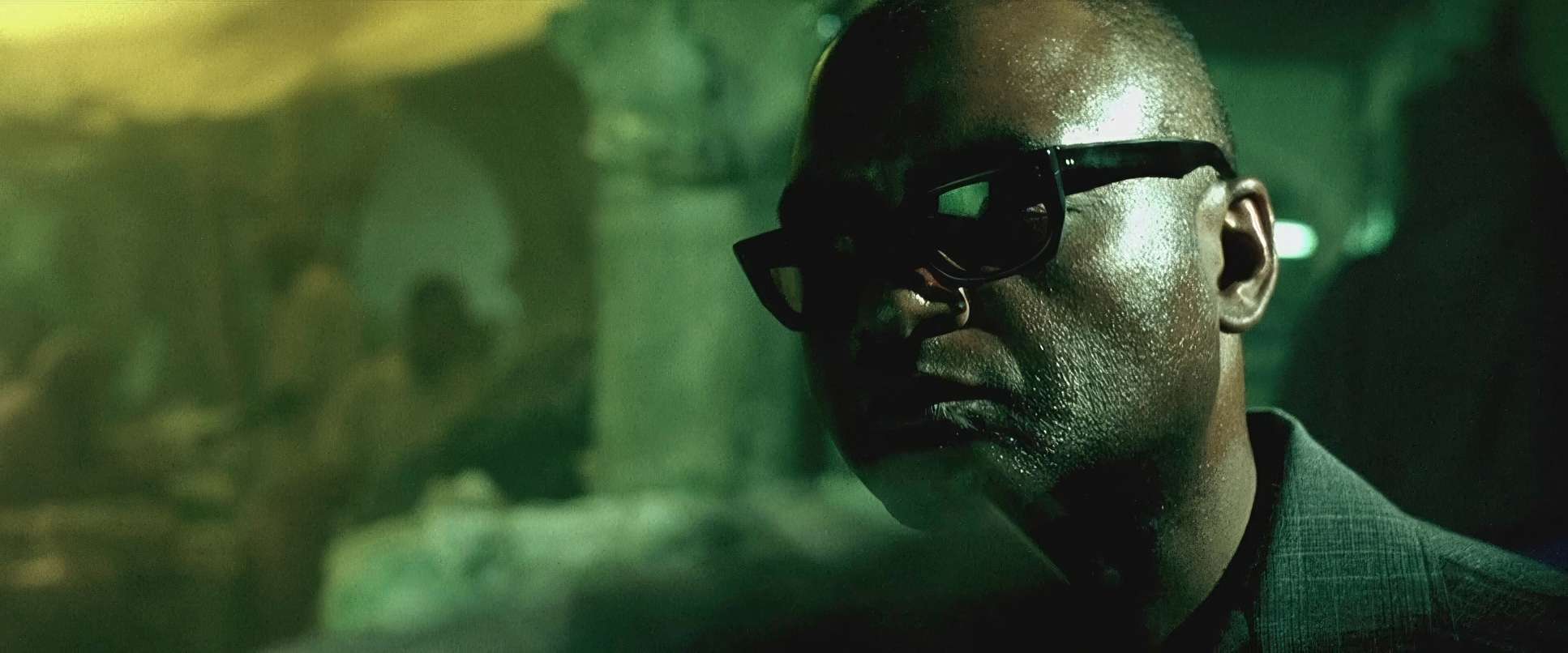
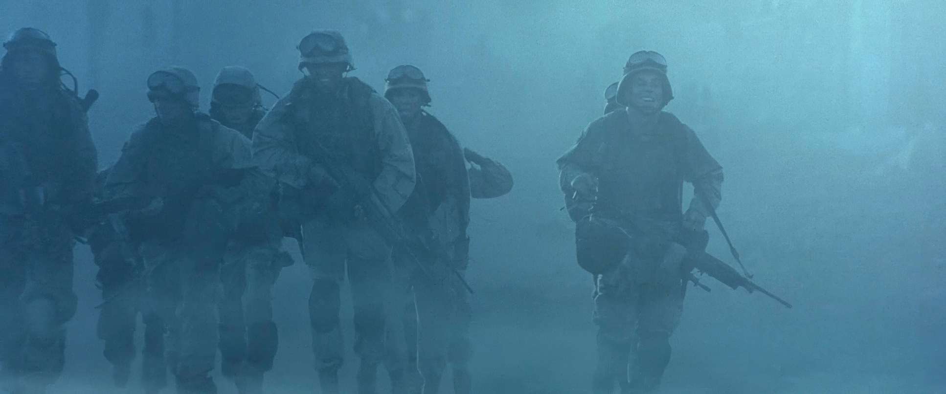
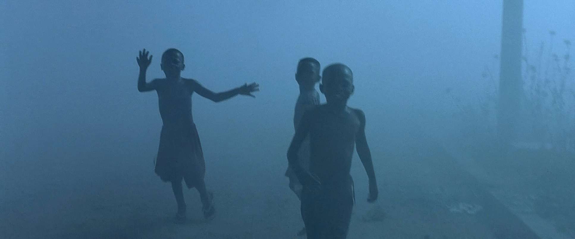
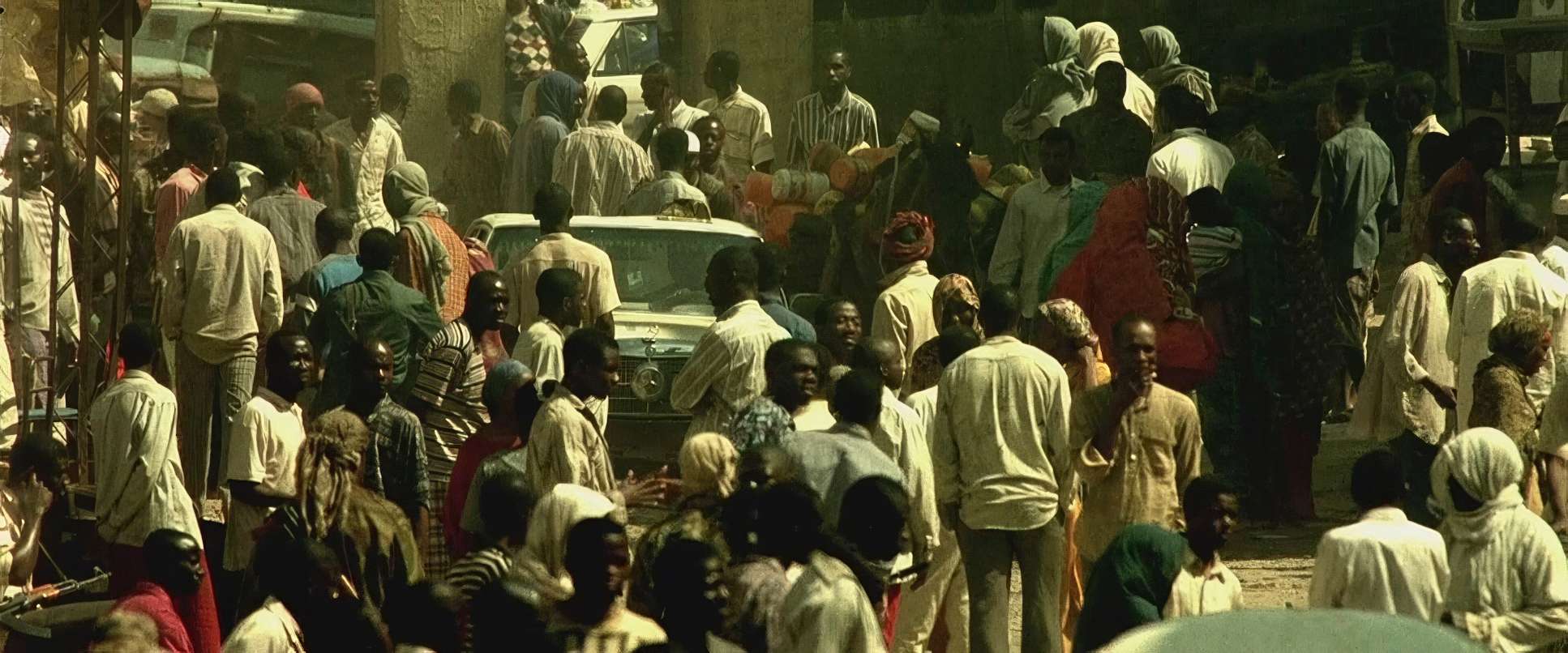
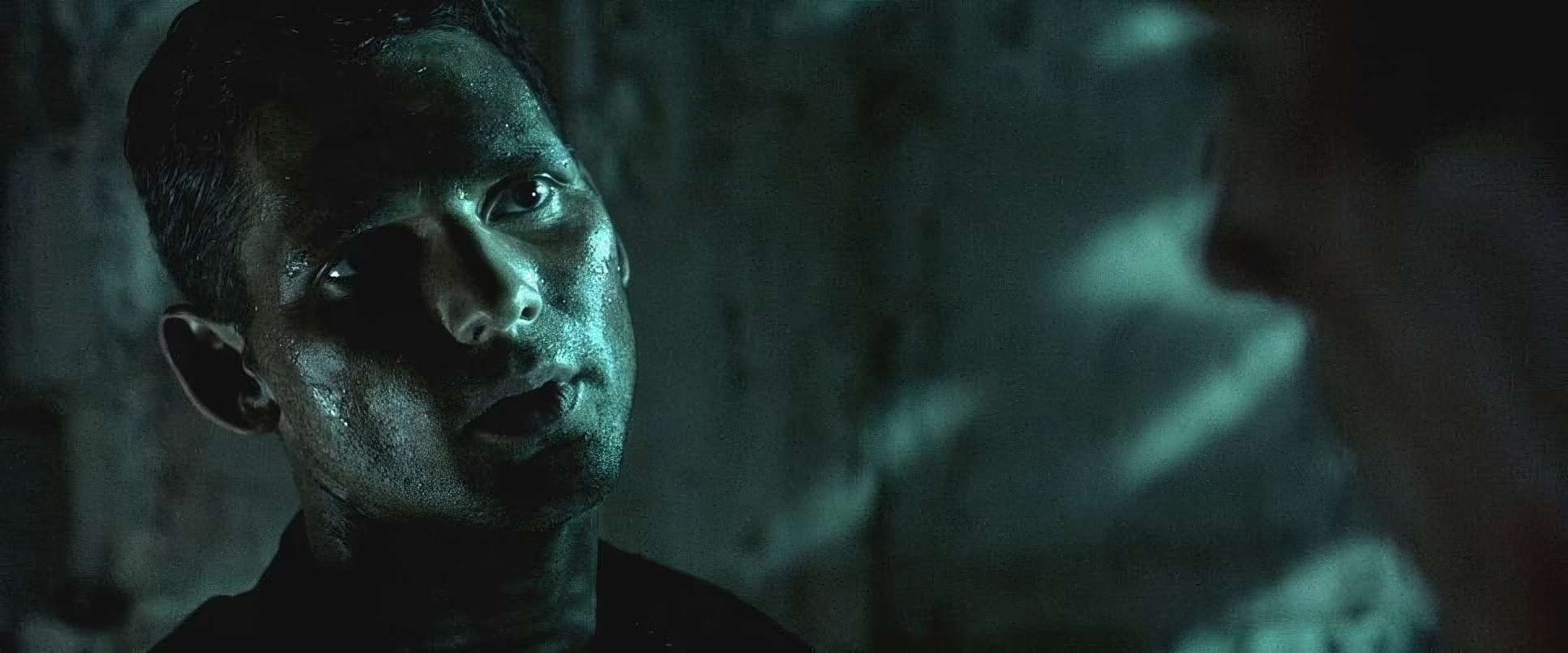
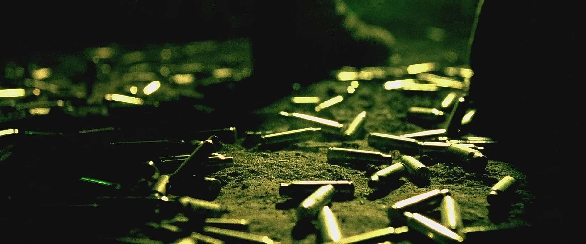
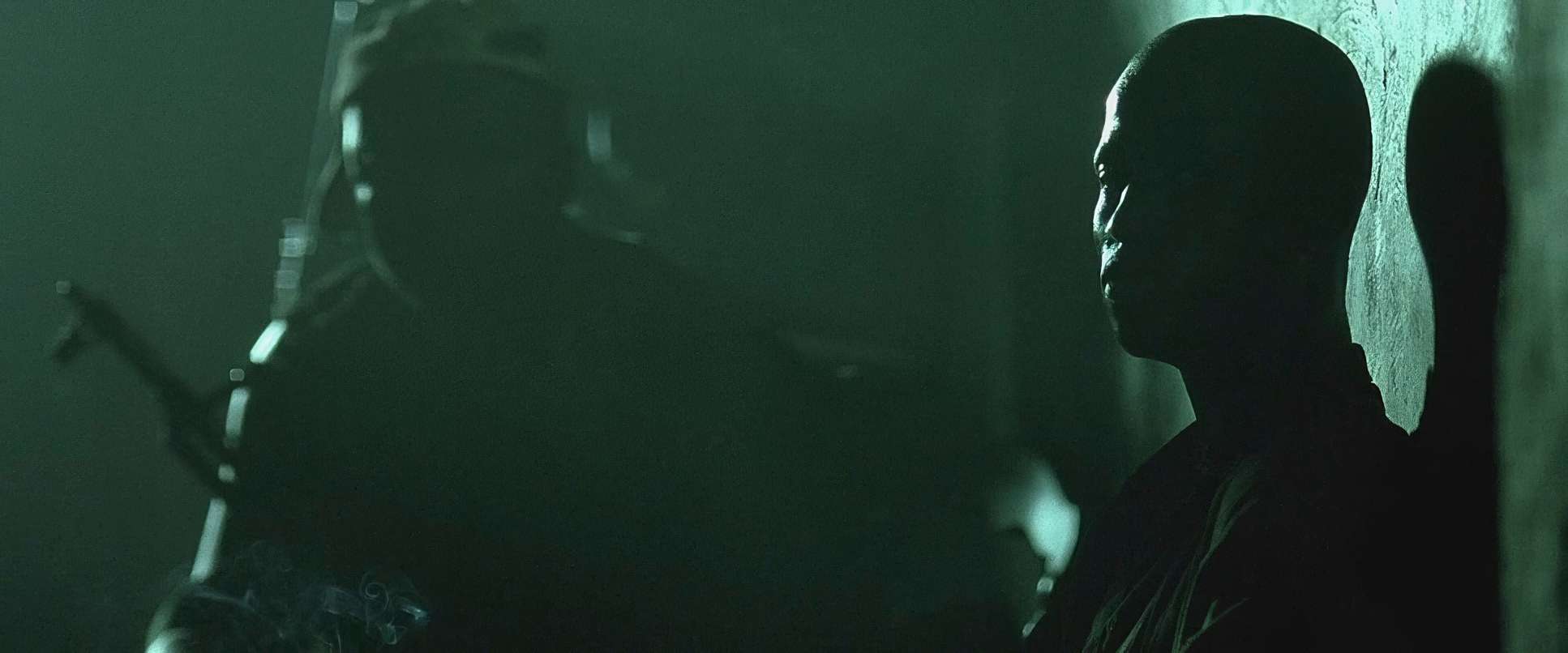
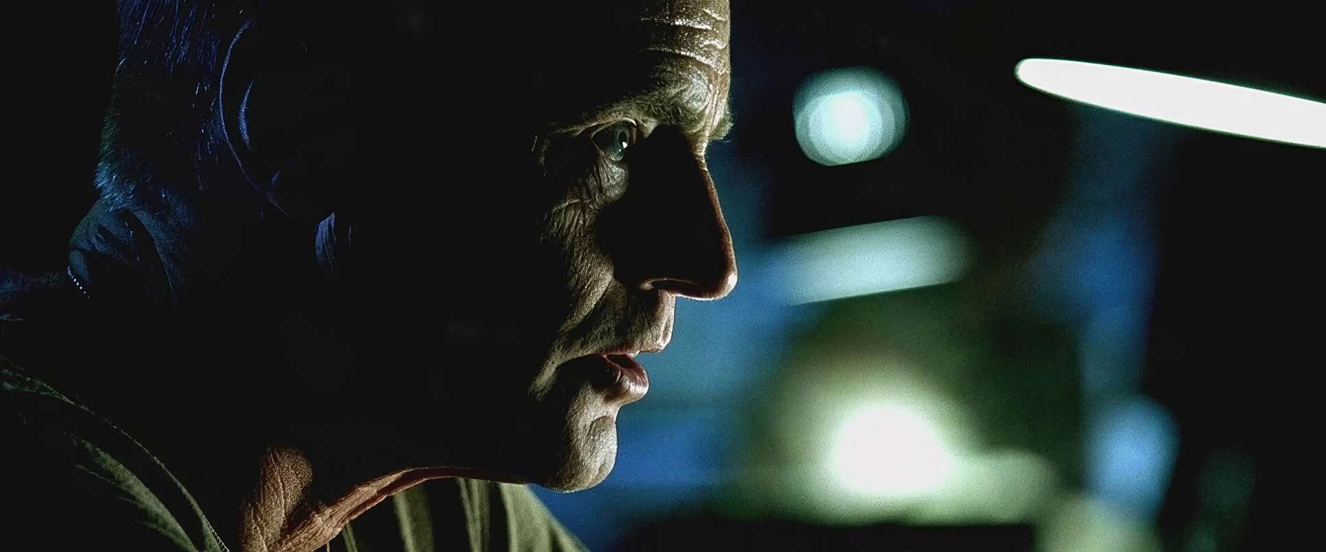
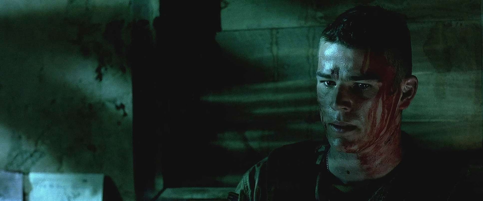
This is where the magic really happens for me. The grade on Black Hawk Down is legendary, handled by Stefan Sonnenfeld a titan in our industry. If you look closely, there’s this sickly, underexposed green tint in the toe of the curve. It’s not a “pretty” look; it feels toxic and weary.
We’re looking at a very tight, muted palette: khaki greens, dusty browns, and desert earth tones. What’s impressive from a grading perspective is the hue separation. Even with that heavy green/cyan wash over the shadows and midtones, the skin tones stay grounded. They don’t look jaundiced; they look human. That’s a hard balance to strike. The contrast is aggressive, pushing the limits of the film stock, but the highlight roll-off is smooth, maintaining that classic “print-film” sensibility that digital often struggles to replicate.
Camera Movements
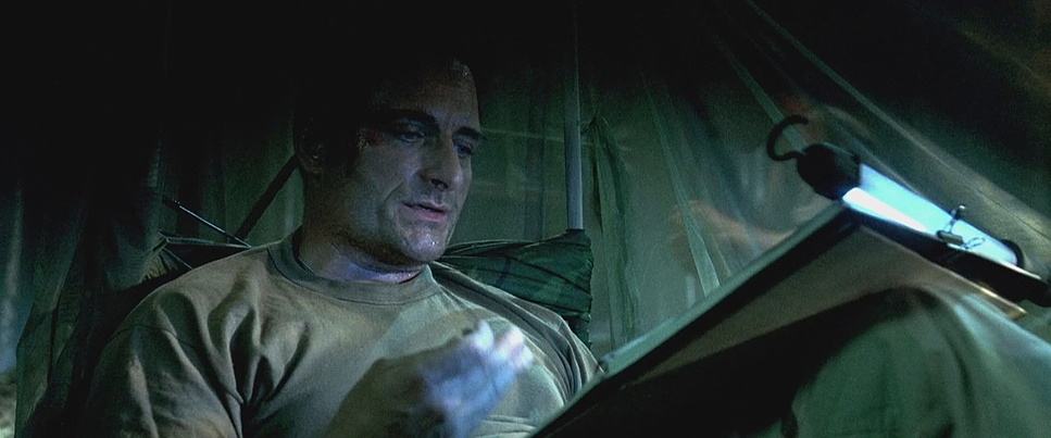
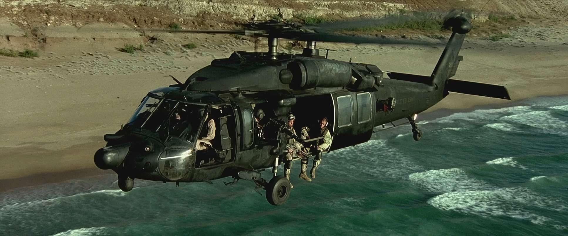
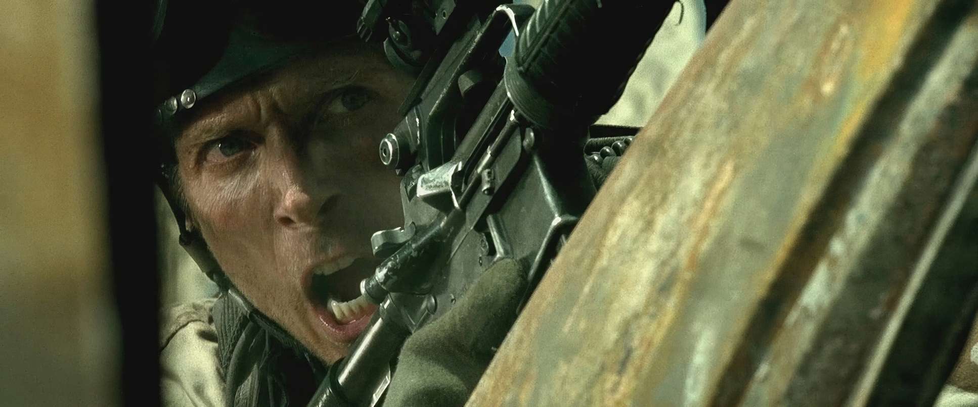
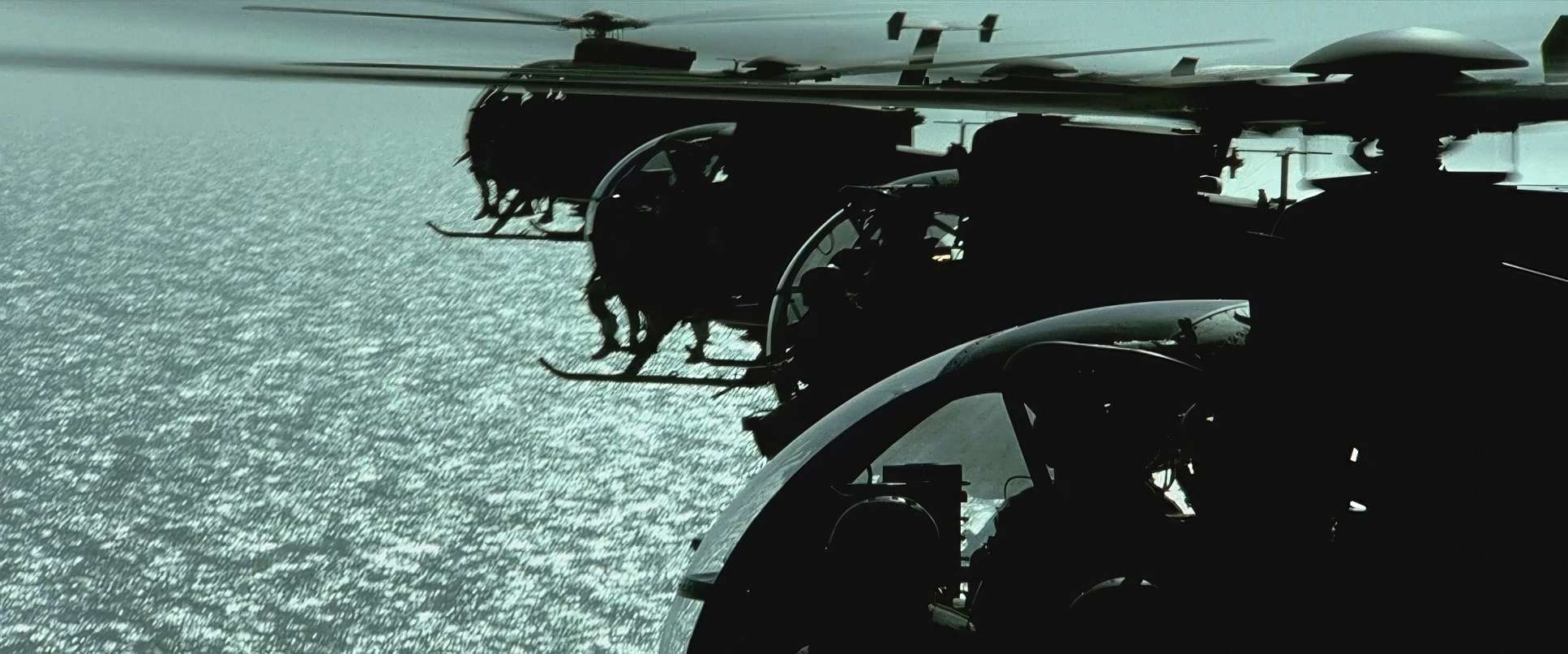
The camera in this film doesn’t just observe; it reacts. It has a frantic, breathing energy that mimics the adrenaline of the Rangers. By using handheld cameras similar to the groundwork laid by Saving Private Ryan Ridley creates a kinetic pulse.
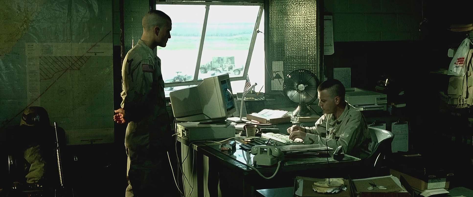
It feels journalistic. The camera jostles in the back of the choppers and swings wildly during firefights in narrow alleys. It’s intensely subjective, putting us shoulder-to-shoulder with the soldiers. You aren’t watching a tactical overview; you’re dodging bullets with them. Those fleeting moments where the camera finally locks off for a wide shot feel like a much-needed breath of air before diving back into the meat grinder.
Compositional Choices
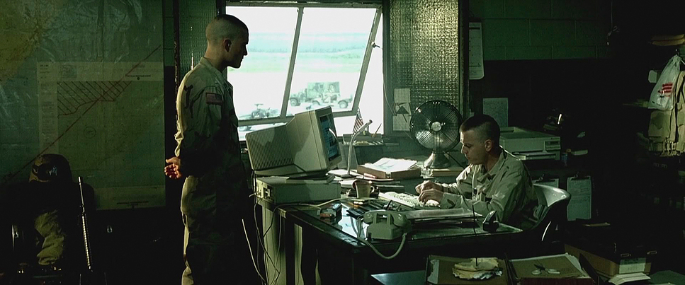
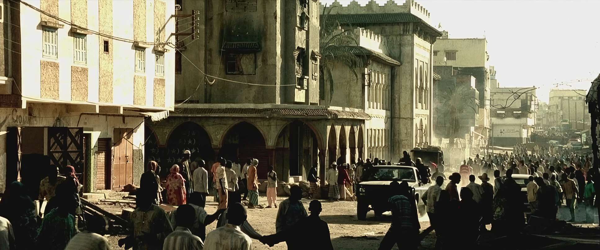
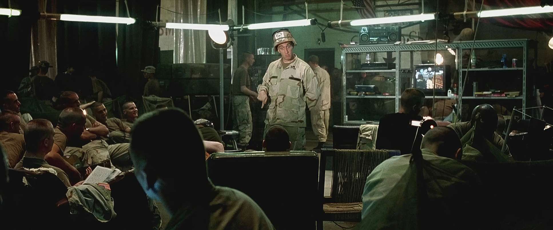
Despite the “handheld” feel, the compositions are incredibly deliberate. Ridley and Idziak had to manage a massive cast 40 to 50 speaking parts while keeping the geography of the city clear.
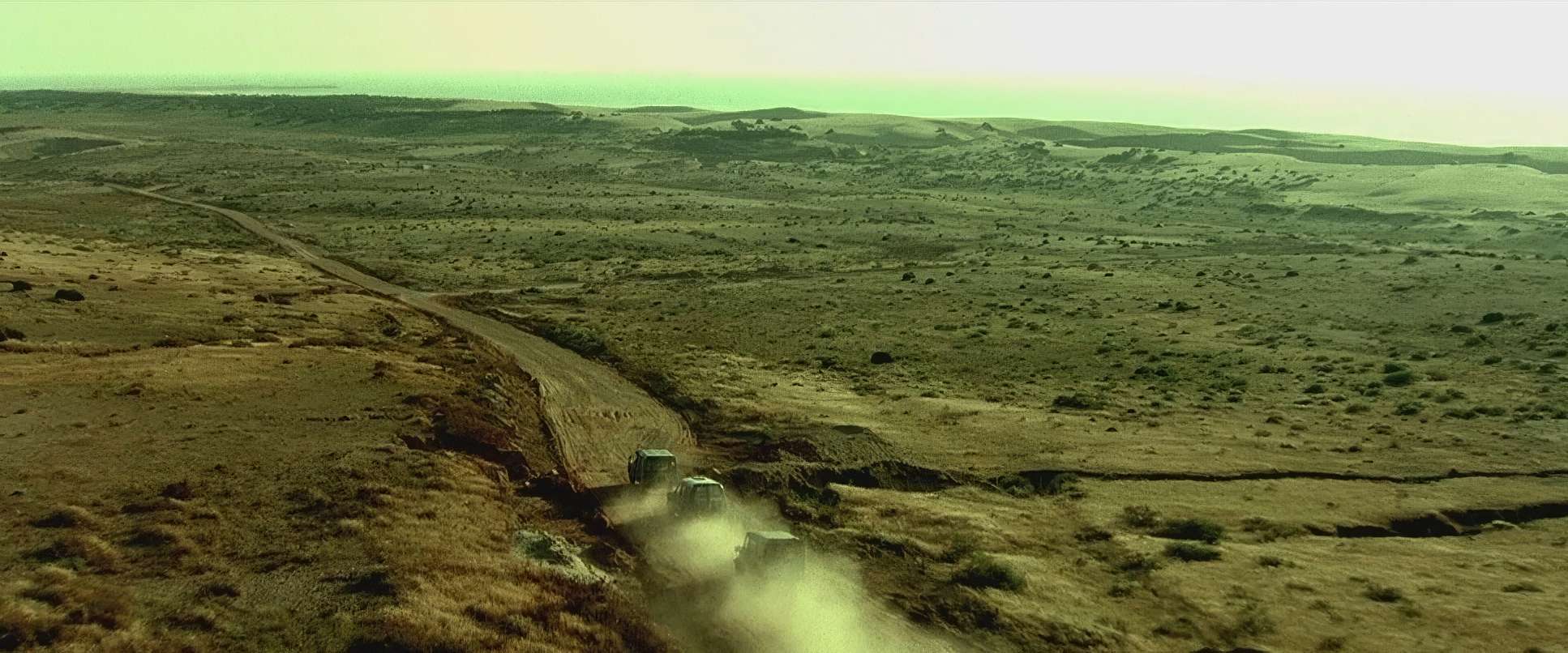
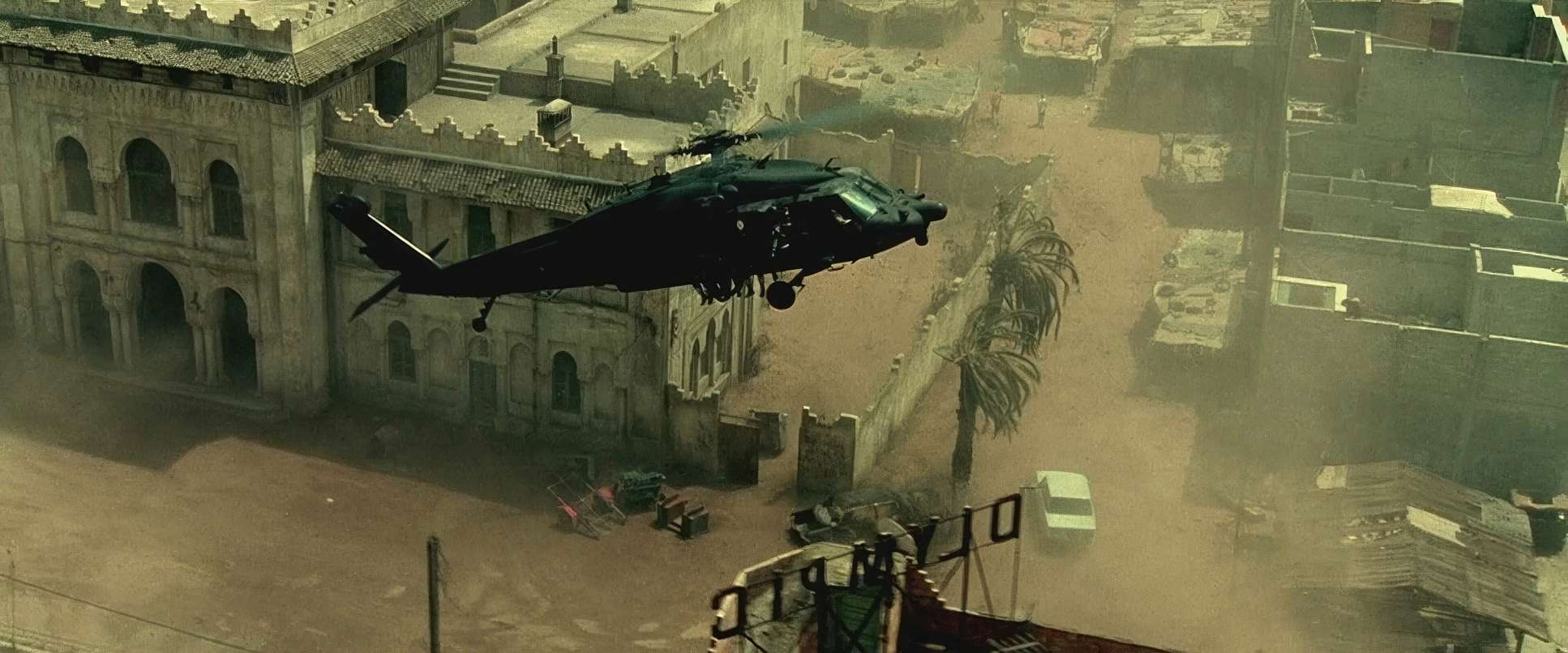
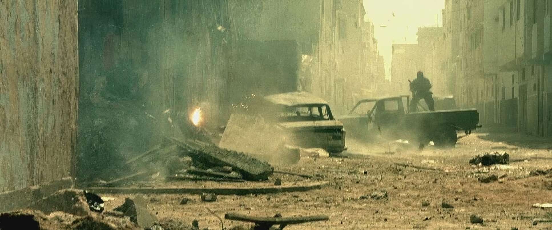
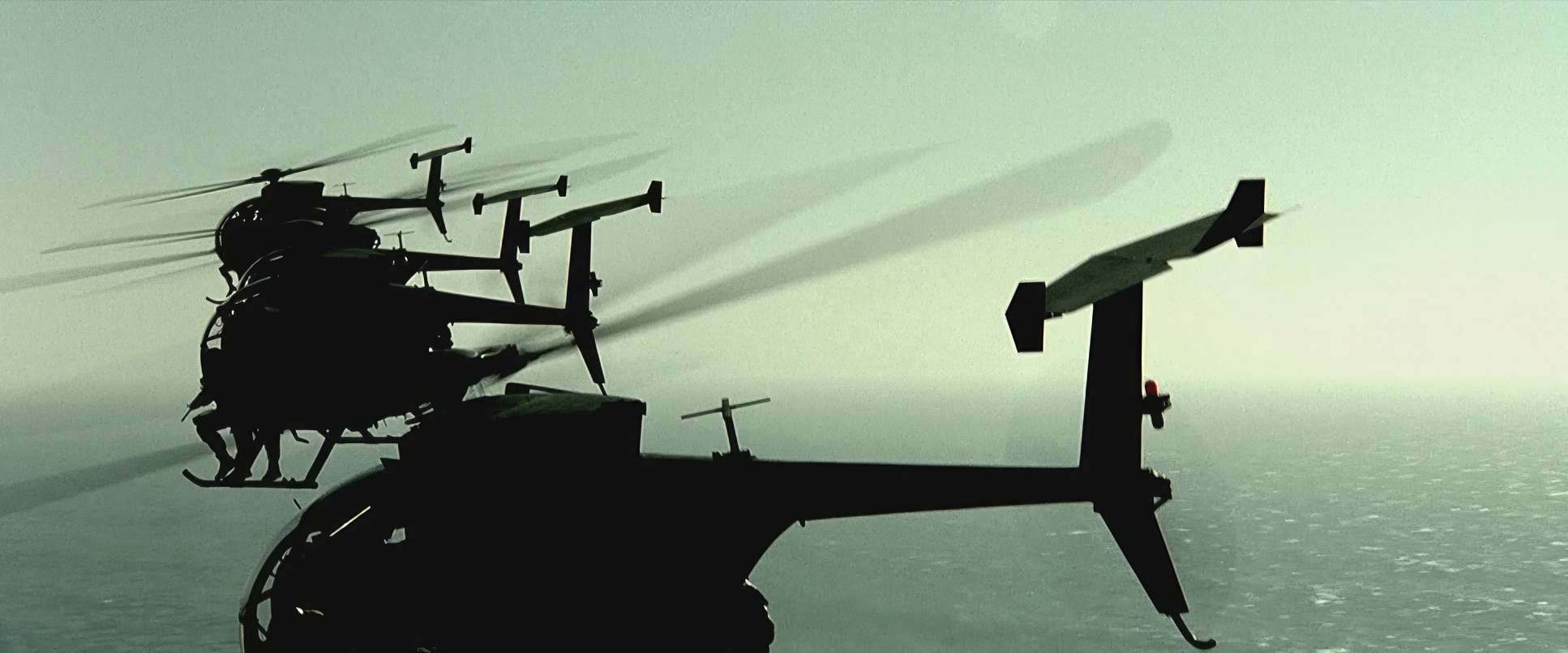
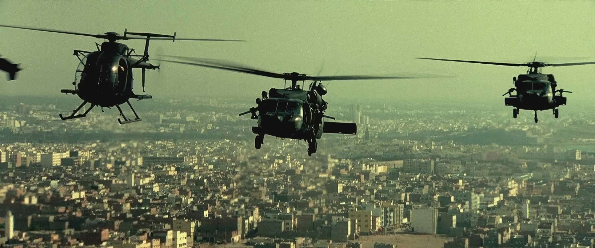
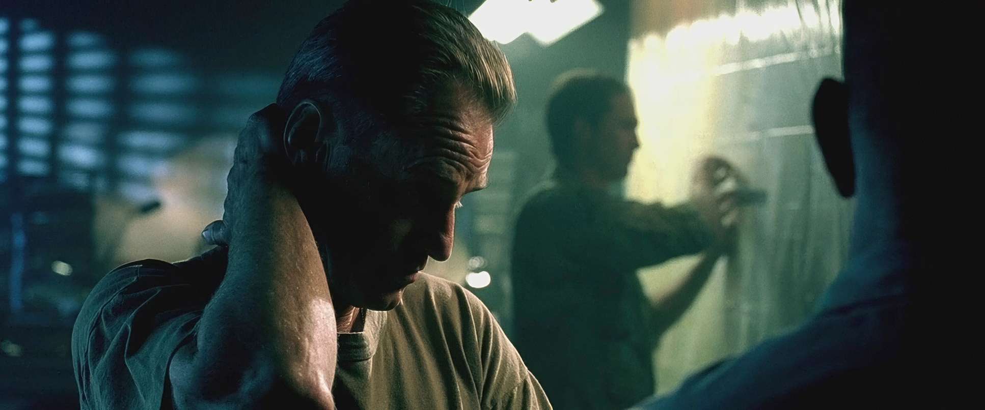
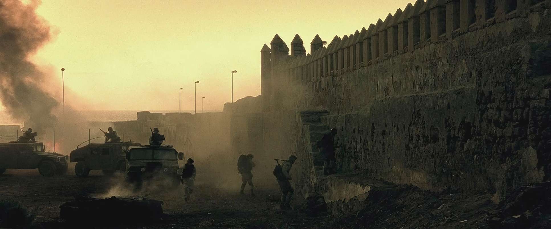
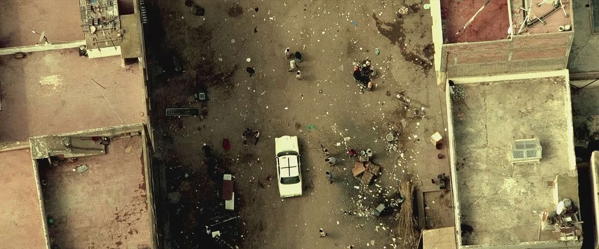
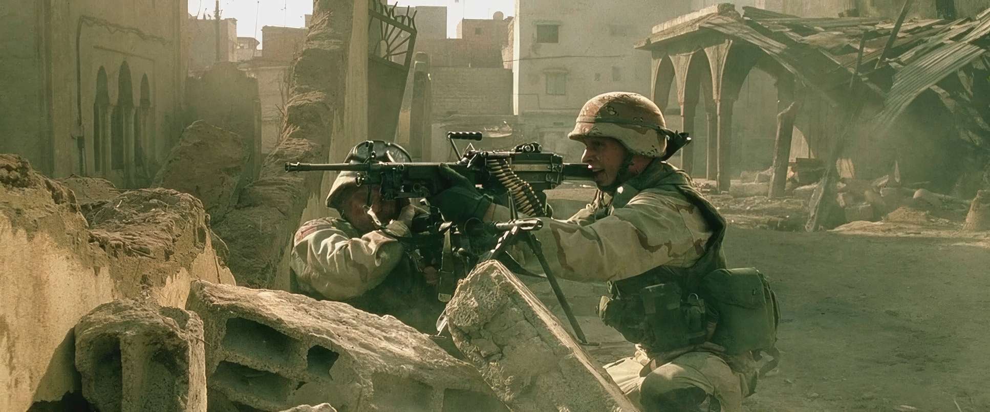
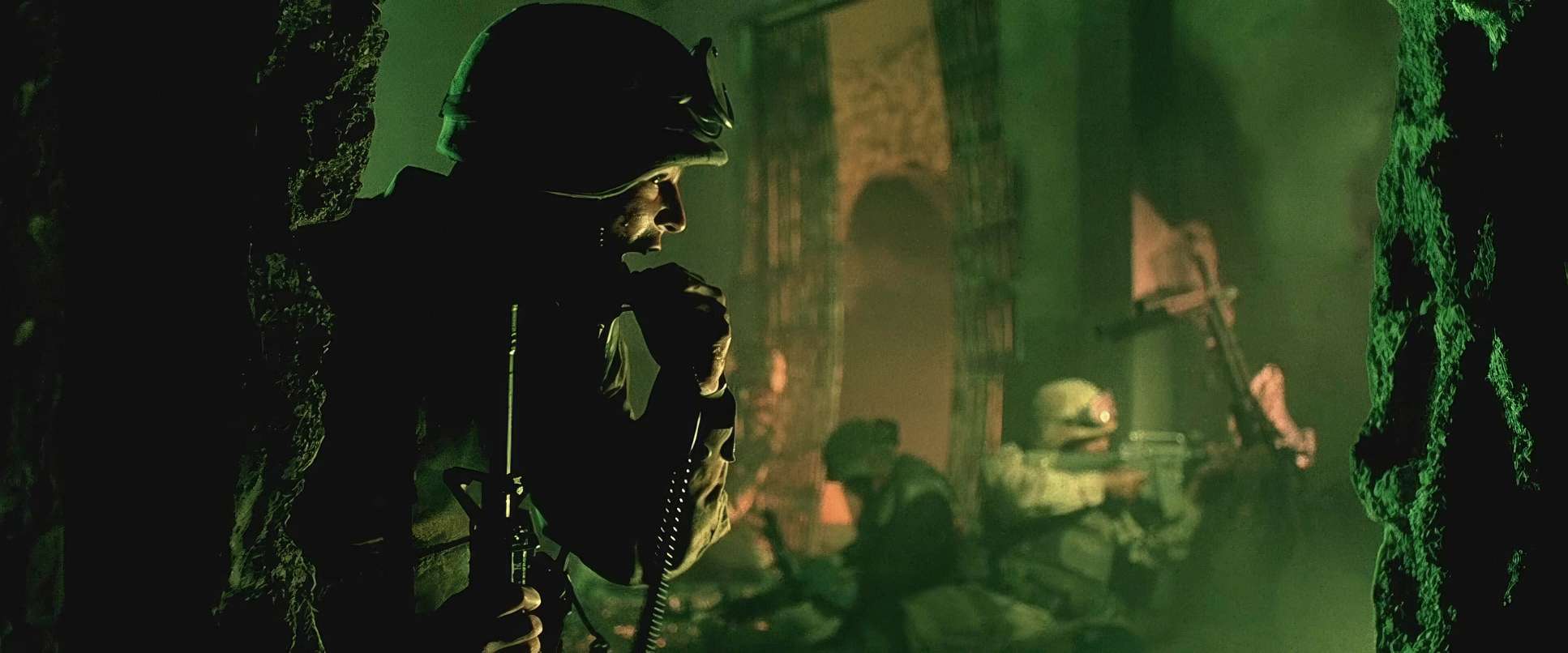
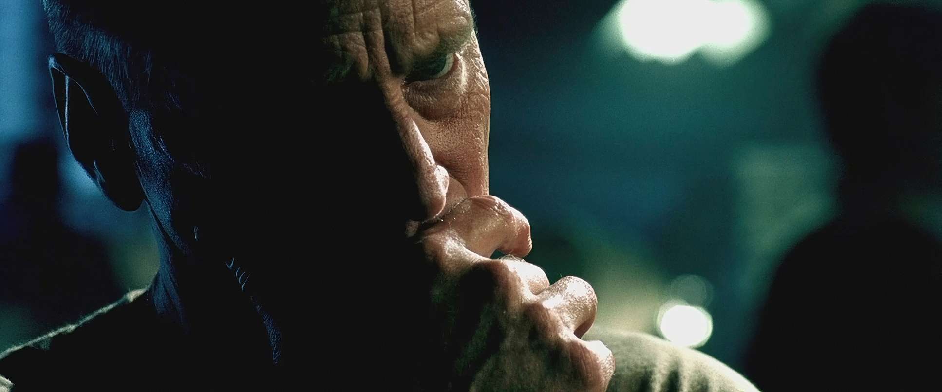
They used long lenses to compress the space, making the militia feel like an overwhelming mass. In the tight urban corridors, you’ll often see a shallow depth of field used to isolate a single soldier. It emphasizes their vulnerability; they are tiny islands of camouflage in a sea of hostile architecture. I also love the use of leading lines the narrow streets and crumbling walls act like funnels, pushing the characters (and the audience) into inescapable kill zones.
Lensing and Blocking

The lensing strategy is all about perspective. Wide-angle lenses are used in close quarters to exaggerate the claustrophobia, making the walls feel like they’re closing in. Then, during the heavy firefights, they switch to telephotos to compress the heat waves and the sheer volume of incoming fire.
They didn’t hide lens flares, either. They embraced them. Those streaks of light from the sun hitting the glass add a layer of “visual noise” that makes the whole thing feel more authentic, like a combat cameraman just trying to keep the lens pointed at the action. The blocking follows suit; it’s about tactical realism. Soldiers move in tight formations, scanning sectors, reacting to the city. It’s a dance of bodies that maintains order within the chaos.
Technical Aspects & Tools
Black Hawk Down (2001) | 35mm • 2.39:1 • Super 35
| Genre | 21st Century Wars, Action, History, Military, War, Docudrama, Drama |
| Director | Ridley Scott |
| Cinematographer | Slawomir Idziak |
| Production Designer | Arthur Max |
| Costume Designer | David Murphy, Sammy Sheldon |
| Editor | Pietro Scalia |
| Colorist | Stefan Sonnenfeld |
| Time Period | 1990s |
| Color Palette | Warm, Saturated, Green |
| Aspect Ratio | 2.39 – Spherical, Super 35 |
| Format | Film – 35mm – Flashing |
| Lighting | Hard light, High contrast, Side light |
| Lighting Type | Daylight |
| Story Location | Somalia > Mogadishu |
| Filming Location | Africa > Morocco |
| Camera | Arri 2c (IIc) |
| Lens | Zeiss Ultra Prime |
| Film Stock / Resolution | 5245/7289 EXR 50D, 5246/7246 Vision 250D, 5248/7248 EXR 100T, 5279/7279 Vision 500T |
Even twenty years later, the film looks spectacular, and a lot of that comes down to the 35mm film stock (Kodak Vision) and the Arricam systems they used. Shooting on film gave them a latitude and texture that digital just didn’t have in 2001.
I have to mention the 4K HDR remaster. Sony did an incredible job here. It’s not just a resolution bump; the HDR actually respects the original grade. It brings out the detail in those harsh highlights and keeps the grain structure looking “clean” and natural. It’s a perfect example of how to modernize a film without stripping away its soul. The grain is there, the grit is there, but the clarity is stunning.
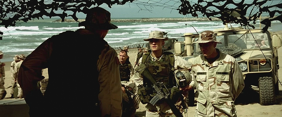
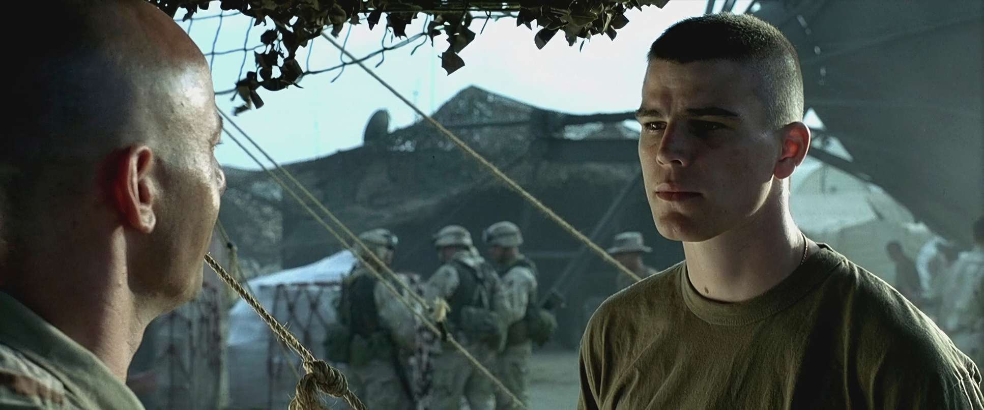
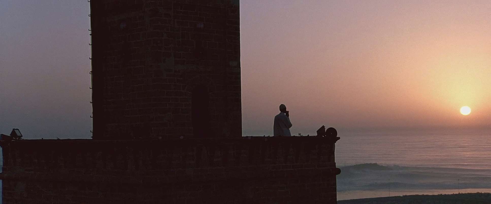
Black Hawk Down (2001) Film Stills
A curated reference archive of cinematography stills from Black Hawk Down (2001). Study the lighting, color grading, and composition.


- Also read: CRASH (2004) – CINEMATOGRAPHY ANALYSIS
- Also read: THE GAME (1997) – CINEMATOGRAPHY ANALYSIS
Browse Our Cinematography Analysis Glossary
Explore directors, cinematographers, cameras, lenses, lighting styles, genres, and the visual techniques that shape iconic films.
Explore Glossary →