Paul Haggis’s 2004 Best Picture winner, my first instinct isn’t to rehash the narrative debates. Trust me, I’ve heard it all the “Brokeback Mountain should have won” chorus, the accusations of its simplistic take on racism, even Haggis himself admitting it was an “experiment” that didn’t quite stick the landing.
I’m always drawn to the craft. I’m looking for the invisible threads of visual storytelling that underpin any project, controversial or not. Let’s set aside the critical drumbeat and look at Crashthrough the lens of its visual construction. How did J. Michael Muro, as the DP, and the post team make sense of this “jumbled plotline”? What visual language did they use to portray a city brimming with “car crash and crime”?
That’s where the real analysis begins for me.
About the Cinematographer

J. Michael Muro was a bold choice for this. He didn’t just walk onto a set; he came up through the ranks as a legendary camera operator for guys like Haskell Wexler and Robert Richardson. That matters. It gives a DP a “hand-on-the-glass” feel for the camera and a visceral understanding of raw, immediate moments.
His work on Crash feels like the ultimate payoff of that observational background. He wasn’t chasing “flashy” or “pretty.” Instead, he was anchoring a sprawling, ensemble narrative in a visually cohesive, emotionally turbulent Los Angeles. He crafts a world that is believable, unsettling, and most importantly profoundly intimate despite the scale of the city.
Inspiration Behind the Cinematography
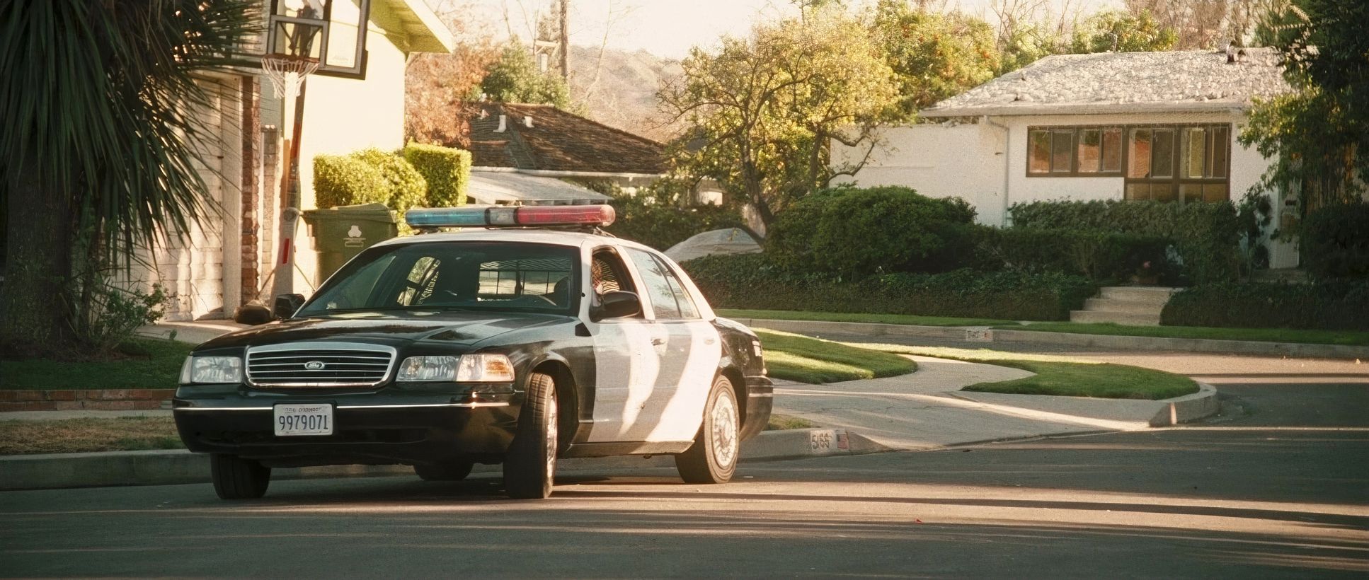
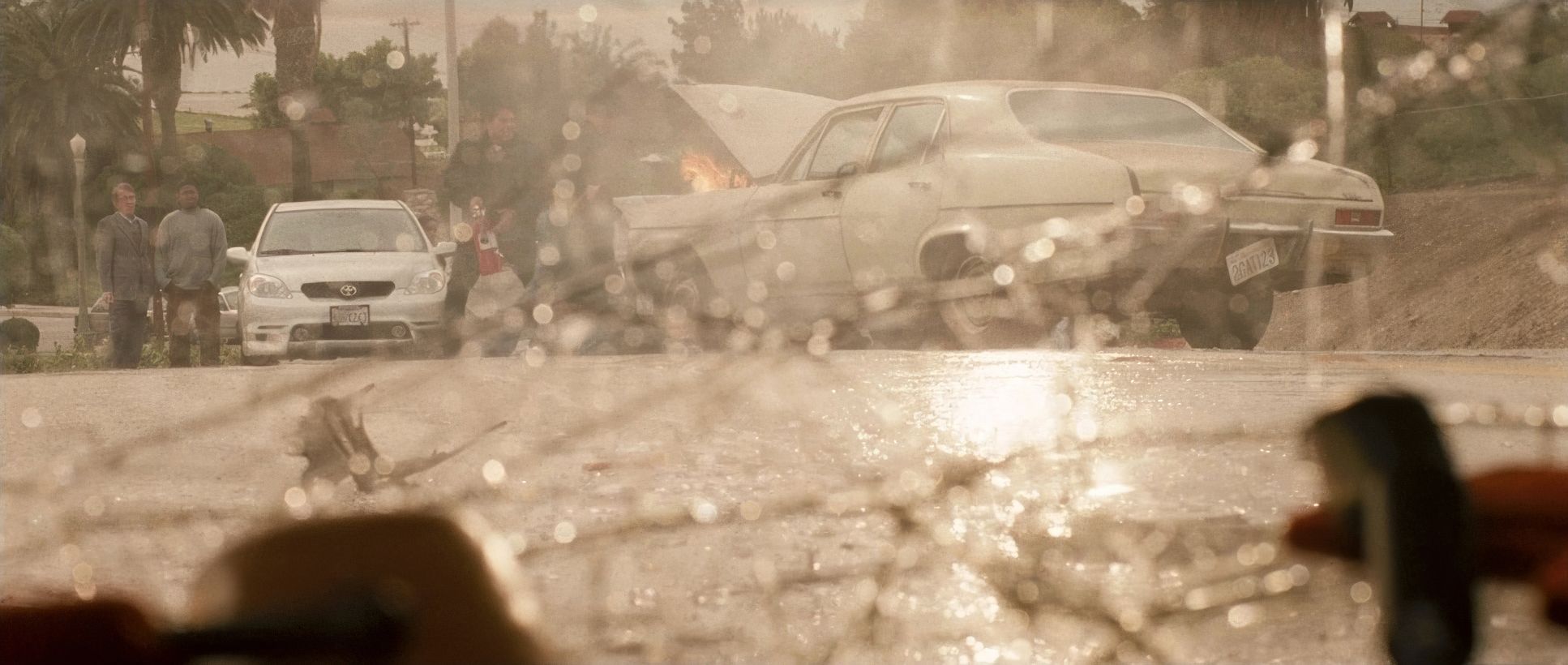
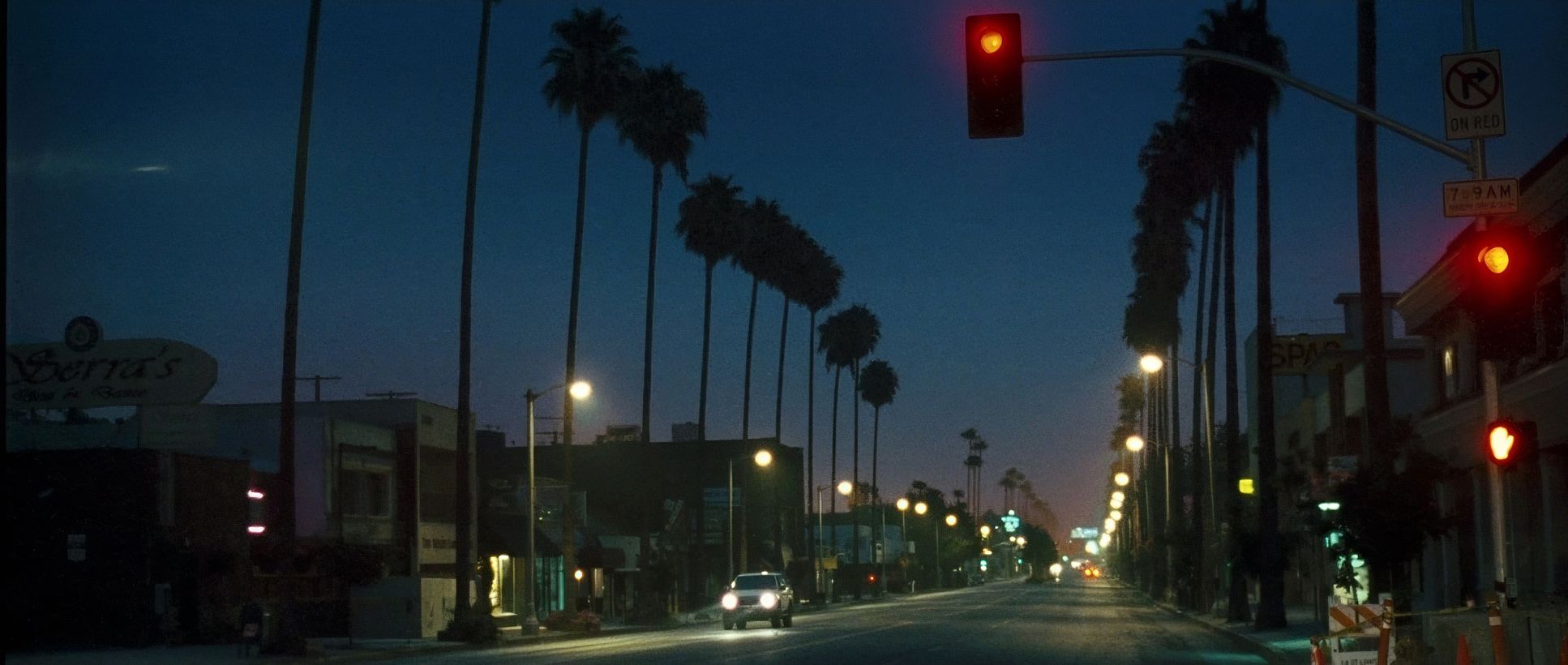
The inspiration for Crash is built into the title: the “car crash” of interconnected lives. Los Angeles here isn’t the sun-drenched, postcard version of the city. It’s a claustrophobic urban labyrinth.
Muro’s approach perfectly reflects this urban anxiety. It’s less about grand vistas and more about the tight spaces and the palpable unease of navigating a minefield of stereotypes. In my view, the city itself is the main character one that’s hot, dusty, sterile, and always one minute away from a collision. The visual style immerses us in a constant low hum of unease.
Lensing and Blocking
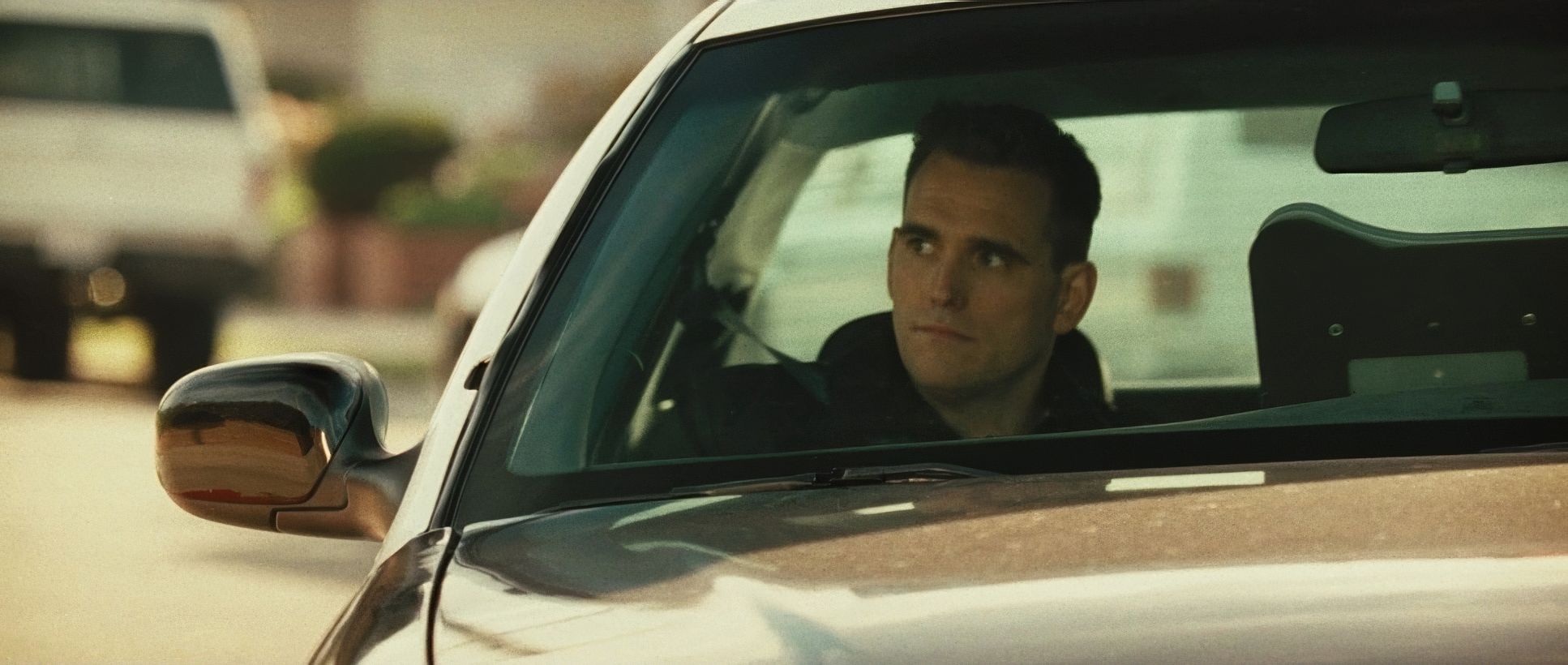
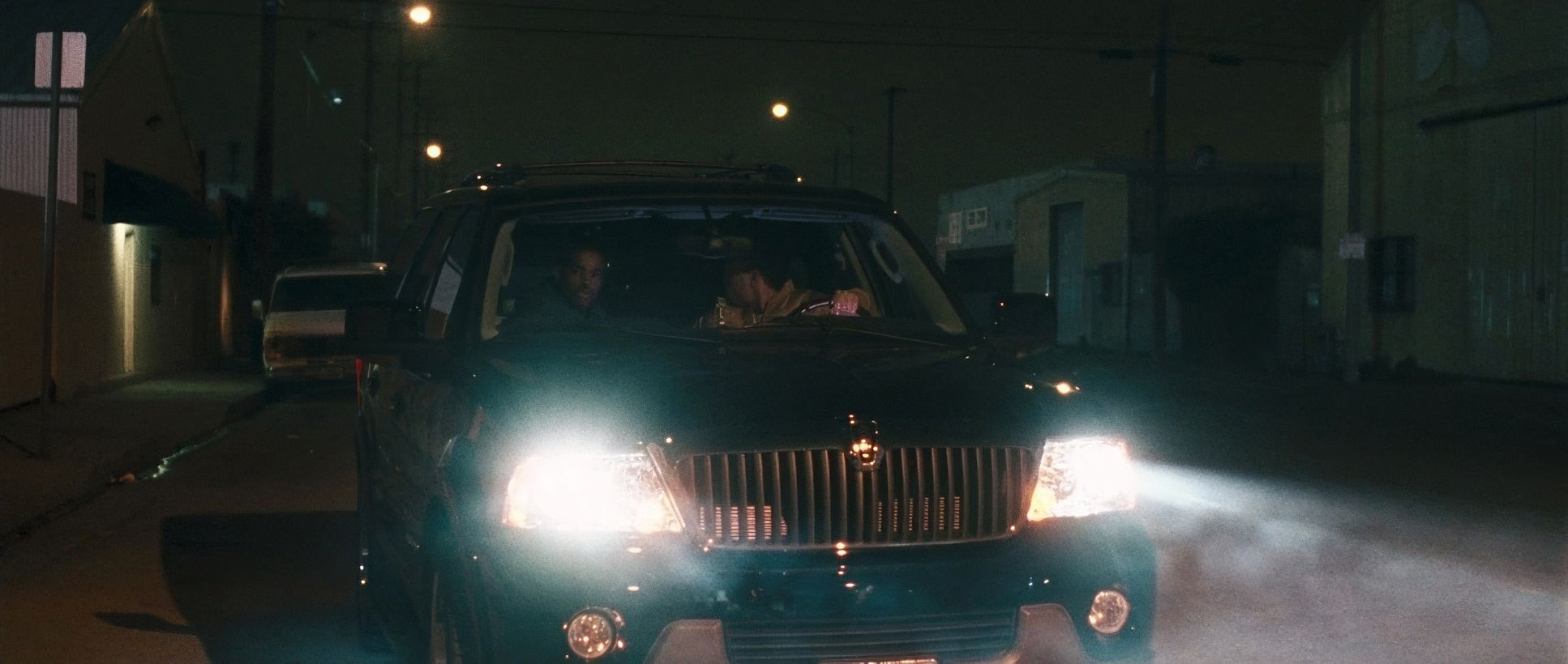
Here is where the technical choices get interesting. While most people associate “big city” films with wide lenses to show the scale, Muro went the other way. We see a heavy reliance on long lenses.
Why? Because long lenses compress space. They “squish” the background right up against the characters, making it feel like there is nowhere to run. By using Panavision Super Speed Zeiss MKII glass, they kept a certain “creaminess” in the bokeh while still being able to shoot in low-light conditions.
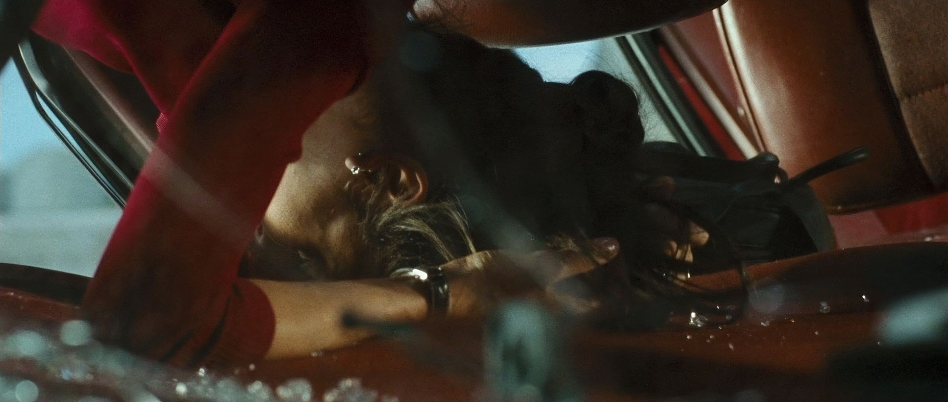
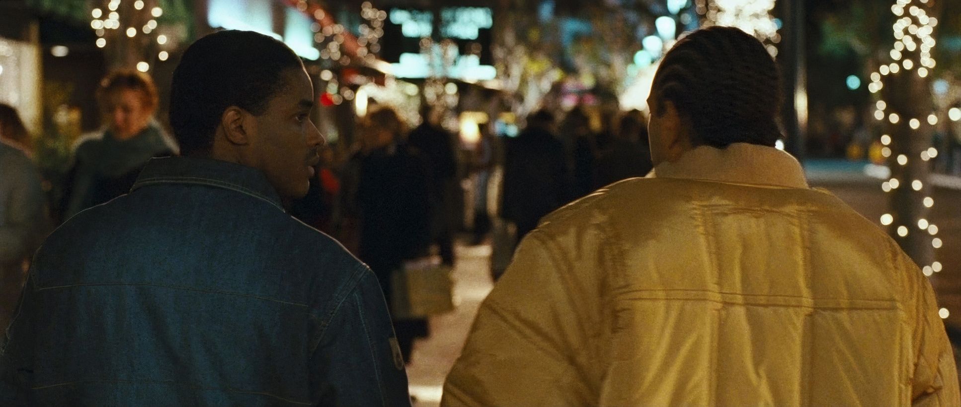
The blocking follows suit. Characters are frequently positioned in tight proximity, physically embodying the “intermingling” that forms the film’s core. Think about the car scenes of which there are plenty. The blocking confines the actors, forcing an uncomfortable closeness that turns every interior into a pressure cooker.
Camera Movements
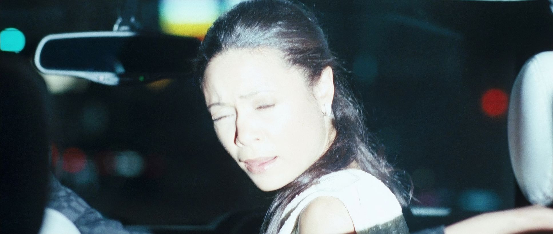
The camera movement in Crash is a key indicator of its narrative intent. It’s deliberate. You’ve got a gritty blend of handheld work during confrontations and more controlled Steadicam shots for the transitions.
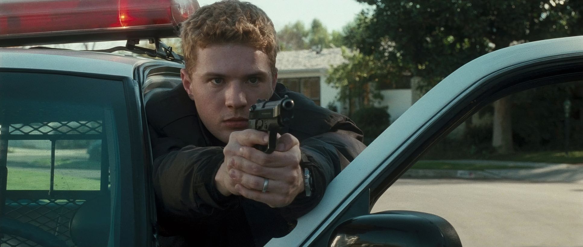
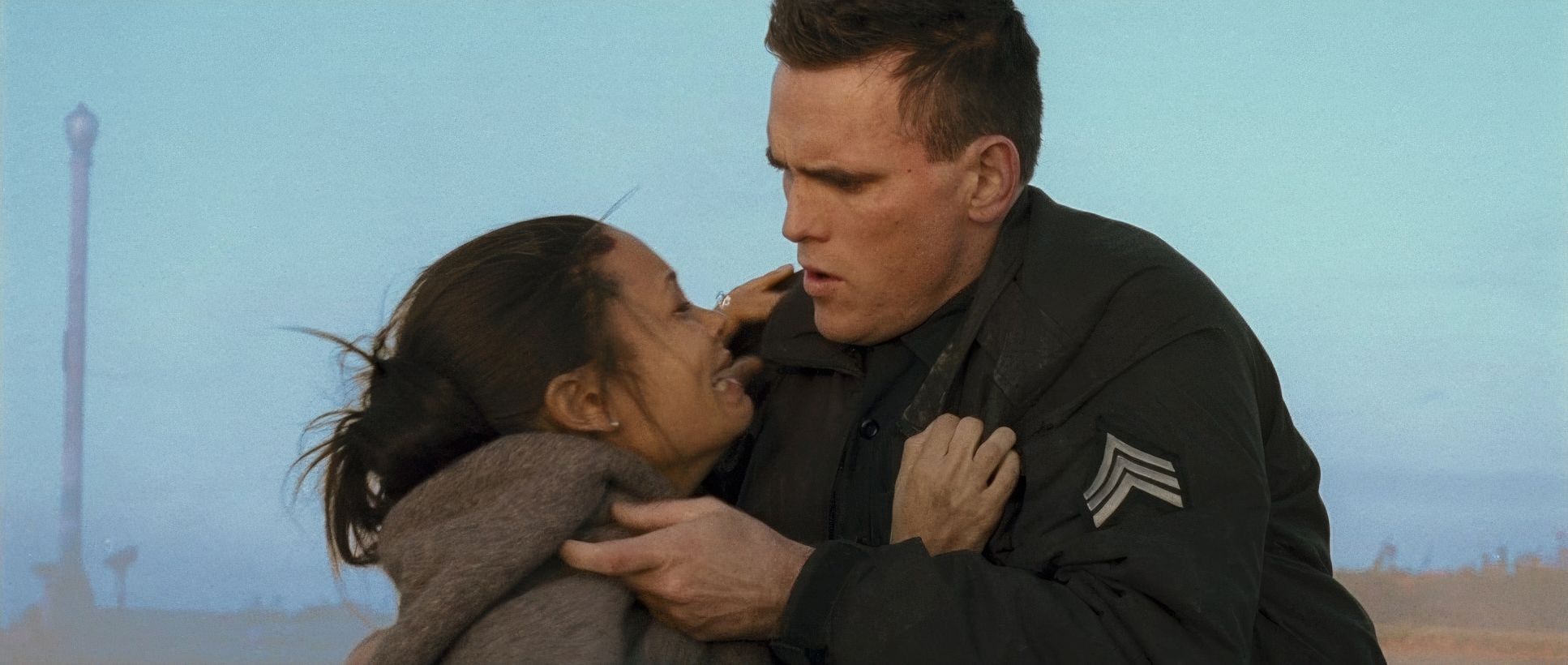
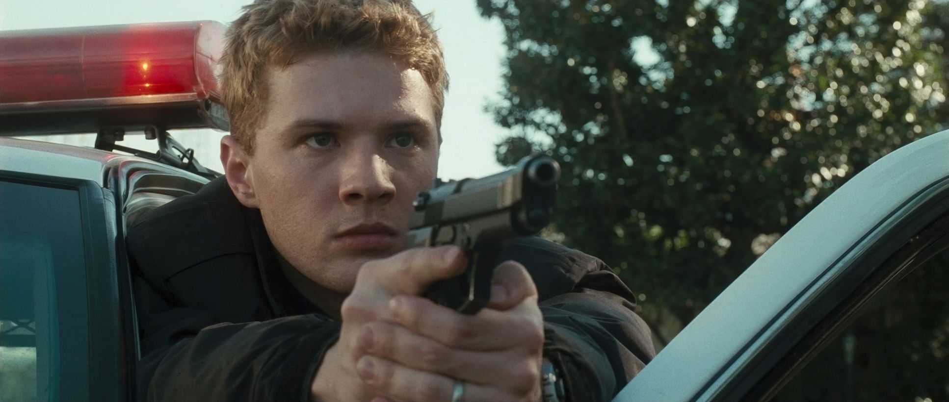
The handheld moments bring a raw, documentary-like immediacy. Look at the scene where Matt Dillon’s character pulls over Terrence Howard and Thandie Newton. The slight shakiness isn’t just a style choice; it’s a violation. It puts you in the car, experiencing the fear. Conversely, the smoother movements connect the disparate storylines across the city. It’s “controlled chaos” a restless energy that propels the narrative without letting it feel adrift.
Compositional Choices
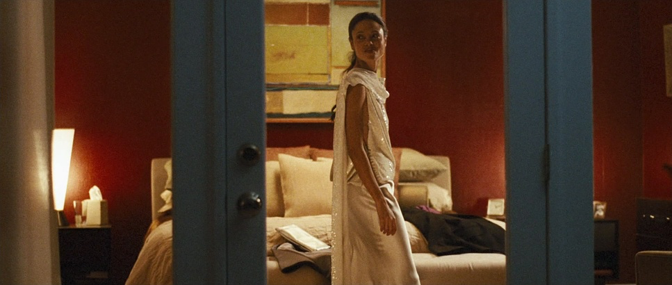
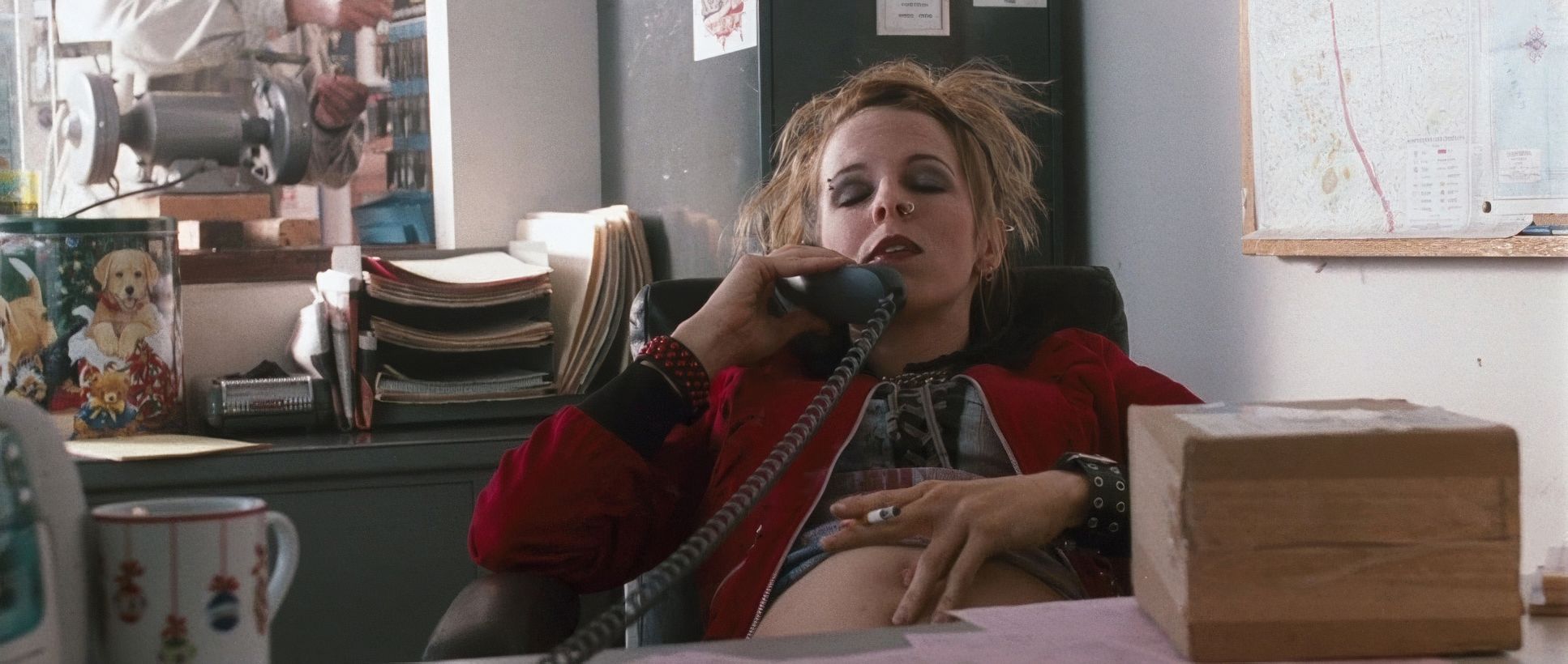
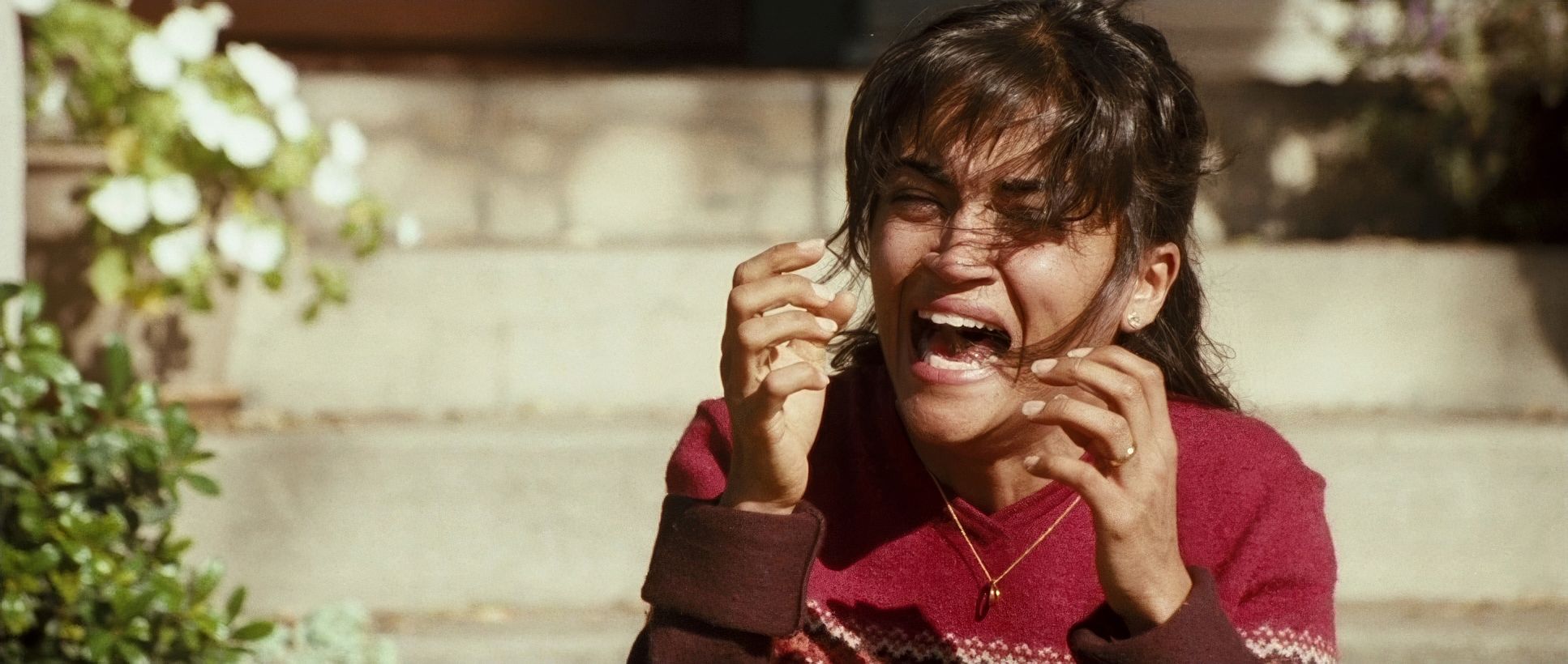
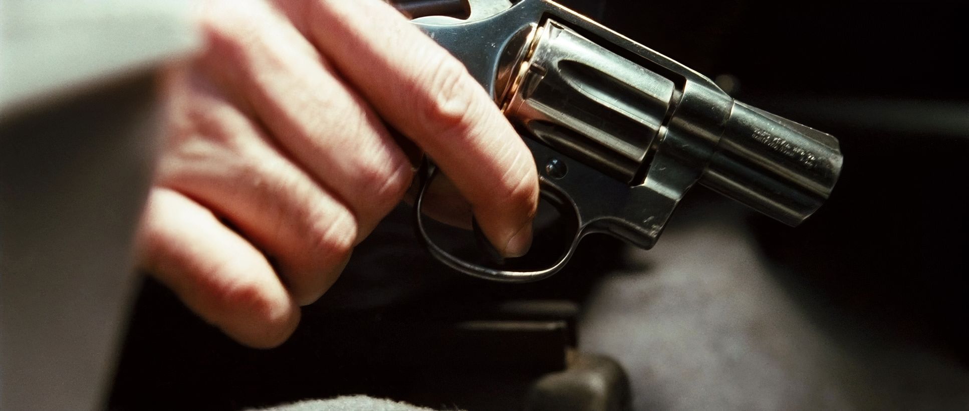
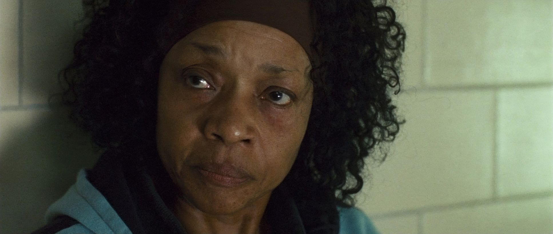
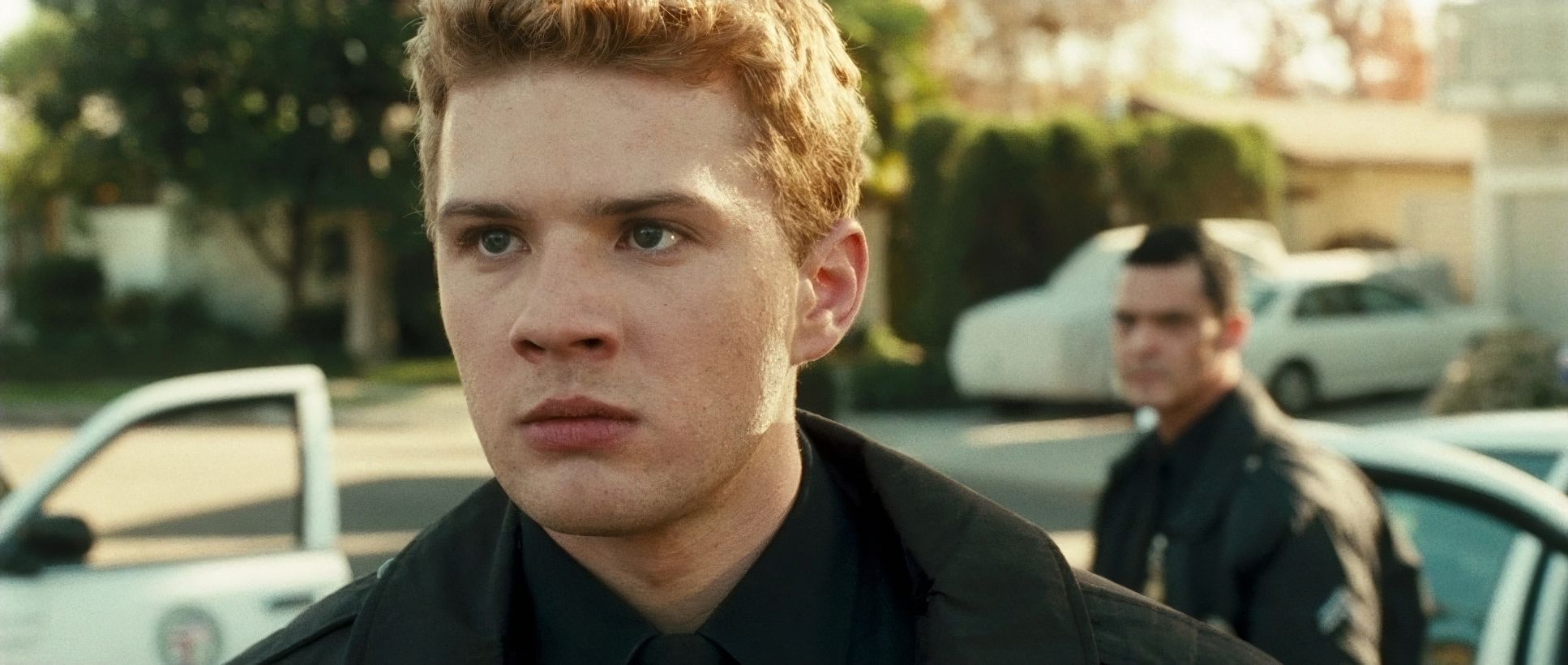
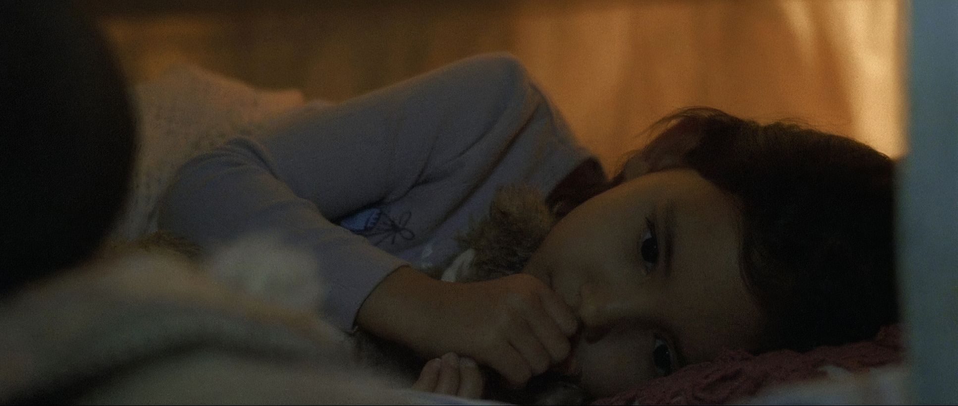
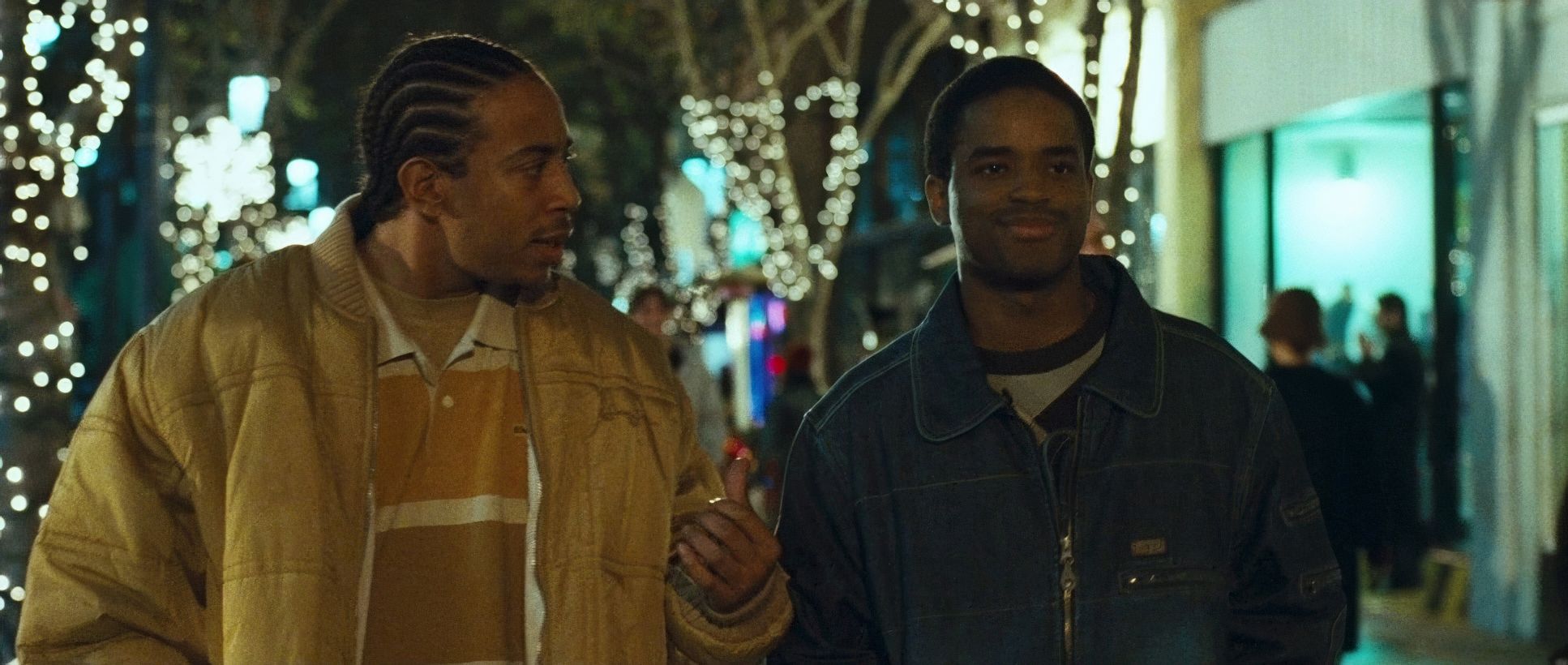
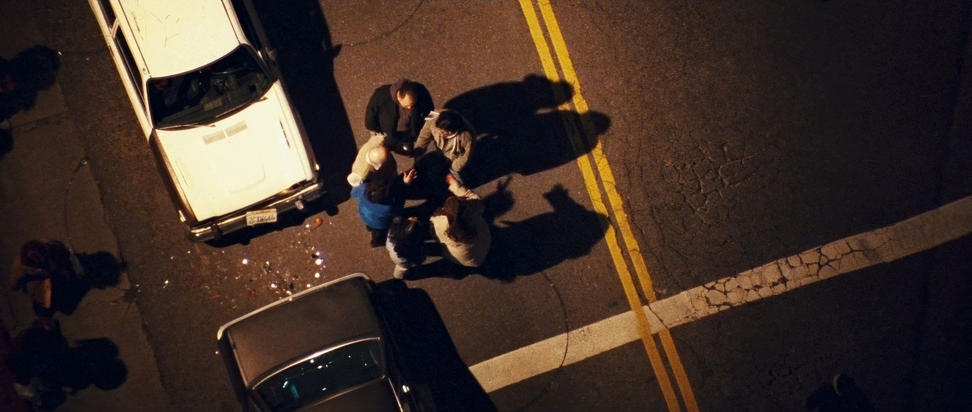
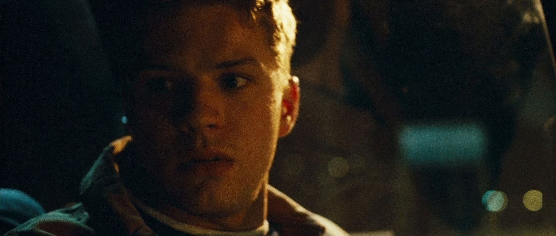
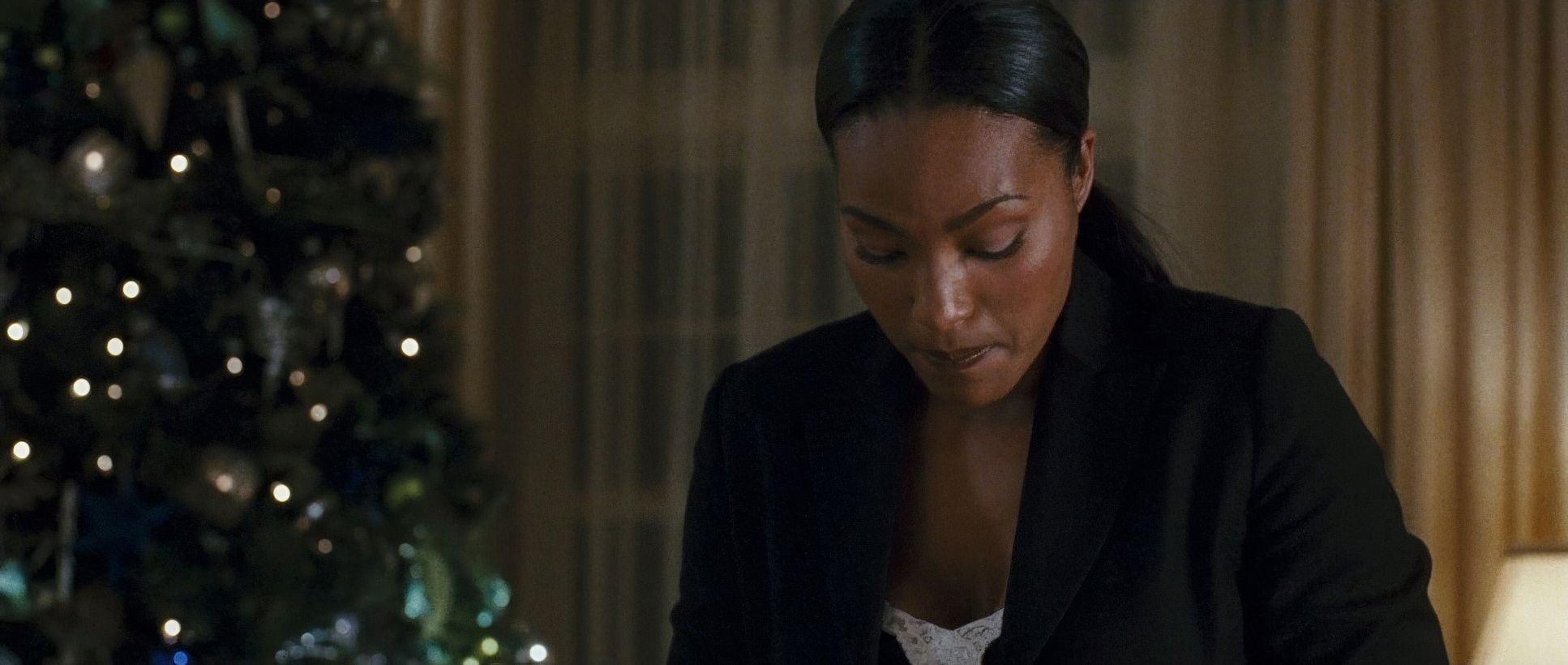
The compositions in Crash are designed to make you feel either isolated or unwelcome. Muro loves a Close Up. He uses them to invade the characters’ personal spaces, making their anxieties feel unavoidable.
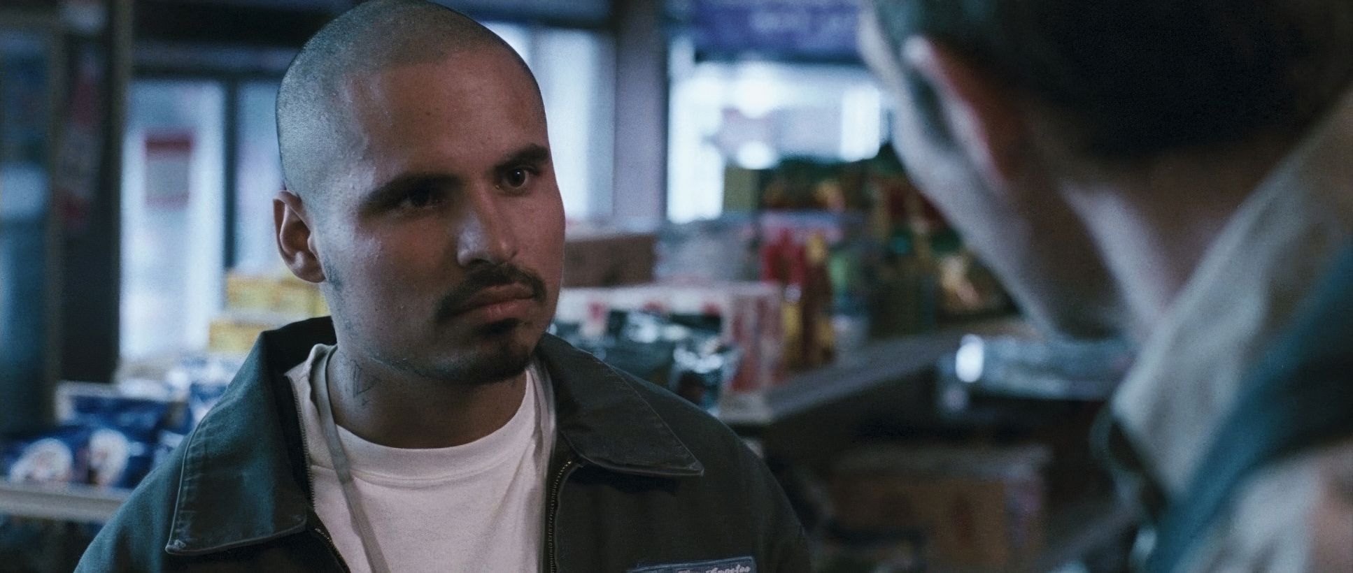
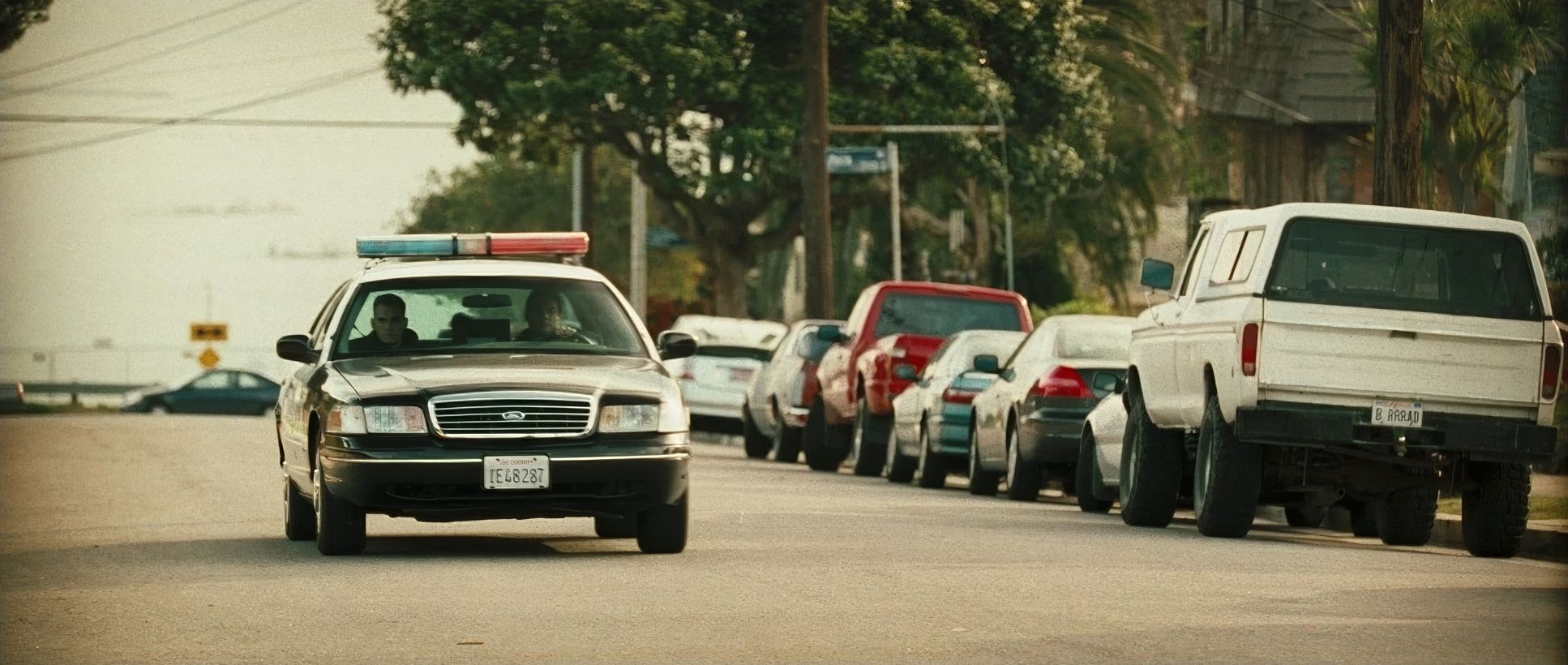
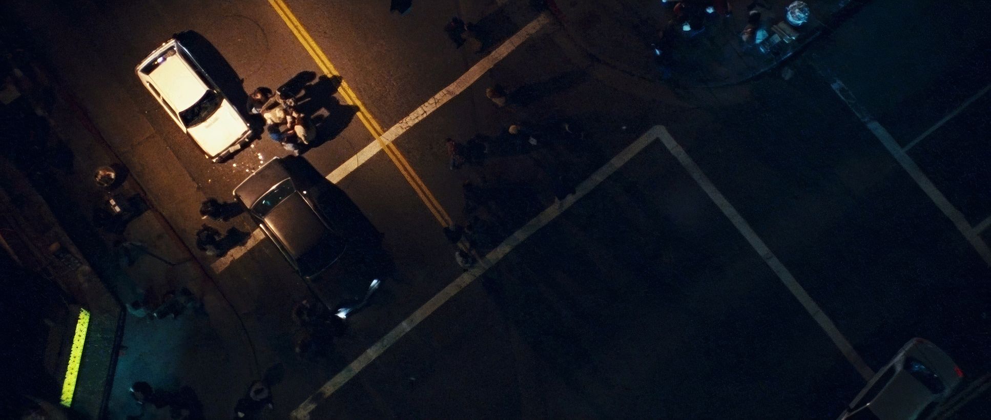
There is a frequent use of left-heavy composition, which subconsciously feels “off” or unsettled to the human eye. We often see characters framed against stark concrete or asphalt, isolating them even in a crowd. It’s a visual push and pull. In the wider shots, like the initial carjacking, the characters look tiny against the LA backdrop. It emphasizes their vulnerability and the arbitrary nature of their encounters. It’s a visual landscape of people who are physically close but miles apart emotionally.
Lighting Style
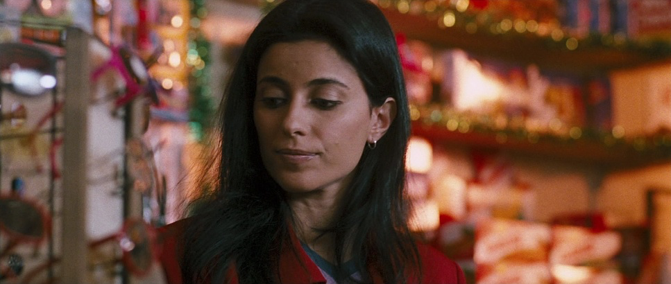
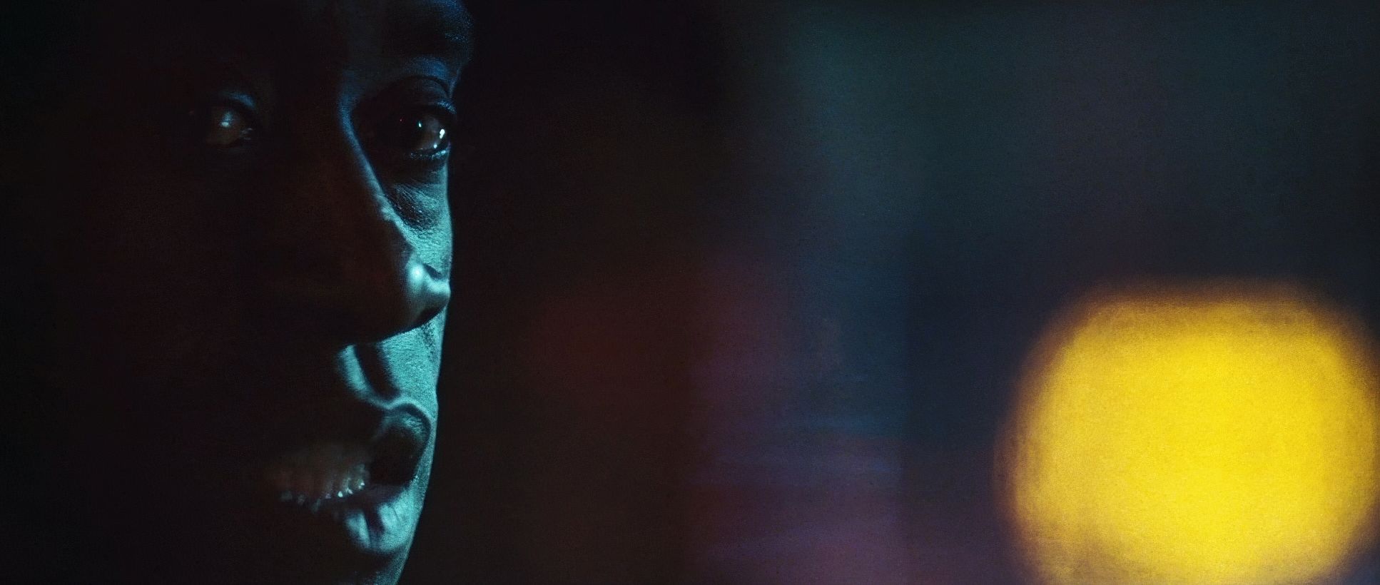
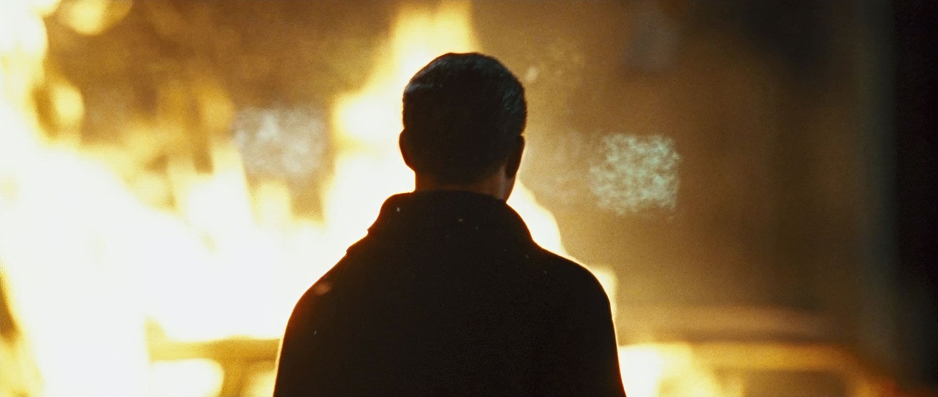
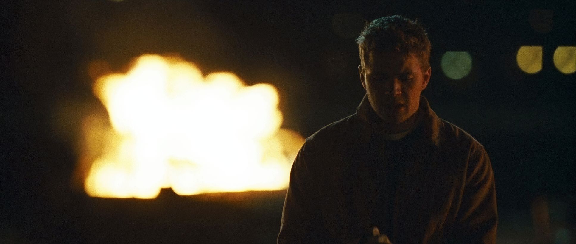
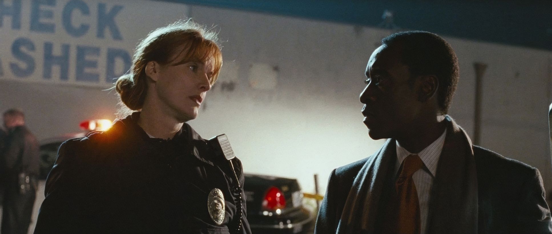
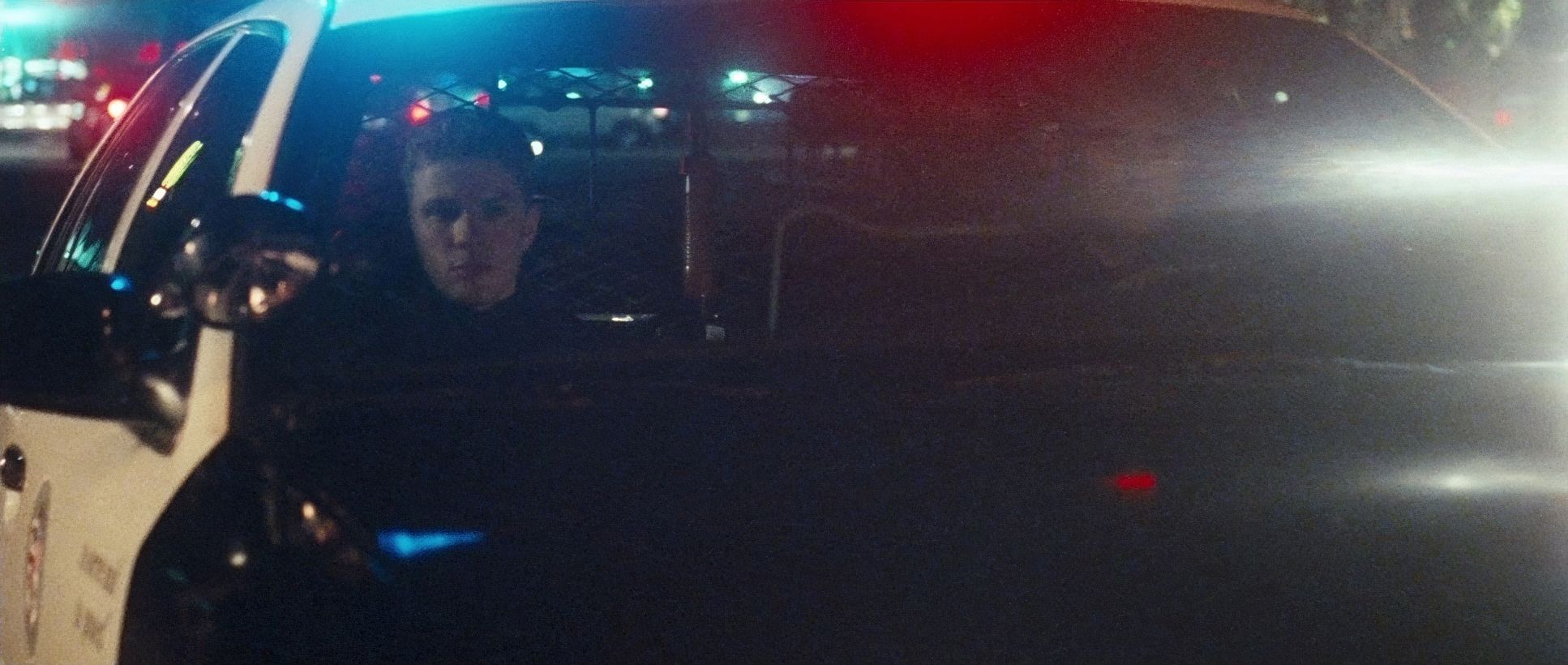
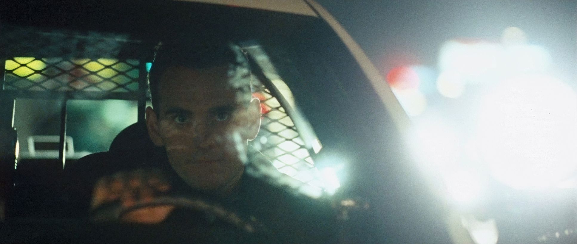
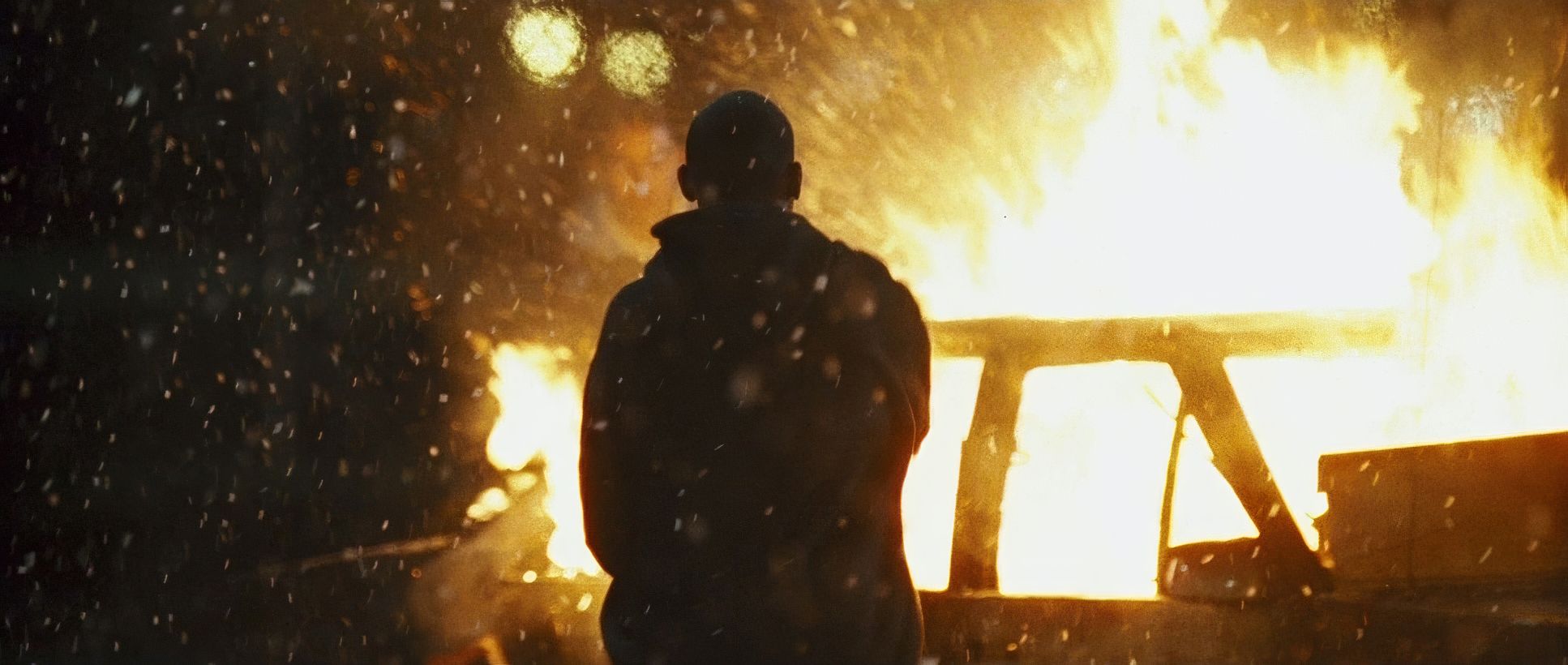
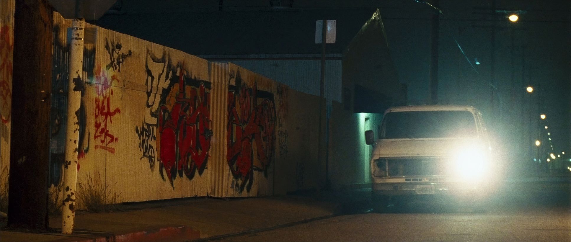
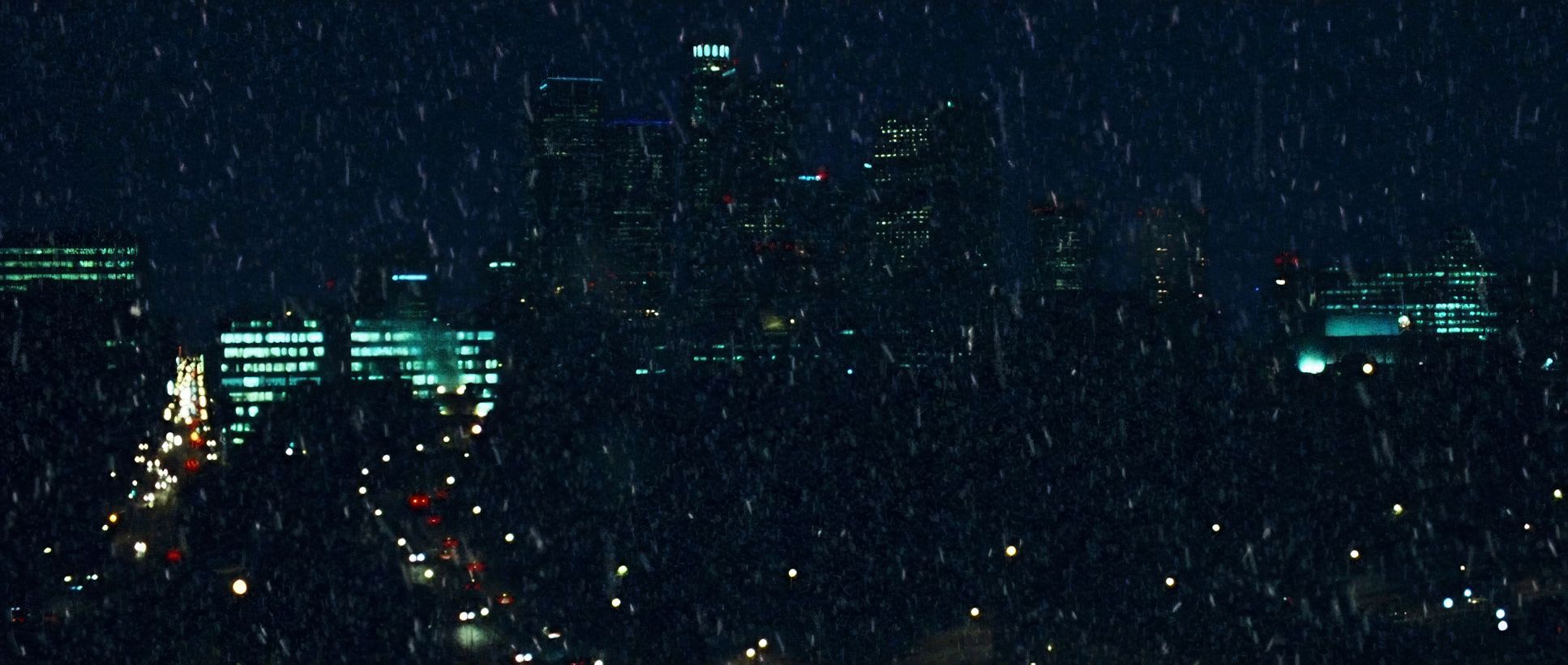
The lighting in Crash is unapologetic. It’s predominantly naturalistic, but don’t mistake “natural” for “accidental.” This is a motivated, high-contrast approach.
Daylight exteriors are harsh. We’re talking deep shadows and blown-out highlights that strip away the glamour of Hollywood. It’s an unforgiving look. But the night scenes? That’s where the craft really kicks in. We see a lot of hard side-lighting and the use of artificial light to create pockets of visibility in the darkness. Using “moonlight” as a cool, secondary source against the warm or sickly-green practicals of the street gives the film a multi-dimensional, gritty texture. It’s rarely “beautiful,” but it’s always honest.
Color Grading Approach
As a colorist, this is where I really get under the hood. Crash doesn’t go for the desaturated “Soderbergh” look you might expect. Instead, it’s actually quite saturated, but in a very specific, cool-toned direction.
The grade leans heavily into Green and Cyan hues, especially in the night scenes. This gives the shadows a sickly, urban feel that works perfectly for a story about social sickness.
- Contrast Shaping: The contrast is aggressive. The blacks are pushed hard often “crushed” to hide the characters’ motives in the “mud” of the frame.
- Hue Separation: While the night is cool and cyan, you see pops of saturated color in the emergency lights or car interiors. It creates a visual “staccato” that keeps the eye moving.
- Tonal Sculpting: The highlight roll-off isn’t soft or dreamy. It’s crisp and clinical.
Finishing through a Digital Intermediate (DI) in 2004 allowed Muro and colorist Adam Hawkey to dial in that print-film sensibility. It doesn’t scream “digital,” but it uses digital tools to push the film stock’s inherent properties into a more anxious, parched, and emotionally charged territory.
Technical Aspects & Tools
Crash (2004) — Technical Specifications
| Genre | Crime, Drama, Social Justice, Political, Melodrama, Body Horror, Erotic |
| Director | Paul Haggis |
| Cinematographer | J. Michael Muro |
| Production Designer | Laurence Bennett |
| Costume Designer | Linda M. Bass |
| Editor | Hughes Winborne |
| Colorist | Adam Hawkey |
| Time Period | 2000s |
| Color | Cool, Saturated, Green, Cyan |
| Aspect Ratio | 2.35 – Spherical |
| Format | Film – 35mm |
| Lighting | Hard light, Side light |
| Lighting Type | Moonlight, Artificial light |
| Story Location | California > Los Angeles |
| Filming Location | California > Los Angeles |
| Camera | Panavision Millennium / Millenium XL / XL2, Panavision Panaflex |
| Lens | Panavision Super Speed Zeiss MKII |
Shooting on 35mm film (likely Kodak Vision or Fuji Eterna) gave them a base of organic grain and rich blacks that digital especially back in ’04 just couldn’t touch. Using the Panavision Millennium series with those Zeiss Super Speeds allowed for a straightforward, realistic perspective.
The DI workflow was the secret sauce. Scanning the film and grading digitally gave them the precision to handle the “five-minute rounds” of the script. They could match the lighting of disparate LA locations to ensure that, even though the plot was “jumbled,” the visual identity remained rock-solid. The production design by Laurence Bennett provides the perfect “lived-in” canvas for this nothing is too clean; everything has a layer of urban dust.
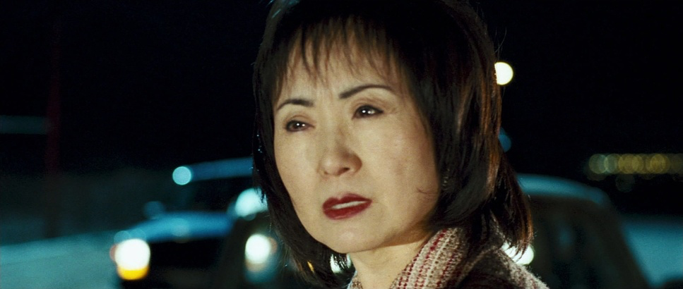
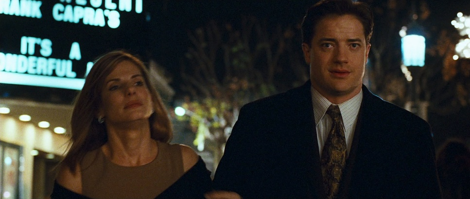
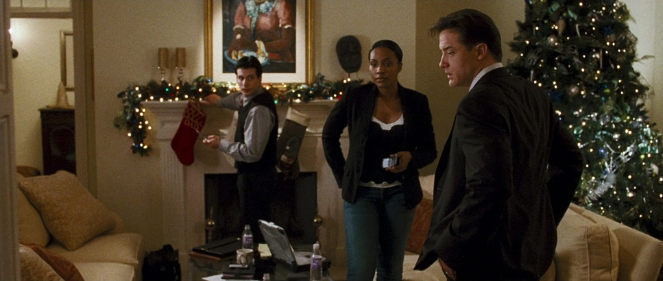
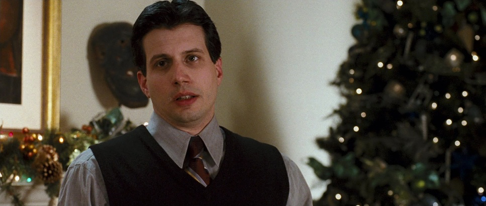
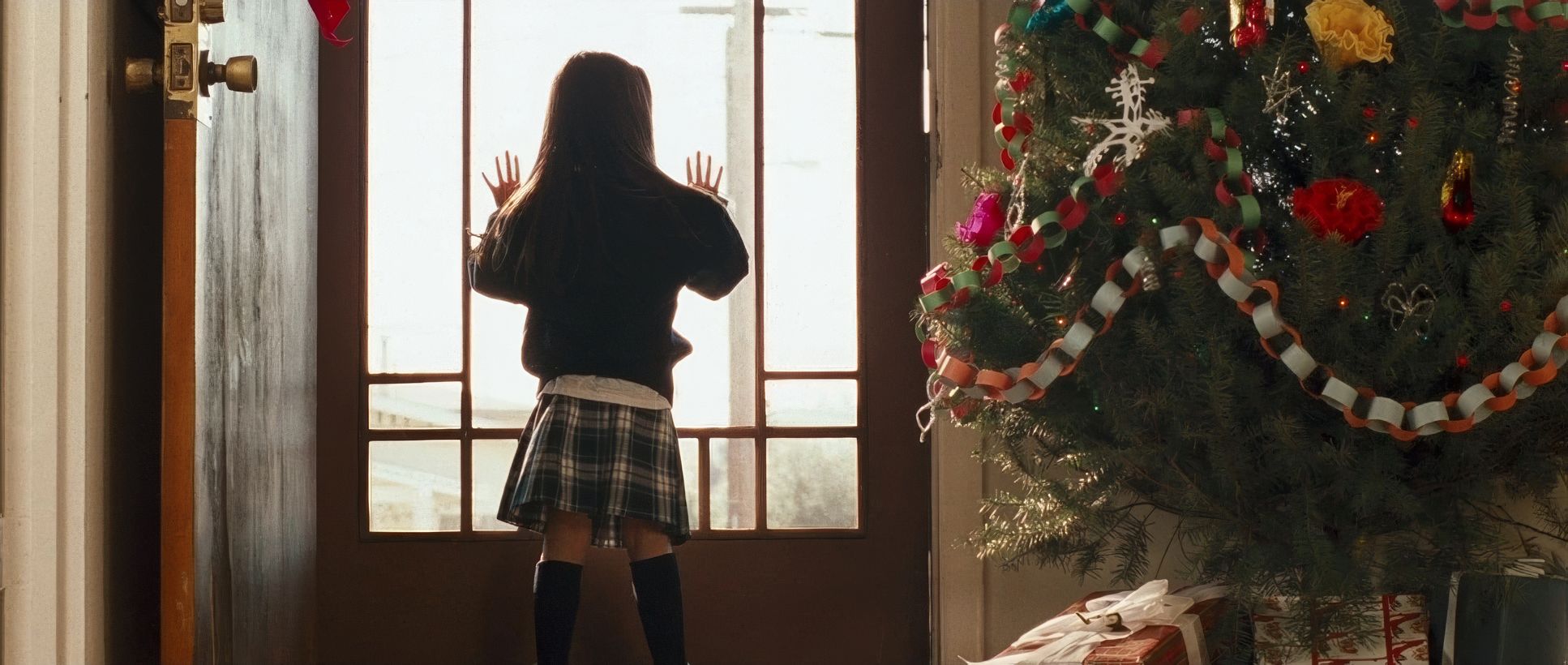
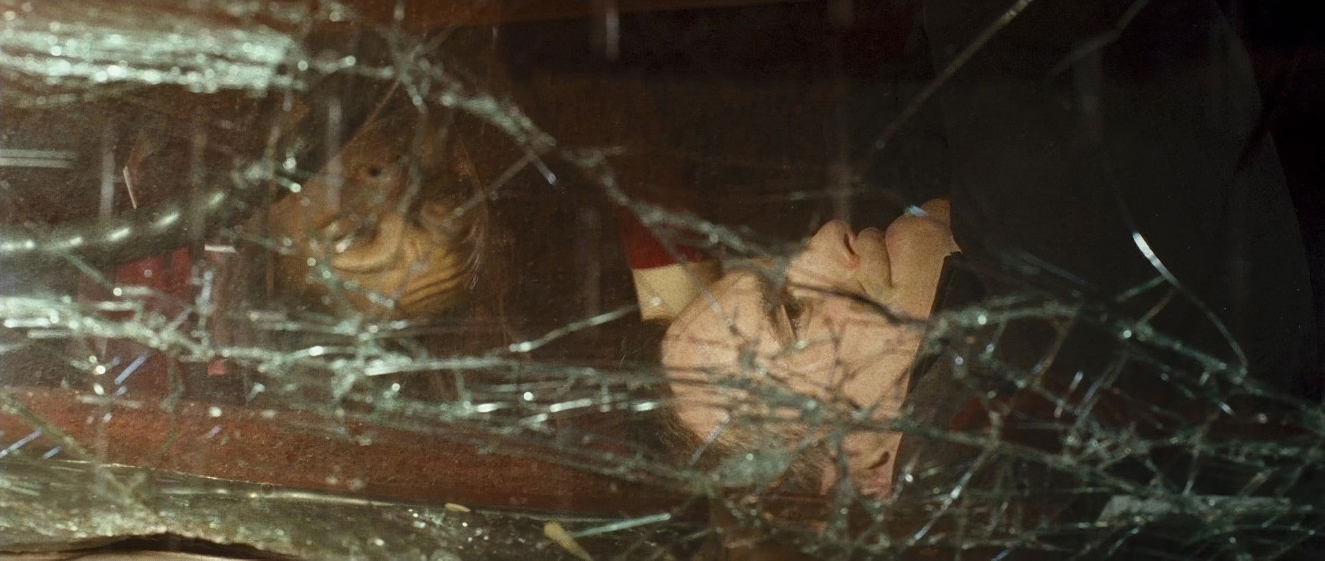
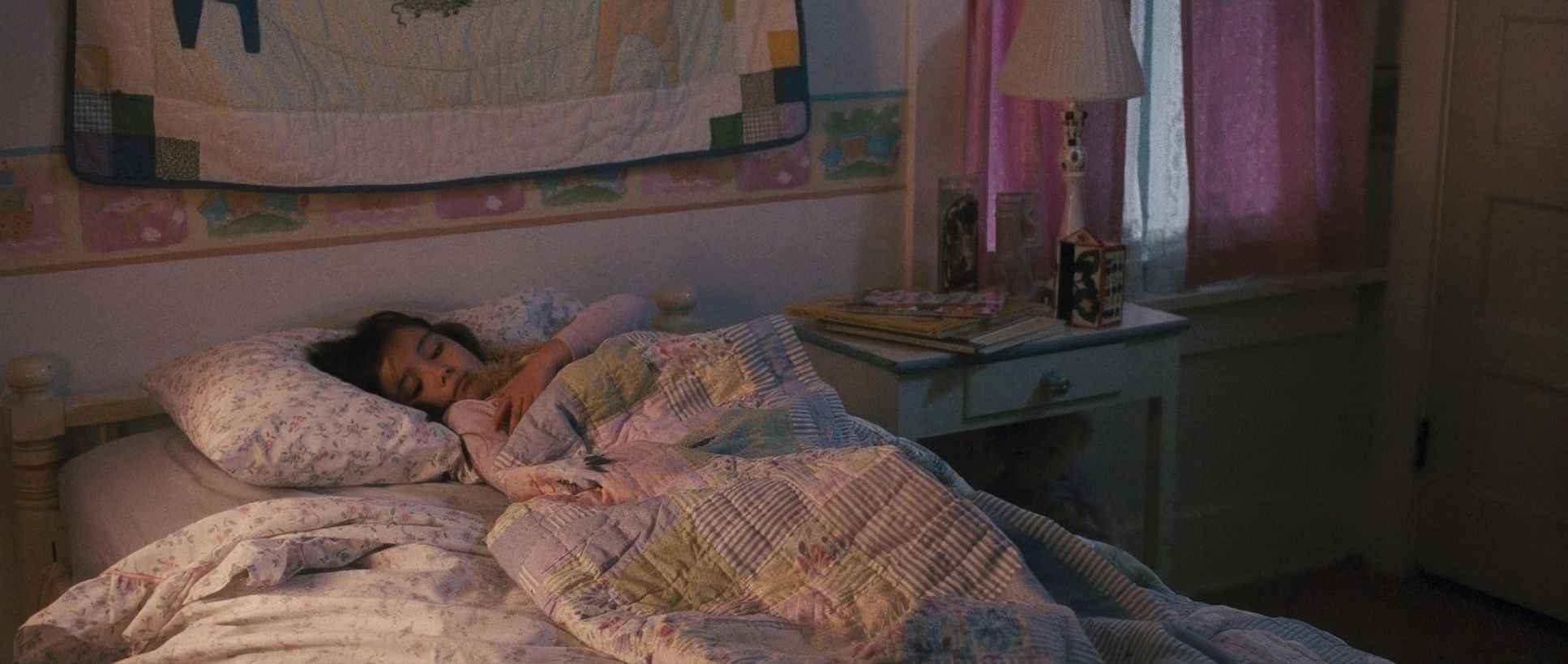
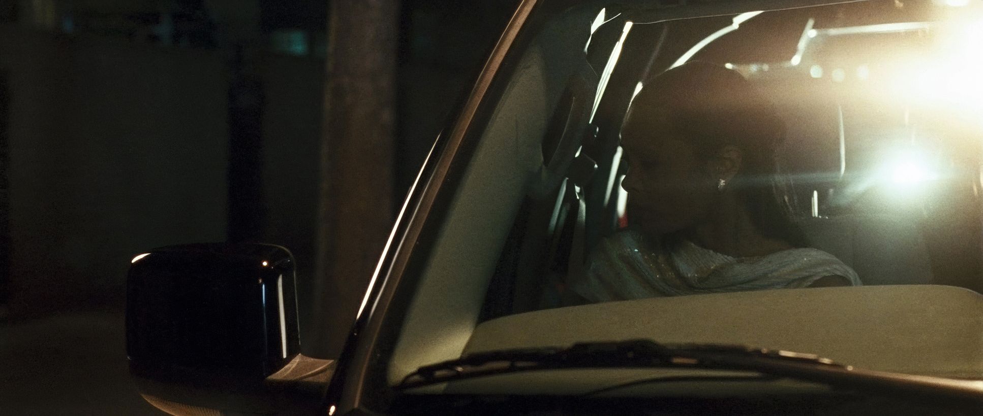
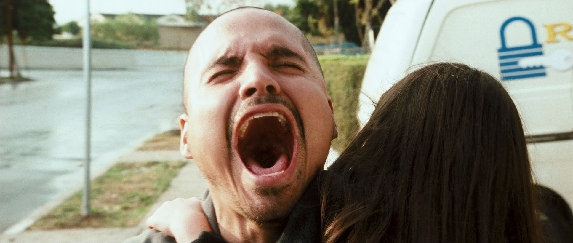
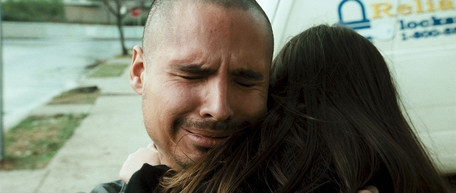
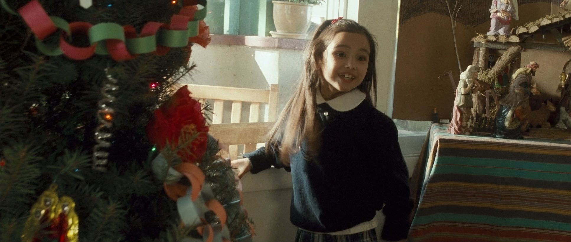
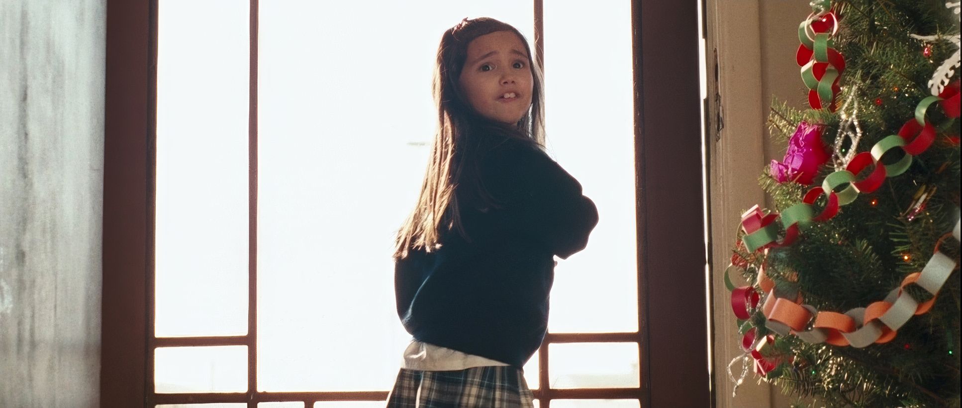
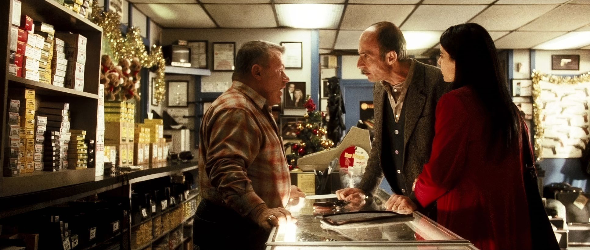
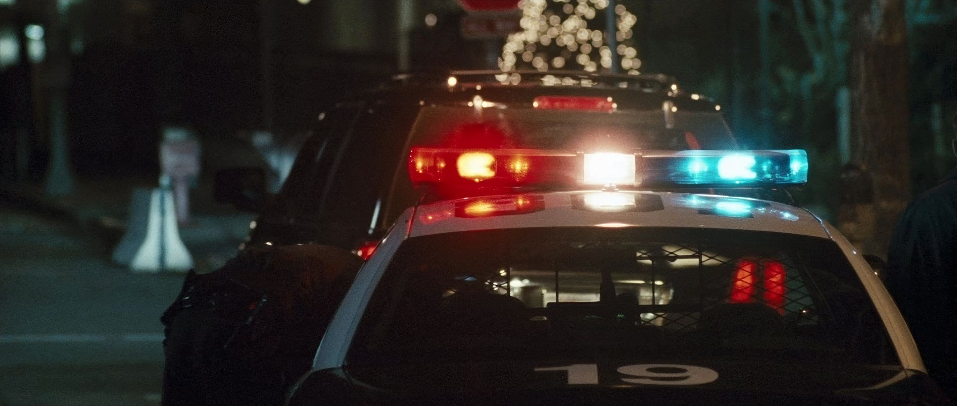
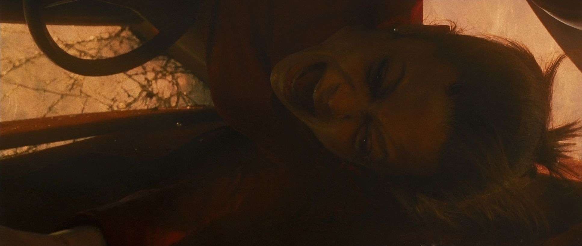
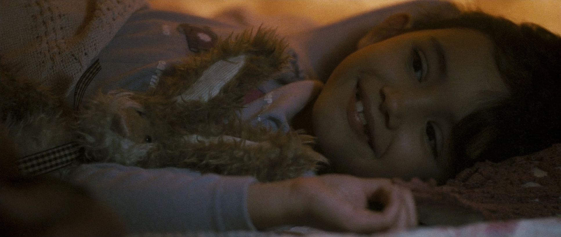
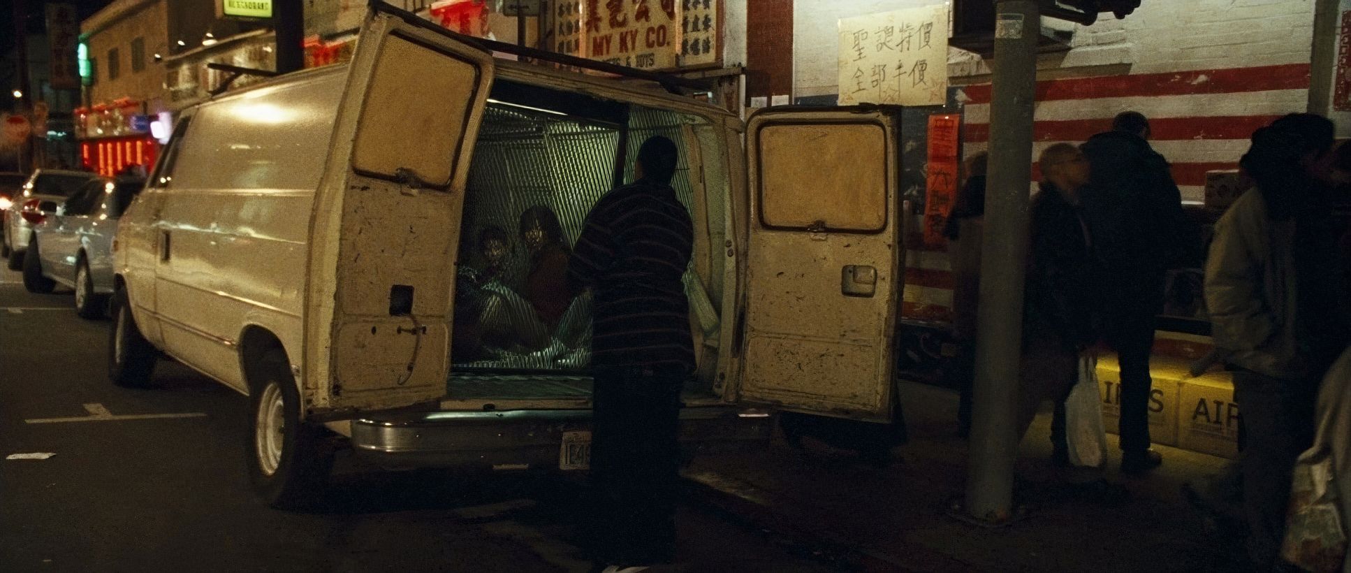
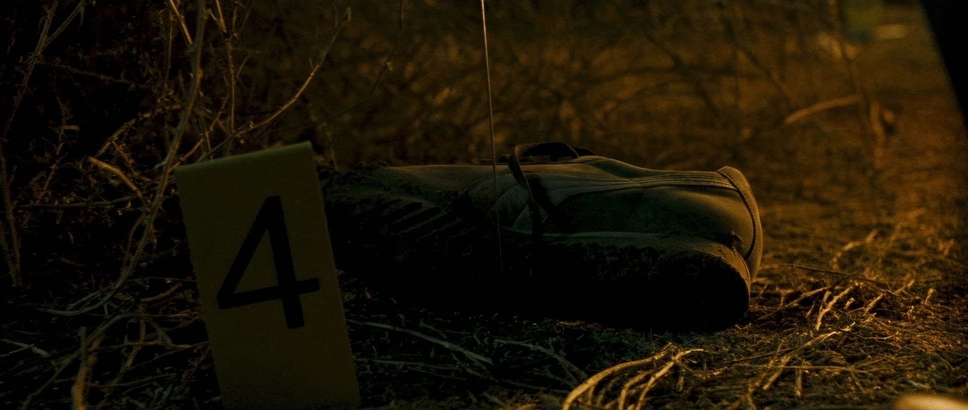
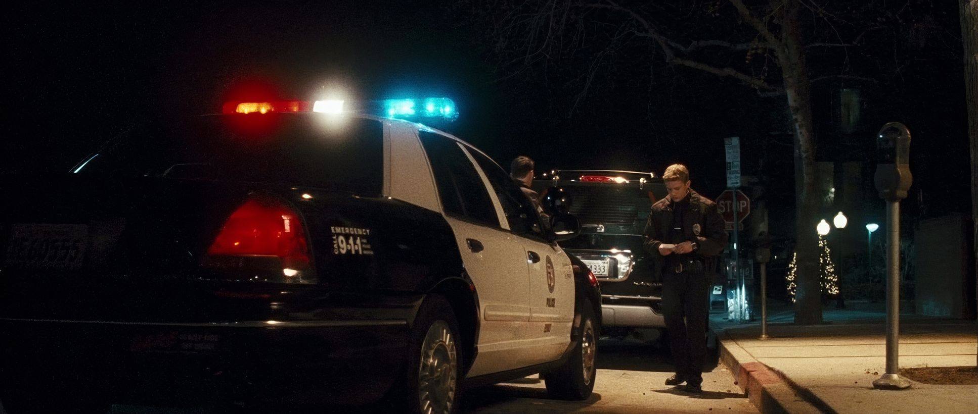
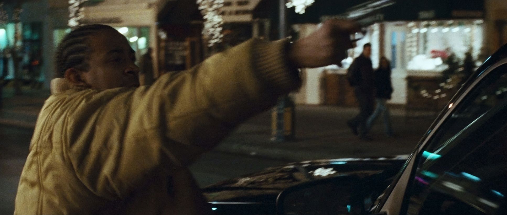
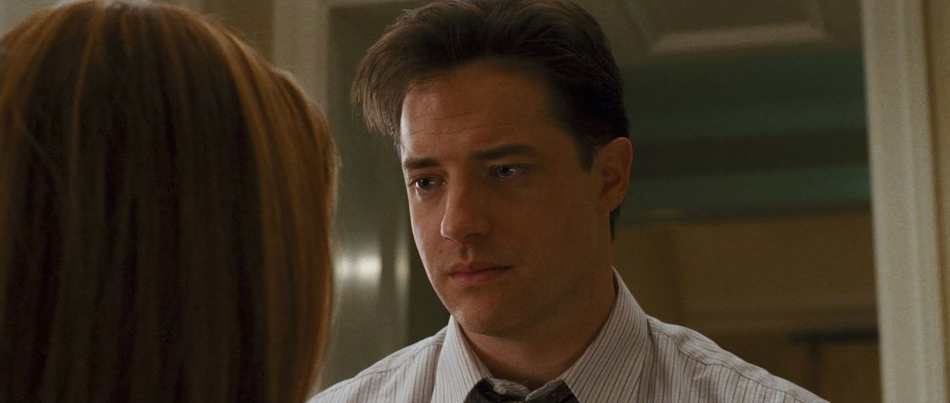
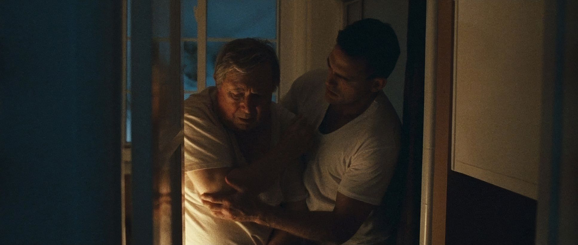
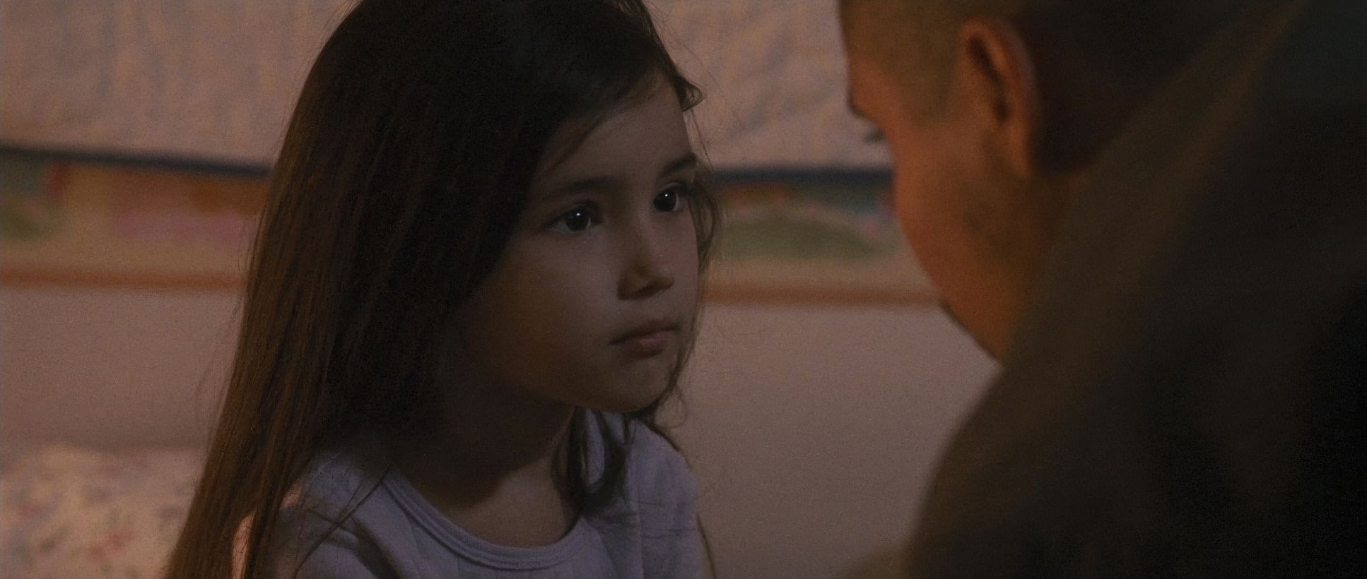
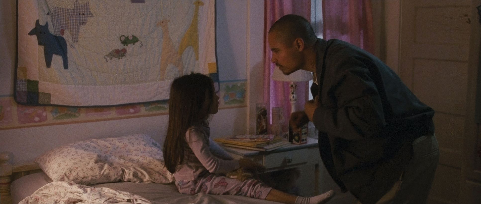
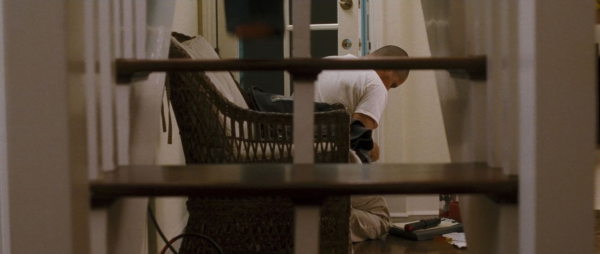
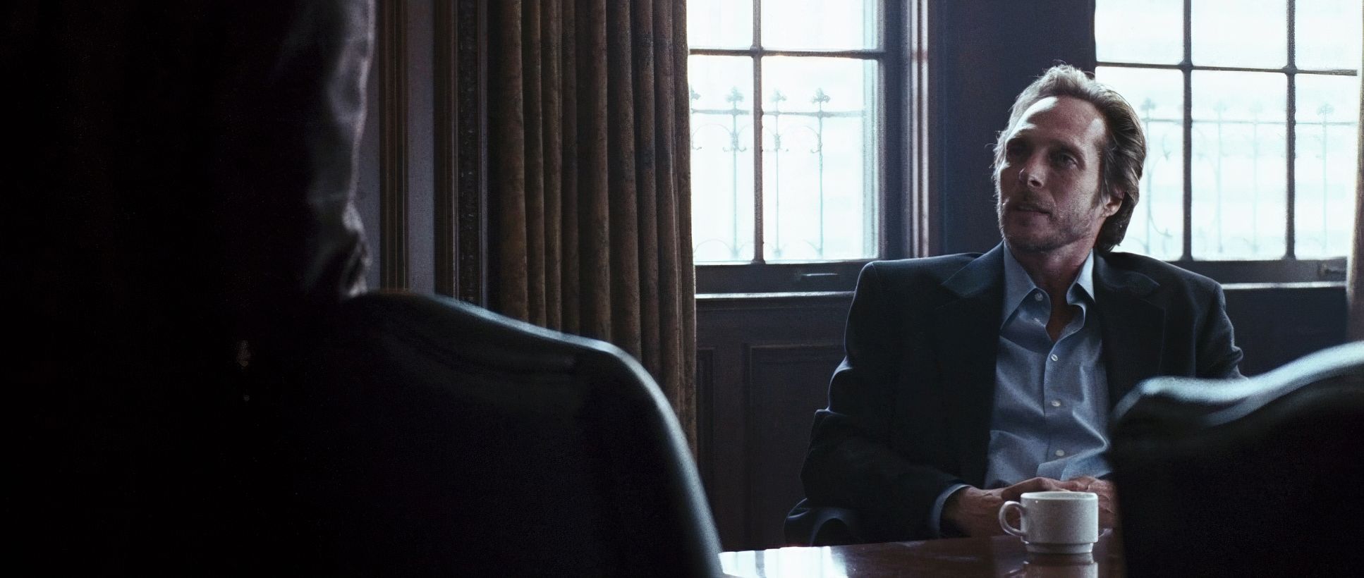
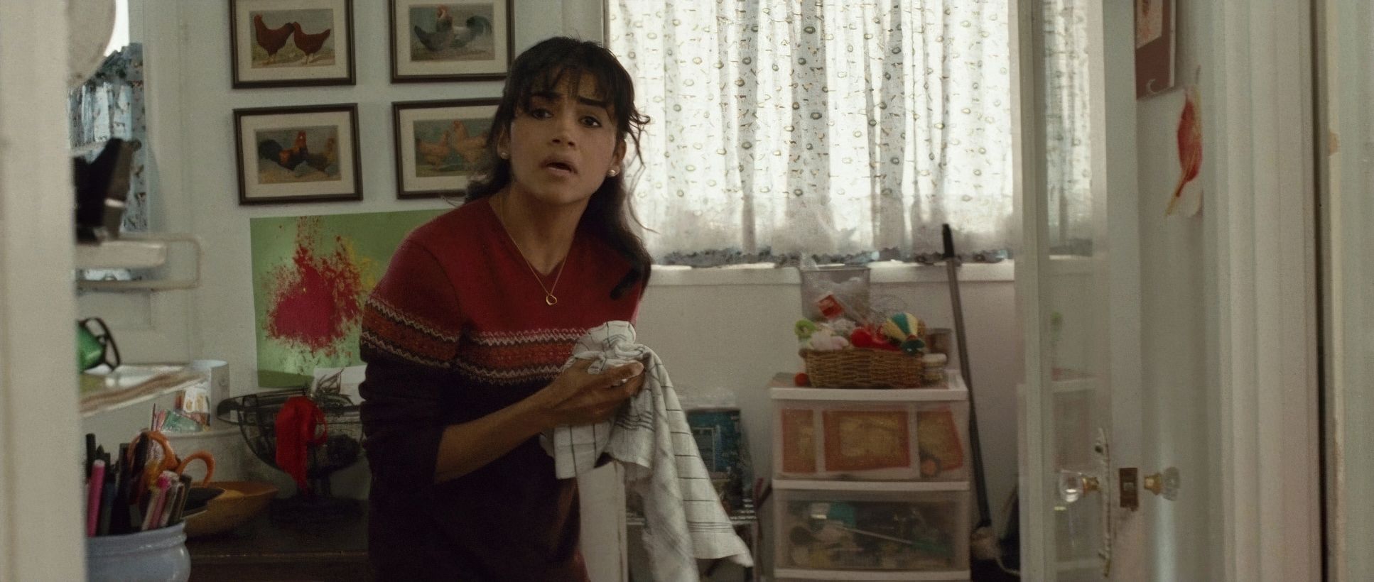
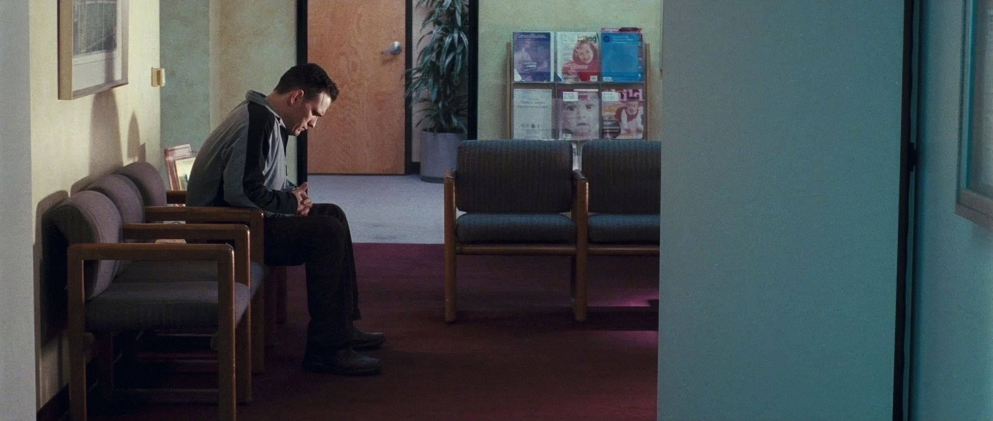
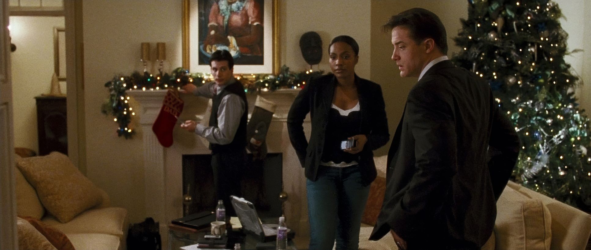
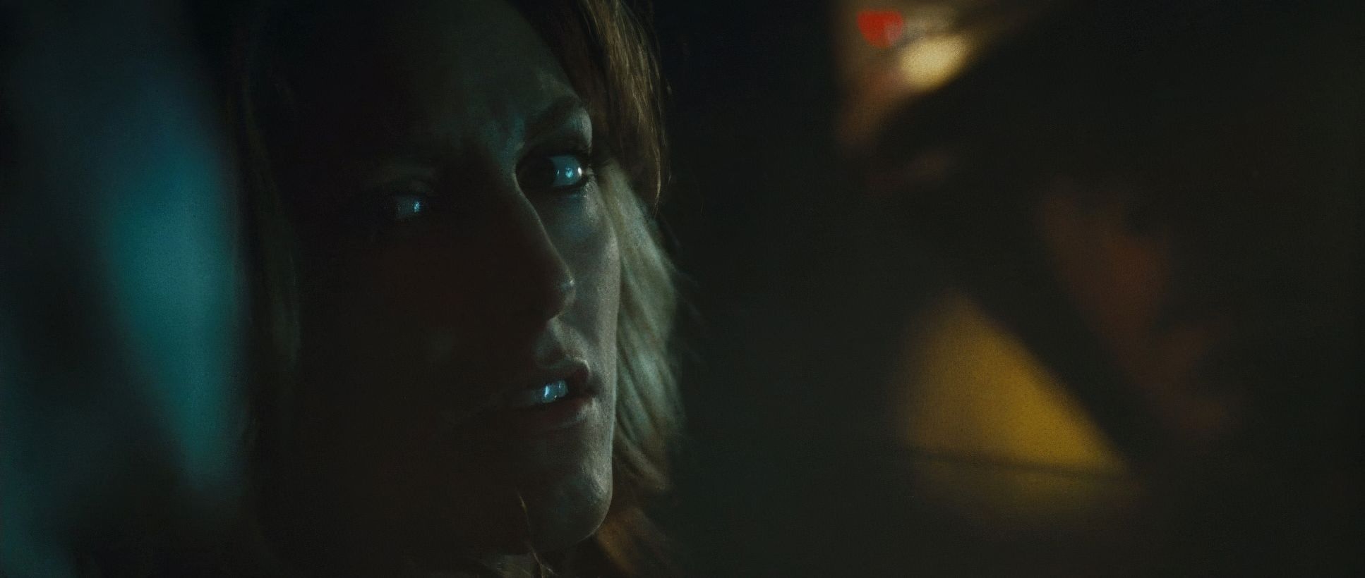
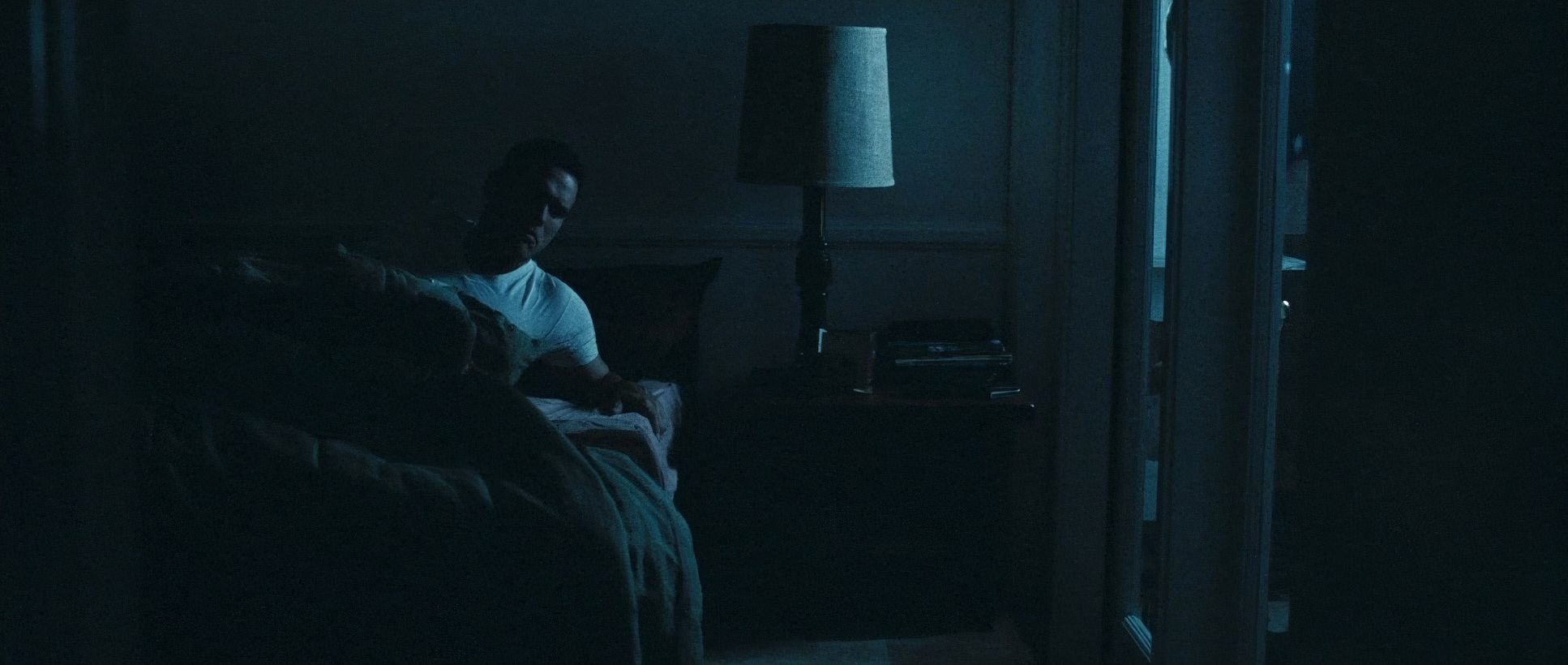
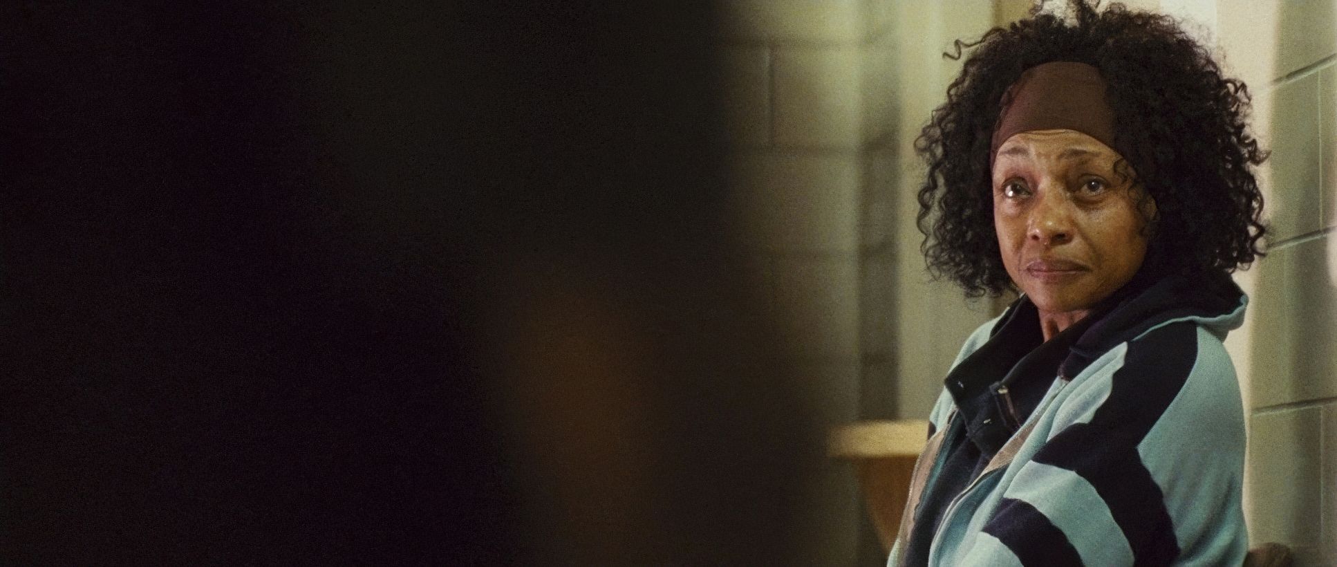
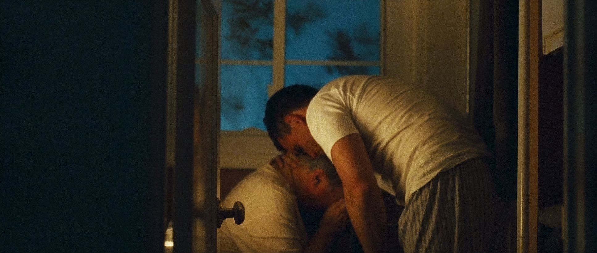
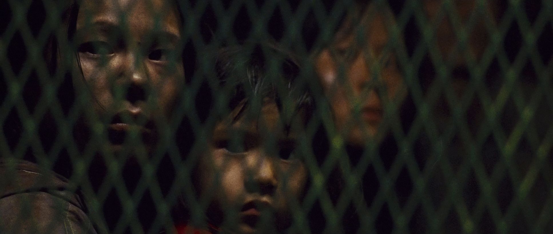
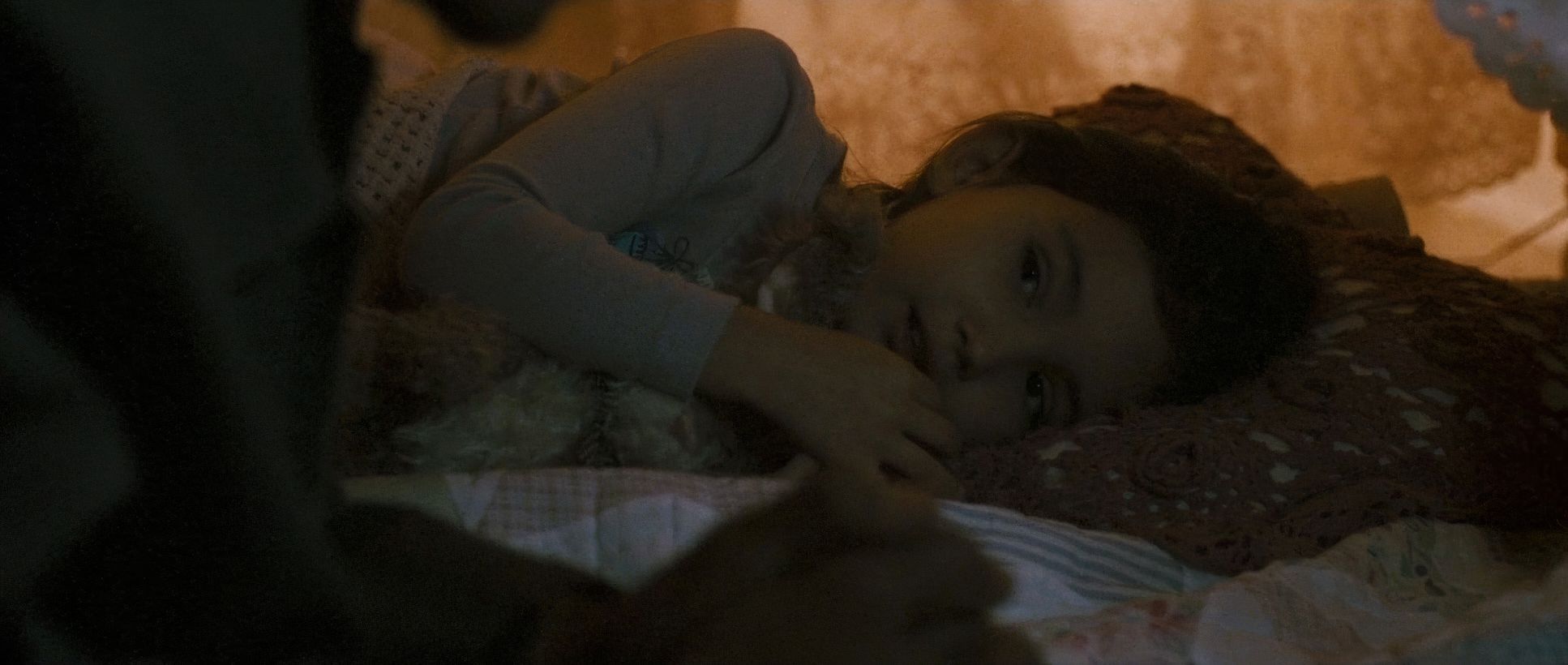
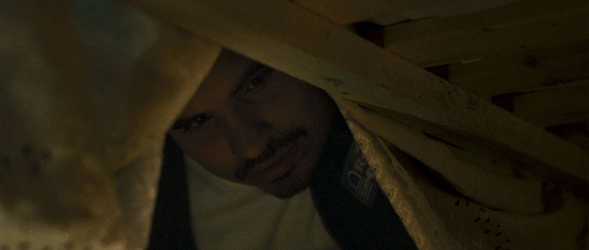
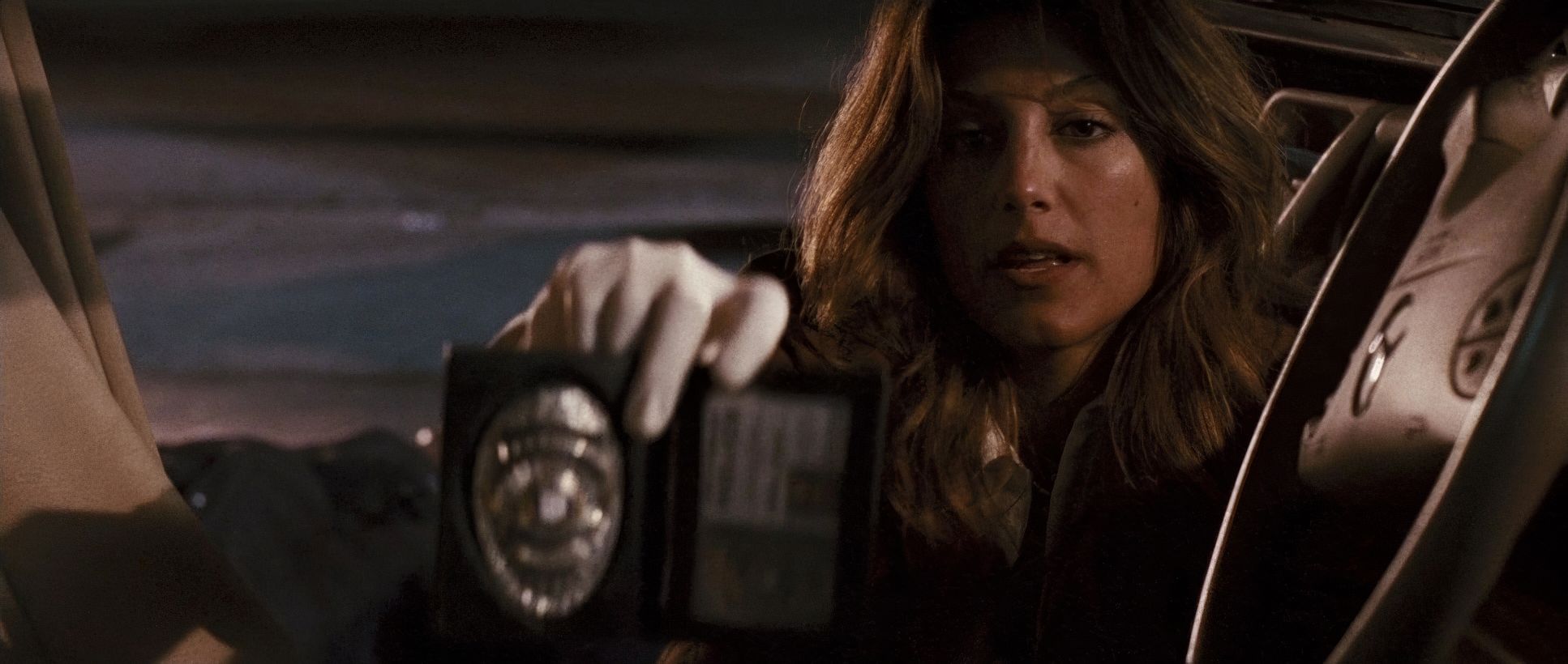
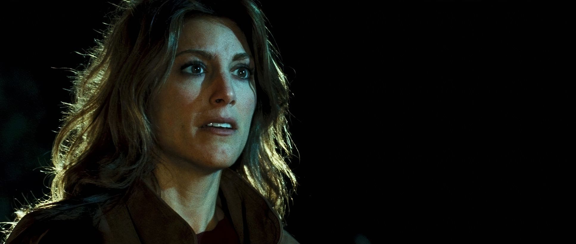
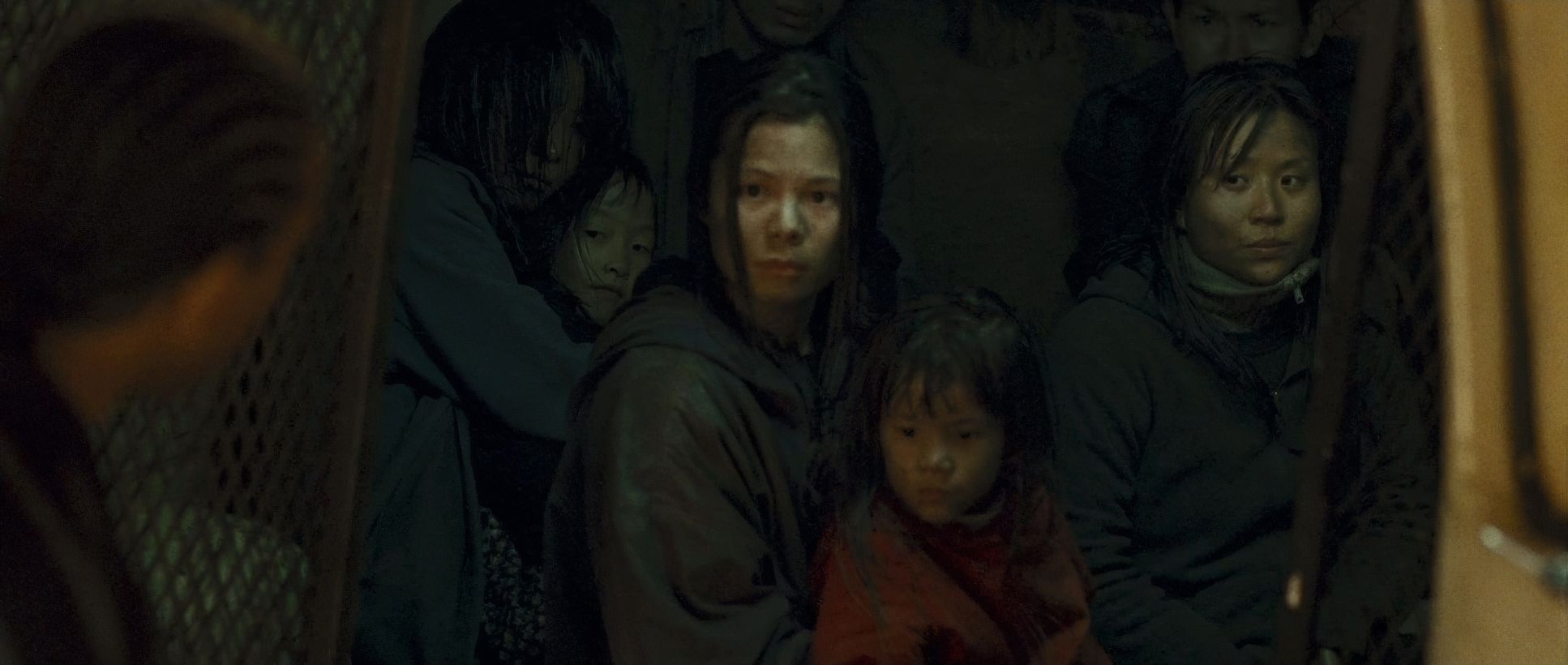
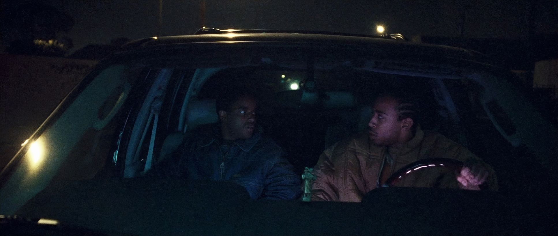
Crash (2004) Film Stills
A curated reference archive of cinematography stills from CRASH (2004). Study the lighting, color grading, and composition.


- Also read: THE GAME (1997) – CINEMATOGRAPHY ANALYSIS
- Also read: WRECK-IT RALPH (2012) – CINEMATOGRAPHY ANALYSIS
Browse Our Cinematography Analysis Glossary
Explore directors, cinematographers, cameras, lenses, lighting styles, genres, and the visual techniques that shape iconic films.
Explore Glossary →