The Bourne Supremacy I study it. When Paul Greengrass took over the director’s chair from Doug Liman, he didn’t just make a sequel; he forged a raw, kinetic visual language that completely recalibrated how we see action cinema. It’s a film I find myself returning to constantly, not for the nostalgia of 2004, but for the sheer audacity of its cinematography.
Back then, Supremacy felt like a jolt to the system. While The Bourne Identity had a certain cool, European spy elegance, Greengrass ripped that out. He replaced it with a “straight-up thriller” energy driven by an intense revenge path and an extremely fast pace. This shift demanded a visual style that didn’t just show the action, but lived inside it. What Oliver Wood and Greengrass delivered was nothing short of a revolution.
Inspiration Behind the Cinematography
The DNA of this film is rooted in Paul Greengrass’s documentary background. He brought a “cinéma vérité” aesthetic to a massive blockbuster, choosing a journalistic immediacy over polished, choreographed moves.
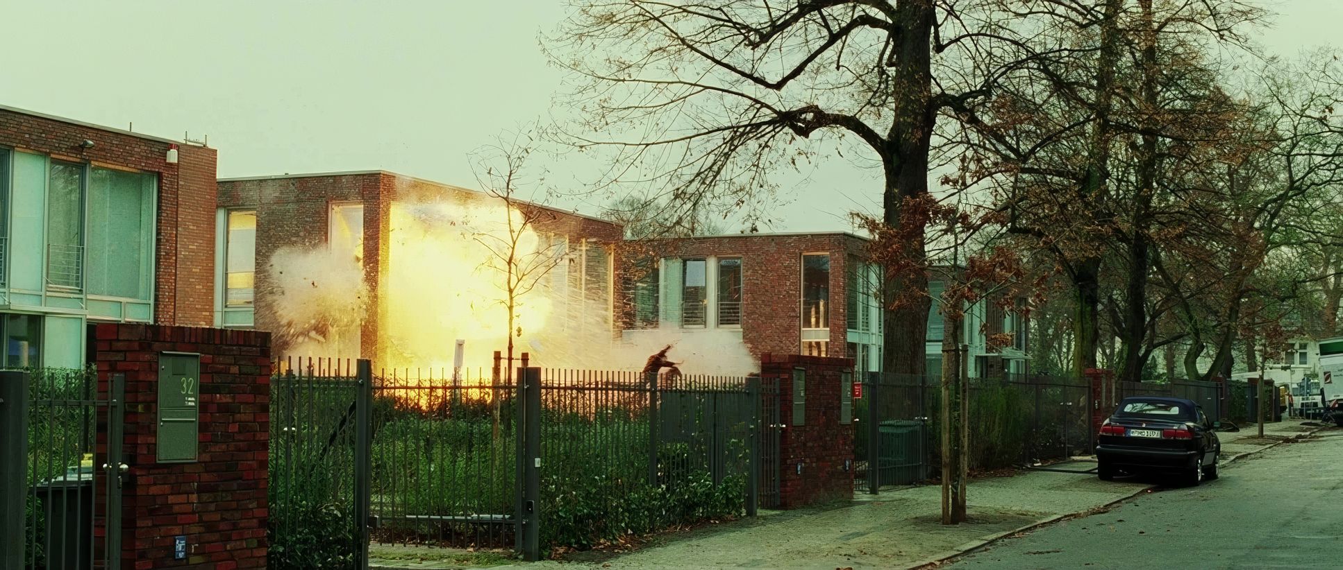
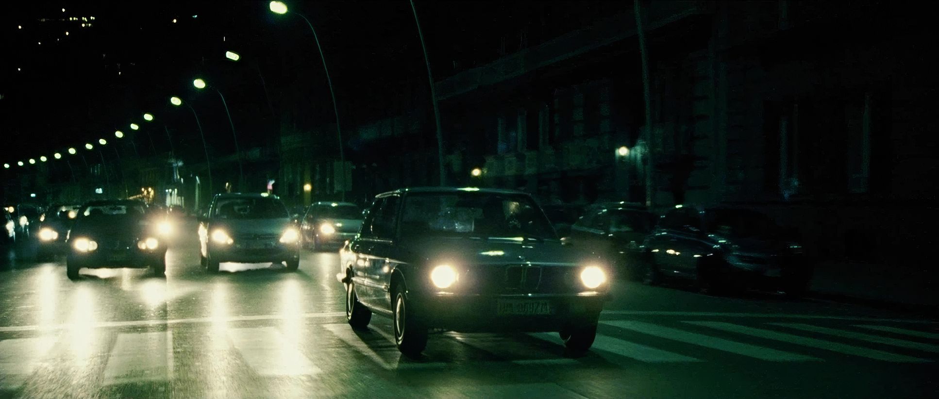
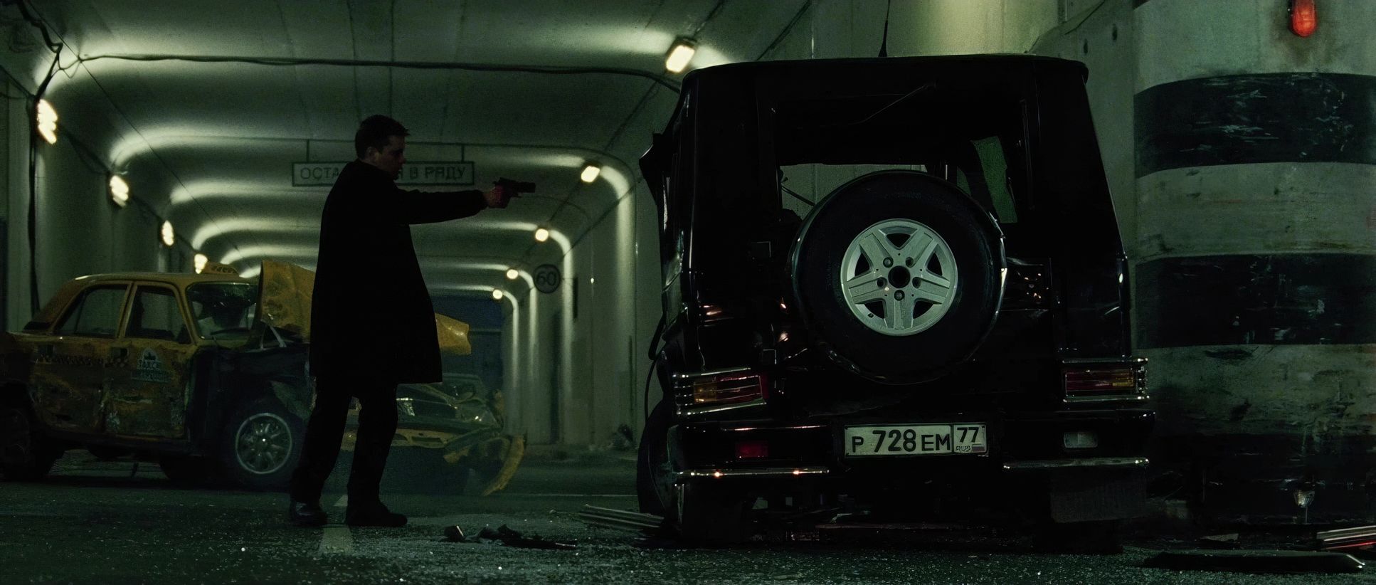
The narrative itself a revenge story with Bourne constantly hunted provided the perfect anchor for this approach. Even the choice of “everyday cars” for the chases instead of exotic supercars was a deliberate move to ground the film in reality. My sense is that Greengrass wanted the audience to feel the panic and the pursuit. It’s a sensory experience that eschews traditional glamour for visceral impact. You aren’t just watching Bourne; you are locked in with him.
About the Cinematographer
Oliver Wood was the perfect choice to lens this vision. He was a master of a specific kind of gritty realism, known for capturing clarity amidst total chaos. His work on Supremacy isn’t about creating “pretty” images; it’s about immersion.
Even though his filmography is robust, this film stands out as a symbiotic relationship between director and DP. Wood had the skill to ensure that even when the camera was turbulent, the narrative remained clear and the emotional stakes felt heavy. It’s a testament to his craft that he could drag the audience into Bourne’s fractured world without losing the story.
Camera Movements
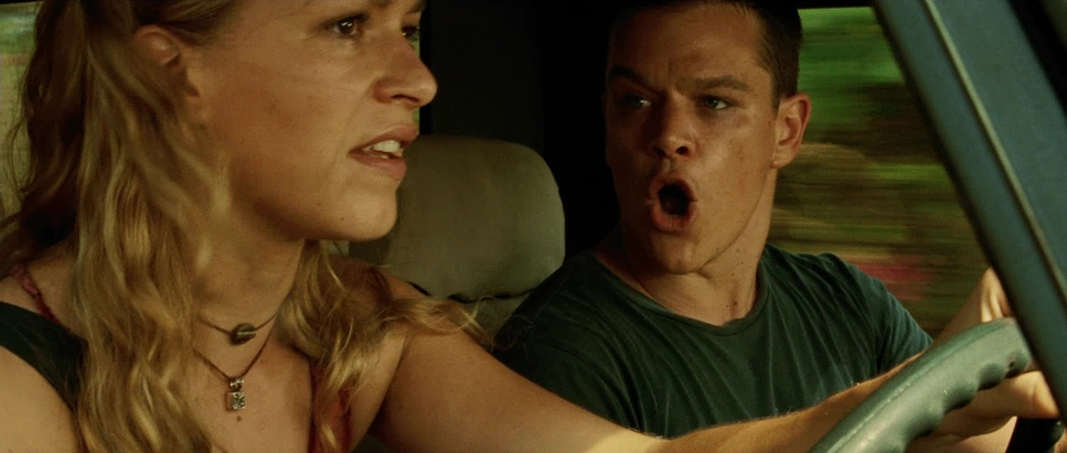
This is where the film made its loudest statement. The Bourne Supremacy is practically synonymous with “shaky cam.” While that technique normally annoys people, Greengrass is one of the few who makes it work. It isn’t just shaky for the sake of it; it’s a form of controlled chaos.
The handheld camera acts like a phantom participant. It breathes, reacts, and jolts alongside Bourne. I’ve often grappled with handheld work in my own projects if it’s poorly executed, it’s just noise. But here, the camera anticipates and lunges. However, I’ll be the first to admit that in the fight scene between Bourne and the other assassin, the technique pushed the limit. At times, the visual static obscures the choreography. Yet, in the car chases, it adds a riveting realism that a stabilized rig could never capture.
Lensing and Blocking
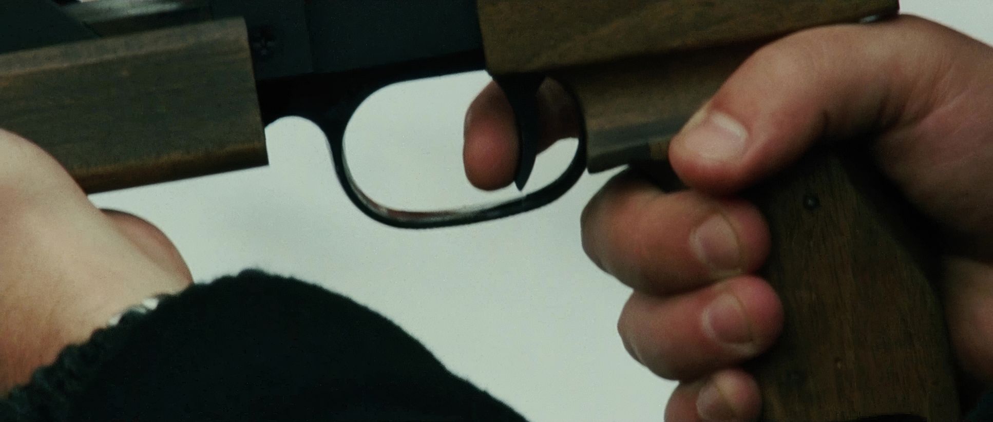
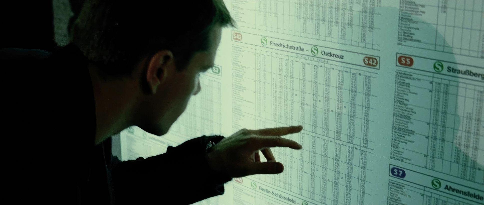
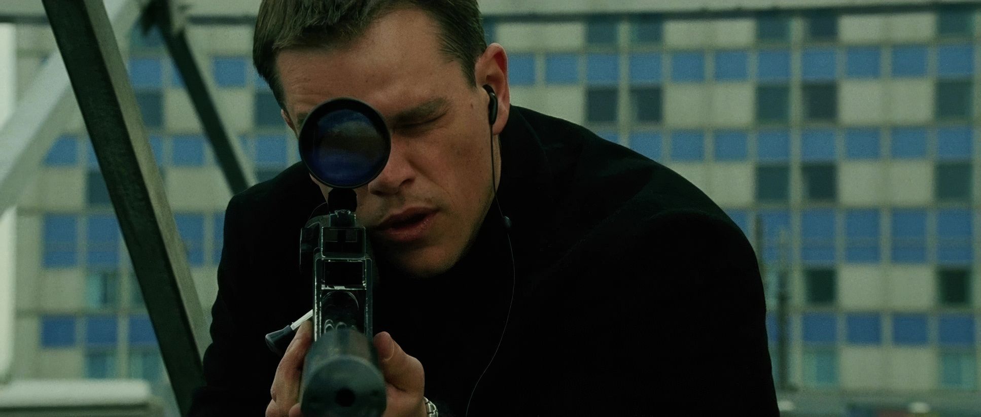
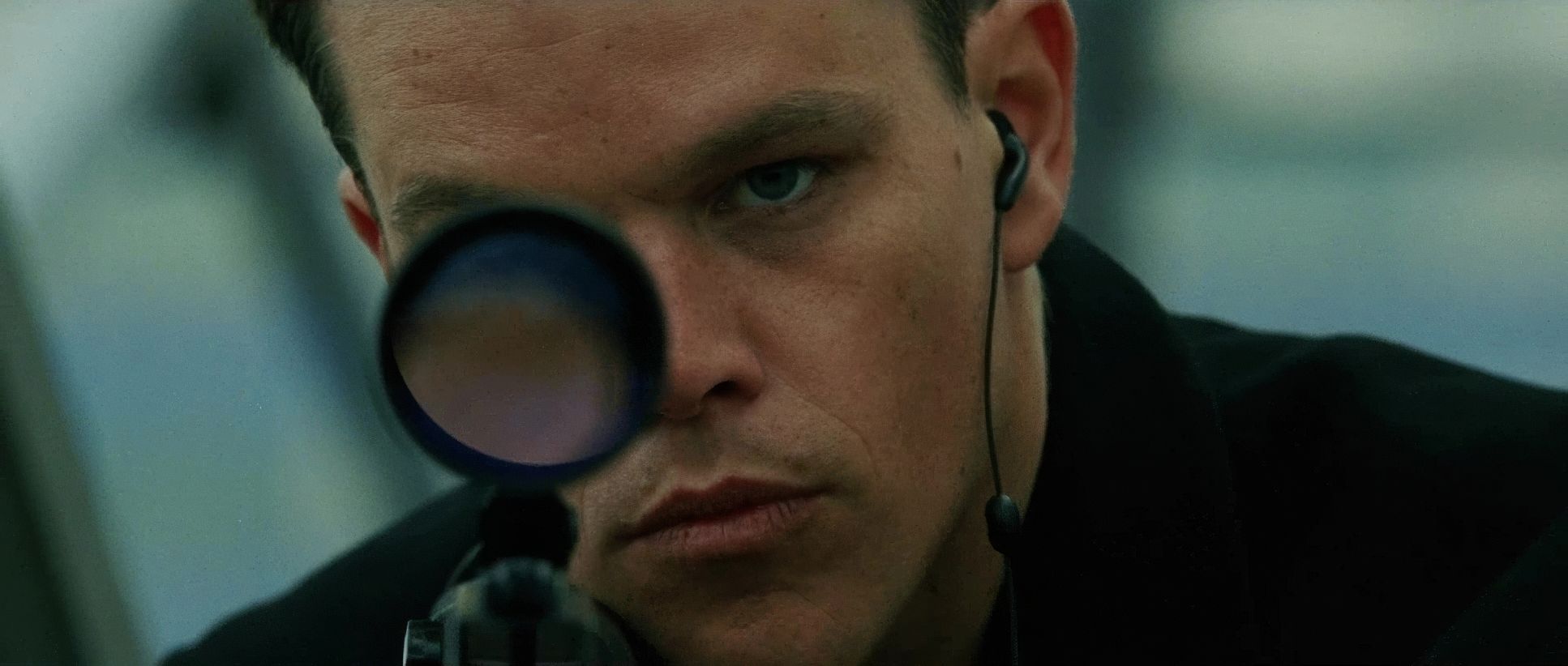
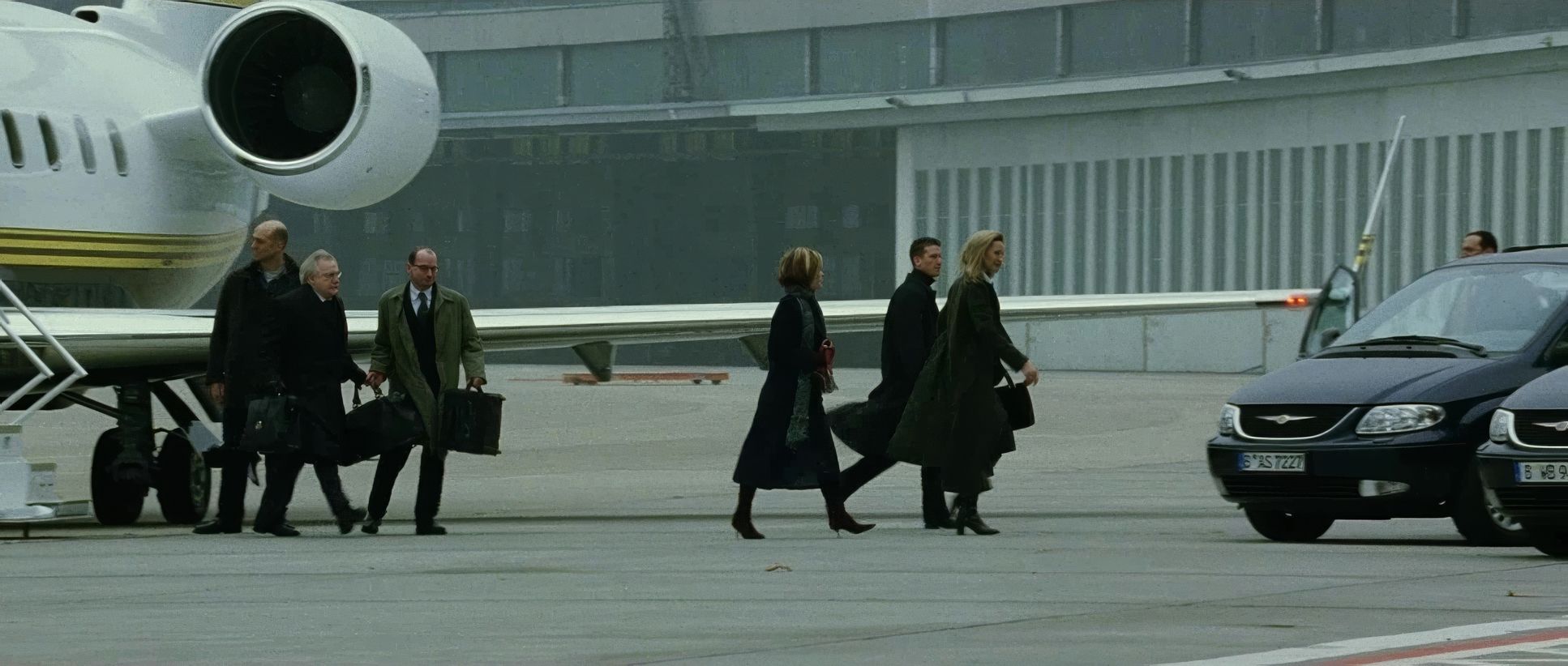
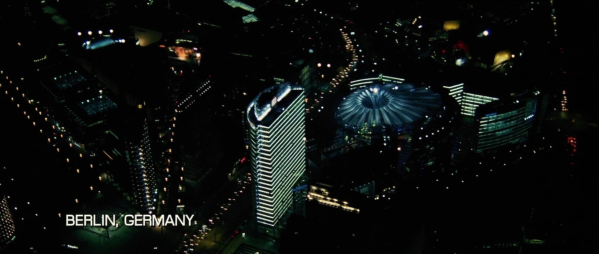
Looking at the technical specs, the film utilized the Arricam LT with Zeiss Ultra Prime lenses. While many assume this look is all wide-angle “in your face” work, there is a massive amount of long lens work here, especially during the surveillance sequences in Berlin.
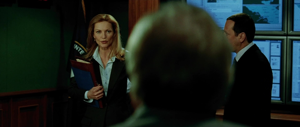
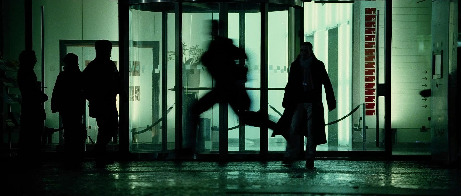
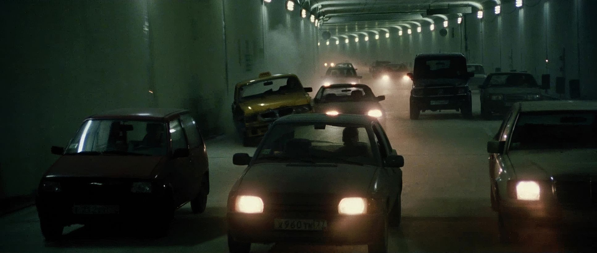
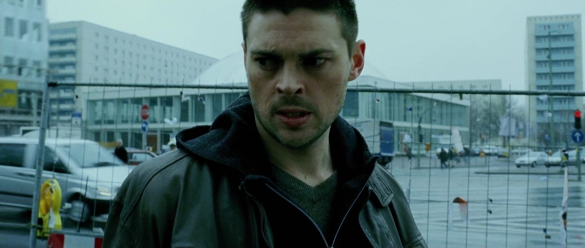
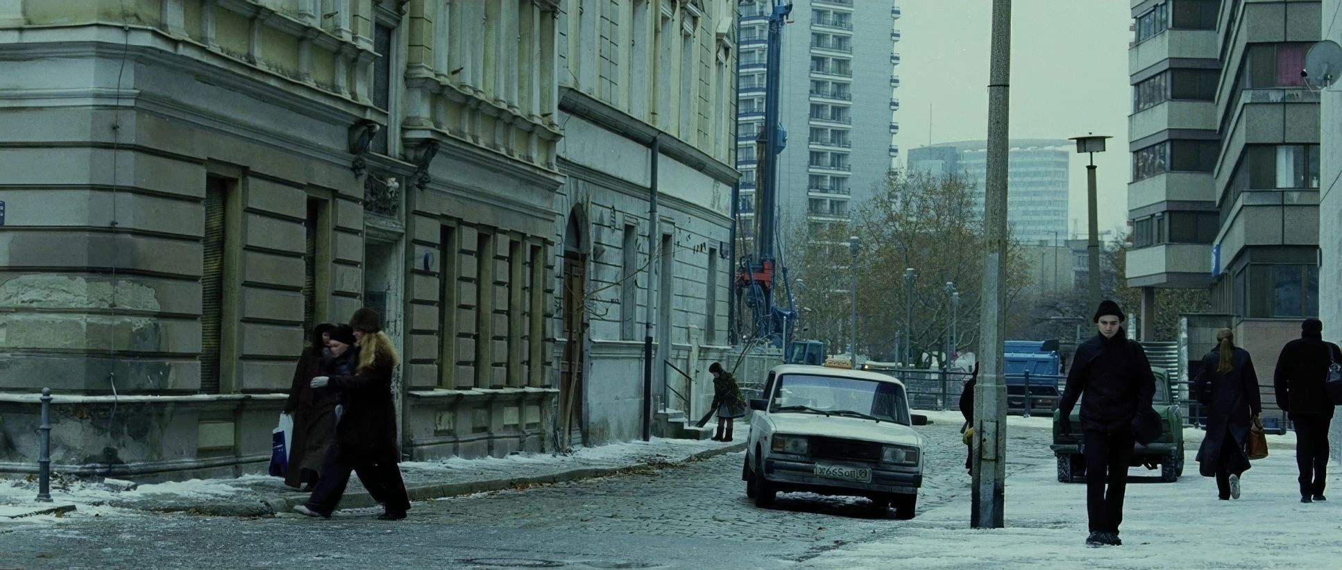
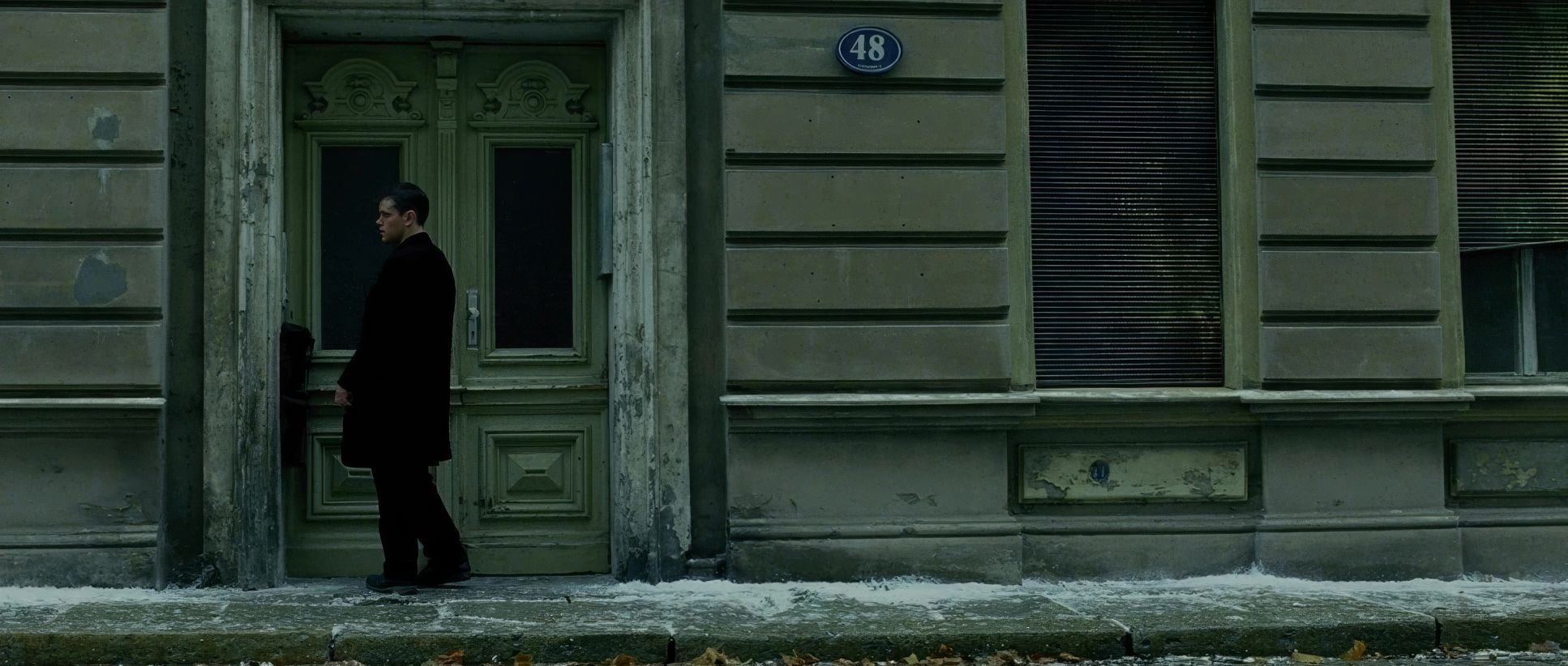
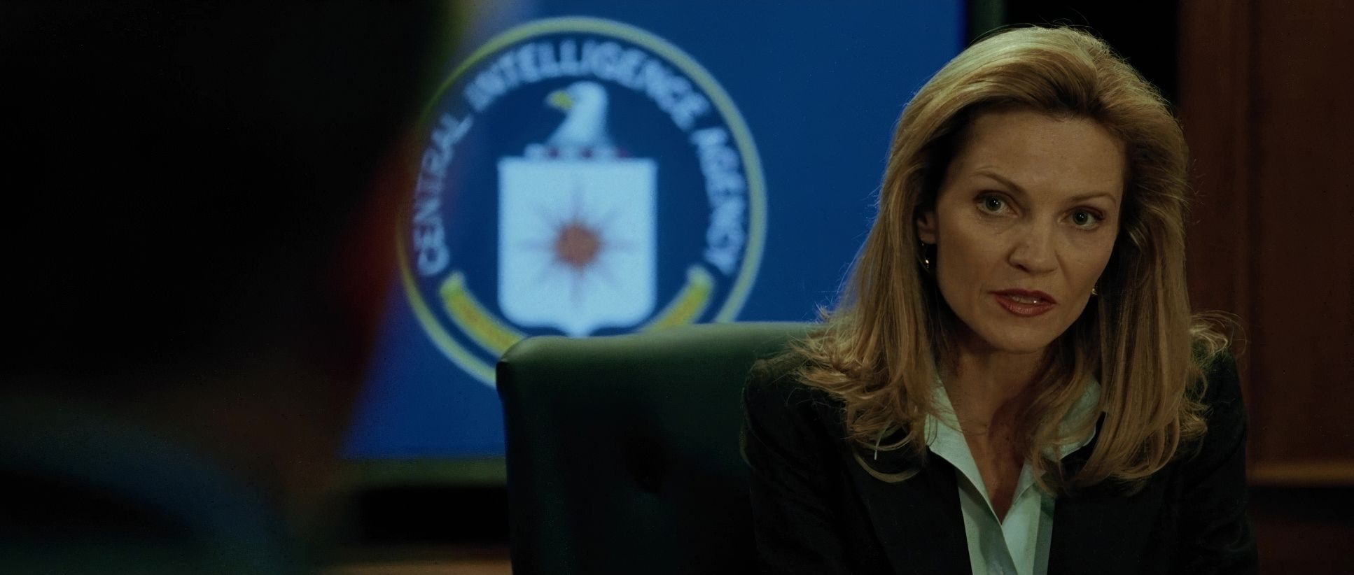
These telephoto shots create a voyeuristic, observational feel that fits the CIA’s perspective. The blocking is equally nuanced. Characters aren’t perfectly centered; they are often physically confined or obscured. During the foot chases in Germany, the blocking is incredibly dynamic characters move fluidly into and out of the frame, forcing the camera to react rather than dictate the movement.
Compositional Choices
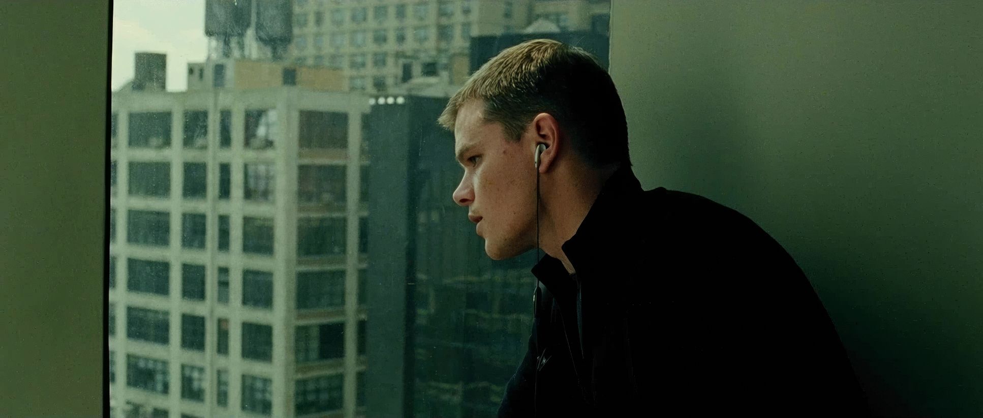
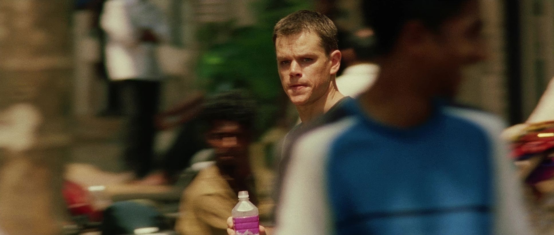
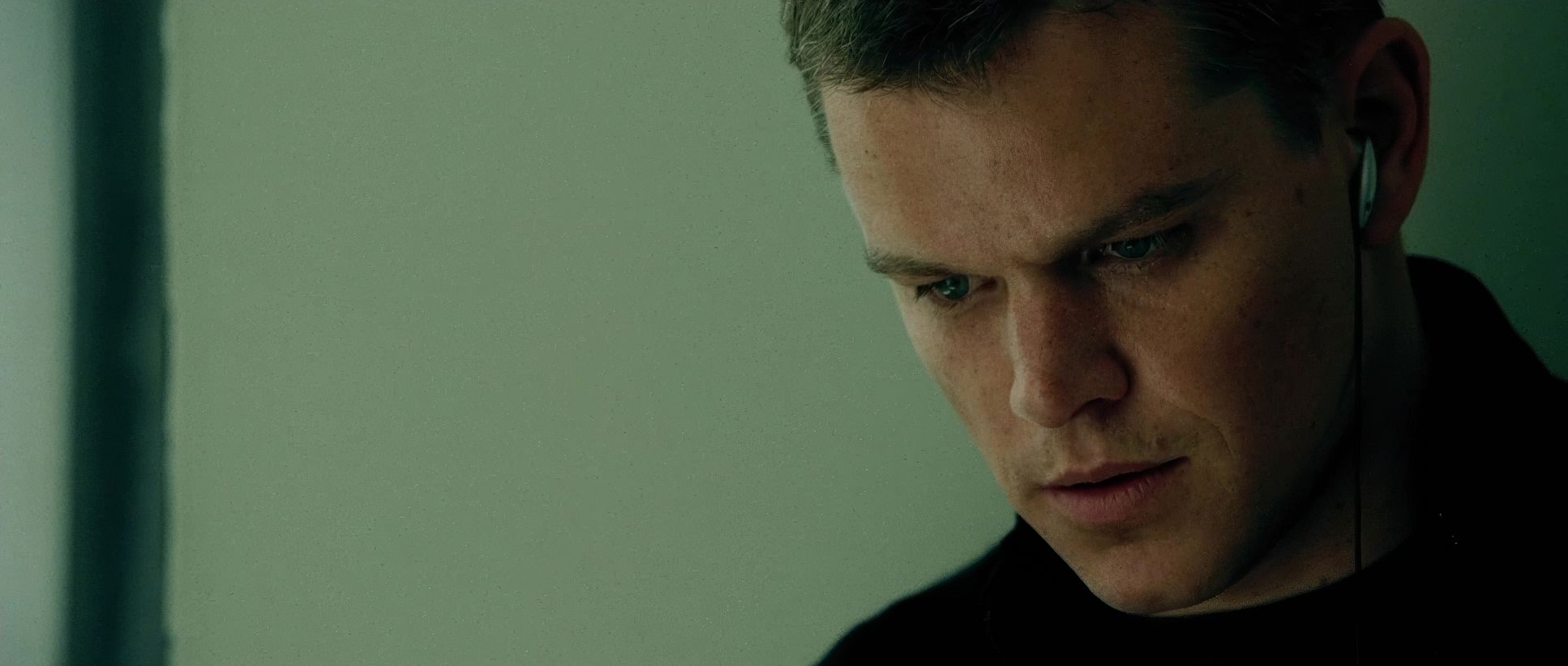
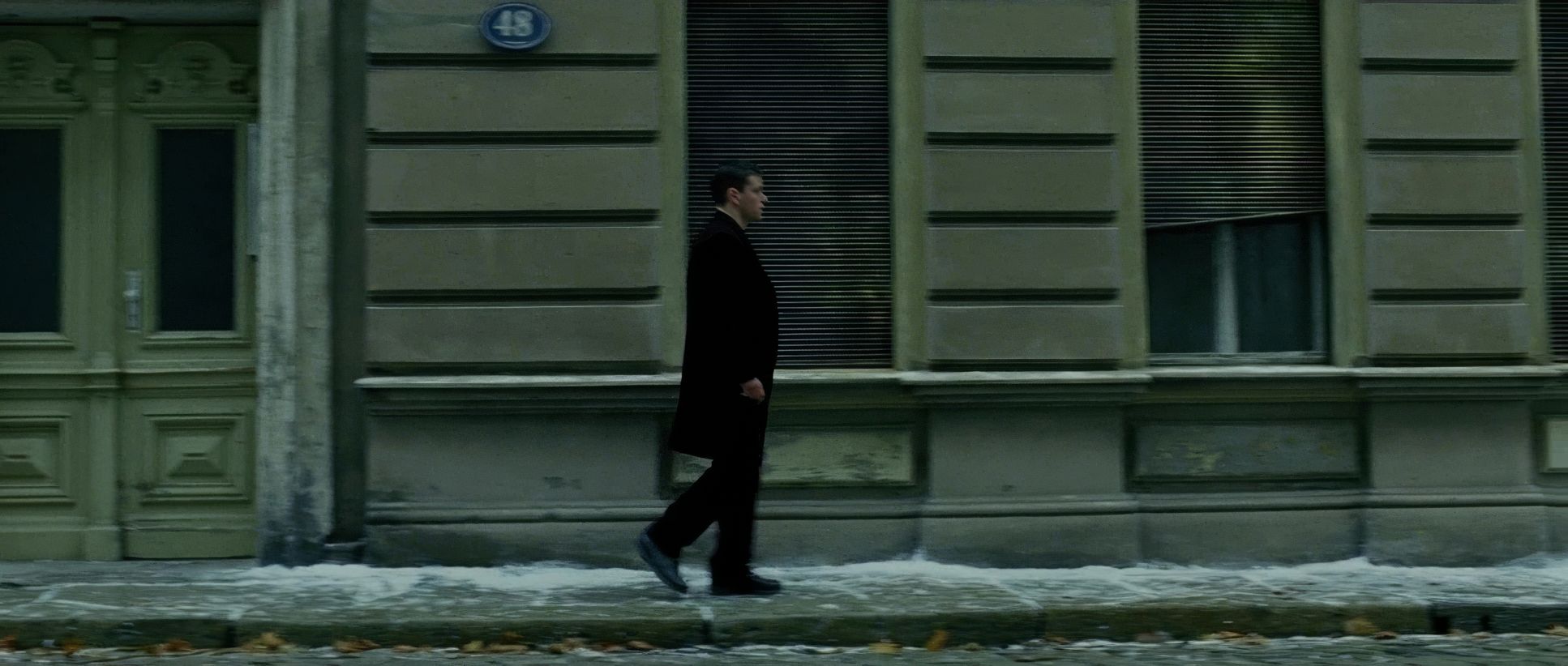
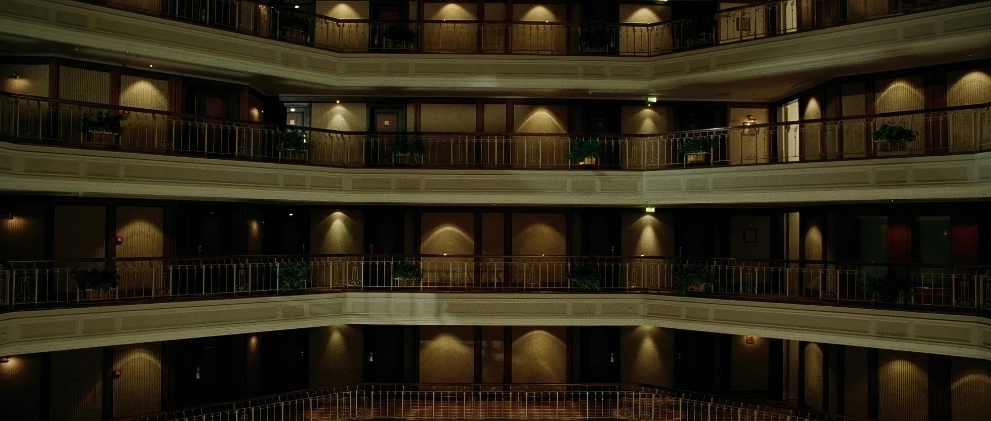
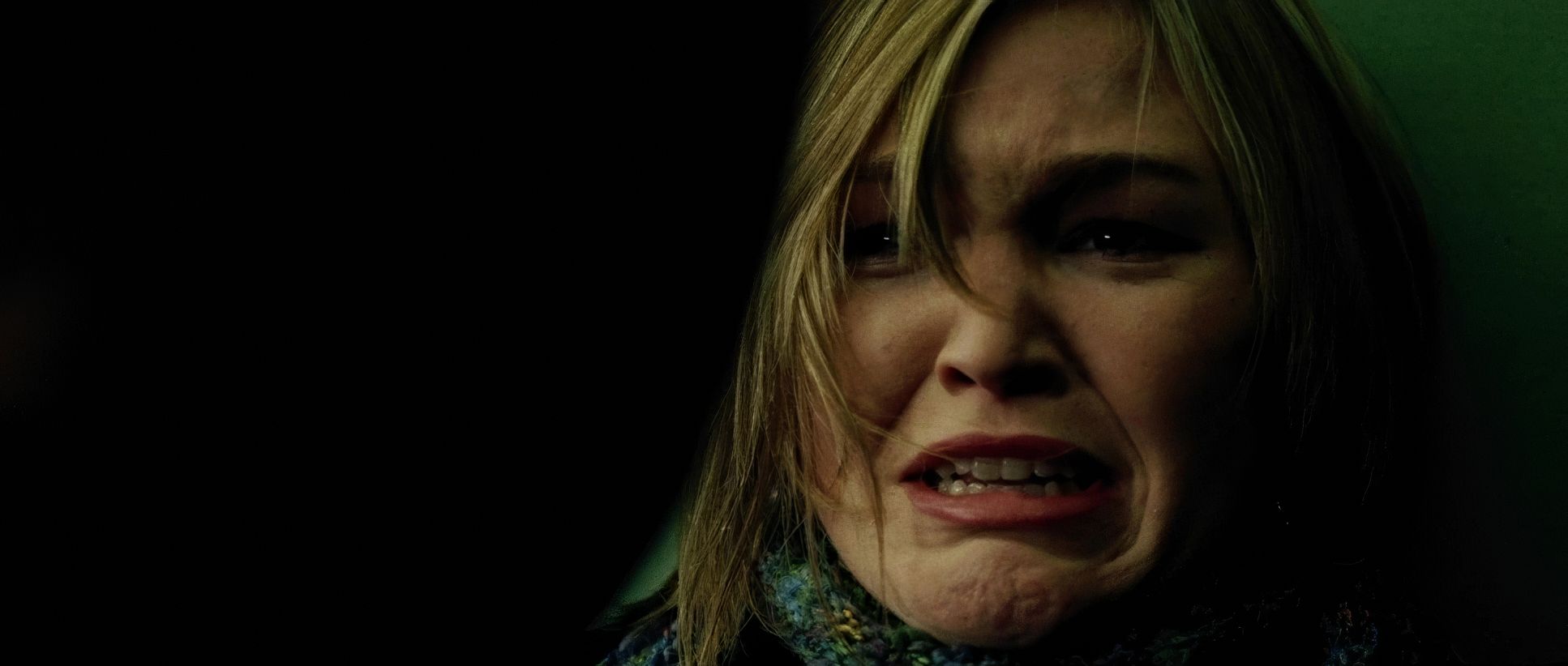
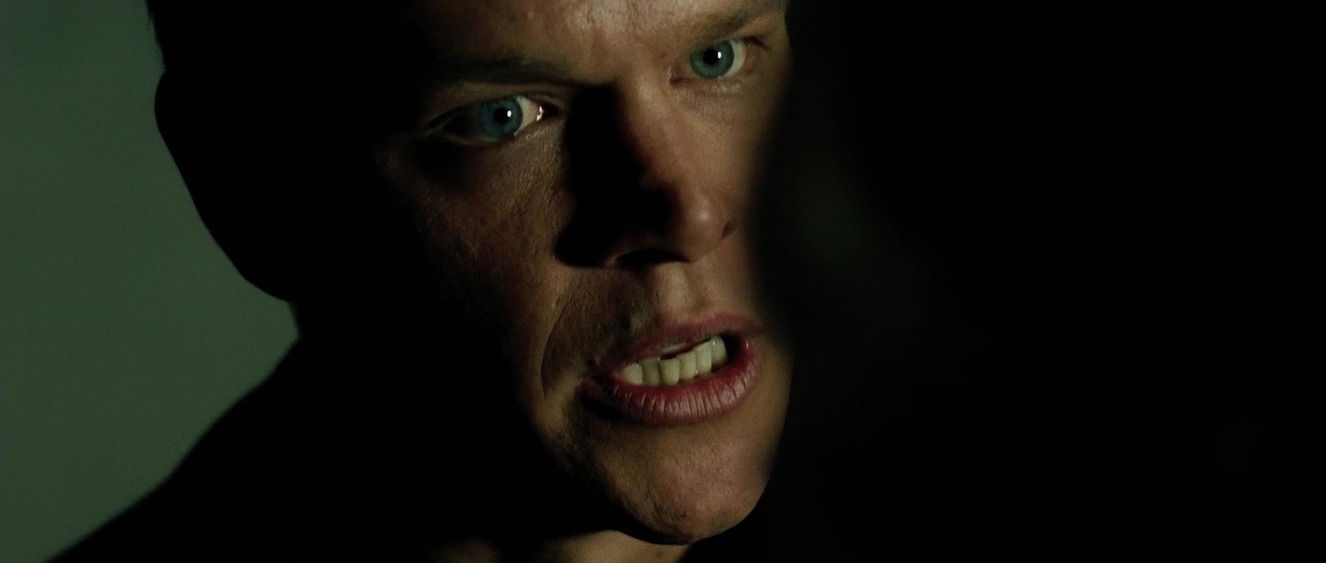
The compositions here are a masterclass in controlled claustrophobia. With a median shot length that is “very, very, very small” barely over a second the frames have to be tight. We are denied spatial comfort.
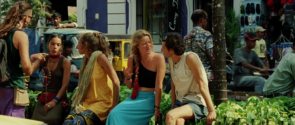
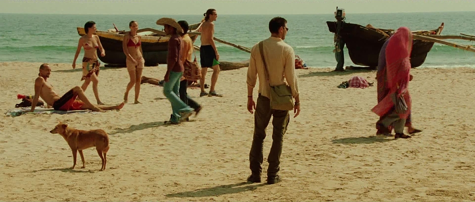
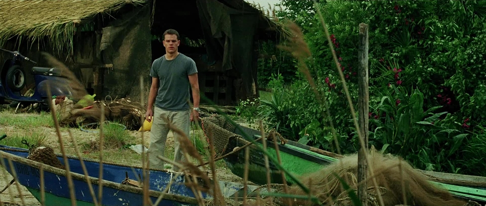
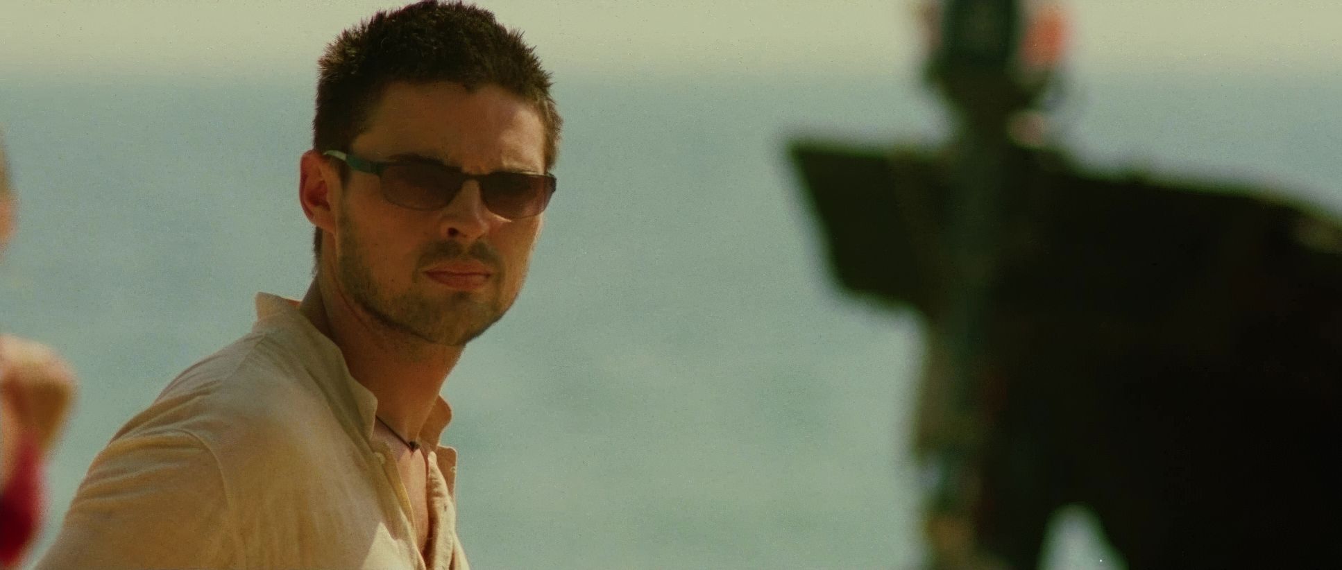
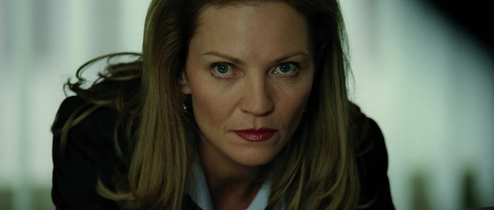
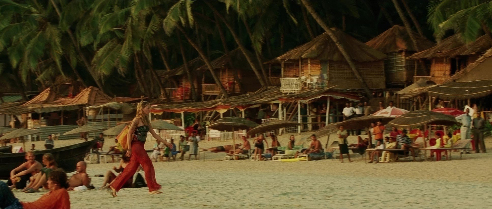
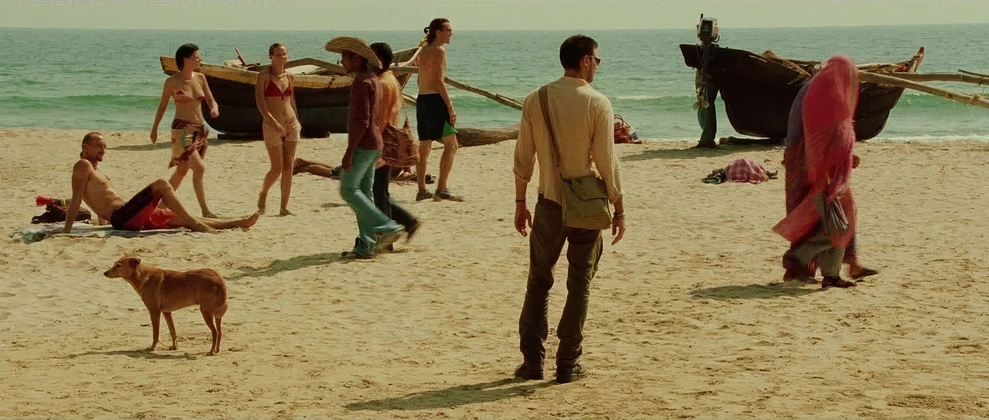
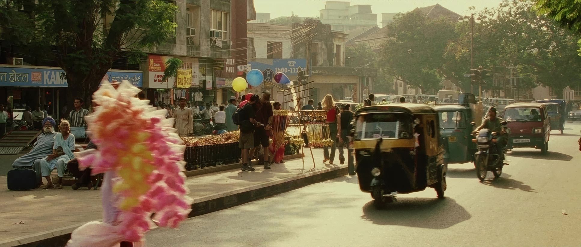
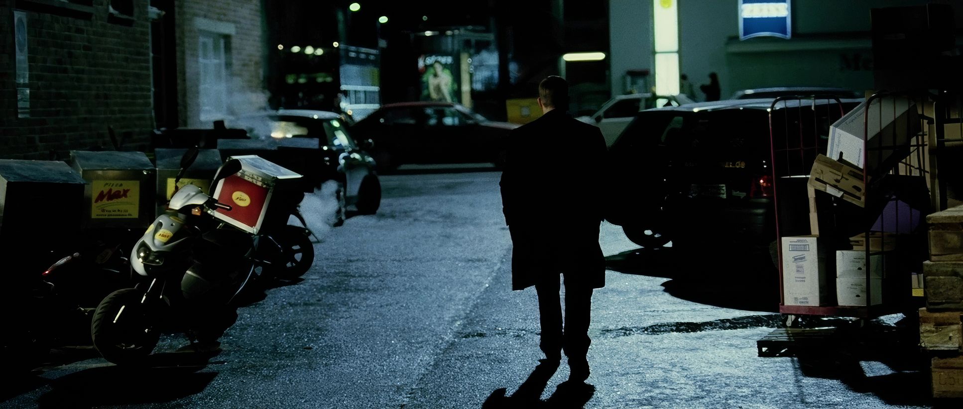
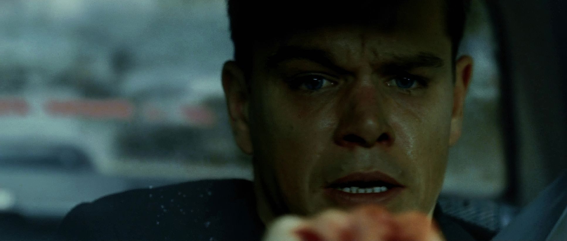
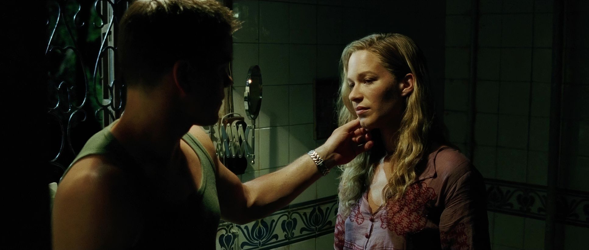
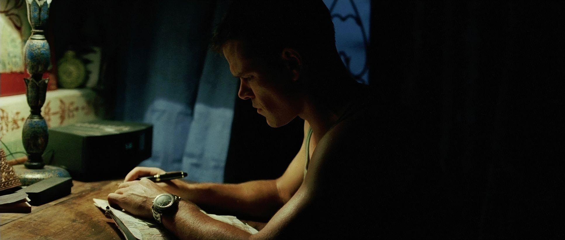
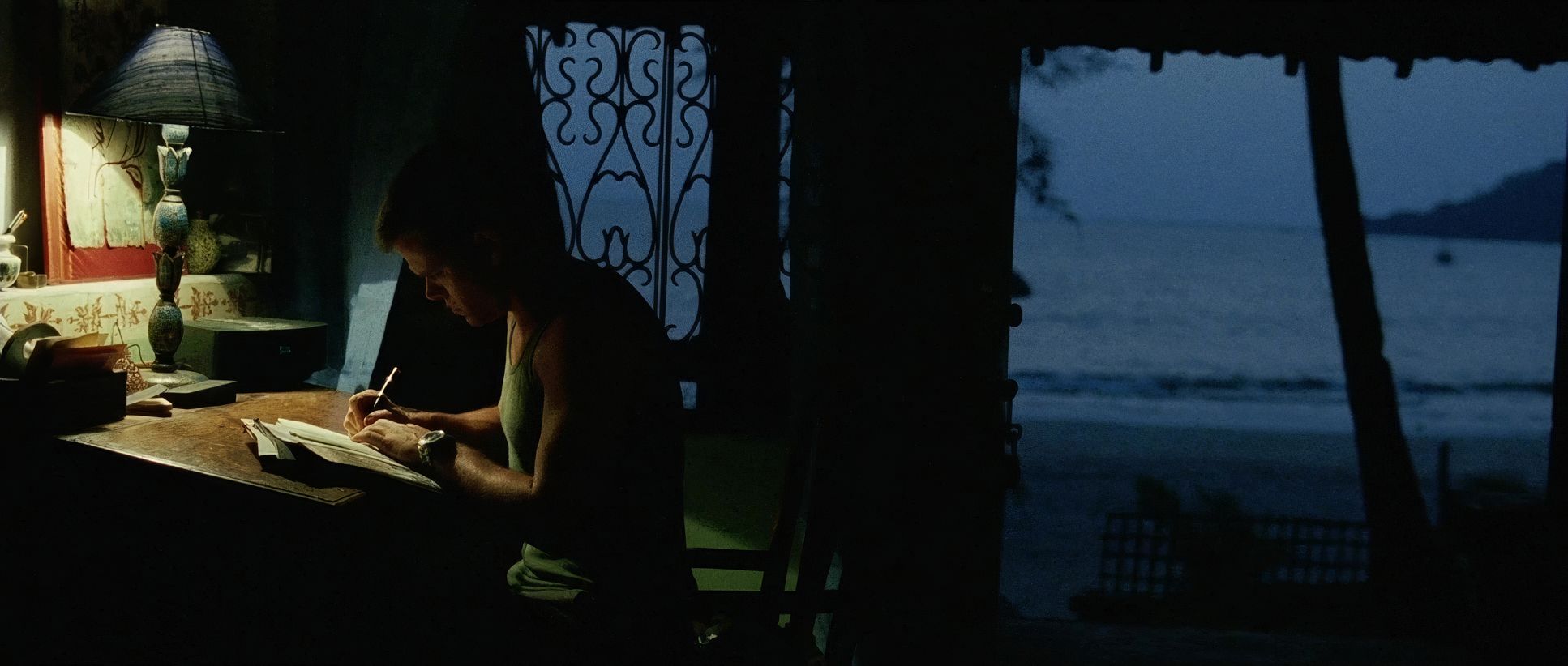
Greengrass and Wood embraced off-center compositions, often placing characters at the edges of the frame to create unease. Depth cues are managed by keeping foreground elements slightly out of focus, mirroring Bourne’s own hyper-aware but fragmented perception. Even the decision to have Bourne “stand out” in Goa by not changing his appearance is reflected in the framing, highlighting his isolation against a crowded, active world.
Lighting Style
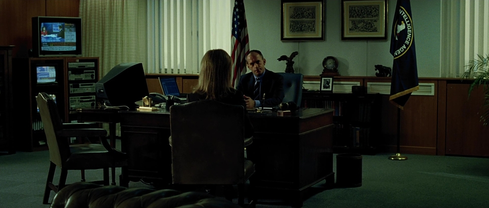
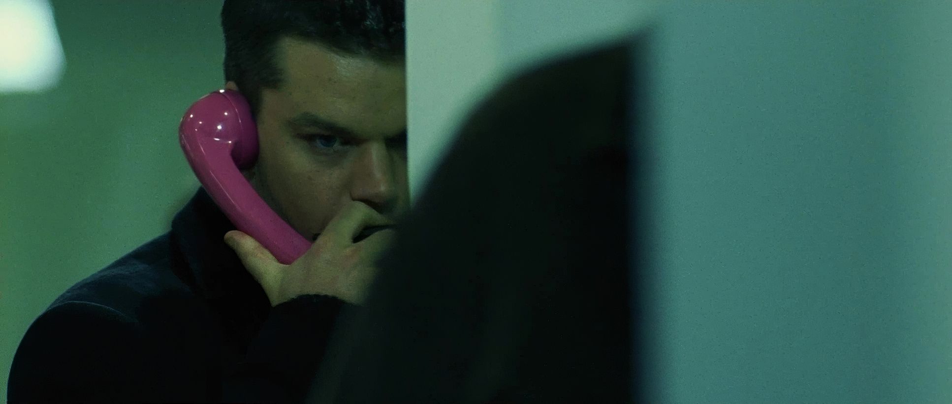
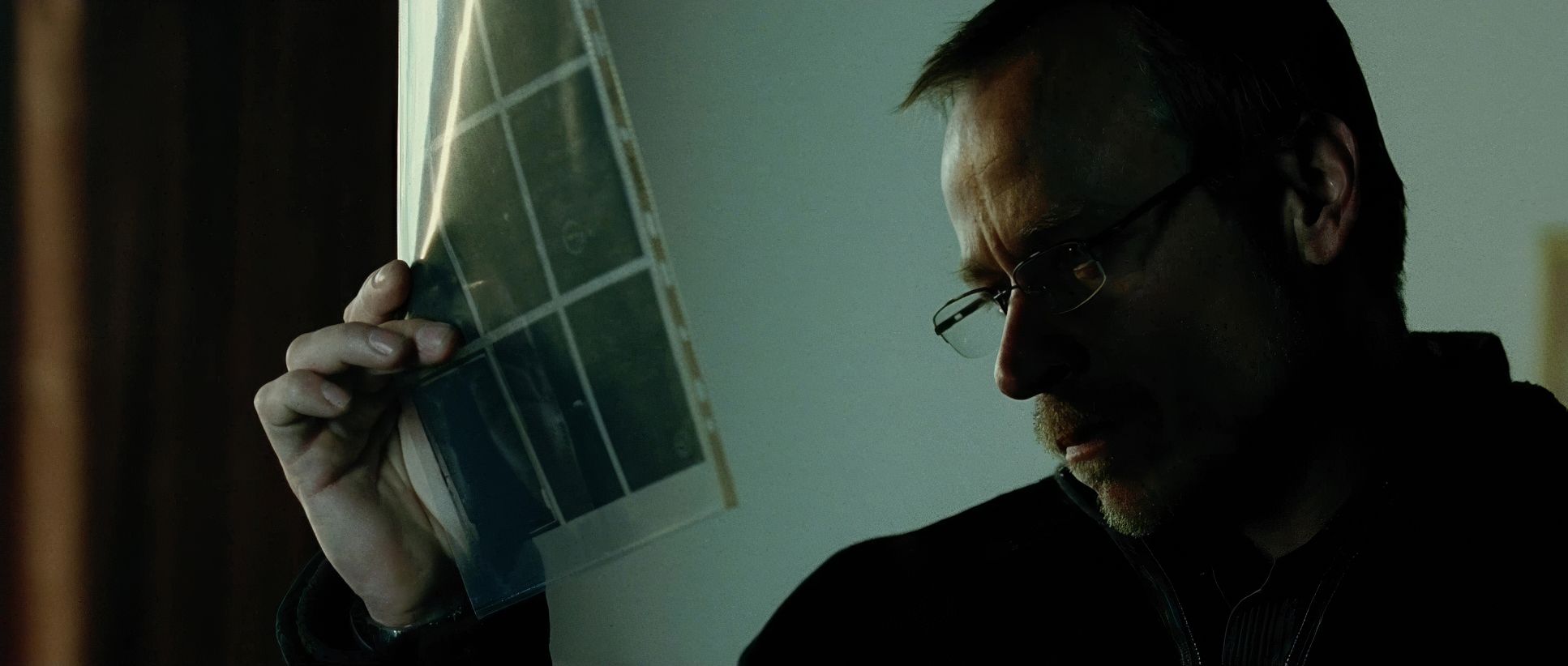
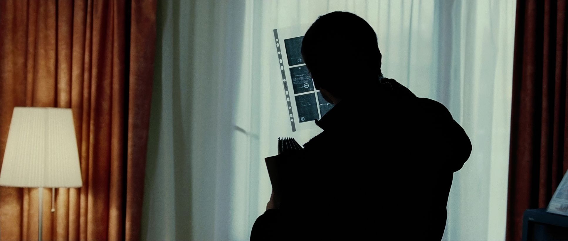
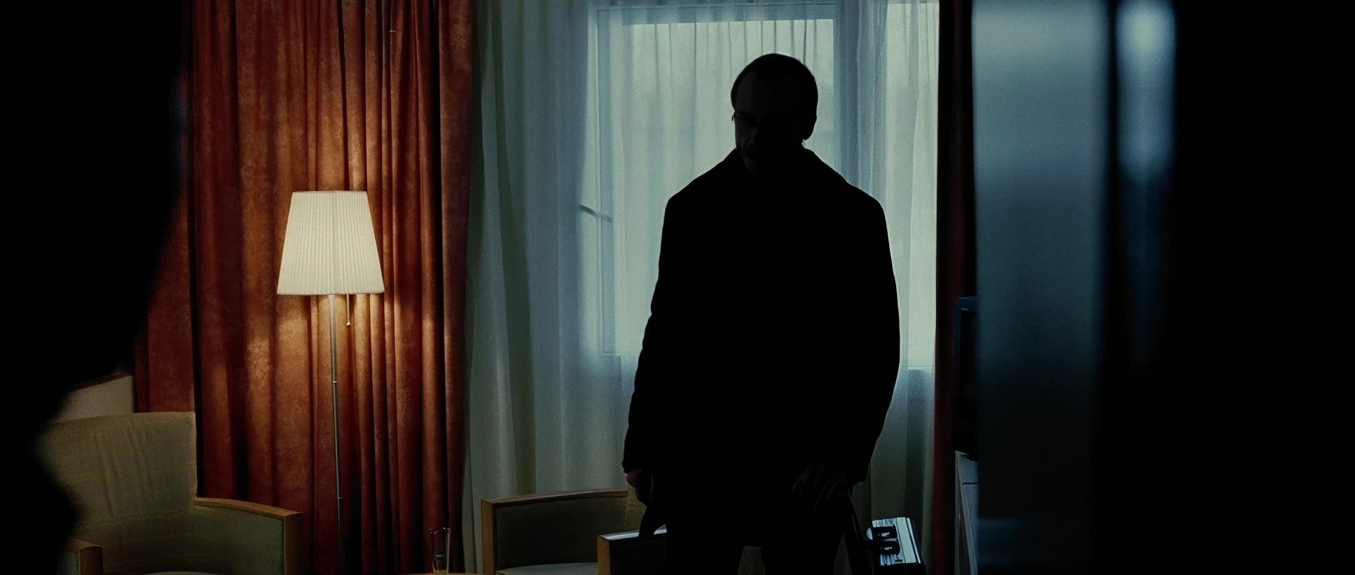
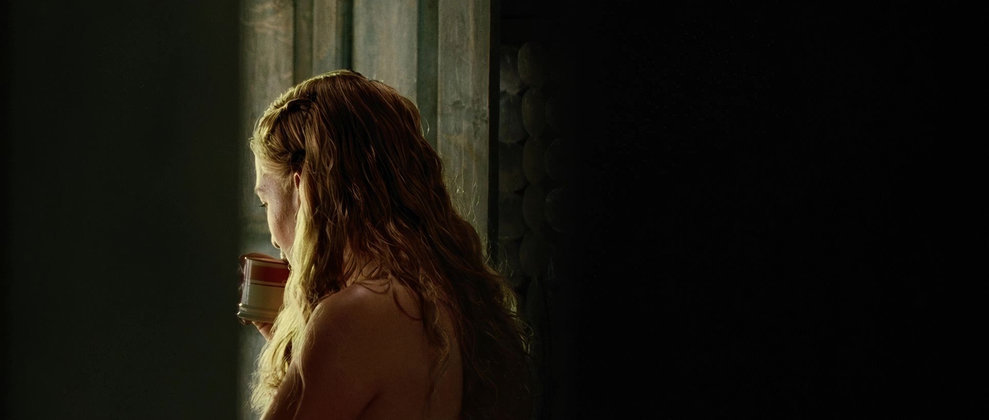
On paper, the lighting is described as soft light and low contrast, using artificial sources on location. But as a colorist, I see how they used that “soft” foundation to create a very “hard” world.
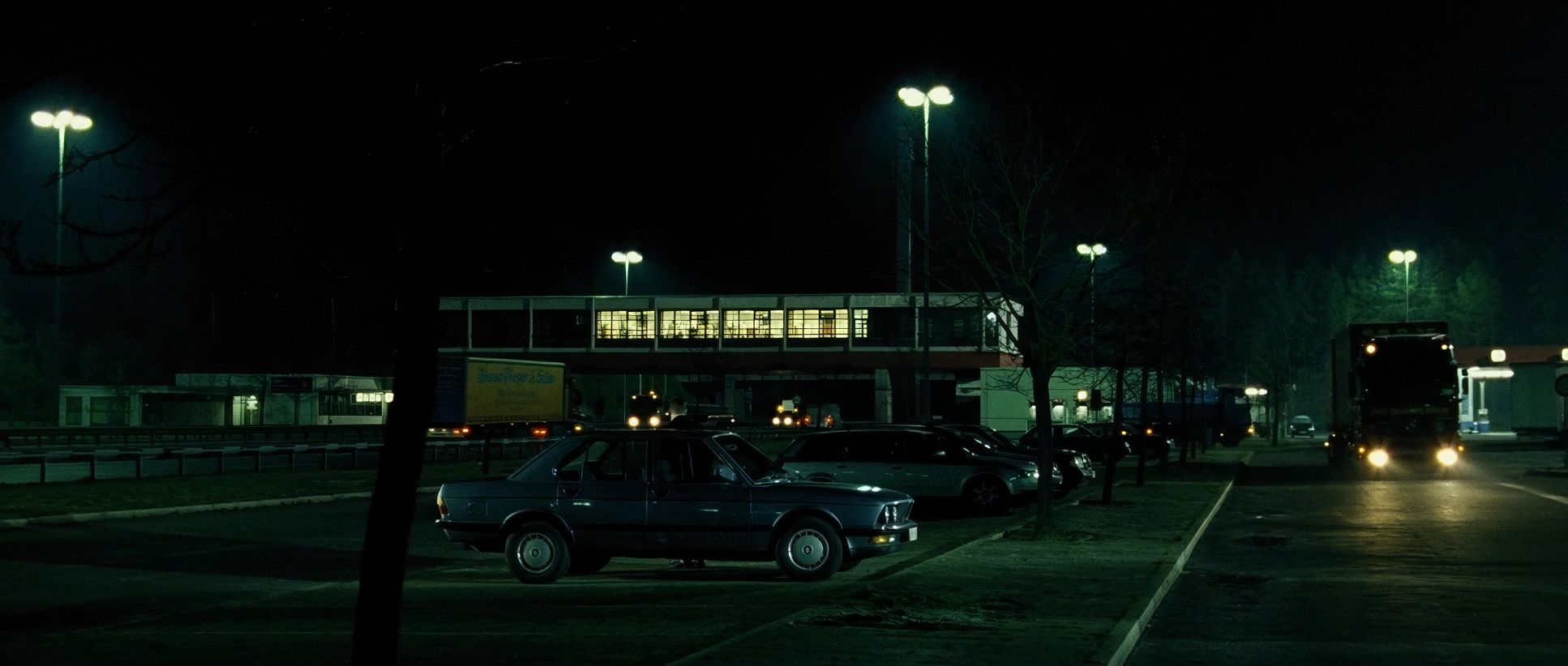
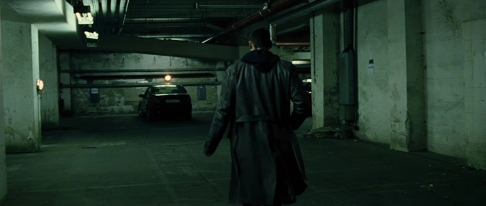
The lighting is deeply rooted in naturalism. Whether it’s the flickering fluorescent lights of a CIA office or the dim glow of a hotel room, every source feels motivated. This isn’t theatrical lighting; it’s an available-light aesthetic that reinforces the documentary feel. By using soft, artificial sources but keeping the contrast ratios tight, they created a look that feels incredibly grounded and authentic.
Color Grading Approach
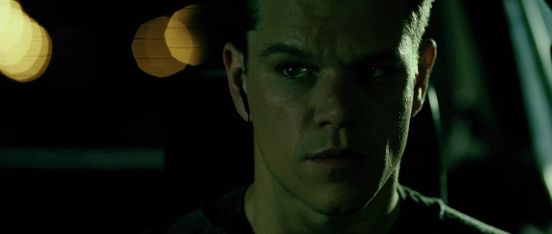
This is where I truly geek out. Working with colorist Michael Healey, the team crafted a look that is cool, desaturated, and stark. The palette is a direct reflection of Bourne’s emotional state his loss, his isolation, and his cold-blooded focus.
Even though the lighting was technically “low contrast,” the final grade is aggressive. We see deep, crushed blacks that add weight and oppression, particularly in the night scenes. The “cinematographer’s filter” is dialed up, creating a desaturated character where skin tones are the only warmth in a cold, blue-gray world. This isn’t just about making the film look “cool”; it’s about sculpting a visual tension that makes the audience feel as anxious as the protagonist. It has that tangible, “print-film” grit that digital clean-up would only ruin.
Technical Aspects & Tools
The Bourne Supremacy: Technical Specifications
| Genre | Action, Drama, Thriller, CIA, Crime, Political, Spy, CIA / FBI, FBI / CIA |
| Director | Paul Greengrass |
| Cinematographer | Oliver Wood |
| Production Designer | Dominic Watkins |
| Costume Designer | Dinah Collin |
| Editor | Richard Pearson, Christopher Rouse |
| Colorist | Michael Healey |
| Time Period | 2000s |
| Color | Cool, Desaturated |
| Aspect Ratio | 2.35 |
| Format | Film – 35mm |
| Lighting | Soft light, Low contrast, Side light |
| Lighting Type | Artificial light |
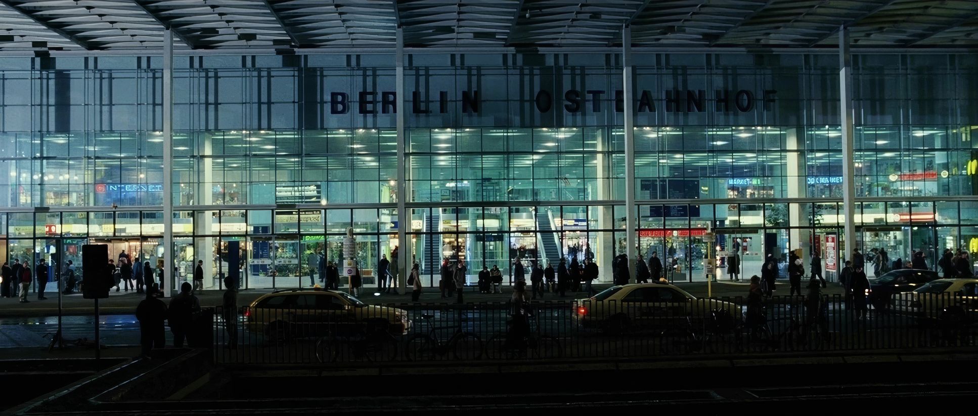
| Story Location | Germany > Berlin |
| Filming Location | Germany > Berlin |
| Camera | Arricam LT |
| Lens | Zeiss Ultra Prime |
The film was captured on 35mm, predominantly using the Arricam LT for that essential handheld agility. The choice of film stock was critical it provided the natural grain structure that gives the image its texture.
The editing by Richard Pearson and Christopher Rouse is perhaps the most defining technical feat. When your average shot length is one second, every frame has to hit like a hammer. The sound design also does heavy lifting here; without such expert sound work, the rapid-fire visual chaos would be indecipherable. The sound grounds the image, helping us orient ourselves even when the camera is whipping 180 degrees.
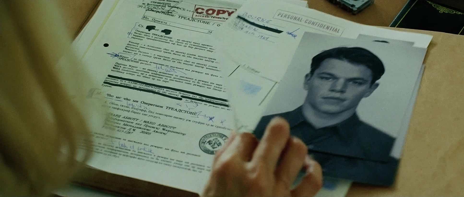
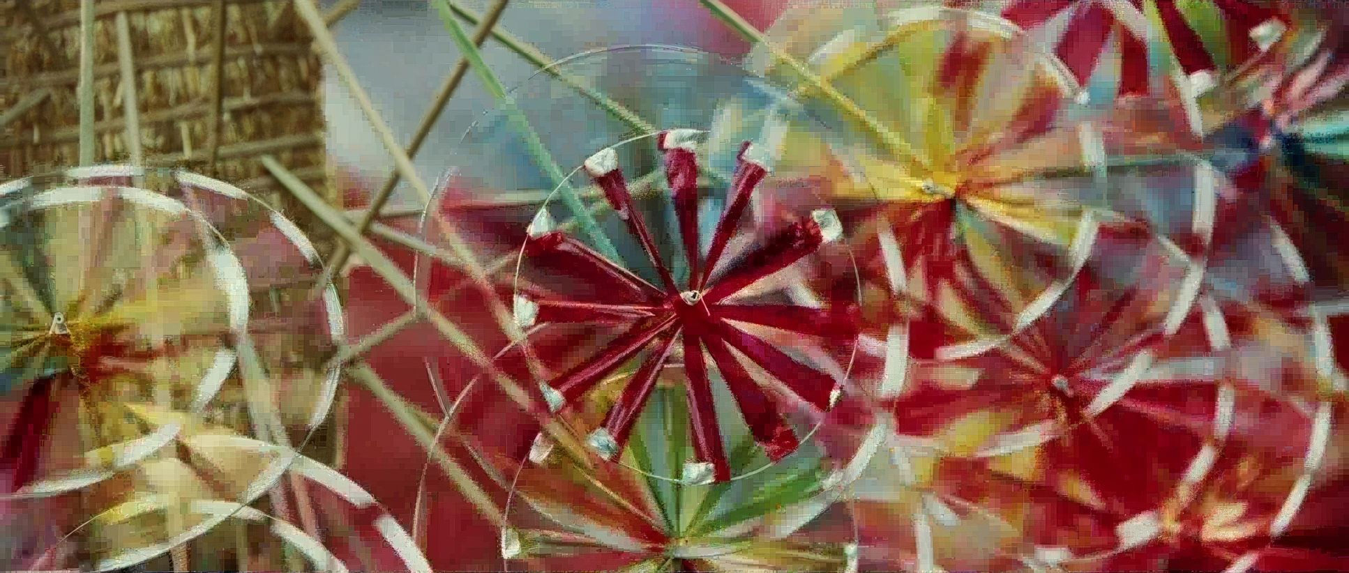
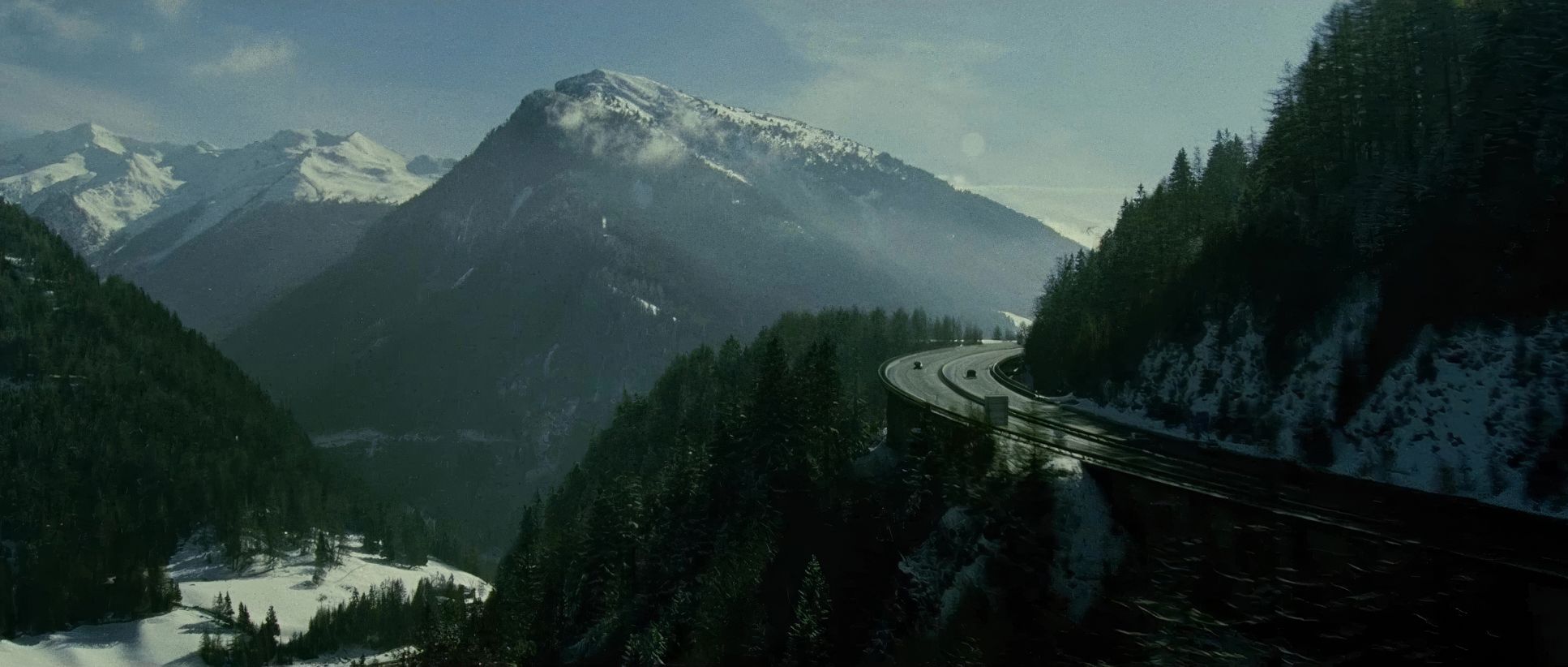
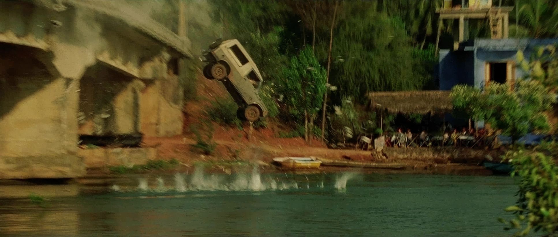
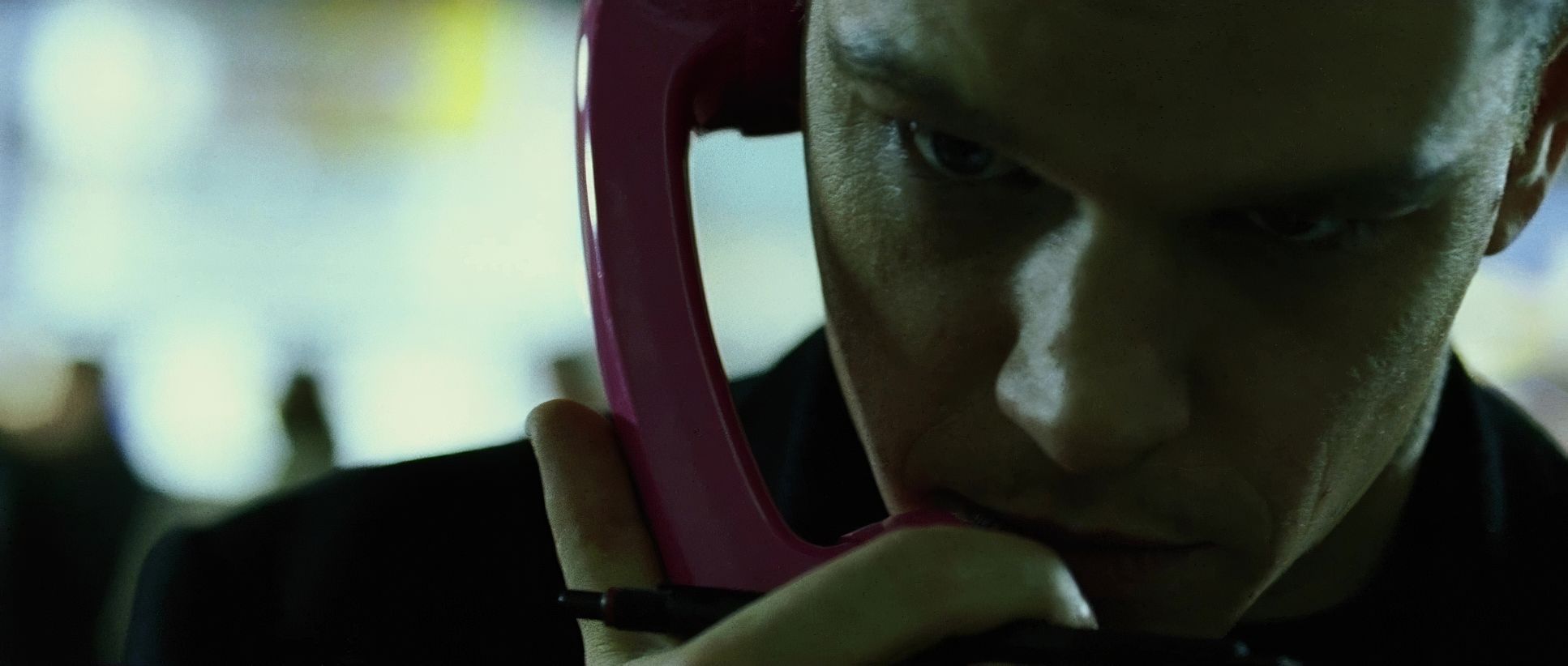
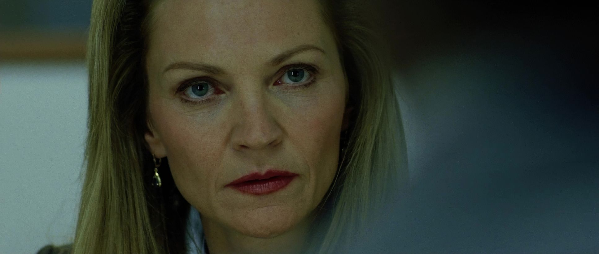
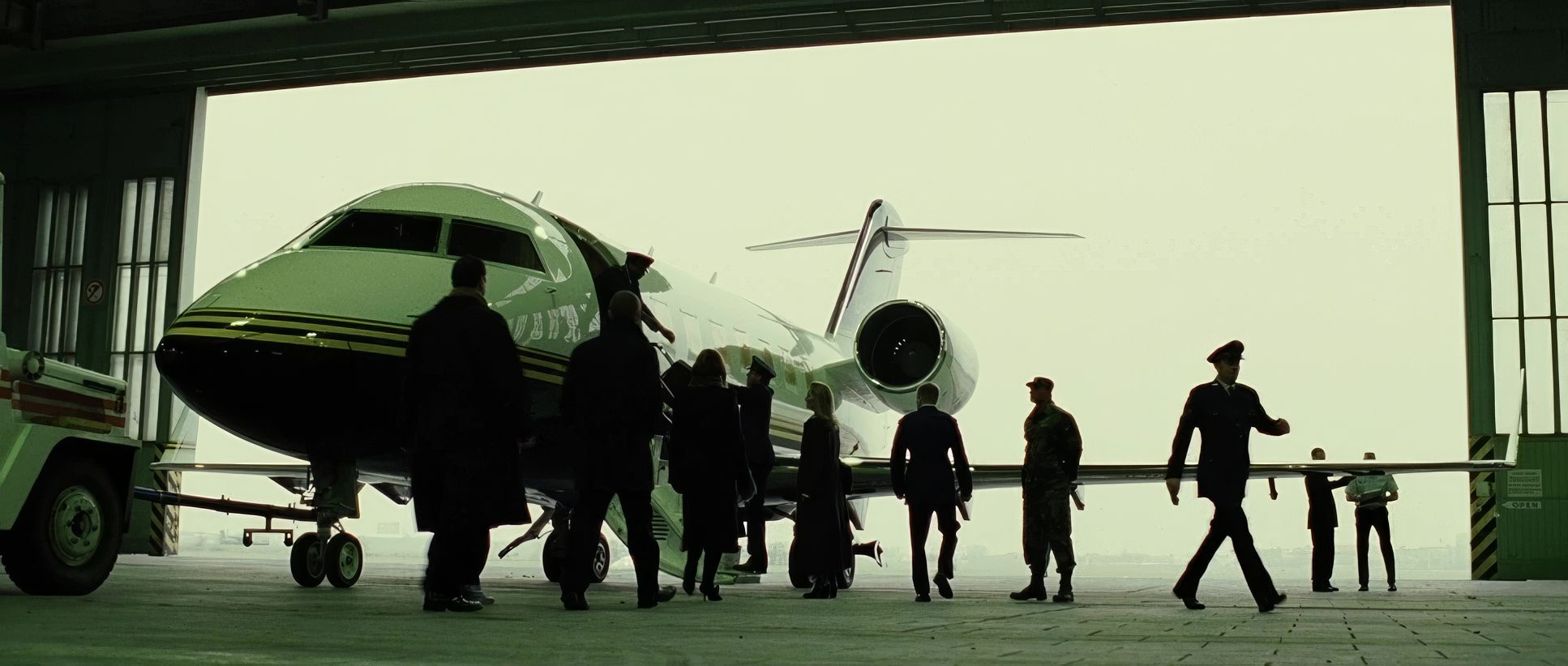
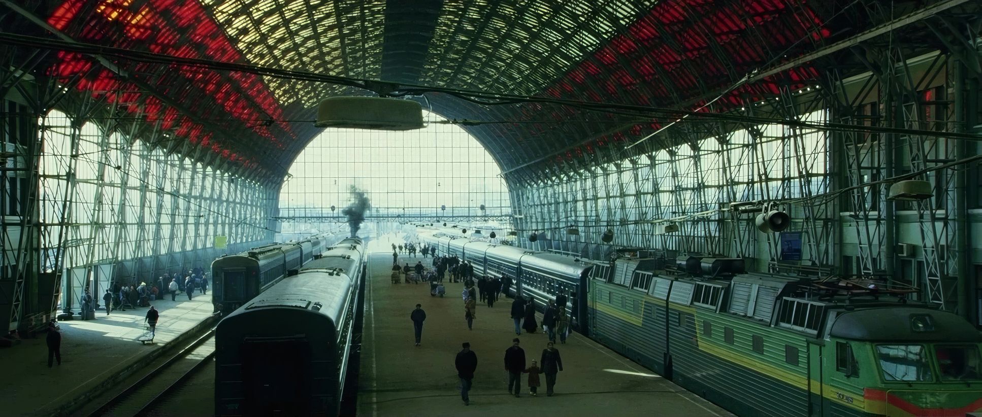
The Bourne Supremacy (2004) Film Stills
A curated reference archive of cinematography stills from The Bourne Supremacy (2004). Study the lighting, color grading, and composition.


- Also read: STAR TREK INTO DARKNESS (2013) – CINEMATOGRAPHY ANALYSIS
- Also read: SICARIO (2015) – CINEMATOGRAPHY ANALYSIS
Browse Our Cinematography Analysis Glossary
Explore directors, cinematographers, cameras, lenses, lighting styles, genres, and the visual techniques that shape iconic films.
Explore Glossary →