Zodiac for those of us who spend our days staring at scopes and tweaking curves, this isn’t just a movie it’s a masterclass in visual discipline. David Fincher is famous for being a perfectionist, but with Zodiac, he and Harris Savides created something that feels almost forensic. It’s a film that gets under your skin not through jump scares, but through a cold, clinical atmosphere that stays with you long after the lights come up.
About the Cinematographer
You can’t talk about the “look” of the 2000s without talking about the late Harris Savides, ASC. He had this incredible, poetic melancholy to his work. If you’ve seen The Game or Birth, you know he was a wizard with underexposure and desaturated palettes. In Zodiac, Savides brought a sense of “naturalistic dread” to the table. He had this rare gift for making a standard office space or a suburban street feel haunted. His partnership with Fincher on this project felt less like a standard Director-DP relationship and more like two detectives obsessed with getting the “truth” of a scene onto the sensor.
Inspiration Behind the Cinematography
What I love about the “why” behind this film is Fincher’s refusal to sensationalize. He treated the production like a piece of journalism. The transcripts and witness testimonies weren’t just references they were the law.
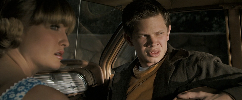
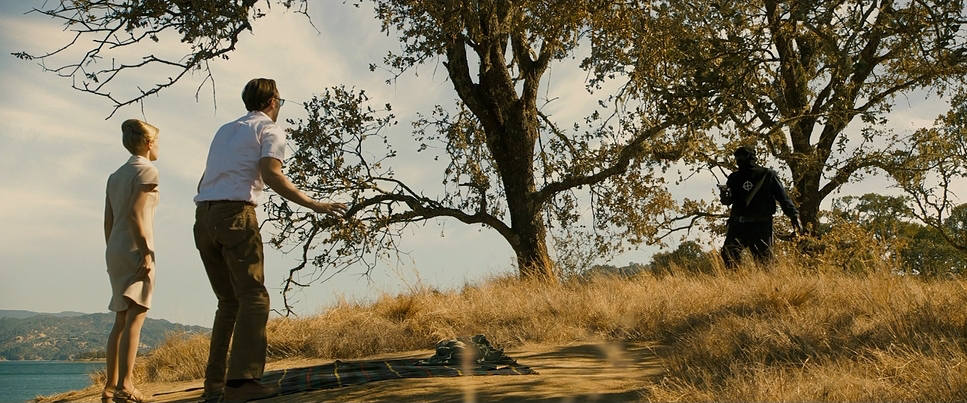
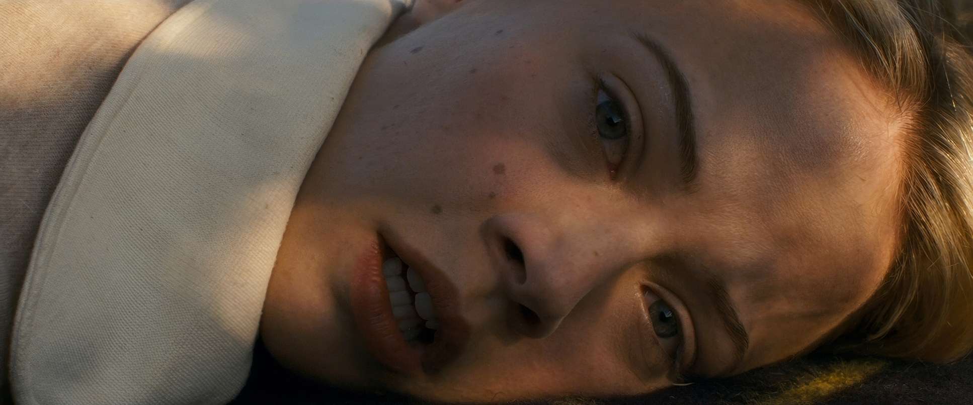
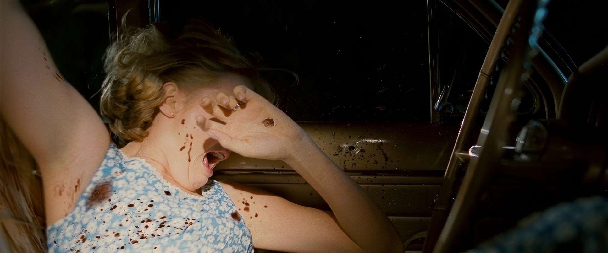
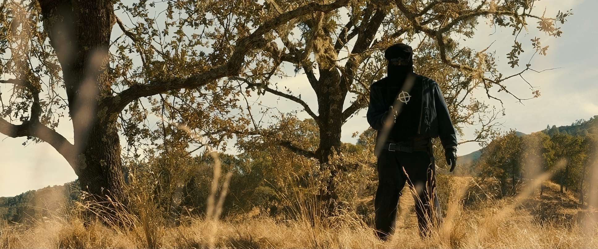
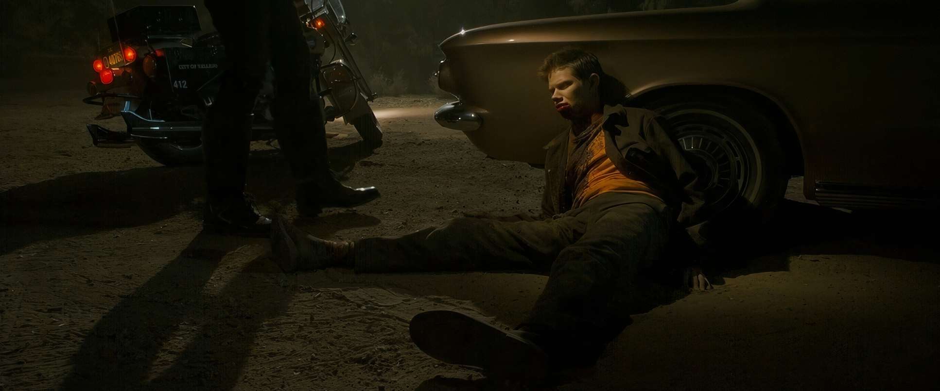
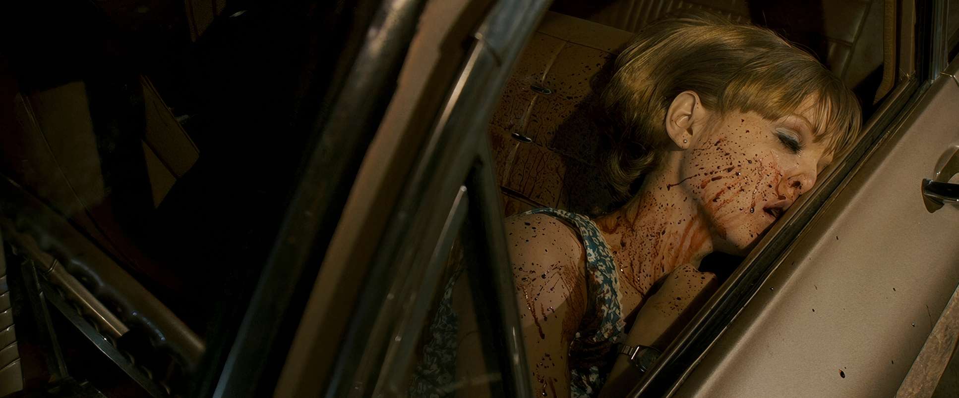
Take the Blue Rock Springs attack: we see the Zodiac as a silhouette behind a blinding, blown-out tactical light. Why? Because that’s exactly how the survivor described it. They didn’t show the Lake Herman Road shooting because there were no survivors to tell the story. That kind of creative restraint is rare. It forces the cinematography to be observational rather than performative. We aren’t just watching a crime; we are tethered to the limited, terrifying perspective of the victims. It grounds the horror in a way that feels uncomfortably real.
Camera Movements
In Zodiac, the camera moves with a terrifyingly calm purpose. You won’t find any “shaky-cam” here to manufacture tension. Instead, it’s all about controlled, methodical observation.
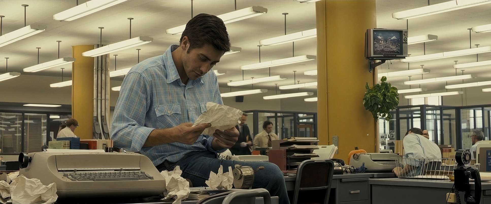
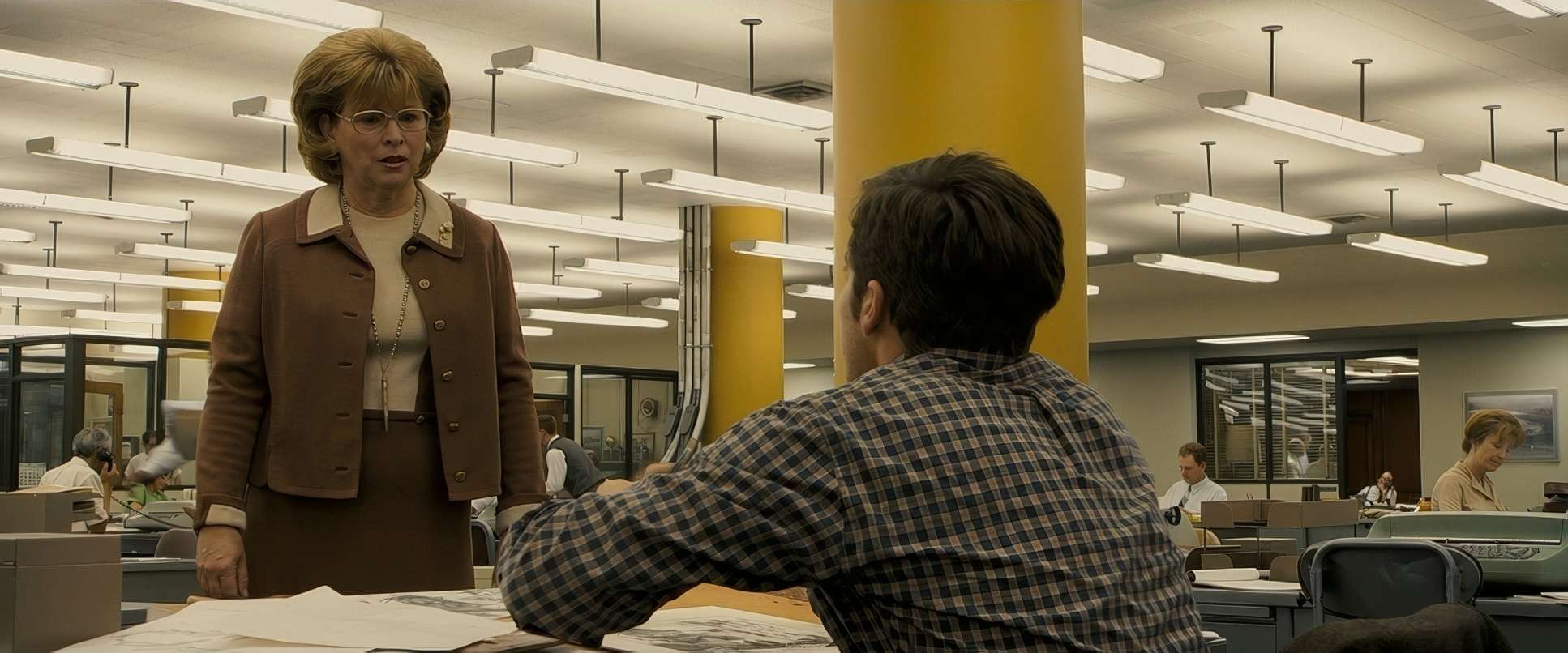
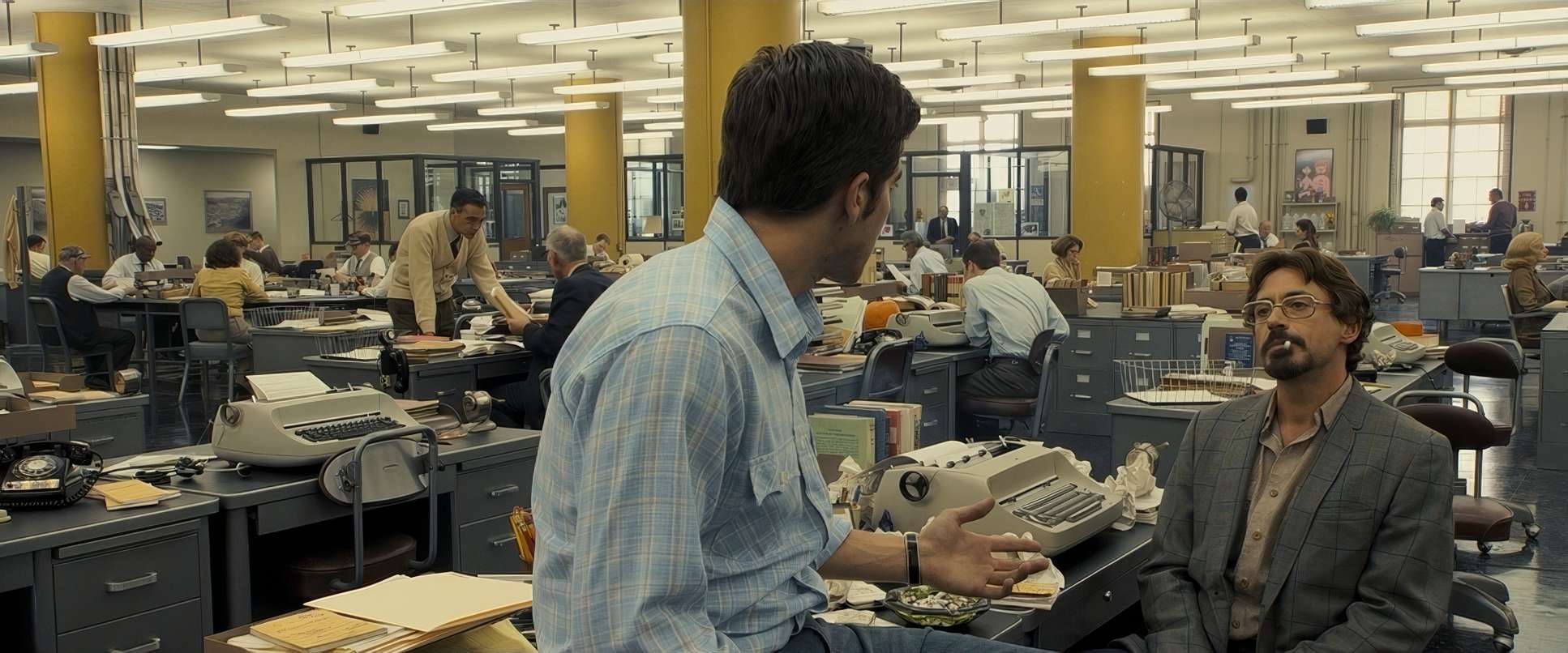
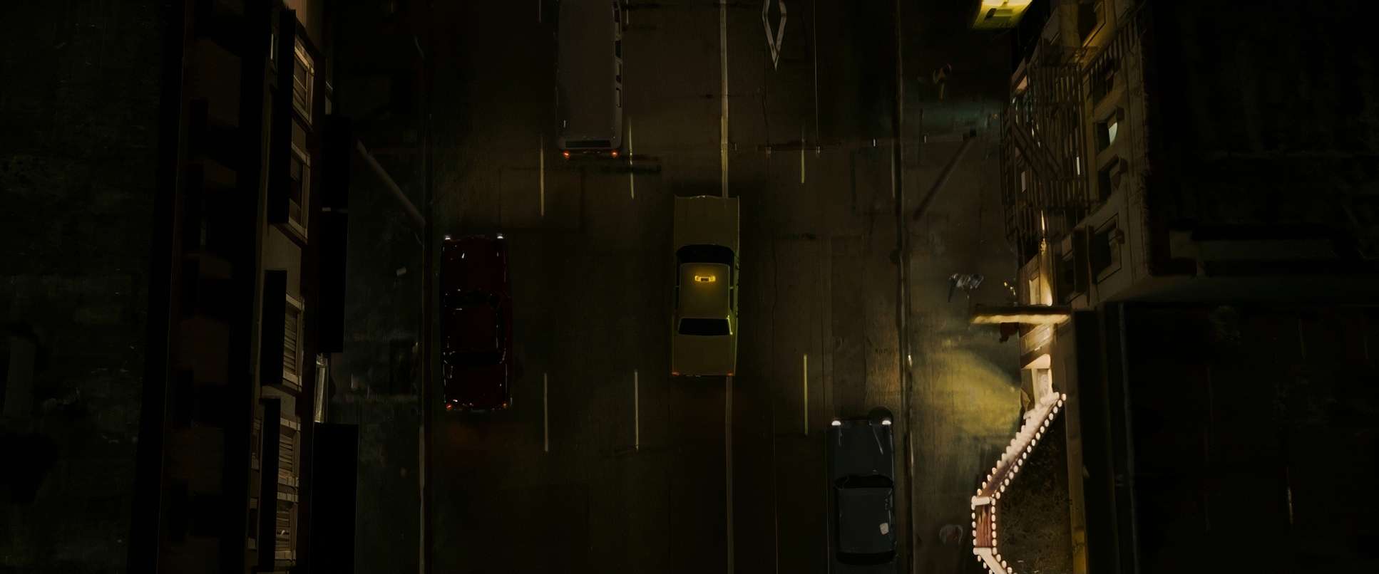
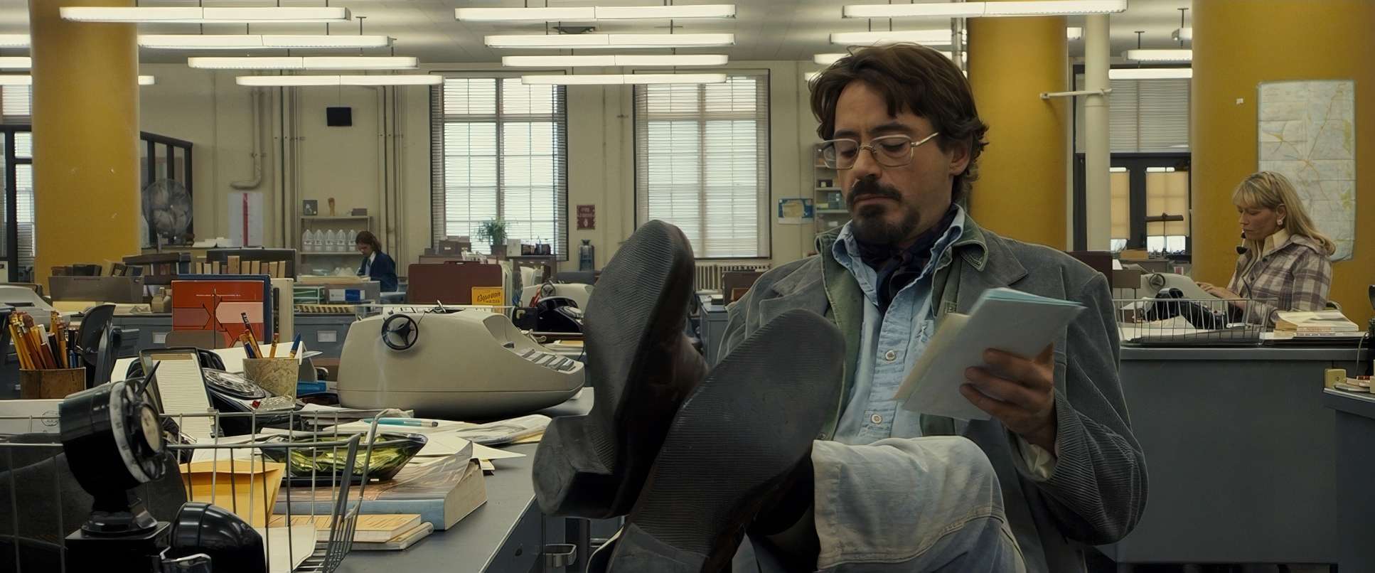
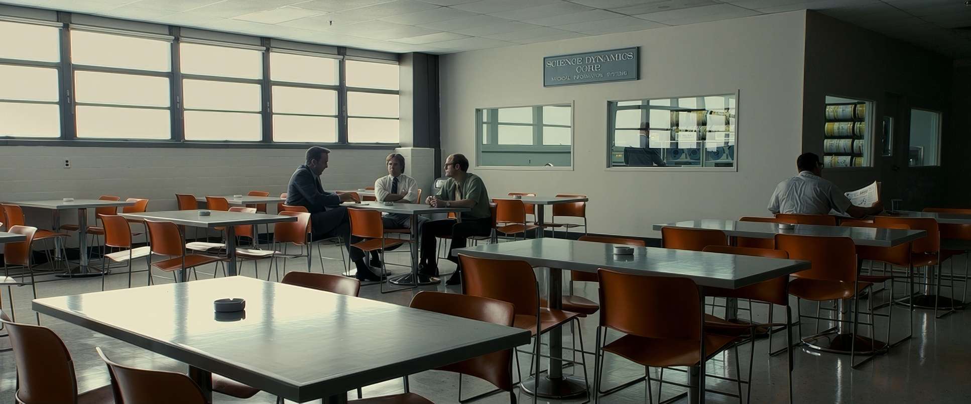
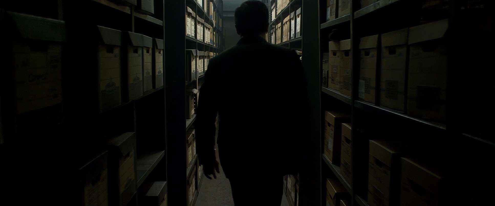
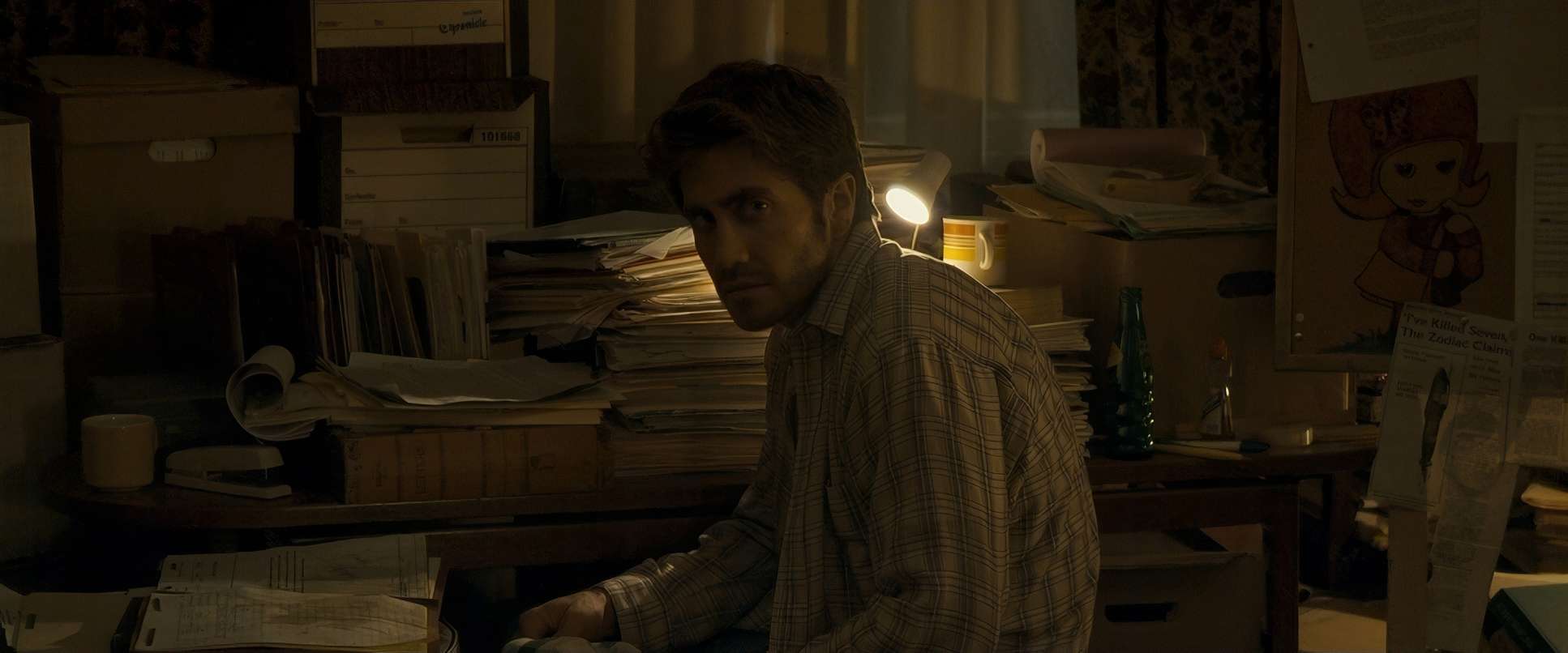
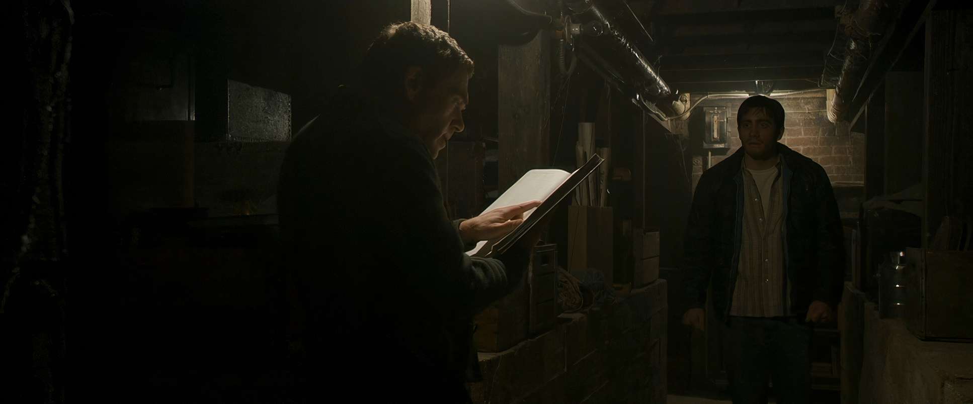
When the camera moves, it feels like it’s searching for a clue. Think about those long, gliding Steadicam shots through the San Francisco Chronicle offices. It establishes this massive, chaotic web of information before the lens slowly narrows its focus onto Graysmith. There’s a stalking quality to the movement, especially as Graysmith gets deeper into the rabbit hole. It’s as if the camera itself is the obsession, Refusing to look away even when we want it to. In the attack scenes, the stillness is what actually kills you the camera just sits there, objective and cold, making the violence feel much more jarring.
Compositional Choices
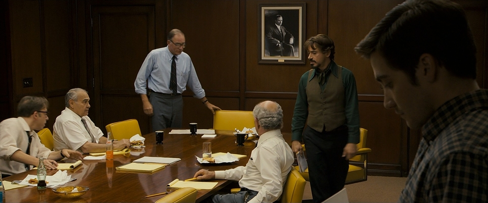
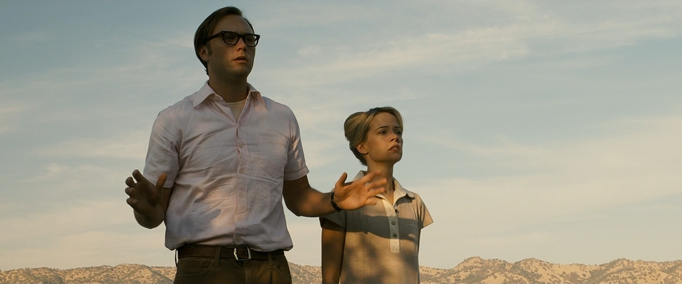
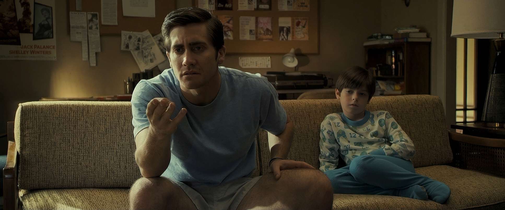
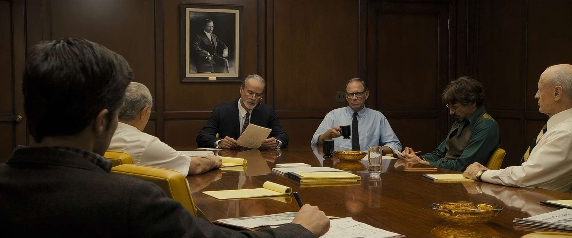
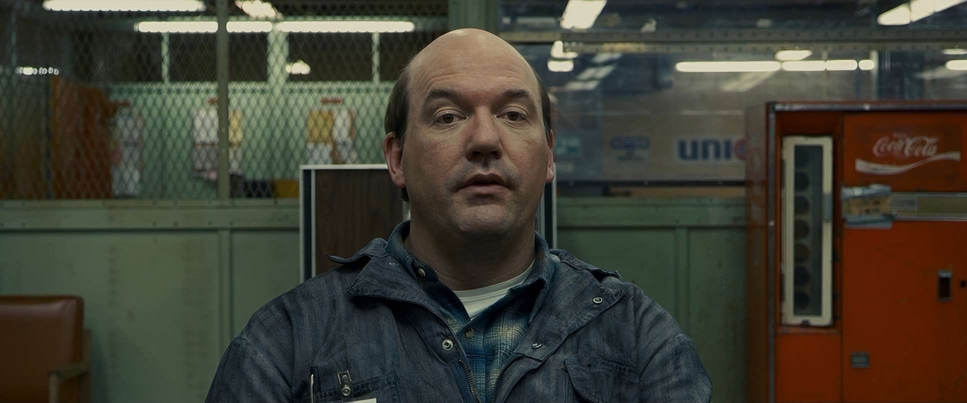
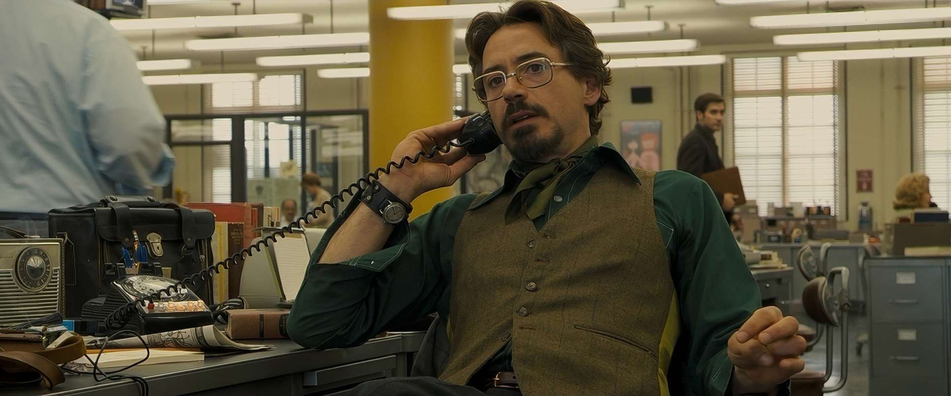
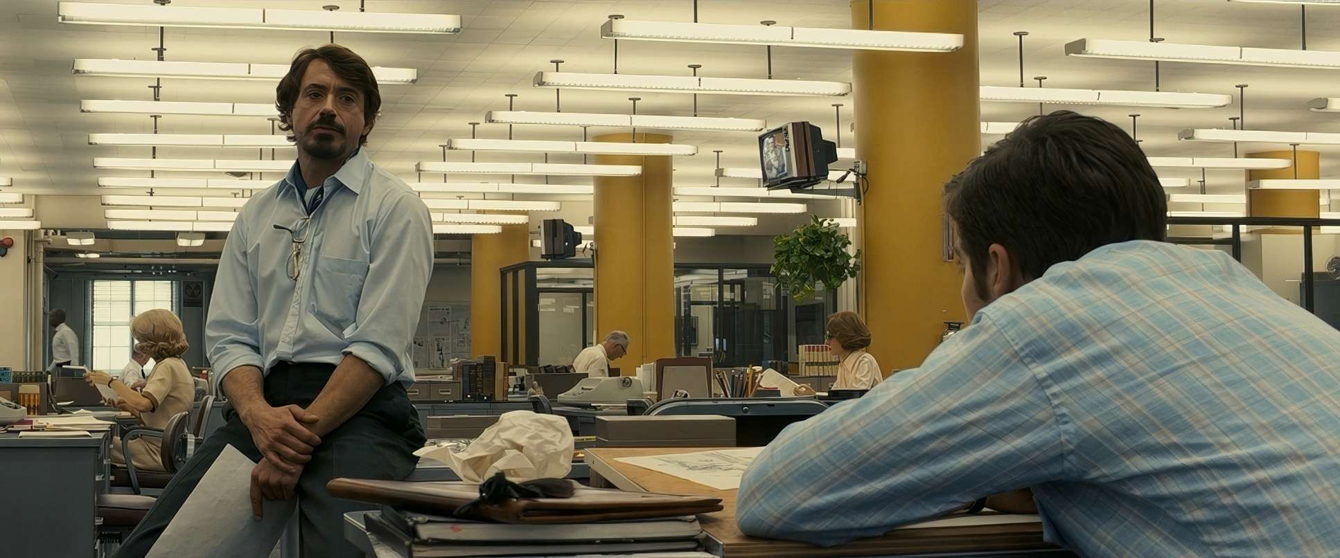
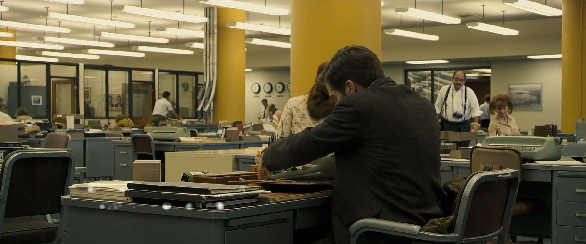
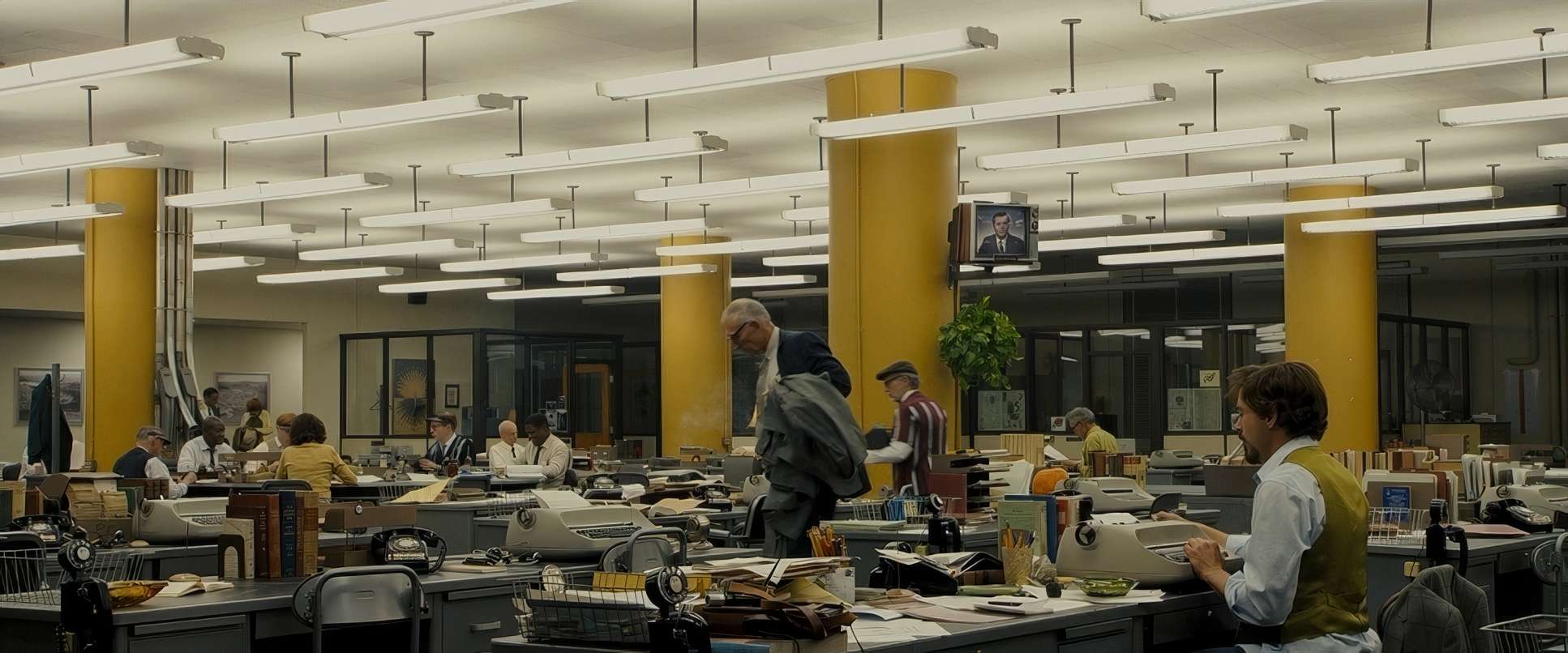
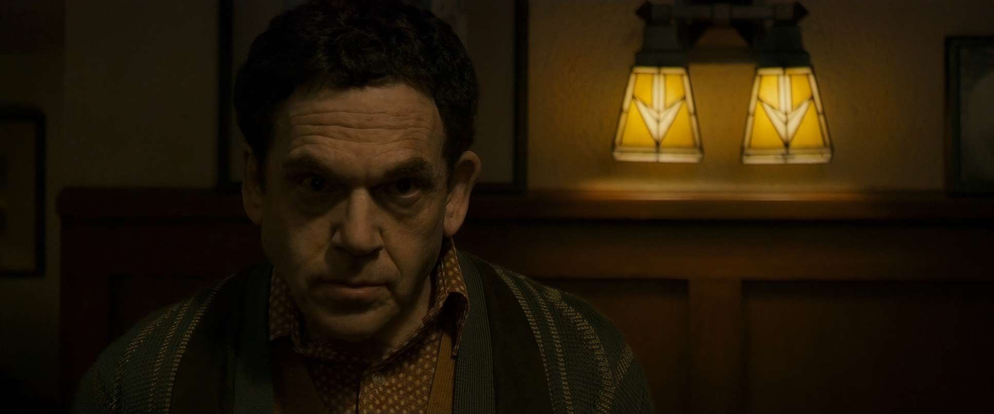
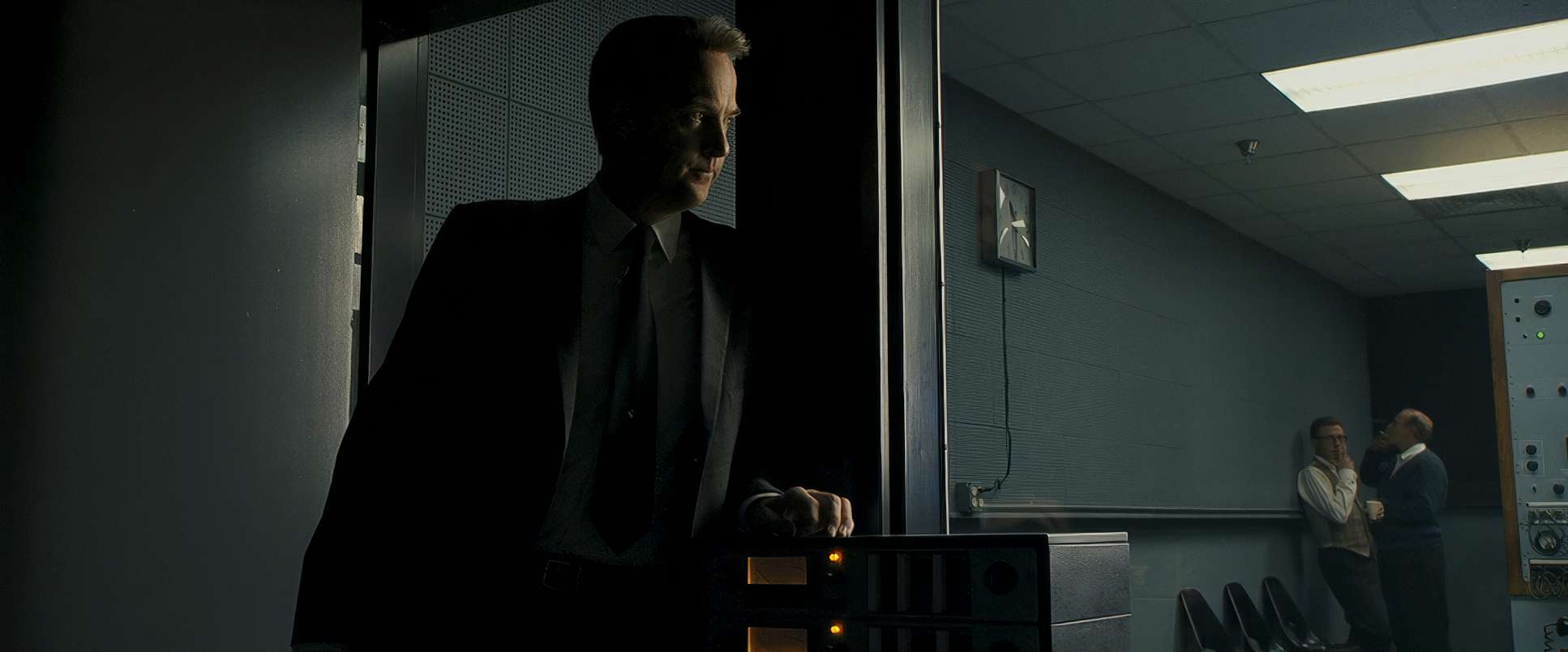
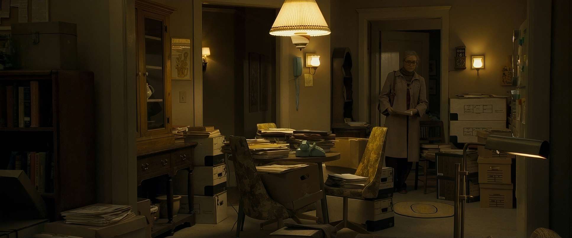
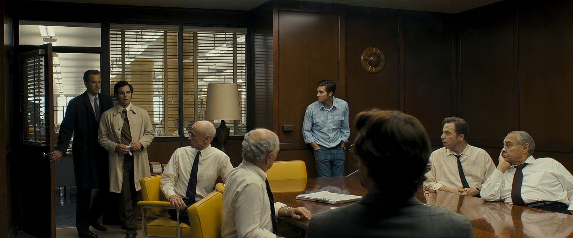
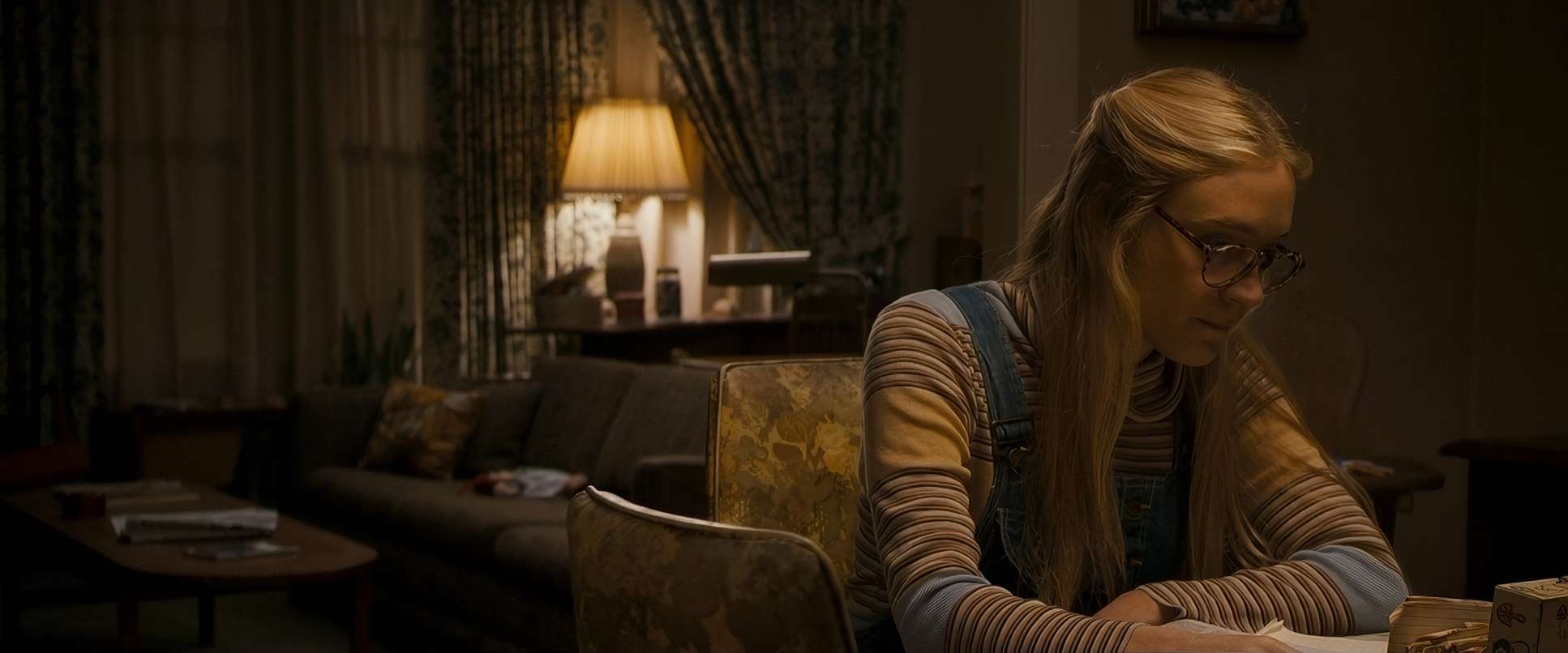
Fincher and Savides use the frame to make the characters look small, trapped, and utterly overwhelmed. There is so much architectural framing putting characters in doorways or behind partitions that suggests they are being squeezed by the very systems meant to protect them.
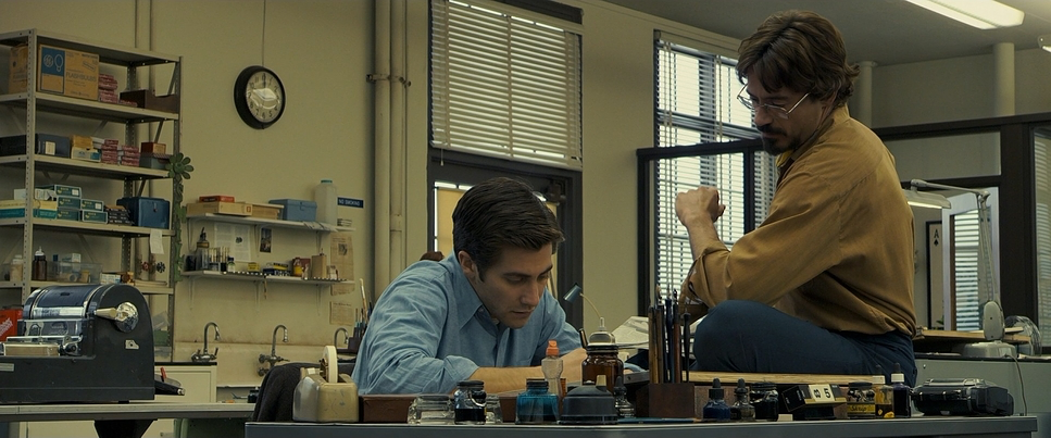
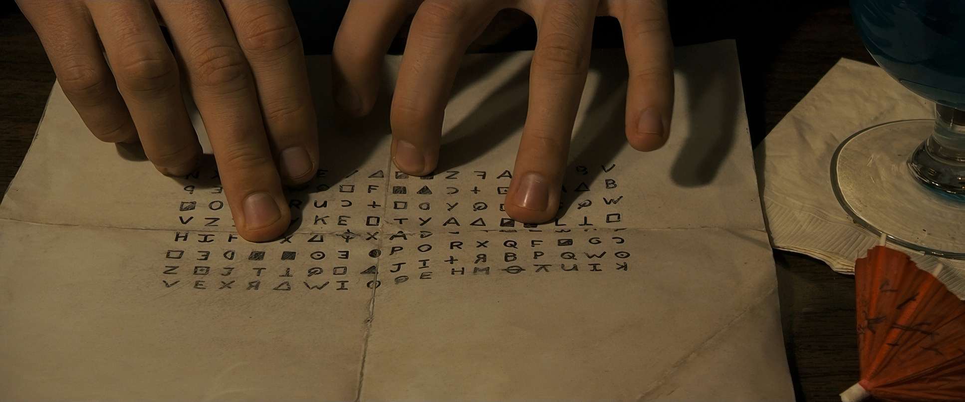
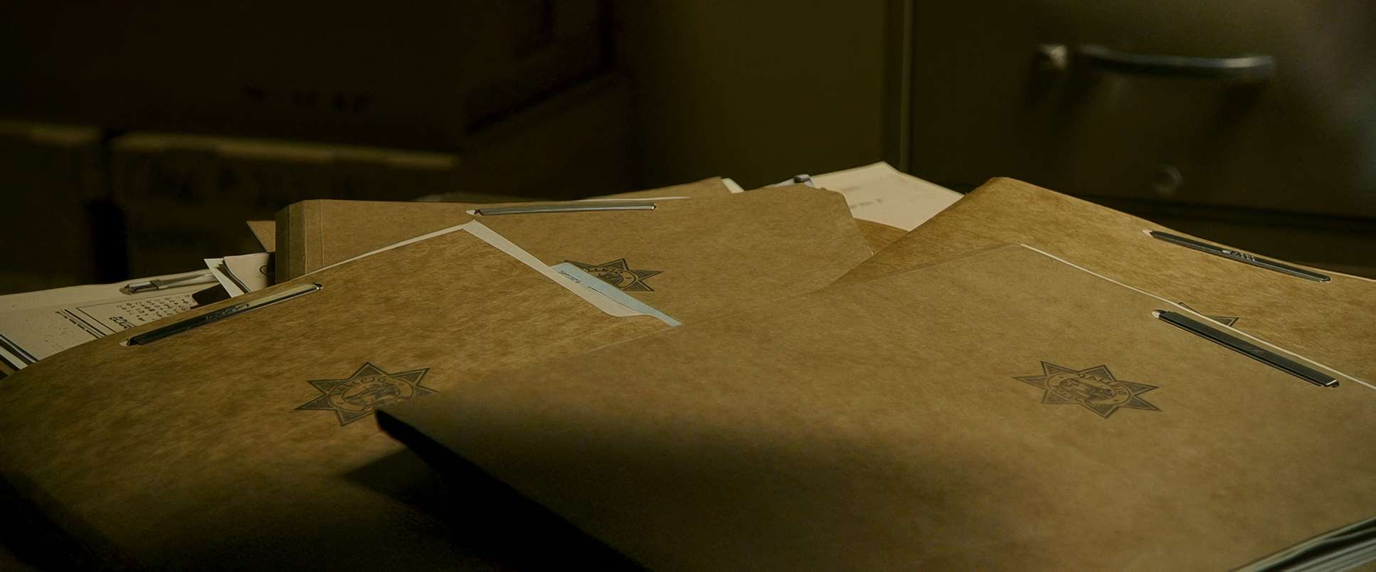
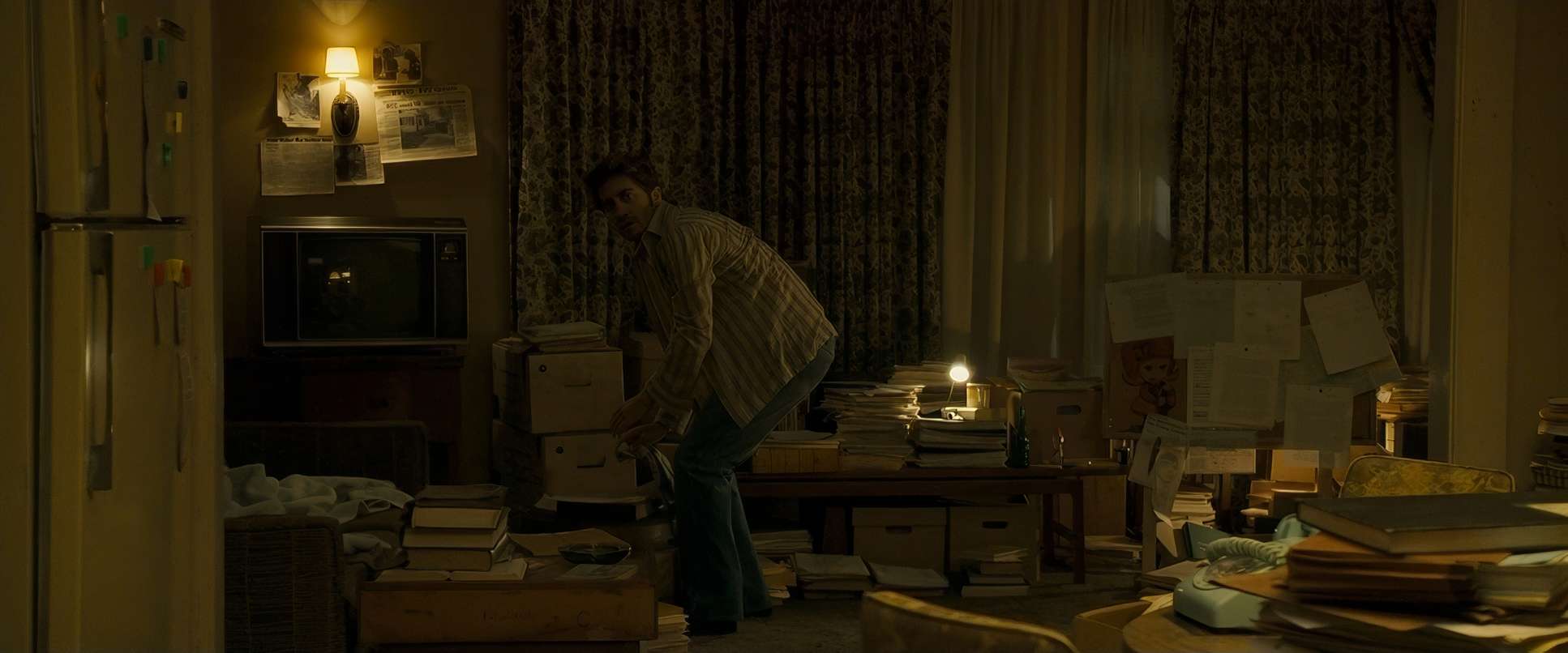
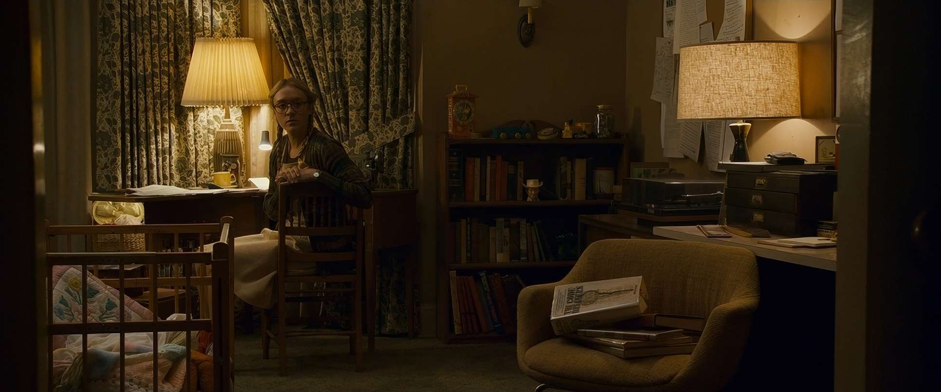
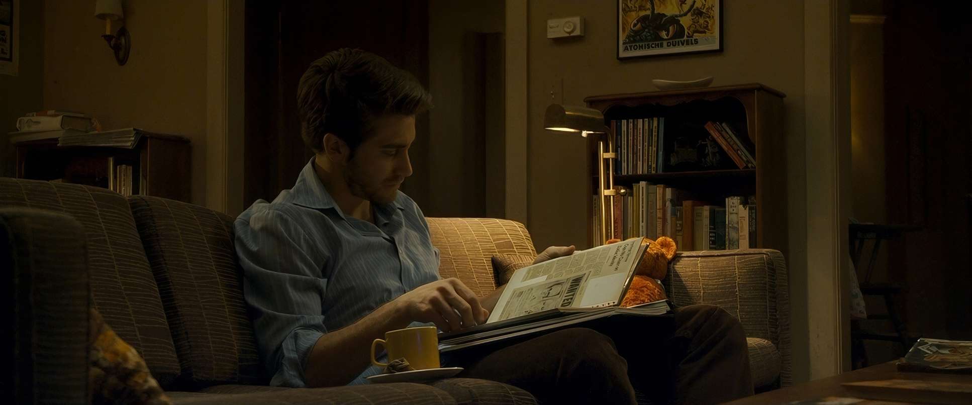
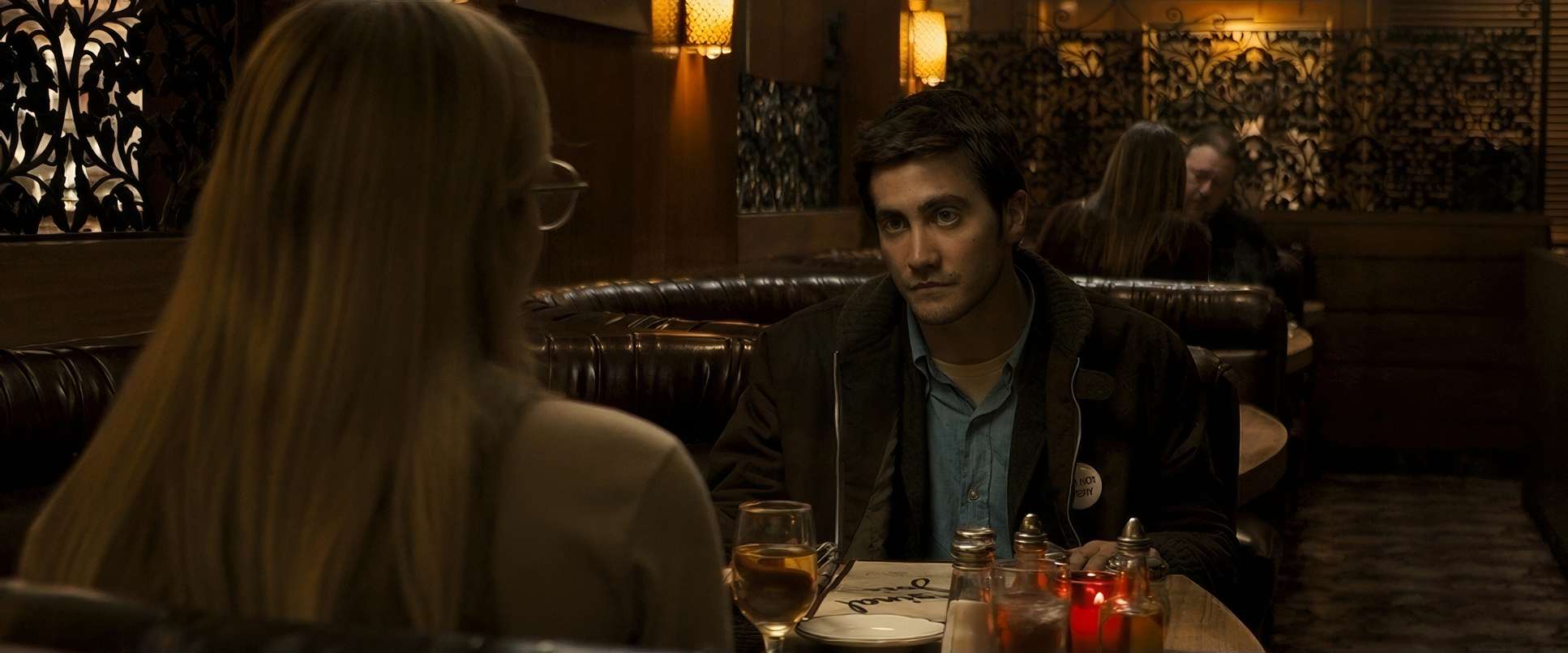
The depth of field is also incredibly intentional. They stack the frames with “clutter” stacks of files, maps, coffee cups to create a layered visual tapestry. As a viewer, your eye starts scanning the background for details, just like the protagonists. By the time we get to the later stages of the investigation, the compositions become more geometric and clinical. Those long, empty library corridors or the cold police stations feel like a maze with no exit. It’s a visual way of saying: “The answer is right here, but you’ll never find it.”
Lighting Style
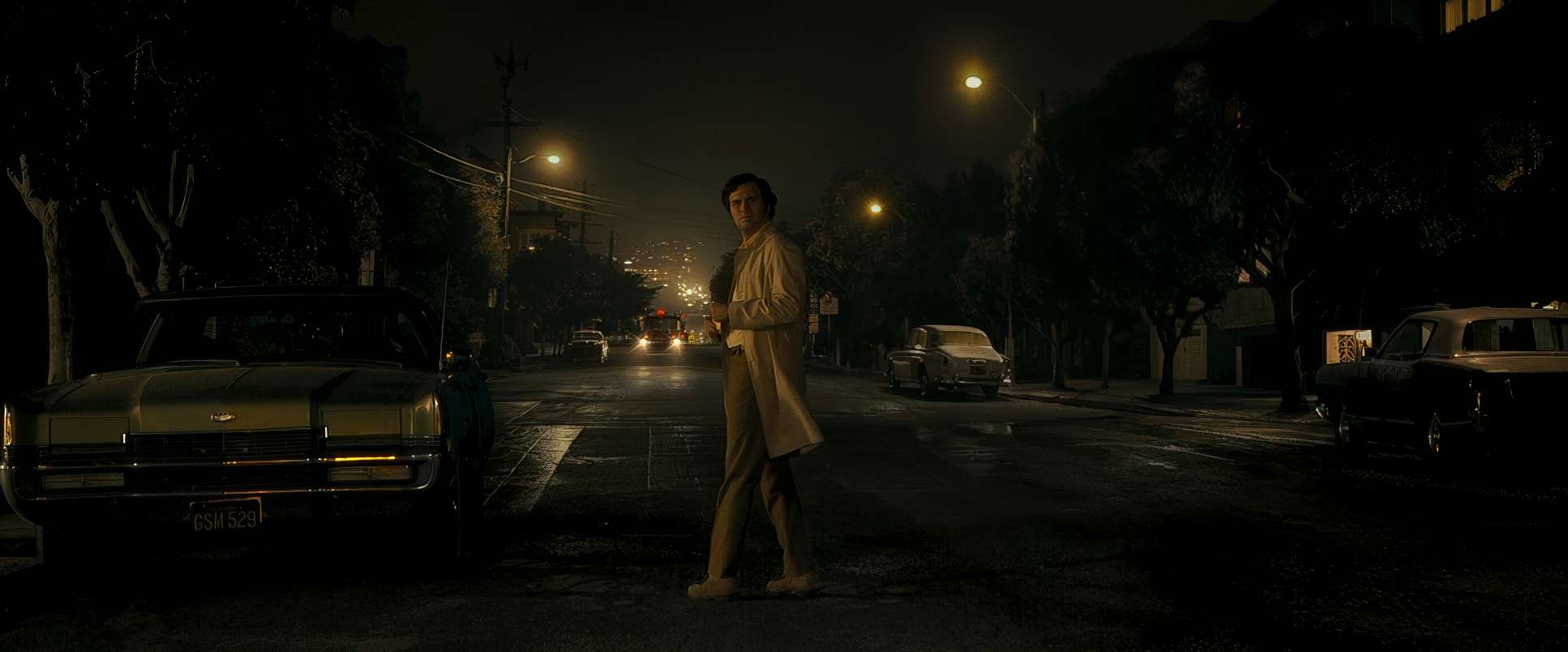
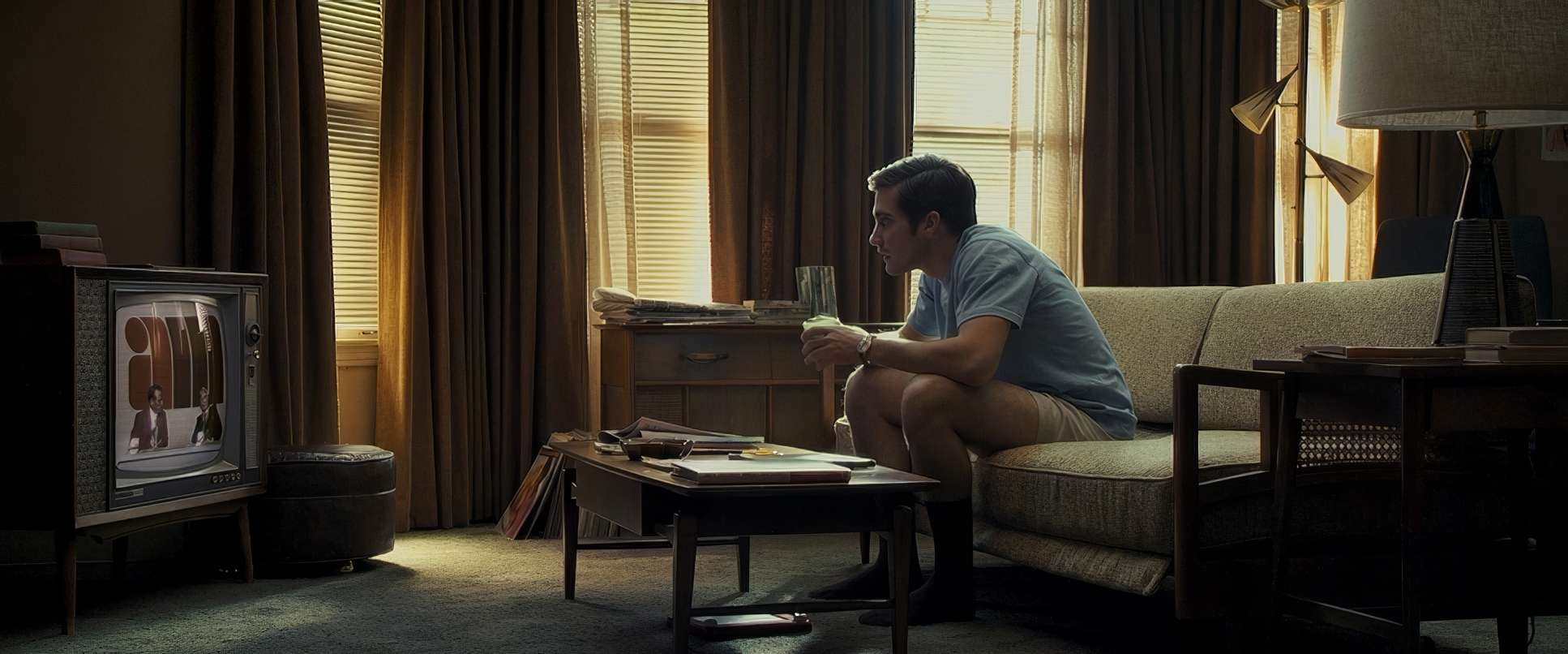
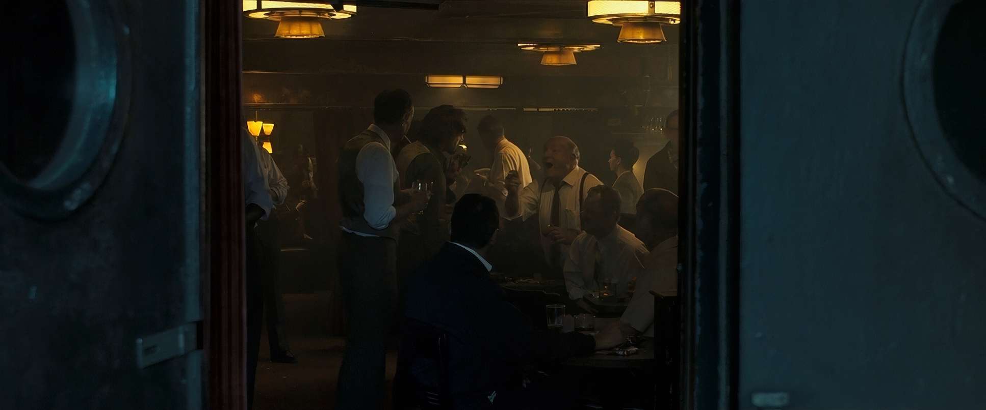
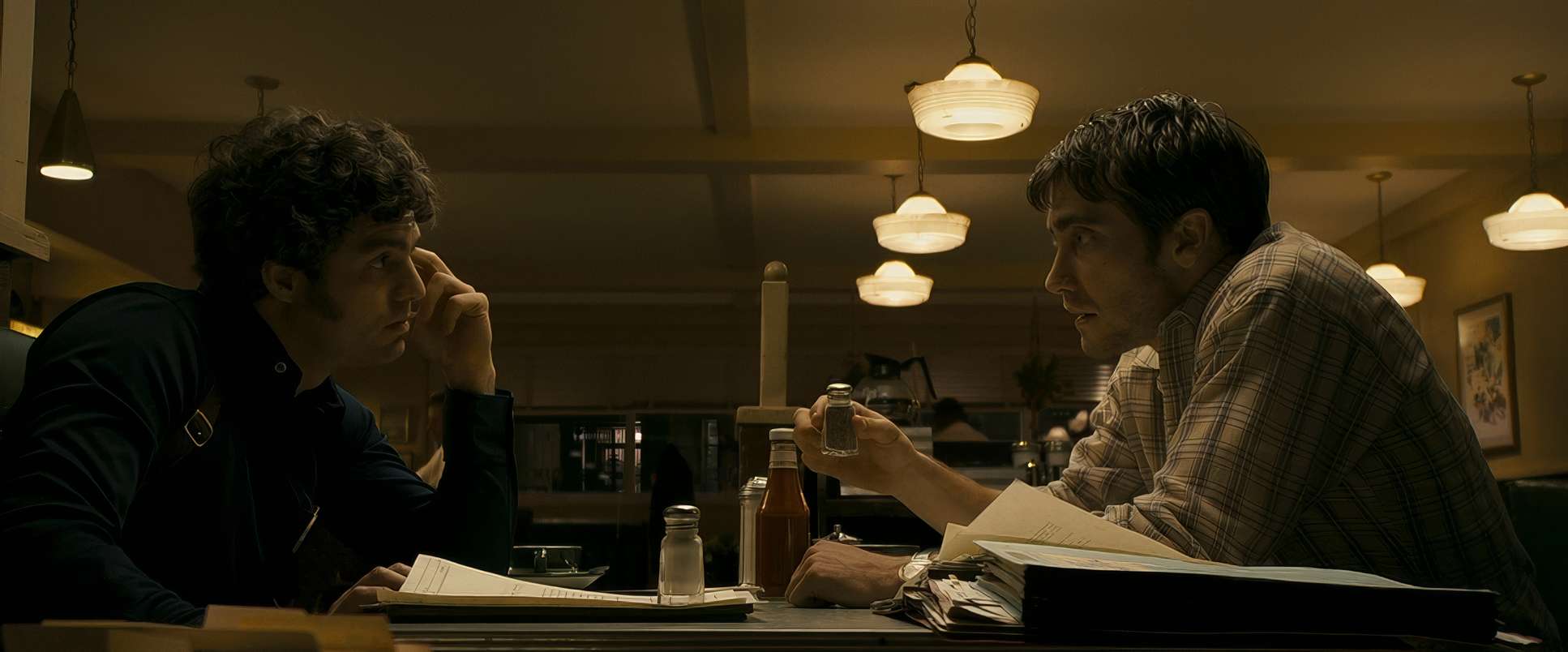
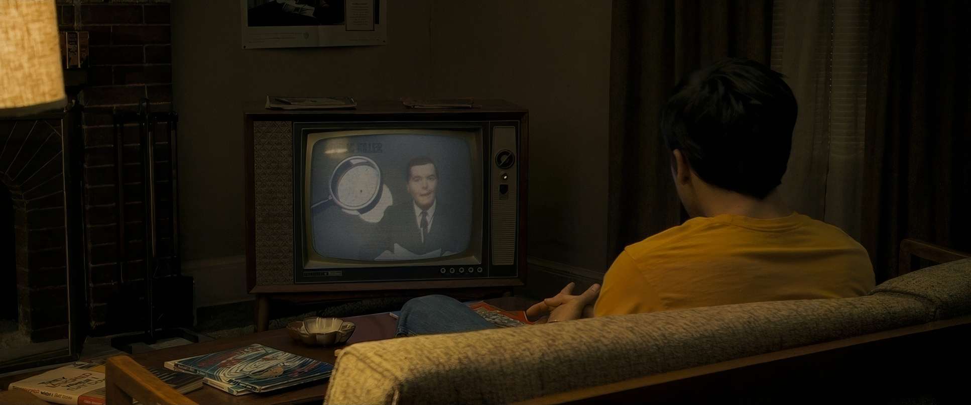
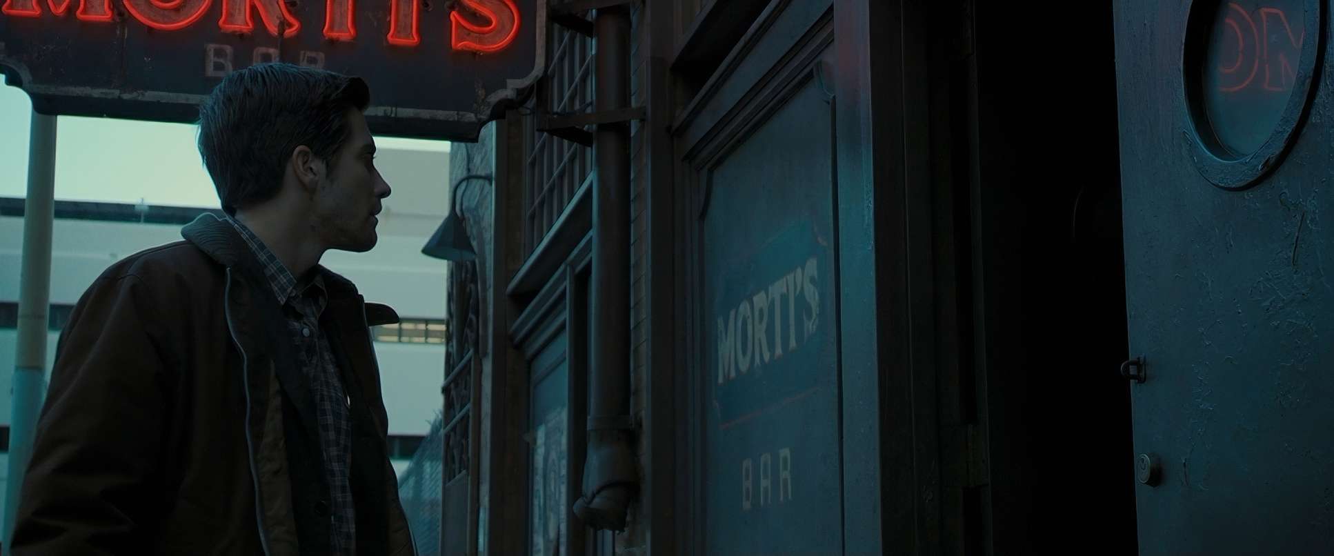
Savides’ lighting here is a masterclass in “motivated realism,” but with a sharp, unsettling edge. He leaned heavily into practicals and ambient light, which gives the film that authentic 70s grit without it feeling like a “period piece” parody.
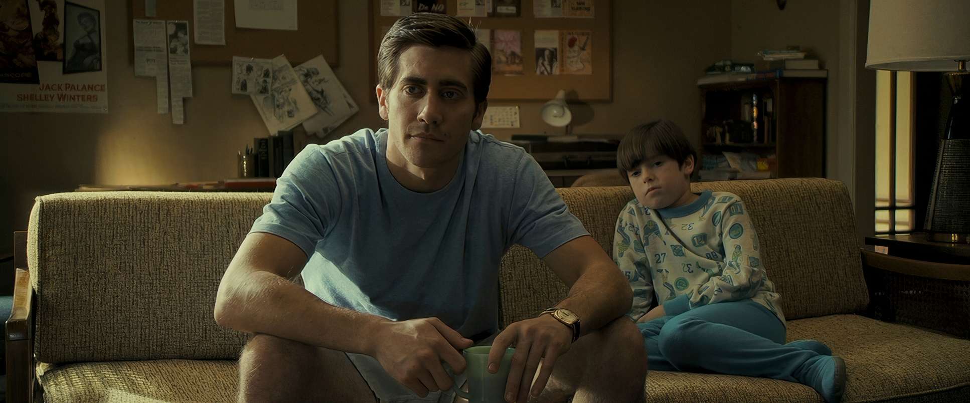
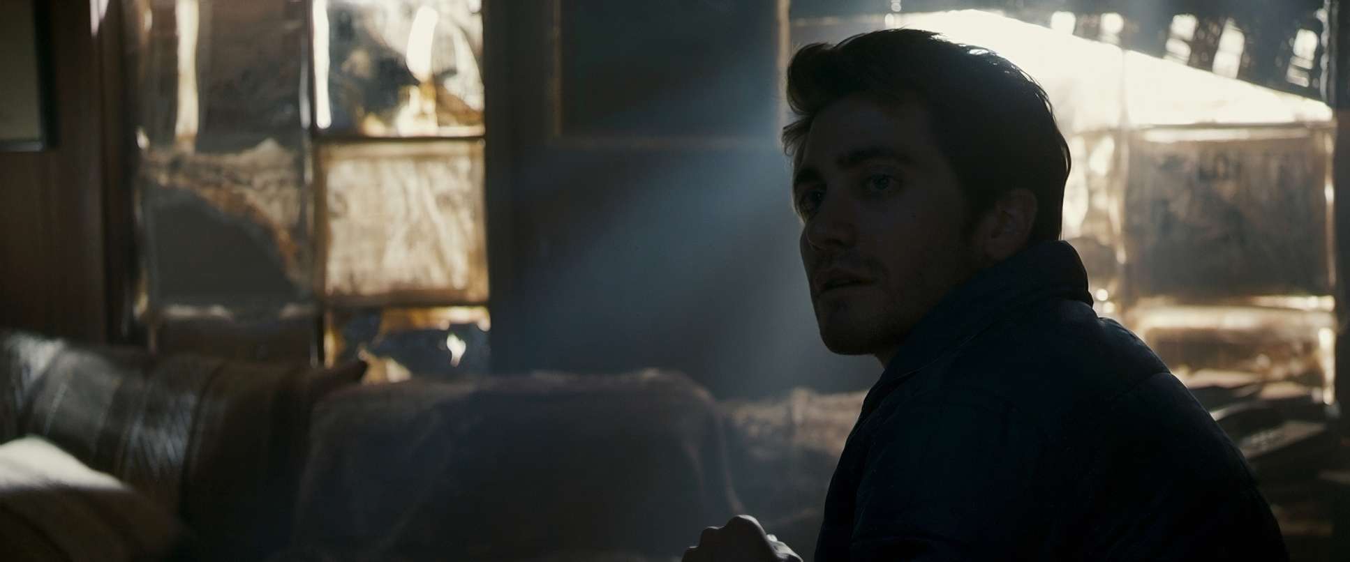
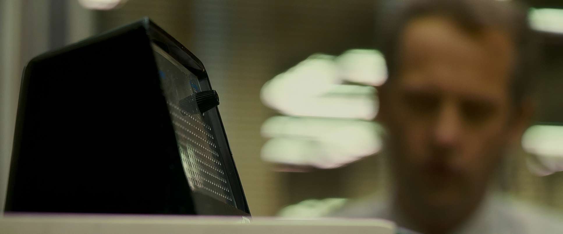
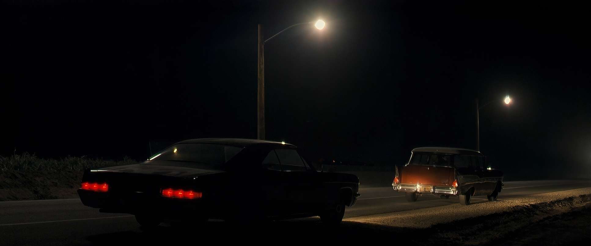
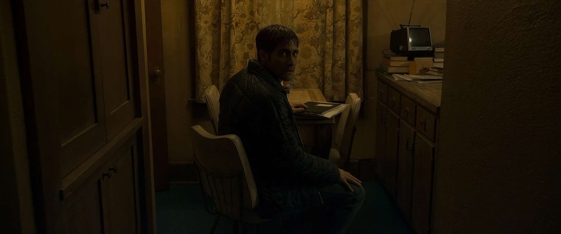
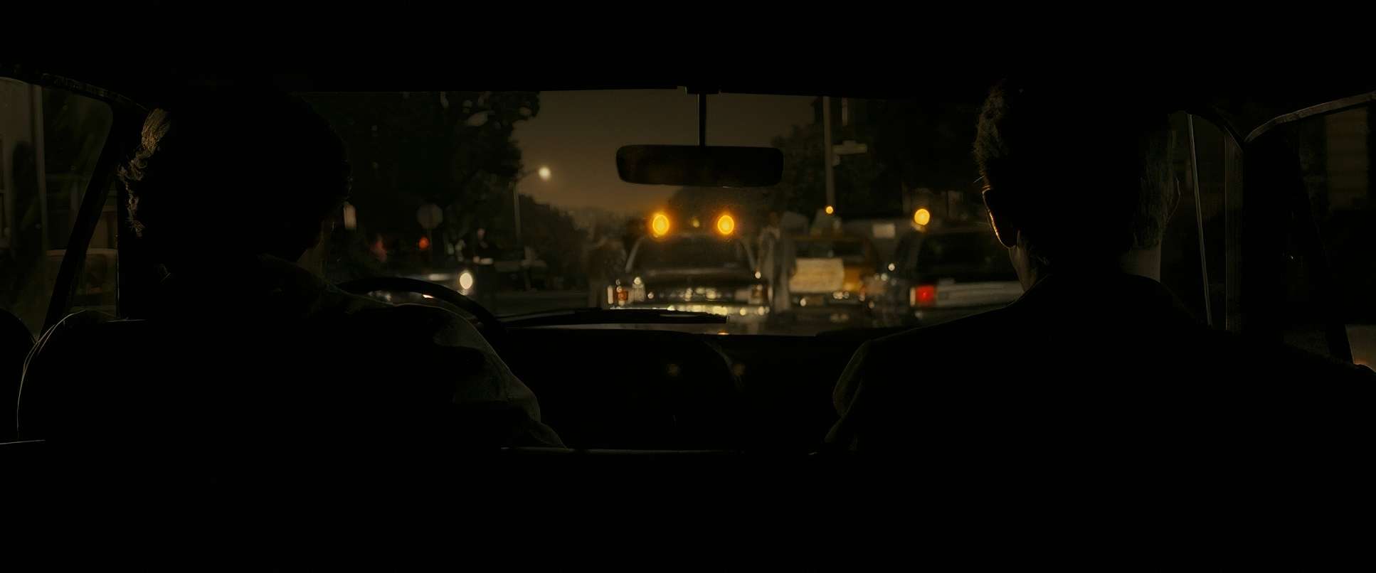
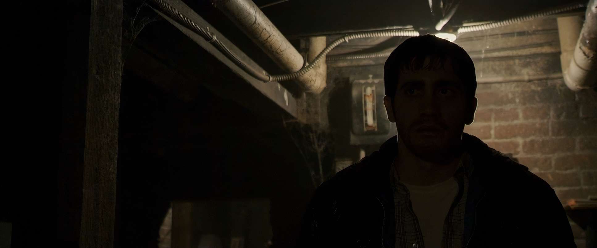
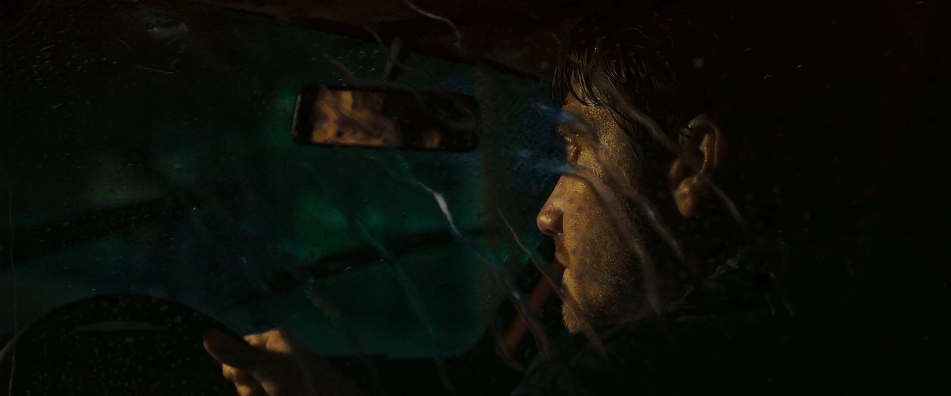
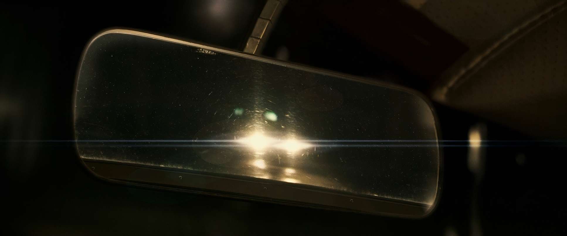
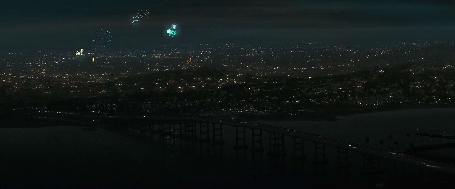
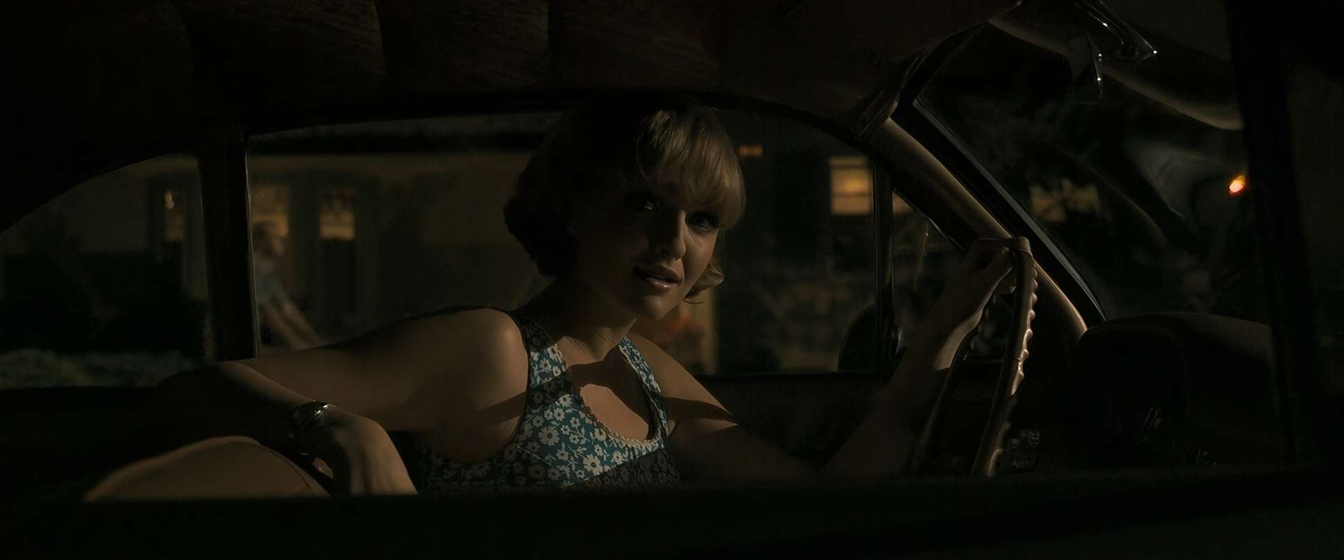
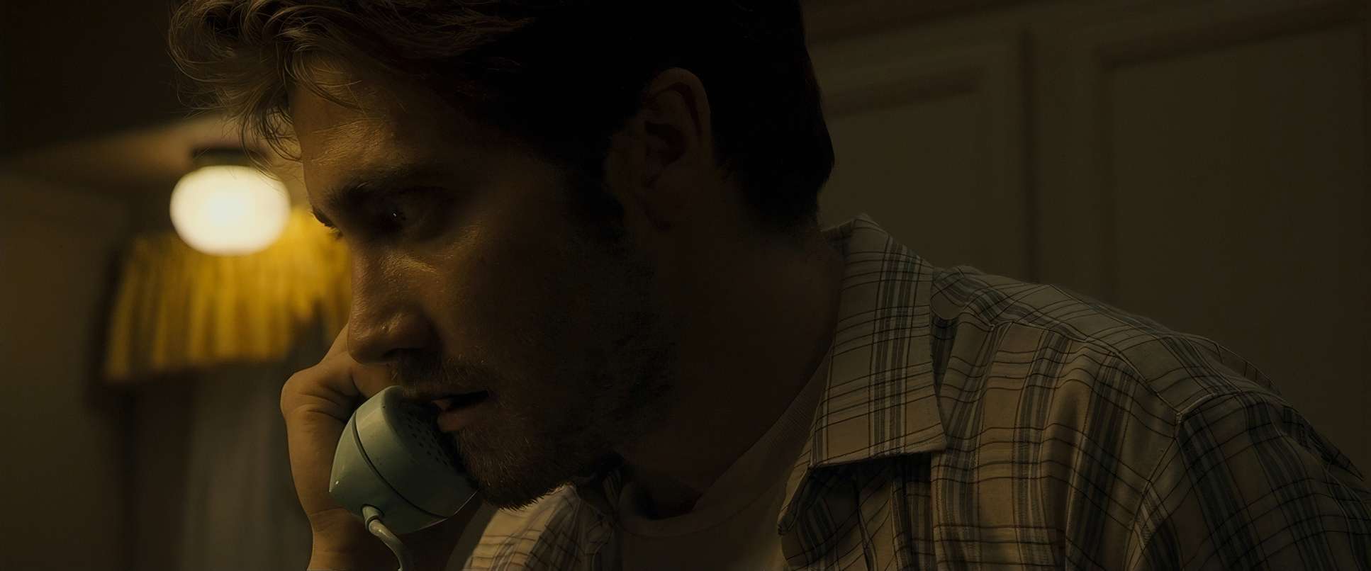
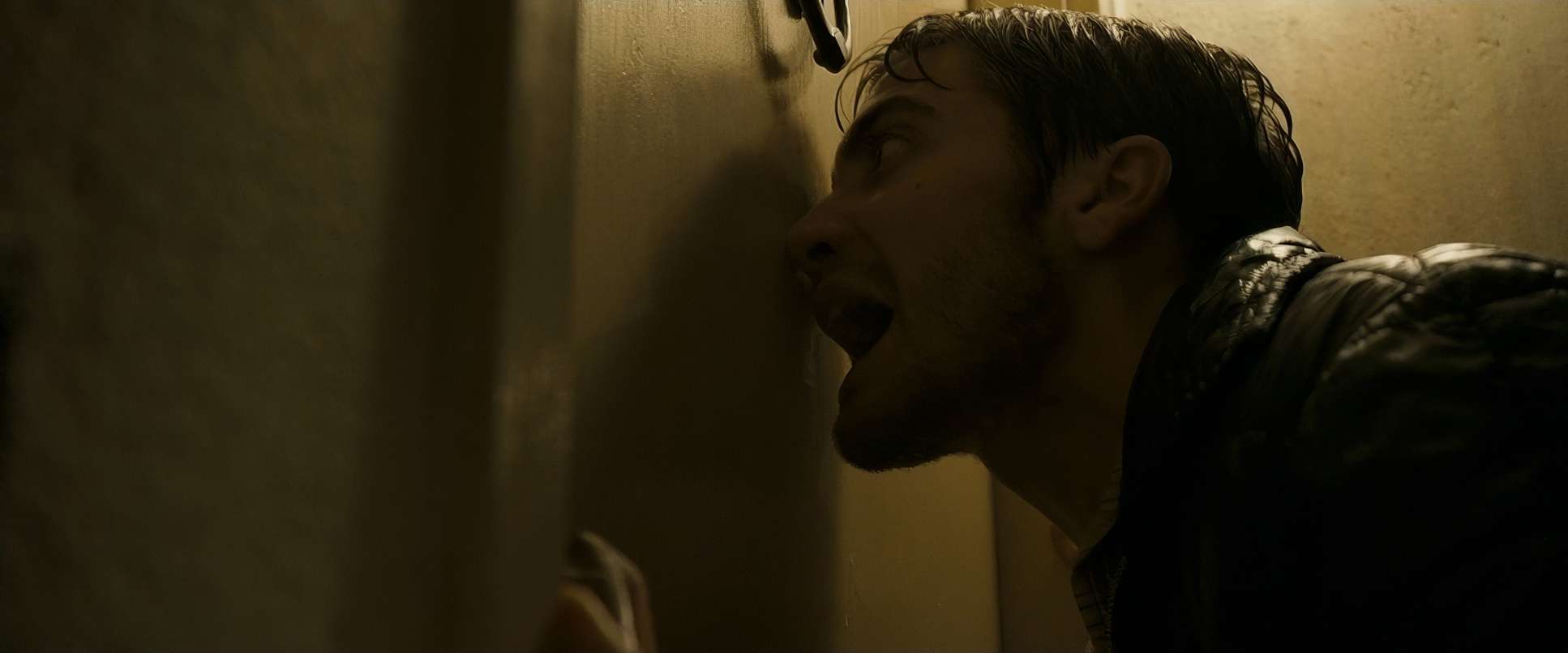
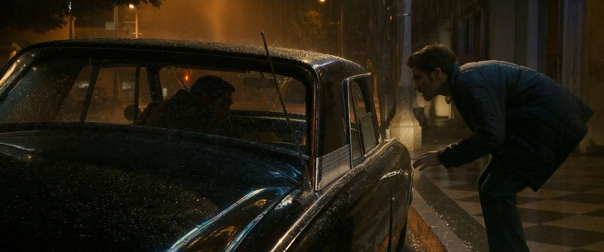
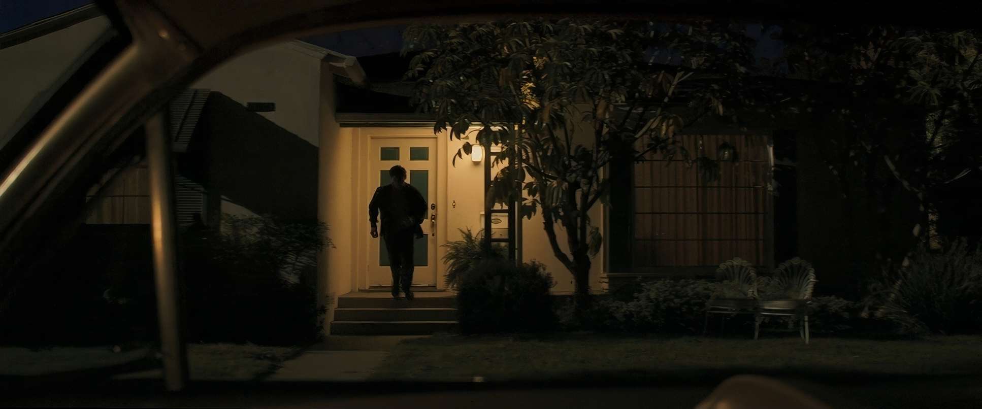
The night sequences are where it really shines or rather, where it doesn’t. The taxi driver scene is a perfect example: the lighting is driven by the flickering streetlights outside the cab, creating these pockets of deep shadow that hide the Zodiac’s face. As a colorist, I really appreciate that they weren’t afraid to let the blacks fall off. They didn’t try to “fill” everything; they let the darkness be a narrative tool. The daytime scenes have this sterile, fluorescent quality that feels like a hospital clean, but completely devoid of warmth.
Lensing and Blocking
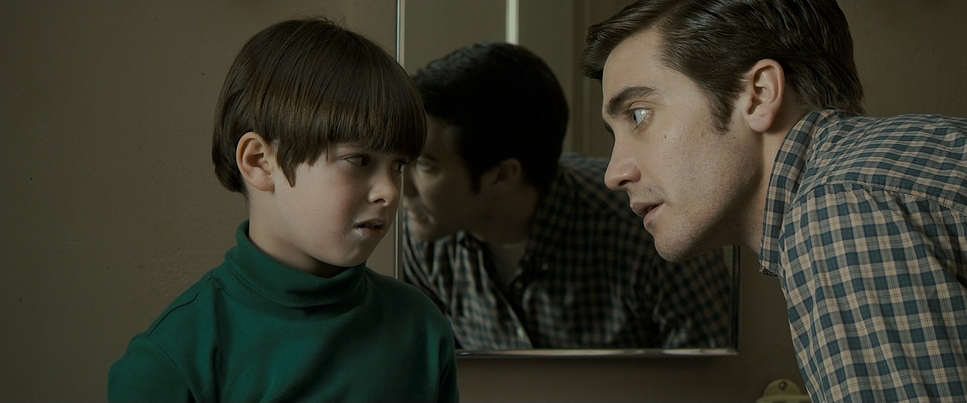
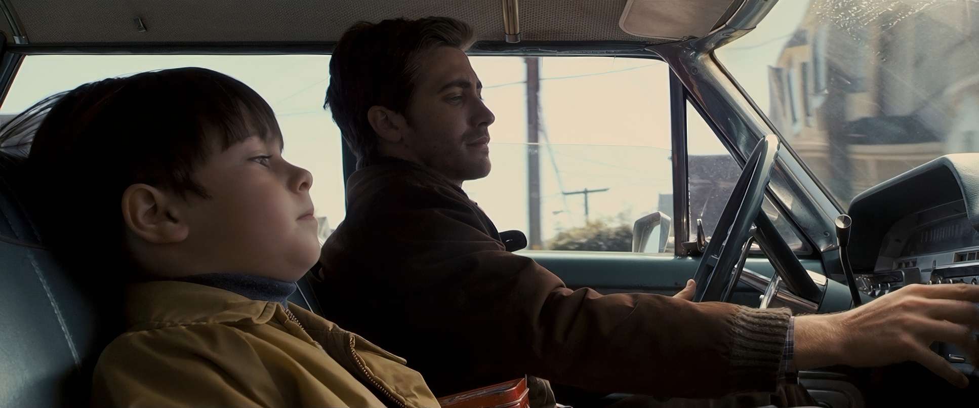
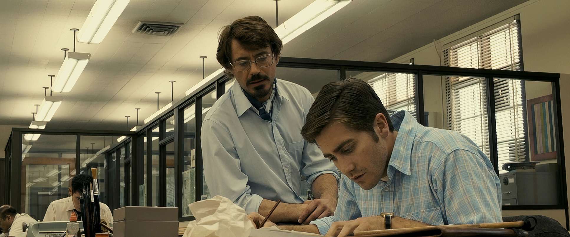
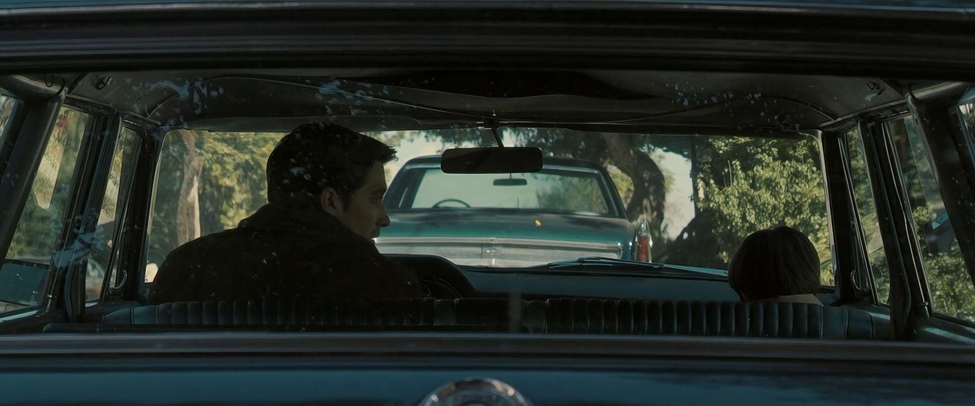
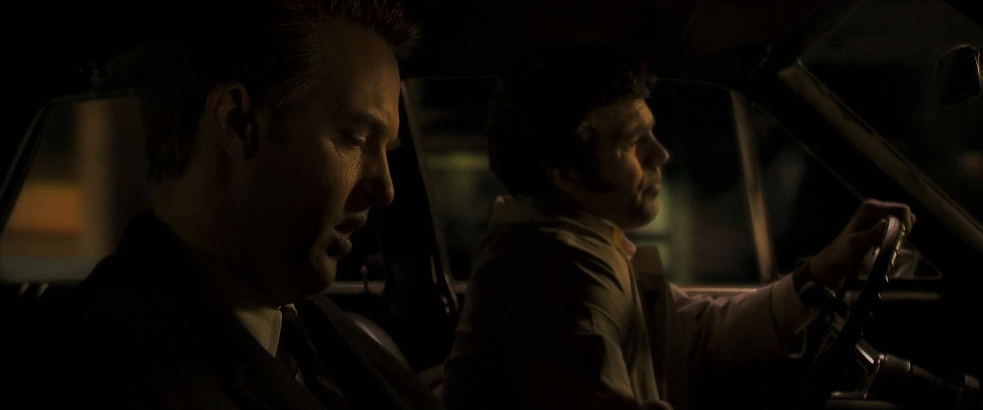
The choice of glass here is all about perspective. They often used wider lenses to show the characters swallowed up by their environments, which keeps everything in sharp focus and forces us to scrutinize every inch of the frame.
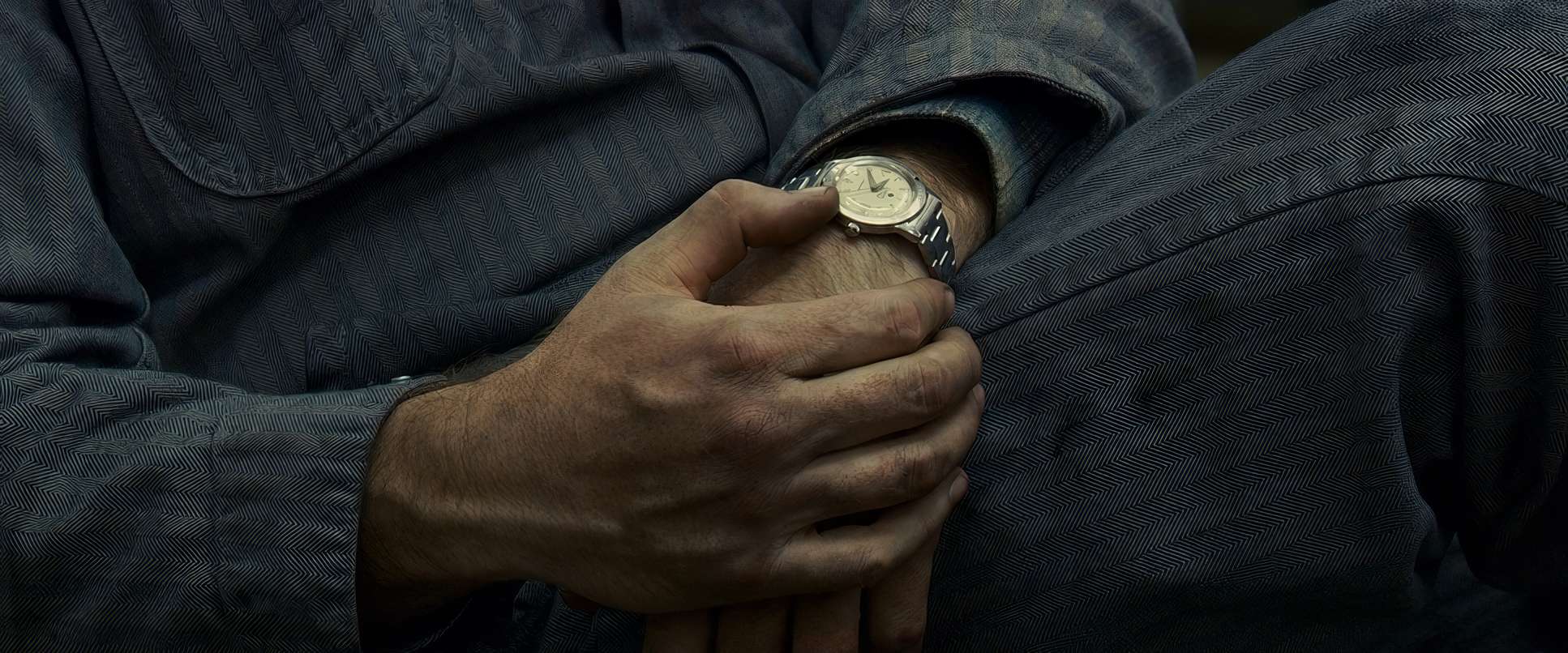
But when the obsession takes over, the lenses get tighter. The space compresses, and we’re shoved right into the characters’ faces. The blocking is just as precise. Look at the scene where Graysmith finally confronts Arthur Leigh Allen in the hardware store. The way they are positioned, the distance between them, and that heavy silence it’s all choreographed to create a peak of tension without a single drop of blood being spilled. It’s pure psychological warfare through placement.
Color Grading Approach
This is my favorite part to talk about. Zodiac was one of the first big features to go digital with the Viper FilmStream, and you can see how that digital precision allowed Fincher and colorist Stephen Nakamura to really sculpt the image in post.
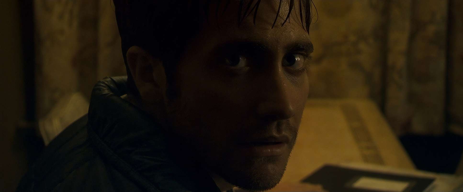
The palette is famously desaturated heavy on the “tobacco” yellows, sickly greens, and cold blues. It’s not “pretty,” but it is atmospheric. I love how they handled the tonal sculpting. The blacks are rich and inky, but they kept just enough detail so the image never feels “crushed” or muddy. The highlight roll-off is beautiful; it mimics the gentle fall-off of 35mm print stock, which helps hide the “digital” origins of the footage. And the skin tones? They kept them natural but slightly sallow, ensuring the human element feels as exhausted and drained as the case itself.
Technical Aspects & Tools
Zodiac (2007)
Thompson Viper FilmStream • Zeiss DigiPrimes • 2.39:1 Anamorphic
| Genre | Crime, Drama, Mystery, Thriller, Detective, Police, Serial Killer, Conspiracy, True Crime, Neo-Noir |
| Director | David Fincher |
| Cinematographer | Harris Savides |
| Production Designer | Donald Graham Burt |
| Costume Designer | Casey Storm |
| Editor | Angus Wall |
| Colorist | Stephen Nakamura |
| Time Period | 1970s |
| Color | Warm, Desaturated |
| Aspect Ratio | 2.39 – Anamorphic |
| Format | Film – 35mm |
| Lighting | Soft light, Side light |
| Lighting Type | Artificial light |
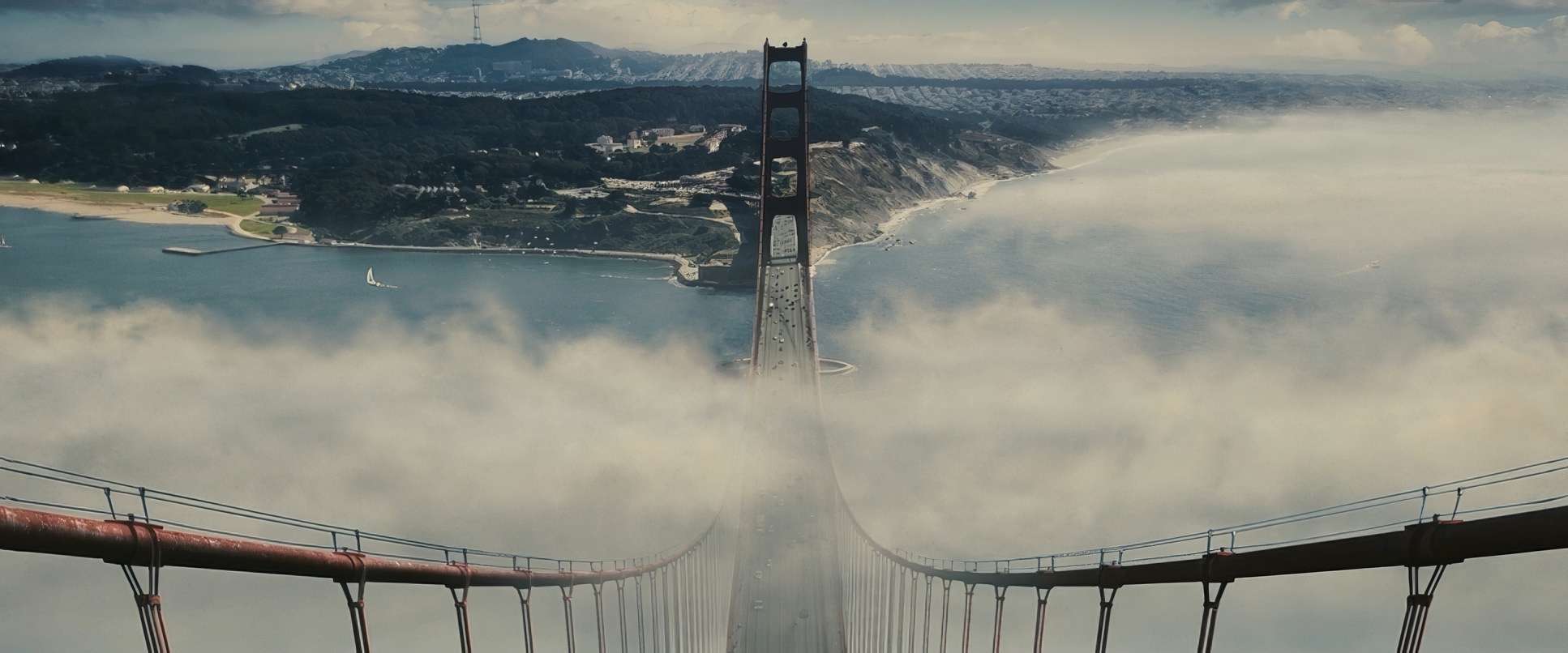
| Story Location | California > San Francisco |
| Filming Location | USA > California |
| Camera | Thompson Viper FilmStream |
| Lens | Zeiss DigiPrimes |
| Film Stock / Resolution | 2383/3383 Vision |
The tech on Zodiac wasn’t just about using the latest toys; it was about achieving a level of control that film couldn’t always offer. Shooting on the Viper gave them an edge in low-light situations, which was vital for those nocturnal San Francisco streets.
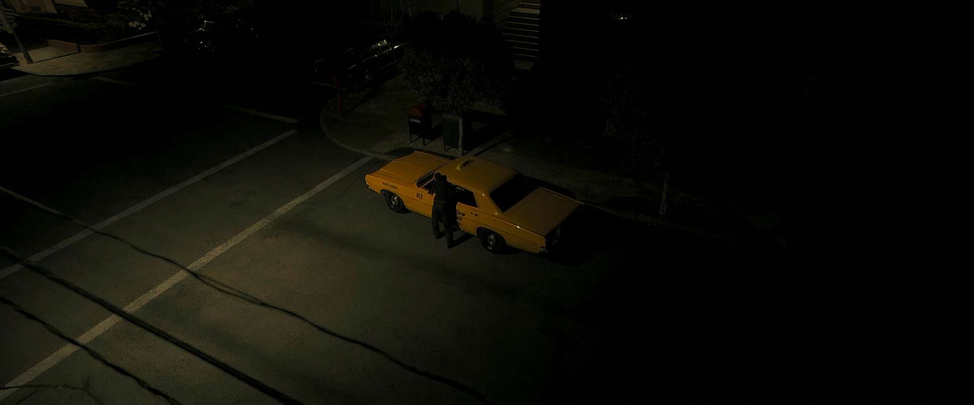
Even the stuff that looks “real” is often a technical feat. The taxi murder was shot on a soundstage with blue screens because they couldn’t get the permit to shoot on the actual corner. But because the lighting and the digital integration were so seamless, you’d never know. Fincher even had the actors speed up their dialogue to fit the massive amount of information into a three-hour runtime. Every technical decision from the camera sensor to the speed of a line was geared toward making this feel like a living, breathing historical record.
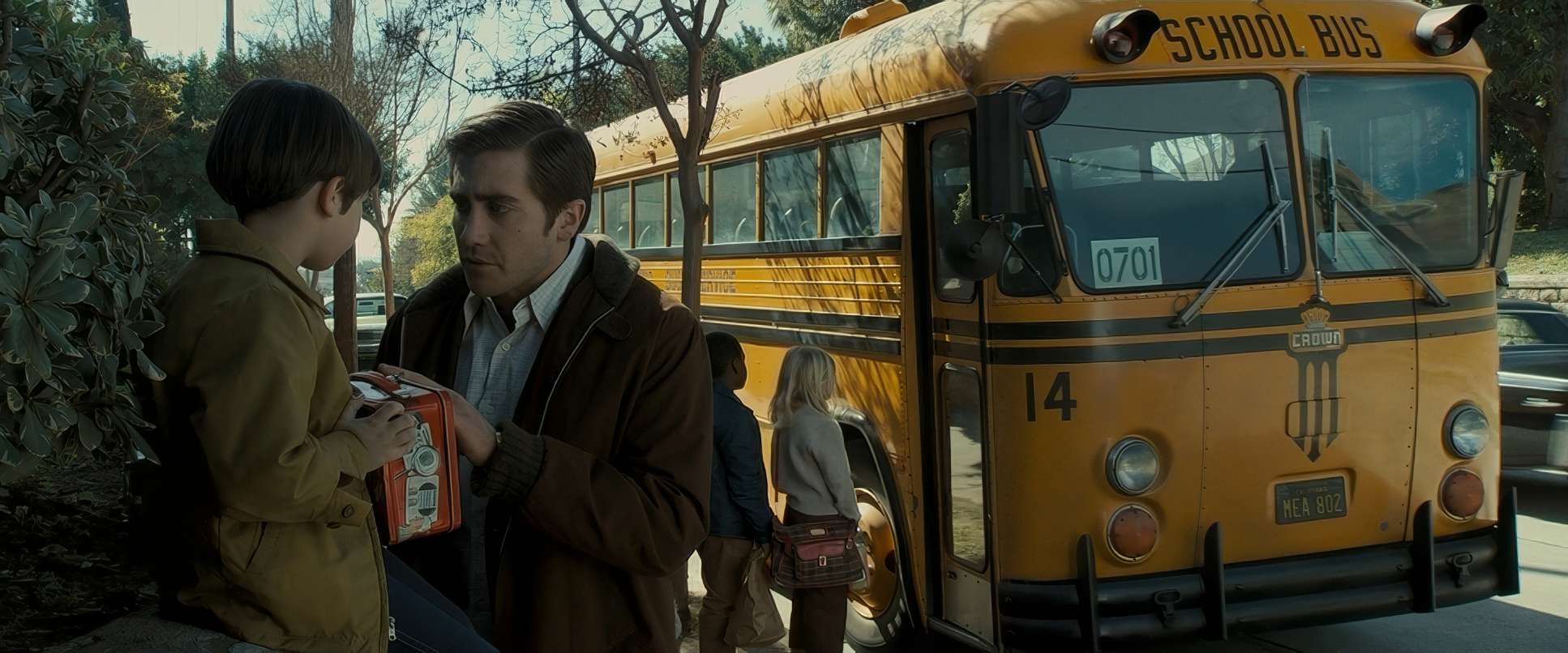
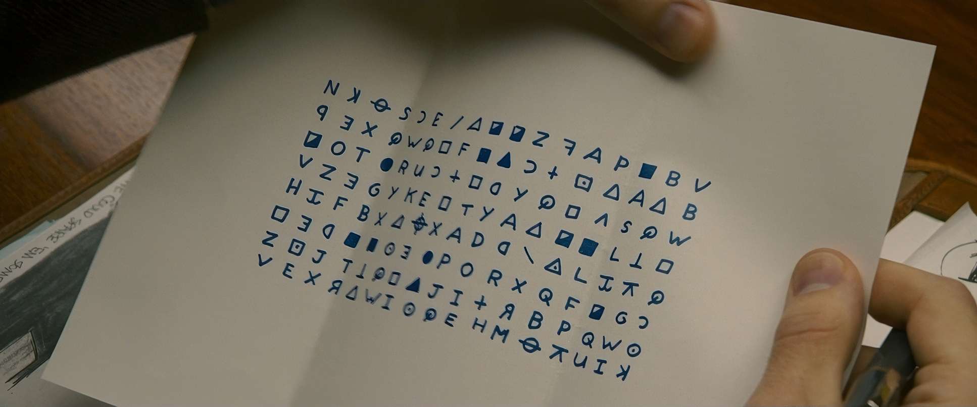
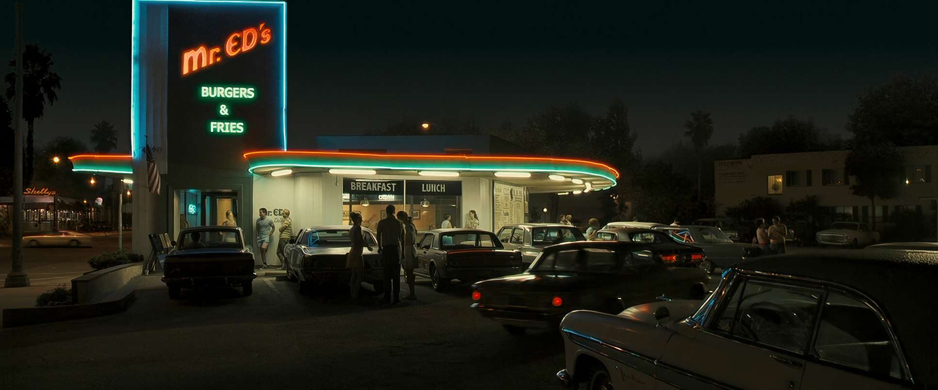
Zodiac (2007) Film Stills
A curated reference archive of cinematography stills from Zodiac (2007). Study the lighting, color grading, and composition.


- Also read: ARGO (2012) – CINEMATOGRAPHY ANALYSIS
- Also read: OCEAN’S ELEVEN (2001) – CINEMATOGRAPHY ANALYSIS
Browse Our Cinematography Analysis Glossary
Explore directors, cinematographers, cameras, lenses, lighting styles, genres, and the visual techniques that shape iconic films.
Explore Glossary →