Ocean’s Eleven (2001) is one of those rare films I can watch on mute and still get a masterclass in visual storytelling. For many, it’s the ultimate “vibe” movie, but as someone who spends my life in the grading suite, I see it as a precision-engineered piece of cinematography. It isn’t just about the sharp suits or the Clooney smirk; it’s a meticulously crafted experience where the light and color do as much heavy lifting as the dialogue.
From my vantage point behind the monitors, this film is a study in how to make “cool” a physical property of the image. Let’s look at how Steven Soderbergh (and his “friend” Peter Andrews) pulled it off.
About the Cinematographer

The most telling thing about the film’s visual DNA is that Steven Soderbergh served as his own cinematographer under the pseudonym “Peter Andrews.” This isn’t just a quirky credit it’s the reason the movie feels so cohesive. When the director is the one actually pulling the stops and framing the Super 35 gates, you lose the “translation layer” between vision and execution.
I see a specific kind of confidence in his lensing that mirrors Danny Ocean’s own swagger. Soderbergh’s “fast-play” style is legendary, but it’s not just about speed; it’s about an intimate understanding of narrative rhythm. He isn’t just “covering” a scene; he’s sculpting it. By eliminating the gap between the director’s chair and the viewfinder, he created a direct line from conceptualization to the screen, resulting in a film that feels remarkably self-assured and lean.
Inspiration Behind the Cinematography

You can feel the ghost of the 1960 Rat Pack original in every frame, but this isn’t a stale remake it’s a modern translation. Soderbergh took that retro-cinematic language and cleaned it up for the 21st century. It’s like taking a vintage single malt and serving it in a sleek, frozen glass; the soul is old, but the presentation is razor-sharp.
The goal here was “motivated glamour.” He tapped into the thrillers of the 60s the elegant moves, the deliberate compositions but he ditched the stagey-ness. He captured that elusive “coolness factor” by making the world of high-stakes gambling look inviting rather than dangerous. For me, the satisfaction is in that balance: it feels authentic to the story, never once breaking the immersion or feeling like a “period piece,” despite its heavy 60s soul.
Camera Movements
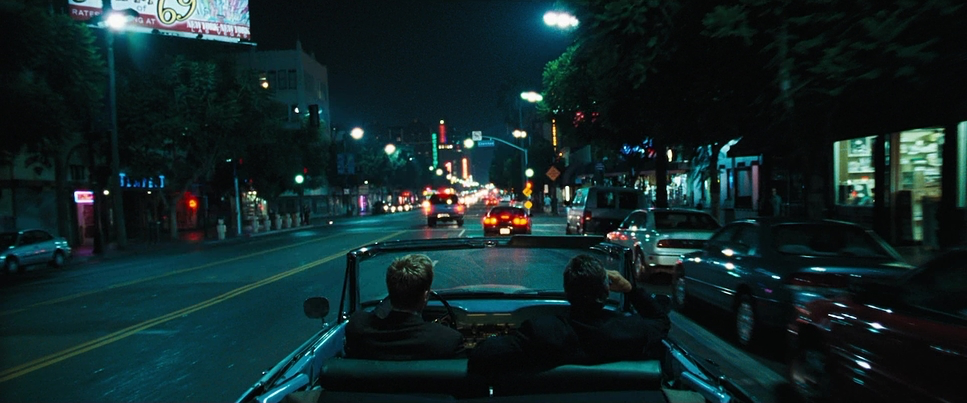
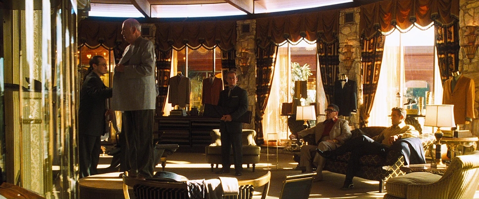
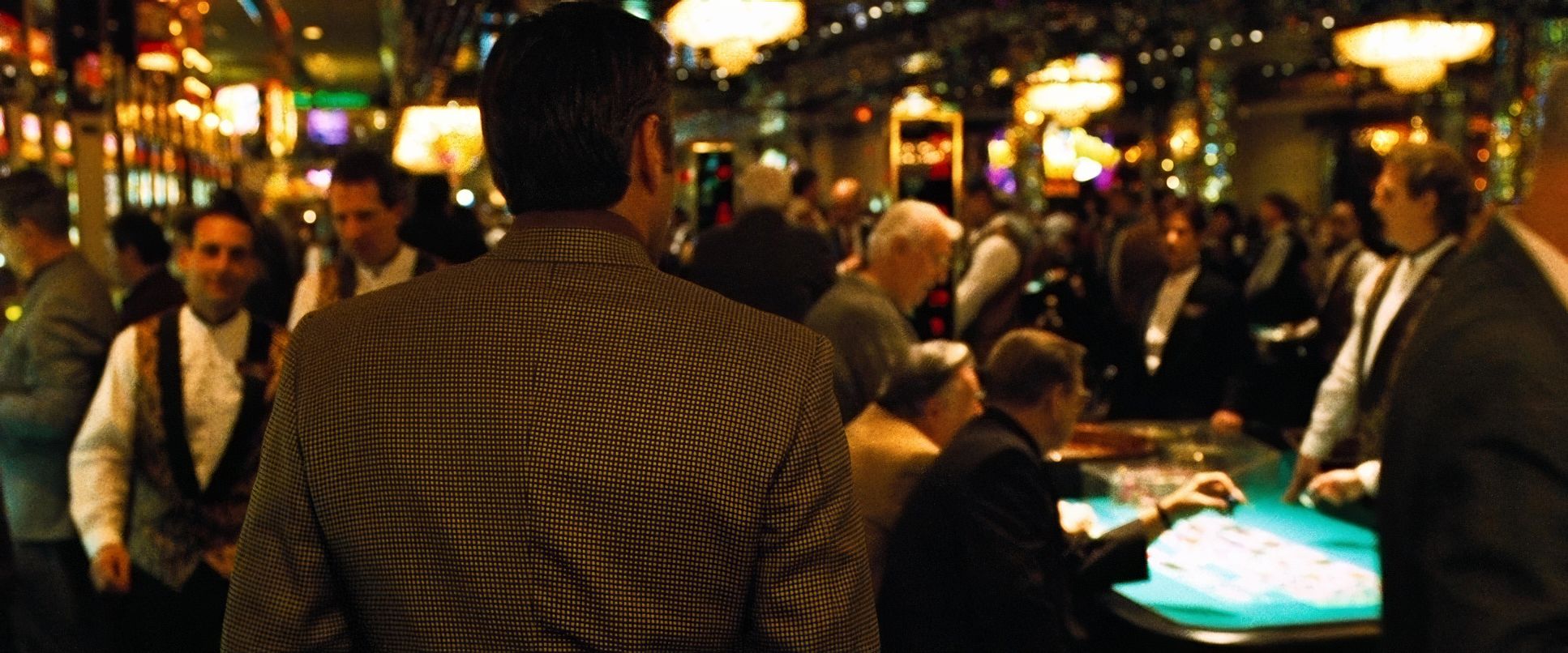
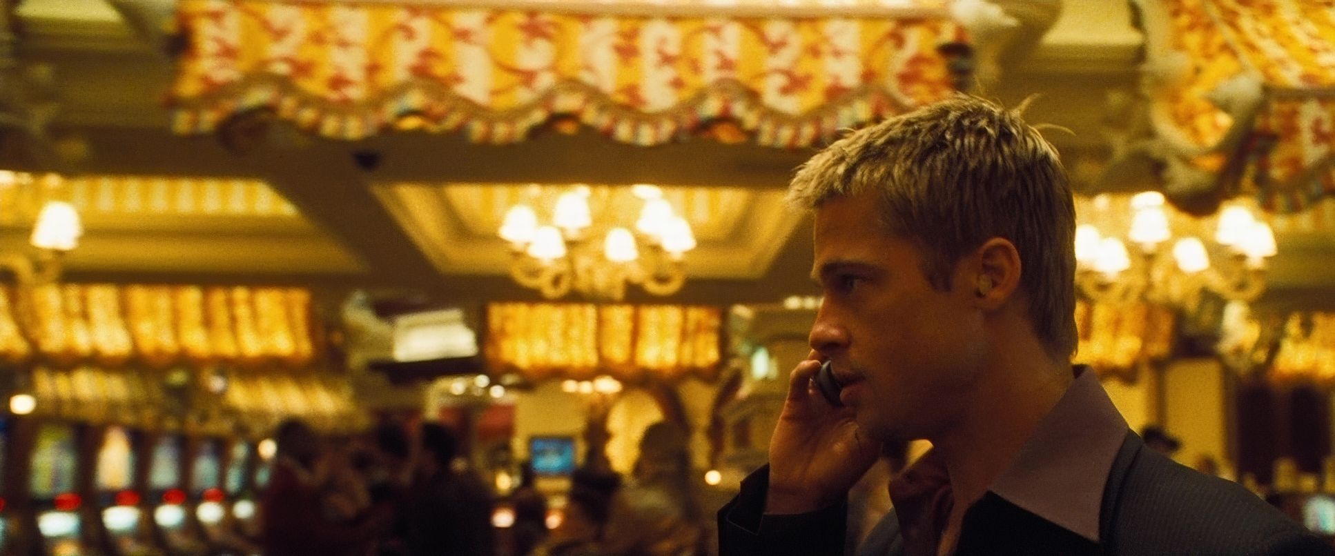
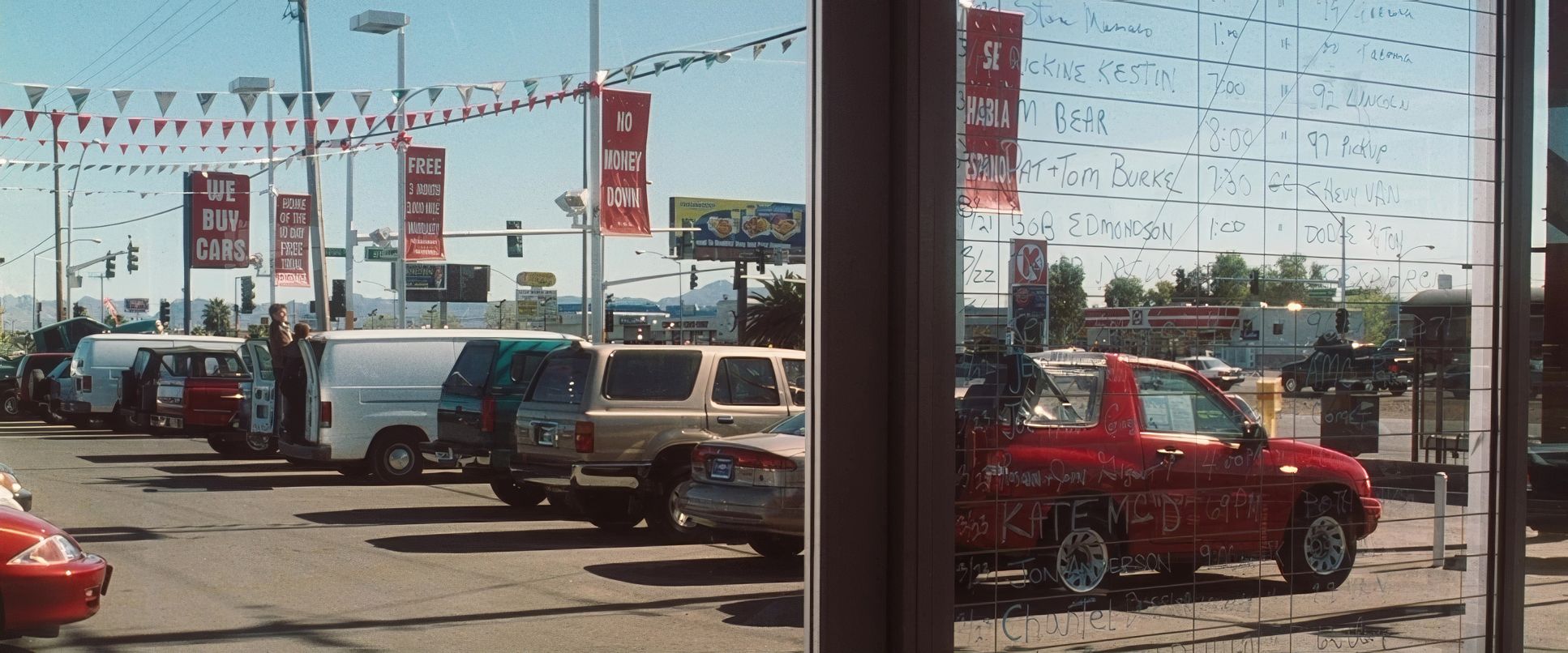
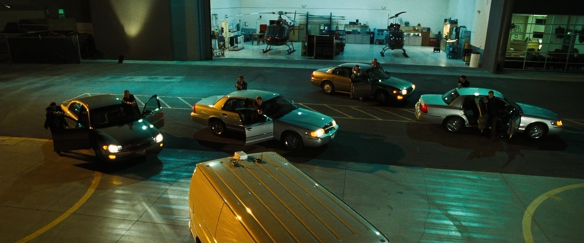
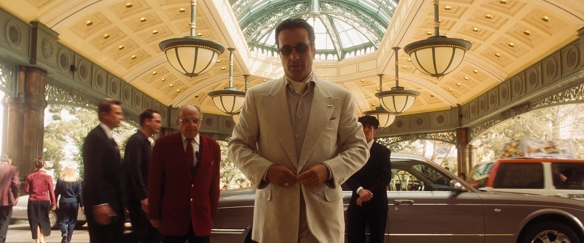
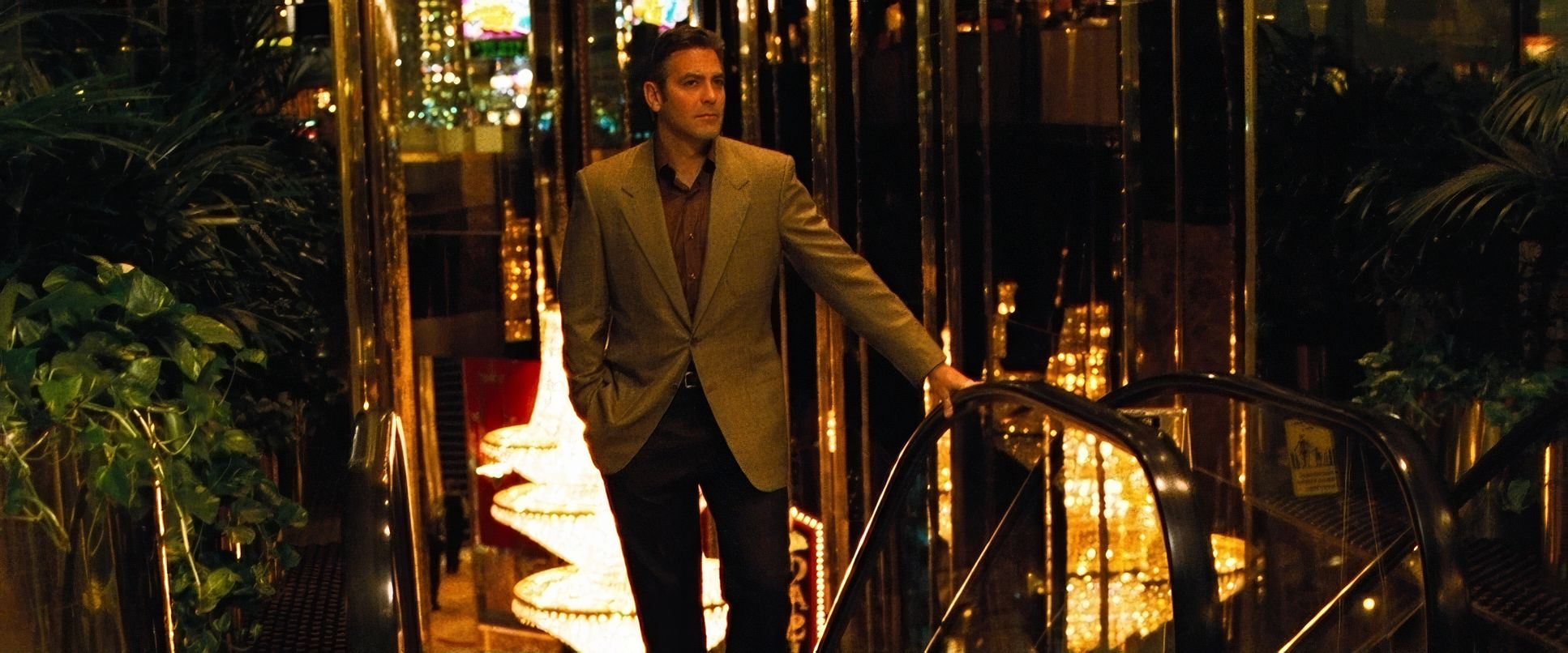
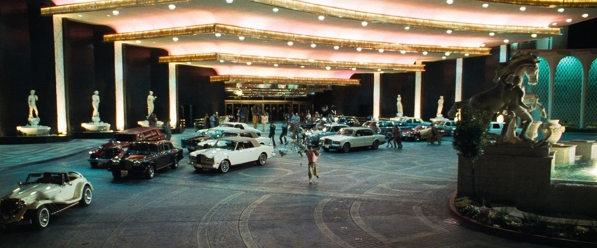
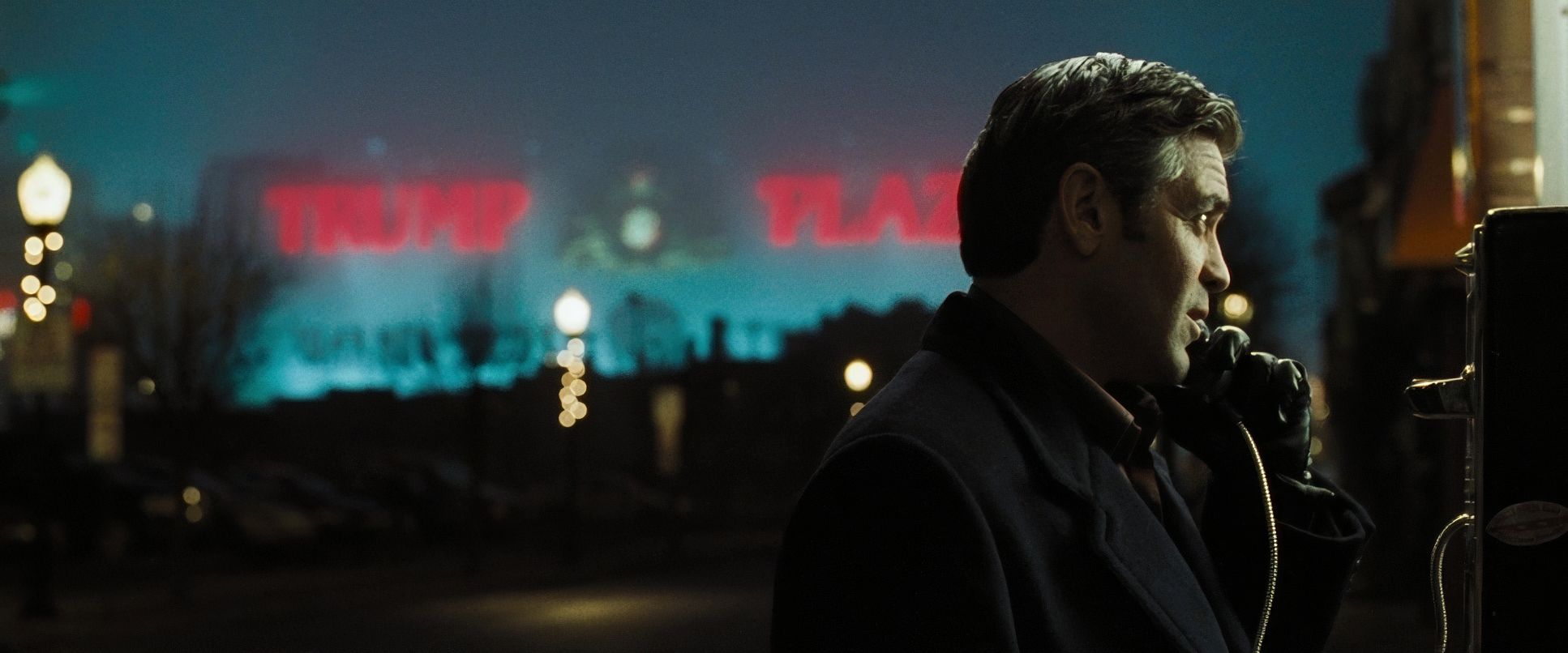
The camera in Ocean’s Eleven moves with a purposeful, controlled kineticism. We aren’t dealing with erratic handheld work here; it’s all about sophisticated dollies and tracking shots that glide through the Bellagio and Trump Plaza like another member of the crew.
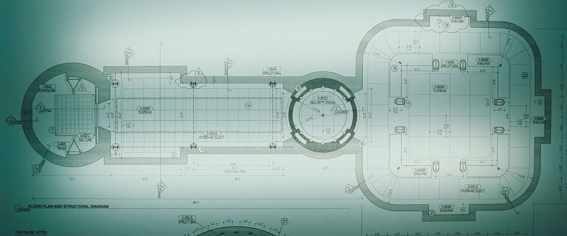
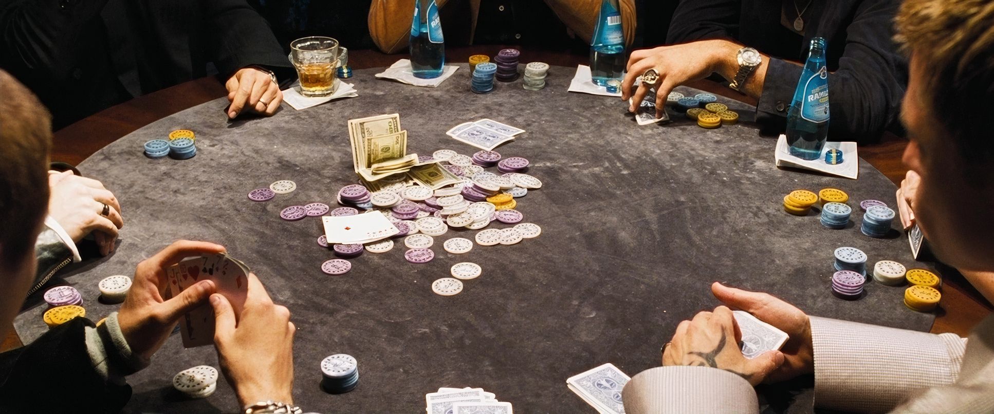
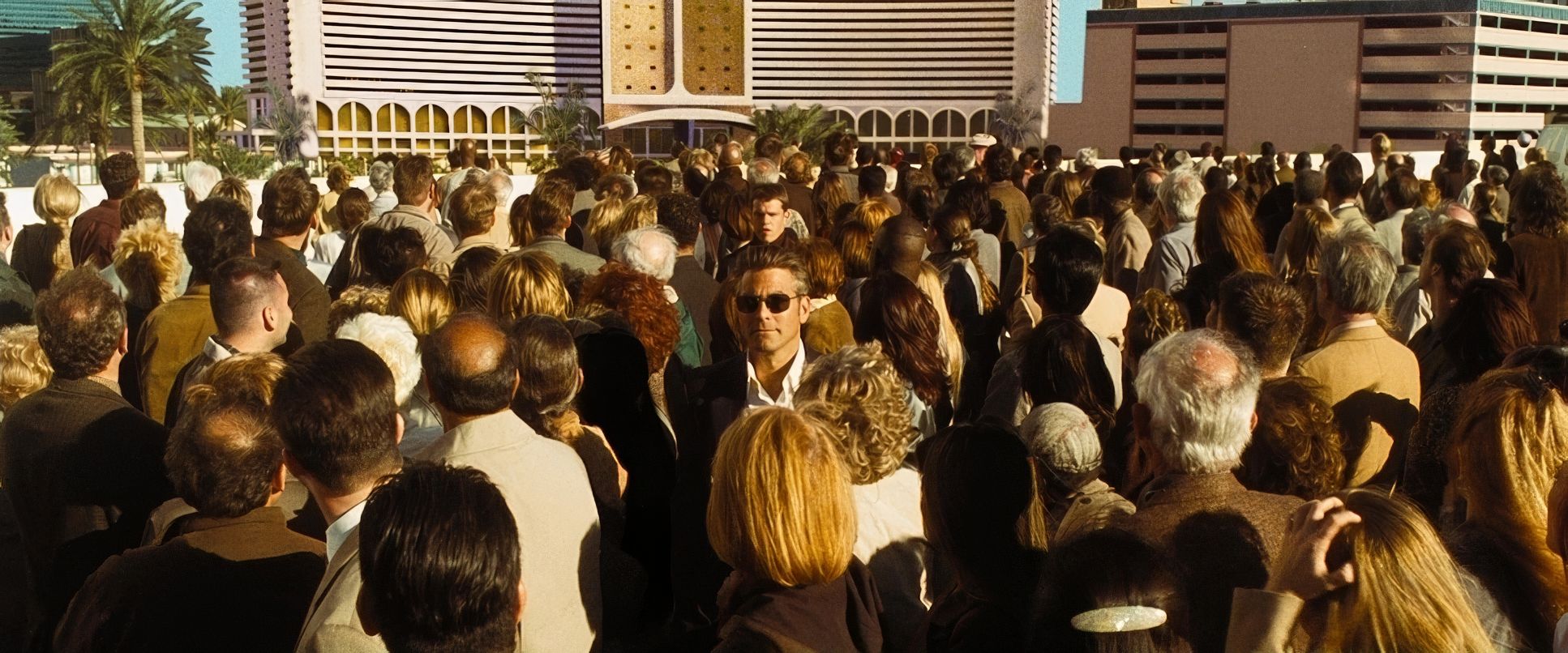
When Danny Ocean walks through the casino floor, the camera tracks with a knowing gaze. It’s an insider’s perspective. Even the expansive aerial shots, which some critics might call excessive, serve a specific purpose: they establish the scale of the “domain” our heroes are about to conquer. It’s about geographical context. Even in the tight poker room at the start, the moves are motivated. Every shift reveals a tell or a reaction, maintaining a sense of dynamic engagement without ever feeling rushed. It’s minimalist, precise, and entirely driven by the heist’s rhythm.
Compositional Choices
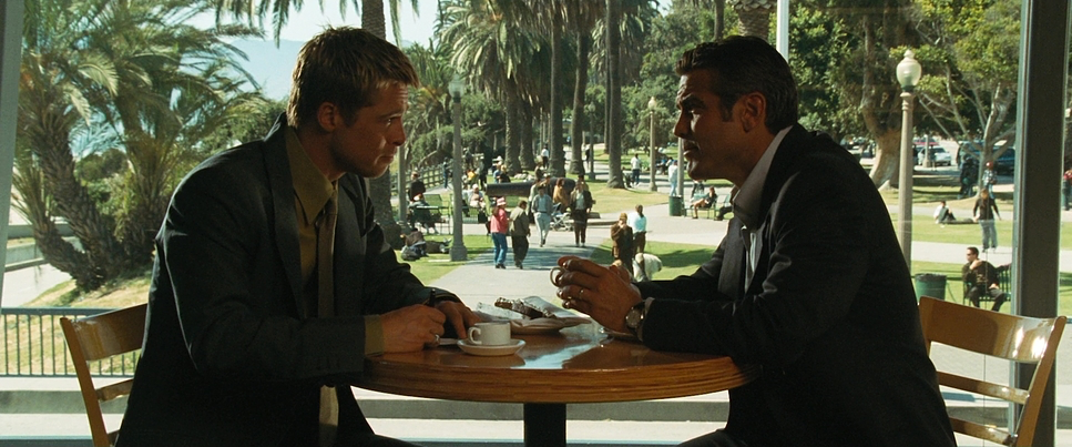
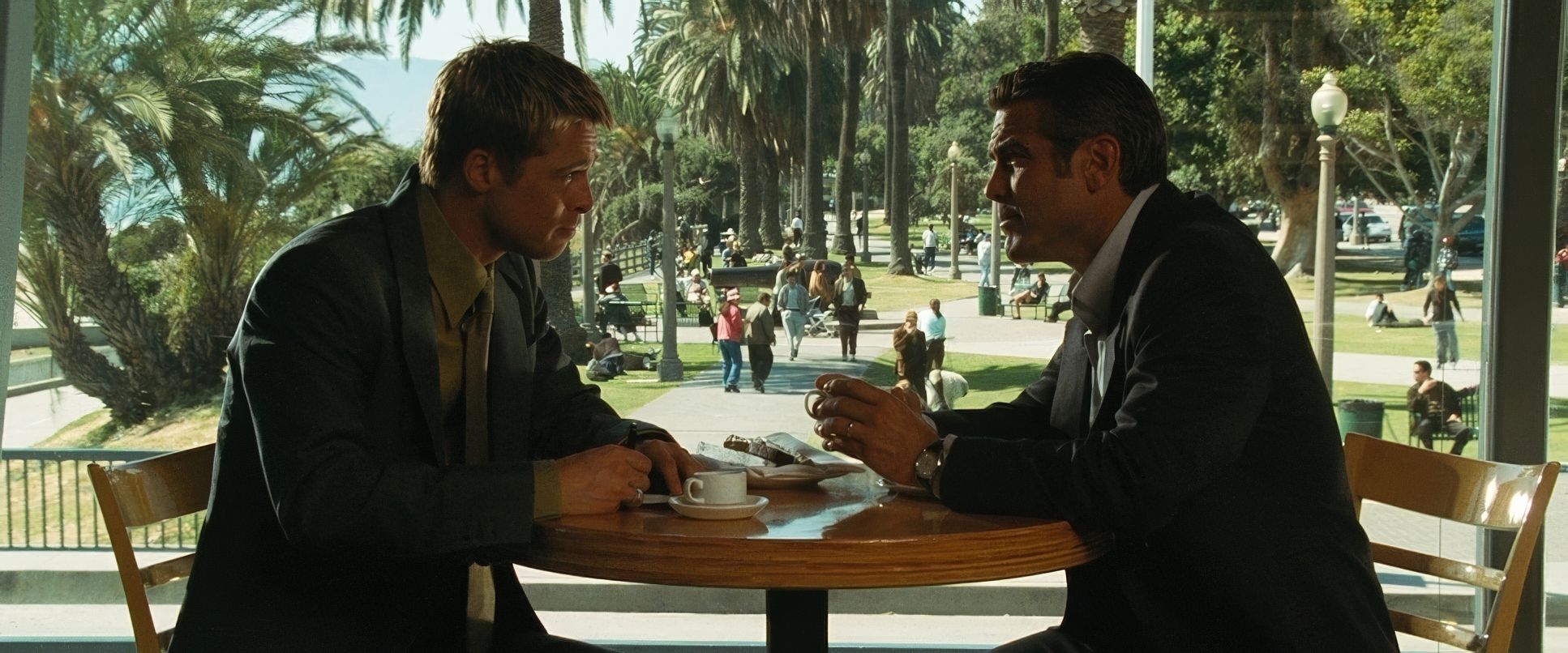
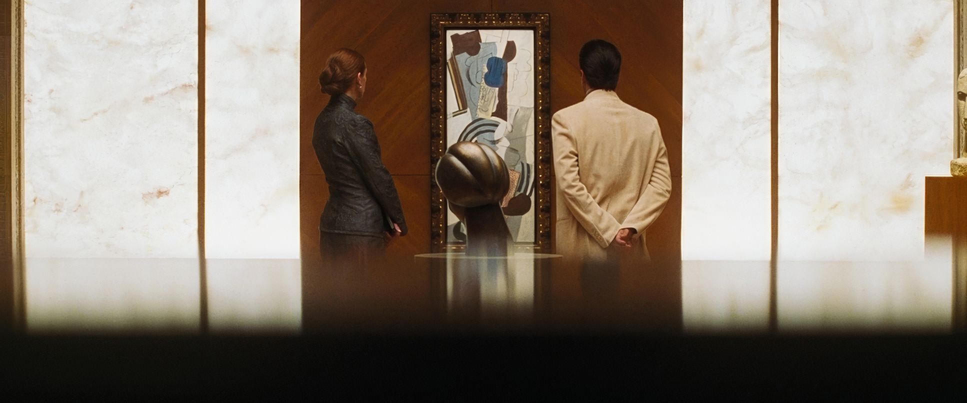
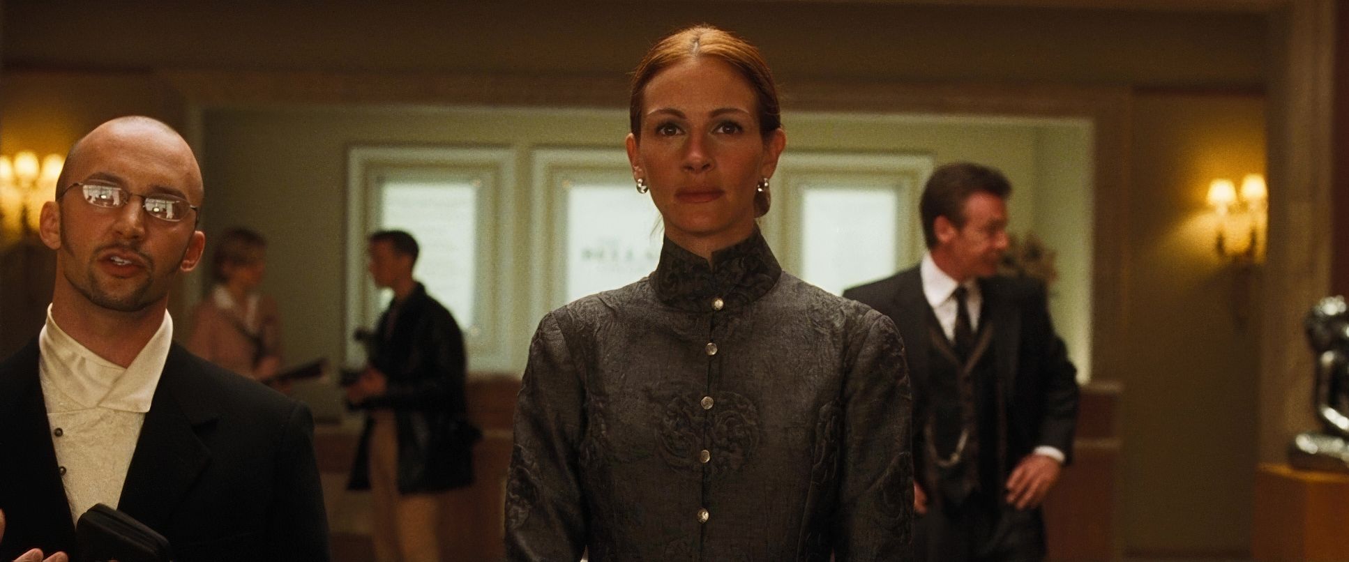
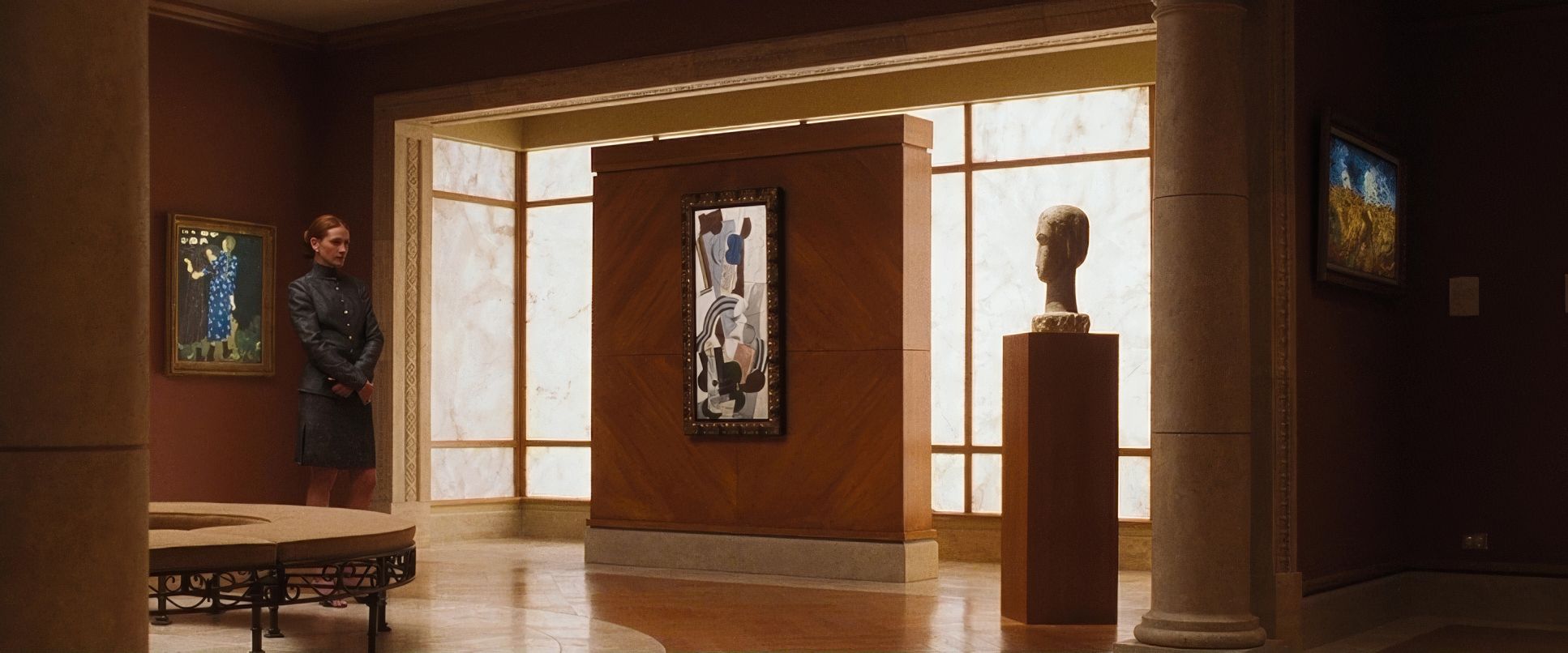
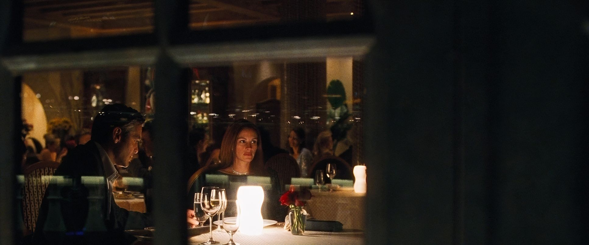
Soderbergh has a “handsome” eye for composition. He uses the 2.39:1 aspect ratio to its full potential, often pulling the eye from foreground banter to the sprawling, vibrant chaos of the casino floor. It’s a constant reminder of the stakes and the surveillance.
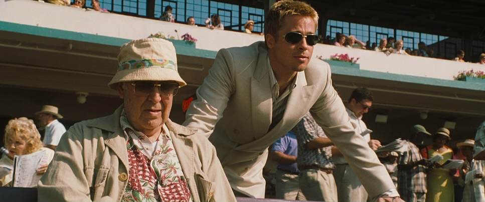
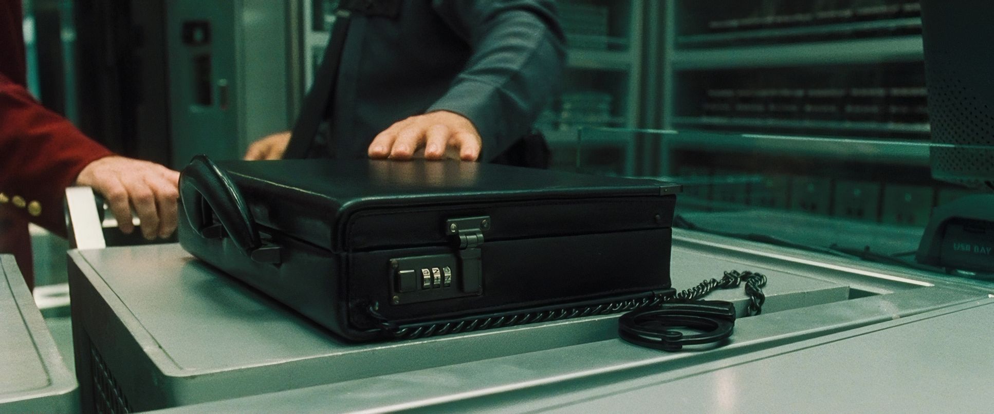
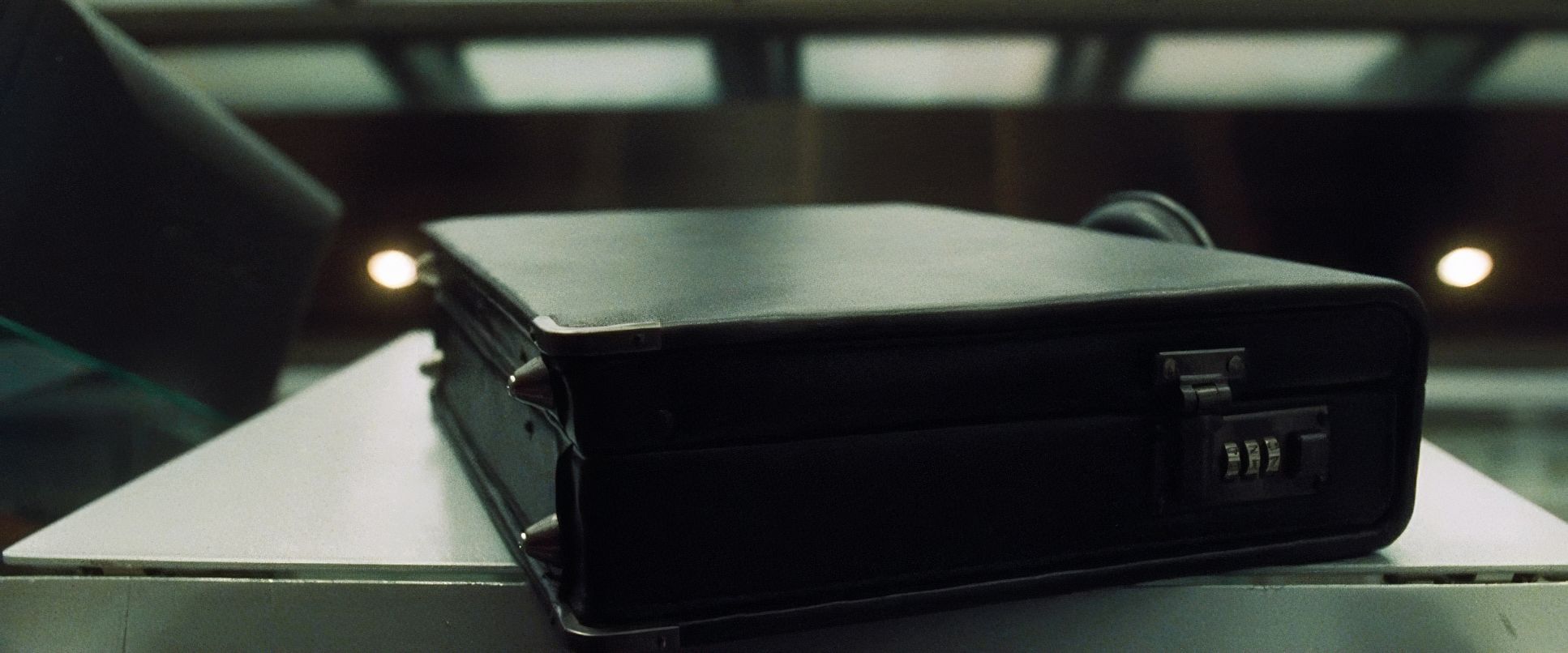
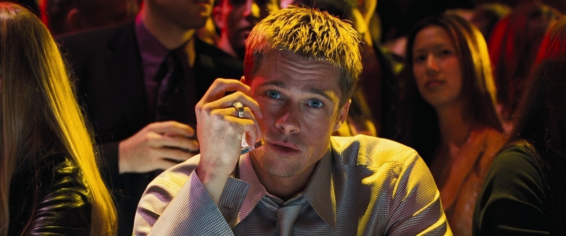
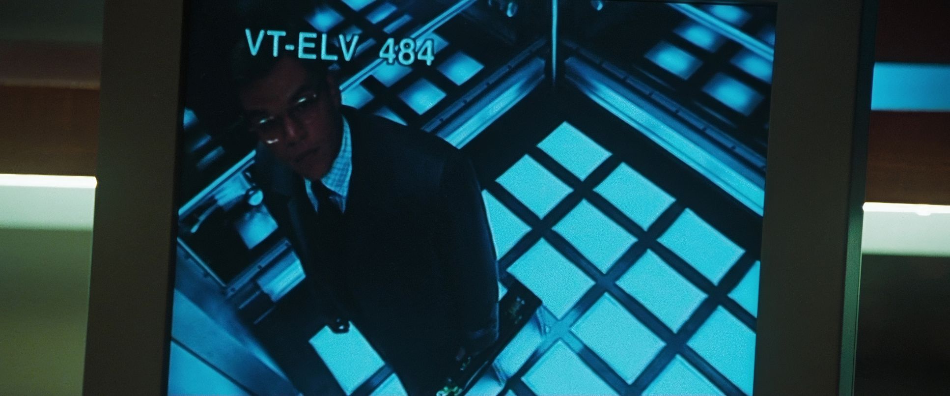
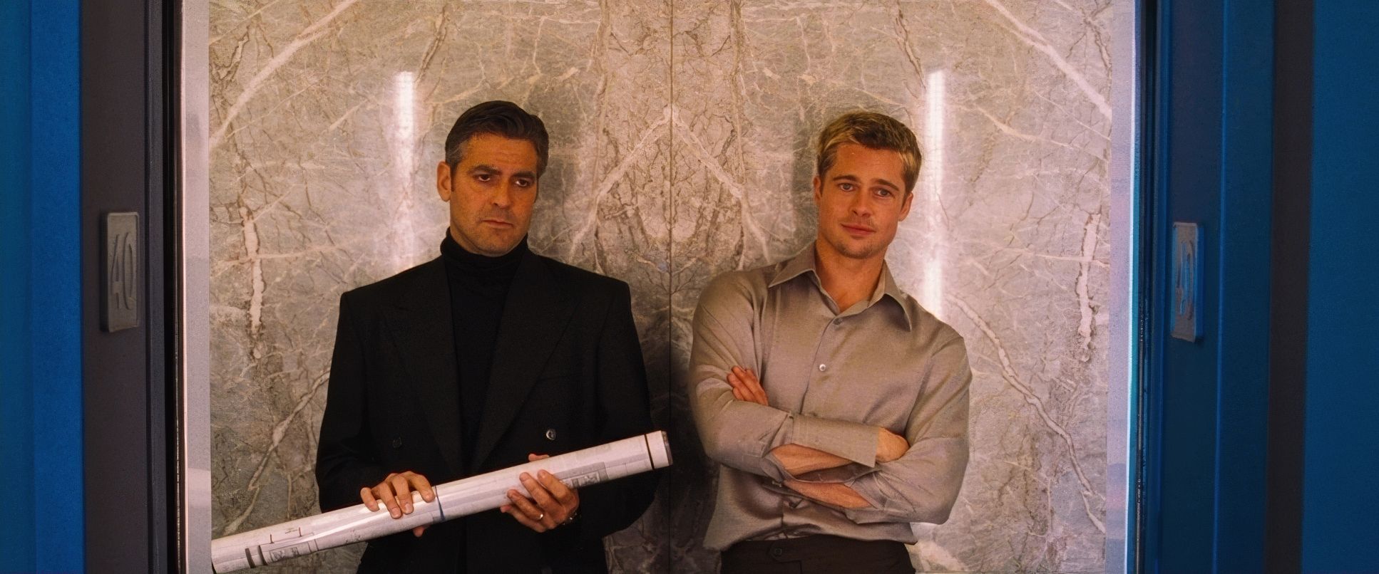
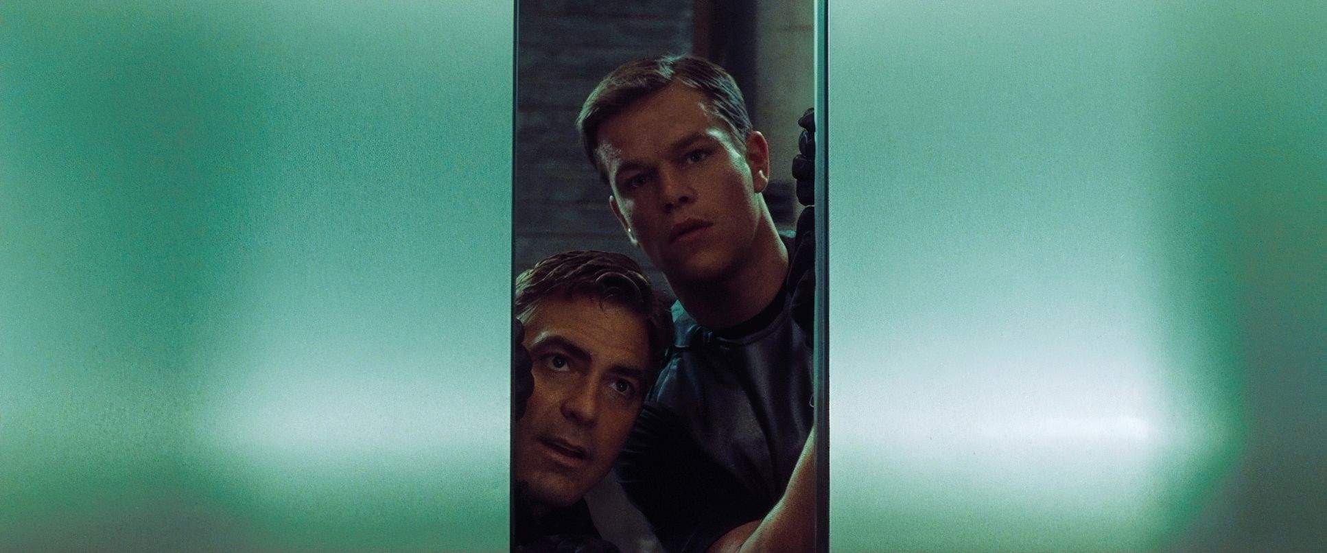
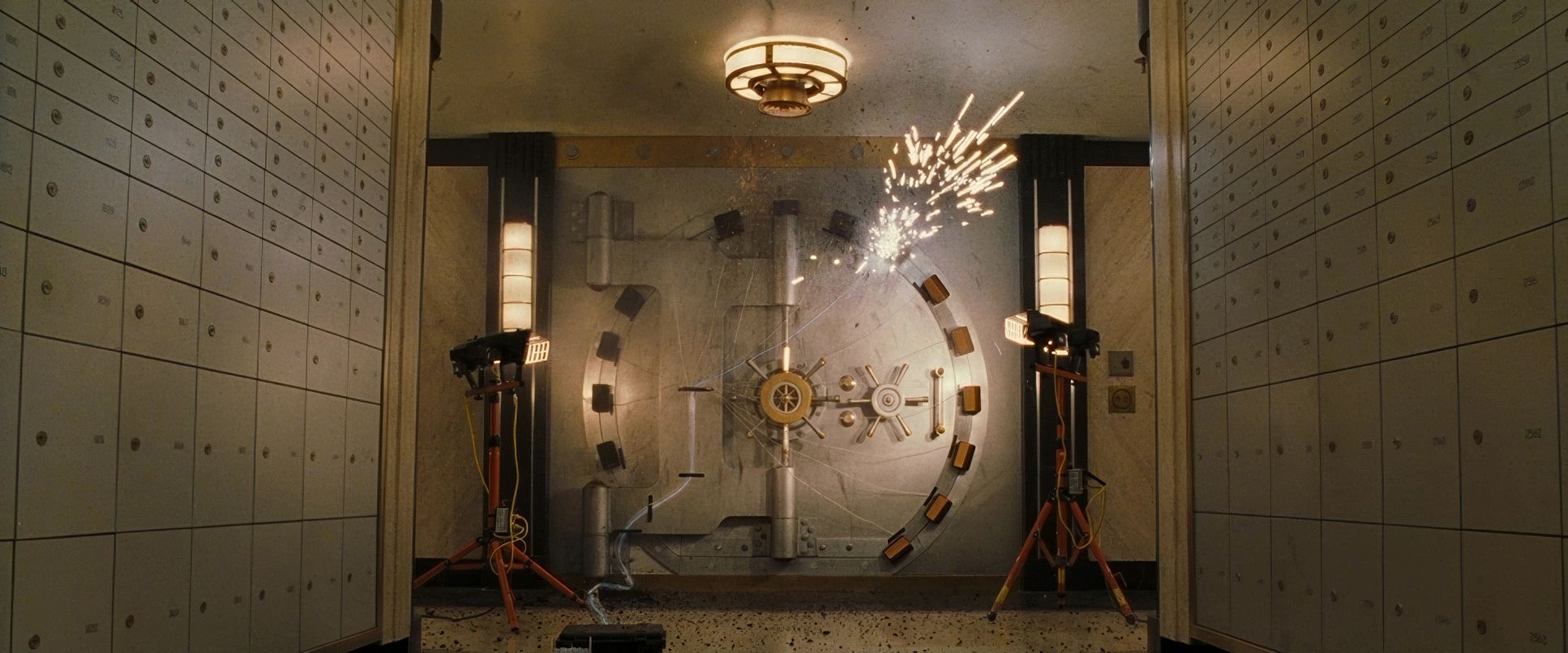
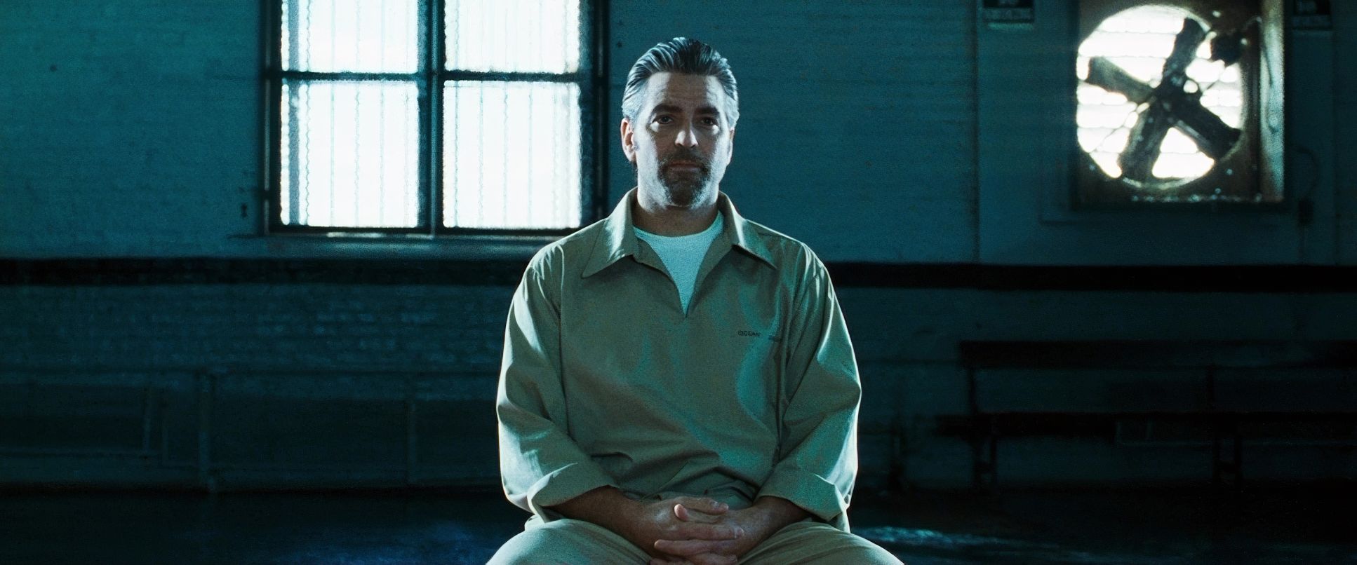
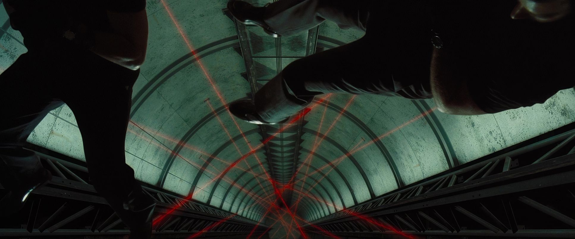
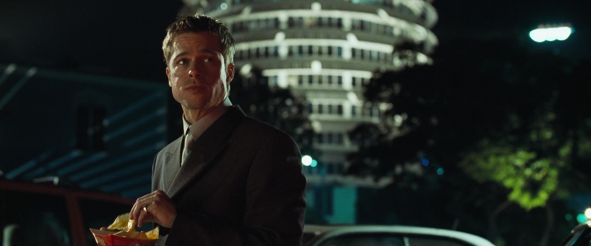
Take the demolition of the old Sands casino. The shot of Clooney and Damon standing apart, refusing to turn around for the explosion, says more about their detached focus than three pages of dialogue could. I also love how he uses negative space. By giving the characters significant headroom in contemplative moments, he lets them “breathe” within the frame, selling that air of confidence. Conversely, when the pressure is on, he tightens the screws, framing through bars or the cramped confines of an elevator. Even Brad Pitt’s constant snacking is framed with an intentionality that makes it iconic these aren’t just pretty pictures; they are narrative drivers.
Lighting Style
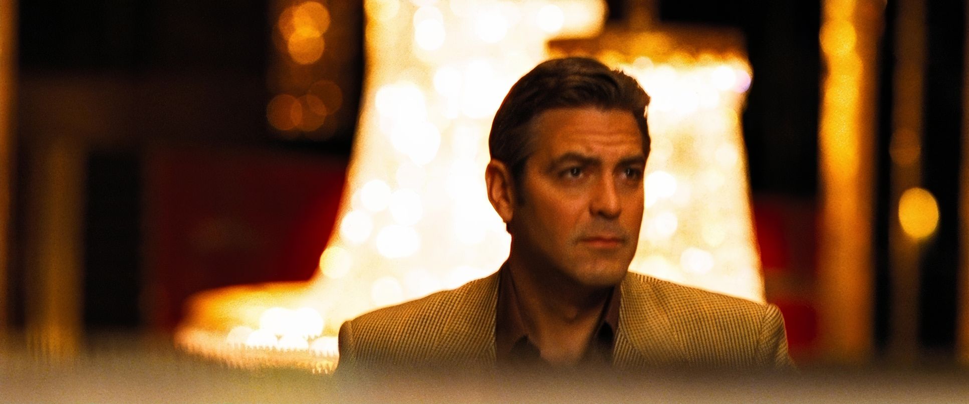
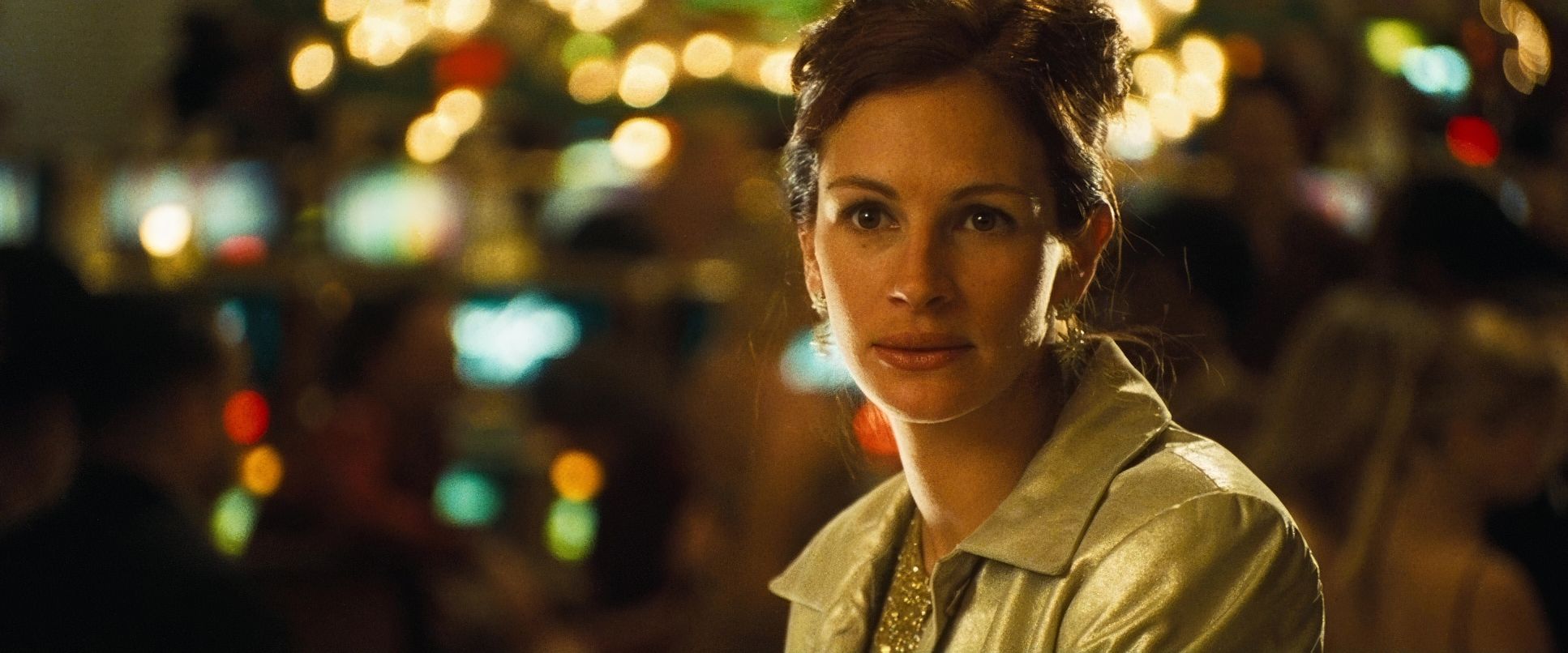
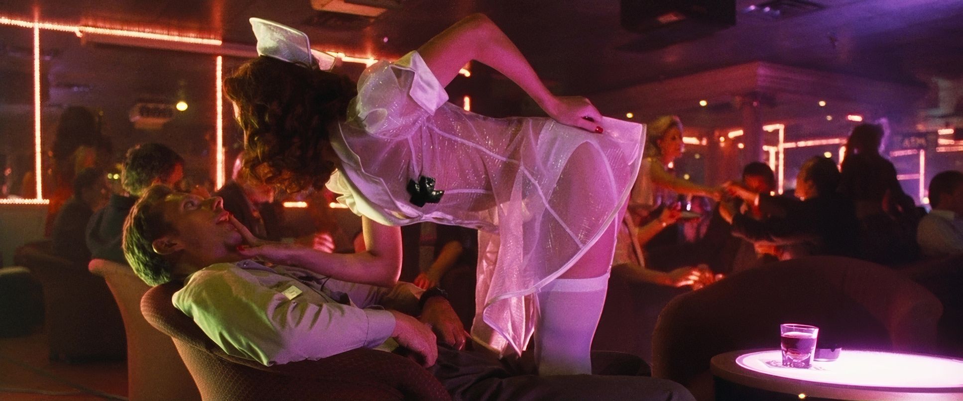
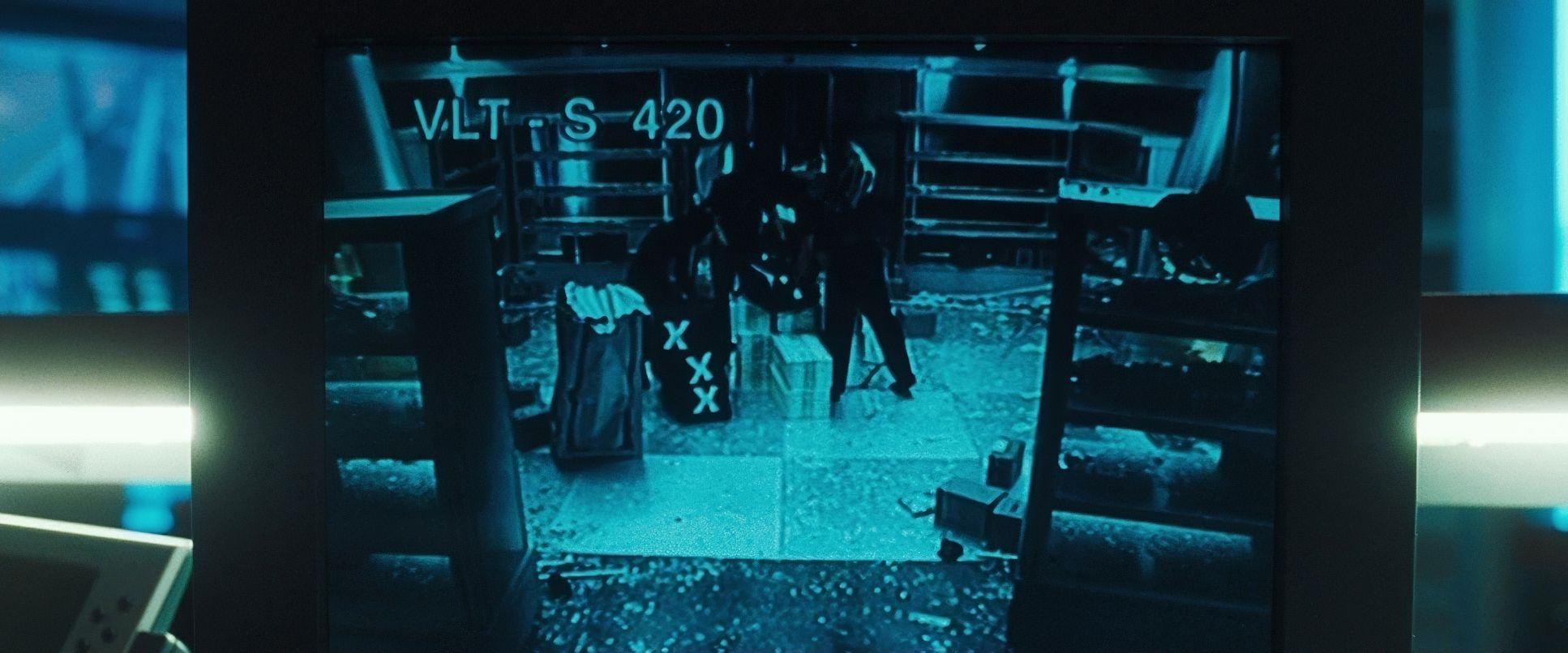
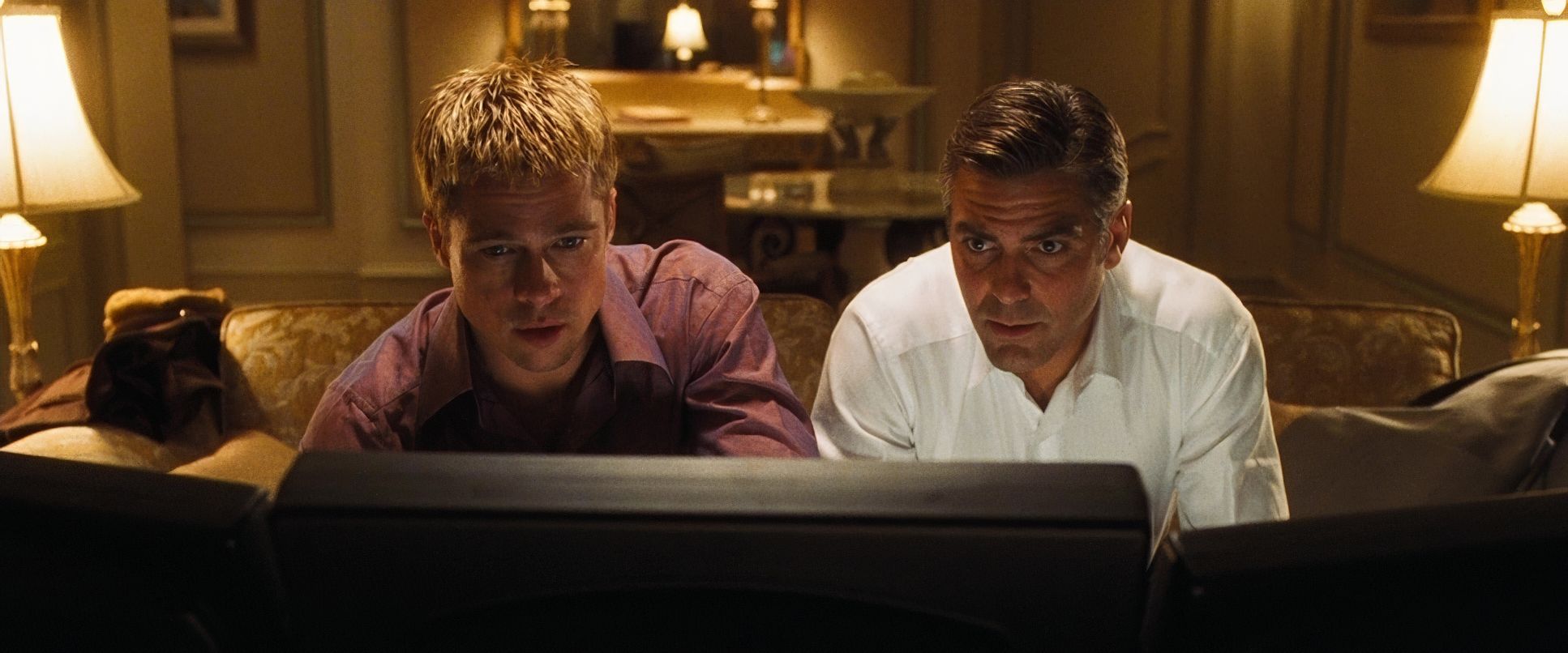
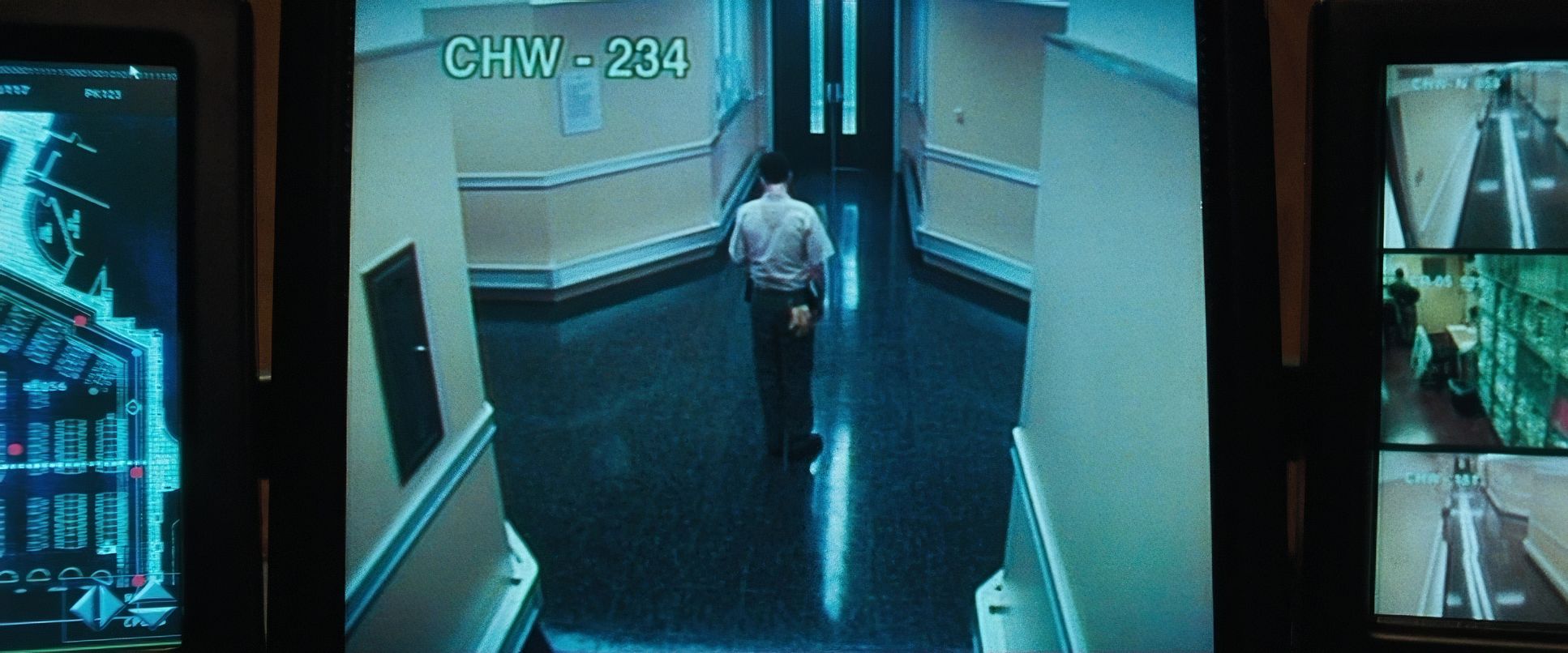
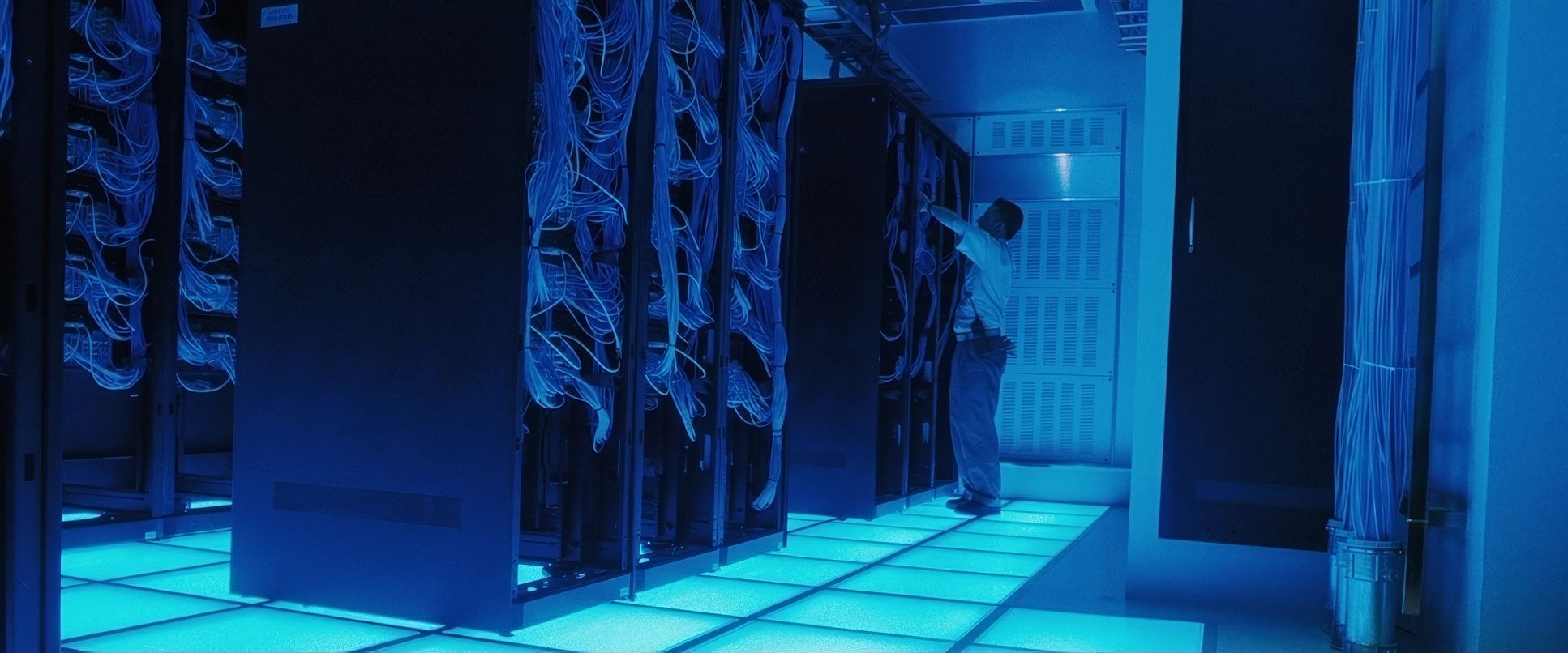
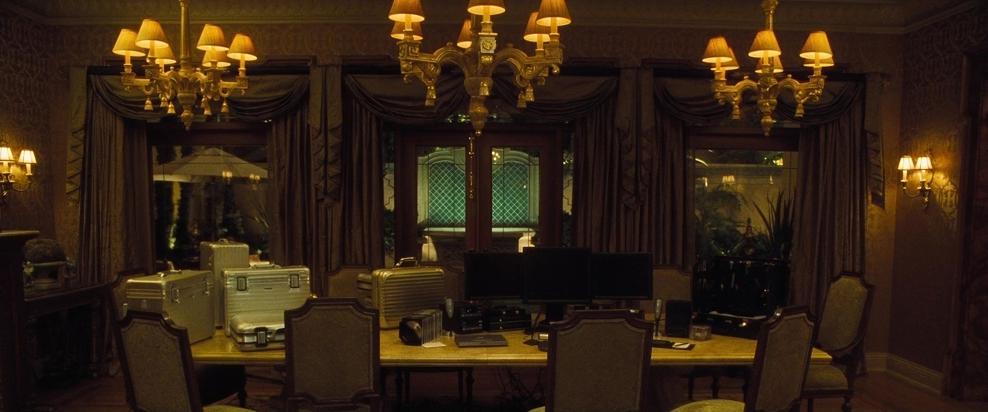
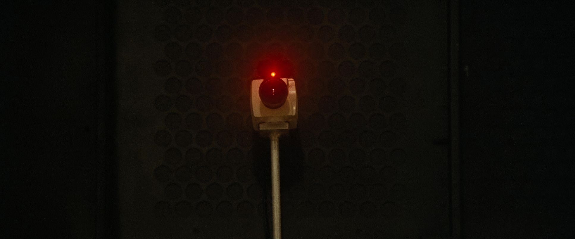
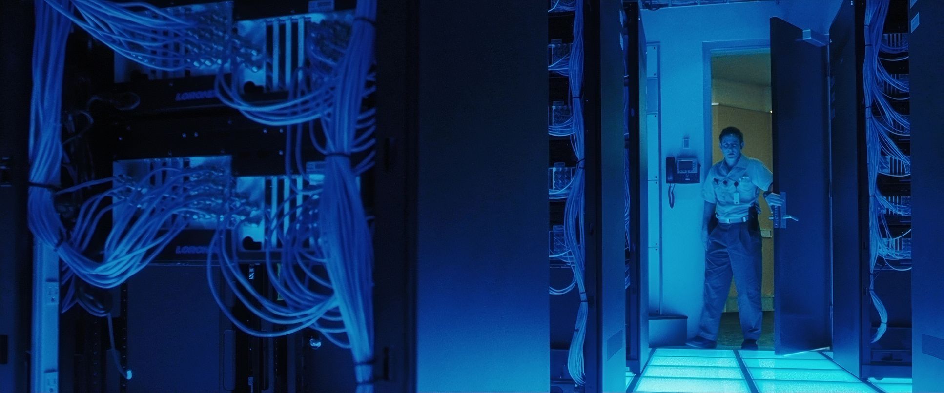
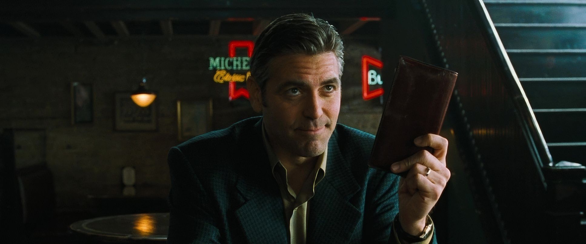
In the grading suite, we talk a lot about “motivated light,” and this film is the gold standard. Las Vegas is built on artificial light neon, amber practicals, and the cold glow of security monitors. Soderbergh embraces the fake-ness and makes it feel opulent.
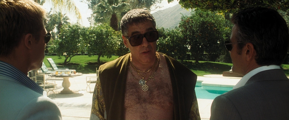
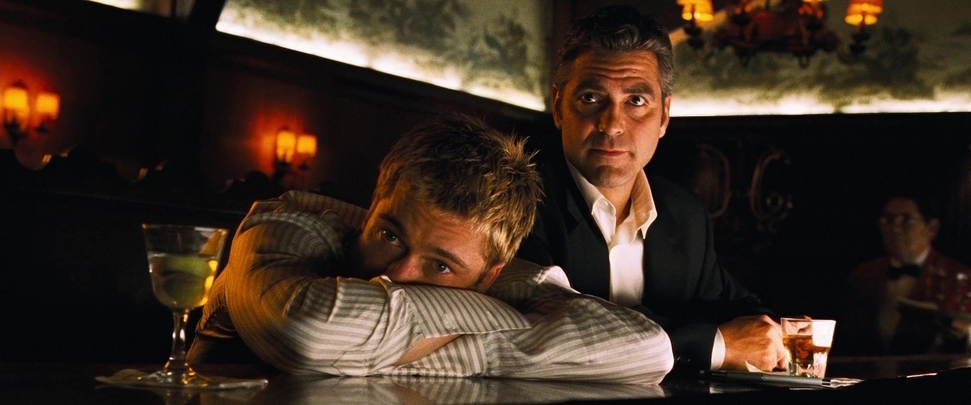
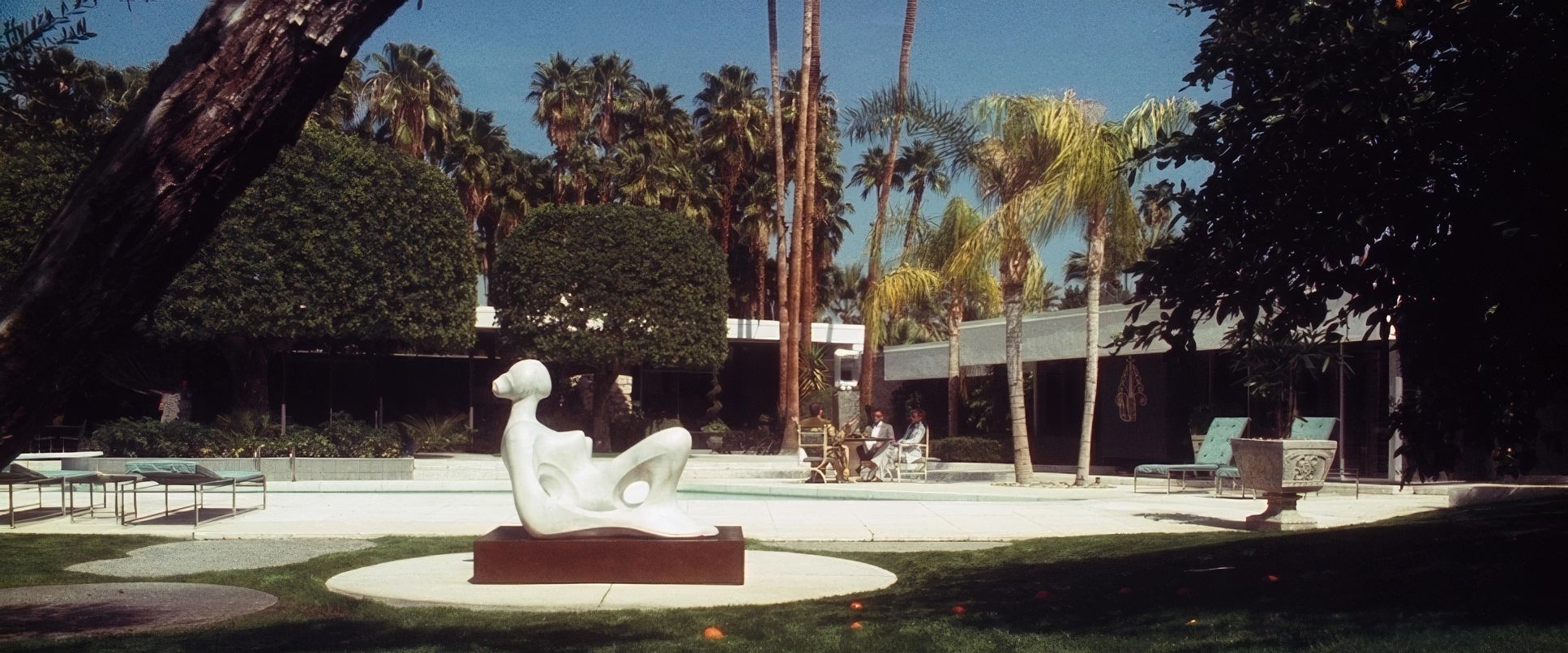
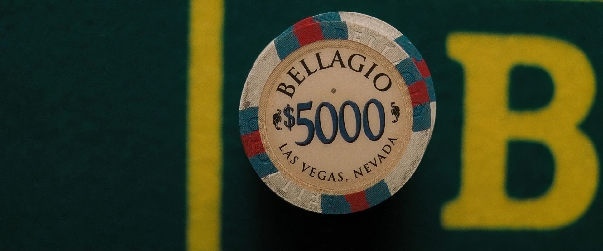
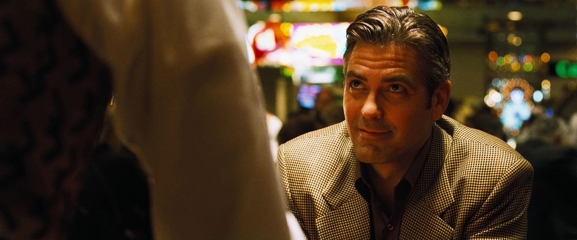
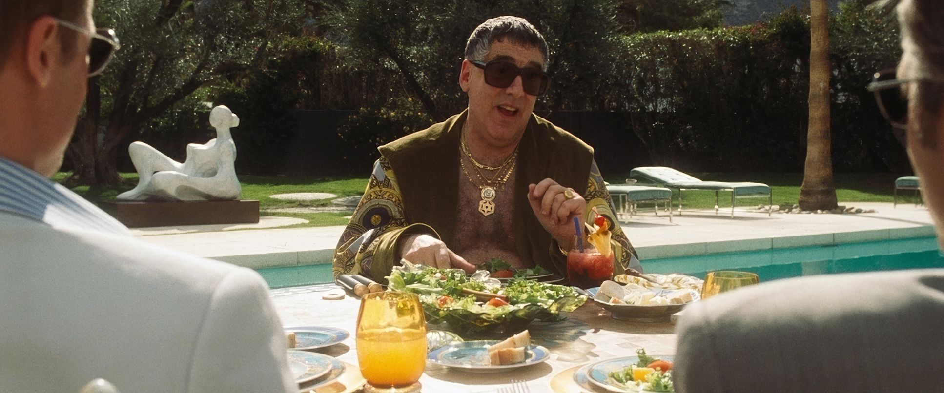
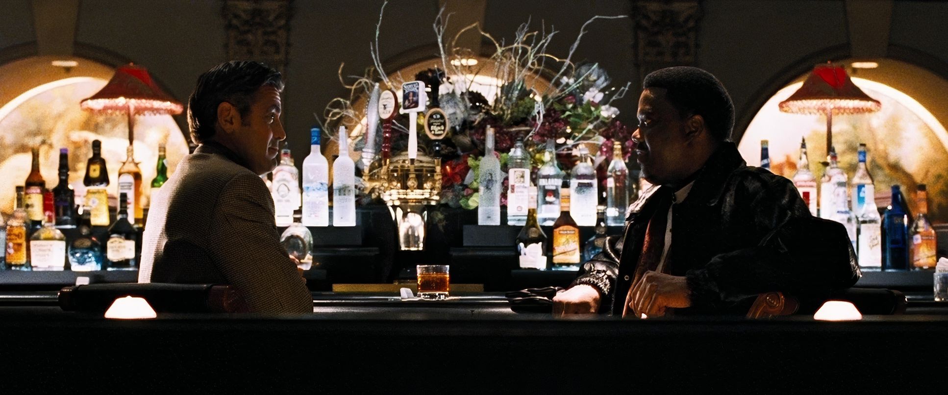
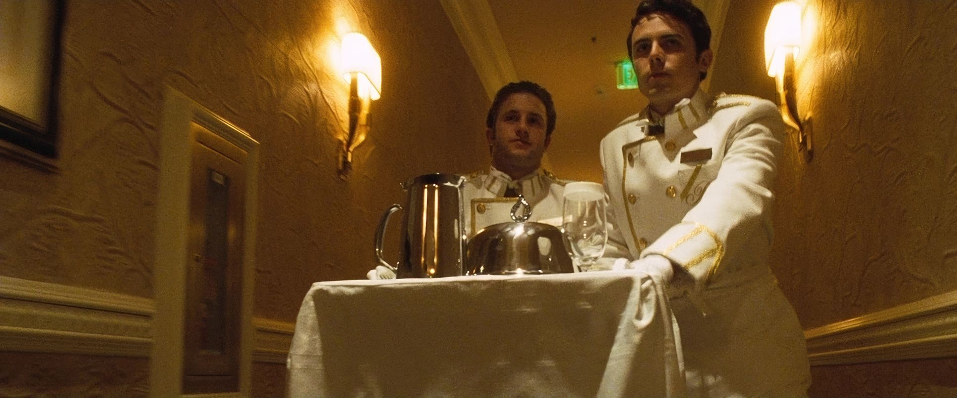
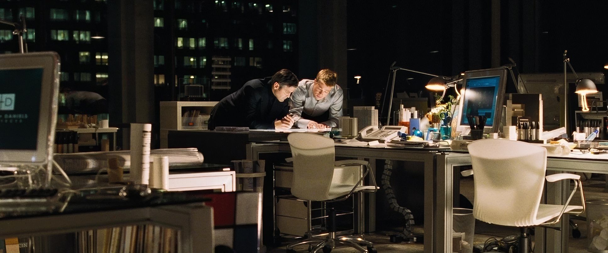
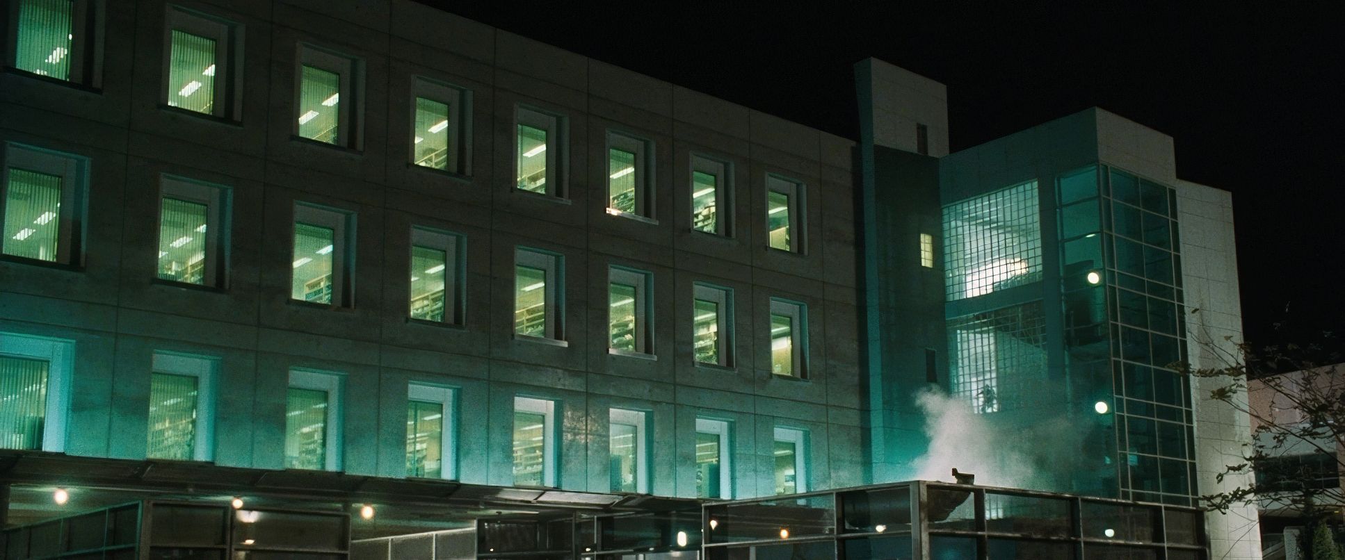
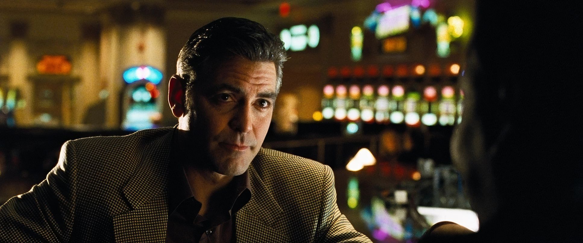
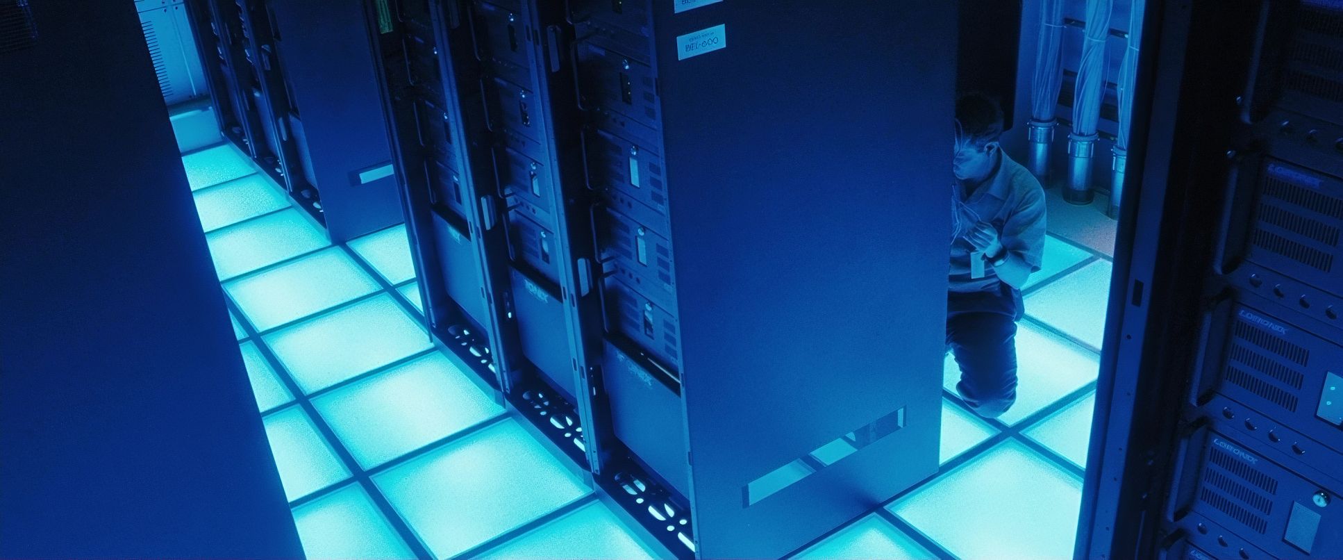
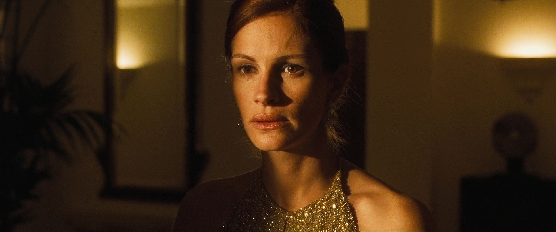
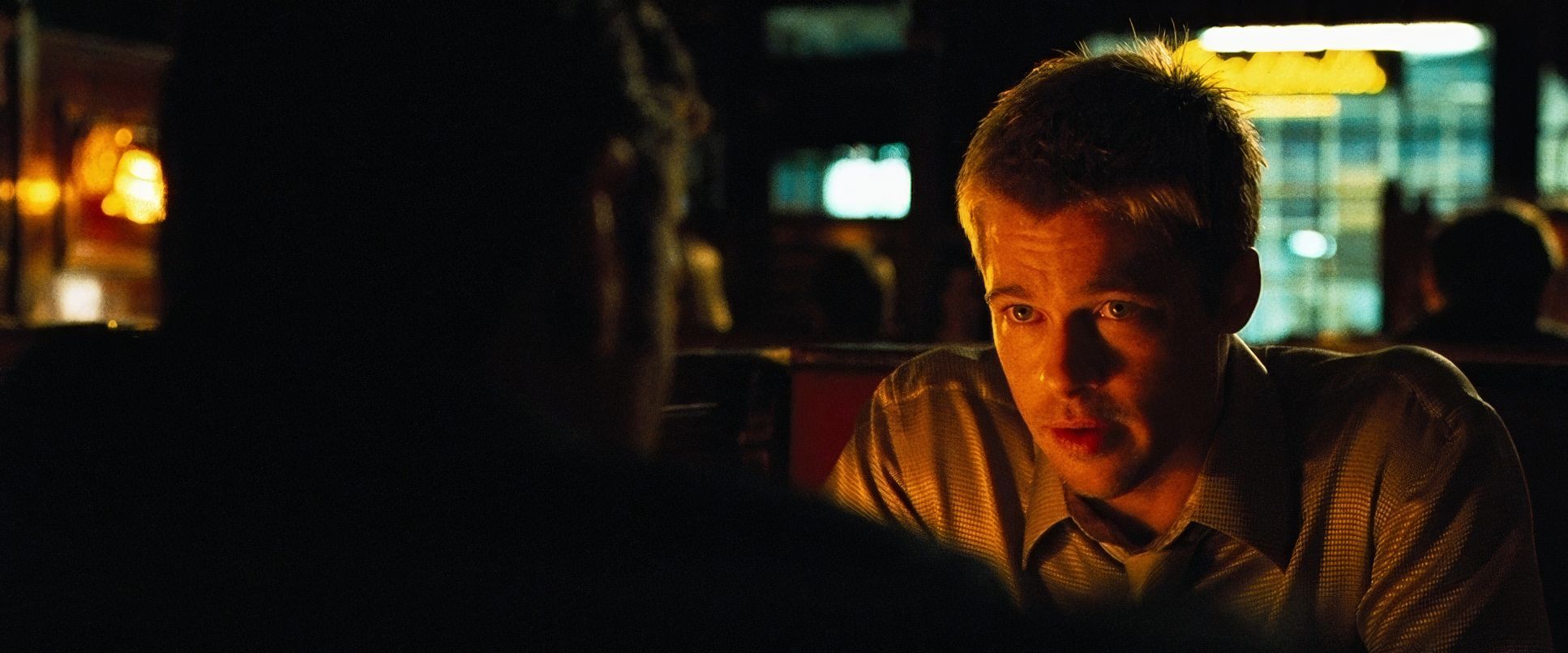
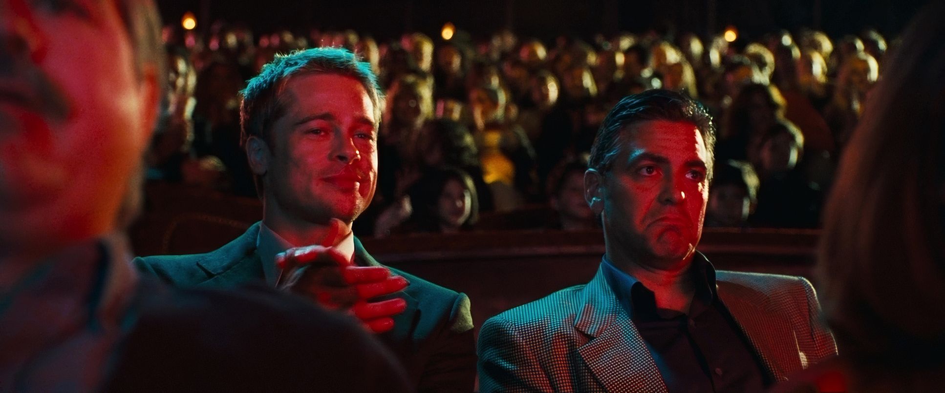
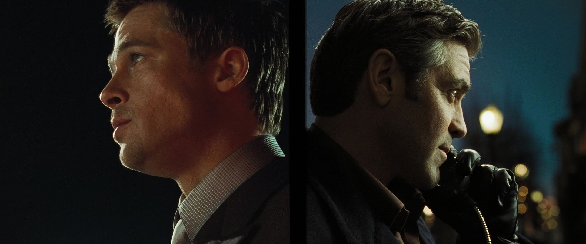
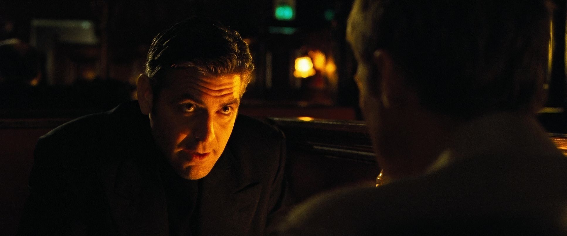
Inside the casinos, there’s a prevailing warmth heavy on the ambers and golds. It’s an inviting luminescence that mirrors the camaraderie of the crew, but it also hints at the “golden cage” of Vegas. This warm ambient light creates a beautiful, movie-star glow on the cast without looking flat. For the night exteriors, he hits the brakes on the warmth, contrasting it with cooler, moonlit blues and the stark spotlights of the Bellagio fountains. It’s high-contrast, playing with deep shadows to build suspense, ensuring the “vibe” stays consistently engaging even when the lights go out.
Lensing and Blocking
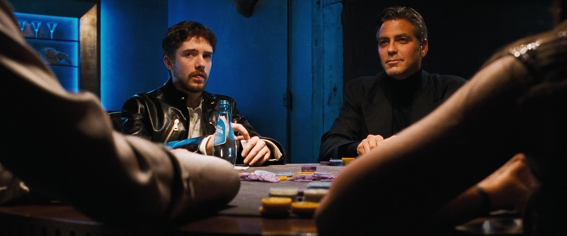
Soderbergh’s choice of Panavision Primo Primes is central to the film’s elegant look. He often goes wide for establishing shots, using a deep depth of field that forces the audience to hunt for details in the frame. It makes the viewer an active participant in the heist.
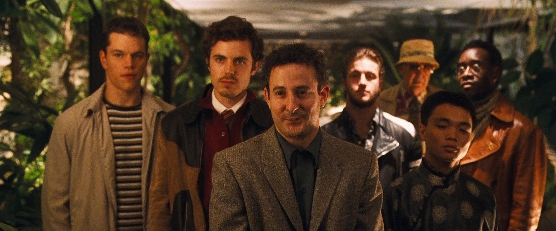
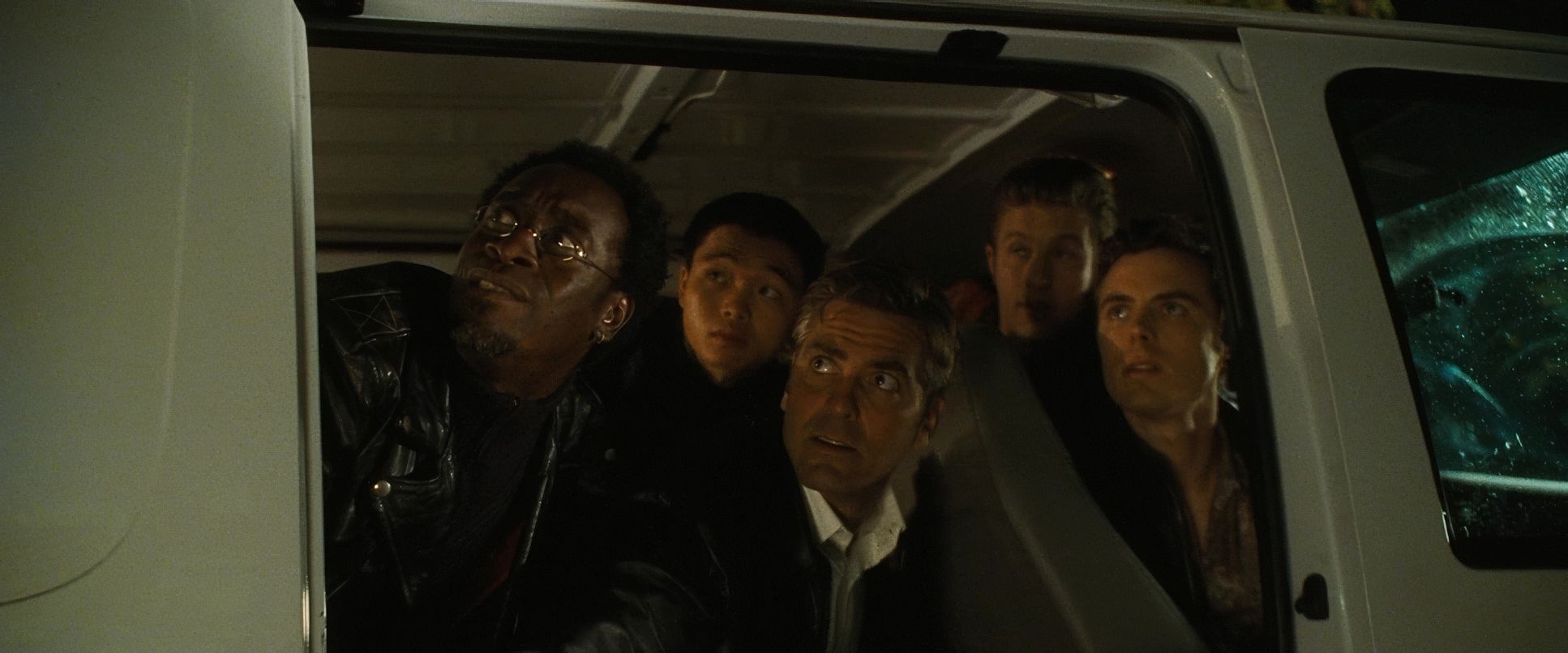
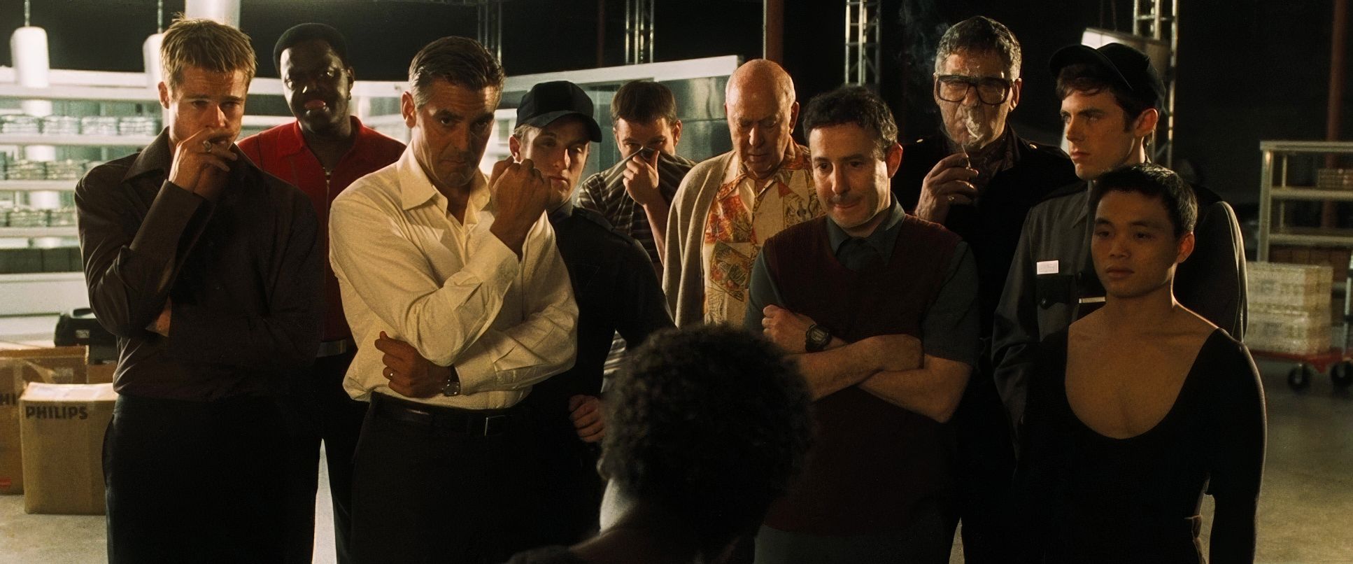
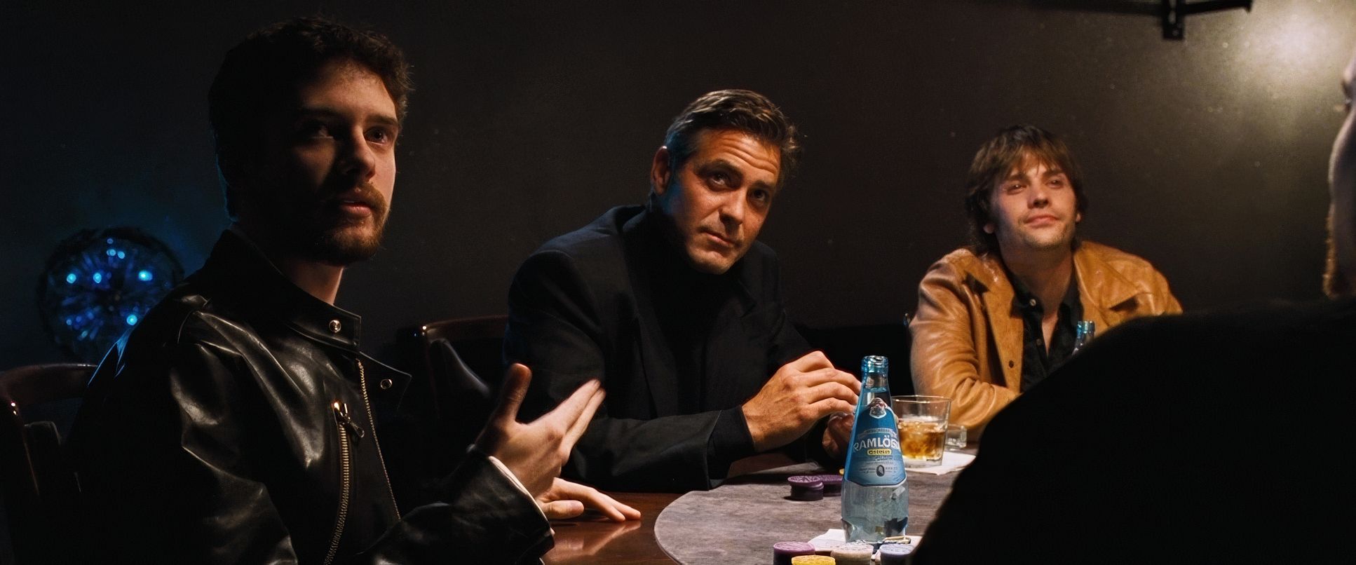
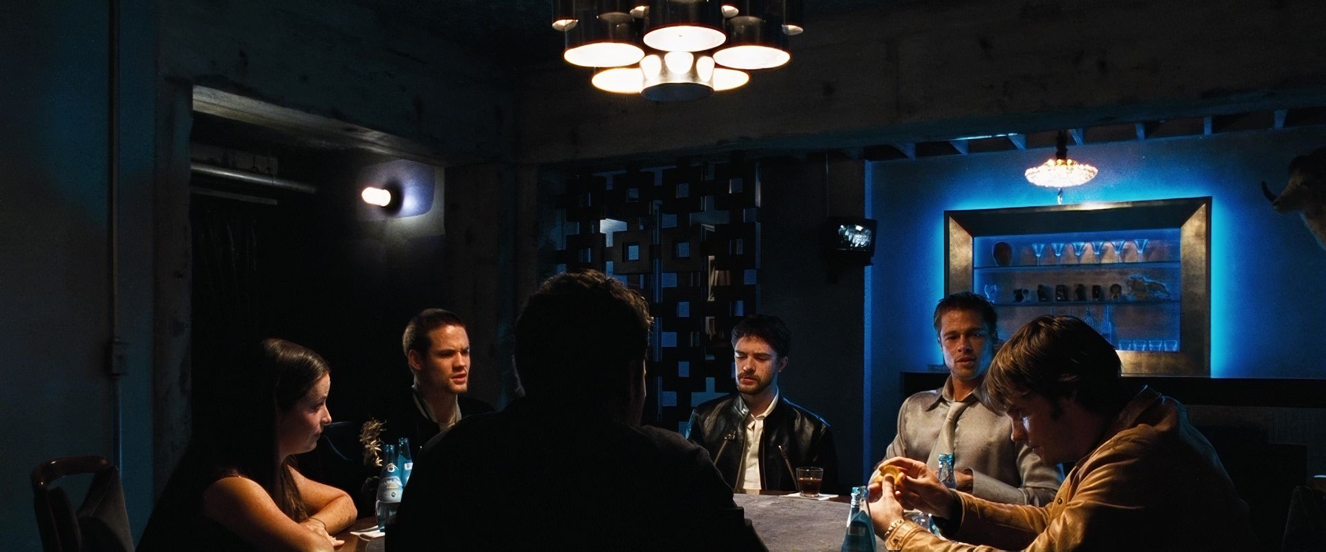
The blocking of such a massive ensemble is where the “Peter Andrews” pseudonym really pays off. Despite having eleven main characters, nobody feels lost. He uses dynamic blocking to signal hierarchy. Look at Matt Damon’s Linus early on, he’s often placed slightly off the core visual axis, reinforcing his “wild card” status and insecurity. As he gains confidence, he moves toward the center of the frame. It’s the subtle language of proximity and visual hierarchy that tells the story without a single line of exposition.
Color Grading Approach
As a colorist, this is where I get excited. Ocean’s Eleven was one of the early adopters of the Digital Intermediate (DI) process, and you can see that fine-tuned control in every scene. They crafted a look that is rich and vibrant but never feels artificially “dialed in.”
The mid-tones are where the magic happens. There’s a deliberate saturation in the reds and yellows to give the skin tones that healthy, appealing glow. But what really kills me is the highlight roll-off a classic characteristic of the 35mm film stock they used. The neon signs and chandeliers have this gentle, organic bleed that prevents the image from feeling harsh or digital. The shadows are “ink-rich,” retaining detail without going muddy. For the covert operations, the grade shifts dropping into desaturated blues and cranking the contrast before snapping back to that familiar, golden warmth. It’s a tonal canvas that perfectly serves the emotional beats of the heist.
Technical Aspects & Tools
Ocean’s Eleven (2001) — 35mm, 2.39:1, Panavision Primo Primes
| Genre | Crime, Heist, Thriller, Biopic, Gambling |
| Director | Steven Soderbergh |
| Cinematographer | Steven Soderbergh |
| Production Designer | Philip Messina |
| Costume Designer | Jeffrey Kurland |
| Editor | Stephen Mirrione |
| Colorist | Dana Ross |
| Time Period | 2000s |
| Color Palette | Warm, Saturated, Orange, Yellow, White |
| Aspect Ratio | 2.39 – Spherical, Super 35 |
| Format | Film – 35mm |
| Lighting | Backlight |
| Lighting Type | Practical light |
| Story Location | North America > United States of America |
| Filming Location | Atlantic City > Trump Plaza Hotel |
| Camera | Panavision Millennium / Millenium XL / XL2 |
| Lens | Panavision Primo Primes |
| Film Stock / Resolution | 5246/7246 Vision 250D, 5279/7279 Vision 500T |
The foundation of this look is the Kodak Vision 500T (5279) and 250D (5246) stocks. Shooting on 35mm gave Soderbergh that organic grain and exceptional latitude, which is vital when you’re dealing with the extreme highlights of a Vegas casino.
By using the Panavision Millennium systems paired with Primo Primes, he achieved a signature clean, sharp look that still feels “film-y.” The early use of DI was a game-changer here, allowing for the precise hue separation and tonal sculpting that traditional photochemical timing just couldn’t touch. Every technical toolfrom the Steadicam to the film stock was chosen to translate a vision of a slick, timeless heist into a reality that feels just as fresh today as it did in 2001.
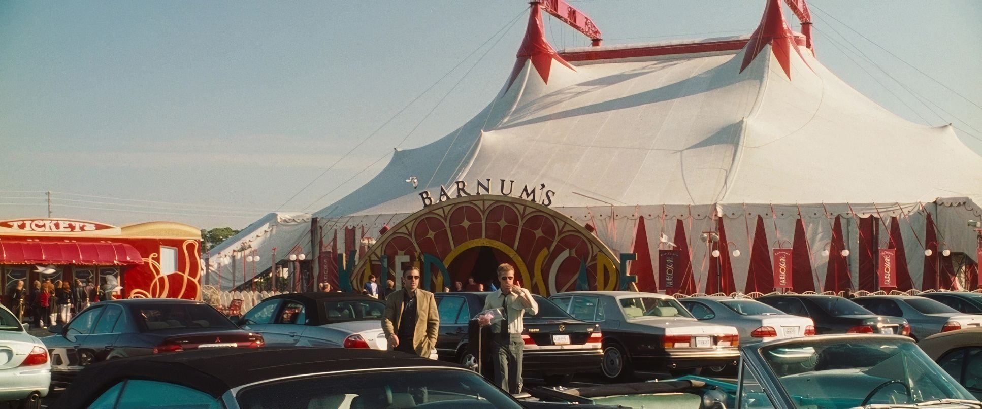
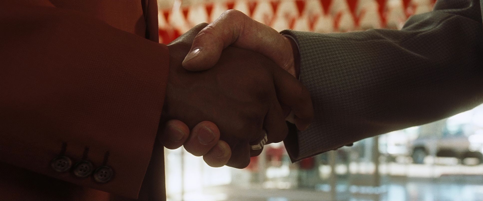
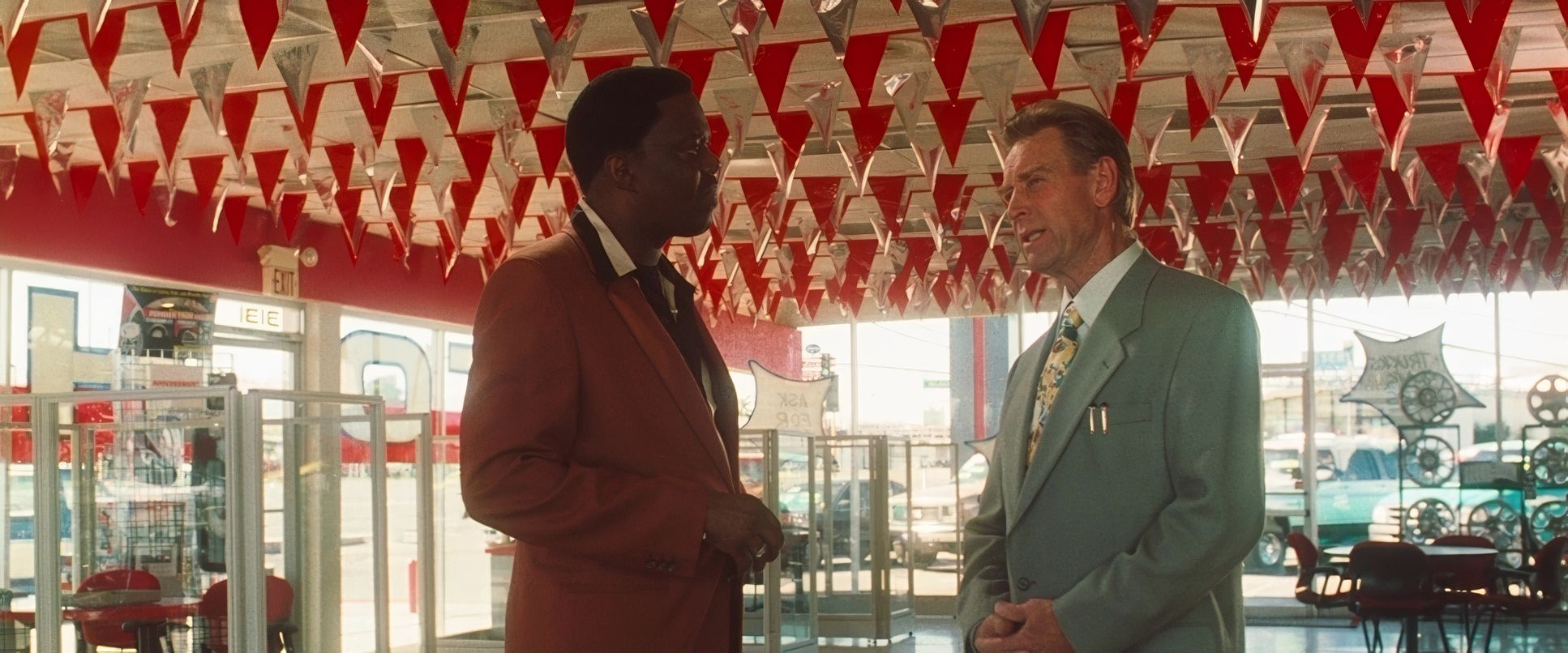
Ocean’s Eleven (2001) Film Stills
A curated reference archive of cinematography stills from Ocean’s Eleven (2001). Study the lighting, color grading, and composition.


- Also read: TAKEN (2008) – CINEMATOGRAPHY ANALYSIS
- Also read: HOME ALONE (1990) – CINEMATOGRAPHY ANALYSIS
Browse Our Cinematography Analysis Glossary
Explore directors, cinematographers, cameras, lenses, lighting styles, genres, and the visual techniques that shape iconic films.
Explore Glossary →