Taken isn’t interested in being pretty. It’s “badass” in the truest sense lean, mean, and completely devoid of fat. While everyone remembers the iconic monologue (and for good reason), the real heavy lifting is done by the visual language. It sets a pace that John Wick and every subsequent “revenge” movie has been trying to chase ever since. Let’s peel back the layers on why this thing actually ticks.
About the Cinematographer
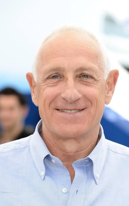
Michel Abramowicz handled the lens here. He might not be a household name like Deakins or Lubezki, but in the world of Luc Besson-style European thrillers, he’s a titan. He doesn’t go for “National Geographic” shots. His style is grounded, favoring a propulsive, almost documentarian realism.
Abramowicz understands that in a movie like this, the camera shouldn’t be a spectator; it should be an accomplice. His work is unromanticized and gritty what I like to call a “meat-and-potatoes” thriller vibe. There’s no ego in the frames, just brutal efficiency.
Inspiration Behind the Cinematography
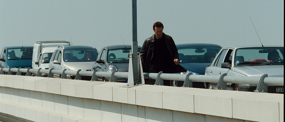
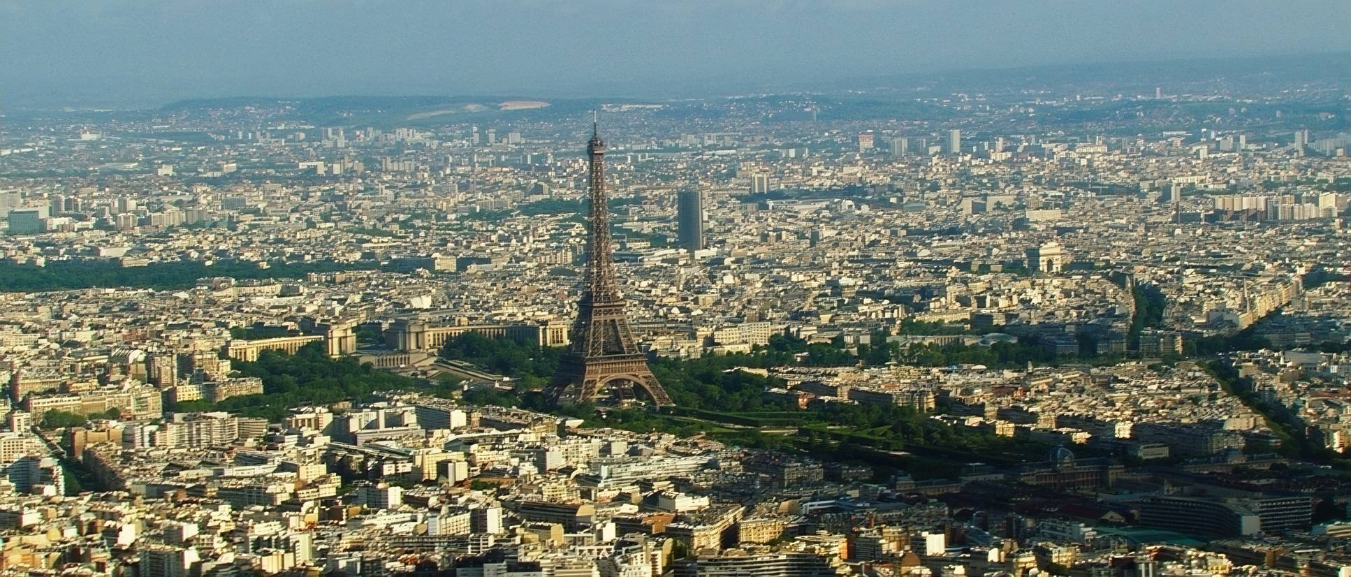
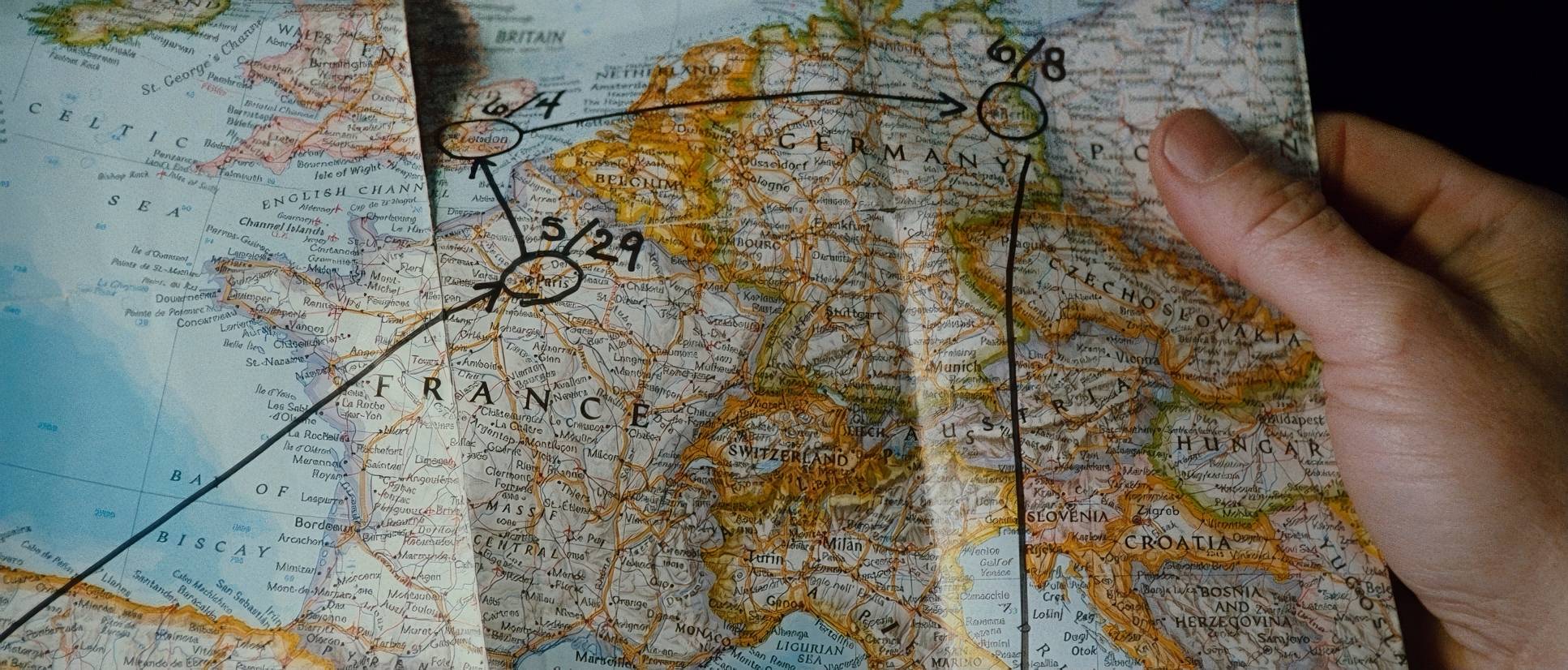
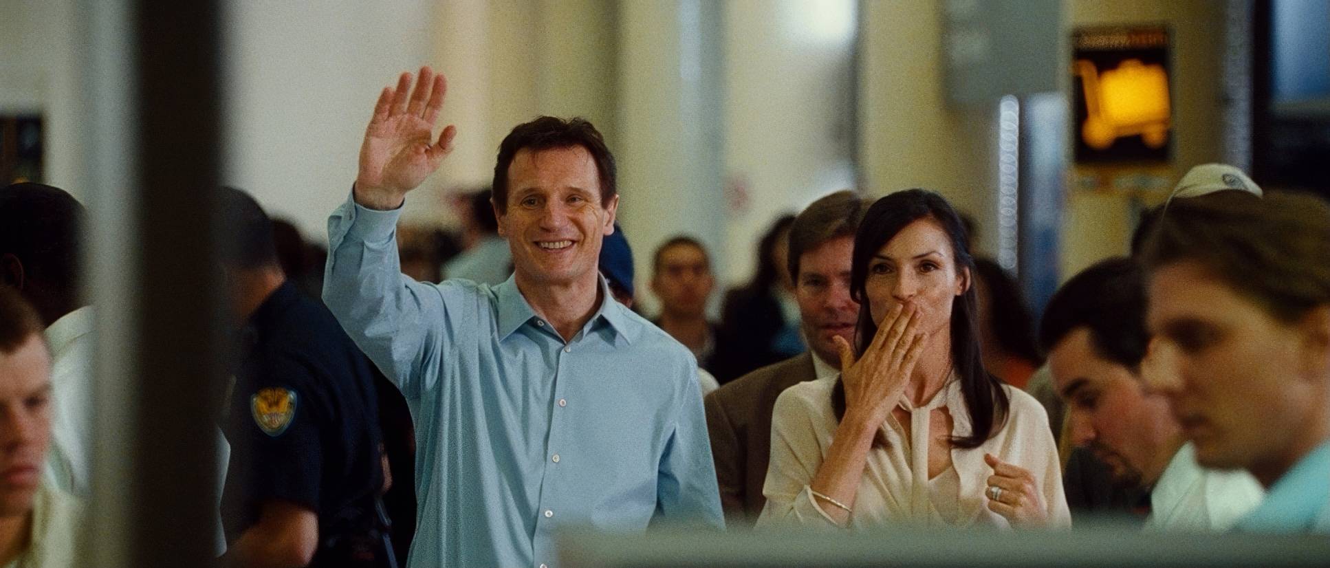
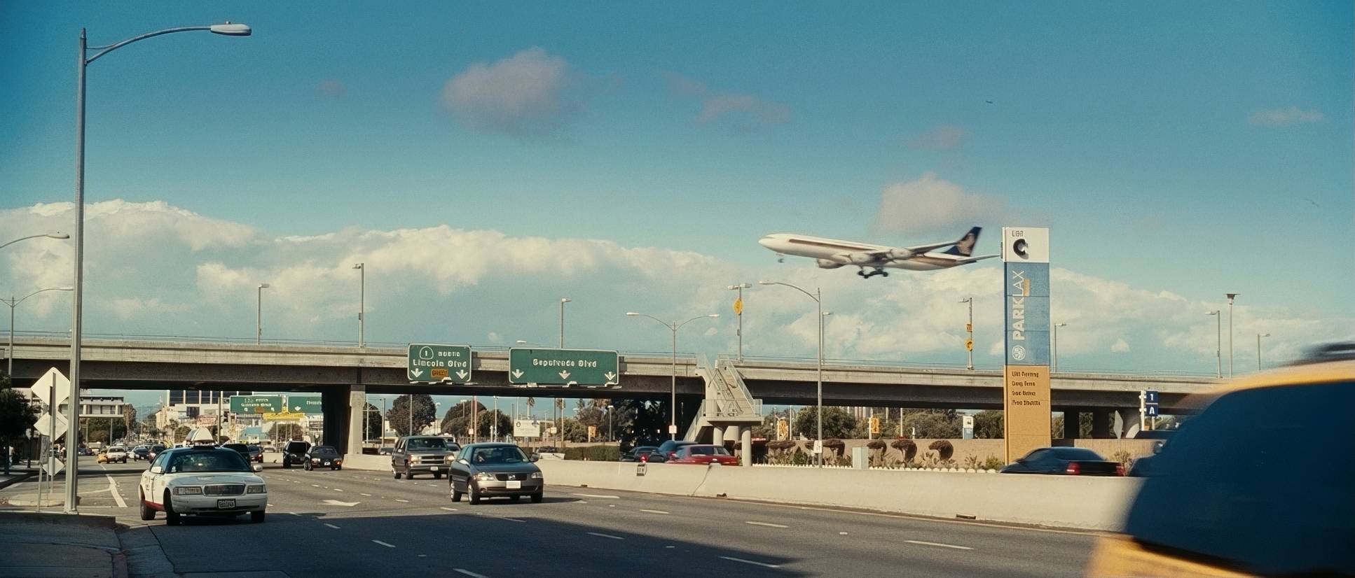
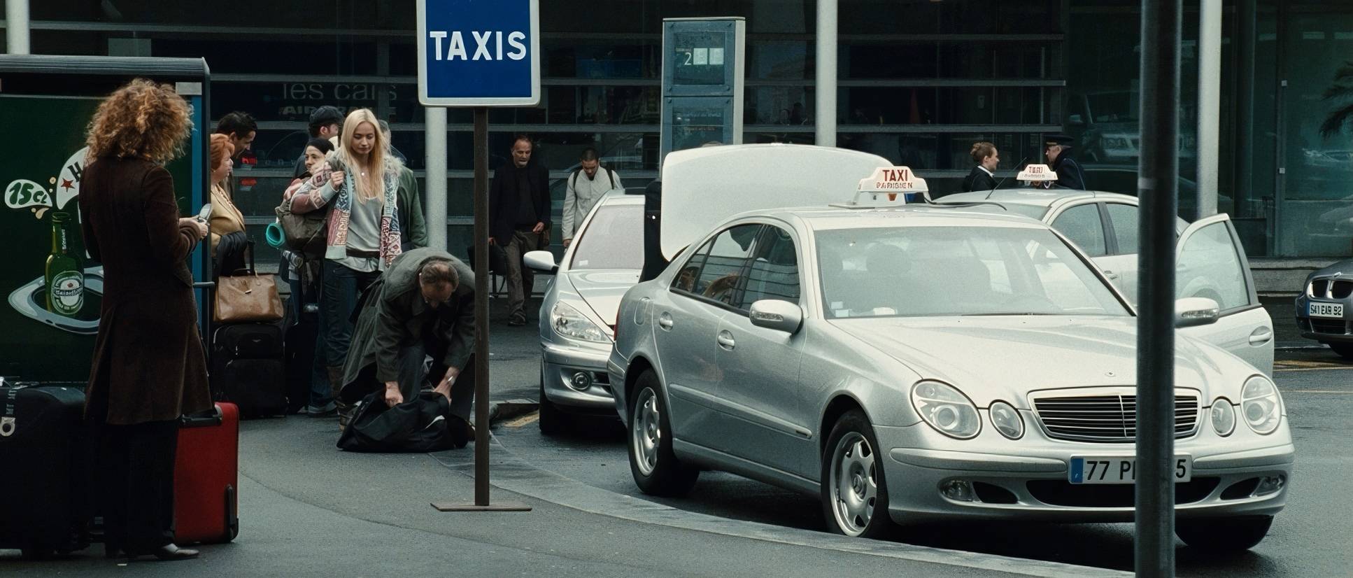
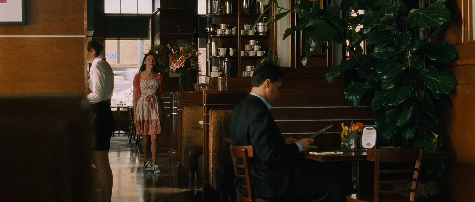
The narrative doesn’t breathe, so the cinematography shouldn’t either. The core inspiration here is the shift from comfort to chaos. We start in L.A., where the frame is wider and the world feels “stable,” but the second we hit Paris, the visual tone shifts into a harsh, unforgiving urban labyrinth.
It draws heavily from the European thriller aesthetic: less overt Hollywood glamour, more candidness. It’s about the uncomfortable proximity to Bryan Mills’ desperation. The film doesn’t waste time on visual poetry. It prioritizes the visceral impact of the pursuit, grounding the almost superhuman prowess of its protagonist in a world that feels like it could actually exist.
Camera Movements
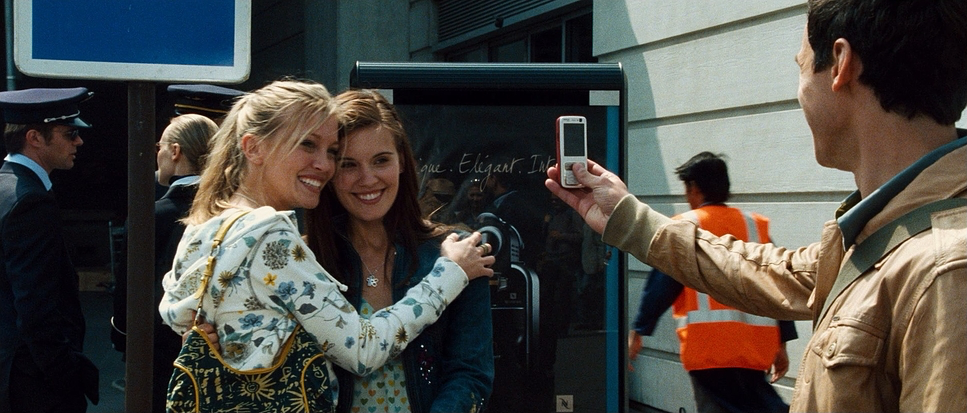
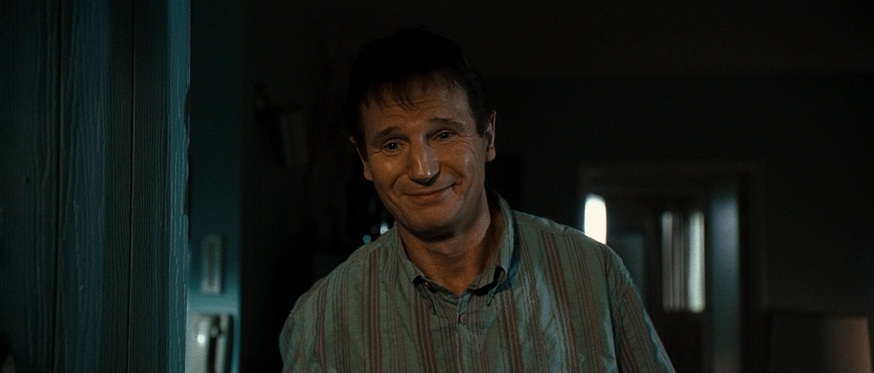
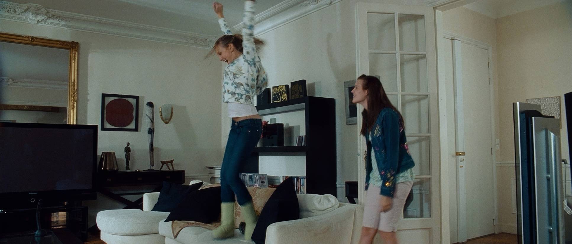
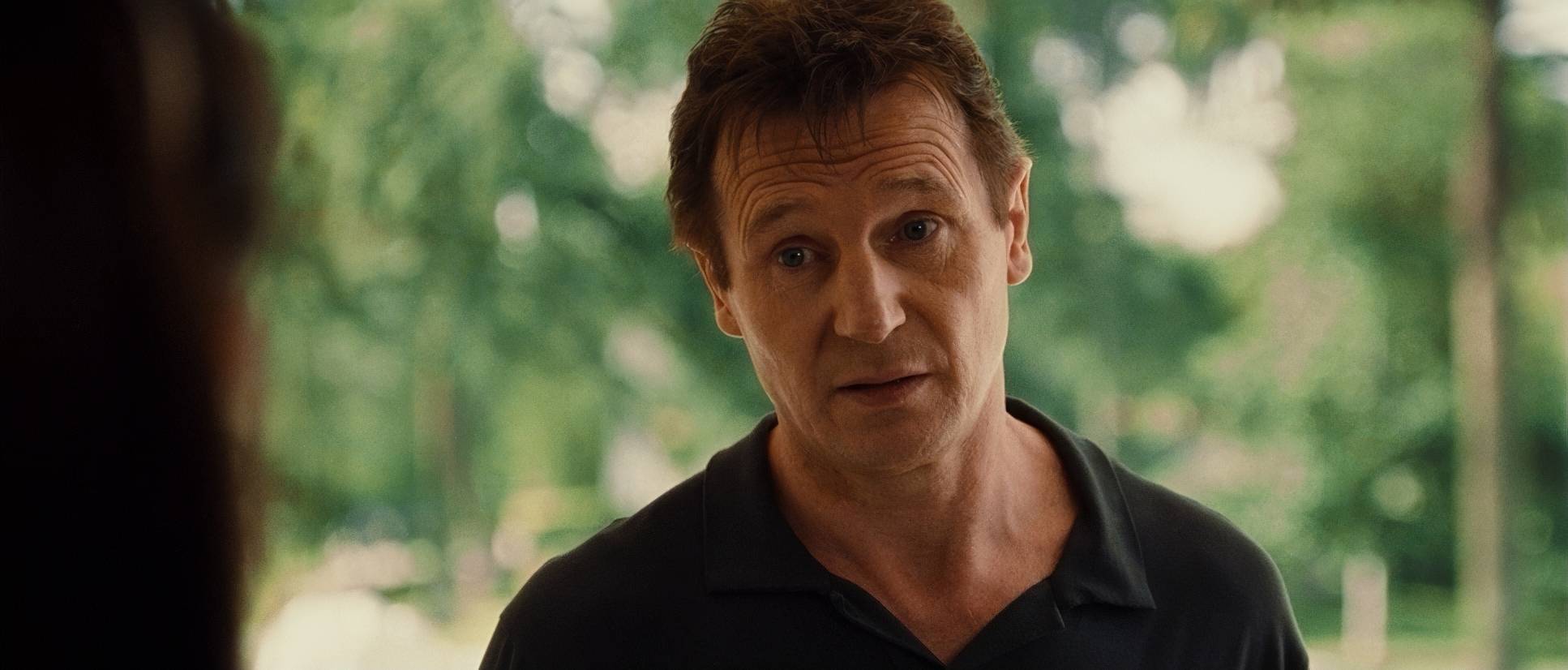
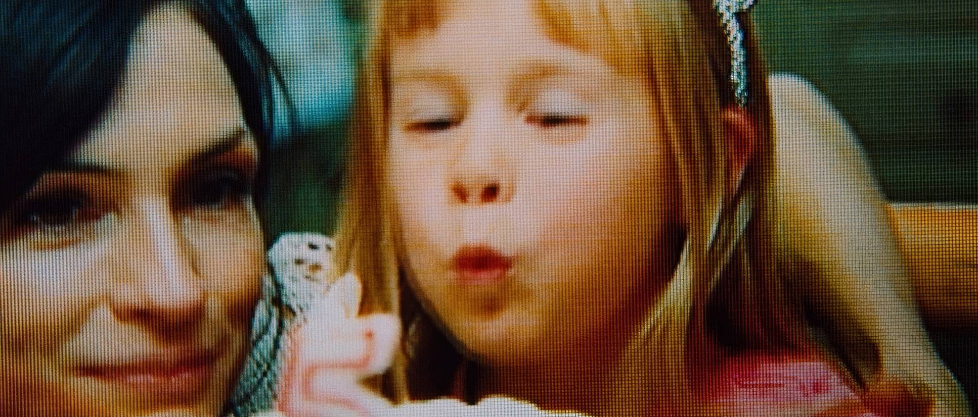
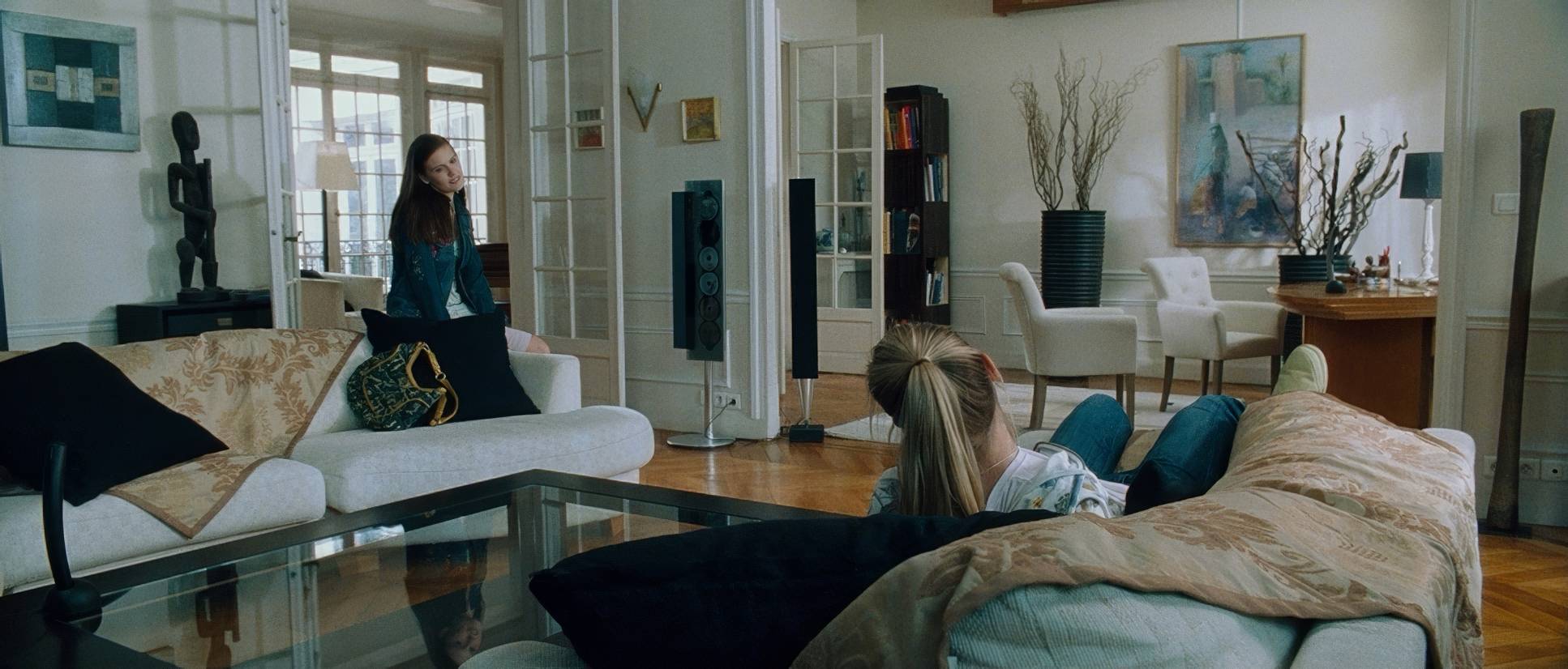
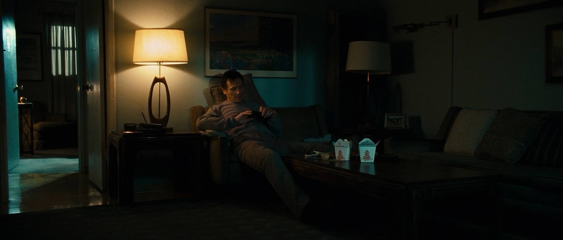
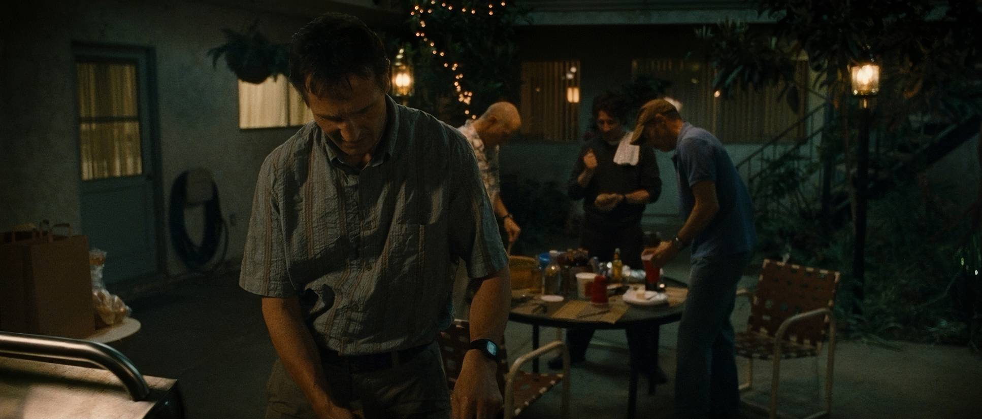
The camera in Taken has an arc. In the early scenes with Kim and Lenore, things are observational and stable. We see static frames and gentle pans the visual equivalent of a normal life.
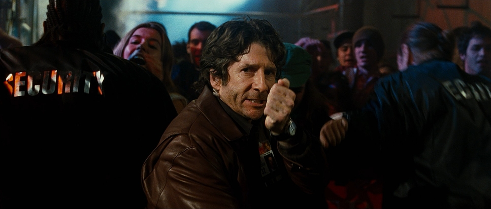
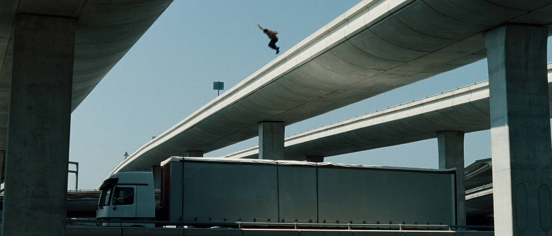
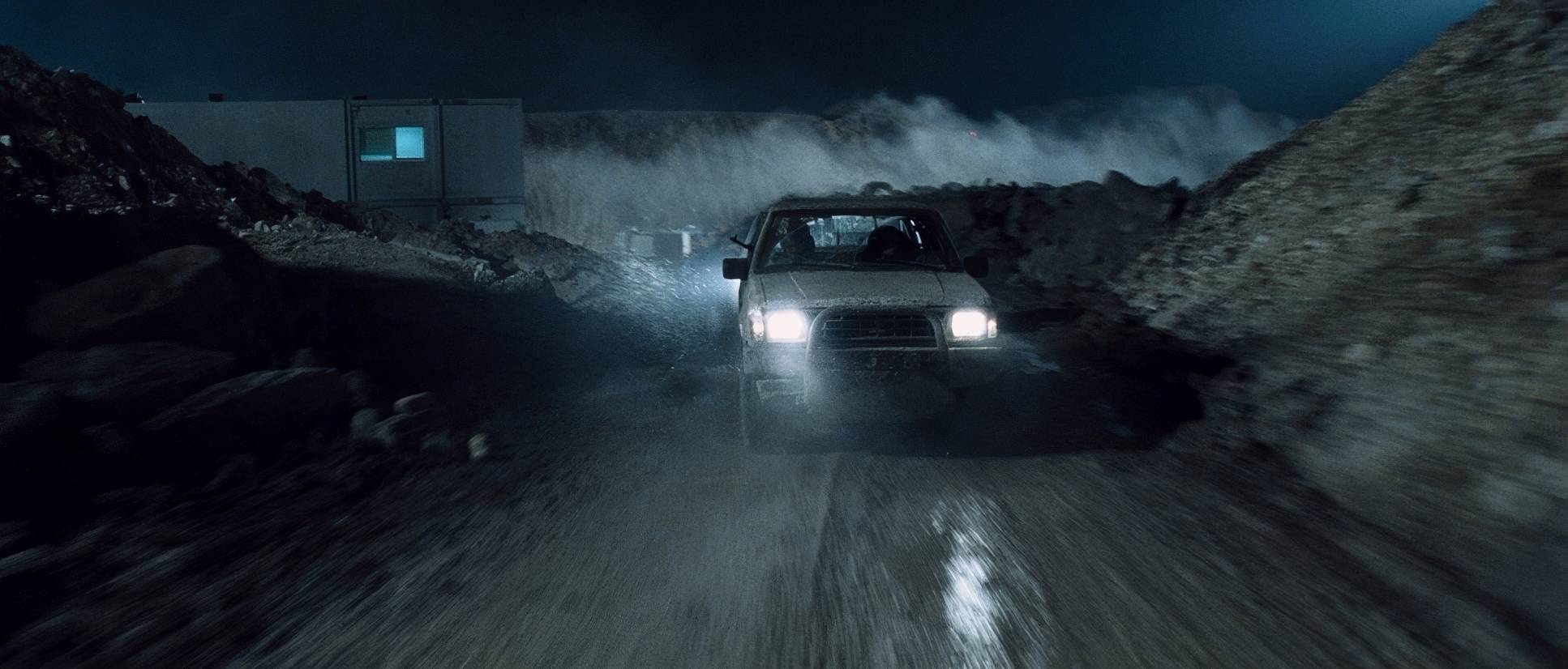
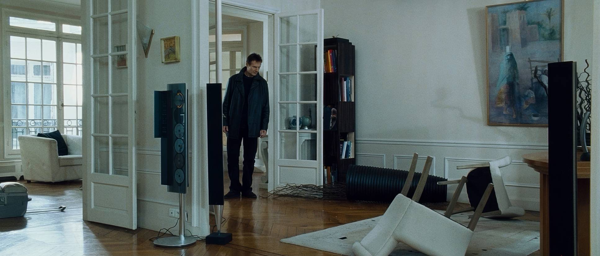
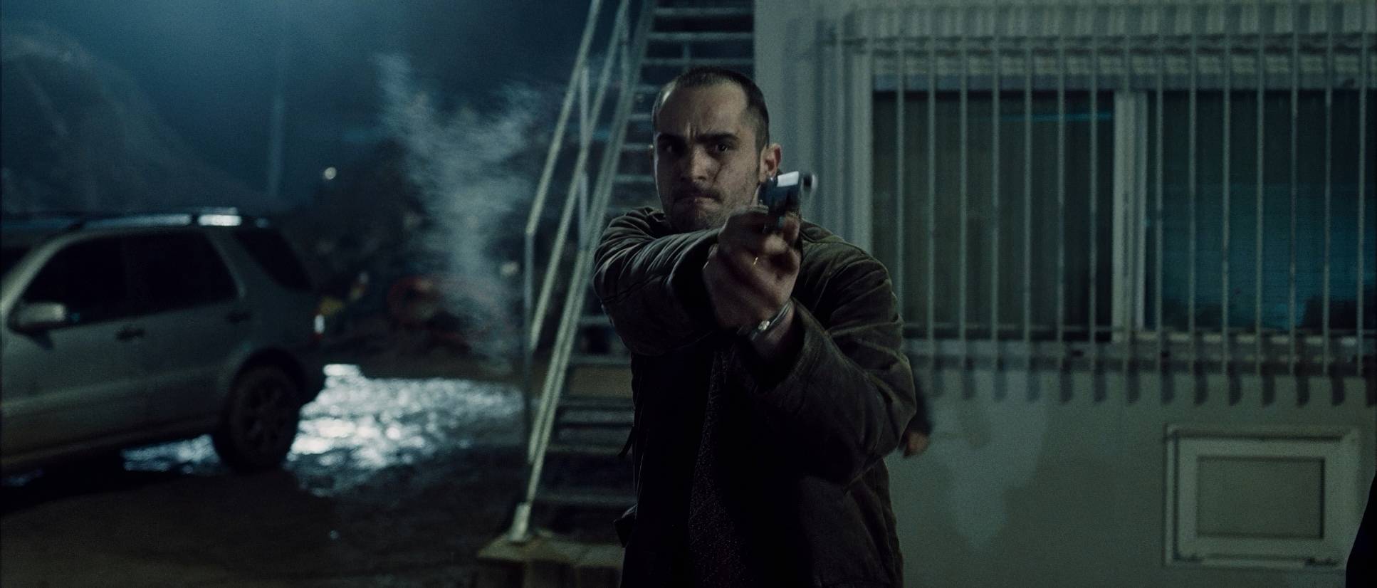
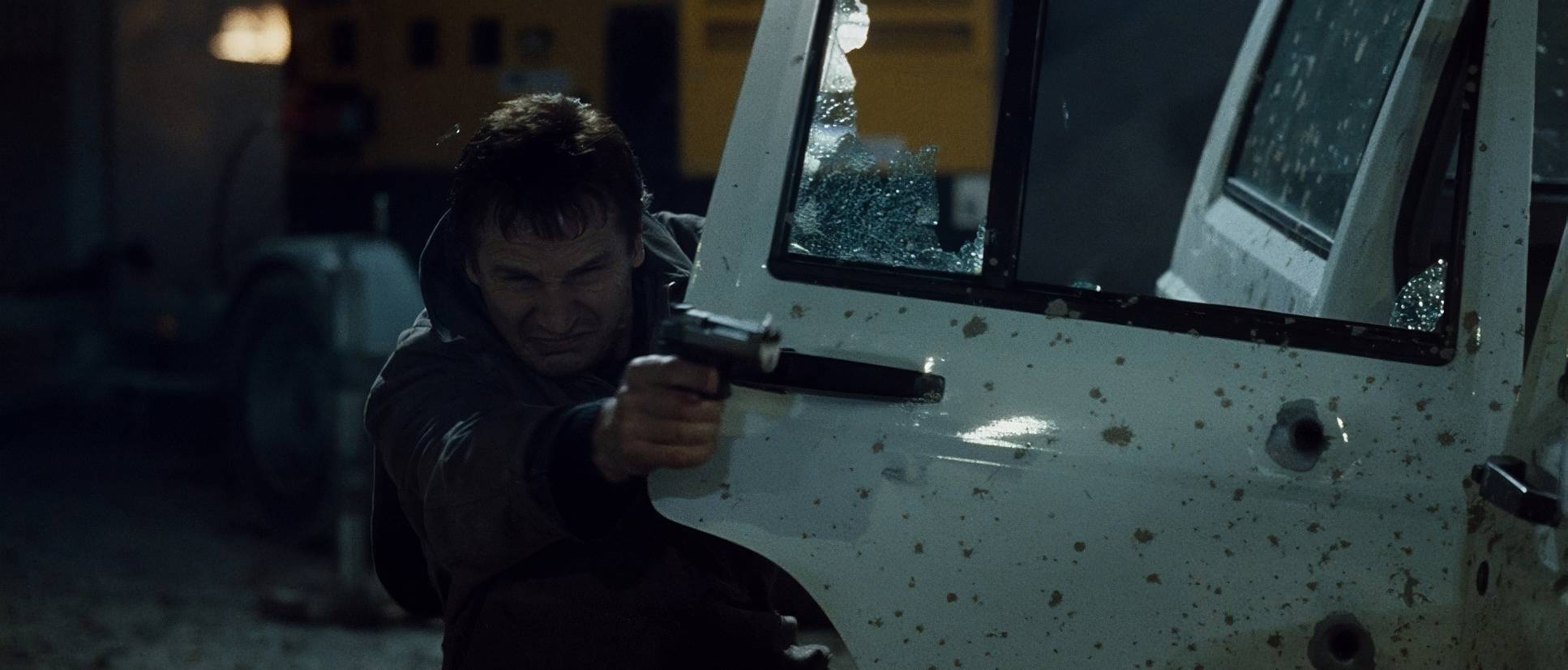
But once Kim is snatched? The camera becomes an extension of Bryan’s anxiety. We move into purposeful, controlled handheld work. These aren’t those nauseating “shaky-cam” movements that ruined action cinema in the late 2010s; they are kinetic and immediate. The camera is right there in Neeson’s face, tracking his gaze and his violent, surgical efficiency.
Compositional Choices
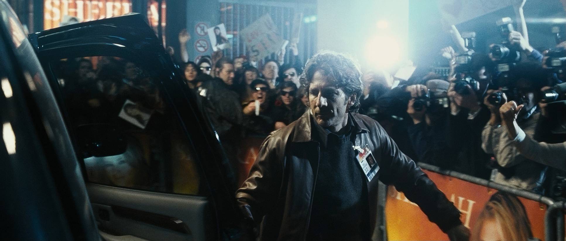
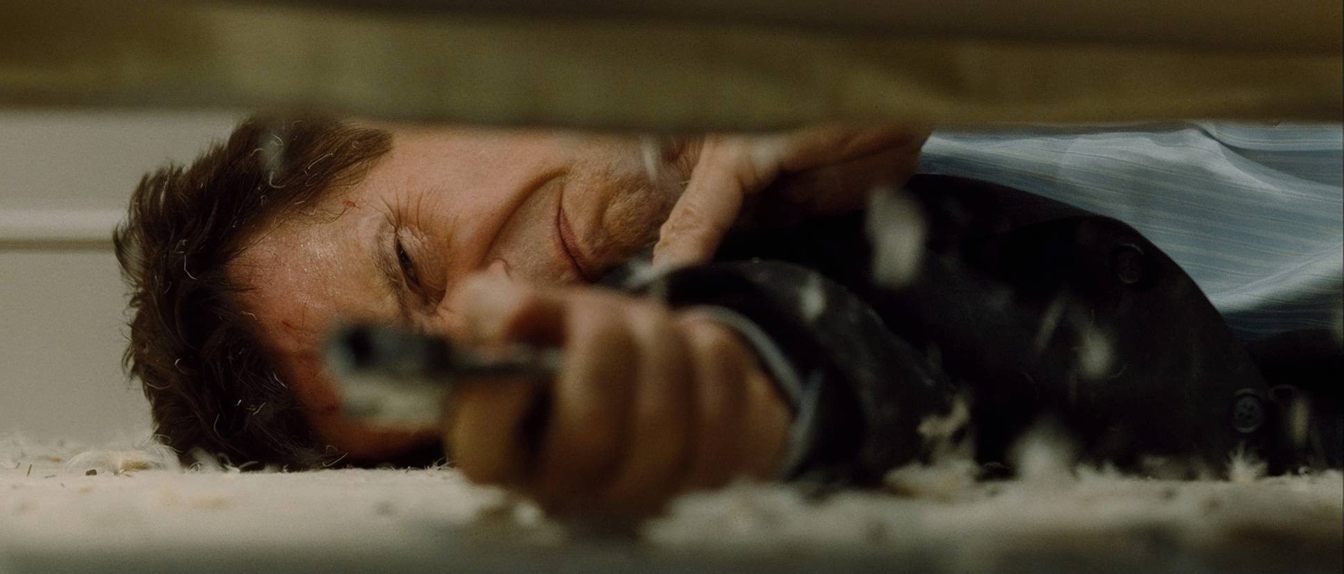
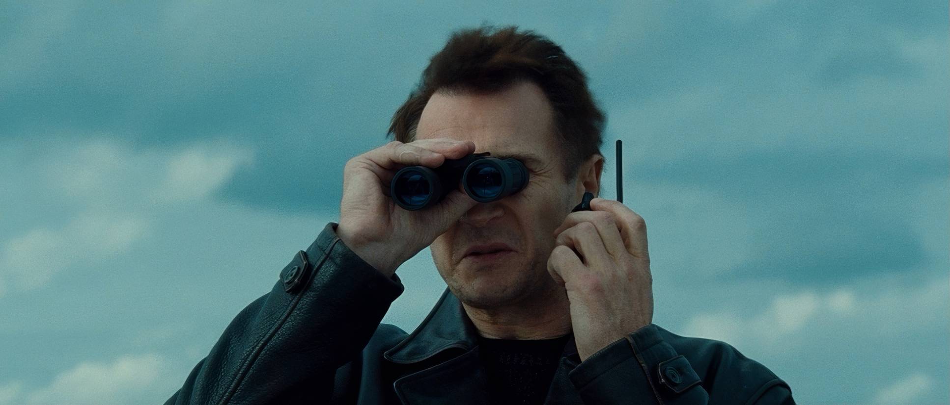
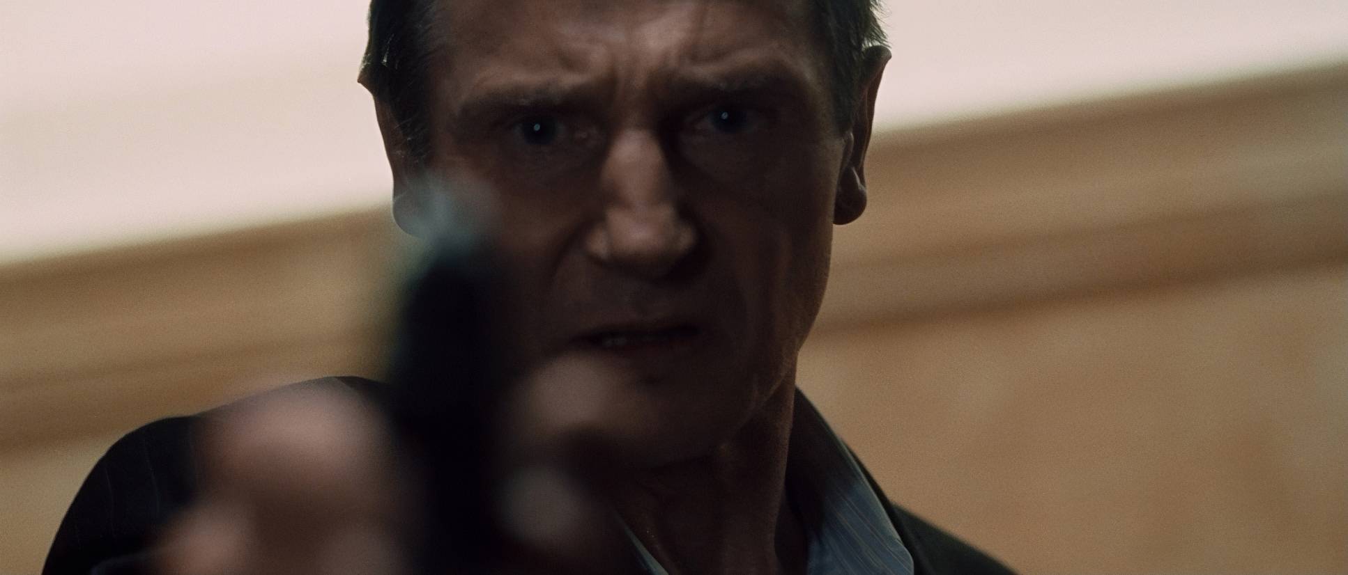
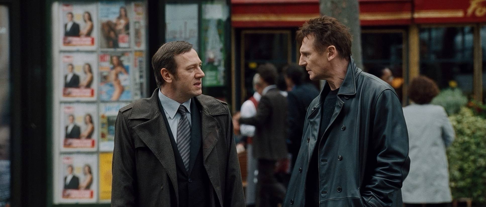
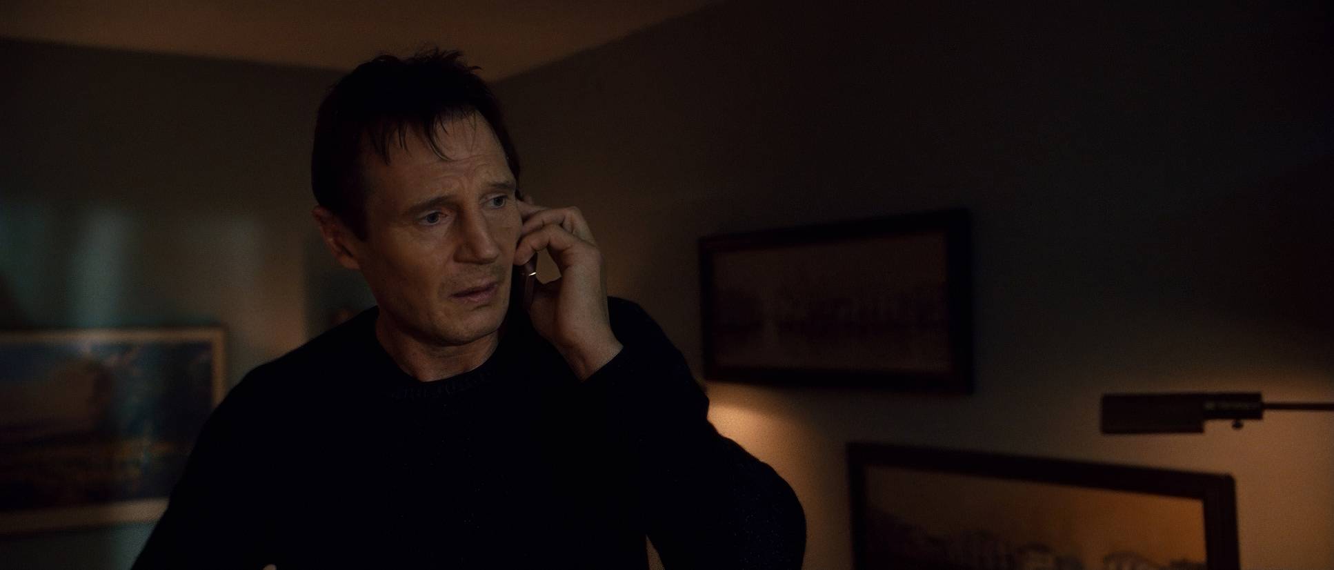
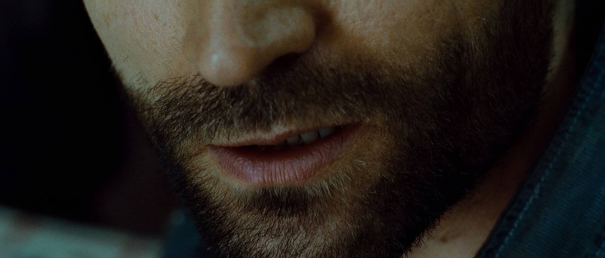
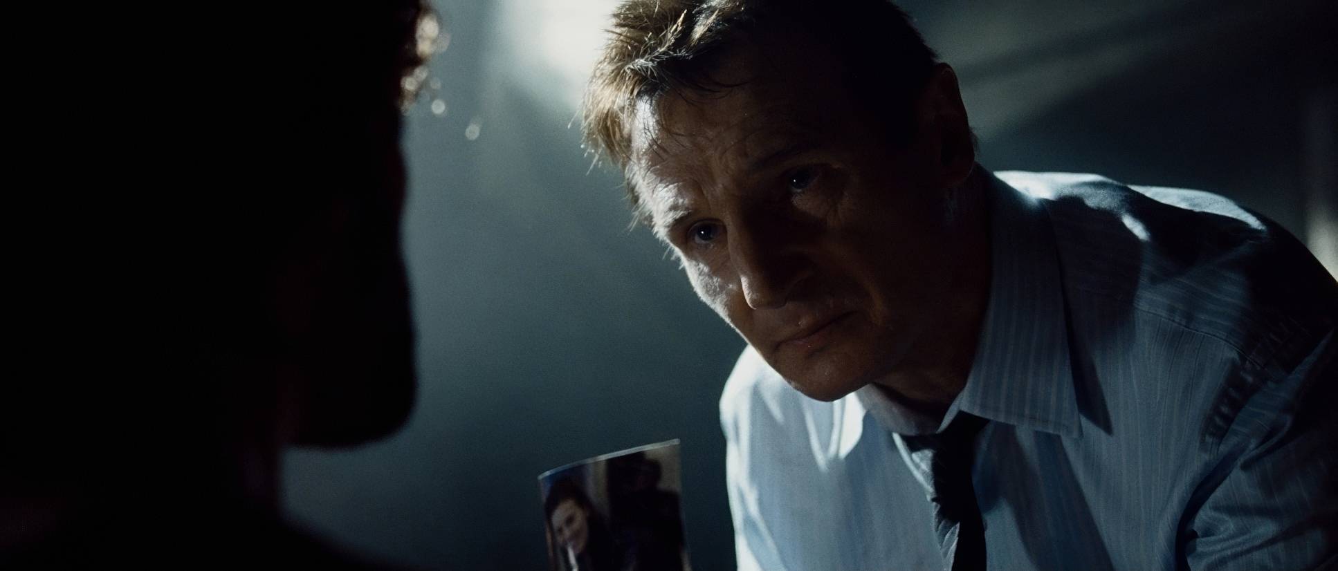
Pragmatism is the name of the game here. We see a massive amount of close-ups and medium shots on Liam Neeson. The film knows its greatest asset is Neeson’s steely resolve, so it anchors the frame on him. By using tight compositions and negative space, Abramowicz highlights Bryan’s singular focus against a vast, indifferent Paris.
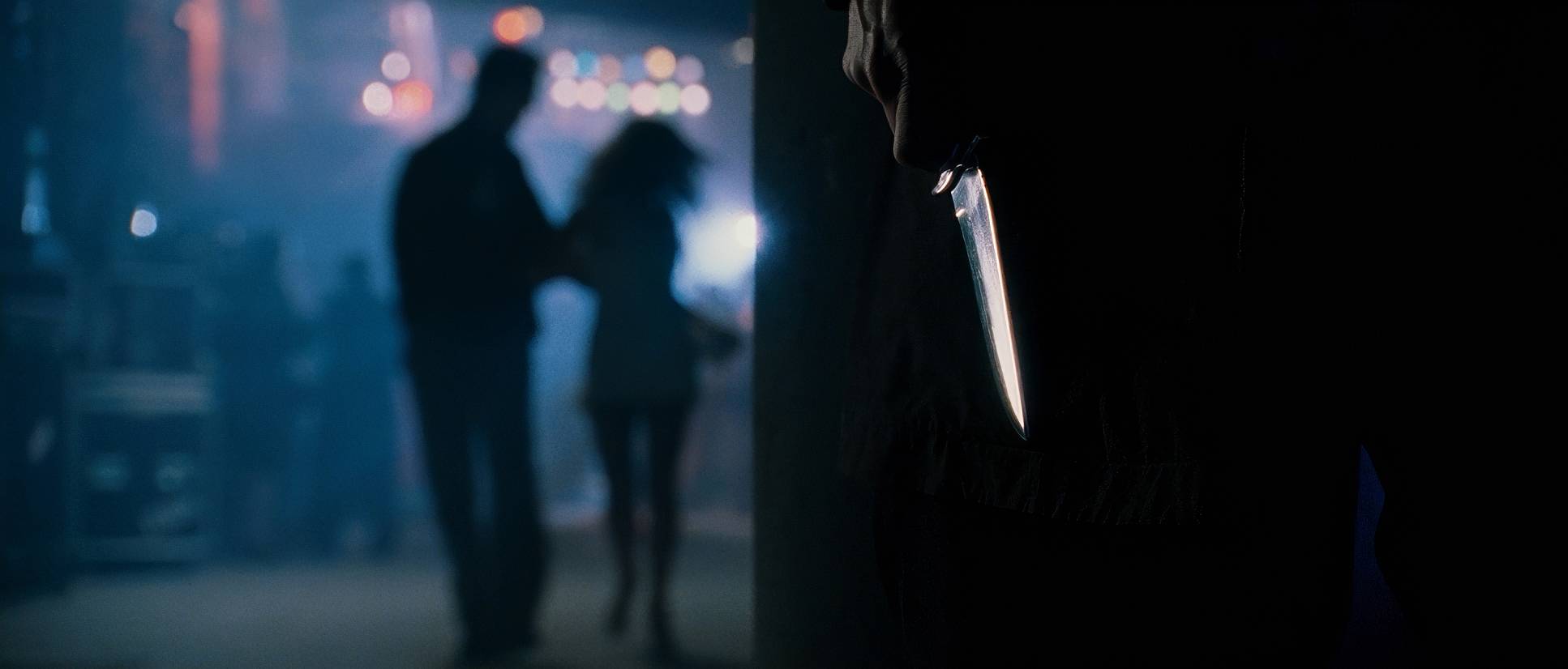
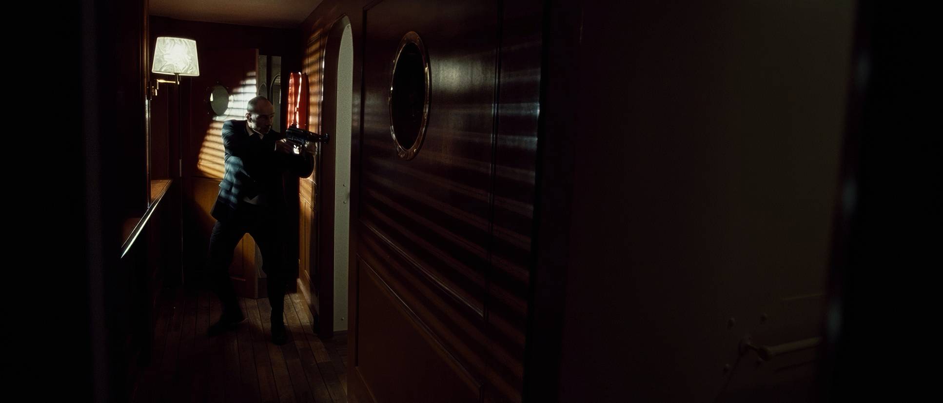
During the fights, the framing stays tight. We’re often denied the “god-view” of the room. By keeping us close, the violence feels more personal and claustrophobic. You don’t just see a punch; you feel the impact because there’s no distance to hide behind. Even the wider “establishing” shots of Paris feel distant and cold showing us exactly how far Bryan is from home.
Lighting Style
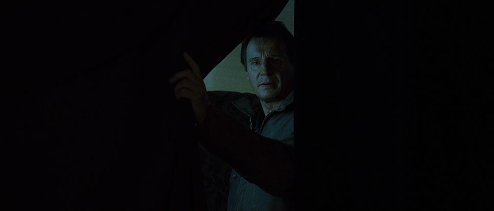
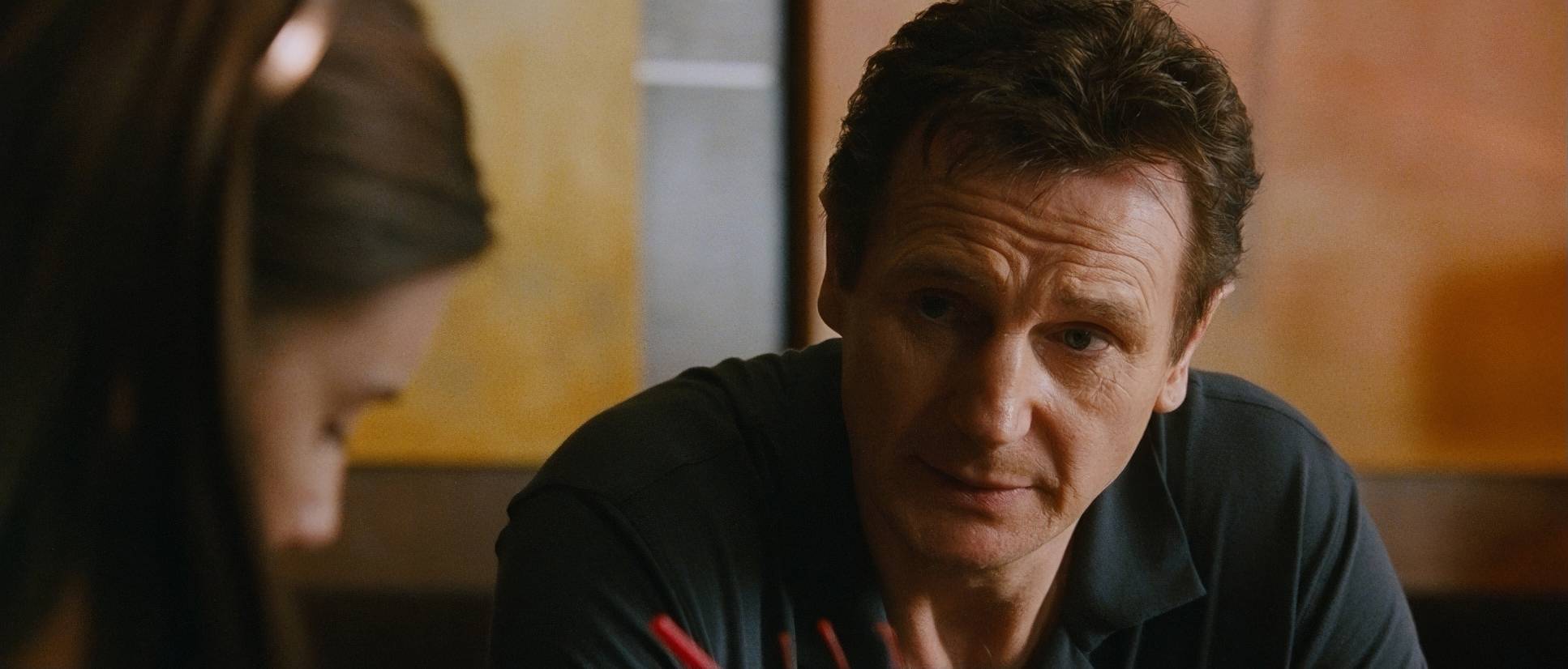
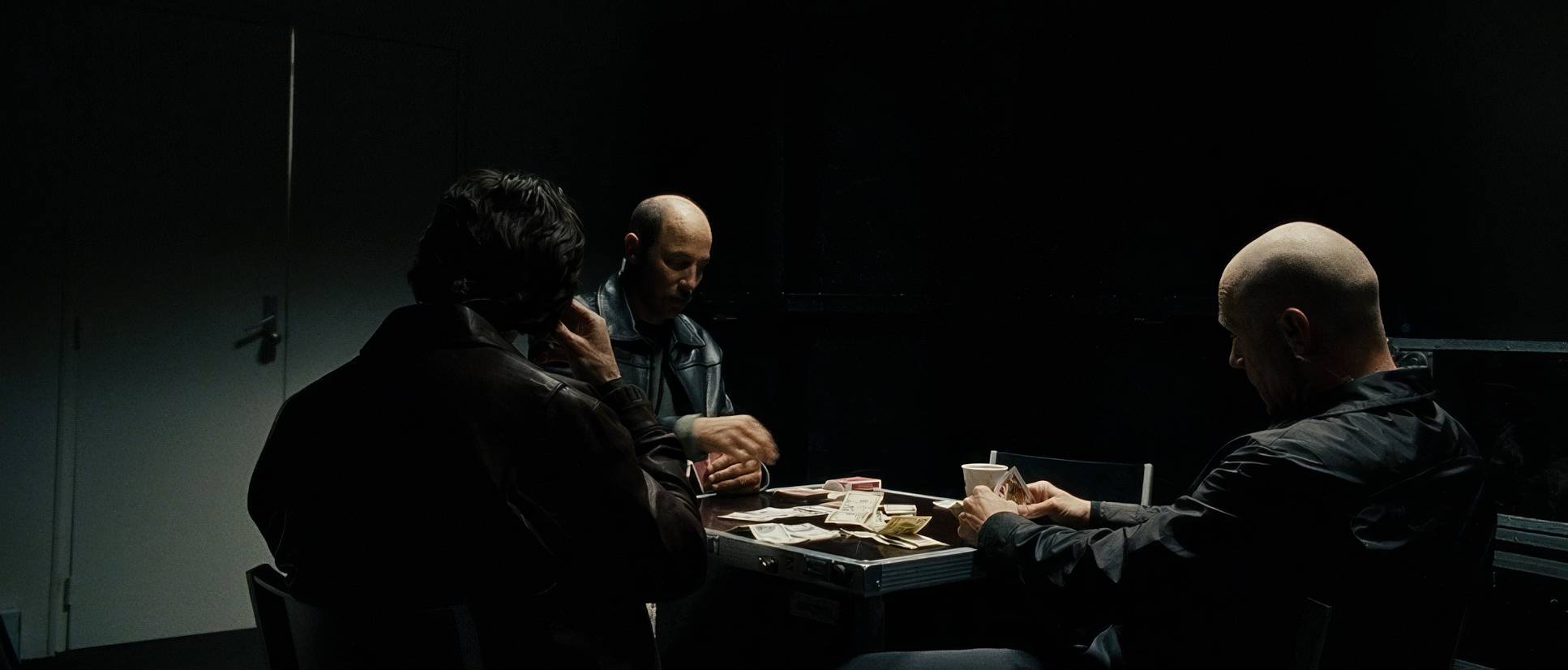
The lighting is firmly rooted in “motivated” reality. This means if there’s a window, that’s the light source. If there’s a shitty fluorescent in a basement, that’s the light source. It’s rarely theatrical.
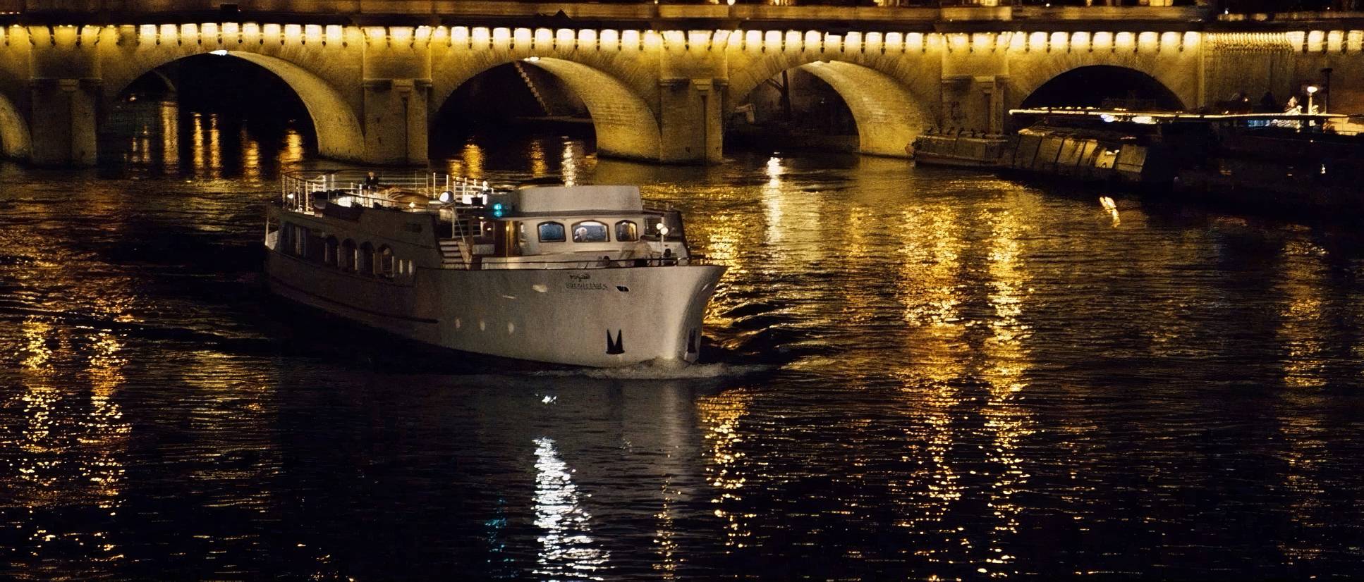
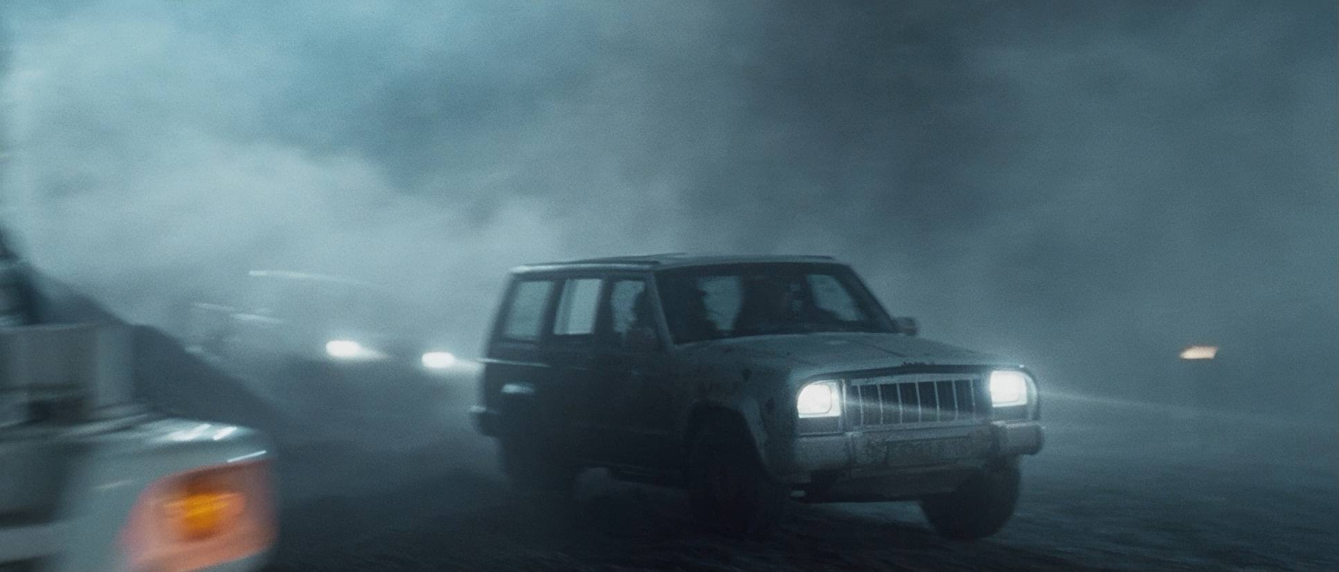
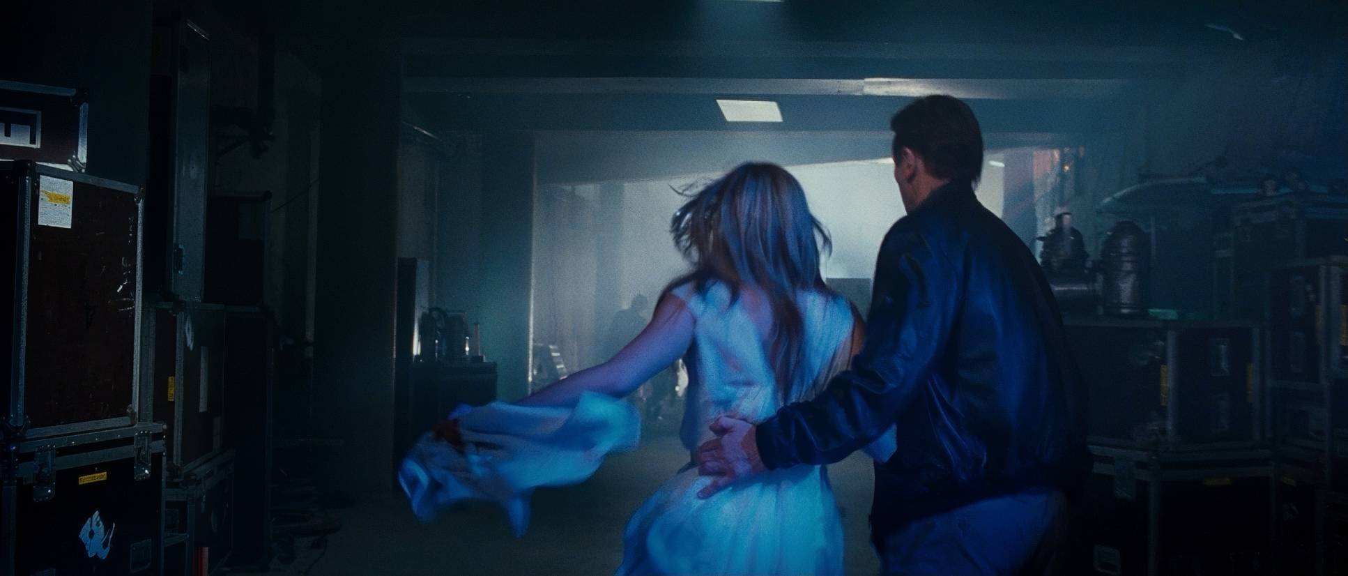
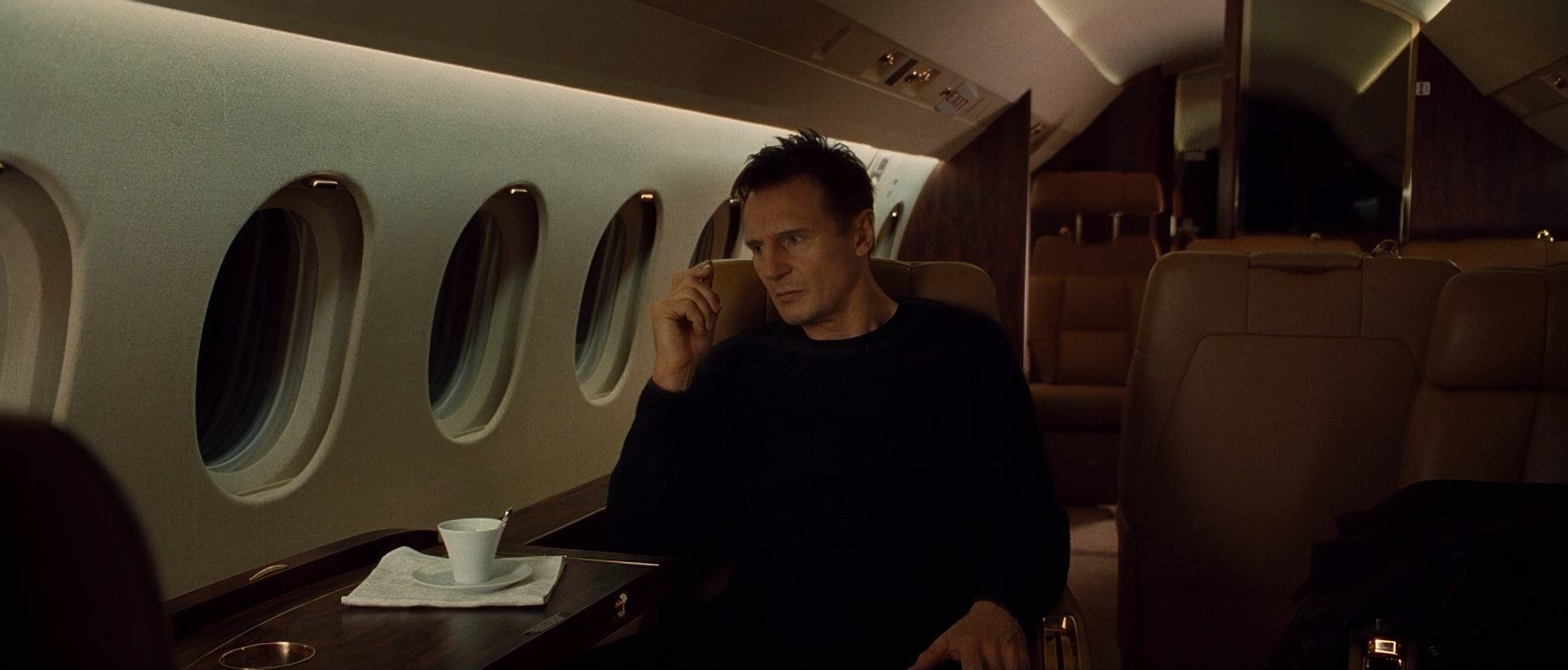
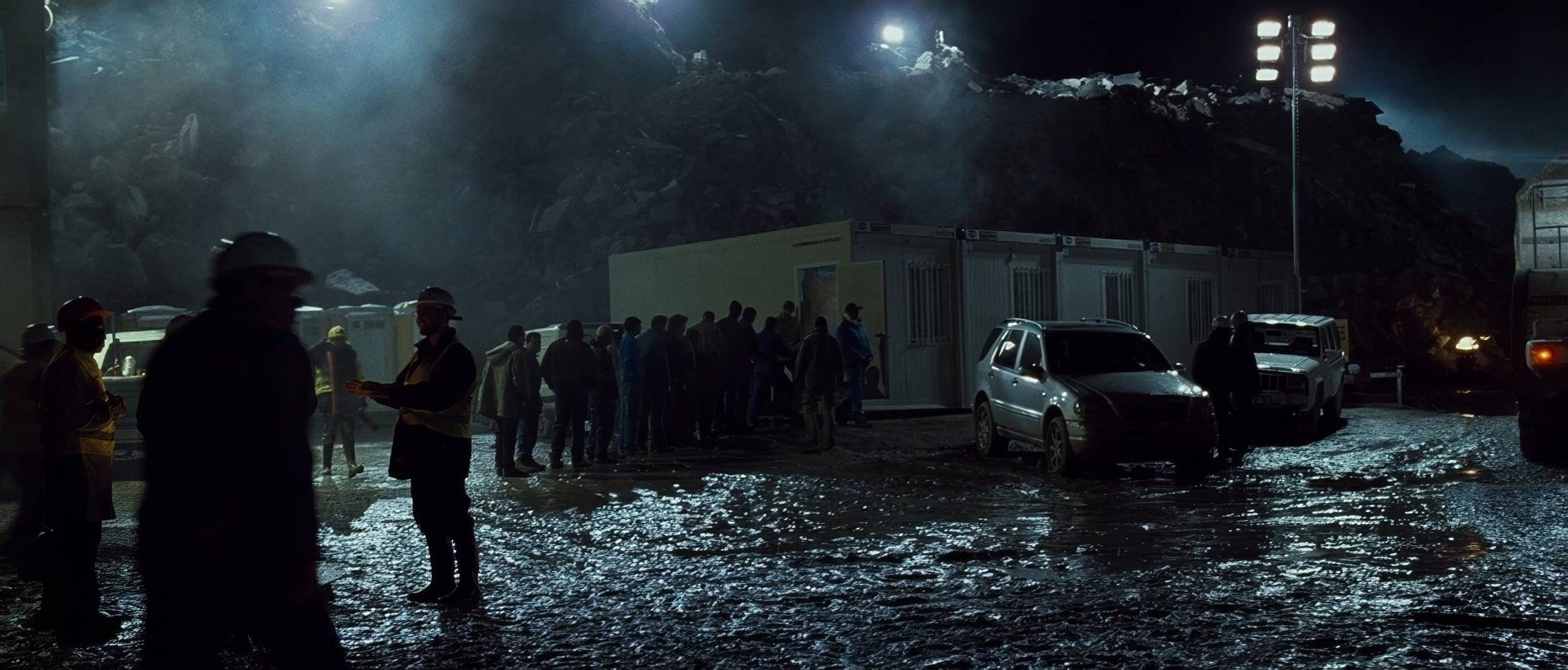
In L.A., we get a softer, warmer ambient bounce. It’s comfortable. But Paris? Paris is stark. Night scenes are lit with deep, unforgiving shadows and harsh practicals. We see the sickly greens of old fixtures, the cool, clinical blues of streetlights, and the sharp flare of car headlamps. There’s very little “fill” light here. Abramowicz lets the shadows deepen, sculpting Neeson’s weathered face and making the underworld feel genuinely dangerous. It’s ugly, and it’s perfect.
Lensing and Blocking
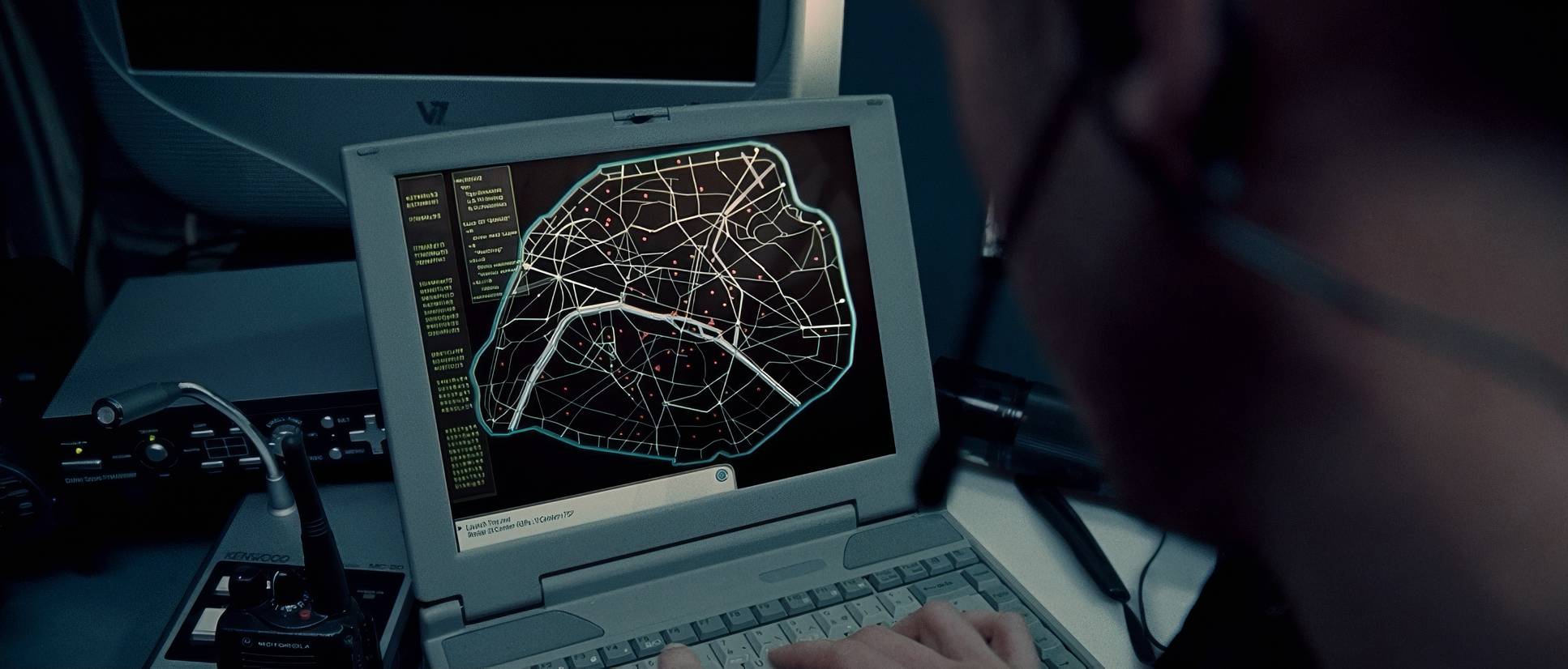
For the most part, we stay on wider to normal focal lengths. This keeps us intimate without the “fish-eye” distortion of a super-wide lens. When they do pull out a long lens, it’s usually to compress space during surveillance scenes, making the distance between Bryan and his target feel both immediate and impossible.
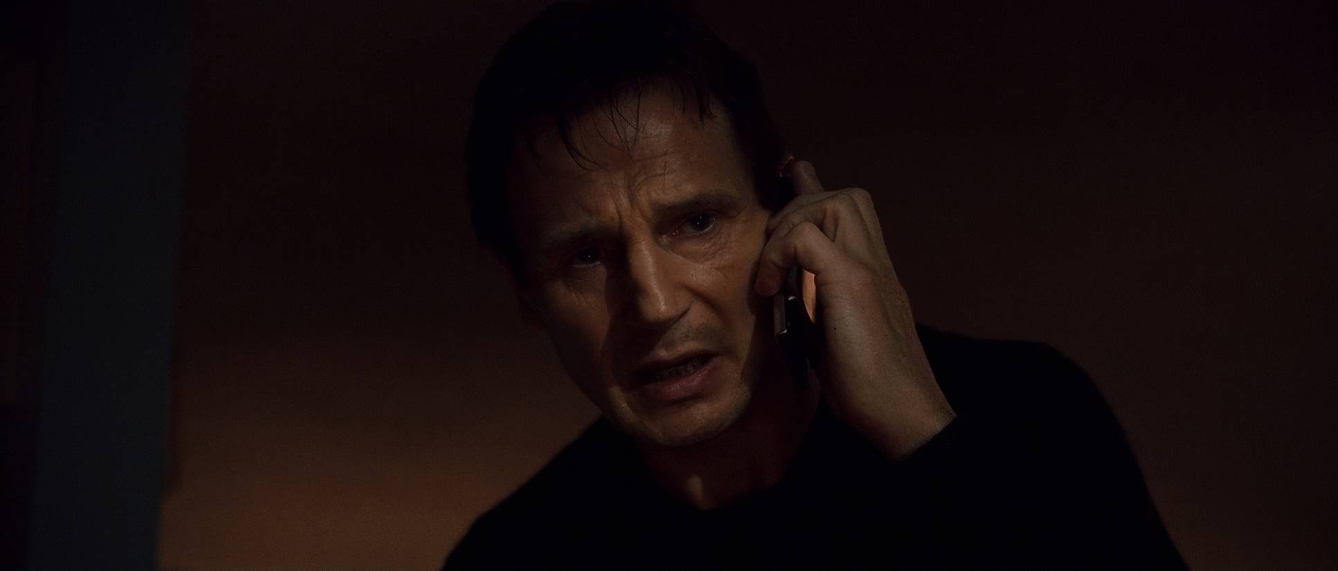
The blocking is where the “predator” vibe comes from. Bryan Mills occupies the frame with a terrifying grace. In that iconic phone call, the blocking is static all the power is in his delivery and the tight framing. But in the field, he moves with a predator’s situational awareness. He towers over his interrogations, physically dominating the space. It’s a masterclass in using body language to communicate competence.
Technical Aspects & Tools
2008 was a weird, fascinating time for cinema tech. Taken was caught right in the “Wild West” transition between film and digital. They used a hybrid setup: the classic 35mm (Kodak Vision2 500T) for that beautiful organic texture, alongside the Panavision Genesis, which was one of the first digital cameras to really challenge film.
You can see that struggle for texture in the final product. The 35mm stock gives the shadows a richness and grain that feels “alive,” while the Genesis work in certain sequences adds to that clinical, digital immediacy. They weren’t using complex crane rigs; it was a “point-and-shoot” mentality executed with surgical precision.
Color Grading Approach
Now, let’s talk shop. As a colorist, I love that Taken doesn’t try to win a beauty pageant. The grade is a masterclass in narrative support. We’re looking at a desaturated, cool palette that strips away the vibrancy once the mission begins.
The contrast is assertive. The shadows are deep and rich, but they aren’t “crushed” into black blobs there’s still enough detail in the dark corners to make you feel like something is lurking there. The highlights have a controlled roll-off that feels more like a print-film look than a sterile digital one.
We aren’t seeing a hyper-stylized “Orange and Teal” LUT here. Instead, it’s about tonal sculpting. The cooler midtones in Paris amplify the somber mood and the urgency of the clock. We’re seeing true blacks and bright whites, maintaining a visual integrity that feels grounded in the real world, not a stylized comic book.
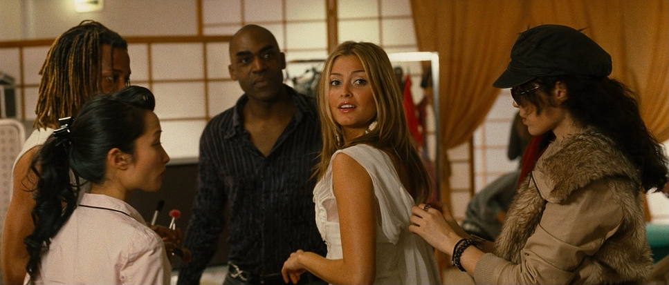
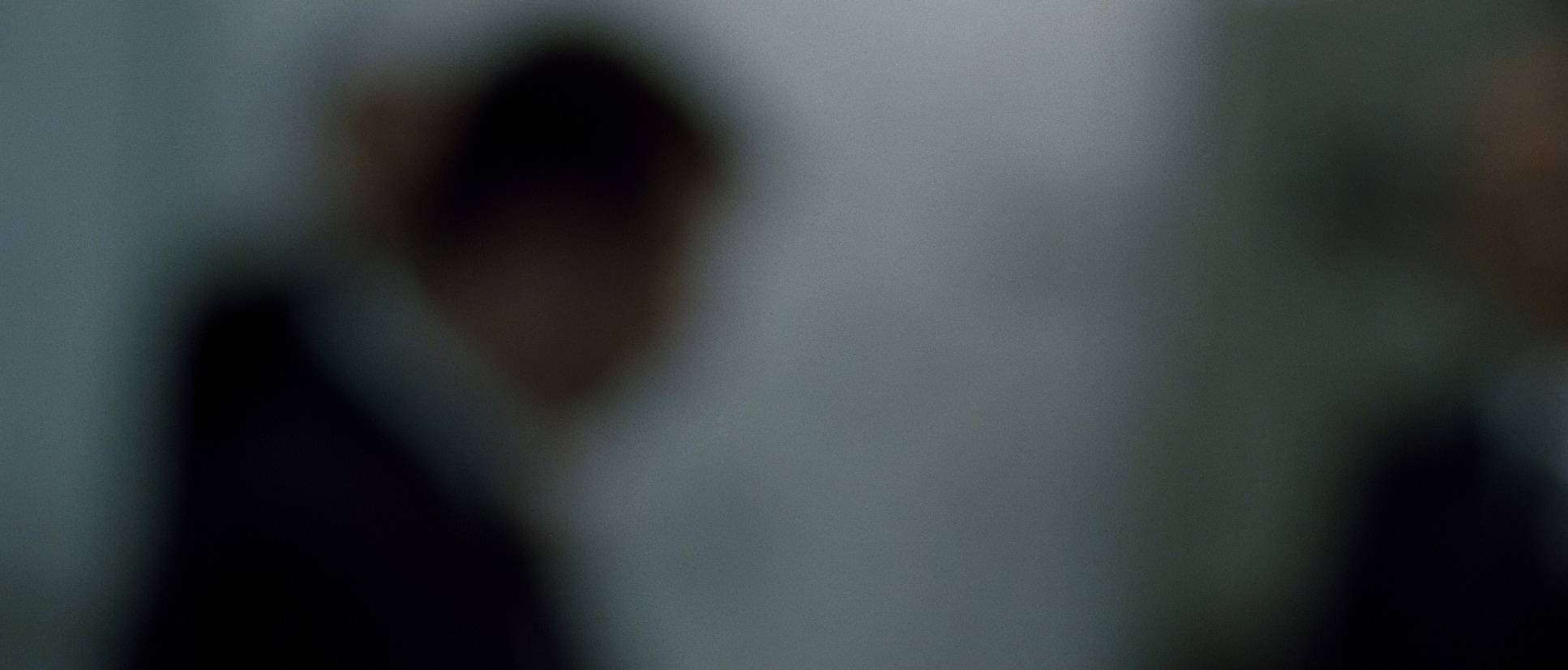
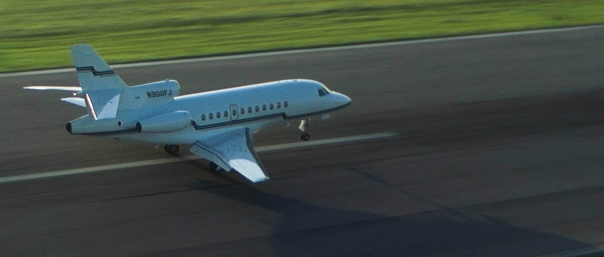
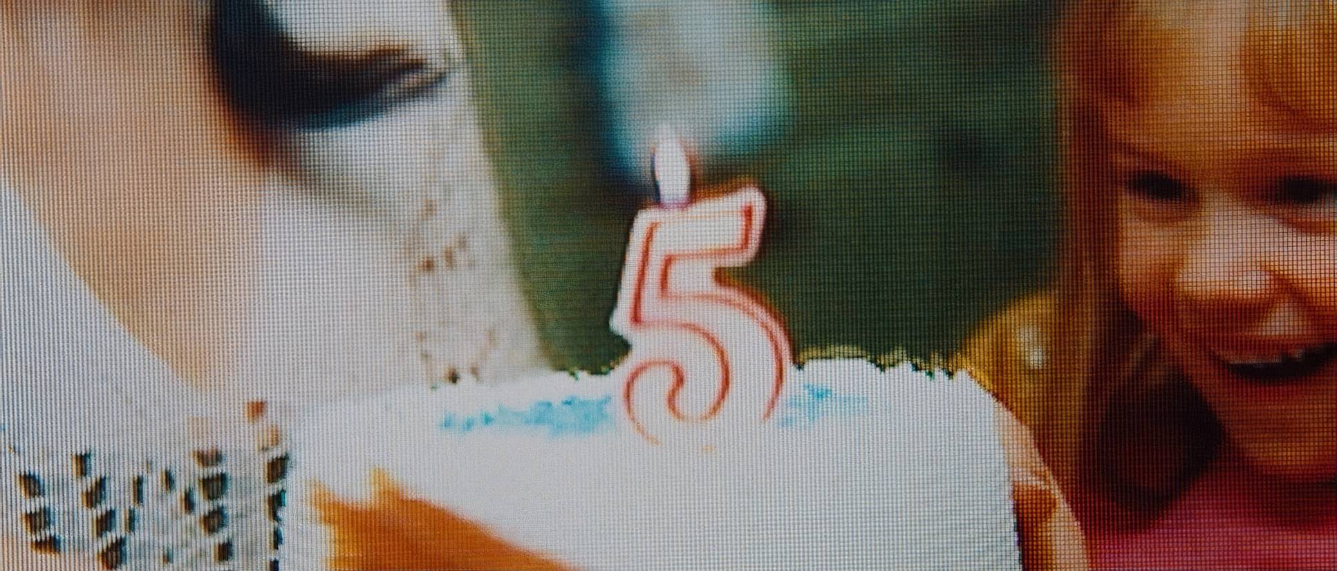
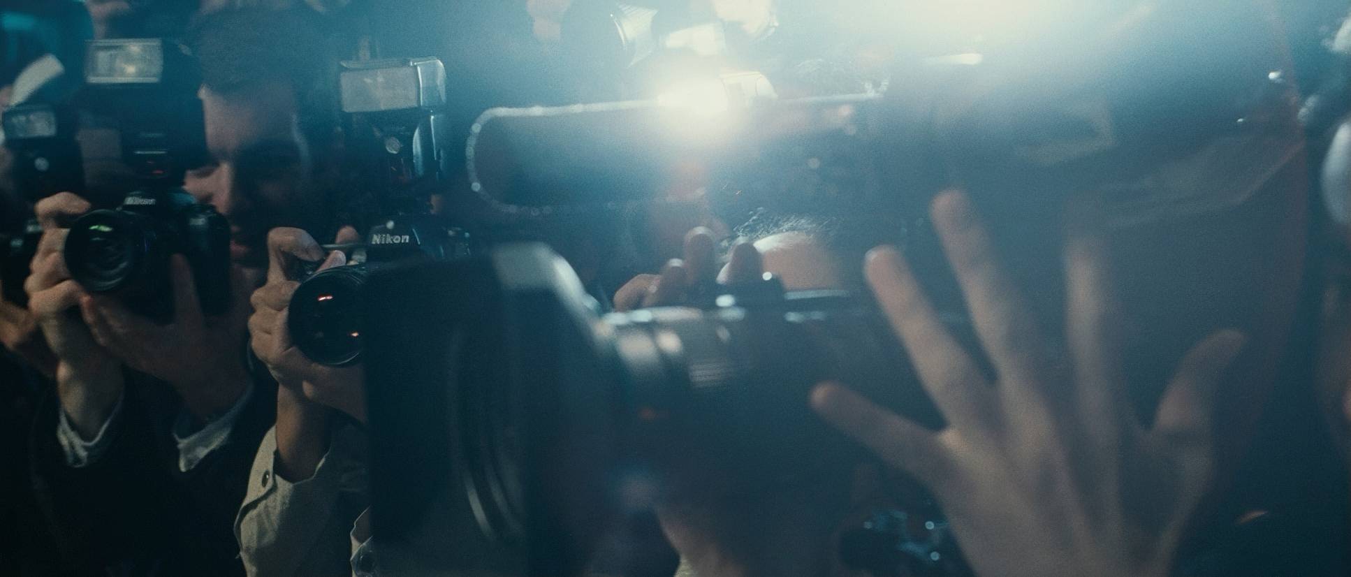
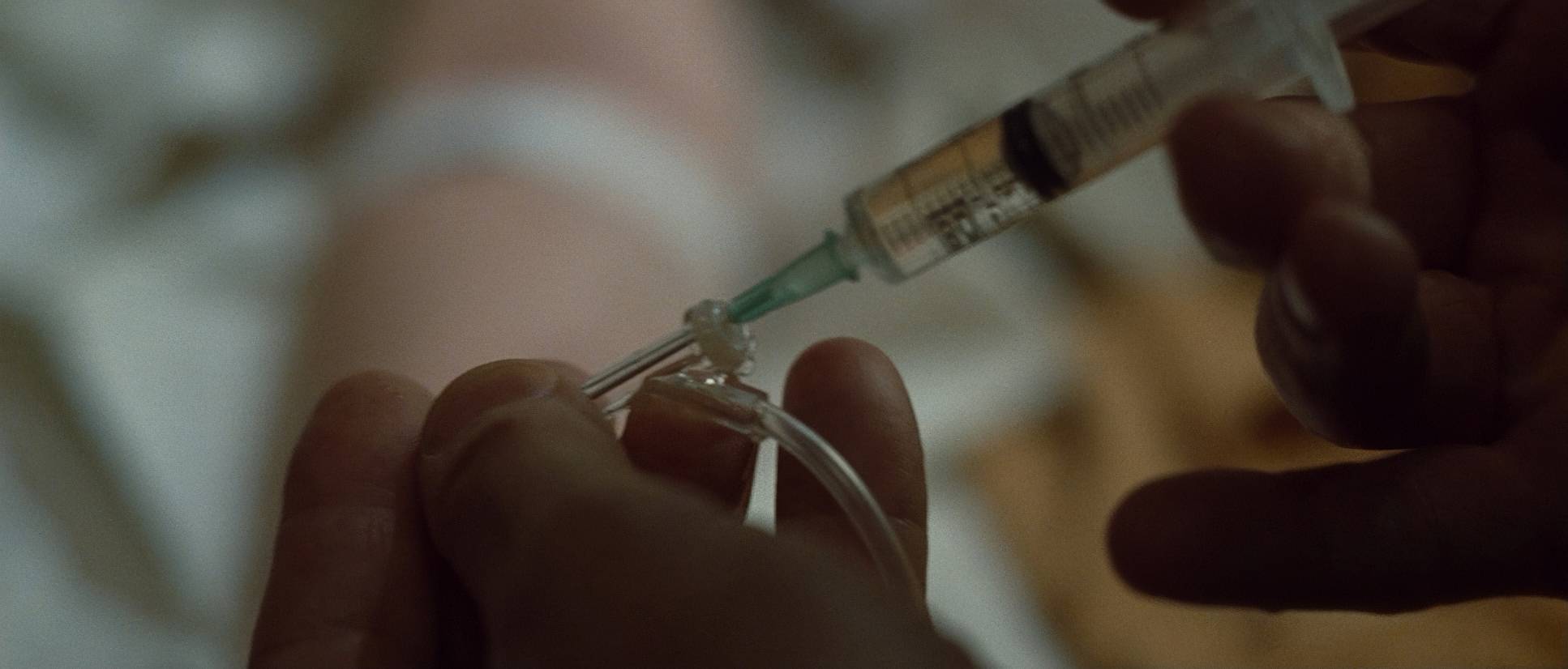
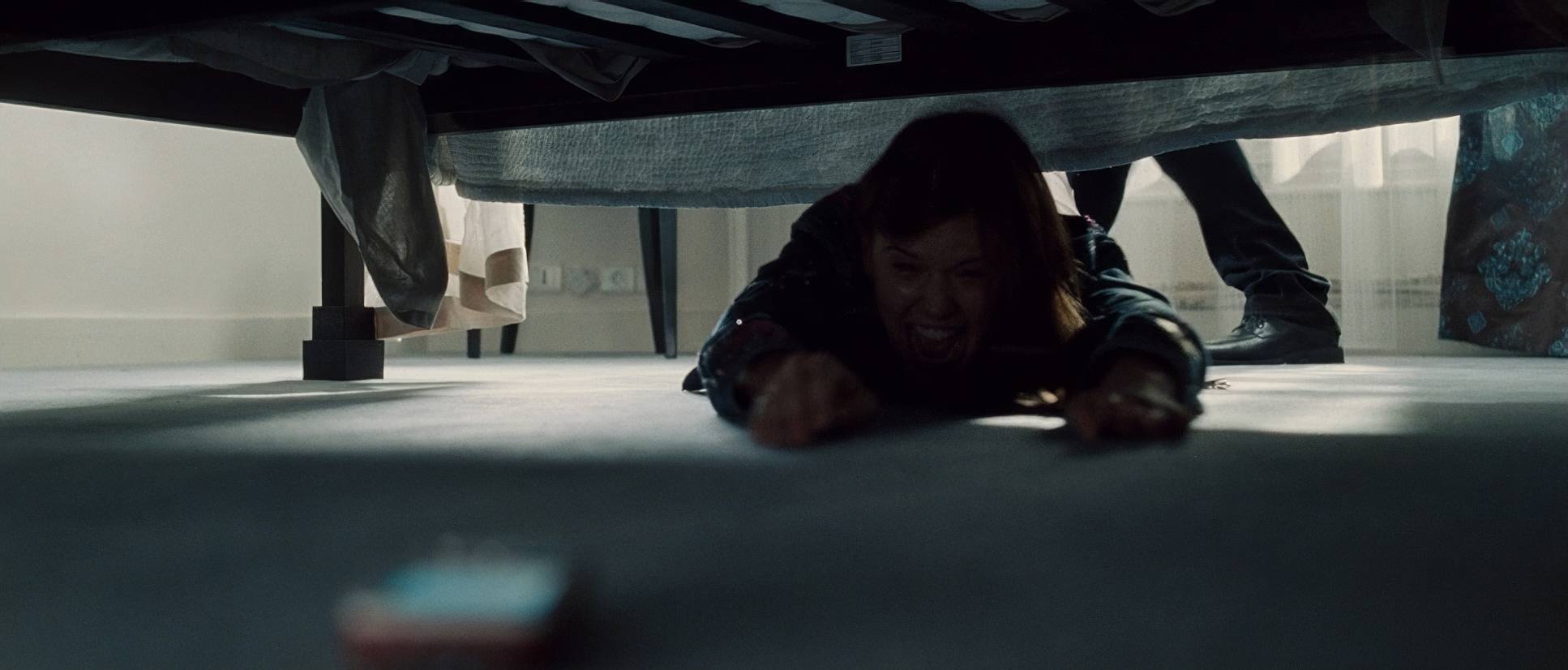
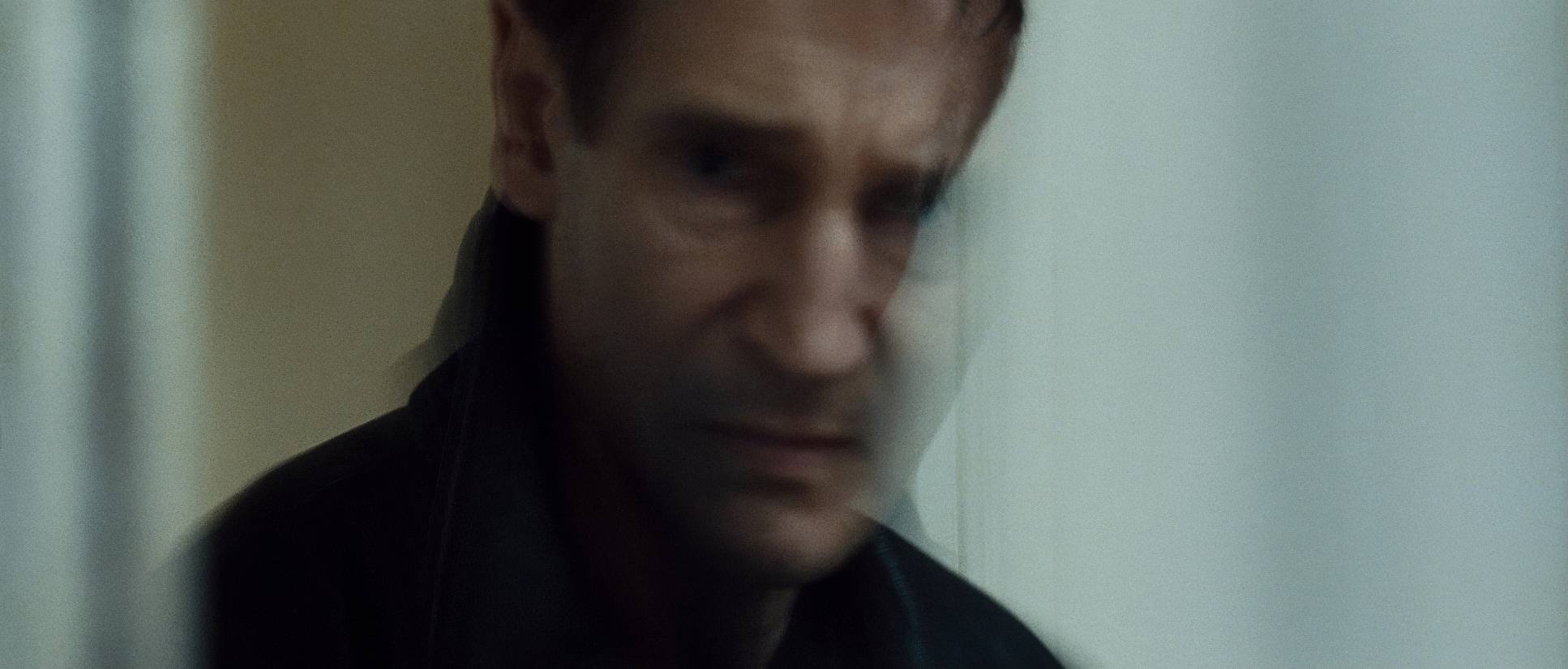
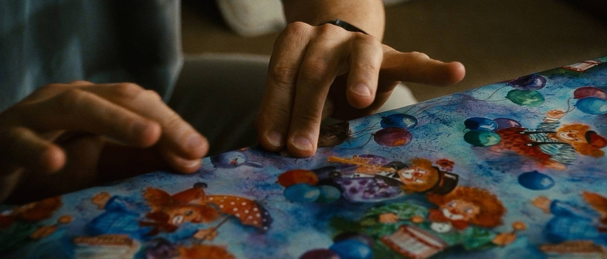
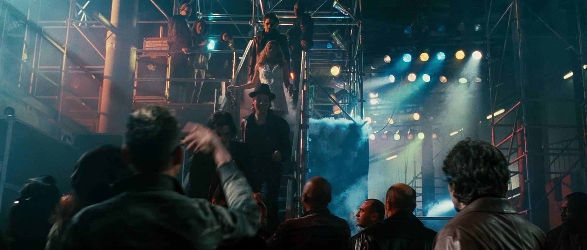
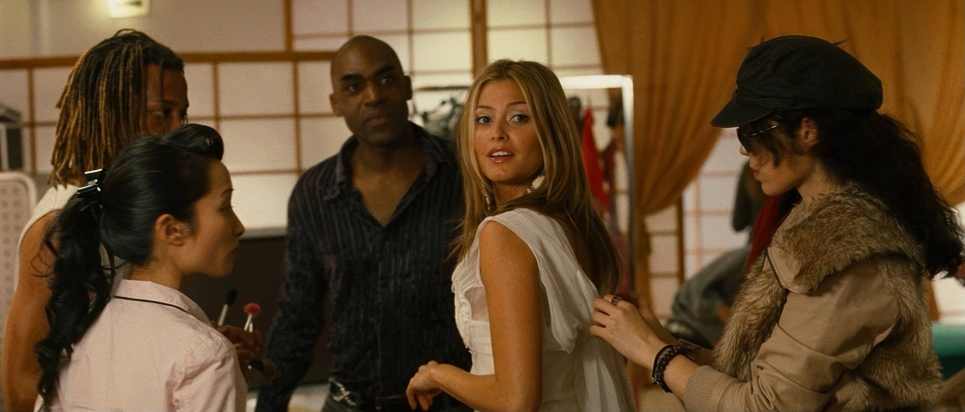
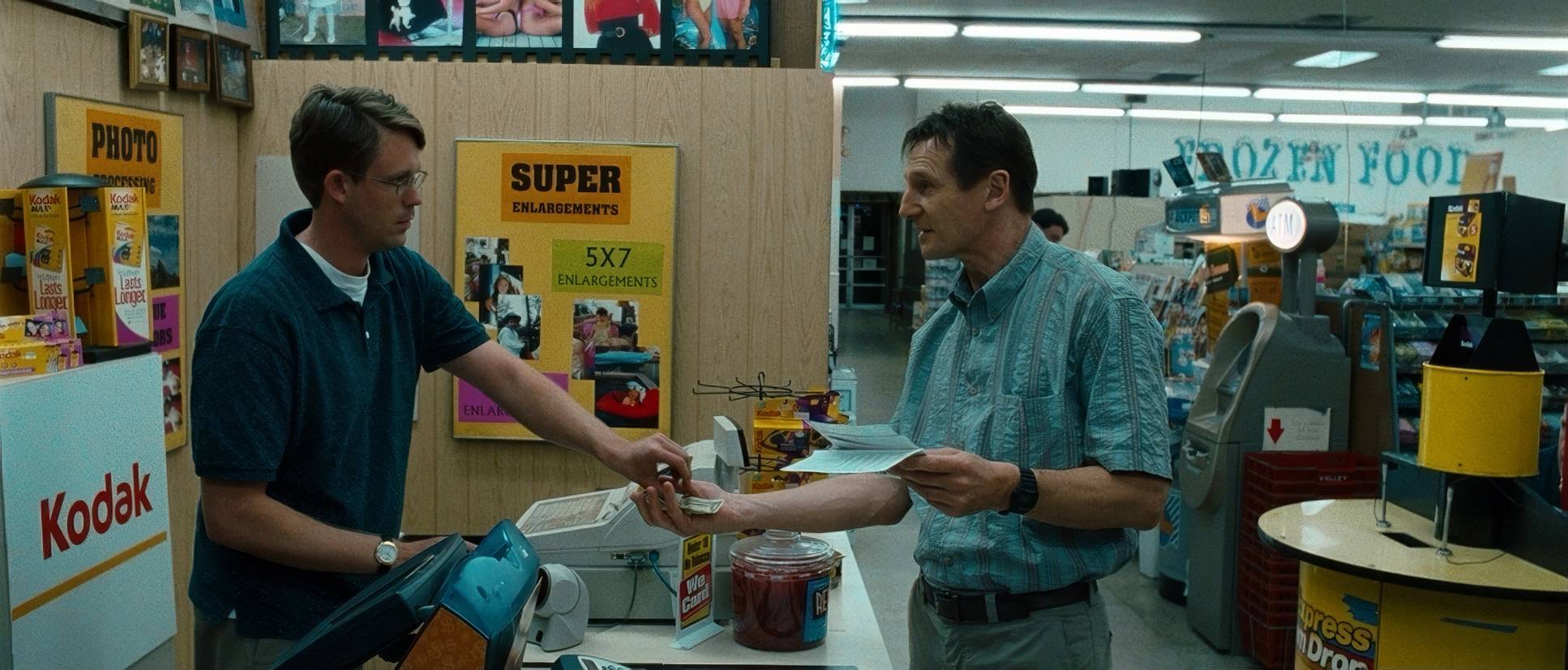
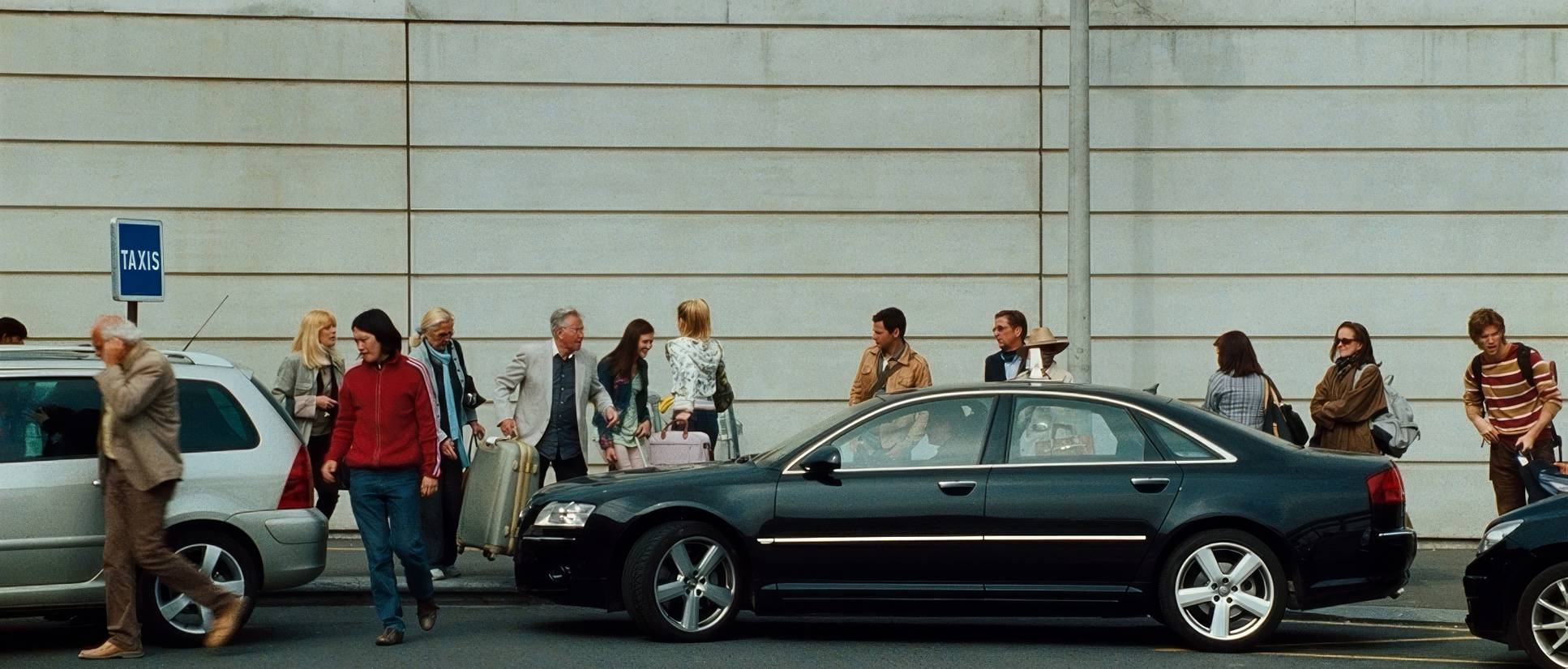
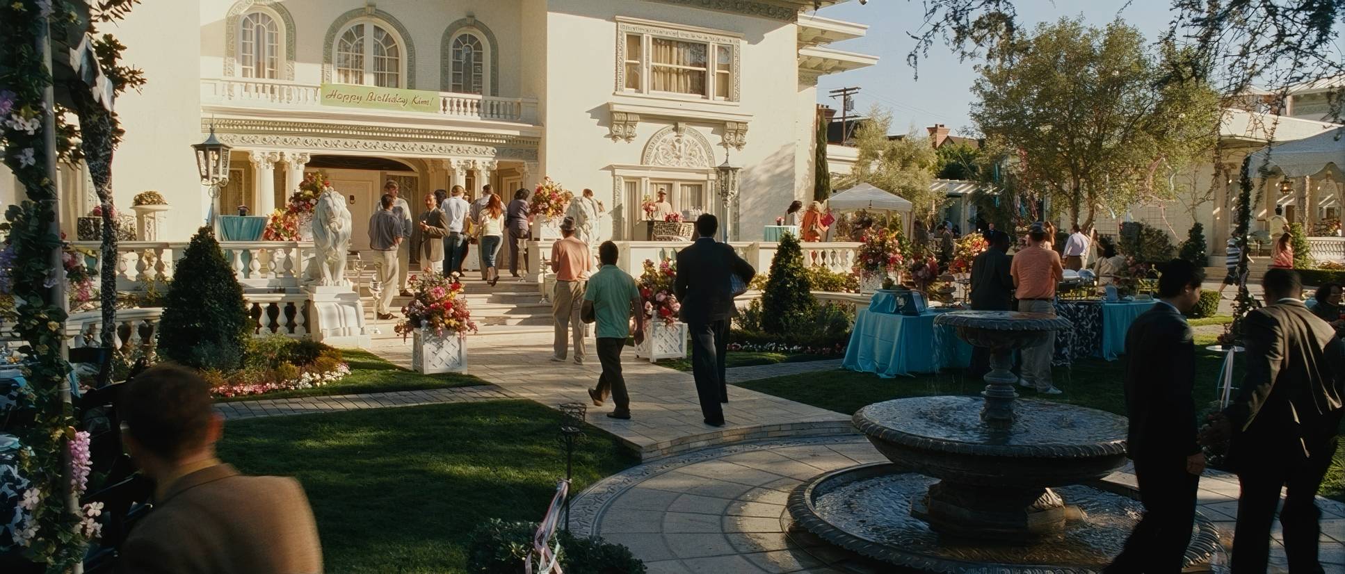
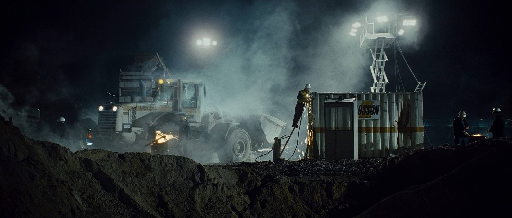
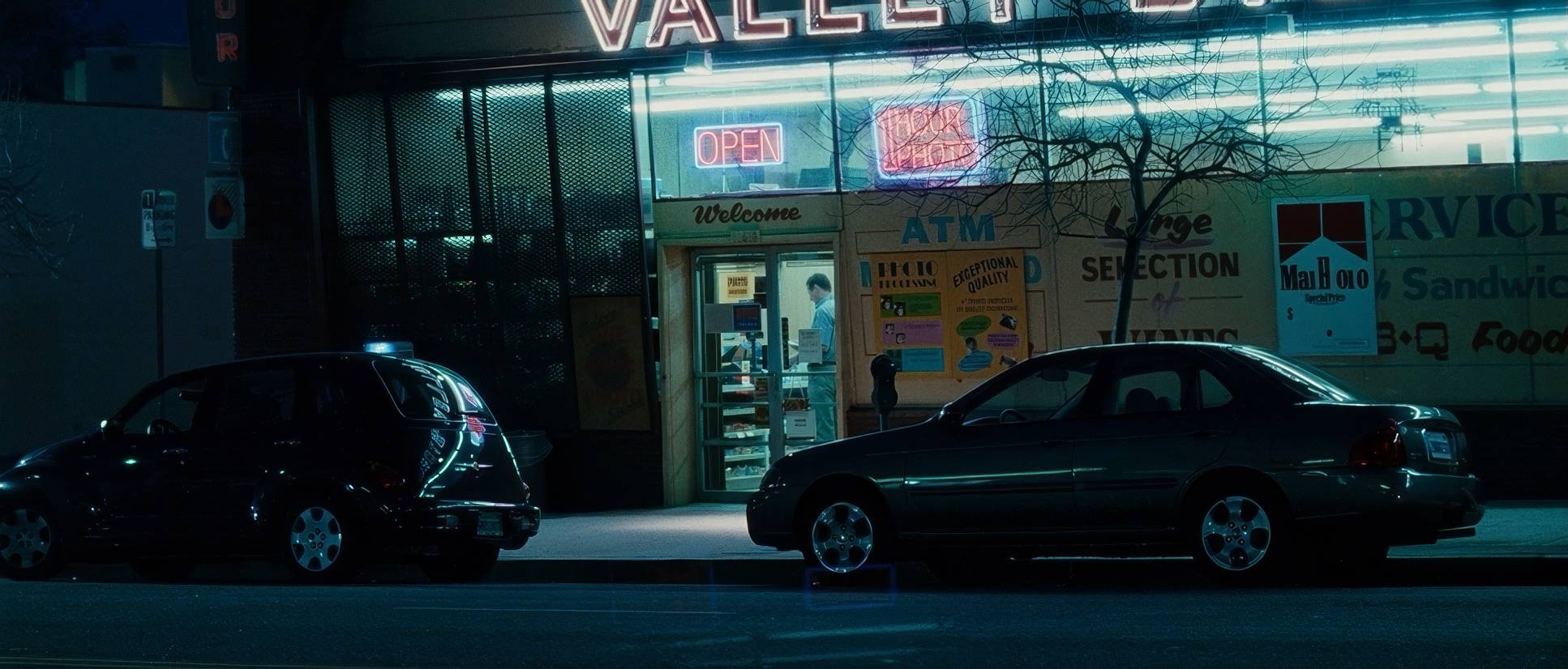
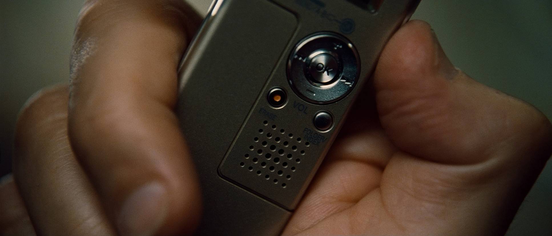
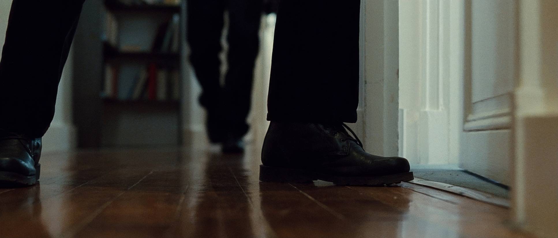
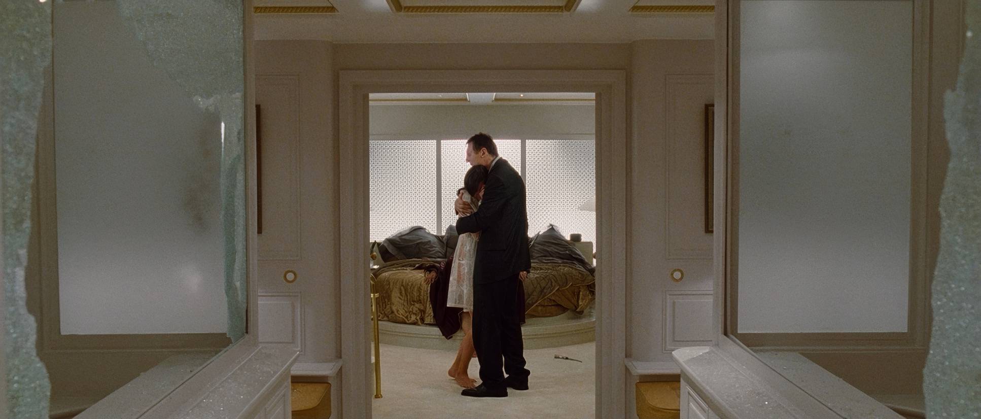
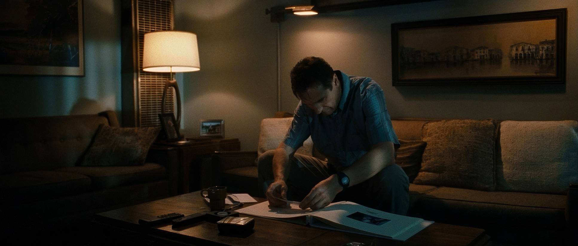
Taken (2008) Film Stills
A curated reference archive of cinematography stills from Taken (2008). Study the lighting, color grading, and composition.


- Also read: HOME ALONE (1990) – CINEMATOGRAPHY ANALYSIS
- Also read: HARRY POTTER AND THE GOBLET OF FIRE (2005) – CINEMATOGRAPHY ANALYSIS
Browse Our Cinematography Analysis Glossary
Explore directors, cinematographers, cameras, lenses, lighting styles, genres, and the visual techniques that shape iconic films.
Explore Glossary →