X-Men: First Class (2011) for me, this isn’t just another superhero movie it’s a masterclass in how to use visual language to build a world from the ground up. It’s the “perfect prequel” because it uses its look to ground the fantastical in a very real, very tangible history.
About the Cinematographer
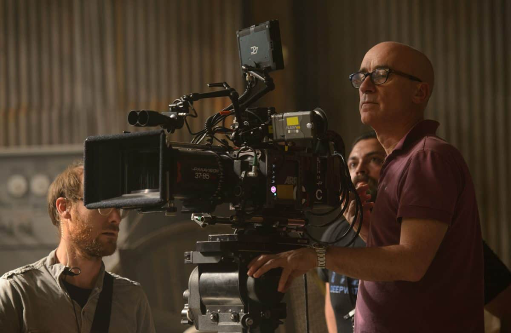
The man behind the lens here is John Mathieson. If you know his work with Ridley Scott (Gladiator, Kingdom of Heaven), you know he’s a master of scale and “grit.” He doesn’t do “clean” and “plastic” very often.
Working with director Matthew Vaughn, Mathieson brought a specific kind of weight to First Class. He has this ability to take high-concept comic book elements and make them feel like a gritty period drama. Every shot feels purposeful. He’s not interested in being flashy for the sake of it; he’s interested in making sure you believe these characters could actually exist in the 1960s.
Inspiration Behind the Cinematography

The 60s setting isn’t just window dressing it’s the soul of the film. We’re talking Cold War paranoia, the DNA of early James Bond thrillers, and that sharp, “Mad Men” aesthetic. Mathieson and Vaughn leaned hard into this, using the architecture and fashion of the era to dictate the lighting.
But what really interests me is how this era reflects the split between Charles Xavier and Erik Lehnsherr. I was watching the “Perfect Prequel” video recently, and it really hits the nail on the head: the film is about why these men changed, not just how.
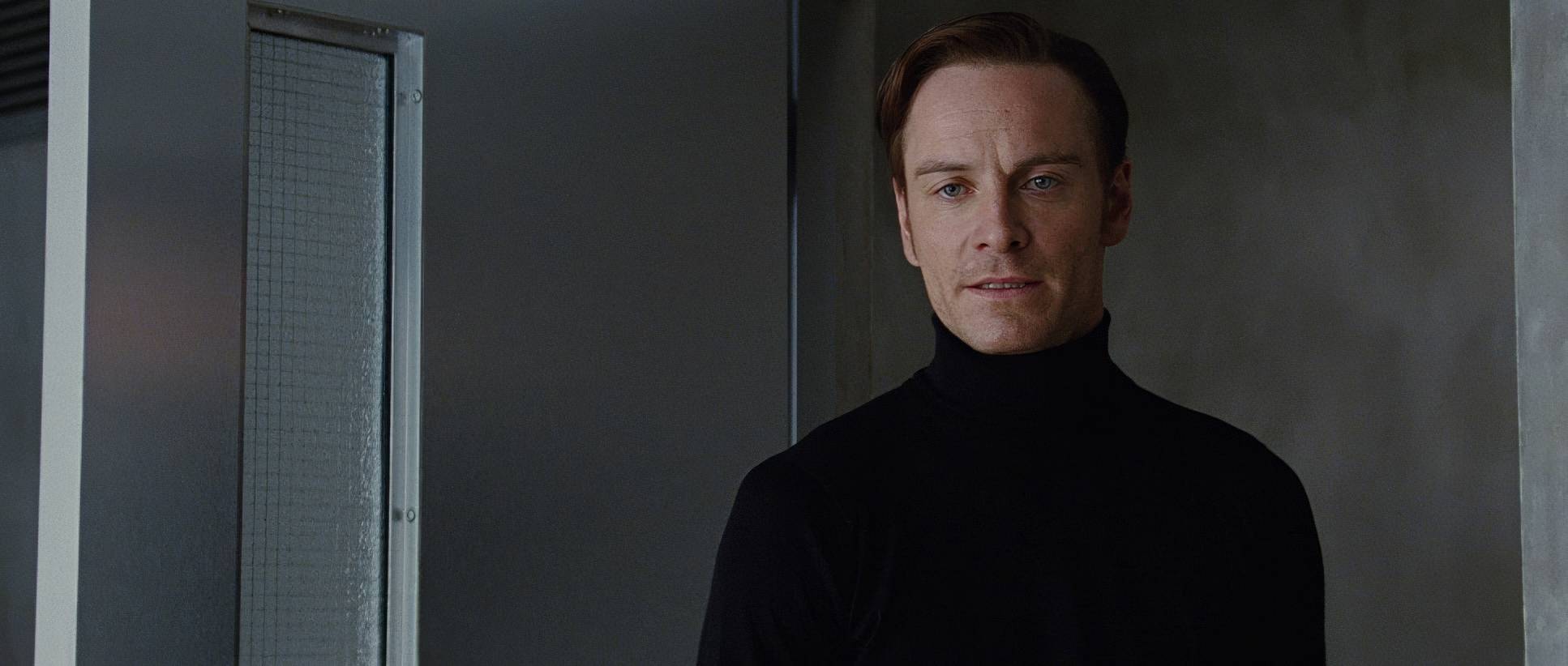
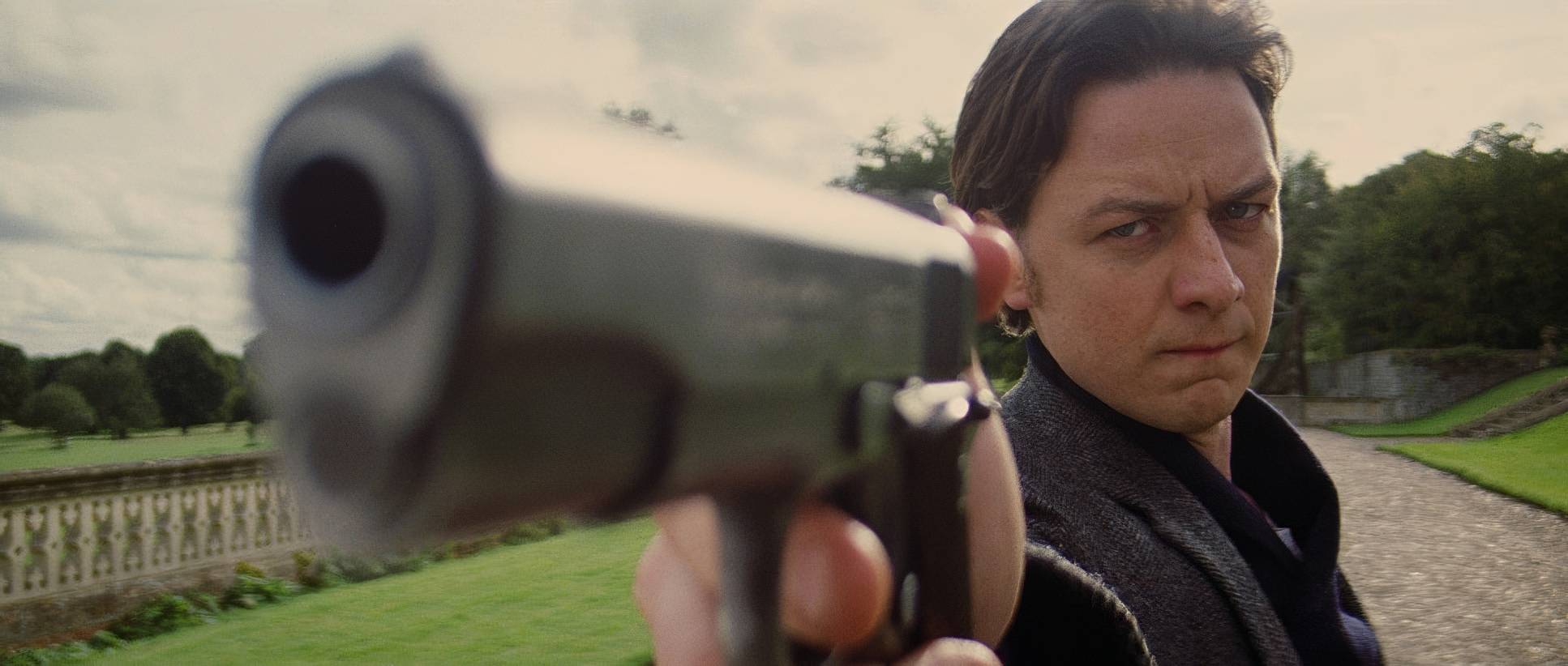
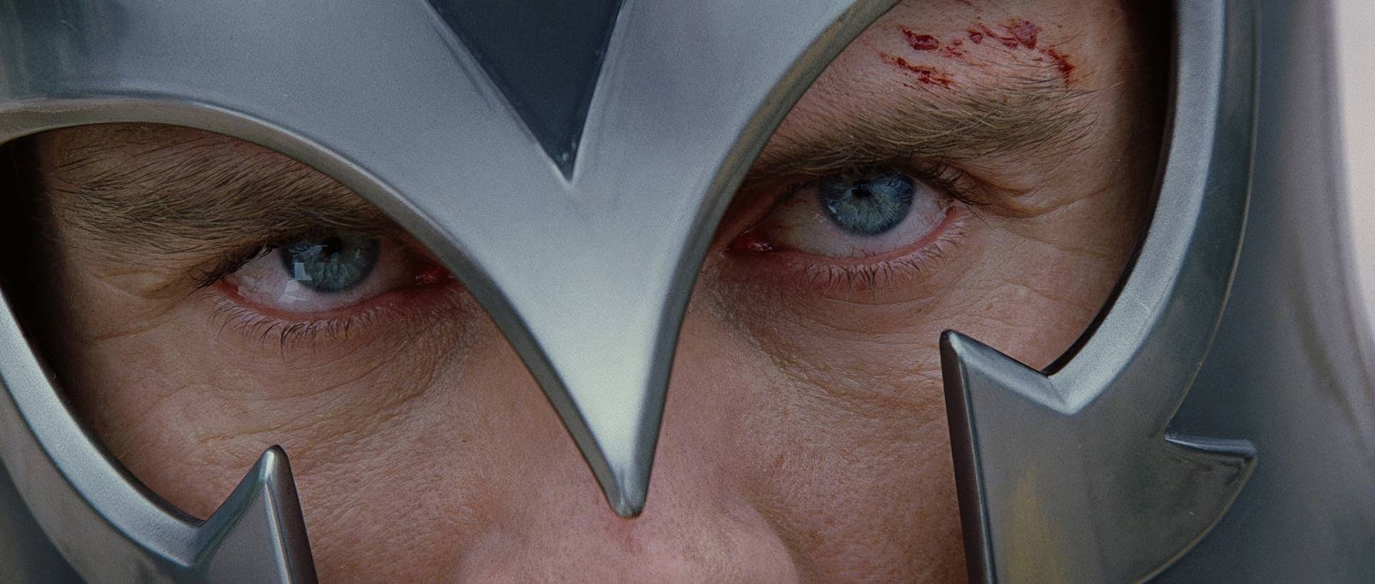
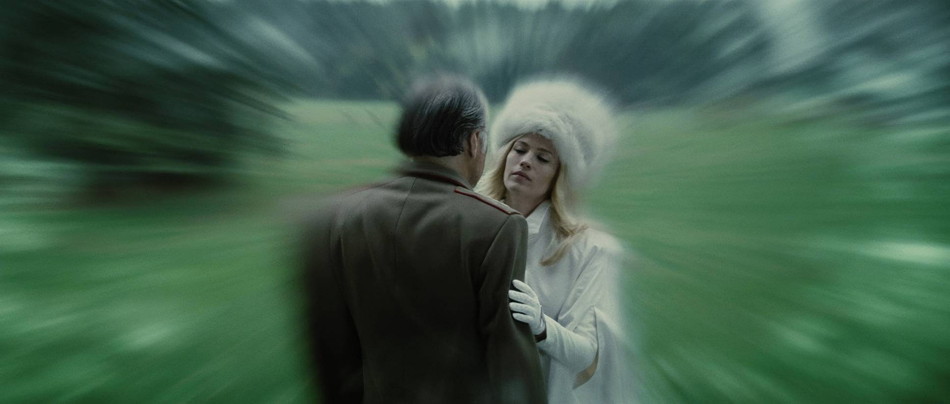
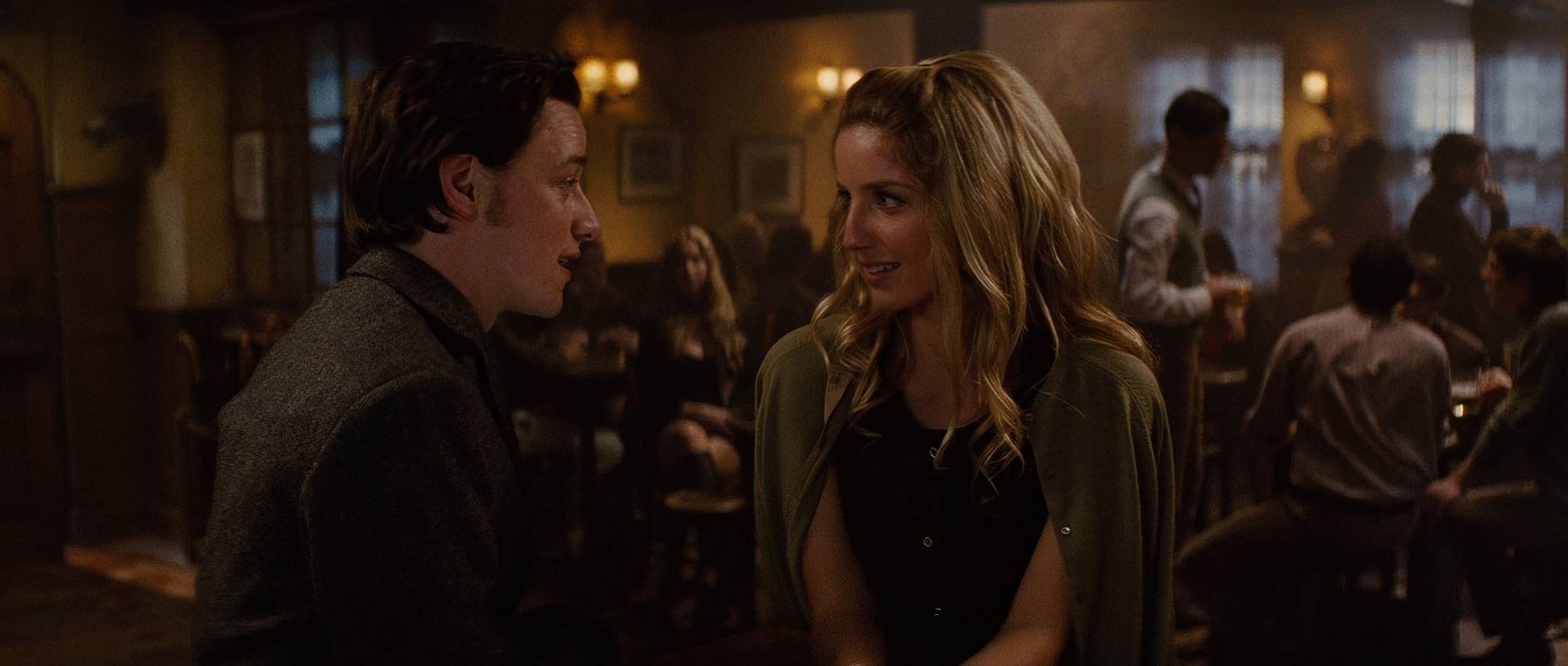
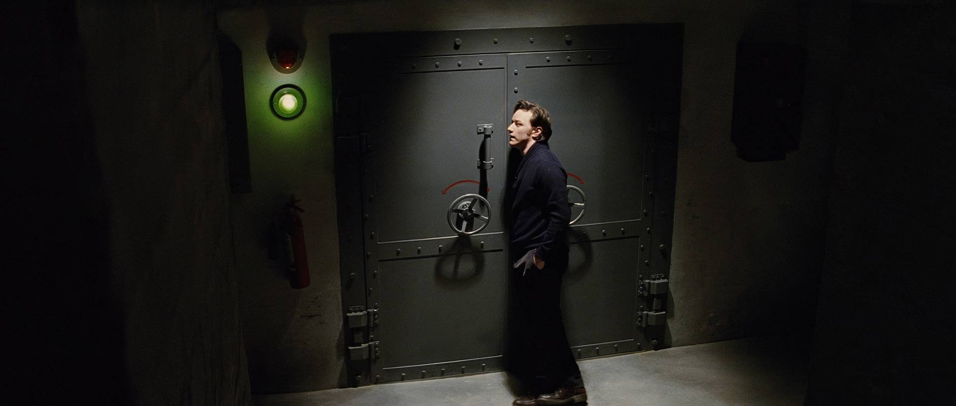
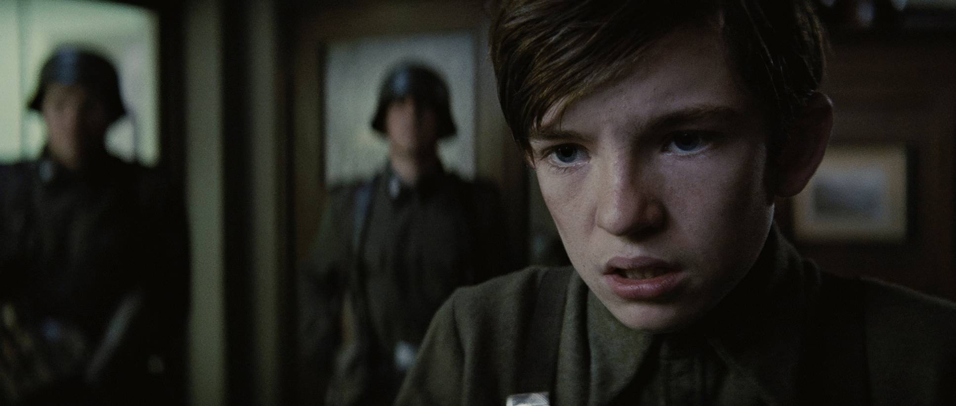
For Erik, the visuals are all about trauma and focus. His early scenes are stark and shadowed very “lone wolf.” When he’s hunting Shaw, the frames get tight and claustrophobic. On the flip side, Charles starts in these bright, open, almost naive compositions. He’s using his powers to flirt at bars, and the camera treats him with a certain lightness. As their friendship fractures, the visuals track that shift perfectly.
Camera Movements

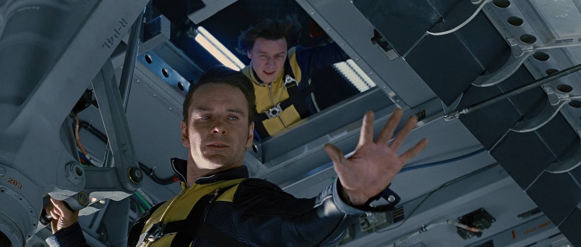
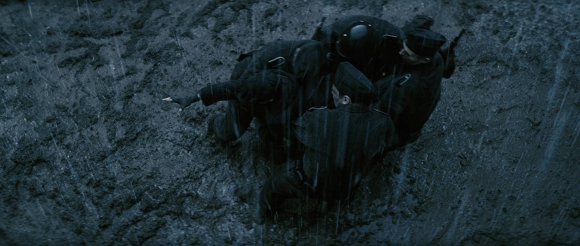
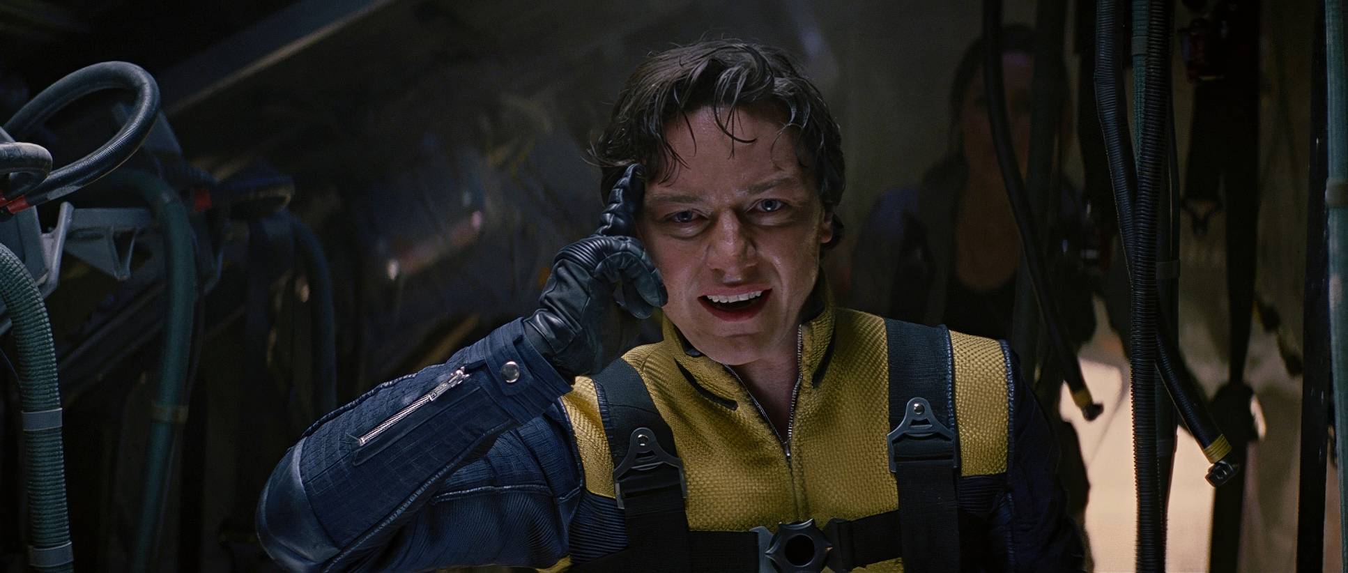
The camera work here is a great mix of classic “Epic” filmmaking and kinetic energy. For the character moments especially Erik’s rage Mathieson goes with a subtle handheld feel. It adds an emotional rawness. You can feel the camera “breathing” with Erik while he’s hunting down Nazis.
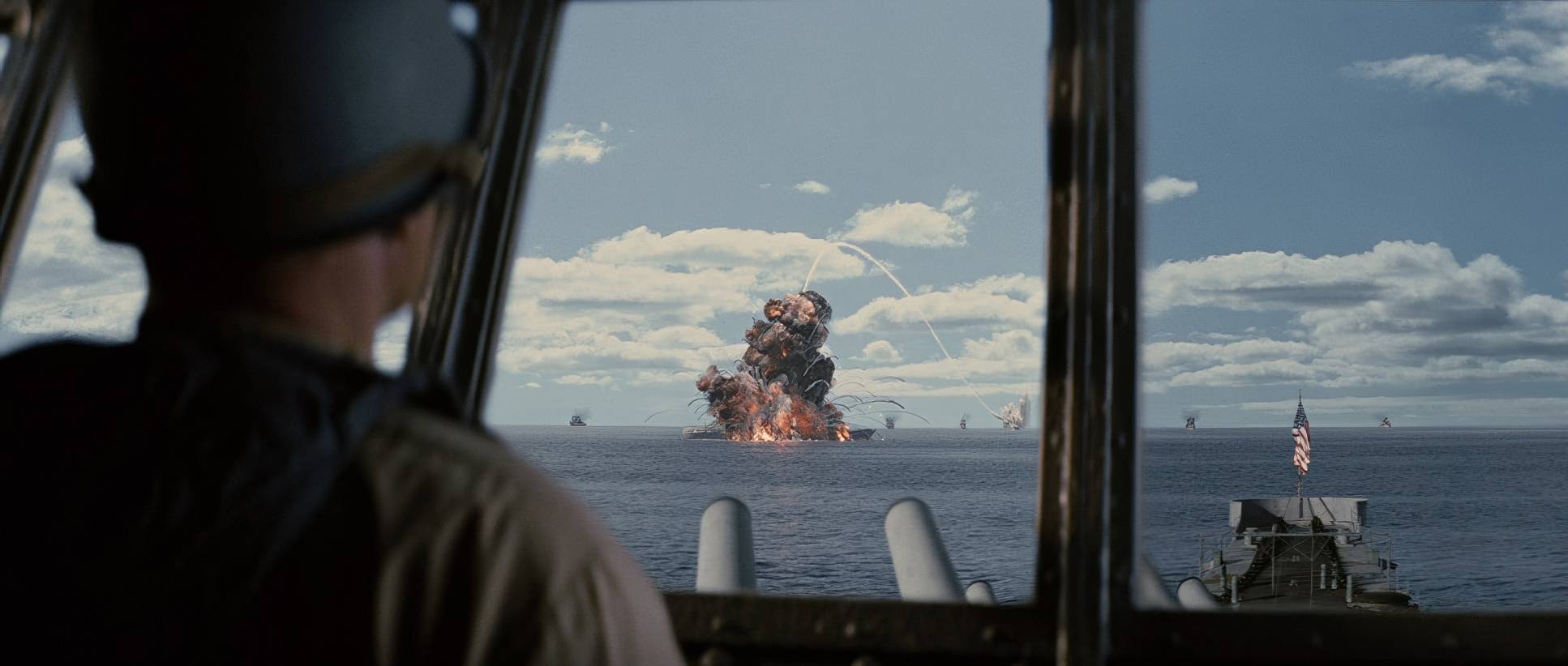
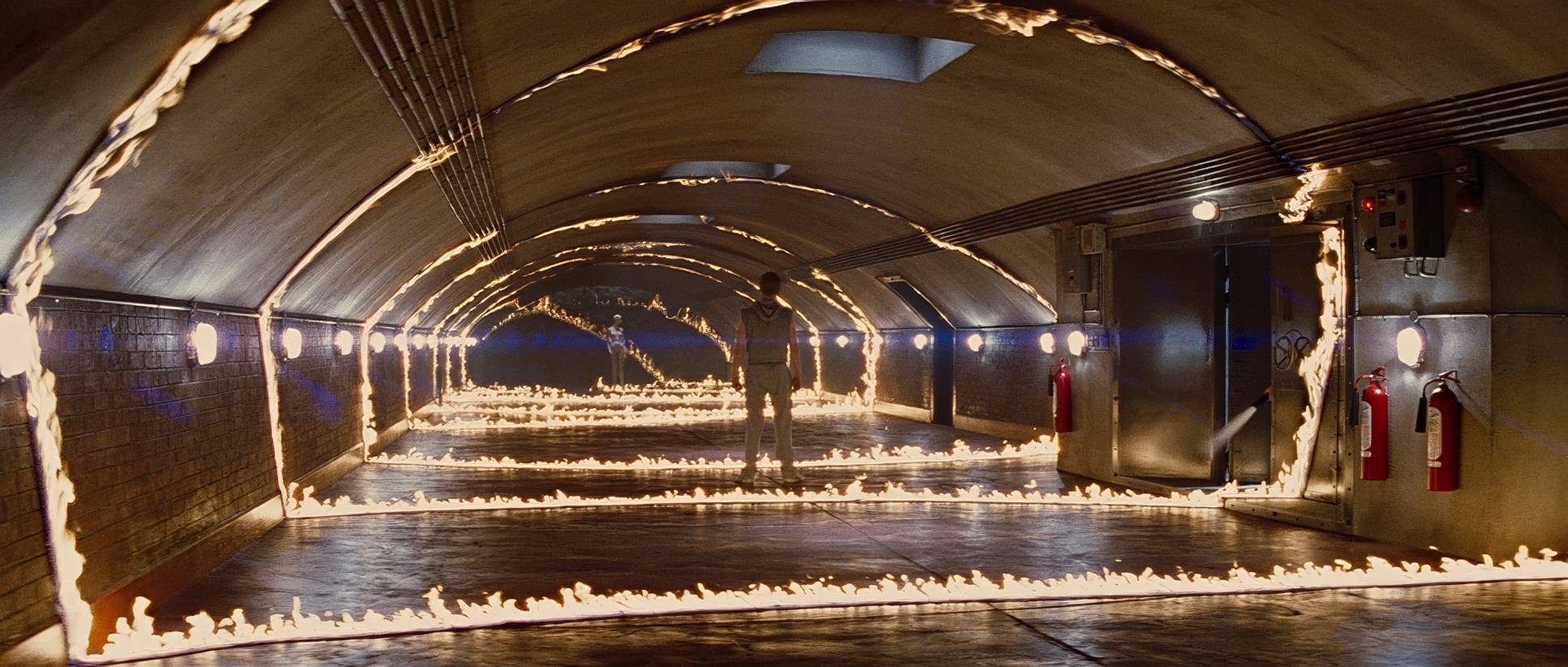
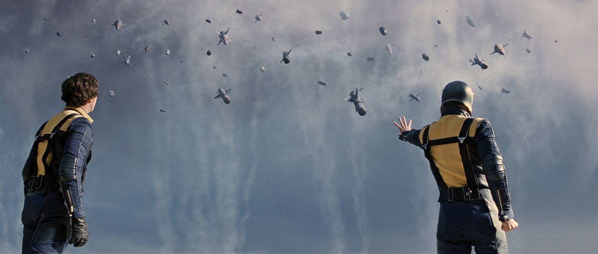
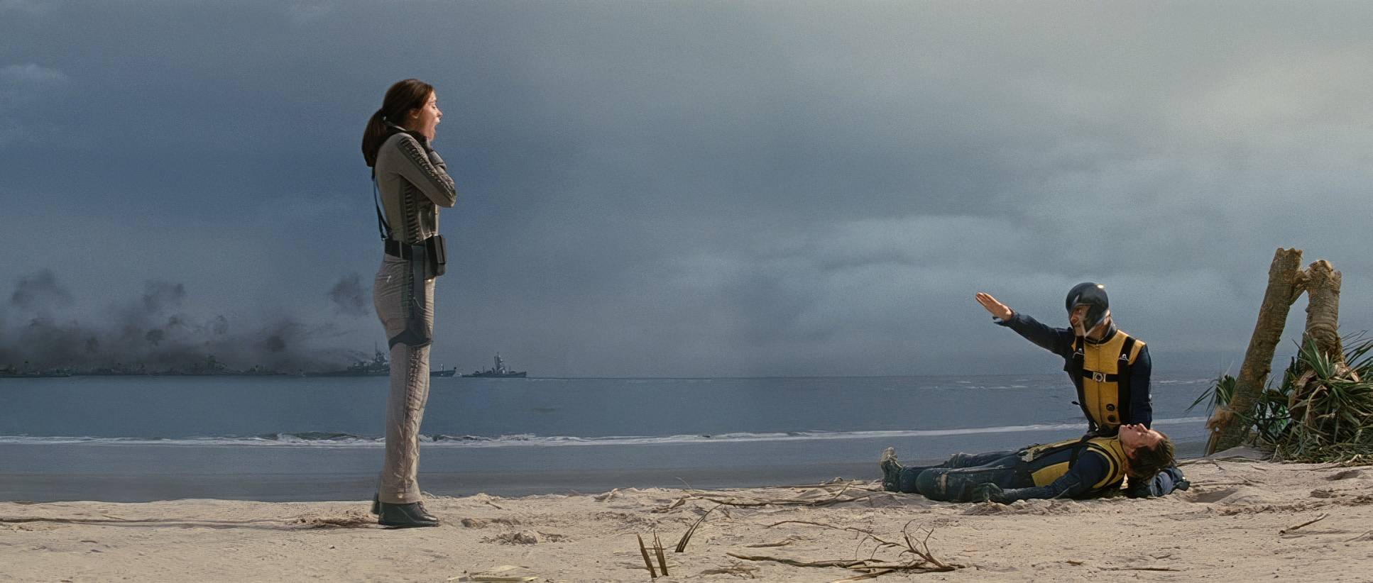
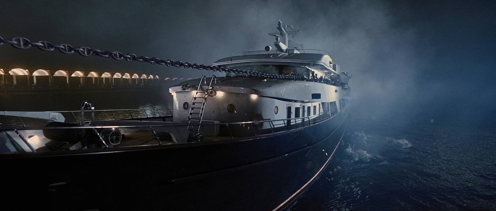
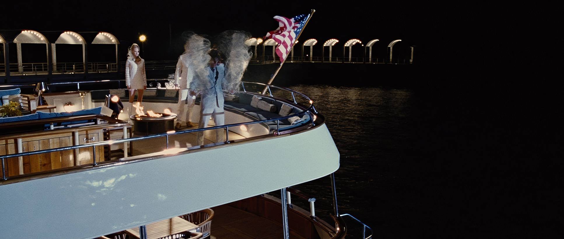
Then, the scope expands. When we get to the Cuban Missile Crisis or the arrival of Shaw’s submarine, the camera shifts to expansive dolly and crane shots. These aren’t just “cool shots”; they provide depth cues that tell the audience exactly how much power is on screen. The balance between that grounded handheld work and the elegant, stable motion of the final battle keeps the movie from feeling like a chaotic mess.
Compositional Choices
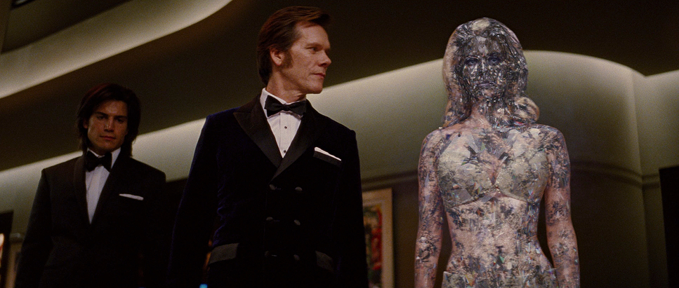
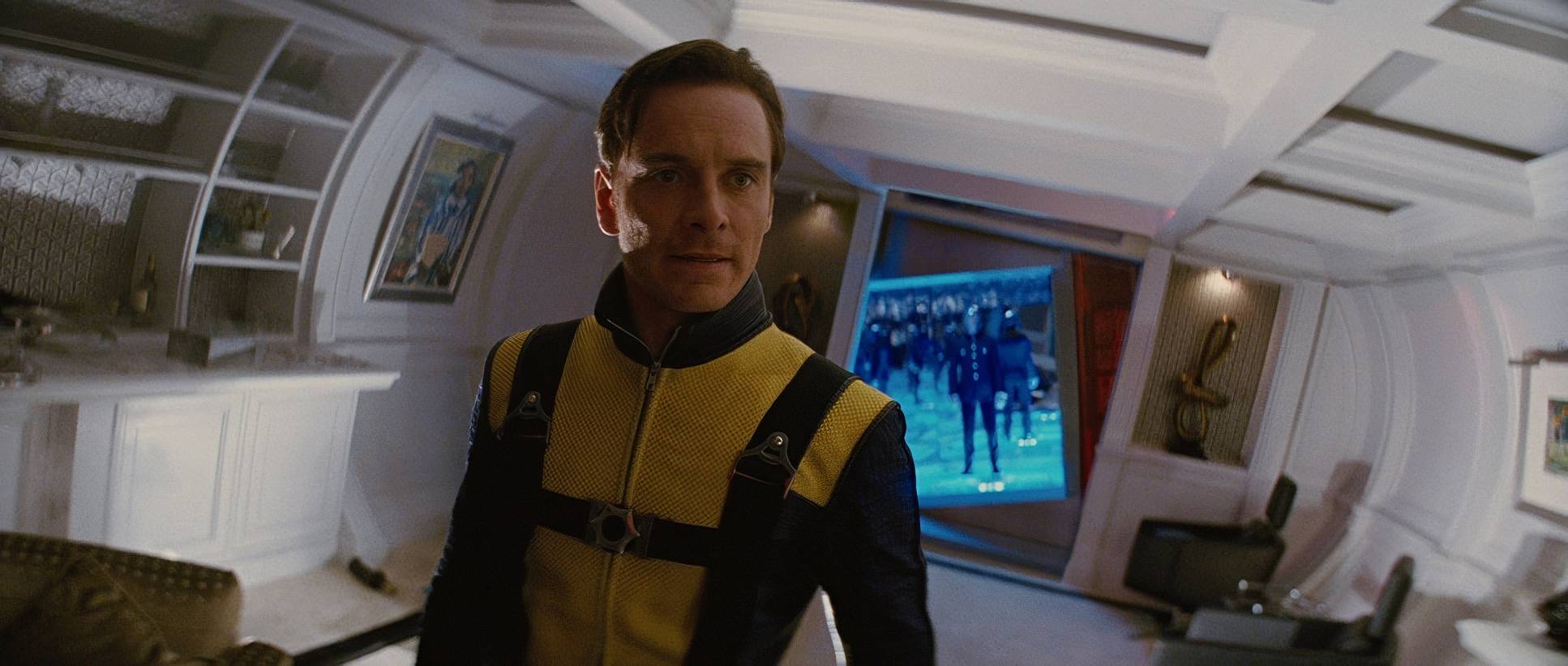
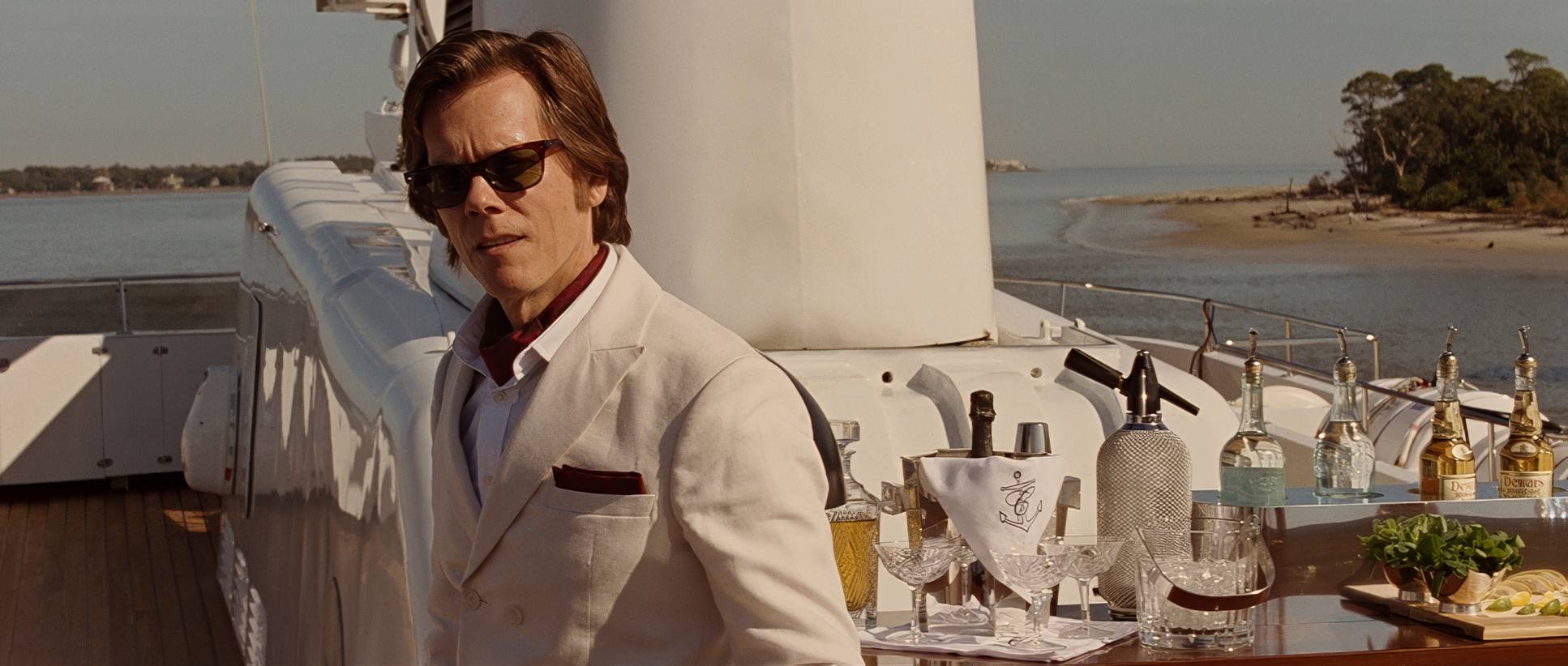
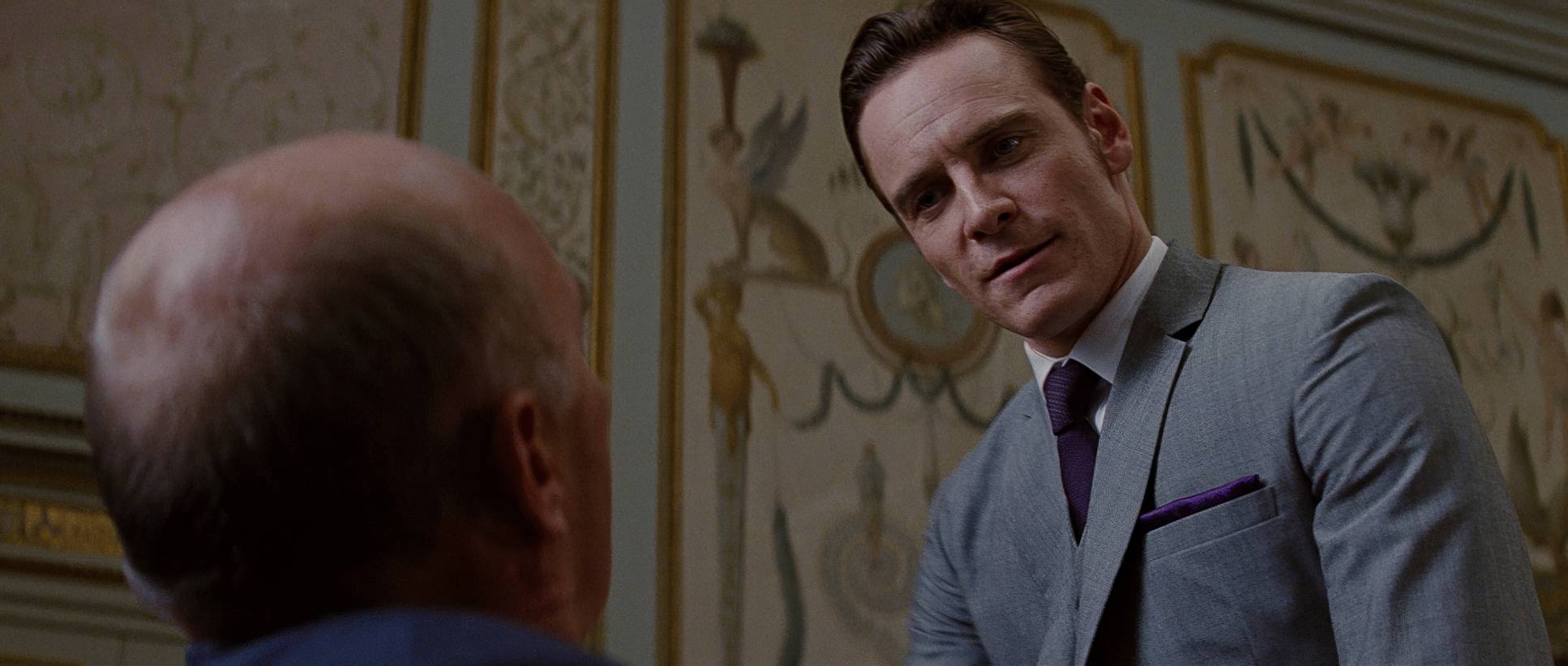
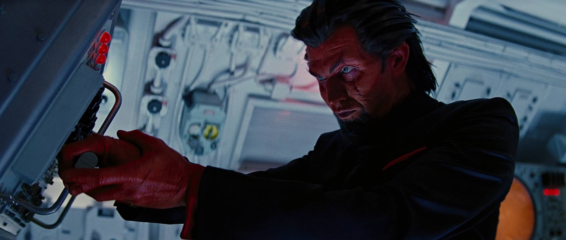
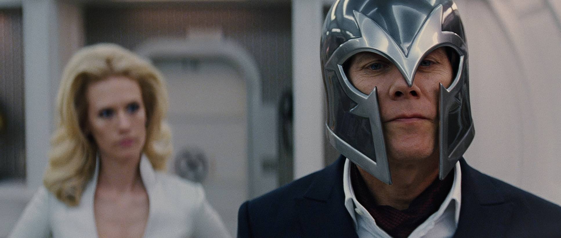
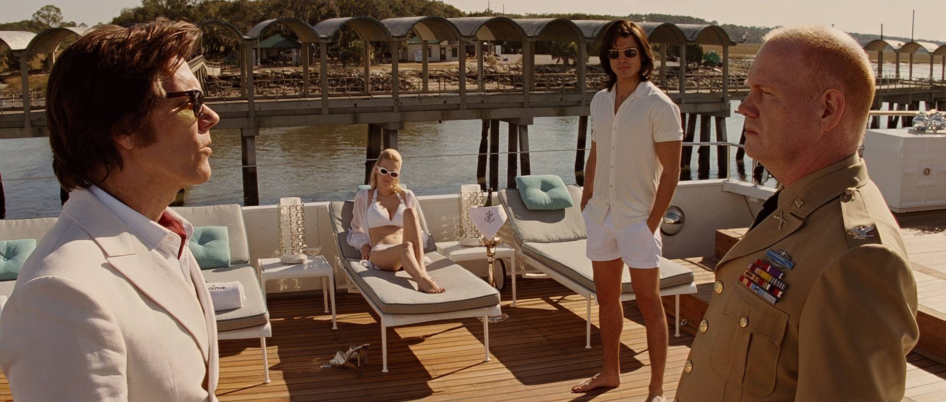
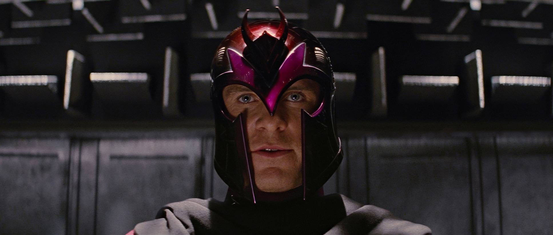
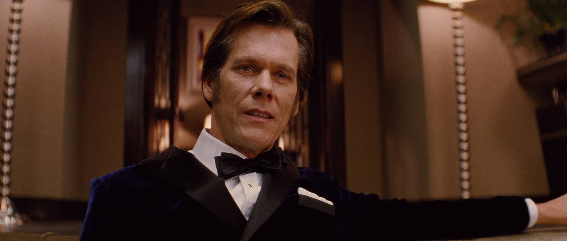
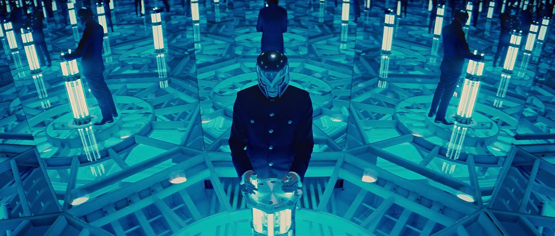
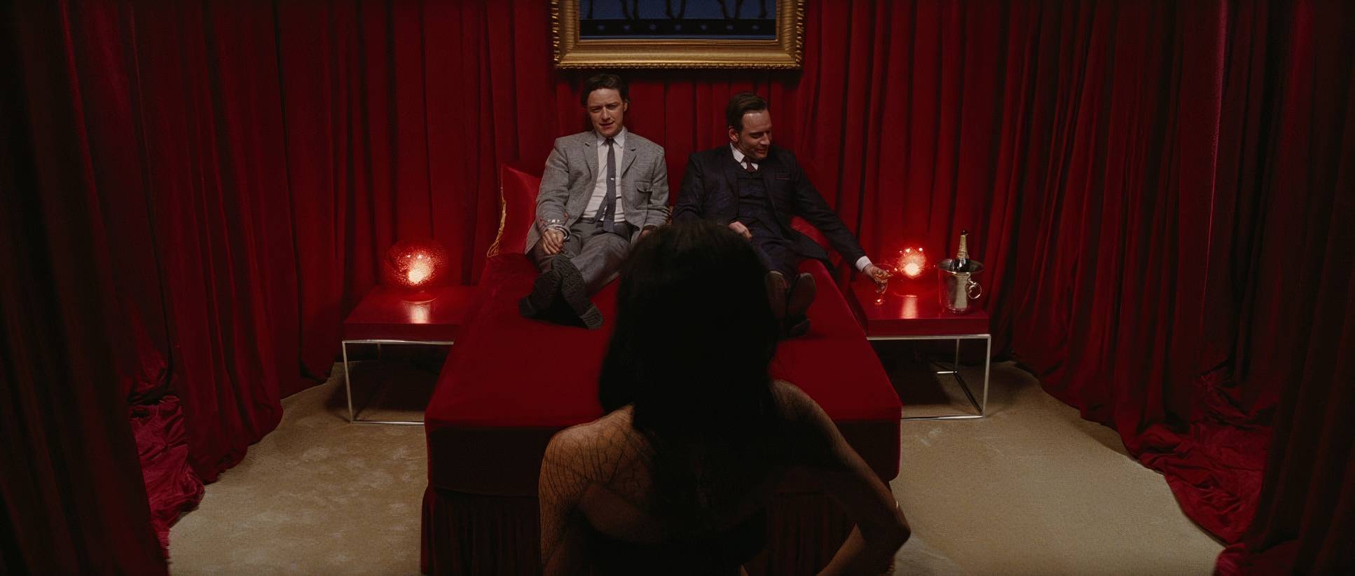
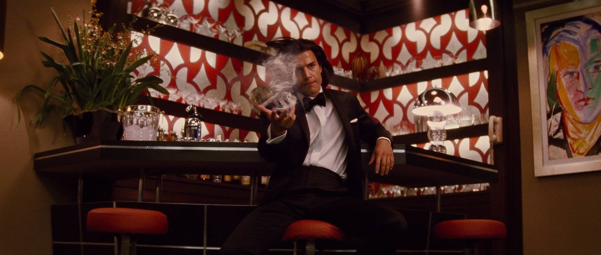
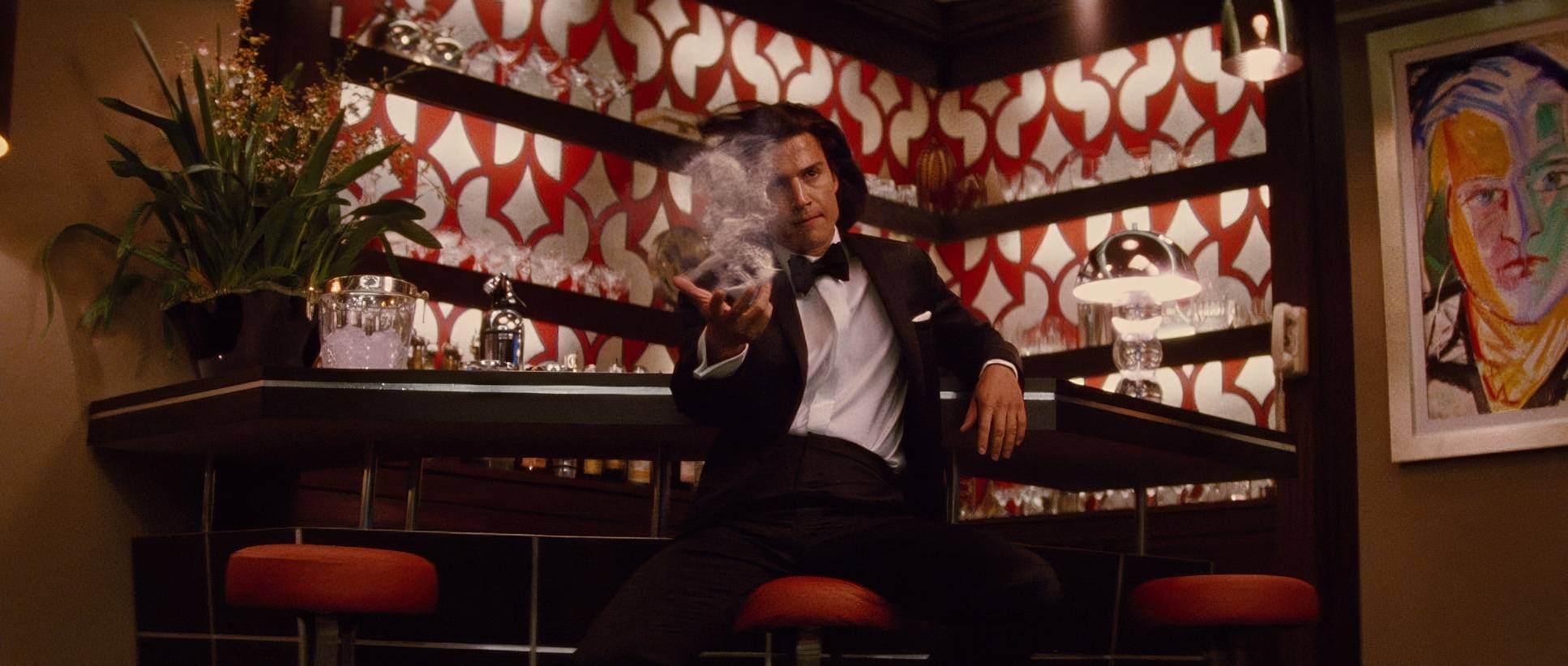
Mathieson’s compositions are all about power dynamics. Take Shaw, for example. He’s almost always framed to look dominant either centered or looking down from a high vantage point. The “Everything Wrong With” guys joke about the cliché of a villain sipping tea while looking out a window, but from a visual standpoint, it works. It establishes his detachment.
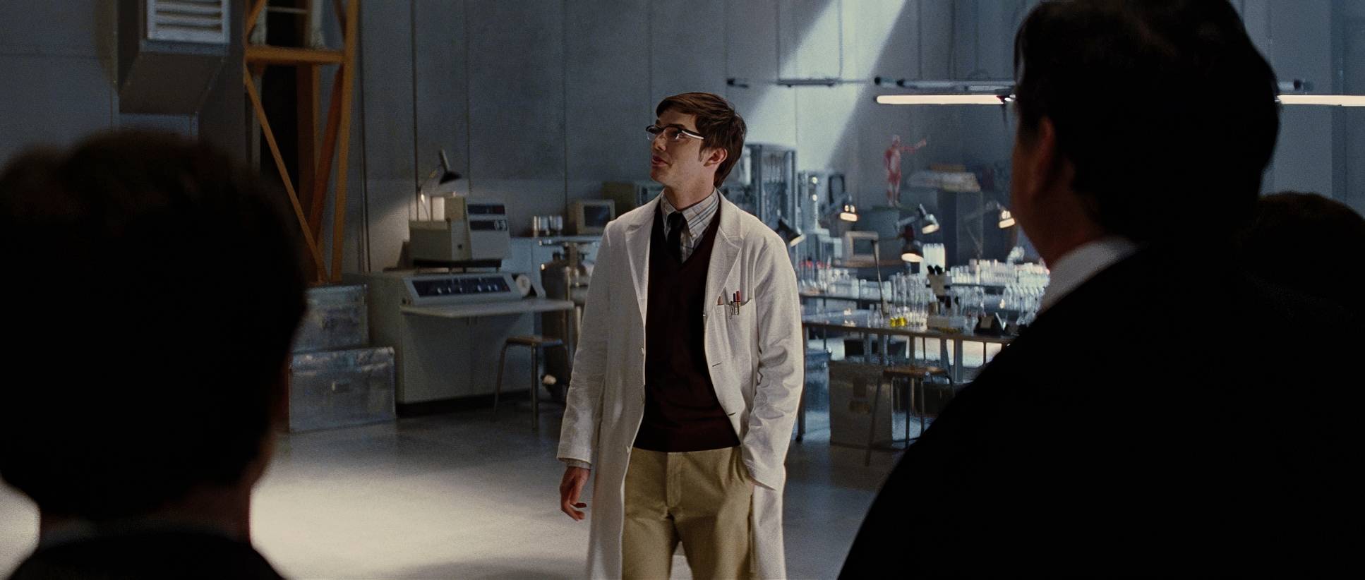
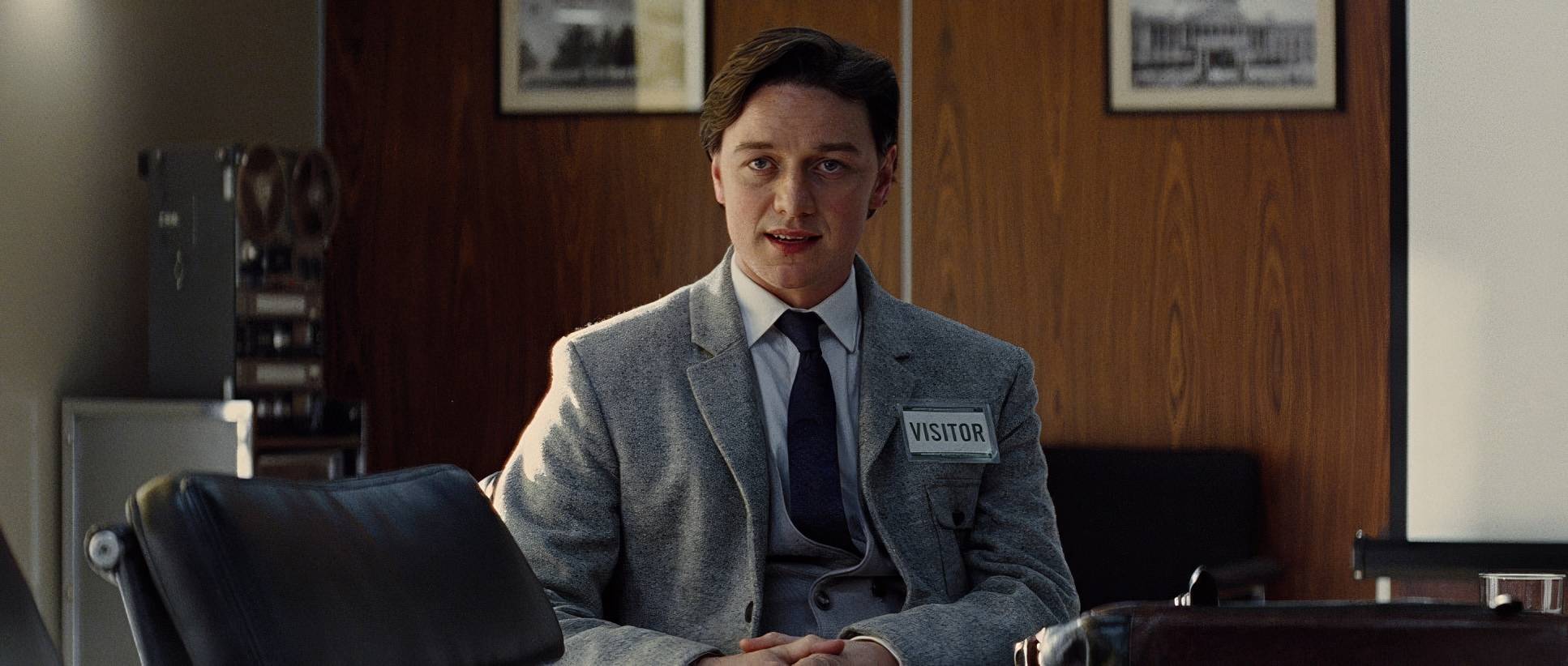
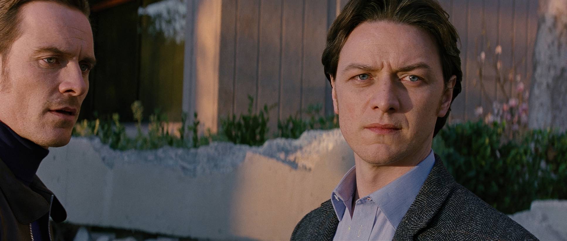
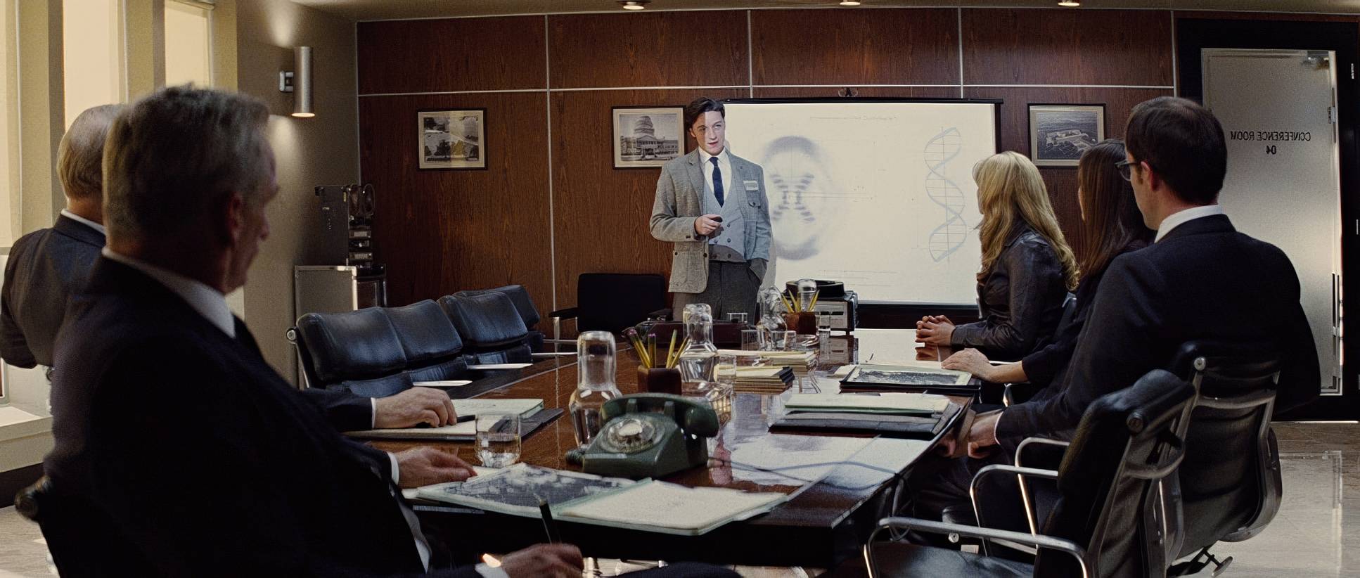
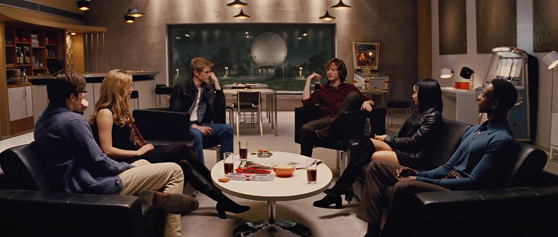
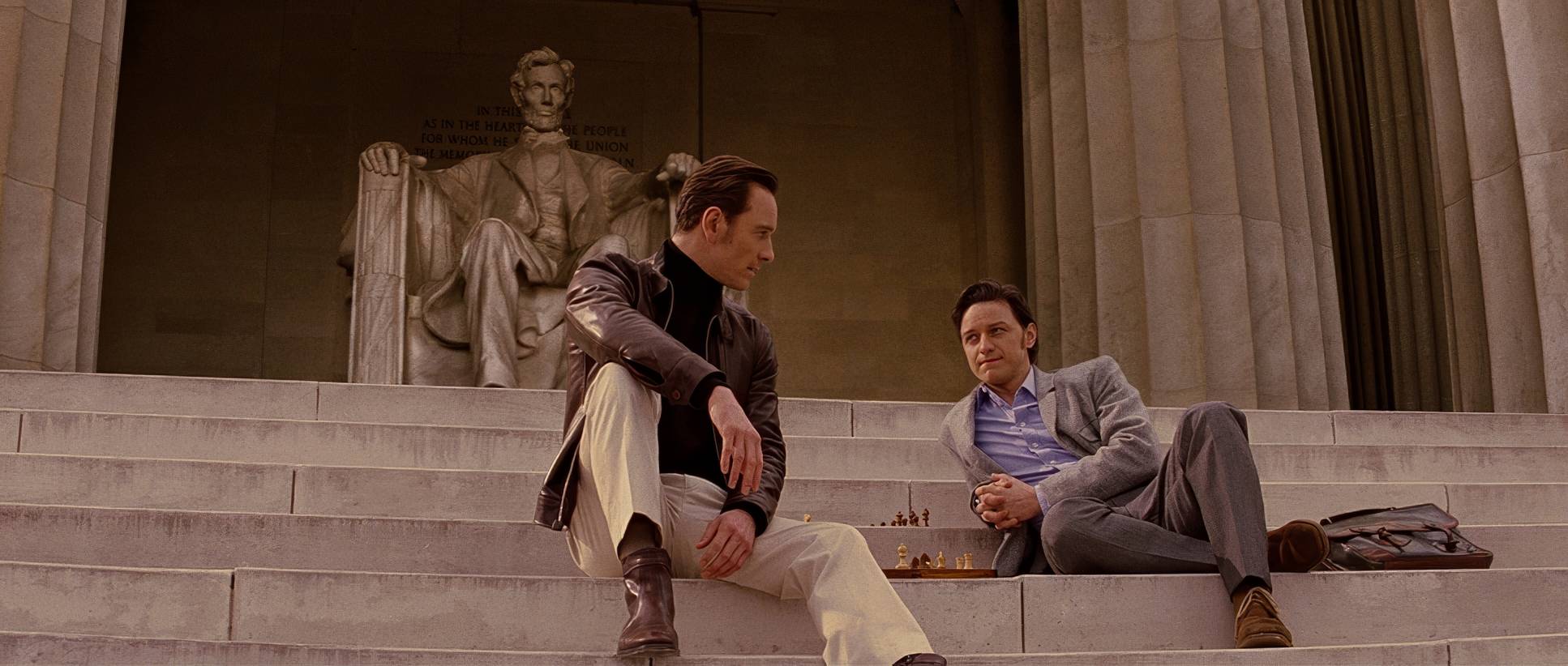
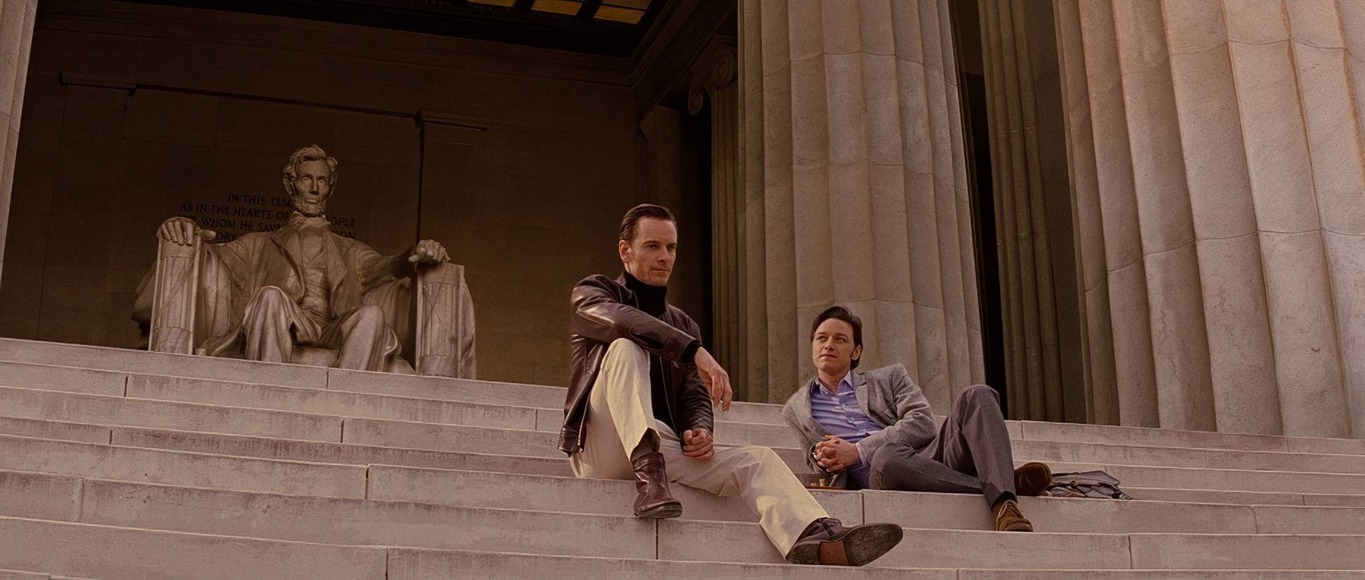
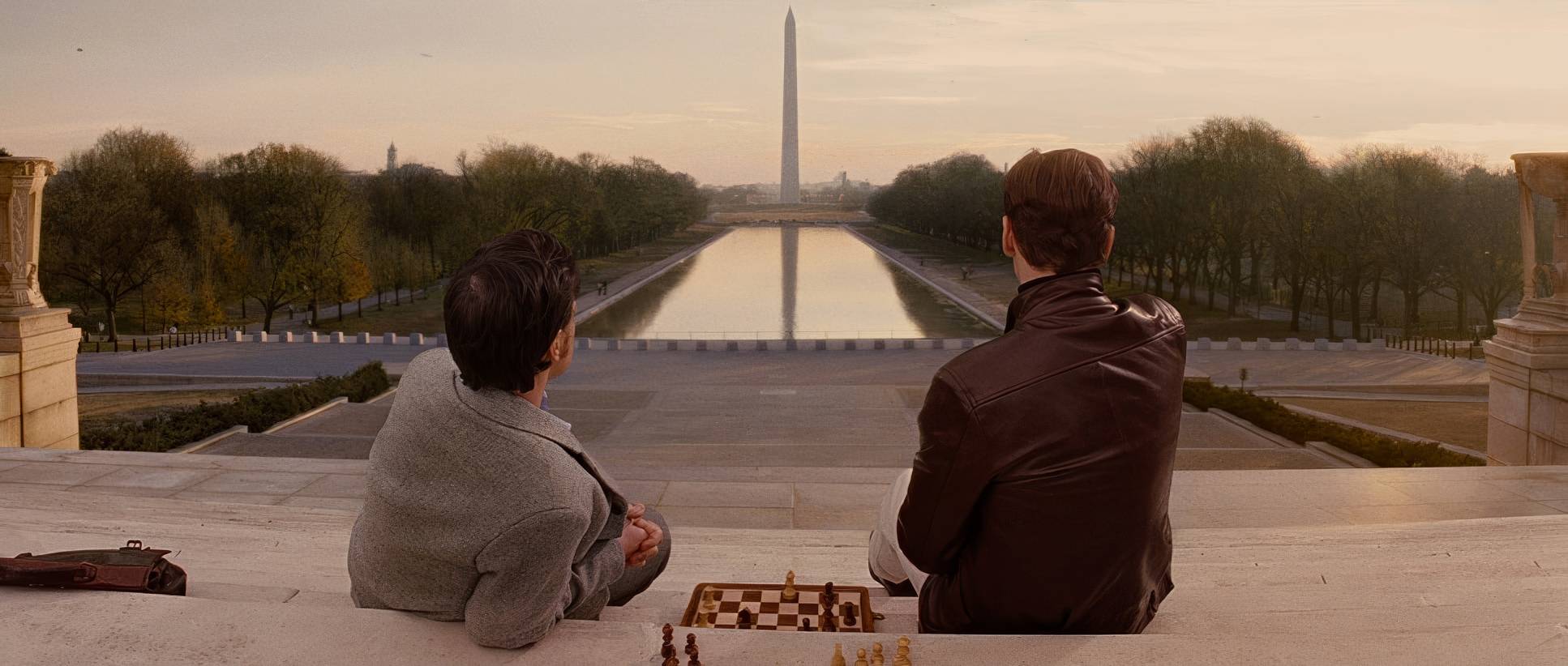
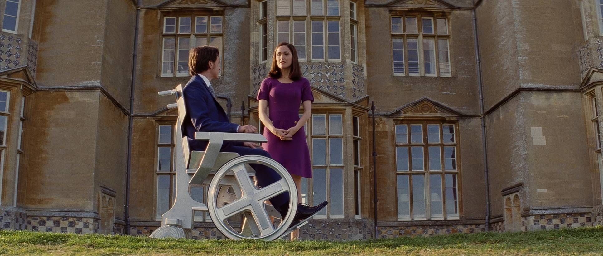
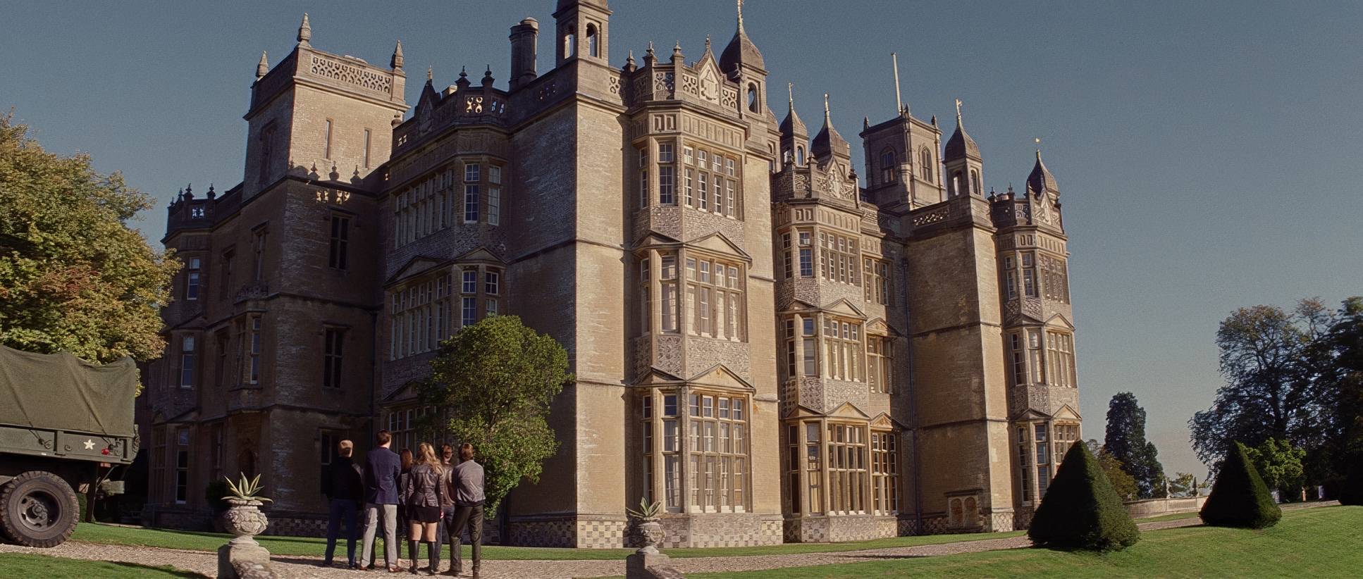
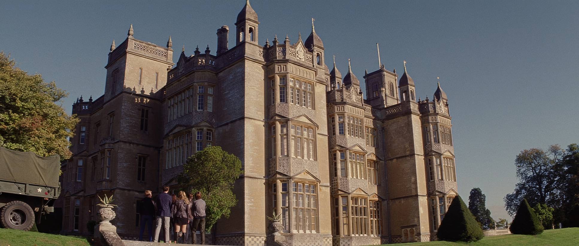
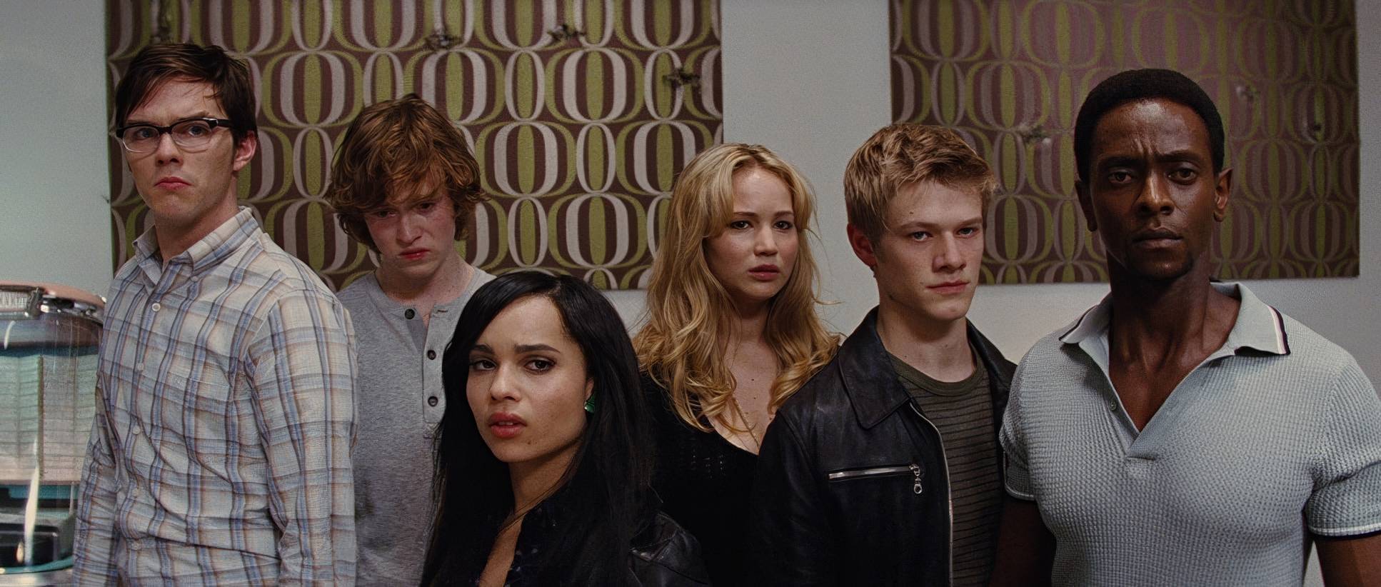
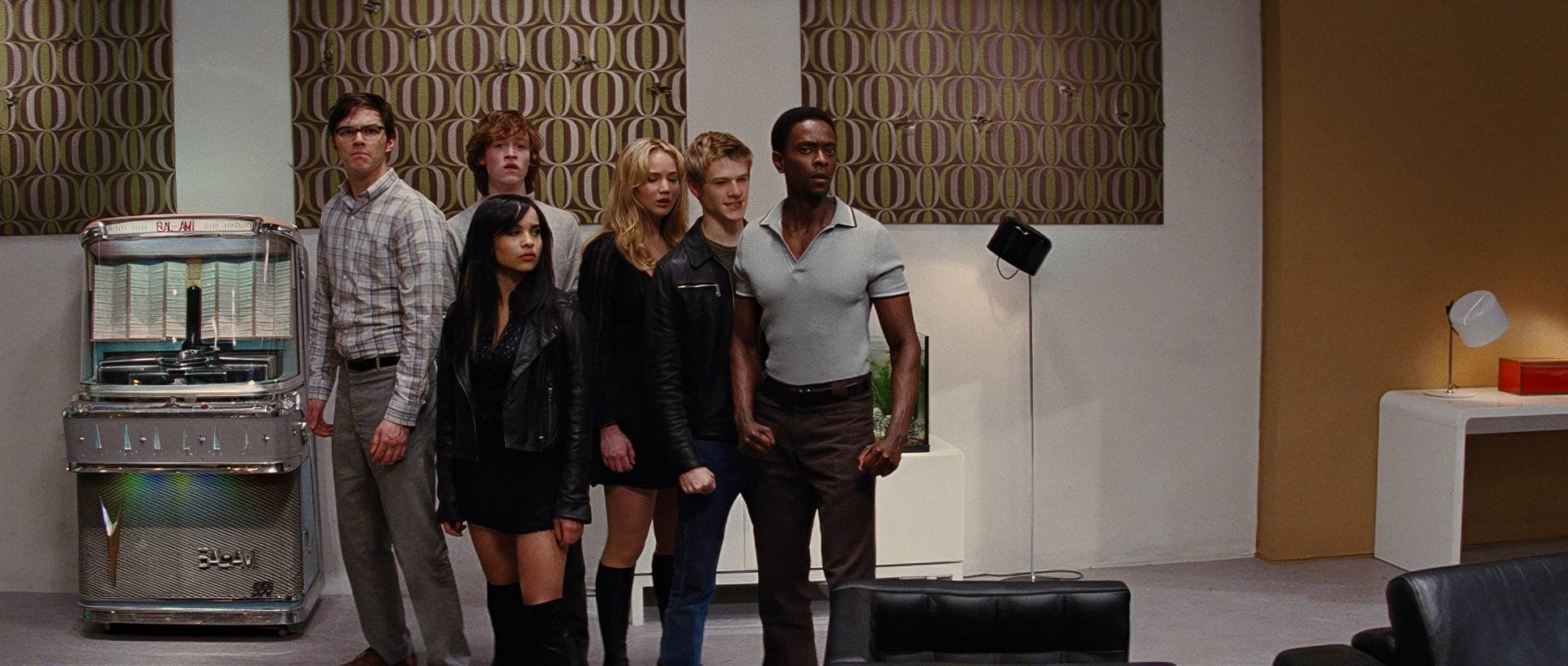
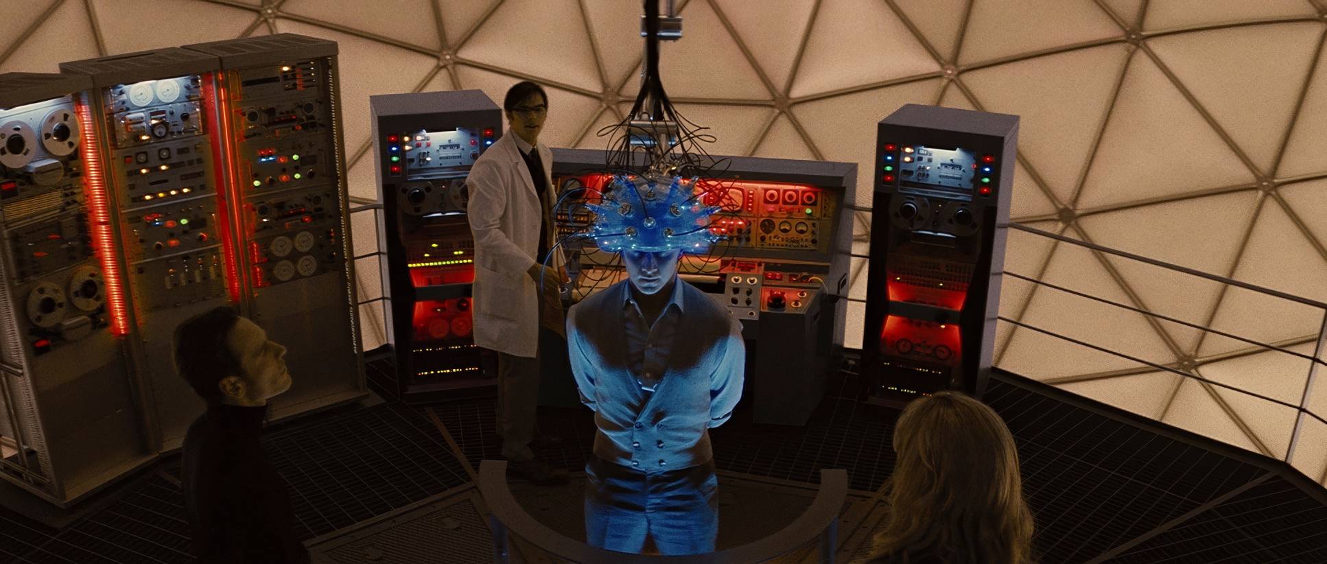
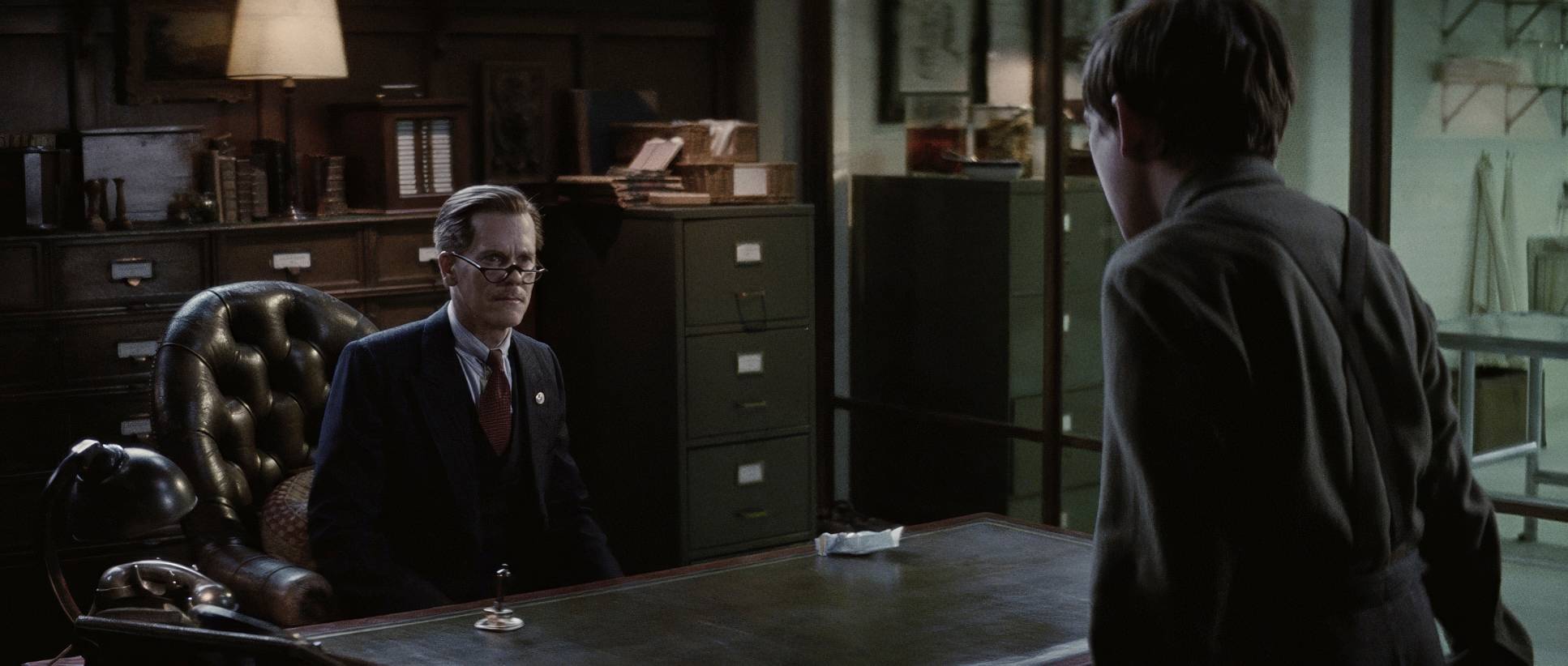
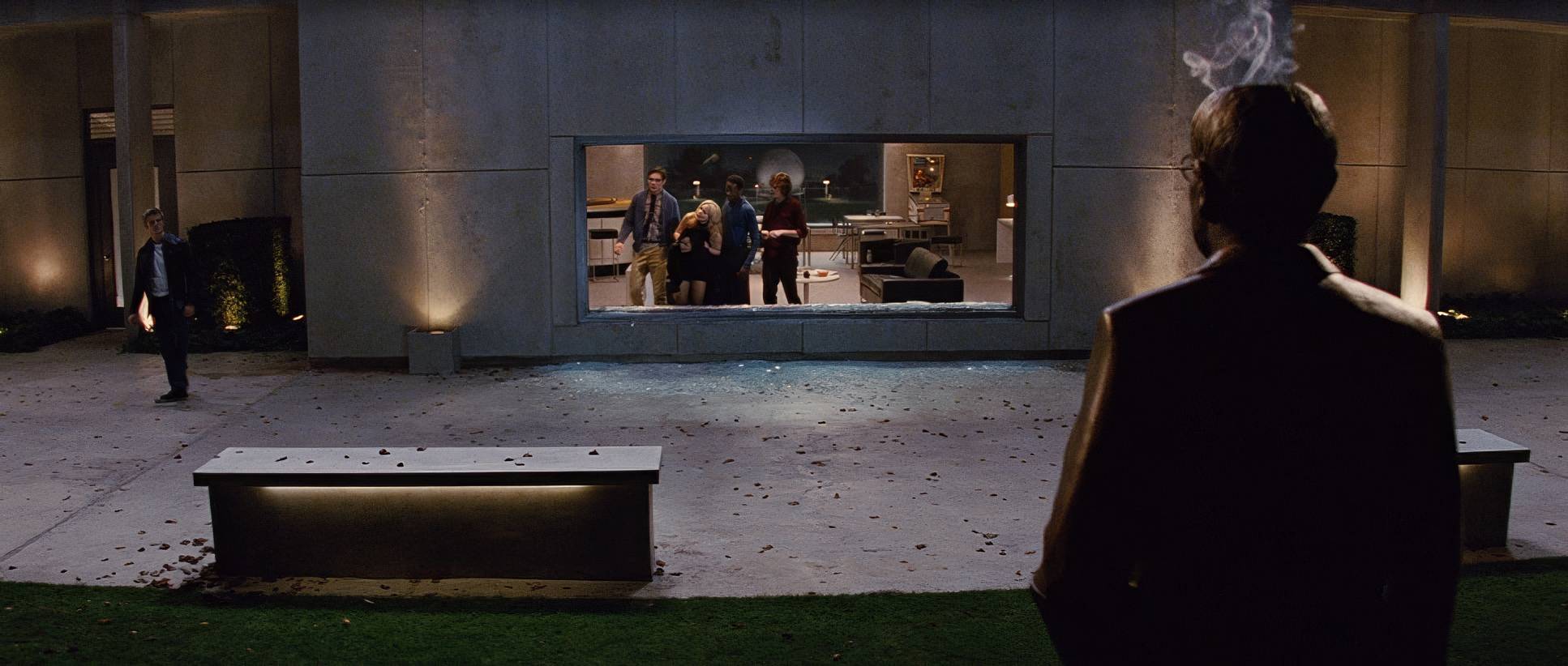
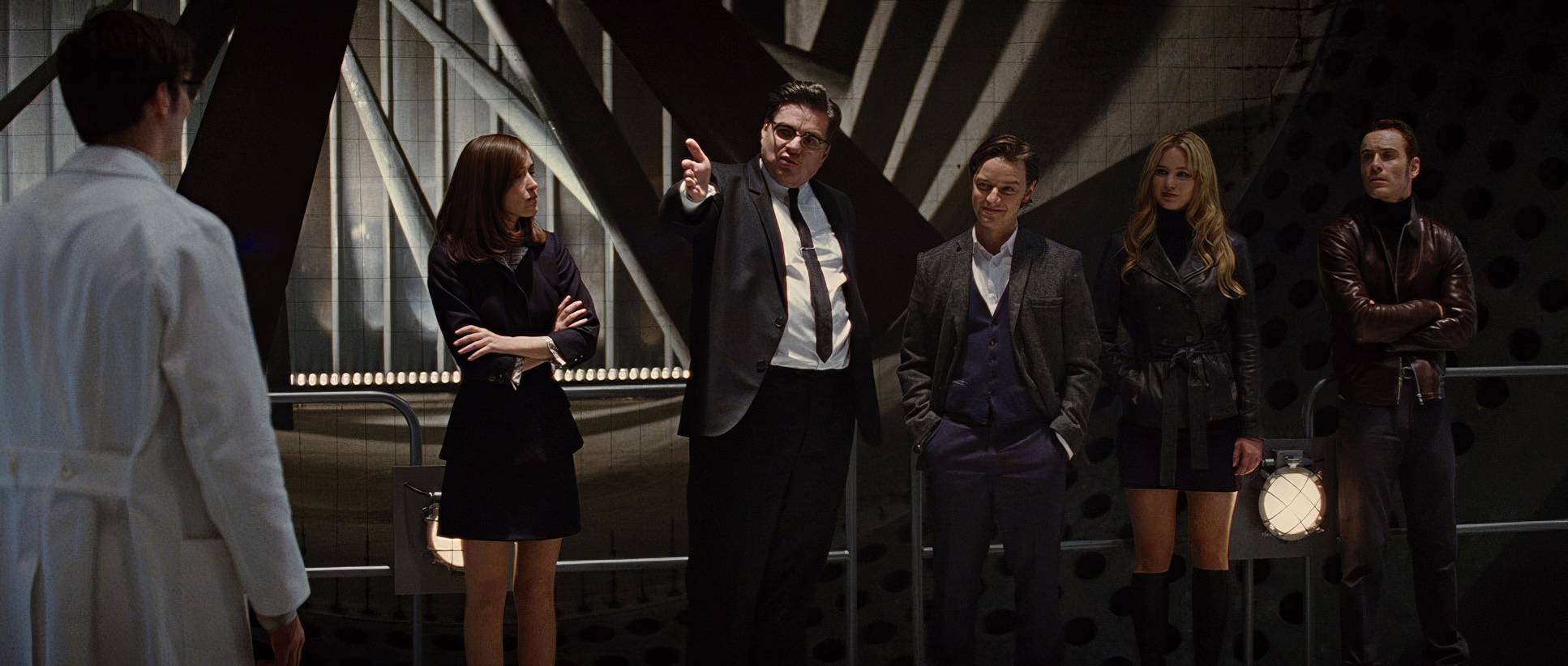
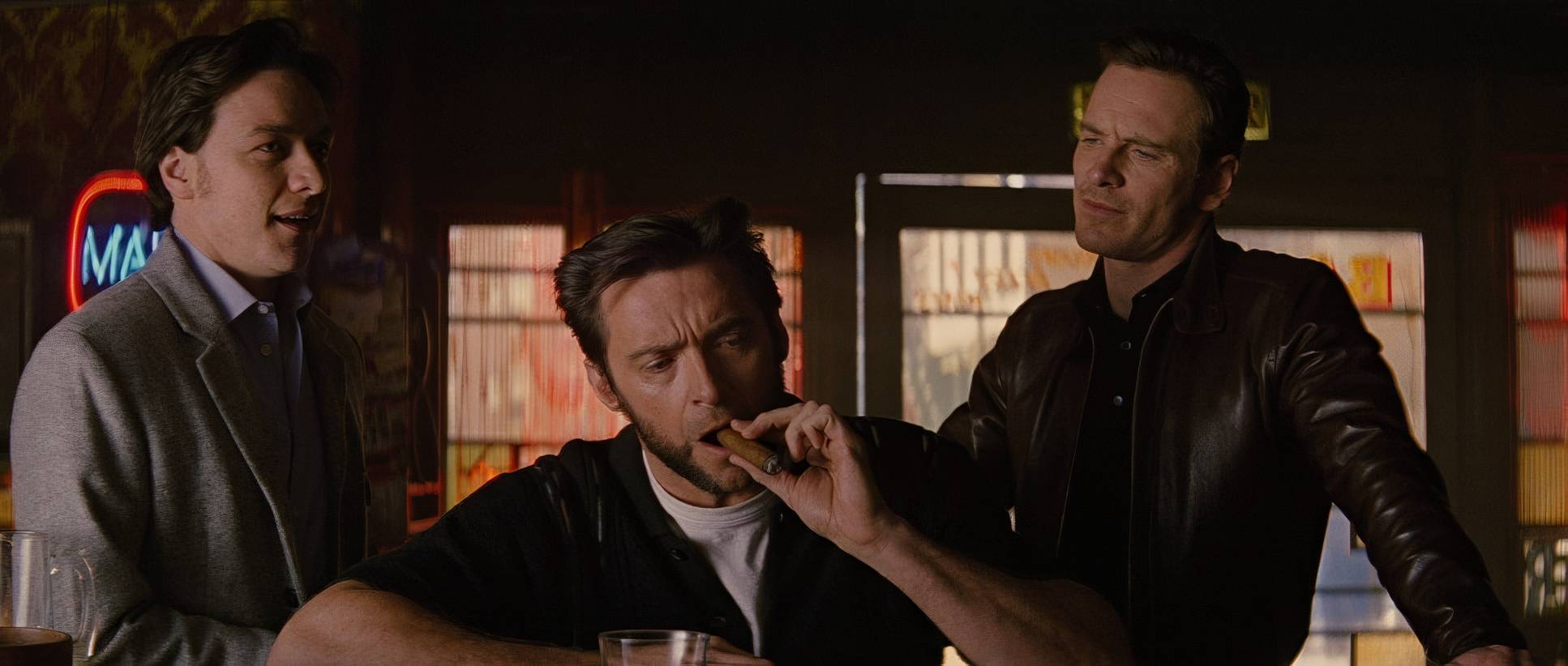
The real storytelling, though, is in the relationship between Charles and Erik. Early on, they share the frame in balanced two-shots. They’re equals. But as the film progresses, the blocking starts to pull them apart. We see more individual frames or shots where one is in the deep background. The sets, like the Division X facility, are massive, making the young mutants look small and vulnerable against the looming threat of the Cold War.
Lighting Style
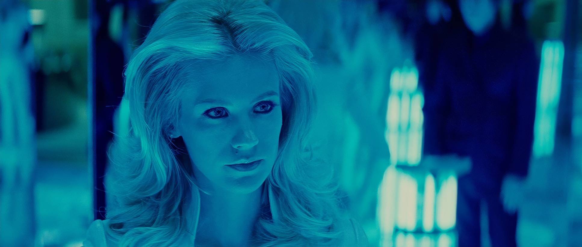
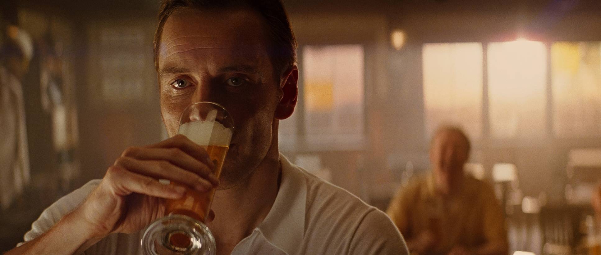
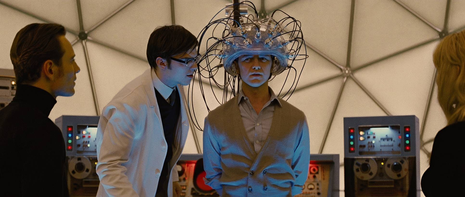
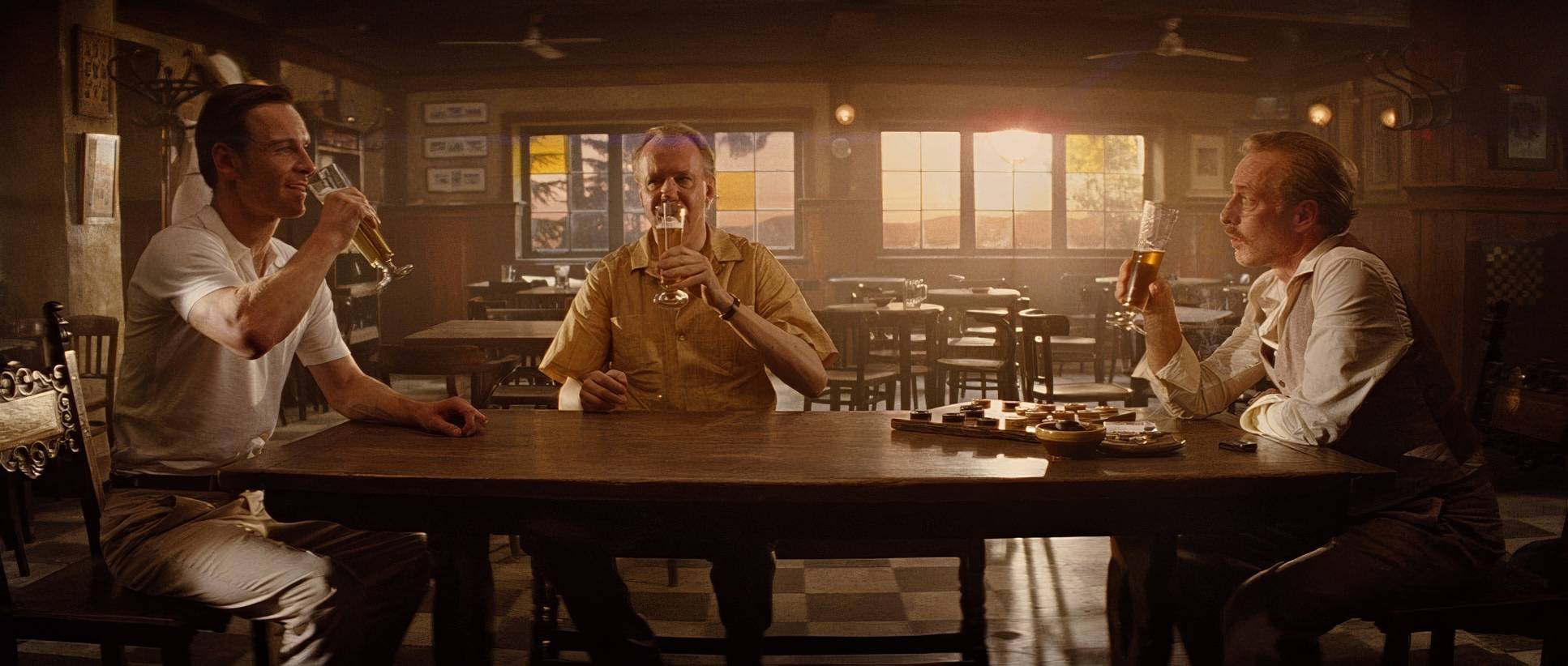
This is where the period setting really shines. Mathieson uses motivated lighting meaning the light feels like it’s coming from the lamps, chandeliers, or the sun in the scene.
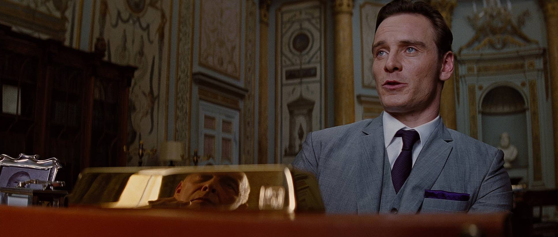
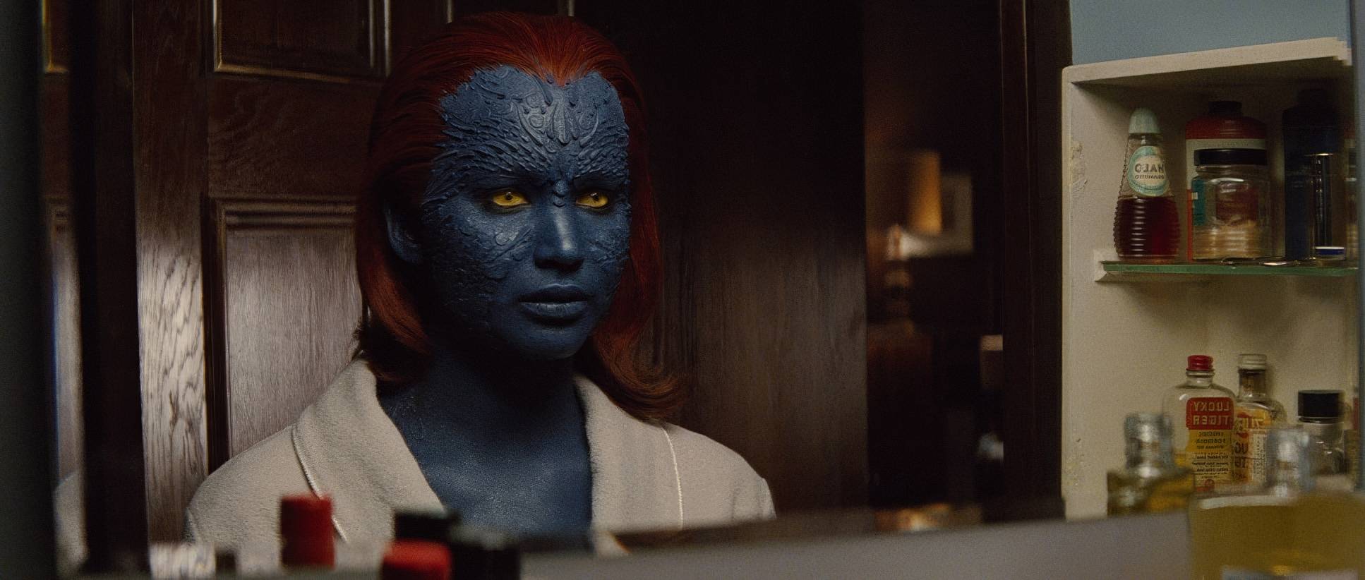
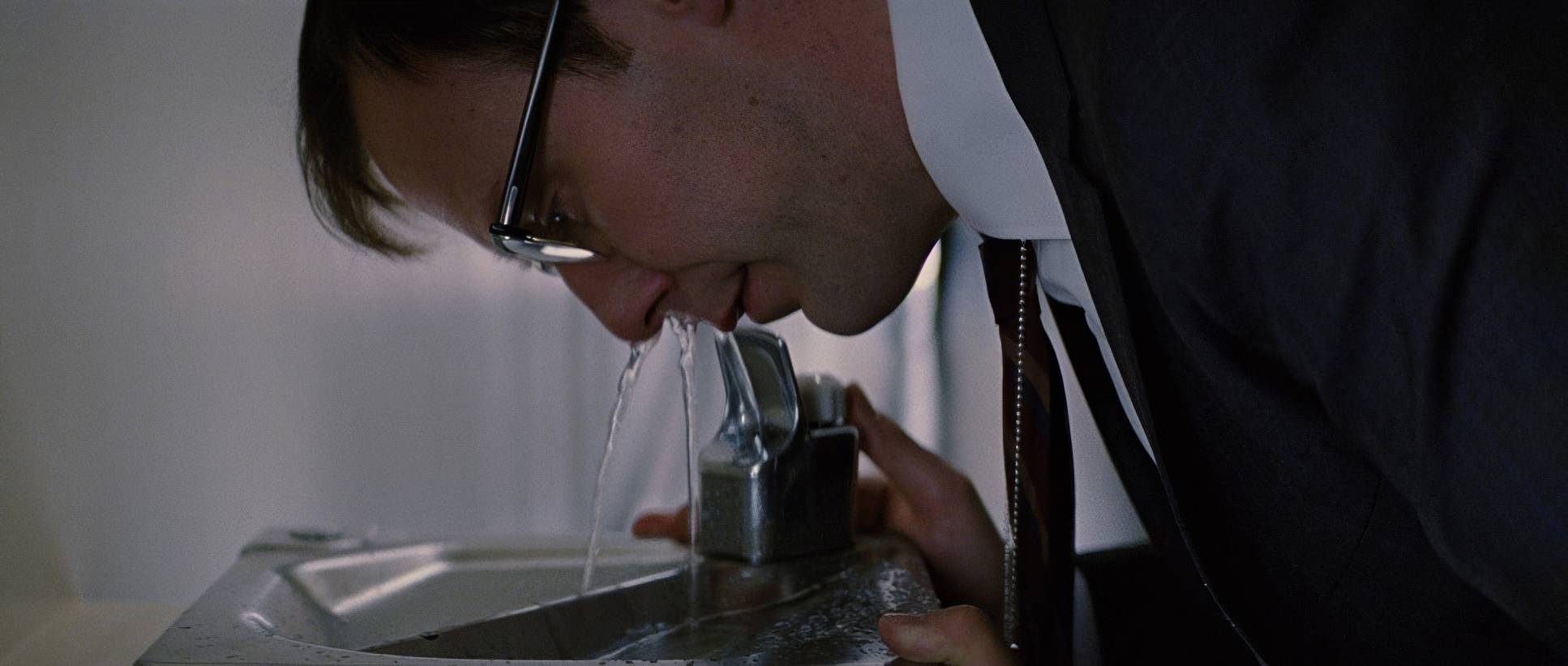
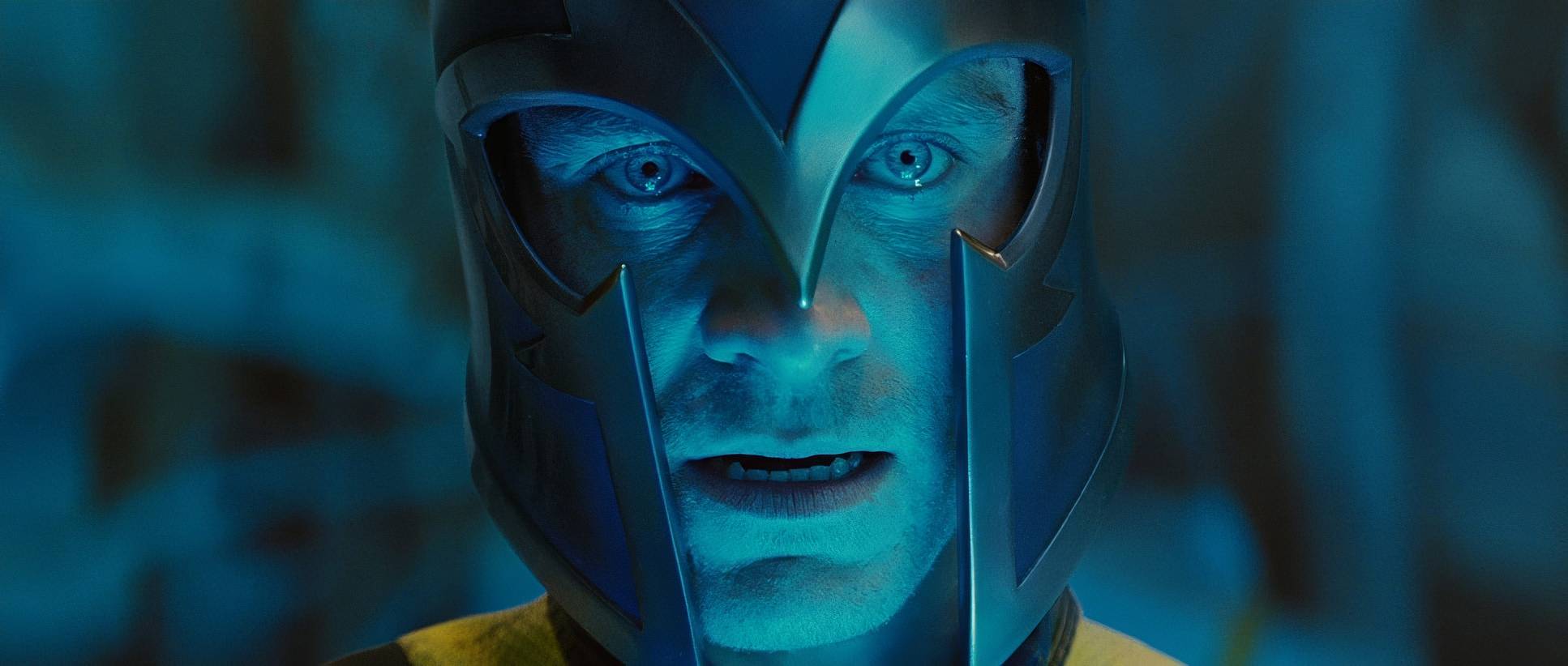
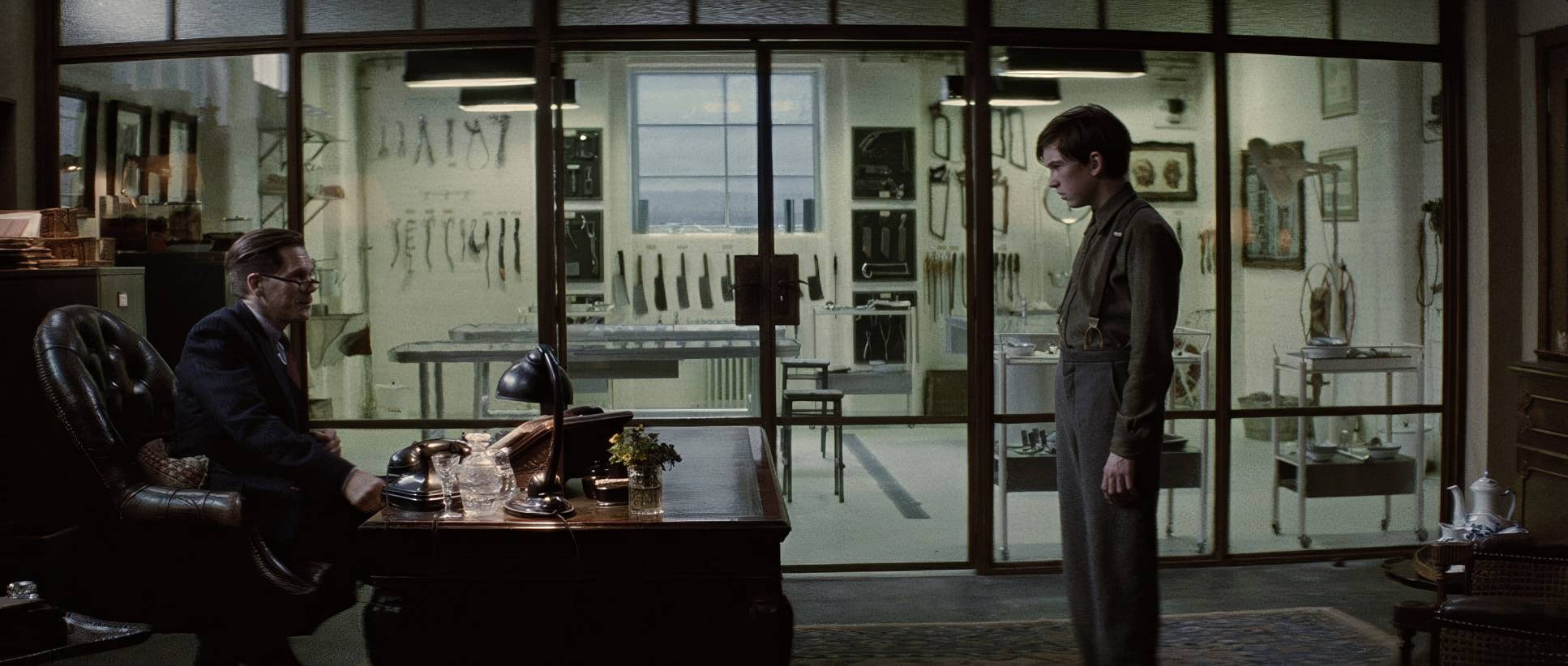
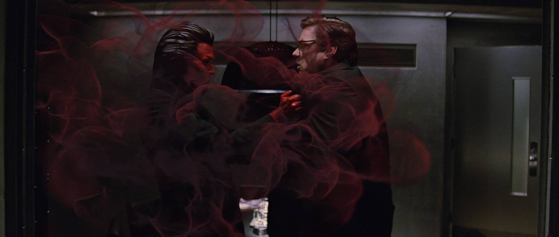
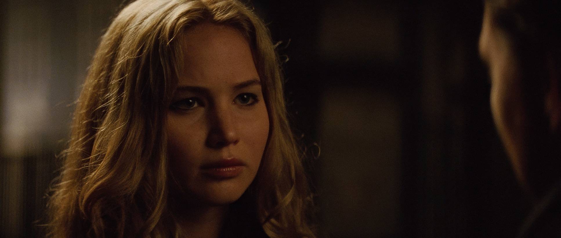
In the Hellfire Club, it’s all about pockets of light and deep shadows, which feels seductive and dangerous. Then you go to the CIA labs, and it’s a clinical, cool blue-green wash. As a colorist, I love the contrast ratios here. The high-stakes moments like Erik pulling the filling out of the banker’s mouth are lit with harsh, high contrast to emphasize the brutality. Meanwhile, Charles’s scenes stay softer and more diffused, reflecting his empathy.
Lensing and Blocking

There’s a common misconception that superhero movies need to be shot spherical for “realism,” but First Class proves the opposite. They shot this Anamorphic using Panavision E and C series glass.
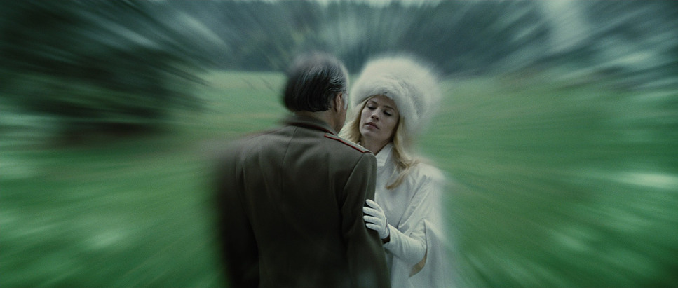
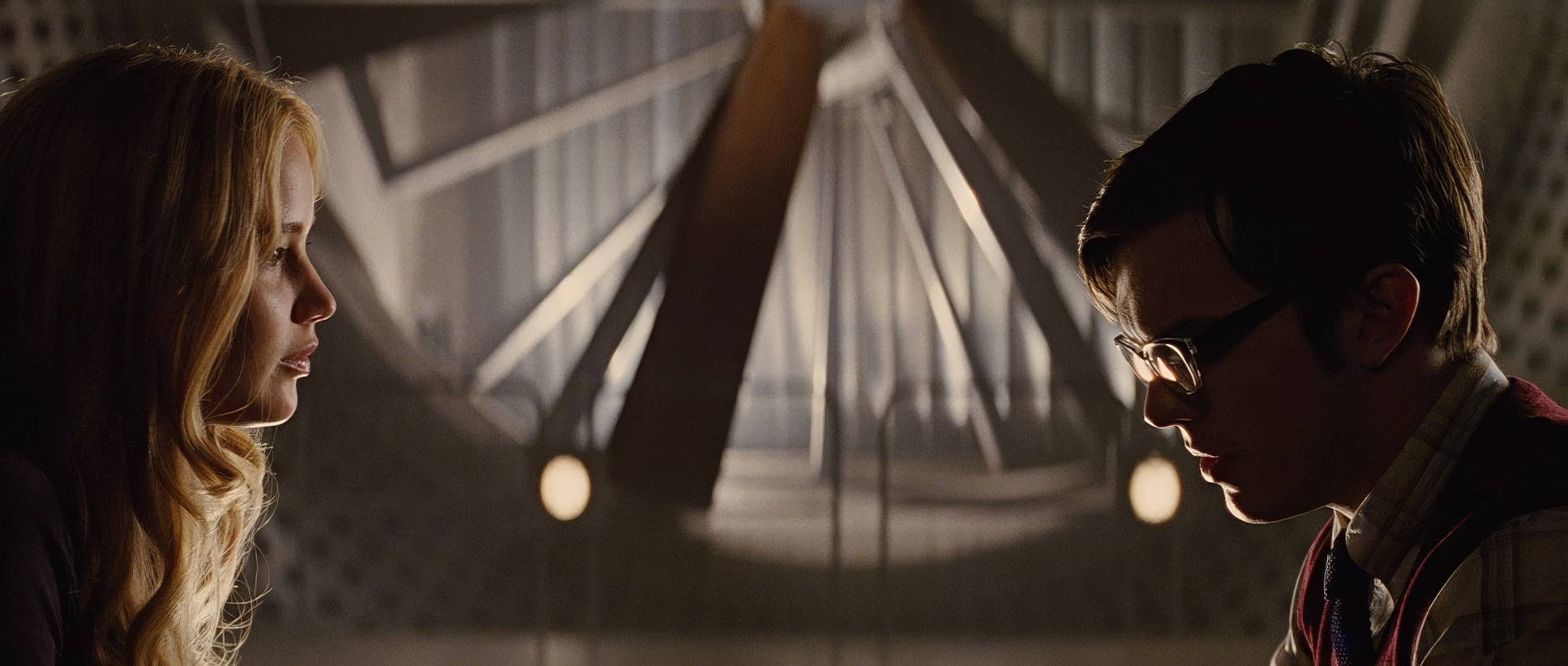
That anamorphic choice is exactly why it feels like a 60s spy thriller. You get those subtle distortions at the edges and the wide, cinematic scope that feels like a vintage Bond film. Long lenses are used brilliantly for the emotional beats like Erik’s memories of his mother compressing the background to make sure we’re locked into his eyes.
The blocking is just as tight. Think about the scene where Charles helps Erik move the satellite. Charles is the guide, Erik is the student. Their physical proximity tells you everything about their mental connection. When Erik finally succeeds, he’s alone in the frame a hint at the isolated path he’ll eventually take.
Color Grading Approach

This is my “home turf.” For First Class, the grade (handled by Yvan Lucas and Mitch Paulson) is legendary. It avoids that hyper-saturated, “plastic” look of modern blockbusters. Instead, it feels like a film print.
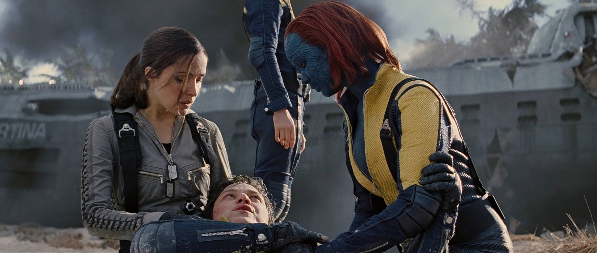
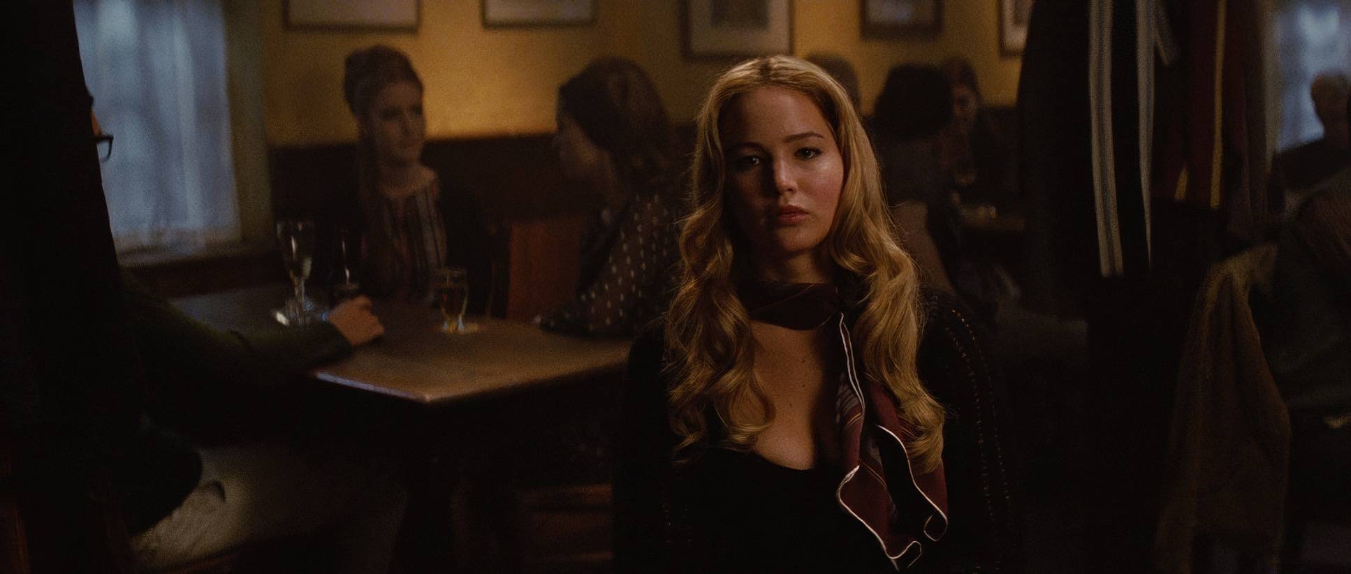
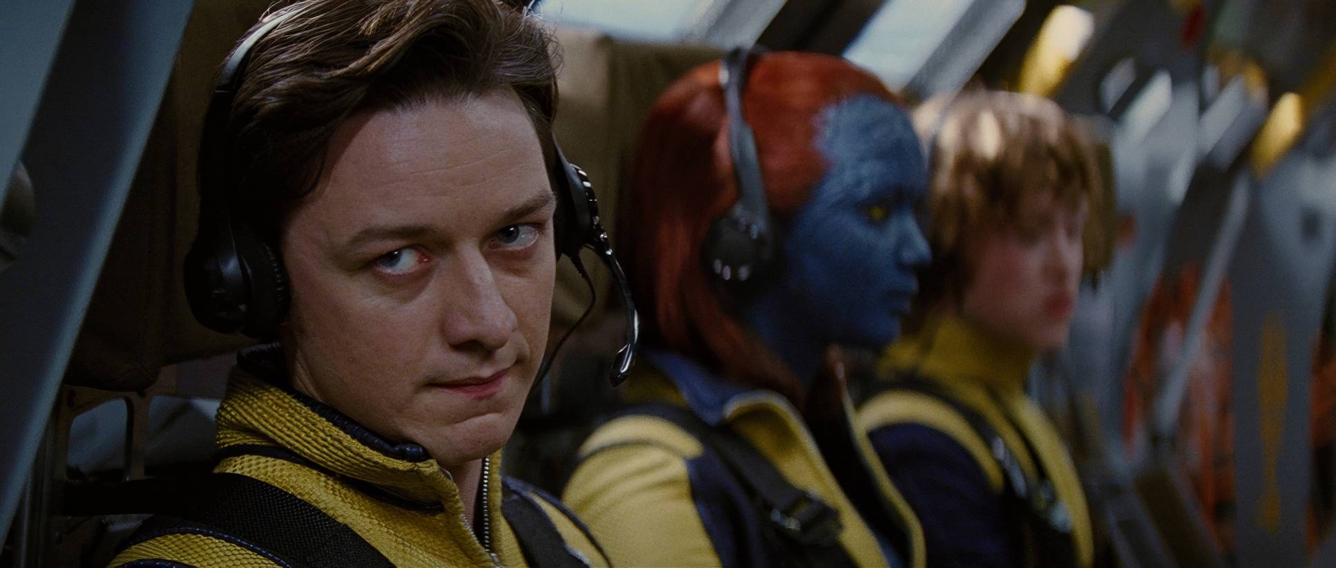
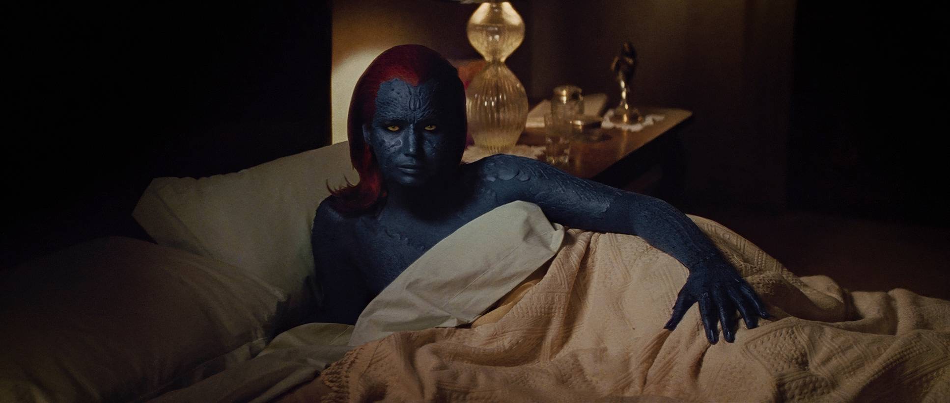
The palette is slightly desaturated with warm, nostalgic undertones. But look at the hue separation: Mystique’s blue and the reds of Shaw’s energy pop specifically because the rest of the world is so grounded in muted browns and greens.
The contrast shaping is beautiful. The blacks aren’t just “crushed” to zero; they have texture and density. And the highlight roll-off is classic film soft and gentle, never blowing out into harsh digital whites. It’s that “print-film” sensibility that makes the whole thing feel expensive and timeless.
Technical Aspects & Tools
X-Men: First Class (2011) — Technical Specifications
| Genre | Action, Adventure, Science Fiction |
| Director | Matthew Vaughn |
| Cinematographer | John Mathieson |
| Production Designer | Chris Seagers |
| Costume Designer | Sammy Sheldon |
| Editor | Eddie Hamilton, Lee Smith |
| Colorist | Yvan Lucas, Mitch Paulson |
| Time Period | 1960s |
| Aspect Ratio | 2.35 – Anamorphic |
| Format | Film – 35mm |
| Lighting | Soft light |
| Camera | Panavision Millennium / Millenium XL / XL2, Arricam ST, Beaumont VistaVision Camera |
| Lens | Panavision E series, Panavision C series, Panavision 70-200mm (ATZ), Panavision 40-80 (Bailey zoom – AWZ2), Panavision 70-200mm (ATZ) |
| Film Stock / Resolution | 5219/7219 Vision 3 500T, 5213/7213 Vision 3 200T |
For the gear nerds out there, Mathieson stayed loyal to 35mm film. They used Arricam ST and Panavision Millennium XL2s. In 2011, digital was starting to take over, but you can’t argue with the organic grain and dynamic range they got out of Kodak Vision3 500T and 200T stocks.
That film negative was scanned for the Digital Intermediate (DI), which gave the colorists the best of both worlds: the texture of film with the precision of digital grading. Using the Panavision E and C series anamorphic lenses gave them that “big screen” feel that defines the franchise.
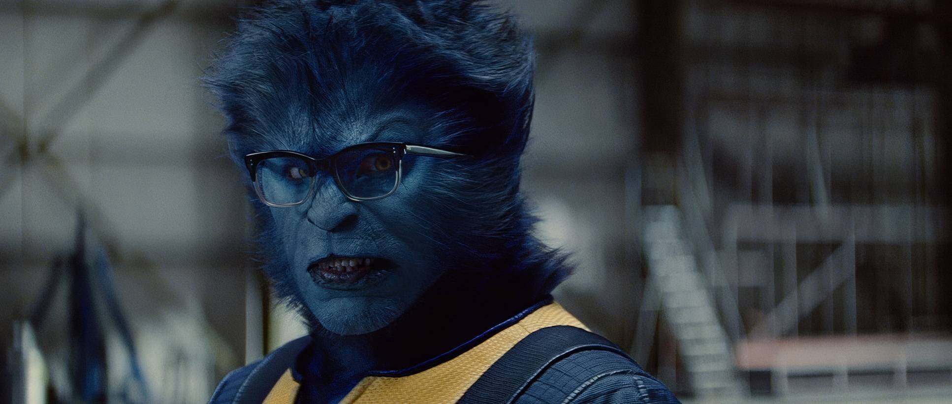
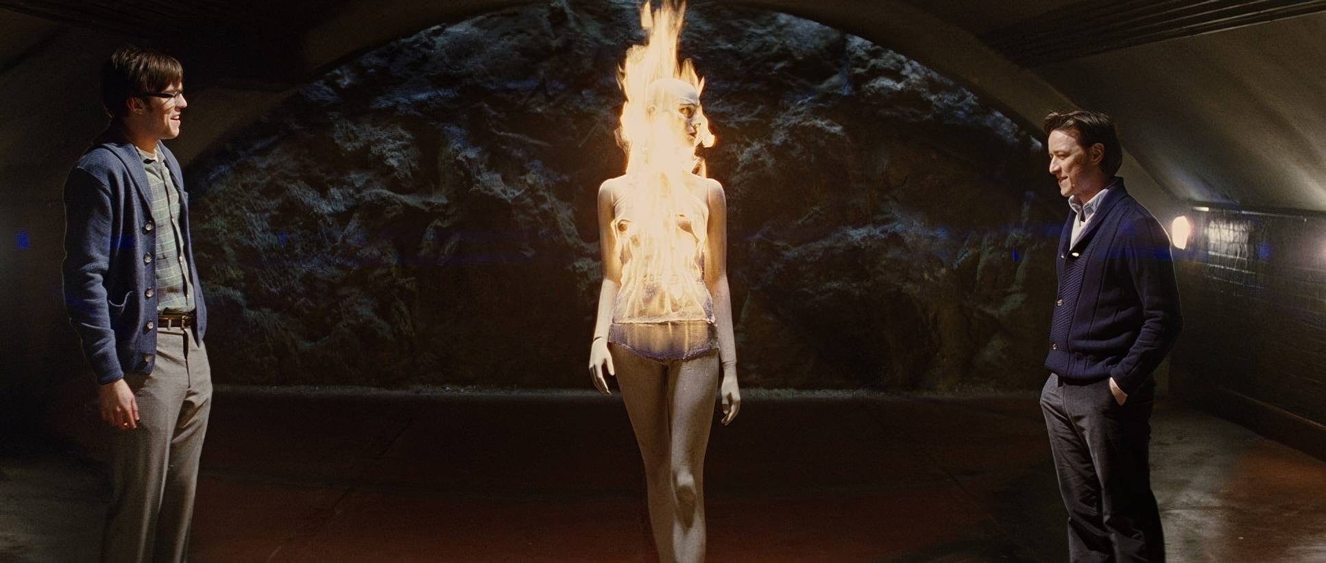
X-Men: First Class (2011) Film Stills
A curated reference archive of cinematography stills from X-Men: First Class (2011). Study the lighting, color grading, and composition.


- Also read: KINGSMAN: THE SECRET SERVICE (2015) – CINEMATOGRAPHY ANALYSIS
- Also read: SILVER LININGS PLAYBOOK (2012) – CINEMATOGRAPHY ANALYSIS
Browse Our Cinematography Analysis Glossary
Explore directors, cinematographers, cameras, lenses, lighting styles, genres, and the visual techniques that shape iconic films.
Explore Glossary →