Lately, with the Wizarding World back in the cultural zeitgeist, I went back to where it all started: Harry Potter and the Sorcerer’s Stone (or Philosopher’s Stone for those of us outside the US).
This wasn’t just a casual rewatch. I wanted to treat it like a technical autopsy. As a colorist, I’m obsessed with how the choices made on set the glass, the lights, the film stock dictate what I can eventually do in the grading suite. In this first outing, the visuals had to be both massive and intimate. It’s a tough balancing act, and I wanted to see exactly how they pulled it off.
About the Cinematographer
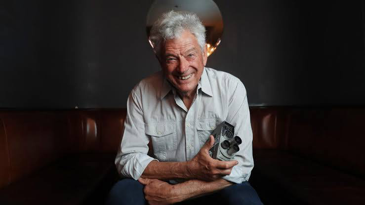
The DP for this first outing was the legendary John Seale, ASC, ACS. If you know Seale’s work, you know he’s a chameleon. He’s the mind behind the intimate, grounded look of Rain Man, but also the guy who captured the high-octane, saturated madness of Mad Max: Fury Road.
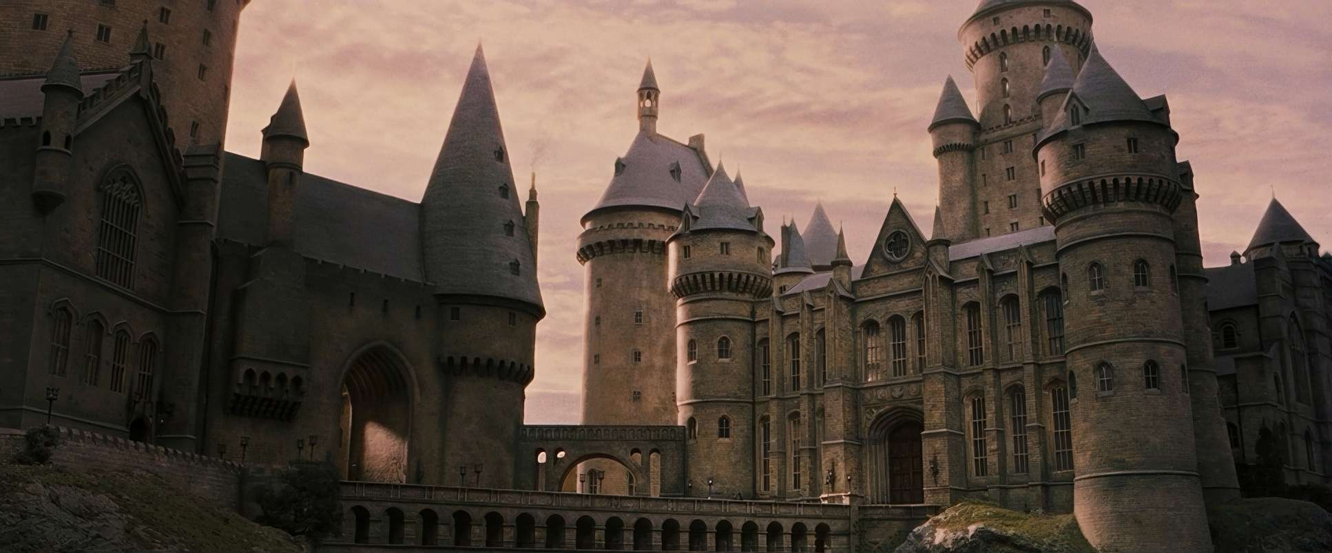
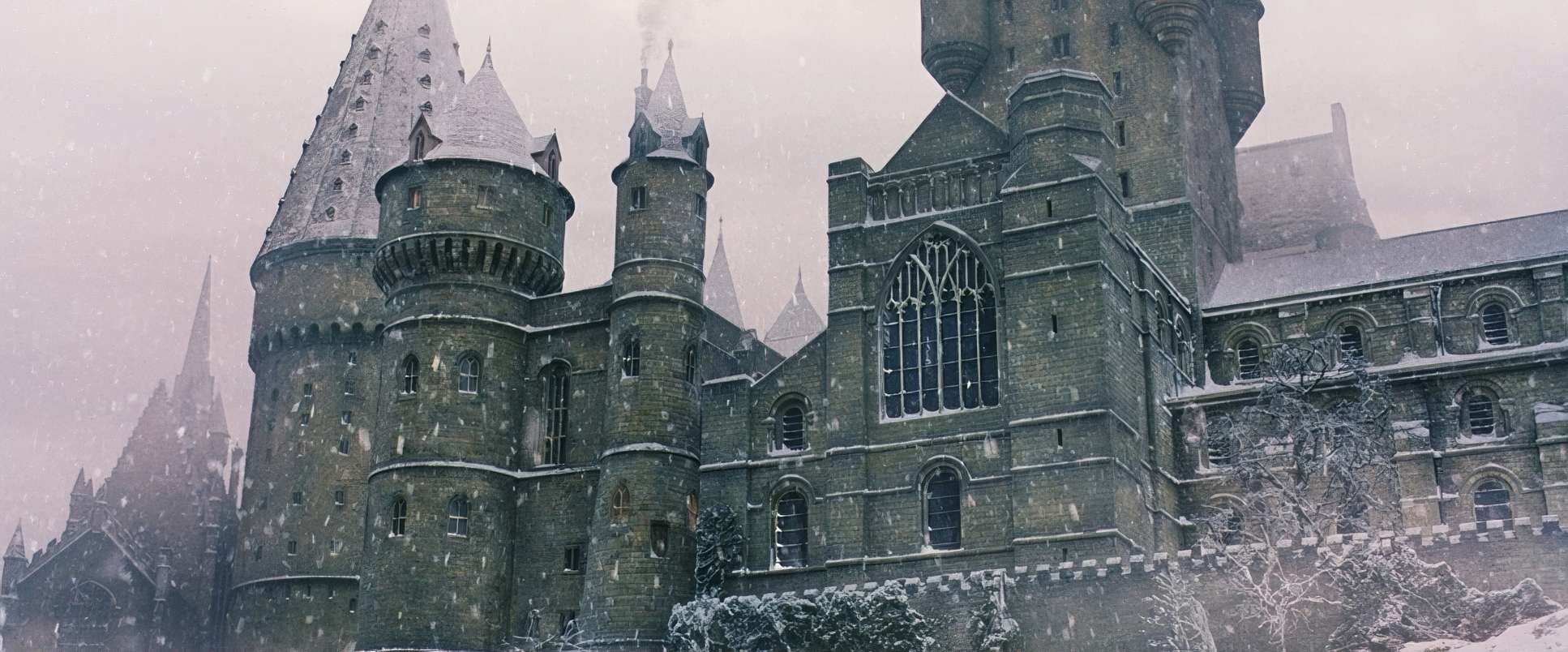
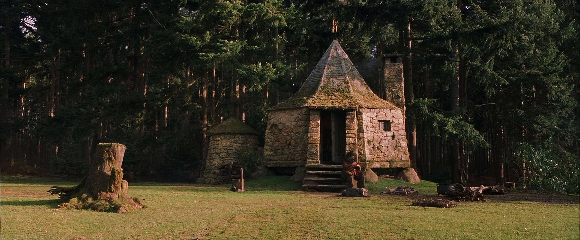
He brought a very “tactile” philosophy to Hogwarts. He wasn’t interested in leaning on early 2000s green-screen tech more than he had to; he wanted the castle to feel heavy, ancient, and real. This was the perfect match for director Chris Columbus. While Columbus is known for “family films,” he’s always had a knack for letting a little bit of darkness creep into the corners. Seale’s ability to build tangible worlds was exactly what was needed to take J.K. Rowling’s descriptions and turn them into something you could actually feel.
Inspiration Behind the Cinematography
The brief was simple but massive: the book. Columbus and Seale had to visualize a world that millions of people had already built in their heads. The goal wasn’t just to make a movie; it was to establish a “visual lexicon” for a decade-long saga.
This required a specific duality. Hogwarts had to be majestic, but it also had to feel like a place where eleven-year-olds actually lived. The look is mostly bright and optimistic reflecting Harry’s own sense of wonder but there are these subtle “touches of darkness.” It’s an inviting movie, but it never lets you forget that something dangerous is lurking in the Forbidden Forest. They weren’t just making a kids’ movie; they were building a world that could grow darker as the characters did.
Lighting Style
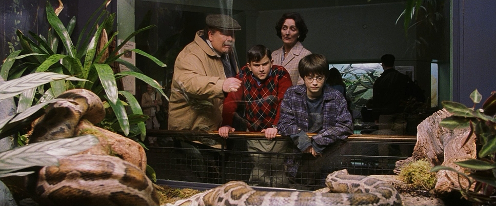
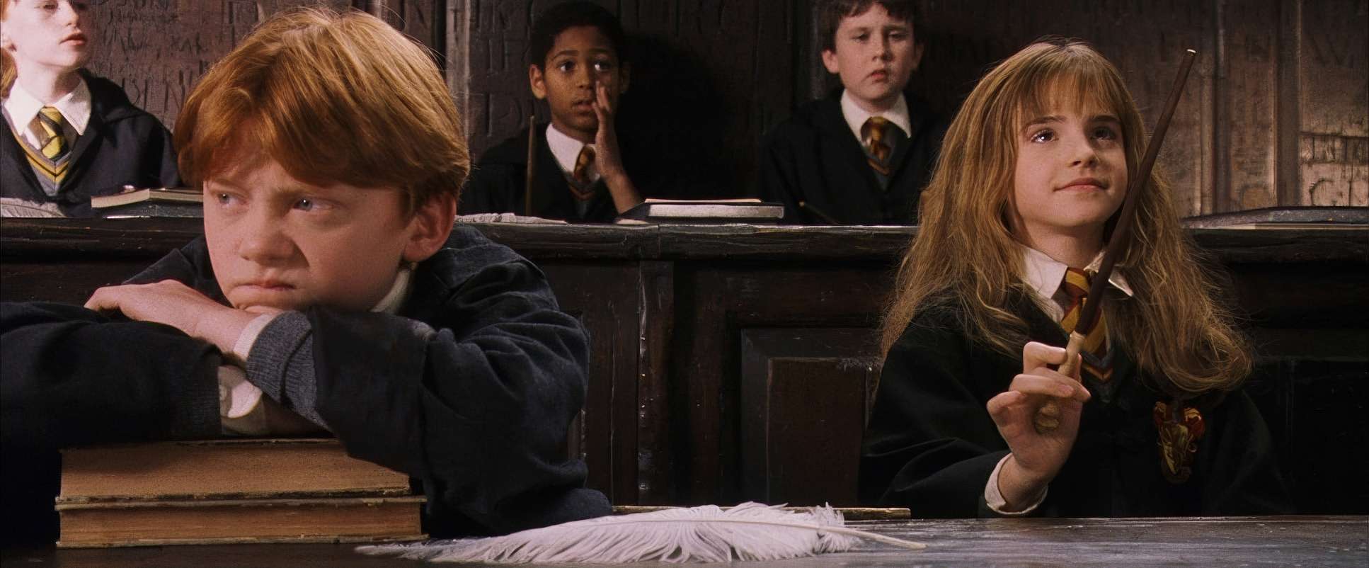
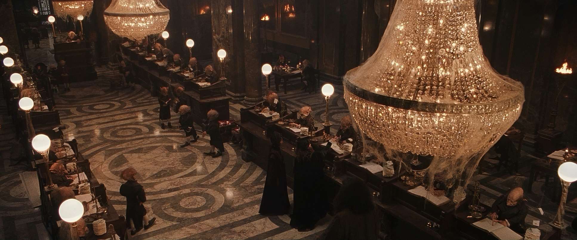
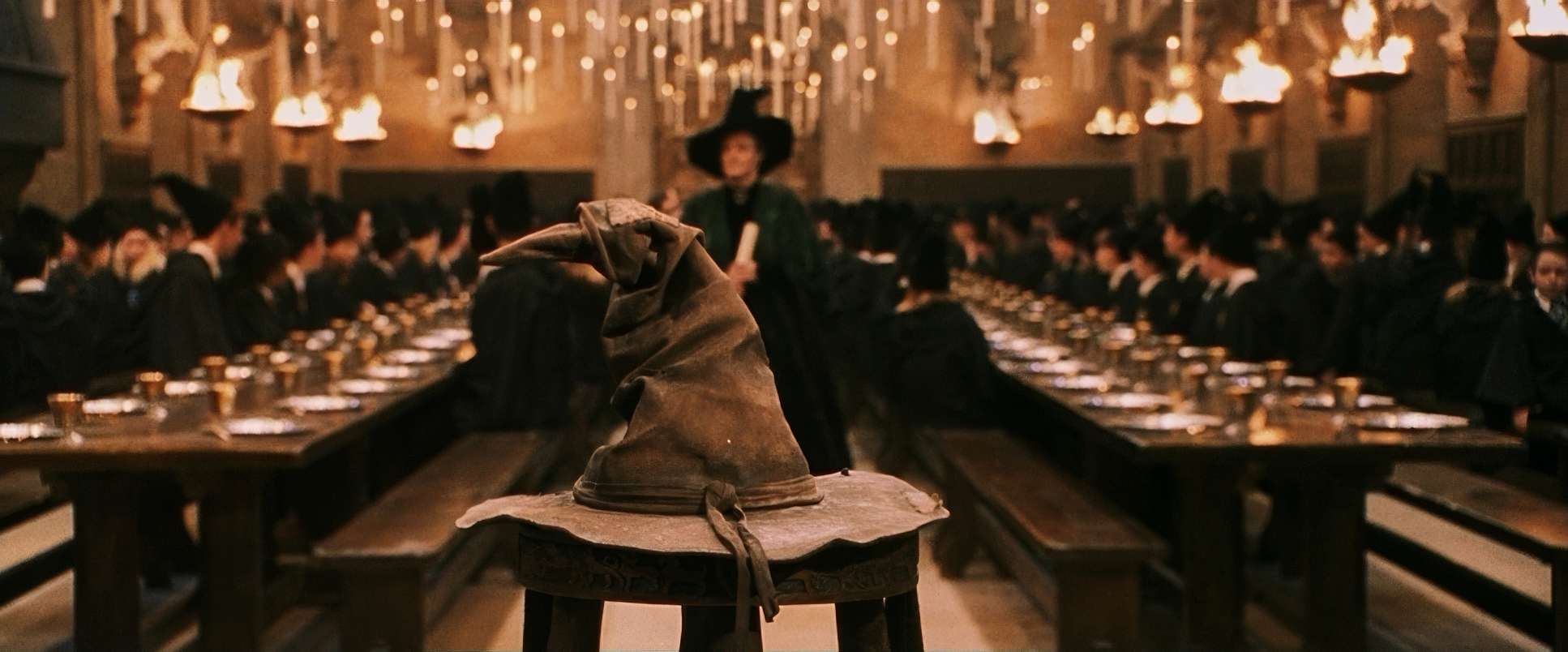
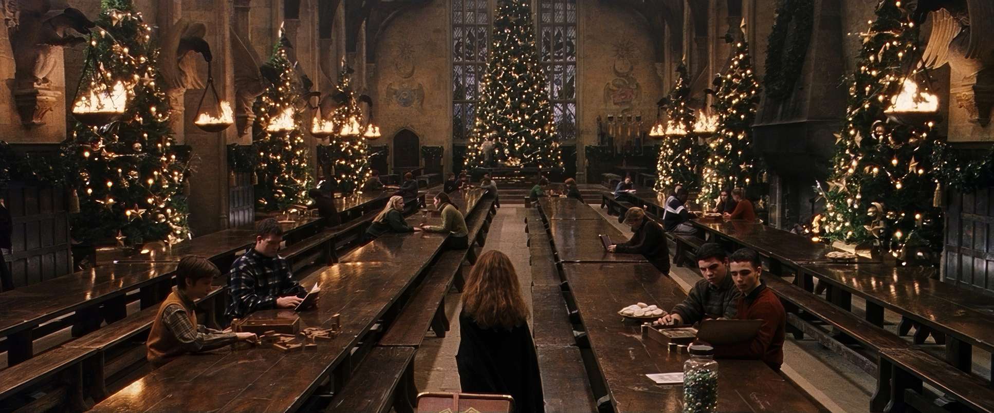
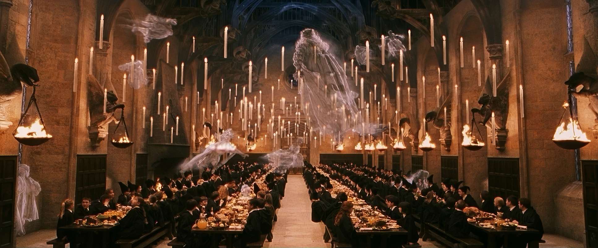
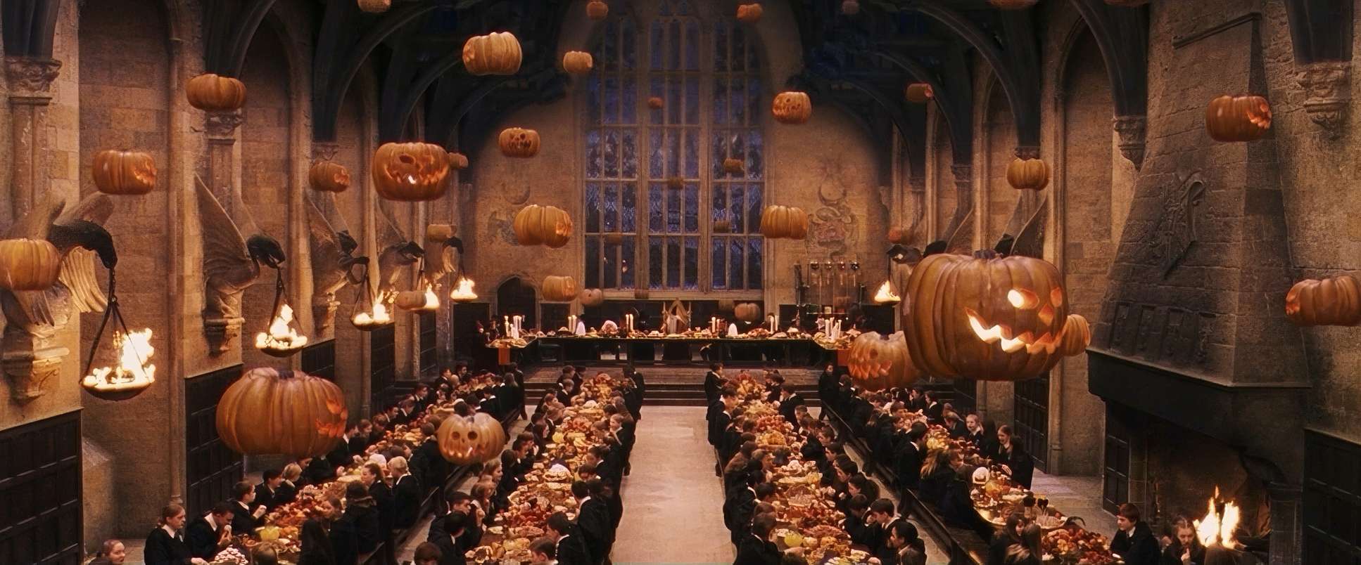
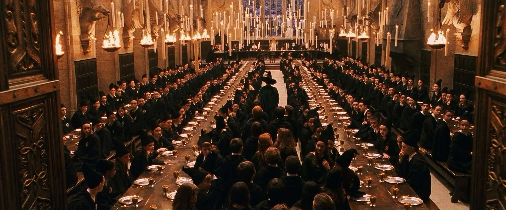
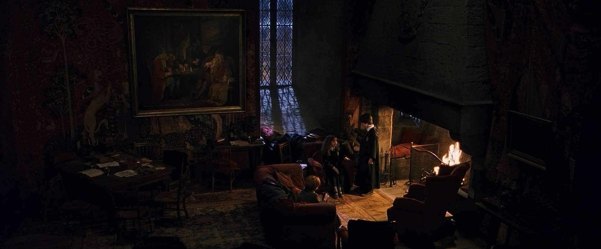
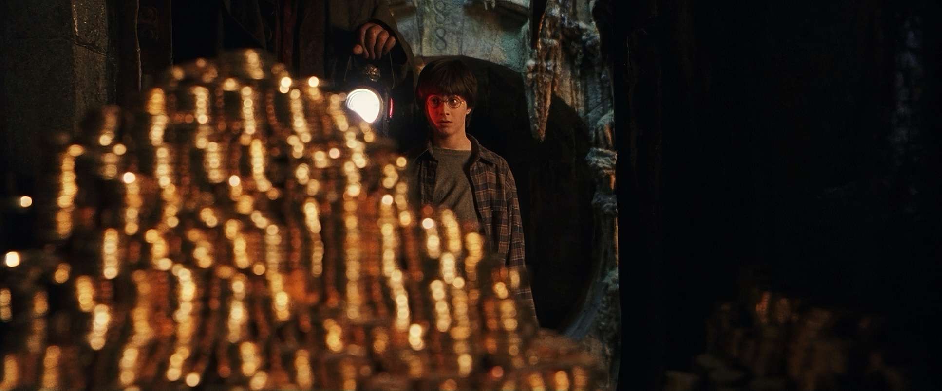
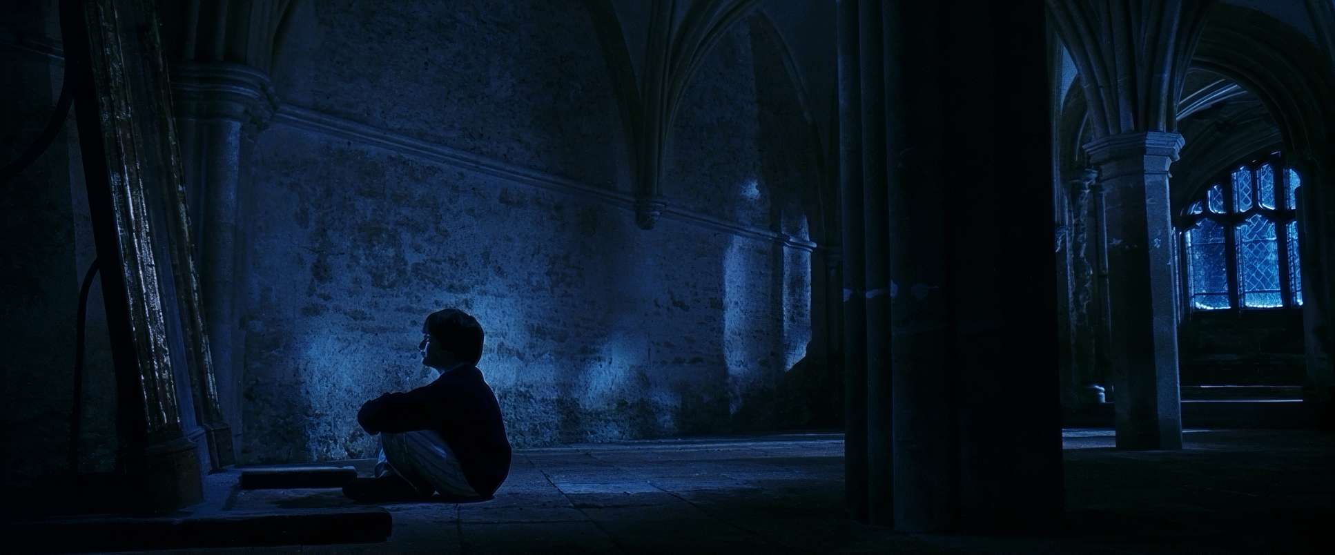
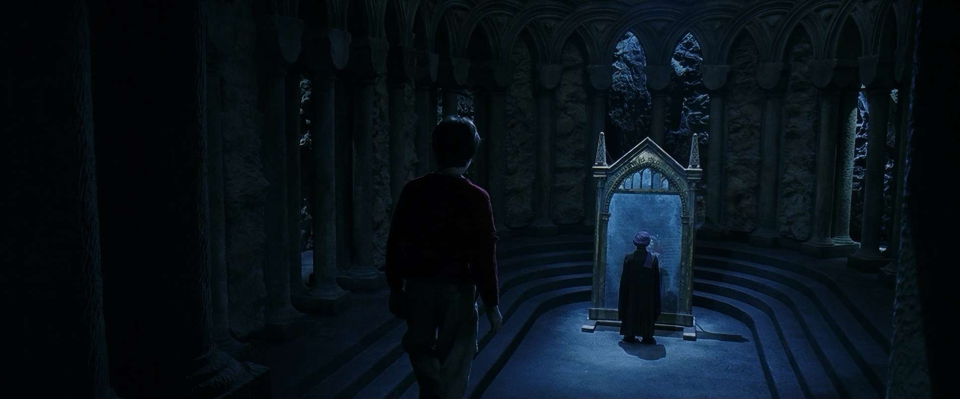
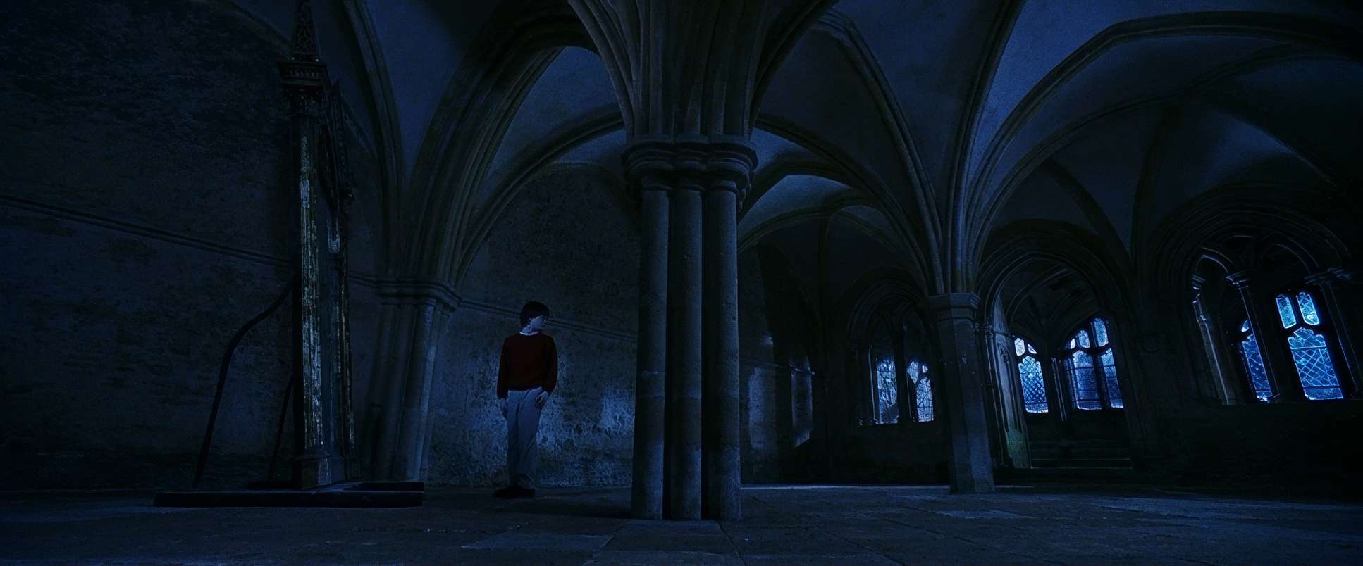
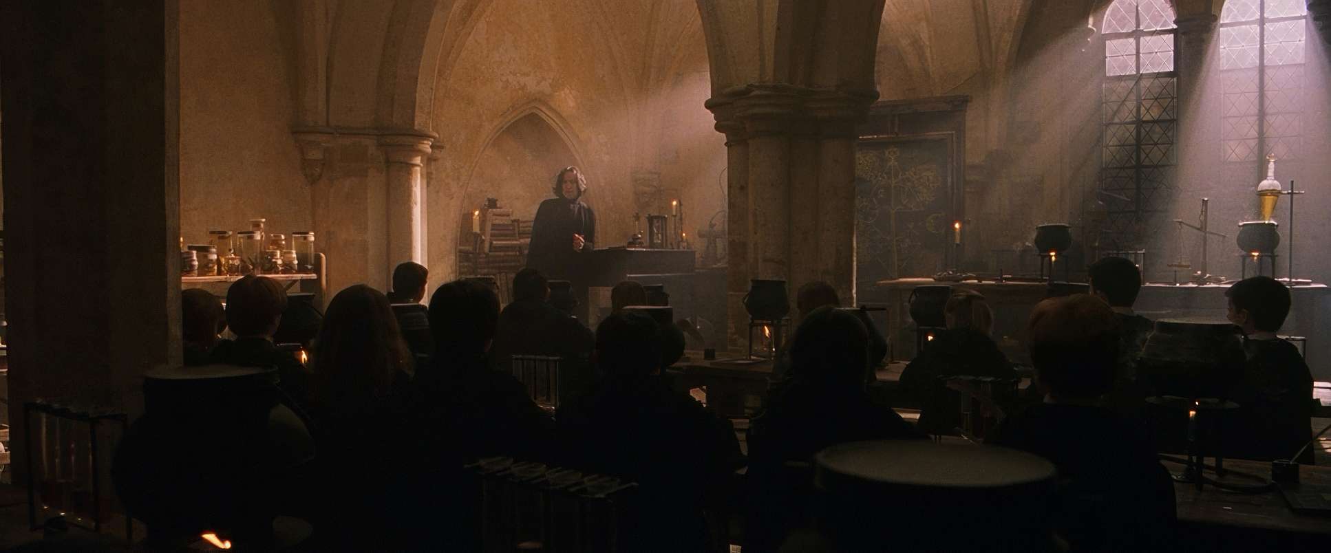
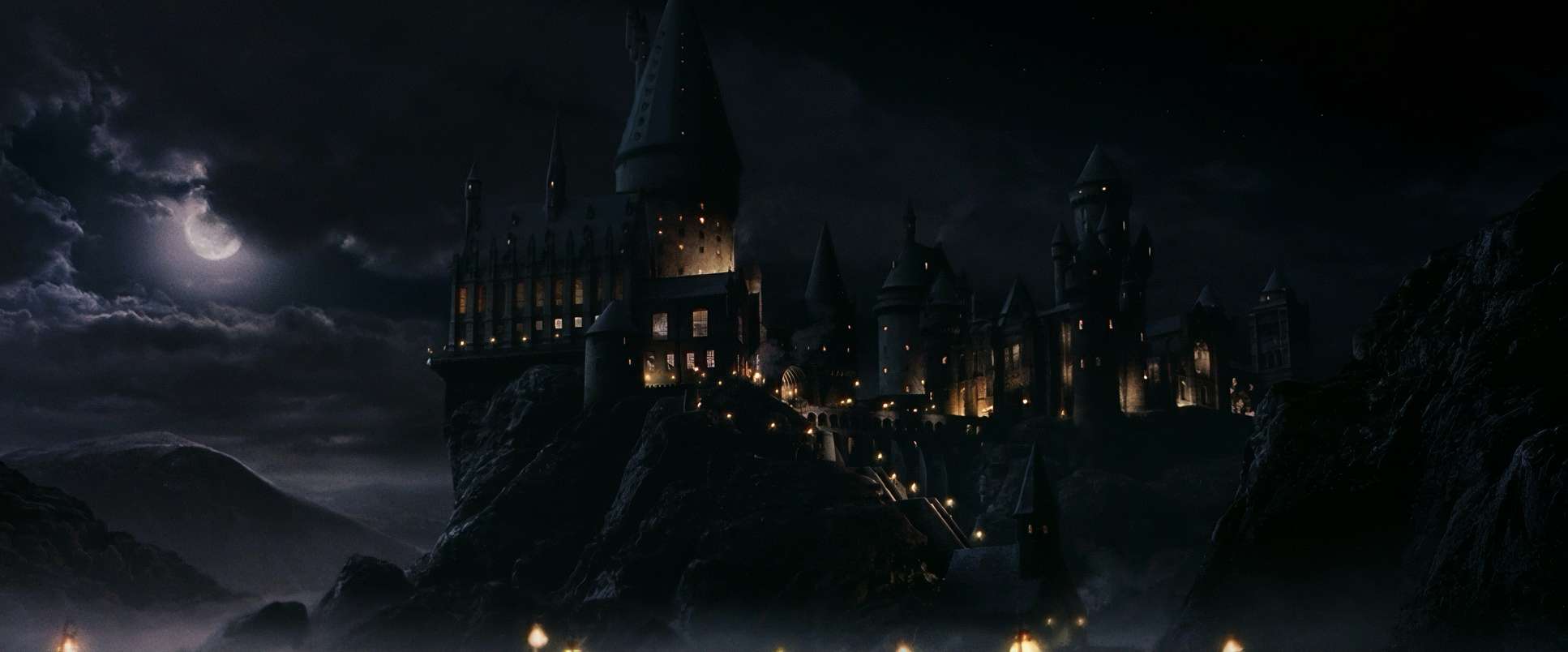
This is where the movie really wins for me. The lighting is a masterclass in using “motivated” sources. Within Hogwarts, the light almost always feels like it’s coming from something real: massive fireplaces, thousands of floating candles, or the huge windows in the Great Hall.
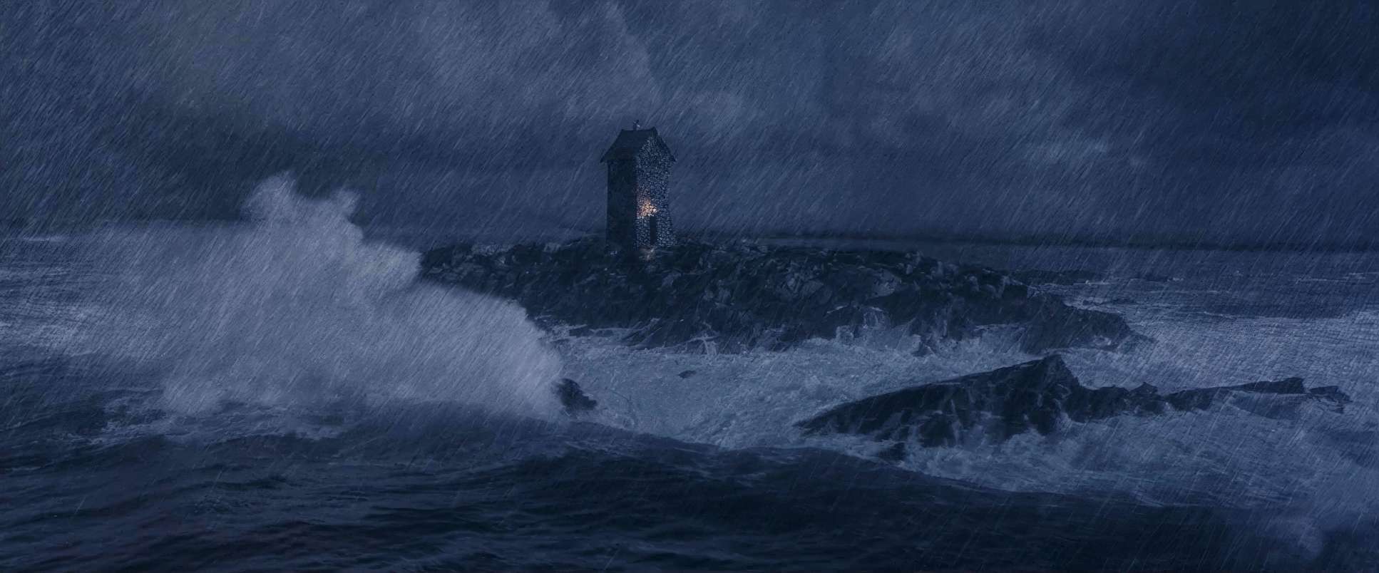
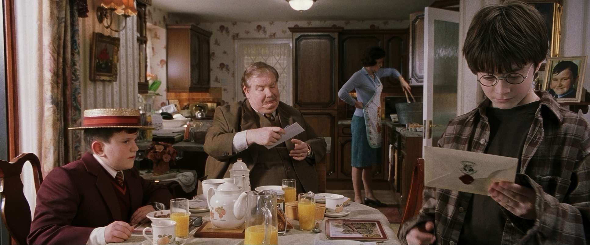
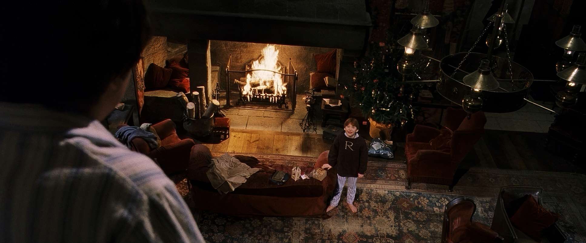
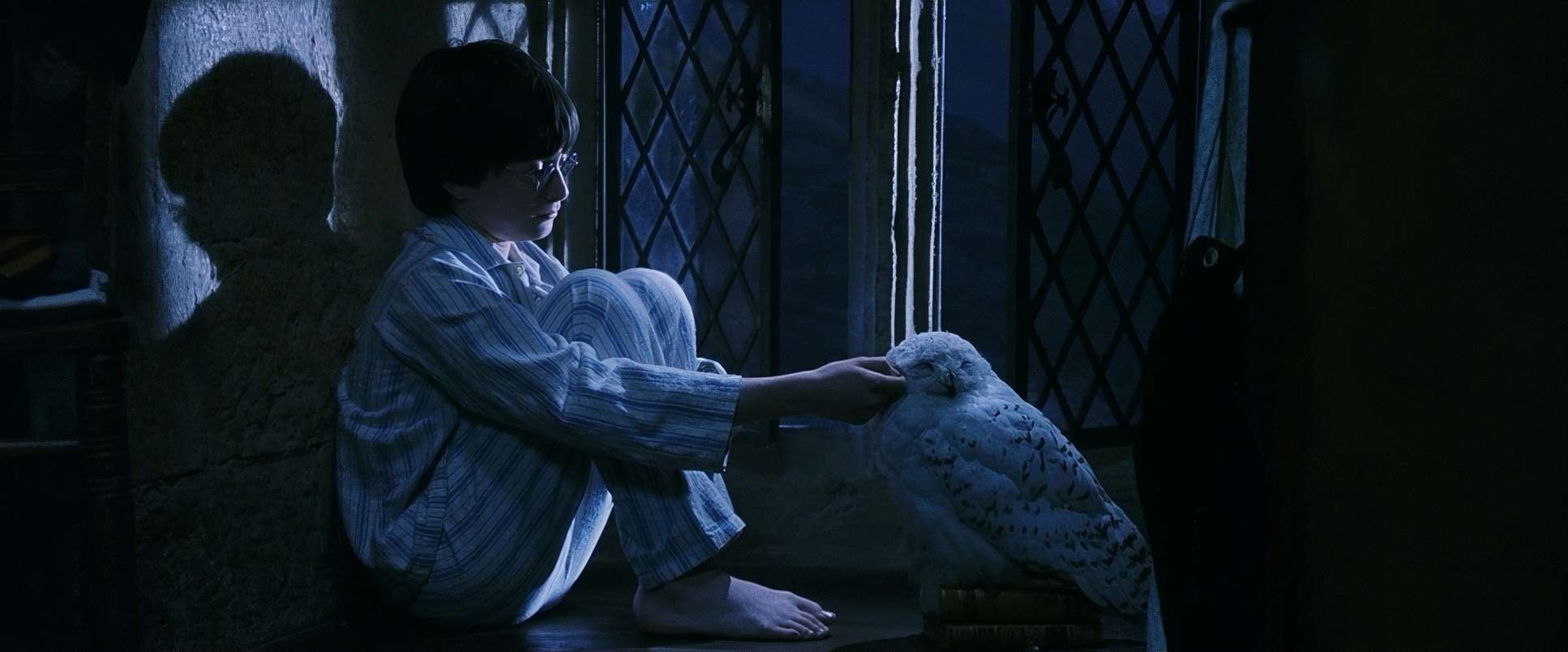
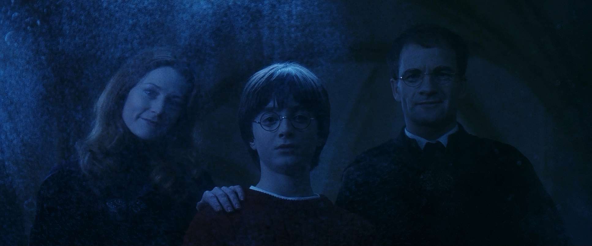
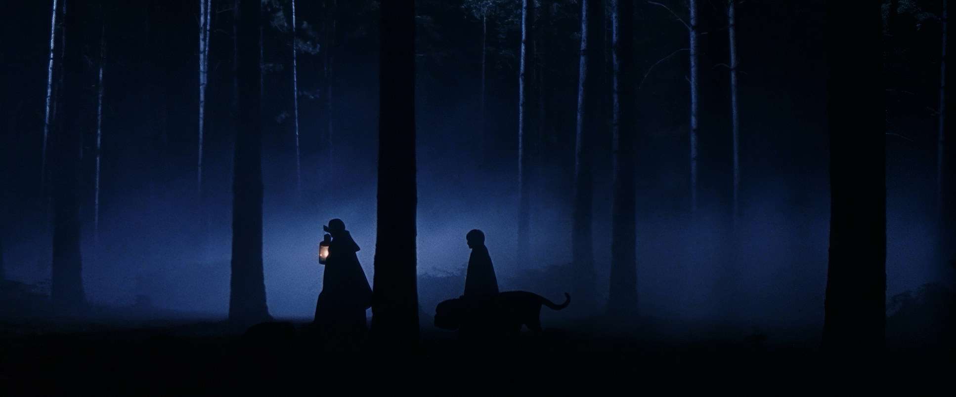
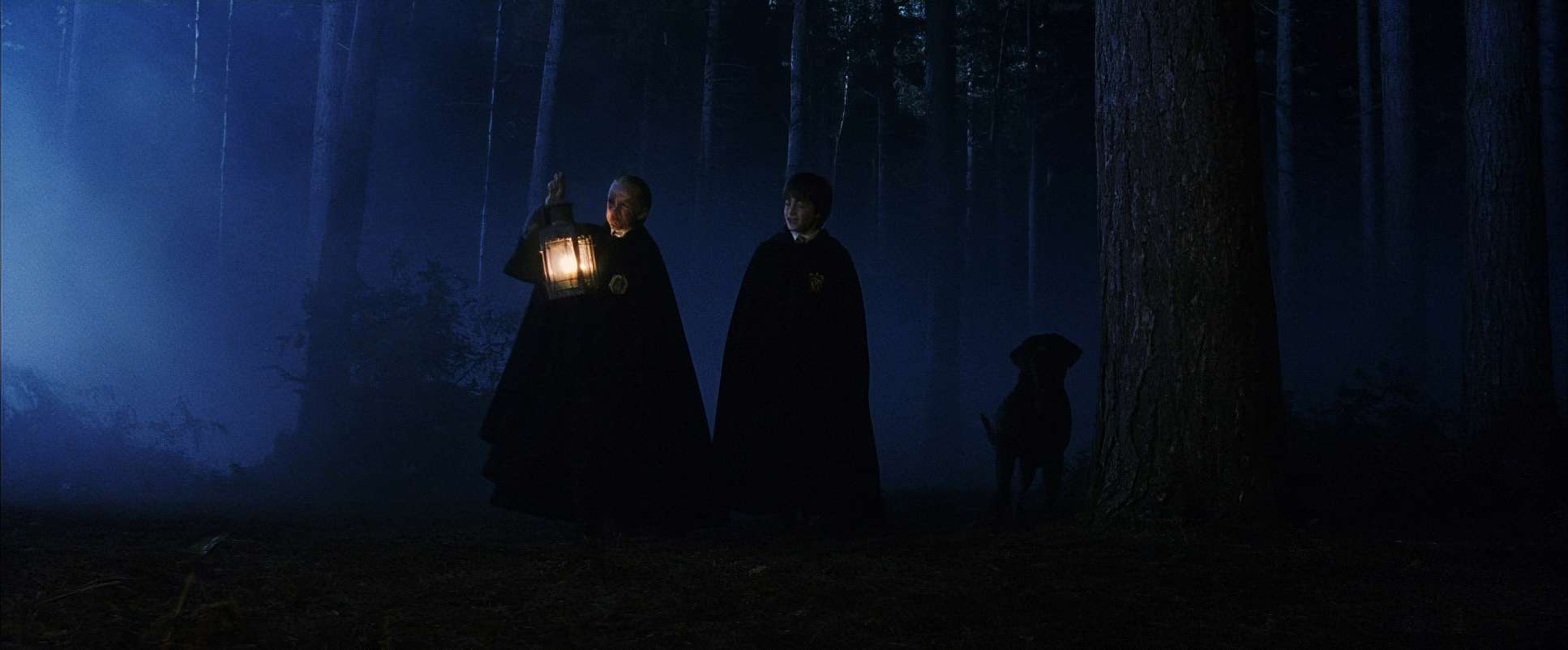
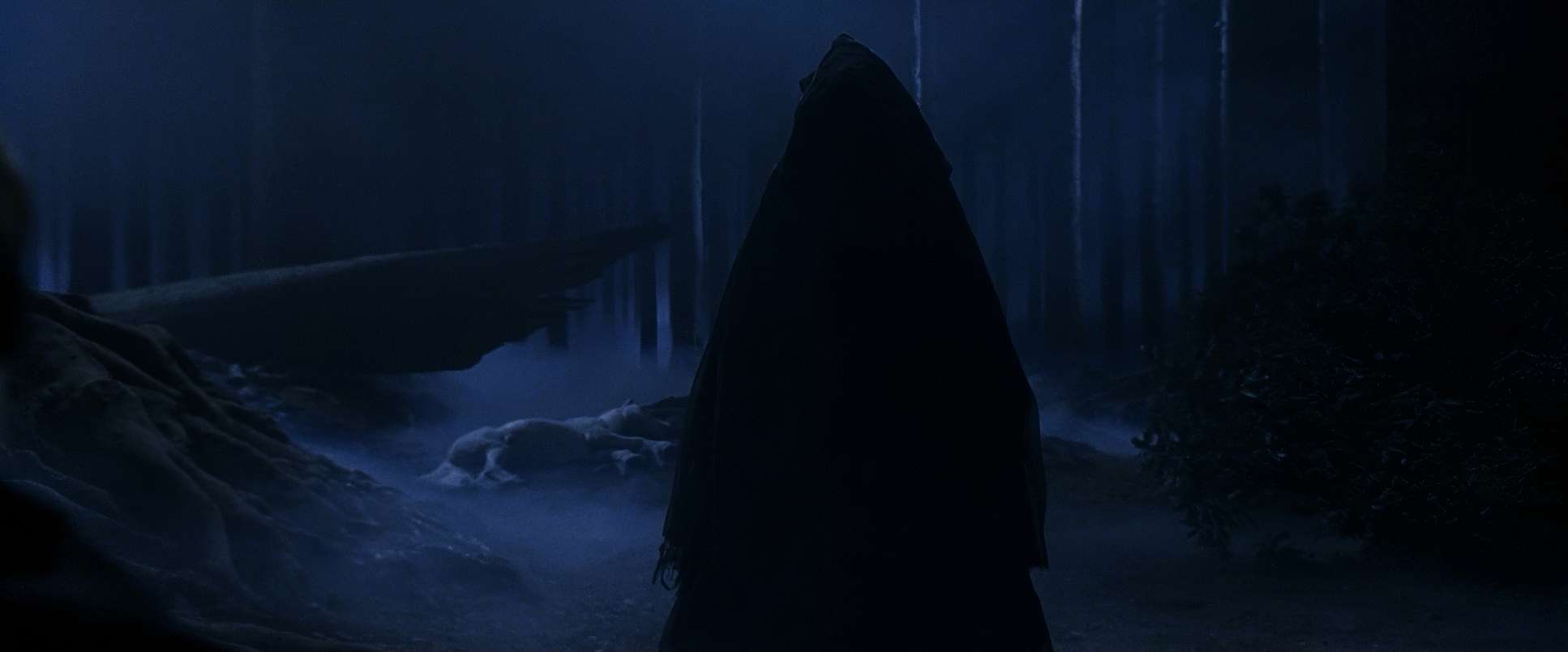
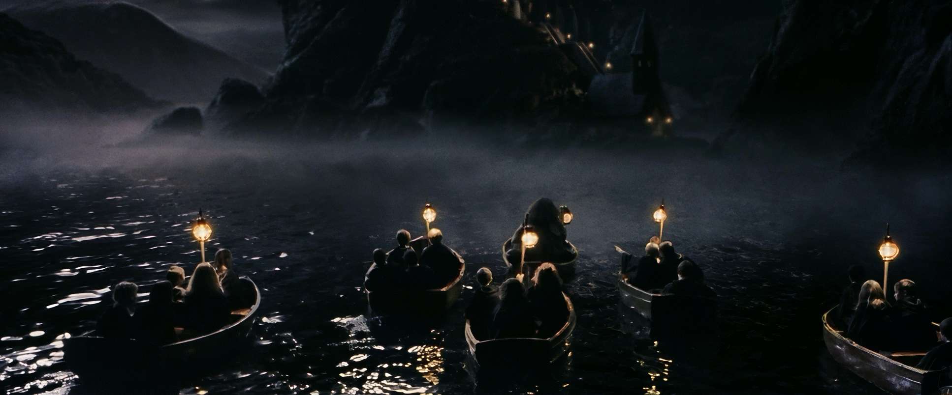
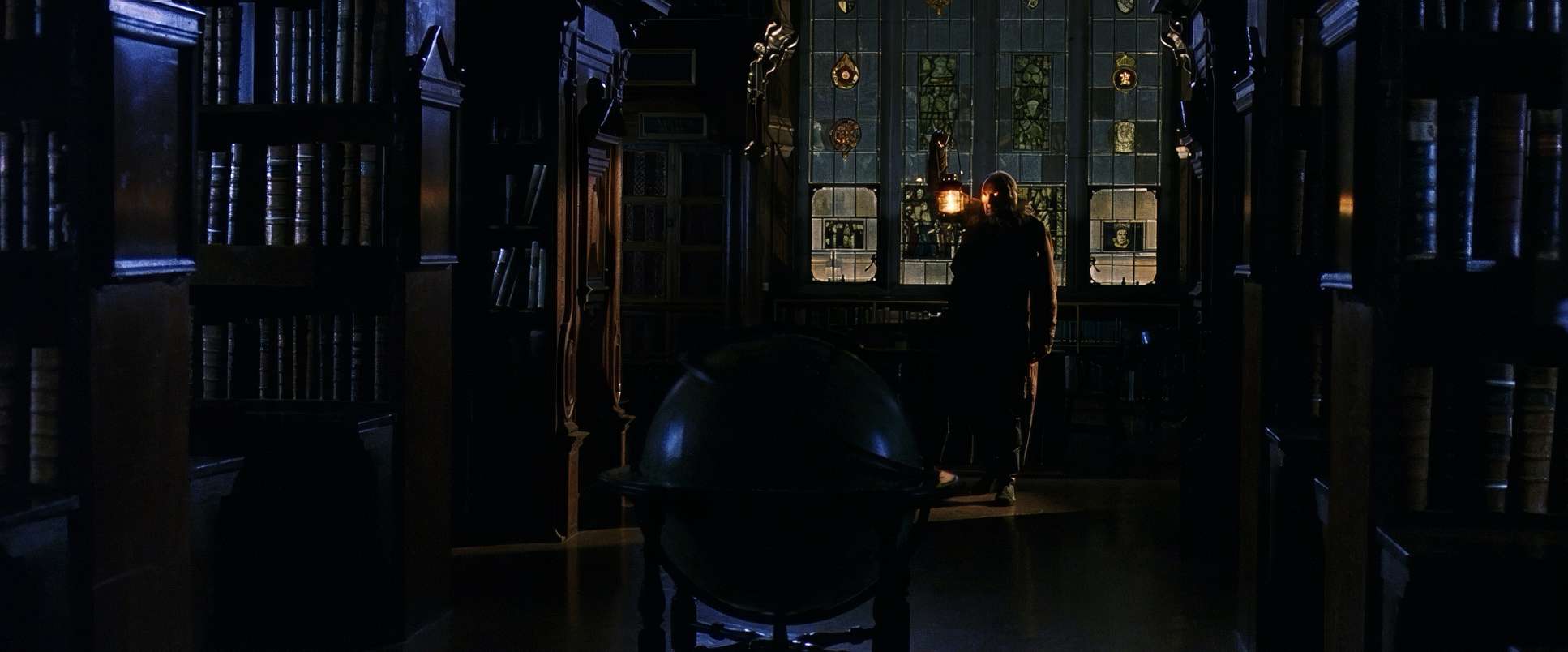
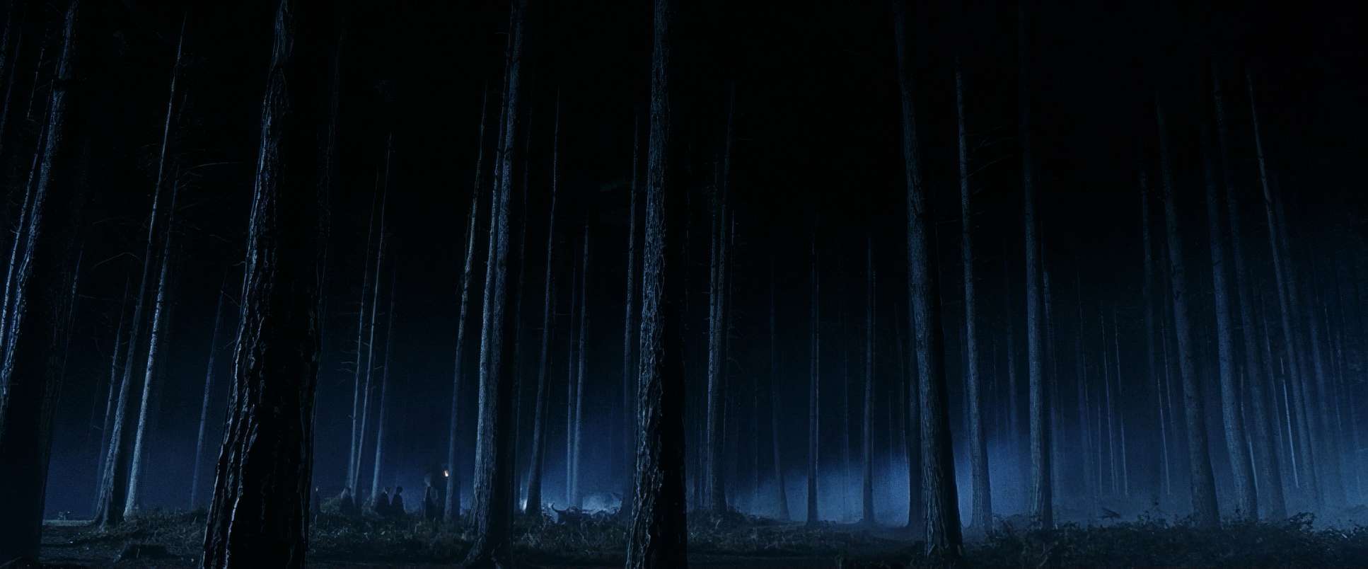
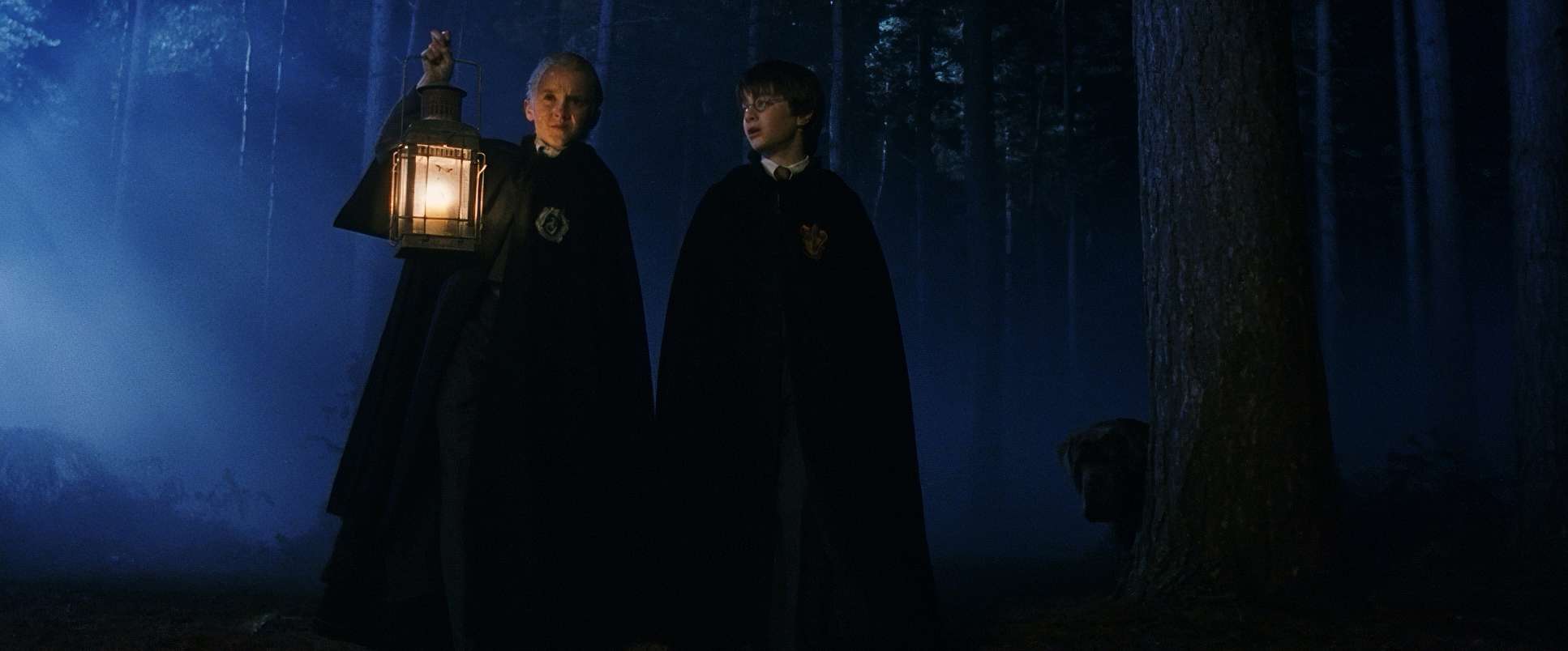
The interiors have this rich, golden, amber glow. It’s “comforting magic.” As a colorist, I love the way Seale sculpted the light here; the highlights have that soft, creamy roll-off you only get with good glass and film. But he wasn’t afraid of contrast. When we go into the Forbidden Forest or encounter Snape, the warmth disappears. It shifts to cool, moonlight-heavy tones with deep shadows. This early introduction of “darkness” visually prepped us for the much grittier films that would come years later.
Color Grading Approach

Let’s talk about the grade, because this is where the real texture of the film lives. For Sorcerer’s Stone, the look is defined by its 35mm origins. It has a “print-film” sensibility that digital often struggles to replicate. The colors aren’t pushed into weird, trendy hues; they have a heightened, vibrant realism.
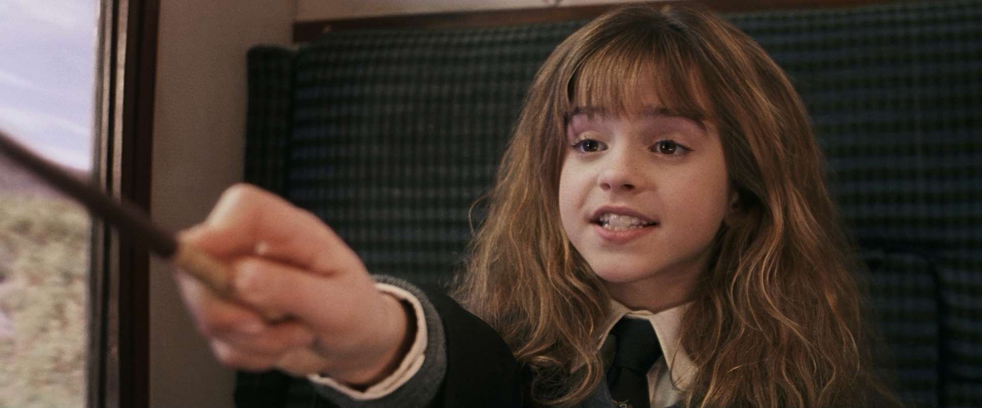
The palette is driven by the House colors those deep Gryffindor reds and lush greens. My favorite thing about this grade is the hue separation. Even in a scene that’s heavy on the amber candlelight, the skin tones stay clean and the specific colors of the scarves or spells really pop. It’s not about over-saturating the whole image; it’s about control. As a colorist, I often ask: Do I chase realism or stylization? This film shows that you don’t have to choose. You can have a grade that supports the wonder of the story without looking “fake.” It’s a gentle hand that lets the story breathe.
Lensing and Blocking
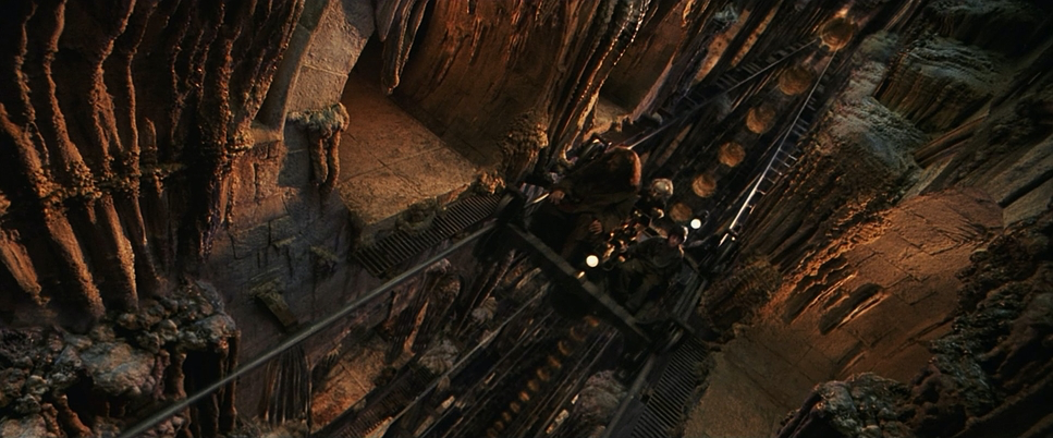
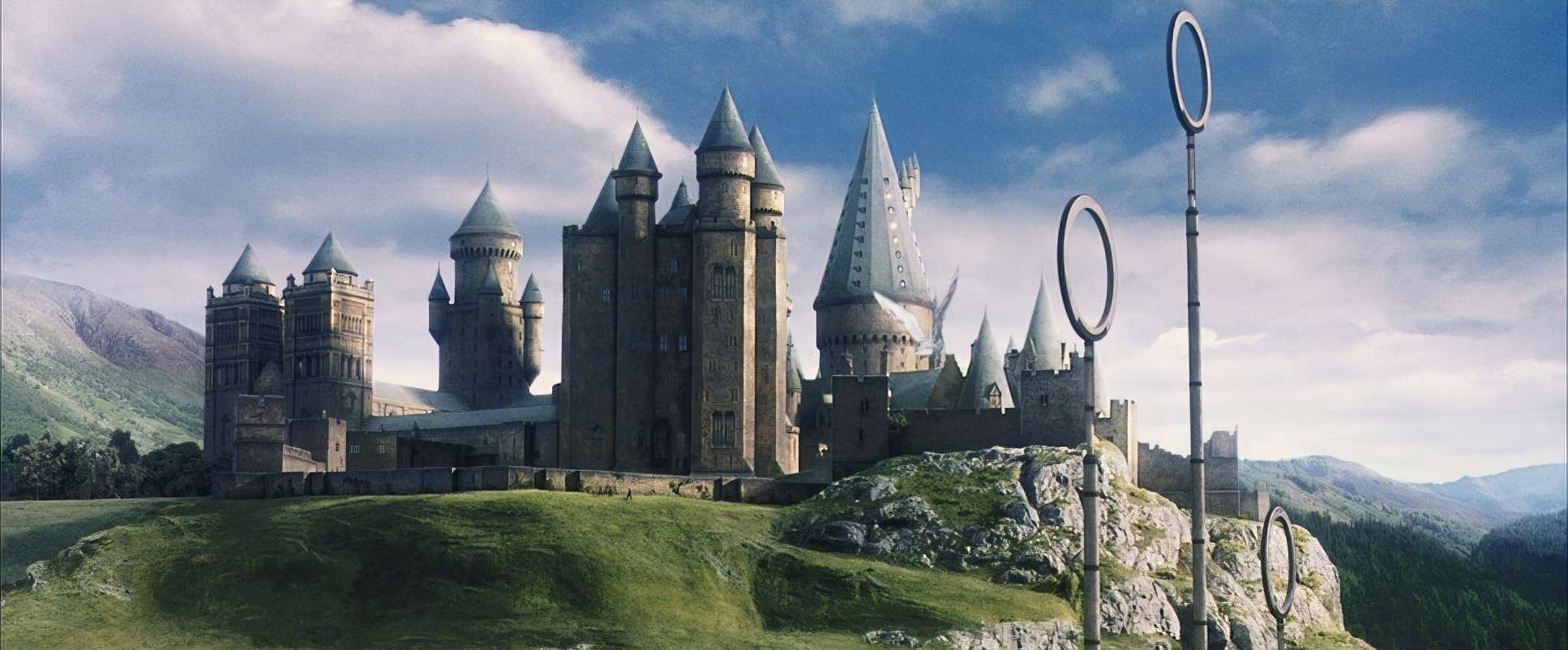
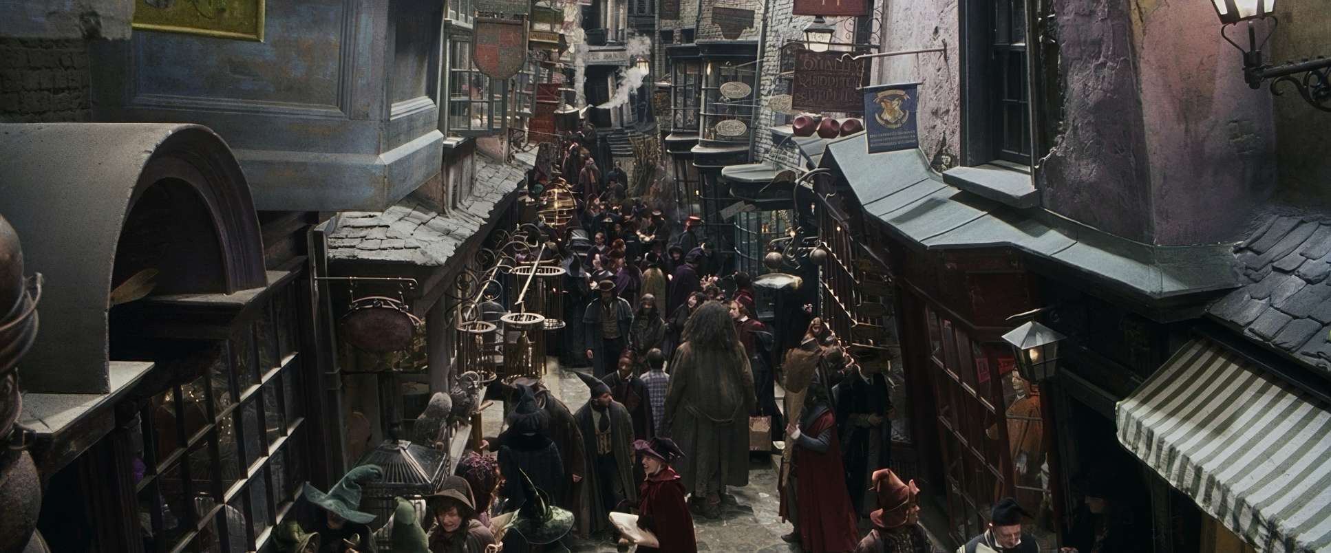
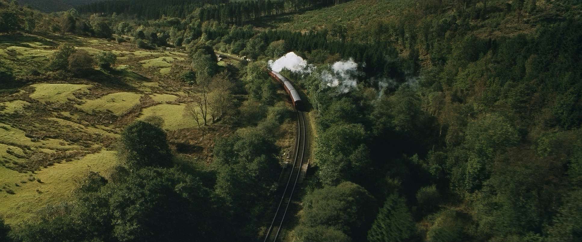
Seale’s choice of glass specifically Panavision Primo Primes and Zooms is key to the film’s scale. They used wide-angle lenses for the establishing shots of the Great Hall, which give you that breathtaking sense of “I’ve arrived.” Wide lenses can be tricky because of distortion, but here they just make the sets feel more expansive.
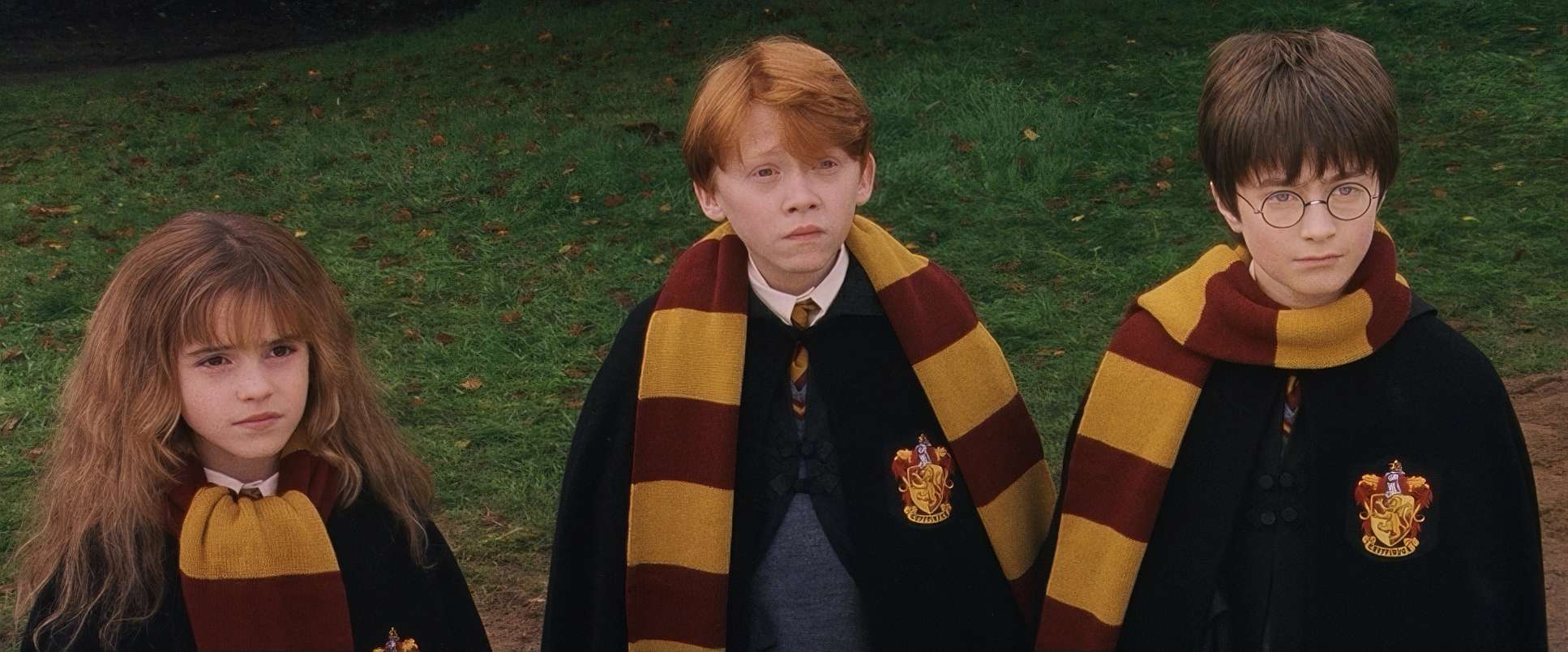
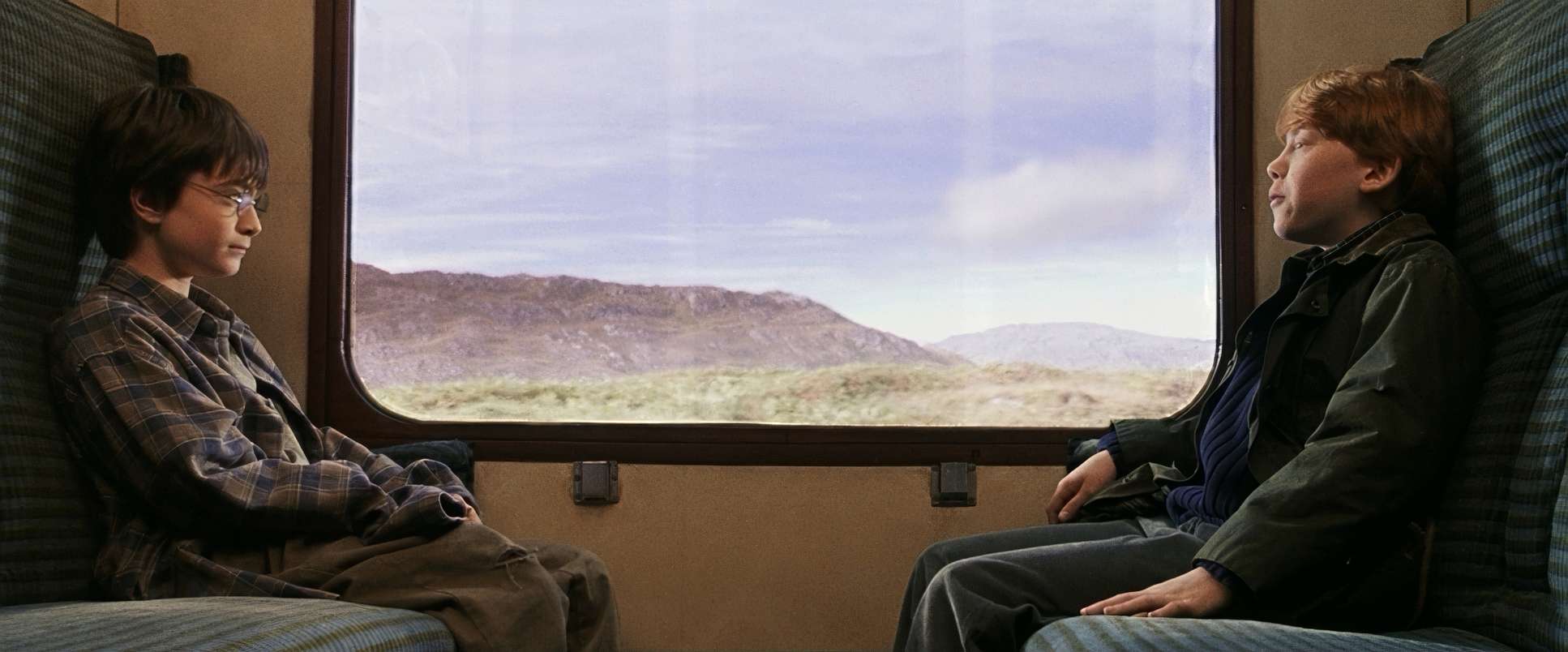
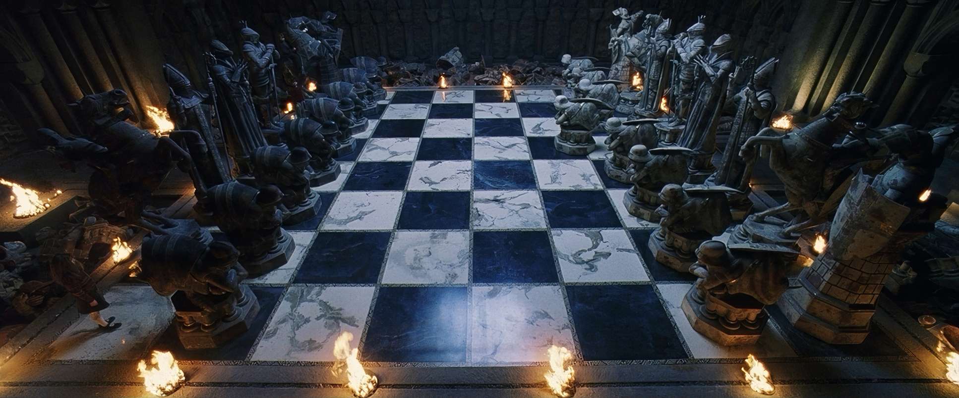
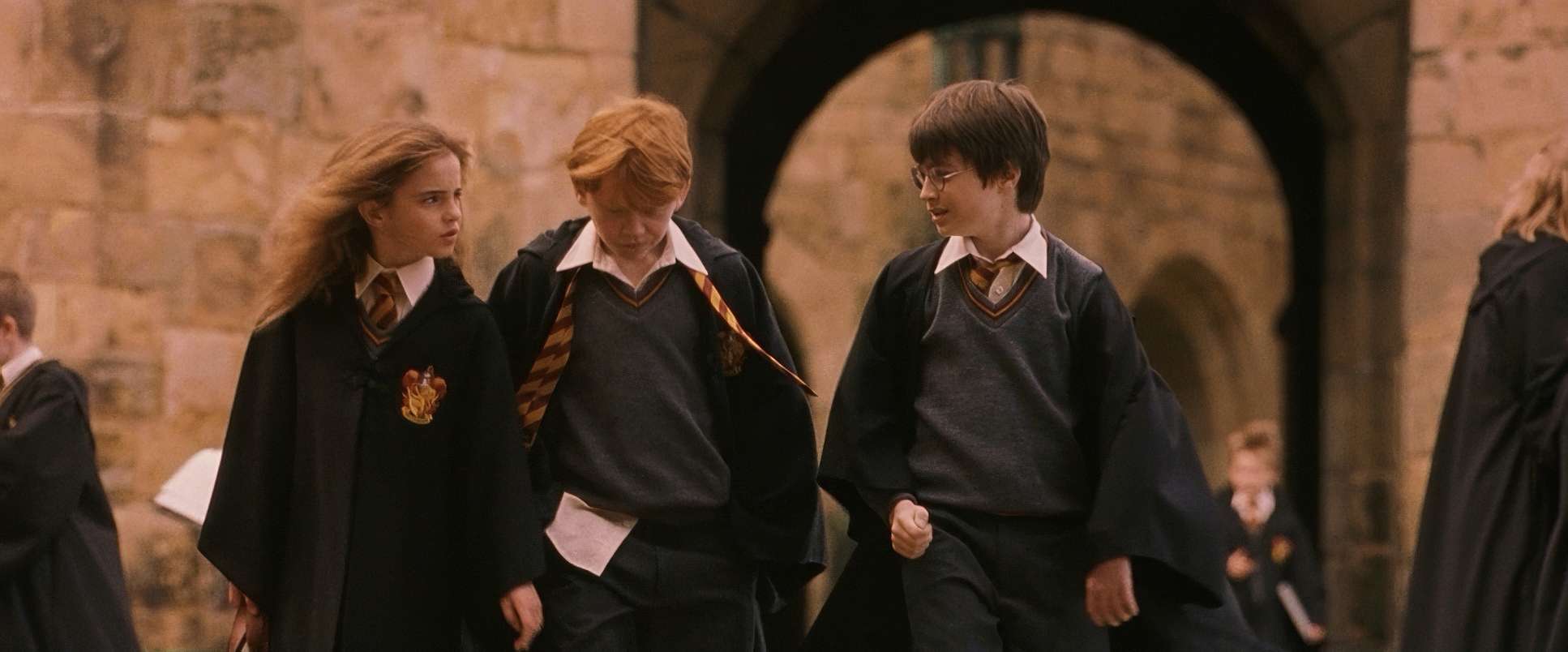
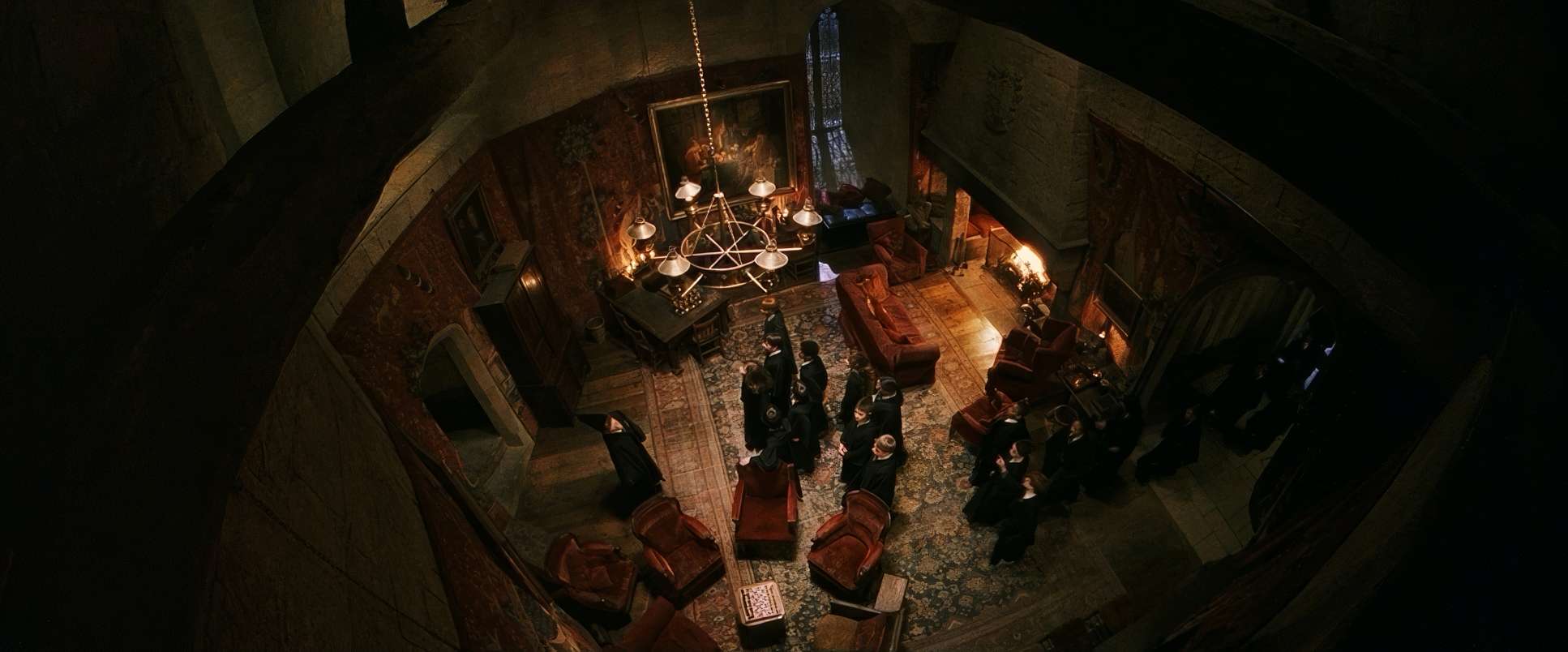
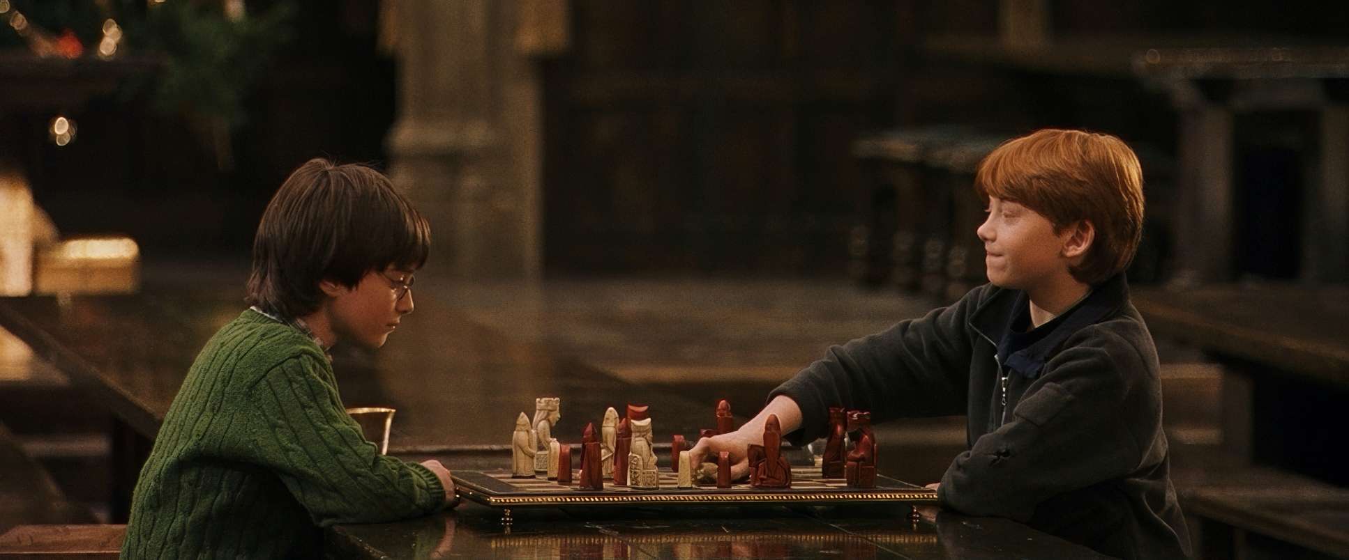
The blocking is equally deliberate. You’ll notice the “trio” (Harry, Ron, and Hermione) are almost always framed close together, physically reinforcing their bond. On the flip side, characters like Snape or Dumbledore are often isolated in the frame or placed in positions of power. During the chess match or Quidditch, the blocking and lensing work together to keep the emotional stakes front and center, even when the world around them is pure spectacle.
Compositional Choices
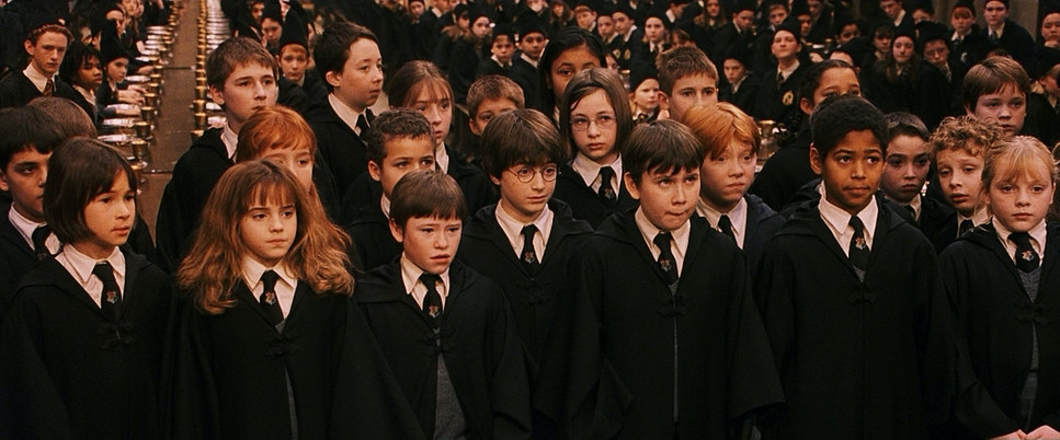
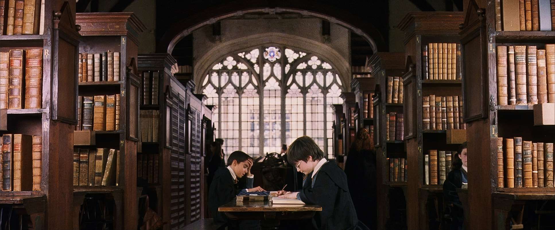
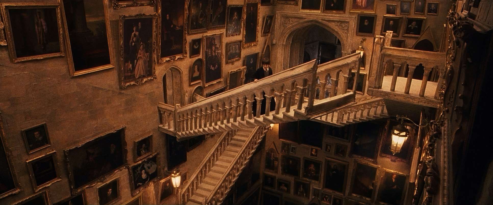
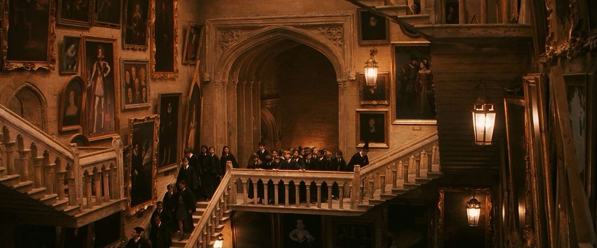
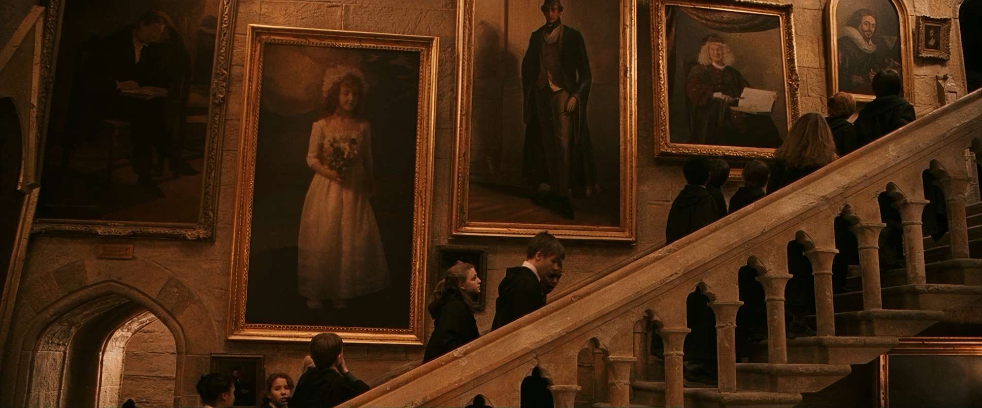
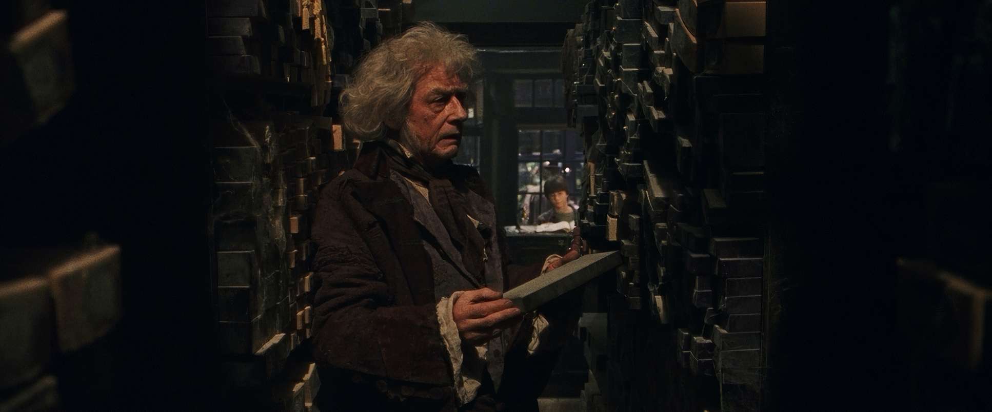
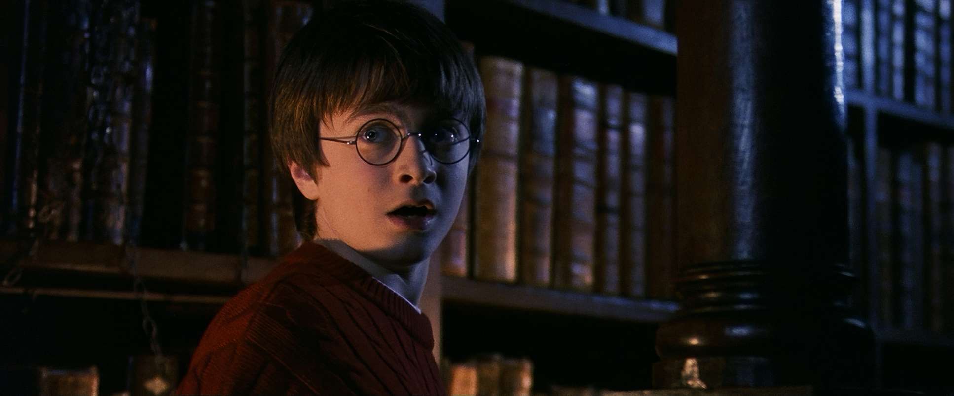
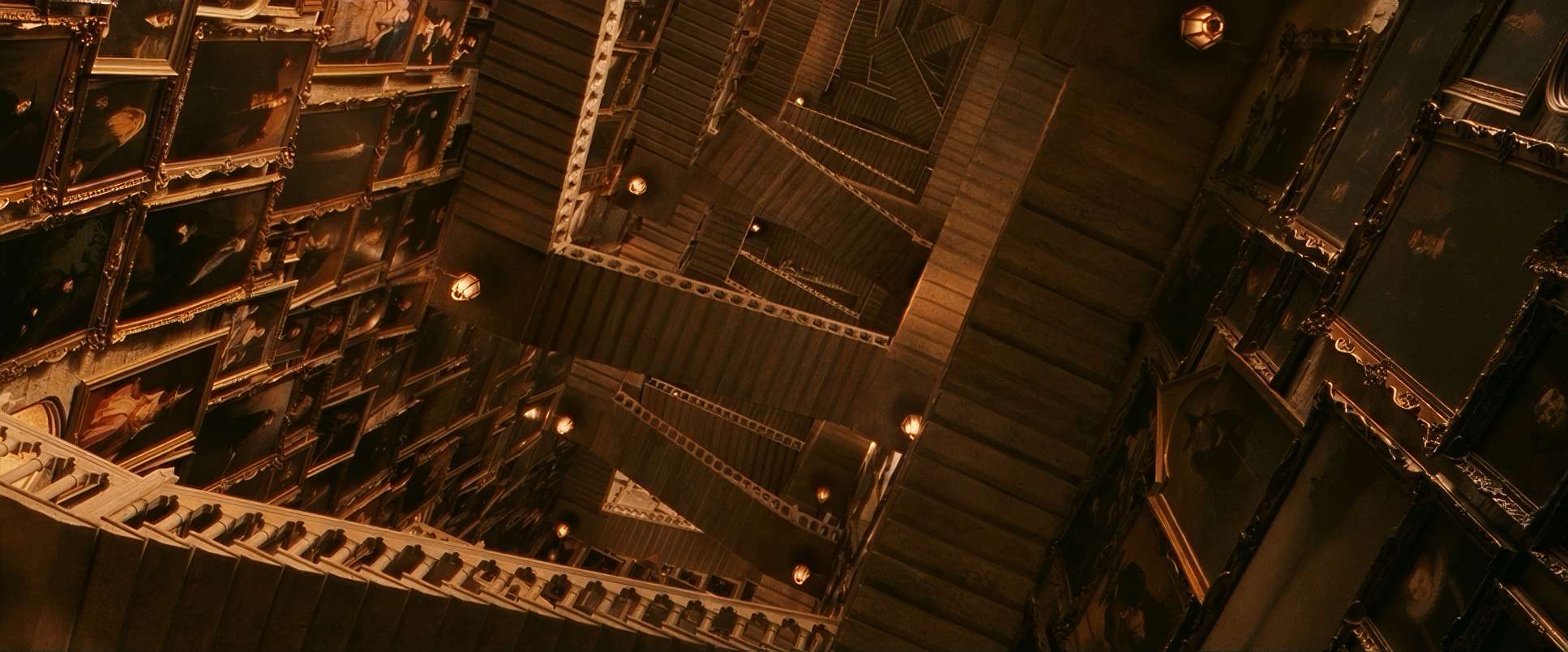
Compositionally, the film leans on a classical sense of balance. Seale used deep focus a lot, which I love because it lets you appreciate Stuart Craig’s insane production design. When you’re in the Great Hall, you’re not just looking at Harry; you’re seeing the depth of the room, the other students, and the floating candles way in the back.
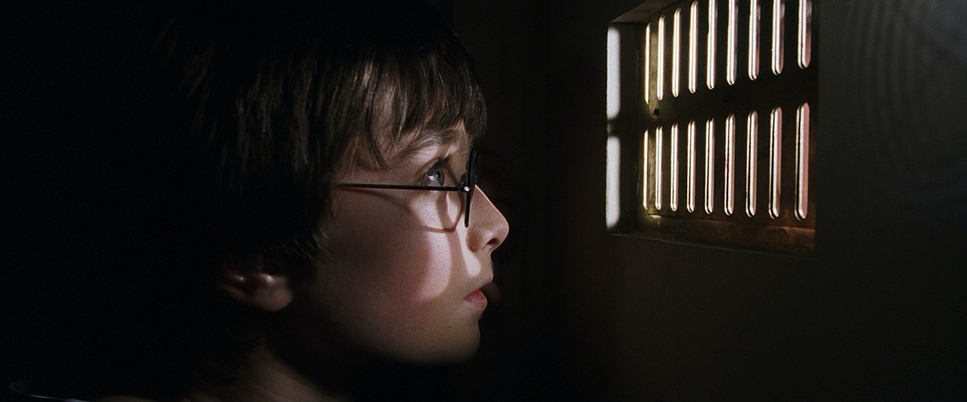
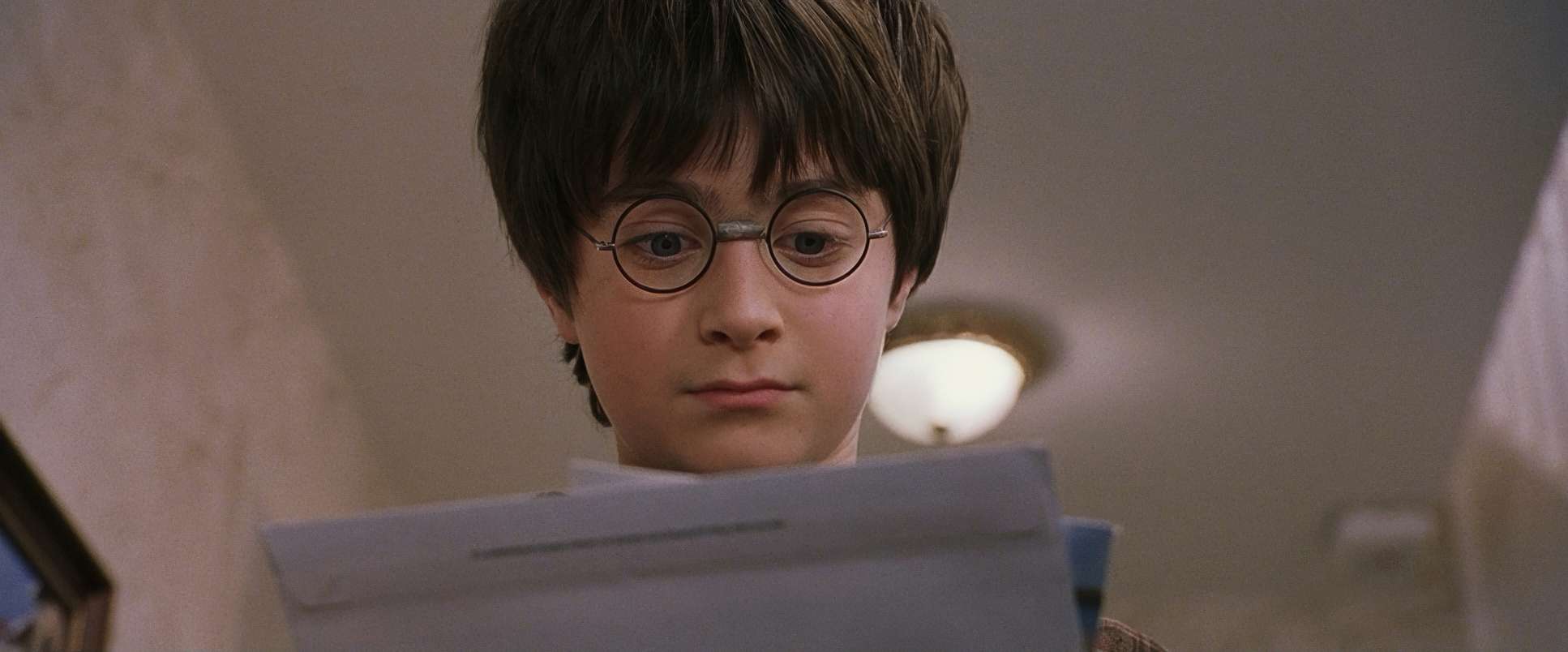
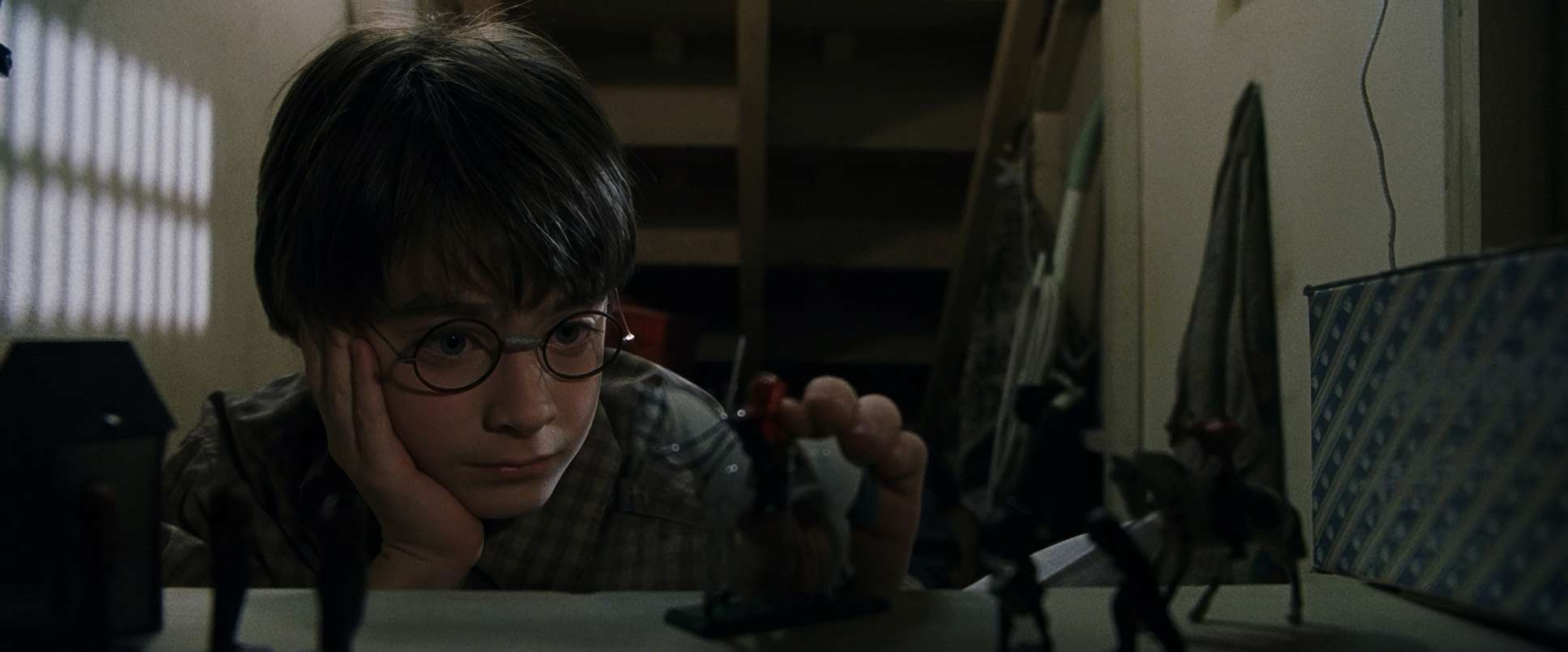
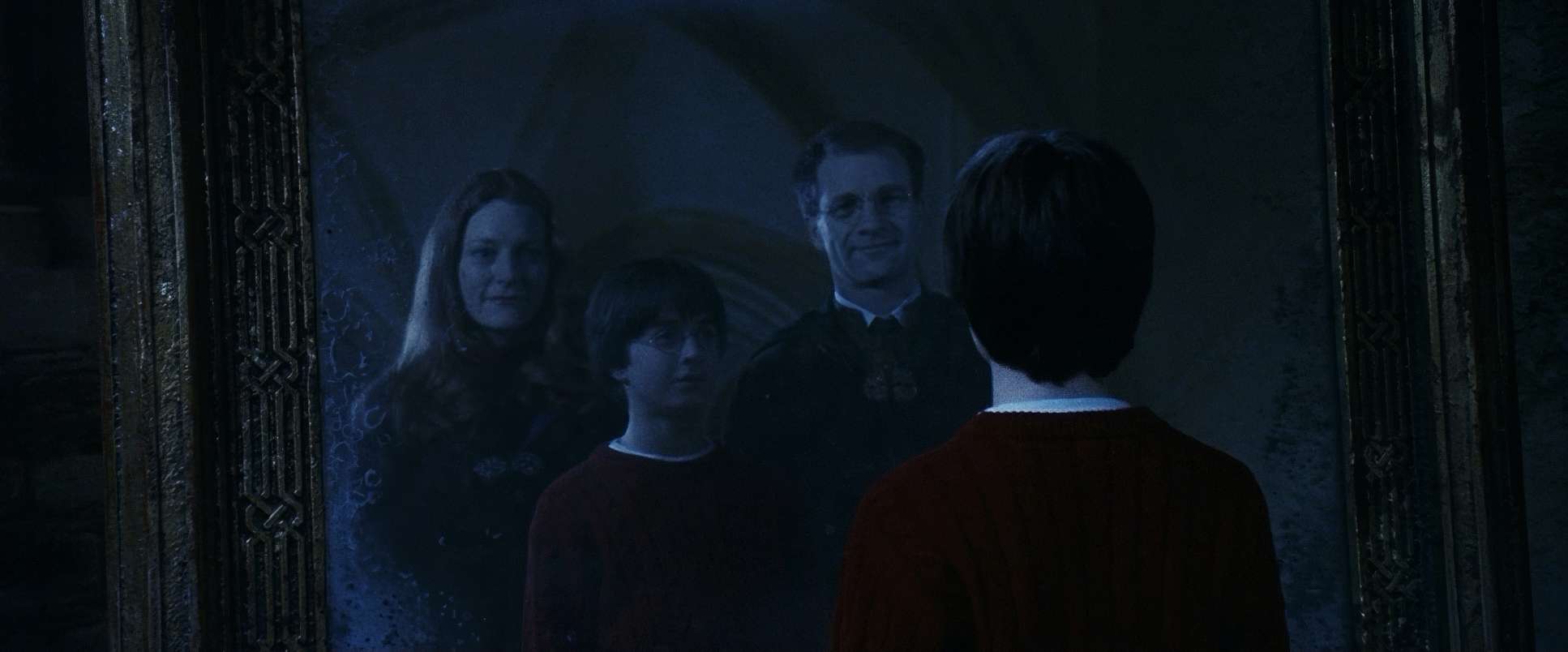
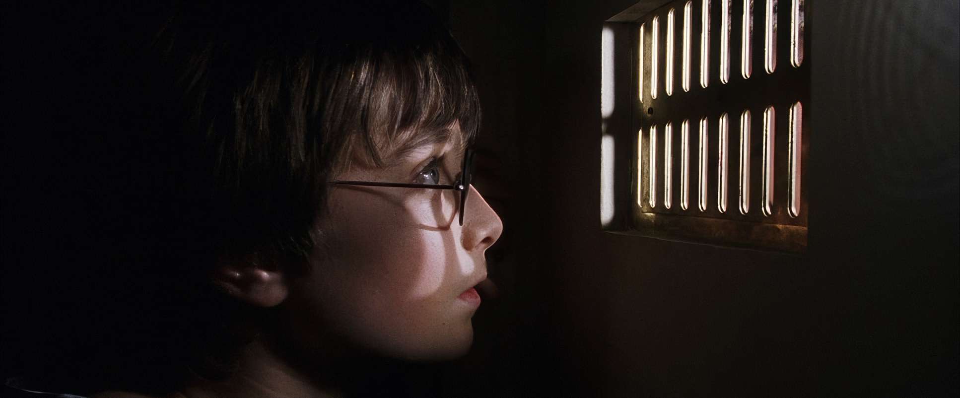
But for the emotional beats, they go tight. We get plenty of eye-level perspectives, which grounds us in the kids’ point of view. It’s a story told from a child’s height, making the adults and the architecture feel even more imposing. They weren’t afraid to use negative space to make Harry feel small or overwhelmed when the moment called for it.
Camera Movements
The camera in Sorcerer’s Stone is purposeful and steady. We see a lot of “classical” movements: sweeping crane shots over the Great Hall and smooth dolly moves through the corridors. These movements are there to show off the scale.
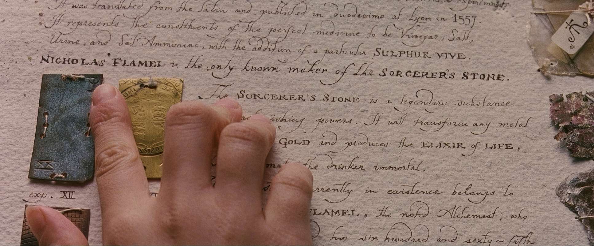
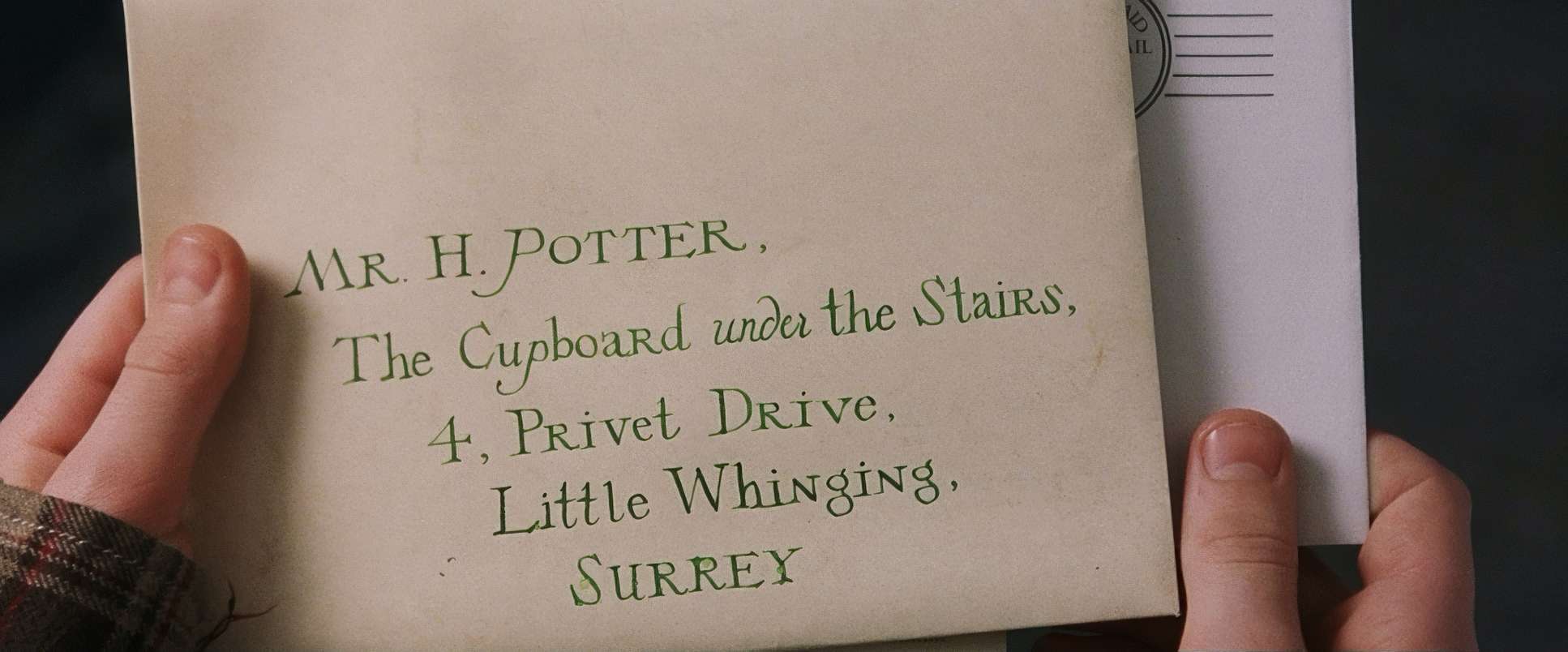
However, they also used a fair bit of handheld work for the more intimate moments. It’s not that shaky, “Bourne Identity” style; it’s a natural, subtle sway that makes the scene feel more personal. When Harry first gets his letter or faces down Snape, that slight movement adds a layer of human immediacy. Even in the Quidditch match, the camera becomes more dynamic with quick pans, trying to keep up with the action even if the “balloon people” CGI from 2001 looks a little dated now.
Technical Aspects & Tools
Harry Potter and the Sorcerer’s Stone
Technical Specifications & Metadata
| Genre | Adventure, Family, Fantasy |
| Director | Chris Columbus |
| Cinematographer | John Seale |
| Production Designer | Stuart Craig |
| Costume Designer | Judianna Makovsky |
| Editor | Richard Francis-Bruce |
| Colorist | Peter Hunt, John Stanborough |
| Time Period | 1990s |
| Aspect Ratio | 2.39 – Anamorphic, Super 35 |
| Format | Film – 35mm |
| Lighting | Soft light |
| Lighting Type | Artificial light |
| Story Location | United Kingdom > Britain |
| Filming Location | United Kingdom > England |
| Camera | Panavision Millennium / Millenium XL / XL2, Panavision Panaflex |
| Lens | Panavision Primo Primes, Panavision Primo Zooms |
| Film Stock / Resolution | 5279/7279 Vision 500T |
The aesthetic here is totally tied to the tech of 2001. Shooting on 35mm film (Kodak Vision 500T 5279/7279) gave the movie its soul. That film grain and natural exposure latitude are things we’re still trying to “emulate” in Resolve today.
They shot on Panavision Millennium cameras, and you can even see the occasional “sprocket bob” if you’re looking for it a characteristic of film that adds to that vintage, tactile charm. While some of the digital effects haven’t aged perfectly (the Quidditch CGI being the main culprit), the way they blended practical sets and costumes with the visual effects was cutting-edge for the time. It’s a fascinating snapshot of a moment when the industry was transitioning into the digital age but still had one foot firmly planted in traditional film craft.
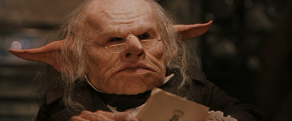
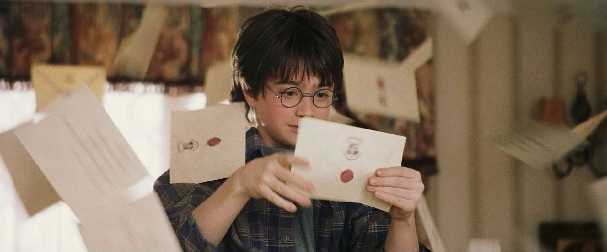
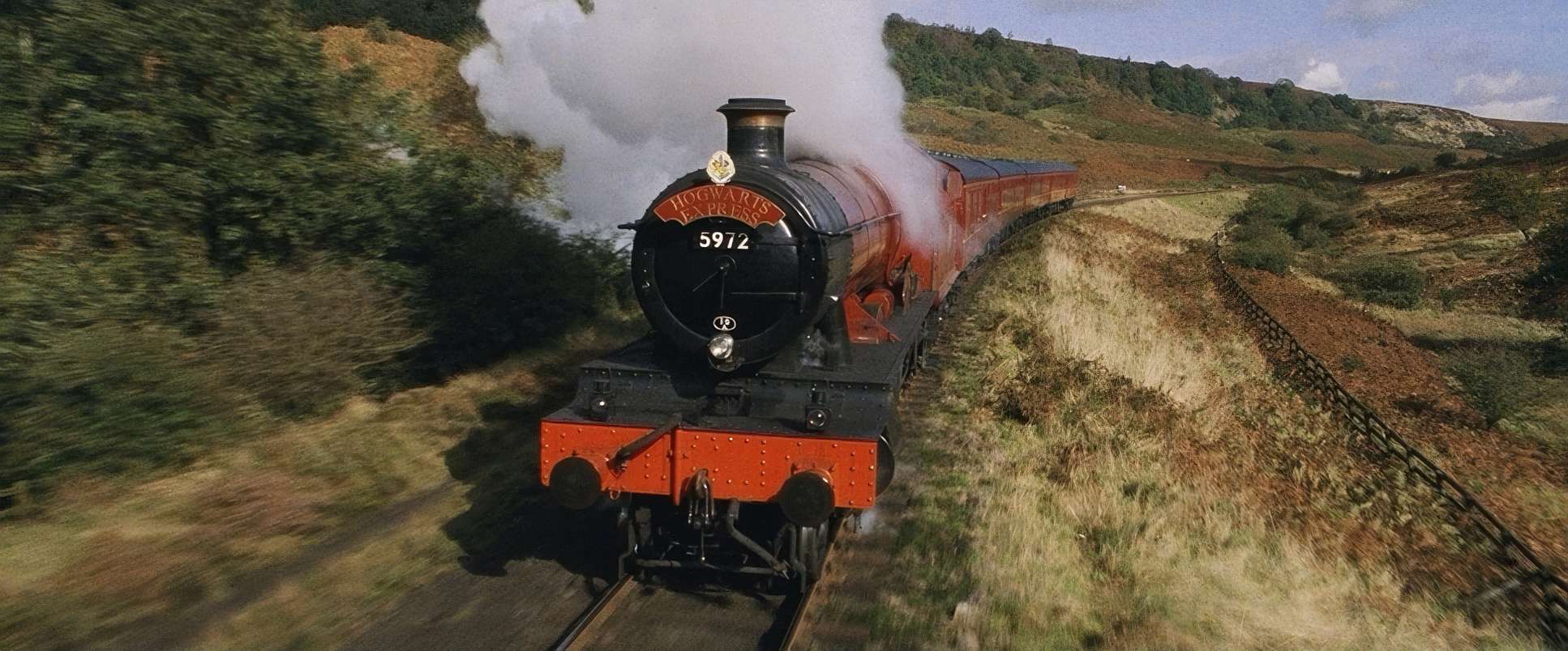
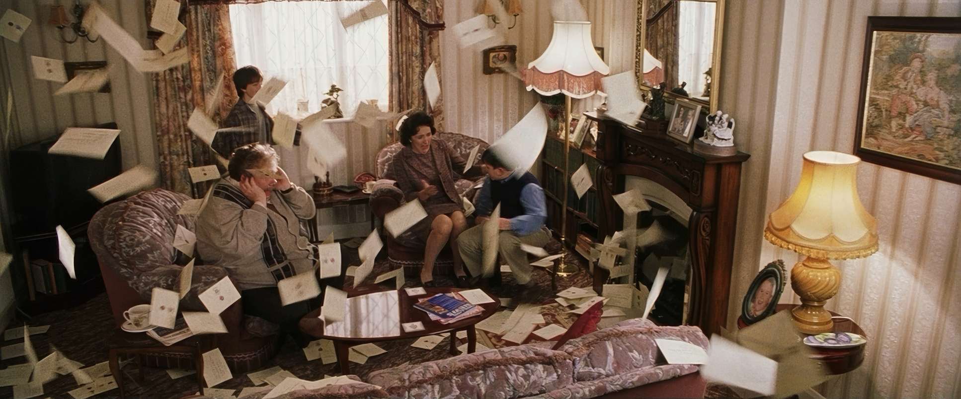
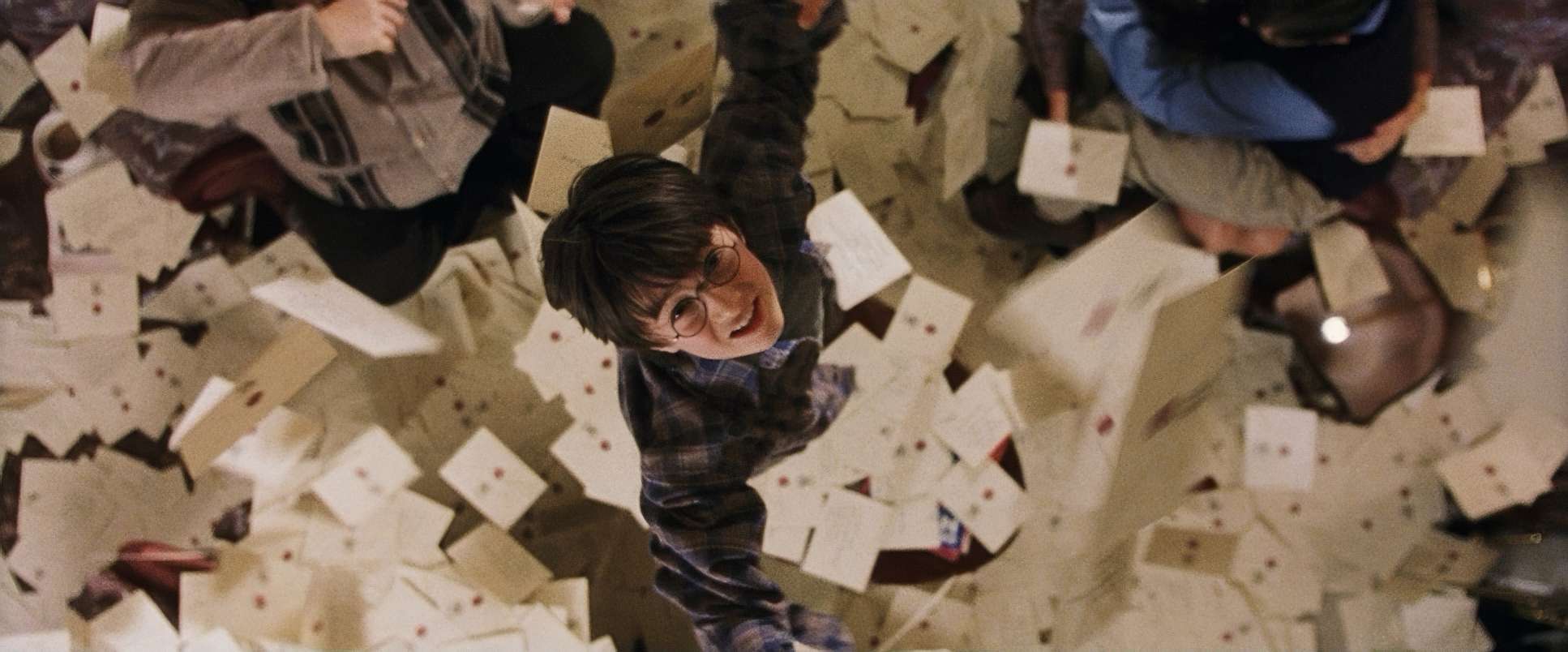
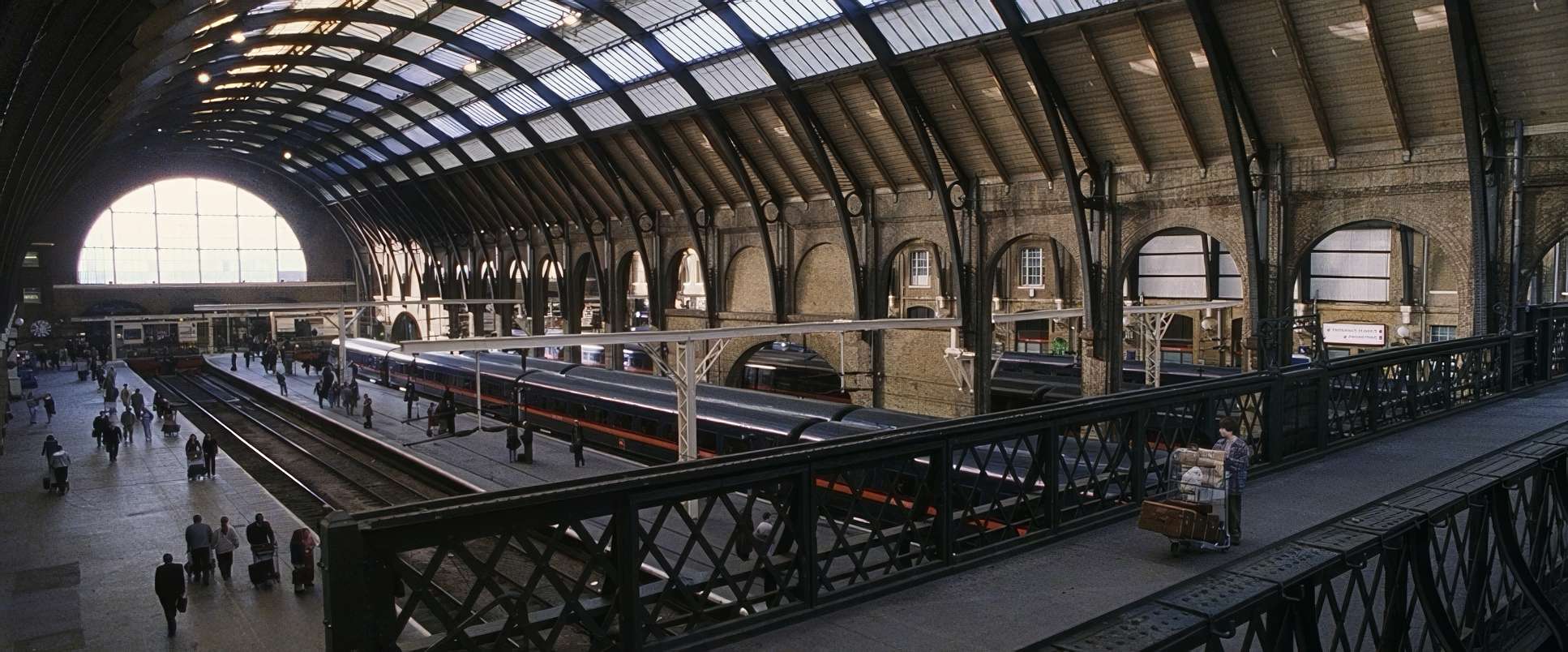
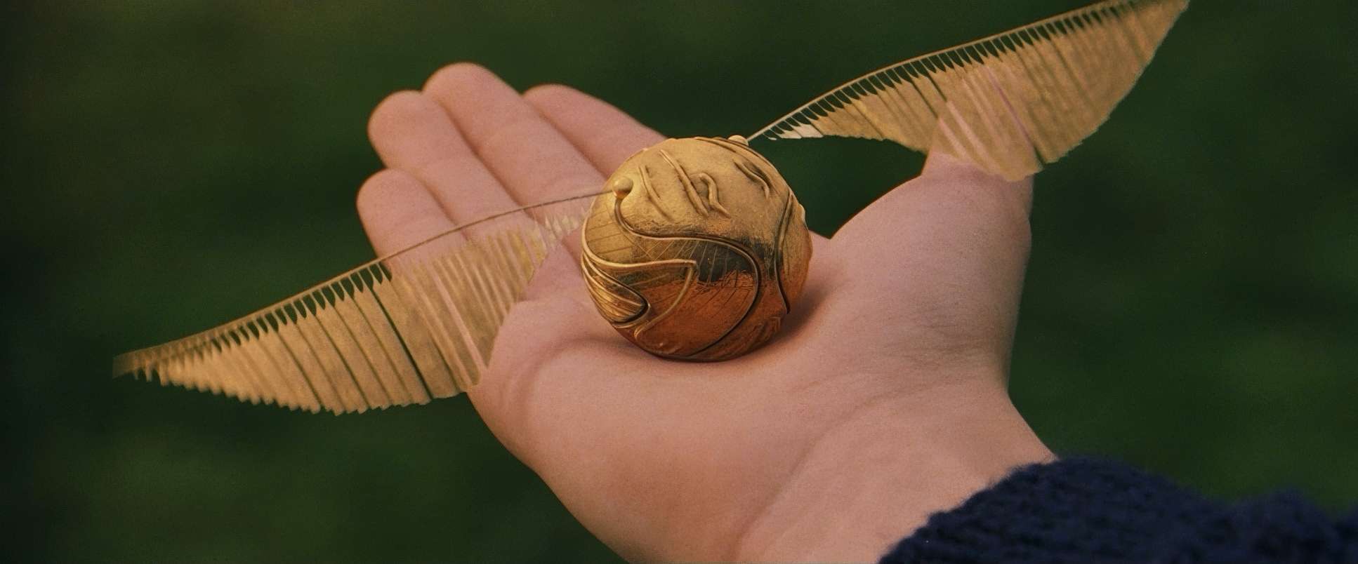
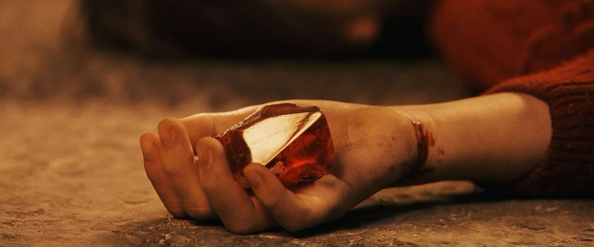
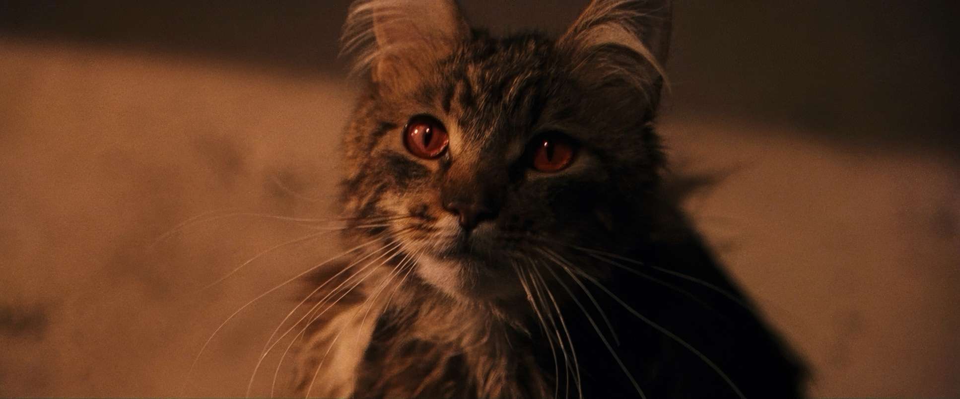
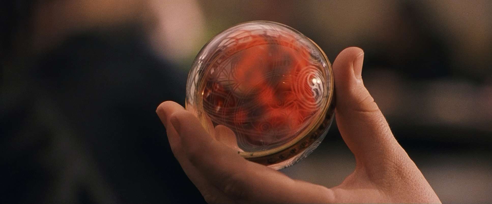
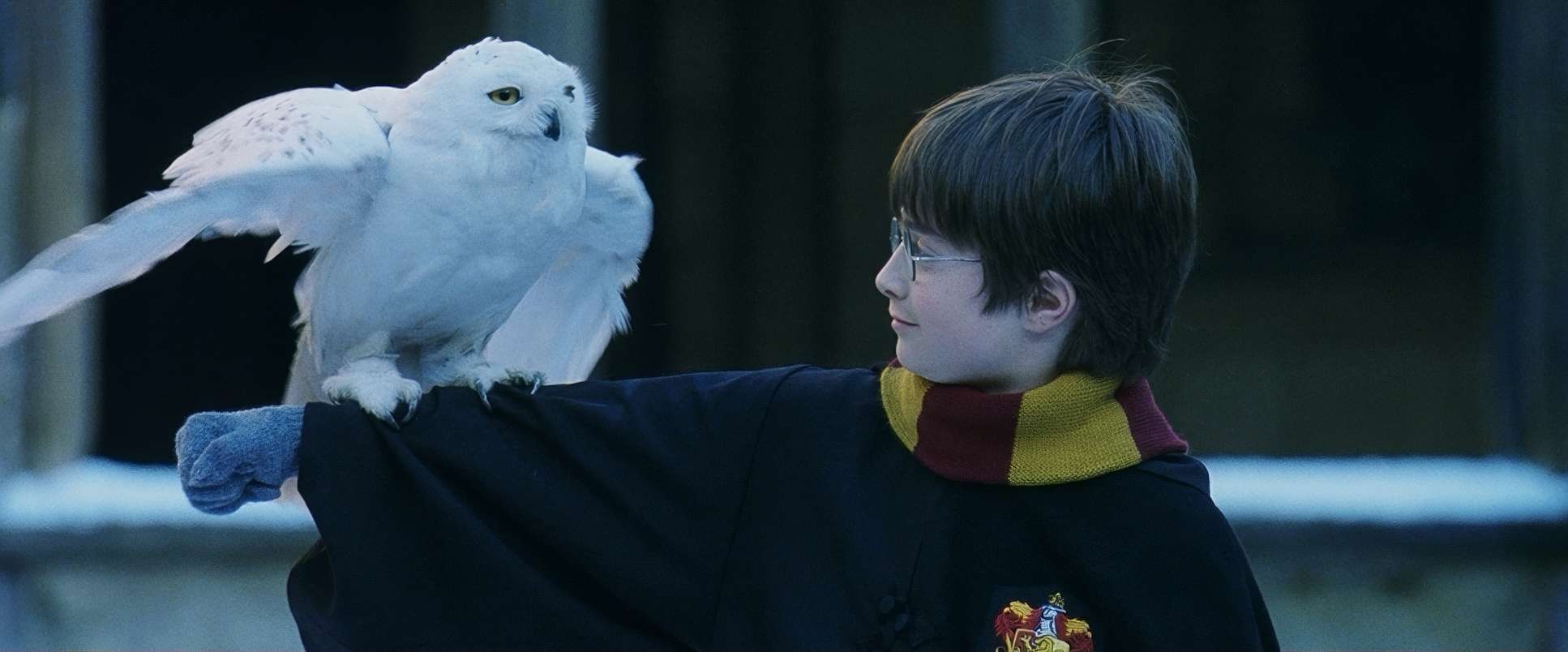
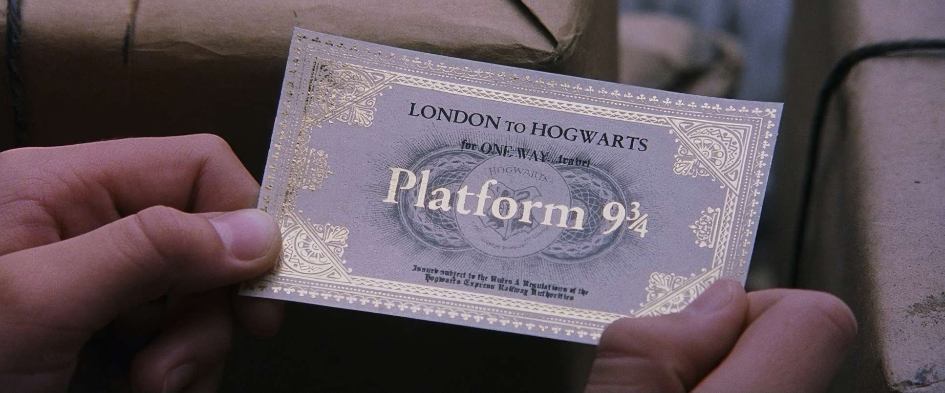
Harry Potter and the Sorcerer’s Stone (2001) Film Stills
A curated reference archive of cinematography stills from HARRY POTTER AND THE SORCERER’S STONE (2001). Study the lighting, color grading, and composition.


- Also read: CAPTAIN AMERICA: THE WINTER SOLDIER (2014) – CINEMATOGRAPHY ANALYSIS
- Also read: STAR WARS: EPISODE VII – THE FORCE AWAKENS (2015) – CINEMATOGRAPHY ANALYSIS
Browse Our Cinematography Analysis Glossary
Explore directors, cinematographers, cameras, lenses, lighting styles, genres, and the visual techniques that shape iconic films.
Explore Glossary →