Star Wars: Episode VII – The Force Awakens occupies a fascinating space in cinema history. It was handed the nearly impossible task of waking up a dormant titan while simultaneously carving out a new identity for a new generation.
The consensus back in 2015 was that it was a “good, not great” movie, but everyone agreed on one thing: it felt like Star Wars again. That feeling isn’t an accident or just a result of seeing Han Solo back on screen. It’s a meticulously engineered atmosphere created through specific choices in the grade and on the day. While some critics dismissed the story as a “blow-for-blow retread,” from a craft perspective, the film is a triumph of visual world-building. Let’s break down how they actually pulled it off.
About the Cinematographer
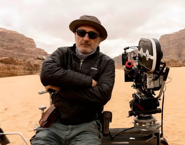
The man holding the light meter for this revival was Dan Mindel, ASC, BSC. If you follow J.J. Abrams’ work, you know Mindel is his go-to guy, having shot Mission: Impossible III and the Star Trek reboots. That kind of shorthand is vital on a production of this scale; they didn’t need to find their rhythm they already had it.
Mindel is a bit of a maverick in the digital age. He’s a staunch advocate for film, known for blending a polished, high-end studio aesthetic with a raw, kinetic energy. He doesn’t just “set and forget” the camera; he embraces a sense of controlled chaos. Coming off the prequels, which often felt sterile due to the early-2000s digital frontier, Mindel was the perfect choice to restore that “lived-in” texture. He wasn’t trying to reinvent the wheel; he was painstakingly restoring a classic.
Inspiration Behind the Cinematography
If Star Wars: Episode VII – The Force Awakens was a love letter to the original trilogy, Mindel’s cinematography was the elegant cursive script. The visual DNA here is 100% A New Hope. Abrams and Mindel made the definitive choice to shoot on Kodak 35mm film, which gave the movie an immediate organic richness that digital sensors at least at the time simply couldn’t mimic.
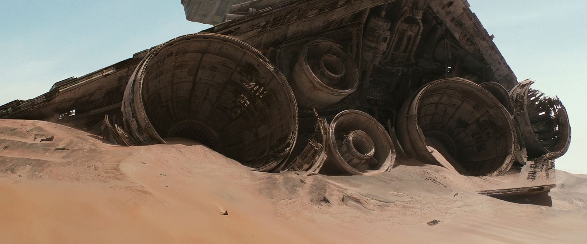
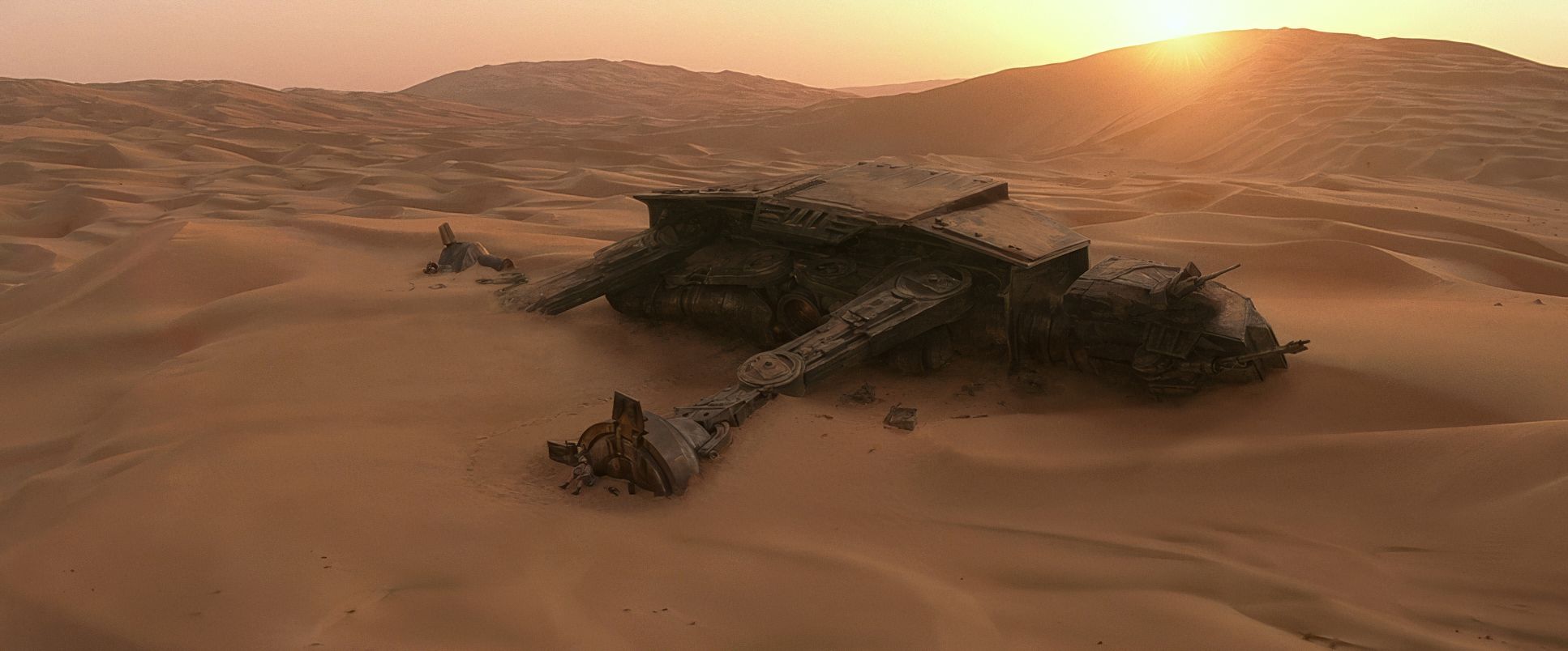
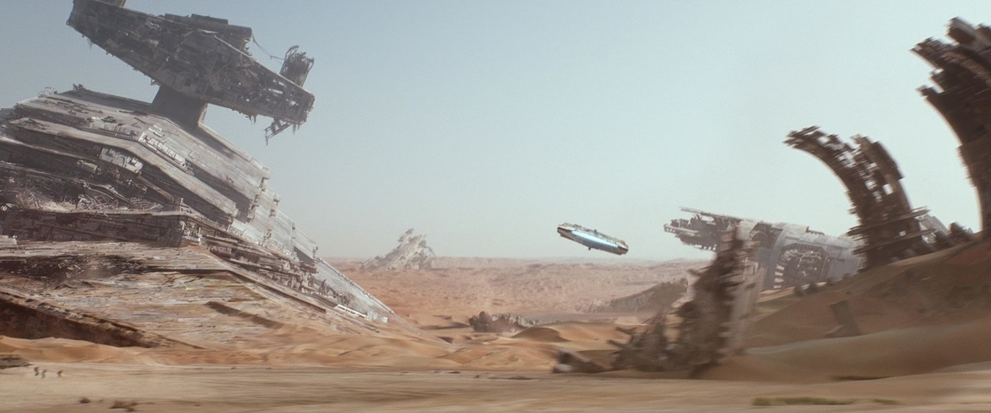
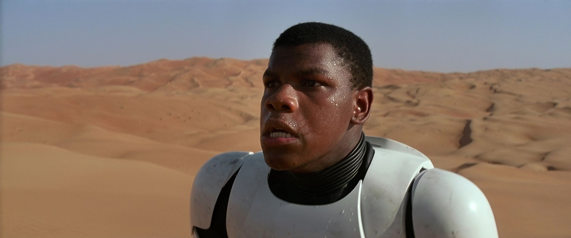
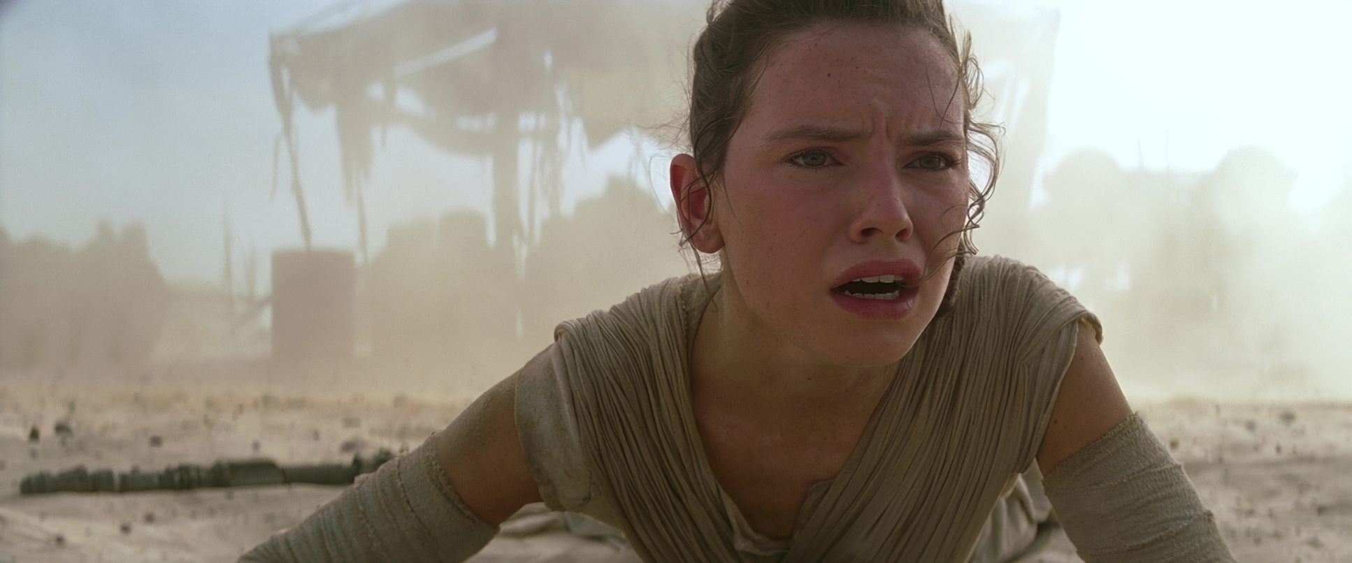
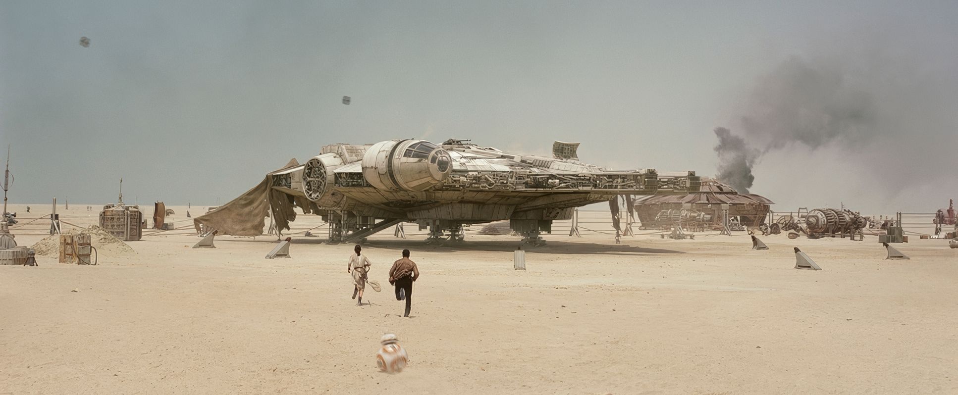
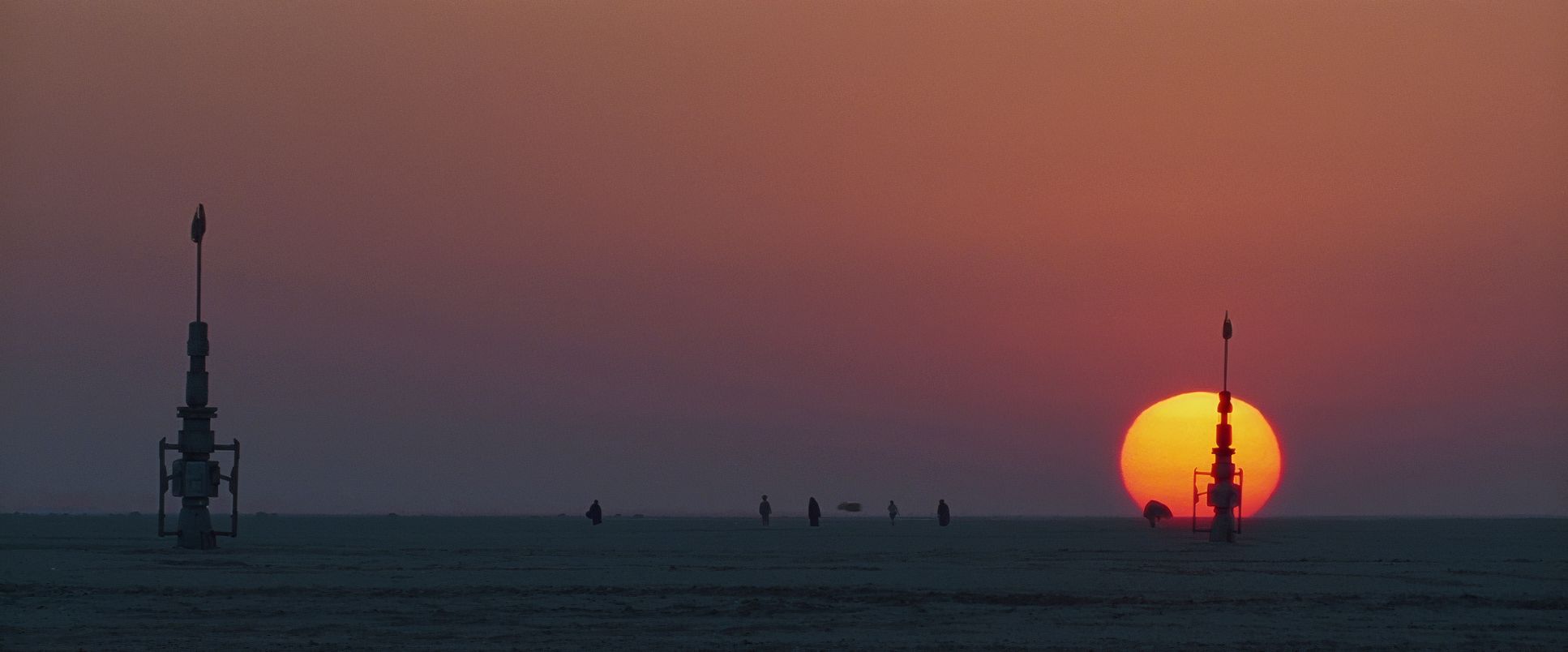
This wasn’t just nostalgia for nostalgia’s sake. It was a response to a fanbase that felt alienated by green-screen overload. By returning to practical models and real locations like the deserts of Abu Dhabi, the cinematography gained a sense of “physicality.” You can feel the heat on the lens and the dust in the air. The aim was a “used universe” ships that look battered and environments that feel like they have a history. That commitment to the “fabric of the image” is what makes the movie feel authentic rather than like a CGI playground.
Camera Movements

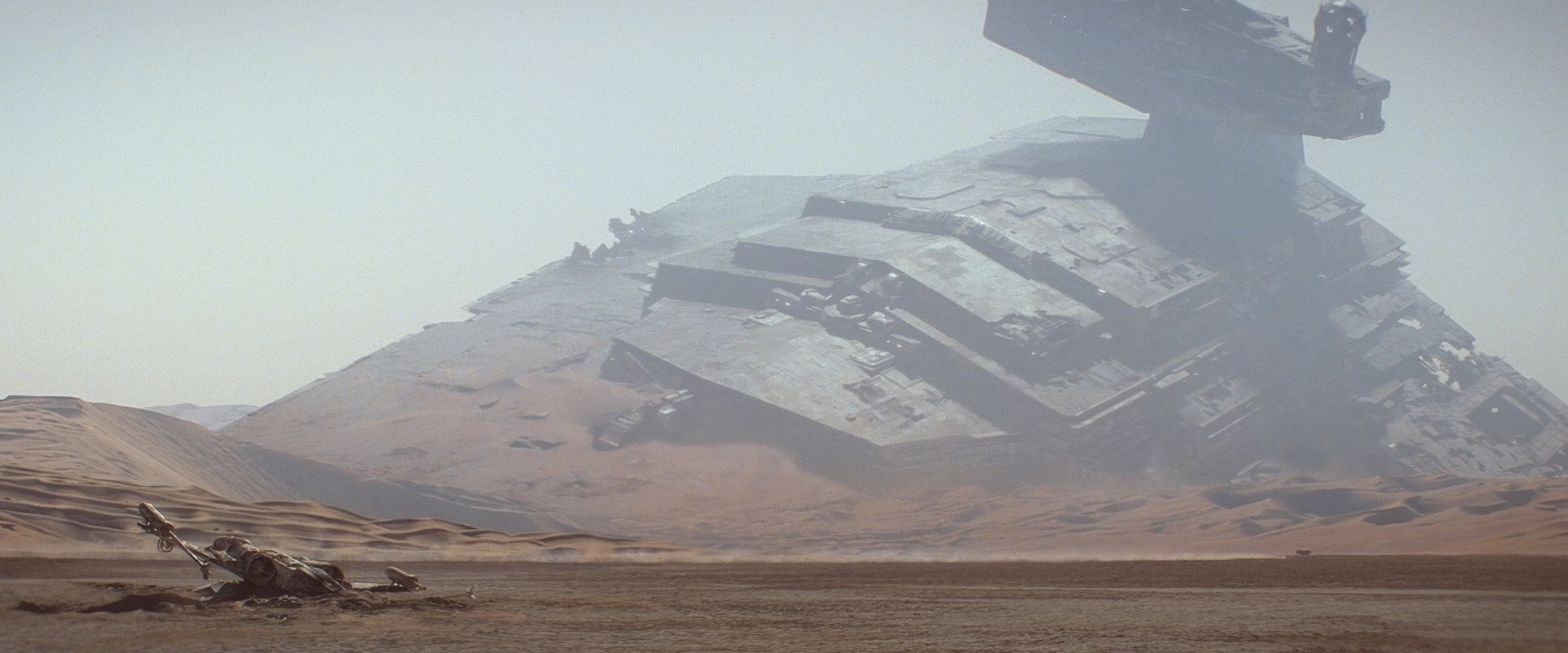
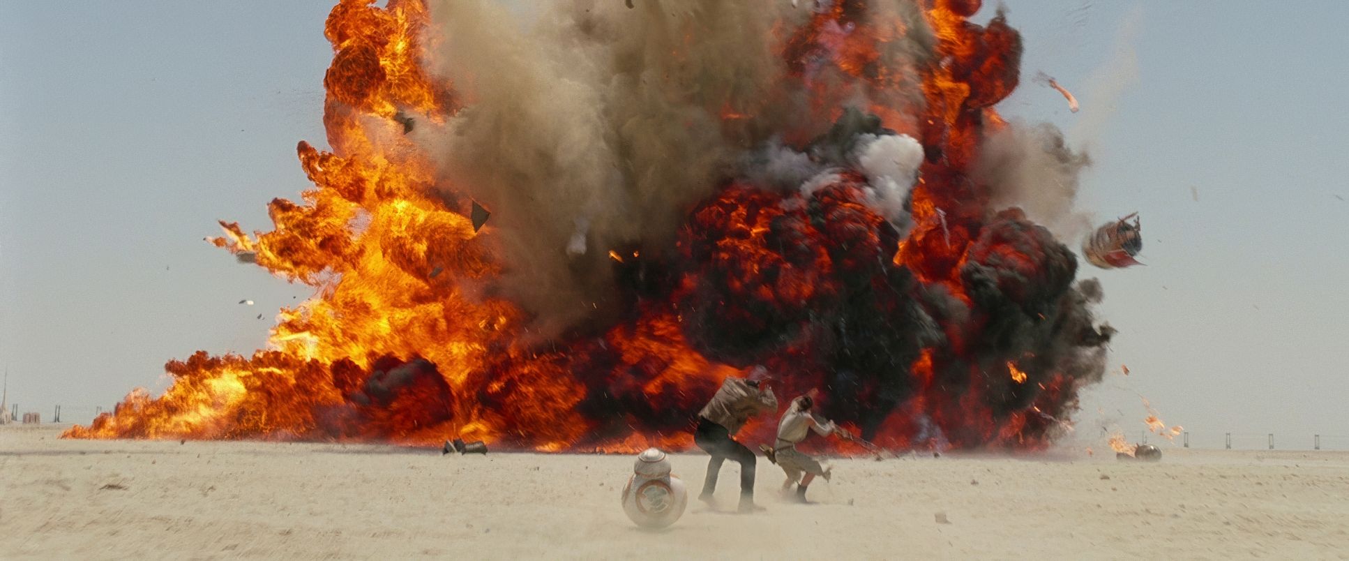
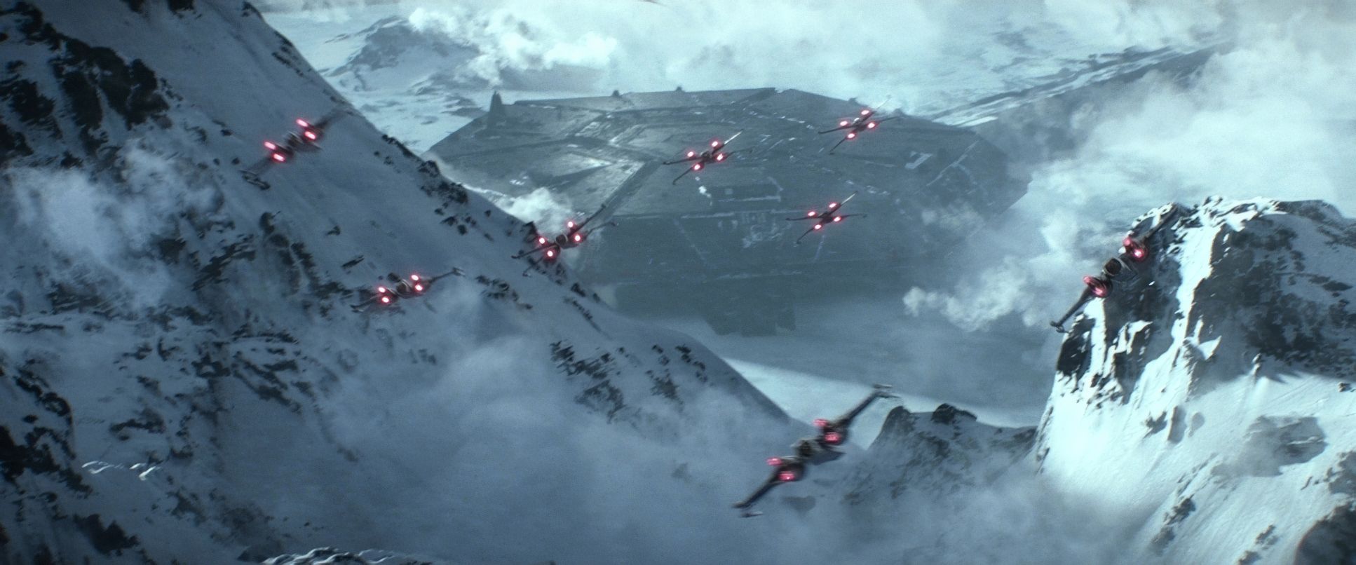
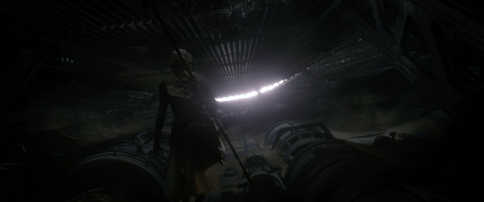
The camera language in The Force Awakens is a balancing act between high-octane energy and character-driven stillness. Mindel uses fluid Steadicam work to keep us tethered to the characters during the chaos think of Rey scrambling through the ruins on Jakku. These movements provide essential depth cues; they make the scale of the Star Destroyer wreckage feel massive because the camera is moving in relation to it.
However, Mindel also knows when to let a frame breathe. We see plenty of those classic, “long wide takes” that let the action play out in a single shot. By avoiding the “shaky-cam” tropes of the mid-2000s, he gives the choreography and the practical stunts room to be seen. It’s a confident style of shooting that says the world is interesting enough to look at without needing a cut every two seconds.
Lighting Style

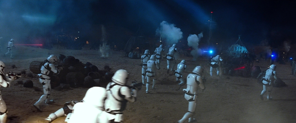
This is where the film really shines literally. Mindel leans into motivated, naturalistic sources but gives them a heightened cinematic “pop.” A perfect case study is the opening raid on the Jakku village (around the 00:03:48 mark).
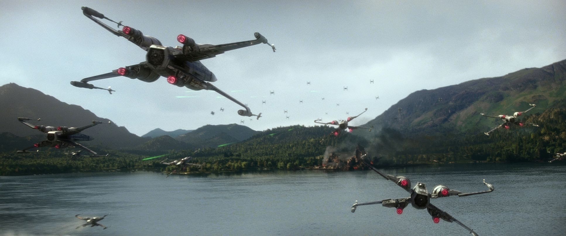
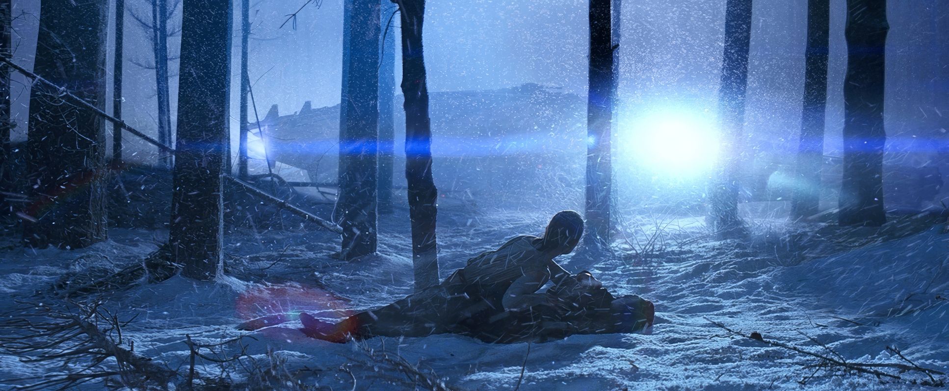
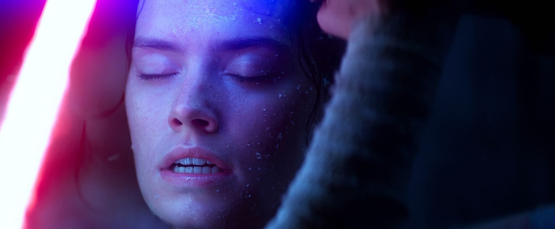
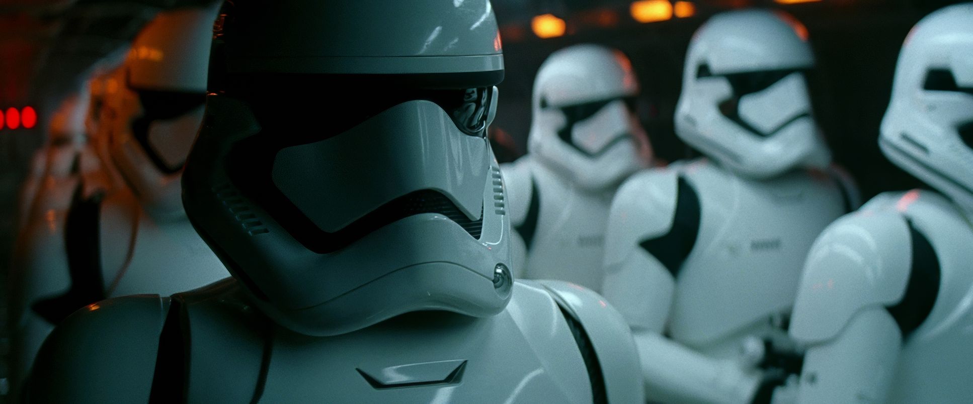
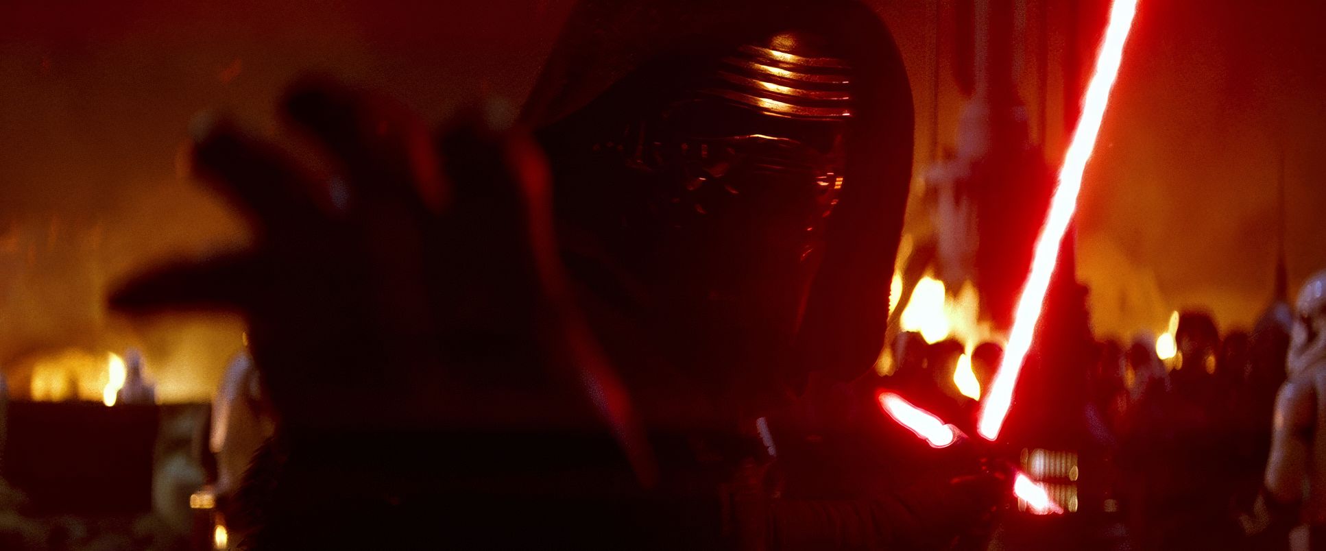
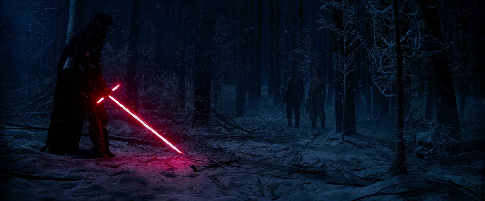
In this sequence, Mindel uses a brilliant mix of firelight and artificial practicals. You have the warm, chaotic orange of the burning village clashing against the cold, sterile blue of the First Order’s shuttles. It’s a classic “Teal and Orange” contrast, but because it’s motivated by the scene’s light sources (side-lighting from the fires), it feels grounded. It creates a “Visual Conflict” that mirrors the narrative the warmth of the villagers versus the cold machine of the First Order. This use of “negative fill” to sculpt faces in a night exterior makes the characters feel tactile and present, not just like figures in a dark frame.
Lensing and Blocking
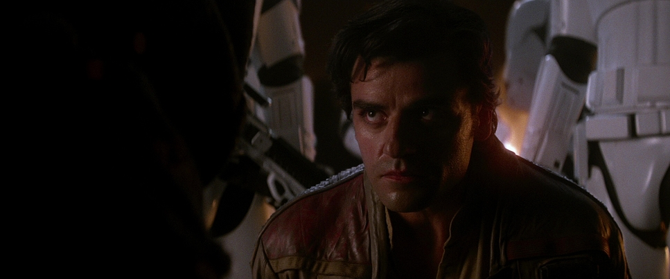
To get that signature widescreen look, Mindel utilized Panavision Anamorphic lenses. These lenses are the secret sauce of the Star Wars aesthetic. They introduce beautiful “imperfections” elongated oval bokeh, subtle barrel distortion, and those iconic horizontal lens flares that J.J. loves so much.
From a blocking perspective, these lenses allow for a “left-heavy” or deep-frame composition. Instead of cutting to a close-up, Mindel often places a character in the foreground (like an over-the-shoulder shot) while the action unfolds in the mid-ground. Using long lenses for these medium close-ups creates a beautiful fall-off, softening the background and keeping our focus locked on the emotional stakes while still maintaining a sense of the massive environment around them.
Compositional Choices
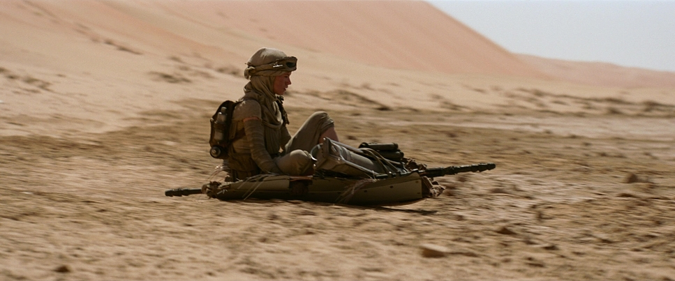
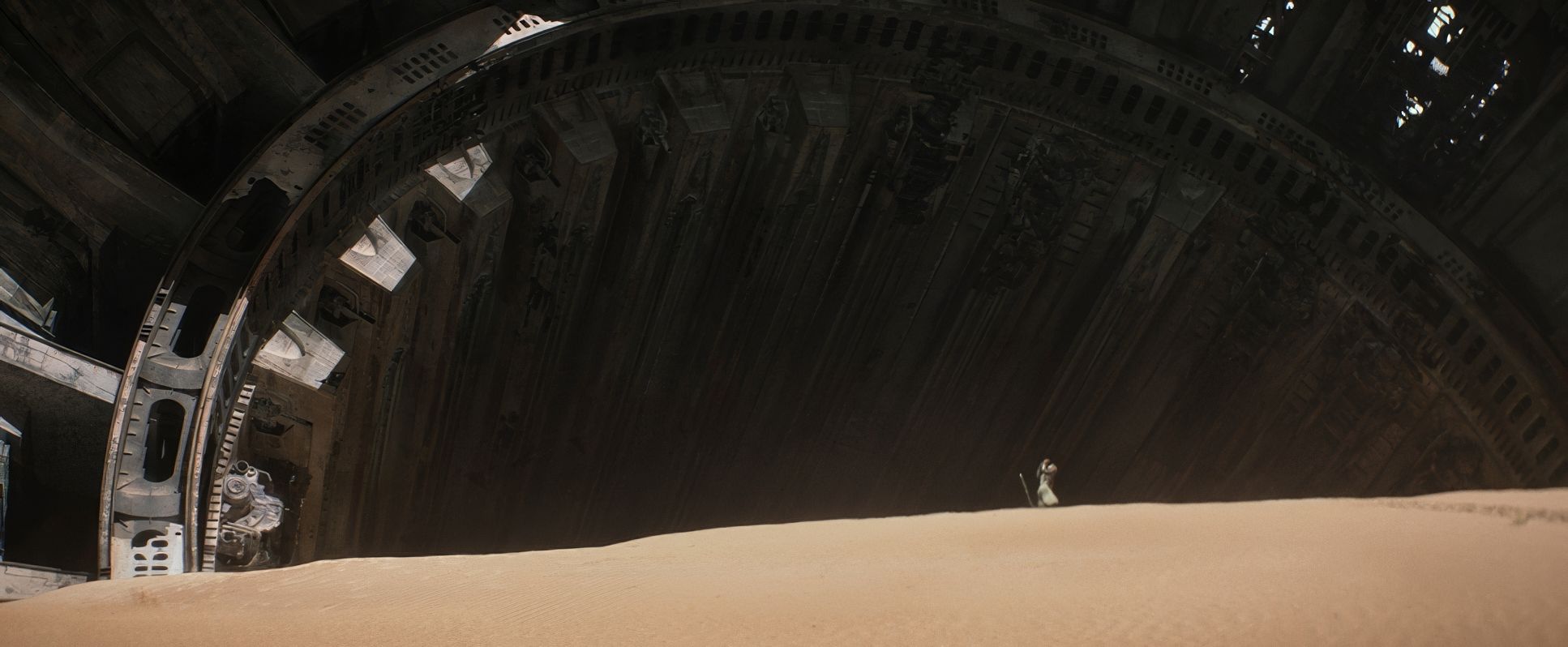
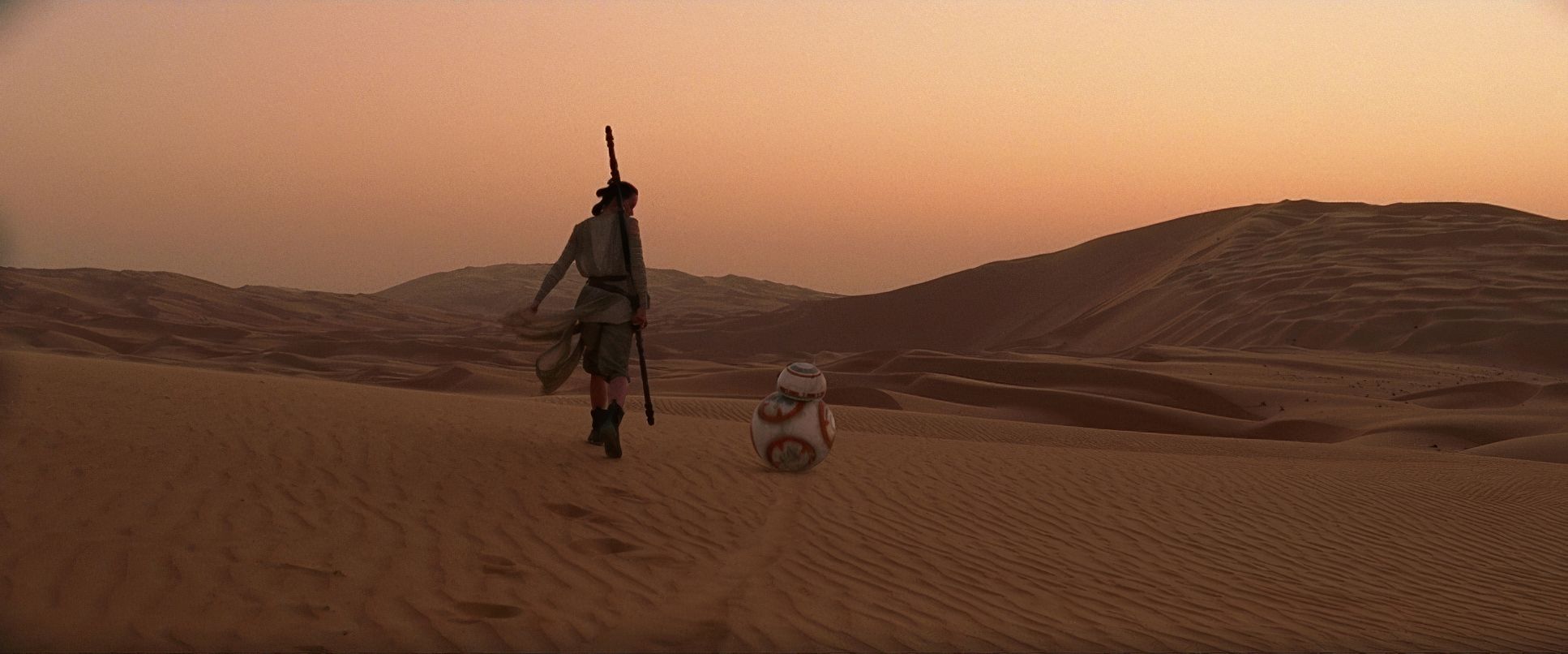
The compositions are a direct nod to the visual grammar established in the 70s. We see a heavy emphasis on wide shots with low horizons, especially on Jakku. This dwarfs Rey against the landscape, visually reinforcing her status as an orphan lost in an indifferent universe.
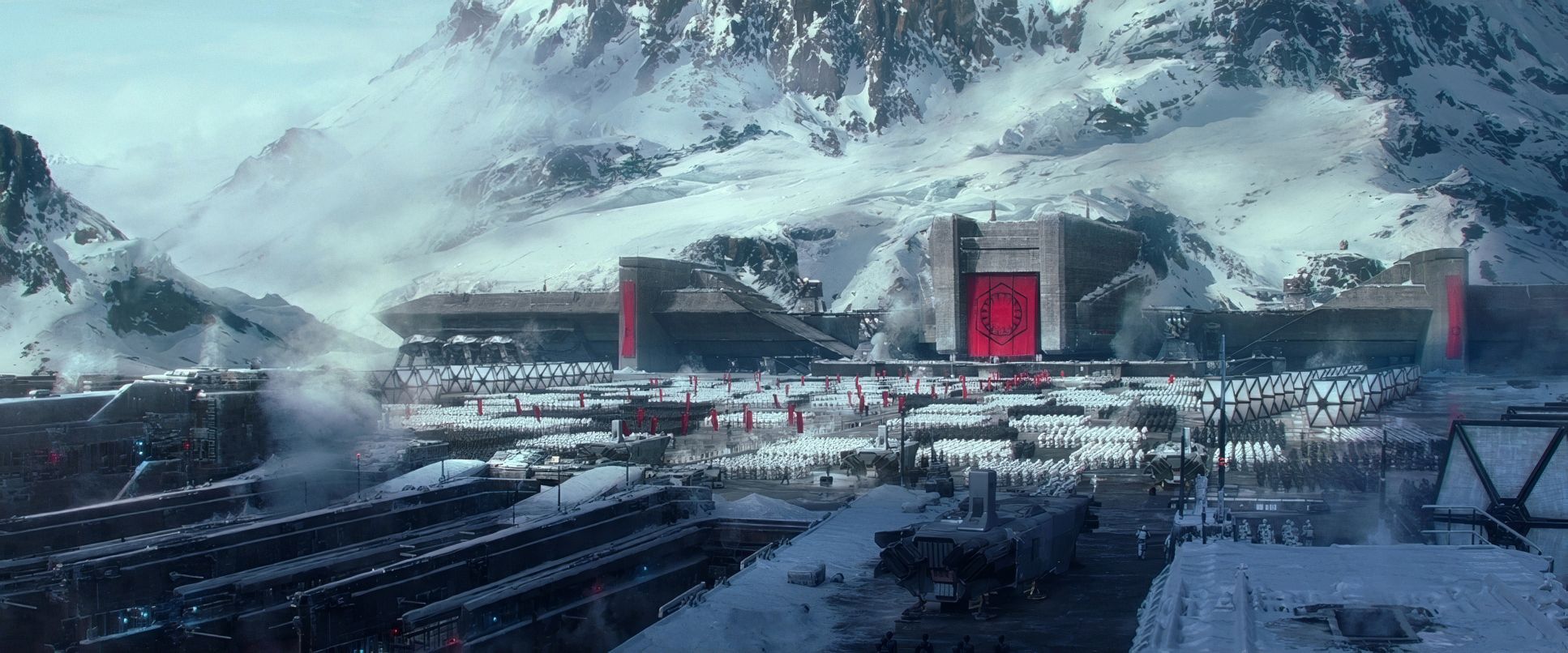
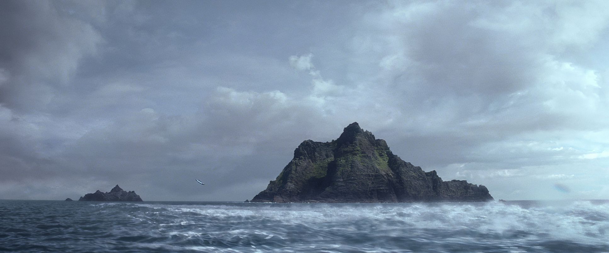
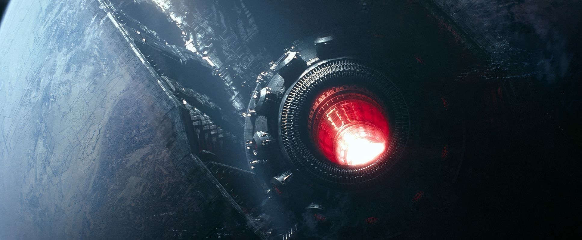
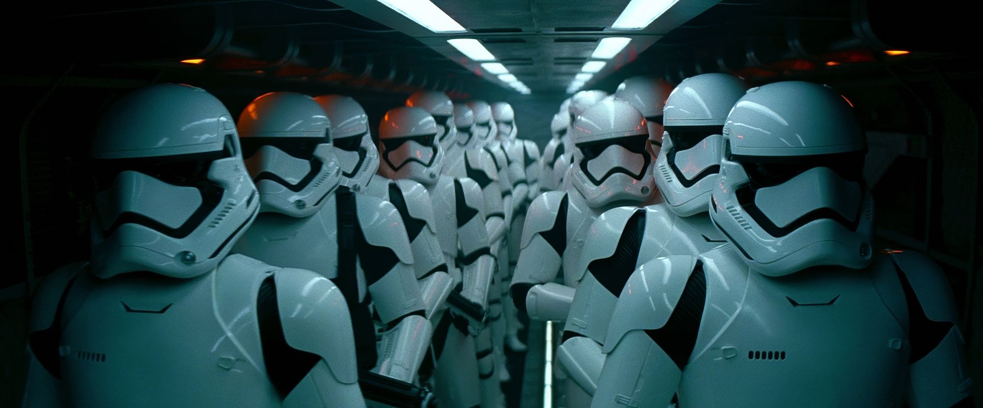
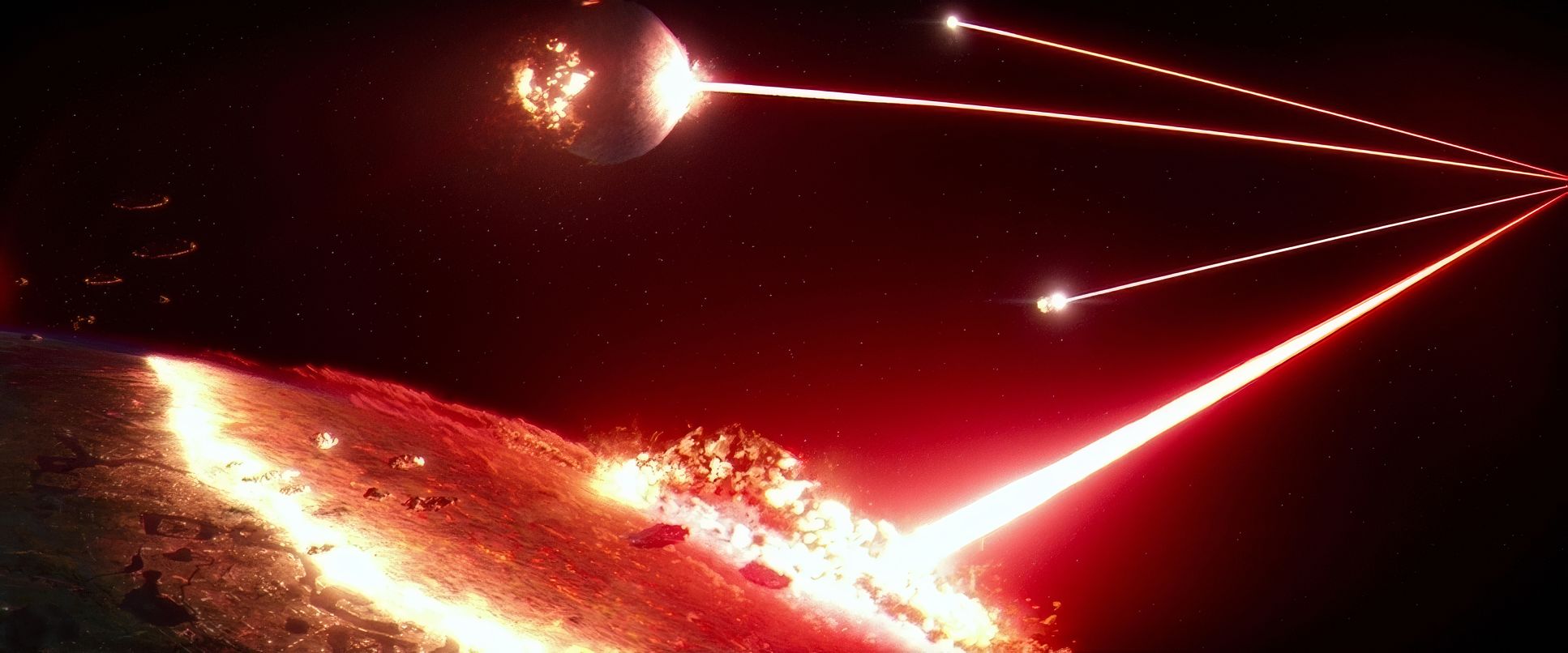
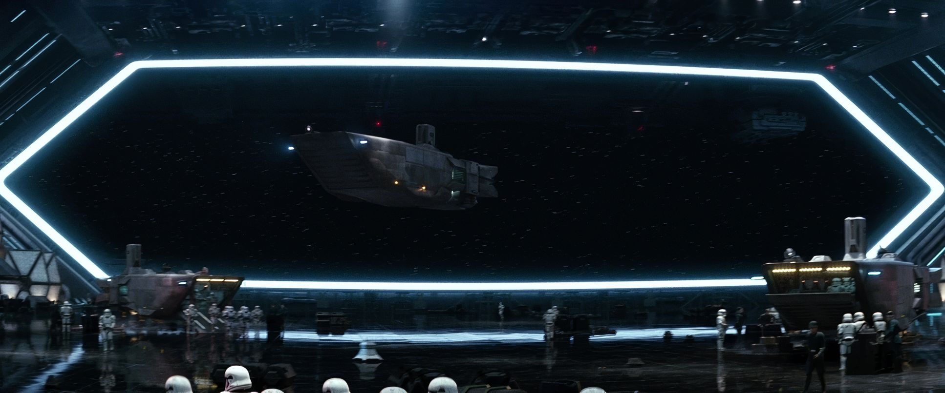
Mindel also uses the “theatrical” quality of the 2.39:1 aspect ratio to its full potential. By blocking characters across the frame rather than just in the center, he invites the audience’s eyes to wander. Whether it’s the cramped, lived-in clutter of the Millennium Falcon or the imposing, vertical architecture of Starkiller Base, the composition always tells you something about the power dynamics of the scene before a single line of dialogue is spoken.
Color Grading Approach

As a colorist, this is the part of the process I find most impressive. The grade, handled by the legendary Stefan Sonnenfeld, is a masterclass in tonal sculpting. They weren’t just slapping a LUT on the footage; they were bridging the gap between a 1977 film print and a 2015 digital intermediate.
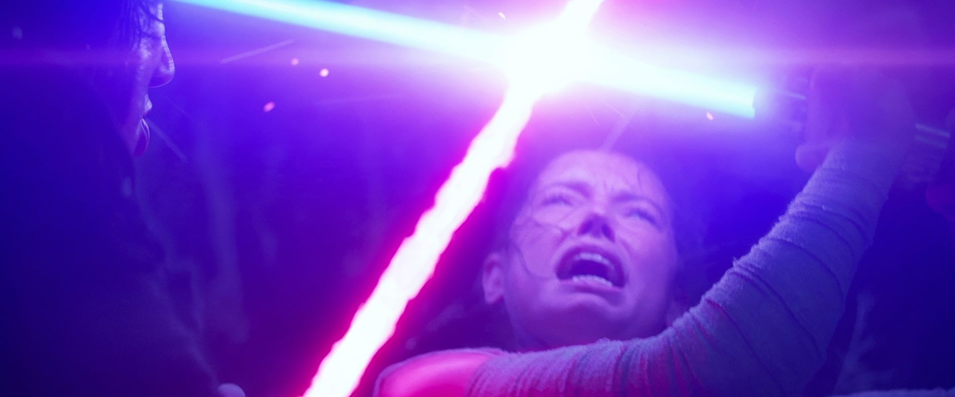
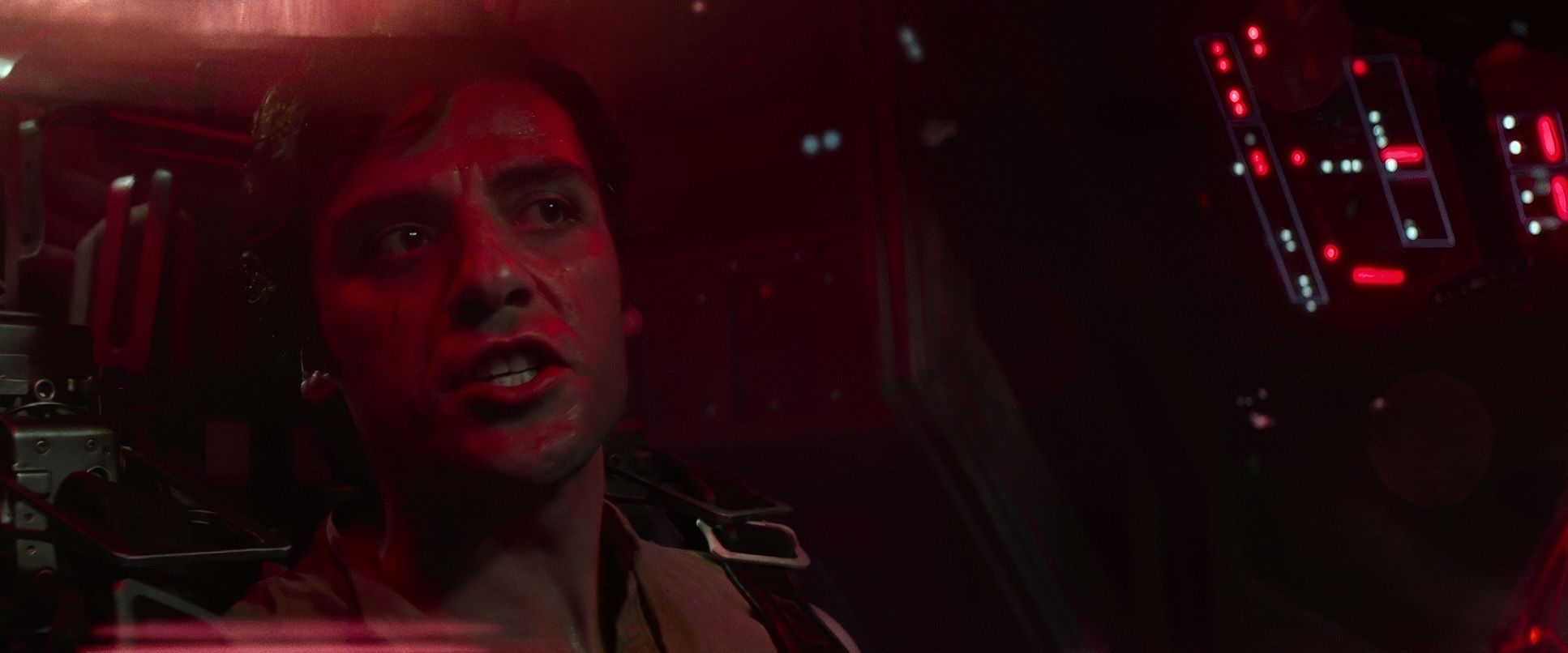
The approach here is all about hue separation and shadow integrity. The blacks are deep and “thick,” reminiscent of a heavy print stock, but they never feel “crushed” you can still see the texture in the First Order uniforms. The highlights have a soft, organic roll-off that you only get from film. I particularly love how they handled the lightsabers; they pop with a vibrant, almost hyper-real intensity, but they cast “interactive light” on the actors’ faces, making them feel like they are actually part of the scene’s lighting environment. There’s a subtle warmth in the midtones and a touch of magenta in the shadows that screams “Kodak,” giving the whole film a nostalgic glow without looking “retro.”
Technical Aspects & Tools
Star Wars: Episode VII – The Force Awakens | 35mm Film • 2.39:1
| Genre | Action, Adventure, Fantasy, Science Fiction, Space, Epic, Science-Fiction |
| Director | J.J. Abrams |
| Cinematographer | Dan Mindel |
| Production Designer | Rick Carter, Darren Gilford |
| Costume Designer | Michael Kaplan |
| Editor | Maryann Brandon, Mary Jo Markey |
| Colorist | Stefan Sonnenfeld |
| Time Period | Future |
| Color | Mixed, Desaturated, Blue |
| Aspect Ratio | 2.39 – Spherical |
| Format | Film – 35mm |
| Lighting | Side light |
| Lighting Type | Artificial light, Practical light, Firelight, Mixed light |
| Story Location | Jakku |
| Filming Location | United Arab Emirates > Abu Dhabi |
The technical backbone of The Force Awakens was a statement of intent. Shooting on Arriflex and Panavision 35mm cameras in an era of digital dominance was a bold move. It allowed for a grain structure and a color rendition that digital sensors even great ones still struggle to replicate perfectly.
By using practical effects and physical sets on location, Mindel was able to capture “real” photons hitting “real” objects. When you see the “real sparks” from a lightsaber clash, that’s not just a post-production trick it’s a practical element captured in-camera that the VFX team then amplified. This synergy between the technical tools and the physical production is why the film feels so much more “weighty” than its predecessors. It’s the difference between looking at a painting and looking through a window.
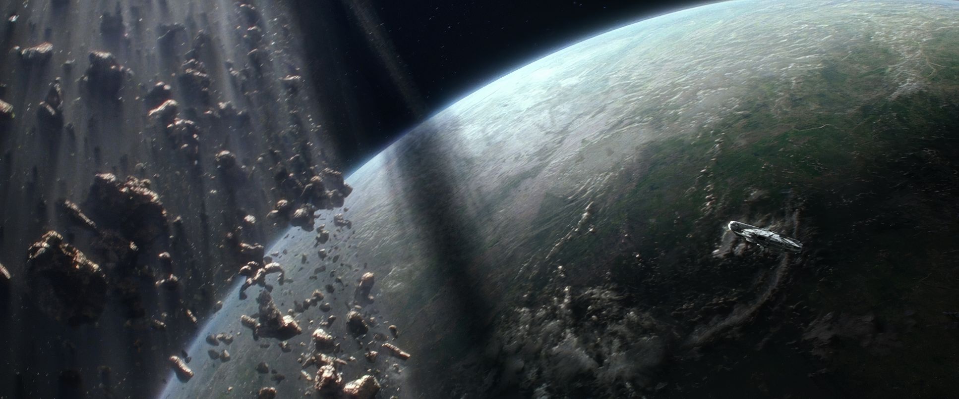
Star Wars: Episode VII – The Force Awakens (2015) Film Stills
A curated reference archive of cinematography stills from Star Wars: Episode VII – The Force Awakens (2015). Study the lighting, color grading, and composition.


- Also read: HOOP DREAMS (1994) – CINEMATOGRAPHY ANALYSIS
- Also read: MAN WITH A MOVIE CAMERA (1929) – CINEMATOGRAPHY ANALYSIS
Browse Our Cinematography Analysis Glossary
Explore directors, cinematographers, cameras, lenses, lighting styles, genres, and the visual techniques that shape iconic films.
Explore Glossary →