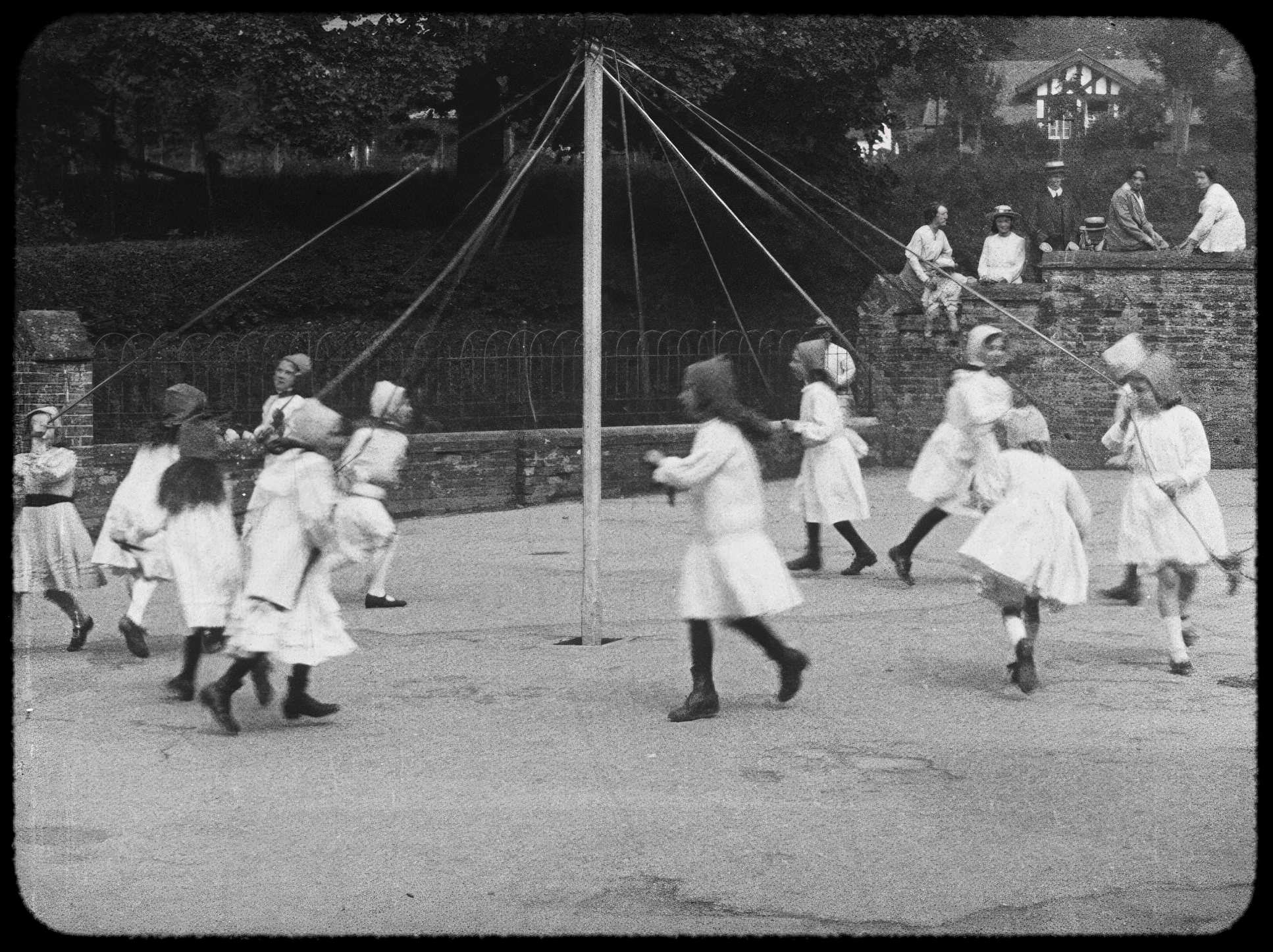
When Peter Jackson’s They Shall Not Grow Old (2018) dropped, it didn’t just catch my eye; it grabbed me by the collar. It’s a profound act of visual archaeology. For those of us who live in the weeds of digital artistry, this isn’t just a documentary; it’s a testament to what happens when historical preservation meets high-end post-production.
At Color Culture, my day-to-day is usually about shaping a narrative through contrast and tone. But what Jackson did here operates on an entirely different plane. He took a century of “unusable” black-and-white archives and turned them into something shockingly immediate. To see someone take grain-heavy, unstable footage and find the emotional resonance buried underneath? That’s a masterclass.
About the Cinematographer (and the Visionary Behind the Lens of Time)
We usually talk about a Cinematographer in terms of their lighting kit or lens choice on set. They Shall Not Grow Oldcompletely shatters that framework. Here, the “cinematography” is a hybrid of a hundred years of visual data and a modern team’s obsessive reconstruction. While anonymous cameramen shot the raw frames under fire in WWI, the real DP of the experience we’re watching is Peter Jackson and the Weta Digital team.
Jackson brought an epic sensibility to this, but it’s the personal connection that grounds it. Knowing his grandfather served in the war explains the mission: he wasn’t just “restoring” files; he was giving these men their souls back. He acted as a director-curator, pulling from the Imperial War Museum archives and fundamentally re-authoring the fabric of the image. This wasn’t about slapping a modern style on old film; it was about stripping away the decay to show us what those original cameramen were actually seeing.
Inspiration Behind the Cinematography
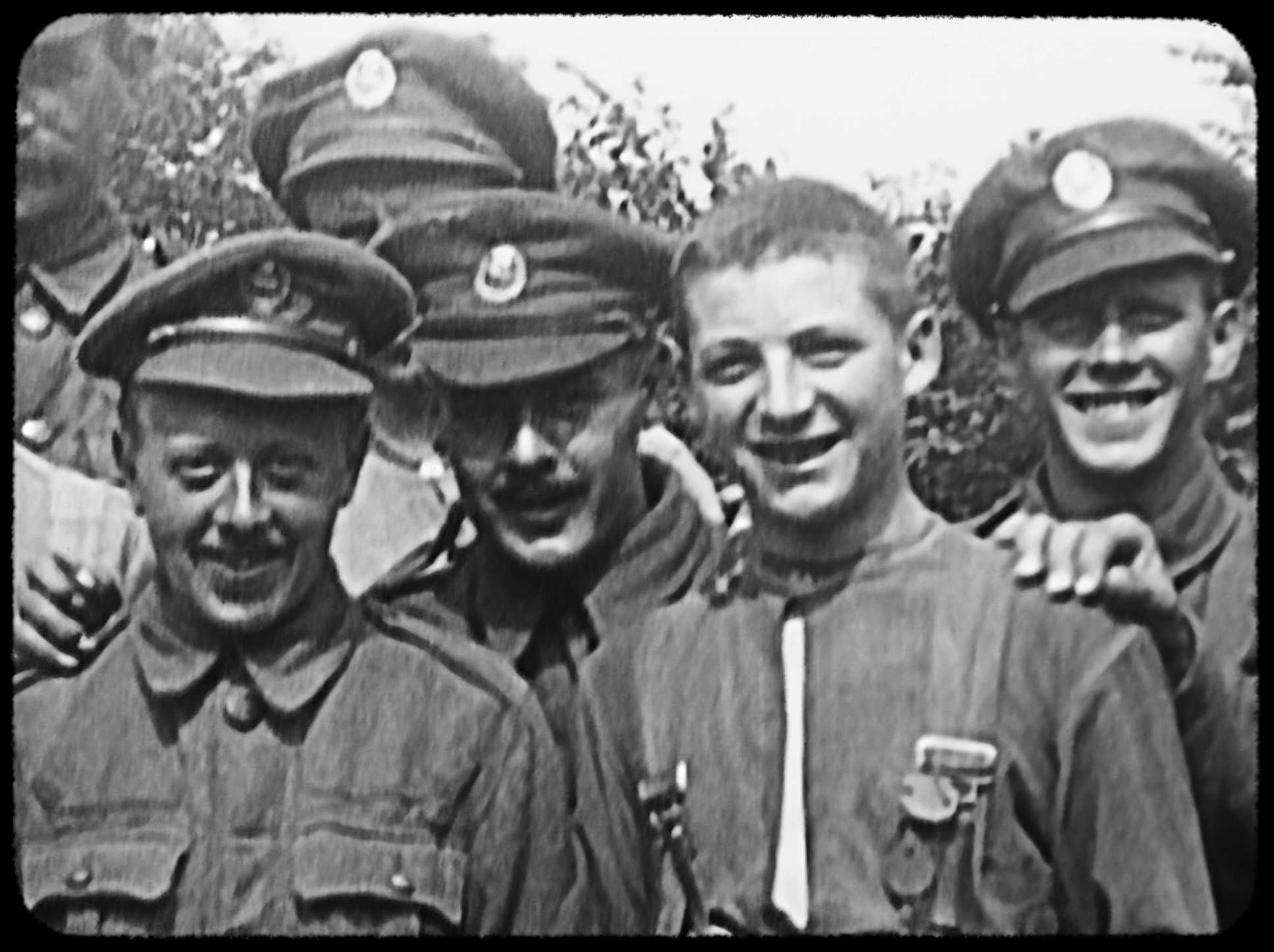
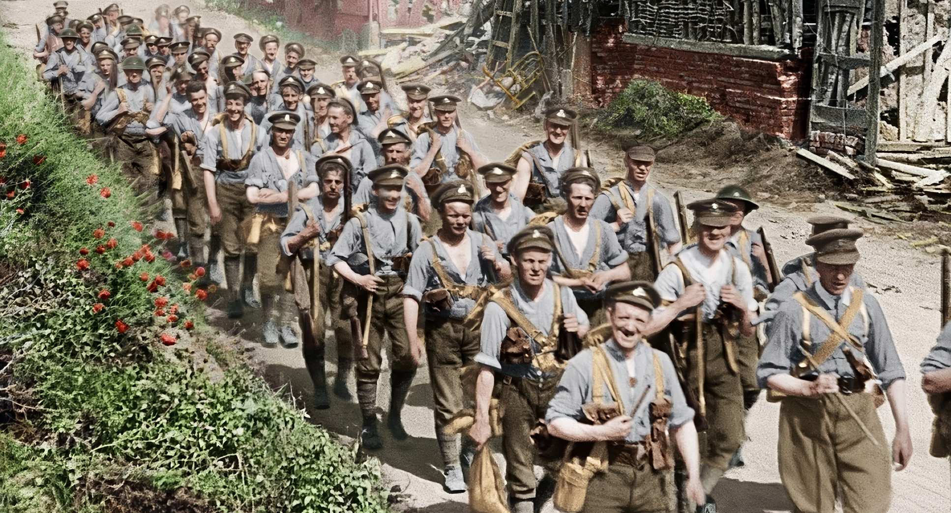
The mandate was clear: “humanize the history.” Jackson wasn’t interested in a dry, archival reel. He wanted to throw the audience into the mud with the British soldiers. This required a radical visual pivot. The technical hurdles erratic frame rates, tiny aspect ratios, and massive film damage usually create a “safety barrier” of time. Jackson’s goal was to tear that barrier down.
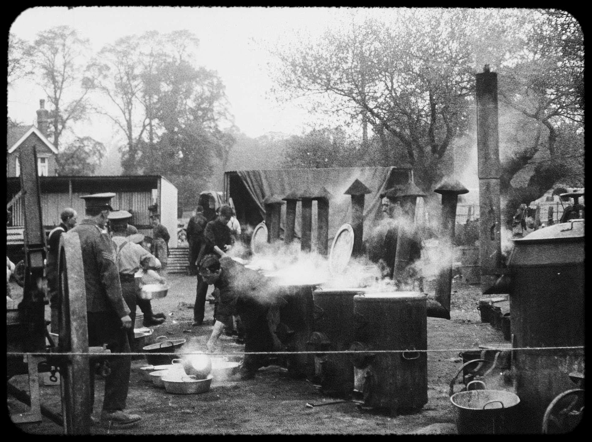
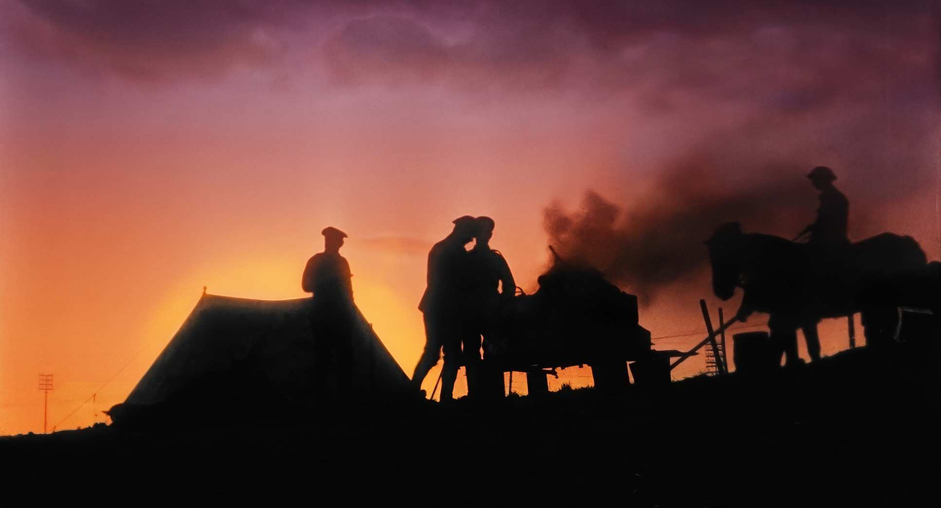
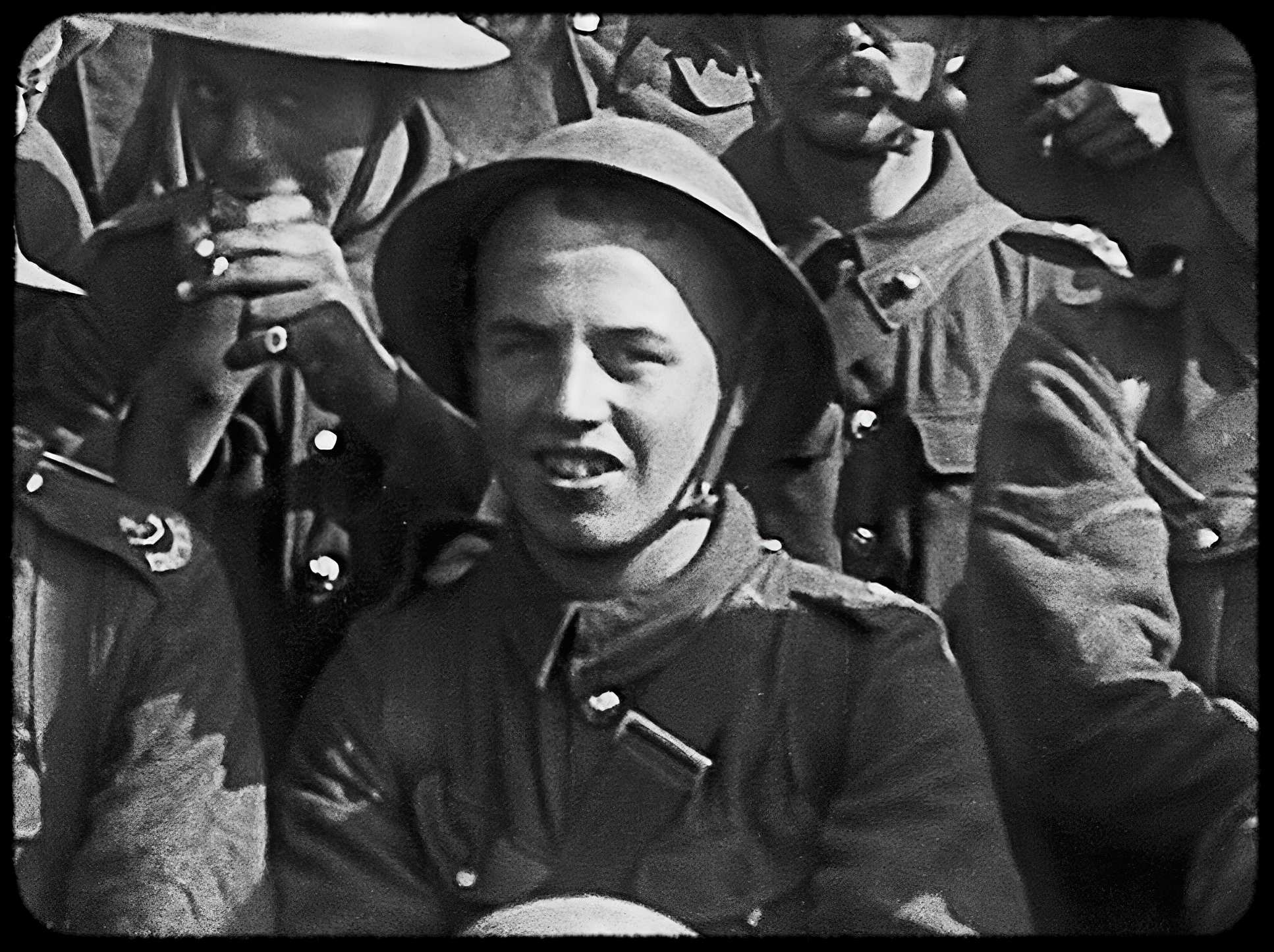
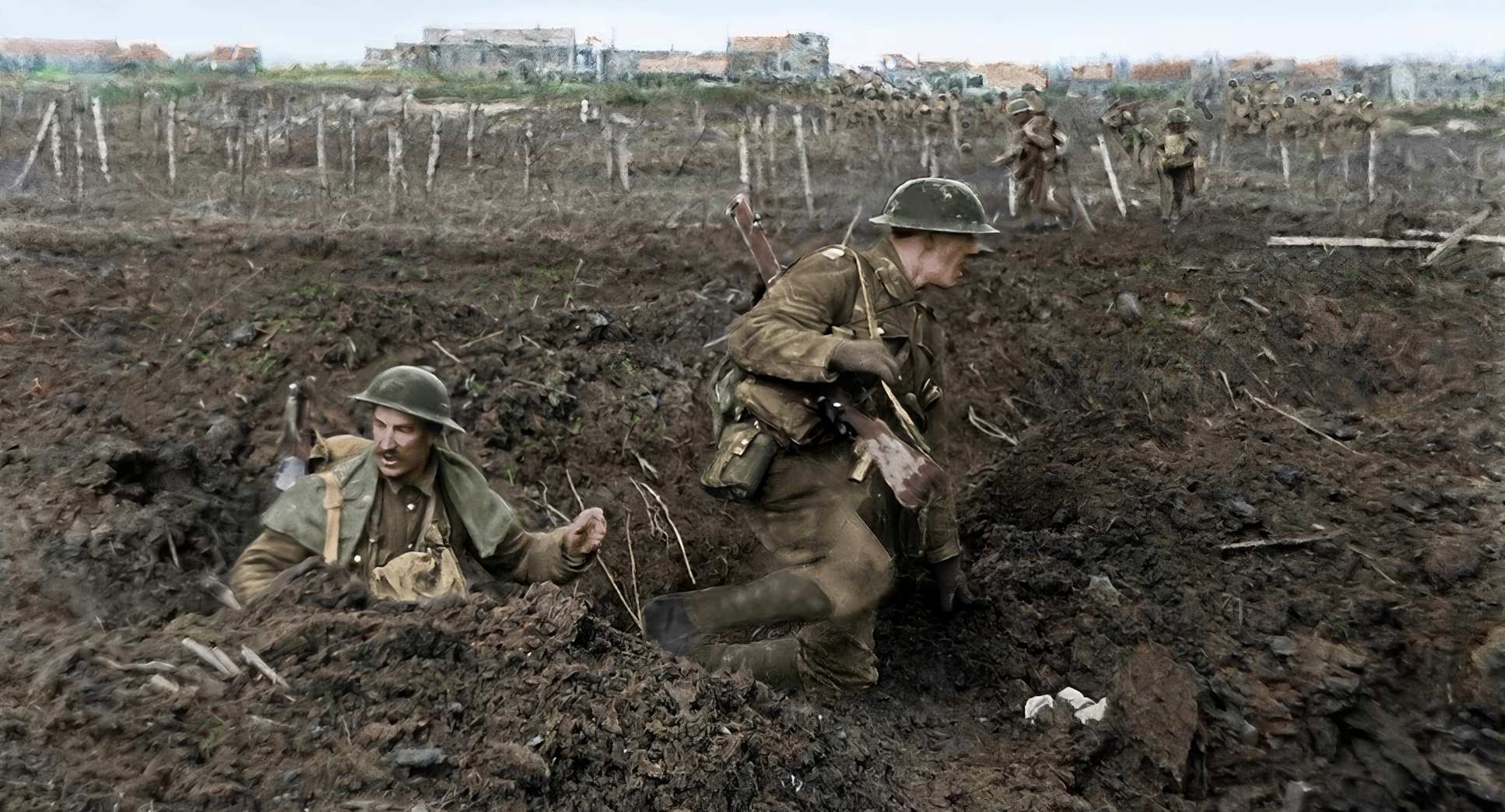
That transition at the start of the film is a genius bit of storytelling. We begin with the raw, silent, boxy footage a portal to a distant past and then it dramatically expands, stabilizes, and bursts into color as they hit the front lines. It’s a visual metaphor for the “gauze of history” falling away. It pulls us from being detached observers to participants in a “re-shot” reality. It’s not just technical wizardry; it’s a calculated choice to make the past feel like the present.
Camera Movements
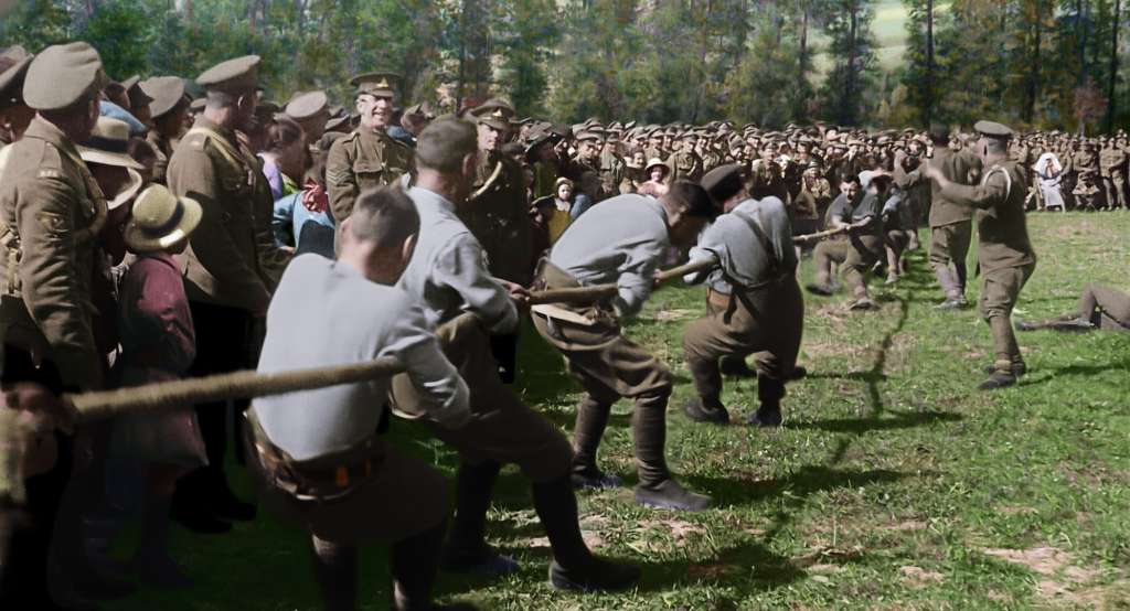
When I look at the camera work here, I’m looking at the tension between the original hand-cranked shots and the digital intervention. Most of the original footage was static or featured very clunky pans because, frankly, those cameras were heavy and hard to move in a trench.
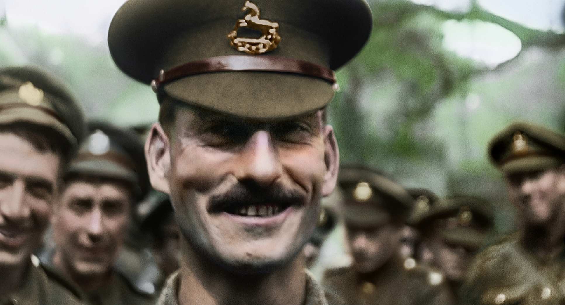
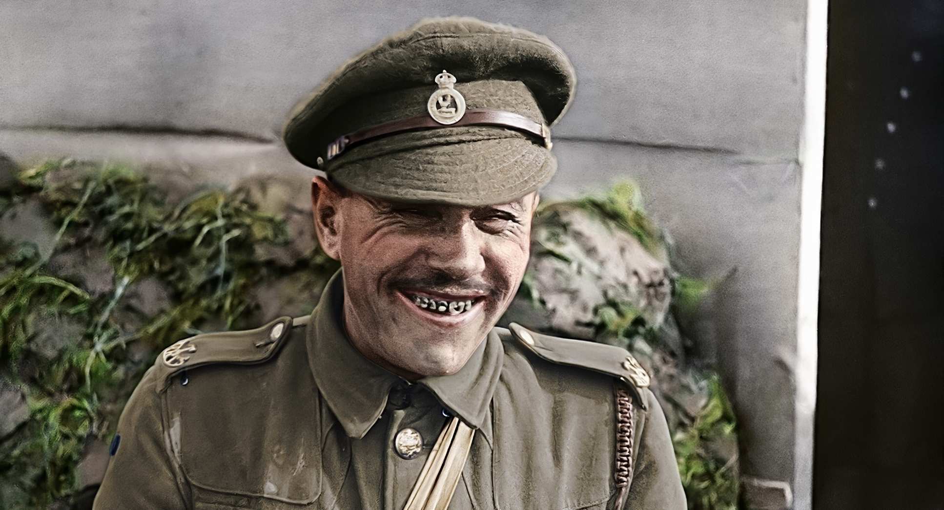
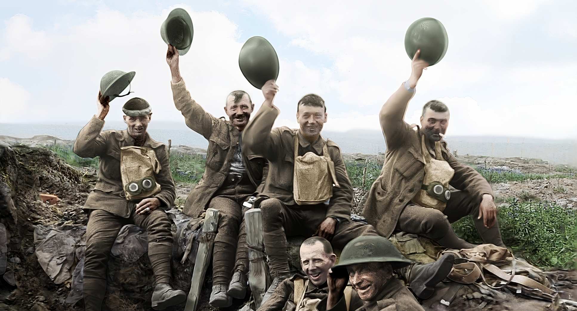
The Weta team didn’t just stabilize the “jitter” they introduced subtle, motivated digital moves. We’re talking slight pans and “push-ins” that guide the viewer’s eye. If a soldier is talking, a slight digital push focuses us on his expression in a way the original wide shot never could. It never feels like an anachronistic drone shot; it feels like the camera is finally doing what the original operator probably wished they could do. It’s a layer of cinematic intention that was physically impossible a century ago.
Compositional Choices
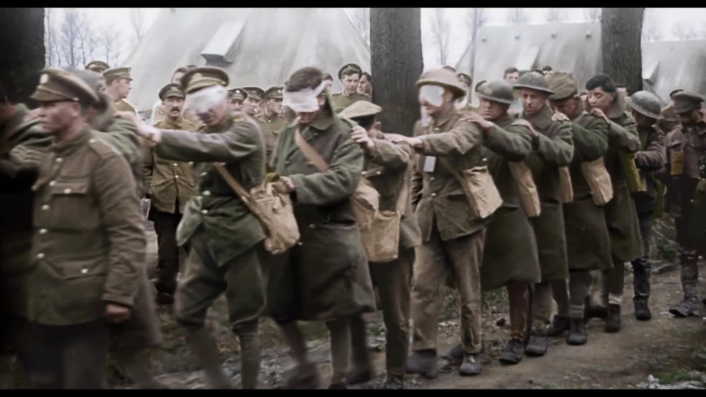
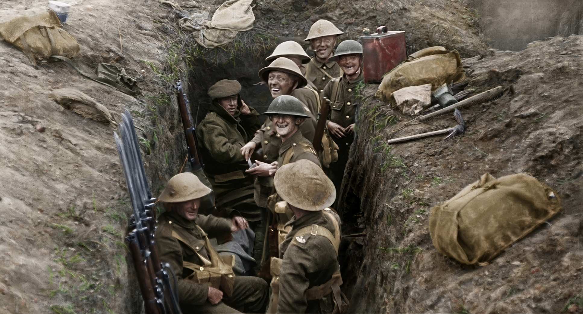
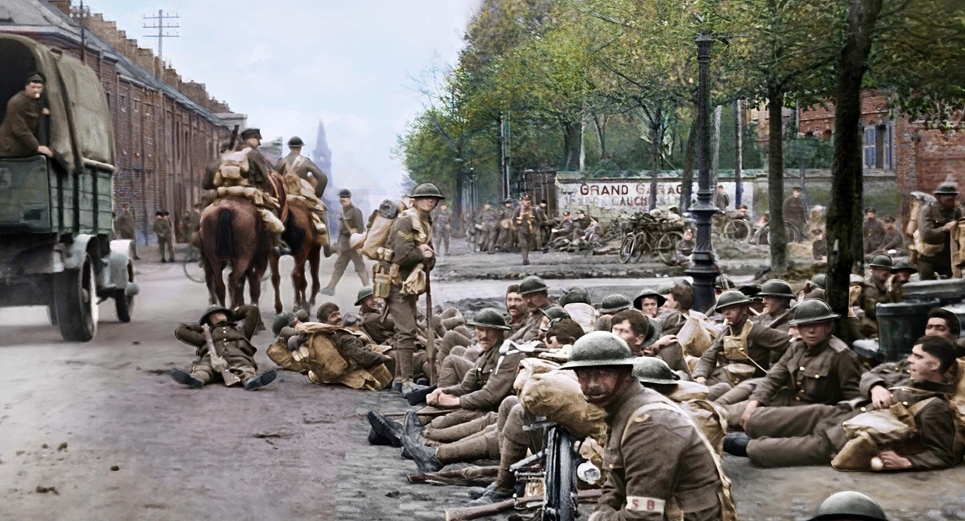
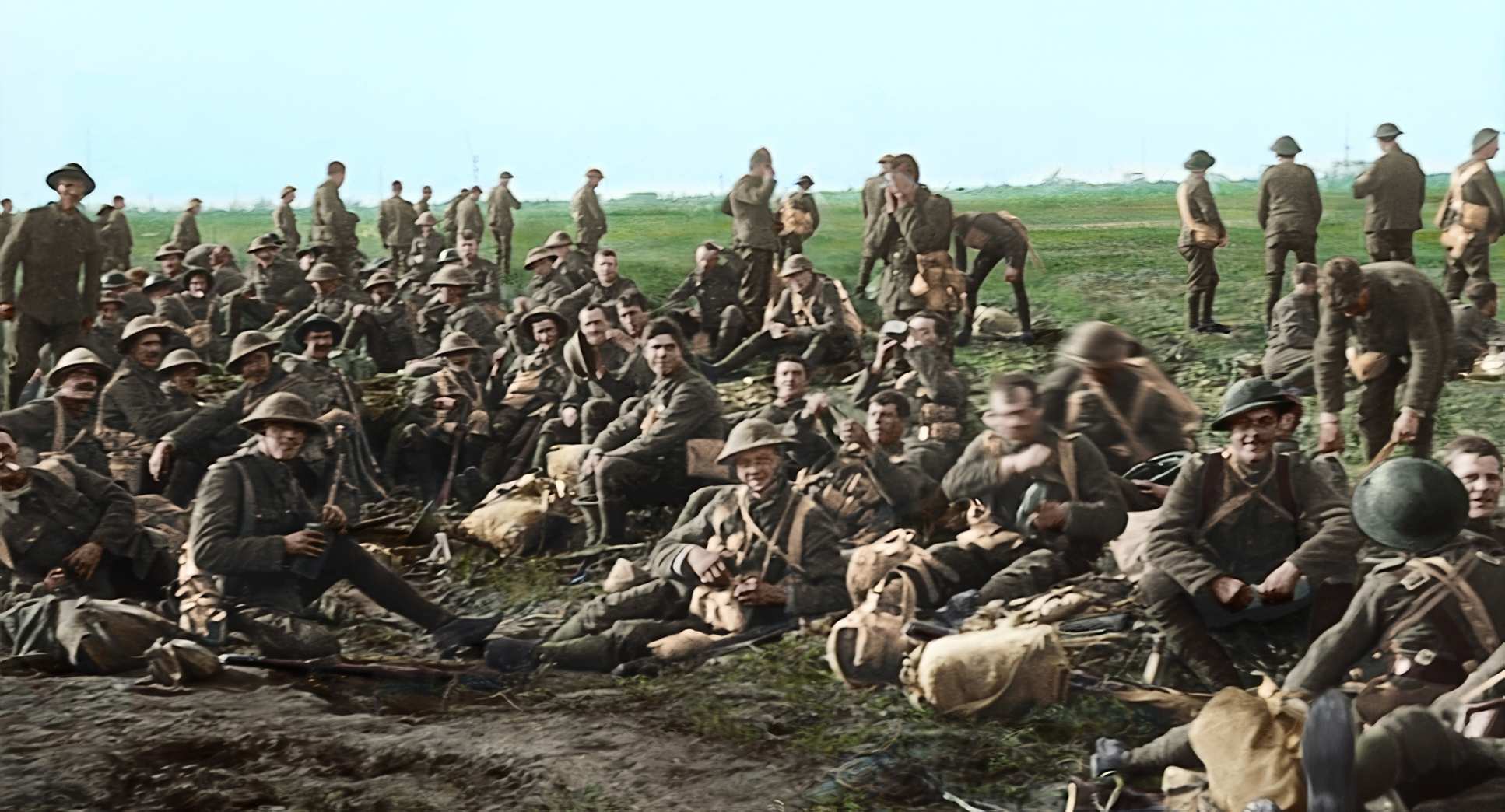
The original WWI footage was largely “information-first.” Those cameramen were capturing the scale of the war, often resulting in sprawling, unfocused wide shots. Jackson’s team had to find the story within those frames.
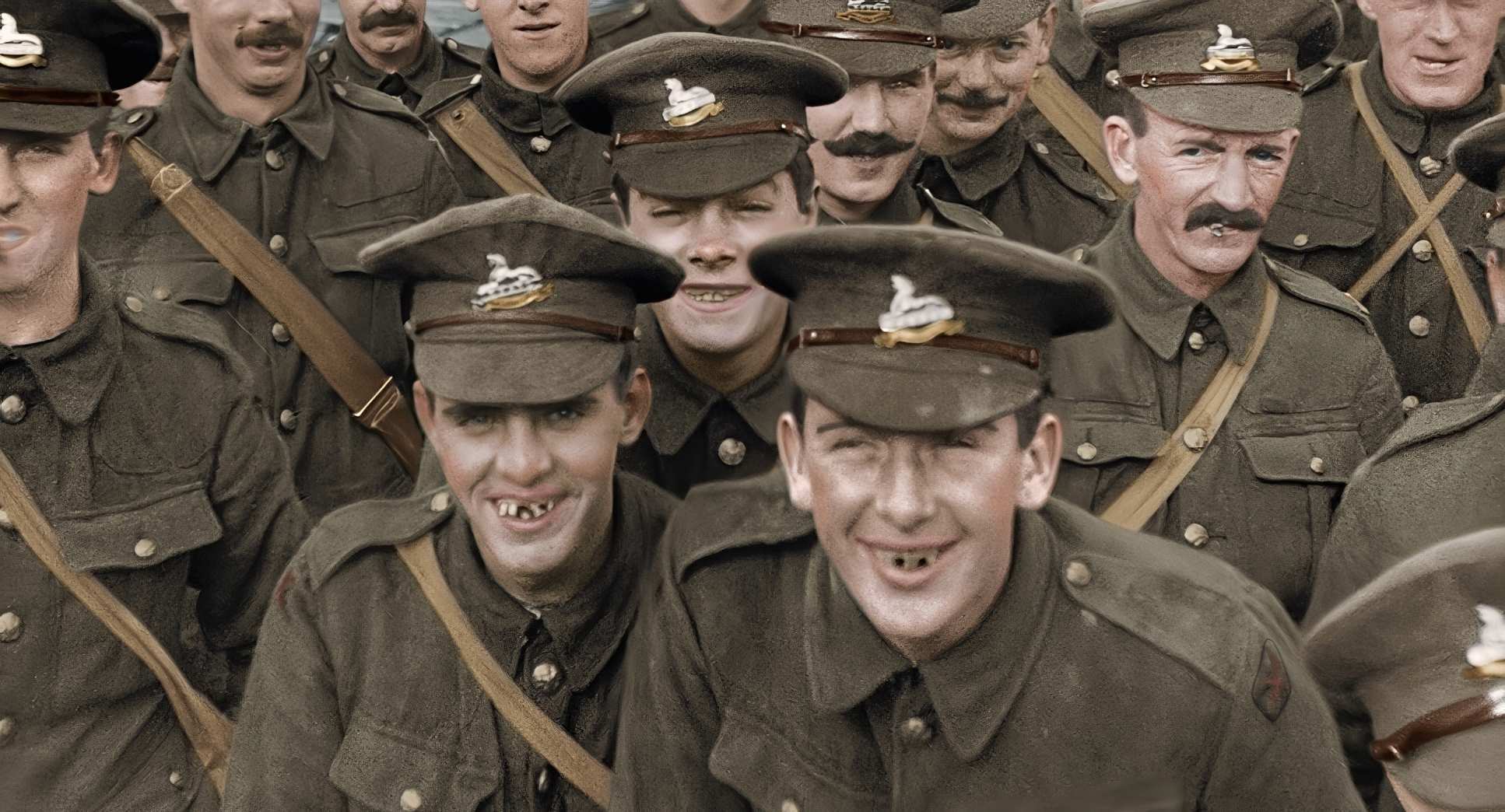
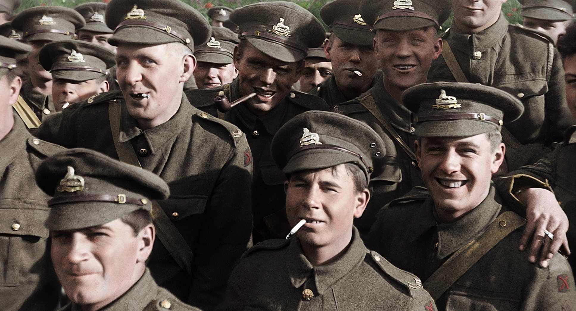
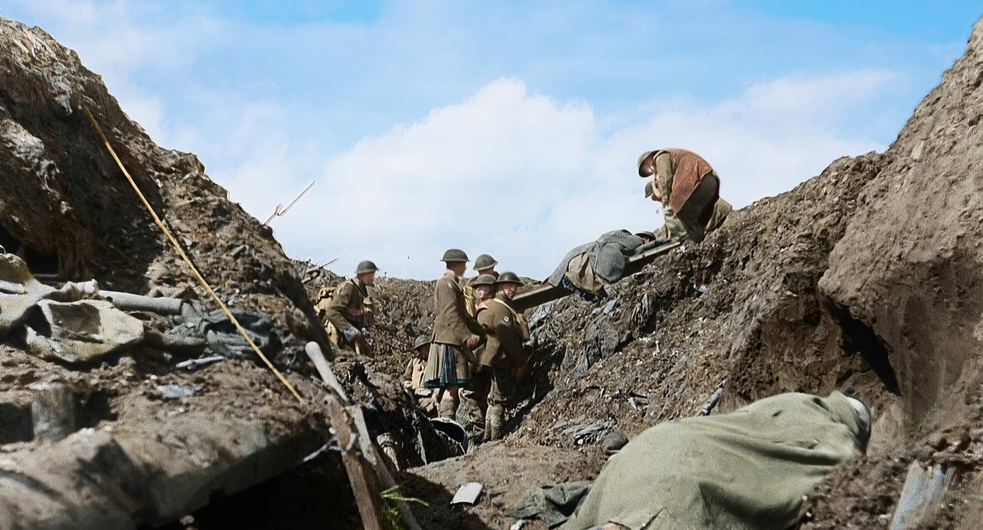
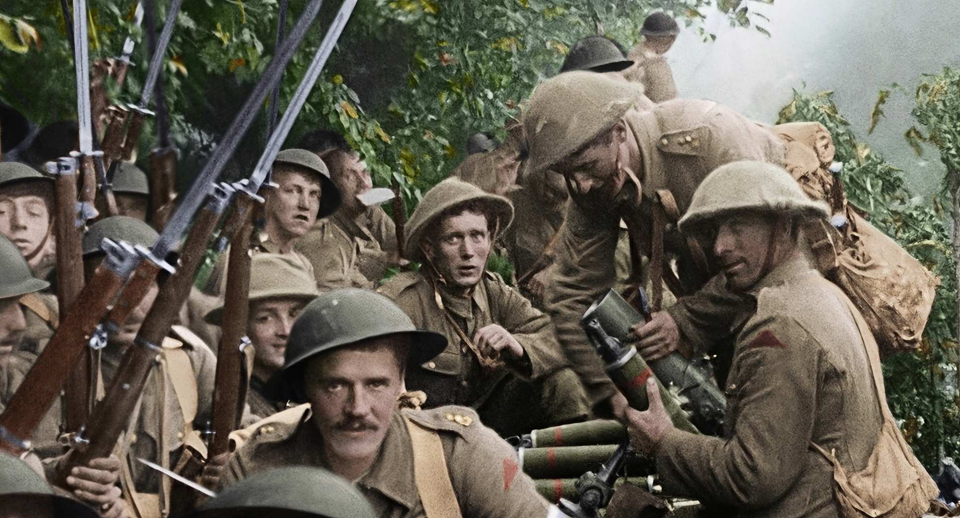
Through digital reframing and aggressive cropping, they extracted intentional compositions from the “mess.” They found the intimate portraits hidden in the corners of wide shots. They applied the rule of thirds and leading lines in post-production, effectively “directing” our eyes long after the fact. The shift to widescreen wasn’t just about filling our 4K monitors; it was a compositional tool to immerse us, using the edges of the frame to suggest a world that feels vast and encompassing rather than small and distant.
Lighting Style
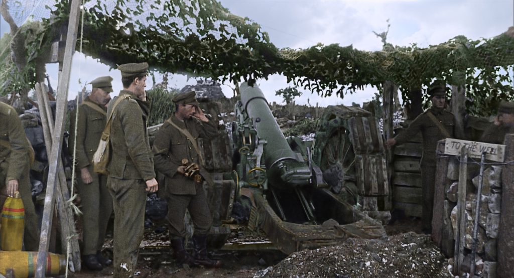
Since this was all shot with available light in 1914, there was no DP to bounce a light or negative fill a face. You get what the sun gives you which is often flat or harsh.
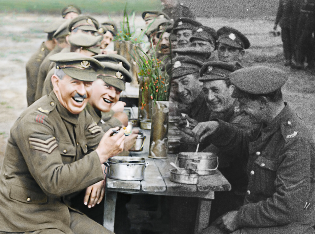
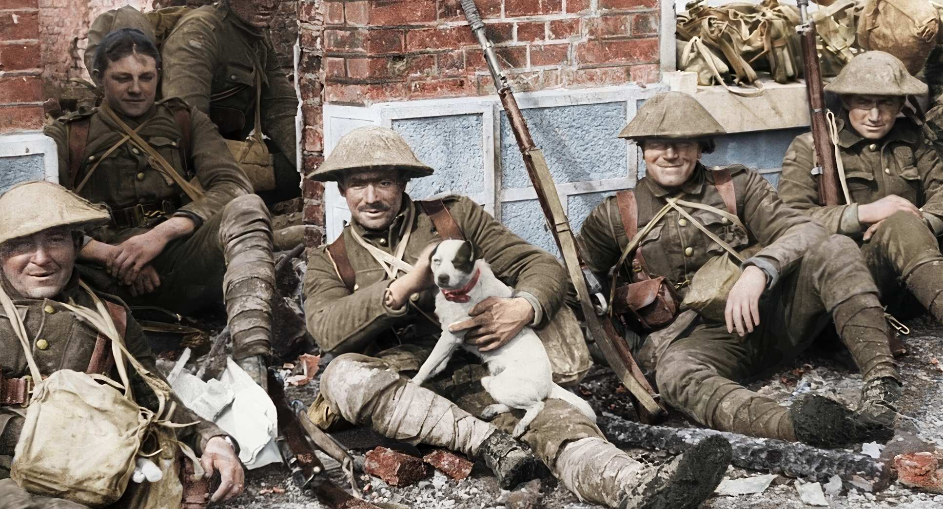
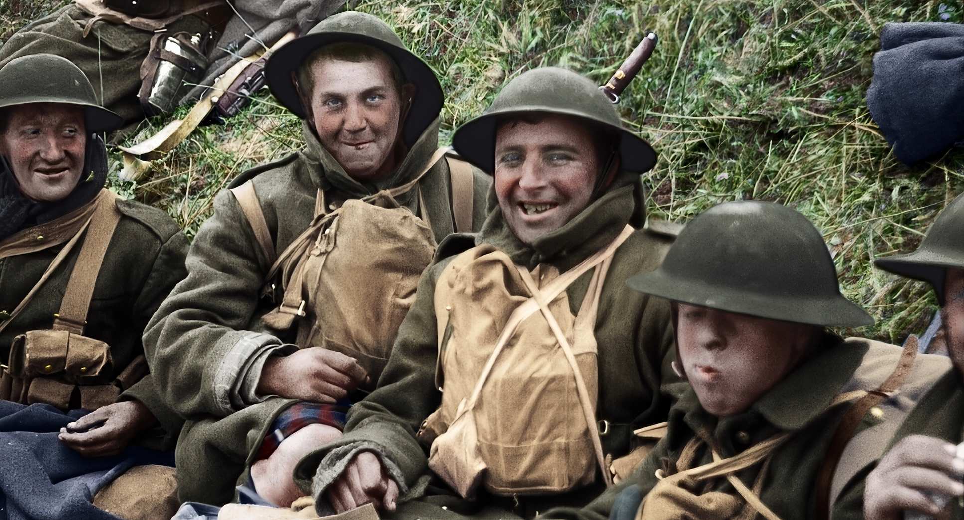
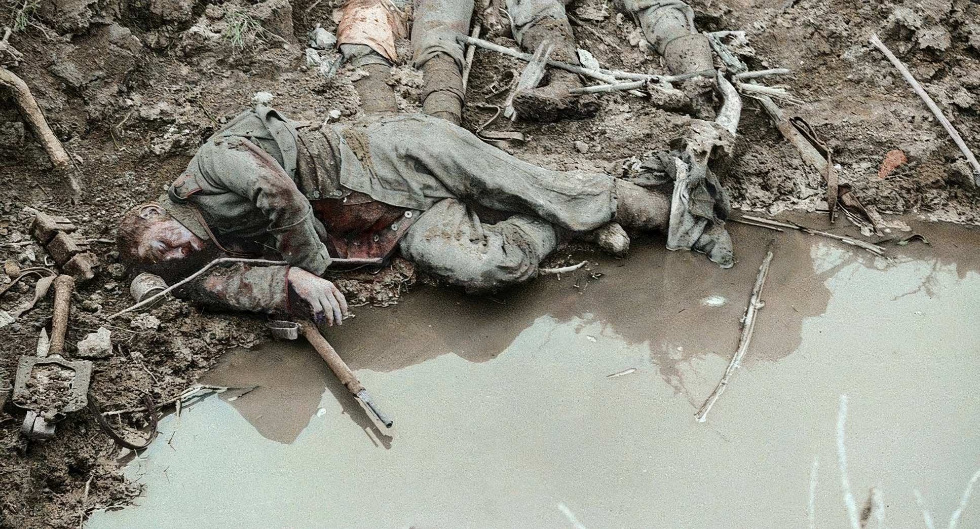
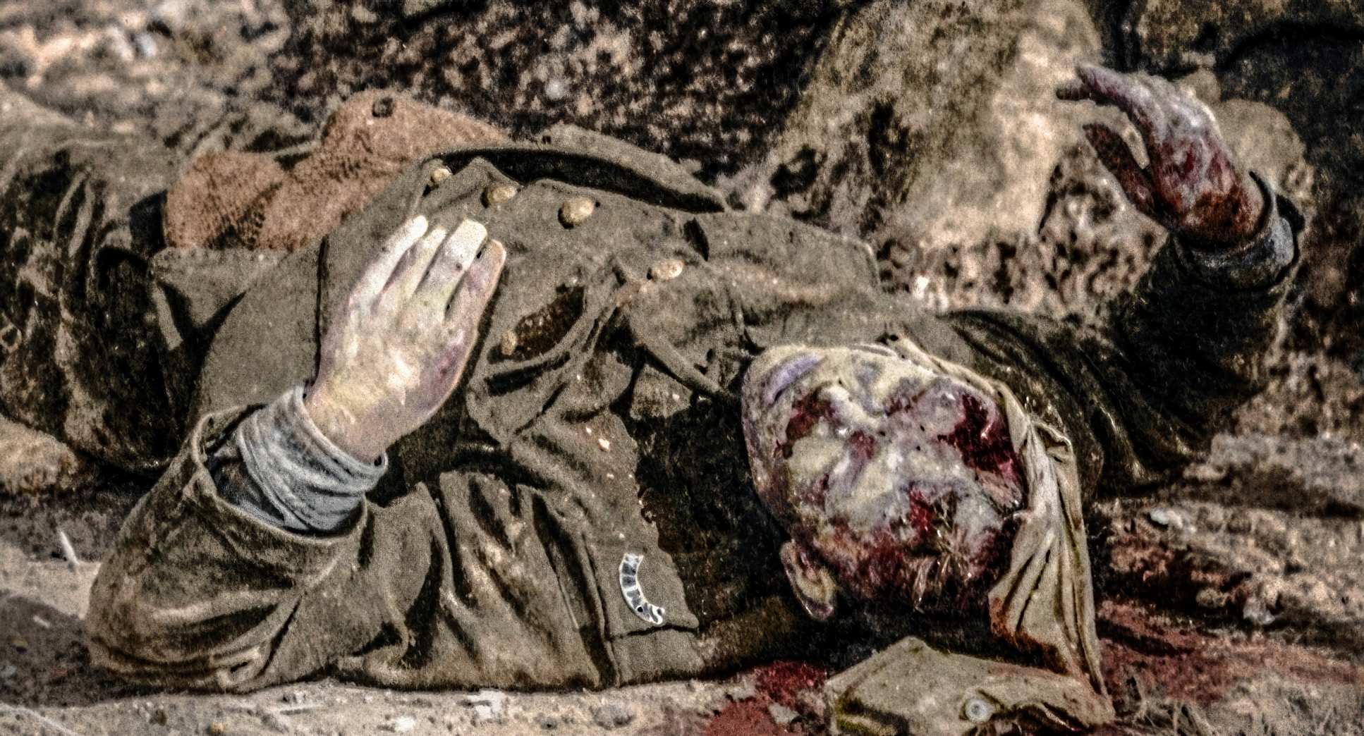
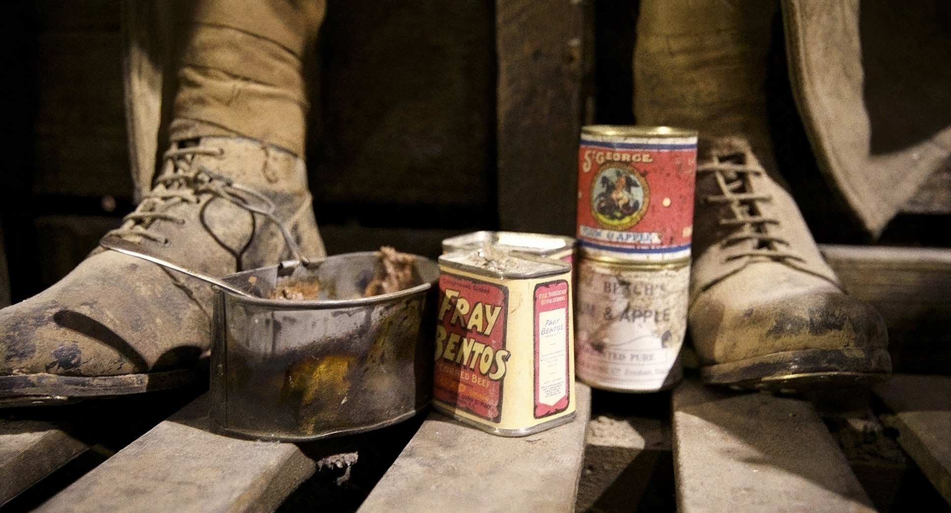
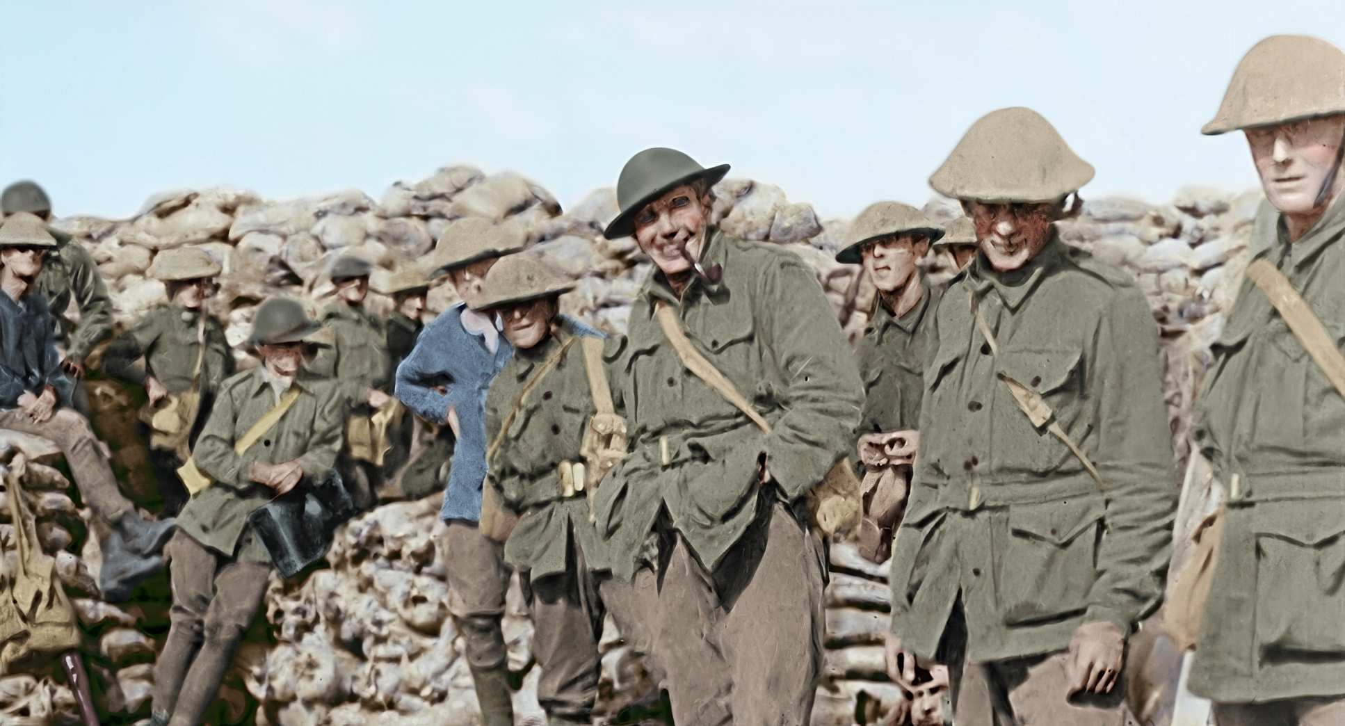
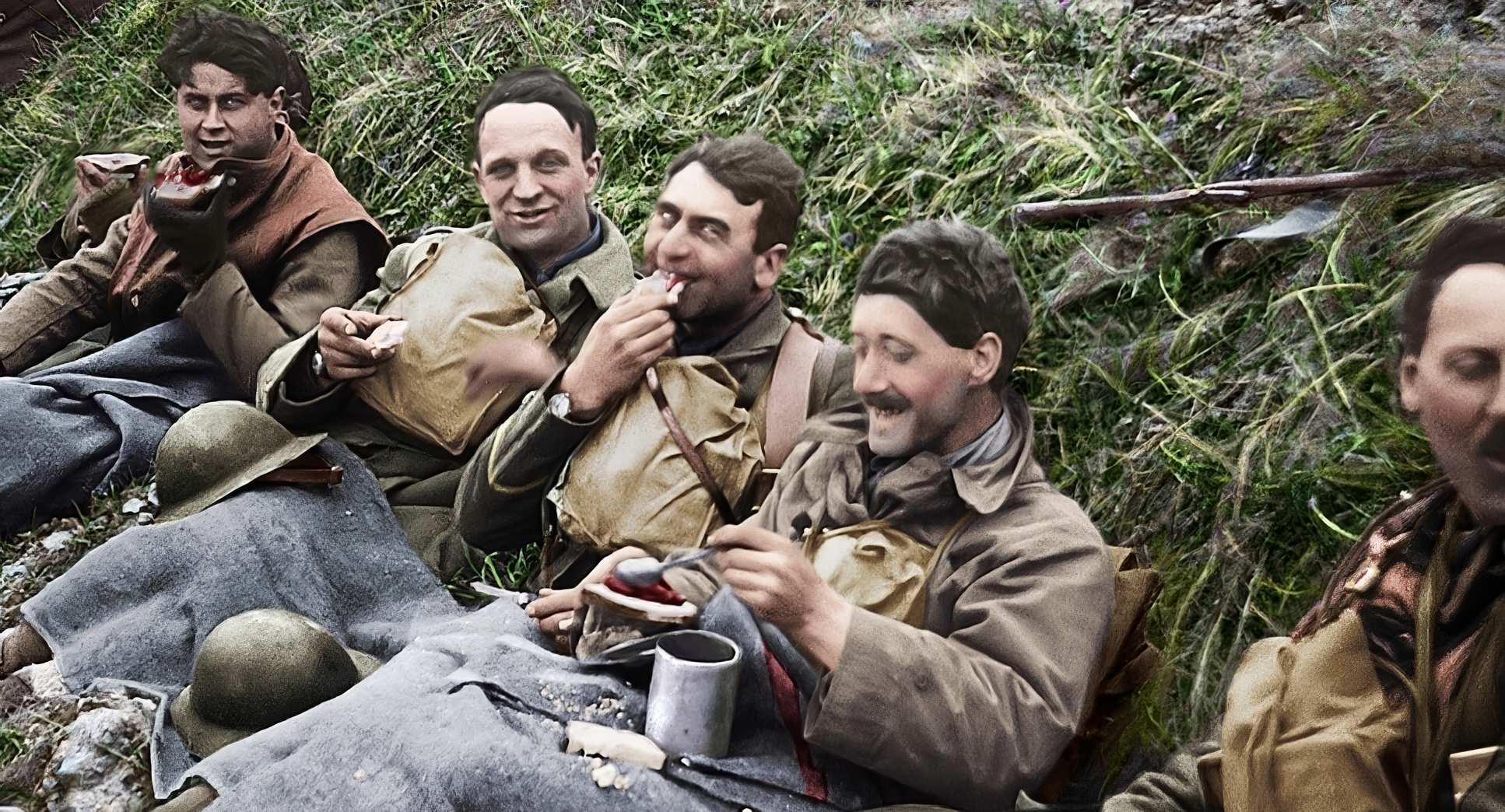
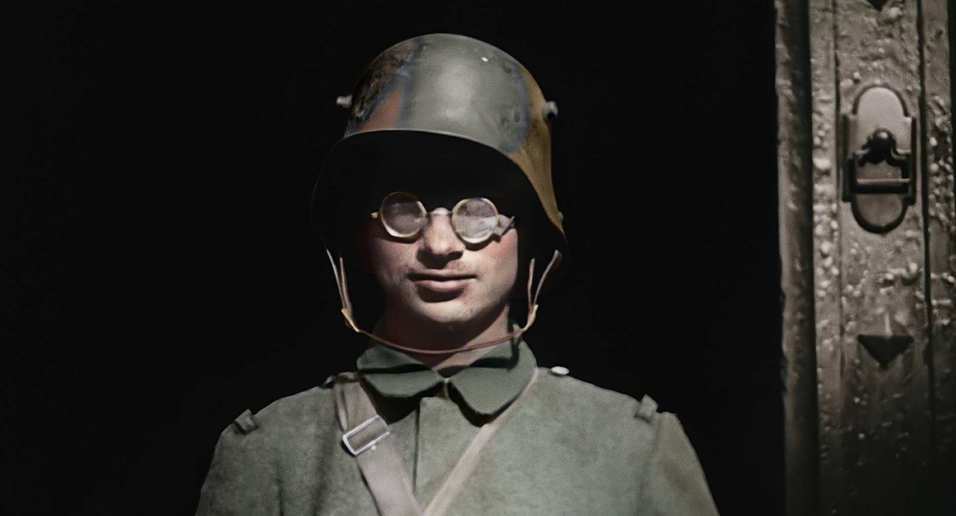
What fascinates me as a colorist is how the restoration team implied a lighting style through the colorization. This isn’t “painting by numbers.” They had to interpret how light would interact with the texture of a wool uniform or the dampness of the mud. When they added color, they had to build in the gradations of hue and saturation that mimic natural light and shadow. They essentially sculpted forms in the grade, adding a dimensional quality to flat, naturally lit scenes that makes them feel cinematic and textured.
Lensing and Blocking
The glass on those early cameras was primitive wide fields of view with a massive depth of field. Everything was in focus, which is the opposite of how we typically shoot narrative drama today. There’s no “creamy bokeh” to hide behind.
While they couldn’t change the lens physics, Jackson’s team used editing and reframing to simulate “blocking.” By cutting between takes or zooming into a specific soldier, they created a focal point that wasn’t there in the raw footage. I think about how much restraint that takes. It’s a delicate dance: you want to make it feel like a modern narrative, but you can’t add anything that breaks the period authenticity. They managed to make spontaneous, unprompted movements feel like a choreographed scene.
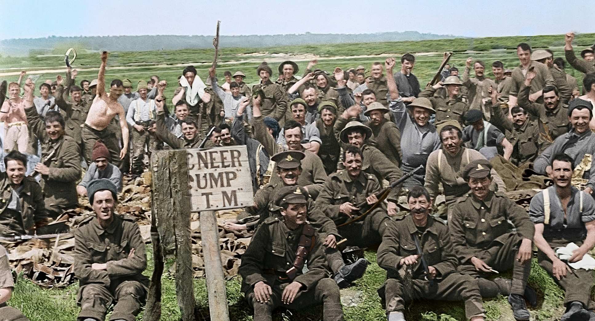
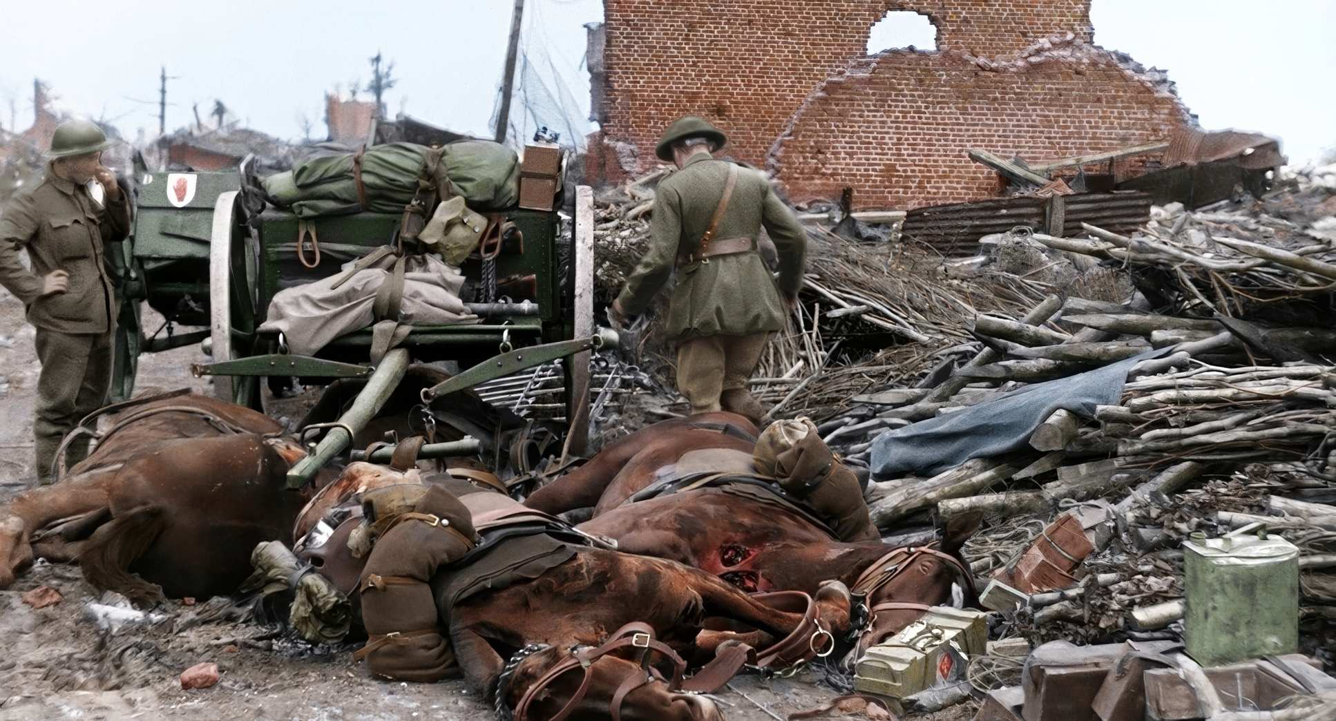
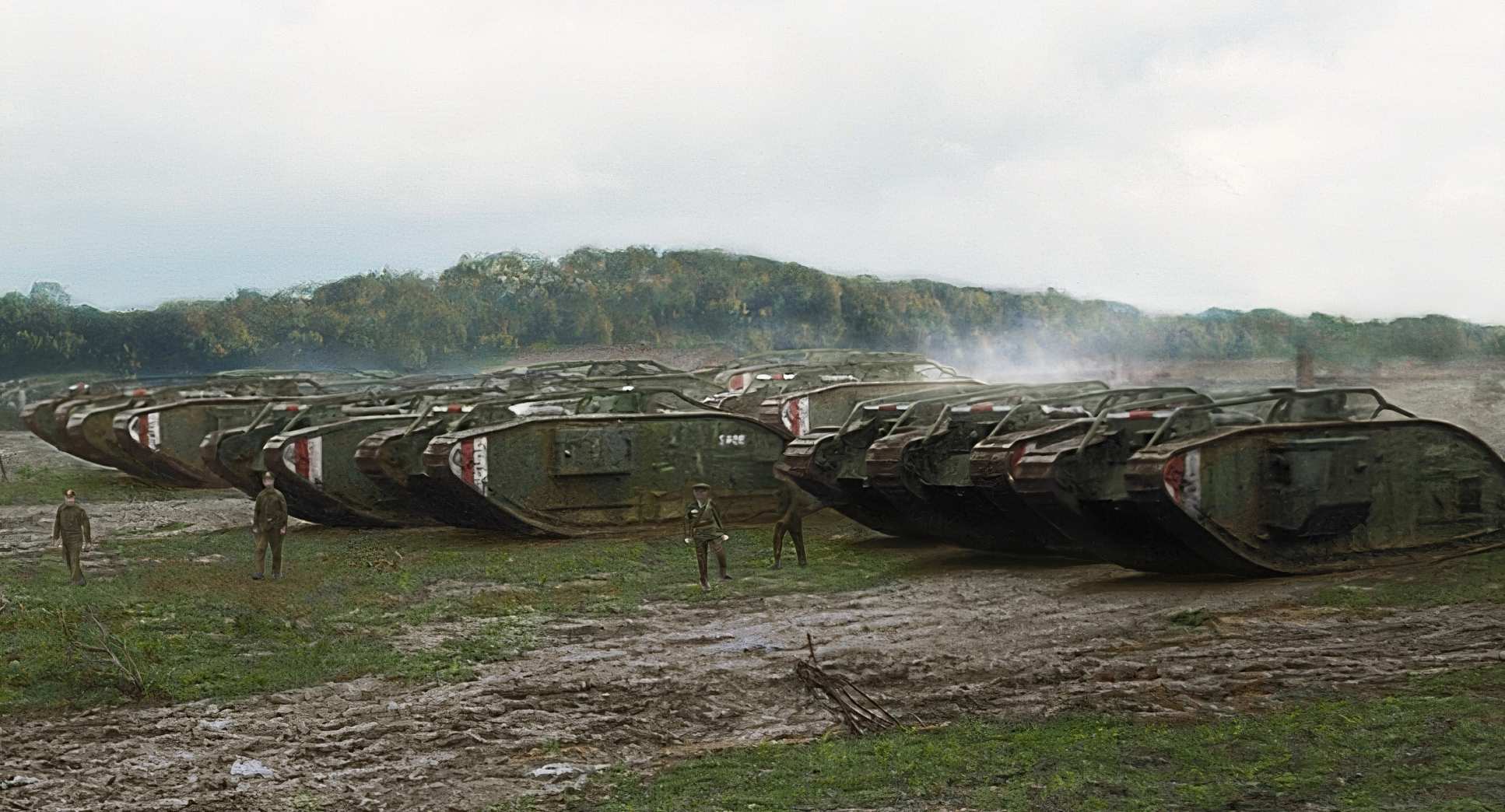
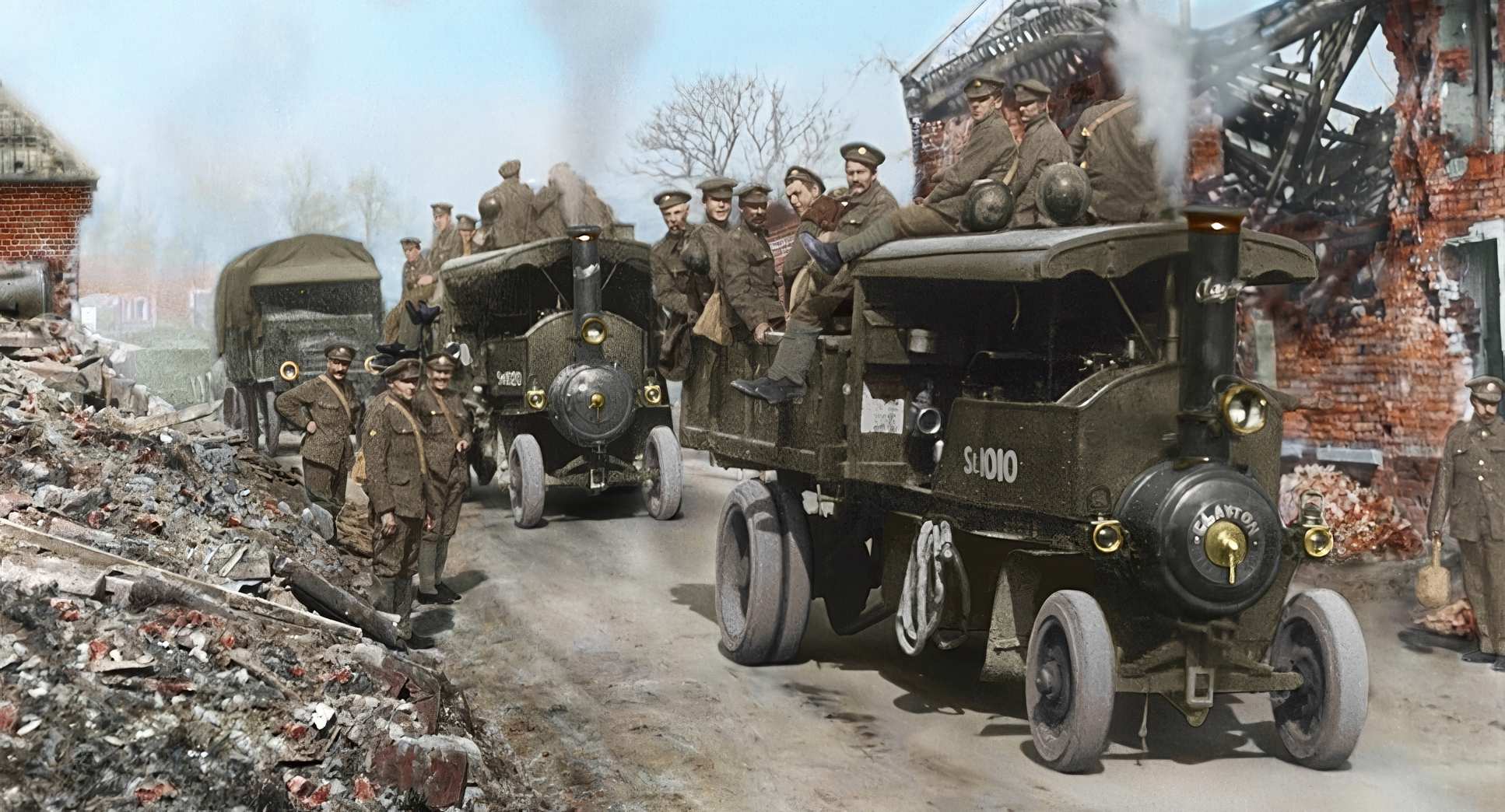
Color Grading Approach
This is where the film really sings for me. The transition from monochrome to color is the film’s heartbeat, and the grade is revolutionary. It’s not just “adding color”; it’s a historically informed, forensic process.
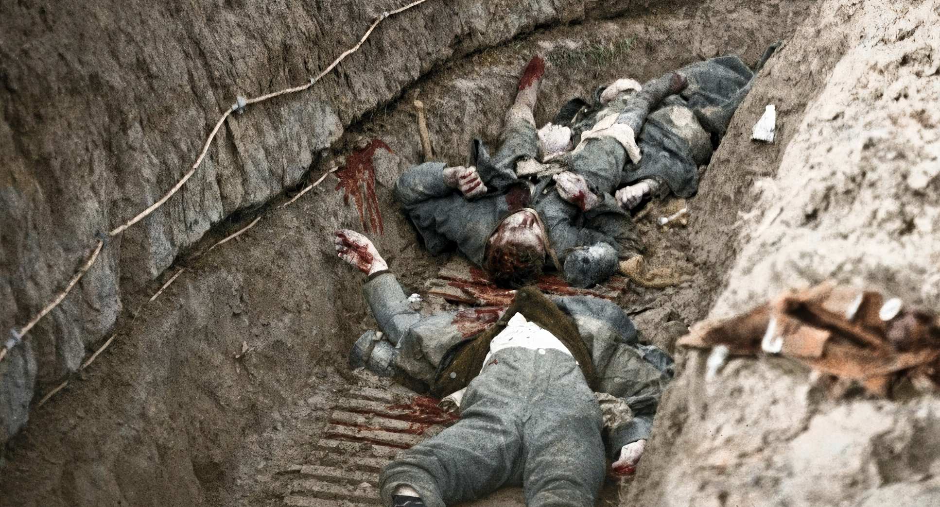
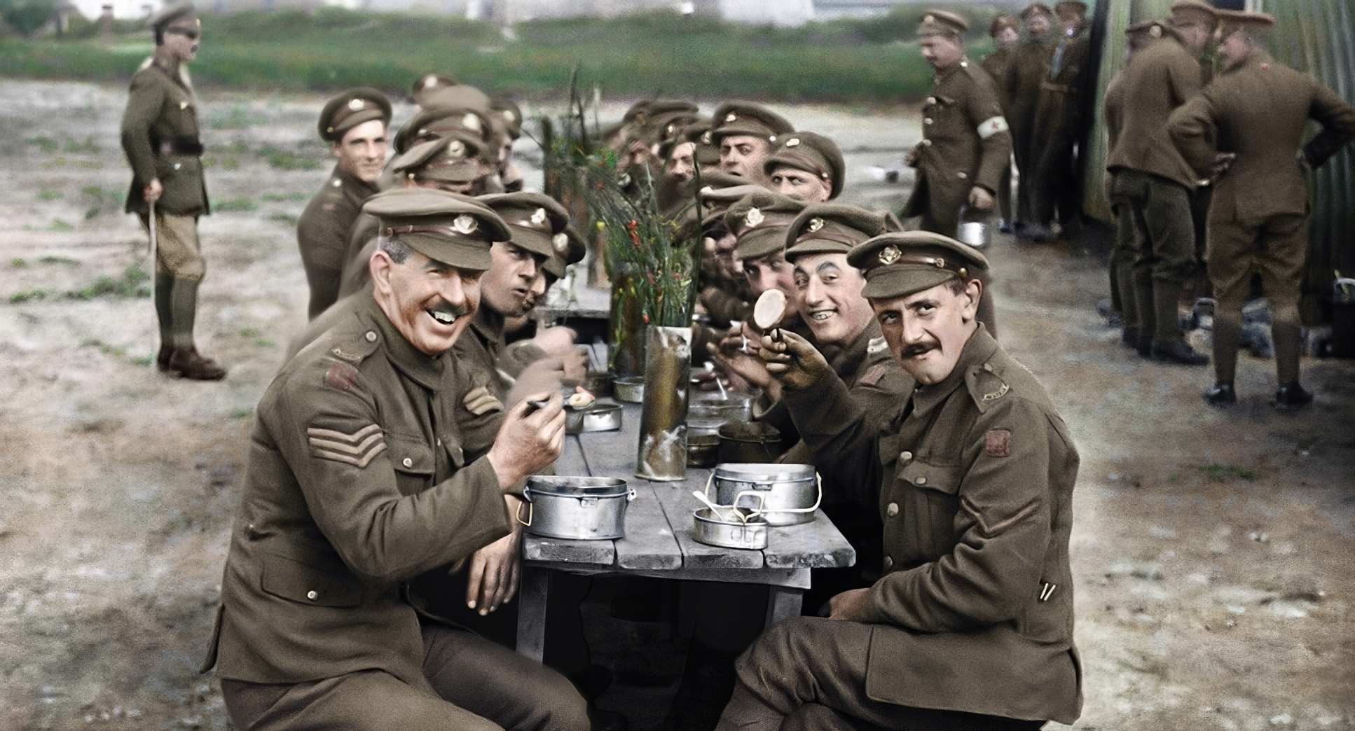
The grade is masterful because it’s restrained. They avoided the hyper-saturated look that usually makes digital colorization look like a cartoon. Instead, it’s a naturalistic, slightly desaturated palette. I can tell they did the work on the skin tones there’s an organic variation there that avoids the “plastic” look.
The contrast shaping is where the real work happened. They had to take low-contrast, flat B&W images and set black points and white points that felt heavy and real. The highlight roll-off on the skies and reflections feels like a photochemical print. It’s a reminder that great grading isn’t about making things “pretty” it’s about making them feel tangible and emotionally resonant.
Technical Aspects & Tools
The sheer “heavy lifting” here is monumental. The biggest headache? The frame rates. Hand-cranked cameras vary wildly anywhere from 10 to 18 fps. To get that to a smooth 24 fps without looking like a “fast-forward” Charlie Chaplin reel, they used sophisticated interpolation. This wasn’t a simple “frame blending” job; it was an intelligent reconstruction of motion.
Then there’s the “cleanup” removing a century of scratches, flicker, and dust. That’s an artistic marathon, not a one-click plugin. And don’t get me started on the sound. Adding foley, ambient battle noise, and ADR using forensic lip-readers? One reviewer called it “black magic fuckery,” and I have to agree. It’s a holistic sensory experience that proves cinematography is more than just the image it’s the atmosphere.
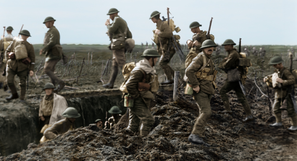
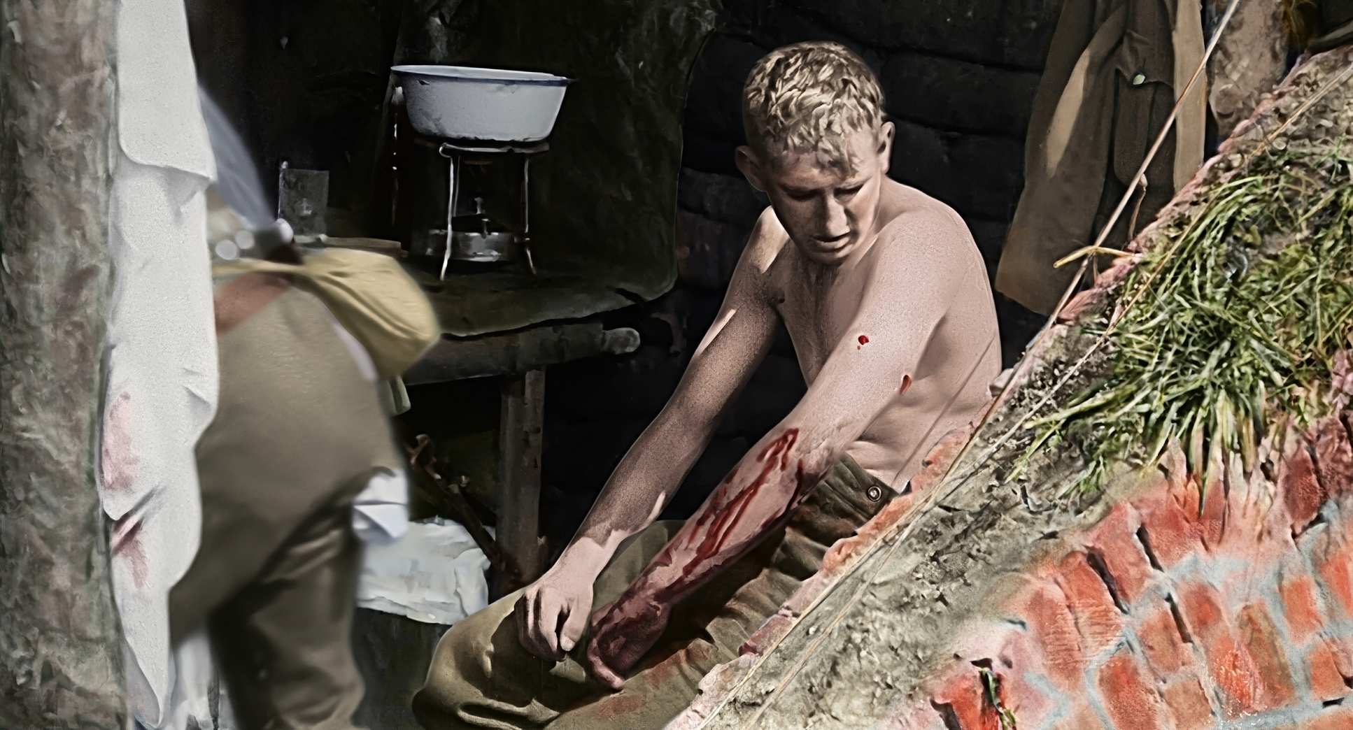
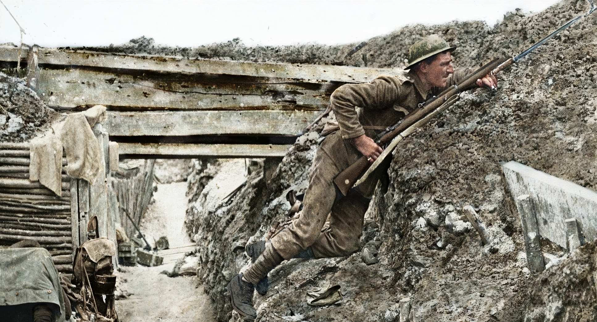
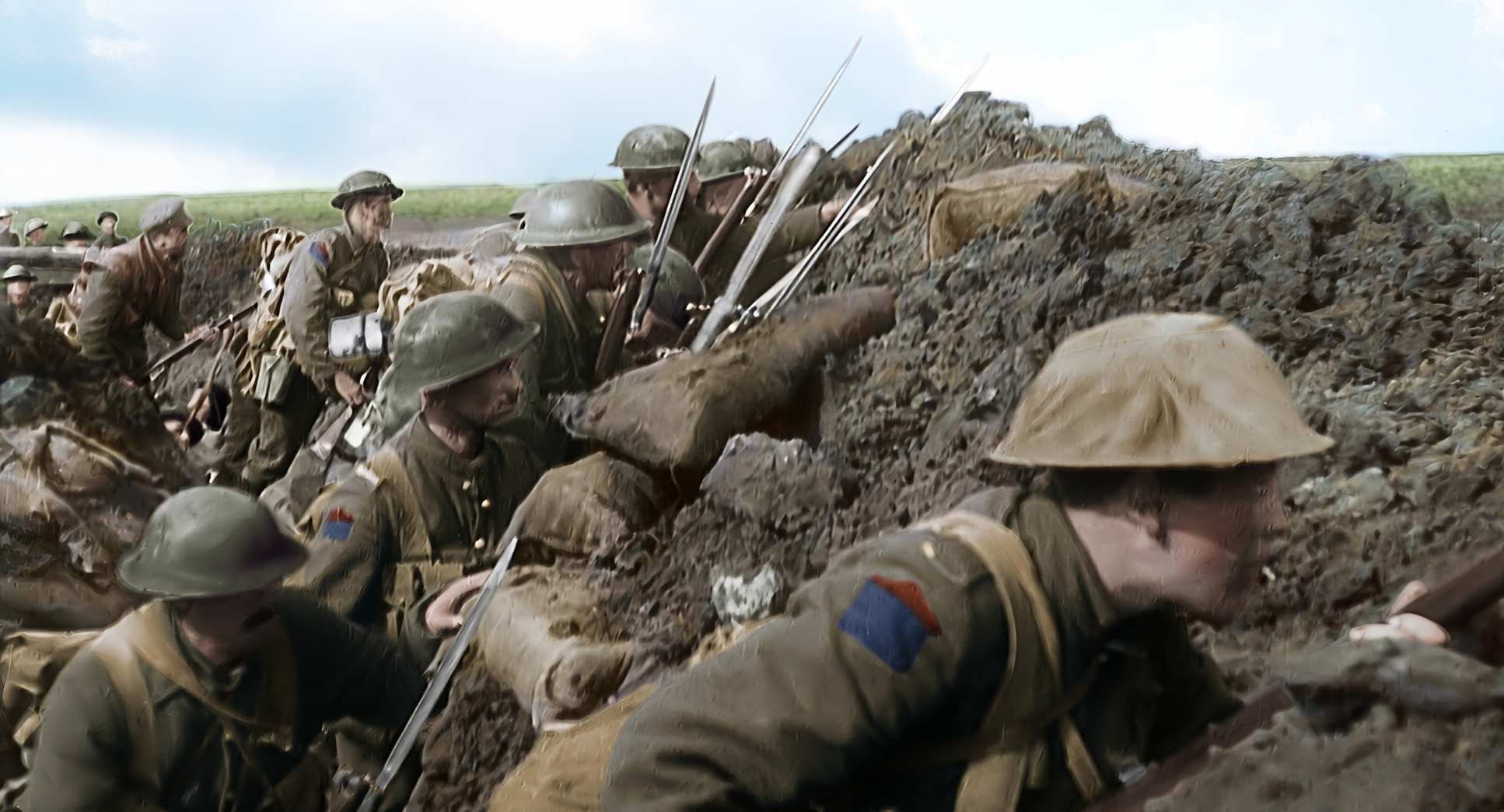
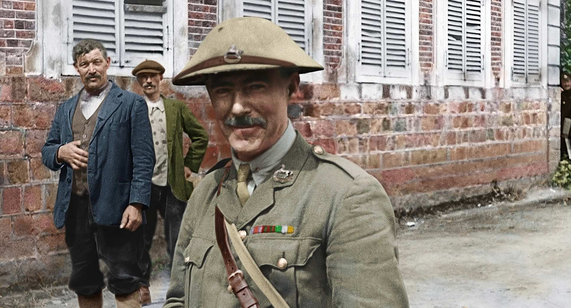
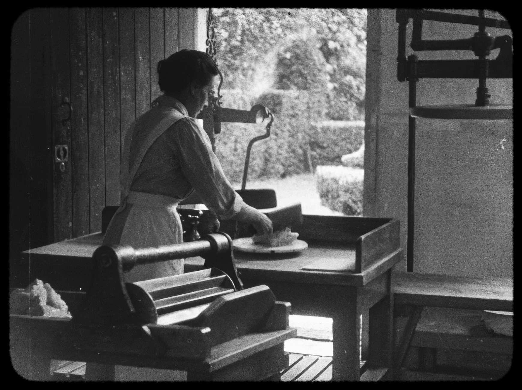
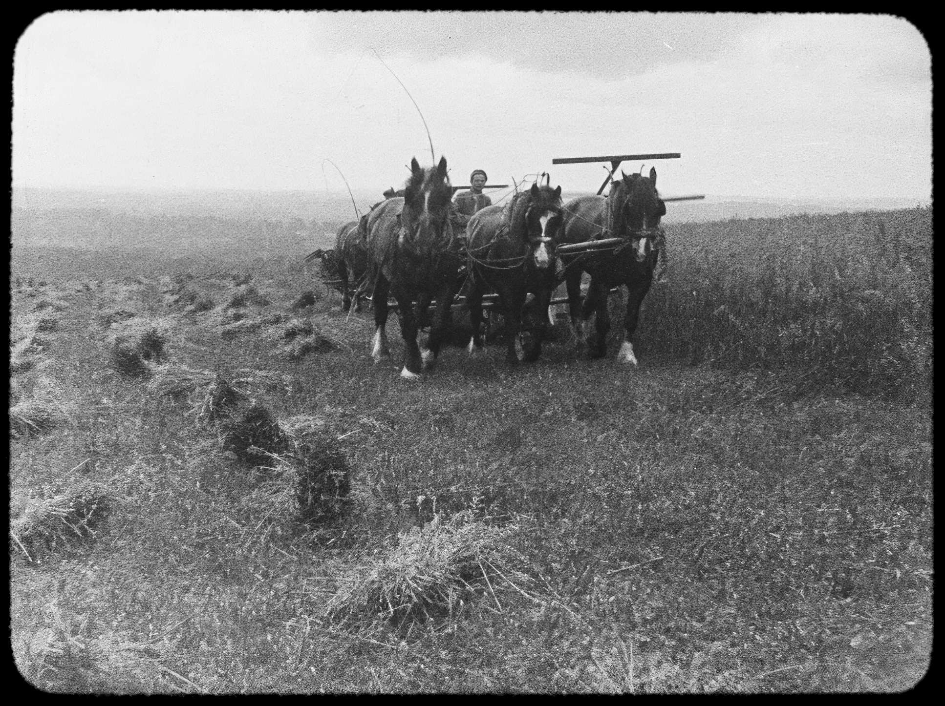
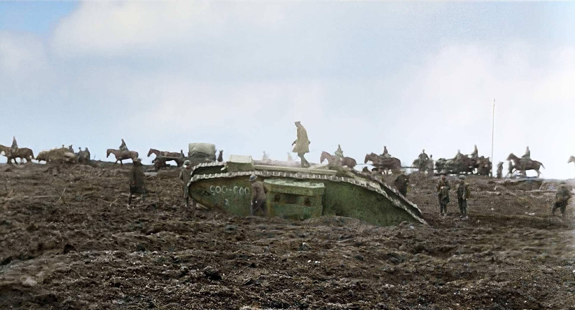
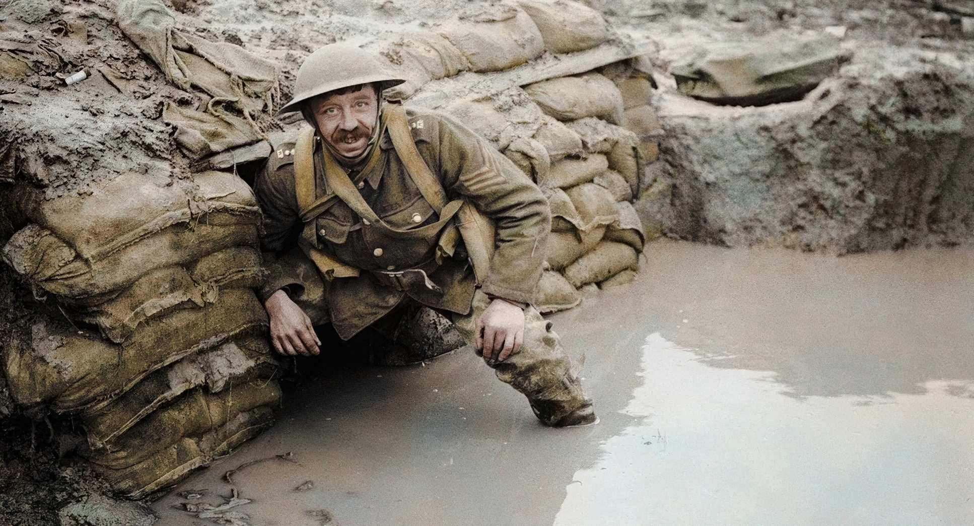
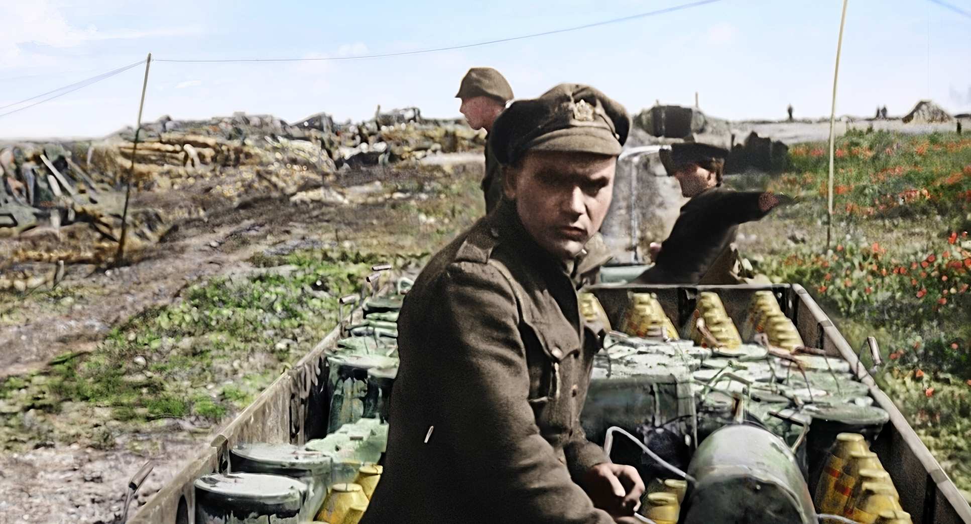
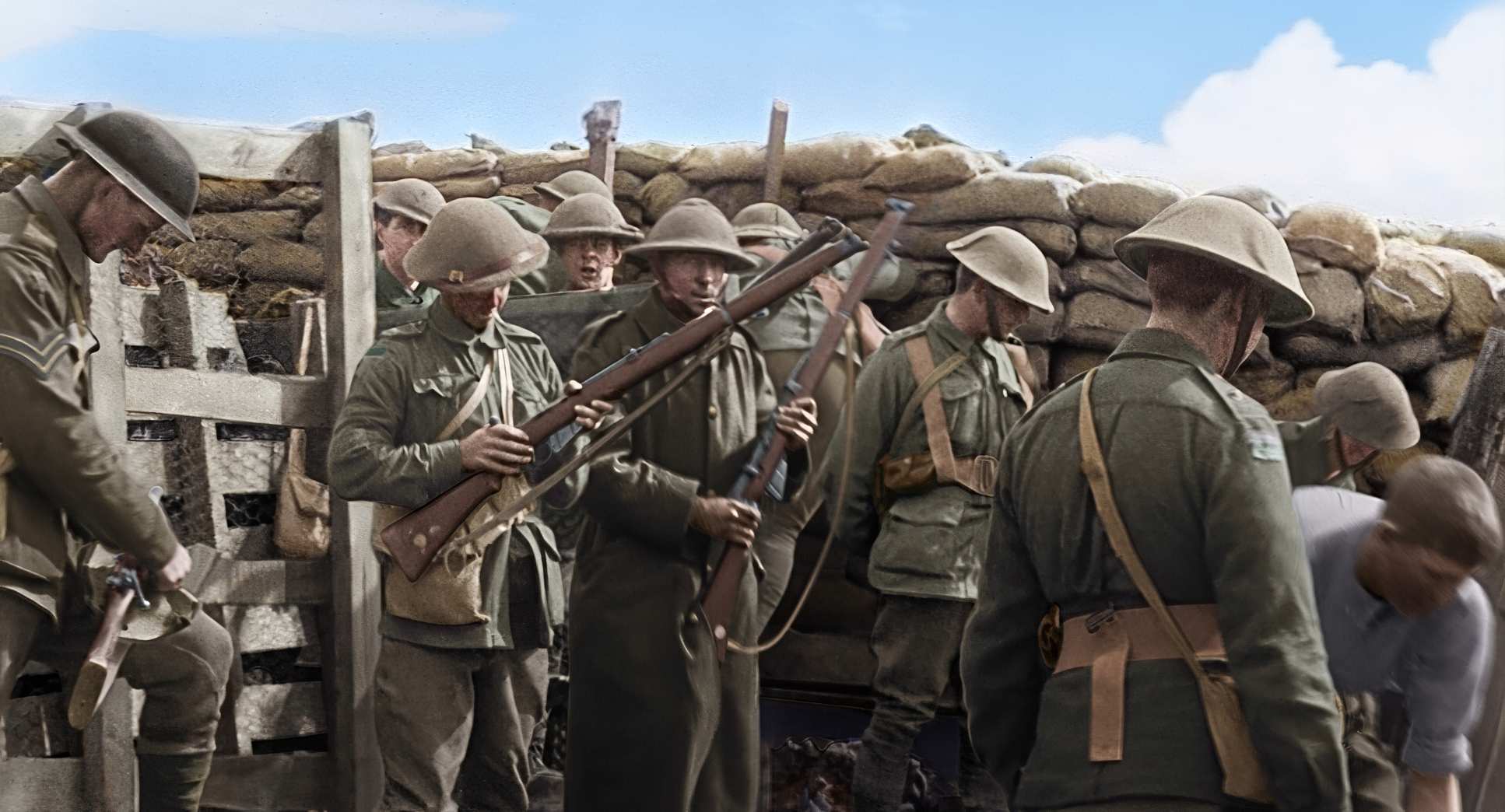
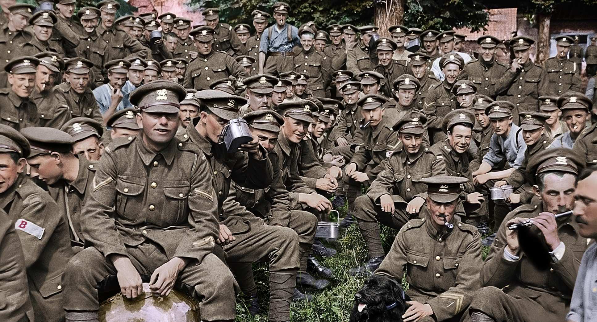
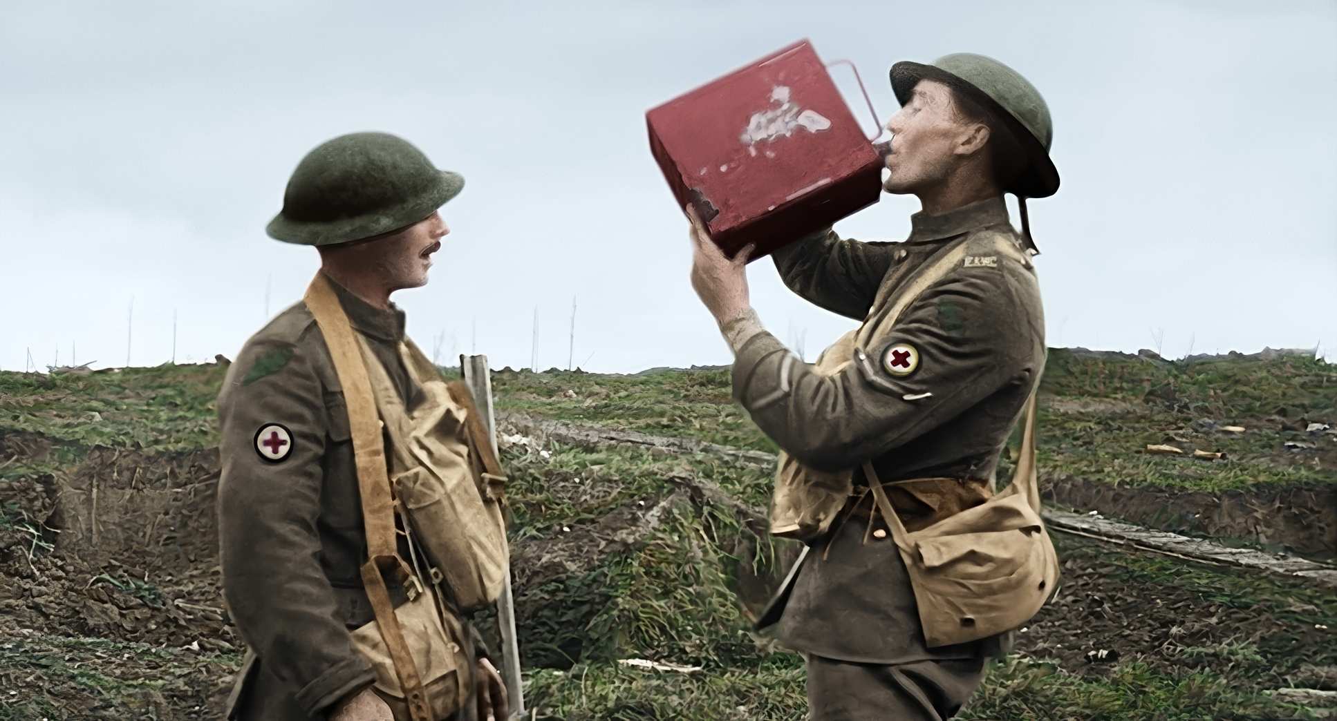
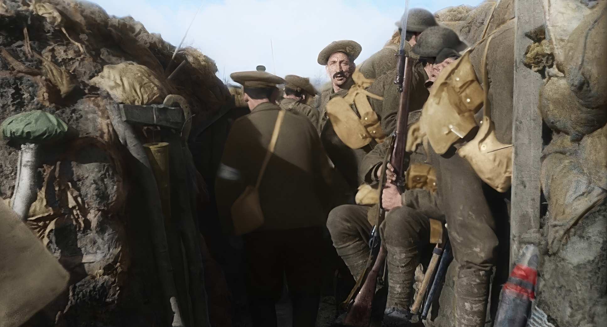
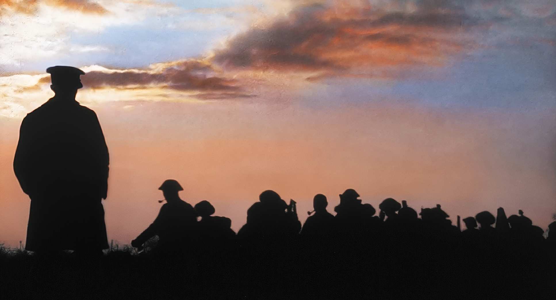
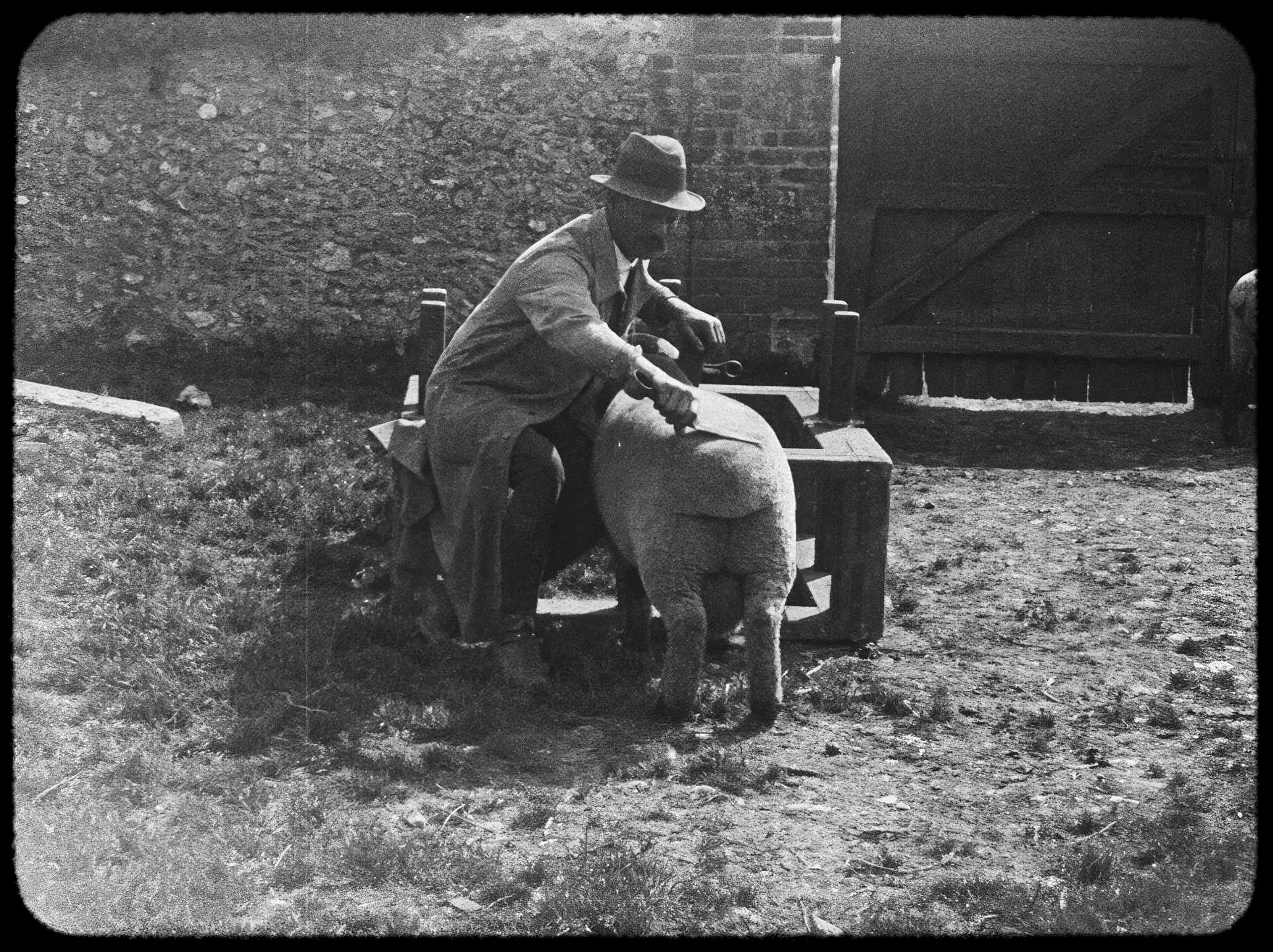
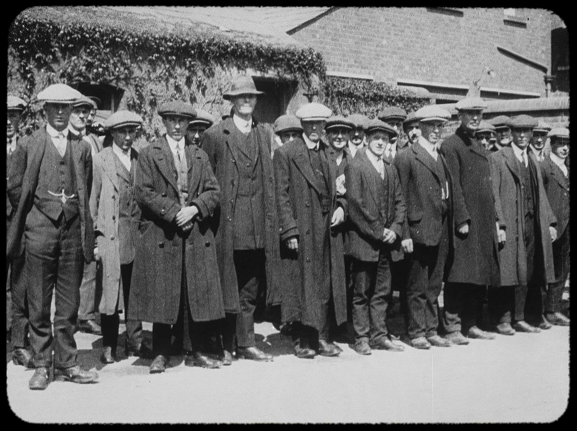
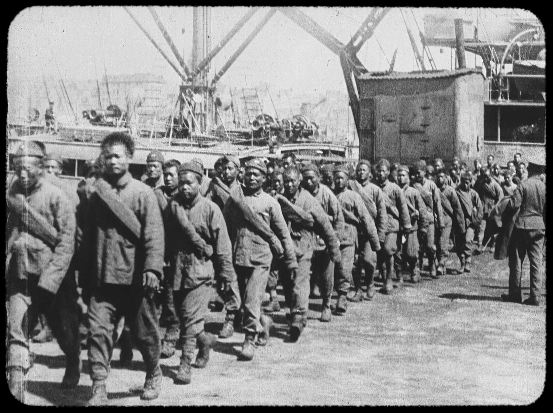
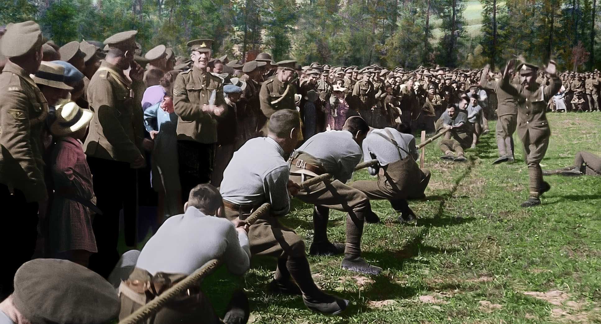
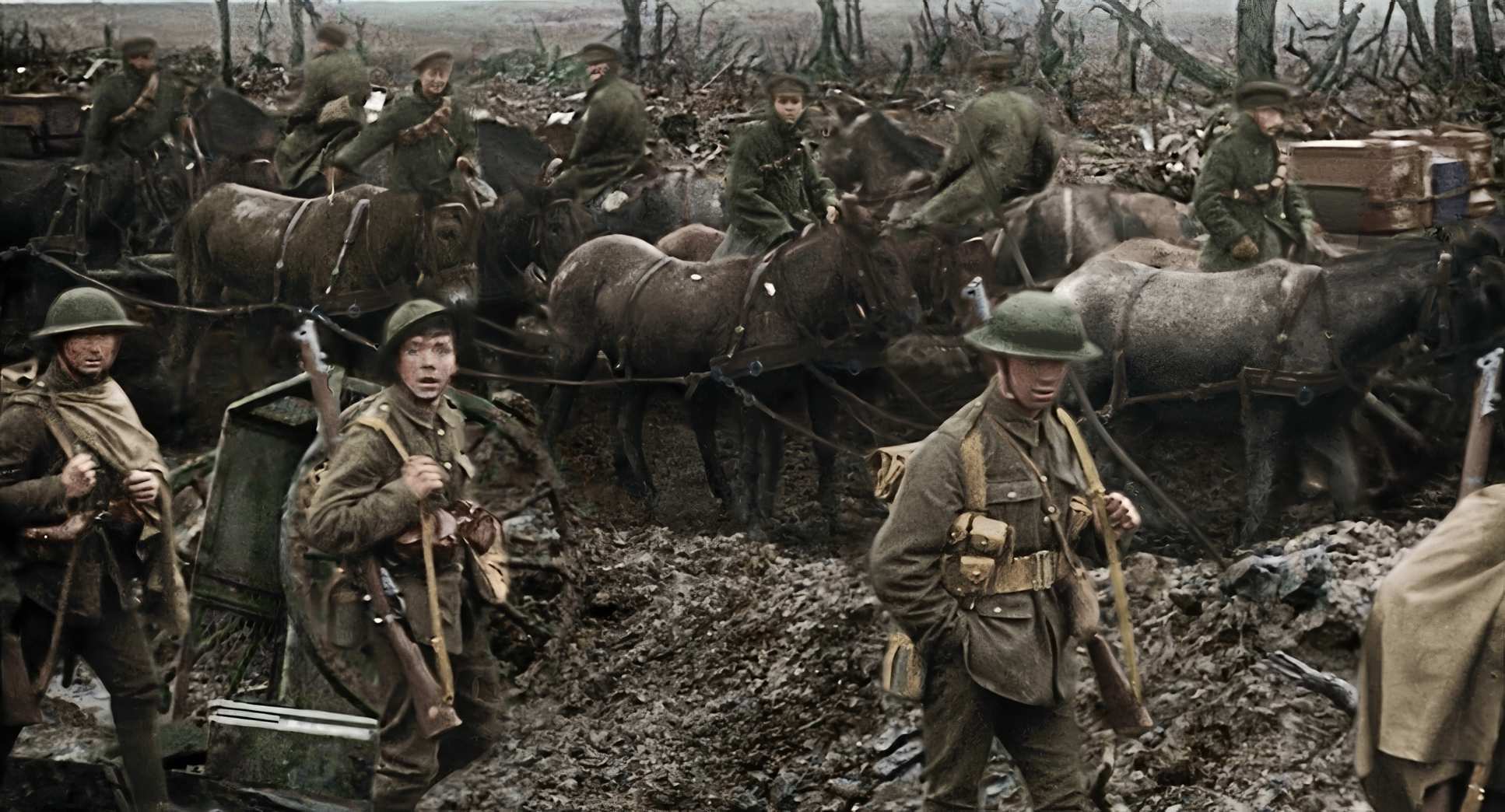
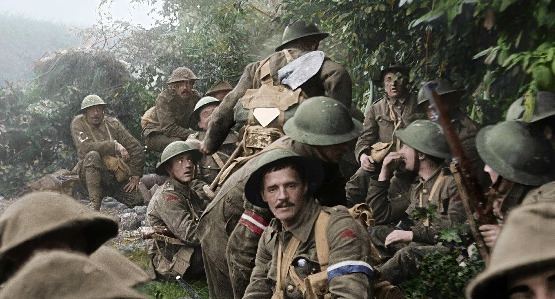
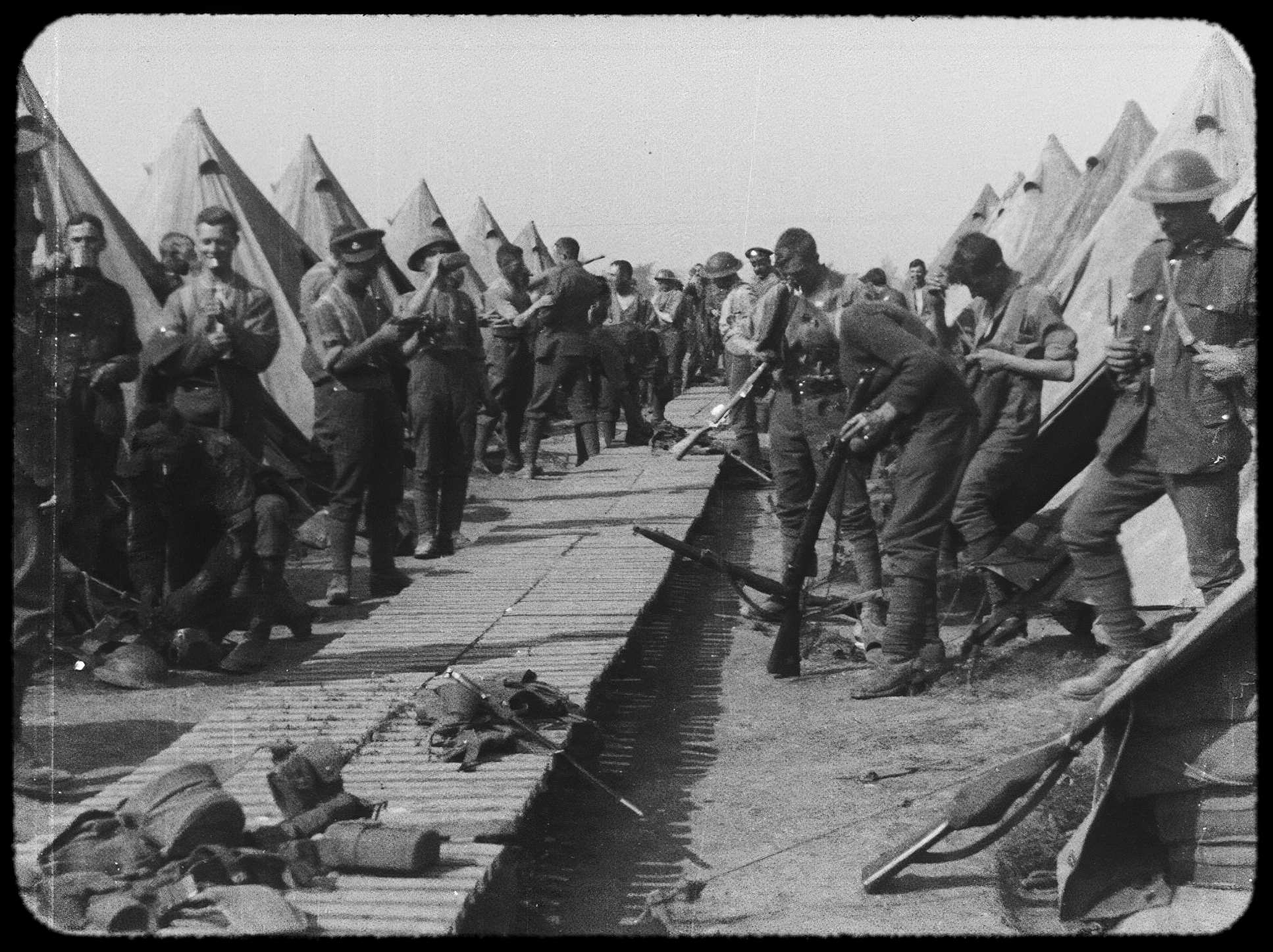
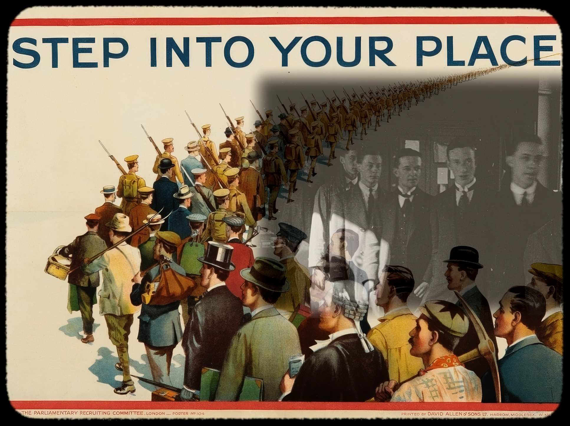
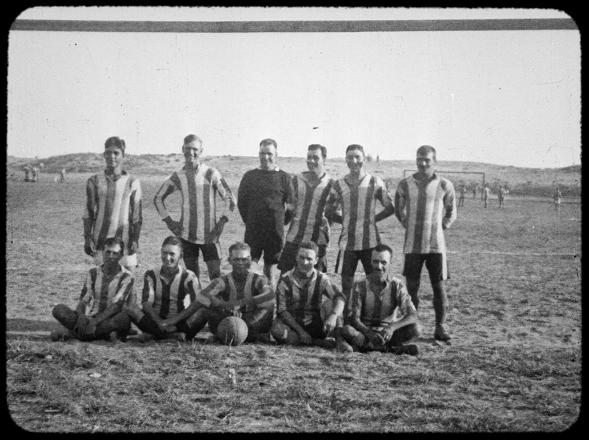
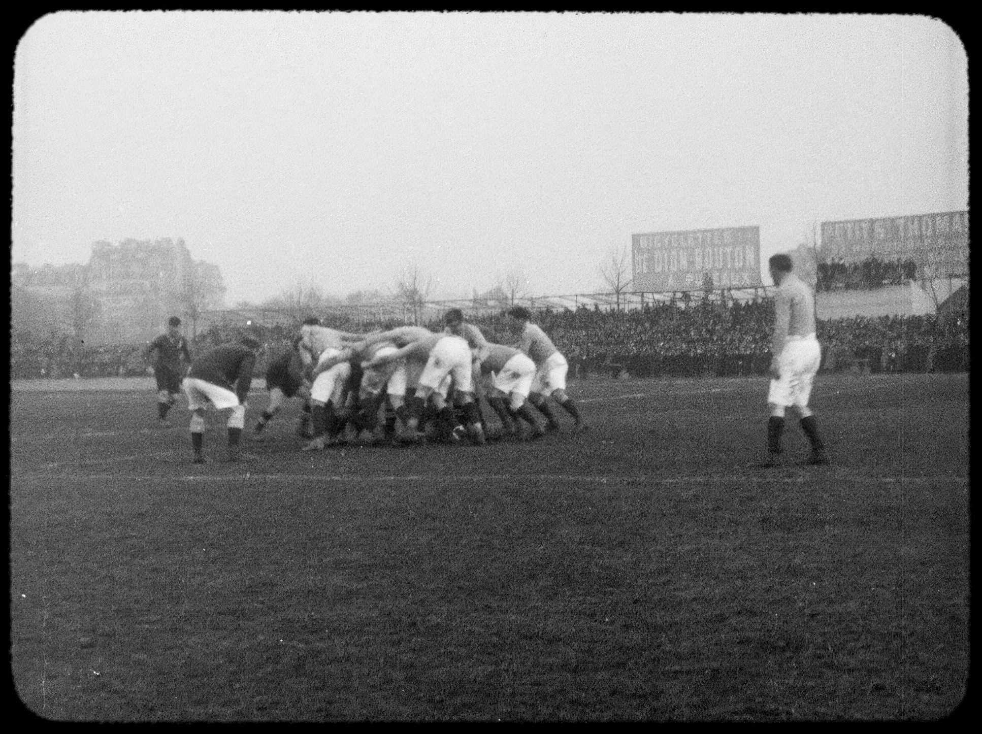
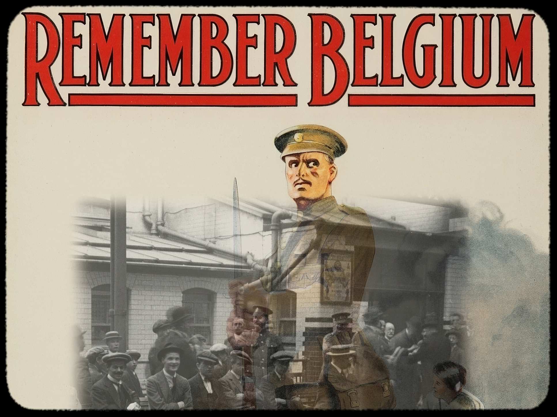
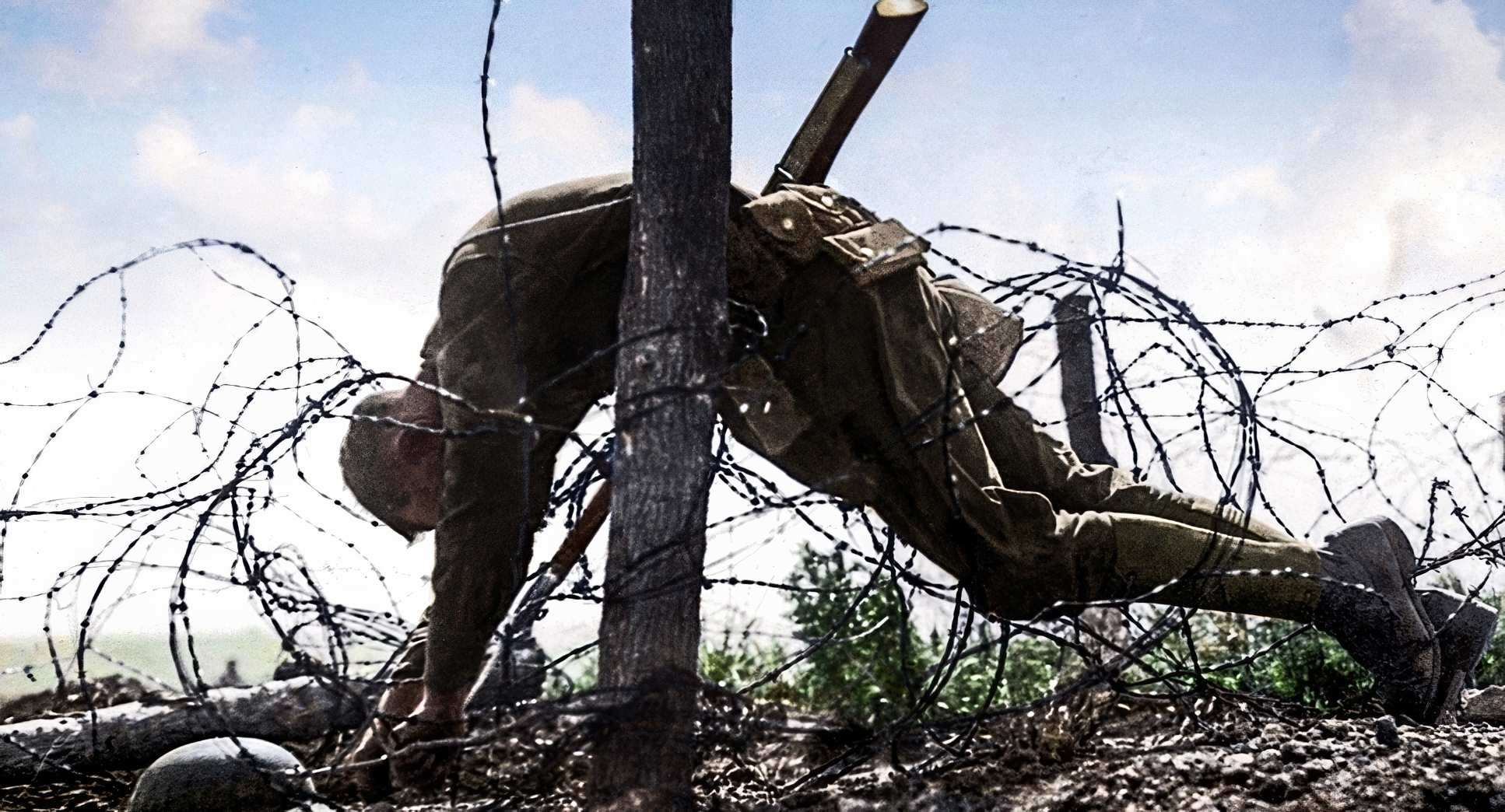
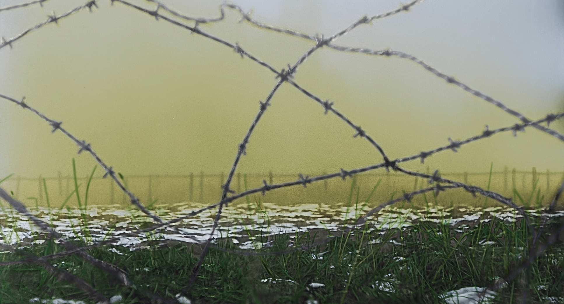
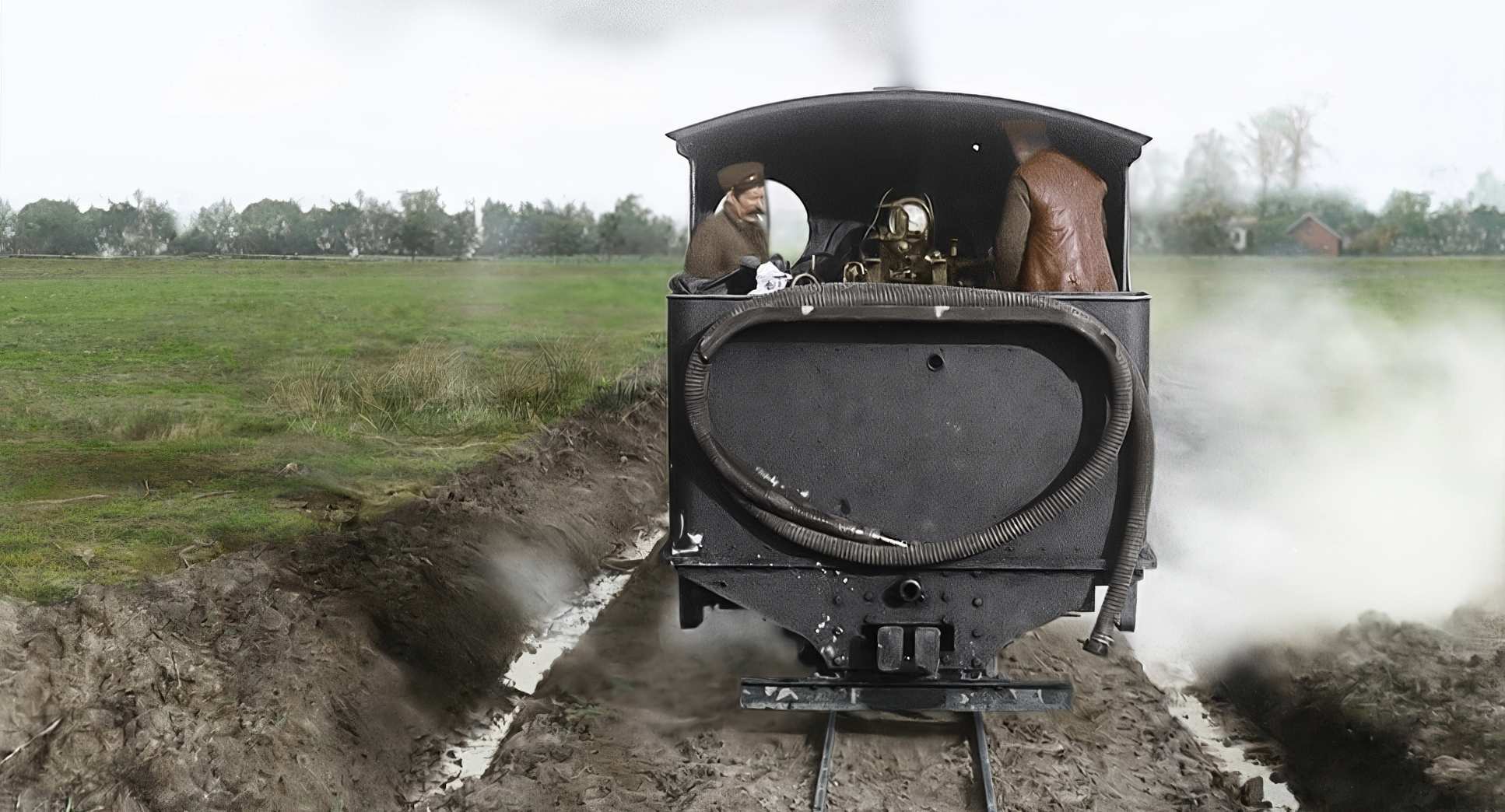
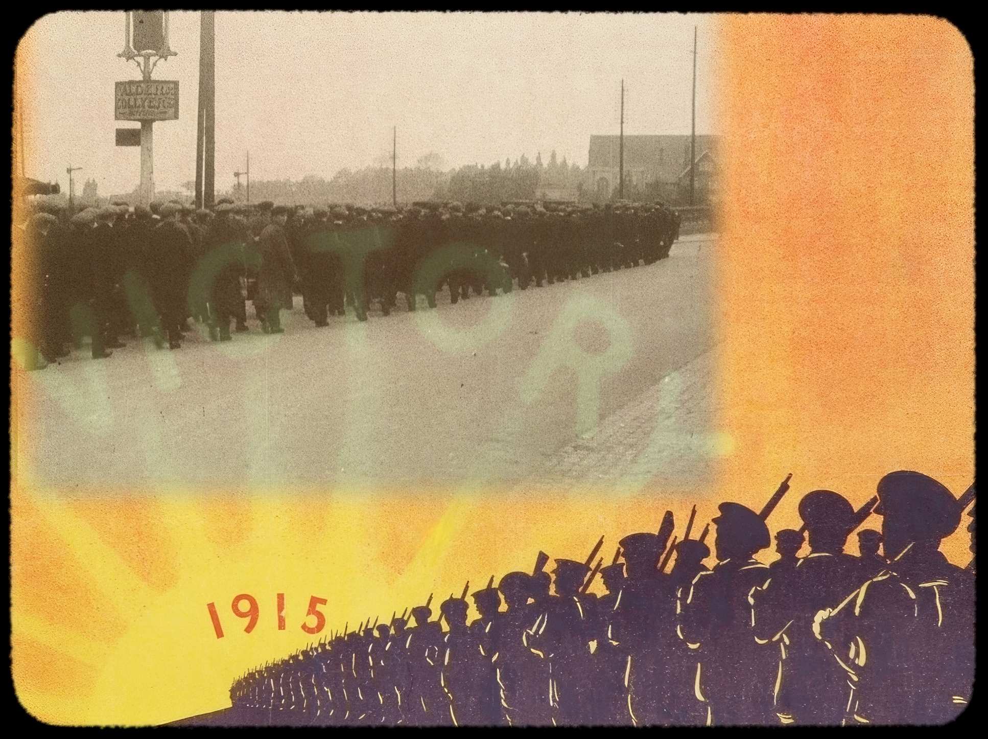
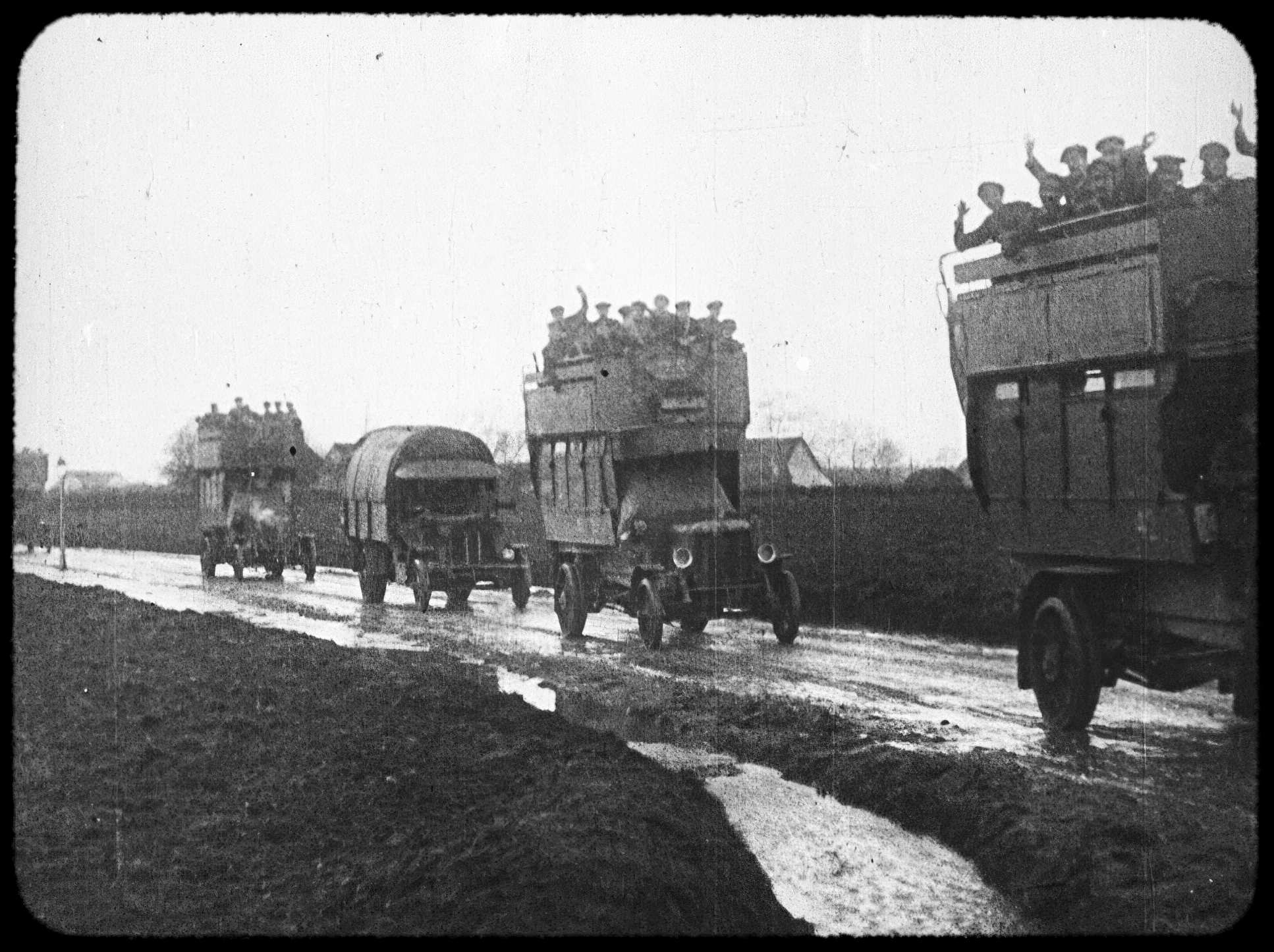
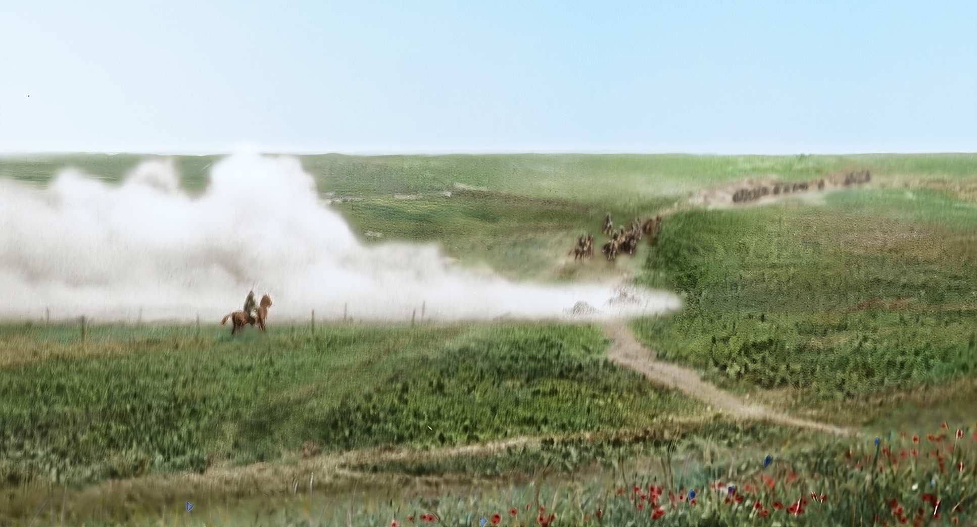
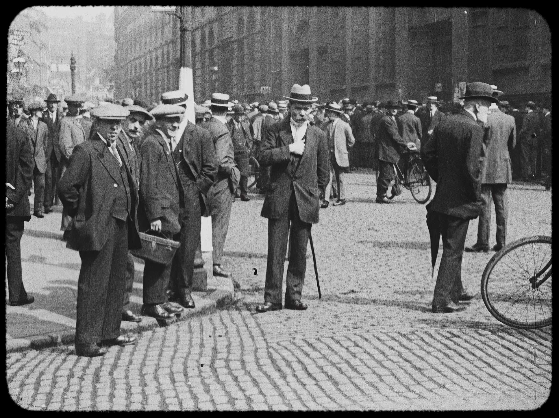
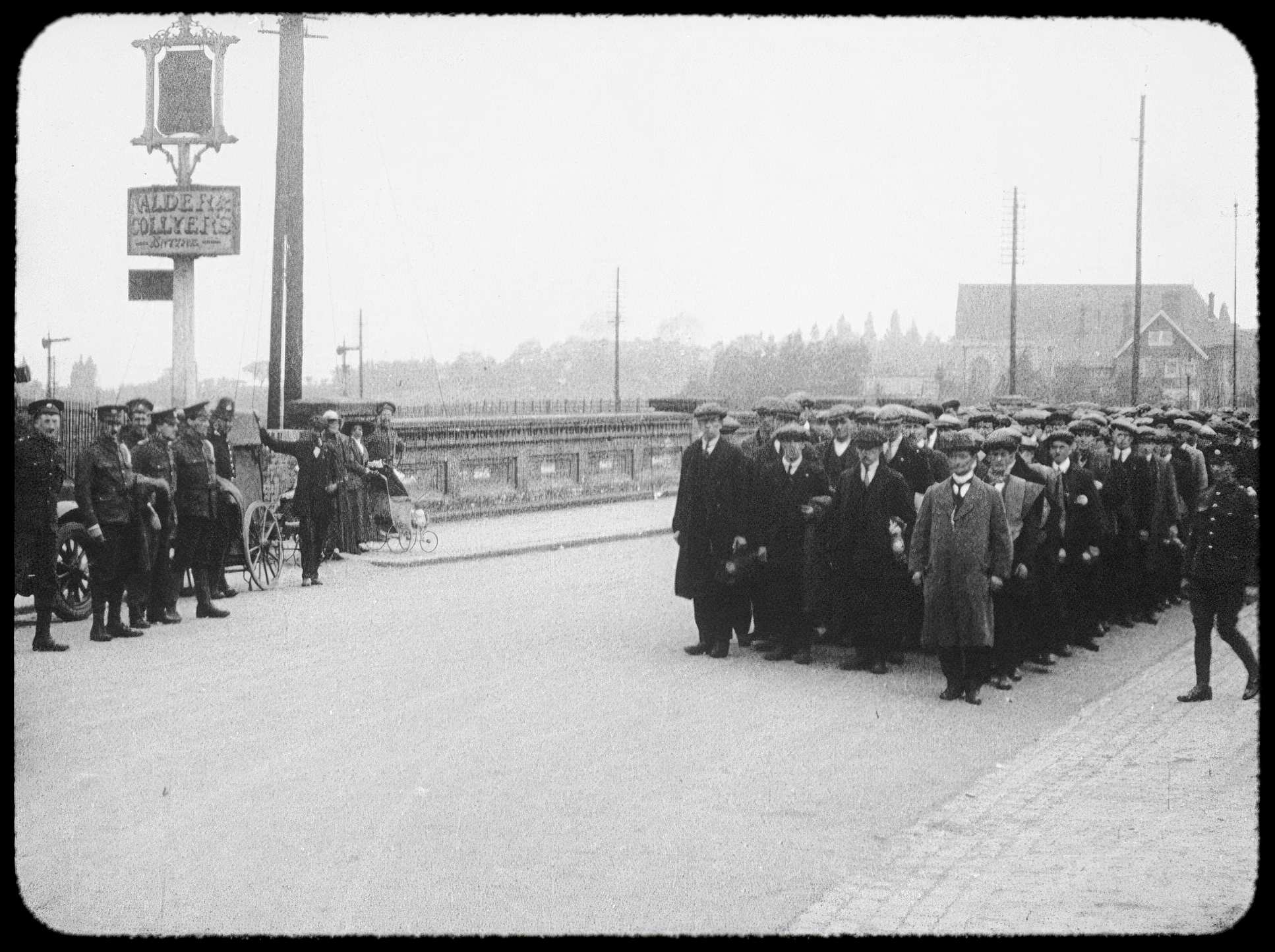
They Shall Not Grow Old (2018) Film Stills
A curated reference archive of cinematography stills from They Shall Not Grow Old (2018). Study the lighting, color grading, and composition.


- Also read: THE GRAND ILLUSION (1937) – CINEMATOGRAPHY ANALYSIS
- Also read: AUTUMN SONATA (1978) – CINEMATOGRAPHY ANALYSIS
Browse Our Cinematography Analysis Glossary
Explore directors, cinematographers, cameras, lenses, lighting styles, genres, and the visual techniques that shape iconic films.
Explore Glossary →