Every so often, you have to stop looking at modern waveforms and go back to the source. For me, Jean Renoir’s 1937 masterpiece, The Grand Illusion, is that “reset” button. It’s an anti-war film that doesn’t need explosions to make you feel the weight of conflict.
It’s a classic WWI prison camp story, but it feels weirdly modern. If you’ve seen The Great Escape or The Shawshank Redemption, you’re seeing Renoir’s DNA. That famous bit where they secretly dump tunnel dirt from their pockets? This is where it started. But as a colorist, what really hooks me isn’t just the tropes it’s the craft. It’s a masterclass in how you can use a camera to build human connection rather than just “cool” shots.
Why the Look Matters: The Inspiration
The look of The Grand Illusion comes straight from Renoir’s obsession with humanism. He wasn’t interested in grand, heroic war imagery. He made this in ’37, with WWII literally on the horizon, so he wanted to show the “mundane” reality of prison life and the way class barriers fall apart when people are stuck in a room together.
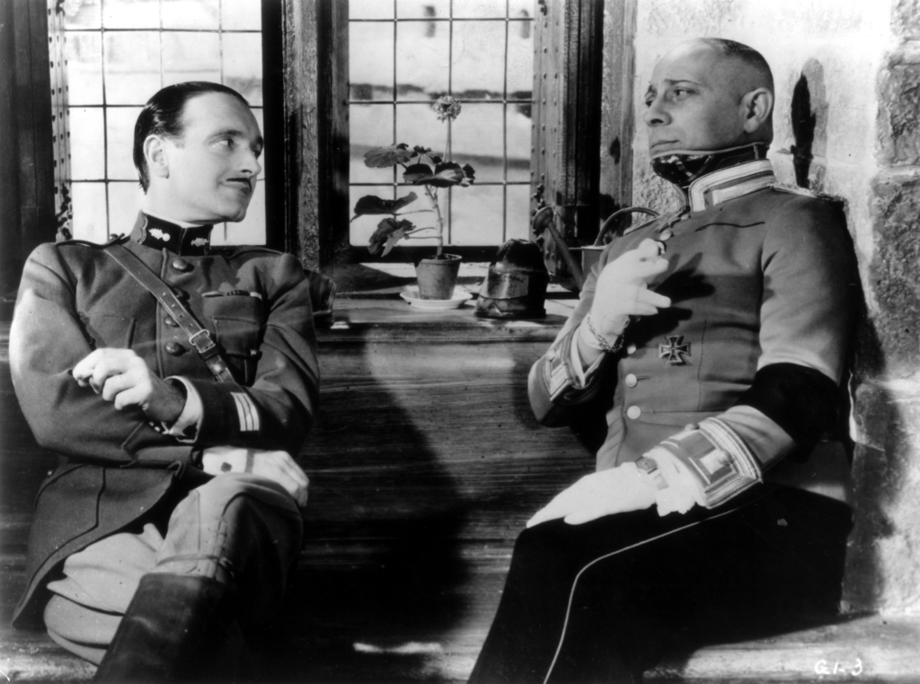
Renoir wanted to challenge the “us vs. them” mentality, specifically addressing the antisemitism of the time through Rosenthal’s character. The cinematography does the heavy lifting here by humanizing everyone. It’s not about making a “pretty” frame; it’s about making an honest one. The goal was to give the conflict a humanist edge treating characters as individuals rather than just bodies in a box. That means the framing stays respectful, giving the actors space to breathe and react naturally without being forced into aggressive close-ups.
The Renoir-Matras Connection
When we talk about the visual genius here, it’s hard to tell where the cinematographer, Christian Matras, ends and Renoir begins. Renoir was famously hands-on. In this era, an auteur’s vision was so baked into the camera work that they became one and the same.
His whole philosophy was built on naturalism. He didn’t care for flashy technicality for its own sake. Instead, he had this innate trust in the audience’s intelligence. He preferred staging scenes with a lot of depth, letting us observe the action rather than spoon-feeding us reactions through fast cuts. Matras was the guy who had to translate that “trust” into tangible images, and together they built a visual language that feels both immediate and deeply thoughtful.
Trusting the Audience: Compositional Choices

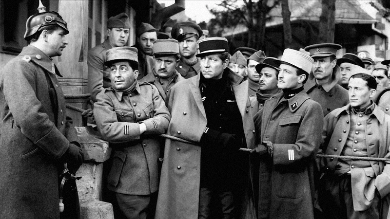
Renoir’s compositions are the backbone of the film. He had this massive “faith in the viewer to read the many characters of one shot.” He used deep-focus constantly, which let multiple layers of a scene happen at the same time. This is huge for showing the communal vibe of the prisoners.
There’s a great scene where the men find women’s clothes in a trunk and one of them puts on a dress. A modern director might cut to five different reaction shots. Renoir? He gives us one long shot of everyone’s faces at once. It’s a better way to show how they’re all in this struggle together. You see the nostalgia, the amusement, and the sadness all at once. It’s heartbreaking, it’s charming, and it works because the frame isn’t lying to you.
The Deep Focus Flex: Lensing and Blocking
Renoir was the king of depth of field. This wasn’t just a technical flex; it was fundamental to the story. By keeping everything from the foreground to the back wall in focus, he could stage these incredibly complex human interactions.
Instead of cutting back and forth between two people talking, he’d put them in the same shot at different distances. This kind of blocking is a nightmare to get right the actors have to be perfect and the camera op has to be on point but the payoff is massive. You get to see reactions happen in real-time. The lens choice (usually on the wider side) helps this along, capturing a big field of view without making things look distorted. It feels like you’re actually in the room with them, not just watching a movie.
The Wanderer: The Active Camera
The camera in The Grand Illusion is basically another prisoner. It’s been described as a “wanderer and a participant,” and I love that. It’s not static, but it’s never showy. You won’t see any crazy crane shots or whip pans here.
Instead, it moves with a quiet purpose. There are these graceful, unhurried tracking shots through the barracks or the halls of the castle. For a colorist, these long takes are a challenge because the light and tone have to stay consistent as the camera moves through the space. But for the viewer, it’s immersive. The camera isn’t just recording; it’s experiencing the passage of time. It’s an empathetic lens that invites you in rather than just pointing at things.
Practical Magic: Lighting with Reality
The lighting here is a perfect example of “motivated” light. Renoir and Matras mostly relied on practical sources windows, lamps, candles to shape the scene. It makes the whole thing feel authentic. You can almost feel the dimness of the barracks vs. the harsh glare of the outdoors.
There’s a soft quality to the interiors that avoids the high-contrast drama you see in a lot of other films from that era. For me, working with black and white means the variations in luminosity are everything. Without color to guide the eye, you’re relying entirely on tonal shifts to show mood and texture. The way light falls across an actor’s face or rolls off a window isn’t just a technical detail it’s the emotional heartbeat of the scene. It’s lighting that breathes.
The Colorist’s Perspective: Grading Without Color
As a colorist, I’m always “grading” in my head, even when I’m watching a monochrome film. The principles of shaping contrast and defining dynamic range are still the same; you’re just doing it with light instead of hue.
If I were grading this today, my main goal would be preserving that gritty, documentary feel. I’d focus on contrast shaping, making sure the fall-off from highlights to shadows feels natural. I’d lean into a broad dynamic range ensuring we don’t crush the blacks or clip the whites so we can keep all that amazing masonry detail.
The tonal sculpting would be the hard part. In B&W, you’re finessing mid-tones to create separation. You want a dark uniform to stay distinct from a shadowed wall through luminance separation. I’d also want to keep those print-film sensibilities. I’d probably add a bit of period-appropriate grain and make sure the highlight roll-off is soft and organic. It’s a delicate dance: you want to use modern tools to make the Blu-ray look “absolutely crisp,” but you can’t lose the soul of the original 1930s film stock.
1937 Tech: No Resolve, No Problem
You have to remember, this was 1937. The tech was, by our standards, a mess. Cameras were bulky, heavy, and stuck in “blimps” to keep them quiet for the new sound equipment. Yet, they still got these fluid shots.
They were shooting on 35mm stock that was pretty slow, which meant they needed a ton of light to get that deep-focus look. The “natural” feel of the lighting is actually a huge achievement, because they likely had massive lighting rigs just to make it look like it was only coming from a single candle. Every take had to be planned to the inch. That kind of discipline is something we sometimes lose today when we can just “fix it in post” or shoot 50 takes on a digital card.
- Also read: AUTUMN SONATA (1978) – CINEMATOGRAPHY ANALYSIS
- Also read: ACE IN THE HOLE (1951) – CINEMATOGRAPHY ANALYSIS
Browse Our Cinematography Analysis Glossary
Explore directors, cinematographers, cameras, lenses, lighting styles, genres, and the visual techniques that shape iconic films.
Explore Glossary →